thematic maps/ map design - stockton university · • data values are classified into ranges for...
TRANSCRIPT
Thematic Maps/ Map Design

Map Layout and Design
• Key components to consider when designing a map1. Legibility2. Visual Contrast3. Visual Balance4. Figure-Ground Relationship5. Hierarchical Organization

• Legibility– Make sure that graphic symbols are easy to
read and understand– Size, color, pattern must be easily
distinguishable
Map Layout and Design
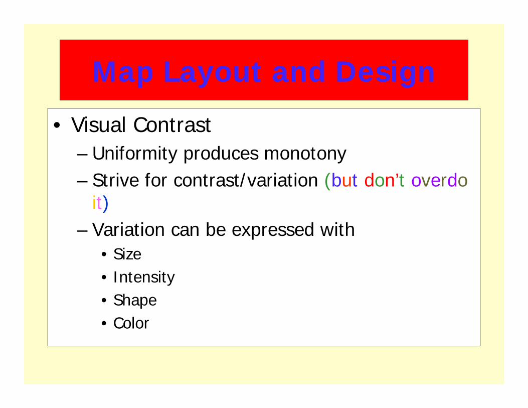
• Visual Contrast– Uniformity produces monotony– Strive for contrast/variation (but don’t overdo
it)– Variation can be expressed with
• Size• Intensity• Shape• Color
Map Layout and Design

Visual Contrast
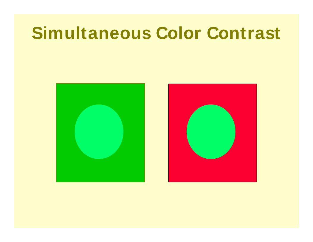
Simultaneous Color Contrast

Map Layout and Design
• Visual Balance– Keep things in balance– Think about the graphic weight, visual weight– Graphic weight is affected by
darkness/lightness, intensity and density of map elements
– Visual center is slightly above the actual center (standard is 5%)

Visual BalanceVisual Balance
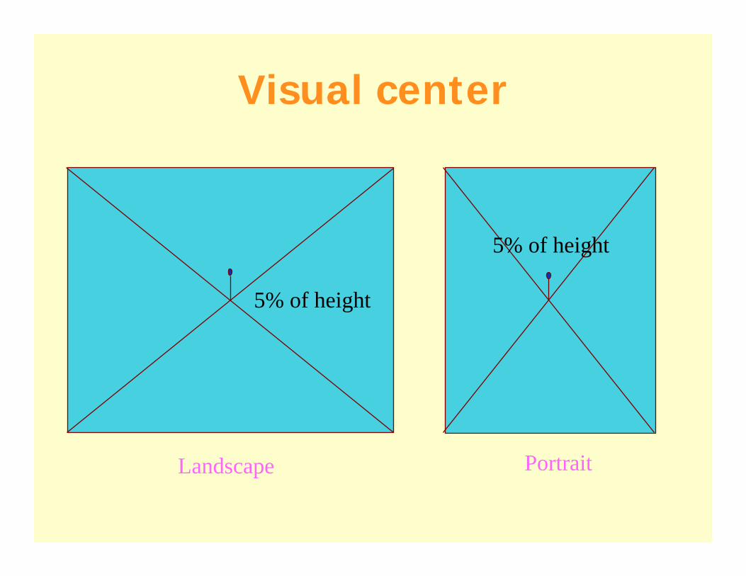
Visual center
5% of height
5% of height
Landscape Portrait

Map Layout and Design
• Figure-Ground Relationship– Complex, automatic reaction of eye and brain
to a graphic display
– Figure: stands outGround: recedes

Map Layout and Design
• Figure-Ground Relationship– All other things being equal, there are factors that
are likely to cause an object to be perceived as figure (i.e. stand out from background)• Articulation & detail• Objects that are complete (e.g. land areas
contained within a map border) • Smaller areas (relative to large background areas)• Darker areas

Map Layout and Design
• Color Conventions– “Normal” colors that we’ve become accustomed to seeing (these are
somewhat standard worldwide, but can be culturally specific)– Part of the figure – ground relationship
• Common Examples– Water = blue– Forests = green– Elevation:
• low = dark• high = light (because mountains can have snow on top)
– Roads in a road atlas: • Interstate = blue• Highway = red• Small road = gray

Where is this?

Map Layout and Design
• Figure-Ground Relationship– Very difficult to develop a hard and fast rule
with figure ground, relies on a mix of factors

Map Layout and Design
• Hierarchical Organization– Use of graphical organization schemes to
focus reader’s attention
• Types– Extensional– Stereogrammatic– Subdivisional

Hierarchical Organization
• Extensional– “Ranks Features on the Map”
• Use of different sized line symbols for roads

#
#
#
#
#
#
#
#
#
##
#
#
##
#
#
#
##
#
#
#
##
#
#
#
#
#
#
#
#
#
#
#
##
#
#
#
#
#
#
#
ÆQ
ÆJ
ÆQ
ÆJ
ÆQ
ÆJ
ÆQ
ÆJ
ÆJ
ÆJ
ÆQ
ÆJ
ÆJÆJ
Ã
ÆJ
ÆQ
ÆJ
ÆJ
ÆJ
ÆQ
ÆQ
ÆJ
ÆJ
ÆJ
Ê
ÆJ
æ
æ
æ
æ
æ
ææ
æ
æ
æ
æ
æ æ
æ
æ
æ
æ
æ
æ
æ
æ
æ
æ
æ
æ
æ
æ
æ
æ
æ
æ
æ
æ
æ
ææ
ææ æ
æ
æææ
æ
æ
æ
æ
æ
æ
æ
æ
æ
æ
æ
æ
ææ
æ
æ
æ
æ
æ
æ
æ
å
å
å
å
å
å
å
å
å
å
å
åå
åå
å
å
å
å
Jackson
Buncombe
Madison
Swain
Macon
Henderson
Great SmokyMountains
National Park "!20 9
.-,40
.-,40
(/19(/19
(/276
Heywood County
# Places
Fish HatcheryGolf
Ê Community Ctr
Heywood LandmarksÆQ CampgroundÆJ Overlook
RetailMisc.
à Monument
æ Churcheså Schools
Roads Primary road with limited access Primary road Secondary and connecting road Local road Road, major and minor categories unknown Ferry crossing
Hierarchical Organization
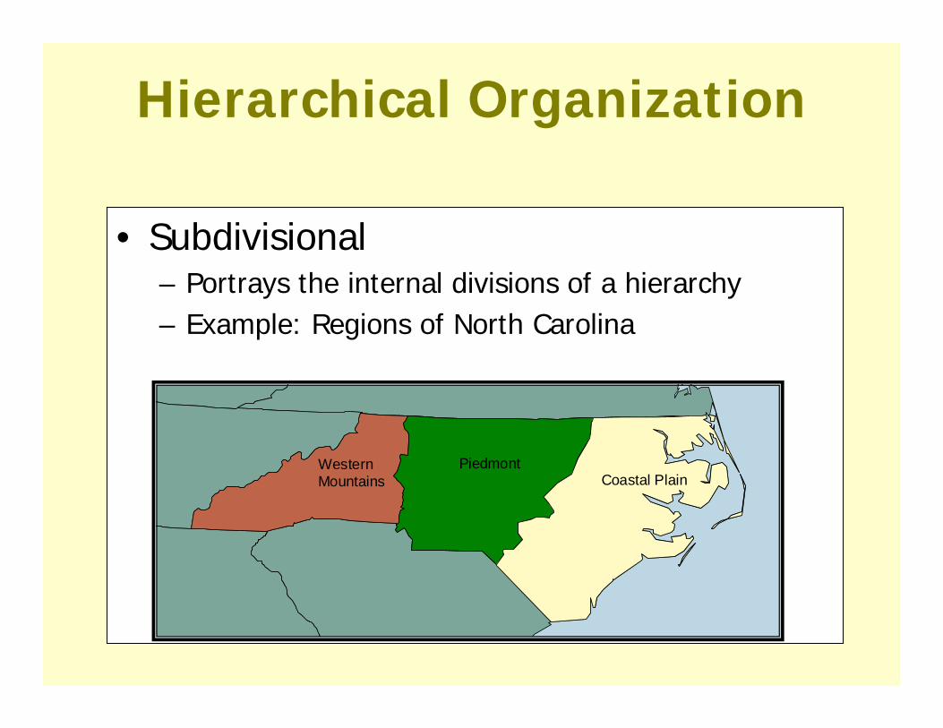
• Subdivisional– Portrays the internal divisions of a hierarchy– Example: Regions of North Carolina
WesternMountains
PiedmontCoastal Plain
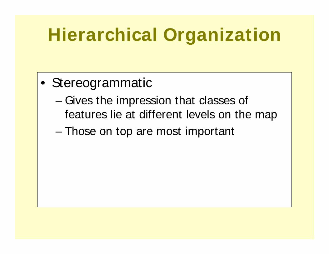
Hierarchical Organization
• Stereogrammatic– Gives the impression that classes of
features lie at different levels on the map– Those on top are most important

WesternMoun i s
PiedmontCoastal Plain

Text: Selection and Placement
POINT
LINE
AREA

• Thematic Maps concentrate on the spatial variations of a single phenomenon or relationship between phenomenon.
Two general goals:1) communicate spatial pattern effectively
while minimizing information loss
2) enhance spatial communication through the use of generalization techniques

Visual Variables points, lines and areas

Matching data types to cartographic representations

• We will consider five thematic map types• Choropleth• Proportional symbol• Dot density• Isoline Maps• Cartograms
Example Map Types

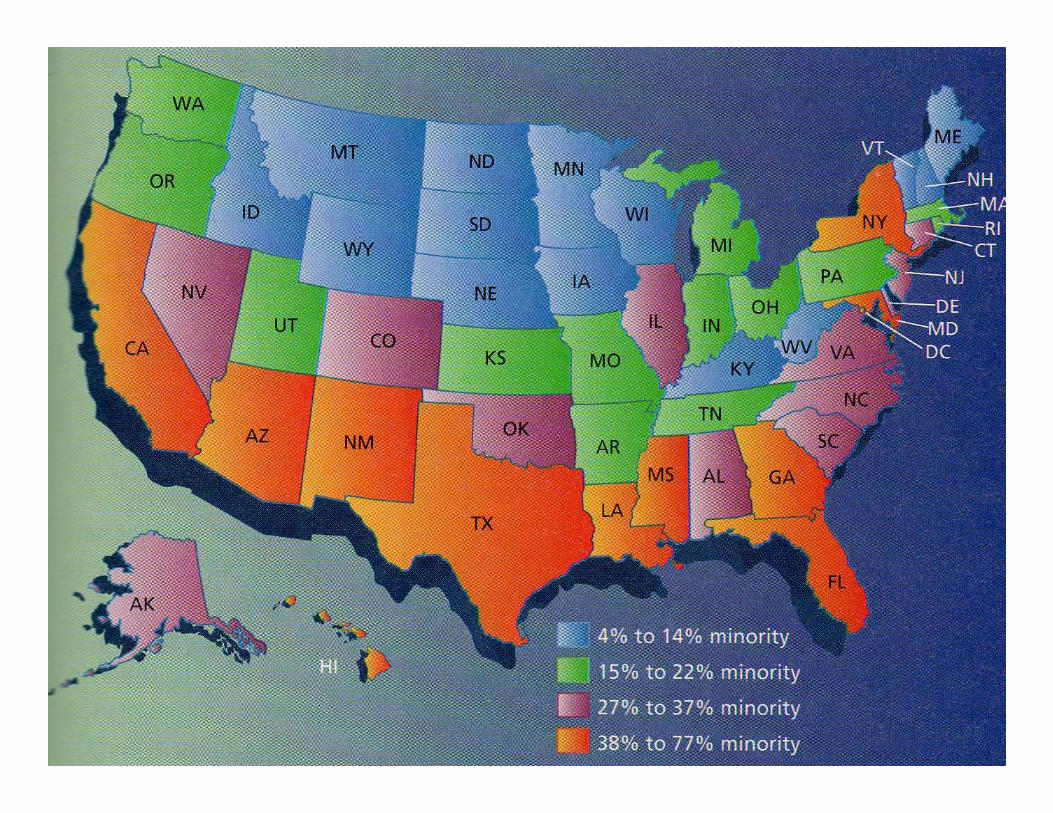
• Greek: choros (place) + plethos (filled)Choropleth Maps

Source: http://www.gis.psu.edu/geog121/pop.html
Choropleth Maps

Choropleth Maps
•These use polygonal enumeration units•E.g. census tract, counties, watersheds, etc.
•Data values are generally classified into ranges
•Polygons can produce misleading impressions•Area/size of polygon vs. quantity of thematic data value

• Assumption: – Mapped phenomena are uniformly spatially distributed within
each polygon unit– This is usually not true!
• Boundaries of enumeration units are frequently unrelated to the spatial distribution of the phenomena being mapped
• This issue is always present when dealing with data collected or aggregated by polygon units
Thematic Mapping Issue:Modifiable Area Unit Problem

MAUPModifiable Areal Unit Problem: (numbers represents the polygon mean)Scale Effects (a,b)Zoning Effects (c,d)
The following numbers refer to quantities per unit area
a) b)
c) d)
Summary: As you “scale up” or choose different zoning boundaries, results change.
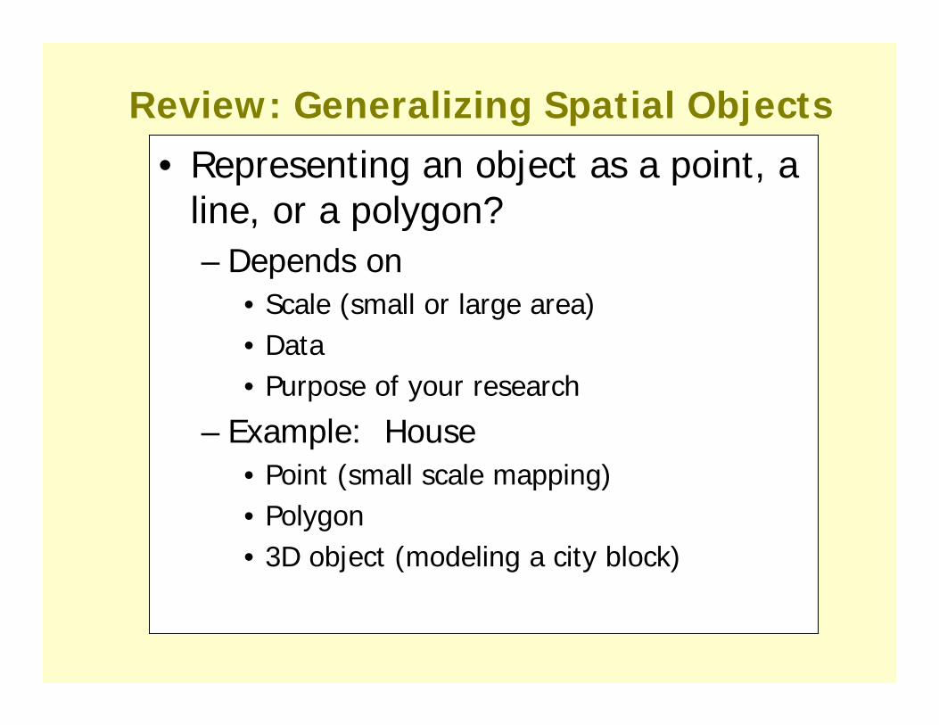
Review: Generalizing Spatial Objects• Representing an object as a point, a
line, or a polygon?– Depends on
• Scale (small or large area)• Data• Purpose of your research
– Example: House• Point (small scale mapping)• Polygon• 3D object (modeling a city block)

•Scale effects how an object is generalized•Left houses appear to have length & width (polygons)•Right houses appear as points
Review: Generalizing Spatial Objects
Generalizing Data by Attribute
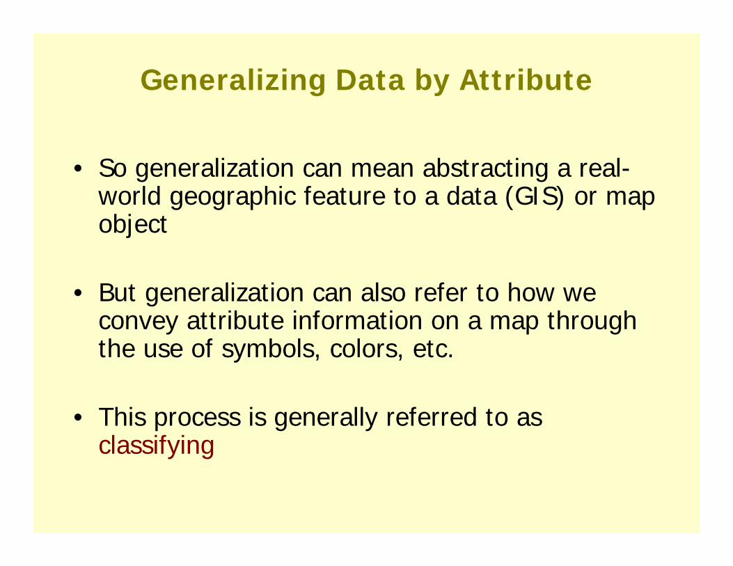
• So generalization can mean abstracting a real-world geographic feature to a data (GIS) or map object
• But generalization can also refer to how we convey attribute information on a map through the use of symbols, colors, etc.
• This process is generally referred to as classifying
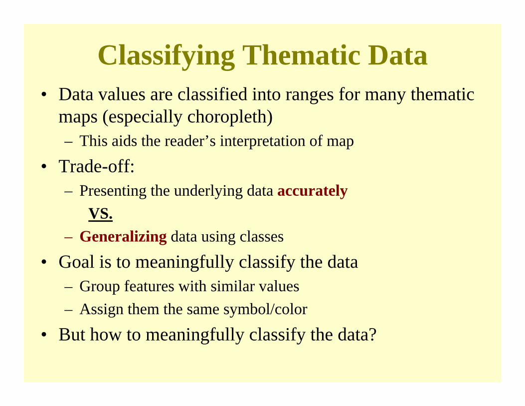
• Data values are classified into ranges for many thematic maps (especially choropleth) – This aids the reader’s interpretation of map
• Trade-off:– Presenting the underlying data accurately
VS.– Generalizing data using classes
• Goal is to meaningfully classify the data– Group features with similar values– Assign them the same symbol/color
• But how to meaningfully classify the data?
Classifying Thematic Data

• How many classes should we use?– Too few - obscures patterns– Too many - confuses map reader
• Difficult to recognize more than 4-5 classes
Creating Classes
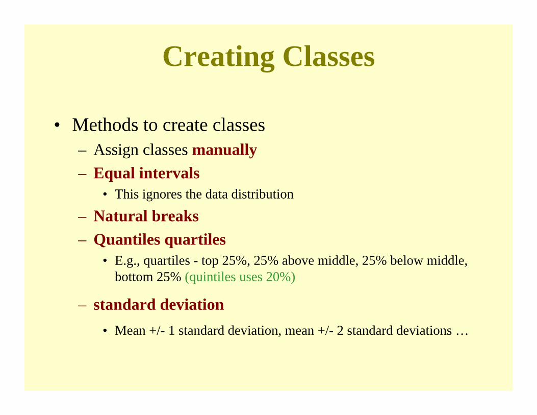
Creating Classes
• Methods to create classes – Assign classes manually– Equal intervals
• This ignores the data distribution
– Natural breaks– Quantiles quartiles
• E.g., quartiles - top 25%, 25% above middle, 25% below middle, bottom 25% (quintiles uses 20%)
– standard deviation • Mean +/- 1 standard deviation, mean +/- 2 standard deviations …
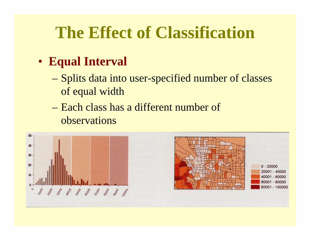
The Effect of Classification• Equal Interval
– Splits data into user-specified number of classes of equal width
– Each class has a different number of observations
The Effect of Classification
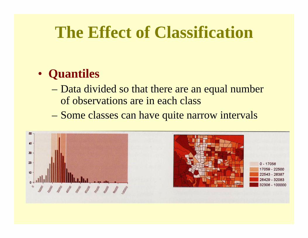
• Quantiles– Data divided so that there are an equal number
of observations are in each class– Some classes can have quite narrow intervals
The Effect of Classification
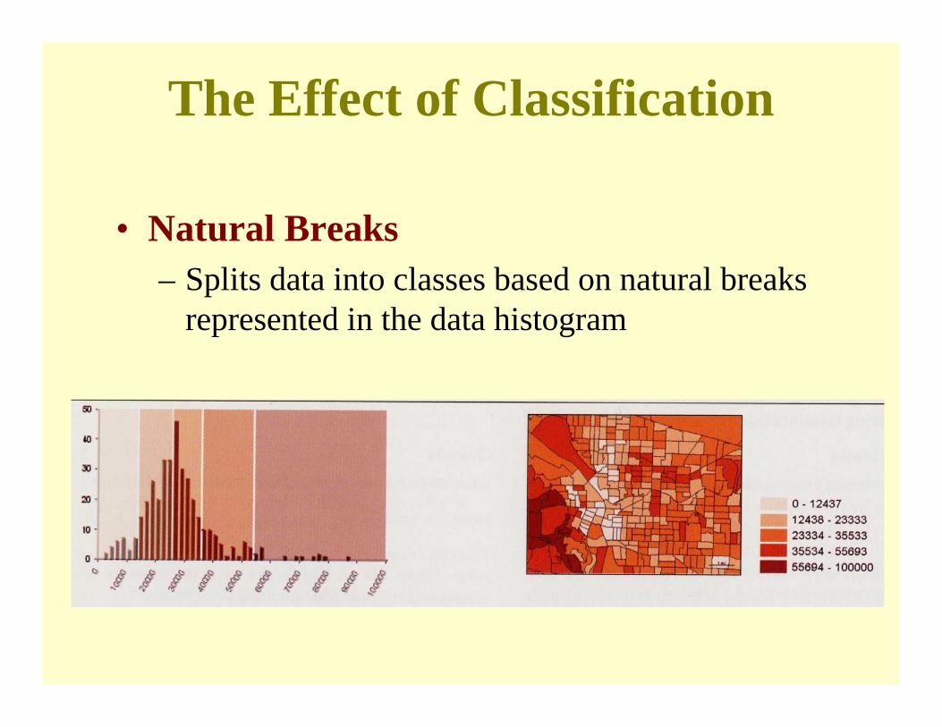
• Natural Breaks– Splits data into classes based on natural breaks
represented in the data histogram

The Effect of Classification
• Standard Deviation– Mean + or – Std. Deviation(s)

Natural BreaksNatural Breaks
QuantilesQuantiles
Equal IntervalEqual Interval
Standard DeviationStandard Deviation

• Class Intervaling is a classification process used to reduce a large number of values to a smaller number of ordered classes
• Fundamental Principles;1) each of the original
values must fall into one of the classes
2) None of the original values may fall into more than one class

• Equal Interval Classing– Take highest number and divide by number of classes
Ex. 201 / 5 classes = 40 (+-)0 – 40, 41- 80, 81 – 120, 121 – 160, 161- 201
• Quantile Classing– Order numbers from lowest to highest then divide
number of classes into number of values10, 11, 14, 18, 25, 36, 38, 39, 51, 52, 61, 70, 100, 101, 106,
126, 141, 152, 160, 183Ex. 20 numbers 5 classes 20/5= 41 – 18, 19 – 39, 40 – 70, 71 – 126, 127 - 183

Thematic Mapping Issue:Counts Vs. Ratios
• When mapping count data, a problem frequently occurs where smaller enumeration units have lower counts than larger enumeration units simply because of their size. This masks the actual spatial distribution of the phenomena.
• Solution: map densities by area– E.g., population density, per capita income, automobile
accidents per road mile, etc.
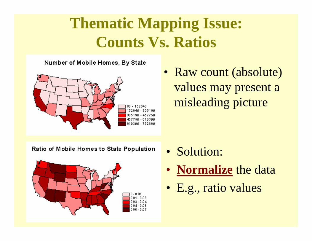
• Raw count (absolute) values may present a misleading picture
• Solution:• Normalize the data• E.g., ratio values
Thematic Mapping Issue:Counts Vs. Ratios

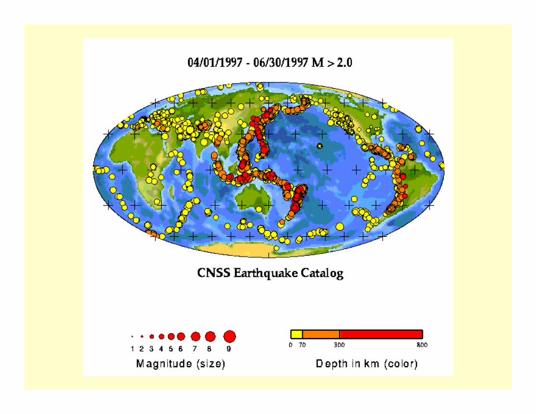
• Size of symbol is proportional to size of data value– Also called graduated symbol maps
• Frequently used for mapping points’attributes– Easily avoids distortions due to area size as seen in
choropleth maps by using both size and color
Proportional Symbol Maps

Proportional Symbol Maps

• Dot density maps provide an immediate picture of density over area
• 1 dot = some quantity of data value– E.g. 1 dot = 500 persons– The quantity is generally associated with polygon enumeration
unit – MAUP still exists
• Placement of dots within polygon enumeration units can be an issue, especially with sparse data
Dot Density Maps

Dot Density Maps
• Population by county
##
# #
##
#
#
#
#
##
##
##
#
#
#
#
#
## # ##
#
#
#
#
#
#
# #
#
#
#
#
##
#
## ##
# ##
#
#
##
#
#
#
#
##
#
#
# #
#
##
#
#
#
#
# ##
#
## #
#
#
##
#
#
#
#
###
#
#
#
#
#
##
#
##
# ##
###
#
#
#
#
##
#
#
# # #
#
#
#
#
##
#
#
#
#
#
#
#
#
#
#
#
#
#
##
#
#
#
###
#
#
##
#
#
##
###
#
#
#
#
#
#
#
#
###
#
#
# #
#
#
#
# #
##
#
##
#
#
###
#
#
#
#
#
#
#
#
#
##
#
#
#
#
#
#
#
##
#
#
# ##
#
##
#
#
###
#
## ###
#
##
##
#
#
#
#
#
#
#
#
#
##
##
##
#
#
#
#
#
#
#
#
#
#
#
#
#
##
##
#
##
##
##
#
##
##
#
# ##
#
####
##
##
##
#
####
#
##
#
# ##
## #
#
#
##
#
#
#
##
#
#
####
#
# ##
#
#
#
#
# #
#
#
##
###
##
#
#
##
#
##
#
#
##
## #
#
#
##
#
#
#
#
#
#
#
#
#
##
#
#
#
#
#
## #
#
#
##
#
#
#
#
# ###
#
# # #
#
# ##
#
##
#
#
#
#
#
#
#
#
###
#
#
#
##
##
##
##
#
#
#
# #
#
#
#
#
#
#
#
#
#
#
#
#
##
#
#
###
#
###
#
#
#
#
##
#
##
#
#
#
###
#
##
#
###
#### #
#
#
#
#
#
#
##
#
#
##
#
#
##
#
#
#
#
#
#
#
#
##
#
#
#
#
#
##
#
#
#
#
#
##
#
#
#
#
#
#
#
#
#
#
#
#
#
##
####
#
#
#
#
#
#
# #
##
#
#
#
##
#
#
#
#
#
#
#
##
#
#
#
#
###
#
#
#
#
#
# ##
#
#
#
#
#
#
#
#
#
#
#
####
##
##
#
#
#
#
#
#
###
#
#
#
#
##
#
#
#
#
#
##
#
##
#
#
#
##
#
#
##
# #
#
#
#
#
##
##
#
#
#
#
#
#
#
#
#
##
##
#
##
#
#
#
#
#
###
#
#
#
# ##
#
##
#
#
###
##
#
#
#
#
###
#
##
#
#
#
#
##
#
#
#
#
#
##
#
# #
#
#
## ##
#
#
#
#
##
#
#
#
##
#
#
#
#
##
#
###
#
#
#
#
##
#
##
#
#
# #
#
#
#
#
##
#
#
#
#
#
#
##
##
#
#
##
##
#
#
#
#
#
#
#
#
####
#
#
##
##
#
#
##
#
#
# #
#
#
#
#
#
#
#
##
#
###
#
## #
#
#
##
#
#
##
#
##
#
#
####
#
#
#
##
#
#
#
#
##
#
#
#
#
##
#
#
#
#
#
###
#
#
#
##
#
#
#
#
###
#
#
##
##
#
#
#
#
#
#
#
#
#
#
#
#
#
#
# #
#
#
##
#
#
#
#
#
#
#
#
#
###
##
##
##
##
#
##
#
#
#
#
#
##
#
#
#
#
#
#
#
#
#
#
##
##
#
#
#
# ##
#
#
# #
#
#
#
#
#
###
#
##
# #
#
#
#
#
#
#
#
#
#
#
#
#
##
#
#
#
#
#
#
## #
#
#
#
#
#
#
# #
#
# #
##
#
#
#
#
#
#
#
#
#
#
#
#
#
#
# #
#
#
#
# ## #
#
# #
#
#
#
#
#
#
##
##
#
#
#
#
#
##
#
###
#
#
#
#
#
# #
#
##
#
#
#
#
# #
#
#
#
##
##
#
#
#
#
###
#
#
#
##
#
#
##
#
#
#
##
#
#
#
#
# #
#
## #
##
#
#
#
##
#
###
#
#
###
#
#
#
#
#
## ##
#
#
#
#
##
#
#
#
##
#
#
#
#
#
##
##
#
# #
##
#
# #
#
# #
# #
## #
###
###
#
# #
#
#
#
#
#
#
#
#
##
# #
##
#
#
#
#
##
#
##
##
#
#
#
#
#
#
#
#
#
#
#
#
#
#
##
#
#
##
#
#
###
###
#
#
##
#
#
##
#
## ##
##
#
#
## #
#
#
#
#
# ##
#
##
#
##
#
#
##
#
##
##
#
#
#
#
##
#
#
##
# #
##
##
###
#
#
## ###
#
# #
###
#
# #
##
##
# ##
#
##
#
#
#
#
#
#
#
#
#
#
#
#
#
#
#
#
#
##
#
##
#
#
#
#
##
#
#
##
#
#
# ##
#
#
##
#
#
#
#
##
#
#
#
##
#
#
#
#
# #
##
#
#
#
#
#
##
#
#
#
#
#
#
##
#
#
##
#
#
#
###
#
##
#
##
#
#
##
#
#
#
##
#
#
#
#
#
#
# #
#
###
#
#
#
##
##
#
#
#
#
#
#
##
#
#
#
###
#
###
###
#
#
# #
# #
##
#
#
#
#
#
#
##
#
##
#
##
##
#
#
##
##
#
#
#
#
#
# #
#
#
#
#
##
#
#
#
#
#
#
##
#
#
#
#
#
#
#
# ##
#
##
#
##
#
#
##
#
#
#
##
###
###
#
# ##
#
#
#
#
#
#
#
##
#
#
#
#
##
#
#
#
#
#
###
#
#
##
#
# #
#
#
#
#
#
##
#
#
#
#
#
#
#
#
#
#
#
#
#
#
##
#
#
#
#
##
#
#
#
# #
##
#
#
#
#
#
#
#
#
#
#
##
##
#
#
##
##
#
#
##
#
##
#
#
##
#
#
#
##
##
#
####
#
#
#
#
#
#
#
#
#
#
#
#
#
#
#
##
# #
#
#
#
#
#
#
## #
#
###
#
##
#
##
#
##
##
#
##
##
#
#
#
#
###
##
#
#
#
#
##
#
##
#
#
#
#
#
#
##
#
#
##
#
#
#
##
#
#
#
#
#
#
#
#
#
#
#
#
##
#
#
#
#
#
#
#
#
#
#
###
#
#
#
##
#
#
#
#
##
#
#
# #
#
##
#
#
#
#
#
#
#
## ###
#
#
#
#
####
#
#
#
#
##
#
## #
#
##
#
#
#
#
#
# #
#
#
#
###
#
# #
#
#
#
#
##
#
# #
#
#
###
## #
#
##
#
#
# #
#
#
#
###
#
#
#
#
##
#
#
##
#
##
#
#
##
#
#
#
#
#
#
#
##
#
# ###
# ##
#
#
#
#
#
#
#
##
#
#
#
#
#
##
#
#
#
#
#
#
#
#
##
##
#
###
###
#
#
####
#
# ##
# #
#
#
# ##
#
##
#
#
#
#
#
#
#
#
#
##
#
#
#
#
#
###
#
##
####
#
#
##
##
#
#
#
#
#
#
#
#
#
#
#
#
#
##
#
#
#
#
##
#
##
#
## # #
#
#
#
#
##
#
#
#
#
##
#
##
#
#
#
##
# #
# #
##
##
## # ####
#
##
#
#
#
#
#
##
##
#
#
#
#
#
#
#
# #
#
#
##
#
#
##
#
#
##
#
#
#
#
#
#
#
#
#
#
#
#
#
#
#
#
#
#
###
#
#
#
#
##
#
##
#
#
##
#
#
#
#
## #
#
#
#
#
#
#
#
#
## #
#
#
#
#
#
#
#
##
##
##
#
#
#
#
#
#
#
#
##
## #
#
#
#
##
####
#
#
#
#
#
#
#
#
#
#
##
##
#
#
##
#
#
##
#
#
#
## #
# #
#
###
#
#
#
#
##
#
#
##
#
#
#
#
##
#
#
#
#
## ##
#
# #
#
#
#
#
#
#
#
##
# #
#
#
#
##
#
##
#
#
#
#
#
#
#
##
#
#
#
##
#
#
#
#
# ##
# #
#
#
#
##
##
#
#
#
#
#
#
##
#
#
#
###
# #
#
###
#
#
##
#
#
# ##
#
#
#
#
#
#
#
#
#
#
#
#
#
#
#
#
#
###
#
#
#
#
# #
#
#
#
#
##
#
#
##
#
#
#
##
##
#
#
# ##
#
#
##
#
### #
##
#
#
#
#
##
#
#
#
##
#
#
#
#
#
#
# #
#
###
# #
#
##
###
##
# #
#
##
#
##
#
#
#
#
#
#
#
#
#
#
#
##
#
#
#
#
#
####
###
#
###
#
# ##
###
##
#
#
#
#
#
#
#
#
#
#
#

Map credits/source: Division of HIV/AIDS Prevention, National Center for HIV, STD, and TB Prevention (NCHSTP), Centers for Disease Control.
Dot Density Maps
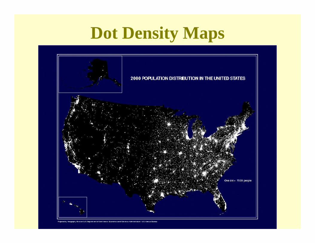
Dot Density Maps

Isoline Maps
• Lines on the map that are used to visualize a surface
• Isolines are best for continuous data (raster), but frequently applied to discrete data (vector) too
• Drawing the lines (or data) in-between the data points utilizes the processes of interpolation– Interpolation: “The action of introducing or inserting
among other things or between the members of any series”

Making Isolines

Making Isolines
Can you draw Isolines with an interval of 5 units?
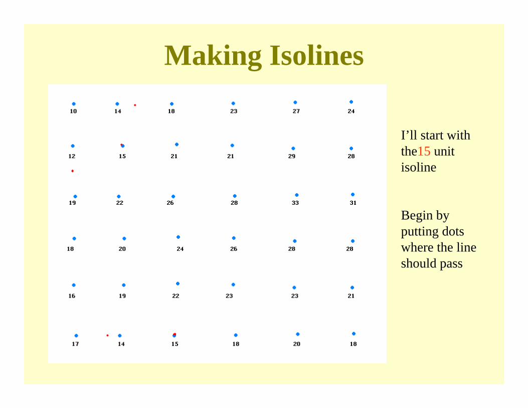
Making Isolines
I’ll start with the15 unit isoline
Begin by putting dots where the line should pass

Making Isolines
Now just connect the dots
Who can draw the 20 unit interval?
Making Isolines
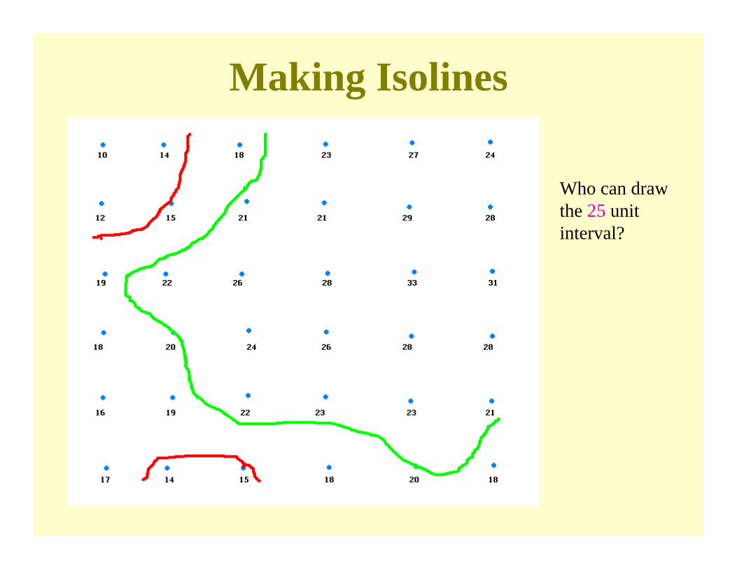
Who can draw the 25 unit interval?
Making Isolines
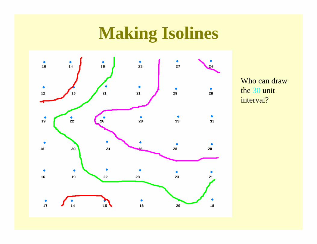
Who can draw the 30 unit interval?
Making Isolines
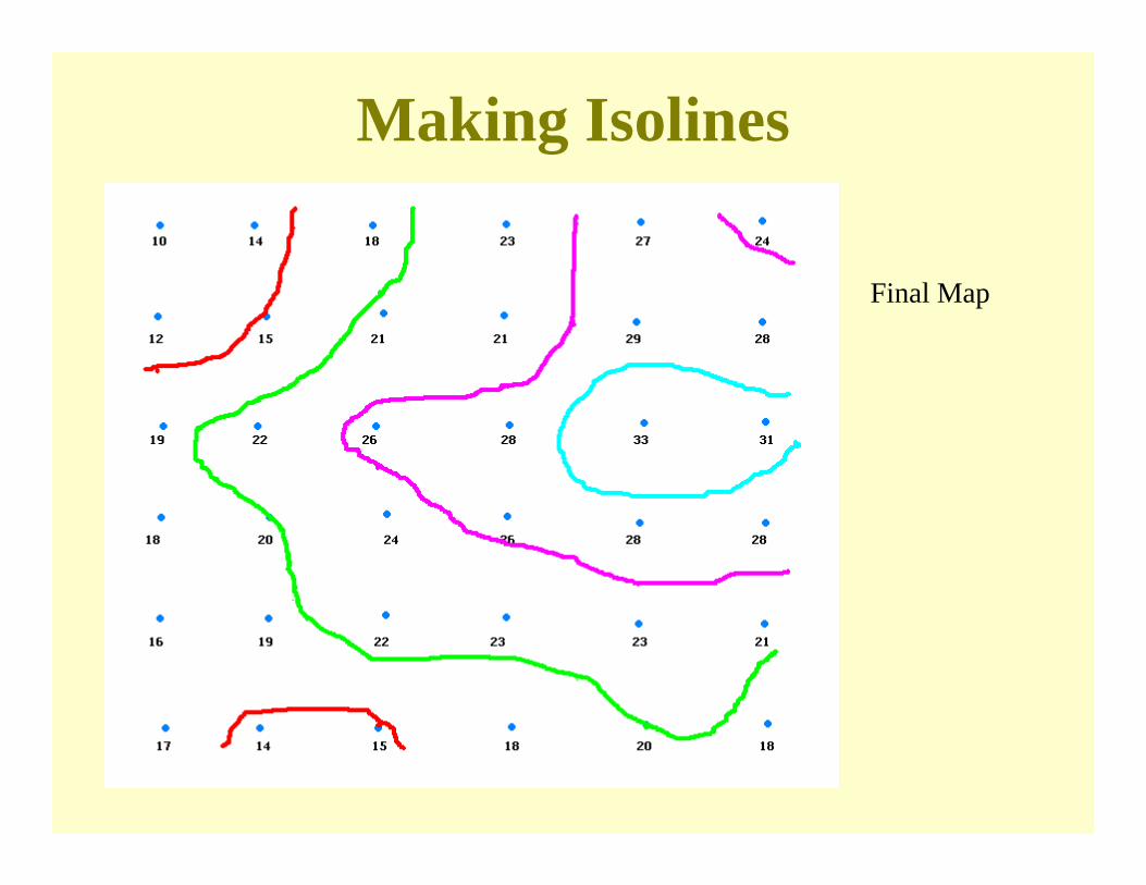
Final Map
Isoline Maps
• Types– Isometric lines – based on control points that have
observed values
– Isopleths – based on point values that are areal averages (e.g., the population density calculated for each county, with the county center point used as the locational information)
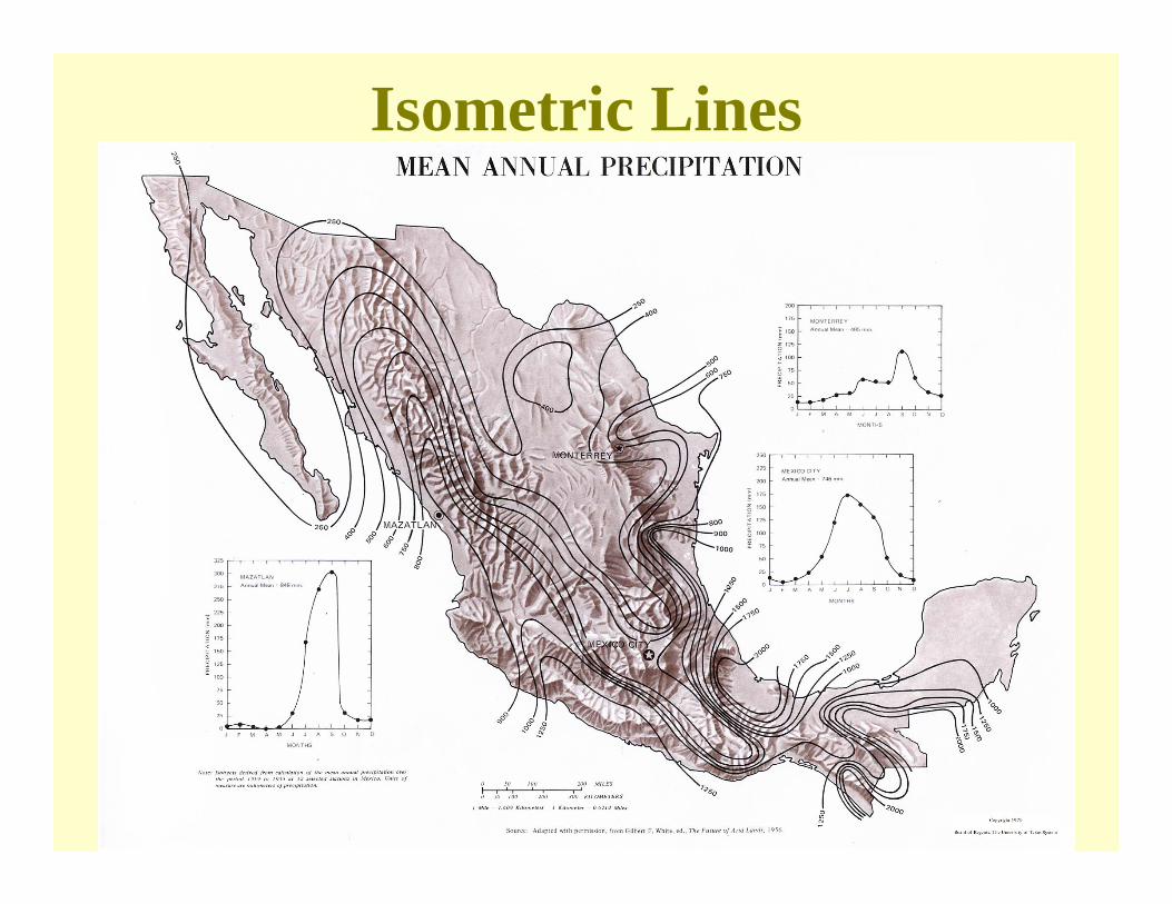
Isometric Lines
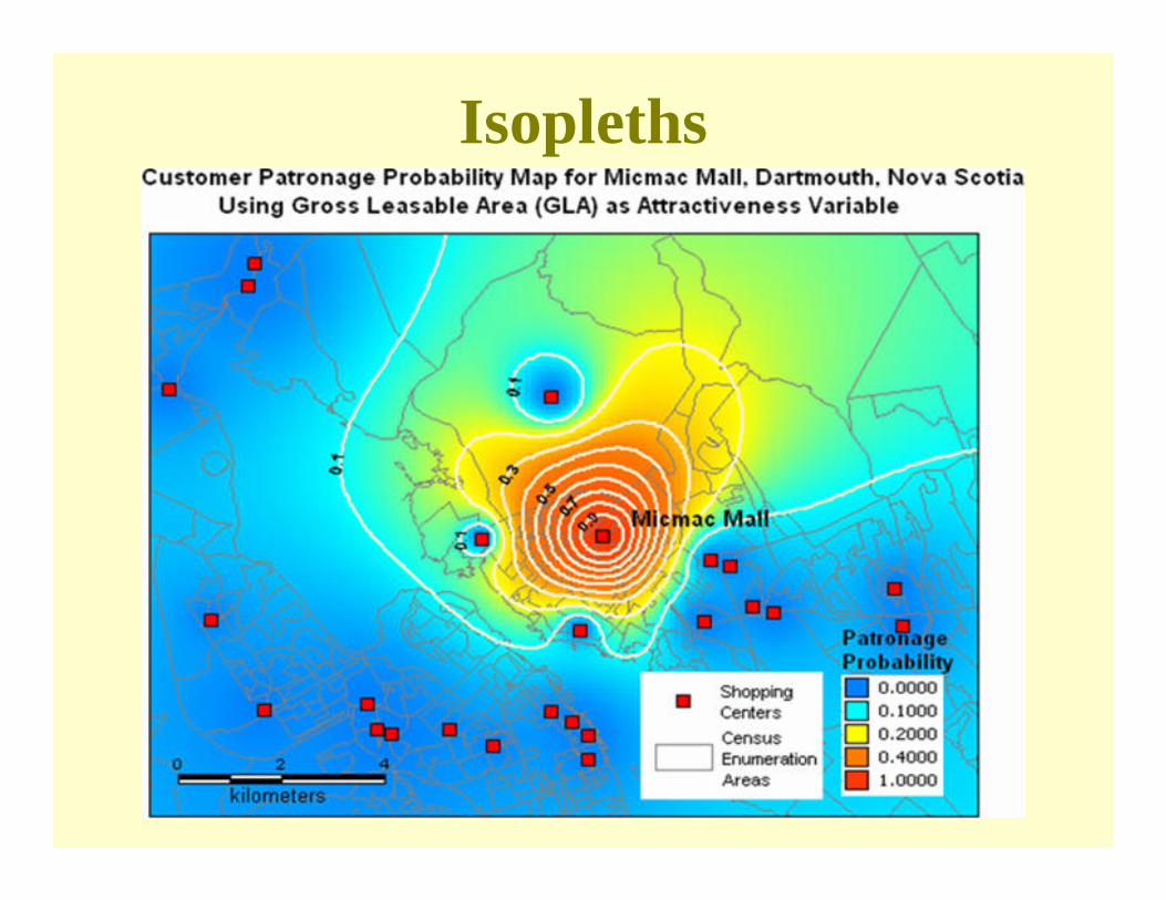
Isopleths

Cartograms•Instead of normalizing data within polygons:
•We can change the polygons themselves!
•Maps that do this are known as cartograms
•Cartograms distort the size and shape of polygons to portray sizes proportional to some quantity other than physical area

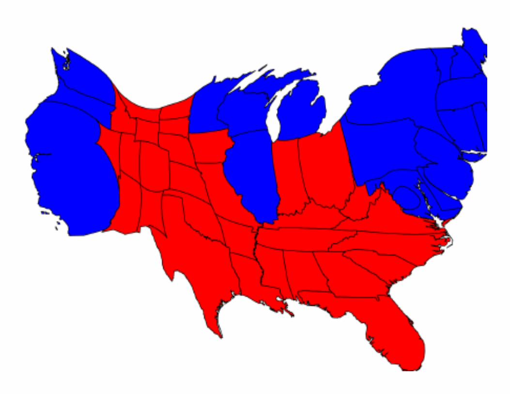
Conventional Map of 2004 Election Results by State
Michael Gastner, Cosma Shalizi, and Mark Newman- University of Michiganhttp://www-personal.umich.edu/~mejn/election/

Population Cartogram of 2004 Election Results by State
Michael Gastner, Cosma Shalizi, and Mark Newman- University of Michiganhttp://www-personal.umich.edu/~mejn/election/
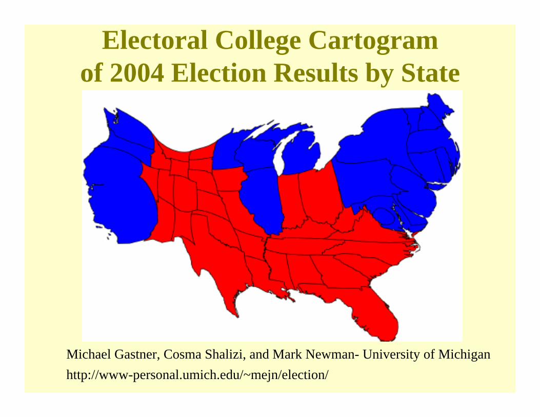
Electoral College Cartogram of 2004 Election Results by State
Michael Gastner, Cosma Shalizi, and Mark Newman- University of Michiganhttp://www-personal.umich.edu/~mejn/election/

Conventional Map of 2004 Election Results by County
Michael Gastner, Cosma Shalizi, and Mark Newman- University of Michiganhttp://www-personal.umich.edu/~mejn/election/
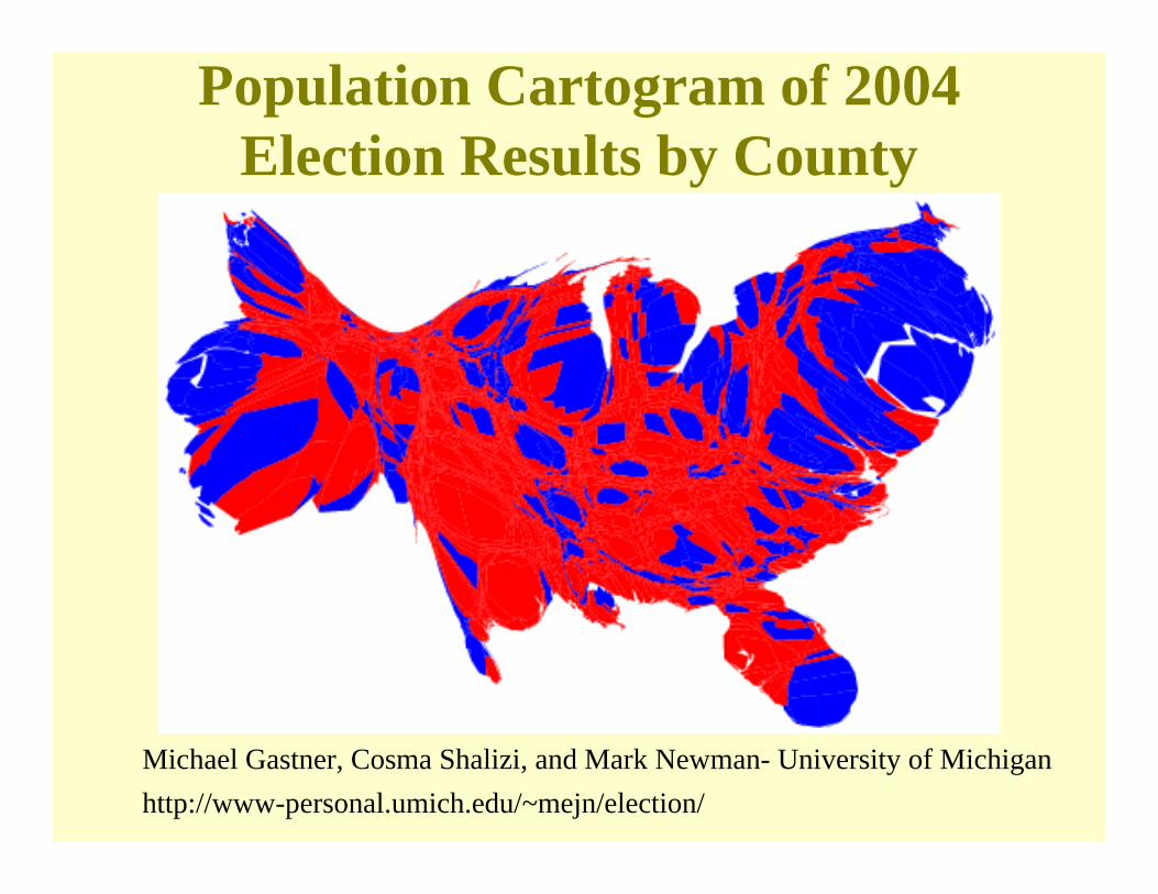
Population Cartogram of 2004 Election Results by County
Michael Gastner, Cosma Shalizi, and Mark Newman- University of Michiganhttp://www-personal.umich.edu/~mejn/election/

Graduated Color Map of 2004 Election Results by County
Robert J. Vanderbei – Princeton Universityhttp://www.princeton.edu/~rvdb/JAVA/election2004/

Graduated Color Population Cartogramof 2004 Election Results by County
Robert J. Vanderbei – Princeton Universityhttp://www.princeton.edu/~rvdb/JAVA/election2004/
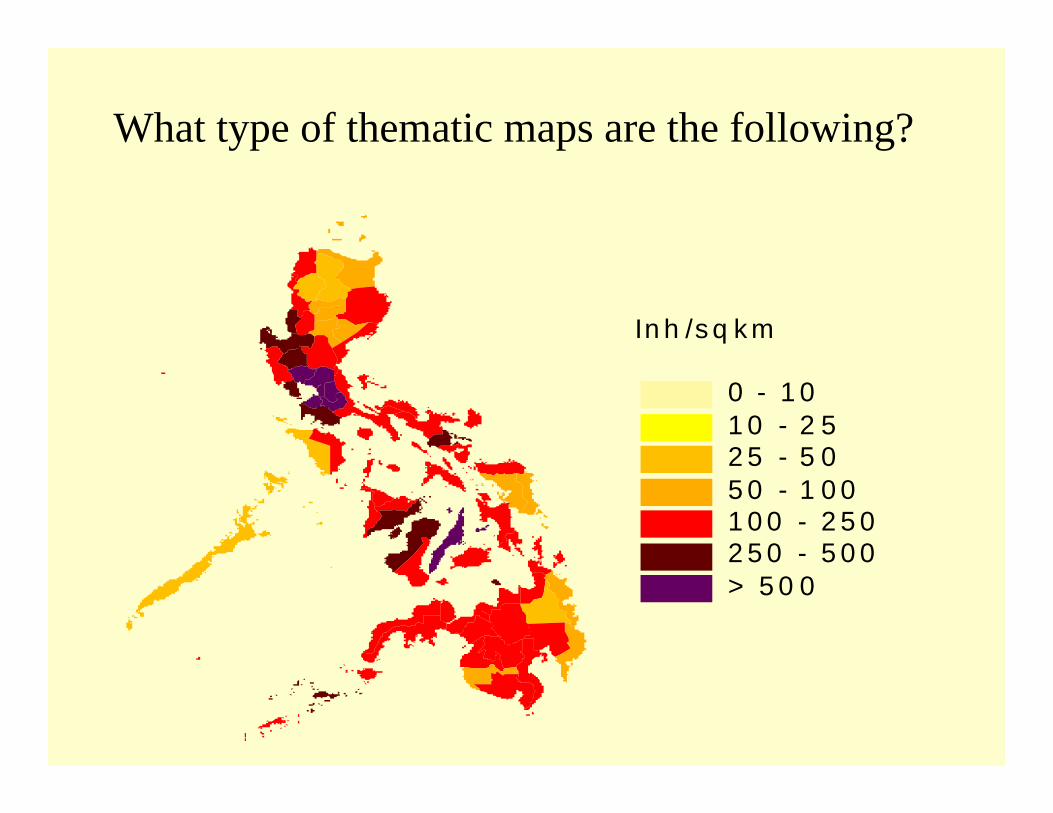
What type of thematic maps are the following?
In h /s q k m
0 - 1 01 0 - 2 52 5 - 5 05 0 - 1 0 01 0 0 - 2 5 02 5 0 - 5 0 0> 5 0 0


102550
100
Number of telephones per
1000 people

1000
5000
10000
net migrationWhere do people migrate to
from this district?