the world distribution of income: falling ...xs23/papers/pdfs/world_income...the world distribution...
TRANSCRIPT
THE WORLD DISTRIBUTION OF INCOME: FALLING POVERTY AND… CONVERGENCE,
PERIOD(*)
Xavier Sala-i-Martin This Draft: October 9, 2005
ABSTRACT We estimate the WDI by integrating individual income distributions for 138 countries between 1970 and 2000. Country distributions are constructed by combining national accounts GDP per capita to anchor the mean with survey data to pin down the dispersion. Poverty rates and headcounts are reported for four specific poverty lines. Rates in 2000 were between one-third and one-half of what they were in 1970 for all four lines. There were between 250 and 500 million fewer poor in 2000 than in 1970. We estimate eight indexes of income inequality implied by our world distribution of income. All of them show reductions in global inequality during the 1980s and 1990s. (*) Columbia University. This paper was partly written when I was visiting Universitat Pompeu Fabra in Barcelona. I thank Sanket Mohapatra for extraordinary research assistance and for comments and suggestions. I also benefited from the comments of Tony Atkinson, Victoria Baranov, Gary Becker, François Bourguignon, Gideon du Rand, Ed Glaeser, Richard Freeman, Laila Haider, Allan Heston, Larry Katz, Michael Kremer, Casey B. Mulligan, Kevin Murphy, Martin Ravallion, and seminar participants at Universitat Pompeu Fabra, Harvard University, University of Chicago, Columbia University, the American Enterprise Institute, Universidad de Santander, Fordham University, and the International Monetary Fund. I would like to thank the NSF Grant 20-3367-00-0-79-447 and the Spanish MEC Grants SEC2001-0674 and SEC 2001-0769 for financial support. Keywords: Income inequality, poverty, world distribution of income, growth JEL: D31, F0, I30, I32, O00.
1
I. Introduction
The world distribution of income (WDI) has been an ongoing concern for economists and
scholars worldwide. The convergence literature convincingly established divergence among
countries in two dimensions:1 first, growth rates of poor countries have been lower than the
growth rates of their rich counterparts (a phenomenon called β-divergence by Barro and Sala-i-
Martin [1992]) and second, the dispersion of income per capita across countries has tended to
increase over time (a phenomenon called σ-divergence by Barro and Sala-i-Martin [1992]).
Following Quah [1993], the “twin peaks” literature analyzed the evolution of the entire world
distribution of incomes per capita across countries (Quah [1996], Jones [1997], Kremer, Onatski,
and Stock [2001]). Here the conclusions are a bit less stark: although Quah [1993, 1996] and
Jones [1997] found that the world seemed to move towards a bimodal (or “twin peaked”)
distribution, Kremer, Onatski and Stock [2001] emphasized the fragility of this result.
Both these literatures analyzed aspects of the WDI, and used countries as their unit of
analysis. This is the correct approach when, for example, one tries to test theories of economic
growth2 because aggregate growth theories tend to predict that growth depends on “national
factors” such as policies, institutions, and other elements determined at the economy-wide level.
To the extent that those determinants are independent across nations, each country can be
correctly treated as an independent data point of an economic “experiment”. Using countries as
units of analysis, however, is not useful if one worries about human welfare because different
countries have different population sizes. After all, there is no reason to down-weight the
wellbeing of a Chinese peasant relative to a Senegalese farmer just because the population in
China is larger than that of Senegal. The country analysis, for example, does not help answer the
questions like: “how many people in the world live in poverty?”, “how have poverty rates
changed over the last few decades?”, or “are inequalities across citizens growing over time?”
2
Scholars partially solve this problem by using population-weighted distributions of
income. Jones [1997] showed that the emergence of a bimodal distribution disappears once each
country data point is weighted by population. And in an important paper, Schultz [1998] found
that, when one uses population-weights, it is no longer true that incomes tend to diverge3: on the
contrary, the incomes of poor citizens have grown faster (β-convergence), and measures of
income inequality have declined (σ-convergence). The striking difference can be appreciated in
Figure I. Panel A displays the well-known scatter plot of the growth rate between 1970 and 2000
versus the logarithm of income per capita in 1970. The correlation is virtually zero. Panel B
displays the same picture but the size of each dot is now proportional to that country’s
population. The negative relation between growth and the initial level of income is apparent: the
few countries in Asia that have converged to income levels of the OECD are large and populous,
while many of the countries that have diverged (chiefly African countries) are not. Since the total
population of the 41 African nations is about half of that of China or India and only twice the
population of Indonesia, the results where each country is one observation (and therefore Africa
gets 41 times the weight of China) are completely different from those where each citizen is one
observation (where Africa gets about half the weight of China).
Using population-weighted distributions of per capita income (from national accounts) is
a step in the right direction, but it is not sufficient to provide accurate estimates of concepts like
poverty rates or indexes of income inequality. These measures still miss within-country
dispersion, a factor that needs to be included if sensible estimates of the WDI are to be
constructed. By using population weights researchers recognize that different countries have
different population sizes… but they implicitly assume that all citizens of a country have the
same level of income corresponding to the per capita income implied by the national accounts.
This can yield misleading results: if the per capita income in a country were a couple of dollars
3
above the poverty line, researchers using distributions based on population-weighted per capita
income would conclude that no poor citizens lived in that country. Similarly, they would tend to
find dramatic declines in poverty rates as the income per capita of very populated countries grow
from a few dollars below to a few dollars above the poverty line. In terms of inequality,
population-weighted indexes of inequality could show a decline in overall global inequality
while the true individual inequalities could be rising if within-country inequalities increases
sufficiently.
Incorporating information about the within-country distribution is problematic, however,
because it is not readily available. Deininger and Squire [1996] collect data from a large number
of microeconomic surveys conducted in a variety of countries over the last thirty years. The
United Nations University’s World Institute for Development Research (UNU-WIDER) keeps an
update of this collection. Although these surveys contain a large amount of information about the
distribution of income (or expenditure) within many countries, they are still incomplete: surveys
do not exist for a number of economies and for the countries for which surveys do exist, many
years are missing. However, this information can and should be used to complement the
population-weighted national accounts and to construct estimates of the WDI.
And this is what we do in this paper: we estimate the WDI for each year from 1970 to
2000 by integrating the income distributions of 138 countries. The means of the individual
country distributions are the population-weighted levels of GDP per capita reported by the Penn
World Tables 6.1 (Heston, Summers and Aten [2002]). The dispersion around each of these
means is estimated using the micro surveys reported by Deininger and Squire [1996] and UNU-
WIDER. Since microeconomic surveys are not available annually for every country, we impute
the missing data by forecasting quintile income shares for the countries for which multiple
surveys are available. For countries with no survey information, we assign the average quintile
4
income shares of the “neighboring region” (defined in section II). We then use a non-parametric
approach to estimate a smooth income distribution for each country/year.
We are not the first ones to merge survey and national account data to estimate
characteristics of the WDI. Schultz [1998] expands the population-weighted distributions
mentioned above with information from the Deininger and Squire [1996] surveys. To fill in the
missing data, he regresses the variance of log income and various other measures of income
inequality on country characteristics. He then uses the coefficients to forecast the missing cells.
Although he provides global measures of inequality, he does not construct an estimate of the
WDI and, as a result, he cannot estimate poverty rates and headcounts.
Bhalla [2002]4 also combines survey and national account data to produced estimates of
the WDI but his procedure is quite different: he uses a parametric approach called the “Simple
Accounting Procedure” (SAP) to approximate the Lorenz Curve for each individual country. The
SAP is based on Kakwani [1980]’s method of approximating the Lorenz curve using limited
data. Estimates are made using quintile data and then projected for any number of centiles.
Bourguignon and Morrison [2002], Quah [2002], and Sala-i-Martin [2002a and b] are two other
papers that combine national accounts and survey data.
Finally, early work by the World Bank on poverty estimation also combined
microeconomic surveys with national accounts data (Ahluwalia, Carter, Chenery [1979]).
However, the World Bank decided to abandon this tradition in the mid-1990s and to anchor their
data to the survey mean. In fact, they recommended that individual countries estimating poverty
rates do the same thing so that countries like India, which had long anchored the survey
distributions to the national account means decided to use both distributions and means from
surveys. As argued by Deaton [2001], “no very convincing reason was ever given for the
change”.
5
The rest of the paper is organized as follows: section II describes the methodology to
construct individual country distributions and the WDI. Section III uses the WDI to provide
estimates of poverty rates and headcounts for the world as well as for the various regions of the
globe. Section IV reports eight inequality measures derived from the estimated WDI. All
measures point in the same direction: not only has world income inequality not increased as
dramatically as many feared, but it has, instead, fallen since its peak in the late 1970s. Section V
concludes.
II. Estimating the WDI
We construct the WDI by estimating an annual income distribution for each of 138
countries, and then integrating these country distributions for all levels of income. The starting
point of our analysis is the population-weighted income per capita, which we will use as the
mean of each country’s distribution. As a measure of income, we use the PPP-adjusted GDP per
capita from the Penn World Tables (6.1, Heston, Summers and Aten [2002]). We could anchor
our country distributions to other measures of average income such as the mean income from
surveys. We choose not to do so for a variety of reasons. First, we want to build on the
population-weighted distributions that are already used in the literature. Second, the properties of
survey means are not well understood. The mean survey income does not always coincide with
the national accounts per capita income and, for some countries, the two tend to diverge over
time, which means that the survey mean tends to capture a declining fraction of the national
accounts mean. This is not surprising, given the differences in methods of collection, recall
periods, survey methodologies, family units, and popular attitudes towards surveys in different
countries. Third, and this is perhaps the most important reason, survey data are not available for
every year and for every country. In fact, of the 138 countries included in this paper, 29 have
6
only one survey between 1970 and 2000, and 28 additional countries have no surveys at all. If
one uses the survey means to anchor the average of the income distribution of these countries,
then we would have to somehow forecast these survey means for the missing country/year cells.
National accounts data, on the other hand, are reported by the PWT yearly for all countries
during our sample period.5
Once we have the mean of the distribution, we complement it with within-country
information on income distribution contained in microeconomic income surveys reported by
Deininger and Squire [1996] (DS) and extended with the UNU-WIDER compilations.6
Throughout this paper we use both individual and household data without distinguising between
them and we use only income surveys. Of the various statistics reported by these two studies we
only use the quintile income shares to get a first approximation of the distribution of income
around the mean.
In order to construct a distribution for every country and every year, we need to have
some estimate of the quintile income shares for every country and every year. Since yearly
surveys were not conducted in every country, we need to approximate the missing data.7 Based
on data availability, we can divide the sample of countries in four groups:
Group A – Countries for which GDP per capita is available and income surveys are
reported for various years.
Group B – Countries for which GDP per capita is available and only one survey is
reported between 1970 and 2000.
Group C – Countries for which GDP per capita is available and microeconomic surveys
are not reported.
Group D – Countries for which no GDP per capita is available.
7
II.A. Income Shares for Countries in Group A
There are 81 countries with more than one survey over the thirty-year period from 1970
to 2000.8 Overall the countries of this group had a total of 5.089 billion citizens in the year 2000
(over 84 percent of the world population). A first look at the income shares for each country
reveals that they tend to follow very smooth trends (see Sala-i-Martin [2002a, and b]). Thus, a
simple linear time-trend forecast is used to estimate the missing values. 9,10
II.B. Income Shares for Countries in Group B
For 29 countries (with a total population of 329 million inhabitants in 2000 or 5 percent
of the world population), only one microeconomic survey is available. Since we cannot really
measure the “evolution” of within-country income inequality for these countries, we could
exclude them from the analysis.11 We include the data we have on these countries as discarding
them would lead to sample selection bias because countries with no survey data tend to be poor
and tend to have “diverged”. Their exclusion from our analysis, therefore, would tend to bias the
results towards finding an excessive reduction in income inequality.
Berry, Bourguignon and Morrison [1983] and Sala-i-Martin [2002a, and b] assign the
same dispersion estimated from the only survey available for all periods (the mean would be
changing over time because we do have annual national accounts data for these countries). This
ignores movement in the within-country distributions, which could be problematic in regions,
like Africa or Latin America, were there is a widespread belief that within-country dispersion has
increased over the last few decades.
Instead, for each country in Group B we use the available survey to anchor the quintile
income shares for the year in which the single survey is available, and then we “forecast” the
shares for the remaining years by imputing the average12 trends estimated for the “neighboring
countries” in Group A. “Neighboring countries” are defined to be those that belong to the same
8
“region” as defined by the World Bank.13 The regions are: East Asia and Pacific, Eastern Europe
and Central Asia, Latin America and the Caribbean, Middle East and North Africa (MENA),
South Asia, Sub-Saharan Africa, High-Income Non-OECD and High-Income OECD. The list
countries that belong to each region is displayed in the footnote to Table II.
II.C. Income Shares for Countries in Group C
There are 28 countries with no survey data but with available annual national accounts.
In 2000, the population for these countries totaled 242 million (4 percent of the world
population). Again, excluding these economies from the analysis could potentially bias our
estimates of the evolution of income inequality towards finding too large a reduction and would
ignore the useful information provided by the mean. To construct the five annual income shares
for each country in this group, we simply impute the neighboring countries’ average quintile
share and the average time trend of each of the shares in groups A and B.
Countries in Group D (that is, countries with no survey data and no GDP data) are
excluded from the analysis.
The 138 countries included comprise 93 percent of the world population in 2000.
II.D. A Note on the Soviet Union and Former Soviet Union (FSU) Republics
The Soviet Union officially dissolved into 15 independent states in 1991. Instead of
excluding this large country (or countries) from our analysis, we incorporate it as a single entity
before 1989 and as 14 different republics after that moment (the PWT start reporting GDP data
for the independent republics in 1989).14 Starting in 1990 we treat each of the FSU republics as
an independent unit, each with its own survey income shares and mean per capita GDP from the
PWT.
9
II.E. A Note on Democratic Republic of Congo / former Zaire
The PWT do not report GDP data for the Democratic Republic of Congo (the former
Zaire) for the latter part of the 1990s: national accounts data were not produced by the
Congolese government because of the civil war. However, we do not exclude it from our
analysis because it is one of the poorest countries in Africa and, with more than 50 million
citizens, one of the largest: its exclusion would cause an underestimate of poverty rates and
headcounts. In order to include Congo/Zaire, we “forecasted” GDP per capita for the final three
years of the sample using a simple moving average of the growth rates of the previous five years.
Since these previous years were disastrous, the growth rates used for this “forecast” were large
negative numbers. The result is that Congo/Zaire’s per capita income falls from more than $1000
in 1970 to about $230 in 2000 in our data. Since this large negative growth rate is probably over-
estimated15, our estimates of the mean of the Congolese distribution of income are probably too
low and the poverty estimates reported in Section III are probably overly pessimistic.
II.F. Estimating Annual Country Distributions Non-Parametrically
Once an income share is assigned to each quintile of each country for each year, we
approximate each country’s annual income distribution using a non-parametric kernel density
function.16 This procedure does not impose specific functional forms on individual country
distributions.17 One key parameter that needs to be specified is the bandwidth of the kernel. We
follow the convention in the literature and use the bandwidth 5/1**9.0 −= nsdw , where sd is the
standard deviation of log-income and n is the number of observations. Obviously, each country
has a different sd so, if we use this formula for w, we would have to assume a different w for
each country and year. Instead, we prefer to use the same bandwidth for all countries and
periods. One reason is that, with a constant bandwidth it is very easy to visualize whether the
variance of the distribution has increased or decreased over time. Given a bandwidth, the density
10
function will have the regular hump (normal) shape when the variance of the distribution is
relatively small. As the variance increases, the kernel density function starts displaying peaks
and valleys.
In choosing the bandwidth, we note that the average sd implied by the survey data for the
United States between 1970 and 1998 is close to 0.9, the average Chinese sd is 0.6 (although it
has increased substantially over time) and the average Indian sd is 0.5. For many European
countries the average sd is close to 0.6. We settle on the simple (non population-weighted) mean
value for sd which is sd=0.6. The implied bandwidth used is, therefore, 0.34.18
We evaluate the density function at 100 different points so that each country’s
distribution is decomposed into 100 centiles. Once the kernel density function for a particular
year and country is estimated, we normalize it so that the area is equal to that year’s total
population of the country and we anchor it so that its mean corresponds to PPP-adjusted GDP per
capita from the PWT.
II.G. Annual Country Distributions: Results
Figure II displays the results for some of the largest countries for 1970, 1980, 1990 and
2000. Figure II.A shows the evolution of the Chinese distribution of income. To get a sense of
the level of income and poverty for each country, the figure also plots a vertical line which
roughly corresponds to the World Bank’s extreme poverty line: one-dollar-a-day in 1985
prices.19
We notice that the mode of the Chinese distribution for 1970 is around $750 a year.
Roughly one-third of the function lies to the left of the $1/day poverty line, which means that
about one-third of the Chinese citizens in 1970 lived in absolute poverty. Note that the whole
density function “shifts” to the right over time. This, of course, reflects the fact that Chinese
incomes have grown. Over time, we note that the incomes of the richest citizens increased more
11
than those of the poorest Chinese. This implies that income inequality within China has
increased. By 2000, the distribution has a mode at $2,400 and the fraction of the distribution
below the one-dollar line is substantially smaller.
Figure II.B reproduces the income distributions for India, the second most populated
country in the world. The positive aggregate growth rates of India over this period have also
shifted the distribution to the right, especially during the eighties and nineties. The total area
increases dramatically over time (corresponding to the large increase in the Indian population),
while the area below the poverty line (the fraction of population that is poor) declines, which
implies that poverty rates have fallen.
Figure II.C shows the incomes for the United States, the third largest country in the world
in terms of 2000 population. In order to be able to see the upper tail of the distribution, the
horizontal axis of Panel C of Figure II ranges from $1,000 to $100,000 (rather than from $100 to
$10,000 as in the other panels). We notice that the fraction of the distribution below the poverty
lines is zero for all years.
Figure II.D displays the distribution of income for Indonesia. In 1970 distribution, the
mode almost coincides with the $1/day poverty line. About one-third of the distribution lies to
the left of the $1/day line. As the economy grew, inequality fell and the fraction of people lying
below the poverty line declined dramatically. This is true, despite the large decline in GDP that
Indonesia suffered immediately after the 1997 East Asian financial crises. To see this point more
clearly, panel D also plots the 1997 distribution. We see that, indeed, the distribution shifts back
to the left between 1997 and 2000 due to the great depression. Although poverty increased after
the 1997 financial crises, the overall picture for Indonesia still exhibits remarkable success in
eliminating poverty over the last three decades.
12
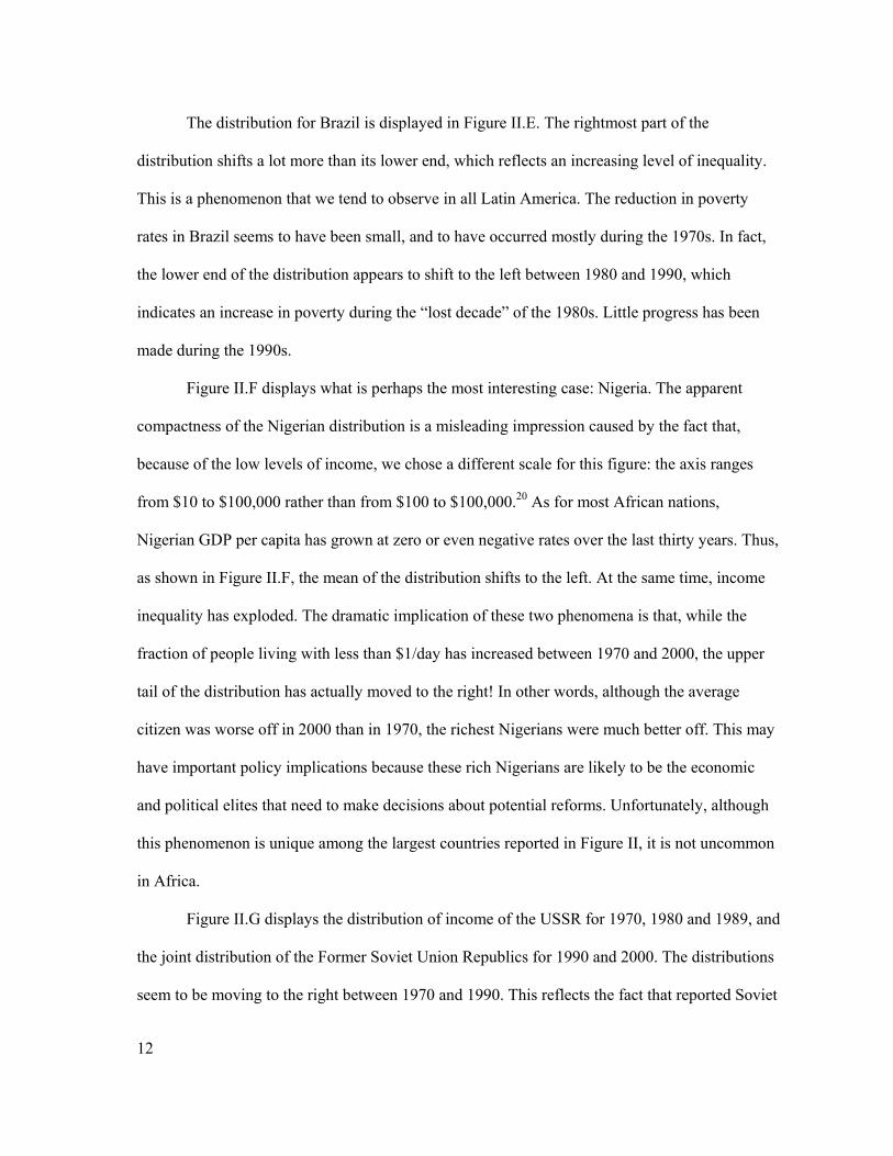
The distribution for Brazil is displayed in Figure II.E. The rightmost part of the
distribution shifts a lot more than its lower end, which reflects an increasing level of inequality.
This is a phenomenon that we tend to observe in all Latin America. The reduction in poverty
rates in Brazil seems to have been small, and to have occurred mostly during the 1970s. In fact,
the lower end of the distribution appears to shift to the left between 1980 and 1990, which
indicates an increase in poverty during the “lost decade” of the 1980s. Little progress has been
made during the 1990s.
Figure II.F displays what is perhaps the most interesting case: Nigeria. The apparent
compactness of the Nigerian distribution is a misleading impression caused by the fact that,
because of the low levels of income, we chose a different scale for this figure: the axis ranges
from $10 to $100,000 rather than from $100 to $100,000.20 As for most African nations,
Nigerian GDP per capita has grown at zero or even negative rates over the last thirty years. Thus,
as shown in Figure II.F, the mean of the distribution shifts to the left. At the same time, income
inequality has exploded. The dramatic implication of these two phenomena is that, while the
fraction of people living with less than $1/day has increased between 1970 and 2000, the upper
tail of the distribution has actually moved to the right! In other words, although the average
citizen was worse off in 2000 than in 1970, the richest Nigerians were much better off. This may
have important policy implications because these rich Nigerians are likely to be the economic
and political elites that need to make decisions about potential reforms. Unfortunately, although
this phenomenon is unique among the largest countries reported in Figure II, it is not uncommon
in Africa.
Figure II.G displays the distribution of income of the USSR for 1970, 1980 and 1989, and
the joint distribution of the Former Soviet Union Republics for 1990 and 2000. The distributions
seem to be moving to the right between 1970 and 1990. This reflects the fact that reported Soviet
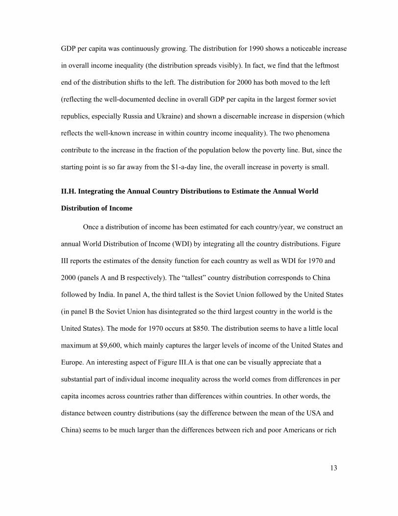
13
GDP per capita was continuously growing. The distribution for 1990 shows a noticeable increase
in overall income inequality (the distribution spreads visibly). In fact, we find that the leftmost
end of the distribution shifts to the left. The distribution for 2000 has both moved to the left
(reflecting the well-documented decline in overall GDP per capita in the largest former soviet
republics, especially Russia and Ukraine) and shown a discernable increase in dispersion (which
reflects the well-known increase in within country income inequality). The two phenomena
contribute to the increase in the fraction of the population below the poverty line. But, since the
starting point is so far away from the $1-a-day line, the overall increase in poverty is small.
II.H. Integrating the Annual Country Distributions to Estimate the Annual World
Distribution of Income
Once a distribution of income has been estimated for each country/year, we construct an
annual World Distribution of Income (WDI) by integrating all the country distributions. Figure
III reports the estimates of the density function for each country as well as WDI for 1970 and
2000 (panels A and B respectively). The “tallest” country distribution corresponds to China
followed by India. In panel A, the third tallest is the Soviet Union followed by the United States
(in panel B the Soviet Union has disintegrated so the third largest country in the world is the
United States). The mode for 1970 occurs at $850. The distribution seems to have a little local
maximum at $9,600, which mainly captures the larger levels of income of the United States and
Europe. An interesting aspect of Figure III.A is that one can be visually appreciate that a
substantial part of individual income inequality across the world comes from differences in per
capita incomes across countries rather than differences within countries. In other words, the
distance between country distributions (say the difference between the mean of the USA and
China) seems to be much larger than the differences between rich and poor Americans or rich
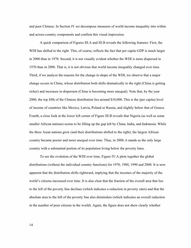
14
and poor Chinese. In Section IV we decompose measures of world income inequality into within
and across-country components and confirm this visual impression.
A quick comparison of Figures III.A and III.B reveals the following features: First, the
WDI has shifted to the right. This, of course, reflects the fact that per capita GDP is much larger
in 2000 than in 1970. Second, it is not visually evident whether the WDI is more dispersed in
1970 than in 2000. That is, it is not obvious that world income inequality changed over time.
Third, if we analyze the reasons for the change in shape of the WDI, we observe that a major
change occurs in China, whose distribution both shifts dramatically to the right (China is getting
richer) and increases in dispersion (China is becoming more unequal). Note that, by the year
2000, the top fifth of the Chinese distribution lies around $10,000. This is the (per capita) level
of income of countries like Mexico, Latvia, Poland or Russia, and slightly below that of Greece.
Fourth, a close look at the lower left corner of Figure III.B reveals that Nigeria (as well as some
smaller African nations) seems to be filling up the gap left by China, India, and Indonesia. While
the three Asian nations grew (and their distributions shifted to the right), the largest African
country became poorer and more unequal over time. Thus, in 2000, it stands as the only large
country with a substantial portion of its population living below the poverty lines.
To see the evolution of the WDI over time, Figure IV.A plots together the global
distributions (without the individual country functions) for 1970, 1980, 1990 and 2000. It is now
apparent that the distribution shifts rightward, implying that the incomes of the majority of the
world’s citizens increased over time. It is also clear that the fraction of the overall area that lies
to the left of the poverty line declines (which indicates a reduction in poverty rates) and that the
absolute area to the left of the poverty line also diminishes (which indicates an overall reduction
in the number of poor citizens in the world). Again, the figure does not show clearly whether
15
world income inequality increased or decreased, so that precise measures of income inequality
will have to be used if we want to discuss the evolution of inequality over the last three decades.
III. Analysis of the WDI (1): Poverty
III.A. World Poverty
Once the WDI has been constructed, we can analyze its features. One important feature is
the implied number of people living below a predetermined poverty line. One problem is the
very definition of poverty. For a long time, analysts identified poverty with the lack of physical
means for survival. Thus, some attempted to define poverty in terms of a minimum required
caloric intake. Other analysts define poverty in monetary terms: poor people are those whose
income (or consumption) is less than a specified amount. Some attempts have been made to
reconcile the two definitions by putting a monetary value on the minimum caloric intake. In fact,
this is how the first widely used monetary poverty line may have been born (See Bhalla [2002]).
Even when analysts agree that poverty should be defined as some monetary measure, they do not
agree on whether we should measure the number of people whose consumption or income lies
level below a specified poverty line: Ravallion et al. [1991], Chen and Ravallion [2001], Bhalla
[2002], and The World Bank [2003], for example, use consumption poverty while the United
Nations’ Millennium Development Goals (MDG) (United Nations [2000]) and Pritchett [2003]
use income poverty.
Another source of disagreement is the exact position of the poverty line. For example, the
poverty line used by the United Nations when they first proposed the Millennium Goals was
“one-dollar-a-day”. The World Bank uses both one-dollar-a-day and two-dollars-a-day lines.
Bhalla [2002] settles in the middle and prefers 1.5 dollars per day. Pritchett [2003] is more
extreme and argues that the poverty line should be put at 15 dollars per day.
16
An additional problem concerns the “baseline year”. Many analysts talk about the
number of people who “live with less than one-dollar-a-day” and they quote, for example, World
Bank poverty estimates. In 1990, the World Bank defined the extreme poverty line to be 1.02
dollars-a-day in 1985 prices. In 2000, the definition changed to its current value of 1.08 dollars-
a-day in 1993 prices. Although this mysterious change in the poverty threshold has never been
explained by the World Bank, what is clear is that 1.02 dollars a day in 1985 prices do not
correspond to 1.08 dollars in 1993 prices. Similarly, in the year 2000 the United Nations’ MDGs
refer to the poor as those whose income is “less than one-dollar-a-day” without being specific
about the baseline year in which this “one dollar” is defined. One might assume that the dollar
they refer to is valued in 2000 prices but then they use the World Bank estimates of poverty
which, as just mentioned, are now defined in 1993 prices. These distinctions may seem trivial at
first, but they are not: one-dollar-a-day in 2000 corresponds to $340 a year21 whereas one-dollar-
a-day in 1985 corresponds to $495 a year. The lack of precision as to what baseline year a
particular definition applies has enormous implications for estimates of poverty rates and
headcounts and their evolution over time: the difference between the number of people who live
with less than $340 and less than $495 is in the hundreds of millions.
The fundamental problem is that all of these definitions are both reasonable and, to some
extent, arbitrary. If we settle on a poverty line, then the number of poor people in the world can
be readily estimated by integrating the estimated WDI from minus infinity to a predetermined
income threshold (known as the poverty line). Poverty rates can be then computed by dividing
the total number of poor by the overall population. The only question is what poverty threshold
to use. Given this ambiguity, we use our estimates of the WDI to analyze the evolution of
poverty in two different ways. The first strategy is to construct the normalized Cumulative
Distribution Function (CDF) of the WDI for each decade. Since the poverty rate is the fraction of
17
the global population whose income is less than a given poverty line, the image of the
normalized CDF for a particular level of income yields exactly the poverty rate corresponding to
a poverty line at that particular level of income. The reader, then, can pick his favorite poverty
line and see if its image on the CDF falls over time.
Figure V displays the CDFs for 1970, 1980, 1990 and 2000. If we choose a poverty line
of $570 a year, poverty rates fell from 20 percent in 1970, to 16 percent in 1980, to 10 percent in
1990 to 7 percent in 2000. If we choose $2,000 a year, poverty rates fell from 62 percent of the
world population in 1970 to 41 percent in 2000. For $5,000 a year, the rates fell from 78 percent
to 67 percent. In fact, inspection of Figure V reveals that the 1980 CDF stochastically dominates
that of 1970 and that the 1990 curve dominates 1980. That is, poverty rates unambiguously fell
between 1970 and 1990 for ALL conceivable poverty lines. The 2000 CDF dominates the three
other curves for all levels of income above $393. It crosses the 1970 line at $262 (73 cents a day
in 1996 prices). The reason these two curves cross is the effect of the Democratic Republic of
Congo (former Zaire). As was discussed in Section II, the lack of National Accounts data for this
war-torn country forced us to essentially make up the mean of its income distribution. Our
moving-average guess for GDP per capita in 2000 was $230. If we exclude Congo/Zaire from
our analysis, the 2000 CDF dominates the 1990 curve so we can say that poverty has declined for
all potential poverty lines, for all four decades. Figure V also shows that the downward “shifts”
of the CDF (and therefore, the decline in poverty rates) are especially pronounced in the region
between $450 and $5,000 a year. The decline was particularly dramatic over the last two
decades.
The second strategy for analyzing the poverty rates and headcounts is to determine a
specific poverty line and integrate the WDI between minus infinity and that particular threshold.
Since, as explained above, there is no agreement on the level of income below which people are
18
poor, we use four different lines. First, the most widely publicized poverty line: the World
Bank’s one-dollar-a-day line. Since the World Bank’s original poverty line was expressed in
1985 prices, 22 and given that our baseline year is 1996, the corresponding annual income in our
analysis is $495. The results, labeled “WB Poverty Line or $1/day” are reported in the first row
of Table I and in Figure VI.
The survey data used to construct our WDI are said to include systematic errors. In
particular, it is believed that the rich tend to underreport their income relatively more than the
poor. If this is the case, then re-anchoring the survey mean to the national accounts mean (as we
do in this paper) biases poverty estimates downwards (although it is not clear whether there are
biases in the trend). Bhalla [2002] argues that this bias is best corrected not by using survey
means (as done by the World Bank), but by adjusting the poverty line by roughly 15 percent.23 If
we increase the $495 poverty line by 15 percent we get an annual income of $570. Since this
roughly corresponds to $1.5/day in 1996 prices, we refer to this as the $1.5/day line in Table I
and Figure VI.
We finally report two additional poverty lines: an annual income of $730 (roughly two-
dollars-a-day in 1996 prices) and $1,140 per year (which is twice $570; since $570 was labeled
$1.5/day line, we call this the $3/day line).24
Table I reports the poverty rates using the above four poverty lines for every five-years
starting in 1970. Figure VI reports annual rates and counts for each of the poverty lines. Using
the original World Bank definition ($495 annual income) the poverty rate declined from 15.4
percent of the world population in 1970 to 5.7 percent in 2000, a decline of a factor of almost
three! This is especially impressive given that, during the same period, world population
increased by almost 50 percent (from 3.5 to 5.5 billion citizens). The implication is that the total
number of poor citizens went from 534 to 322 million, a decline of 50 percent.
19
Using the $1.5/day line, we see a similar picture: the poverty rate fell from 20 percent to
7 percent, a decline of a factor close to 3. The poverty headcount declined by about 300 million
citizens (from 700 million people to a little less than 400 million). In other words, the total
number of poor citizens declined by about 56 percent in a period during which world population
increased by 50 percent.
With the two-dollars a day definition ($730 a year), the poverty rate was close to 30
percent in 1970 and a little below 11 percent in 2000. Again, the poverty rate declined by a factor
close to 3. The number of citizens whose income was less than $2 a day was just above one
billion people in 1970 and about 600 million in 2000, a decline of 400 million citizens or 54
percent.
Finally, using the three-dollar-a-day definition ($1,140 dollars a year), the poverty rate
was 47 percent in 1970 and 21 percent in 2000, again a healthy decline over the last 30 years.
The overall poverty headcount declined by more than 400 million people, from 1.6 billion in
1970 to 1.2 billion in 2000.
It is interesting to note that the total number of people whose income is less than one-
dollar-a-day is nowhere near the widely-cited number of 1.2 billion. Our estimates of $1/day are
between 33 percent and 40 percent lower. One reason is that the widely-cited numbers are those
provided by the World Bank. As argued by Martin Ravallion [2004] the main reason is that the
World Bank uses a concept of poverty based on household consumption, not income. He says:
“It is not clear how much higher Mr Sala-i-Martin's poverty line should be to assure
comparability with the Bank's $1-a-day standard. However, a good guess might be that his
poverty threshold should be doubled to reflect the other items that he has implicitly included in
his measure of income”. If we do, he claims, “the two series line up rather well” (see Chen and
Ravallion [2004]). Since our corrected $1/day line corresponds to $570 per year, the doubling of
20
that threshold would yield $1140/year. Note that our 2000 estimate for that poverty line is,
indeed, 1.2 billion people.
III.B. The Role of China in Reducing World poverty
Given its large size and the remarkable rate at which it has reduced poverty, the exact
growth of per capita GDP in China is a key determinant of the reduction of worldwide poverty.
Economists have recently pointed out that Chinese statistical reporting during the last few years
has been less than accurate (see for example, Ren [1997], Maddison [1998], Meng and Wang
[2000], and Rawski [2001]). The complaints pertain mainly to the period starting in 1996 and
especially after 1998 (see Rawski [2001]). This coincides with the very end of and after our
sample period, so it does not affect our estimates. However, we should remember that we do not
use the official statistics of Net Material Product supplied by Chinese officials. The PWT
numbers used in this paper attempt to deal with some of the anomalies following Maddison
[1998] (see the China Appendix in Heston, Summers, and Aten [2002]). For example, the growth
rate of Chinese GDP per capita in our data set is 5 percent per year, more than two percentage
points less than the official estimates (the growth rate for the period 1978-2000 is 6.2 percent in
our data set as opposed to the 8.0 percent reported by the Chinese Statistical Office). The World
Bank reports an annual growth rate of 7.6 percent over the same period.25
Using survey data only, the World Bank estimates that $1/day consumption poverty in
China fell from 53 percent in 1980 to 8 percent in 2000 (see Chen and Ravallion [2004]). If we
use the Ravallion’s rule of thumb and compare their $1/day consumption poverty line with our
$2/day income line we see that our $2/day poverty estimates display a slightly smaller decline:
from 48 percent in 1980 to 11 percent in 2000. Thus, our estimated reduction in poverty rates in
China does not seem to be exaggerated in comparison to what is found in the literature.
21
III.C. Regional Poverty
This section decomposes world poverty by region. Table II and Figure VII report poverty
rates for East Asia, South Asia, Africa, Latin America, Eastern Europe and Former Soviet Union,
and Middle East and North Africa (MENA). To economize on space, we only report the poverty
rates and headcounts corresponding to the $570/year ($1.5/day) line.
With over 1.7 billion citizens in 2000, East Asia is the most populous region in the world
accounting for 30 percent of the world population. Poverty Rates in East Asia were close to one-
third in 1970. By 2000, poverty rates had declined to a little less than 2.4 percent. Poverty rates
in East Asia, thus, were cut by a factor of 10! The poverty headcount was reduced by over 300
million citizens, from 350 million in 1970 to 41 million in 2000. The poverty headcount fell by
70 million citizens in the 1970s, and by 127 and 114 million people in the 1980s and 1990s
respectively. This tremendous achievement, together with the great disaster in Africa which we
discuss below, meant that while 54 percent of the world’s poor lived in East Asia in 1970, by the
year 2000 this fraction was only 9.4 percent (see the bottom panel of Table II).
Although China is an important part of this success story (a decline of the poverty rate
from 32 percent in 1970 to 3.1 percent in 2000 which accounts for 251 million people escaping
poverty), it is by no means the whole story. Indonesia saw its poverty rate decline from 35
percent in 1970 to 0.1 percent in 2000 (a reduction in the headcount of about 41 million).
Thailand, with a poverty rate over 23 percent in 1970, had practically eliminated poverty by
2000 (a reduction of more than 8 million people). In fact, all the countries in this region
experienced reduction in poverty rates. The only country in this region that lived through an
increase in poverty headcount was Papua New Guinea.
South Asia is the second most populous region in the world, with 1.3 billion people in
2000 (24 percent of the world population). The evolution of poverty in South Asia is similar to
22
that in East Asia: the poverty rate fell from 30 percent in 1970 to 2.5 percent in 2000.The poverty
headcount fell by 178 million people, from 211 million poor in 1970 to 33 million in 2000. This
success was achieved primarily over the last two decades. Most of the decline in the poverty
headcount (145 million), can be attributed to the success of the post-1980 Indian economy
(between 1970 and 1980, the total number of poor Indians actually increased by 15 million). This
is not to say that the other countries in the region did not improve. With the exception of Nepal,
all the other countries also experienced a positive evolution of overall poverty.
The great Asian success contrasts dramatically with the African tragedy. With a total
population of just over 608 million citizens, Sub-Saharan Africa is the third most populated
region in our data set. A total of 41 countries are analyzed in this paper. Most of them had such
dismal growth performances that poverty increased all over the continent. Overall, poverty rates
in 1970 were similar to those in South and East Asia: 35 percent. By 2000, poverty rates in
Africa had reached close to 50 percent while those in Asia had declined to less than 3 percent.
The three decades have been almost equally terrible: the poverty rate increased from 35.1 percent
to 37.2 percent in the 70s, to 43.7 percent in 1990 to 48.8 percent in 2000. The overall number of
poor grew from 93 million in 1970 to almost 300 million in 2000. That is, the total number of
poor in Africa jumped by more than 200 million citizens (an increase of 36 million during the
1970s, 75 during the 1980s and 92 during the 1990s). Within Africa, poverty headcounts
increased in all countries with the exception of Botswana, the Republic of Congo and the islands
of Mauritius, Cape Verde and the Seychelles.
This disappointing performance, together with the great success of the other two poor
regions of the world (East and South Asia) means that the majority of the world’s poor now live
in Africa. Indeed, Africa accounted for only 14.5 percent of the world’s poor in 1970. Today,
despite the fact that Africa accounts for only 10 percent of the world population, it accounts for
23
67.8 percent of the world’s poor (see the bottom panel of Table II). Poverty, once an essentially
Asian phenomenon, has become an essentially African phenomenon.
With close to 500 million citizens (about 9 percent of the world population), Latin
America has had a mixed performance over the last three decades. Poverty rates were cut by
more than one-half between 1970 (poverty rate of 10.3 percent) and 2000 (4.2 percent). This
would be an optimistic picture were it not for the fact that all of the gains occurred during the
first decade. Little progress has been achieved after that. Indeed, the poverty rate in Latin
America grew from 3 percent in 1980 to 4.1 percent in 1990. The poverty headcount declined by
17 million during the 1970s and increased by 10 million over the following twenty years. This
mixed performance has meant that, although Latin America started from a superior position
relative to both East and South Asia (where poverty rates were well above 30 percent in 1970),
we see that poverty rates were larger in Latin America than in both Asian regions by 2000. The
fraction of the world’s poor that live in Latin America declined from 4.3 percent in 1970 to 1.7
percent in 1980. It then increased to 3.7 percent in 1990 and to 4.8 percent by the year 2000.
Our sample of Middle Eastern and North African (MENA) countries has 220 million
citizens (7.7 percent of world’s sampled population in 2000). Poverty rates in MENA countries
have declined over the last three decades. Although the starting point was better than that of East
Asia, South Asia and Sub-Saharan Africa, MENA has nevertheless managed to reduce those
rates even further.
Our final region is Eastern Europe and Central Asia, which includes the USSR and, after
1990, the former Soviet Republics. About 436 million people inhabited this region in 2000. A lot
has been written about the deterioration of living conditions in this region after the fall of
communism. The fact, however, is that although poverty has increased since 1990, the level of
income in this region was so high to begin with that poverty rates were a lot smaller than in any
24
of the regions analyzed up until now. The rate, which was at the already low level of 1.3 percent
in 1970, had declined to 0.4 percent by 1980. It did not change at all during the 1980s. And then,
it more than doubled during the decade that followed the fall of communism. The increase in
poverty was the result of both a decline in per capita income and an increase in inequality within
countries. But the starting level was so small in magnitude that, despite its doubling, the rate
remained at 0.1 percent in 2000. In terms of absolute numbers, the Eastern Block managed to
almost eradicate poverty between 1970 and 1985, when the overall number of poor citizens was
369,000. The poverty headcount multiplied by 5 over the following 5 years to 1.9 million, and
then doubled again to 4.4 million in 2000.
IV. Analysis of the WDI (2): World Income Inequality
Researchers have long worried about world income inequality.26 Recently, policymakers
have joined the debate. For example, the 2001 Human Development Report of the United
Nations’ Development Program (UNDP) argues that global income inequality has risen based on
the following logic:
Claim 1: “Income inequalities within countries have increased.”
Claim 2: “Income inequalities across countries have increased.”
Conclusion: “Global income inequalities have also increased.”
To document claim 1, analysts collect the Gini coefficients for a number of countries.
They notice that the Gini “has increased in 45 countries and fell in 16”.27 To document the
second claim, analysts go to the convergence/divergence literature and show that the Gini
coefficient of per capita GDP across countries has been unambiguously increasing over the last
30 years.28 This increasing difference in per capita income across countries is a well known
phenomenon called “absolute divergence” by empirical growth economists. Lant Pritchett [1997]
famously labeled it as “divergence big time”.
25
Although it is true that within-country inequalities are increasing on average, and it is
also true that income per capita across countries has been diverging, the conclusion that global
income inequality has risen does not follow logically from these premises. The reason is that
Claim 1 refers to the income of “individuals” and Claim 2 refers to per capita incomes of
“countries”. By adding up two different concepts of inequality to somehow analyze the evolution
of world income inequality, the UNDP falls into the fallacy of comparing apples to oranges.
The argument would be correct if the concept of inequality implicit in Claim 2 was not
“the level of income inequality across countries” but, instead, the “inequality across individuals
that would exist in the world if all citizens in each country had the same level of income, but
different countries had different levels of per capita income”. Notice that the difference is that
the correct statement would recognize that there are four Chinese citizens for every American so
that the income per capita of China gets four times the weight. In other words, instead of using a
measure of inequality in which each country’s income per capita is one data point, the correct
measure would weight by the size of the country.29 The problem for the UNDP is that,
population-weighted measures of income inequality show a downward trend over the last twenty
years.30 The question, then, is whether the decline in across-country individual inequality
(correctly weighted by population) more than offsets the population-weighted average increase
in within-country individual inequality. Since we have estimated the WDI, we are well equipped
to answer this question.
Many indexes of income inequality have been proposed in the literature.31 We report
eight of the most popular ones: the Gini coefficient, two Atkinson indexes with coefficients 0.5
and 1 respectively,32 the variance of the logarithm of income, the ratio of the average income of
top 20 percent of the distribution to the bottom 20 percent and the ratio of the top 10 percent to
the bottom 10 percent of the distribution33, the Mean Logarithmic Deviation (MLD, which
26
corresponds to the Generalized Entropy Index with coefficient 0), and finally, the Theil Index
(which corresponds to the Generalized Entropy Index with coefficient 1).
IV.A. Global Income Inequality: Convergence, Period!
The results of estimating each of the eight indexes for each year between 1970 and 2000
are reported in Table III. Column 1 of Table III reports the evolution of the Gini coefficient (see
also Figure VIII). According to this index, world income inequality remained more or less flat
during the 1970s. After peaking in 1979 (at 0.662), it followed a downward trend over the
following two decades. In 2000, the world Gini coefficient was 0.637. Overall, the Gini declined
by almost 4 percent since 1979.
An important aspect of the yearly evolution of the Gini coefficient is that its behavior is
not monotonic. For example, we see a sudden decline in 1975 which is explained by the fact that
rich countries suffered an important recession in that year due to the first oil shock, a recession
that was not felt in some of the poorest and largest countries in the world. For example, in 1975
the growth rate in China was 3.6 percent and that of India was over 7 percent. Of course when
the rich suffer and the poor gain, world income inequality is reduced. Another example of a short
term reversal occurred in the late 1980s, when inequality increased for a few years before
returning to its longer term downward trend. This increase in inequality can be partly explained
by the large 1988 recession in China. The central point is that business cycles in the largest
countries or groups of countries are associated with short term reversals in the trend of world
inequality, which implies that we should distrust empirical studies of this problem that cover
very short time spans.
The rest of Table III reports the estimates of seven other inequality indexes. The main
lessons are: First, all indexes show a remarkably similar pattern of worldwide inequality over
time. Second, inequality remained more or less constant (or possibly increased) during the 1970s.
27
Third, inequality declined substantially during the 1980s and 1990s. The size of the decline
depends a bit on the exact measure: the largest reduction occurred in the top-20 percent-to-
bottom-20 percent ratio, which declined by almost 30 percent between 1979 and 2000, followed
by the top-10 percent-to-bottom-10 percent ratio (a decline of 17.3 percent), the MLD index
(which declined by 9 percent ), the Atkinson(0.5) index (down by 7.8 percent), the Theil index
(which declined by almost 7 percent), the Atkinson(1) index (down by 5.7 percent), the Gini
coefficient (down by 3.8 percent), and finally, the variance of the logarithm (down by 2.6
percent). Despite these small differences across measures, the overall picture is clear: inequality
declined during the last twenty years. In 1997, Lant Pritchett famously described the evolution of
income per capita across countries with the expression “divergence, big time”. Using a similarly
spirited expression, we could say that our analysis shows that, if rather than considering GDP per
capita across countries we analyze the incomes of individual citizens, the last two decades have
witnessed an unambiguous process of “convergence, period!”34
Our analysis shows that, after having stagnated during the 1970s, global income
inequality started a two-decade-long process of decline. This change in trend is surprising
because, according to Bourguignon and Morrison [2002], world income inequality had
continuously increased over the last century and a half. What caused this reversal? The answer is
the growth rate of some of the largest yet poorest countries in the planet: China, India and the
rest of Asia. We could say that in 1820 the whole world was poor. Equal and poor. Slowly, the
incomes of the one billion citizens (in population size of 2000) of what is today the OECD grew
and diverged away from the incomes of the five billion people of the developing world. The
dramatic growth rates of China, India and the rest of Asian countries from the 1970s meant that
the incomes of three to four billion people started to converge to those of the OECD. This
reduced worldwide income inequality for the first time in centuries because it more than offset
28
the divergent incomes of 608 million Africans. The problem now is, therefore, that unless the
incomes of these African citizens start growing fast, world income inequality will start rising
again.
To gauge the importance of China in this whole process, Figure IX displays the Gini
coefficient for the WDI when this, the largest country of the world is ignored. The picture reveals
that when China is excluded from the analysis, worldwide individual income inequalities
increase from 0.620 to 0.648, an overall increase of 4.4 percent. Of course, eliminating 22
percent of the data points (that is excluding 1.58 billion citizens out of 5.66 billion) in any
empirical analysis can overturn any result. And this is the case here: excluding the incomes of 22
percent of the citizens that have converged, the remaining incomes have, of course, diverged. We
should not conclude, however, that all our results are driven by China. They are driven by China,
and by all other citizens of the world. For example, excluding the United States from the analysis
(5 percent of the data points), the tendency for incomes to converge is reinforced: the Gini
coefficient declines from 0.637 in 1970 to 0.605 in 2000, a decline of 5.27 percent (compared to
2.44 percent when the United States is included). If, instead, we exclude the people of Africa
(Africa has a total of 41 countries but, with 608 million people, it has only half of the Chinese
population and thus accounts for 11 percent of the data points), the decline in inequality is also
reinforced from 0.646 to 0.615 (a reduction of 5 percent over three decades). Finally, if we
exclude China, the United States and Africa (which, overall account for 2.1 billion people or 38
percent of the data points), the Gini coefficient still declines from 0.599 in 1970 to 0.591 in
2000, an overall decline of 1.32 percent. In other words, if we exclude the “main convergers”
(namely China) and the “main divergers” (Africa and the United States), we still reach the
conclusion that world income inequality has decreased over the last three decades.
29
IV.B. Inequality Decomposition
Our final analysis decomposes global income inequality into two components: within-
country and across-country inequality. The “within-country” component is the amount of
inequality that would exist in the world if all countries had the same income per capita (that is,
the same distribution mean) but the actual within-country differences across individuals. This
measure is a population-weighted average of within-country inequalities.
The “across-country” component is the amount of inequality that would exist in the world
if all citizens within each country had the same level of income, but there were differences in per
capita incomes across countries. An important point is that this would correspond to a
population-weighted (or aggregate income-weighted) measure of inequality.35
Table IV reports the decomposition of world income inequality using our two
decomposable indexes. The first three columns use the Mean Logarithmic Deviation (MLD). For
1970, the aggregate MLD is 0.861. Of this, 0.616 corresponds to “across-country” inequality and
0.246 to within-country. In other words, over 71 percent of income inequality across individuals
in the world is accounted for by differences across countries and only 29 percent is accounted for
by within-country differences. The numbers for the Theil Index do not look very different: 69
percent of the overall inequality (0.821) for 1970 is accounted for by across-country differences
and only 31 percent by within-country dispersion. Recall that, when we inspected Figure II.A we
already suspected that most of world income inequality was accounted for by across-country
differences. We now confirm this suspicion.
The second interesting lesson of Table IV is that within-country inequality has been
increasing over time, both according to the MLD and the Theil Index. The third finding is that
across-country inequality has experienced the opposite trend. The combined effect of these two
findings implies that the fraction of global inequality which can be accounted for by across-
30
country differences has been decreasing. In fact, by the year 2000, only 61 percent of global
MLD and only 64 percent of the global Theil index come from the across-country component
(down from 72 percent and 69 percent in 1970 respectively).
The fourth result is that the decline in across-country inequality has been larger than the
increase in within-country so that the sum has gone down. In other words, despite the fact that
inequality within China, within Russia, within the United States, and within many other countries
has gone up, the growth of some of the largest and poorest countries in the world (most notably
China, India and the rest of Asia) has tended to reduce overall income inequality across the
citizens of the world.36
V. Summary and Conclusions
We combine micro and macro data to estimate the world distribution of income. We use
microeconomic surveys to estimate the dispersion of the distribution of 138 countries for each
year between 1970 and 2000 and population-weighted PPP-adjusted national accounts GDP per
capita data to pin down the mean of each of these distributions. We integrate the 138 individual
distributions to construct the WDI. A number of interesting lessons arise from this analysis.
The first finding is that global poverty rates (defined as the fraction of the WDI below a
certain poverty line) declined significantly over the last three decades. The CDF for 1990
stochastically dominates that of 1970. This means that poverty rates declined for all conceivable
poverty lines. The 2000 CDF also dominates the 1970 distribution for all levels of income above
$262. If Congo/Zaire is excluded from the analysis, then the 2000 CDF stochastically dominates
the 1970 curve so we again conclude that poverty rates fell for all conceivable poverty lines.
In order to provide specific poverty numbers, we report poverty rates and headcounts for
four different poverty lines: the original World Bank’s poverty line or $1/day, $1.5/day, $2/day
31
and $3/day lines. Poverty rates were cut by a factor of almost three according to all four lines,
and the total decline in poverty headcounts was between 212 million and 428 million people.
The spectacular reduction of worldwide poverty hides the uneven performance of various
regions in the world. East and South Asia account for a large fraction of the success. Africa, on
the other hand, seems to have moved in the opposite direction. The dismal growth performance
of the African continent has meant that poverty rates and headcounts increased substantially over
the last three decades. The implication is that where poverty was mostly an Asian phenomenon
thirty years ago (87 percent of the world’s poor lived in East and South Asia), poverty is, today,
an essentially African problem (68 percent of the poor live in Africa today whereas only 18
percent live in Asia).
Our estimated WDI allows us to compute various measures of inequality across
individuals. We report eight measures of global income inequality. All of them deliver the same
picture: after remaining constant during the 1970s, inequality declined substantially during the
last two decades. The main reason is that incomes of some of the poorest and most populated
countries in the World (most notably China and India, but also many other countries in Asia)
rapidly converged to the incomes of OECD citizens. This force has been larger than the
divergence effect caused by the dismal performance of African countries. The estimates range
from a 2.6 percent reduction in the variance of log-income to a 30 percent decline in the top-20
percent-to-bottom-20 percent ratio. Rather than the “divergence, big time” famously described
by Pritchett [1997], we find that individual incomes have followed a process of “convergence,
period!”
The decomposition of inequality into “within-country” and “across-country” components
reflects that within-country inequality increased over the sample period. However, the decline in
32
across-country inequality more than offset the first effect and delivered an overall reduction in
global income inequality.
One final thought. In 2000, the United Nations established the MDGs. Its first and main
goal was to “reduce by half the proportion of people that, in 1990, lived on less than one dollar
a day”. The deadline was 2015. Table I shows that the poverty rate in 1990 was 10 percent. The
MDG will be achieved, therefore, when poverty rates are 5 percent. The poverty rate in 2000 was
7 percent. Thus, when the MDG was established in 2000, the world was already 60 percent of the
way towards achieving it. If we exclude Congo/Zaire from the analysis (because no good GDP
data are available for that country for the late 1990s), the poverty rate was 9.6 percent in 1990
and 6.3 percent in 2000. Hence, by the time the MDG was established, the world had already
gone 69 percent of the way towards achieving it. The world might just be in a better shape than
many of our leaders believe!
33
References
Ahluwalia, Montek S., Nicholas Carter, and Holis Chenery, “Growth and Poverty in Developing Countries,” Journal of Development Economics, 6: (1979), 299-341.
Atkinson Anthony B., “On the Measurement of Inequality,” Journal of Economic Theory, 2, (1970), 244-263.
Atkinson Anthony B. and A. Brandolini, “Promise and Pitfalls in the use of ‘Secondary’ Data-Sets: Income Inequality in OECD Countries as a Case Study,” Journal of Economic Literature, vol XXXIX (3), (2001), pp.771-800, September
Barro Robert J. and Xavier Sala-i-Martin, “Convergence,” Journal of Political Economy, 100(2), (1992), April, 223-251.
Barro Robert J. and Xavier Sala-i-Martin, Economic Growth, 2nd ed. MIT Press, (Cambridge, MA, 2003).
Baumol, William, "Productivity Growth, Convergence, and Welfare: What the long run data show," American Economic Review , 76(5) (1986) December, 1072-85.
Berry, Albert, François Bourguignon, and Christian Morrison, “Changes in the World Distribution of Income Between 1950 and 1977," The Economic Journal, June, (1983), 331-350.
Bhalla, Surjit S. Imagine there is No Country, Institute for International Economics, (Washington DC 2002),
Blanke, Jennifer, "Growth, Income Distribution and Poverty Trends: A Long-Run Perspective," Mimeo Graduate Institute of International Studies, Geneva (2005).
Bourguignon, François, “Decomposable Income Inequality Measures,” Econometrica 47, (1979), 901-920.
Bourguignon, François and Christian Morrison, “Inequality Among World Citizens: 1820-1992," American Economic Review 92(4), (2002), 727-744.
Chen, Shaoua and Martin Ravallion “How did the World’s Poorest Fare in the 1990s?,” Review of Income and Wealth, 47(3), (2001), September 283-300.
Chen, Shaoua and Martin Ravallion, “How did the World’s Poorest Fare since the early 1980s?,”, The World Bank’s Research Observer, vol 19(2), (2004), 141-170.
Chotikapanich, Duangkamon, Rebbeca Valenzuela, and D. S. Prasada Rao, "Global and Regional Inequality in the Distribution of Income: Estimation with Limited and Incomplete Data," Empirical Economics, Springer, vol. 22(4), (1997), 533-46.
Cowell, Frank A., Measuring Income Inequality, 2nd Edition, Harvester Wheatsheaf, (London U.K., 1995)
34
Deaton, Angus, “Counting the World’s Poor: Problems and Possible Solutions”, mimeo Princeton University, (2001).
Deaton, Angus “’Measuring Poverty in a Growing World’ (or ‘Measuring Growth in a Poor World’),” The Review of Economics and Statistics, 87(1), (2005), 1-19.
Deininger, Klaus and Lyn Squire, "A New Data Set Measuring Income Inequality," World Bank Economic Review, Vol. 10, (1996), 565–91.
Delong, J. Bradford, "Productivity Growth, Convergence, and Welfare: Comment," American Economic Review, 78(5), (1988), December, 1138-54.
Dikhanov, Yuri and Michael Ward, “Evolution of the Global Distribution of Income, 1970-99,” mimeograph August 2001.
Dowrick, Steve and Muhammad Akmal, "Contradictory Trends in Global Income Inequality: A Tale of Two Biases," mimeo Australian National University, (2003), March.
Firebaugh, Glenn, “Empirics of World Income Inequality,” American Journal of Sociology, 104: (1999), 1597-1630.
Heston, Allan, Robert Summers, and Bettina Aten, Penn World Table Version 6.0, Center for International Comparisons at the University of Pennsylvania (CICUP), (2002), December.
Jones, Charles, "On the Evolution of the World Income Distribution," Journal of Economic Perspectives, vol 11(3), Summer (1997), 19-36.
Kakwani, Nanak, Income Inequality and Poverty: Methods of Estimation and Policy Applications, Oxford University Press, (Oxford, U.K., 1980).
Kremer, Michael, Alexei Onatski, and James Stock, "Searching for Prosperity," Carnegie-Rochester Conference Series on Public Policy, vol 55, December (2001).
Maddison, Angus, Chinese Economic Performance in the Long Run, Edited by OECD, (Paris, France, 1998).
Mankiw, N. Gregory, David Romer, and David Weil, “A Contribution to the Empirics of Economic Growth,” Quarterly Journal of Economics, 107(2), May (1992) 407-437.
Melchior, Arne, Kjetil Telle and Henrik Wiig, Globalisation and Inequality – World Income Distribution and Living Standards, 1960-1998, Royal Norwegian Ministry of Foreign Affairs, (Oslo, Norway 2000).
Meng, Lian and Xiaolu Wang, “An Estimate of the Reliability of Statistical Data on China’s Economic Growth,” Jingji yanji (economic Research), vol 10 (2000), 3-13.
Milanovic, Branko, “True world income distribution, 1988 and 1993: First calculation based on household surveys alone,” Economic Journal, 112 vol 476 January (2002), 51-92.
35
Milanovic, Branko, “Worlds apart: the twentieth century’s promise that failed,” manuscript, the World Bank (2002).
Pritchett, Lant, “Divergence, Big Time,” Journal of Economics Perspetives, 11(3), Summer (1997), 3-17.
Pritchett, Lant, “One World, One World Bank, One Poverty Line: Proposing A New Standard for Poverty Reduction,” mimeoraph Center for Global Development (2003). Quah, Danny, "Twin Peaks: Growth and Convergence in Models of Distribution Dynamics," Economic Journal, 106(407), July (1996), 1045-55.
Quah, Danny, "Empirics for Growth and Distribution: Polarization, Stratification, and Convergence Clubs," Journal of Economic Growth, vol II (1997) 27-59.
Quah, Danny, “One-Third of the World’s Growth and Inequality,” mimeo London School of Economics (2002).
Ravallion, Martin, “Should Poverty Measures be Anchored to the National Accounts?,” Economic and Political Weekly, August (2000).
Ravallion, Martin, “Pessimistic on Poverty?,” The Economist, April 7th (2004)
Ravallion, Martin and Shaohua Chen, “Learning from Success: Understanding China’s (uneven) progress against poverty,” Finance and Development, December, (2004), 16-19.
Ravallion, Martin, Gaurav Datt, and Dominique van de Walle, “Qualifying Absolute Poverty in the Developing World,” Review of Income and Wealth, 37, (1991), 345-361.
Rawski, Thomas, “What’s Happening to Chinese Statistics?,” China Economic Review, December (2001).
Ren, Ruoen, China’s Economic Performance in International Perspective, OECD, (Paris, France, 1997).
Sala-i-Martin, Xavier, "Regional Cohesion: Evidence and Theories of Regional Growth and Convergence," European Economic Review, Vol 40, June, (1996), 1325-52.
Sala-i-Martin, Xavier, “The Disturbing ‘Rise’ of Global Income Inequality,” NBER Working Paper 8904, (2002) April.
Sala-i-Martin, Xavier, “The World Distribution of Income (estimated from Individual Country Distributions),” NBER Working Paper 8933, (2002b) May.
Sala-i-Martin, Xavier, “The World Distribution of Income Estimated from Log-Normal Country Distributions,” mimeo Columbia University, (2004).
Schultz, T. Paul, “Inequality and the Distribution of Personal Income in the World: How it is Changing and Why,” Journal of Population Economics, 11(3) (1998), 307-344.
36
Shorrocks, Anthony F., “The Class of Additively Decomposable Inequality Measures,” Econometrica 48, (1980) 613-625.
Silverman, Bernard W., “Density Estimation for Statistics and Data Analysis”. Chapman and Hall (London, UK 1986).
Theil, Henri, “World Income Inequality and its components,” Economics Letters, 2: (1979), 99-102.
Theil, Henri, “Studies in Global Econometrics,” Kluwert Academic Publishers, (Amsterdam, Holland, (1996).
Theil, Henri and James Seale, “The Geographic Distribution of World Income, 1950-1990," The Economist, 4 (1994).
United Nations, “The UN Development Goals”, www.un.org/millenniumgoals (2000)
United Nations Development Program, “Human Development Report”, (New York, NY, 2001).
United Nations Development Program, “Human Development Report”, (New York, NY, 2003).
United Nations University’s World Institute for Development Research, UNU- WIDER, “World Income Inequality Database”, http://www.wider.unu.edu/wiid/wiid.htm.
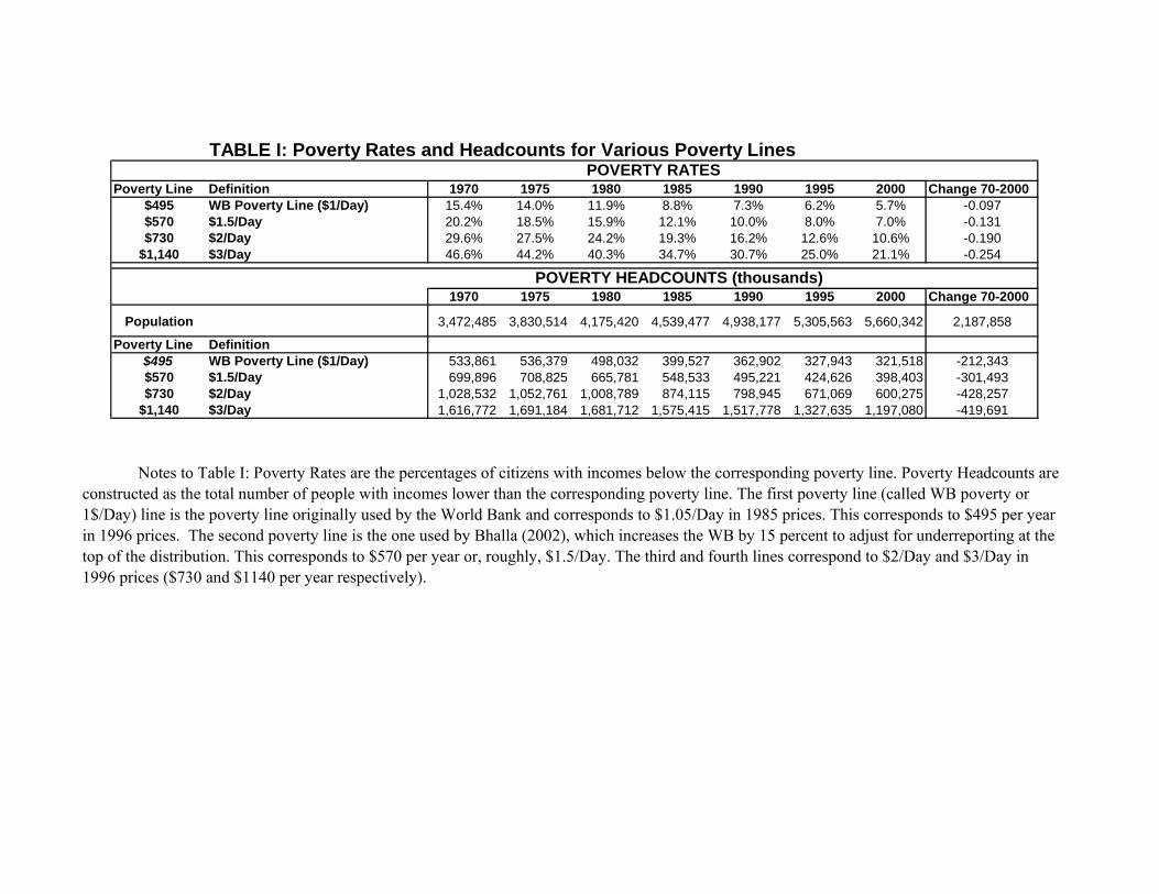
TABLE I: Poverty Rates and Headcounts for Various Poverty Lines POVERTY RATES
Poverty Line Definition 1970 1975 1980 1985 1990 1995 2000 Change 70-2000$495 WB Poverty Line ($1/Day) 15.4% 14.0% 11.9% 8.8% 7.3% 6.2% 5.7% -0.097$570 $1.5/Day 20.2% 18.5% 15.9% 12.1% 10.0% 8.0% 7.0% -0.131$730 $2/Day 29.6% 27.5% 24.2% 19.3% 16.2% 12.6% 10.6% -0.190
$1,140 $3/Day 46.6% 44.2% 40.3% 34.7% 30.7% 25.0% 21.1% -0.254
POVERTY HEADCOUNTS (thousands)1970 1975 1980 1985 1990 1995 2000 Change 70-2000
Population 3,472,485 3,830,514 4,175,420 4,539,477 4,938,177 5,305,563 5,660,342 2,187,858
Poverty Line Definition$495 WB Poverty Line ($1/Day) 533,861 536,379 498,032 399,527 362,902 327,943 321,518 -212,343$570 $1.5/Day 699,896 708,825 665,781 548,533 495,221 424,626 398,403 -301,493$730 $2/Day 1,028,532 1,052,761 1,008,789 874,115 798,945 671,069 600,275 -428,257
$1,140 $3/Day 1,616,772 1,691,184 1,681,712 1,575,415 1,517,778 1,327,635 1,197,080 -419,691
Notes to Table I: Poverty Rates are the percentages of citizens with incomes below the corresponding poverty line. Poverty Headcounts are constructed as the total number of people with incomes lower than the corresponding poverty line. The first poverty line (called WB poverty or 1$/Day) line is the poverty line originally used by the World Bank and corresponds to $1.05/Day in 1985 prices. This corresponds to $495 per year in 1996 prices. The second poverty line is the one used by Bhalla (2002), which increases the WB by 15 percent to adjust for underreporting at the top of the distribution. This corresponds to $570 per year or, roughly, $1.5/Day. The third and fourth lines correspond to $2/Day and $3/Day in 1996 prices ($730 and $1140 per year respectively).
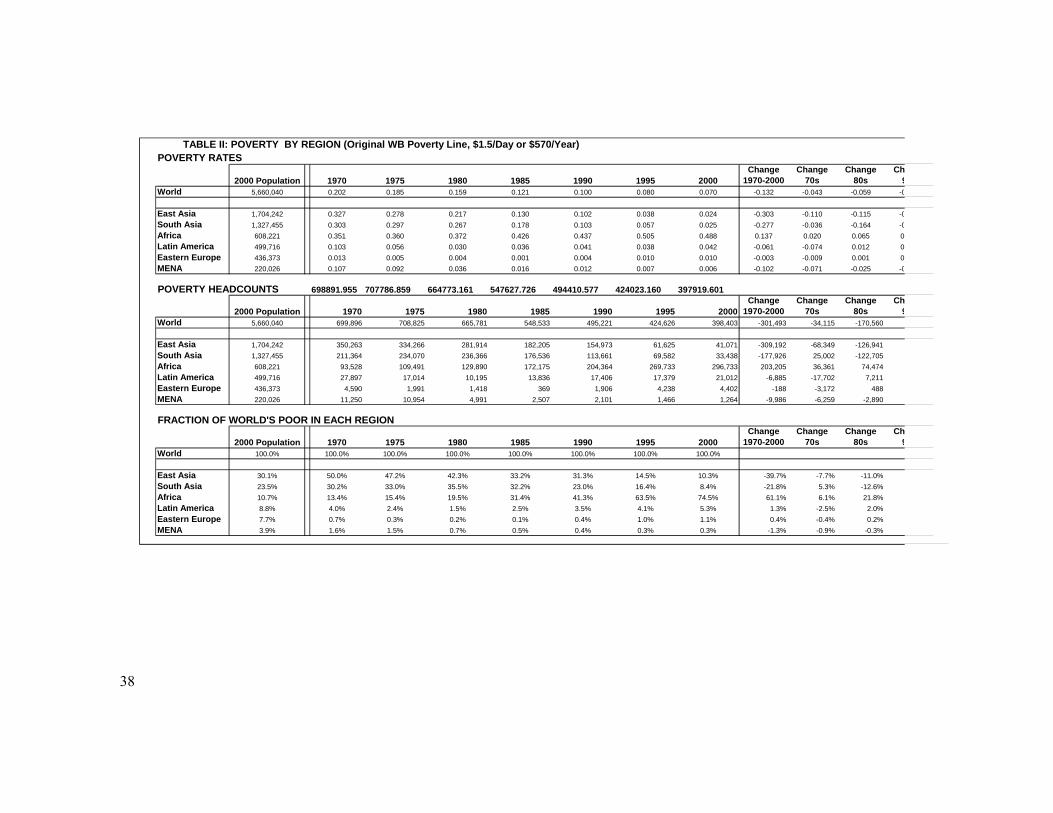
38
TABLE II: POVERTY BY REGION (Original WB Poverty Line, $1.5/Day or $570/Year)POVERTY RATES
2000 Population 1970 1975 1980 1985 1990 1995 2000Change
1970-2000Change
70sChange
80sCh
9World 5,660,040 0.202 0.185 0.159 0.121 0.100 0.080 0.070 -0.132 -0.043 -0.059 -0
East Asia 1,704,242 0.327 0.278 0.217 0.130 0.102 0.038 0.024 -0.303 -0.110 -0.115 -0South Asia 1,327,455 0.303 0.297 0.267 0.178 0.103 0.057 0.025 -0.277 -0.036 -0.164 -0Africa 608,221 0.351 0.360 0.372 0.426 0.437 0.505 0.488 0.137 0.020 0.065 0Latin America 499,716 0.103 0.056 0.030 0.036 0.041 0.038 0.042 -0.061 -0.074 0.012 0Eastern Europe 436,373 0.013 0.005 0.004 0.001 0.004 0.010 0.010 -0.003 -0.009 0.001 0MENA 220,026 0.107 0.092 0.036 0.016 0.012 0.007 0.006 -0.102 -0.071 -0.025 -0
POVERTY HEADCOUNTS 698891.955 707786.859 664773.161 547627.726 494410.577 424023.160 397919.601
2000 Population 1970 1975 1980 1985 1990 1995 2000Change
1970-2000Change
70sChange
80sCh
9World 5,660,040 699,896 708,825 665,781 548,533 495,221 424,626 398,403 -301,493 -34,115 -170,560
East Asia 1,704,242 350,263 334,266 281,914 182,205 154,973 61,625 41,071 -309,192 -68,349 -126,941 -South Asia 1,327,455 211,364 234,070 236,366 176,536 113,661 69,582 33,438 -177,926 25,002 -122,705Africa 608,221 93,528 109,491 129,890 172,175 204,364 269,733 296,733 203,205 36,361 74,474Latin America 499,716 27,897 17,014 10,195 13,836 17,406 17,379 21,012 -6,885 -17,702 7,211Eastern Europe 436,373 4,590 1,991 1,418 369 1,906 4,238 4,402 -188 -3,172 488MENA 220,026 11,250 10,954 4,991 2,507 2,101 1,466 1,264 -9,986 -6,259 -2,890
FRACTION OF WORLD'S POOR IN EACH REGION
2000 Population 1970 1975 1980 1985 1990 1995 2000Change
1970-2000Change
70sChange
80sCh
9World 100.0% 100.0% 100.0% 100.0% 100.0% 100.0% 100.0% 100.0%
East Asia 30.1% 50.0% 47.2% 42.3% 33.2% 31.3% 14.5% 10.3% -39.7% -7.7% -11.0%South Asia 23.5% 30.2% 33.0% 35.5% 32.2% 23.0% 16.4% 8.4% -21.8% 5.3% -12.6%Africa 10.7% 13.4% 15.4% 19.5% 31.4% 41.3% 63.5% 74.5% 61.1% 6.1% 21.8%Latin America 8.8% 4.0% 2.4% 1.5% 2.5% 3.5% 4.1% 5.3% 1.3% -2.5% 2.0%Eastern Europe 7.7% 0.7% 0.3% 0.2% 0.1% 0.4% 1.0% 1.1% 0.4% -0.4% 0.2%MENA 3.9% 1.6% 1.5% 0.7% 0.5% 0.4% 0.3% 0.3% -1.3% -0.9% -0.3%
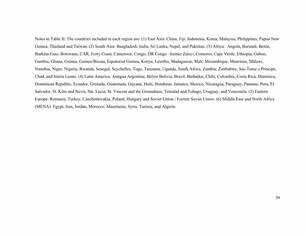
39
Notes to Table II: The countries included in each region are: (1) East Asia: China, Fiji, Indonesia, Korea, Malaysia, Philippines, Papua New
Guinea, Thailand and Taiwan. (2) South Asia: Bangladesh, India, Sri Lanka, Nepal, and Pakistan. (3) Africa: Angola, Burundi, Benin,
Burkina Faso, Botswana, CAR, Ivory Coast, Cameroon, Congo, DR Congo –former Zaire-, Comoros, Cape Verde, Ethiopia, Gabon,
Gambia, Ghana, Guinea, Guinea-Bissau, Equatorial Guinea, Kenya, Lesotho, Madagascar, Mali, Mozambique, Mauritius, Malawi,
Namibia, Niger, Nigeria, Rwanda, Senegal, Seychelles, Togo, Tanzania, Uganda, South Africa, Zambia, Zimbabwe, Sao Tome e Principe,
Chad, and Sierra Leone. (4) Latin America: Antigua Argentina, Belize Bolivia, Brazil, Barbados, Chile, Colombia, Costa Rica, Dominica,
Dominican Republic, Ecuador, Grenada, Guatemala, Guyana, Haiti, Honduras, Jamaica, Mexico, Nicaragua, Paraguay, Panama, Peru, El
Salvador, St. Kitts and Nevis, Sta. Lucia, St. Vincent and the Grenadines, Trinidad and Tobago, Uruguay, and Venezuela. (5) Eastern
Europe: Romania, Turkey, Czechoslovakia, Poland, Hungary and Soviet Union / Former Soviet Union. (6) Middle East and North Africa
(MENA): Egypt, Iran, Jordan, Morocco, Mauritania, Syria, Tunisia, and Algeria.
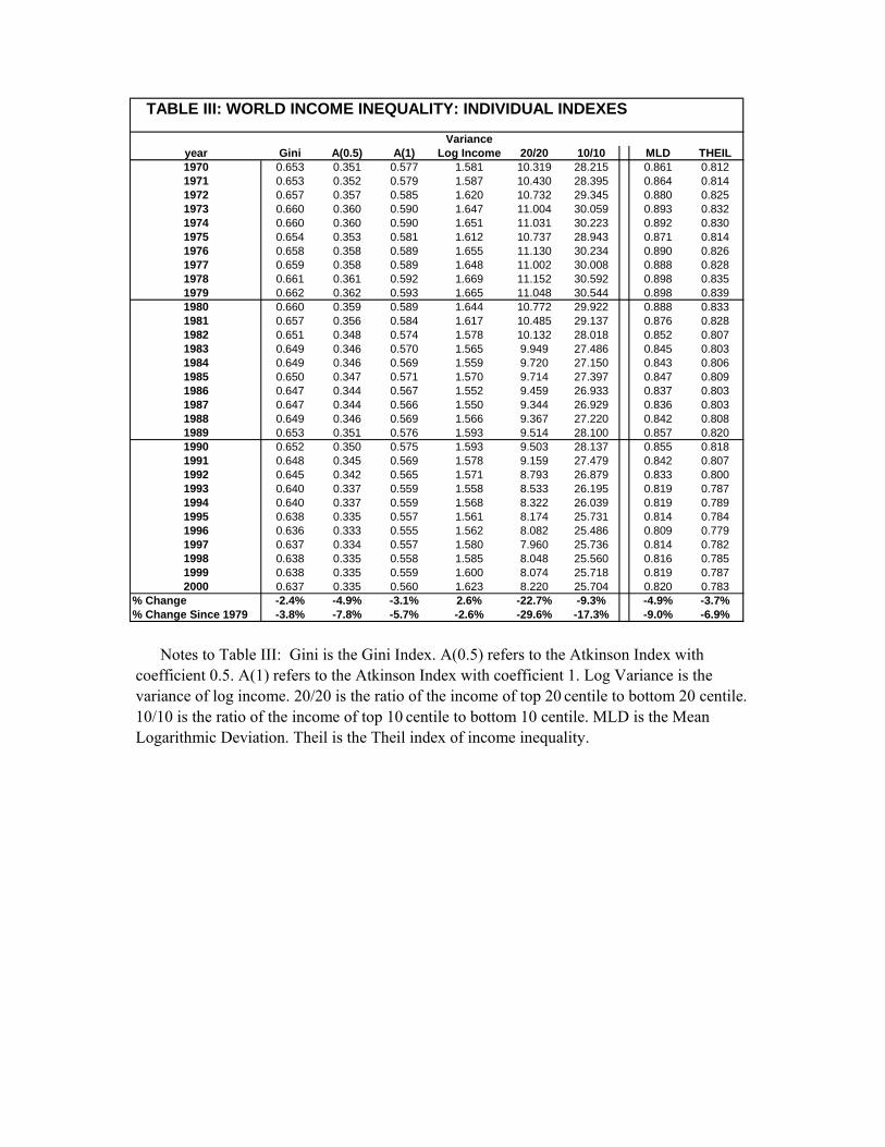
TABLE III: WORLD INCOME INEQUALITY: INDIVIDUAL INDEXES
Varianceyear Gini A(0.5) A(1) Log Income 20/20 10/10 MLD THEIL1970 0.653 0.351 0.577 1.581 10.319 28.215 0.861 0.8121971 0.653 0.352 0.579 1.587 10.430 28.395 0.864 0.8141972 0.657 0.357 0.585 1.620 10.732 29.345 0.880 0.8251973 0.660 0.360 0.590 1.647 11.004 30.059 0.893 0.8321974 0.660 0.360 0.590 1.651 11.031 30.223 0.892 0.8301975 0.654 0.353 0.581 1.612 10.737 28.943 0.871 0.8141976 0.658 0.358 0.589 1.655 11.130 30.234 0.890 0.8261977 0.659 0.358 0.589 1.648 11.002 30.008 0.888 0.8281978 0.661 0.361 0.592 1.669 11.152 30.592 0.898 0.8351979 0.662 0.362 0.593 1.665 11.048 30.544 0.898 0.8391980 0.660 0.359 0.589 1.644 10.772 29.922 0.888 0.8331981 0.657 0.356 0.584 1.617 10.485 29.137 0.876 0.8281982 0.651 0.348 0.574 1.578 10.132 28.018 0.852 0.8071983 0.649 0.346 0.570 1.565 9.949 27.486 0.845 0.8031984 0.649 0.346 0.569 1.559 9.720 27.150 0.843 0.8061985 0.650 0.347 0.571 1.570 9.714 27.397 0.847 0.8091986 0.647 0.344 0.567 1.552 9.459 26.933 0.837 0.8031987 0.647 0.344 0.566 1.550 9.344 26.929 0.836 0.8031988 0.649 0.346 0.569 1.566 9.367 27.220 0.842 0.8081989 0.653 0.351 0.576 1.593 9.514 28.100 0.857 0.8201990 0.652 0.350 0.575 1.593 9.503 28.137 0.855 0.8181991 0.648 0.345 0.569 1.578 9.159 27.479 0.842 0.8071992 0.645 0.342 0.565 1.571 8.793 26.879 0.833 0.8001993 0.640 0.337 0.559 1.558 8.533 26.195 0.819 0.7871994 0.640 0.337 0.559 1.568 8.322 26.039 0.819 0.7891995 0.638 0.335 0.557 1.561 8.174 25.731 0.814 0.7841996 0.636 0.333 0.555 1.562 8.082 25.486 0.809 0.7791997 0.637 0.334 0.557 1.580 7.960 25.736 0.814 0.7821998 0.638 0.335 0.558 1.585 8.048 25.560 0.816 0.7851999 0.638 0.335 0.559 1.600 8.074 25.718 0.819 0.7872000 0.637 0.335 0.560 1.623 8.220 25.704 0.820 0.783
% Change -2.4% -4.9% -3.1% 2.6% -22.7% -9.3% -4.9% -3.7%% Change Since 1979 -3.8% -7.8% -5.7% -2.6% -29.6% -17.3% -9.0% -6.9%
Notes to Table III: Gini is the Gini Index. A(0.5) refers to the Atkinson Index with
coefficient 0.5. A(1) refers to the Atkinson Index with coefficient 1. Log Variance is the variance of log income. 20/20 is the ratio of the income of top 20 centile to bottom 20 centile. 10/10 is the ratio of the income of top 10 centile to bottom 10 centile. MLD is the Mean Logarithmic Deviation. Theil is the Theil index of income inequality.
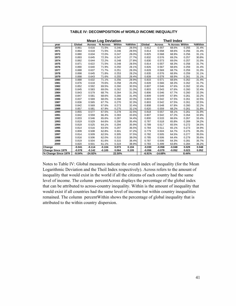
41
TABLE IV: DECOMPOSITION of WORLD INCOME INEQUALITY
Mean Log Deviation Theil Indexyear Global Across % Across Within %Within Global Across % Across Within %Within1970 0.861 0.616 71.5% 0.246 28.5% 0.812 0.557 68.6% 0.255 31.4%1971 0.864 0.618 71.5% 0.246 28.5% 0.814 0.558 68.6% 0.256 31.4%1972 0.880 0.634 72.0% 0.247 28.0% 0.825 0.568 68.9% 0.256 31.1%1973 0.893 0.645 72.3% 0.247 27.7% 0.832 0.576 69.2% 0.257 30.8%1974 0.892 0.644 72.2% 0.248 27.8% 0.830 0.573 69.0% 0.257 31.0%1975 0.871 0.622 71.5% 0.248 28.5% 0.814 0.557 68.3% 0.258 31.7%1976 0.890 0.640 71.9% 0.250 28.1% 0.826 0.567 68.6% 0.259 31.4%1977 0.888 0.637 71.7% 0.251 28.3% 0.828 0.569 68.7% 0.259 31.3%1978 0.898 0.645 71.8% 0.253 28.2% 0.835 0.576 68.9% 0.259 31.1%1979 0.898 0.643 71.6% 0.255 28.4% 0.839 0.578 68.9% 0.261 31.1%1980 0.888 0.632 71.1% 0.256 28.9% 0.833 0.571 68.6% 0.262 31.4%1981 0.876 0.618 70.6% 0.258 29.4% 0.828 0.566 68.3% 0.262 31.7%1982 0.852 0.592 69.5% 0.260 30.5% 0.807 0.546 67.6% 0.262 32.4%1983 0.845 0.583 69.0% 0.262 31.0% 0.803 0.543 67.6% 0.260 32.4%1984 0.843 0.579 68.7% 0.264 31.3% 0.806 0.546 67.7% 0.260 32.3%1985 0.847 0.581 68.6% 0.266 31.4% 0.809 0.549 67.8% 0.261 32.2%1986 0.837 0.569 68.0% 0.268 32.0% 0.803 0.542 67.5% 0.261 32.5%1987 0.836 0.565 67.7% 0.270 32.3% 0.803 0.542 67.5% 0.261 32.5%1988 0.842 0.569 67.6% 0.273 32.4% 0.808 0.548 67.8% 0.260 32.2%1989 0.857 0.581 67.9% 0.275 32.1% 0.820 0.559 68.2% 0.261 31.8%1990 0.855 0.577 67.5% 0.278 32.5% 0.818 0.557 68.1% 0.261 31.9%1991 0.842 0.559 66.4% 0.283 33.6% 0.807 0.542 67.2% 0.264 32.8%1992 0.833 0.546 65.6% 0.287 34.4% 0.800 0.533 66.6% 0.267 33.4%1993 0.819 0.529 64.6% 0.290 35.4% 0.787 0.518 65.8% 0.269 34.2%1994 0.819 0.525 64.1% 0.294 35.9% 0.789 0.517 65.5% 0.272 34.5%1995 0.814 0.516 63.5% 0.297 36.5% 0.784 0.511 65.1% 0.273 34.9%1996 0.809 0.508 62.8% 0.301 37.2% 0.779 0.504 64.7% 0.275 35.3%1997 0.814 0.509 62.5% 0.305 37.5% 0.782 0.505 64.5% 0.277 35.5%1998 0.816 0.506 62.0% 0.310 38.0% 0.785 0.506 64.4% 0.279 35.6%1999 0.819 0.504 61.6% 0.315 38.4% 0.787 0.506 64.3% 0.281 35.7%2000 0.820 0.501 61.1% 0.319 38.9% 0.783 0.499 63.8% 0.284 36.2%
Change -0.041 -0.114 -0.104 0.073 0.104 -0.030 -0.058 -0.048 0.029 0.048Change Since 1979 -0.078 -0.142 -0.105 0.064 0.105 -0.056 -0.079 -0.052 0.023 0.052% Change Since 1979 -9.04% -24.92% 22.50% -6.91% -14.68% 8.44% Notes to Table IV: Global measures indicate the overall index of inequality (for the Mean Logarithmic Deviation and the Theil Index respectively). Across refers to the amount of inequality that would exist in the world if all the citizens of each country had the same level of income. The column percentAcross displays the percentage of the global index that can be attributed to across-country inequality. Within is the amount of inequality that would exist if all countries had the same level of income but within country inequalities remained. The column percentWithin shows the percentage of global inequality that is attributed to the within country dispersion.
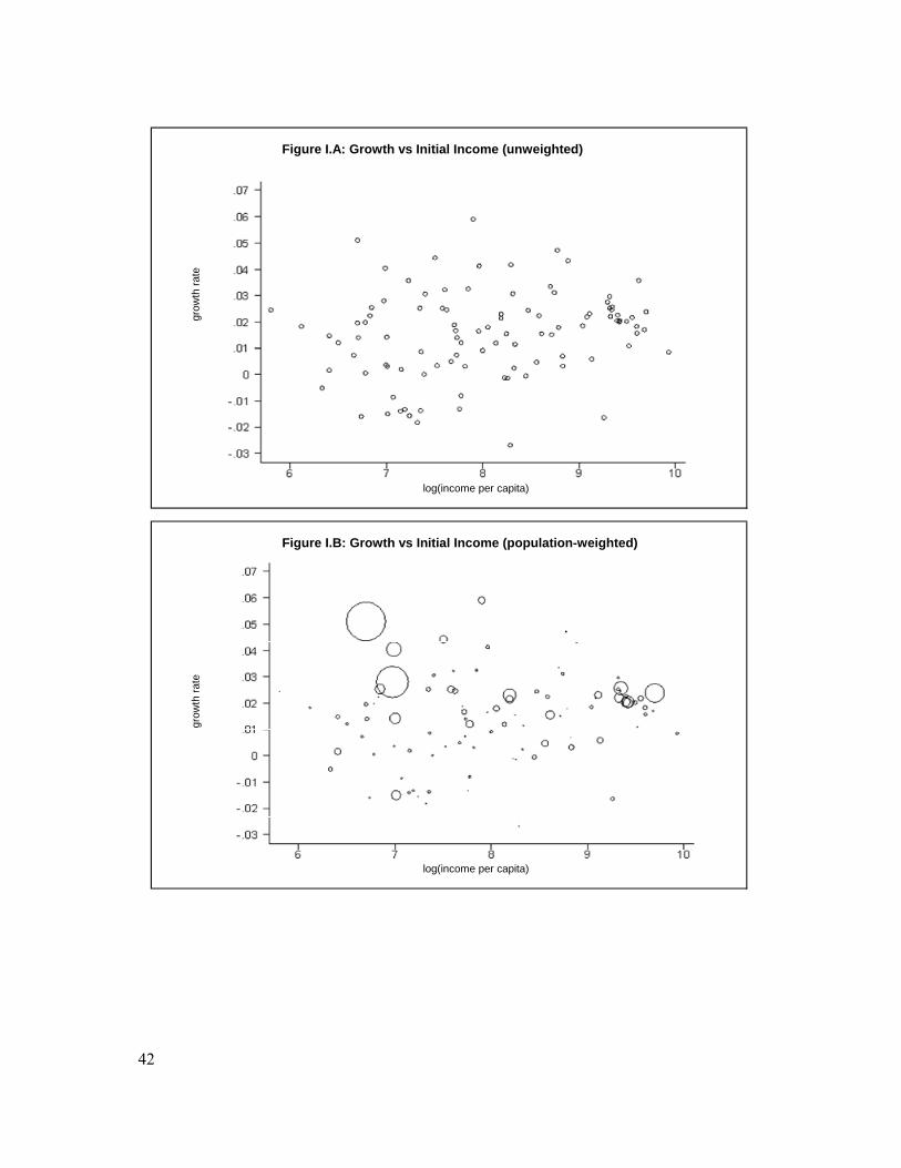
42
Figure I.A: Growth vs Initial Income (unweighted)
grow
th ra
te
log(income per capita)
Figure I.B: Growth vs Initial Income (population-weighted)
grow
th ra
te
log(income per capita)
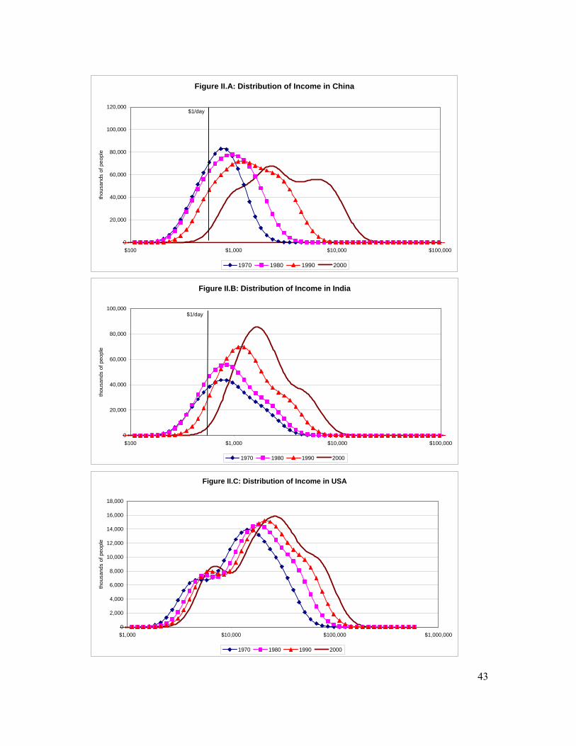
43
Figure II.A: Distribution of Income in China
0
20,000
40,000
60,000
80,000
100,000
120,000
$100 $1,000 $10,000 $100,000
thou
sand
s of
peo
ple
1970 1980 1990 2000
$1/day
Figure II.B: Distribution of Income in India
0
20,000
40,000
60,000
80,000
100,000
$100 $1,000 $10,000 $100,000
thou
sand
s of
peo
ple
1970 1980 1990 2000
$1/day
Figure II.C: Distribution of Income in USA
0
2,000
4,000
6,000
8,000
10,000
12,000
14,000
16,000
18,000
$1,000 $10,000 $100,000 $1,000,000
thou
sand
s of
peo
ple
1970 1980 1990 2000
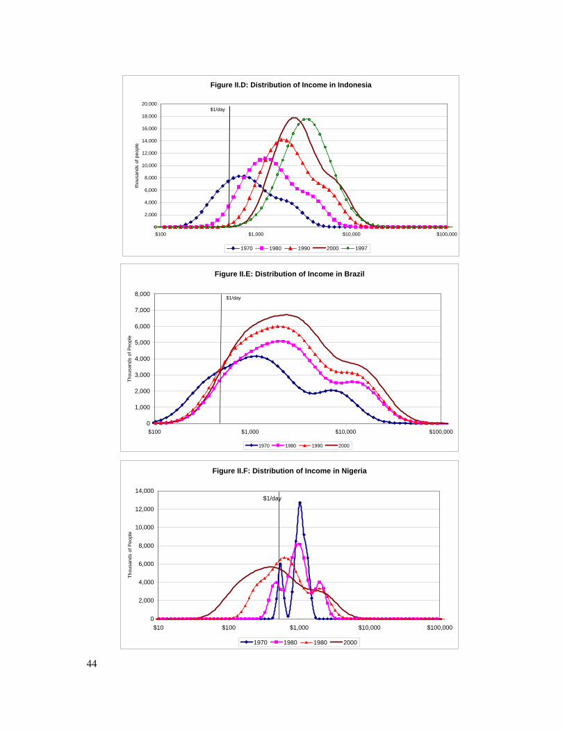
44
Figure II.D: Distribution of Income in Indonesia
0
2,000
4,000
6,000
8,000
10,000
12,000
14,000
16,000
18,000
20,000
$100 $1,000 $10,000 $100,000
thou
sand
s of
peo
ple
1970 1980 1990 2000 1997
$1/day
Figure II.E: Distribution of Income in Brazil
0
1,000
2,000
3,000
4,000
5,000
6,000
7,000
8,000
$100 $1,000 $10,000 $100,000
Thou
sand
s of
Peo
ple
1970 1980 1990 2000
$1/day
Figure II.F: Distribution of Income in Nigeria
0
2,000
4,000
6,000
8,000
10,000
12,000
14,000
$10 $100 $1,000 $10,000 $100,000
Thou
sand
s of
Peo
ple
1970 1980 1980 2000
$1/day
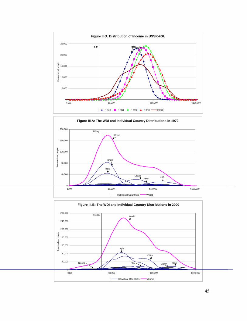
45
Figure III.A: The WDI and Individual Country Distributions in 1970
0
40,000
80,000
120,000
160,000
200,000
$100 $1,000 $10,000 $100,000
thou
sand
s of
peo
ple
Individual Countries World
World
China
India
USSR Japan USA
$1/day
Figure II.G: Distribution of Income in USSR-FSU
0
5,000
10,000
15,000
20,000
25,000
$100 $1,000 $10,000 $100,000
thou
sand
s of
peo
ple
1970 1980 1989 1990 2000
Figure III.B: The WDI and Individual Country Distributions in 2000
0
40,000
80,000
120,000
160,000
200,000
240,000
280,000
$100 $1,000 $10,000 $100,000
thou
sand
s of
peo
ple
Individual Countries World
World
China
India
FSU Nigeria USA Japan
$1/day
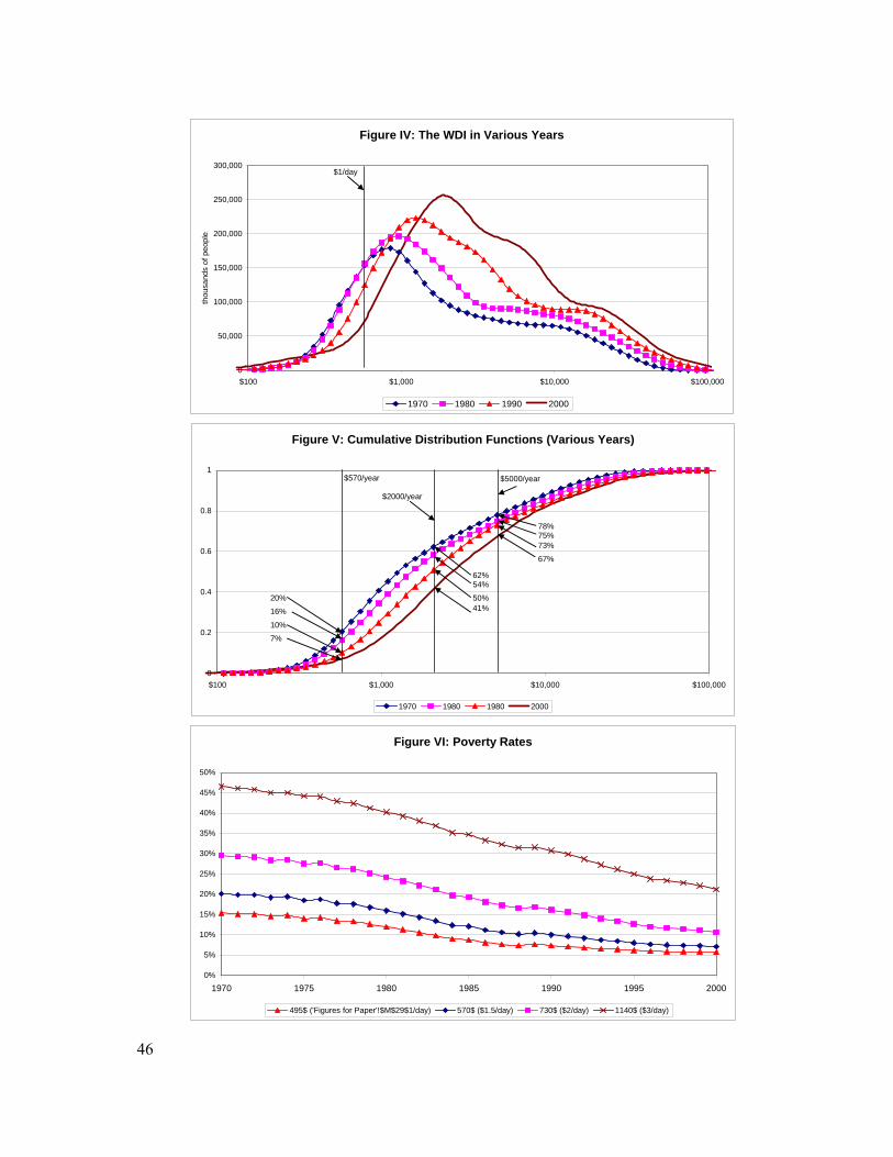
46
Figure IV: The WDI in Various Years
0
50,000
100,000
150,000
200,000
250,000
300,000
$100 $1,000 $10,000 $100,000
thou
sand
s of
peo
ple
1970 1980 1990 2000
$1/day
Figure VI: Poverty Rates
0%
5%
10%
15%
20%
25%
30%
35%
40%
45%
50%
1970 1975 1980 1985 1990 1995 2000
495$ ('Figures for Paper'!$M$29$1/day) 570$ ($1.5/day) 730$ ($2/day) 1140$ ($3/day)
Figure V: Cumulative Distribution Functions (Various Years)
0
0.2
0.4
0.6
0.8
1
$100 $1,000 $10,000 $100,000
1970 1980 1980 2000
$570/year
$2000/year
$5000/year
20%
16%
10%
7%
62%54%
50%41%
78%
67%
73%75%
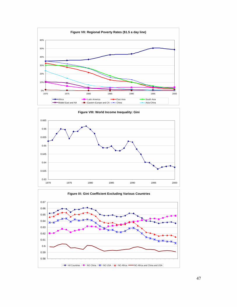
47
Figure VII: Regional Poverty Rates ($1.5 a day line)
0%
10%
20%
30%
40%
50%
60%
1970 1975 1980 1985 1990 1995 2000
Africa Latin America East Asia South AsiaMiddel East and NA Eastern Europe and CA China Asia-China
Figure VIII: World Income Inequality: Gini
0.63
0.635
0.64
0.645
0.65
0.655
0.66
0.665
1970 1975 1980 1985 1990 1995 2000
Figure IX: Gini Coefficient Excluding Various Countries
0.58
0.59
0.6
0.61
0.62
0.63
0.64
0.65
0.66
0.67
All Countries NO China NO USA NO Africa NO Africa and China and USA
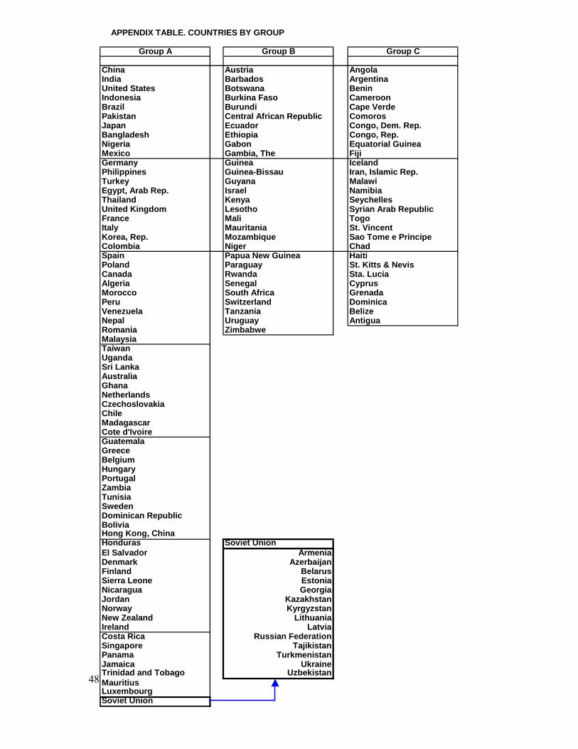
48
APPENDIX TABLE. COUNTRIES BY GROUP
Group A Group B Group C
China Austria AngolaIndia Barbados ArgentinaUnited States Botswana BeninIndonesia Burkina Faso CameroonBrazil Burundi Cape VerdePakistan Central African Republic ComorosJapan Ecuador Congo, Dem. Rep.Bangladesh Ethiopia Congo, Rep.Nigeria Gabon Equatorial GuineaMexico Gambia, The FijiGermany Guinea IcelandPhilippines Guinea-Bissau Iran, Islamic Rep.Turkey Guyana MalawiEgypt, Arab Rep. Israel NamibiaThailand Kenya SeychellesUnited Kingdom Lesotho Syrian Arab RepublicFrance Mali TogoItaly Mauritania St. VincentKorea, Rep. Mozambique Sao Tome e PrincipeColombia Niger ChadSpain Papua New Guinea HaitiPoland Paraguay St. Kitts & NevisCanada Rwanda Sta. LuciaAlgeria Senegal CyprusMorocco South Africa GrenadaPeru Switzerland DominicaVenezuela Tanzania BelizeNepal Uruguay AntiguaRomania ZimbabweMalaysiaTaiwanUgandaSri LankaAustraliaGhanaNetherlandsCzechoslovakiaChileMadagascarCote d'IvoireGuatemalaGreeceBelgiumHungaryPortugalZambiaTunisiaSwedenDominican RepublicBoliviaHong Kong, ChinaHonduras Soviet UnionEl Salvador ArmeniaDenmark AzerbaijanFinland BelarusSierra Leone EstoniaNicaragua GeorgiaJordan KazakhstanNorway KyrgyzstanNew Zealand LithuaniaIreland LatviaCosta Rica Russian FederationSingapore TajikistanPanama TurkmenistanJamaica UkraineTrinidad and Tobago UzbekistanMauritiusLuxembourgSoviet Union
49
1 See Baumol [1986], Delong [1988], Barro and Sala-i-Martin [1992], Mankiw, Romer, and Weil [1992], Sala-i-Martin [1996], Pritchett [1997]. 2 The convergence literature, for example, was centered on the testing of the neoclassical growth model that predicts conditional convergence. See Barro and Sala-i-Martin [1992]. 3 Theil [1979, 1996], Berry, Bourguignon and Morrison [1983], Theil and Seale [1994], Firebaugh [1999], and Melchior, Telle, and Wiig [2000] also construct population-weighted measures of per capita income inequality. 4 Bhalla wrote his book as the first drafts of this paper were written. 5 Deaton [2005], after documenting that average consumption from surveys is substantially smaller than household consumption as it appears in the national accounts, argues that combining national accounts consumption with survey data to estimate within-country dispersion will bias poverty estimates downwards. He also argues that using the survey means to anchor country distribution of consumption, on the other hand, will bias poverty estimates upwards. He calls for “an international initiative to provide a set of consistent international protocols for survey design, as well as a deeper study into the effects of non-sampling errors, particularly non-compliance”. Some of his arguments for not using national accounts’ consumption do not apply to national accounts’ income or GDP. For example, one of his main complaints is that national accounts consumption is typically estimated as a residual using the commodity flow method (see also Ravallion [2000]: starting from an estimate of GDP of each commodity, net exports and government consumption are deducted, as are the amounts used in investment and intermediate consumption, with the residuals attributed to household consumption. There are many opportunities for error along this chain of calculation. For example, intermediate business consumption is usually estimated applying pre-set ratios to measured production. These ratios come from business surveys and are often outdated, particularly in economies that grow and experience structural changes. Notice that these criticisms, while they apply to consumption, they do not apply to income, which is what we estimate in this paper. 6 For a critical description of these surveys, see Atkinson and Brandolini [2001]. 7 Only the United States has surveys for every year. 8 See Appendix 1 for the names of the countries in this category. 14 of the 81 countries are republics of the former Soviet Union. Since all these republics were part of the same country, the number of countries in Group A is 68 before 1990. 9 This was done using two methods. First, the regressions were estimated independently for each of the five quintiles without worrying about adding-up constraints. A second method estimated the regressions for the top two and the bottom two quintiles, leaving the income share of the middle quintile as the residual. Both methods gave identical results. 10 It can be persuasively argued that some of these countries (for example India or China) experienced large increases in inequality after large reforms took place in the 1980s. Sala-i-Martin [2002a, and b] allows for two “slopes” for both India and China (one for pre- and one for post-liberalization) and shows that the estimated WDI does not change substantially. In particular, his measures of global income inequality (measured by the Gini coefficient, the Theil index, various Atkinson indexes, or the mean logarithmic deviation) are virtually identical to those estimated with the same trend for both periods. 11 This is the choice made, for example, by Dowrick and Akmal [2003] or Milanovic [2002]. 12 This is the simple mean, not the population-weighted average. The reason for using the simple mean is that individual inequality within a country is probably determined by
50
countrywide policies and institutions. As a result, each country represents an independent experiment from which we can draw information. 13 Bourguignon and Morrison [2002] also assign the within country distributions of “similar” countries where “similar” is sometimes defined as “regional proximity” and sometimes as “common historical roots”. Bhalla [2002] also uses the survey data of neighbouring regions. Alternatively, we could follow Schultz [1998] and construct “forecasted” measures of dispersion for the countries of Group A by using observed characteristics that are thought to be determinants of the within-country income distribution (such as macroeconomic, regional, religious, institutional or policy variables). The problem with this approach is that the determinants of income inequality within a country are not well understood, so that the variables to be incorporated into the analysis would be subject to debate. 14 The analysis post 1990 excludes the republic of Moldova because PWT data are not available for that country. 15 According to the World Bank, Congolese PPP-adjusted GDP per capita fell by 66 percent (our data display a much sharper decline of 87.6 percent). The decline for the period 1997-2000 is 4.3 percent (we assume a fall of 17 percent). Given that our assumed growth rates are more negative, the growth of poverty in Congo/Zaire is likely to be overestimated. 16 Quah [2002] and Sala-i-Martin [2005] follow the microeconomic literature on income distribution for developed countries (see, for example, Cowell [1995]) and estimate a log-normal distribution where the mean is GDP per capita and the variance is estimated from surveys. One problem with this approach is that the exact functional form of the distribution for each country is not really known so imposing normality would lead to estimation errors, especially at the tails.
17 We use Gaussian kernel weights but we experimented with other weights. The results do not seem to be affected by this choice. 18 We also tried the optimal Silverman [1986] bandwidth and got very similar results in terms of poverty and income inequality. 19 In Section 3 we define this poverty line more precisely. 20 Because we back-forecast the quintile income shares, we probably estimate that the dispersion in 1970 was smaller than it actually was. Thus, we will probably under-estimate poverty in 1970. As a result we will probably over-estimate the subsequent increase in poverty rates. 21 This calculation uses 1996 prices, the baseline used throughout the paper. 22 The WB poverty line was defined for consumption levels but analysts and the popular press always refer to “one-dollar-a-day” line when they talk about income poverty. For example, one of the United Nations’ Millennium Goals is to “halve the number of people whose income is less than one dollar a day by 2015”. 23 Of course if the errors in reporting were increasing over time (as they do in some, but not all, countries) the adjustment should also increase over time. Since we do not have a good sense of whether the errors indeed grow or, if they do, by how much, we stick with a constant poverty line at $570 per year. 24 Strictly speaking, three dollars a day would correspond to $1,095 a year. Instead, we report poverty figures for $1140 a year because this is exactly double $570. Since $570 a year is the $1/day poverty line as defined by the World Bank once it is adjusted by 15 percent to correct for underreporting of the rich, the $1,140 dollars a year line corresponds to twice the original
51
WB poverty line. The differences between the $1,095 and $1,140 lines are quite small so, in order to economize on space, we no not report the results for both. 25 Bhalla [2002] uses World Bank PPP-adjusted GDP data rather than PWT data to pin down the mean of the distribution. The fact that the annual growth rates of PPP-adjusted per capita GDP reported by the World Bank are 2.1 percent larger than those reported by the PWT might explain why the reduction in poverty rates reported by Bhalla are substantially larger than ours. 26 The extensive literature examining individual income inequalities at the global level includes, among others, Bourguignon and Morrisson [2001], Schultz [1998], Dikhanov and Ward [2001], Chotikapanich, Valenzuela and Rao [1997], Dowrick and Akmal [2001], Milanovic [2000, 2002]. 27 United Nations, UNDP [2001], p.17. See also UNDP [2003] 28 This is also true for other measures of per capita income dispersion. See for example, Barro and Sala-i-Martin [1992, 2003]. 29 Even in this case, the conclusion would not be entirely true if the measure of inequality is the Gini coefficient (the concept used by UNDP (2001)). As shown by Bourguignon [1979] and Shorrocks [1980], the Gini coefficient does not satisfy the additivity or decomposability property so the “within-country Gini” and the “across-country Gini” do not add up to a global Gini. Bourguignon [1979] and Shorrocks [1980] show that the only indexes that satisfy the “decomposability property” (and other desirable axioms such as “scale independence” and the “Pigou-Dalton Transfer Principle”) are those called “Generalized Entropy Indexes”. Two of the widely used indexes in the inequality literature are the Theil Index and the Mean Logarithmic Deviation. We discuss these decompositions in Section 4 below. 30 This phenomenon was first documented by Schultz [1998]. See also the population-weighted β-convergence picture displayed in Figure I.B. 31 See Cowell [1995] for a description and properties of each of these inequality indexes.
32 See Atkinson [1970]. 33 The top-20 percent-to-bottom-20 percent is the ratio of the income of the person located at the top 20th centile divided by the income of the corresponding person at the bottom 20th centile. A similar definition applies to the top-10 percent-to-bottom-10 percent ratio. 34 Finally, it is interesting to note that Sala-i-Martin [2002a, and b] reach exactly the same conclusions, even though those studies used a different methodology and did not include the USSR/FSU in the analysis. In other words, contrary to what one might have suspected, the collapse of the Soviet Union and the subsequent explosion of income across former soviet citizens does not alter the overall picture. As conjectured in Sala-i-Martin [2002a, footnote 22], the collapse of the Soviet Union has two offsetting implications for worldwide inequality. First, the increase in within-country inequality tends to increase the overall worldwide inequality. Second, the reduction of per capita GDP of a relatively rich country tends to induce convergence of per capita income between the citizens of the FSU and those of the developing world, which tends to reduce the estimates of overall world income inequality. The two effects roughly offset each other so that the overall trend of world inequality turns out not to change when we incorporate the USSR/FSU in our analysis. 35 The methodology followed by the UNDP (2001) is flawed, as it puts equal weight on each country.
52
36 However, Sala-i-Martin [2002] shows that if South and East Asia keep growing at current rates and Africa keeps falling behind, global inequalities will increase again as the incomes of Asian citizens will have fully converged to those of OECD citizens and together, they will diverge away from African incomes.