the three rules of data analysis
DESCRIPTION
The three rules of data analysis won’t be difficult to remember: Make a picture —things may be revealed that are not obvious in the raw data. These will be things to think about. Make a picture —important features of and patterns in the data will show up. - PowerPoint PPT PresentationTRANSCRIPT

Slide 3-1 Copyright © 2004 Pearson Education, Inc.
The Three Rules of Data Analysis
• The three rules of data analysis won’t be difficult to remember:
1. Make a picture—things may be revealed that are not obvious in the raw data. These will be things to think about.
2. Make a picture—important features of and patterns in the data will show up.
3. Make a picture—the best way to tell others about your data is with a well-chosen picture.

Slide 3-2 Copyright © 2004 Pearson Education, Inc.
Making Piles
• We can “pile” the data by counting the number of data values in each category of interest.
• We can organize these counts into a frequency table, which records the totals and the category names.
• A relative frequency table is similar, but gives the percentages (instead of counts) for each category.
Slide 3-3 Copyright © 2004 Pearson Education, Inc.
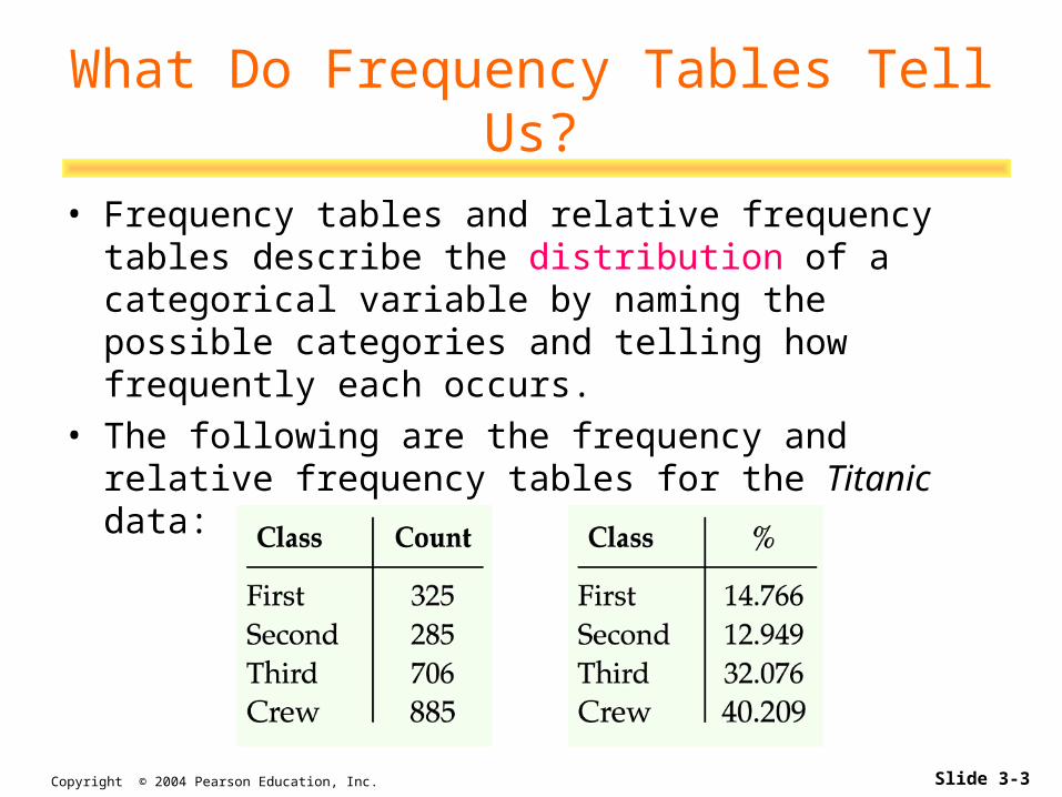
What Do Frequency Tables Tell Us?
• Frequency tables and relative frequency tables describe the distribution of a categorical variable by naming the possible categories and telling how frequently each occurs.
• The following are the frequency and relative frequency tables for the Titanic data:

Slide 3-4 Copyright © 2004 Pearson Education, Inc.
What’s Wrong With This Picture?
• You might think that
a good way to show
the Titanic data is
with this display:
Slide 3-5 Copyright © 2004 Pearson Education, Inc.
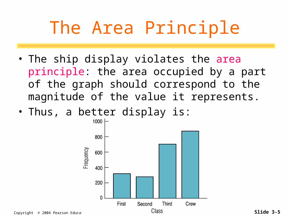
The Area Principle
• The ship display violates the area principle: the area occupied by a part of the graph should correspond to the magnitude of the value it represents.
• Thus, a better display is:

Slide 3-6 Copyright © 2004 Pearson Education, Inc.
• When you are interested in parts of the whole, a pie chart might be your display of choice.
• Pie charts show the whole group of cases as a circle.
• They slice the circle into pieces whose size is proportional to the fraction of the whole in each category.
A Slice of the Pie

Slide 3-7 Copyright © 2004 Pearson Education, Inc.
Contingency Tables
• A contingency table allows us to look at two categorical variables together. – Example: we can examine the class of ticket and whether
a person survived the Titanic:
• The totals in the margins of the table give us the marginal distribution of the respective variables.

Slide 3-8 Copyright © 2004 Pearson Education, Inc.
Conditional Distributions
• A distribution of one variable for only those individuals or cases satisfying some condition on another variable is called a conditional distribution.
• In a contingency table, variables are independent when the distribution of one variable is the same for all categories of another.

Slide 3-9 Copyright © 2004 Pearson Education, Inc.
Conditional Distributions (cont.)
• Consider the following two pie charts from the text:
• These pie charts show the ticket class of the passengers conditional on survival status. We can see differences in the distributions—ticket class and survival are not independent.

Slide 3-10 Copyright © 2004 Pearson Education, Inc.
Segmented Bar Charts
• A segmented bar chart displays the same information as a pie chart, but in the form of bars instead of circles.
• Here is the segmented bar chart for ticket class by survival status:
Slide 3-11 Copyright © 2004 Pearson Education, Inc.
What Can Go Wrong?
• Don’t violate the area principle. • Keep it honest—make sure your display
shows what it says it shows.• Don’t confuse similar-sounding
percentages—pay particular attention to the wording of the context.
• Be sure to use enough individuals! • Don’t overstate your case—don’t claim
something you can’t.
Slide 3-12 Copyright © 2004 Pearson Education, Inc.
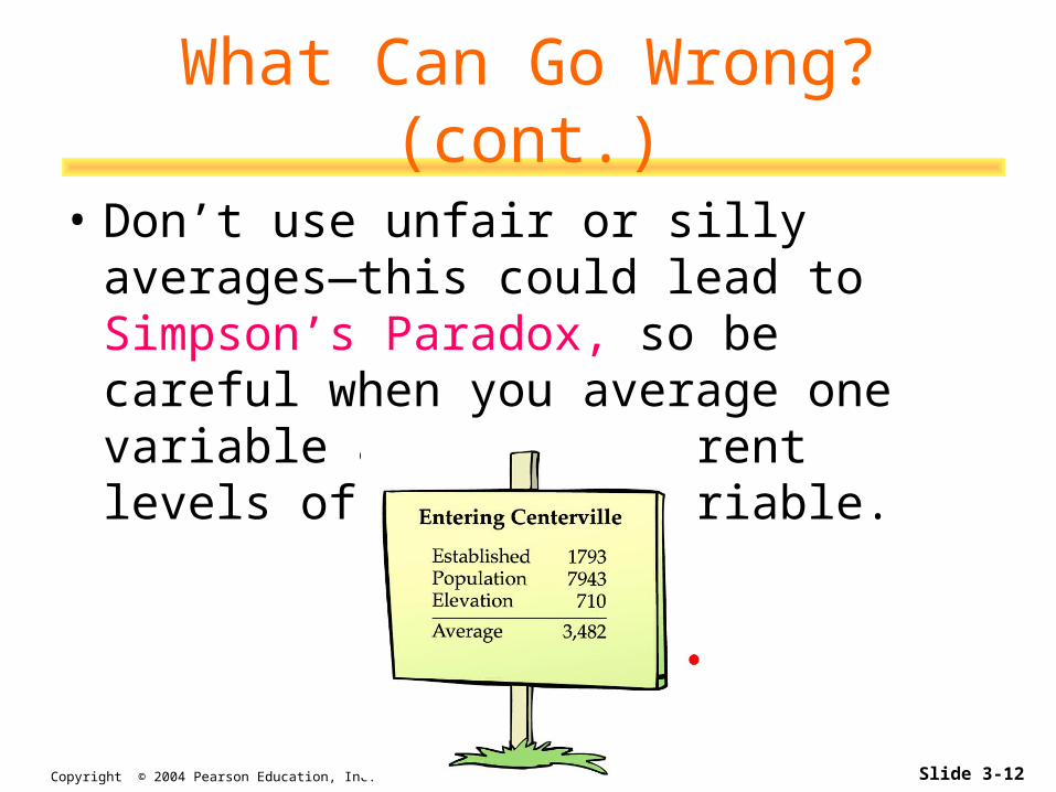
What Can Go Wrong? (cont.)
• Don’t use unfair or silly averages—this could lead to Simpson’s Paradox, so be careful when you average one variable across different levels of a second variable.

Slide 3-13 Copyright © 2004 Pearson Education, Inc.
Key Concepts
• Categorical variables can be summarized in frequency or relative frequency tables.
• Categorical variables can be displayed with bar charts and/or pie charts—just make sure to follow the area principle.
• A contingency table summarizes two variables at a time. – From a contingency table we can find the marginal
distribution for each variable or the conditional distribution for one variable conditional on the other variable.

Slide 3-14 Copyright © 2004 Pearson Education, Inc.
Key Concepts (cont.)
• Two categorical variables are said to be independent if the conditional distribution of one variable is the same for each category of the other.
• Beware of Simpson’s paradox—when averages are taken across different groups, they can appear to be contradictory.