the role of local design factors for newspaper reading ... · a small number of explorative and...
TRANSCRIPT

Kenneth Holmqvist and Constanze Wartenberg, Lund University Cognitive Studies, 127, 2005
Lund University Cognitive Studies- LUCS 127 ISSN 1101-8453 © 2005 by authors
1
The role of local design factors for newspaper reading behaviour – an eye-tracking perspective
Kenneth Holmqvist and Constanze Wartenberg
Lund University Cognitive Science
Kunsghuset, Lundagård
S-222 22 Lund
Sweden
INTRODUCTION Newspaper design is a creative art, and the possibilities to vary design are endless. Basically, newspaper designers judge the value of a designed spread by looking at it themselves and imagining how readers could perceive it or sense what it feels like. Actual feedback on readers perception of the design is very scarce. The only method widely in use is target group interviews. Interviews can cover large samples from a reader population, but readers have only a very limited self-knowledge and memory of their own reading (Helander, Landauer and Prabhu 1997). Also, very few general interview questions are asked. It is unlikely that these can reflect all potentially interesting details and processes that occur during the half hour that Scandinavian readers on average spend with their newspaper.
Eye-tracking during newspaper reading gives us precise information 50 times per second on where readers are looking. Thus, eye-tracking methodology provides precise insight into how the individual reader perceives newspaper spreads.
This article describes a study of local design factors such as colour, drop quotes, fact boxes etc. in 34 spreads from 17 Nordic newspapers. The study was initiated by the board of the Society for Newspaper
Design/Scandinavia (SND/S) in the context of preparations for the SND/S 2003 conference. In particular, this study looks at the effect of each factor on scanning order and on dwell time. We try to answer questions like: Do fact boxes attract reader attention? Does colour lead to longer visual dwell times?
Wartenberg and Holmqvist (2004), using the same data, present results on how well designers predict the effect of the different design factors. For instance: Do designers assume that fact boxes attract attention?
This article does not present any results concerning the role of content or of global design factors such as overall composition or the degree of white space on a spread.
LOCAL DESIGN FACTORS There are a number of local design factors that the designer could use as tools to emphasise objects – a story or an ad – on a spread. Whether these tools work the way it is assumed is the main question in this study. There have been many hypotheses on newspaper design factors:
• Positioning an object at the top of a spread, for instance, could lead to readers seeing it earlier.

Kenneth Holmqvist and Constanze Wartenberg, Lund University Cognitive Studies, 127, 2005
Lund University Cognitive Studies- LUCS 127 ISSN 1101-8453 © 2005 by authors
2
• Giving the object a bigger size should make readers see it earlier. (Lundqvist and Holmqvist 2001).
• Colour in a photo may attract the reader’s eyes (possibly Garcia and Stark 1991, see also Hansen 1994 and Josephson 1996).
• The drop quotes are introduced into texts for the very reason to attract attention during scanning.
• Fact boxes may be used for another purpose, but could have the same effect as drop quotes.
• Pictures are known from Garcia and Stark as well as from Hansen to attract the earliest fixations on a spread.
• The axiality of an object has been thought to matter for reading depth – a long vertical text could scare readers off.
Some of these hypotheses are very wide-spread assumptions in the design world. Most of them have never been tested before. Colour, pictures, position and size have been addressed in various studies. In the current study, we will present results concerning all of the above-mentioned local design factors.
Global design factors, such as the choice of typeface, the amount of white space in the spreads, or the typical “look” of a particular newspaper have not been included as factors in this study.
PREVIOUS RESEARCH A small number of explorative and experimental eye tracking studies of newspaper reading have been conducted beginning in the late 1980s. Küpper (1989) tested 60 readers of Badisches Tagblatt, asking basic questions such as whether pictures are looked at more than text, whether there are favorable positions on a spread and whether short texts are preferred to long ones. Several questions that later were studied in more detail were assessed for the first time in this study; in particular reading order on pages, and the influence of position, pictures and headlines. Unfortunately, data treatment and statistics are rather poorly described, making it difficult to interpret some of the results.
Widman and Polansky (1990) tested 129 readers of the Stockholm newspaper Dagens Nyheter for advertisement reading. The unpublished internal
report shows that 39 % of all ads are seen, and the bigger the ad, the more likely that it is seen, and remembered. This report also investigates the importance of different positions and contents of newspaper ads, noting that a position slightly to the left of the middle is optimal for the smaller ads. Photographs, pictures and colour in ads are reported to increase fixation frequency on the ad. Widman and Polansky also note that readers very quickly forget that they have actually looked at particular ads.
Lundqvist and Holmqvist (2001) tested 14 readers of Dagens Nyheter in a follow-up study to Widman and Polansky, but focussing entirely on the size effect on attention, attitude, and memory of ads. Results show that these variables strongly correlate: A bigger ad size makes the reader see, like and remember the ad better. Dwell time on an ad is thus a strong predictor of how well it is remembered. An unpublished follow-up study (by the same authors) on Svenska Dagbladet and Metro indicates that tabloid and broadsheet formats do not differ in how ads are perceived.
Garcia and Stark (1991) tested 90 readers of three newspapers at three different sites in the US. The editions (prototypes A and B) given to the readers were manipulated with respect to colour – a major motivation behind this study was to see whether colour in itself attracts reader attention. Participants could read as long as they wished and their eye movements were tracked during the reading session. A videotape with newspaper pages and the tracks of the eye movements across the pages was used to find out whether elements on the page were processed, read or “read in depth”. The material was considered ‘read’ if the reader’s eyes moved across one or more lines of print from left to right. When at least one half of any text was read, it was considered ‘read in depth’. ‘Processing’ in Garcia and Stark’s termininology means just looking at an item, probably but not necessarily acquiring information.
A major finding in Garcia and Stark’s study was that readers not really read but rather scan newspapers. At certain so-called entry points they stop scanning and start reading the story that the entry point belongs to. Garcia and Stark’s discussion ends by defining newspaper design as the task “to give readers material that is worthy of their scan, that makes them stop scanning and start reading” (ibid. 1991:67). Pictures and graphics were identified as the main entry points, followed by front-page promotion boxes. Readers usually enter the page through the dominant photo and then move to a prominent

Kenneth Holmqvist and Constanze Wartenberg, Lund University Cognitive Studies, 127, 2005
Lund University Cognitive Studies- LUCS 127 ISSN 1101-8453 © 2005 by authors
3
headline or another dominant photo.
The entry point concept in Garcia & Stark is a central one. Entry points are entities on a spread that draw initial attention: Pictures, headline, quotes, fact boxes could be entry points. But virtually all elements, anywhere, even editorial text, can serve as entry points into reading. This, the authors argue, is strong evidence against the classical inverted information pyramid. The inverted information pyramid tells us that important information should be given most space, and placed at the top, while gradually less important information should be given less space further down. Instead they argue in favour of a creative design dividing stories into substories and fact boxes with a marked graphical support.
According to Garcia and Stark, headlines, cutlines and briefs are processed – i.e. looked at – often and in depth. However, only 25% of the text itself are processed. On average, text processing is highest in the news section, lowest in the sports sections. Readers devote more time to photo groupings when they are in colour. Size increases the attraction to a photo. Unfortunately, in their book, Garcia and Stark do not present their underlying statistical analysis, which makes it difficult for the reader to interpret Garcia and Stark’s results scientifically.
Hansen (1994) studied 12 readers of the Copenhagen newspaper Det Fri Aktuelt. Hansen’s unpublished study investigates the order in which objects on spreads were scanned. He found that pictures are seen first, then icons and graphics followed by headlines of different sizes and text, with form items being observed last. Hansen’s hierarchical order can be seen as a more precise version of Garcia and Stark’s entry points.
Hansen also investigated readers’ priorities with respect to the length of articles, their placement and genre (news, features, debate, sport etc.). He measured how many centimetres of text article were read by subjects and calculated a depth index (the amount of text that has actually been read, in % of the whole text length) and a total response index
(averagedepth index for a number of readers). His results show that only short articles are fully read. The longer the article, the smaller the proportion of it will be read. In this respect, Hansen’s results resemble the result in Garcia and Stark (1991) that a mere 25 % of all articles are seen, and only 12 % are read dee per than half of its length. Hansen’s subjects were most engaged in reading at the pages 2-6 and after that, their interest in reading decreased with the exception of the last page of the newspaper. Stories on the left-hand side of the spread were seen significantly earlier than stories on the right hand side. News, features and debates had approximately the same total response index whereas sport articles got significantly lower total response indices. Hansen stresses the importance of designing the newspaper layout so that it helps the reader to prioritise among all the information on the spread.
Hansen’s study did not confirm the Garcia & Stark finding that colour objects attract attention more than do greyscale objects.
Josephsson (1996) studied the colour vs. greyscale effect for photos in 4 manipulated newspaper pages, which 32 subjects were allowed to look at for 10 seconds per page. Her findings indicate that the position of the photo on the page is more important than the colour/greyscale factor. Her subjects looked at the top of pages earlier than at the bottom, and the earliest position was the upper left, regardless of colour.
Holmqvist, Holsanova, Barthelsson and Lundqvist (2003) developed a reading filter to study how much reading takes place in newspapers and net papers. When reading on a spread, readers exhibit one of two very distinct behaviours: They either scan or read. Reading is a well-defined movement of the eye from left to right, with approximately one stop at each word and small jumps called saccades between them. It is assumed that readers process the text when they do this.

Kenneth Holmqvist and Constanze Wartenberg, Lund University Cognitive Studies, 127, 2005
Lund University Cognitive Studies- LUCS 127 ISSN 1101-8453 © 2005 by authors
4
Figure 1: Reading across text.
Scanning is accompanied by quite different eye-movements: Saccades are much longer and can go in practically any direction. The eye often hits pictures, headlines and drop quotes during scanning. Only a few words can be processed at each stop. The purpose of scanning appears to be to find interesting entry points; points where deeper reading can continue.
Results show that newspaper readers read 55 % of the time and scan 45 %. Net paper readers read only 44 % of the time, scanning 56 %. All differences were significant. Holmqvist et. al (2003) argue that this indicates that newspapers are a more efficient medium for readers: In newspapers, they can read more and have to scan (search) less than in net papers. The explanation to this difference is in the large design differences between net and paper: The many small items on the net pages, as well as the cumbersome page turing, force readers to do more scanning
TECHNOLOGY In the first eye tracking studies of newspaper reading, eye movement data were recorded as videos. A video recording of a reader going through a newspaper is very illustrative. It is possible to follow the reader’s eye movements online and to see on a very detailed level which elements on the pages interested that particular reader. If however, we want to come to general conclusions on reading behaviour, the video must be analysed frame by frame according a defined number of parameters that can be summarised over a sample of different readers. This is very time consuming. Garcia and Stark (1991) judge the work behind their somewhat larger study to equal a Ph.D. thesis, or four years of full time work.
Absolute data coordinates reflect an exact point of gaze on a specified plane. For newspaper reading, this technology was first used in recordings of eye-movements when reading tabloid newspapers
(Holmqvist et. al 2003). The reason for the limitation to tabloid format was that recordings had to be made by so-called remote equipment, which require a stable spatial configuration of both reader and newspaper as well as the eye. The degree to which the eye-tracker could follow the reader’s head and eye-movements was limited, and such an eye tracker can therefore not cover a broader field of vision than that of a tabloid spread. This technology could not be expanded to studies of broad-sheet.
The solution used in the current study combines eye-tracking with headtracking and a virtual reality model of the table and newspaper. Readers wear a helmet equipped with head-tracking and eye-tracking devices which measures both the position and the direction of the head as well as the direction of the eye in the head. The combined head-eye vector hits the newspaper plane at a certain position, the absolute coordinates of this point of gaze on the plane are recorded.
Figure 2: Scanning across a newspaper. by the eye tracking software.

Kenneth Holmqvist and Constanze Wartenberg, Lund University Cognitive Studies, 127, 2005
Lund University Cognitive Studies- LUCS 127 ISSN 1101-8453 © 2005 by authors
5
There is therefore no need to watch the video in slow motion and encode specific parameters frame by frame. Instead, the computer does the decoding based on the absolute data coordinates representing the point of gaze and knowing which spread corresponded to the specified plane when data were recorded.
Not only does this allow us to record for simplified analysis on both tabloid and broadsheet. Some other clear advantages of this new technology are the higher spatial precision, the better temporal resolution and the possibility to compensate for calibration off-sets.
This study is to our knowledge the first eye-tracking study of newspaper reading that utilises eye- and headtracking technology. The time cost for preparations, data recording and analysis was approximately four man-months, to be compared to the estimated four man-years in Garcia and Stark (1991).
PURPOSE The purpose of the present study was to examine the effect of local design factors on readers’ visual behaviour.
DATA COLLECTION Stimulus material: Chief designers from 17 Nordic newspapers each sent us two spreads from the current issue (Danish & Swedish) or a very recent issue (Norwegian & Finnish). Virtually all spreads were chosen from the sections of the papers that have much editorial material. Very few spreads had larger ads.
The designers divided each spread into at most 16 areas of interest, and predicted 1) in what order these areas were observed, 2) for how long each area was observed, and 3) how deep each area was read. Areas of interest were usually texts with accompanying headline and picture. Sometimes an area could be an ad. Sometimes picture and accompanying text were divided into separate areas.
Subjects: A total of 26 readers participated, i.e. 6 or 7 readers for each of the four languages.
Equipment: For eye movement recordings, we used the SMI iView X Headset with Polhemus headtracking. The headtracker knows where the head is, while the eyetracker knows to where the eye is directed. Together, they allowed for freedom of movement – necessary when reading broadsheet newspapers – while at the same time giving us absolute data coordinates in the coordinate system of the newspaper – much simplifying data analysis.
Figure 3: Participant fitted with head-mounted eye-tracking equipment, reading the newspaper
Procedure: Newspapers were laid out on a slightly inclined table in front of the reader. The reader was asked to put on the headset, essentially a bicycle helmet with cameras and a mirror (see figure 3). After a short calibration, they were asked to read the spreads as they would normally read a newspaper. Readers turned pages themselves, and were allowed to go through pages backwards if they wanted to. They read for as long as they wanted.
Kenneth Holmqvist and Constanze Wartenberg, Lund University Cognitive Studies, 127, 2005
Lund University Cognitive Studies- LUCS 127 ISSN 1101-8453 © 2005 by authors
6
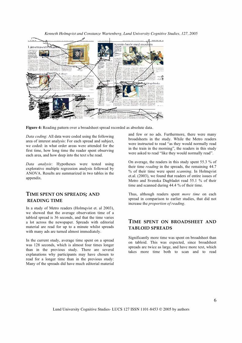
Figure 4: Reading pattern over a broadsheet spread recorded as absolute data.
Data coding: All data were coded using the following area of interest analysis: For each spread and subject, we coded: in what order areas were attended for the first time, how long time the reader spent observing each area, and how deep into the text s/he read.
Data analysis: Hypotheses were tested using explorative multiple regression analysis followed by ANOVA. Results are summarized in two tables in the appendix.
TIME SPENT ON SPREADS; AND READING TIME In a study of Metro readers (Holmqvist et. al 2003), we showed that the average observation time of a tabloid spread is 36 seconds, and that the time varies a lot across the newspaper. Spreads with editorial material are read for up to a minute whilst spreads with many ads are turned almost immediately.
In the current study, average time spent on a spread was 128 seconds, which is almost four times longer than in the previous study. There are several explanations why participants may have chosen to read for a longer time than in the previous study: Many of the spreads did have much editorial material
and few or no ads. Furthermore, there were many broadsheets in the study. While the Metro readers were instructed to read “as they would normally read in the train in the morning”, the readers in this study were asked to read “like they would normally read”.
On average, the readers in this study spent 55.3 % of their time reading in the spreads, the remaining 44.7 % of their time were spent scanning. In Holmqvist et.al. (2003), we found that readers of entire issues of Metro and Svenska Dagbladet read 55.1 % of their time and scanned during 44.4 % of their time.
Thus, although readers spent more time on each spread in comparison to earlier studies, that did not increase the proportion of reading.
TIME SPENT ON BROADSHEET AND TABLOID SPREADS Significantly more time was spent on broadsheet than on tabloid. This was expected, since broadsheet spreads are twice as large, and have more text, which takes more time both to scan and to read

Kenneth Holmqvist and Constanze Wartenberg, Lund University Cognitive Studies, 127, 2005
Lund University Cognitive Studies- LUCS 127 ISSN 1101-8453 © 2005 by authors
7
Table 1: Average observation times for broadsheet and tabloid spreads
Absolute spread time Time per cm2
Broadsheet 145 s 0.034 s
Tabloid 102 s 0.050 s
In table 1, we see that broadsheet spreads attract approximately 45 % more time in total - this difference is significant. But when we calculate the time readers spend per square centimeter, we have another result: tabloids get 47 % more attention. In other words, broadsheet spreads receive more attention in virtue of their size, but tabloid spreads get more attention per unit of paper surface. Tabloids in this sense make more efficient use of paper than broadsheet.
SKIPPING AND SEEING Garcia and Stark 1991 report that about 25 % of all texts in a newspaper were seen. 75 % were skipped. Hansen 1994 confirmed this result.
In the present study, 85 % of all texts were seen. A mere 15 % were skipped. 66 % of the ads were seen, 37 % skipped. The same reasons we suggest for a higher spread time (above) would also explain the higher text observation values: Spreads with more interesting editorial texts, and readers who were not limited in time, but could “do their best”.
SKIPPING AND SEEING IN BROADSHEET AND TABLOID More objects are skipped in broadsheet than in tabloid, but the difference is not significant.
POSITION: ORDER A particular reading pattern has been observed over several video-based studies. When opening a spread, readers typically make the first fixation on the right page - often a dominating headline or photograph.
They do not stay there for long, however, but quickly move over to the left page and often start reading in an area just to the left of the middle.
Figure 5: A very common way to start observing a spread.
The first look at the right-page is a consequence of page-turning. When turning pages, the reader monitors the hand holding and turning the page. As the turned page moves to the left, the next right page appears first to the eyes. When the turned page descends on the left, the eyes move over to that side. The page-turning process is a little longer than a second, and the first looks at the right page often take even less time.
The reader then continues over the entire spread. When regarding the opened spread, the average reading direction is from the upper left corner to the lower right corner. Or more precisely: Objects in the upper left are seen earlier than objects in the lower right. In fact, data from our study reach significance in both horizontal and vertical directions independently.

Kenneth Holmqvist and Constanze Wartenberg, Lund University Cognitive Studies, 127, 2005
Lund University Cognitive Studies- LUCS 127 ISSN 1101-8453 © 2005 by authors
8
a
further to the right = later
Figure 6: Significant reading order: From upper left to lower right.
It is important to understand that this result does not mean that all readers start at the upper left and read downwards and to the right. In fact, readers do often switch quickly between texts and pictures on both pages of the spread. In average, however, they see objects on the left page before objects on the right page.
Hansen (1994) found that the left page is observed before the right page, which is in line with our results, when disregarding the first look at the right page. Küpper (1989) claims that backward readers switch the reading order, reading the right page before the left one. Josephsson (1996) reports that her subjects looked at the top left position of pages first.
POSITION: ACCUMULATED DWELL TIME When readers turn a page, the total viewing time on each part of the image is sometimes called
accumulated dwell time. Observe that accumulated dwell time thus includes both reading and scanning across the spread. Accumulated dwell time varies between different positions across a spread. A map showing such a distribution is sometimes called an attentional map. The first attentional maps - see figure 7 - comprising results of several readers and all the spreads of two newspapers were presented in Holmqvist (2002). Data indicate that most attention is allocated just to the left of the middle of the spread. Less is given to the right, and the least to the bottom right corner.
Figure 8 above shows average reading times over all spreads in percent in the present study. Each spread has been divided into sixteen areas, and the accumulated dwell time for each area has been summed up. We see a similar preference for the left page in the spreads as was observed in the earlier studies. The “hot spot” has moved somewhat to the left, probably because there were almost no ads in the leftmost column of the spreads in the present study.
Figure 7: Attentional map over spread from Holmqvist (2002). Data from Metro and Svenska Dagbladet. Figure 8: Percent of time spent in 16 different areas in the present study (12 % saccades excluded).

Kenneth Holmqvist and Constanze Wartenberg, Lund University Cognitive Studies, 127, 2005
Lund University Cognitive Studies- LUCS 127 ISSN 1101-8453 © 2005 by authors
9
A similar pattern is found in Widman and Polansky (1990) for ads: Ads get most looked at when placed in a position just to the left of the middle.
Why this particular pattern? It is possible that the pattern is just a reflection of average arrangement of articles: The main news is often placed in the area where we record most fixations. Ads often appear on the right page, where we record fewer fixations.
An alternative explanation would be that readers look more towards the left-hand side irrespective of how the spread is designed. Evidence for the design-independent interpretation is provided by a study of yellow page ad reading by Hansen 1998. Yellow pages are phone books designed in columns, just lining up ad after ad in alphabetic order (within category). When asked to look for a provider of a particular service, Hansen's subjects exhibited a reading pattern very similar to what we see in newspaper reading. Most attention was allocated to the position just to the left of the middle; very little or nothing to the rightmost side.
In the current data, we classified all objects according to type; whether they were texts, ads or text-related pictures etc. If we exclude all ads from the data, counting as if there were no ads in the newspaper, the leftward dominance disappears. This means that texts appear to be read independently of position. It also means that ads are probably more often placed on the right page and therefore dwell time decreases there.
It remains to explain why Hansen’s yellow page readers also exhibited a leftward preference. It is possible that Hansen's readers were so used to reading newspapers that they brought with them the knowledge that interesting material is usually found just to the left of the middle. Experience from daily reading of newspapers with a specific arrangement of articles and ads could create such an expectation.
THE SIZE PROPERTY Our data show that larger newspaper objects are seen significantly earlier than smaller objects. Also, larger
objects are looked at significantly longer than smaller objects.
Neither result is surprising. In part it replicates Lundqvist and Holmqvist's (2001) finding that larger ads are more likely to be seen and looked at for a longer time. Larger object – ads, pictures and texts – may be more attractive because of their size. But merely by virtue of their size, the probability of the eye looking there is higher.
What we must remember, however, is the difference between reading for a long time and reading in depth. Although large texts are read for a longer time (e.g. 40 seconds rather than 15 seconds), smaller texts have a better chance of being read to the end (100 % rather than 25 %).
Hansen (1994) found the following rule of thumb for the relation between text length and reading depth: Triple the length of the text – e.g. to 60 cm rather than 20 cm – and you will have half as deep a reading – 10 % rather than 20 %. Now, since 20 % of 20 cm is 4 cm and 10 % of 60 cm is 6 cm, you would actually gain 2 cm of reading by making the text longer. However, the increase from 4 cm to 6 cm of read text costs you an increase from 16 cm to 54 cm of unread text.
In conclusion: Large texts are looker at for a longer time, but not necessarily read deeper. According to Hansens data, the trade-off in making texts long is not very favourable.
The data in this study were not analysed with respect to reading depth. We are still awaiting a more precise defintion of reading depth.
THE AXIALITY PROPERTY Texts may be presented in an area with larger extension in horizontal than in vertical direction – that is with horizontal axis (see Figure 9a), or with a vertical axis (see Figure 9b), or in a form that has no obvious axis at all (see Figure 9c).

Kenneth Holmqvist and Constanze Wartenberg, Lund University Cognitive Studies, 127, 2005
Lund University Cognitive Studies- LUCS 127 ISSN 1101-8453 © 2005 by authors
10
Figure 9 a,b,c: Articles with no particular axis (a), with a vertical (b) or a horizontal (c) direction or axis.
The question has been raised whether long vertical texts like that in figure 9b may appear frighteningly time-consuming to a reader who quickly browses over the spread. Readers would then avoid them, judging the time required for reading such a text to be too long.
Data indicate that objects with an axis are seen significantly earlier than objects with no axis. Also, objects with an axis are observed for a longer time than objects without an axis. There is no difference between horizontally and vertically directed texts. This result indicates quite clearly that readers have no problem with texts arranged with a clear axis. Quite on the contrary, texts that conform to a near square are looked at both later and less.
THE COLOUR PROPERTY Garcia and Stark’s (1991) eye-tracking study on the effect of colour - as opposed to greyscale - for newspaper reading came in a time when many newspapers had to decide whether to invest in an expensive colour press. If colour attracts the reader's eye, then of course there is a good reason to make that investment. Colour is reported to interact with picture content and other design factors in a way that makes it difficult to say what exactly produced the behaviour. However, Garcia and Stark report that the use of colour in the spread affects the order in which different elements are regarded: when the ad is in colour it attracts the second fixation, but when it is printed in grey, the second fixation goes to the lobster text.

Kenneth Holmqvist and Constanze Wartenberg, Lund University Cognitive Studies, 127, 2005
Lund University Cognitive Studies- LUCS 127 ISSN 1101-8453 © 2005 by authors
11
Figure 10: An example from the study of Garcia & Stark (1991) – the figure indicates how they argue that the use of colour affects the order in which elements are regarded. The two prototypes A and B differ only in that prototype A presents the large ad in colour whilst prototype B presents the same ad in greyscale. Eye-movements of readers presented with prototype A are said to move from the left middle (marked 1) to the coloured ad (marked 2). In prototype B on the other hand, eye-movements of readers start in the same place (marked 1) and move down to the text on the right page (marked 2).
As shown in Wartenberg & Holmqvist (2004), newspaper designers behave as if they believed quite strongly in the effect of colour for attracting fixations.
Hansen (1994) in his study of Det fri Aktuelt readers did not confirm any significant effect of colour on fixation order, possibly because there were too few colour pictures in the issue he used.
The present study also included colour as a possible local layout factor. We could not find a significant effect of colour on the order in which elements are observed.
The effect of colour on visual attention is a difficult one to prove. A recent study by Tatler, Baddeley and Gilchrist (2003) “What determines where we move our eyes in the natural world?” found that “Colour and luminance were less important [than contrast and edge content] for selecting where to fixate”.
Josephson (1996) tested colour photos in newspaper pages against black and white photos. She got one significant effect: If a colour picture is placed at the bottom of an otherwise black-and-white spread, the eye gets down to that picture sooner than for a grey-scale photo. She concludes that “Overall, color does
not seem to draw more attention to photographs unless the sole color picture on a page is in a subordinate position.”
For the particular context of newspaper reading, it is also possible that the extensive use of colour in ads has taught the reader that “where there is colour, there is an ad”. This may make them look less to where there is a lot of colour.
Also, when Garcia and Stark made their study in the early 90s, colour was a new experience to readers. Perhaps colour was then a factor attracting reader gaze – their book does not give a conclusive answer. Garcia and Stark’s readers were interviewed about colour after the test; and readers said that they liked colour, that they thought they read more on pages with colour, and that there was more information on pages with colour. This reader belief in colour, Stark says, was an illusion: Their data shows that readers did not read more on pages with colour. Colour only created the impression of more, better and more readable (Stark 2004).
However, over the past decade, as colour has been more and more commonly used, in particular in ads, readers may have learnt to look away from it.

Kenneth Holmqvist and Constanze Wartenberg, Lund University Cognitive Studies, 127, 2005
Lund University Cognitive Studies- LUCS 127 ISSN 1101-8453 © 2005 by authors
12
Figure 11: An ad with an extensive use of colour. Such rich use of colour in ads may in fact serve as a cue NOT to look in that direction. This ad was not looked at more than other ads.
Although evidence seems to indicate that colour does not attract the eyes of newspaper readers in the initial scanning process, colour may be pleasing to read, as Garcia and Stark found in their post-test interview.
The reading time results in our SND/S study show that texts with colour in the picture or in the text itself are read significantly longer than other texts. Josephsson (1996) reports an insignificant tendency that coloured pictures are looked at longer than greyscale pictures.
In conclusion, these results indicate that colour should perhaps be used not to attract attention but to keep it. 14 DROP QUOTES Drop quotes are short pieces of a text that are inserted inbetween columns and given a bold format. Drop quotes are assumed to guide the scanning process towards the text, serving as entry points into deeper reading. The choice of text in the drop quote is decisive. Drop quotes are often central quotes from the text, bringing out the essence of the issue, or standing in a clear relationship to the headline.

Kenneth Holmqvist and Constanze Wartenberg, Lund University Cognitive Studies, 127, 2005
Lund University Cognitive Studies- LUCS 127 ISSN 1101-8453 © 2005 by authors
13
Figure 12: Two drop quotes.
Results from the current data show that texts with drop quotes are in fact seen significantly earlier than texts without drop quotes. It seems that drop quotes do exactly what they are meant to do: Attract reader attention.
Drop quotes are read during the scanning process. Typically, readers see the drop quote and the headline. Therefore, it makes good sense to “tell the story” in the these two parts of the design, for instance by contrasting or examplifying the headline in the drop quote.
However, drop quotes not only attract attention. The data from the current study show that texts with drop quotes are also read for a significantly longer time. This means drop quotes are efficient tools: They both attract and keep attention.
When readers read through the text next to drop quotes, no disturbance in the reading pattern could been seen in our data. However, during the scanning process, it appears that some readers enter into the article through the drop quote, and then look into the text for the place where the drop quote is taken. This is probably disturbing to readers, and could most likely be resolved by establishing a good quote-text relation.
FACT BOXES Fact boxes are short background texts that complement a longer text on a specific topic. Fact boxes are rarely coherent text, but rather presented like a table or as an enumeration with bullets.

Kenneth Holmqvist and Constanze Wartenberg, Lund University Cognitive Studies, 127, 2005
Lund University Cognitive Studies- LUCS 127 ISSN 1101-8453 © 2005 by authors
14
Figure 13: Example of a fact box.
Fact boxes are not designed for reader guidance. They exist as a place to put information that is cumbersome to place in running text. Extracted into for instance a list of bulleted items, or as in figure 13 a list of demographic data, this information instead is compact and easy to format.
Not surprisingly, readers appriciate fact boxes. The data in our study show that texts that include a fact box are seen significantly earlier than texts without a fact box. Also, texts with fact boxes are attended for a
significantly longer time than texts without fact boxes.
PICTURES AND GRAPHICS Pictures are obvious attractors to the eye. Garcia and Stark (1991) as well as Hansen (1994) both conclude that pictures are generally the first objects looked at on a spread.
Figure 14: An example a large picture.

Kenneth Holmqvist and Constanze Wartenberg, Lund University Cognitive Studies, 127, 2005
Lund University Cognitive Studies- LUCS 127 ISSN 1101-8453 © 2005 by authors
15
Figure 15: Example of information graphics.
According to the current data, pictures attracted significantly earlier attention than picture-less areas. The domination of pictures in the competition of early fixations is perhaps the most stable result in all eye-tracking studies of newspaper reading.
Our data also shows that large pictures are looked at significantly earlier than medium and small pictures. The same importance of size has been shown for ads in Widman and Polansky (1990) and Lundqvist and Holmqvist (2001). Surprisingly, the type of picture also matters. In the current data, we divided pictures into information graphics, maps, drawings and photos. All but information graphics contributed significantly to early fixations.
Why does not information graphics draw early fixations? Our data does not tell us why; but obviously readers do not judge that information graphics helps them in deciding whether to read a text or not. Pictures - often in combination - with headlines offer a good insight into the contents of the text, but information graphics does not?
The puzzle becomes even more intriguing when we look at the effect of different types of pictures on the duration of observation. In our data, texts that are illustrated by pictures are regarded for a significantly longer time than other texts. Texts that have information graphics, however, are attended even significantly longer than texts with other types of pictures. Information graphics increase reading time more than any other type of picture.
The special status of information graphics is intriguing: They are seen later, but increase the observation time more than any of the other three types of images. Obviously, information graphics is an interesting topic to study further: Does it compete with the text it is supposed to complement, for instance? It is still not clear whether the text or the graphics, or both together, are responsible for the increase in reading time. And how is information graphics read; do readers follow the intended reading path through the graphics?
RELATIVE STRENGTH OF THE DIFFERENT TYPES OF DESIGN FACTORS The explorative multiple regression analysis summarized in the appendix was performed to see which design factors had most influence on the reading behaviour we described above.
To attract early reading, the most important local design factors are:
1) Large size *** 2) Position (upper left) *** 3) Drop quotes or fact box ** 4) Large picture * 5) Clear axiality *
Colour does not seem to have an effect!

Kenneth Holmqvist and Constanze Wartenberg, Lund University Cognitive Studies, 127, 2005
Lund University Cognitive Studies- LUCS 127 ISSN 1101-8453 © 2005 by authors
16
For dwell time, the most important local design factors are:
1) Large size *** 2) Large picture or even better: Information graphics. ***
3) Drop quotes or fact box. * 4) Colour. *
Position does not seem to have an effect!
What if designers would apply all of the significant design factors at once in one and the same spread? Would they still work? We do not know, but it is likely that we will have a saturation of effects: There will be so much that pulls on the eye of the reader, that s/he will have harder to decide where to look.
Factors such as drop quotes are used to prioritise for the readers. If designers would start to place prioritisation signals everywhere, the readers would not know where to begin. Designers should first decide on a priority of the elements in the spread, and then use the factors that are known to have an effect.
GENERAL DISCUSSION AND FUTURE RESEARCH The present study is not a completely controlled experiment but a case study. Results presented above should be interpreted with care, and generalisations to other contexts and material may have to be made with caution. A case study by its very nature runs the risk that factors not controlled for - such as content -
may cause effects that mistakenly are attributed to other factors that are being studied (e.g. layout qualities).
An experimental study should have varied all the local design factors systematically, while holding other factors such content and global layout fixed. An experiment would require that the study uses two versions of the same newspaper spread – where the two versions differ in one aspect only – the factor under investigation. For instance, colour in one version, grayscale in the other, as in some of the material used by Garcia and Stark (1991), see figure 10 above.
Virtually all eye-tracking studies of newspaper reading have been case-studies made on actual issues. With the partial exceptions of Garcia and Stark, no-one appears to have carried out controlled, yet ecologically valid, experiments that deal with the influence of local layout factors on eye movements during newspaper reading. Josephson 1996 presents an experimental study of the photo colour effect in newspapers, but her study has a lower degree of ecological validity: It differs too much from actual newspaper reading.
In an experimental study on the position effect, for instance, half of the readers would read a newspaper with a particular text on the optimal reading position on the left page. The other half would read exactly the same newspaper except that the text is now on the poor position on the right page. If we then see a significant difference in reading depth between for the same text in two different positions, then we can draw the conclusion that position is responsible for the difference.

Kenneth Holmqvist and Constanze Wartenberg, Lund University Cognitive Studies, 127, 2005
Lund University Cognitive Studies- LUCS 127 ISSN 1101-8453 © 2005 by authors
17
Figure 16: The “same” spread in two different version of a manipulated issue of Norrköpings Tidningar. Two texts switch position between the versions. Will the two articles be read differently depending on position?
Kenneth Holmqvist and Constanze Wartenberg, Lund University Cognitive Studies, 127, 2005
Lund University Cognitive Studies- LUCS 127 ISSN 1101-8453 © 2005 by authors
18
All significant design factors reported above are excellent candidates for further experimental research. In an upcoming study from the Lund Eye-Tracking laboratory, two local layout factors are studied experimentally:
• Position on spread
• Use of information graphics
Eye-tracking data were recorded on manipulated newspapers that look like they were today’s issue, but which systematically vary the position of texts, as in figure 16. Two articles switched position between the two versions, while everything else remained the same. Other spreads vary the presence of information graphics to otherwise identical texts. Such experimental manipulation allows for natural – ecologically valid – reading.
Not only the factors we have tested are good candidates for experimental research. Virtually all design factors could be studied experimentally :
- Positions can be varied between newspaper versions - Colour vs. greyscale (cf Josephson 1996). - Texts with drop quotes vs. without drop quotes - Bold vs. non-bold text style - Picture vs. no picture together with a text - Picture vs. information graphics to a text - Poor vs. good picture-headline fit - A minimalistic design with a lot of white space vs. a heavy/ messy design with lots of colour, bold and pictures. - Morning paper vs evening paper design, presenting the same content and pictures - Tickers can be varied in several ways between versions - Tabloid vs. broadsheet format of the same design, content and pictures etc.
In view of the scientfic advantages of experimental studies, what about the significant results reported above for this case study? Do we have to wait for experimental confirmation before we go ahead and use the results? Or can we - based on the current case study - trust for instance drop quotes to both attract early attention and increase dwell time on texts?
Although the present case study – due to the methodological problems presented above – does not allow for scientifically firm conclusions, one can
regard the results as hints to the relevance of certain layout factors. Results ought to be interpreted in relation to previous studies – in case they are in accordance to these, this indicates an increased confirmation of previously established experiences. In case they disagree with expectations or previous knowledge – one ought to be rather cautious and search for additional evidence in previous or future studies.
Is the reading situation natural? 73 % of the readers in this study reported that they read as they would normally have done. 61 % reported that they were not disturbed in any way by the eye-tracking equipment. Still, our impression is that readers have spent longer time with the paper than usual – at least more than they did in similar studies on newspaper reading. There are many possible explanations to this, for instance the comparatively large amount of text on the spreads selected for the study. As compared to “everyday newspaper reading” one might, furthermore, assume that study participants want to “do their best” once they are in a study. For future studies, we recommend setting up a time limit, such as 20 or 30 minutes, and placing a clock in the reader’s field of view. Instructions can be given that encourage the readers to behave as in the reading situation that is to be studied. For instance, “Imagine you sit in the railway station. Your train leaves in 20 minutes. You have an issue of today’s newspaper, and read it while waiting.”
Without an instruction with a time limit, eye tracking recordings will resemble Sunday morning reading, with lots of time and comfortable chair. Would we get similar reading patterns if we recorded during breakfast in a family with small children where there is a hurry to get to school and to work? We do not know yet. Such a study has not been made yet. Probably the same objects that get early fixations in our study would get early fixations in a study with time-pressure as well. But reading depth would not be near to what we observed in the present study. The degree of skipping would be much larger, and the skipped objects would probably be those that are seen late in this study; that is objects that have few of the significant local design factors, as for instance objects placed near the bottom-right corner.
Reading depth is in an important variable if all studies of text length. Unfortunately, the reading depth concept has not yet received a clear definition. One problem is how depth relates to density: A deep but not dense reading is exemplified in figure 17.

Kenneth Holmqvist and Constanze Wartenberg, Lund University Cognitive Studies, 127, 2005
Lund University Cognitive Studies- LUCS 127 ISSN 1101-8453 © 2005 by authors
19
Figure 17: Deep but not dense reading. Commonly observed.
Working out a clear definition of reading depth taking into account a set of observed behaviours should be a prioritised research task.
How do eye-tracking studies compare to other methods of research on newspapers? It is currently not known how the result of an eye tracking study of a newspaper would relate to results from an interview study, the dominating alternative. We know that we get a lot more data per reader in eye-tracking studies as compared to interview studies. Also, we know that the interview study may include large samples of readers, whilst an eye-tracking study due to practical reasons usually is limited to 20-30 readers per day and eye tracking system. We can reasonably assume that the interviews will not be able to reveal the detailed order in which elements on the spread are regarded or exactly how long different elements were attended. There is good reason to believe that readers forget large parts of what they have read from the time of reading to the time of the interview (compare the ad data in Lundqvist & Holmqvist 2001, and Widman & Polansky 1989). For these reasons, it would be worthwhile to carry out a study comprising both eye-tracking and interview methods in order to compare the observations that result from both methods.
Why has the content of articles been completely disregarded in this study? Content must play an
important role for reading depth, and there ought to be a considerable inter-individual variation in which articles are of interest and which contents are skipped. Unfortunately, content analysis was not in the scope of this study. However, asking readers about their individual interests in different topics and coding texts and ads in relation to these topics could be very revealing in combination with reading depth data. For ads, this has been done (see Lundqvist and Holmqvist, 2001).
Content analysis could perhaps explain why readers stop reading in the midst of texts. Albeck Johansen (1996) shows that readers surprisingly often have trouble understanding the words, constructions and referents in texts. She presents a set of words and other text factors that cause trouble for the average reader. Probably, words and constructions that are not understood or make the readers feel inadequate may cause them to stop reading. This could be just as an important explanation for shallow reading depth in a text as could be a bad position, lack of picture or disinterest in the content.
Individual differences in reading behaviour definitely exist. However, in order to identify and classify individual reading styles, very large studies with large samples of participants as well as extensive newspaper material are needed. In the long term, however, this should be a prioritised research task.

Kenneth Holmqvist and Constanze Wartenberg, Lund University Cognitive Studies, 127, 2005
Lund University Cognitive Studies- LUCS 127 ISSN 1101-8453 © 2005 by authors
20
APPENDIX: SUMMARY OF THE STATISTICAL ANALYS Results from the explorative multiple regression analysis:
Sequence Estimate Std. Error t-value P Factor Intercept .578 .078 7.41 .000 Vertical size -.286 .056 -5.08 .000* Horizontal size -.285 .077 -3.70 .000* Vertical position .135 .026 5.17 .000* Horizontal position .283 .027 10.35 .000* Drop quote/fact box
-.070 .022 -3.17 .001*
Number of columns .078 .079 .98 .327 Colour .005 .022 .23 .822 Picture -.074 .055 -1.29 .198 Type of picture -.058 .055 -1.06 .288 Size of picture -.063 .030 -2.07 .039* Multiple R-Squared adjusted
.20 N=1130 (data on ads excluded)
Thus, only ca 20% of variance are explained by the local layout factors – their relevance in relation to other sources of variation is limited and results ought to be interpreted with caution
Dwell Time Estimate Std. Error t-value P Factor Intercept .010 .036 .29 .771 Vertical size .129 .026 4.99 .000* Horizontal size .088 .036 2.48 .013* Vertical position .009 .012 .73 .467 Horizontal position -.021 .013 -1.62 .105 Drop quote/fact box
.025 .010 2.46 .014*
Number of columns .076 .037 2.07 .039* Colour -.040 .010 -3.94 .000* Picture .115 .026 4.35 .000* Type of picture -.091 .025 -3.62 .000* Size of picture .039 .014 2.79 .005* Multiple R-Squared adjusted
.172 N=1134 (data on ads excluded)
Thus, only ca 17% of variance are explained by the local layout factors – their relevance in relation to other sources of variation is limited and results ought to be interpreted with caution
ACKNOWLEDGEMENTS The Society for Newspaper Design/Scandinavia helped us organise and finance this study. Many
people helped, but Bjørn Sæbø was the man who made it possible in the end.
These results were first presented at the SND/S conference in Stavanger in May 2003. This text is an

Kenneth Holmqvist and Constanze Wartenberg, Lund University Cognitive Studies, 127, 2005
Lund University Cognitive Studies- LUCS 127 ISSN 1101-8453 © 2005 by authors
21
updated version of that presentation. A lot of people have helped us with comments on the text, in particular John Paulin Hansen, Pegie Stark, Mario Garcia, Bengt Engwall and Niels Heie.
The following 17 Nordic newspapers contributed to and collectively paid for this study: Berlingske Tidene, ExtraBladet, Politiken, Etelä-Soumen Sanomat, Helsingen Sanomat, Kaleva, Adresseavisen, Bergens Tidene, Dagens Næringsliv, Stavanger Aftenblad, VG, Vårt Land, Aftonbladet, Helsingborgs Dagblad, Svenska Dagbladet, Sydsvenska Dagbladet, and Ystads Allehanda.
Read more about our studies at
http://www.sol.lu.se/humlab/eyetracking
REFERENCES
Albeck, Ulla (1996): “Projekt Læserforudsætninger”, project report available from Danske Dagblades Forening.
Garcia, M.R. and Stark, P. (1991). Eyes on the News. St. Petersburg, Florida: The Poynter Institute.
Hansen, J.P. (1994). “Analyse af læsernes informationsprioritering”, Unpublished report. Kognitiv Systemgruppen, Forskningscenter Risø, Roskilde.
Hansen, J.P. (1998). “Reading in Yellow Pages”; presentation at the Lund-Risø eye-tracking meeting in November 1998.
Helander, M., Landauer, T.K. & Prabhu, P. (1997): “Usability Inspection Methods”, pp 705-715 in ibid. Handbook of Human-Computer Interaction, Elsevier.
Holmqvist, K (2002): “How we read rewspapers - or rather not.” Presentation at the SND/S conference in Malmö, August 2002.
Holmqvist, K, Holsanova, J, Barthelson, M. and Lundqvist, D. (2003): “Reading or Scanning? A Study of Newspaper and Net Paper Reading”, in Hyönä, J, Radach, R and Deubel, H: The Mind's Eye: Cognitive and Applied Aspects of Eye Movement Research, Elsevier.
Josephson, Sheree (1996). “Questioning the power of color”, Visual Communication Quarterly, 4-7, 12.
Küpper, N. (1989): “Recording of Visual Reading Activity: Research into Newspaper Reading Behaviour.” Available as pdf from http://calendardesign.de/leseforschung/Eyetrackstudy.pdf
Lundqvist, D and Holmqvist, K. (2001). “Bigger is better: How Size of Newspaper Advertisement and Reader Attitude Relate to Attention and Memory”, presentation at the ECEM 11, Turku, Finland.
Stark, P. (2004). Personal email communication.
Tatler, Baddeley and Gilchrist (2003) “What determines where we move our eyes in the natural world?, presentation at the ECEM 12 in Dundee.
Widman, L. and Polansky, S. H. (1990). “Annonsläsning: En ögonrörelseundersökning av DN-läsare.” Unpublished report. Stockholm: Dagens Nyheter.