the purple blurb - example of a sixth form magazine
TRANSCRIPT

Sixth Form Magazine Conventions
Annotating ‘The Purple Blurb’

Dominant Cover Image
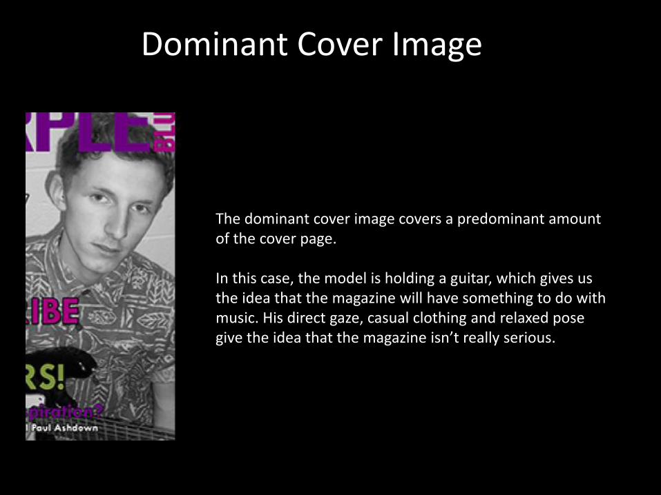
The dominant cover image covers a predominant amount of the cover page.
In this case, the model is holding a guitar, which gives us the idea that the magazine will have something to do with music. His direct gaze, casual clothing and relaxed pose give the idea that the magazine isn’t really serious.

Masthead
The masthead is basically the title of the magazine, in a bold type face and is often the part of the front cover of which stands out the most.
In this case, the word ‘PURPLE’ is suitably coloured purple, and the varying word angles make the masthead more than just a title, therefore making it more enticing and interesting.

Masthead Underlay
The dominant cover image is lying underneath the masthead, this is called a masthead underlay.
This also demonstrates the importance of the magazine’s house style, and they believe that the magazine’s reputation itself will appeal more to their audience than the cover stories themselves.

Appropriate Colour Pallet
The colour pallet of a magazine is the general colour scheme used.
For this magazine, they have used a general colour pallet of purple/pink to follow the masthead/title, and it is a quite ‘neutral’ colour and so gives the magazine no real specific genre, allowing them to range their content.

Skyline
The skyline is a coloured line of text of above the masthead.
For this example, the skyline is used to demonstrate the issue number of the magazine.
Lead Cover Line
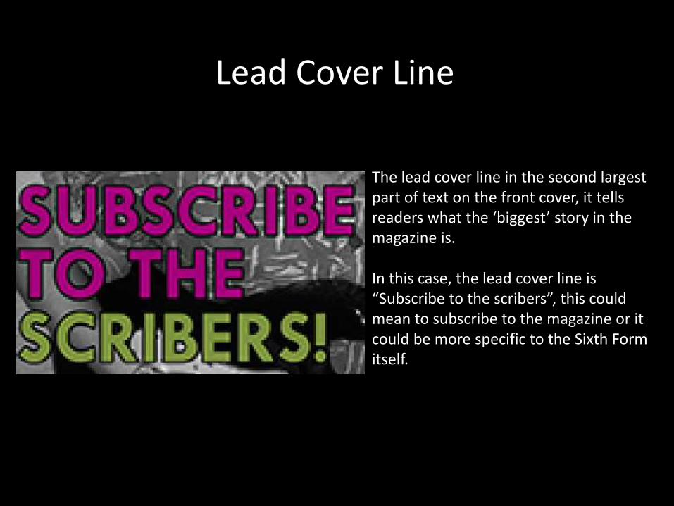
The lead cover line in the second largest part of text on the front cover, it tells readers what the ‘biggest’ story in the magazine is.
In this case, the lead cover line is “Subscribe to the scribers”, this could mean to subscribe to the magazine or it could be more specific to the Sixth Form itself.
Secondary Coverlines
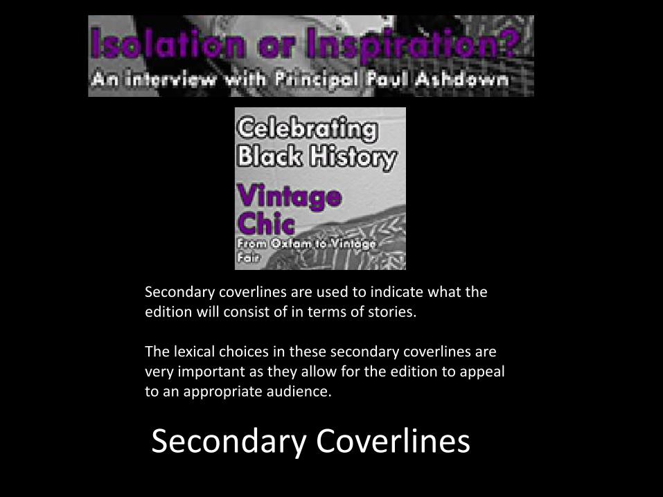
Secondary coverlines are used to indicate what the edition will consist of in terms of stories.
The lexical choices in these secondary coverlines are very important as they allow for the edition to appeal to an appropriate audience.

Strip
This is a strip of colour at the bottom of the front cover of which features more information for what is featured in the magazine.
In this case, it features exclusives, Principal Answers, Music Reviews, Book Reviews and Fashion.

Sans Serif Font
This magazine front cover uses a sans serif type face, meaning that the letters are ‘block’ and there are no projecting features at the end of the letters.
This gives the magazine a more casual look, appealing more to their Sixth Form audience.

Direct Gaze
The direct gaze is when the model looks directly at the camera.
This gives a more personal and organised effect.

Pose
The model is clearly positioned and the dominant cover image is clearly planned.
This makes the magazine look slightly more professional.

Iconography
(Iconography = Styles or images associated with sixth form magazine)
-Sans Serif Font
-Topic Related Dominant Cover Image
-Direct Gaze
-For this example, a purple/pink colour pallet
-Pose
-Lack of superlatives in text