the impact of white space on user experience for tablet
TRANSCRIPT
Rochester Institute of Technology Rochester Institute of Technology
RIT Scholar Works RIT Scholar Works
Theses
12-2017
The Impact of White Space on User Experience for Tablet Editions The Impact of White Space on User Experience for Tablet Editions
of Magazines of Magazines
Fanyi Cheng [email protected]
Follow this and additional works at: https://scholarworks.rit.edu/theses
Recommended Citation Recommended Citation Cheng, Fanyi, "The Impact of White Space on User Experience for Tablet Editions of Magazines" (2017). Thesis. Rochester Institute of Technology. Accessed from
This Thesis is brought to you for free and open access by RIT Scholar Works. It has been accepted for inclusion in Theses by an authorized administrator of RIT Scholar Works. For more information, please contact [email protected].
The Impact of White Space on User Experience for
Tablet Editions of Magazines
By Fanyi Cheng
A Thesis Proposal submitted in partial fulfillment of the requirements
for the degree of Master of Science in Print Media in the School of Media Sciences
in the College of Imaging Arts and Sciences of the Rochester Institute of Technology
December, 2017
Primary Thesis Advisor: Professor Elena Fedorovskaya
Secondary Thesis Advisor: Professor Christine Heusner
School of Media Sciences
Rochester Institute of Technology
Rochester, New York
Certificate of Approval
The Impact of White Space on User Experience for
Tablet Editions of Magazines
This is to certify that the Master’s Thesis of Fanyi Cheng has been approved by the
Thesis Committee as satisfactory for the Thesis requirement for the Master of Science in
Print Media degree at the convocation of Dec, 2017 Thesis Committee:
[Name], Primary Thesis Advisor Date
[Name], Secondary Thesis Advisor Date
[Name], Graduate Program Director Date
[Name], SMS Administrative Chair Date
i
Table of Contents
Acknowledgements ............................................................................................................ iii
List of Tables ..................................................................................................................... iv
List of Figures ..................................................................................................................... v
Abstract ............................................................................................................................... 1
Chapter 1: Introduction ....................................................................................................... 3
Topic Statement .......................................................................................................... 3 Design and Readership ............................................................................................... 6
Reason for Interest ...................................................................................................... 7 Chapter 2: Theoretical Basis ............................................................................................... 8
White Space ................................................................................................................ 8 User Experience ........................................................................................................ 13
Chapter 3: Literature Review ............................................................................................ 16
The Influence of White Space................................................................................... 16 Value of User Experience ......................................................................................... 19 Dimensions of the User Experience .......................................................................... 20 Conclusion ................................................................................................................ 22
Chapter 4: Research Objectives ........................................................................................ 24
Research Questions ................................................................................................... 24 Chapter 5: Methodology ................................................................................................... 26
Preliminary Experiment ............................................................................................ 28 Participants’ Demographics ...................................................................................... 29
Creation of Stimuli .................................................................................................... 30
Macro White Space ................................................................................................... 30 Micro White Space ................................................................................................... 30 Main Experiment Participants................................................................................... 34 Main Experiment ...................................................................................................... 36
Conducting the Main Experiment ............................................................................. 38 Data Collection ......................................................................................................... 39
Data Analysis ............................................................................................................ 40 Chapter 6: Results ............................................................................................................. 43
Visual Aesthetics ...................................................................................................... 43 Legibility ................................................................................................................... 49 Readability ................................................................................................................ 59
Chapter 7: Summary and Conclusions ........................................................................... 66

ii
Notable Findings ....................................................................................................... 66 Challenge, Limitation, and Consideration ................................................................ 69
Suggestions for Further Research ............................................................................. 69
Contributions and Conclusions ................................................................................. 70 List of References ............................................................................................................. 71
Appendix A: Tales of least squares means estimates from questionnaire and objective
performance measures for readability and legibility ........................................................ 79
Appendix B: The objective performance measures for the readability and legibility ...... 88
Appendix C: Questionnaire............................................................................................... 92
Appendix D: Experiment Profiles ..................................................................................... 93
Appendix E: Profile Content Source List ....................................................................... 108
Text ......................................................................................................................... 108
Photo ....................................................................................................................... 108
iii
Acknowledgements
First, I would like to express my sincere appreciation to my advisors, Elena
Fedorovskaya and Christine Heusner, for their encouragement, support, and guidance
throughout my research. Their support helped me to make it through the days when I
questioned and doubted myself. And now I am confident and proud of what I
accomplished. My gratitude also goes to all School of Media Science faculty and staff. I
am deeply appreciative that I have met the most wonderful people in these three years at
RIT.
Thank you to my parents. They supported me unconditionally throughout the
process of my education in RIT, also in my life. Last but not least, thank you to all my
friends at RIT, I shared tears and smiles with all of you. Without your companionship,
my life at RIT would not have been so wonderful.
iv
List of Tables
Table 1 Fixed Effect Tests for Visual Aesthetics ..................................................... 44
Table 2 Fixed Effect Tests for Legibility .................................................................. 50
Table 3 Fixed Effect Tests for Distinguishing Letter Time ...................................... 55
Table 4 Fixed Effect Tests of the Percent of Correct for Letter Counting ............... 57
Table 5 Fixed Effect Tests for Readability ............................................................... 60
Table 6 Fixed Effect Test for Percent of Correct (how much
participants recalled) .................................................................................. 62
v
List of Figures
Figure 1 The example of “figure-ground” relationship. The blue boxes are figure
and the white area surrounding is ground ......................................................... 10
Figure 2 The white space in present study is separated into two parts: macro white
space and micro white space ............................................................................. 11
Figure 3 The shadow area is the macro white space. ............................................... 12
Figure 4 The micro white space is the shadow area representing interline space. ... 13
Figure 5 Example of a seven-point end-anchored interval scale .............................. 15
Figure 6 Methodology Overview ............................................................................. 27
Figure 7 Content is framed in black using Adobe Photoshop .................................. 31
Figure 8 Histogram option in Photoshop.................................................................. 31
Figure 9 The interface of G* Power ......................................................................... 35
Figure 10 The magazine page with 38% macro white space and 135% micro white
space ................................................................................................................. 45
Figure 11 The magazine page with 59% macro white space and 105% micro white
space .................................................................................................................. 46
Figure 12 The least square plot of visual aesthetics for macro white space ............. 47
Figure 13 The least square plot of visual aesthetics for micro white space ............. 48
Figure 14 The least square plot of visual aesthetics for interaction between macro
white space and micro white space ................................................................... 49
vi
Figure 15 The magazine page with 31% macro white space and 105% micro white
space .................................................................................................................. 51
Figure 16 The least square plot of legibility for macro white space ........................ 52
Figure 17 The least square plot of legibility for micro white space ......................... 53
Figure 18 The least square plot of legibility for interaction between micro white
space and macro white space ............................................................................ 54
Figure 19 The least square plot of distinguishing letter time for macro white space56
Figure 20 The least square plot of distinguishing time for micro white space ......... 56
Figure 21 The least square plot of distinguishing time for interaction of micro white
space and macro white space ............................................................................ 57
Figure 22 The least square plot of the percent of correct for letter counting, micro
white space ........................................................................................................ 58
Figure 23 The least square plot of the percent of correct for letter counting,
interaction of macro and micro ......................................................................... 59
Figure 24 The least square plot of readability for interaction between micro white
space and macro white space ............................................................................ 61
Figure 25 The least square plot of readability for macro white space...................... 62
Figure 26 The least square plot of readability for micro white space ...................... 63
Figure 27 The least square plot of percent of correct (how much participants
recalled) for macro white space ........................................................................ 64
Figure 28 The least square plot of percent of correct (how much participants
recalled) for micro white space ......................................................................... 65
vii
Figure 29 The least square plot of the percent of correct (how much participants
recalled), interaction of macro and micro ......................................................... 66
1
Abstract
After declining for six years (Wang, 2016), printed magazines are facing the
dilemma of a paperless era. As magazine publishing emerges into the digital world, it
needs to achieve the degree of readers’ desire that is comparable to or surpassing print
publications.
Limited research has been done regarding white space in digital magazines. This
thesis aimed to investigate how user experience is affected by white space in the layout of
digital editions of food magazines designed for the Apple iPad.
The study focused on the evaluation of white space as the factor influencing the
quality of the user experience. White space was separated into macro and micro white
space. The researcher defined and quantified levels of macro and micro white space and
created samples of magazine pages with the corresponding white space levels.
Subsequently, the researcher obtained subjective evaluations of three perspectives of user
experience: satisfaction, ease of use, and usefulness. Analysis of Variance was employed
to determine if any of these white space levels have significant effect on user experience.
The study determined that macro, micro, and the interaction of macro and micro
white space had a significant impact on all three perspectives of UX based on the
questionnaire data. It was observed that the majority of 62 participants chose the 38%
macro white space, and 135% micro white space was the best combination regarding all
three aspects of the user experience. It was concluded that 135% micro white space had
the most significant effect on legibility, and 120% micro white space had the most
positive effect on readability.
2
Upon conclusion of the study, the researcher believes there is no specific white
space amount that would satisfy all of the people. However, within the scope of the
present experiment, it could provide a useable manual to magazine publishers and
designers.
3
Chapter 1: Introduction
The magazine industry in the United States has experienced significant changes in
recent years. With the proliferation of smartphones and the Internet, consumers make
fewer trips to the newsstand (Sasseen, Matsa, & Mitchell, 2013). The MPA FACTBOOK
2013-2014 (2014) investigated that digital magazine readers grew 84% from 9.2 million
to 16.9 million from 2012 to 2013. In addition, the number of digital magazine
downloads increased 39% from 2011 to 2013, and the prediction for further increases is
favorable.
According to the research at Technavio for publishing and advertising, they
forecast that the digital magazine platform will grow from 14% in 2015 to 35% by 2020
in the global magazine publishing market (Technavio, 2016). Therefore, more and more
publications are meeting this challenge by distributing their content via up-to-the-minute
digital platforms that include websites, smartphones, and tablets.
Topic Statement
Limited studies had looked into design preferences and aesthetics of digital
magazines when different design elements were manipulated. With rapid changes in the
magazine industry, publishers need comprehensive guidelines to design their digital
magazines (Guenther, 2011). Currently, the glossy, bound papers now appear on the
digital screens as electronic files, but publishers need to identify readers’ preferences for
design attributes in their digital editions. Guenther, who pointed that design is critical to
4
the magazine industry, has emphasized the need to look deeper into finding out how to
engage readers (2011).
In the digital environment, readers’ preferences and behaviors have changed in
the past ten years (Liu, 2005). Tablets are now mainstream devices for digital publishing
(Huang, Chen, & Ho, 2014). A benchmark study of tablet usage, Magazine Media
Readers and Tablets (2011), looked at customers’ habits regarding digital magazine apps
designed for tablets and eReaders. The study showed that 68% of households currently
have an Apple iPad, and 53% iPad owners strongly agreed and somewhat agreed that
they prefer digital magazines over printed ones (The Association of Magazine Media,
MPA, 2011). What’s more, in the global entertainment and media outlook
(Pricewaterhouse Cooper, 2014), the data showed that there will likely be a quick growth
of the digital magazine market in the years 2016-2018 globally.
Upon these findings, the researcher can conclude that readers’ preference is
shifting towards digital magazines, and further research supports this trend.
For example, according to Joseph’s report, Magazine circulation growth fueled by
digital subscription, (2015) digital readership rose up to 21% from 2014 to 2015, which
adds to the fact that digital magazine readership is growing rapidly. The food magazine
category was one of the strongest in that regard (Bazilian, 2013). For this reason, the
researcher selected lifestyle food magazines for iPads as a reference in the present study.
According to a 2001 study, “Who pays for magazines? Advertisers or
Consumers,” U.S advertising revenue increased 13.5% in the year 2000. In the period
from 1980 to 1998, consumer magazine revenue increased 16%, from 42.4% to 58.2%.

5
Advertising has been creating a large portion of revenue for magazine publishers, but
who is reading these publications?
Readership is frequently confused with circulation. While readership is an
estimate of how many people read a publication, circulation is the number of copies
distributed. According to Industry Predictions For 2014 Viewability (Shields, 2013), 80%
of advertisers among 600 advertisers interviewed believed viewability is very important.
Advertisers want to be seen, and of course, magazine publishers rely on readership to
maintain advertisers’ revenue, so they need to closely focus on what their readers want.
Fallon, a graduate of the Master of Science Print Media Program at the Rochester
Institute of Technology, conducted research on the effect of different design elements on
reader preference for digital editions (Fallon, 2014). She chose the image-to-white-space
ratio, grid, body typeface, and body text point as attributes when determining the
relationship between these factors and readers’ preferences. Fallon determined that those
attributes do impact people’s preference for digital magazines. The results of her study
showed that body text typeface has the most salient impact on the readers’ preferences
over the image-to-white-space ratio. On the other hand, existing research proves that the
white space has an effect on legibility, aesthetics, and people’s emotional response
(Kripintiris, 2008; Pracejus, O'Guinn, & Olsen, 2013; Zdralek, 2003). This contradiction
prompted the researcher to further investigate if white space of digital magazines has an
impact on people’s preference for digital magazines.
6
Design and Readership
Visual design is an essential element of grabbing a reader’s attention (Cleveland,
2005), which significantly influences readers’ preferences and readership. Specifically,
research shows that design can affect readability; that is, readers’ ability to read and
comprehend the material (Turnbull, 2011). For newspapers, Arnold (1981) has found that
a layout consisting of multiple horizontal columns ensues a faster rate of reading
compared to that of a single vertical column. Price (1974) has proven that design assists
content in determining the readership. He found that a 19-pica width horizontal
newspaper layout compared to an 11-pica width vertical layout increased readership of a
newspaper. Price’s findings correlated with Arnold’s.
Further, Cleveland (2005) conducted an experiment on nine magazines distributed
in Australia covering a spectrum of market segments to study whether design affects
readership. Cleveland asked 80 undergraduate design students to evaluate and score the
magazines’ visual power, which he defined as the capacity to attract attention. He found a
connection between readership spread and the amount of visual power, which relates to
the layout design of magazines. The readership spread refers to the range of demographic
or psychographic characteristics of readers, in this case, age, and results in a larger
audience. One of Cleveland’s findings showed that when the layout looked stale, the
readers decreased their hedonic response. Based on this, Cleveland argued that low
attractiveness of magazines may cause readers to switch to another publication. These
studies show a correlation between readership and design, which provides support for the
significance of the present research.
7
Reason for Interest
The researcher has a keen interest in the magazine publishing industry with a
career anticipation of having a footprint in this industry. The researcher is eager to grasp
this opportunity and explore the design feature of white space for digital magazine
publishing that has many unknown factors that need to be understood.
With a shift to digital media, publishers need to provide a reading experience to
their subscribers, that is on par or better than that of print editions, and will attract readers
to subscribe to the tablet editions of digital magazines. As Johnson and Prijatel (2006)
stated, “The challenge for magazines has been to discover their relevance across the
different digital platforms.” The researcher has confidence that the findings of the present
study will help designers in a concrete and explicit way to identify the best design
patterns pertaining to white space for digital magazines.
8
Chapter 2: Theoretical Basis
This chapter provides the theoretical background for the significance of this
research. It begins with an introduction of white space. Then, the figure-ground theory
(Coates, 2014) is introduced. Finally, the concept of user experience is discussed. User
experience is the dependent variable that the research examined. Little research has been
done about the effects of white space for digital magazine publications. After an
extensive literature review, no conclusive metrics for the examination of white spave
were found.
White Space
White space, when applied to design, is a complex concept that has been proven
difficult to define because it includes several visual elements. The basic definition of
white space chosen for this research is “The conspicuously open space found between
other design elements or objects within the borders of an ad,” as defined in “How
Nothing Became Something: White Space, Rhetoric, History, and Meaning” (Pracejus,
Olsen, & O’Guinn, p82, 2006). White space is comprised of several factors, including
margins, gutters, leading. It is named this because of the typical background material of
its day, but white space is not necessarily white (Coates, 2014).
White space can give relief to readers as well as impact their perception. For a
magazine that is full of pictures and narrative content, it is necessary to give the brain and
eyes a break (Thomas, 2015). White space draws attention to important content elements
and visually communicates information in an explicit order. In other areas such as
9
designing websites and advertisements, researchers have proven that white space has
important effects on users. What is more, it improves readability and comprehension
(O'Guinn, Olsen, & Pracejus, 2013; Zdralek, 2003).
Also, white space helps to visually organize material and facilitate information
processing in smaller portions or chunks. Not only does white space affect readability and
legibility, but it also effects people’s perception. Pracejus and other researchers have
proven that the use of white space in advertisements can influence consumers’ perception
about the brand image. For these reasons, white space is a design element that cannot be
neglected.
Figure-ground relationship.
To assess the white space for the purpose of this research, the well-known
“figure-ground” relationship is adopted. Coates (2014, p.26) summarized the “figure-
ground” relationship: space is the “ground” in which a form becomes a “figure.” Coates
also claimed: “The figure-ground relationship is the relationship of the object to its
surrounding space.” Researchers adopted this theory and treat the white space as the
space surrounding the objects.
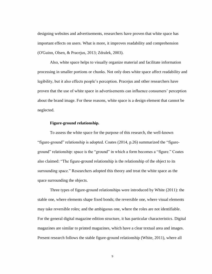
Three types of figure-ground relationships were introduced by White (2011): the
stable one, where elements shape fixed bonds; the reversible one, where visual elements
may take reversible roles; and the ambiguous one, where the roles are not identifiable.
For the general digital magazine edition structure, it has particular characteristics. Digital
magazines are similar to printed magazines, which have a clear textual area and images.
Present research follows the stable figure-ground relationship (White, 2011), where all
10
the elements on the page are shaped into fixed frames (Figure 1). In Figure 1, all the
framed content represented by the rectangle figures is consumed as the figure, and the
space between the rectangle figures is the ground. The researcher is concerned with the
effect of the balance between figure and ground.
Figure 1. The example of “figure-ground” relationship. The black boxes are figure and
the white area surrounding is ground.
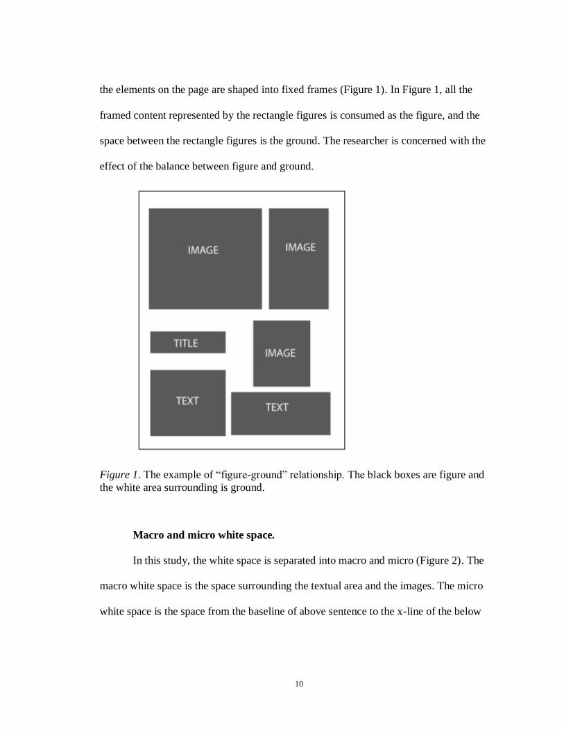
Macro and micro white space.
In this study, the white space is separated into macro and micro (Figure 2). The
macro white space is the space surrounding the textual area and the images. The micro
white space is the space from the baseline of above sentence to the x-line of the below
11
sentence. The way to manipulate white separately can provide a way to selectively assess
their contributions, and these features may affect the user experience.
Figure 2. The white space in the present study is separated into two parts: macro white
space and micro white space.
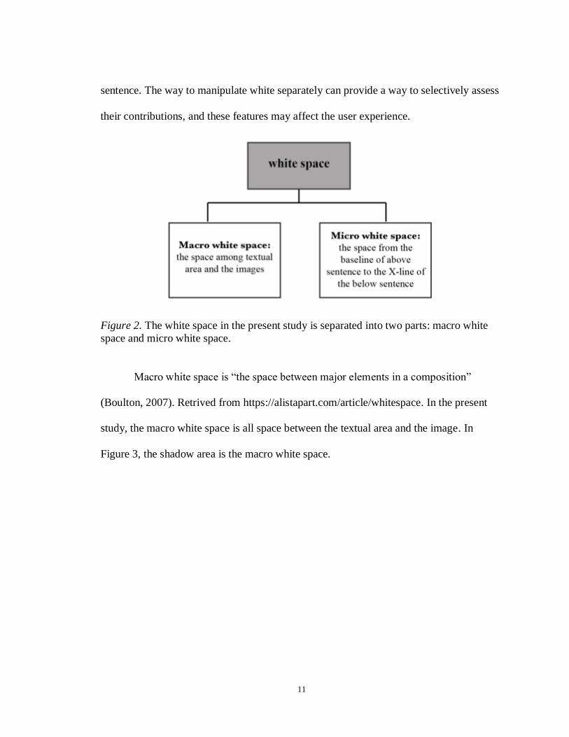
Macro white space is “the space between major elements in a composition”
(Boulton, 2007). Retrived from https://alistapart.com/article/whitespace. In the present
study, the macro white space is all space between the textual area and the image. In
Figure 3, the shadow area is the macro white space.

12
Figure 3. The shadow area is the macro white space.
Micro white space is the space between smaller objects. Kunz (2002) defined
interline space as the space between the baseline of type to the x-line of the line below. In
the book, he indicated that interline space helps to guide the eye effortlessly across each
line and to facilitate the transition from one line to the next, the interline space must be
visually larger than the space between words. Kunz suggests, for legibility of type, the
interline space should never be less than the height of the capital H. For the purpose of
this study, the micro white space is the interline space, which is the space from the
baseline to the x-line of the line below (Figure 4). The body type and display type size
and face are constant.

13
Figure 4. The micro white space is the shadow area representing interline space.
User Experience
In this research, the concept of user experience (UX) in relationship to visual
design is introduced. According to ISO/FDIS 9241-210, user experience is defined as “a
person’s perceptions and responses resulting from the use and/or anticipated use of a
product, system or service” (ISO, ISO/FDIS 9241-210:2010 Ergonomics of human-
system interaction -- Part 210: Human-centred design for interactive systems, 2010).
Readers’ preferences, emotional responses, beliefs, perceptions, and behaviors are all
considered part of UX. User experience covers all the aspects of people’s interaction with
a product, application, or system (Tullis & Albert, 2013).
The purpose of introducing UX is to improve the design for digital editions. In
“Measuring the user experience,” Tullis and Albert (2013) claimed that UX metrics help
magazine owners determine where their magazine stands relative to the competition and
helps them pinpoint what to focus on and improve. This matches the purpose of this
study, which aims to find out the best proportion or usage of white space. UX evaluation
14
is a relevant tool for assessing this problem, and the seven-point anchored scale is a tool
to help with this assessment.
Measuring User Experience Using Seven-point Anchored Scale
The seven-point Likert scale is a type of scale where people rate their agreement
by using seven different levels. A Likert scale is used to scale responses in survey
research. It is named after its inventor, psychologist Rensis Likert. The choice of the
seven-point Likert scale over a five-point scale is made because the seven-point Likert
scale can provide a more accurate measure of a participant’s evaluation (Finstad, 2010).
Finstad conducted a research study to investigate the difference and weakness between
five-point scales and seven-point scales. He recruited 172 Intel® employees to do the
usability test of two software applications. The participants were assigned to provide their
response using either a five-point scale or seven-point scale. To compare the difference
between five-point and seven-point based ratings, he recorded invalid responses, such as
3.5 or 2.5 as interpolations, and counted their number. In two tests, they discovered that
the number of interpolations in the 5-point scale condition were significantly higher than
in the 7-point scale condition, meaning that participants in his test were more likely to
interpolate in the 5-point condition. Finstad (2010) concluded that 5-point Likert scales
are not sensitive enough to capture a usability test. Based on this conclusion, the
researcher decided to implement the seven-point scale approach to measure UX attributes
in the present study.
Figure 5 shows an example of the seven-point scale that was employed in the
present study to assess visual aesthetics. This scale can also be named as an end-anchored
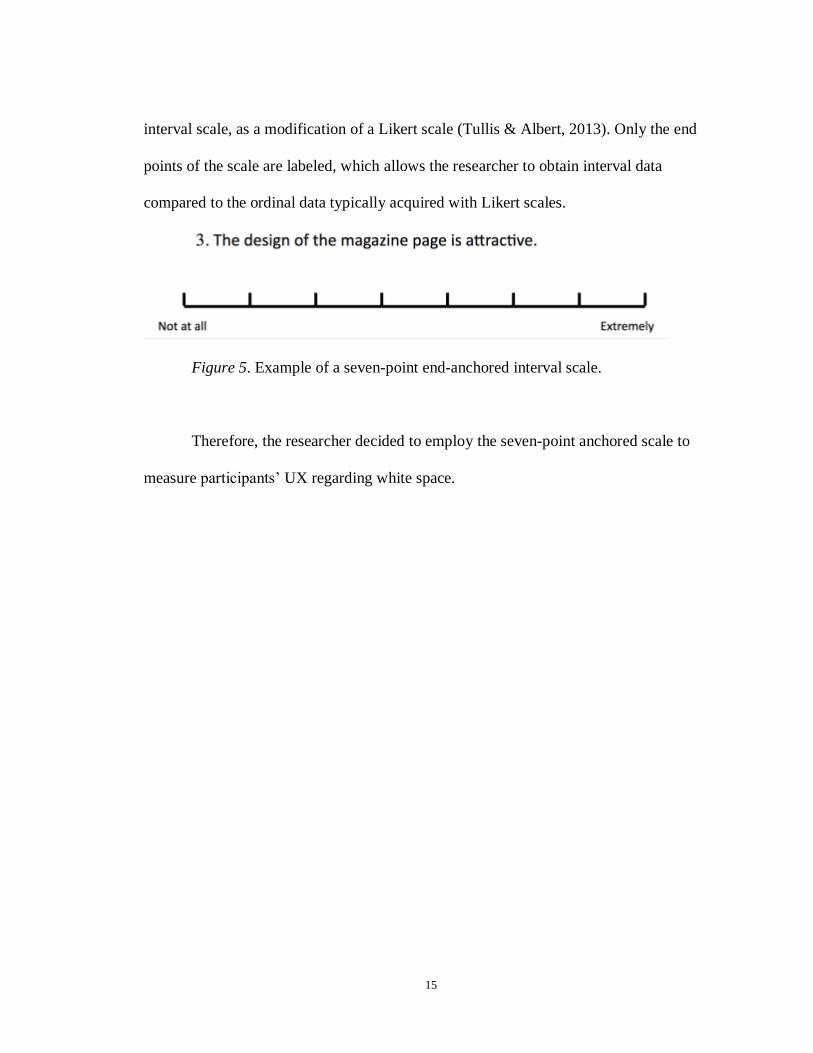
15
interval scale, as a modification of a Likert scale (Tullis & Albert, 2013). Only the end
points of the scale are labeled, which allows the researcher to obtain interval data
compared to the ordinal data typically acquired with Likert scales.
Figure 5. Example of a seven-point end-anchored interval scale.
Therefore, the researcher decided to employ the seven-point anchored scale to
measure participants’ UX regarding white space.
16
Chapter 3: Literature Review
This literature review starts with a discussion about the impact of white space on
different aspects of user experience, including usability, emotional response, and
perception. Finally, this review discusses the significance of UX, the object of inquiry
selected for the current study.
The Influence of White Space
Several studies from different areas identified that white space is an important
attribute of a layout, and it affects people’s attitudes. This literature includes the visual
aesthetics and perceived attractiveness, legibility, and overall perceptions as UX
dimensions.
Perceived aesthetics and usability.
In Coursaris and Kripintris’ (2012) study, they explored the relationship between
white space, perceived attractiveness, and perceived usability in web media by addressing
three main research questions: (a) How does white space impact a website’s perceived
attractiveness? (b) How does white space impact a website’s perceived usability? (c)
How does perceived attractiveness impact a website’s perceived usability? Since visual
communication and organization are integral parts of web design, they stated that visual
aesthetics could play a critical role in the web design process.
To observe the online behavior of the user, they created an online website
representing a fictional travel agency. Coursaris and Kripintris used three levels of white
17
space in his experiment (25%, 50%, and 75%) and asked participants to rate the websites
for perceived attractiveness, perceived efficiency, and perceived effectiveness. The
results of this research showed that there were no significant differences among
efficiency, effectiveness, and attractiveness for 50% and 25%, although there was a trend
toward a 50% optimum for attractiveness and efficiency. The ratings for all perceived
attributes decreased when the 75% white space was used. Coursaris and Kripintris (2012)
concluded that because users now get used to those websites, which utilize a minimal
amount of white space, they perceived less white space as effective.
Legibility.
Legibility is used to describe the ease of character recognition in type and text.
Too much or too little micro white space could affect legibility. According to How Much
Visual Power can a Magazine Take? (Cleveland, 2005), legibility is the first concern
when it comes to the layout of a magazine. Zdralek (2013) stated that the ability to
manipulate white space in various ways results in different aesthetic effects. He argued
that white space is an important design tool and can affect the legibility of web sites.
Zdralek (2013) measured the reaction time of subjects to assess the relationship between
legibility and different gutter white space levels. He found that visual search time
increases as white space decreases and at the same time, the navigation time increases.
Furthermore, when the target size, which is the print size, increases, legibility increases.
Using those findings, Zdralek (2013) concluded that white space does have an impact on
legibility. He further proposed that careful consideration should always be made about

18
the effects of added scrolling or the distribution of information across multiple pages
caused by added white space while designing a web site.
Legge and Bigelow (2011) examined the relationship between print size and
readability in Does print size matter for reading? A review of findings from vision science
and typography. Because type size affects the line spacing and the space between the
letters, which belongs to micro white space, this study can help us to understand the
relationship between micro white space and readability. Legge and Bigelow (2011)
examined x-height to measure type size and introduced reading speed as a metric for
measuring the legibility of print. The result showed there is a range of type size that can
achieve maximum reading speed. They concluded that for online articles, there is no need
to use large headlines to attract readers. The more articles on the website, the more likely
a reader would choose to read them.
Perception.
Perception is the way that an individual thinks and feels about the interaction with
the thing (Tullis & Albert, 2013). Pracejus, O’Guinn, and Douglas (2013) looked into the
relationship between white space with the economic “burning money” account by
evaluating people’s perception of the brand. The “burning money” idea used in
commercial marketing, means that the more expense and existence of advertisements, the
more positive information consumers would get. To prove if this idea is wrong or not,
they created a small ad, which is one-fifth of the page size and does not use white space
as a design element. For a comparison, they created another one full-page ad with low
white space and one full-page ad with high white space. One hundred and eighty-four
19
participants were asked to view the stimuli for 30 seconds and then rate their level of
agreement with 12 statements about the ads (from 1 “strongly disagree” to 7 “strongly
agree”). Their results indicated that beliefs in the ad brand significantly increased with
the high white space compared to low white space. The results showed that employing
ads with more white space increased people’s perception about quality, leadership, trust,
and prestige. (O'Guinn, Olsen, & Pracejus, 2013) This research proved that white space
could be a salient factor that affects people’s perception.
Value of User Experience
In this research, UX considers a person’s perceptions and responses resulting
from viewing and reading digital magazines. Tullis and Albert (2013) claimed that
measuring UX offers so much more than observation. UX metrics add structure to the
design and evaluation process. They concluded that UX provides insight and information
to the decision makers.
Nowadays, people interact with screens almost daily according to the number of
mobile phones and tablets owned. It is necessary to evaluate the UX of information on
digital displays, as the dynamic and limiting nature of digital screens increases the
challenge of visual design decisions. Many inconspicuous things can affect UX. For
instance, screen resolution is one of the limitations for digital design. This limitation is
explored when Lundgaard, founder of Brandworkz, underscored the importance of user
experience relative to visual identity (Lundgaard, 2013). He emphasized the importance
of UX based on two of his own relative examples while he was in New York’s JFK
Airport. Lundgaard used the touchscreen to make a selection in the food outlet, and it was

20
easy to order and interact with. On the contrary, when he selected Budweiser on a screen
in one of the airport bars, Lundgaard struggled to determine what was on the screen,
because the Budweiser design is intricately detailed, which is more suited to be placed on
physical media rather than on the screen. In conclusion, it is important for people to test
the UX of content display. It helps designers to enhance their design and achieve a higher
degree of the users’ overall satisfaction.
Dimensions of the User Experience
There are many different dimensions to consider when choosing the assessment
approach for UX. For example, Benedek and Miner (2003) created a table listing 118
kinds of reactions they used in the product reaction cards method they developed. The
table contains positive and negative words (e.g., Attractive, Comprehensive, Rigid,
Frustrating) to assess desirability and feelings toward a product. In the present study, the
research particularly focuses on three dimensions: satisfaction, ease of use, and
usefulness following Lund (2001) proposed dimensions of usefulness, satisfaction, and
ease of use in his questionnaire to measure UX. Hence, in the present study, the research
objective is to evaluate the personal experience of human subjects interacting with digital
magazines with various white space parameters as the stimuli by focusing on these three
main dimensions.
Satisfaction.
Satisfaction is about what readers think or say about their overall interaction with
the object, and it covers enjoyment, expectations, engagement, visual aesthetics and

21
similar characteristics (Tullis & Albert, 2013). This research investigated visual
aesthetics as one of the aspects of satisfaction.
Design can affect satisfaction. Shird (2003) conducted a study that consisted of
designing and examining the satisfaction and user preference of interface design. In this
study, four different interface versions were created, including a traditional design, a
frames design, a textual design, and a graphical design. Shird administered user
satisfaction questionnaires and assigned preference ranking to each design. The
satisfaction questionnaire consisted of nine statements for which the users chose the
response that best corresponded to their feelings on a scale from one to five. The result
showed that people rated the frames interface design for the highest user satisfaction
scores. The traditional design was chosen as the least preferred interface design. Thus,
satisfaction has been chosen as one of the UX dimensions in this research.
Usefulness.
Usefulness is the opinion of users about how useful they consider a particular
feature or function (Paplauskaite, 2014). For digital magazines on tablet, the key aspect
of usefulness is the readability of the content. Readability is the degree to which a body
of text is easy for people to read and understand (Felici, 2012). This research investigated
readability as one of the factors of UX by assessing usefulness.
Design can affect usefulness. In “Web site usability, usefulness, and visit
frequency” (2000), Lee studied the usefulness of web site design. After conducting 51
survey questionnaires, he found out that the function of “finding information” is
correlated with web site usefulness. Lee suggested that the details of web site design
22
elements might affect site usefulness. For that reason, usefulness is a dimension of UX
which this research examines.
Ease of use.
Ease of use is users’ assessment to how easy or difficult each task is (Tullis &
Albert, 2013). For the present study, the concept of ease of use encompasses legibility.
Legibility is the ease for a reader to distinguish individual characters and words. (Felici,
2012) In other words, the ease of use examines the ease for people to read content on the
digital magazine. Therefore, this research assessed legibility as one of the factors of UX.
In the study “User satisfaction with mobile websites: the impact of usefulness,
ease of use and trust” (2014), researchers aimed to investigate the impact of usefulness,
ease of use and trust on mobile website satisfaction. The results showed that there is a
positive relationship between ease of use and a mobile user’s satisfaction. Based on the
result, the researchers suggested some strategies for marketing managers to enhance ease
of use to improve people’s satisfaction with mobile websites.
In conclusion, satisfaction, usefulness, and ease of use are three common
dimensions of UX to examine in design. Considering the characteristics of digital
magazines, this research investigated specifically three perspectives related to the above
dimensions: visual aesthetics, readability and legibility.
Conclusion
The information acknowledged in this literature review served to build a
foundation for developing the methodology of the present research. Upon the discussion,
23
with the evaluation of UX, a better relationship can be formed bonding the readers with
the magazines. Understanding the importance of white space is essential during the
design of digital magazines. Finally, the researcher believes, the attempt to investigate the
relationship between white space for digital editions of magazines and UX is a positive
pursuit for magazine publishers and readers.
24
Chapter 4: Research Objectives
This study explores how white space for digital magazines affects users’
experience by evoking the findings of Fallon (2014). Fallon investigated reader
preference for the layout of digital magazines on Apple iPads including features related
to white space. She found that the most salient attribute that affects reader preference is
body text typeface. Although Fallon found that white space-to-image ratio was not a
significant attribute in determining readers’ preferences, upon the literature review, it
became evident that several researchers proved that the white space in different media
does impact various UX dimensions. This conflict makes the researcher wonder if white
space does really impact user experience for digital magazines.
The objective of this research is to study the personal experience of human
participants interacting with the stimuli, which are digital magazines with quantified
white-space elements. Different aspects of UX were the dependent variables. The study,
therefore, focused on user’s reactions and responses while reading magazines with
varying levels of white space.
Research Questions
1. For articles in the digital editions of food magazines on an iPad platform, does
white space impact the UX dimensions of visual aesthetics, readability, and legibility for
readers?
2. If so, which dimensions of UX have been affected acutely by white space?
25
3. Are there any exact quantitative features in terms of white space results that can
help designers understand design patterns for digital magazines concretely and explicitly?
26
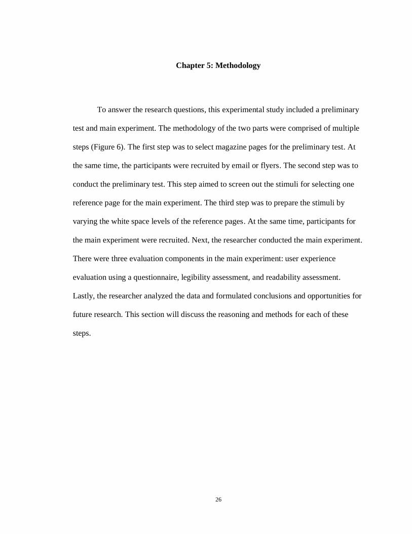
Chapter 5: Methodology
To answer the research questions, this experimental study included a preliminary
test and main experiment. The methodology of the two parts were comprised of multiple
steps (Figure 6). The first step was to select magazine pages for the preliminary test. At
the same time, the participants were recruited by email or flyers. The second step was to
conduct the preliminary test. This step aimed to screen out the stimuli for selecting one
reference page for the main experiment. The third step was to prepare the stimuli by
varying the white space levels of the reference pages. At the same time, participants for
the main experiment were recruited. Next, the researcher conducted the main experiment.
There were three evaluation components in the main experiment: user experience
evaluation using a questionnaire, legibility assessment, and readability assessment.
Lastly, the researcher analyzed the data and formulated conclusions and opportunities for
future research. This section will discuss the reasoning and methods for each of these
steps.
27
Figure 6. Methodology Overview.
28
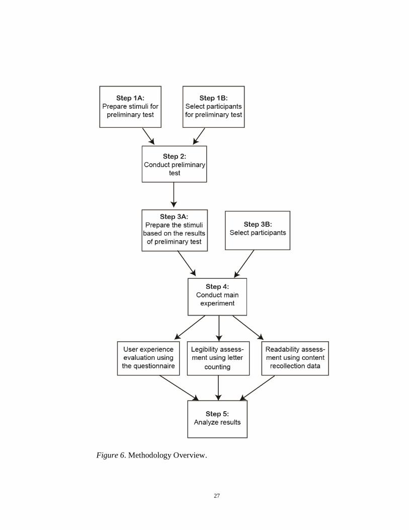
Preliminary Experiment
People have preferences including content, pictures, layout. (Kanazawa, 2010)
These preferences may affect the way the participants will judge experimental stimuli. To
minimize the effect of preference and experimental error, the researcher conducted the
preliminary test. The goals of the preliminary test were to help the researcher choose
appropriate stimuli for the main experiment. The ideal stimuli would have a moderate
preference and avoid extreme favor or disfavor.
A preliminary test is a small-scale experiment designed to screen out layouts and
content that evokes extreme responses to produce moderate ratings on average. Yet, the
sample size should be comprehensive and representative. Hill (1998) suggested 10 to 30
participants for pilots in survey research. In the present study, the preliminary test was
conducted with 10 female participants.
For the preliminary test, 27 pages from several popular digital food magazines
were selected. The food magazines were: Food Network, Saveur, Taste of Home, Eating
Well, Food and Wine, and Bon Appétit. The pages covered general food categories:
dessert, vegetable and meat dishes, soup, beverage, baking, party food, and seafood. The
pages also included a variety of layouts: one column, two columns, and three columns of
text. Participants were asked to glance at each page and sort them into seven categories
based on how much they liked the design of the page ranging from the lowest category
being “Not at all” and the highest category of “Extremely.”
29
The results showed that magazine pages with a two-column layout had a moderate
preference rating. This aligns with the preference of professional designers who agree
that two columns are commonly used for iPad digital magazine layouts. For instance,
Carrie Cousins (2012), who has years of experience in web and graphic design,
mentioned that two columns are easy to read on an iPad. Another designer, Szywalski
(2013) also indicated that the use of a two-column layout would make digital magazines
more legible and aesthetically pleasing.
The researcher chose a chicken rice salad recipe because the moderately rated
layouts had vegetables and meat recipes as content. The reference page included one food
recipe and one image. Having a food recipe on the page is important to maintain the
function of the food magazine for testing user experience. One image on the page
provides ease for the researcher in manipulating the white-space of the layout.
Participants’ Demographics
The thesis sample demographic was selected based on the analysis of Food
Network Magazine Media Kit (2016). Food Network Magazine had over 12.7 million
readers in 2016, which is the largest number of all monthly food titles in 2016. According
to this research, the percentage of female readers in the Food Network audience is
71.6 %, with 59.2% of the readers in college. Therefore, the participants for the present
study are specified as the female students between 18 and 28 years old who are attending
a university at the time of the study. The participants have normal or corrected-to-normal
vision. Participants were recruited using email and flyers. The researcher recruited
30
participants from a variety of degree programs. The specific number of participants
recruited for each experiment is discussed in the corresponding sections.
Creation of Stimuli
After the preliminary test, the reference page was selected. To create stimuli, the
researcher mimicked the layout and content of the chosen magazine reference page and
created final stimuli by using Adobe Suite CC. The content used for the final stimuli was
similar to the reference page determined in the preliminary study; the reference magazine
described rice salad, so the researcher chose a similar rice salad recipe from www.
Foodista.com, which is a website powered by Creative Commons (CC) by license. The
image in the page was downloaded from Wikimedia Commons, which is a website under
the Creative Commons License. The Creative Commons License is the public copyright
license that allows for the free distribution of copyrighted work with the credit of the
original creator. Their official website indicates, “Our tool gives everyone from
individual creators too large companies and institutions a simple, standardized way to
grant copyright permissions to their creative work.”
(https://creativecommons.org/licenses/)
Macro White Space.
Macro white space is the space between the textual area and the image. First, it
was necessary to define experimental levels for macro white space. The first level was
determined by the sampling page from the reference digital magazine. The researcher
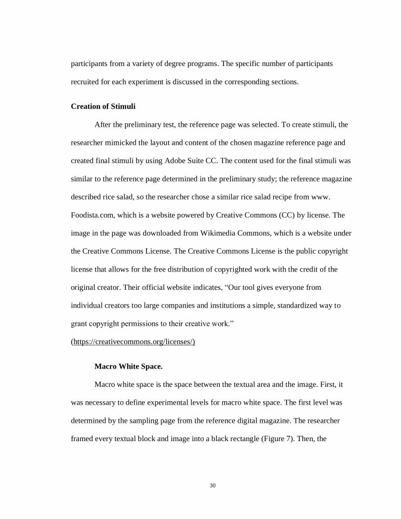
framed every textual block and image into a black rectangle (Figure 7). Then, the
31
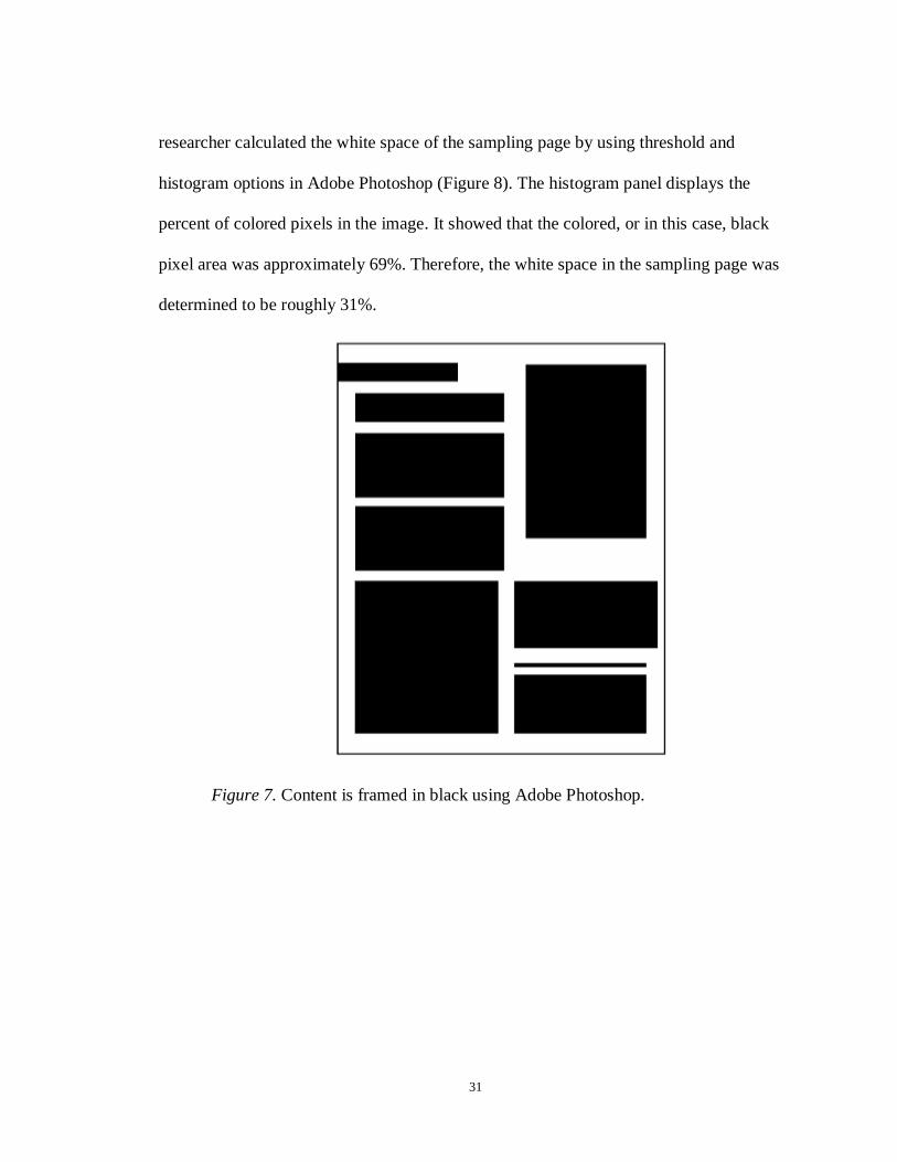
researcher calculated the white space of the sampling page by using threshold and
histogram options in Adobe Photoshop (Figure 8). The histogram panel displays the
percent of colored pixels in the image. It showed that the colored, or in this case, black
pixel area was approximately 69%. Therefore, the white space in the sampling page was
determined to be roughly 31%.
Figure 7. Content is framed in black using Adobe Photoshop.

32
Figure 8. Histogram option in Photoshop.
In Kripintiris’s study (2008), 75% and 25% white space has been shown not to be
optimal with respect to perceived visual aesthetics. The researcher decided to narrow the
range and add 7% to each level from 31% macro white space. In total, five levels of
macro white space were developed: 31%, 38%, 45%, 52%, and 59%.
Micro White Space.
Micro white space, in this study, is defined as the interline space, which is the
space from the baseline of the upper line of text to the x-line of the line below. In Adobe
InDesign software, designers normally change the leading setting to adjust spacing
between lines of type to improve legibility. Leading in Adobe InDesign is measured from
the baseline of one line of text to the baseline of the next line of text. Interline space is
included in this measurement. Thus, for manipulating the interline space, the researcher
adjusted leading in Adobe InDesign. The official website of InDesign indicates that the
default auto-leading option is 120% of the type size. Bailey, a graphic designer with 10
33
years’ experience, discussed that 120% of type size is the often-recommended value for
line spacing based on readability and aesthetics (2011).
There are three levels of micro white space in the present study. For the micro
white space variable in the present research, the researcher used 120%, the optimal
leading setting in Adobe InDesign. Two other levels are deviated from 120% by 15%;
they are: 105%, 120%, and 135% leading. The 105% of type size measurement for micro
white space is close to the leading setting in the reference magazine page.
Creation of Layouts.
Because there are five levels of macro and three levels of micro white space, 15
different versions of the magazine layout were developed. The layouts were designed to
have the same number of content blocks, images, and general layout to ensure
consistency in the design to the original reference page.
The manipulation of white space was done through calculations using Microsoft
Excel. The researcher measured the width and height of all the blocks on the reference
page. The height and width of each block were changed based on the selected levels for
the independent variable of macro white space to produce different combinations for the
15 experimental stimuli. Specifically, the researcher reduced or increased the height and
width of the blocks in proportion to the ratio between the target macro white space and
the reference macro white space. The goal was to manipulate the white space evenly and
not affect the overall design aesthetic of the page.
For the micro white space, the researcher inserted the desired number in the
leading option in Adobe InDesign based on the three selected levels of micro white
34
space. For the samples created for the legibility and readability assessment of the main
experiment, the researcher adjusted paragraphs for each page while keeping the macro
and micro white space the same. The researcher kept the number of text lines in the
paragraph identical within all 15 samples that were assigned to be read by participants.
To maintain a fixed amount of overall macro white space, some text lines in other
paragraphs were deleted, under the premise that the whole page design was not changed.
This was done because after redesigning the reference magazine page with different
macro and micro white space levels, the number of lines in the same paragraphs of text
became different for different stimulus pages. This change could have affected the results
when participants read the text under the time limitations. Therefore, the researcher also
prepared an additional 15 versions of the magazine page layouts for assessing legibility
and readability.
Main Experiment Participants
To estimate a sample size for the main experiment, the researcher used G*Power
3.1. The program takes into consideration the anticipated effect size and the planned
design of the experiment. To evaluate a possible effect size, the researcher asked ten
participants to do the pilot test during the formulation of the proposal. After analyzing
their data, the researcher found that partial eta squared (2) of the macro variable for the
aesthetics was 0.13. The equation used for calculating 2 is:
2= Between-Groups Sum of Squares ÷ Total Sum of Squares
The 2 equals 0.13, which means that the macro white space had a large effect on
these ten participants. Therefore, the partial eta square 0.13 is used to calculate the ideal
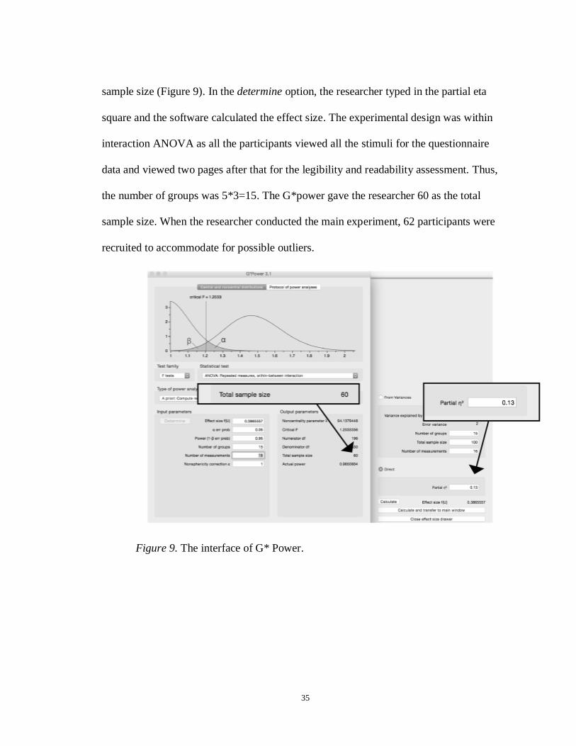
35
sample size (Figure 9). In the determine option, the researcher typed in the partial eta
square and the software calculated the effect size. The experimental design was within
interaction ANOVA as all the participants viewed all the stimuli for the questionnaire
data and viewed two pages after that for the legibility and readability assessment. Thus,
the number of groups was 5*3=15. The G*power gave the researcher 60 as the total
sample size. When the researcher conducted the main experiment, 62 participants were
recruited to accommodate for possible outliers.
Figure 9. The interface of G* Power.

36
Main Experiment
Experimental variables and experimental design.
A macro white space and micro white space variation were used in the main
experiment, where each participant evaluated all of the stimuli produced by the reference
stimulus defined in the preliminary test. The description of the experimental variables
follows.
The independent variables for the main experiment are: 1) macro white space with
five different levels and 2) micro white space with three different levels. The dependent
variables are participant’s ratings of the three perspectives of UX: visual aesthetics,
readability, and legibility, and in the second part, legibility and readability evolutions as
explained below.
The main experiment included several steps. First, people’s perceptions regarding
the three factors of UX were evaluated using the questionnaire. Then, letter counting
(Subbaram, 2004) and content recollection of selected paragraphs were employed to
assess the effects of white space on legibility and readability.
User experience evaluation using the questionnaire.
For this part of the main experiment, each participant answered three questions
for each page containing different combinations of macro and micro white space in a
form of ratings. Seven-point scales with anchored end points were employed in the
questionnaire. They were labeled at the two ends as Not at all and Extremely. The three
questions were aimed at assessing three aspects of UX: perceived visual aesthetics,
37
perceived readability, and perceived legibility. They were: 1) How satisfied are you with
the visual aesthetics of this page?, 2) How legible do you find this page?, and 3) How
readable do you find this page? It was a within-subjects experiment because every
participant was exposed to every stimuli.
Legibility assessment using letter counting.
The researcher realized that a questionnaire is not the most precise measurement
to assess readability and legibility, because the questionnaire is based on subjective
probability. The researcher believes legibility and readability require more objective
analysis. Legibility is the how easily people can read each character (Felici, 2012). In
Subbaram’s study (2004), he found that letter counting speed is correlated with legibility.
In this research, letter counting was adopted to assess the correlation between white space
and legibility. Each participant was instructed to read two specific paragraphs with
different white space levels and count the total number of specific letters in the text.
There was no time limitation in this section. Participants’ performance time and the
number of errors were recorded.
Readability assessment using content recollection data.
As previously discussed, readability is how easily people can understand the
content in the article (Felici, 2012). When Green discussed the process of reading
comprehension in his dissertation “Fourth graders’ literal and inferential reading
comprehension: Effects of readability and answer format,” he mentioned that text
readability can influence short-term memory (Green, 2000). Considering the relationship
38
between readability and short-term memory, to assess readability, the participants were
told to remember the ingredients’ names after they read the ingredients paragraph. The
number of ingredients they recalled was recorded. The time duration for reading the
paragraph was limited to 15 seconds.
Conducting the Main Experiment
The main experiment was conducted from January 27 to March 10, 2017.
Participants signed up to take part in the experiment via direct email to the researcher.
Each administration of the experiment was conducted in the Gravure Research Library in
the School of Media Sciences to ensure a consistent experimental environment for each
participant; that is, a typical office space environment with fluorescent lighting fixtures
on the ceiling.
At the beginning of the experiment, each participant was required to review and
sign the consent form. Then, they read the study introduction to get an overview of the
experiment and the purpose of the study. The participant was asked to quickly review 15
magazine pages on an iPad. Each page was viewed within 7-10 seconds. The participant
rated each page, one page at a time using the paper-based questionnaire. Each participant
was assigned to view a randomly organized sequence of magazine pages. All the
participants’ codes and answers were recorded both on physical paper and in a Microsoft
Excel spreadsheet. Through this method, all the answers can be easily tracked back to an
individual participant’s code.
Once the questionnaire was completed, the participant proceeded to the next part
of the main experiment, which assessed legibility and readability. The researcher
39
assigned each participant to review two different magazine pages. To assess legibility, the
participant was requested to read two different paragraphs, one paragraph per page, and
count the number of a specific letter in each paragraph, letter S for one page, and letters I
for the second page. The performance time was recorded. For readability, they were
asked to read two different paragraphs, one paragraph per page, and try to remember the
names of ingredients in each paragraph. They were asked to write down all the
ingredients they remembered on a sheet of paper. The duration for reading each
paragraph was limited to 15 seconds.
Each participant was assigned the same two magazine pages for assessing
legibility and readability. Upon completion of this part of the main experiment, the
participant was thanked and compensated with free snacks.
Data Collection
Two categories of data were collected for this experiment. The questionnaire data
captured self-reported measures for subjective impressions of the three user experience
attributes. Additionally, legibility and readability were evaluated using objective
observation measures.
For the objective assessment of legibility, two measures were used. The first one
is the average time that participants spent on distinguishing each letter for the given
letters of S or I. This was calculated as the total time that participant used to count the
letters divided by the total number of all letters in the paragraph. The second measure was
the percentage of correct responses, calculated as the number of letters the participant

40
counted, divided by the actual number of selected letters in the paragraph, multiplied by
100.
For the objective assessment of readability, the percent of correctly recalled
ingredients was used. This was calculated as the numbers of ingredients that the
participant recalled, divided by the total number of ingredients in the paragraph,
multiplied by 100.
Data Analysis
As participants completed the survey, their responses were transferred to an Excel
spreadsheet, which served as the repository for the resulting data.
The two-way Analysis of Variance (ANOVA) was applied to test the significance
of the independent white space variables, namely the main effects of macro and micro
white space, and the interaction effect between macro and micro white space variables.
In the present study, the 62 participants were randomly selected from a larger
population. In the first part of the experiment, when the questionnaire data was collected,
the within-subjects design was used, which means that all participants were exposed to
every experimental stimulus; every participant evaluated all 15 layout variations.
Therefore, each factor combination was measured 62 times. The analysis of the effects of
this data is the two-way ANOVA with repeated measures (Girden, 1992). To account for
the randomness of participants’ selection, a Participants’ variable was included as a
random effect in this analysis.
The data analysis for the first part of the main experiment employed a mixed
model using analysis of variance within the Fit Model platform in the JMP Pro 13
41
statistical software package to assess the relationship between 15 white space
combinations and user experience. The mixed model is appropriate when one or more of
the factors are considered random.
In the present research, the F-test was used to test the hypotheses as follows:
1. H0: there is no effect of macro white space on visual aesthetics/
readability/legibility.
2. H0: there is no effect of micro white space on visual aesthetics/
readability/legibility.
3, H0: there is no effect of the interaction between micro and macro white space
on visual aesthetics/readability/legibility.
The answers stemmed from the F-ratio and p-value. Each of the attributes of UX
were tested by calculating an F-ratio. The F statistic must be used in combination with
the p-value when you are deciding if your overall results are significant. The p-value
of .05 is often used as a default value in most statistical software applications (Anderson,
2013). In the present analysis, p= .05 was used as a cut-off value to designate statistical
significance. This value corresponds to the 95% confidence interval to reject the null
hypothesis. If the p value was less than .05, the researcher considered the result to be
statistically significant and rejected the null hypotheses.
For the second and third research questions of this study, considering the effect of
specific white space combinations on UX, the answer stemmed from the least square
means. The least square mean is the group mean adjusted for the model (Deng, 2009). To
42
examine which levels of white space has the best affect on UX, the researcher determined
the highest least square mean.
Thus, the participants’ data were analyzed using ANOVA to determine the
significance of the contribution of the two independent variables with interactions to
ratings for the UX ratings and objective measures for legibility and readability. These
results are summarized in tables and plots in the following Results chapter.

43
Chapter 6: Results
The separate sections of Chapter 6 describe the results of the data analysis for
visual aesthetics, readability, and legibility.
The statistically significant data is provided in the tables and is based on the
analysis of variance for the main effects of macro, micro white space, and their
interactions. The plots are used to describe tendencies and are based on least square
means estimates. The questionnaire data for the three user experience attributes and
pairwise Student test results for different macro and micro white space combinations are
documented in Appendix A. The objective performance measures for the readability and
legibility are documented in Appendix B.
Visual Aesthetics
The researcher used repeated measures ANOVA to determine the fixed main
effects on visual aesthetics for macro white space, micro white space, and the fixed
interaction effect between macro and micro white space. Table 1 shows the results of the
fixed effect test for visual aesthetics, the left column contains the name of the main
effects: macro white space, micro white space, and interaction of macro and micro white
space. “ Prob > F ” represents the p values. They are based on the F-ratio values, which
are presented in the middle column. As seen from Table 1, all three fixed effects were
statistically significant, because all p-values were less than .05. This result demonstrated
that the macro and micro white space had a statistically significant influence on
participants’ impressions of visual aesthetics. The interaction effect between macro and
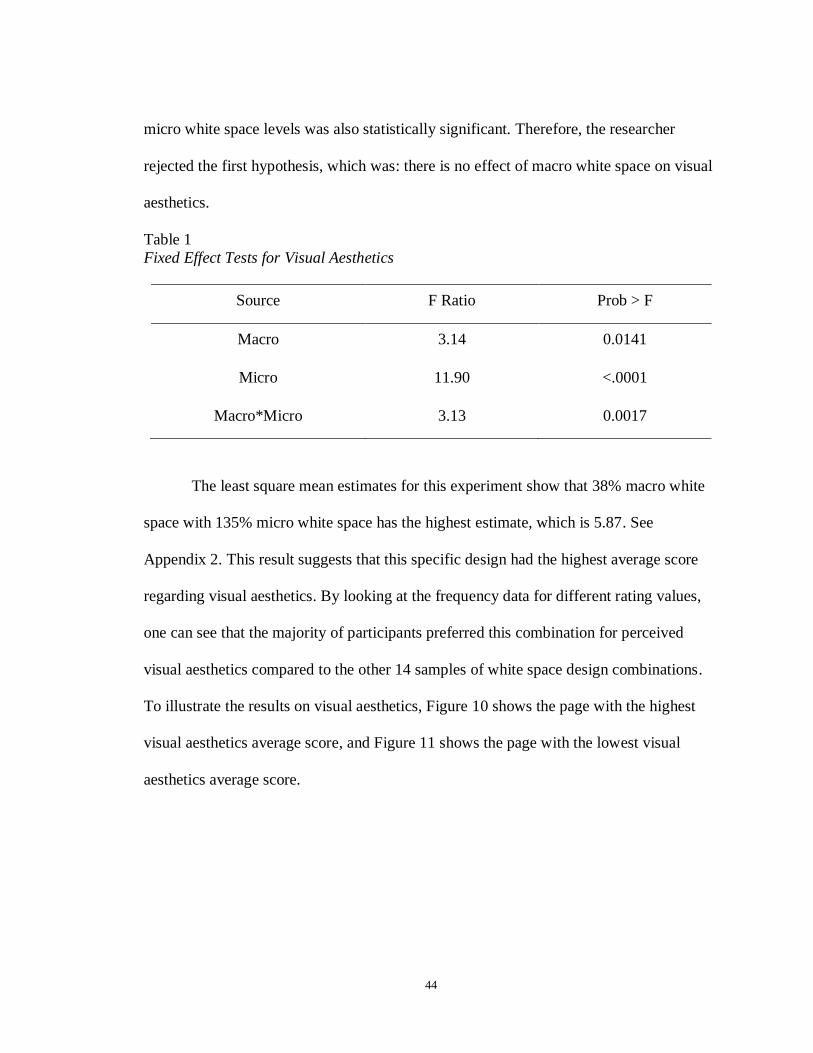
44
micro white space levels was also statistically significant. Therefore, the researcher
rejected the first hypothesis, which was: there is no effect of macro white space on visual
aesthetics.
Table 1
Fixed Effect Tests for Visual Aesthetics
Source F Ratio Prob > F
Macro 3.14 0.0141
Micro 11.90 <.0001
Macro*Micro 3.13 0.0017
The least square mean estimates for this experiment show that 38% macro white
space with 135% micro white space has the highest estimate, which is 5.87. See
Appendix 2. This result suggests that this specific design had the highest average score
regarding visual aesthetics. By looking at the frequency data for different rating values,
one can see that the majority of participants preferred this combination for perceived
visual aesthetics compared to the other 14 samples of white space design combinations.
To illustrate the results on visual aesthetics, Figure 10 shows the page with the highest
visual aesthetics average score, and Figure 11 shows the page with the lowest visual
aesthetics average score.

45
Figure 10. The magazine page with 38% macro white space and 135% micro
white space.
46
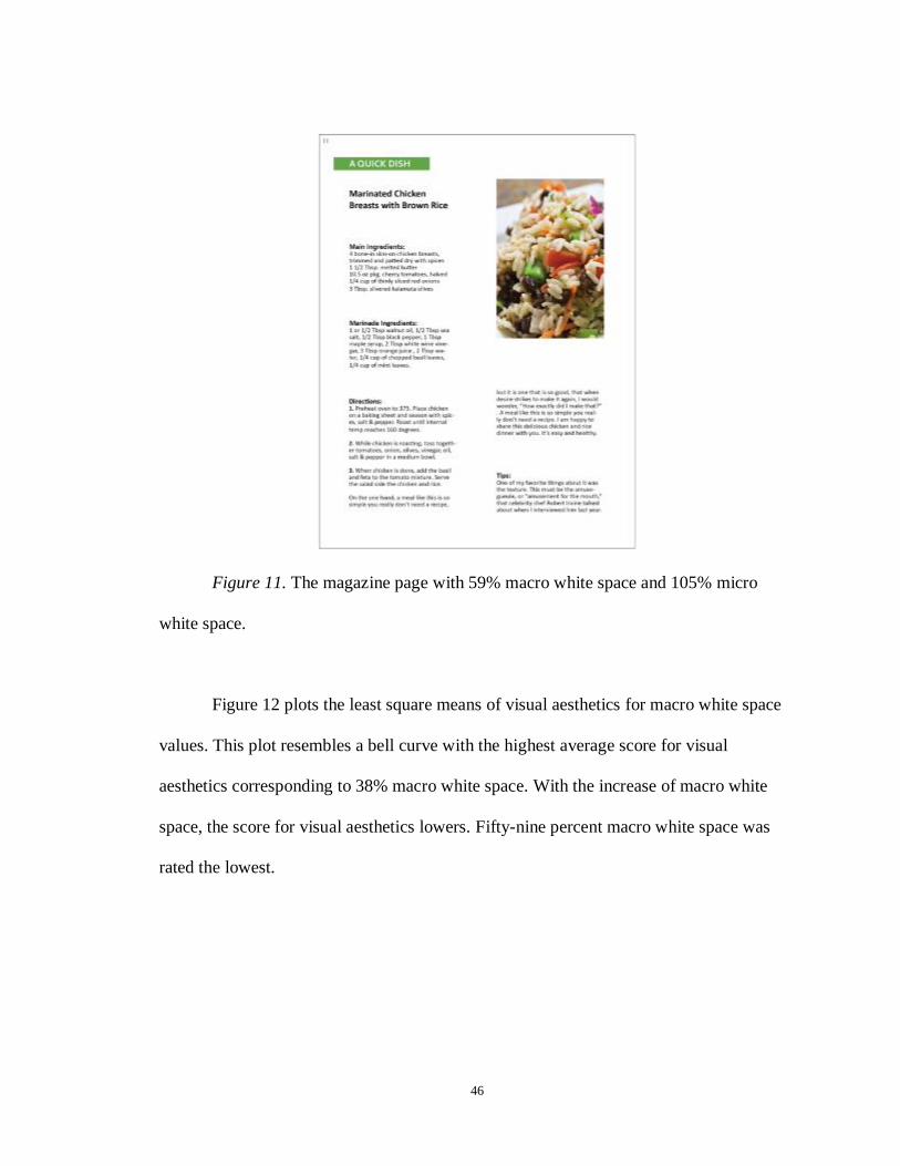
Figure 11. The magazine page with 59% macro white space and 105% micro
white space.
Figure 12 plots the least square means of visual aesthetics for macro white space
values. This plot resembles a bell curve with the highest average score for visual
aesthetics corresponding to 38% macro white space. With the increase of macro white
space, the score for visual aesthetics lowers. Fifty-nine percent macro white space was
rated the lowest.
47
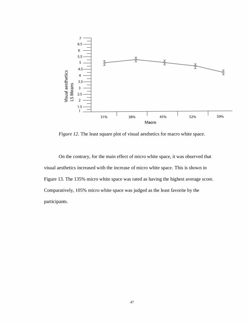
Figure 12. The least square plot of visual aesthetics for macro white space.
On the contrary, for the main effect of micro white space, it was observed that
visual aesthetics increased with the increase of micro white space. This is shown in
Figure 13. The 135% micro white space was rated as having the highest average score.
Comparatively, 105% micro white space was judged as the least favorite by the
participants.

48
Figure 13. The least square plot of visual aesthetics for micro white space.
Again, the interaction of 38% macro white space and 135% micro white space
was given the highest score regarding visual aesthetics. See Figure 14. When the macro
white space increased from 31% to 38%, the rating of visual aesthetics of the magazine
page increased particularly for the micro white space levels of 120% and 135%. When
the macro white space increased from 45% to 59%, the score started decreasing for all
three levels of micro white space.

49
Figure 14. The least square plot of visual aesthetics for interaction between macro
white space and micro white space.
Legibility
For assessing legibility, the research conducted two methodologies: questionnaire
and letter counting. The following are the results analysed these two methods.
Results of questionnaire.
For assessing the legibility, there are two methods in the present study. The
following is the results from the questionnaires, obtained in the first part of the main
experiment.
As seen in Table 2, all three fixed effects were statistically significant. This stems
from the fact that all the p- values were less than .05. This result demonstrates that both
macro and micro white space had significant influence on participants’ impressions of
legibility; the result is consistent with that of the analysis of the visual aesthetics. The

50
interaction effect between macro and micro white space levels was also statistically
significant.
Table 2
Fixed Effect Tests for Legibility
Source F Ratio Prob > F
Macro 4.76 0.0008
Micro 28.76 <.0001
Macro*Micro 3.08 0.0020
According to the least square mean estimates, the combination of 38% macro
white space with 135% micro white space has the highest estimate, which is 5.75. See
Appendix A. This specific design had the most effect on the legibility score. It also can
be interpreted that the majority of people think the corresponding magazine page is more
legible compared to the rest of the 14 samples of white space combinations design. This
result is identical with the result on visual aesthetics. On the contrary, the magazine page
with 31% macro white space and 105% micro white space was rated the lowest on the
legibility, with the score of 4.30. More information on specific significant differences can
be found in the Appendix A. Figure 15 shows the pages with the highest legibility
average score, and Figure 16 shows the lowest legibility average score.
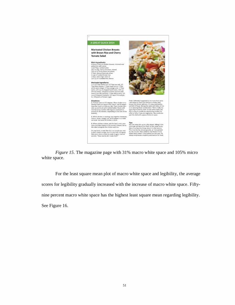
51
Figure 15. The magazine page with 31% macro white space and 105% micro
white space.
For the least square mean plot of macro white space and legibility, the average
scores for legibility gradually increased with the increase of macro white space. Fifty-
nine percent macro white space has the highest least square mean regarding legibility.
See Figure 16.
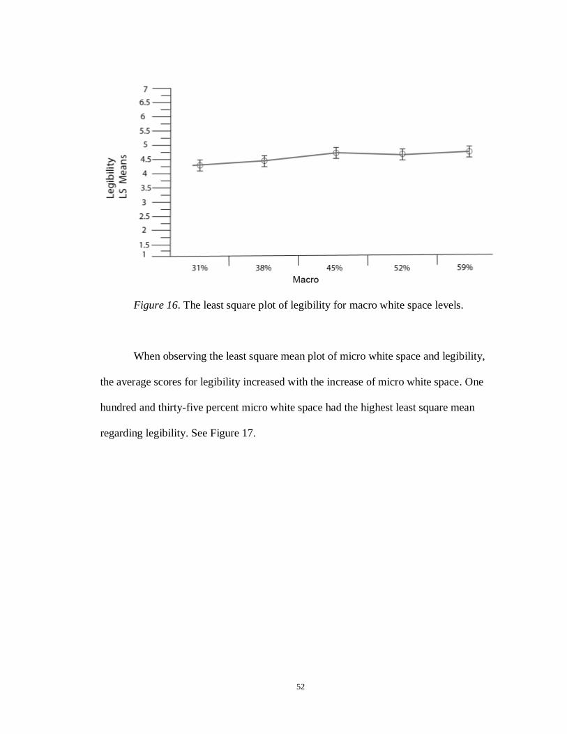
52
Figure 16. The least square plot of legibility for macro white space levels.
When observing the least square mean plot of micro white space and legibility,
the average scores for legibility increased with the increase of micro white space. One
hundred and thirty-five percent micro white space had the highest least square mean
regarding legibility. See Figure 17.
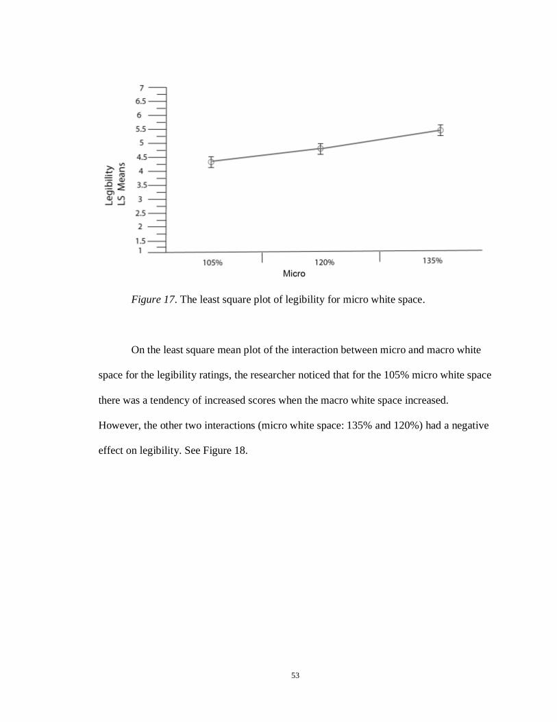
53
Figure 17. The least square plot of legibility for micro white space.
On the least square mean plot of the interaction between micro and macro white
space for the legibility ratings, the researcher noticed that for the 105% micro white space
there was a tendency of increased scores when the macro white space increased.
However, the other two interactions (micro white space: 135% and 120%) had a negative
effect on legibility. See Figure 18.
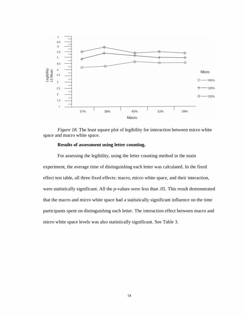
54
Figure 18. The least square plot of legibility for interaction between micro white
space and macro white space.
Results of assessment using letter counting.
For assessing the legibility, using the letter counting method in the main
experiment, the average time of distinguishing each letter was calculated. In the fixed
effect test table, all three fixed effects: macro, micro white space, and their interaction,
were statistically significant. All the p-values were less than .05. This result demonstrated
that the macro and micro white space had a statistically significant influence on the time
participants spent on distinguishing each letter. The interaction effect between macro and
micro white space levels was also statistically significant. See Table 3.
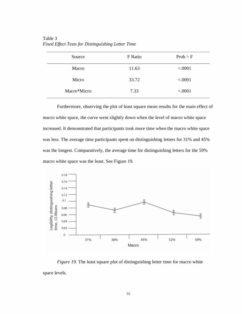
55
Table 3
Fixed Effect Tests for Distinguishing Letter Time
Source F Ratio Prob > F
Macro 11.63 <.0001
Micro 33.72 <.0001
Macro*Micro 7.33 <.0001
Furthermore, observing the plot of least square mean results for the main effect of
macro white space, the curve went slightly down when the level of macro white space
increased. It demonstrated that participants took more time when the macro white space
was less. The average time participants spent on distinguishing letters for 31% and 45%
was the longest. Comparatively, the average time for distinguishing letters for the 59%
macro white space was the least. See Figure 19.
Figure 19. The least square plot of distinguishing letter time for macro white
space levels.
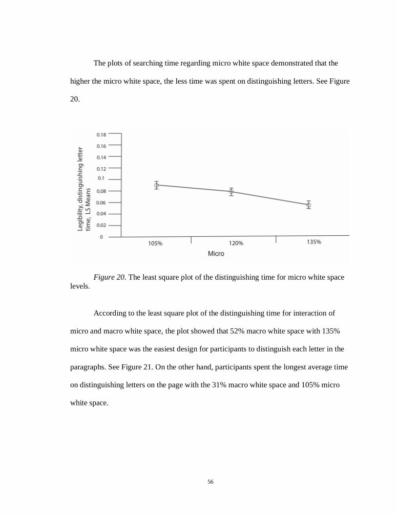
56
The plots of searching time regarding micro white space demonstrated that the
higher the micro white space, the less time was spent on distinguishing letters. See Figure
20.
Figure 20. The least square plot of the distinguishing time for micro white space
levels.
According to the least square plot of the distinguishing time for interaction of
micro and macro white space, the plot showed that 52% macro white space with 135%
micro white space was the easiest design for participants to distinguish each letter in the
paragraphs. See Figure 21. On the other hand, participants spent the longest average time
on distinguishing letters on the page with the 31% macro white space and 105% micro
white space.
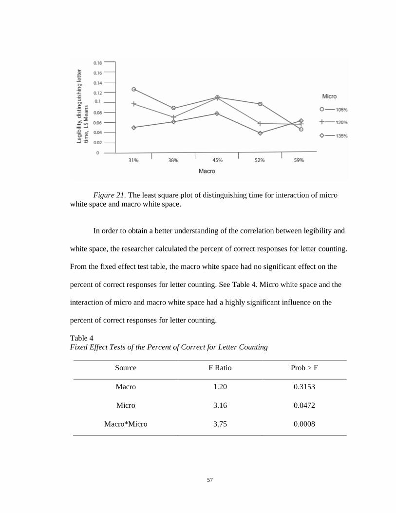
57
Figure 21. The least square plot of distinguishing time for interaction of micro
white space and macro white space.
In order to obtain a better understanding of the correlation between legibility and
white space, the researcher calculated the percent of correct responses for letter counting.
From the fixed effect test table, the macro white space had no significant effect on the
percent of correct responses for letter counting. See Table 4. Micro white space and the
interaction of micro and macro white space had a highly significant influence on the
percent of correct responses for letter counting.
Table 4
Fixed Effect Tests of the Percent of Correct for Letter Counting
Source F Ratio Prob > F
Macro 1.20 0.3153
Micro 3.16 0.0472
Macro*Micro 3.75 0.0008
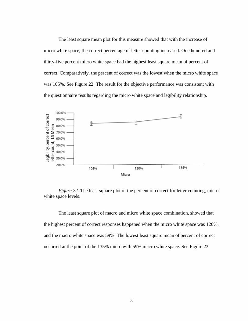
58
The least square mean plot for this measure showed that with the increase of
micro white space, the correct percentage of letter counting increased. One hundred and
thirty-five percent micro white space had the highest least square mean of percent of
correct. Comparatively, the percent of correct was the lowest when the micro white space
was 105%. See Figure 22. The result for the objective performance was consistent with
the questionnaire results regarding the micro white space and legibility relationship.
Figure 22. The least square plot of the percent of correct for letter counting, micro
white space levels.
The least square plot of macro and micro white space combination, showed that
the highest percent of correct responses happened when the micro white space was 120%,
and the macro white space was 59%. The lowest least square mean of percent of correct
occurred at the point of the 135% micro with 59% macro white space. See Figure 23.

59
Figure 23. The least square plot of the percent of correct for letter counting,
interaction of macro and micro white space.
Readability
For assessing readability, the research conducted two methodologies:
questionnaire and content recollection. The following are the results analysed these two
methods.
Results of questionnaire.
Similar to legibility, two methods were used to evaluate readability in the present
study: perceived readability questionnaire and objective assessment of readability.
For the questionnaire data, mixed model repeated measures ANOVA was
employed to evaluate fixed effects of macro white space, micro white space, and their
interaction, with Participants considered as a random effect. The analysis showed that all
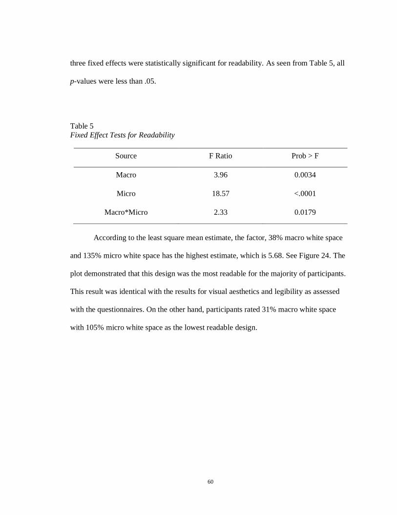
60
three fixed effects were statistically significant for readability. As seen from Table 5, all
p-values were less than .05.
Table 5
Fixed Effect Tests for Readability
Source F Ratio Prob > F
Macro 3.96 0.0034
Micro 18.57 <.0001
Macro*Micro 2.33 0.0179
According to the least square mean estimate, the factor, 38% macro white space
and 135% micro white space has the highest estimate, which is 5.68. See Figure 24. The
plot demonstrated that this design was the most readable for the majority of participants.
This result was identical with the results for visual aesthetics and legibility as assessed
with the questionnaires. On the other hand, participants rated 31% macro white space
with 105% micro white space as the lowest readable design.

61
Figure 24. The least square plot of readability for interaction between micro white
space and macro white space.
Furthermore, observing the plot of least square mean results for macro white
space, the curve gradually increased when the level of macro white space increased,
approaching a plateau or slightly decreasing after 52% macro white space. See Figure 25.
Figure 25. The least square plot of readability for macro white space.
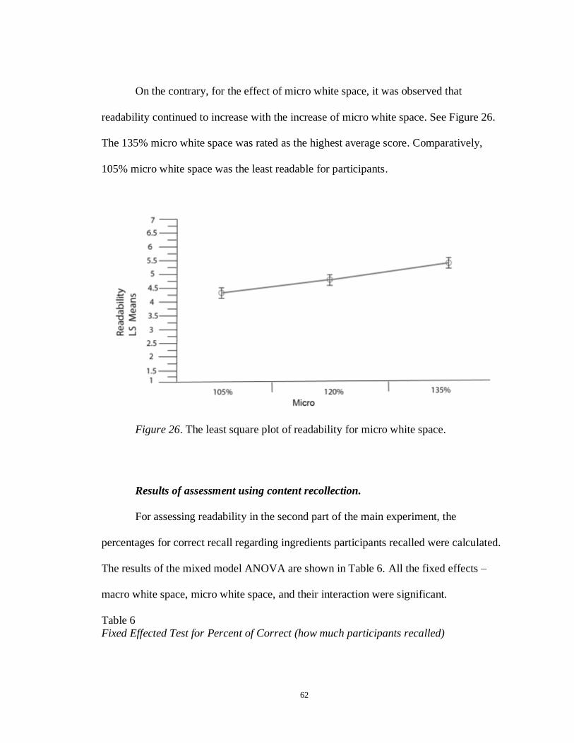
62
On the contrary, for the effect of micro white space, it was observed that
readability continued to increase with the increase of micro white space. See Figure 26.
The 135% micro white space was rated as the highest average score. Comparatively,
105% micro white space was the least readable for participants.
Figure 26. The least square plot of readability for micro white space.
Results of assessment using content recollection.
For assessing readability in the second part of the main experiment, the
percentages for correct recall regarding ingredients participants recalled were calculated.
The results of the mixed model ANOVA are shown in Table 6. All the fixed effects –
macro white space, micro white space, and their interaction were significant.
Table 6
Fixed Effected Test for Percent of Correct (how much participants recalled)

63
Source F Ratio Prob > F
Macro 3.56 0.0095
Micro 14.53 <.0001
Macro*Micro 6.64 <.0001
From the least square mean plot for macro white space, an irregular curve can be
observed. See Figure 27. The highest percent of correct recall was found for the 31%
macro white space and lowest for the 59% macro white space. Some discrepancies
existed when comparing the results from the questionnaire and the recall data. The
researcher believed that it related to people’s reading habits and capability of
memorizing. The value of 120% of type size is a widely used leading default value in
page layout software. Therefore, because it so often used in page layout, 120% micro
white space could be more comfortable for readability.
Figure 27. The least square plot of percent of correct (ingredients recalled) for
macro white space.
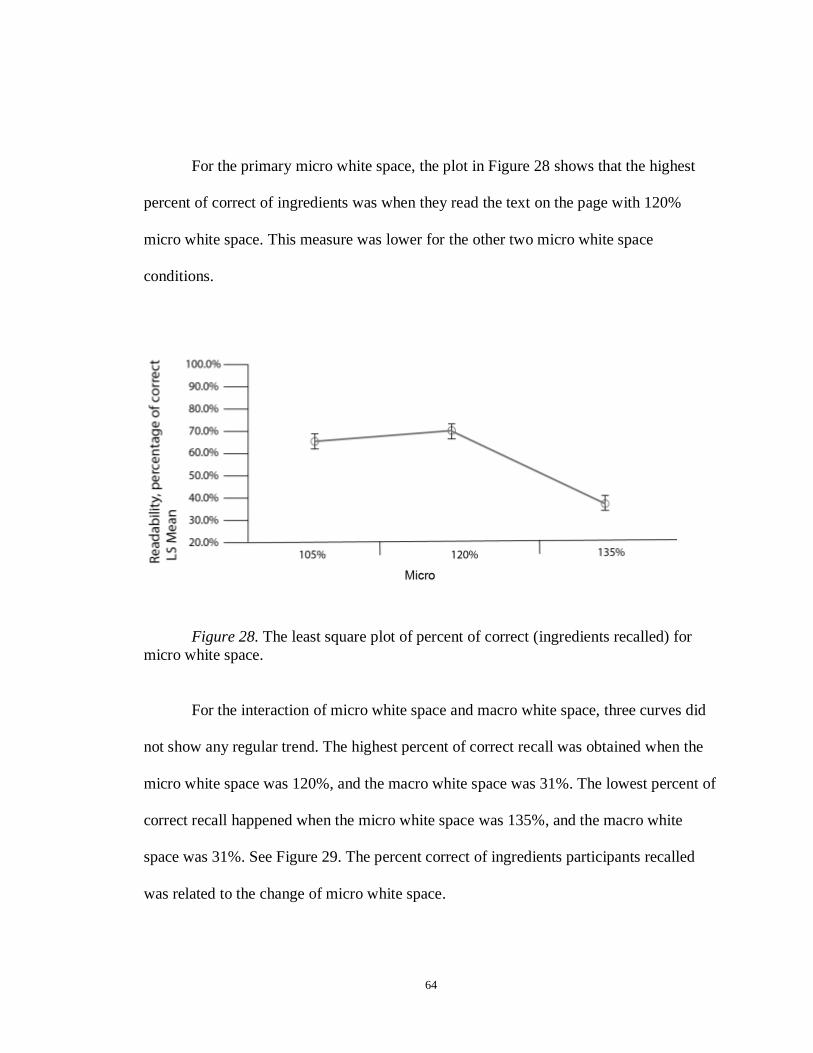
64
For the primary micro white space, the plot in Figure 28 shows that the highest
percent of correct of ingredients was when they read the text on the page with 120%
micro white space. This measure was lower for the other two micro white space
conditions.
Figure 28. The least square plot of percent of correct (ingredients recalled) for
micro white space.
For the interaction of micro white space and macro white space, three curves did
not show any regular trend. The highest percent of correct recall was obtained when the
micro white space was 120%, and the macro white space was 31%. The lowest percent of
correct recall happened when the micro white space was 135%, and the macro white
space was 31%. See Figure 29. The percent correct of ingredients participants recalled
was related to the change of micro white space.

65
Figure 29. The least square plot of the percent of correct (ingredients recalled),
interaction of macro and micro.
66
Chapter 7: Summary and Conclusions
Notable Findings
At the conclusion of the study, the research questions were answered based on the
results of the analysis of variance:
For articles in the digital editions of food magazines on an iPad platform, does
white space impact the UX (visual aesthetics, readability, and legibility) for readers?
It was determined that three fixed effects: macro white space, micro white space,
and the interaction of macro and micro white space had a statistically significant impact
on all three perspectives of UX based on the questionnaire data. All the p-values were
less than .05. For the objective performance measures of readability and legibility, the
results were similar with the exception of only macro white space not having significant
effect on the percent of correct for letter counting.
If so, which dimensions of UX have been affected acutely by white space?
Based on the questionnaire results from two parts of experiment, all three
dimensions have been significantly affected by the white space variables. What more,
when the researcher observed the main effect of micro white space, ratings for all three
dimensions of UX monotonically increased as the micro white space increased. However,
the perceived data showed different effects of macro white space on the three dimensions
of UX.
First, the visual aesthetics decreased when the macro white space increased from
38% to 59%. For the legibility, the data showed that it increased when the macro white
67
space increased. Last but not least, the readability increased when the macro white space
increased to 52%. However, then it started dropping when the macro white space
increased to 59%, showing, therefore, an optimum for the macro white space at 52%.
From the objective performance measures, it was concluded that the readability
increased when micro white space increased from 105% to 120%. At the same time,
readability decreased when micro white space increased from 120% to 135%. For
legibility, the time for distinguishing each letter decreased with the increase of the macro
white space. For the micro white space, the time of distinguishing each letter decreased
when the micro white space increased from 105% to 135%. Also, the data showed that
with more micro white space more correct letters were distinguished. Therefore, the
legibility increased when the micro white space increased. These objective performance
results are consistent with the perceived assessments.
Are there any exact quantitative features in terms of white space results that can
help designers understand design patterns for digital magazines concretely and explicitly?
Based on the questionnaire results, the perceived data demonstrated that the
majority of 62 participants chose the 38% macro white space and 135% micro white
space as the best combination regarding all three aspects of UX.
What’s more, the results from the second part of the experiment showed that
people spent the least time searching letters when the macro white space was 59%. For
the percent correct for legibility, the design with 59% macro white space with 135%
micro white space had the most positive effect. As a result, if designers want to achieve
high legibility of a magazine page, they should consider having macro white space,
68
which is more than 50% of the space of the magazine page on the iPad, and micro white
space that is higher than the default line space in the Adobe InDesign software. For
readability, the results were similar to legibility. It was concluded that for the
combination of macro white and micro white space, the readability increased when the
macro white space was bigger than 38% and 52%; the micro white space was 120% or
135%.
There were some discrepancies between the results of the questionnaire and the
objective performance. The researcher assumed that it related to participants’ different
reading habits and capability of memorizing. These two factors may subconsciously
affect the result of readability assessment in the second part of main experiment, when
the researcher required participants to recall the content of the text during the experiment.
However, the researcher believes that designers could refer to the different sets of results
for different purposes.
The purpose of this study was to develop a compatible solution to help designers
to manipulate white space. The above findings are the three main results that designers
might refer to for different concerns. First, the 38% macro white space with 135% of the
type size in the leading setting option is the best choice regarding perceived visual
aesthetics, legibility, and readability. Second, 135% micro white space had the most
significant effect on legibility. Last but not least, 120% micro white space had the most
positive effect on readability out of three levels of micro white space.
69
Challenges, Limitations, and Considerations
To determine the optimum resolution for assessing readability was a challenge for
the researcher, as she manipulated white space ratio. The manipulation was done by
changing the width and height of each block. Therefore, the length and the content of text
were changed at the same time. To minimize the impact of different text lengths, the
researcher created another set of 15 magazine pages but kept the same number of lines in
the “ingredients” paragraph with a fixed white space ratio.
The limitation of this research was the choice of letters for counting in assessing
legibility. Letters include those with ascenders, those with descenders, and those with
neither, in addition to the shape differences. Different letters may have different effects
on legibility. However, due to the text content for the experiment, the researcher had to
choose two different letters with a similar number of occurrences. The letters I and S
were selected.
Suggestions for Further Research
In the present research, there are several limitations regarding the assessment of
legibility and readability; for instance, the choice of letters. It would be interesting to see
if a different choice of letters for the legibility study would reveal different effects of
macro and micro white space. This could be a goal for future research.
All the sample magazine pages were designed using a white background and
black text. It would be interesting to study the effect of negative space as a generalization
of white space and conduct the research with the white space as different colored
backgrounds.
70
Contributions and Conclusions
Upon conclusion of the study, within the scope of the present experiment, the
researcher did narrow the selected range of white space ratios. She believes it provides a
useable manual to magazine publishers and designers. Using this framework, magazine
designers could consult the relation between white space and user experience while
composing their digital magazine layouts. It may help them to avoid mistakes.
The researcher’s original intention is that these findings from the study can
answer questions regarding white space, especially for those who design digital food
magazines.
71
List of References
Amin, M., Rezaei, S., & Abolghasemi, M. (2014). User satisfaction with mobile
websites: the impact of perceived usefulness, perceived ease of use and trust.
Nankai Business Review International, 5(3), pp. 258-274.
An, Q. (2010). A Monte Carlo Study of Several Alpha-Adjustment Procedures Used in
Testing Multiple Hypotheses in Factorial Anova. Ohio University. ProQuest
Dissertations Publishing.
Anderson, C. (2013, Jan 6). What's the significance of 0.05 significance? Retrieved May
1, 2017, from p-value.info: http://www.p-value.info/2013/01/whats-significance-
of-005-significance_6.html
Arnold, E. (1981). Design the Total Newspaper. New York: Harper and Row Publisher.
Bailey, C. (2011, Jun 22). The Basics of Typography. Retrieved Mar 24, 2016, from
DESIGN INSTRUCT: http://designinstruct.com/tools-basics/the-basics-of-
typography/Design Instruct
Bazilian, E. (2013, May 29). Magazine Readership Growing, Survey Shows Digital
readership up more than 80% in past year. Retrieved June 2016, from adweek:
http://www.adweek.com/news/press/magazine-readership-growing-survey-shows-
149863
Benedek, J., & Miner, T. (2003). Measuring Desirability: New methods for evaluating
desirability in a usability lab setting. Proceedings of Usability Professionals
Association.
72
Bennett, J. G. (2012). Design fundamentals for new media. Portland, United States:
Ringgold Inc.
Boulton, M. (2007, Jan 09). Whitespace. Retrieved Apr 22, 2016, from alistapart:
http://alistapart.com/article/whitespace
Brandes, D. R. (2015, May). Repeated Reading with and without Vocabulary Instruction:
Outcomes for English Language Learners. Retrieved Aug 4, 2016, from ProQuest
Dissertations and Theses:
http://search.proquest.com.ezproxy.rit.edu/docview/1733680773?accountid=108
Cai, S., Xu, Y., Yu, J., & Souza, R. D. (2008). UNDERSTANDING AESTHETICS
DESIGN FOR E-COMMERCE WEB SITES: A COGNITIVE-AFFECTIVE
FRAMEWORK. ACIS 2008 - 12th Pacific Asia Conference on Information
Systems: Leveraging ICT for Resilient Organizations and Sustainable Growth in
the Asia Pacific Region (p. 60). Suzhou: PACIS 2008 Proceeding.
Cao, J., Zieba, K., & Ellis, M. (2015, May 28). Why White Space Is Crucial To UX
Design. Retrieved Apr 22, 2016, from fastcodesign:
http://www.fastcodesign.com/3046656/why-white-space-is-crucial-to-ux-design
Carter, B. (2013). Food magazine readership shows gender divide. Media News.
Cleveland, P. (2005). How much visual power can a magazine take? Design Studies, 271-
317.
Coates, S. (2014). White Space: An Overlooked Element of Design. Student Research
Conference Select Presentations, (p. 26).
73
Coursaris, C. K., & Kripintris, K. (2012). Web Aesthetics and Usability: An Empirical
Study of the Effects of White Space. International Journal of E-Business
Research, 35.
Cousins, C. (2012, Feb 10). Practical Tips for Utilizing Columns of Text in Your Layouts.
Retrieved Oct 2016, from Design Shack:
https://designshack.net/articles/layouts/practical-tips-for-utilizing-columns-of-
text-in-your-layouts/
David, A., & Glore, P. (2010). The Impact of Design and Aesthetics on Usability,
Credibility, and Learning in an Online Environment.
Deng, C. Q. (2009, April 05). Least squares means (marginal means) vs. means.
Retrieved April 20, 2017, from On Biostatistics and Clinical Trials:
http://onbiostatistics.blogspot.com/2009/04/least-squares-means-marginal-means-
vs.html
Fallon, S. (2014, May). A Conjoint Analysis of Reader Preference for the Layout of
Tablet Editions of Magazines.
Felici, J. (2012). The complete Manual of Typography: a Guide to Setting Perfect Type,
Second Edition. Berkeley, CA: Peachpit.
Finstad, K. (2010, May). Response Interpolation and Scale Sensitivity: Evidence Against
5-Point Scales. JOUNAL OF USABILITY STUDIES, 5(3), 104-110.
Garett, J. J. (2002). The Elements of User Experience . New Riders.
Girden, E. R. (1992). ANOVA Reapted Measures. Newbury Park: SAGE Publications,
Inc.
74
Gralnick, J. (2012, Mar 28). Half of U.S. homes own Apple products. Retrieved Feb 2,
2016, from USAtoday: http://usatoday30.usatoday.com/tech/news/story/2012-03-
28/cnbc-survey-apple-products-us-homes/53827254/1
Green, L. B. (2000). Fourth graders' literal and inferential reading comprehension:
Effects of readability and answer format.
Guenther, M. (2011, October 20). Magazine publishing in transition: unique challenges
for multi-media platforms. Publishing Research Quarterly, pp. 327-331.
Haniff, Z. (2012). Niche Theory in New Media: Is Digital Overtaking the Print Magazine
Industry? Las Vegas: University of Nevada – Las Vegas.
Hill, R. (1998). What sample size is “enough” in internet survey research? ,.
Interpersonal Computing and Technology: An Electronic Journal for the 21st
Century, 3-4.
Huang, K., Chen, K., & Ho, C. (2014). Enhancement of reading experience Users’
behavior patterns and the interactive interface design of tablet readers. Library Hi
Tech, 509-528.
ISO, I. O. (2010). ISO/FDIS 9241-210:2010 Ergonomics of human-system interaction --
Part 210: Human-centred design for interactive systems. Switzerland: ISO.
Jane Sasseen, K.-E. M. (2013). News Magazines: By the Numbers. Retrieved from
American Jounalism: http://www.stateofthemedia.org/2013/news-magazines-
embracing-their-digital-future/news-magazines-by-the-numbers/
Johnson, S., & Prijatel, P. (2006). The Magazine from Cover to Cover.

75
Joseph, S. (2015, August 13). Magazine circulation growth fuelled by digital
subscriptions. Retrieved July 2016, from The Drum:
http://www.thedrum.com/news/2015/08/13/magazine-circulation-growth-fuelled-
digital-subscriptions
Kanazawa, S. (2010, March). Why Liberals and Atheists Are More Intelligent. Social
Psychology Quarterly, 73(1), pp. 33-57.
Kripintiris, K. E. (2008). Web Aesthetics And Usability: An Empirical Evaluation Of
White Space.
Kunz, W. (2002). Typography: Macro and Microaesthetic. Sulgen: Verlag Niggli AG.
Lee, A. T. (2000). Web site usability, usefulness, and visit frequency. Human Factors
and Ergonomics Society Annual Meeting Proceedings. 1, p. 404. Santa Monica:
Human Factors and Ergonomics Society.
Legge, G., & Bigelow, C. (2011, Aug). Does print size matter for reading? A review of
findings from vision science and typography. Journal of Vision, 11(5), 8-8.
Liu, Z. (2005). Reading behavior in the digital environment: Changes in reading behavior
over the past ten years. Joutnal of Documentation, 61(6), 700-712.
Lund, A. (2011). User Experience Management: Essential Skills for Leading Effective
UX Teams. User Experience Management: Essential Skills for Leading Effective
UX Teams, 124.
Lundgaard, J. (2013, July 11). Why user experience is as important as visual identity.
Retrieved May 4, 2016, from Design Week Online: www. designweek.co.uk/why-
user-experience-is-as-important-as-visual-identity/

76
O'Guinn, T. C., Olsen, G. D., & Pracejus, J. W. (2013). When white space is more than
“burning money”: Economic signaling meets visual commercial rhetoric. Intern.
J. of Research in Marketing, 211-218.
Pace, L. (2007). Lesson 9: ANOVA for Mixed Factorial Designs. (Furman University)
Retrieved Nov 8, 2016, from SPSS Tutorial:
http://eweb.furman.edu/~lpace/SPSS_Tutorials/lesson9.html
Paplauskaite, L. (2014, March 6). USABILITY AND USEFULNESS IN UX WEB
DESIGN . Retrieved April 17, 2016, from bitzesty:
https://bitzesty.com/2014/03/06/usability-and-usefulness-in-ux-web-design/
Pracejus, J. W., O'Guinn, T. C., & Olsen, G. D. (2013). When white space is more than
“burning money”: Economic signaling meets visual commercial rhetoric. Intern.
J. of Research in Marketing, 211-218.
Pracejus, J. W., Olsen, G. D., & O’Guinn, T. C. (2006, June). How Nothing Became
Something: White Space, Rhetoric, History, and Meaning. Journal of Consumer
Research, 33, page 82.
Price, H. T. (1974). Some Possible Effects on Readership. American Newspaper
Publisher Association Resarch Bulletin.
Pricewaterhouse Cooper. (2014). Global entertainment and media outlook 2014-2018.
Pricewaterhouse Cooper.
Sarte, P. R. (2014). The role of social and temporal distance on college student decision
making. Capella University.
77
Sasseen, J., Matsa, K.-E., & Mitchell, A. (2013). The state of the News Media 2013.
Retrieved 2015, from News Magazines: Embracing Their Digital Future:
http://www.stateofthemedia.org/2013/news-magazines-embracing-their-digital-
future/
Shields, M. (2013, November 20). Advertisers Seem to Care More Than Publishers
About Seeing Ads Study says 2014 will be a big year for viewability. Retrieved
Feburary 15, 2016 , from Adweek: http://www.adweek.com/news/advertising-
branding/advertisers-seem-care-more-publishers-about-seeing-ads-153967
Shird, L. (2003). Examining usability and its effects on user satisfaction and user
preferences for interface design. MAI 42/03M, Masters Abstracts International, p.
88.
Subbaram, V. M. (2004, Sep). EFFECT OF DISPLAY AND TEXT PARAMETERS ON
READING PERFORMANCE.
Szywalski, W. (2013, Oct 6). 6 Golden Rules To Design Successful Digital Magazine.
Retrieved Oct 3, 2016, from Presspad: http://blog.presspadapp.com/successful-
digital-magazine-design-rules/
Technavio. (2016, Feb 23). Global Digital Magazine Publishing Market to Exceed USD
35 Billion by 2020, According to Technavio. New York: Business Wire. Retrieved
Apr 16, 2016, from
http://search.proquest.com.ezproxy.rit.edu/docview/1767352867?accountid=108
The Asoociation of Magazine Media . (2014). 2013/2014 MPA Magazine Media
Factbook. The Asoociation of Magazine Media .

78
The Association of Magazine Media, MPA. (2011). Magazine Media Readers and
Tablets. Retrieved Feb 10, 2016, from The Association of Magazine Media,
MPA: http://www.magazine.org/insights-resources/research-publications/guides-
studies/magazine-media-readers-and-tablets
Thomas , A. N. (2015, Aug 08). Why Whitespace is Important. Retrieved Jan 25, 2016,
from Amy N. Thomas; Web & Graphic Design: http://designamy.com/why-
whitespace-is-important/
Tullis, T., & Albert, B. (2013). Measuring the User Experience Collecting, Analyzing,
and Presenting Usability Metrics. Waltham, MA, USA: Elsevier Inc.
Turnbull, C. (2011, July 19). Using White Space (or Negative Space) in Your Designs.
Retrieved April 16, 2016, from envatotuts+:
http://webdesign.tutsplus.com/articles/using-white-space-or-negative-space-in-
your-designs--webdesign-3401
Wang, A. (2016, Jan 02). Books and newspapers will do just fine in 2016. Magazines?
Not so much. Retrieved Sep 2016, from QUARTZ: http://qz.com/584744/books-
and-newspapers-will-do-just-fine-in-2016-magazines-not-so-much/
White, A. W. (2011). The elements of Graphic Design. New York, United States:
Allworth Press.
Zdralek, J. (2003). “White Space: How much nothing should there be?”. Carleton
University, Department of Psychology, Ottawa.
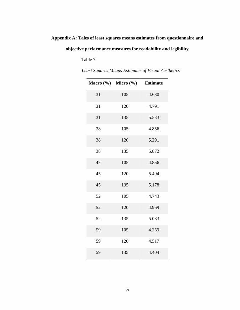
79
Appendix A: Tales of least squares means estimates from questionnaire and
objective performance measures for readability and legibility
Table 7
Least Squares Means Estimates of Visual Aesthetics
Macro (%) Micro (%) Estimate
31 105 4.630
31 120 4.791
31 135 5.533
38 105 4.856
38 120 5.291
38 135 5.872
45 105 4.856
45 120 5.404
45 135 5.178
52 105 4.743
52 120 4.969
52 135 5.033
59 105 4.259
59 120 4.517
59 135 4.404
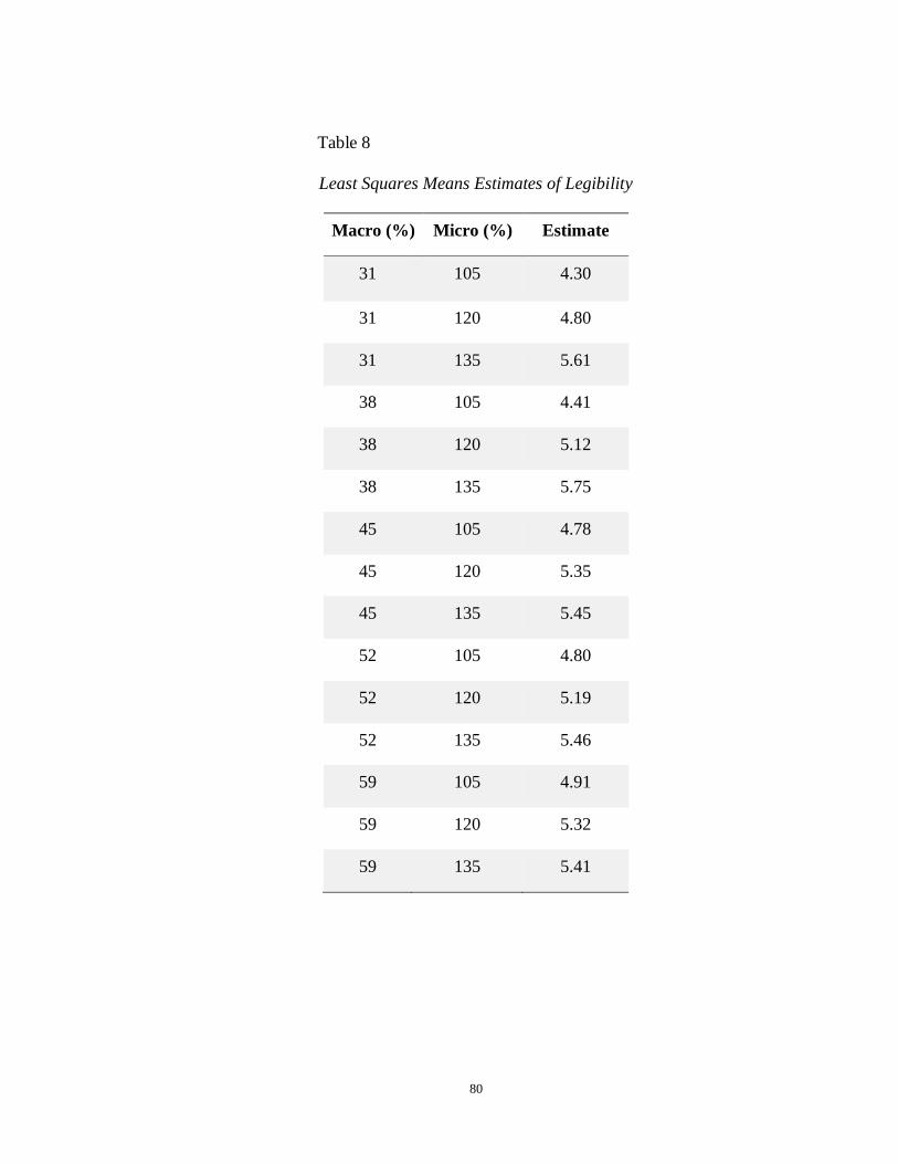
80
Table 8
Least Squares Means Estimates of Legibility
Macro (%) Micro (%) Estimate
31 105 4.30
31 120 4.80
31 135 5.61
38 105 4.41
38 120 5.12
38 135 5.75
45 105 4.78
45 120 5.35
45 135 5.45
52 105 4.80
52 120 5.19
52 135 5.46
59 105 4.91
59 120 5.32
59 135 5.41
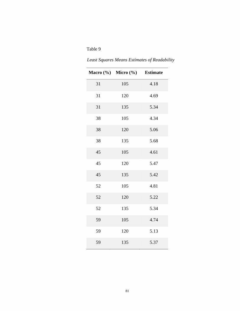
81
Table 9
Least Squares Means Estimates of Readability
Macro (%) Micro (%) Estimate
31 105 4.18
31 120 4.69
31 135 5.34
38 105 4.34
38 120 5.06
38 135 5.68
45 105 4.61
45 120 5.47
45 135 5.42
52 105 4.81
52 120 5.22
52 135 5.34
59 105 4.74
59 120 5.13
59 135 5.37
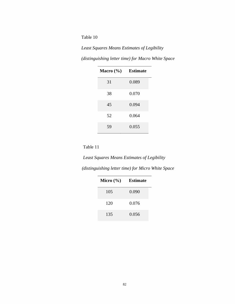
82
Table 10
Least Squares Means Estimates of Legibility
(distinguishing letter time) for Macro White Space
Macro (%) Estimate
31 0.089
38 0.070
45 0.094
52 0.064
59 0.055
Table 11
Least Squares Means Estimates of Legibility
(distinguishing letter time) for Micro White Space
Micro (%) Estimate
105 0.090
120 0.076
135 0.056

83
Table 12
Least Squares Means Estimates of Legibility
(distinguishing letter time) for Macro and Micro White Space
Macro (%) Micro (%) Estimate
31 105 0.121
31 120 0.097
31 135 0.049
38 105 0.083
38 120 0.068
38 135 0.058
45 105 0.104
45 120 0.102
45 135 0.075
52 105 0.095
52 120 0.058
52 135 0.038
59 105 0.047
59 120 0.056
59 135 0.061
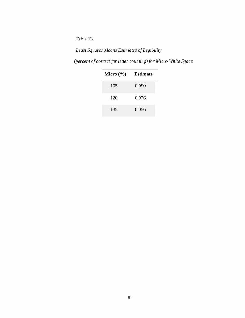
84
Table 13
Least Squares Means Estimates of Legibility
(percent of correct for letter counting) for Micro White Space
Micro (%) Estimate
105 0.090
120 0.076
135 0.056
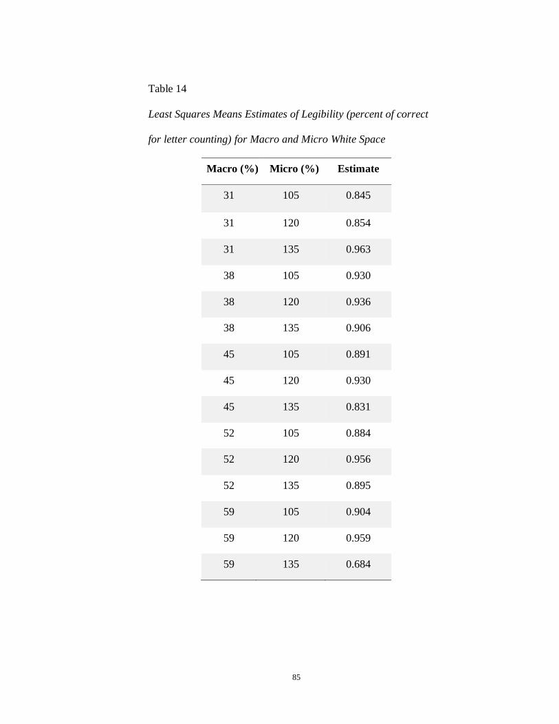
85
Table 14
Least Squares Means Estimates of Legibility (percent of correct
for letter counting) for Macro and Micro White Space
Macro (%) Micro (%) Estimate
31 105 0.845
31 120 0.854
31 135 0.963
38 105 0.930
38 120 0.936
38 135 0.906
45 105 0.891
45 120 0.930
45 135 0.831
52 105 0.884
52 120 0.956
52 135 0.895
59 105 0.904
59 120 0.959
59 135 0.684
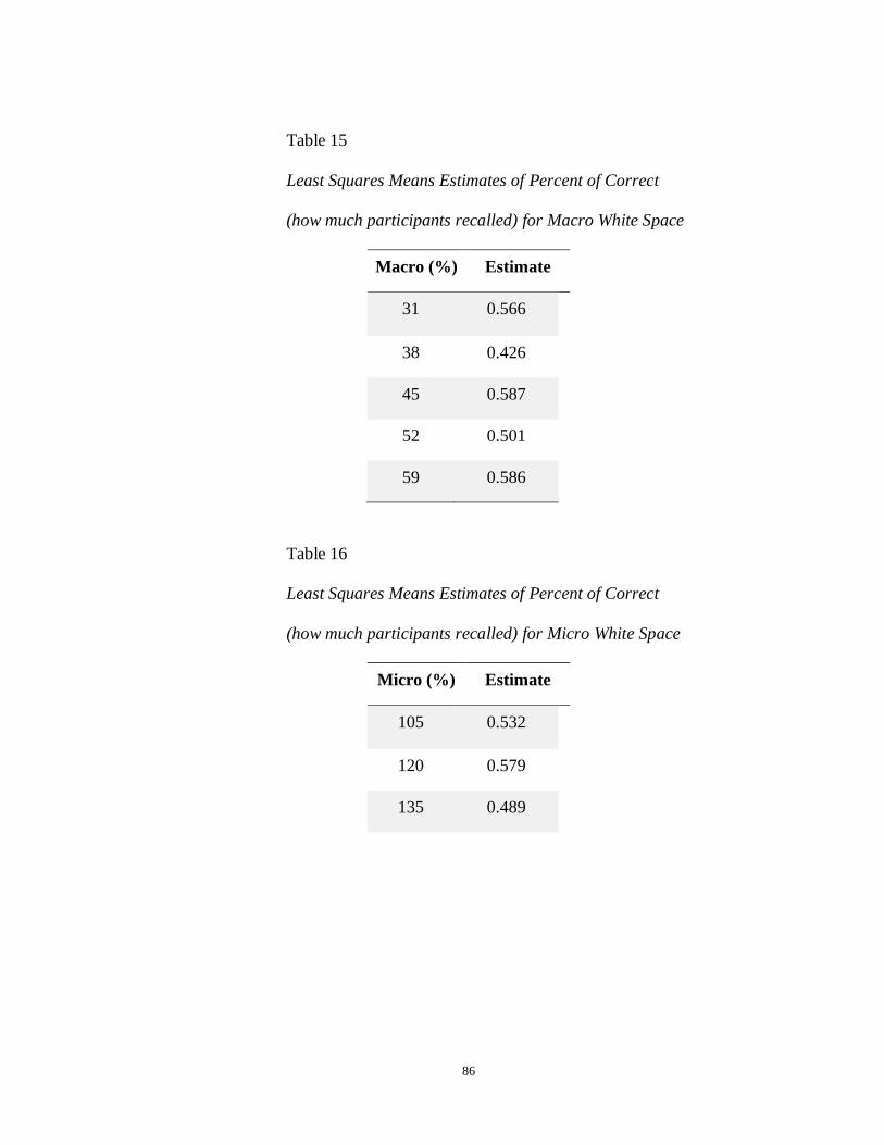
86
Table 15
Least Squares Means Estimates of Percent of Correct
(how much participants recalled) for Macro White Space
Macro (%) Estimate
31 0.566
38 0.426
45 0.587
52 0.501
59 0.586
Table 16
Least Squares Means Estimates of Percent of Correct
(how much participants recalled) for Micro White Space
Micro (%) Estimate
105 0.532
120 0.579
135 0.489
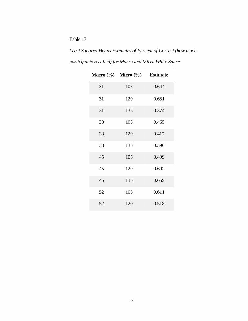
87
Table 17
Least Squares Means Estimates of Percent of Correct (how much
participants recalled) for Macro and Micro White Space
Macro (%) Micro (%) Estimate
31 105 0.644
31 120 0.681
31 135 0.374
38 105 0.465
38 120 0.417
38 135 0.396
45 105 0.499
45 120 0.602
45 135 0.659
52 105 0.611
52 120 0.518
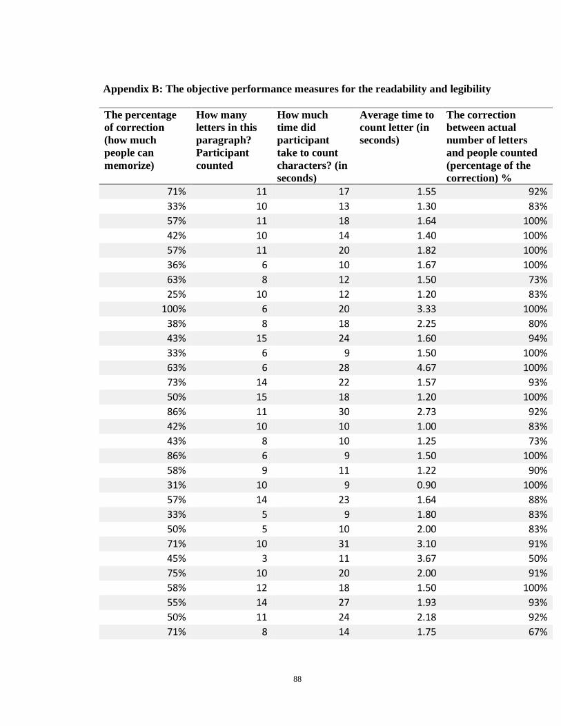
88
Appendix B: The objective performance measures for the readability and legibility
The percentage
of correction
(how much
people can
memorize)
How many
letters in this
paragraph?
Participant
counted
How much
time did
participant
take to count
characters? (in
seconds)
Average time to
count letter (in
seconds)
The correction
between actual
number of letters
and people counted
(percentage of the
correction) %
71% 11 17 1.55 92%
33% 10 13 1.30 83%
57% 11 18 1.64 100%
42% 10 14 1.40 100%
57% 11 20 1.82 100%
36% 6 10 1.67 100%
63% 8 12 1.50 73%
25% 10 12 1.20 83%
100% 6 20 3.33 100%
38% 8 18 2.25 80%
43% 15 24 1.60 94%
33% 6 9 1.50 100%
63% 6 28 4.67 100%
73% 14 22 1.57 93%
50% 15 18 1.20 100%
86% 11 30 2.73 92%
42% 10 10 1.00 83%
43% 8 10 1.25 73%
86% 6 9 1.50 100%
58% 9 11 1.22 90%
31% 10 9 0.90 100%
57% 14 23 1.64 88%
33% 5 9 1.80 83%
50% 5 10 2.00 83%
71% 10 31 3.10 91%
45% 3 11 3.67 50%
75% 10 20 2.00 91%
58% 12 18 1.50 100%
55% 14 27 1.93 93%
50% 11 24 2.18 92%
71% 8 14 1.75 67%

89
The percentage
of correction
(how much
people can
memorize)
How many
letters in this
paragraph?
Participant
counted
How much
time did
participant
take to count
characters? (in
seconds)
Average time to
count letter (in
seconds)
The correction
between actual
number of letters
and people counted
(percentage of the
correction) %
50% 9 10 1.11 75%
71% 10 20 2.00 91%
50% 9 16 1.78 90%
57% 6 13 2.17 100%
38% 10 10 1.00 100%
29% 16 35 2.19 100%
33% 6 8 1.33 100%
29% 9 19 2.11 82%
36% 6 9 1.50 100%
63% 8 13 1.63 73%
25% 11 14 1.27 92%
75% 6 14 2.33 100%
36% 15 23 1.53 100%
25% 16 16 1.00 107%
43% 11 20 1.82 92%
42% 11 32 2.91 92%
71% 10 33 3.30 91%
58% 10 10 1.00 100%
43% 4 8 2.00 67%
38% 10 12 1.20 100%
71% 12 19 1.58 75%
50% 4 9 2.25 67%
75% 5 11 2.20 45%
71% 8 12 1.50 73%
82% 4 8 2 67%
63% 10 13 1.30 91%
42% 9 12 1.33 75%
55% 13 16 1.23 87%
58% 11 20 1.82 92%
43% 11 23 2.09 92%
25% 12 15 1.25 100%
71% 11 17 1.55 100%
50% 9 12 1.33 90%
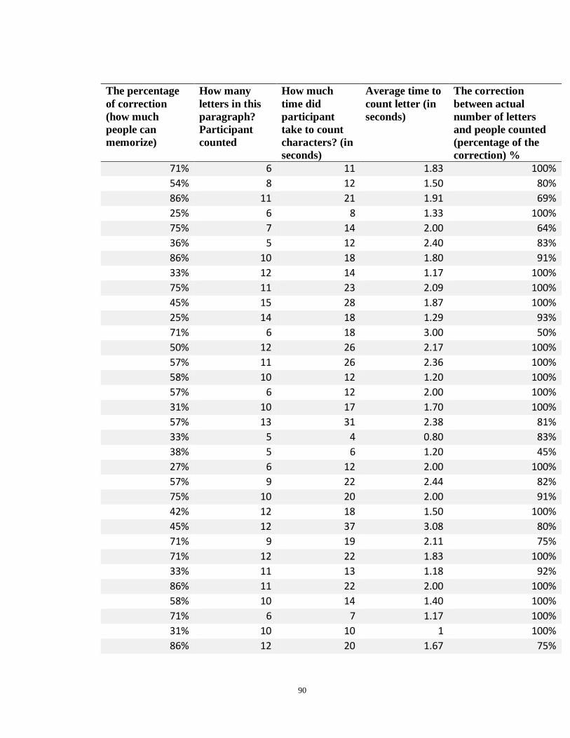
90
The percentage
of correction
(how much
people can
memorize)
How many
letters in this
paragraph?
Participant
counted
How much
time did
participant
take to count
characters? (in
seconds)
Average time to
count letter (in
seconds)
The correction
between actual
number of letters
and people counted
(percentage of the
correction) %
71% 6 11 1.83 100%
54% 8 12 1.50 80%
86% 11 21 1.91 69%
25% 6 8 1.33 100%
75% 7 14 2.00 64%
36% 5 12 2.40 83%
86% 10 18 1.80 91%
33% 12 14 1.17 100%
75% 11 23 2.09 100%
45% 15 28 1.87 100%
25% 14 18 1.29 93%
71% 6 18 3.00 50%
50% 12 26 2.17 100%
57% 11 26 2.36 100%
58% 10 12 1.20 100%
57% 6 12 2.00 100%
31% 10 17 1.70 100%
57% 13 31 2.38 81%
33% 5 4 0.80 83%
38% 5 6 1.20 45%
27% 6 12 2.00 100%
57% 9 22 2.44 82%
75% 10 20 2.00 91%
42% 12 18 1.50 100%
45% 12 37 3.08 80%
71% 9 19 2.11 75%
71% 12 22 1.83 100%
33% 11 13 1.18 92%
86% 11 22 2.00 100%
58% 10 14 1.40 100%
71% 6 7 1.17 100%
31% 10 10 1 100%
86% 12 20 1.67 75%

91
The percentage
of correction
(how much
people can
memorize)
How many
letters in this
paragraph?
Participant
counted
How much
time did
participant
take to count
characters? (in
seconds)
Average time to
count letter (in
seconds)
The correction
between actual
number of letters
and people counted
(percentage of the
correction) %
33% 5 8 1.60 83%
63% 6 7 1.17 55%
45% 5 9 1.80 83%
43% 2 9 4.50 18%
42% 9 16 1.78 75%
63% 6 11 1.83 55%
45% 11 19 1.73 73%
50% 14 16 1.14 93%
86% 11 21 1.91 92%
58% 14 13 0.93 117%
57% 10 18 1.80 91%
50% 9 10 1.11 90%
57% 6 12 2.00 100%
38% 11 18 1.64 110%
86% 15 36 2.40 94%
58% 6 12 2.00 100%
75% 6 18 3.00 55%
57% 11 21 1.91 100%
45% 6 7 1.17 100%
50% 10 16 1.60 91%
50% 12 13 1.08 100%
45% 13 19 1.46 87%
43% 11 22 2.00 92%
71% 11 22 2.00 92%
42% 12 23 1.92 100%
29% 10 34 3.40 91%
42% 10 14 1.40 100%

92
Appendix C: Questionnaire
Participant ID:
Date:
Questions for page 1- 15
1. How satisfied are you with the visual aesthetics of this page?
Not at all Extremely
1 2 3 4 5 6 7
2. How legible do you find this page?
Not at all Extremely
1 2 3 4 5 6 7
3. How readable do you find this page?
Not at all Extremely
1 2 3 4 5 6 7
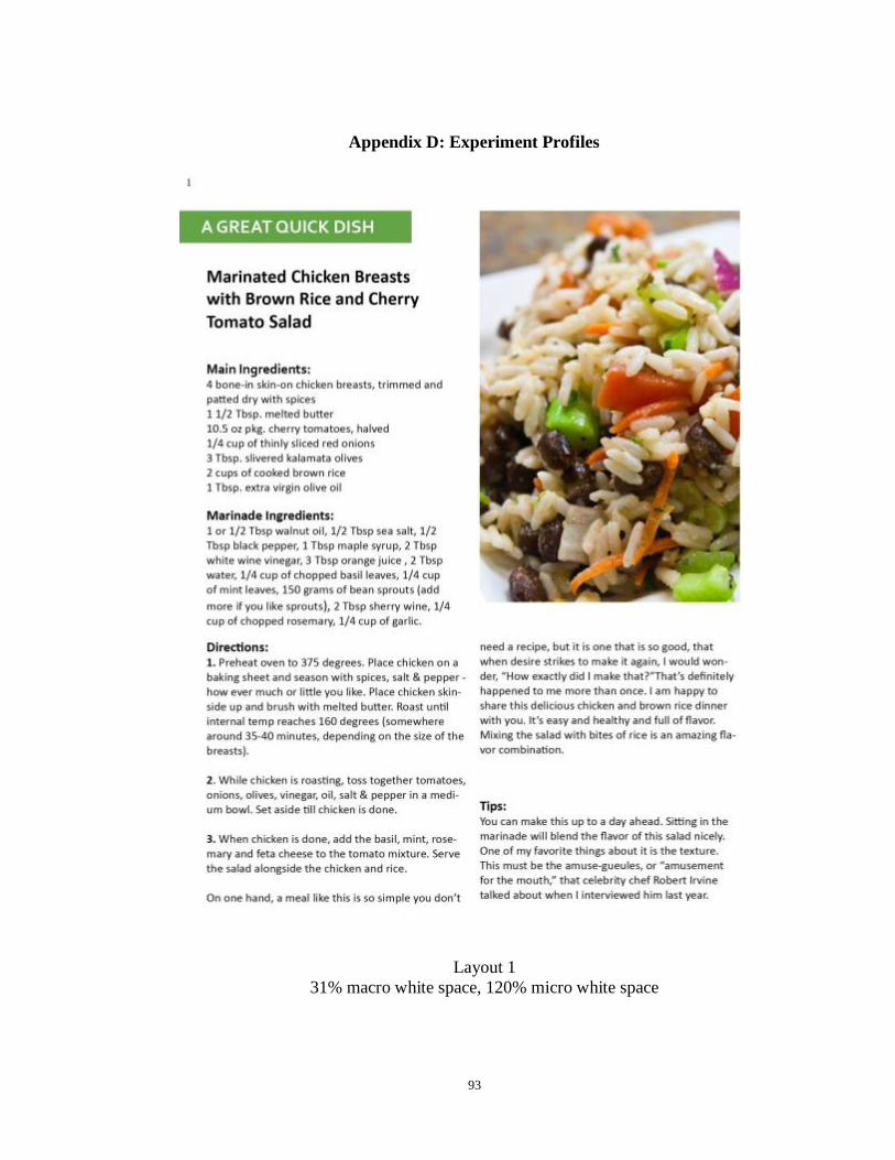
93
Appendix D: Experiment Profiles
Layout 1
31% macro white space, 120% micro white space

94
Layout 2
38% macro white space, 120% micro white space
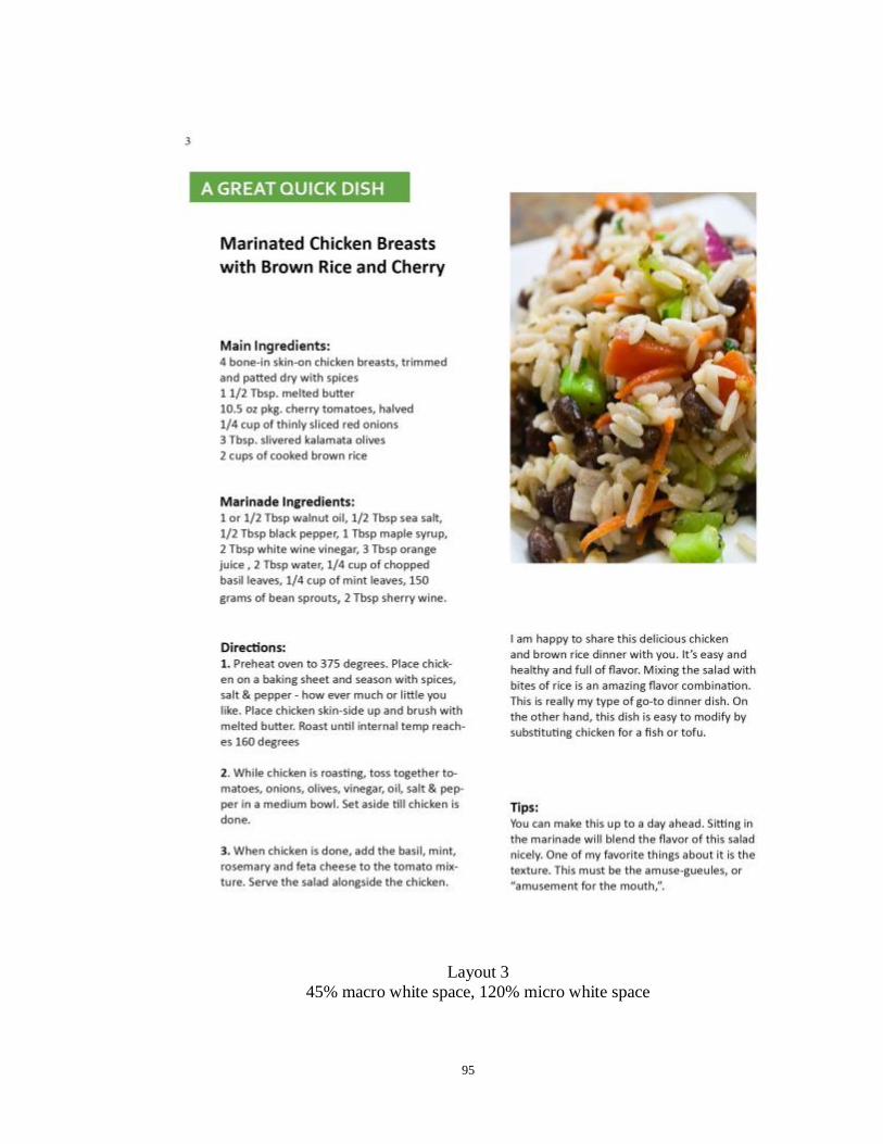
95
Layout 3
45% macro white space, 120% micro white space

96
Layout 4
52% macro white space, 120% micro white space

97
Layout 5
59% macro white space, 120% micro white space

98
Layout 6
31% macro white space, 135% micro white space
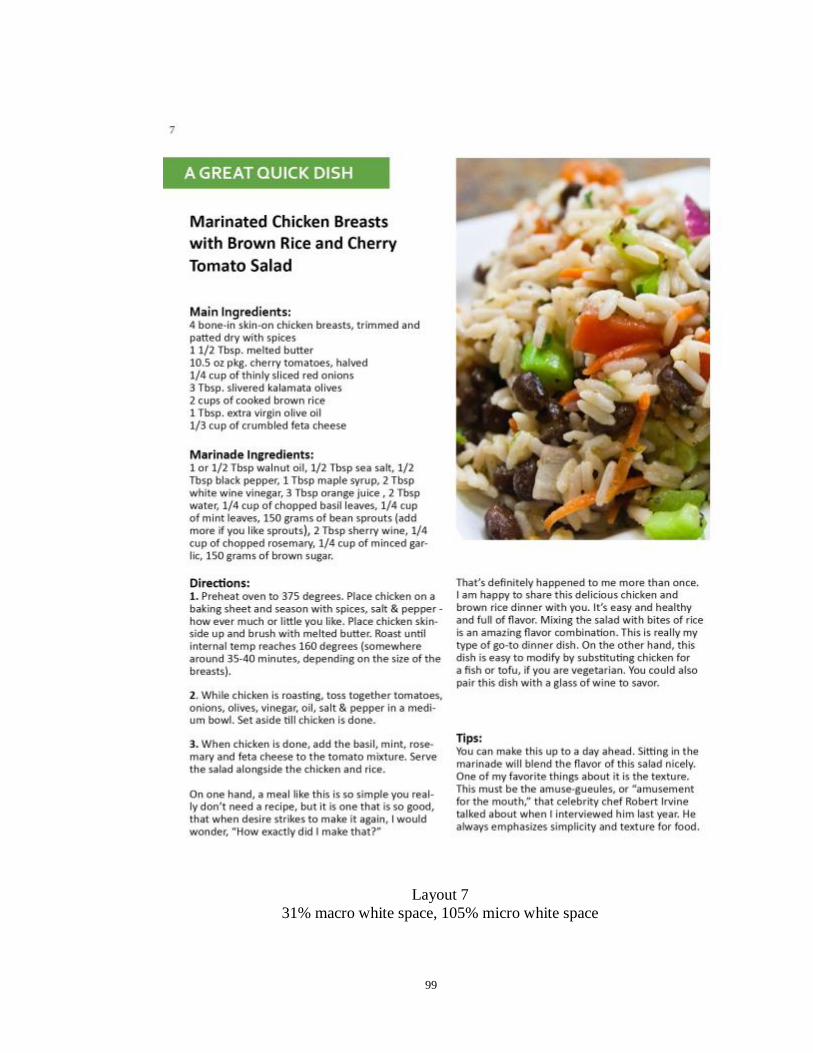
99
Layout 7
31% macro white space, 105% micro white space
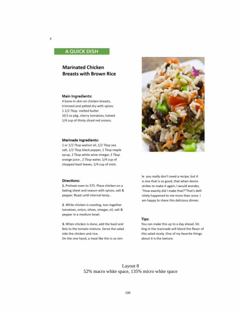
100
Layout 8
52% macro white space, 135% micro white space
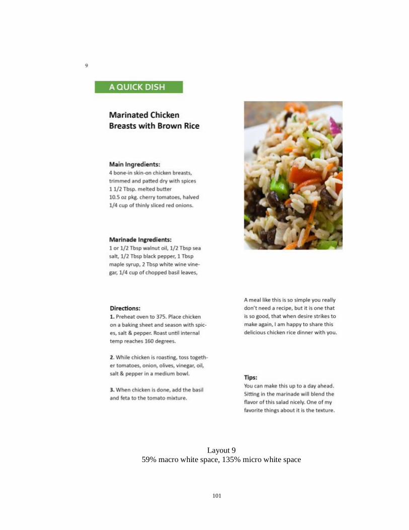
101
Layout 9
59% macro white space, 135% micro white space

102
Layout 10
52% macro white space, 105% micro white space

103
Layout 11
59% macro white space, 105% micro white space
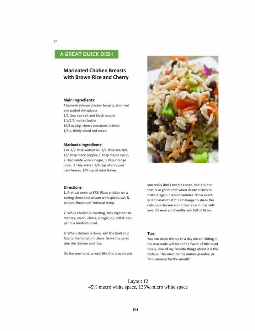
104
Layout 12
45% macro white space, 135% micro white space
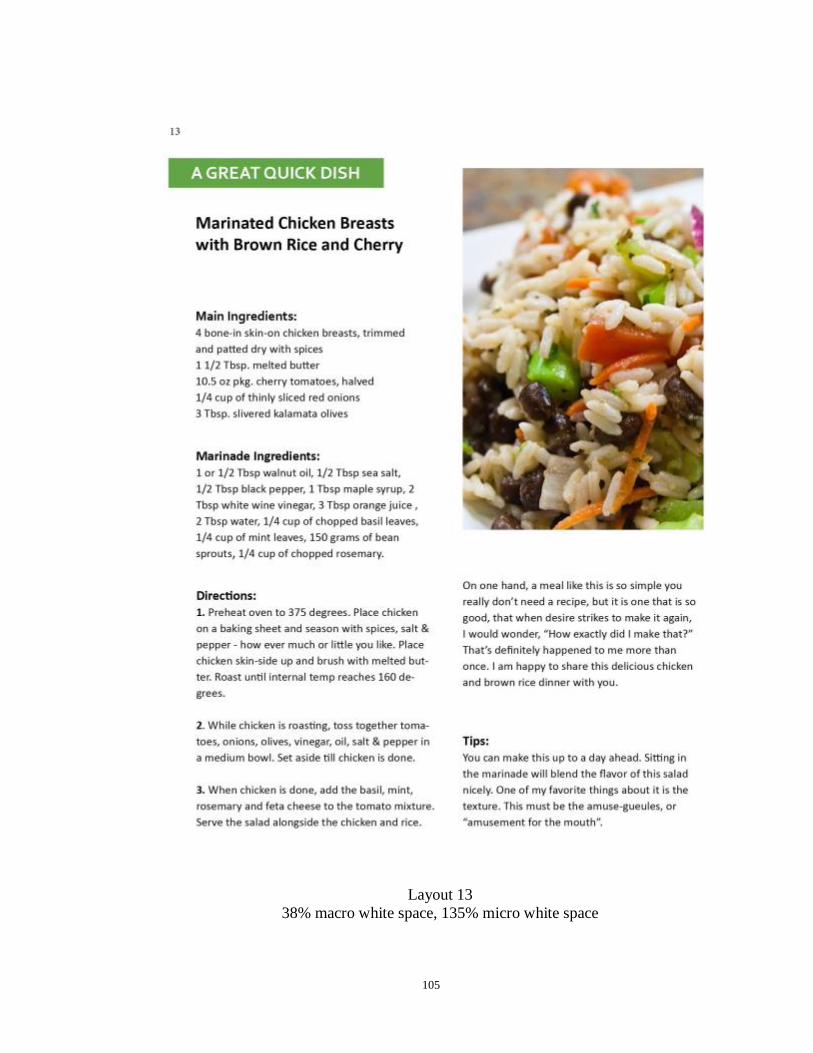
105
Layout 13
38% macro white space, 135% micro white space

106
Layout 14
45% macro white space, 105% micro white space

107
Layout 15
38% macro white space, 105% micro white space
108
Appendix E: Profile Content Source List
Text
http://www.foodista.com/recipe/S25QZRTV/roasted-chicken-breasts-with-
brown-rice-and-cherry-tomato-salad
Photo
https://commons.wikimedia.org/wiki/File:Bean_Rice_Salad.jpg