the housing headwind the housing headwind: the impact of rising housing costs on uk living standards...
TRANSCRIPT
resolutionfoundation.org [email protected] +44 (0)203 372 2960 @resfoundation
REPORT
The housing headwindThe impact of rising housing costs on UK living standards
Stephen Clarke, Adam Corlett and Lindsay JudgeJune 2016

This publication is available in the Housing section of our website @resfoundation
The housing headwind: the impact of rising housing costs on UK living standards Acknowledgements 2
Acknowledgements
The authors would like to thank the many experts who have shared their thoughts on this report through conversations and comments including Kathleen Kelly, Gerald Koessl, John Longbottom, John Muellbauer, Bob Pannell, Kate Webb and Peter Williams. Any errors or omissions are of
course our own.

3The housing headwind: the impact of rising housing costs on UK living standards Contents
This publication is available in the Housing section of our website @resfoundation
Contents
Executive Summary ���������������������������������������������������������������������������������4
Section 1
Introduction ������������������������������������������������������������������������������������������10
Section 2
Housing costs, incomes and affordability in the UK ������������������������������11
Section 3
Housing costs and the regional picture�������������������������������������������������23
Section 4
Housing costs and age ��������������������������������������������������������������������������29
Section 5
Housing costs and income groups ��������������������������������������������������������34
Section 6
Conclusion ��������������������������������������������������������������������������������������������40

This publication is available in the Housing section of our website @resfoundation
The housing headwind: the impact of rising housing costs on UK living standards Executive Summary 4
Executive summary
Much will be made in future months about the relationship between living standards and the Brexit vote. As we seek to learn lessons from the referendum, a proper understanding of the lived experience which has informed the outcome is required. But this demands an examination not just of household incomes but also of costs. And for most households, there is no more important an outgoing each week than housing which is usually the single biggest expenditure that gets prioritised over and above all others.
This report explores the relationship between the incomes and housing costs of working age households over a 20 year period. Rising house prices, changing tenure patterns and cuts in housing subsidy have conspired to increase housing costs for large numbers of working age households over the past two decades. Crucially, the gains associated with the sharp cut in interest rates in 2008-09 which softened the blow to incomes in the immediate post-crisis period are dissipating, even though rates remain at historically low levels.
Housing costs have functioned as a headwind, dragging on incomes over time. When we include housing costs in our wider consideration of living standards we find over half of households across the working age population have seen falling or flat living standards since 2002. While low and middle income households have been hit the hardest, all parts of the country have seen improvements in their living standards impeded by our failure as a country to deliver affordable housing.
As a result, the ratio between housing costs and incomes has been reset at a higher level than at the beginning of our period of inquiry. But if we are to address the income squeeze which may lie is at the root of so much disaf-fection we see in the UK today, housing costs must be seen alongside low earnings growth as a key part of the living standards debate.

This publication is available in the Housing section of our website @resfoundation
The housing headwind: the impact of rising housing costs on UK living standards Executive Summary 5
The relationship between housing costs and income has moved through four distinct phases since the mid-1990s
Housing costs are determined by a range of factors which can interact in different ways, for different groups, at different points in time. House prices and interest rates can pull in opposite directions, for example, benefiting some home-owners while hurting others.
What is clear is that the amount households pay for housing does not track incomes in a straightforward way. Instead, at points housing costs undermine living standards as they consume a growing share of household income. At others, they have the opposite effect. In this report, we identify four key phases in the relationship between income and housing costs as follows:
» 1995-2003 when housing costs grew at a similar rate to incomes and had a broadly neutral effect on living standards;
» 2003-2009 during which housing costs outstripped incomes with a clear drag effect;
» 2009-2012 when housing costs fell faster than incomes as interest rates reached and then remained at record lows. Throughout this phase housing costs played a supporting role by moderating the acute living standards squeeze that followed the financial crisis;
» 2012-2015 when housing costs and incomes once again entered into a neutral relationship with each other, albeit with the ratio between the two now standing at a level four percentage points higher than it did during the previous neutral period.
Tenure is important in differentiating the housing costs experience
Despite the often commented-upon fall in homeownership, households
with mortgages continue to be the largest tenure group in the UK and dominate much of our analysis. Critically we note that as those who took on mortgages in the earlier part of our period pay off their smaller debts, it is households with larger, more recent liabilities who increasingly determine the overall picture. As a result, even in the current benign interest rate climate the stock of debt held by mortgagor households remains an important determinant of the housing cost to income ratio, and will continue to do so for some time even if house prices were to fall in the future.

This publication is available in the Housing section of our website @resfoundation
The housing headwind: the impact of rising housing costs on UK living standards Executive Summary 6
High house prices have other effects beyond simply driving up the costs for mortgagor households however. Locked out of home-ownership, a rising
proportion of working-age households now rent in the private sector. We show that private renters consistently spend a higher proportion of their incomes on housing than any other tenure group, with significant implica-tions for both their immediate living standards and longer term prospects.
Social renters have a different experience from other tenure groups given that their living standards are determined more by policy and less by the vagaries of the market. Changes that reduce supply, set sub-market rent at higher levels or reduce eligible rents for Housing Benefit purposes have all squeezed the incomes of social renter households over time. Moreover, it should not be forgotten that while social renters may spend a lower proportion of their income on housing costs than other tenure types, their income after housing costs still remains far smaller than that of either private renters or homeowners.
Place and age matter too
All things are not equal across the UK with significant regional variations in
housing affordability. However it is wrong to see housing as a living standards challenge only in the South of England. Indeed, we see the North and South converging on some, if not all, affordability measures, with households in parts of the North now having a housing cost to income ratio approaching that witnessed in London two decades ago. The stand out exception to this general trend is the capital, however, where the most striking regional results are always found. At the beginning of our period London was only marginally more expensive than the surrounding regions but today is a startling outlier on every score.
While the youngest households in the population allocate the largest share of income to housing it is the two subsequent age groups (25-34 year olds and 35-44 year olds) that have experienced the biggest percentage point increase in their housing cost to income ratio over time. Partly as a result we note that tenure, not age, is now the key determinant of housing affordability. Unlike 20 years ago we now see only a small difference in the proportion of income that different aged households spend in the same tenure, suggesting households can no longer simply age their way to affordability. Moreover, Generation Rent is growing up and having children, changing the nature of the housing need in the private rented sector. It is 25-44 year olds that

This publication is available in the Housing section of our website @resfoundation
The housing headwind: the impact of rising housing costs on UK living standards Executive Summary 7
have seen the biggest increase in over-crowding over the past 20 years, for example, indicating that quality as well as cost is an increasingly pertinent issue for some.
Housing costs have a real effect on living standards over time – with low to middle income households experiencing the strongest downward pressure
These changes in housing costs over time have had a real effect on household
finances. Our analysis shows that if a dual earning couple household with one child was paying the same proportion of their income in housing costs today as an equivalent family did in the early 1990s, they would be £1,400 a year better off. Put another way, this loss is equivalent to a 9p rise in the basic rate of income tax over the period, a burden it is hard to imagine being tolerated in that form.
The top and bottom halves of the income distribution have had radically different experiences of housing affordability over the past two decades. Those in the bottom half have historically spent a higher proportion of their income on housing than the top, and the gap between the two has widened over time. But rather than those at the top or bottom of the distribution, it is low and middle income households who have felt the squeeze the
most. They have experienced both the largest jump in their housing cost to income ratio level over the period as well as the biggest rise in over-crowding. Moreover, we see some higher income households such as those living in London increasingly spending close to the same proportion of income on housing as those in the bottom half of the distribution do nationwide. Far from being a live concern only for those on the lowest incomes, housing affordability has become a majority problem.
Rising housing costs are projected to wipe out much – if not all – of two decades of income growth for many households
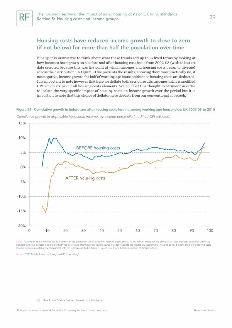
» Housing has been an important element, then, of the living standards squeeze that appears to have been an important determinant of the Brexit decision. When we stack up trends from 2002-03 (the year that household incomes in the UK began to slow down) to 2015 the picture comes into even sharper focus, with housing costs effectively wiping out most if
not all of the modest income gains made by the bottom 56 per cent of
working age households over a 13 year period.

This publication is available in the Housing section of our website @resfoundation
The housing headwind: the impact of rising housing costs on UK living standards Executive Summary 8
Putting these trends into cash terms, we show that:
» Real average working age household income has grown by £32 a week (7 per cent) between 2002-03 and 2015, while real housing costs have grown by £21 a week (32 per cent). As a result, two thirds (66 per cent) of the income gains over the period have been absorbed by rising housing costs.
» Real average private renter household income has grown by £8 a week (2 per cent) over the period while real housing costs have grown by £19 a week (16 per cent). This means that the income gains made by this group have been absorbed by rising housing costs more than twice over.
» Real average London household income has reduced by £29 (minus 4 per cent) over the period while real housing costs have grown by £36 (29 per cent).
» Real average household income for those headed by someone aged
25-44 has grown by £12 a week (2 per cent) over the period while housing costs have grown by £25 a week (25 per cent). Consequently rising housing costs have absorbed the income gains of this group more than twice over.
» Real average low to middle income household income has grown by £18 a week (5 per cent) over the period while housing costs have grown by £23 a week (36 per cent). As a result, all and more of their income gains have been absorbed by rising housing costs.
Looking to the future, housing looks set to remain a key liv-ing standards issue of this parliament
Now more than ever, uncertainties are rife when we look to the future. The Brexit vote will clearly have effects on both the housing costs and income growth although at this point in time the scale of change is impossible to predict. Moreover, even before the referendum some ascribed rising house prices, particularly in London, to a bubble effect which may deflate in the coming months and years. But it is clear that structural changes also lie behind the long-term upward trend in the housing cost to income ratio since the mid-1990s, and that for many households housing will remain a key downward pressure on living standards in the years to come.

This publication is available in the Housing section of our website @resfoundation
The housing headwind: the impact of rising housing costs on UK living standards Executive Summary 9
Politicians of all stripes increasingly acknowledge the need to ‘do something’ about housing and promises abound. While the issue is not new we should heed the fact that if households are spending an increasing proportion of their income on housing in a period of earnings growth and record low interest rates, something must be going very wrong indeed. While households on low to middle incomes are most affected, the living standards of those right across the income distribution and indeed the country will be impeded if we cannot get this right.
And failing to tackle the issue of housing has consequences beyond the immediate pressure on household incomes. High housing costs impede labour mobility and the efficient functioning of the economy, for example, and entrench inequality between the housing haves and have nots. If housing is to be turned from a headwind to a tailwind, a fundamental rethink of housing policy is clearly required.

This publication is available in the Housing section of our website @resfoundation
10The housing headwind: the impact of rising housing costs on UK living standards Section 1: Introduction
Section 1
Introduction
Housing is a topic that is rarely out of the news these days where frequent references are made to a brewing, if not fully perked, housing crisis. The problem is posed in many forms. Some emphasise the low rates of house building in the UK. Others highlight the rise of the buy-to-let landlord and the rapid expansion of the private rented sector. Older people who under-occupy large houses are contrasted with younger people unable to get a foot on the property ‘ladder’. But however the issue is presented, there is a strong sense that housing in the UK is increasingly unaffordable, and downright out of reach for some.
For the vast majority of households, housing costs comprise the single largest expenditure they pay out. As a result, the benefits of growth can evaporate if the increase in their housing costs outpaces their income growth, while a fall in their housing costs (as a result, for example, of very low interest rates) can support incomes when growth is less than robust.
This report explores the question of how incomes and housing costs have interacted over time. It asks a seemingly simple question: how affordable has housing been for different groups in the UK over the last two decades? Through this exercise, we show how housing costs have (or have not) contributed to living standards at different points in time, and identify who may be vulnerable to continued housing pressure over the course of this parliament.
To this end, the report is structured as follows:
» Section 2 looks at the overall UK experience and in particular considers how tenure affects the affordability picture that we present.
» Section 3 considers affordability from a regional perspective, testing the proposition that the South and the capital are significantly more unaffordable than other parts of the country.
» Section 4 views the question of affordability through the prism of age, exploring how different age groups have fared over time in the housing costs stakes.
» Section 5 asks how housing costs are inflected by income, noting how affordability has played out for different income groups over time.
» Section 6 then concludes by showing how changes in incomes and housing costs for all different groups have played out in cash terms in recent years.

This publication is available in the Housing section of our website @resfoundation
11The housing headwind: the impact of rising housing costs on UK living standards Section 2: Housing costs, incomes and affordability in the UK
Section 2
Housing costs, incomes and affordability in the UK
While earnings, benefit levels and taxation all attract a large amount of commentary, living costs have been relatively overlooked in recent living standards debates. This may be unsurprising given the prevailing low levels of inflation in the UK, but it is important to remember that a household’s living standards are determined not just by its income but also by its outgoings. Crucially, the headline inflation rate can mask important variations across households. This is particularly true of housing costs (which are not included at all in some inflation measures) which usually comprise the largest and most important expenditure a household makes. But what determines a household’s housing costs? And how do costs interact with incomes over time? This section begins our exploration of housing affordability by considering these questions.
Living standards have moved through four distinct phases since the mid-1990s
Broadly speaking, working-age household incomes are a function of both labour market outcomes (driven by levels of employment and rates of pay) and interaction with the state (in the form of cash benefits and direct taxes). Other sources of income, such as returns on investment, can be sizeable in some households (particularly at the top of the distribution) but account for only around 5 per cent of gross income on average. When focusing specifically on living standards rather than income, the final part of the equation relates to costs – measured normally by some general level of inflation.
Figure 1 takes this standard approach, setting out the trajectory of average real-terms net income in the period since 1997 before housing costs are deducted. By overlaying the performance of each of the composite elements of this living standards metric, we can identify four distinct periods.
» During the ‘strong growth’ years of the late 1990s, employment and earnings grew together and drove a rapid increase in household incomes;
» A subsequent plateauing of employment and slowing of earnings growth produced a ‘pre-crisis slowdown’ in incomes during the years immediately before 2008;
» The global financial crisis of 2008 sparked a ‘big squeeze’, when employment and (unusually) pay fell. Benefit payments rose and tax bills fell correspondingly;
» Employment started rebounding strongly from around 2013, driving what we might consider the ‘early recovery’ phase. Pay was slower to follow suit, though the seven year pay squeeze eventually ended in mid-2014, helped in no small part by ultra-low inflation.
Taking the whole period together, we see that average working-age incomes remained around 5 per cent below their pre-crisis level in 2015, with average employment income around 8 per cent below its 2008 level.

This publication is available in the Housing section of our website @resfoundation
12The housing headwind: the impact of rising housing costs on UK living standards Section 2: Housing costs, incomes and affordability in the UK
With housing costs both dragging on and supporting living standards at different times
While useful for headline purposes, such analysis tells us little about how living standards vary both over time and across different parts of society. We can of course look at similar income trends for other parts of the income distribution or in other parts of the country – as we did in our Living Standards 2016 publication[1] – but the use of a standard inflation measure means that we inevitably fail to capture differences in households’ experiences of living costs. Such experiences are a product of a multitude of factors including life-stage, location and tastes and can therefore be difficult to capture meaningfully. But one area of spending which has a particularly large impact on living standards – and is therefore worth isolating – is housing.
The approach taken in the DWP’s Households Below Average Incomes, and the one we follow here, is to identify ‘housing costs’ at the individual household level and remove these in order to create an ‘after housing costs’ measure of income. Figure 2 presents average working-age incomes on both a before and after housing cost basis .This time we use a modified CPI to deflate the results, reflecting the removal of some elements of spending which appear in the standard CPI basket. Moreover, given that what we are interested in here is the household experience the figures we present here and throughout the report are net of Housing Benefit (see Annex 1 for a further discussion of this important issue).
[1] A Corlett, D Finch & M Whittaker, Living Standards 2016: The experiences of low to middle income households in downturn
and recovery, Resolution Foundation, February 2016
Figure 1: Average net income and its drivers among working-age households: UK
Indices of average employment income, taxes and benefits, 2007-08 = 100 (CPI-adjusted)
Notes: ‘Benefits’, ‘employment income’ and ‘direct taxes’ are all drawn from the ONS Effect of Taxes and Benefits on Household Incomes dataset and relate to the average household. The ‘household income’ measure is drawn from the DWP Family Resources Survey in the period to 2013-14 and RF ‘nowcasting’ thereafter (see Annex 2 for details).
Source: ONS, Effect of Taxes and Benefits on Household Incomes; DWP, Family Resources Survey; and RF ‘nowcasting’
Household income
Employment income
Benefits
Direct taxes
65
70
75
80
85
90
95
100
105
110
115
120
1997 1999 2001 2003 2005 2007 2009 2011 2013 2015
Strong, shared growth
Pre-crisis slowdown
The big squeeze
Early recovery

This publication is available in the Housing section of our website @resfoundation
13The housing headwind: the impact of rising housing costs on UK living standards Section 2: Housing costs, incomes and affordability in the UK
By definition, the after housing cost measure is consistently lower than the before housing cost one – but the wedge between the two has varied in size over time. Over the period as a whole, average incomes before housing costs rose by 27 per cent; after housing costs they rose by 22 per cent.
To get a clearer sense of the role played by housing in different phases, we can shift our focus away from housing costs and onto housing affordability. To do so, the primary measure we use throughout this report is the housing cost to income ratio (HCIR). As with the housing costs measure discussed above there is no perfect measure of affordability (see Box 1 and Annex 1). But by providing a clear statement of the proportion of disposable income a household spends on housing, the HCIR gives us an insight into how housing costs bear down on families and individuals of all types.
Figure 2: Average net income before and after housing costs among working-age households: UK
Average weekly household income (modified CPI-adjusted)
Notes: ‘Housing costs’ includes mortgage capital and interest payments, rent, water rates, structural insurance premiums and ground rent or service charges (but not council tax payments). After housing cost incomes are presented net of Housing Benefit receipt. Underlying data is drawn from DWP’s Family Resources Survey in the period to 2013-14 and RF ‘nowcasting’ there-after (see Annex 2 for details). ‘Modified CPI’ strips out any elements of ‘housing costs’ contained within the standard CPI. This deflator is applied to both the before and after housing costs measures in order to isolate the impact of accounting for housing costs. It means the before housing costs income measure is not directly comparable with the index presented in Figure 1.
Source: DWP, Family Resources Survey; and RF ‘nowcasting’
BEFORE housing costs
AFTER housing costs
£400
£450
£500
£550
£600
£650
1997 1999 2001 2003 2005 2007 2009 2011 2013 2015
Strong, shared growth
Pre-crisis slowdown
The big squeeze
Early recovery

This publication is available in the Housing section of our website @resfoundation
14The housing headwind: the impact of rising housing costs on UK living standards Section 2: Housing costs, incomes and affordability in the UK
Figure 4 presents the average of all HCIRs across the working-age population. It shows that the average ratio has risen from roughly 17 per cent in 1995 to just under 21 per cent in 2015, with this
i Box 1: Measuring housing affordability
Despite widespread interest in the topic, housing afford-ability is far from a stable concept. The standard measure of affordability is the housing cost to income ratio (HCIR) which provides a clear statement of the proportion of disposable income a household spends on housing. By virtue of being easy to calculate and straightforward to interpret, the HCIR is the measure most widely employed throughout the affordability literature.
The HCIR is not without its shortcomings however. First, the notion of affordability depends on a normative judgement about what proportion of income should be spent on housing. What this level should be changes with both time and place. Studies of housing affordability in the US have moved from regarding 25 per cent as the threshold in the 1980s, for example, to up to 40 per cent today.[1] The UK government has viewed a ratio of 30 per cent of gross income as unaffordable,[2] while Eurostat treats 40 per cent of net income as the appropriate ‘housing over-burden’ level in its cross-national analysis.[3]
Second, regardless of where the precise affordability level is determined, some challenge the ratio approach per se arguing that it does not fully capture the living standards effect of housing costs. In particular, they note that while a well-off household could spend more than the threshold ratio and have plenty of income to spare, those on lower incomes may pay out a lower proportion but be left with little to afford other basic necessities. In place of the HCIR, they propose a ‘residual’ measure that captures the amount left over after housing costs and then assesses this against some standard of sufficiency.[4]
Third, others point out that the HCIR does not reflect the trade-offs that some households may choose to make in order to achieve affordability. It is possible, for example, that a household keep their housing costs low and enjoy an affordable HCIR as a result of over-crowding, accepting
[1] M Stone, What is Housing Affordability? The Case for the Residual Income
Approach, University of Massachusetts Boston, January 2006
[2] Strategic housing market assessments: practical guidance, Department
for Communities and Local Government, August 2007
[3] EUROSTAT, Living conditions in Europe 2014 edition available at
http://ec.europa.eu/eurostat/documents
[4] M Stone, What is Housing Affordability? The Case for the Residual Income
Approach, University of Massachusetts Boston, January 2006
sub-standard living conditions or residing a significant distance from work or other amenities such as schools. This has led some to suggest that a true measure of housing affordability must capture both the ability to enjoy a satis-factory standard of housing and to have enough left over to meet other basic living costs.[5]
While consideration of all aspects of this question is beyond the scope of this paper, Figure 3 provides an overview of recent trends in overcrowding by tenure. It highlights an overall rise in the proportion of households living in overcrowded accommodation, with social renters experiencing both the worst starting point and the largest rise overall, closely followed by private renters who are also making compromises. Such non-financial aspects of living standards clearly matter.
[5] D Hirsch, Measures of housing affordability – is there a better way?
Discussion paper produced for the Resolution Foundation, April 2014
Figure 3: OOvercrowding within working-age households by tenure: UK
Proportion of households living in over-crowded conditions)
Notes: A household is defined as living in over-crowded conditions if it resides in a property that does not meet the bedroom standard as established by The Housing (Overcrowding) Bill of 2003
Source: DWP, Family Resources Survey
Figure 3:
Social renter
Private renter
Own outright
Own with mortgage
0% 2% 4% 6% 8% 10%
1994-95
2013-14

This publication is available in the Housing section of our website @resfoundation
15The housing headwind: the impact of rising housing costs on UK living standards Section 2: Housing costs, incomes and affordability in the UK
increase of nearly one-quarter being the product of four phases which we can see more clearly than in Figure 2.
» Housing affordability as measured by the HCIR was broadly flat between 1995 and 2003, the product of strong income growth over the period matched by housing costs rising by a similar factor. As a result, housing costs had a broadly neutral impact on living standards during this phase;
» House prices began to accelerate in the early 2000s as earnings growth began to slow. We see the sharp rise in the average HCIR between 2003 and 2009 as a consequence, jumping from 17 per cent to 22 per cent in just six years. Housing costs during this period therefore had a clear drag effect on living standards,
» As incomes fell rapidly in the wake of the financial crisis house prices suffered a sharp, but only short, shock dropping about 10 per cent in 2008 and 2009 and then returning to growth. However, the decision to reduce interest rates to record lows ensured that housing costs dropped faster than incomes between 2009 and 2012. The HCIR fell back to around 20 per cent during this phase, softening the squeeze on incomes felt at the start of the downturn and therefore supporting living standards to some degree.
» The combination of tepid income growth and rising house prices that were still moderated by record low interest rates produced a relatively flat HCIR between 2012 and 2014. This remains static in our ‘nowcast’ assumption for 2015. At face value, this hints at housing playing a new neutral role on living standards with a broadly flat HCIR, albeit at a much higher level than was the norm before the millennium.
Figure 4: Average housing cost to income ratio among working-age households: UK
Average housing cost to net income ratio
Notes: ‘Housing costs’ includes mortgage capital and interest payments, rent, water rates, structural insurance premiums and ground rent or service charges (but not council tax payments). Af-ter housing cost incomes are presented net of Housing Benefit receipt. Underlying data is drawn from DWP’s Family Resources Survey in the period to 2013-14 and RF ‘nowcasting’ thereafter (see Annex 2 for details).
Source: DWP, Family Resources Survey; and RF ‘nowcasting’
15%
16%
17%
18%
19%
20%
21%
22%
23%
1994 1996 1998 2000 2002 2004 2006 2008 2010 2012 2014
Largely neutral Dragging Supporting A new neutral?

This publication is available in the Housing section of our website @resfoundation
16The housing headwind: the impact of rising housing costs on UK living standards Section 2: Housing costs, incomes and affordability in the UK
Of course, this rise in the average HCIR over the last two decades could simply be the product of large changes experienced by a small number of households. However, as Figure 5 shows, the distribution of HCIRs has generally shifted rightwards. That is, the heavier housing cost burden has been widely felt. Taking a ratio of 33 per cent to be a marker of unaffordability (in line with previous Resolution Foundation work[2]), the chart shows that the proportion of working-age households in this position more than doubled between 1995 and 2014 (from 7 per cent to 16 per cent). Similarly, the proportion spending more than half of their net income on housing increased from 3 per cent to 5 per cent.
The increased squeeze that housing costs have placed on living standards over the last two decades is real and significant. We calculate that if a dual earning couple household with one child was paying the same proportion of their income in housing costs today as they did in the early 1990s, they would be £1,400 a year better off. Put another way, this is a loss is equivalent to a 9p rise in the basic rate of tax over the period.
These trends have been driven by much more than just house prices
Given the cultural importance we attach to owning homes in the UK it is unsurprising that the national conversation about affordability has largely revolved around rising house prices in recent years. Yet house prices are only one element of the wider housing cost and housing affordability picture.
[2] V Alakeson and L Gardiner, Home Stretch: Coping with high housing costs, Resolution Foundation, December 2014
Figure 5: Changing distribution of housing cost to income ratio across working-age households: UK
Cumulative distribution of working-age households by housing cost to income ratio
Notes: See notes to Figure 4
Source: DWP, Family Resources Survey
2013-14
1994-95
0%
20%
40%
60%
80%
100%
0% 10% 20% 30% 40% 50% 60% 70% 80% 90% 100%
1994-95
In 1994-95, 7 per cent of working-age households spent more than 1/3 of their income on housing
and 3 per cent spent more than 1/2
By 2013-14, 16 per cent spent more than 1/3 of their income on housing and 5 per cent spent
more than 1/2
Proportion of income spent on housing
Prop
ortio
n of
wor
king
ag
e ho
useh
old
s

This publication is available in the Housing section of our website @resfoundation
17The housing headwind: the impact of rising housing costs on UK living standards Section 2: Housing costs, incomes and affordability in the UK
The impact of house prices is most direct in relation to households taking out a newer or larger mortgage in order to buy a home. For both first time buyers and home movers, underlying price trends have a clear read through to subsequent monthly costs. But even here, overall affordability is also a function of interest rates and prevailing loan-to-value levels.
For example, Figure 6 compares movements in the typical median price paid by buyers (both first time buyers and those moving home) over recent decades with the median mortgage advance and the average interest rate being paid. What’s clear is both that the wedge between the price and the advance has widened over time (reflecting a trend towards larger deposits in recent years) and that mortgage rates have drifted downwards (most markedly since the financial crisis and the slashing of the Bank of England’s base rate to its historic low of 0.5 per cent).
As such, while median house prices have far outpaced the median borrower income reported to lenders, the median repayment ratio (the typical ratio of principal and interest repayment to income) recorded among new borrowers has not always moved in line with this divergence. Indeed, even though house prices have risen by 27 per cent since 2008 and borrower incomes by just 17 per cent (in nominal terms), the repayment ratio has fallen by 25 per cent.
Figure 6: House price and affordability indices among new borrowers: UK
Affordability indices among new borrowers (Q1 1994 = 100): all buyers
Source: Council of Mortgage Lenders
Median purchase price
Median advance
Median income
Median repayment ratio
Average interest rates
0
50
100
150
200
250
300
350
400
450
1994 1996 1998 2000 2002 2004 2006 2008 2010 2012 2014
This publication is available in the Housing section of our website @resfoundation
18The housing headwind: the impact of rising housing costs on UK living standards Section 2: Housing costs, incomes and affordability in the UK
Moving beyond those who have recently bought, the house price effect becomes weaker still. For example, someone who bought 15 years ago will face a mortgage payment that is sensitive to the mortgage rate they pay, but not to the trends in house prices over the intervening period. That said, it is worth remembering that as prices rise, owners of all types may be more inclined to release equity from their homes. As a result, their housing costs may increase as they service their new or larger mortgages while they enjoy their newly liberated wealth in different ways. Finally, outright owners are unlikely to face any significant connection between their monthly housing costs and current house price trends. Nevertheless, all home owners are likely to have some exposure to housing bubbles and the consequences of subsequent bursting.
The transmission from house prices to rents is obviously more complicated. Private rents are driven in part by the same combination of house prices, advances and interest rates – albeit often with a significant lag as rents are rarely renegotiated mid-lease. This differing feed-through is evident when looking at average HCIRs split by tenure type, as we do in Figure 7. It shows both that HCIRs vary across tenure types and that trends have sometimes moved in opposite directions – although over the period as a whole ratios have risen for all tenures other than the outright owner group.

This publication is available in the Housing section of our website @resfoundation
19The housing headwind: the impact of rising housing costs on UK living standards Section 2: Housing costs, incomes and affordability in the UK
Ratios are highest among private renters, having risen steadily between the mid-1990s and 2009. However, costs have moved broadly in line with incomes subsequently, leaving HCIRs of this group flat since the financial crisis at around 30 per cent. The house price effect on mortgagors is clear in the pre-crisis years, but the sharp fall in interest rates dominated more recently, pushing HCIRs down to around 24 per cent in 2015. In contrast, the upward drift in the average HCIR of social renters has continued largely unabated – ending the period at around 19 per cent. Unpacking these results we see that this is primarily the product of the policy decision to bring council rents up to housing association rent levels, increasing costs for social renters overall.[3]
With the shift from home ownership towards renting playing an evident role
These differing trends go some way to explaining the four different phases of HCIR observed in Figure 4. However, to fully understand what has driven the overall ratio we must also consider how the tenure mix has shifted among working-age households over the same period. All else being equal, we would expect a move away from those tenures with lower HCIRs (outright owners and social renters) towards those with higher HCIRs (private renters and mortgagors) to push the aggregate figure up.
[3] See Rent setting: Social housing (England), House of Commons Library Briefing Paper Number 09010, March 2016 for
further details
Figure 7: Average housing cost to income ratio among working-age households by tenure type: UK
Average housing cost to net income ratio
Notes: See notes to Figure 4.
Source: DWP, Family Resources Survey; and RF ‘nowcasting’
0%
5%
10%
15%
20%
25%
30%
35%
1994 1996 1998 2000 2002 2004 2006 2008 2010 2012 2014
Own outright
Social renters
Own with mortgage
Private renters

This publication is available in the Housing section of our website @resfoundation
20The housing headwind: the impact of rising housing costs on UK living standards Section 2: Housing costs, incomes and affordability in the UK
So what compositional shift have we seen in the UK over the period? Figure 8 shows that the proportion of working-age households owning a home with a mortgage plummeting from around 55 per cent in 2000 to just 41 per cent in 2015. Over the same time, the proportion living in private rented accommodation has more than doubled: from 11 per cent to 25 per cent.
We can formally measure the relative importance of changes in HCIRs within tenures and the changing tenure mix across households using a shift-share decomposition. Table 1 presents the results. By focusing on the four different phases highlighted in Figure 4 it shows that within tenure effects tend to dominate in most periods, with unsurprisingly the mortgagor and private renting groups accounting for the majority of the overall movement.
Figure 8: Changing tenure mix among working-age households: UK
Proportion of working-age households
Source: DWP, Family Resources Survey; and RF ‘nowcasting’
Own with mortgage
Social renters
Private renters
Own outright
0%
10%
20%
30%
40%
50%
60%
1997 1999 2001 2003 2005 2007 2009 2011 2013 2015

This publication is available in the Housing section of our website @resfoundation
21The housing headwind: the impact of rising housing costs on UK living standards Section 2: Housing costs, incomes and affordability in the UK
Table 1: Decomposition of change in housing cost to income ratio among working-age households between 1995 and 2015: UK
Notes: ‘Within tenure’ figures show the changes in HCIR driven purely by changes in HCIR in each of the different tenure types (i.e. what would happen in the absence of any tenure shift). ‘Tenure mix’ figures show the change in HCIR driven purely by changes in the housing composition (i.e. what would happen in the absence of any change in HCIRs within tenures). ‘Contributions from tenure’ figures show how important each tenure is (in terms of the within and across effects that they explain) to the overall change in HCIR. Numbers may not sum due to rounding.
Source: RF analysis of DWP, Family Resources Survey; and RF ‘nowcasting’
» In the ‘largely neutral’ 1995-2003 period, the overall HCIR increased by just 0.2 percentage points. If there had been no shift in the tenure mix, movements in HCIRs within each of the four tenures would have raised the aggregate HCIR by 0.4 percentage points. In contrast, if the HCIR within each tenure had remained constant in this phase, just the movement of households into the tenures with lower HCIRs (most obviously owning outright) would have reduced the aggregate HCIR by 0.2 percentage points. We therefore conclude that within tenure effects accounted for more than 100 per cent of the overall movement in that period;
» Within tenure effects were similarly dominant in the ‘dragging’ period of 2003-2009. Of the overall 4.6 percentage point increase in the average HCIR in that period, 4.7 percentage points were accounted for by changes in HCIRs within each tenure. At first glance it might appear surprising that the changing tenure mix didn’t have more of a bearing in that period given the significant shift towards the private rented sector (and therefore the higher average HCIR) that we saw in Figure 8. Certainly the increase in the share of households living in private rented accommodation did have an upwards effect on the aggregate HCIR, but it was eclipsed by the effect associated with mortgagors. That is, because the average HCIR rose so rapidly within the mortgagor group in the period, the aggregate HCIR would have increased even more had the proportion of working-age households living in the mortgagor sector not fallen as it did.
» The 1.7 percentage point decline in the aggregate HCIR in the ‘supporting’ period between 2009 and 2012 would have been larger still in the absence of any compositional change. As we saw in Figure 7, the HCIR fell for all tenures but was by far the most marked among mortgagor households. That helps to explain why the mortgagor group accounted for more than 100 per cent of the overall decline (-2.2 percentage points), with the private renter group acting to reduce the scale of the fall (pushing the HCIR back up by 0.7 percentage points).
» Most recently, the partial reversal of the decline in the aggregate HCIR recorded in the ‘new neutral?’ phase after 2012 looks somewhat different. Unlike the other phases, the overall trend is influenced by both within tenure and tenure mix effects, with the latter accounting for roughly two-fifths of the overall change. It also differs from the other periods in the importance of the social rented sector to the overall trend. As seen in Figure 7 HCIRs continued to fall in among mortgagors and (more marginally) private renters, but they rose sharply within the social rented sector. The decomposition shows that the aggregate HCIR would have been broadly flat after 2012 in the absence of this social sector effect.
1995-2003 2003-2009 2009-2012 2012-2015'Largely neutral' 'Dragging' 'Supporting' 'New neutral?'
Absolute change in average HCIR +0.2% +4.6% -1.7% +0.5%
of which:Change in HCIR within tenure +0.4% +4.7% -2.0% +0.3%Changing tenure mix -0.2% +0.2% +0.2% +0.2%Interactions -0.0% -0.3% +0.1% +0.0%
Contribution from tenure:Own with mortgage -0.2% +1.8% -2.2% -0.8%Private renters +0.4% +2.4% +0.7% +0.6%Social renters +0.0% +0.2% +0.0% +0.6%Own outright +0.0% +0.3% -0.2% +0.0%

This publication is available in the Housing section of our website @resfoundation
22The housing headwind: the impact of rising housing costs on UK living standards Section 2: Housing costs, incomes and affordability in the UK
Housing costs are the product of various factors, then, which interact in complex ways over time. House prices and interest rates can affect groups of mortgagors differently: new and upgrading buyers are sensitive to price but for the much larger stock of existing owners, interest rates are the key determinant of costs. Likewise, house price effects may take time to transmit through to private rent levels, but as demand for this type of tenure increases so does the opportunity to raise rents. The interplay between housing costs and incomes is equally varied, changing over time in response to market conditions and policy interventions alike. But housing costs are also acutely local, and it is to an examination of the regional picture that we now turn.

This publication is available in the Housing section of our website @resfoundation
23The housing headwind: the impact of rising housing costs on UK living standards Section 3: Housing costs and the regional picture
Section 3
Housing costs and the regional picture
Housing costs are often seen as a problem only for those living in expensive parts of the country but when we set costs against regional incomes is this actually the case? This section considers how housing costs have affected living standards in different parts of the country over time. It begins by noting that the gap between housing cost to income ratios in the North and the South of the UK has narrowed over the last two decades while the capital has pulled away on all measures of housing affordability. But the regional experience is also in part determined by tenure, with certain types of households in each region more prone to a squeeze on their incomes as a result of rising housing costs.
A tale of two countries – or three? The narrowing of the North-South divide and the special case of London
Local housing markets clearly vary widely across the country and have a strong bearing on afford-ability within regions. While high housing costs are often perceived as primarily a Southern concern, affordability (whereby costs are placed alongside incomes) is increasingly an issue for other parts of the country too.
Figure 9 compares regional HCIRs over a 20 year period. It shows that there was a discernible North-South divide at the start of our period, with London, Eastern England the South West and South East having HCIRs in the range 19 per cent to 21 per cent – some 3 percentage points higher than anywhere else in the country. The North-South gap has subsequently narrowed across most regions, with HCIRs rising much more rapidly in Scotland, the North West, North East and Midlands than in the South East for example. By 2015 the gap in HCIRs between the South East and the North West was just 2 percentage points, down from 5 percentage points in 1995.

This publication is available in the Housing section of our website @resfoundation
24The housing headwind: the impact of rising housing costs on UK living standards Section 3: Housing costs and the regional picture
However, the standout region is London. Here, the average HCIR increased by more than 7 percentage points over the period (or just over one-third). As a result the average HCIR reached 28 per cent, leaving it 6 percentage points higher than the area with the next highest ratio and 11 percentage points (or roughly two-thirds) higher than the North East.
Despite the narrowing of the gap in average HCIRs between the North and South (excluding London), it remains the case that affordability remains more of an issue in areas such as the South East. As shown in Figure 5, across the UK 16 per cent of working-age households spent more than one-third of their net income on housing costs in 2014 – thereby leaving them above our affordability threshold. But, as Figure 10 shows, there is significant variation across different parts of the country. Again a North-South divide is apparent at the start of the period, with some narrowing (perhaps not as marked as in Figure 9) in this gap over the subsequent years. By 2014, close to one-fifth of working-age households had ratios in excess of one-third in the South East, Eastern England and the South West (all 19 per cent) – roughly double the proportion recorded in the North East (10 per cent).
Figure 9: Average housing cost to income ratio among working-age households by region: GB
Housing cost to net household income ratio
Notes: See notes to Figure 4. Northern Ireland is not included as data is not available for the full time series
Source: DWP, Family Resources Survey; and RF ‘nowcasting’
London
Eastern
South West
South East
North West
East Midlands
West Midlands
Yorks and Humberside
Wales
Scotland
North East
10% 12% 14% 16% 18% 20% 22% 24% 26% 28% 30%
1994-95 2015

This publication is available in the Housing section of our website @resfoundation
25The housing headwind: the impact of rising housing costs on UK living standards Section 3: Housing costs and the regional picture
London is once again the outlier however, with over 30 per cent of households spending more than one-third of their income on housing in the capital in 2014. That represents an increase of 14 percentage points (or a near doubling) from the 1995 level of 17 per cent. It means Londoners are roughly 1.6 times more likely to be above the housing affordability threshold than residents in any other part of the country, rising to more than 3 times relative to those living in the North East.
Looking at tenures within regions highlights how variable af-fordability is across the country
Digging further into the numbers to look at tenure differences at the regional level, we find some further striking trends. Figure 11 highlights a particular divergence of experience within the private rented sector. While average HCIRs increased significantly between 1997 and 2014 in most parts of the country, they actually declined in Yorkshire and the Humber and the North East.[4] Aside from London it is in Scotland that we see the largest rise in HCIR for both private renters (10 percentage points) and mortgagors (6 percentage points).
[4] Note although we have used three-year averages, this analysis inevitably rests on some smaller sample sizes in some in-
stances and should therefore be treated with caution.
Figure 10: Proportion of working-age households above the housing affordability threshold by region: GB
Proportion spending more than one-third of their net income on housing costs
Notes: See notes to Figure 4. Northern Ireland is not included as data is not available for the full time series
Source: DWP, Family Resources Survey; and RF ‘nowcasting’
London
South East
Eastern
South West
West Midlands
North West
Wales
East Midlands
Scotland
Yorks and Humberside
North East
0% 5% 10% 15% 20% 25% 30% 35%
1994-95 2013-14

This publication is available in the Housing section of our website @resfoundation
26The housing headwind: the impact of rising housing costs on UK living standards Section 3: Housing costs and the regional picture
The chart also shows the variation in affordability across the country in starker terms. In the three years to 2014, average HCIRs were 36 per cent among private renters in London compared with just 14 per cent among social renters in Scotland. This spread of 22 percentage points is remarkable and has grown, surpassing the 20 percentage point spread recorded in the three years to 1997.
London is the exceptional case on all measures
London is such a striking outlier in terms of housing affordability that it repays further study. Figure 12 shows how tenure shares have changed in the capital over the past two decades among working-age households. Here, the national pattern we saw in Section 1 is exaggerated, with
Figure 11: Average housing cost to income ratio among working-age households by region and tenure: GB
Housing cost to net household income ratio (three year averages)
Notes: See notes to Figure 4. Northern Ireland is not included as data is not available for the full time series
Source: DWP, Family Resources Survey; and RF ‘nowcasting’
Lon
Lon
Lon
SE
SE
SE
SW
SW
SW
East
East
East
NW
NW
NW
EM
EM
EM
Wal
Wal
Wal
NE
NE
NE
WM
WM
WM
YH
YH
YH
Sco
Sco
Sco
5% 10% 15% 20% 25% 30% 35% 40%
1994-97 2011-14
Social renters
Own with mortgage
Private renters

This publication is available in the Housing section of our website @resfoundation
27The housing headwind: the impact of rising housing costs on UK living standards Section 3: Housing costs and the regional picture
households substituting private renting for home ownership (and to a lesser but still important extent, for social renting). As a result, the private rented sector is now the largest single tenure among working-age households in the capital.
In terms of HCIRs, we’ve already seen that Londoners paid an average 28 per cent of their income on housing costs in 2015, up from 20 per cent in 1995. But as Figure 13 shows, once again it is private renters who are paying the most, breaching the affordability threshold of 33 per cent not just in the immediate pre-crisis period but for large parts of our time series.
Figure 12: Changing tenure mix among working-age households: London
Proportion of working-age households
Source: DWP, Family Resources Survey
Own with mortgage
Social renters Private renters
Own outright
0%
5%
10%
15%
20%
25%
30%
35%
40%
45%
50%
1997 1999 2001 2003 2005 2007 2009 2011 2013

This publication is available in the Housing section of our website @resfoundation
28The housing headwind: the impact of rising housing costs on UK living standards Section 3: Housing costs and the regional picture
The experience of social renters (who still comprise one-fifth of London’s households) is also worthy of note. The average HCIR within the group increased by 7 percentage points (or more than half ) between 1995 and 2015, the largest increase recorded across the different tenure types. As a result, social renters in the capital now spend around one-fifth (21 per cent) of their income on housing – the same as the national average across all tenures.
The regional housing affordability story, then, is one of two if not three countries…
While the Southern part of the UK may have higher housing costs in absolute terms, when these are viewed as a proportion of regional income the picture changes, with the North playing catch up with the South over time. The capital, however, is now exceptional on all housing costs measures. Here, both types of renters are clearly under strain. The private rented sector has had to absorb large numbers of households who in the past may have purchased a property or been housed in the social rented sector, driving up their HCIR to prohibitive levels. Likewise, social renters now spend over a fifth of their incomes on housing in the capital.
Tenure and location have clear impacts on living standards, then, but in an era of rising housing costs those who have entered the game at a later point may be additionally disadvantaged. So how have different age groups fared in the housing stakes of the last 20 years? In the next section we consider how housing affordability is inflected by age.
Figure 13: Average housing cost to income ratio among working-age households by tenure type: London
Average housing cost to net income ratio
Notes: See notes to Figure 4.
Source: DWP, Family Resources Survey; and RF ‘nowcasting’
0%
5%
10%
15%
20%
25%
30%
35%
40%
1994 1996 1998 2000 2002 2004 2006 2008 2010 2012 2014
Own outright
Social renters
Own with mortgage
Private renters
All

This publication is available in the Housing section of our website @resfoundation
29The housing headwind: the impact of rising housing costs on UK living standards Section 4: Housing costs and age
Section 4
Housing costs and age
Housing need changes over the course of a life time as households vary in both size and in the level of housing stability they desire. This section adds pensioners back into the analysis so we can explore how housing affordability plays out for the whole population by age group. It considers which age groups have spent the largest share of income on housing over time. Again, we also look at this question through the lens of tenure. In particular, we explore how younger age groups that have been locked out of home ownership by high house prices over time and continue to live in the private rented sector are faring as they age and their housing needs evolve.
Younger age groups spend a greater proportion of their in-comes on housing – and this has increased over time
Figure 14 illustrates the age effect on the HCIR, showing that younger age groups consistently spend a higher proportion of their income on housing costs over time. While this may be an intuitive finding given the way that incomes rise over the life course, it also shows that every group except pensioners has had to allocate a larger share of their income to housing costs over this period. The increases vary between 3 percentage points (for the 55-64 group) and 5 percentage points (for the 25-34 and 35-44 groups), but represent a rise of around one-quarter in almost all instances.

This publication is available in the Housing section of our website @resfoundation
30The housing headwind: the impact of rising housing costs on UK living standards Section 4: Housing costs and age
The one exception is the under-25 group where the increase of 3 percentage points is equivalent to 13 per cent. However, it’s likely that this result is affected by compositional changes, with rising costs meaning that increasing numbers of younger individuals stay in their parental home for longer. Indeed, households headed by someone aged under 25 comprised just 4 per cent of the overall household population in 2014, a reduction of 17 per cent relative to 1995.
Tenure matters too – with younger households increasingly likely to rent privately
As with the overall findings presented in Section 2, the HCIR trends within age groups will of course be affected by compositional factors as well. Table 2 highlights the striking decline in owning with a mortgage across most age groups – with the fall being most pronounced among the under 44s – and the corresponding increase in private renting. The sizeable increase in outright owning among the 65+ group goes some way to explaining the overall reduction in average HCIR recorded in Figure 14.
Figure 14: Average housing cost to income ratio by age of head of household: UK
Average housing cost to net income ratio
Notes: See notes to Figure 4. Age is that of the household reference person (HRP) defined as the person in whose name the dwelling is owned or rented or who is otherwise responsible for the accommodation. In the case of joint owners and tenants, the person with the highest income is taken as the HRP. Where incomes are equal, the older is taken as the HRP. Students living in halls of residence are not included. Adult children who remain in the parental home are also not picked up in this analysis.
Source: DWP, Family Resources Survey; and RF ‘nowcasting’
0%
5%
10%
15%
20%
25%
30%
35%
1994 1996 1998 2000 2002 2004 2006 2008 2010 2012 2014
under 25
55-64 years
45-54 years
35-44 years
25 - 34 years
65 and above

This publication is available in the Housing section of our website @resfoundation
31The housing headwind: the impact of rising housing costs on UK living standards Section 4: Housing costs and age
Table 2: Change in tenure held by age of head of household: UK 1994-95 to 2012-13
Source: RF analysis of DWP, Family Resources Survey
Looking again at the HCIRs within each age group, but this time splitting them by tenure type, Figure 15 presents a more detailed picture of how affordability has shifted over time. We find increases in HCIRs for all groups other than those aged 65+ in the social rented sector. Among mortgagors and private renters, the biggest increases are recorded amongst older working-age households; while among social renters the biggest increases are found among younger groups. The result of these contrasting trends is a narrowing of the spread of HCIRs across age groups in all three tenures.
Under 25 25-34 35-44 45-54 55-64 65+
Distribution of tenure type within age group: 2013-14Own with mortgage 7% 36% 53% 50% 27% 4%Private renters 67% 44% 23% 13% 9% 5%Social renters 23% 17% 17% 17% 16% 19%Own outright 3% 2% 7% 20% 48% 72%
Percentage point change 1994-95 to 2013-14Own with mortgage -18% -25% -16% -10% -3% -1%Private renters +25% +29% +15% +6% +3% -2%Social renters -9% -4% -1% +1% -4% -14%Own outright +1% +0% +2% +3% +4% +16%
Figure 15: Average housing cost to income ratio by age of head of household and tenure: UK
Housing cost to net household income ratio (three year averages)
Notes: See notes to Figure 4.
Source: DWP, Family Resources Survey; and RF ‘nowcasting’
Under 25
Under 25
Under 25
25-34
25-34
25-34
35-44
35-44
35-44
45-54
45-54
45-54
55-64
55-64
55-64
65+
65+
65+
5% 10% 15% 20% 25% 30% 35%
1994-97 2011-14
Social renters
Own with mortgage
Private renters

This publication is available in the Housing section of our website @resfoundation
32The housing headwind: the impact of rising housing costs on UK living standards Section 4: Housing costs and age
The implication of this compression is that households can no longer rely on the passage of time to automatically reduce their HCIR. This finding is made all the more important by the fact that the route out of renting and into home ownership has become less common over the same period. Analysis of the English Housing Survey shows that renting in the private sector is no longer the preserve of young people who prize the flexibility and the choices it gives them. Generation Rent is growing up – and critically is having children. As a result, 1.6 million households with children now live in private rented accommodation, compared to 690,000 a decade ago.[5] These families have different housing needs in terms of standards and security, and the private rented sector looks poorly placed to meet them.
Younger age groups are increasingly squeezed (literally)
Figure 16 presents one element of quality by focusing on changes in levels of overcrowding within each age group. This confirms our previous finding that it is younger households (in particular the 25-34 and 35-44 groups) who are experiencing the tightest housing squeeze. Again, however, it is worth noting that older working-age households are also observing a rise in over-occupancy.
[5] Resolution Foundation analysis of English Housing Survey data 1994-5 and 2014-15
Figure 16: Overcrowding within working-age households by tenure: UK
Proportion of households living in over-crowded conditions (three-year averages)
Notes: A household is defined as living in over-crowded conditions if it resides in a property that does not meet the bedroom standard as established by The Housing (Overcrowding) Bill, 2003
Source: DWP, Family Resources Survey
under 25
25-34
35-44
45-54
55-64
65+
0.0% 0.5% 1.0% 1.5% 2.0% 2.5% 3.0% 3.5% 4.0% 4.5% 5.0% 5.5%
1994-97
2011-14

This publication is available in the Housing section of our website @resfoundation
33The housing headwind: the impact of rising housing costs on UK living standards Section 4: Housing costs and age
There is no simple story as to how age and housing affordability interact, but it is clear that increasing costs are forcing different groups to make different types of compromises. Housing costs bite very hard on the smaller incomes of the youngest households, some of whom are delaying independent living as a result.[6] Today’s 25-44 year olds are increasingly housed in the private rented sector and now have to combine the insecurity of this tenure with the needs of children and the desire to create a family home. But older households have their own challenges, especially those with a mortgage who are often still paying off the large loans later in life.
Age matters, then, in the housing affordability stakes. But are there other factors that matter more? In the next section we turn to consider how housing costs affect the living standards of different income groups.
[6] See, for example, ONS, Families and Households: 2015, Nov 2015, which shows around 40 per cent of 15-30 year olds in the
UK were living with their parents in 2015.

This publication is available in the Housing section of our website @resfoundation
34The housing headwind: the impact of rising housing costs on UK living standards Section 5: Housing costs and income groups
Section 5
Housing costs and income groups
Housing costs are clearly experienced very differently throughout the income distribution. While cheaper choices are available for those on lower incomes there are limits to the compromises that can be made in the quest for affordability. Social norms and practical considerations such as distance from work may make some options unreasonable, while reducing housing costs if incomes decline can take time. With these challenges in mind, in this section we look at how housing costs as a proportion of incomes have changed for different parts of the income distribution over time.
Households in the bottom half of the income distribution spend a significantly higher proportion of their income on housing
We begin our analysis by considering how the income groups that the Resolution Foundation work regularly employs experience housing costs. We follow the methodology used in the Living Standards Audit 2016 and divide the working age population into three distinct groups:
» At one end of the income distribution we identify the households we refer to as ‘benefit reliant’, characterised by an equivalised household income that is both below the median and comprised of at least 20 per cent means-tested benefits.
» All other households in the bottom half of the income distribution who derive a larger part of their income from earnings are classified as ‘low to middle income’.
» Finally, households with equivalised incomes above the median are labelled ‘higher income’.[7]
When we look at the HCIRs of these three groups we see a striking difference between the housing costs experiences of the bottom and top halves of the income distribution. Figure 17 shows that benefit reliant and low to middle income households have routinely spent a significantly higher proportion of their income on housing than higher income households.
[7] For further details of our methodology see A Corlett, D Finch & M Whittaker, Living Standards 2016: The experiences of low
to middle income households in downturn and recovery, Resolution Foundation, February 2016

This publication is available in the Housing section of our website @resfoundation
35The housing headwind: the impact of rising housing costs on UK living standards Section 5: Housing costs and income groups
With low to middle income households experiencing the larg-est changes over time���
While this holds true over the time series, the gap between low to middle income households and the higher income group in particular has widened. While the average HCIR among higher income households increased by around one-quarter (25 per cent) between 1995 and 2015, the ratio among low to middle income households increased by one-third (33 per cent). As such, low to middle income households currently have a HCIR over 6 percentage points higher than higher income households, up from just over 4 percentage points at the start of the period.
Figure 17 also shows that the average HCIR has been higher among low to middle income households than among benefit reliant ones since 2005. However, we should be careful not to overstate the case. Figure 18 shows the after housing costs income for our three analytical groups. As this makes clear, there is a significant difference that has a real bearing on the lived experience between the residual income of benefit reliant and low to middle income households (and of course, an even starker differential between both groups and higher income households).
Figure 17: Average housing cost to income ratio among working-age households by income group: UK
Average housing cost to net income ratio
Notes: See notes to Figure 4. Income groups are defined on the basis of their positioning in the equivalised net household income distribution. Low to middle income households comprise those who both fall within deciles two to five and who receive no more than one-fifth of their income from means-tested benefits (excluding tax credits). Benefit reliant households comprise those in the bottom decile and those receiving more than one-fifth of their income from means-tested benefits. Higher income households comprise all households in the top half of the distribution.
Source: DWP, Family Resources Survey; and RF ‘nowcasting’
12%
14%
16%
18%
20%
22%
24%
26%
1994 1996 1998 2000 2002 2004 2006 2008 2010 2012 2014
Low to middle income households
Higher income households
Benefit reliant households

This publication is available in the Housing section of our website @resfoundation
36The housing headwind: the impact of rising housing costs on UK living standards Section 5: Housing costs and income groups
Once again however, it is low to middle income households who perform least well in relative terms over the period. An increase in average after housing costs income of £39 a week represents a 16 per cent improvement; compared with an increase of 20 per cent in the benefit reliant group and 25 per cent among higher income households.[8]
As well as spending higher shares of their incomes on housing, members of the bottom half of the income distribution also make more trade-offs with respect to the quality of their accommo-dation. Figure 19 shows the levels of over-crowding by income group. This makes plain that while benefit reliant households live in more crowded conditions than the other two groups in absolute terms, again it is low to middle income households who have their seen levels of over-occupancy increase the most over our time period.
[8] It is important to note that these results are for the working age population only and include the repayment of mortgage
principal unlike, for example, the AHC inequality analysis presented in DWP, Households Below Average Income: An analysis of
the income distribution 1994/95 – 2013/14, June 2015 (United Kingdom). These methodological differences explain the slight
variance we see between our and others results with respect to trends in AHC inequality.
Figure 18: Change in after housing cost income by income group: UK 1994-95 to 2013-14
Average equivalised weekly net household income (modified CPI-adjusted)
Notes: See notes to Figure 17.
Source: DWP, Family Resources Survey
Benefit reliant
Low to middle income
Higher income
£0 £100 £200 £300 £400 £500 £600 £700
1994-95 2013-14

This publication is available in the Housing section of our website @resfoundation
37The housing headwind: the impact of rising housing costs on UK living standards Section 5: Housing costs and income groups
…especially in the capital
The pattern of rising housing costs weighing particularly heavily on those on low to middle incomes is even more evident in London. Figure 20 shows that the average HCIR within the group has been around or above our affordability threshold of 33 per cent since the mid-2000s, with a 9 percentage point gap between the low to middle income and benefit reliant groups. And looking at trends within different parts of the UK more generally, the low to middle income group recorded the biggest proportional increase in HCIR in seven of the eleven areas studied.
Figure 19: Overcrowding within working-age households by income group: UK
Proportion of households living in over-crowded conditions (three-year averages)
Notes: A household is defined as living in over-crowded conditions if it resides in a property that does not meet the bedroom standard as established by The Housing (Overcrowding) Bill of 2003. See also notes to Figure 17.
Source: DWP, Family Resources Survey
Benefit reliant
Low to middle income
Higher income
0% 1% 2% 3% 4% 5% 6% 7% 8%
1994-97
2011-14

This publication is available in the Housing section of our website @resfoundation
38The housing headwind: the impact of rising housing costs on UK living standards Section 5: Housing costs and income groups
Things have got worse for those in the bottom half of the income distribution, then, on a range of measures but the levels of housing affordability that they have faced for many years are now also being experienced by some parts of the top half of the income distribution. Figure 20 also shows that while higher income households may spend a lower proportion of their income on housing than the other two income groups in London, the levels they do pay now top those paid by the benefit reliant category at the beginning of our period.
Figure 20: Average housing cost to income ratio among working-age households by income group: London
Average housing cost to net income ratio (two-year averages)
Notes: See notes to Figure 17.
Source: DWP, Family Resources Survey; and RF ‘nowcasting’
15%
20%
25%
30%
35%
40%
1994 1996 1998 2000 2002 2004 2006 2008 2010 2012 2014
Low to middle income households
Benefit reliant households
Higher income households
This publication is available in the Housing section of our website @resfoundation
39The housing headwind: the impact of rising housing costs on UK living standards Section 5: Housing costs and income groups
Housing costs have reduced income growth to close to zero (if not below) for more than half the population over time
Finally, it is instructive to think about what these trends add up to in lived terms by looking at how incomes have grown on a before and after housing cost basis from 2002-03 (with this start date selected because this was the point at which incomes and housing costs began to diverge) across the distribution. In Figure 21 we presents the results, showing there was practically no, if not negative, income growth for half of working age households once housing costs are deducted. It is important to note however that here we deflate both sets of results incomes using a modified CPI which strips out all housing costs elements. We conduct this thought experiment in order to isolate the very specific impact of housing costs on income growth over the period but it is important to note that this choice of deflator here departs from our conventional approach.[9]
[9] See Annex 3 for a further discussion of this issue
Figure 21: Cumulative growth in before and after housing costs income among working-age households: UK 2002-03 to 2015
Cumulative growth in disposable household income, by income percentile (modified CPI adjusted)
Notes: Percentiles at the extreme top and bottom of the distribution are excluded for reasons of robustness. ‘Modified CPI’ strips out any elements of ‘housing costs’ contained within the standard CPI. This deflator is applied to both the before and after housing costs measures in order to isolate the impact of accounting for housing costs. It means the before housing costs income measure is not directly comparable with the index presented in Figure 1. See Annex 3 for a further discussion of deflator effects.
Source: DWP, Family Resources Survey; and RF ‘nowcasting’
-20%
-15%
-10%
-5%
0%
5%
10%
15%
0 10 20 30 40 50 60 70 80 90 100
AFTER housing costs
BEFORE housing costs

This publication is available in the Housing section of our website @resfoundation
40The housing headwind: the impact of rising housing costs on UK living standards Section 6: Conclusion
Section 6
Conclusion
This report has explored how housing costs and incomes have evolved over time, highlighting the need to regard housing as a central element of the living standards debate. We have shown that over two decades housing costs have consumed an increasing share of household income although there have been real and significant fluctuations in this relationship over time. Critically, the post-financial crisis period bucked the trend, as the dramatic cut in the base rate provided mortgagor households with a genuine windfall to soften the living standards squeeze.
However, when we stack up trends from 2002-03 (the year that household incomes in the UK began to slow down) to 2015 we see quite clearly how housing costs have acted as a headwind countering living standards improvements over time. Put in cash terms:
» Real average working age household income has grown by £32 a week (7 per cent) between 2002-03 and 2015, while real housing costs have grown by £21 a week (32 per cent). As a result, two thirds (66 per cent) of the income gains over the period have been absorbed by rising housing costs.
» Real average private renter household income has grown by £8 a week (2 per cent) over the period while real housing costs have grown by £19 a week (16 per cent). This means that the income gains made by this group have been absorbed by rising housing costs more than twice over.
» Real average London household income has reduced by £29 (minus 4 per cent) over the period while real housing costs have grown by £36 (29 per cent).
» Real average household income for those headed by someone aged 25-44 has grown by £12 a week (2 per cent) over the period while housing costs have grown by £25 a week (25 per cent). Consequently rising housing costs have absorbed the income gains of this group more than twice over.
» Real average low to middle income household income has grown by £18 a week (5 per cent) over the period while housing costs have grown by £23 a week (36 per cent). As a result, all and more of their income gains have been absorbed by rising housing costs.
Our findings are consistent with wider political debate. There is an increasing sense across the political spectrum that something needs to be done to address housing affordability. In cities and rural areas alike, housing is often seen as the number one problem for government to address. Policies abound – from those designed to stimulate supply such as direct commissioning and relaxing planning rules, to demand side interventions like the starter homes initiative or the recently announced Lifetime Investment Savings Account (LISA). Whether these and other actions can truly begin to tackle the housing costs challenge we have set out here remains to be assessed. This is a question we will return to in the future.

This publication is available in the Housing section of our website @resfoundation
41The housing headwind: the impact of rising housing costs on UK living standards Annex 1: Housing cost to income ratio methodology
Annex 1: Housing cost to income ratio methodology
Constructing the HCIR poses a number of practical problems. To begin, there is the question of what should be considered a housing cost. In the analysis presented in this report we take as our starting point the DWP’s Households Below Average Income series which helpfully presents incomes both before and after housing costs.[10] We follow their method by treating housing costs to include rent, mortgage interest payments, water rates, structural insurance premiums, and ground rent or service charges (but not council tax payments).
In addition to these variables we also add back into the equation the capital repayment made by home owners with a mortgage. There are good arguments that can be made to exclude principal repayment from the housing costs measure: some argue this is best treated as accumulation of an asset rather than consumption of a good.[11] The view we take in this study, however, is that the principal has to be paid each month and therefore from a lived experience perspective it is perceived as an ongoing housing cost. In this we follow the Bank of England which also includes the repayment of mortgage capital as part of their housing cost measure in order to highlight the vulnerability of households to shocks.[12]
The question of what is counted as income also needs to be resolved. While some have used gross income, the majority of studies employ net disposable household income as the denominator in the HCIR. However, there is no consensus as to whether Housing Benefit (HB) should be included as income for the purposes of the HCIR. On the one hand, HB is clearly part of a household’s budget in much the same way that other benefits and tax credits are. On the other, because it responds to changes in housing costs, increasing (albeit only up to certain limits) to offset rent rises when they occur, its bearing on the affordability question is limited.
Including HB in the production of the HCIR produces quite different results from when it is excluded, particularly for those households where their full rent is covered by the benefit. Given that what we are interested in here however is the lived experience we take the view that excluding HB from both income and housing costs gives us a better sense of the housing burden borne by the household (and not the state). As a result, the analysis presented in this report uses HCIR net of HB.
Finally, there is an ongoing debate in the literature as to the treatment of capital gains made by many home owners especially in an era of rising house prices, with some suggesting that these should be factored into the income side of the equation in some form or fashion.[13] However, given a lack of quality data on owner-occupier capital gains we have not attempted to do this here. This may, however, be something we return to in the future.
[10] DWP, Households Below Average Income: An analysis of the income distribution 1994/95 – 2013/14, June 2015 (United Kingdom)
[11] See for example C Bellfield, D Chandler and R Joyce, Housing: Trends in Prices, Costs and Tenure IFS Briefing Note BN161,
February 2015
[12] P Bunn and L Draper, The potential impact of higher interest rates and further fiscal consolidation on households: evidence
from the 2015 NMG Consulting survey, Bank of England, December 2015
[13] P Armour, R Burkhauser and J Larrimore, ‘Deconstructing Income and Income Inequality Measures: A Crosswalk from Mar-
ket Income to Comprehensive Income’, American Economic Review: Papers & Proceedings, 2013, 103(3)

This publication is available in the Housing section of our website @resfoundation
42The housing headwind: the impact of rising housing costs on UK living standards Annex 1: Housing cost to income ratio methodology
Table 3 summarises what we have included and excluded when producing the HCIR shown in this report.
Table 3: Summary of income and housing costs variables
Income Housing costsIncludes: Includes:
Net earnings RentBenefits and tax credits Mortgage interest payments
Water rates, structural insurance premiums, and ground rent or service chargesMortgage capital repayment
Excludes : Excludes: Housing benefit Council tax Capital gains for homeowners Element of rent covered by housing benefit
Upfront costs of buying a house e.g. deposit, stamp dutyEndowment payments made by those with interest only mortgages

This publication is available in the Housing section of our website @resfoundation
43The housing headwind: the impact of rising housing costs on UK living standards Annex 2: Nowcasting methodology
Annex 2: Nowcasting methodology
Our nowcast presented in this report employs the same method developed in Resolution Founda-tion’s Living Standards Audit 2016.[14]
In constructing our nowcast of the 2015 housing cost to income ratio, we use the following data and assumptions.
On the housing costs side, that:
» Rents have increased in line with the OBR’s Index of Private Housing Rental Prices, by region;
» Social rents grow according to their respective rules or standards in England, Wales and Scotland and according to the actual increase in NI Housing Executive rents;
» Eligible rents (for Housing Benefit) increase in line with rents in the social sector, and in line with OBR projections in the private sector;
» Mortgage costs increase in line with our modelling, based on average mortgage rates, OBR projections for secured liabilities and our projection for the number of mortgagors. No regional or age differences in cost growth are included;
» Water and sewerage charges increase in line with CPI;
» Tenure is adjusted using more timely data from the English Housing Survey and Labour Force Survey;
» We assume that the changing size of different tenure groups – and of demographic changes regarding age and region – does not impact on their composition.[15]
On the income side, that:
» Earnings are increased in line with Labour Force Survey data, looking at pay growth among subgroups of employees based on their hours, sector (public or private), region and whether they were low paid;
» Self-employment incomes (and unearned incomes) grow in line with average employee earnings;
» Aggregate employment (including a public/private split), unemployment and non-partici-pation change in line with Labour Force Survey data;
» Taxes and benefits change based on the rates and thresholds that apply in 2015-16.
Our nowcast, like any other, is subject to inevitable uncertainties and should be regarded as indicative and not definitive.
[14] For a detailed explanation of the methodology see A Corlett, D Finch and M Whittaker, Living Standards Audit Resolution
Foundation 2016 available at http://www.resolutionfoundation.org/wp-content/uploads/2016/02/Audit-2016.pdf
[15] In our reweighting we follow the method developed by J Browne, Reweight2: Stata command to reweight data to user-de-
fined control totals, IFS 2012
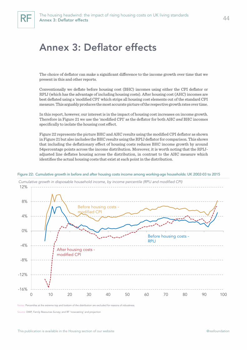
This publication is available in the Housing section of our website @resfoundation
44The housing headwind: the impact of rising housing costs on UK living standards Annex 3: Deflator effects
Annex 3: Deflator effects
The choice of deflator can make a significant difference to the income growth over time that we present in this and other reports.
Conventionally we deflate before housing cost (BHC) incomes using either the CPI deflator or RPIJ (which has the advantage of including housing costs). After housing cost (AHC) incomes are best deflated using a ‘modified CPI’ which strips all housing cost elements out of the standard CPI measure. This arguably produces the most accurate picture of the respective growth rates over time.
In this report, however, our interest is in the impact of housing cost increases on income growth. Therefore in Figure 21 we use the ‘modified CPI’ as the deflator for both AHC and BHC incomes specifically to isolate the housing cost effect.
Figure 22 represents the picture BHC and AHC results using the modified CPI deflator as shown in Figure 21 but also includes the BHC results using the RPIJ deflator for comparison. This shows that including the deflationary effect of housing costs reduces BHC income growth by around 54percentage points across the income distribution. Moreover, it is worth noting that the RPIJ-adjusted line deflates housing across the distribution, in contrast to the AHC measure which identifies the actual housing costs that exist at each point in the distribution.
Figure 22: Cumulative growth in before and after housing costs income among working-age households: UK 2002-03 to 2015
Cumulative growth in disposable household income, by income percentile (RPIJ and modified CPI)
Notes: Percentiles at the extreme top and bottom of the distribution are excluded for reasons of robustness.
Source: DWP, Family Resources Survey; and RF ‘nowcasting’ and projection
-16%
-12%
-8%
-4%
0%
4%
8%
12%
0 10 20 30 40 50 60 70 80 90 100
After housing costs -modified CPI
Before housing costs -RPIJ
Before housing costs -modified CPI

This publication is available in the Housing section of our website @resfoundation
45The housing headwind: the impact of rising housing costs on UK living standards Annex 3: Deflator effects

resolutionfoundation.org [email protected] +44 (0)203 372 2960 @resfoundation
Resolution Foundation is an independent research and policy organisation. Our goal is to improve the lives of people with low to middle incomes by delivering change in areas where they are currently disadvantaged. We do this by:
» undertaking research and economic analysis to understand the challenges facing people on a low to middle income;
» developing practical and effective policy proposals; and » engaging with policy makers and stakeholders to influence
decision-making and bring about change.
For more information on this report, contact:
Lindsay JudgeSenior Policy [email protected] 020 3372 5801