the financial meltdown: data and diagnoses
TRANSCRIPT

1
The Financial Meltdown: Data and Diagnoses
Arvind Krishnamurthy1 Kellogg School of Management, Northwestern University and NBER
1 This paper is based on a talk prepared for the Credit Crisis meeting of the NBER Corporate Finance group, held in
Boston on November 20, 2008. I thank Markus Brunnermeier, Mike Fishman, David Lucca, Bob McDonald and
Annette Vissing‐Jorgensen for helpful comments.

2
1. Introduction
We are currently engulfed in the most severe financial crisis since the Great Depression. The
upheaval in financial markets that began in August of 2007 has continued to escalate, taking a
dramatic turn for the worse in September of 2008. Figure 1 below provides a sense of the
recent events.
Figure 1: CDS Spreads (Basis Points) Source: Datastream
The figure graphs the 5 year credit default swap (CDS) rates for 5 major financial institutions
over the period from March 1, 2008 to November 10, 2008. The CDS rate measures the dollar
cost that must be paid (i.e. $1000) to insure against default on a notional $10,000 face‐value of
bonds. There are a few things to note from this graph. First, the events since mid‐September
reflect an order of magnitude increase in default concerns; the Bear Stearns event appears
minor compared to the recent period. Depending on assumptions on recovery rates, the
highest CDS rates for Goldman Sachs and Morgan Stanley imply risk‐neutral probabilities of
defaulting over the next 5 years of between 30% and 60%. Second, while AIG was downgraded
and was the subject to the Fed intervention, the CDS of all the financials follow a similar time‐
series pattern of widening in the recent period. Even non‐bank financials (GE CC) follow this
pattern. The events since mid‐September thus reflect a systemic default concern, rather than

3
concerns centering on a particular financial institution. Last, while the CDS rates have come
down, especially since the equity infusions by the Treasury, they still (as of early November)
remain at markedly high levels.
The first part of this paper presents some data on asset prices and quantities to establish the
main features of the crisis, paying special attention to the recent period. I then turn to a
diagnosis of the corporate financing problems in financial institutions that have exacerbated
the crisis. Understanding these corporate financing problems is essential because the various
government interventions undertaken by the Treasury and the Federal Reserve are at root
intended to attack these problems. Four candidate diagnoses that many experts have made
about the current situation are:
1. Regulatory capital requirements: Banks face risk‐based capital requirements and losses
have led to reductions in equity capital to the point that bank behavior is constrained by
low regulatory capital.
2. Financial distress risk: The managers of financial institutions face a variety of distress
possibilities, ranging from outright default on debt, difficulties in rolling over short‐term
debt, margin calls, to mutual funds or hedge funds redemptions. Many financial
institutions follow internal value‐at‐risk controls to limit the risk of these distress events.
As equity capital has fallen and distress risks have risen, financial institutions have
reduced risk exposures (see Krishnamurthy, 2008, or He and Krishnamurthy, 2008).
3. Informational problems: Adverse selection issues are plausibly rampant in the current
environment. If a subprime mortgage is for sale, is it a lemon? Are counterparties on
bilateral trades lemons? Moreover, given the speed and evolution of financial events,
there is rampant uncertainty in the marketplace. Many financial institutions, faced with
such uncertainty follow worst‐case decision rules that suggests that the uncertainty is
Knightian. These types of informational problems have plausibly played an important
role in the current crisis (see Caballero and Krishnamurthy, 2008).
4. Debt overhang: Many financial institutions have too much debt relative to assets –
indeed this is part of what the CDS rates tell us. The debt overhang problem as
identified by Myers (1977) is that when management makes decisions in the interest of
shareholders, and since the return on the marginal investment accrues principally to the
debt holders, shareholders will be reluctant to invest money in a firm (see Veronesi and
Zingales, 2008).
I return to a fuller discussion of these diagnoses after reviewing some data

4
2. Data a. Real Estate Exposure and Losses
Table 1 below lists real estate exposure across the main financial institutions in the U.S. The
Table is reproduced from an April 2008 Lehman Brothers report. Real estate exposure comes in
various forms: direct loans and second mortgages are held principally by US Banks & Thrifts;
mortgage‐backed securities (MBS) are held by a variety of players; and collateralized debt
obligations (CDOs) are held principally by Broker/Dealers and Financial Guarantors. While on
many of these assets, a homeowner owns equity which takes the first loss if real estate prices
decline, as prices have declined, these equity buffers have shrunk. Thus, as the crisis has
deepened, it is increasingly the financial sector which bears the burden of further drops in real
estate values.
Table 1 Source: Lehman Brothers Report April 2008
Across US Banks and Thrifts, Broker/Dealers, Financial Guarantors, and Insurance companies
the total real estate exposure is $5.8 trillion. If we think that prices are forecast to fall a further
20%, we should expect further losses to the financial sector in the neighborhood of $1tn.

5
Figure 2: Capital and Losses (Billions of $) Source: Bloomberg
Figure 2 graphs the cumulative reported losses across the financial sector (Banks, Brokers,
Insurance Companies, Monolines) as well as the cumulative capital raised. The reported losses
thus far are between $600 and $700 billion; total capital raised is just under $500 billion, with
much of this due to the recent Treasury capital infusion. The difference between losses and
capital raised of around $200 billion is the current shortfall to the financial sector. We should
note two things here. As mentioned above, if real estate prices continue to fall, these losses will
likely double. Also, there is some question as to whether reported losses reflect a full mark‐to‐
market of all institutions given the heterogeneity of mark‐to‐market rules.
b. Decreased Risk Capital
Cash‐flows expected on the various mortgage assets held by the financial sector have fallen.
But additionally, the financial claims on these cash‐flows have likely fallen further. In the
current market environment, mortgage and credit assets are heavily discounted. We may think
of this discount as reflecting the scarcity of risk‐capital in the financial system – thus a risk‐
discount – as well as the enormous liquidity preference exhibited by investors. Illiquid
mortgage and credit assets thus trade at a liquidity discount.

6
Figure 3: GNMA OAS and Swap Spread (%) Source: Bloomberg (top panel) and Federal Reserve (bottom panel)
Figure 3 (top panel) graphs the option‐adjusted spread on the 30‐year Ginnie Mae 6% TBA
mortgage‐backed security. The option‐adjusted spread is computed based on Bloomberg’s
prepayment model. The computation strips out the prepayment option component of the
MBS, leaving a spread that, if the computation is precise, is a risk premium and illiquidity
premium.
The blue line graphs the spread on the Ginnies versus the interest rate swap (i.e. LIBOR) curve.
The Ginnies carry the explicit “full faith and credit of the U.S. government” and are therefore as
safe as Treasuries. Moreover, if a homeowner defaults on a mortgage, the U.S. government
absorbs any losses, paying par to the holder of the mortgage‐backed security. Thus there is no
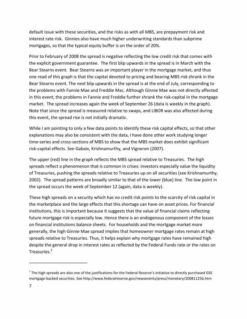
7
default issue with these securities, and the risks as with all MBS, are prepayment risk and
interest rate risk. Ginnies also have much higher underwriting standards than subprime
mortgages, so that the typical equity buffer is on the order of 20%.
Prior to February of 2008 the spread is negative reflecting the low credit risk that comes with
the explicit government guarantee. The first blip upwards in the spread is in March with the
Bear Stearns event. Bear Stearns was an important player in the mortgage market, and thus
one read of this graph is that the capital devoted to pricing and bearing MBS risk shrank in the
Bear Stearns event. The next blip upwards in the spread is at the end of July, corresponding to
the problems with Fannie Mae and Freddie Mac. Although Ginnie Mae was not directly affected
in this event, the problems in Fannie and Freddie further shrank the risk‐capital in the mortgage
market. The spread increases again the week of September 26 (data is weekly in the graph).
Note that since the spread is measured relative to swaps, and LIBOR was also affected during
this event, the spread rise is not initially dramatic.
While I am pointing to only a few data points to identify these risk capital effects, so that other
explanations may also be consistent with the data, I have done other work studying longer
time‐series and cross‐sections of MBS to show that the MBS market does exhibit significant
risk‐capital effects. See Gabaix, Krishnamurthy, and Vigneron (2007).
The upper (red) line in the graph reflects the MBS spread relative to Treasuries. The high
spreads reflect a phenomenon that is common in crises: investors especially value the liquidity
of Treasuries, pushing the spreads relative to Treasuries up on all securities (see Krishnamurthy,
2002). The spread patterns are broadly similar to that of the lower (blue) line. The low point in
the spread occurs the week of September 12 (again, data is weekly).
These high spreads on a security which has no credit risk points to the scarcity of risk capital in
the marketplace and the large effects that this shortage can have on asset prices. For financial
institutions, this is important because it suggests that the value of financial claims reflecting
future mortgage risk is especially low. Hence there is an endogenous component of the losses
on financial institutions balance sheets. For households and the mortgage market more
generally, the high Ginnie Mae spread implies that homeowner mortgage rates remain at high
spreads relative to Treasuries. Thus, it helps explain why mortgage rates have remained high
despite the general drop in interest rates as reflected by the Federal Funds rate or the rates on
Treasuries.2
2 The high spreads are also one of the justifications for the Federal Reserve’s initiative to directly purchased GSE
mortgage‐backed securities. See http://www.federalreserve.gov/newsevents/press/monetary/20081125b.htm

8
Another piece of evidence for the lack of risk‐capital is the recent behavior of the 30 year
interest rate swap spread (Figure 3, bottom panel). The swap spread measures the difference
between 30 year Treasury rates and 30 year fixed‐for‐floating (LIBOR) swap rates. Since the
swap rate reflects LIBOR, swap rates are almost always higher than Treasury rates. However,
since September there are a number of dates on which swap rates were below Treasury rates
(while the usual pricing pattern prevailed for all other maturities – see the 5 year spread on the
graph). For example, on November 20 the 30 year swap rate was 20 basis points below the 30
year Treasury. Market participants ascribed this to an unwinding of long‐term swap trades by a
number of players. However, the fact the spread was negative suggests that the other side of
the market must have been lacking. Arbitrage capital that would otherwise capitalize on the
negative 20 bp spread was absent.
To see why the negative spread is anomalous, consider the following trade. An arbitrageur
could purchase $100 worth of a 30 year Treasury, say at 4%. Using the Treasury as collateral,
he can do a repurchase agreement where he pays the repo rate. He can then do a fixed rate
swap paying 3.80% and receiving LIBOR. This trade eliminates all interest rate risk. LIBOR rates
have been between 100 and 300 basis points above the Treasury repo rate recently; historically
this spread is always positive and averages closer to 40 basis points. Thus, this trade earns a
fixed rate differential of 20 bps and a floating rate differential of between 40 and 300 basis
points. Moreover, if the swap spread turns positive, the arbitrageur can unwind the trade at a
profit. The trade has “positive carry” and substantial upside.
Why isn’t this trade being done? There are three frictions which may prevent this trade from
being done in sufficient size. First, the trade requires capital – haircuts and collateral for the
repo and swaps. As noted above, there is little risk capital in the marketplace now. Second,
many practioners have noted that the repo market is currently not functioning well; volume of
trade has fallen and many money funds have withdrawn from the triparty repo market. Last,
the swap is a bilateral trade with another counterparty, and given the counterparty risk
concerns present currently, an arbitrageur may be reluctant enter a swap. These three frictions
are all possible, and the fact that they have significantly affected pricing relationships indicates
how distorted asset markets are currently.
If the prices on these two low‐risk assets – swap spread and Ginnie Mae MBS – can be as
affected by market disruptions, we can surmise that more risk‐sensitive assets such as the
senior tranches on subprime CDOs must be more affected. Thus there is plausibly a large
endogenous component of market losses borne by financial institutions.

9
c. Bank Lending
Banks have made less new loans to firms and households. This aspect of the credit crunch has
been widely discussed in the financial press. Academic evidence for the drop in loan supply is
presented in Scharfstein and Ivashina (2008), and I refer the interested reader to their paper on
these points. Their evidence suggests that new loans, as reported in the Dealscan database of
loan originations, have fallen by $300 billion since the summer of 2007. The fall is across both
loans for financial restructuring (i.e. LBOs) as well investment projects (i.e. capital
expenditures).
Figure 4: C&I Loans, All US Banks (Billions of $) Source: Federal Reserve
Figure 4 paints a somewhat contrary and confusing picture. Commercial and industrial loans
made by banks have increased rapidly since the crisis worsened in mid‐September.3 How could
we have both a credit crunch and an expansion in bank balance sheets?
The answer has to do with credit lines. Banks have on the order of $3 trillion of undrawn credit
lines extended to firms. Most of these credit lines are “covenant‐lite” so that banks cannot
easily absolve them. Since September 15, firms have drawn down credit lines in an effort to
shore up their balance sheets. Thus banks have had to make forced loans.
3 More broadly, the Federal Reserve reports that large domestically chartered commercial banks acquired $259.2
billion in assets and liabilities of nonbank institutions in the week ending October 1, 2008.

10
Here is an example reported by Scharfstein and Ivashina. Duke Energy on September 30
drewdown $1bn out of a $3.2bn credit line, citing:
“In light of the uncertain market environment, we have made this proactive
financial decision to increase our liquidity and cash position and to bridge our
access to the debt capital markets. This improves our flexibility as we continue to
execute our business plans.”
These credit lines reflect options that banks have sold to firms on their (the banks’) liquidity.
Indeed, there is a wider pattern that these credit lines reflect. Banks have been providers of the
liquidity facilities on Asset‐Backed Commercial Paper. These liquidity facilities obligate banks to
purchase ABCP directly, which they have had to do as the CP market dried up. Thus another
source of balance sheet expansion has been the absorbing of ABCP in conjunction with these
liquidity facilities. Finally, banks have made implicit commitments to absorb off‐balance sheet
SIVs back onto balance sheets and have done so systematically over the past year. For example
on November 19, 2008 Citigroup purchased approximately $17 billion of an SIV that it had
sponsored.
As these liquidity options have been exercised against banks, their balance sheets have grown.
But, it would be incorrect to ascribe such balance sheet growth to a healthy banking system.
Indeed, as banks scarce lending capacity has been strained to meet these obligations, lending in
the form of new loans has suffered.
Figure 5: Unused Credi Lines, All US Banks (Billions of $) Source: Federal Reserve Call Reports

11
Figure 5 presents data on the amount of unused credit lines, drawn from the Federal Reserve’s
call reports. Note in particular how large these numbers are, suggesting that this process may
continue and moreover may affect banks’ current asset/liability choices. In particular, knowing
that it may lose liquidity suddenly, a bank may be likely to precaution against this event by
hoarding liquidity.
d. Money Markets and Maturity Shortening
Figure 6 graphs the money under management in money market funds since the beginning of
the year. The sharp drop in mid‐September has been widely associated with the freeze in
money markets following the Lehman bankruptcy. Funds fell by approximately $200 billion, but
have since recovered (in part, because of the various money‐market facilities enacted by the
Fed). Note also that despite the fall in September, the general trend from this graph is that
funds under management have grown. This reflects the general risk aversion in the
marketplace, as investors seek cash investments.
The money market freeze has had effects on borrowers. The biggest buyers of commercial
paper are money market funds. As money funds have become more concerned with
redemption risk (highlighted by the events following the Lehman default) they have tilted their
portfolio preferences to favor more safe and liquid investments.
Figure 6: Money Market Funds (Billions of $) Source: Federal Reserve

12
Figure 7 presents a dramatic illustration of this shift in portfolio preferences. The figure graphs
the issuance volume of commercial paper broken down by maturity buckets (note that the
figure presents volume issued, not volume outstanding). The maturity structure of commercial
paper issuance has shortened, with maturities over 9 days being replaced by maturities under 9
days. Anecdotally, much of this shortening is in fact to overnight paper.
By shifting to overnight lending, the money market funds achieve a liquidity objective.
Overnight loans are de‐facto liquid. Moreover, by shortening maturities, the money market
funds also give themselves the option to renew credit, somewhat lessening credit exposures.
Figure 8 reflects the price effects of this maturity preference. The spread between overnight
commercial paper placed by AA financials and 30‐day paper has widened to as high as 200 basis
points. The spread prior to mid‐September were already at the historically elevated levels of
50 basis points.
Figure 7: Commercial Paper Issuance (Millions of $) Source: Federal Reserve

13
The maturity spread is not unique to the commercial paper market and reflects a wider
maturity shortening that is evident across the money markets. Figure 9 graphs the spread
between the rate on a 4‐week Federal Funds term loan and the 1 month OIS. The OIS reflects
the market expectations of the average overnight Federal Funds rate over the next month.
There is a dramatic spike after mid‐September, as in previous graphs. Note also the elevated
levels of near 50 basis points in the earlier part of the year. We can surmise, as with the
commercial paper market, that these spreads are coincident with a shortening in the maturity
structure of Federal Funds loans: mostly overnight and less term lending. In communication
with Jamie McAndrews and David Skeie at the New York Federal Reserve who have studied
these quantities, I can confirm that term Federal Funds volumes have halved since the
beginning of the year.
Figure 8: Financial CP rates (%) Source: Federal Reserve

14
Figure 9: Fed Funds Term Premium (%) Source: Bloomberg
The maturity shortening is interesting because it reflects a self‐enforcing tightening mechanism.
As market conditions worsen, maturities contract. But then any given borrower faces a greater
chance of debt rollover risk, which increases that borrower’s liquidity preference. If the
borrower is a financial player – say a hedge fund – the liquidity preference will be reflected in
the portfolio choices, say away from illiquid MBS and towards liquid Treasuries. Finally, as
liquidity conditions worsen, maturities contract further. One can describe a circular gridlock in
which all wealth is invested overnight across all markets. Any given borrower has no incentive
to unilaterally extend the terms of his loan for fear that his own financing will be curtailed.
e. Summary
The following points summarize the data I have presented.
1. Losses in banks have triggered solvency issues.
2. Asset market prices are reflective of

15
a. High risk aversion,
b. High liquidity preference.
3. Banks are reducing new loans.
a. Instead are making forced loans as options on their liquidity are exercised.
4. The maturity structure of debt is shortening.
3. Diagnosis
Let me next turn to a diagnosis in light of this data. What is driving the behavior of financial
institutions? There are four possibilities mentioned in the introduction, which I consider in turn.
1. Regulatory capital requirements: Banks have clearly suffered losses, so that regulatory
capital is lower. Since capital requirements are higher for more risky assets and C&I
loans, a binding capital requirement will tend to make banks reduce holdings of risky
assets, consistent with the high risk premia we observe in the marketplace, as well as
cut back on lending. Moreover, since liquid assets such as Treasuries or cash carry no
capital charges, banks are likely to prefer these assets, consistent with the liquidity
preference we observe.
This diagnosis however does not speak to financial institutions such as money funds,
whose liquidity preference appears to be affecting the commercial paper market, or any
of the other non‐bank financial institutions. More importantly, it does not address the
central question of why banks do not issue equity to relieve the capital constraint, if it is
indeed binding. Thus, while this diagnosis is plausible, it is incomplete.
If regulatory capital is the main constraint, then an easy solution to the financial
institutions’ problems is to simply rewrite the capital requirements. At the least, this is
cheaper than the trillions that have been spent by the government supporting various
asset markets.
2. Avoid risk of distress: Managers of financial institutions take decisions to avoid various
forms of “distress” including, problems with rollover of debt, bankruptcy,
collateral/margin calls, and redemption risk for mutual or hedge funds. We may also
think of this as binding value‐at‐risk constraints for financial institutions.

16
This diagnosis like (1), can help to understand the lack of new loans, high risk premia,
high liquidity premia, as well as the observed maturity shortening. Financials are heavily
exposed to mortgage and credit assets, and at the margin adding more mortgage or
credit risk rather than a Treasury will add to distress risk. Moreover, given that
mortgage and credit assets seem “fire‐sale” prone, concerns about avoiding liquidity risk
will lead financials to avoid these assets. I have noted earlier how redemption risk can
also lead to liquidity preference as well as maturity shortening.
This diagnosis has the advantage over (1) that it is immediately applicable to a wide
range of financial institutions and is not commercial bank centric. However, like (1), it
does not speak to the question of why financials don’t restructure balance sheets (i.e.
issue equity or do debt‐for‐equity swaps) to avoid distress risks.
The next two diagnoses can explain the lack of equity issuance.
3. Information: There is adverse selection on the location of the most toxic assets which
can heighten counterparty risk. Moreover, given uncertainty over valuation of the most
complex credit assets, market participants may fear that if they transact they will be left
with a “lemon.” Thus this diagnosis is consistent with the lack of liquidity in markets.
Informational problems may also be apparent in Knightian decision rules by agents who
are faced with new assets that they find hard to value, or a new environment; decision
rules that protect against worst‐case scenarios. Thus this explanation is also consistent
with the high risk aversion we see in the market.
Moreover, adverse selection problems can explain why banks are unable to raise equity
finance. Investors will infer that the banks that choose to raise equity finance are
lemons.
On the other hand this explanation likely overstates the case for liquidity problems,
when we know there are true solvency problems. For example, since the capital
problems are so widespread, we can imagine that every bank may need to raise equity
finance, in which case investor pricing will be based on the average quality of the pool
rather than on lemons pricing.
4. Debt overhang: There is too much debt relative to assets and managers/shareholders
make all investment and financing decisions.
This diagnosis can explain both the lack of equity financing and lack of lending.
However, the debt overhang problem suggests that banks should be changing portfolios

17
to risk‐seek, not shed risks. That is given that shareholders hold out‐of‐the‐money
options on bank assets (which makes them reluctant to inject more funds), they will
prefer to sell Treasuries and buy more risky assets. This is clearly inconsistent with the
high risk aversion apparent in asset prices, suggesting that the debt overhang diagnosis
is second‐order at best.
I conclude that the corporate financing problems are some mix of undercapitalization problems
which have raised the risk of distress, along with informational problems which explains the
shutdown of many markets and modes of financing.
4. Policy Prescription a. Diagnosis (1) or (2)
If the corporate financing problem is (1) or (2), then as many economists have emphasized the
obvious solution is to inject equity or do a debt‐for‐equity swap. These types of policies relax
the equity capital constraint that is the root problem. The U.S. Treasury has injected equity, but
has thus far not seriously considered facilitating private sector debt‐for‐equity swaps. How
feasible are such swaps?
Table 2 provides data on the capital structure of Citibank North America (first column) and all
U.S. commercial banks (second column). There are two points to note from this table. First,
almost all bank debt is short‐term. A widescale debt‐for‐equity swap will involve money market
participants such as money market funds and non‐financial companies having to hold equity
stakes. While possible, it should be noted that these investors traditionally do not own equity,
suggesting that a third‐party equity‐investor will have to brought to the table. Second, much of
bank debt is insured by the FDIC. One can argue that to the extent that such debt is an
obligation of the government, the government is in effect swapping its own claims on the
banking sector by doing equity infusions.

18
Debt for Equity Swap?
Checking Deposits
Time Deposits
Large Time Deposits
Repos,FedFunds,CP
Long‐Term Debt
Equity
Citibank
3Q08
104 bn
631 (total TD)
169
145
91
All Comm.
Banks (Q2)
585 bn
4189
1991
916
782
?
End Investors
Households: 5910 bn
Nonfinancial Business: 933 bn
Money Funds: 393bn
Other: 2400 bn
Table 2 Source: Citibank 10Q and Federal Reserve Flow of Funds
b. Diagnosis (3): Information
Under the information diagnosis the best solution is for the government to purchase the most
toxic assets which are the cause of the market freeze. By buying all such assets, the
government removes adverse selection and Knightian problems. Indeed, this is the main merit
of the Treasuries original TARP proposal.
Of course, there are implementation issues in purchasing such assets as many observers have
noted. But there are also implementation issues in figuring out which banks will be allowed
access to equity from the TARP (as is currently becoming clear).

19
One possible implementation is to do the asset purchase on a transaction basis, with the
government offering to ring‐fence the most toxic assets if private investors are willing to
purchase equity stakes in banks. This type of deal is what made the Bear Stearns unwind
possible, and has been considered in other government‐assisted restructuring deals including
the recent Citigroup intervention. It seems worth thinking about whether this type of policy
can be systematized.
But it does not make sense to complete ignore the asset purchase policy as it is the only policy
that attacks the informational problem directly (as equity infusions attack the
undercapitalization problem). Indeed, since the data does not allow us to definitively conclude
whether the problem is purely undercapitalization or information, prudential policy‐making
dictates attacking both problems.

20
References:
1. Caballero, Ricardo, and Arvind Krishnamurthy, 2008, “Collective Risk Management in
Flight to Quality Episode,” Journal of Finance.
2. Gabaix, Xavier, Arvind Krishnamurthy and Olivier Vigneron, 2007, “Limits of
Arbitrage: Theory and Evidence from the MBS market,” Journal of Finance, 62(2),
557‐596.
3. He, Zhiguo, and Arvind Krishnamurthy, 2008, ``A Model of Capital and Crises,”
working paper, Northwestern University.
4. Krishnamurthy, Arvind, 2002, “The Bond/Old‐Bond Spread," Journal of Financial
Economics, 66(2), 463‐506.
5. Krishnamurthy, Arvind, 2008, “Amplification Mechanisms in Liquidity Crises,”
working paper, Northwestern University.
6. Myers, Stewart, 1977, "Determinants of Corporate Borrowing", Journal of Financial
Economics, 5, 147‐75
7. Veronesi, Pietro and Luigi Zingales, 2008, ``Paulson’s Gift,” working paper, University
of Chicago.