thames inundation report
TRANSCRIPT

THE CREATION OF A 6M INUNDATION ZONE AROUND THE RIVER THAMES, LONDON, UK AND
ITS EFFECTS ON VULNERABLE POPULATIONS AND BUILDING INFRASTRUCTURE
IAN J. MORRIS
ABSTRACT
The intent of this work is to display the benefits provided by two dimensional inundation modelling along the River
Thames in London, UK and how it can be used to identify populations and infrastructure at risk. A total of 107,937
people within a pre-defined set of “vulnerable” age groups, 0-7 and 65+ year olds, fall within the Boroughs of
Greenwich, Lewisham, Newham, Southwark and Tower Hamlets. In total, segments of 14 Boroughs fall within a 6m
inundation level of the river and its tributaries, with differences in the spread of population and infrastructure creating
zones of higher and lower risk across this defined 91.43km2 hazard zone. In this respect the Boroughs of Newham,
containing the highest proportions of total “vulnerable” population and 0-7 year olds, and Southwark, containing the
highest proportion of 65+ year olds, are classified as being the most at risk areas. Building density data confirms this
categorization and shows a higher proportion of buildings, per kilometer radius, in and around these areas.
INTRODUCTION
The aim of this study is to create a model, and subsequent series of thematic maps, in order to visualise both the hazard
zone and the associated risks and effects on building infrastructure, within this zone, brought on by a 6m inundation of
the River Thames, and its tributaries, within Ordnance Survey (OS) tiles TQ37, TQ38, TQ47 and TQ48 of London, UK.
In order to achieve this, the areal extent of the inundation, within the aforementioned OS tiles must first of all be
identified, using LiDAR DTM or DSM data, to establish a hazard zone that will form a basis to the rest of the study. From
the establishment of this hazard zone, 2011 census population data will be used in conjunction with the boundaries of
local Boroughs to identify the population at risk, defined in this study to be those within age groups 0-7 years and those
in advance of 65 years of age. The extent of the hazard zone and its effects on current building infrastructure is to then
be assessed with the end product of this study being the creation of suitable thematic maps including any relevant items
(legend, north arrow, etc) to effectively visualise both the hazard and risk zones of the inundation.
Previous work with inundation modelling has shown it to be useful in the “development of spatially accurate hazard
maps” in “the assessment of risk to life and property in the floodplain” (Mason, Schuman & Bates, year unknown).
It is hoped this study will give further insight to the benefits of inundation modelling so that it may play a bigger role
and/or further assist governmental policy making and operations to further protect populations in and around areas at
risk of inundation and flooding. In particular it is hoped that this study will provide these insights and assistance to the
Boroughs of London affected by the River Thames and its tributaries.
Why is inundation modelling important?
A two dimensional inundation model, as used in this study, effectively displays the areas affected by a given amount of
inundation (the rise in elevation of a terrain) brought on by a known threat or hazard, i.e. water, during a flood event.
Inundation modelling is crucial and used so that the hazards posed by extreme rises in water, such as flooding, can be
visualised in order to identify those at risk and accurately mitigate this risk so that its effects on demographics such
population, infrastructure, various commercial, industrial and residential zones as well as agricultural areas and other
items or areas of interest are lessened as much possible.
Hazards can be defined as a phenomena, physical event or human activity that has the potential to cause loss of life,
injury, damage to property and social or economic disruption as well as environmental degradation (jbpub.com, last
accessed 21st February 2016.). In conjunction with this, risk is defined as a society or element vulnerable to a hazard
(jbpub.com, last accessed 21st February 2016).

According to the London Assembly this mitigation should include the waterproofing of external walls, the use of flood
resistant plaster and using solid concrete for ground floor areas amongst other items (London Assembly, 2002). They
also highlight work done by the Environment Agency and the importance of “living with the Thames” in how crucial
further mitigation, through the implementation of further flood defence infrastructure, is in the face of rising sea levels
(London Assembly, 2002).
METHODS
Note: This study uses ArcMap 10.3 for the processing of data and creation of maps.
The data used in this study comprised of both a DTM and a DSM raster elevation dataset captured by LiDAR technology
at 2m spatial resolutions as provided by the Environmental Agency. Only one of which could be used for the final
thematic maps. A shapefile containing a series of polyline vectors representing the River Thames and its tributaries was
also used and taken from the Ordnance Survey Open Rivers dataset. The fourth dataset, provided by the Office of
National Statistics, was a shapefile containing the boundaries of local boroughs (i.e. Tower Hamlets) and their smaller
local regions (i.e. Bethnal Green South) in polygon shape and the fifth, provided by InFuse portal, the UK’s 2011 census
data gateway, was an excel .csv spreadsheet containing their population and density statistics. The sixth file contained
building footprints represented as polygons and the sixth file as provided by the Ordnance Survey Mastermap
Topography Layer. All files used covered Ordnance Survey (OS) tiles TQ37, TQ38, TQ47 and TQ48 of London, England.
Hazard Zone Creation
In trying to satisfy objective number one of the study, model builder was used and the first stage of building a successful
and transferrable model would be the need to select all areas of terrain either “equal to or less than” 6m in elevation
which, in effect, displays the inundation. Using the DTM raster elevation data set the most efficient way of doing this is
to create an SQL query within the “Raster Calculator” of ArcToolbox in ArcMap to return a new layer displaying both the
true (the inundated areas) and false (the non-inundated areas) values of the input criteria in different colours. It was
decided that more accurate results would be obtained from the DTM raster due to the completeness and continuity of
the data. The DSM raster displayed gaps in the data in crucial areas of the dataset, i.e. near the river and its tributaries
(figure 1), making it difficult to obtain accurate results from this data and therefore make accurate analyses and
decisions through use of it. Tobler’s first law could have been applied and spatial interpolation used to “fill in the gaps”
but this works on the assumption that there are no anomalous heights or topographies that occur in these areas in the
real world. Again this makes it difficult to justify the use of the DSM raster as crucial and potentially life or death
affecting situations (i.e. whether or not to evacuate the area) could be based on these maps. Doing this with potentially
inaccurate data is too great a risk despite the fact that the interpolation has the potential to create near accurate,
compared to the real world, elevation data, it cannot be assumed that it definitely will.
Figure 1 – DSM (left) and DTM (right) raster elevation showing high (red) to low (green) elevations with areas of no data
(white) visible in critical areas near the river and its tributaries.

The second stage would involve reclassifying this new output layer to remove all of the areas of no interest (those
“more than” 6m in elevation) or “non-inundated” areas, as they’re not part of the objectives of this study. This is
achieved by selecting the output raster from stage one as the input raster in the “Reclassify” tool and reclassifying the
false, “1” values, as “NoData”, to remove them from the output raster of this stage and also changing the true, “2”
values to “1”. This has the desirable effect of “de-cluttering” the layer by removing values of irrelevance to the study.
The areas of land between 0-6m in elevation would need to be hydrologically connected to the River Thames and its
tributaries in order for them to flood and become inundated. This third stage of model building initially involves
converting the output raster from stage two in to polygons by using the “Raster to Polygon” tool – it was decided not to
simplify the polygons in order to preserve area size and shapes. This then allows use of the “Select by Location” tool,
during the fourth stage of model building, to select all polygons from the newly created output layer that “are crossed
by the outline of the source layer feature” with the source layer feature being a shapefile containing the “River”
geometries. This output layer was then clipped to ensure that only the relevant data, i.e. the administrative boundaries
that fell within the flood zone, were used in the final map.
This selected data is then exported, using the same co-ordinates as the source layers data and added to the map in a
layer that displays vector polygons, hydrologically connected to the “River” line polygons that are between 0-6m in
elevation and therefore capable of becoming inundated aka the “flood zone”.
Figure 2 – The Model Builder design used to process and complete objective 1 - ascertain a flood inundation hazard zone
caused by a 6m rise in flood waters.
Population at Risk
In order to achieve the second objective of the study and identify the vulnerable (0-7 and 65+ year olds) population at
risk from the created flood zone a population layer needed to be created for each of these demographics. This was done
by first of all joining the shapefile, containing the local area boroughs and regions, with the population statistics data (via
a primary key) excel .csv, file for the two age groups to create two, thematic, population maps. Next the areas within the
inundation zone had to be selected and this was achieved by running another “Select by Location” query and setting the
target layer as the shapefile containing the local boroughs and regions, the source layer as the flood zone and selection
method as “intersect the source layer feature” thereby selecting all local boroughs and areas that are within the flood
zone. This output layer was then clipped to ensure that only the relevant data, i.e. the administrative boundaries that
fell within the flood zone, was used in the final maps. Finally, the two datasets were classified in order to show their
respective population densities, this is discussed in further detail under the heading “Data Classification methods”.
Building Density
To achieve objective three and assess the extent of hazardous regions and their effect on current building infrastructure,
building density was first of all calculated. The first step in this was to initially identify all buildings within the flood zone
and this was done with another “Select by Location” using the building footprints data set as the target layer and the
flood zone as the source layer and selecting anything that “intersects the source layer” feature. Next in order to
calculate the actual density itself the polygons needed to be converted to the location of their centroid points. This was
done by first of all adding two new columns labelled “Latitude” and “Longitude” to the building footprints attribute table
and using the “Calculate Geometry” feature to calculate the X and Y “Co-ordinates of the Centroid”. The results were
then exported to a new table which was then turned into an “XY Event Layer” through ArcToolbox “Data Management
Tools > Layers and Table Views”. The final stage of this process was to set the appropriate fields “X” to longitude and “Y”
to latitude before adding this new layer to the map.
Next, in order to analyse how many points occurred within an arbitrary, circular, radius (1km was used) of one another
the newly created layer from the previous step was used as the input layer of the “Point Density” tool within “Spatial
Analyst Tools > Density”. This layer was then classified using Natural Breaks, separating the data into five classes and
added to the map.
Result Analysis
Note: Results in this study are obtained through descriptive and inferential statistics where applicable
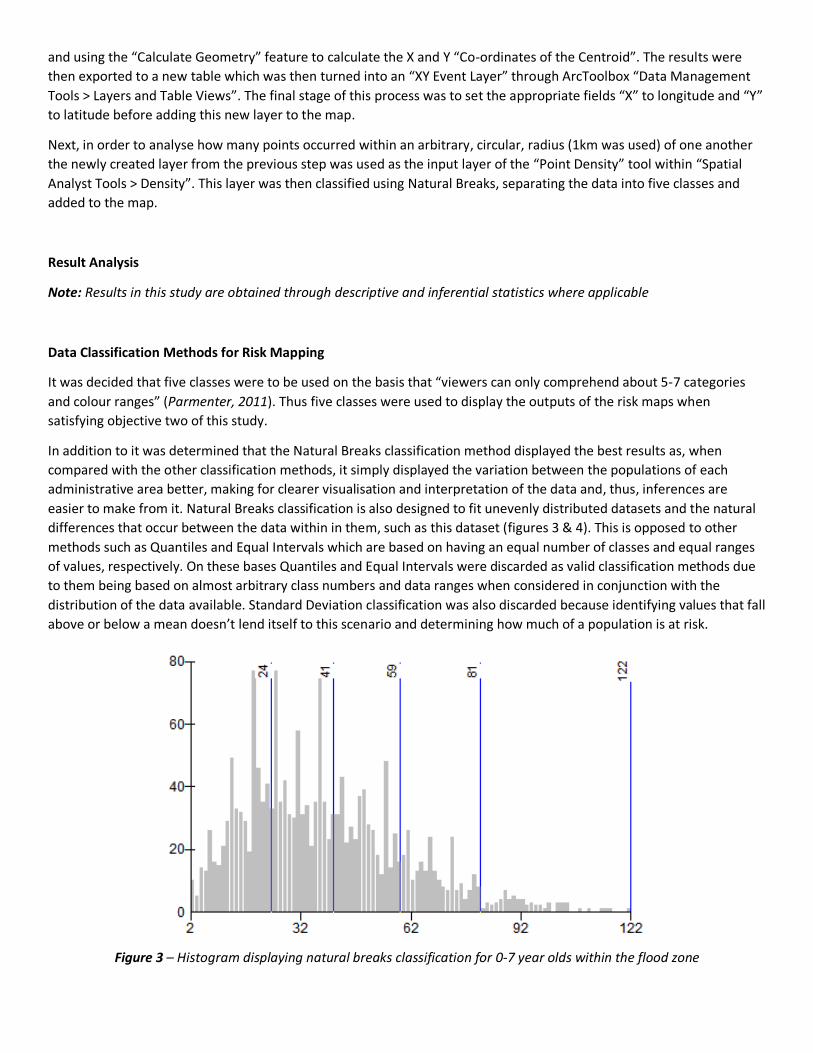
Data Classification Methods for Risk Mapping
It was decided that five classes were to be used on the basis that “viewers can only comprehend about 5-7 categories
and colour ranges” (Parmenter, 2011). Thus five classes were used to display the outputs of the risk maps when
satisfying objective two of this study.
In addition to it was determined that the Natural Breaks classification method displayed the best results as, when
compared with the other classification methods, it simply displayed the variation between the populations of each
administrative area better, making for clearer visualisation and interpretation of the data and, thus, inferences are
easier to make from it. Natural Breaks classification is also designed to fit unevenly distributed datasets and the natural
differences that occur between the data within in them, such as this dataset (figures 3 & 4). This is opposed to other
methods such as Quantiles and Equal Intervals which are based on having an equal number of classes and equal ranges
of values, respectively. On these bases Quantiles and Equal Intervals were discarded as valid classification methods due
to them being based on almost arbitrary class numbers and data ranges when considered in conjunction with the
distribution of the data available. Standard Deviation classification was also discarded because identifying values that fall
above or below a mean doesn’t lend itself to this scenario and determining how much of a population is at risk.
Figure 3 – Histogram displaying natural breaks classification for 0-7 year olds within the flood zone
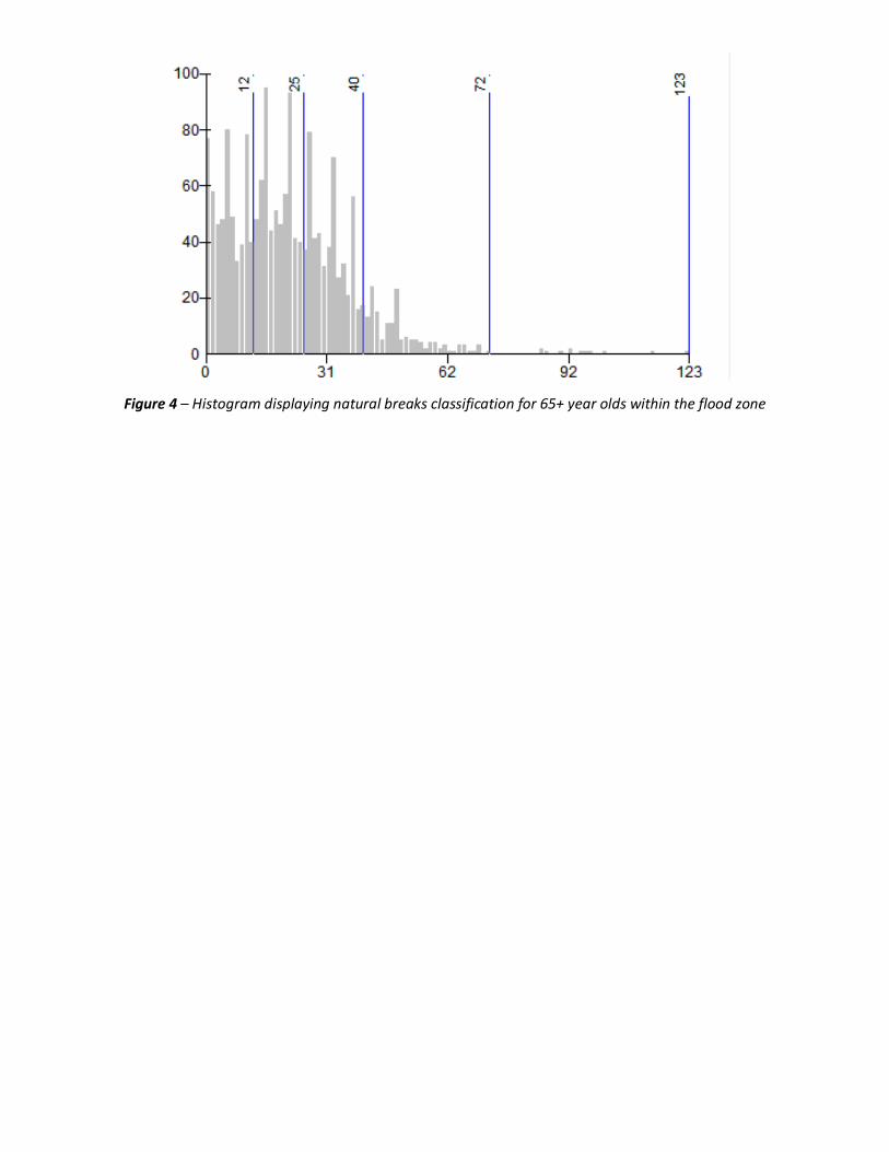
Figure 4 – Histogram displaying natural breaks classification for 65+ year olds within the flood zone
RESULTS
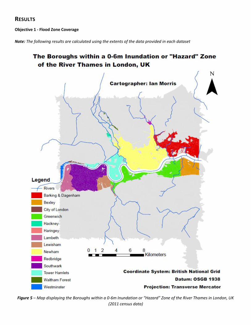
Objective 1 - Flood Zone Coverage
Note: The following results are calculated using the extents of the data provided in each dataset
Figure 5 – Map displaying the Boroughs within a 0-6m Inundation or “Hazard” Zone of the River Thames in London, UK
(2011 census data)
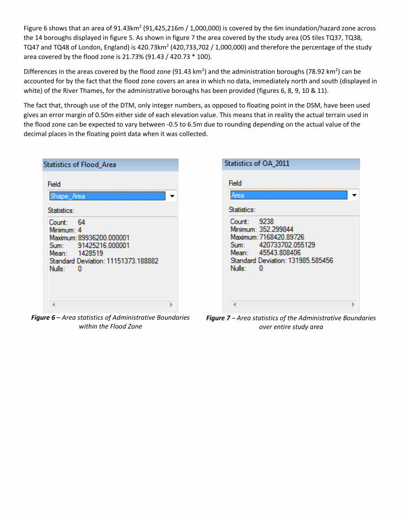
Figure 6 shows that an area of 91.43km2 (91,425,216m / 1,000,000) is covered by the 6m inundation/hazard zone across
the 14 boroughs displayed in figure 5. As shown in figure 7 the area covered by the study area (OS tiles TQ37, TQ38,
TQ47 and TQ48 of London, England) is 420.73km2 (420,733,702 / 1,000,000) and therefore the percentage of the study
area covered by the flood zone is 21.73% (91.43 / 420.73 * 100).
Differences in the areas covered by the flood zone (91.43 km2) and the administration boroughs (78.92 km2) can be
accounted for by the fact that the flood zone covers an area in which no data, immediately north and south (displayed in
white) of the River Thames, for the administrative boroughs has been provided (figures 6, 8, 9, 10 & 11).
The fact that, through use of the DTM, only integer numbers, as opposed to floating point in the DSM, have been used
gives an error margin of 0.50m either side of each elevation value. This means that in reality the actual terrain used in
the flood zone can be expected to vary between -0.5 to 6.5m due to rounding depending on the actual value of the
decimal places in the floating point data when it was collected.
Figure 6 – Area statistics of Administrative Boundaries
within the Flood Zone
Figure 7 – Area statistics of the Administrative Boundaries
over entire study area
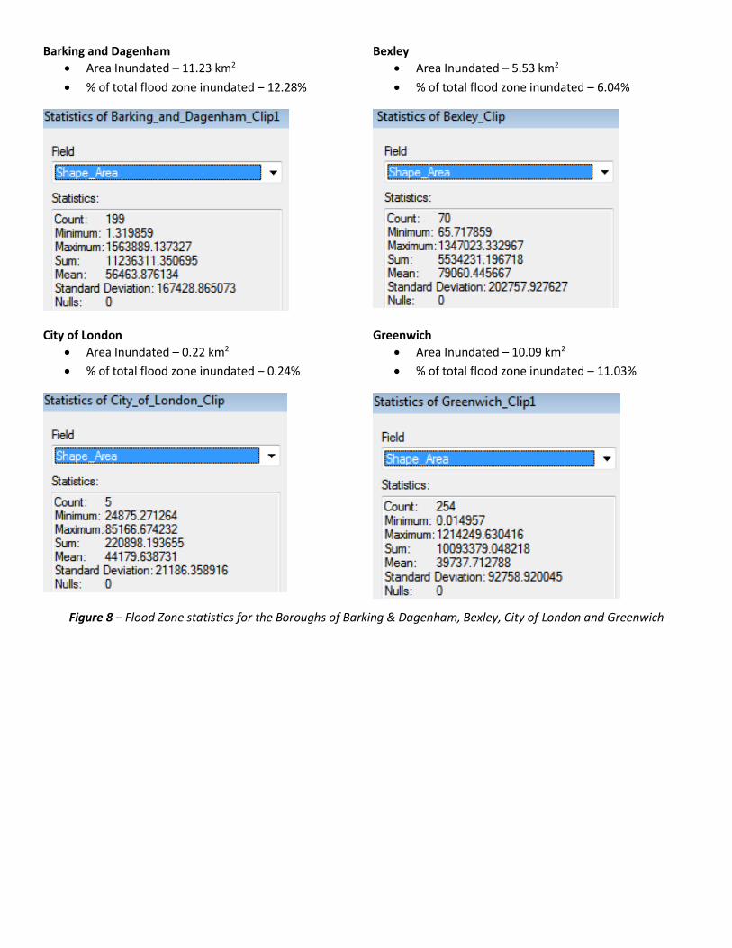
Barking and Dagenham
Area Inundated – 11.23 km2
% of total flood zone inundated – 12.28%
Bexley
Area Inundated – 5.53 km2
% of total flood zone inundated – 6.04%
City of London
Area Inundated – 0.22 km2
% of total flood zone inundated – 0.24%
Greenwich
Area Inundated – 10.09 km2
% of total flood zone inundated – 11.03%
Figure 8 – Flood Zone statistics for the Boroughs of Barking & Dagenham, Bexley, City of London and Greenwich

Hackney
Area Inundated – 0.40 km2
% of total flood zone inundated – 0.43%
Haringey
Area Inundated – 0.024 km2
% of total flood zone inundated – 0.02%
Lambeth
Area Inundated – 4.25 km2
% of total flood zone inundated – 4.64%
Lewisham
Area Inundated – 3.17 km2
% of total flood zone inundated – 3.46%
Figure 9 – Flood Zone statistics for the Boroughs of Hackney, Haringey, Lambeth and Lewisham
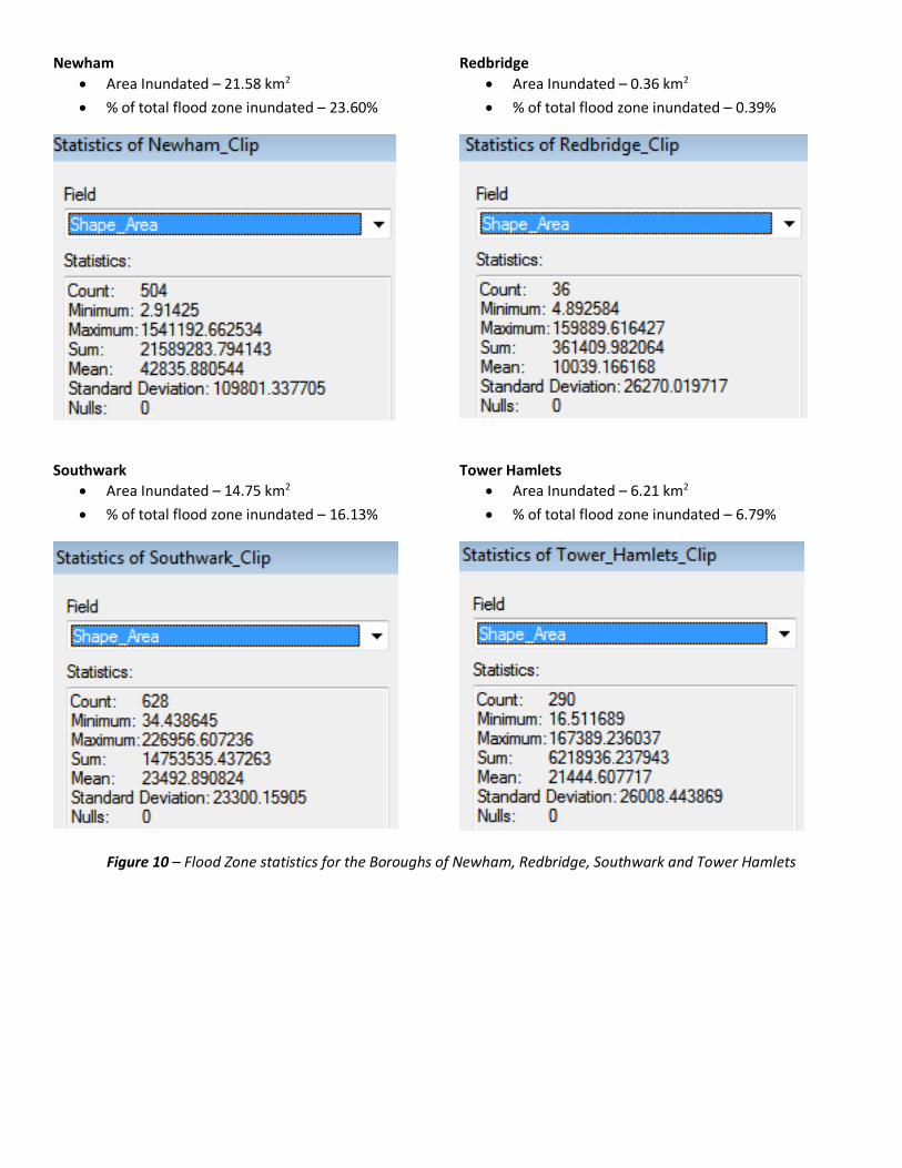
Newham
Area Inundated – 21.58 km2
% of total flood zone inundated – 23.60%
Redbridge
Area Inundated – 0.36 km2
% of total flood zone inundated – 0.39%
Southwark
Area Inundated – 14.75 km2
% of total flood zone inundated – 16.13%
Tower Hamlets
Area Inundated – 6.21 km2
% of total flood zone inundated – 6.79%
Figure 10 – Flood Zone statistics for the Boroughs of Newham, Redbridge, Southwark and Tower Hamlets

Waltham Forest
Area Inundated – 0.39 km2
% of total flood zone inundated – 0.42%
Westminster
Area Inundated – 0.72 km2
% of total flood zone inundated – 0.78%
Figure 11 – Flood Zone statistics for the Boroughs of Waltham Forest and Westminster
The hazard map (figure 5) and figures 8, 9, 10 and 11 show the flood zone to have the largest areal impact on Newham
with 21.58km2 flooded by the 0-6m inundation, representing almost one quarter (23.50%) of the flood zone itself.
Comparatively, the borough in receipt of the least amount of flooding is Haringey with only 0.024 km2 becoming
inundated, representing only 0.02% of the entire flood zone.
The second largest area covered is Southwark at 14.75 km2 (or 16.13% of the flood zone) with Barking & Dagenham third
at 11.23 km2 (or 12.28% of the flood zone) and Greenwich fourth at 10.09 km2 and 11.03% of the flood zone. In total
these four Boroughs represent 57.65km2, or 63.04% of the flood zone.
The Boroughs of City of London, Hackney, Haringey, Redbridge, Waltham Forest and Westminster all represent areas
covered by the flood zone of less than 1% and 1km2 each, totaling 2.28% together, and 2.114km2.
The remaining Boroughs of Bexley, Lambeth, Lewisham, and Tower Hamlets all represent the remaining 19.16km2, or
20.93% of the flood zone – less than the amount and percentage covered by Newham by itself.
In this respect it can be calculated that the area of “no data” covers 12.51km2 or 13.68% of the flood zone.
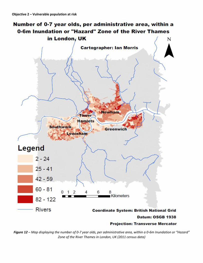
Objective 2 – Vulnerable population at risk
Figure 12 – Map displaying the number of 0-7 year olds, per administrative area, within a 0-6m Inundation or “Hazard”
Zone of the River Thames in London, UK (2011 census data)
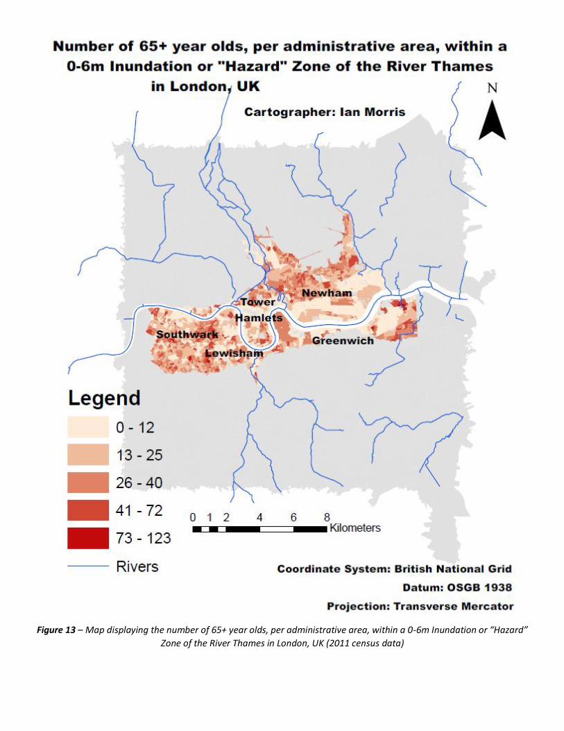
Figure 13 – Map displaying the number of 65+ year olds, per administrative area, within a 0-6m Inundation or “Hazard”
Zone of the River Thames in London, UK (2011 census data)
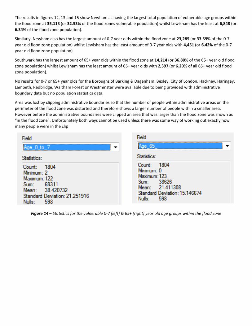
The results in figures 12, 13 and 15 show Newham as having the largest total population of vulnerable age groups within
the flood zone at 35,113 (or 32.53% of the flood zones vulnerable population) whilst Lewisham has the least at 6,848 (or
6.34% of the flood zone population).
Similarly, Newham also has the largest amount of 0-7 year olds within the flood zone at 23,285 (or 33.59% of the 0-7
year old flood zone population) whilst Lewisham has the least amount of 0-7 year olds with 4,451 (or 6.42% of the 0-7
year old flood zone population).
Southwark has the largest amount of 65+ year olds within the flood zone at 14,214 (or 36.80% of the 65+ year old flood
zone population) whilst Lewisham has the least amount of 65+ year olds with 2,397 (or 6.20% of all 65+ year old flood
zone population).
No results for 0-7 or 65+ year olds for the Boroughs of Barking & Dagenham, Bexley, City of London, Hackney, Haringey,
Lambeth, Redbridge, Waltham Forest or Westminster were available due to being provided with administrative
boundary data but no population statistics data.
Area was lost by clipping administrative boundaries so that the number of people within administrative areas on the
perimeter of the flood zone was distorted and therefore shows a larger number of people within a smaller area.
However before the administrative boundaries were clipped an area that was larger than the flood zone was shown as
“in the flood zone”. Unfortunately both ways cannot be used unless there was some way of working out exactly how
many people were in the clip
Figure 14 – Statistics for the vulnerable 0-7 (left) & 65+ (right) year old age groups within the flood zone
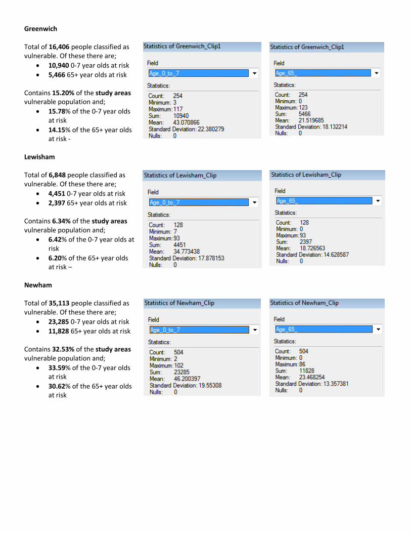
Greenwich Total of 16,406 people classified as vulnerable. Of these there are;
10,940 0-7 year olds at risk
5,466 65+ year olds at risk
Contains 15.20% of the study areas vulnerable population and;
15.78% of the 0-7 year olds at risk
14.15% of the 65+ year olds at risk -
Lewisham Total of 6,848 people classified as vulnerable. Of these there are;
4,451 0-7 year olds at risk
2,397 65+ year olds at risk Contains 6.34% of the study areas vulnerable population and;
6.42% of the 0-7 year olds at risk
6.20% of the 65+ year olds at risk –
Newham Total of 35,113 people classified as vulnerable. Of these there are;
23,285 0-7 year olds at risk
11,828 65+ year olds at risk Contains 32.53% of the study areas vulnerable population and;
33.59% of the 0-7 year olds at risk
30.62% of the 65+ year olds at risk

Southwark Total of 34,257 people classified as vulnerable. Of these there are;
20,043 0-7 year olds at risk
14,214 65+ year olds at risk
Contains 31.74% of the study areas vulnerable population and;
28.92% of the 0-7 year olds at risk
36.80% of the 65+ year olds at risk
Tower Hamlets Total of 15,313 people classified as vulnerable. Of these there are;
10,592 0-7 year olds at risk
4,721 65+ year olds at risk
Contains 14.19% of the study areas vulnerable population and;
15.28% of the 0-7 year olds at risk
12.22% of the 65+ year olds at risk
Figure 15 – Statistics tables displaying vulnerable population numbers and percentages data for Greenwich, Lewisham,
Newham, Southwark and Tower Hamlets
As can be seen in figure 15 the total number of 0-7 and 65+ year olds within the flood zone stands at 107,937 people of
which 69,311 (or 64.21%) are 0-7 years old and a further 38,626 (or 35.79%) being 65+ years old.

Objective 3 – Effects on building infrastructure
Figure 16 – Map displaying building density, per square km, within the 0-6m Inundation or “Hazard” Zone of the River
Thames in London, UK (2011 census data)
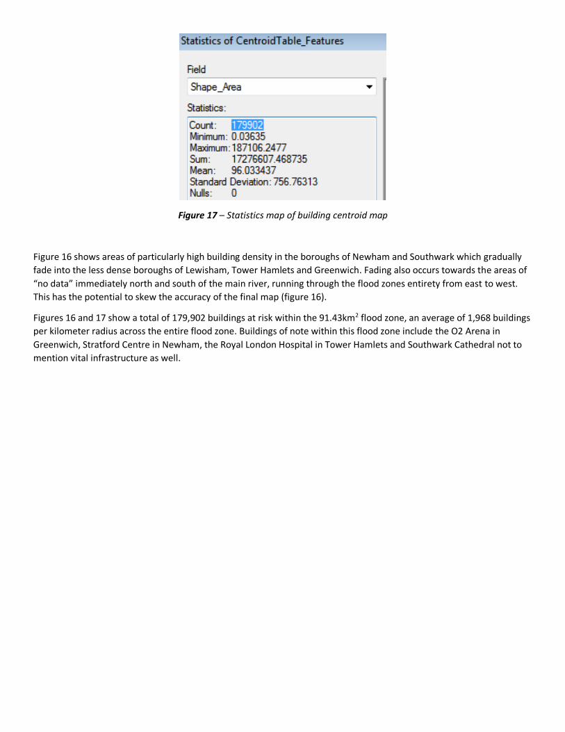
Figure 17 – Statistics map of building centroid map
Figure 16 shows areas of particularly high building density in the boroughs of Newham and Southwark which gradually
fade into the less dense boroughs of Lewisham, Tower Hamlets and Greenwich. Fading also occurs towards the areas of
“no data” immediately north and south of the main river, running through the flood zones entirety from east to west.
This has the potential to skew the accuracy of the final map (figure 16).
Figures 16 and 17 show a total of 179,902 buildings at risk within the 91.43km2 flood zone, an average of 1,968 buildings
per kilometer radius across the entire flood zone. Buildings of note within this flood zone include the O2 Arena in
Greenwich, Stratford Centre in Newham, the Royal London Hospital in Tower Hamlets and Southwark Cathedral not to
mention vital infrastructure as well.
DISCUSSION & CONCLUSIONS
Objective 1 - Flood Zone Coverage
From the results and figures 5 and 15 it can be inferred that, of the 14 Boroughs identified as being within a 0-6m
“hazard” or inundation zone, the Borough of Newham is at the highest risk of becoming inundated as this is where the
largest amount of terrain, within the inundation zone of 0-6m, occurs. Comparatively, Haringey is at the lowest risk of
inundation as this is where the least amount of terrain, within 0-6m, occurs.
By splitting the Boroughs in to arbitrary groupings, based on percentages of total flood zone inundated, of;
Those above 10%
Those between 1-9%
Those below 1%
It can be attained that Newham, Southwark, Barking & Dagenham and Greenwich are at the highest risk of inundation.
Bexley, Lambeth, Lewisham, and Tower Hamlets are at moderate risk of inundation and City of London, Hackney,
Haringey, Redbridge, Waltham Forest and Westminster are at low risk of inundation.
Use of the DTM over the DSM isn’t perfect. The DTM uses “lie of the land” and this affects where the water will flow and
pool (low lying topography, valleys, etc). However use of the DSM will include buildings and other objects that may
divert the flow of water. This is more realistic than use of the DTM if it is assumed that these objects will definitely
impede the flow of water to such a point where it will not flow into and through them and they prevent other areas
from flooding. However the effects of water on the buildings structures and the stability of other objects as identified in
the DSM raster can potentially damage them to a point where they no longer prevent the flow of water and they flood
and allow other areas to flood. Therefore it is “safer” to assume that all areas within the 0-6m elevation will flood and
thus is more prevalent to use the DTM.
Objective 2 – Vulnerable population at risk
From figures 12 and 15 it appears that more 0-7 year olds are at risk to the north east and east of the flood zone in
Newham and Greenwich than the south and south west towards Tower Hamlets, Southwark and Lewisham. This is
where larger areas of “high” population occur however there are small patches of “higher” population amongst the
Tower Hamlets, Southwark and Lewisham regions as well. In addition to this, the occurrence of these “higher”
population regions appears to be clustered where they occur.
For the 65+ year olds (figure 13) the population at risk seems to be a lot more evenly spread, even though clustering of
higher populations still occurs, just not as densely. Having said this it would appear that Tower Hamlets, Southwark and
Lewisham rather than Greenwich and Newham contains a higher proportion of the higher populations, the opposite to
what occurs for the 0-7 year olds.
From this it can be inferred that Newham and Greenwich, with small pockets of Tower Hamlets, Southwark and
Lewisham are higher risk areas for 0-7 year olds with Tower Hamlets, Southwark and Lewisham a higher risk area for 65+
year olds.
However these interpretations can be skewed by the size of each respective administrative boundary. For example a
large administrative boundary may contain similar numbers of 0-7 or 65+ year olds at risk as a smaller one, and it may be
easy to interpret this as the larger administrative boundary being more at risk than the smaller one due the respective
areas covered by each one. Bearing this in mind the smaller administration boundaries seem to appear in the
Southwark, Lewisham and Tower Hamlets regions when compared to Newham and Greenwich.
It is also noted that vulnerable populations did not include those with physical, medical or any other kind of impairment
which leaves them unable to care for themselves in the way that those with no impairment would do.
Objective 3 - Effects on building infrastructure
From a building infrastructure perspective, Newham and Southwark could be described as being at higher risk to the
inundation than Lewisham, Tower Hamlets and Greenwich as this is where highest building densities occur (figure 16).
From this it could inferred that there is a higher chance of important infrastructure such as emergency services,
transport and communication networks, sewage, water and electricity networks, etc occurring within these regions.
Therefore there is more potential for disruption, not only by destruction of infrastructure in these regions, but also
through ongoing dangers and costs caused by the destabilisation of these buildings and infrastructure. They may need to
be structurally surveyed and either repaired or replaced, as well as the loss of income through not being open or in use.
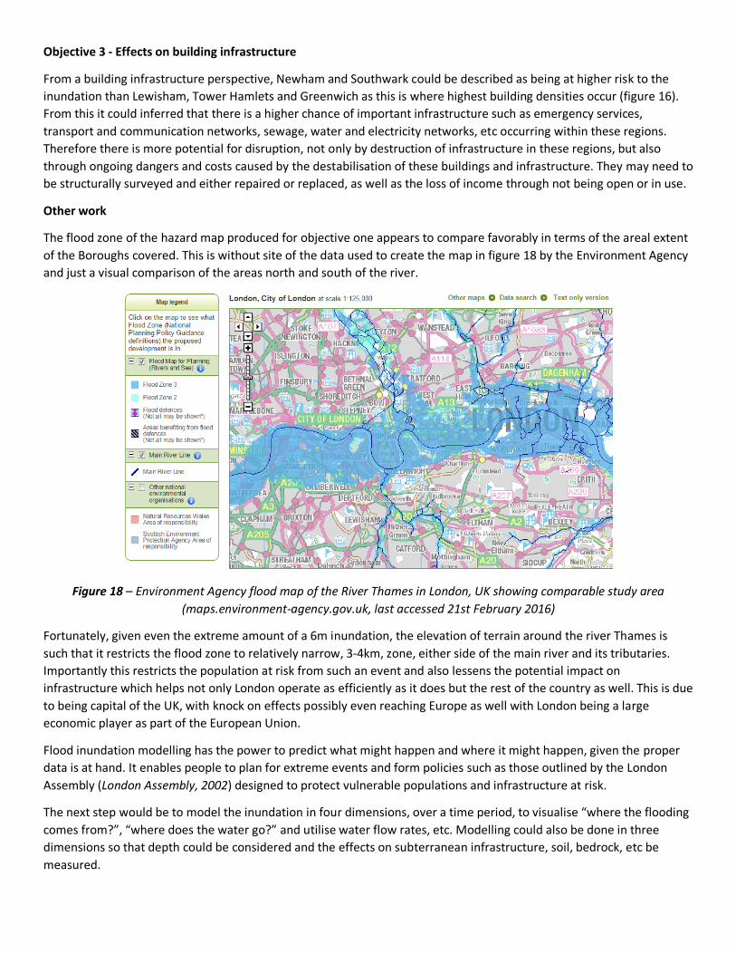
Other work
The flood zone of the hazard map produced for objective one appears to compare favorably in terms of the areal extent
of the Boroughs covered. This is without site of the data used to create the map in figure 18 by the Environment Agency
and just a visual comparison of the areas north and south of the river.
Figure 18 – Environment Agency flood map of the River Thames in London, UK showing comparable study area
(maps.environment-agency.gov.uk, last accessed 21st February 2016)
Fortunately, given even the extreme amount of a 6m inundation, the elevation of terrain around the river Thames is
such that it restricts the flood zone to relatively narrow, 3-4km, zone, either side of the main river and its tributaries.
Importantly this restricts the population at risk from such an event and also lessens the potential impact on
infrastructure which helps not only London operate as efficiently as it does but the rest of the country as well. This is due
to being capital of the UK, with knock on effects possibly even reaching Europe as well with London being a large
economic player as part of the European Union.
Flood inundation modelling has the power to predict what might happen and where it might happen, given the proper
data is at hand. It enables people to plan for extreme events and form policies such as those outlined by the London
Assembly (London Assembly, 2002) designed to protect vulnerable populations and infrastructure at risk.
The next step would be to model the inundation in four dimensions, over a time period, to visualise “where the flooding
comes from?”, “where does the water go?” and utilise water flow rates, etc. Modelling could also be done in three
dimensions so that depth could be considered and the effects on subterranean infrastructure, soil, bedrock, etc be
measured.

REFERENCING
1. Environment Agency. (2016). Flood Map for Planning (Rivers and Sea). Available: http://maps.environment-
agency.gov.uk/wiyby/wiybyController?x=531500.0&y=181500.0&topic=floodmap&ep=map&scale=5&location=L
ondon,%20City%20of%20London&lang=_e&layerGroups=2,&distance=&textonly=off#x=54. Last accessed 21
February 2016.
2. London Assembly. (2002). Flooding in London - A London Assembly Scrutiny Report November 2002.
3. Mason, D. C., Schumann, G., Bates P. D. (year unknown). Data utilisation in flood inundation modelling
4. Parmenter, B. (2011). Cartography Tips
5. Unknown Author (??). Hazards, Vulnerability and Disaster Risk. Jones & Bartlett Learning LLC Available: http://samples.jbpub.com/9780763781552/81552_CH02_FINAL.pdf. Last accessed 21st February 2016.
LIST OF FIGURES
1. DSM (left) and DTM (right) raster elevation showing high (red) to low (green) elevations with areas of no data
(white) visible in critical areas near the river and its tributaries.
2. The Model Builder design used to process and complete objective 1 - ascertain a flood inundation hazard zone
caused by a 6m rise in flood waters.
3. Histogram displaying natural breaks classification for 0-7 year olds within the flood zone
4. Histogram displaying natural breaks classification for 65+ year olds within the flood zone
5. Map displaying the Boroughs within a 0-6m Inundation or “Hazard” Zone of the River Thames in London, UK
(2011 census data)
6. Area statistics of Administrative Boundaries within the Flood Zone
7. Area statistics of the Administrative Boundaries over entire study area
8. Flood Zone statistics for the Boroughs of Barking & Dagenham, Bexley, City of London and Greenwich
9. Flood Zone statistics for the Boroughs of Hackney, Haringey, Lambeth and Lewisham
10. Flood Zone statistics for the Boroughs of Newham, Redbridge, Southwark and Tower Hamlets
11. Flood Zone statistics for the Boroughs of Waltham Forest and Westminster
12. Map displaying the number of 0-7 year olds, per administrative area, within a 0-6m Inundation or “Hazard” Zone
of the River Thames in London, UK (2011 census data)
13. Map displaying the number of 65+ year olds, per administrative area, within a 0-6m Inundation or “Hazard”
Zone of the River Thames in London, UK (2011 census data)
14. Statistics for the vulnerable 0-7 (left) & 65+ (right) year old age groups within the flood zone
15. Statistics tables displaying vulnerable population numbers and percentages data for Greenwich, Lewisham,
Newham, Southwark and Tower Hamlets
16. Map displaying building density, per square km, within the 0-6m Inundation or “Hazard” Zone of the River
Thames in London, UK (2011 census data)
17. Statistics map of building centroid map
18. Environment Agency flood map of the River Thames in London, UK showing comparable study area
(maps.environment-agency.gov.uk, last accessed 21st February 2016)