textual analysis sam cooley. the blair witch project
TRANSCRIPT

Textual Analysis
Sam Cooley

The Blair Witch Project
Overview Of The Trailer
The Blair Witch Project trailer isn't what would be considered a conventional trailer as it only uses one aspect of Todorovs' theory, the disequilibrium. However, the trailer does follow Barthes' theory of the enigma code, as when watching the trailer, the audience is unsure of what is going on as there aren't any clear images. However it is clear that something bad is happening in the trailer as there is the diajetic sound of someone screaming, but the audience is unsure of the source of the screaming or the reason for the screaming.
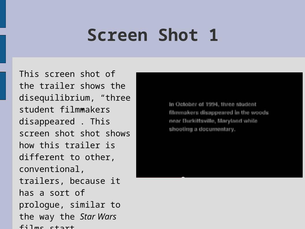
Screen Shot 1
This screen shot of the trailer shows the disequilibrium, “three student filmmakers disappeared”. This screen shot shot shows how this trailer is different to other, conventional, trailers, because it has a sort of prologue, similar to the way the Star Wars films start.

Screen Shot 2This shot uses low key lighting to create a sense of unease in the audience. This shot is of a dark 'forest' at night which goes with a stereotypical horror genre setting. The words “Genuinley Frightening” add to the sense of fear created in the audience because the word “Genuinley” implies that the film is true, which can scare audiences even more then an obviously fictional horror story.

Screen Shot 3
This shot uses low key lighting, which is typical of most horror movies, because the darkness creates tension and a sense of mystery for audiences. this scene is also made scary for audiences because there is a hand just visible at the bottom of the frame. this hand adds to the tension because the audience is unaware of who that hand belongs to, or its intention.
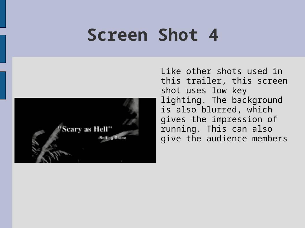
Screen Shot 4
Like other shots used in this trailer, this screen shot uses low key lighting. The background is also blurred, which gives the impression of running. This can also give the audience members
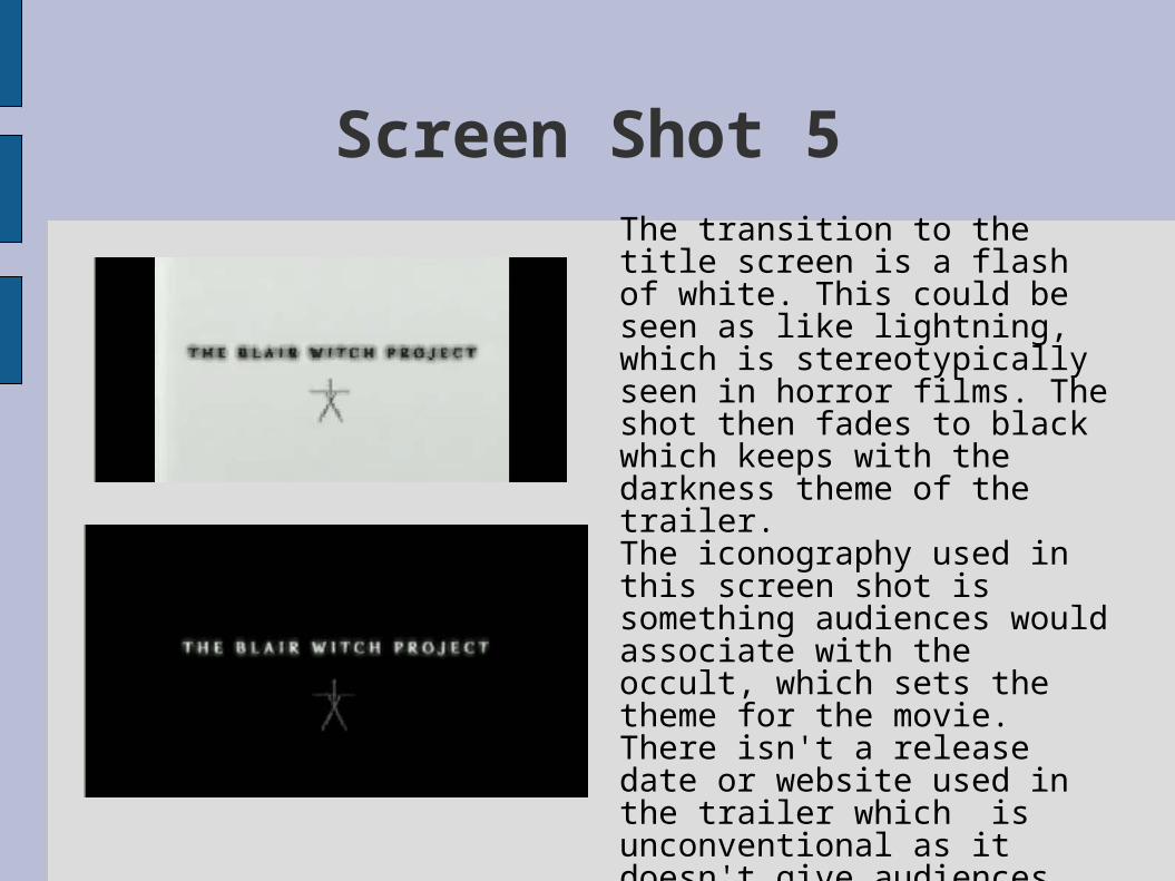
Screen Shot 5The transition to the title screen is a flash of white. This could be seen as like lightning, which is stereotypically seen in horror films. The shot then fades to black which keeps with the darkness theme of the trailer.The iconography used in this screen shot is something audiences would associate with the occult, which sets the theme for the movie.There isn't a release date or website used in the trailer which is unconventional as it doesn't give audiences the opportunity to find more information on the movie, and is therefore bad advertising.
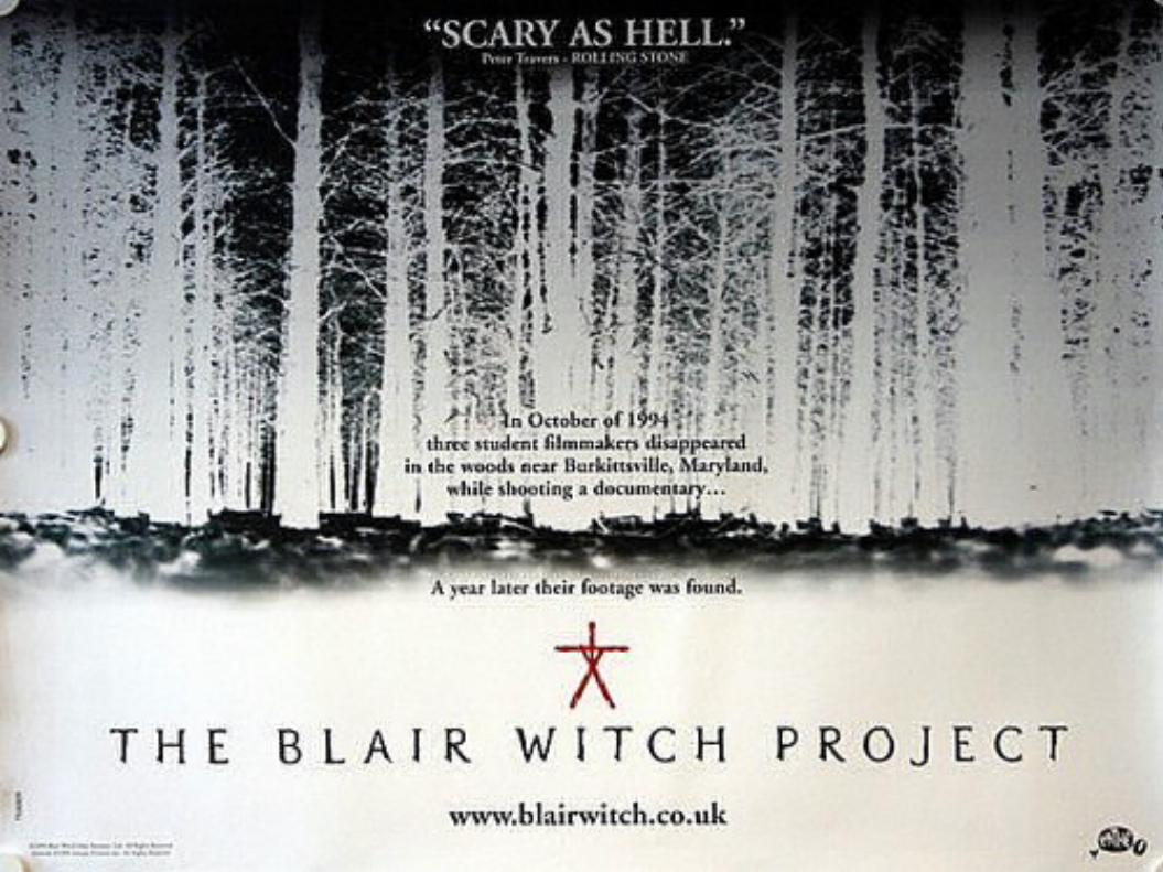
The PosterThe poster for the Blair Witch Project is a black and white negative shot of some woods, which gives the audience an idea of where the film is going to be set. The image being a negative goes with the storyline of the film being from footage made by students, and the background of the poster is from a still from there film. It makes sense that it is a film negative as digital movie cameras weren't made available at consumer level until 1995. The shot seems to be taken as if the camera was lying on the floor, which would make it one of the last frames to be captured before the “student filmmakers dissapeared”. The poster has very basic, and unconventional layout, as it doesn't have the cast, director, producer, etc on it. The same occult symbol that is used in the trailer, which gives the campaign package a sense of unity and a theme. Unlike the trailer, the poster has the website address, which gives audiences the opportunity to find more information on the film.

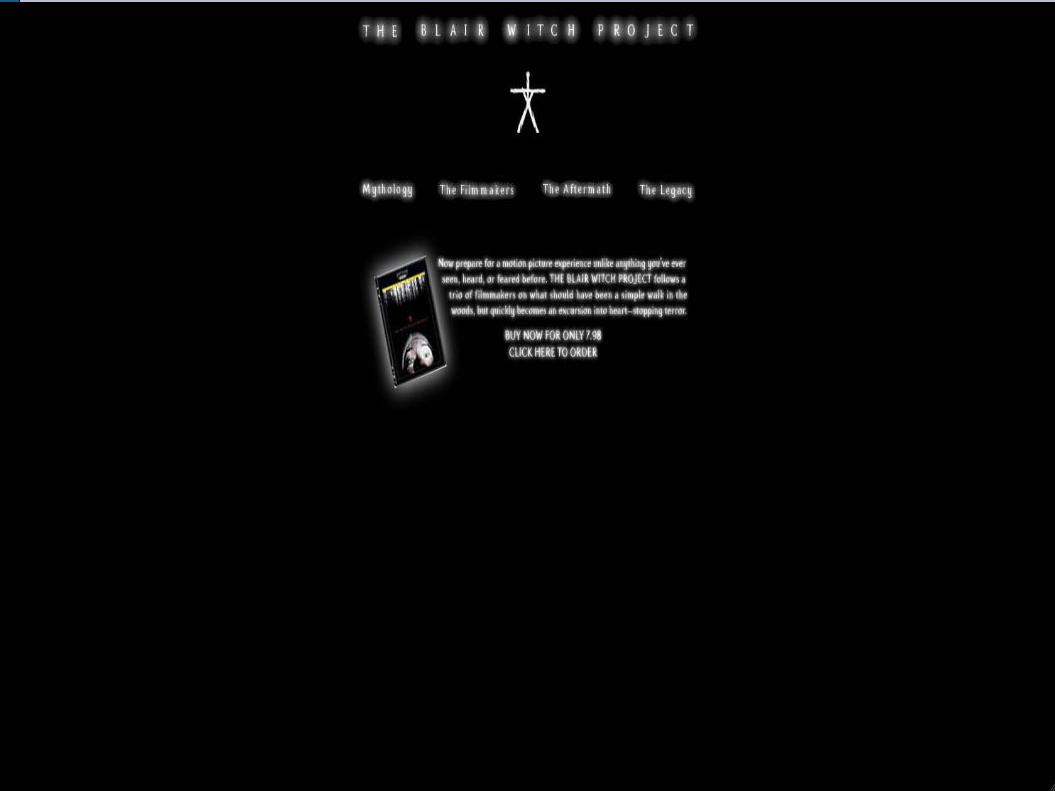
The Web PageLike the poster, the web page for The Blair Witch Project uses a simple layout. The same 'occult' symbol as the trailer and the poster, which keeps the theme of the campaign package going. The homepage has four links, Mythology, The film makers, The Aftermath and The Legacy. These links sound like they could be links to information on the story, as if it were true.

30 Days Of Night
Overview Of The Trailer
Like most film trailers, the trailer for 30 Days Of Night follows Barthes' media theory of the 'Enigma code'. It also follows Todorovs' theory as there is an Equilibrium at the beginning, followed quickly by the disruption of the equilibrium and recognition of the disruption, and there is also a brief glimpse of the attempt to repair. As well as this, there is also propps' theory seen in the trailer. There is the villain, which is all the vampires, and there seems to be a hero, who seems to be the police officer.The diajetic music in this trailer is tense from the start of the trailer, which tells the audience that something bad is going to happen and puts them on 'edge' from the beginning of the trailer.

Screen Shot 1This shot shows the equilibrium as the un-named woman is washing up. This shot also goes on an old fashioned stereotype of women as the “stay at home mum”.
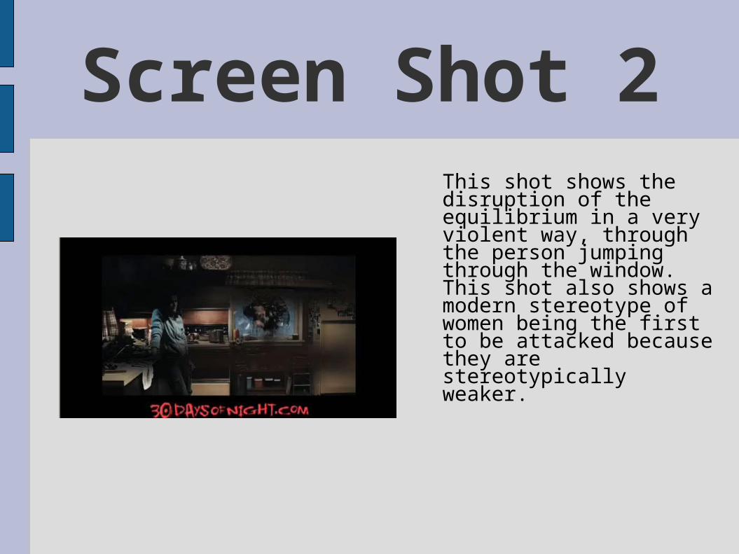
Screen Shot 2This shot shows the disruption of the equilibrium in a very violent way, through the person jumping through the window. This shot also shows a modern stereotype of women being the first to be attacked because they are stereotypically weaker.

Screen Shot 3
This shot follows Barthes’ enigma code theory, as the audience is unsure of the two figures intention. However, the colour scheme in this shot uses dark colours, which suggests that these characters could be the antagonists.

Screen Shot 4In this shot, the audience gets its’ first look at the antagonist. It is obvious that he is the antagonist because the colouring is very dark. Also he has a scarred face, which audiences generally associate with antagonists. As well as this, his eyes are completely black, which people stereotypically associate with evil.

Screen Shot 5
This is the audiences first look at the presumed hero. The audience would presume this character protagonist because of his police uniform. He also takes on a 'superhero' role because he is summoned to where he is needed, in a similar way to batman being summoned by the spotlight.
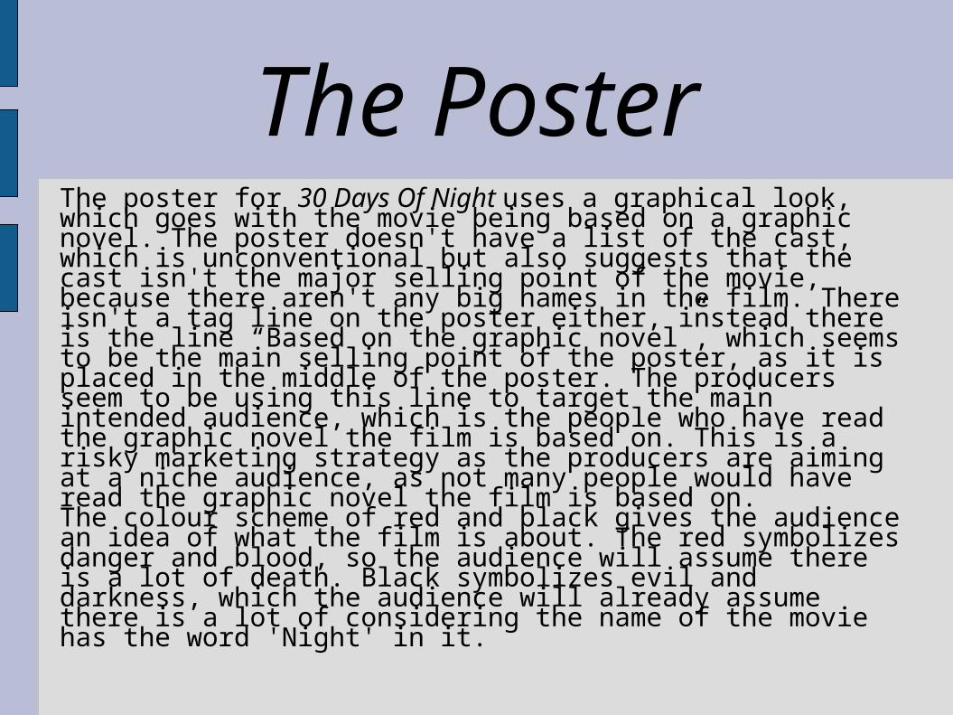
The PosterThe poster for 30 Days Of Night uses a graphical look, which goes with the movie being based on a graphic novel. The poster doesn't have a list of the cast, which is unconventional but also suggests that the cast isn't the major selling point of the movie, because there aren't any big names in the film. There isn't a tag line on the poster either, instead there is the line “Based on the graphic novel”, which seems to be the main selling point of the poster, as it is placed in the middle of the poster. The producers seem to be using this line to target the main intended audience, which is the people who have read the graphic novel the film is based on. This is a risky marketing strategy as the producers are aiming at a niche audience, as not many people would have read the graphic novel the film is based on.The colour scheme of red and black gives the audience an idea of what the film is about. The red symbolizes danger and blood, so the audience will assume there is a lot of death. Black symbolizes evil and darkness, which the audience will already assume there is a lot of considering the name of the movie has the word 'Night' in it.


THE WEBSITE
The website for 30 Days Of Night no longer advertises the film, just the DVD and Blu-ray.The layout of the website uses what looks like one of the posters from the film, as well as still shots from the movie. I think that this will help the audience connect the posters with the website.

THE UNBORN

Overview Of The Trailer
Like most trailers, the trailer for The Unborn follows Barthes' theory of the enigma code, in the sense that a majority of the information about the plot is with held from the audience.The trailer also has elements of Todorovs' theory as there is a clear equilibrium, disruption of the equilibrium and recognition of the equilibrium disruption.Also, Propps' theory is used, as there is a brief view of the antagonist.

Screen Shot 1This is an establishing shot. Its sets the idea for the movie, as it uses low key lighting, which makes the house seem creepy. Also, there are a few items in the foreground, which gives the viewer the impression that they are seeing the house from someone else's point of view.
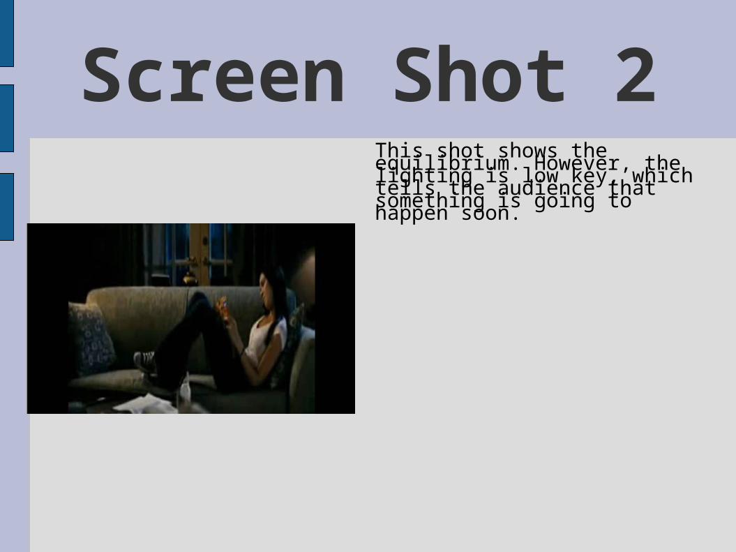
Screen Shot 2This shot shows the equilibrium. However, the lighting is low key, which tells the audience that something is going to happen soon.
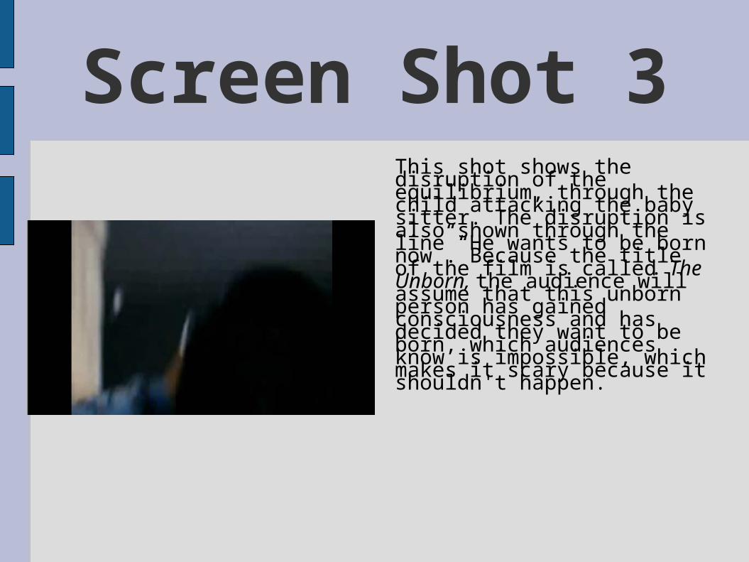
Screen Shot 3This shot shows the disruption of the equilibrium, through the child attacking the baby sitter. The disruption is also shown through the line “He wants to be born now”. Because the title of the film is called The Unborn, the audience will assume that this unborn person has gained consciousness and has decided they want to be born, which audiences know is impossible, which makes it scary because it shouldn't happen.

Screen Shot 4This is the first recognition of the disruption of the equilibrium for the characters.This is also where the primary protagonist finds out she is a twin of an unborn child, which reveals a tiny portion of the narrative to the audience.
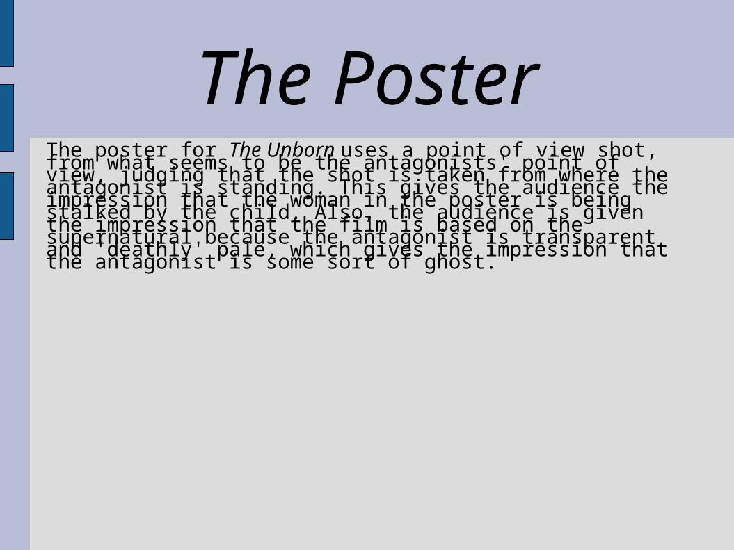
The PosterThe poster for The Unborn uses a point of view shot, from what seems to be the antagonists' point of view, judging that the shot is taken from where the antagonist is standing. This gives the audience the impression that the woman in the poster is being stalked by the child. Also, the audience is given the impression that the film is based on the supernatural because the antagonist is transparent and 'deathly' pale, which gives the impression that the antagonist is some sort of ghost.


THE WEBSITEThe Unborn website uses a similar layout to the website for the The Blair Witch Project.However, it also has images of the protagonists in the movie flash up on the page, which creates fear and tension.It also uses the same low key lighting shots that are seen in the trailer and poster, which keeps a consistency throughout the advertising campaign.
