terje midtbø - eötvös loránd universitylazarus.elte.hu/cet/madrid-2005/midtbo.pdf · 1 midtbØ...
TRANSCRIPT
1
MIDTBØ - LARSEN: MAP ANIMATIONS VERSUS STATIC MAPS – WHEN IS ONE OF THEM BETTER?
MAP ANIMATIONS VERSUS STATIC MAPS – WHEN IS ONE OF THEM BETTER?
Terje Midtbø1
Elina Larsen2
Norwegian University of Science and Technology (Norway), [email protected] 1, [email protected] 2
Abstract: During the last decade the introduction of new techniques on World Wide Web has opened for increasing use of dynamic maps. However, it is still not fully known in which cases a map animation convey the information faster and better than a set of static maps, and the other way around, when the static maps will be the best choice. This paper is based on an experiment where some information was presented for a group of people as animations (without any interac-tion), while another group studied the same information as a set of static maps. Both the animations and the static maps were displayed for a limited time, and the participants answered some questions related to the displayed information. The groups are alternately introduced to animations or static maps. The experiment showed some tendencies that animations could be better in given situations. Especially small changes in the location of a phenomenon was better comprehended by an animation
INTRODUCTION
People have used maps as tools for description of the geographical environment for ages, while the media for transmission of geographic information have changed over the years. Materials like stone, mammoth teeth, clay tablets, silk, papyrus, wood, copper, paper etc have been involved. Today most maps are stored electronic, and many of them are passed on to the user trough a computer screen. While cartography has been concentrated on static illustrations during thousands of years, computer based methods open for a new category of maps: the map animations and dynamic maps. These maps offer something that never could be a part of the traditional maps; movement and change in the map. The history of map animations goes back to scenes in animated movies in the thirties (Peterson 1999). However, the quantity of map anima-tions has not really increased that much until the last 5-10 years. And it is quite obvious that the Internet and the World Wide Web (WWW) has been the most important catalyst for this increase.
The cartography for map animations, and maps on the Web in general, has evolved over a relatively short period com-pared to the cartography for traditional paper maps. New methods for presentations are developed frequently, but we do not always know how the various dynamic maps contribute in the communication of the core message. Does the anima-tion help to make faster comprehension of the information? Do we understand the information better? Are the dynamic presentations making the presentations more attractive? Will the information be better passed on trough one or several static maps? These and other questions have been discussed by several authors. Some of the authors claim to have dem-onstrated that animations are to be preferred for some types of information, while others are more doubtful to the assertion that animations communicates information better than static pictures. Tversky (2002) found no advantage by choosing non-interactive animations rather than a series of static pictures. These investigations was however conducted by using animations in general (no cartographic approach), and the duration of the animation/presentation seemed not to be a vari-able in the experiment. Tversky (2002) and Harrower (2003) also point out that animations should contain as few details as possible and that they should not be too complex.
Kraak (2000) introduces a classification of Web maps where the maps first are categorized as static or dynamic, and on the next level grouped as view only or interactive. It is a quite common opinion that interactive animations are more efficient than their non-interactive equal. Tversky (2002) draws a sharp distinction between non-interactive and interactive anima-tions and claims that in general animations are more efficient when they become interactive. However, it is still an open discussion on how efficient non-interactive animations are compared to their static parallel, and in which situation the ani-mations are to be preferred (if any). This paper looks closer into Kraak (2000)’s two classes “static map – view only” and “dynamic map – view only” and compares how these presentations communicate geographic information. Will all types of information be comprehended equal for static maps and animations, or will one of them appear to be better suited for efficient communication of particular types of information? Or maybe some of the visual and dynamic variables are better suited to make animation more efficient than their static counterpart? The largest group of small electronic maps – static

2
MIDTBØ - LARSEN: MAP ANIMATIONS VERSUS STATIC MAPS – WHEN IS ONE OF THEM BETTER?
or dynamic – is passed on trough WWW. Consequently it is appropriate to involve the same technology in the study of how people understand the selected presentation. This paper is based on an experiment in Larsen (2005) where a group of students were introduced to a web application involving both static and dynamic maps. Subsequently they where asked some question in order to ”measure” how much of the message they had received. The research has to be considered as preliminary and certain parts of the survey will be selected for further and more detailed research in future work.
DYNAMIC VARIABLES IN MAP ANIMATIONS
Various authors have described visual variables in the presentation of maps in general and thematic maps in particular, and the most used classification is made by Bertin (1967). He distinguishes the variables location (x and y), size, value, texture, colour, direction and shape for the use on static maps. Bertin (1981) did some further exploration of these variables, but the present was still not ready for more dynamics in the map. About ten years later DiBiase et al (1992) introduced the three dynamic variables; duration, succession and rate of change. Some years later MacEachren (1995) distinguished display date, frequency and synchronization as dynamic variables in addition two the three first ones.
In our experiment we attempted to keep focus on some particular variables in each animation. We made a set of different animations and corresponding static maps representing the same phenomena. Bertin (1981) claimed that a good thematic map didn’t involve more than one visual variable in addition to location (which always will be an important component in the representation of a geographical space). In the same manner location is central in combination with the all the dynamic variables, and it can also be an important component in the dynamic variable itself. If an animation is made to illustrate the speed of some moving objects, one solution can be to represent the speed by a corresponding rate of change. In a static map the speed and direction of the object can for example be illustrated by arrows of different sizes (repre-senting speed and direction of the moving object), or, if different directions of movement and start and endpoint for the movement are central, the situation may be illustrated by several static maps, each representing a certain point of time. In the last example the variable location are saying something about the speed of the moving object.
The objective of the experiment this paper is based on was to make comparisons between a non-interactive dynamic map and a series of static maps describing the same situation. Consequently, the representation of the phenomena was kept as similar as possible. While the animations appeared by a continuous movement, the static counterparts were based on several snapshots from the animation without any adjustment of the visual variables.
SETTING UP THE EXPERIMENT
The experiment was based on the study of how maps can be presented in an electronic media, an in particular how it can be presented in a web environment. A natural consequence was to run the experiment itself in a web environment. Several phenomena were chosen to be represented as an animation and on a series of static maps. For the animations we employed one of the most used animation software: Macromedia Flash. The animations were implemented, and subse-quently a series of snapshots from the animations formed the static visualizations of the phenomena.
One task was to study if the use of one or more particular dynamic variable appeared to give better results for the anima-tions than the other ones. Accordingly the various animation examples were based on different dynamic variables. The following animations were included in the experiment:
• Epidemic – spreading. A map divided into several territories is pre-sented. Each territory is inhabited by a particular ethnic group. The animated information is represented by an epidemic spreading over the whole area (Figure 1), and together with the visual variable co-lour it involves mainly the dynamic variable succession (succession of when different territories were hit by the epidemic). The partici-pants in the experiment should detect the direction of the epidemic and if there were differences in how resistant the various groups of people were against the epidemic. The non-interactive presentation of the phenomenon was represented by 6 different static maps, each representing a “time-slice” in the animation. The presentation (static and dynamic) lasted in 5 seconds.
Figure 1: Spreading of epidemic

3
MIDTBØ - LARSEN: MAP ANIMATIONS VERSUS STATIC MAPS – WHEN IS ONE OF THEM BETTER?
• Growth of cities. The second example is describing the growth of cities in Norway. As in Figure 2 the presentation shows a map over Norway includ-ing a red spot for each large city. The focus in the presentation was pointed on when the different cities passed the number of 50 000 inhabitants. In the animation the red dots representing the cities were flashing the actual year this number was reached. This is a typical application where display date is the most distinctive variable. Time was represented by a sliding bar bellow the map, and it went from about 1900 to 2000. The series of static map was in this case represented by 11 maps, each representing a decade. Display time: 18 seconds.
• Age structure. This animation (maps) is showing the distribution of age groups. The whole area is divided into regions with a different age struc-ture. The grey-values in the regions represent the parts of the population that are members of the age group indicated above the map. The participant should, by studying the animation (or the series of static maps), decide in which part of the area the age structure was tending to an older average and, vice versa, where it was predominance of younger people. In the ex-ample from the experiment one can see how the age structure is “moving” across the area. This information is passed on trough the variable succes-sion. The corresponding non-interactive representation consists of 21maps altogether! Figure 3 shows a time-slice where it lives more people in the age group 69-72 in east than in the western part. Displayed in 9 seconds.
• Movement of boats. The fourth example in the experiment is based on the dynamic variable rate-of-change and shows three sailing boats that move by various speed in slightly different directions (Figure 4). The speeds of the sailing boats were correlated to the sailing movement to indicate a wind direction. The participants had to indicate which boats that were moving, and from their movement decide the wind direction. While the three previous examples were run only once, the boat animation/maps was introduced in three different versions. One animation lasted for 14 seconds with a corresponding series of 9 static map, one animation was shown in 7 seconds with a corresponding series of 8 maps, while the last animation was displayed in only 2 seconds (4 corresponding static maps). The first objective was to detect if one of the representation (static or dynamic) was better when displayed a short time only. The second was to study how well small movements was detected.
• Amount of precipitation. Again we have an area divided into several separate regions. This time the amount of precipitation is illustrated by the dynamic variable duration in the animation, but since the precipitation in the regions never is “turned off” it may be perceived as the variable display date by the user. The audience was asked to study 3 of the regions in particular and decide which of them received most rainfall during the represented time period. In Figure 5 they were asked to detect which of the areas B, G or H (showed in advance) that received most precipitation. This example was also presented in 3 different time spans; 1, 3 and 5 seconds. However, this time all the static map series consisted of 9 maps.
• Active volcanoes. The last example was an attempt to make use of the dynamic variable frequency to indicate activity of volcanoes around the world. The most active volcanoes were illustrated by blinking dots of high frequency. The animation, which lasted for 4 seconds, gave an OK impres-sion of the situation. The static maps illustrated the same phenomenon as a kind of “dot maps”.
All the six examples were gathered in a larger animation which included explanation to what the participants could expect to see, questions after the animations etc. Two such master animations were made. Each of these showed every second example as animations and the other half as a series of static maps. In this way all the participants was introduced to both some animations and some static maps. When the application was initiated one of the master animations were selected in a way that made the distribution between the two sets about even.
Figure 2: Growth of cities (red.)
Figure 3: Age structure
Figure 4: Movement of boats
Figure 5: Amount of percipitation
Figure 6: Active volcanos

4
MIDTBØ - LARSEN: MAP ANIMATIONS VERSUS STATIC MAPS – WHEN IS ONE OF THEM BETTER?
Before each participant was involved in a test dataset they were introduced to a training example. This was based on the same background map but with different data for the changing phenomenon. The training animations/maps were also fol-lowed by some questions related to the content of the presentation.
The experimental part itself was timed by the computer. When the preset time limit was reached the animation automati-cally jumped to the question page. Except for the precipitation example the questions were asked after the animations/maps were displayed. The training animations/maps did however give some indication of what they should observe. In advance of the experiment the participants had received a small booklet where the questions to each animation/set of maps were located on separate pages. They were asked not to turn over to the question page before they had studied the presentation. The booklet gave some alternatives where the participants were asked to indicate what they believed to be the right answer, or to check a “don’t know” box if they had no clue. The progress of the experiment was like this: 1. Introductionary page 2. Practical information about the line of action in the experiment 3. Screen views for each animation/map type a. Description of the task b. Display training animation/map set c. Examples on questions and information about the test (for example how long it would appear on the
screen) d. Questions on the screen with duplicates in the booklet 4. “Thank you for participation” page
Just before the experiment started we detected some differences between various Web-browsers. The set of static maps, which was lined up nicely in Internet Explorer and Opera, was separated and displayed one on each line in Firefox. Consequently the participants were asked to use Internet Explorer during the experiment. The experiment itself was ac-complished by engaging different groups of students in a computer laboratory. The largest group consisted of about 20 students.
RESULTS AND ANALYSIS
38 participants all together were employed by the experiment. The distribution between the two master animations was randomly selected and ended up as 17-21. The age group of the participants was about 20-25, and almost everybody was regular students at the Norwegian University of Science and Technology (NTNU). It was however a large predominance of males (87%). This reflects the student profile in general on technology studies at NTNU!
The responses in the questionnaires gave answers like “the red boat is moving”, “region A is most resistant”. The ques-tions had 3-5 alternatives, where one of them always was “don’t know”. For both the animation group and the static maps group the frequencies of the different answers were transformed into three possible outcomes; true, false and uncertain. These values were further analyzed to see if there could be detected any significant difference between the answers from the animation group and the static maps group. The same hypotheses can be used for all the tests and are formulated like this:
H0H0H : There is no significant difference between the answers from the group who studied the animation and the an-swers from the group who studied the set of static maps.
H1H1H : There is a significant difference between the answers from the group who studied the animation and the an-swers from the group who studied the set of static maps.
The data was tested using chi-squared statistics on the frequencies and for all cases a 0.05 confidence level was used.
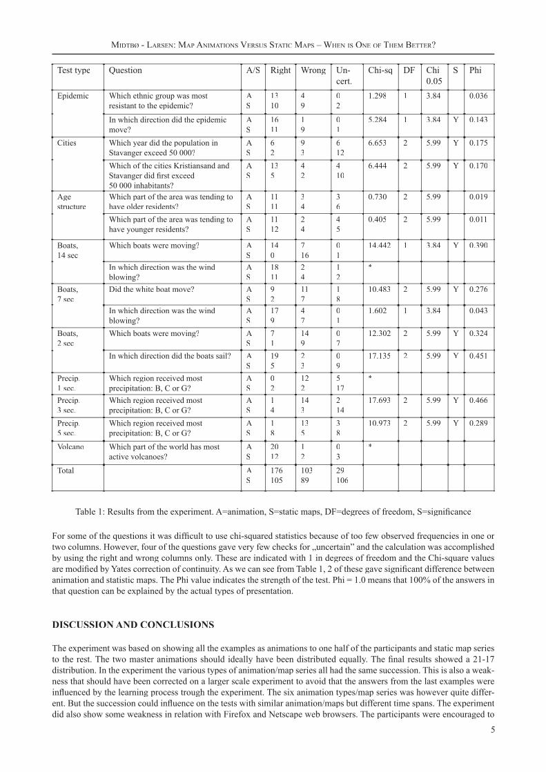
Since some of the animations/ maps were displayed in several time spans, and each of the examples had one or two ques-tions, the response to 16 questions were evaluated in the analysis. Table 1 shows the results from the experiment.
5
MIDTBØ - LARSEN: MAP ANIMATIONS VERSUS STATIC MAPS – WHEN IS ONE OF THEM BETTER?
Test type Question A/S Right Wrong Un-cert.
Chi-sq DF Chi0.05
S Phi
Epidemic Which ethnic group was most resistant to the epidemic?
AS
1310
49
02
1.298 1 3.84 0.036
In which direction did the epidemic move?
AS
1611
19
01
5.284 1 3.84 Y 0.143
Cities Which year did the population in Stavanger exceed 50 000?
AS
62
93
612
6.653 2 5.99 Y 0.175
Which of the cities Kristiansand and Stavanger did first exceed 50 000 inhabitants?
AS
135
42
410
6.444 2 5.99 Y 0.170
Age structure
Which part of the area was tending to have older residents?
AS
1111
34
36
0.730 2 5.99 0.019
Which part of the area was tending to have younger residents?
AS
1112
24
45
0.405 2 5.99 0.011
Boats, 14 sec
Which boats were moving? AS
140
716
01
14.442 1 3.84 Y 0.390
In which direction was the wind blowing?
AS
1811
24
12
*
Boats, 7 sec
Did the white boat move? AS
92
117
18
10.483 2 5.99 Y 0.276
In which direction was the wind blowing?
AS
179
47
01
1.602 1 3.84 0.043
Boats, 2 sec
Which boats were moving? AS
71
149
07
12.302 2 5.99 Y 0.324
In which direction did the boats sail? AS
195
23
09
17.135 2 5.99 Y 0.451
Precip.1 sec.
Which region received most precipitation: B, C or G?
AS
02
122
517
*
Precip.3 sec.
Which region received most precipitation: B, C or G?
AS
14
143
214
17.693 2 5.99 Y 0.466
Precip.5 sec.
Which region received most precipitation: B, C or G?
AS
18
135
38
10.973 2 5.99 Y 0.289
Volcano Which part of the world has most active volcanoes?
AS
2012
12
03
*
Total AS
176105
10389
29106
Table 1: Results from the experiment. A=animation, S=static maps, DF=degrees of freedom, S=significance
For some of the questions it was difficult to use chi-squared statistics because of too few observed frequencies in one or two columns. However, four of the questions gave very few checks for „uncertain” and the calculation was accomplished by using the right and wrong columns only. These are indicated with 1 in degrees of freedom and the Chi-square values are modified by Yates correction of continuity. As we can see from Table 1, 2 of these gave significant difference between animation and statistic maps. The Phi value indicates the strength of the test. Phi = 1.0 means that 100% of the answers in that question can be explained by the actual types of presentation.
DISCUSSION AND CONCLUSIONS
The experiment was based on showing all the examples as animations to one half of the participants and static map series to the rest. The two master animations should ideally have been distributed equally. The final results showed a 21-17 distribution. In the experiment the various types of animation/map series all had the same succession. This is also a weak-ness that should have been corrected on a larger scale experiment to avoid that the answers from the last examples were influenced by the learning process trough the experiment. The six animation types/map series was however quite differ-ent. But the succession could influence on the tests with similar animation/maps but different time spans. The experiment did also show some weakness in relation with Firefox and Netscape web browsers. The participants were encouraged to

6
MIDTBØ - LARSEN: MAP ANIMATIONS VERSUS STATIC MAPS – WHEN IS ONE OF THEM BETTER?
use other browser, but still 3 participants claimed to have used Firefox. Those should probably have been left out of the analysis. Here is a short discussion on the different animation/map types:
• Epidemic – spreading. Here it is interesting to notice that the direction of the spreading gave significant differ-ence between the two display types, while the “where” question didn’t. For both questions the tendency is that the animation gave most correct answers.
• Growth of cities. The form of the map resulted in a little scrolling on the static map view even on IE and Opera browsers, and may have been a factor when the H0 hypotheses is rejected. This example was difficult to compre-hend because it was necessary to keep track on the time scale and the map simultaneously (Midtbø et al. 2005).
• Age structure. This is the second example where scrolling of the static map series may have influenced on the results. The participants found it hard to understand the message both in the animation and the static maps. Fur-ther, the two questions based on this example were strongly correlated (complementary). This gives quite similar answers on both questions
• Movement of boats. Some of the answers gave unequal distribution and was difficult to analyse by chi-square calculation. But of those that could be analysed, several showed significant differences. It is interesting to notice the difference especially when the time span is short.
• Amount of precipitation. In this example the intention was to use duration as the dynamic variable. However, since the colour of the area only changes once, the participants apprehend the display date variable. Two of the questions gave significant differences, but with somewhat unexpected frequencies. It seemed like the animation group believed wrongly to know the answer, while the static group was more determined that they didn’t know.
• Active volcanoes. This example was “an easy one” for both groups. Chi-square could not be calculated, but the counted observations tend to go in advantage of the animation.
A tendency in the different results is that animations seem to be favourable when rate of change is used as variable. Animations are especially suited for small changes which are difficult to detect in a series of static maps. Some of the examples do also indicate that the direction of a moving object is easier comprehended in an animation. However, to make the comparison between dynamic and static maps possible, the static maps had to use comparable variables with the ani-mation. In this case snapshots of the animation were used. Some of the static map series would probably have been better presented by using other visual variables. Movement could for example be illustrated by arrows of corresponding size and direction. This experiment was based on 38 participants, which was a little bit low when using chi-square statistics for the analysis. More participants would have given more solid results.
Some of the results was however interesting as a basis for further research. We are planning further studies of animations that use the variables rate of change and directions, and how the time factor plays a role in this connection. It may also be interesting to have a look on how animations are comprehended in comparison with single thematic maps with better adapted visual variables.
REFERENCES
1. Bertin, J. (1967): Semiologie Graphique, Paris/Den Haag: Mouton.2. Bertin, J. (1981). Graphics and Graphic Information Processing. Translated by William J. Berg and Paul Scott. Walter de Gruyter, Berlin*New York.3. DiBiase, D. (1992) “Stretching Space and Splicing Time: from cartographic animation to interactive visualiza tion.”,Cartography and Geographic Information Systems. 19(4):215-227;4. Harrower, M. (2003). “Tips for Designing Effective Animated Maps”,Cartographic Perspectives, Number 44 (Winter 2003):63:65. 5. Kraak, M-J. (2000). “Settings and needs for web cartography”, in Kraak and Brown (eds.), Web Cartography.Taylor & Francis Inc. London, 2001.6. Larsen, E. (2005). Thematic map animations versus static thematic maps - investigations of effects and benefits.Master thesis at the Norwegian University of Science and Technology, Division of Geomatics, June 2005.7. MacEachren, A.M. (1994). “Visualization in Modern Cartography: Setting the Agenda”, in MacEachren and Tay lor, D.R.F. (eds.), Visualization in Modern Cartography. New York: Pergamon, 1-12.8. Midtbø, T., Clarke, K. and Fabrikant, S.I. (2005). “Effective portrayals of the Passage of Time in Cartographic Animations: A Web-based Experiment”,Manuscript in preparation, Norwegian University of Science and Technology and University of California at Santa Barbara.9. Peterson, M.P. (1995). Interactive and Animated Cartography. Prentice Hall, New Jersey.10. Peterson, M.P. (1999). “Active legends for interactive cartographic animation”,International Journal of Geo graphical Information System, 13(4):375-383.11. Tversky, B., Morrison, J.B. and Betrancourt, M. (2002). “Animation: can it facilitate?”,International Journal of Human-Computer Studies (2002) 57, 247-262.