teradata partners conference 2017 | brand...
TRANSCRIPT

TERADATA PARTNERS CONFERENCE 2017 BRAND STYLE GUIDE
T E R A DATA PA R T N E R S C O N F E R E N C E 2 0 1 7 | B R A N D S T Y L E G U I D E
O C T O B E R 2 2 - 2 6 , A N A H E I M , C A

Conference Logo and Usage..................................................................3-5
Conference Theme Narrative ................................................................ 6-8
Conference Theme and Symbol Usage...........................................9-10
Primary Graphics and Usage......................................................................11
Typography........................................................................................................12
Premiums Lockup ...........................................................................................13
Presentations ................................................................................................... 14
Email Signature................................................................................................15
Conference Promotions Contact.............................................................16
Table of Contents
TERADATA PARTNERS CONFERENCE 2017 BRAND STYLE GUIDE 2
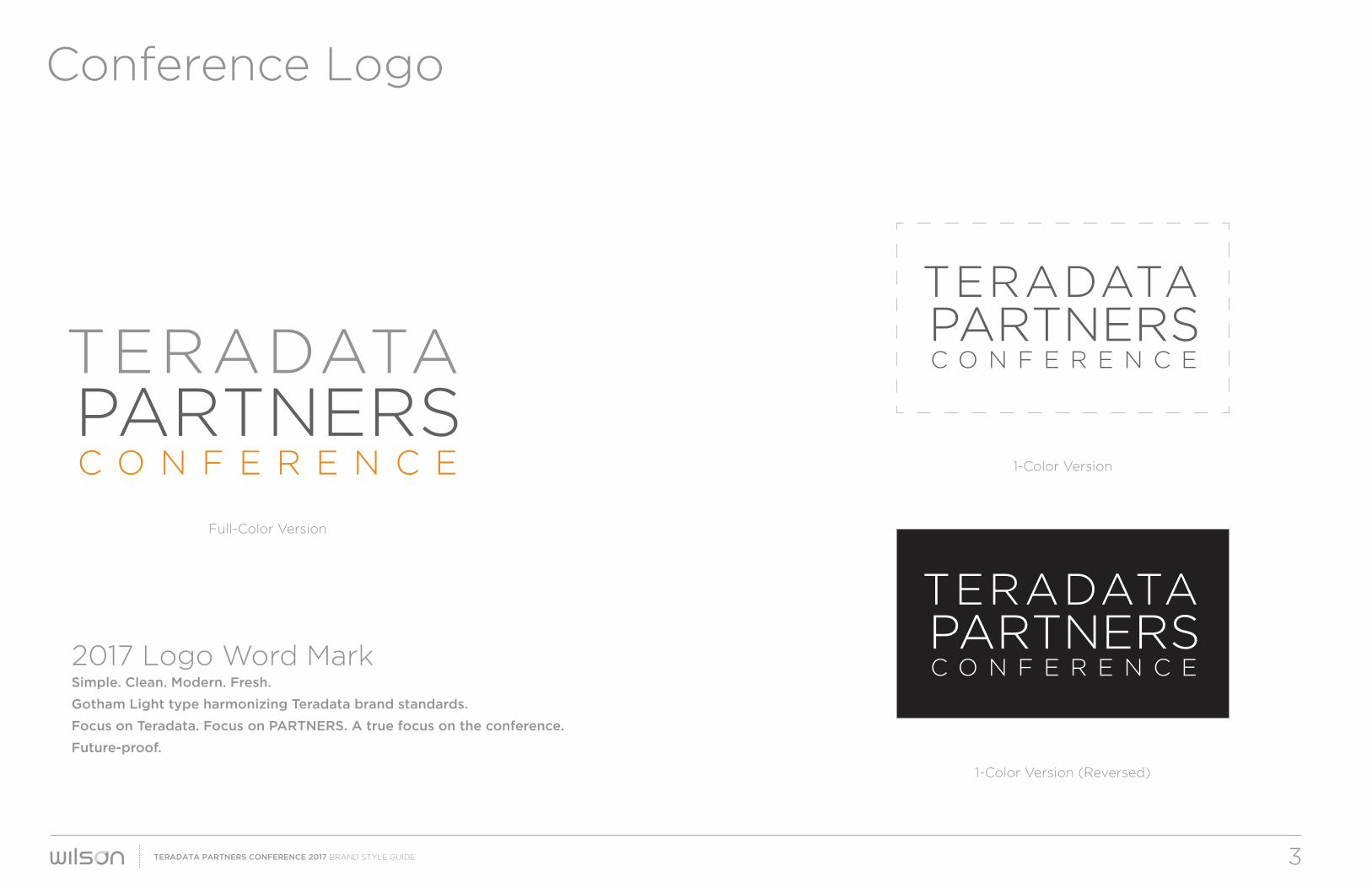
1-Color Version (Reversed)
1-Color Version
Full-Color Version
2017 Logo Word MarkSimple. Clean. Modern. Fresh.
Gotham Light type harmonizing Teradata brand standards.
Focus on Teradata. Focus on PARTNERS. A true focus on the conference.
Future-proof.
Conference Logo
TERADATA PARTNERS CONFERENCE 2017 BRAND STYLE GUIDE 3

Logo Sizing & Dates
TERADATA PARTNERS CONFERENCE 2017 BRAND STYLE GUIDE 4
C O N F E R E N C E
TERADATAPARTNERS
C O N F E R E N C E
OCT 22-26 | ANAHEIM
TERADATAPARTNERS
C O N F E R E N C E
TERADATAPARTNERS
C O N F E R E N C E
TERADATAPARTNERS
For instances
Larger than 2 inches wide
For instances
Smaller than 2 inches wide
For digital instances
Smaller than 160 pixels wide

Always use the logo options provided in various formats in the PARTNERS Visual Asset Library. DO NOT recreate logo using text.
Clear SpaceUse the “T” height as a guide for clear space around all four sides
Embroidery1-inch wide minimum size
Use in:
– Emails
– Registration Sites
– PPT Presentations
– Collateral
– Mobile App
– Signage
– Premiums
Use in:
– Videos
– Internal Teradata Communications
– Collateral
Primary Conference Logo Conference Logowith Dates/Location
Logo Usage & Clear Space
TERADATA PARTNERS CONFERENCE 2017 BRAND STYLE GUIDE 5

Conference Theme
TERADATA PARTNERS CONFERENCE 2017 BRAND STYLE GUIDE 6
From Conference Survey:
How important are the following when
choosing to attend PARTNERS?
90% Content that is visionary, futures, trends
88% Content that is product/solution specific
78% Networking opportunities
Whether faced with business or technology challenges
this theme positions our content and conference
experience to be current, contemporary and on the
pulse of the future. Exactly what our attendees ask for.
T H E E D G E O F N E X T

TERADATA PARTNERS CONFERENCE 2017 BRAND STYLE GUIDE 7
Conference Theme
A vertical integration of the theme
The Edge of Next speaks to:
Our technology and product roadmap
Analytics and trends
Our customers who seek knowledge – “what to do next”
Our customers who are “doing next”
Our community of visionaries and trusted advisors
On a micro platform:
Retail at the Edge of Next
Data philanthropy at the Edge of Next
Learning at the Edge of Next
The Edge of Next is a place where data and analytics meet.
PARTNERS represents this intersection through business and technology,
through knowledge and networking.
As a company we push our technology and solutions to the edge,
and then beyond. As leaders we strive for next-level results to deliver
more competitive advantage. As consumers we desire the most
current products that help solve our daily lives – at home or in the office.
The Edge of Next is disruptive, challenging and inviting.
W h y i t w o r k s

TERADATA PARTNERS CONFERENCE 2017 BRAND STYLE GUIDE 8
Conference Theme
The 2017 theme resonates with our audience and will
support why customers choose Teradata.
While our customers strive to solve the most complex
data challenges now, they also seek trusted advisors
who will lead them to revolutionize their business.
This puts Teradata at the intersection of need and want.
Of today and tomorrow.
The Edge of Next strikes the perfect balance of
business outcomes through technology enabled
N a r r a t i v e
solutions that produce high-impact insights and tangible
value for the business.
Every presentation, every display of technology and each
interaction should support the theme and help answer
today’s questions yet compel attendees to look toward
the horizon and see next.
Attendees should leave the conference with a roadmap
for the future. Thanks to Teradata.

Conference Theme and Symbol
TERADATA PARTNERS CONFERENCE 2017 BRAND STYLE GUIDE 9
The Conference Theme and Conference Symbol must ALWAYS be used together, not independently, unless being used in copy.
Preferred use of the Conference Theme and Symbol is centered “X” surrounded by “THE EDGE” on the left and “OF NEXT” on the right.
Font is Gotham book, ALL CAPS, kerning 100.
Font Dark Gray:CMYK = 62/53/51/23 RGB = 95/96/98HEX = 5F6062
Alternate Conference Theme and Symbol usage is offset to the left.
THE EDGE OF NEXT
Conference Symbol
Conference Theme
THE EDGE OF NEXT
Conference Theme
Conference Symbol

Do:
Don’t:
Conference Theme and Symbol Usage
TERADATA PARTNERS CONFERENCE 2017 BRAND STYLE GUIDE 10
THE EDGE OF NEXT
Do NOT fill Conference Symbolwith any other color or gradient.
Do NOT use colored Conference Symbolon any background other than white.
Approved usage on white background:
(NEVER use “X” symbol without Conference Theme)
Approved usage on one of four core graphic backgrounds(shown on next page)
Do NOT use Conference Theme and Symbol on anybackground other than the four approved core graphics.

Principal VisualsThe artwork created above is intended to be a dramatic and artistic expression of complexity, movement and positive energy that converge along a central line and offers up a sense of anticipation. This same emotional drama sets the tone for what comes next and is important to integrating with our theme. Multi-dimensional, vibrant and fluid, these images match the world we live in. Fast paced, ever changing and one where data and analytics are propelling forward progress.
Approved imagery available for marketing and promotional use.
Core Graphics
TERADATA PARTNERS CONFERENCE 2017 BRAND STYLE GUIDE 11
TERADATA PARTNERS CONFERENCE 2017 BRAND STYLE GUIDE 12
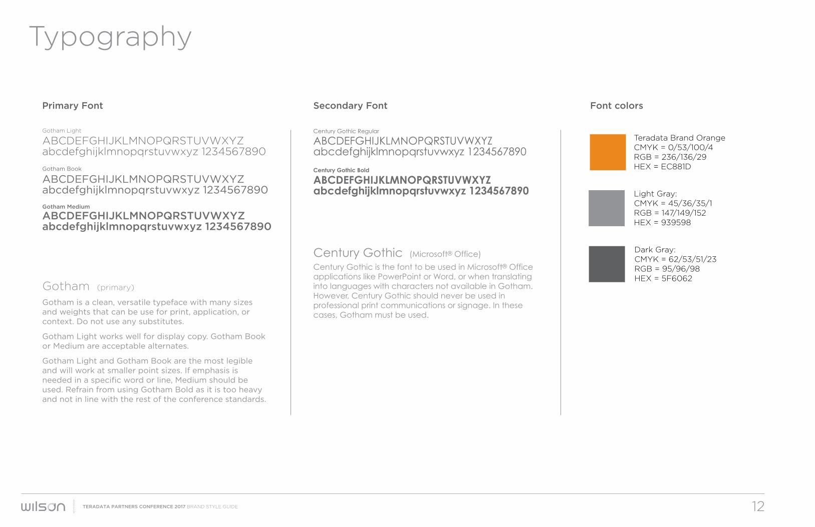
Gotham Light
ABCDEFGHIJKLMNOPQRSTUVWXYZabcdefghijklmnopqrstuvwxyz 1234567890
Gotham (primary) Gotham is a clean, versatile typeface with many sizes and weights that can be use for print, application, or context. Do not use any substitutes.
Gotham Light works well for display copy. Gotham Book or Medium are acceptable alternates.
Gotham Light and Gotham Book are the most legible and will work at smaller point sizes. If emphasis is needed in a specific word or line, Medium should be used. Refrain from using Gotham Bold as it is too heavy and not in line with the rest of the conference standards.
Gotham Book
ABCDEFGHIJKLMNOPQRSTUVWXYZabcdefghijklmnopqrstuvwxyz 1234567890
Gotham Medium
ABCDEFGHIJKLMNOPQRSTUVWXYZabcdefghijklmnopqrstuvwxyz 1234567890
Century Gothic Regular
ABCDEFGHIJKLMNOPQRSTUVWXYZabcdefghijklmnopqrstuvwxyz 1234567890
Century Gothic (Microsoft® Office)
Century Gothic is the font to be used in Microsoft® Office applications like PowerPoint or Word, or when translating into languages with characters not available in Gotham. However, Century Gothic should never be used in professional print communications or signage. In these cases, Gotham must be used.
Century Gothic Bold
ABCDEFGHIJKLMNOPQRSTUVWXYZabcdefghijklmnopqrstuvwxyz 1234567890
Primary Font Secondary Font Font colors
Typography
Dark Gray:CMYK = 62/53/51/23 RGB = 95/96/98HEX = 5F6062
Light Gray:CMYK = 45/36/35/1 RGB = 147/149/152HEX = 939598
Teradata Brand OrangeCMYK = 0/53/100/4RGB = 236/136/29HEX = EC881D
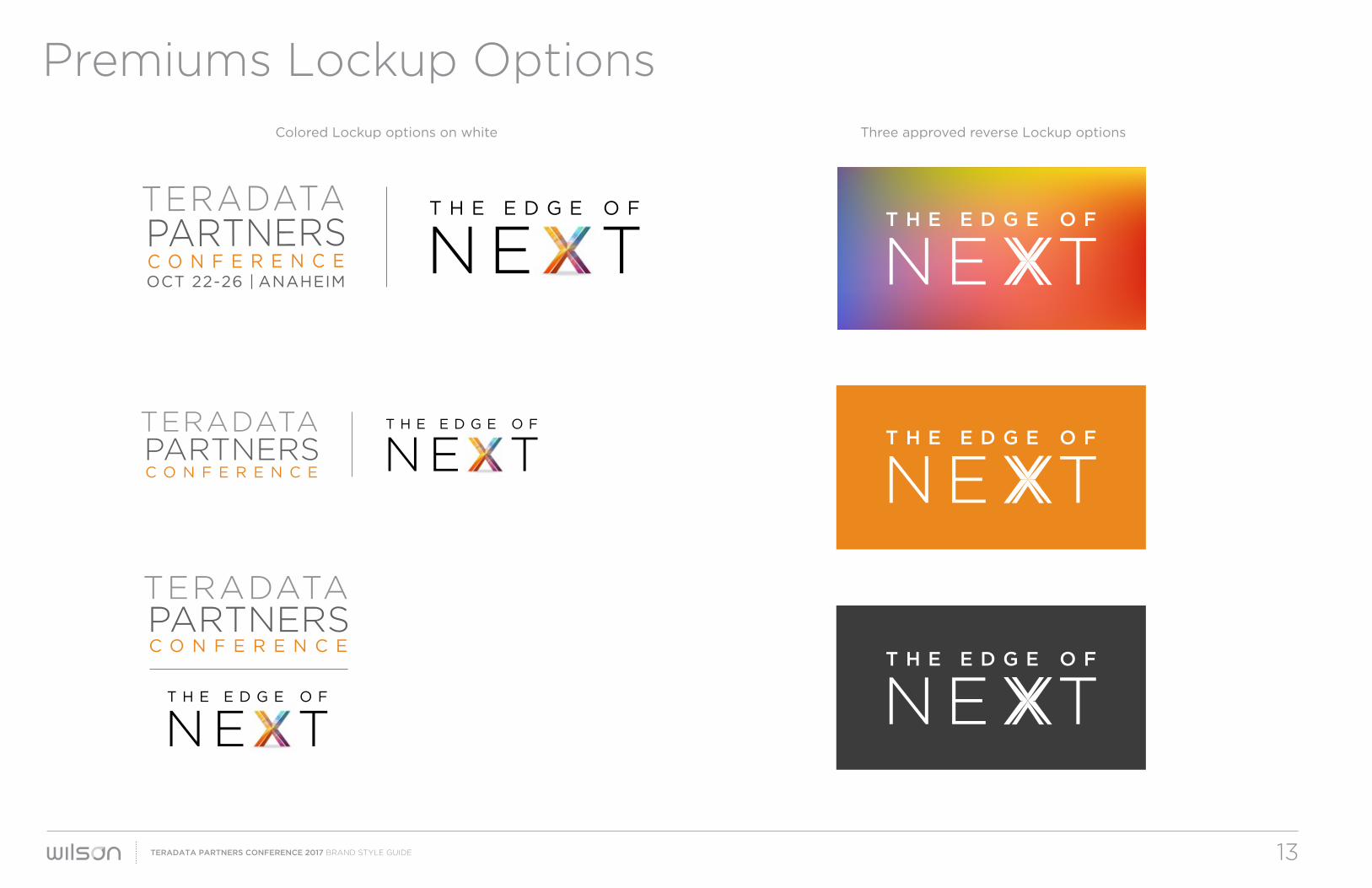
Premiums Lockup Options
TERADATA PARTNERS CONFERENCE 2017 BRAND STYLE GUIDE 13
NE TT H E E D G E O F
NE TT H E E D G E O F
NE TT H E E D G E O F
NE TT H E E D G E O F
NE TT H E E D G E O F
NE TT H E E D G E O F
OCT 22-26 | ANAHEIMC O N F E R E N C E
TERADATAPARTNERS
Colored Lockup options on white Three approved reverse Lockup options

Presentations
Choose from two cover options and interior page designs.
Note: Century Gothic is the default font for all PowerPoint presentations.
Use ONLY for Teradata PARTNERS Conference 2017.
14
Presentations
TERADATA PARTNERS CONFERENCE 2017 BRAND STYLE GUIDE

Email Signature is set 186 pixels wide for best viewing on multiple
devices. Set the image to hyperlink to partners.teradata.com
Opt. A
Opt. B
Email Signature
TERADATA PARTNERS CONFERENCE 2017 BRAND STYLE GUIDE 15

Contact
Click the link below to access all available assets and
templates for the 2017 Teradata PARTNERS Conference:
For any questions, or access to Principal Visual artwork,
please contact:
Katie FleischmanClient Account Leader
WILSON
Repositioning Mature Brands
3060 South Tech Blvd. Dayton, OH 45342
(937) 291-4899
wilsonrebranding.com
TERADATA PARTNERS CONFERENCE 2017 BRAND STYLE GUIDE 16
Asset Library