technical report -chromaticity explained
TRANSCRIPT

Lab Report: Block Three Martin Jesson
Chromaticity and the Measurement of Colour
Abstract Whilst we require sufficient quantities of light to perform tasks, light is made up of various colours and this can have an equally important effect on our ability to perform tasks. Colour is an interaction we have with light and the appearance colour creates can directly effect our experience of a space. This report intends to explain how colour appearance and rendering properties are vital in lighting design and show how colour is defined using the CIE Chromaticity system.
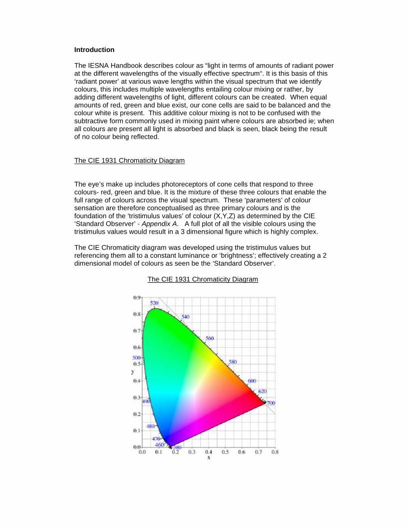
Introduction The IESNA Handbook describes colour as “light in terms of amounts of radiant power at the different wavelengths of the visually effective spectrum“. It is this basis of this ‘radiant power’ at various wave lengths within the visual spectrum that we identify colours, this includes multiple wavelengths entailing colour mixing or rather, by adding different wavelengths of light, different colours can be created. When equal amounts of red, green and blue exist, our cone cells are said to be balanced and the colour white is present. This additive colour mixing is not to be confused with the subtractive form commonly used in mixing paint where colours are absorbed ie; when all colours are present all light is absorbed and black is seen, black being the result of no colour being reflected. The CIE 1931 Chromaticity Diagram The eye’s make up includes photoreceptors of cone cells that respond to three colours- red, green and blue. It is the mixture of these three colours that enable the full range of colours across the visual spectrum. These ‘parameters’ of colour sensation are therefore conceptualised as three primary colours and is the foundation of the ‘tristimulus values’ of colour (X,Y,Z) as determined by the CIE ‘Standard Observer’ - Appendix A. A full plot of all the visible colours using the tristimulus values would result in a 3 dimensional figure which is highly complex. The CIE Chromaticity diagram was developed using the tristimulus values but referencing them all to a constant luminance or ‘brightness’; effectively creating a 2 dimensional model of colours as seen be the ‘Standard Observer’. The CIE 1931 Chromaticity Diagram

The result of removing the ‘brightness’ factor is that colours can be defined as ‘Chromaticity Coordinates’ (of ‘x’ and ‘y’) and can be plotted on the diagram to find a resultant colour. This can be the colour of a light source, the colour of a surface or the colour of light passing through a colour filter. A fully saturated or pure spectral colour is a colour that is made up of one waveform and does not need to be made from mixing. It comprises of coordinates that fall on the ‘Spectral Locus’ – the outline of the diagram. The chromaticity coordinates for the pure spectral colours can be found from:
Note: x + y + z = 1 and therefore only the x and y coordinates are needed to identify a colour. Colour and Objects We see objects because of the light reflected from them. Objects reflect only their own colour and absorb all other colour falling upon them. It is therefore important a light source can emit a large range of the visible spectrum. When light passes through an object all colours are absorbed except the colour of the object itself. For example consider a green GLS lamp; when light passes through the green glass of the bulb, all colours are absorbed except the green. The light is not ‘converted’ to green it is only the green portion which is being transmitted. Colour in relation to a light source (ie; lamps) is split into two areas; colour appearance and colour rendering. Colour Appearance refers to the feeling or ambience that is created by the light source. ‘Cool’ or ‘Warm’ are terms used to describe this effect, and are coupled with the colour temperature method of identifying a light sources colour. The CIE Chromaticity Diagram below has the Black Body Locus plotted with the relevant colour temperatures.

The colours are measured in Kelvin and reflect the colour seen when a Black body radiator is heated from 0K to 10000K. As the body gets hotter its colour moves from red to white – known as the equal energy white point(all colour energies are equal) - until it is so hot it is blue. This forms the standard for colour appearance categories;
Warm – under 3300K. Intermediate – 3300K to 5300K. Cool – above 5300K.
Colour rendering is the ability of a light source to show the true colour of
objects and is determined by the spectral power distribution of the light source. Only those sources that fall on the black body locus or very close to it, can be reflected from it. So to achieve a good colour rendering we need to have a light source that emits all wavelengths of light and so, such a source is termed ‘Full Spectrum’. In reality there are few sources capable of full spectrum rendition, examples include, the sun/daylight, incandescent and tungsten halogen sources. In order to define light sources that are not full spectrum (discharge lamps) with a colour temperature, projected ‘isotemperature’ lines are plotted on the black body locus (and are seen above) that consist of colours very close to that of the related colour and thus are deemed to have a correlated colour temperature (CCT).
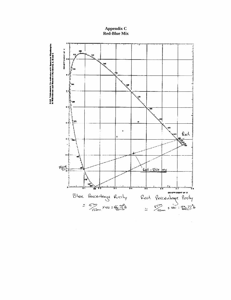
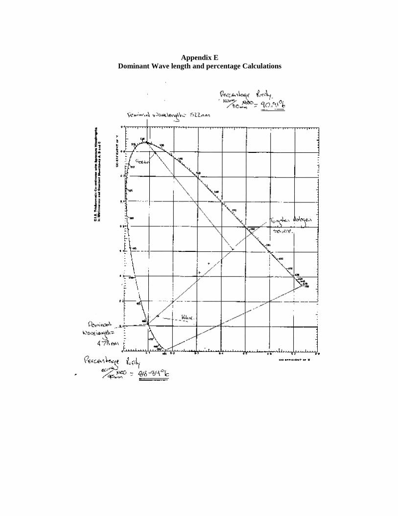
As well as determining colours, the CIE Chromaticity diagram can be used to find the dominant wavelength of colour that appears on a object/surface that is lit by a white light source (light source located on the black body locus). By using a straight line drawn from the light source point through the object/surface colour and extended out to the spectral locus. The point the line intersects the spectral locus is the dominant wavelength. Additionally, the purity of the surface colour can be found. The closer a colour is to the spectral locus, the more pure it is and this can be expressed as percentage, offering us the ‘Percentage Purity’. This is found by attaining the fraction between the total length (in millimetres) of the straight line from the light source to the spectral locus. And the total length (in millimetres) from the colour coordinates to the spectral locus. It is the aim of this report to show colour is defined as part of the CIE 1931 chromaticity system and explain the make up of source blending.

Method Apparatus: Chroma Meter - Konica Minolta CL-200 4 Channel Dimmer - Jands RO7238 Programmable AC Power Source - Chroma 6415 Tripod for holding Lamp Holders. Lamp Holder – 3 off Aureol incorporating 1 off MR16 Dichoric 50W Lamp 1 off Red primary colour filter 1 off Green primary colour filter 1 off Blue primary colour filter A totally dark room, with a ‘white’ wall to aid with identifying source blending. Procedure: This experiment was set up in a dark room with the 3x Aureol light source’s all aimed at the same point on a white wall. The Aureol light source’s each had a primary colour filter inserted and were connected via 4channel dimmer. Their outputs were controlled via the Chroma 6415 power source with the voltage maintained at 230v.
Chroma Meter Aureol Light sources Dimmer Regulated Power Source

Firstly, the Chromaticity coordinates and Tristimulus values for the primary Red, Green and Blue colours were measured using the Chroma meter. The Red Source was turned on at full intensity and the chromaticity coordinates and tristimulus values measured. The Green Source was turned on at full intensity and the chromaticity coordinates and tristimulus values measured. The Blue Source was turned on at full intensity and the chromaticity coordinates and tristimulus values measured. Secondly, the Chromaticity coordinates and Tristimulus values of the source blended Red, Green and Blue colours were measured using the Chroma meter. The Red and Blue Spots were set to full intensity with there beams overlapping and the chromaticity coordinates and tristimulus values measured. The Red and Green Spots were set to full intensity with there beams overlapping and the chromaticity coordinates and tristimulus values measured. With the Red and Green Spots still at full intensity, the Blue was ramped up to full intensity and a measurement taken. Results Table of Data:
Source Colour Chromaticity Coord Tristimulus Values x y X Y Z Red 0.709 0.29 1870 766 1 Blue 0.147 0.141 413 395 1982 Green 0.128 0.797 240 1465 156 Red + Blue 0.424 0.212 2264 1127 1910 Red + Green 0.669 0.324 1893 910 17 Red + Green + Blue 0.416 0.228 2290 1246 1916
Please see the below contents of appendix for plotted Results and dominant waveform and percentage purity calculations. Appendix ‘B’: Source Colours, Red, Green and Blue Appendix ‘C’: Red – Blue Mix Appendix ‘D’: Red-Green + Red – Green – Blue Mix Appendix ‘E’: Dominant Wavelength and Percentage Purity Calculations Appendix ‘F’: Red-Green Mix Appendix ‘G’: Tristimulus Value Calculations.

Discussion Source Colours If we refer to appendix B we can see that the Red source is the only pure colour as it’s coordinates are measured to be on the spectral locus at 625nm. This is at the mercy of our measuring skills and approximations however. If we refer to the results table we can check this however by referring to the tristimulus value for Z, which equals 1. This would be correct as the Z axis runs along the length of the Spectral Locus from X coordinate ‘1’ to Y coordinate ‘1’. The Green and Blue source coordinates do not locate on the spectral locus, and these source’s are not pure. They do plot close to the spectral locus however indicating a high percentage purity. We can find the dominant wavelength and determine the percentage purity as per the below.

It must be noted that the light source is tungsten halogen which carries a full spectrum so we can rule this out as limiting the purity for the green and blue samples. If we were to use a light source that didn’t have 625nm in its spectrum we would not get the 100% purity that this experiment has measured for the red source and this colour would not been seen in its entirety. As stated in the introduction of this report; When light passes through an object all colours are absorbed except the colour of the object itself… This is evident in the results of the source colours. Blended Colours The Red-Blue Mix (Appendix C) shows it equates to 53.27% red source and 46.72% blue source. The results are not 50-50 as the blue source colour is not pure and has a red contingent in its makeup attributing to the added 3.27% amount of red. The Red-Green Mix (Appendix G) was interesting in that shows a high amount of red, 97.26% and only 2.73% Green, completely contrasting the red-blue mix. Whilst the green source wasn’t pure, it was highly saturated, 90.91% purity. This may be due to the tungsten halogen source having a lower intensity of green light within its spectrum and thus less light is reaching the target area being measured by the Chroma meter. Red colour light is greatly represented in the tungsten halogen spectrum causing the green to be ‘washed’ away by the red. From the results of this experiment it can be determined the CIE 1932 Chromaticity system accurately defines colours and allows us to interpret how colours are made, what wavelength colours they are made up of and shows how source blending creates colours. Our perception of colour is determined by our relation to our surroundings which is dependant on the colour of the light that fills on it. As seen in this experiment, the type of light source plays a vital role in portraying colours and this can directly effect a persons interpretation of a space or an object. Full or high spectrum light sources are needed in order to show ‘true’ colour of the objects and surfaces within a space. Our surroundings include factors of influence such as; the characteristics or objects or surfaces, the properties of light sources and the observers adaptation state. This results in a complex arrangement of variables that a lighting designer must take into consideration when designing the lighting of a specific space.

References Illuminating Engineering Society of North America (1993) Lighting Handbook, 8th Edition, Warren G Julian (2011, February). Lighting: Basic Concepts, 6th Edition,

Appendix A Tristimulus Values

Appendix B
Source Colours
Appendix C Red-Blue Mix

Appendix D
Red – Green – Blue Mix
Appendix E
Dominant Wave length and percentage Calculations

Appendix F Red – Green Mix

Appendix G Tristimulus Values Calculations.