tableau 9 overview - university of texas at austincannata/datavis/class notes/_05... · tableau 9...
TRANSCRIPT

Tableau9Overview
Dr.PhilipECannataOracleDataScien9st,OracleCer9fiedProfessional,andAdjunctProfessorattheUniversityofTexasComputerScienceDepartmentinAus9n
1

Objec9ve
Thispresenta9onwillcommunicateatahighlevelmymethodologyforsystema9callyanalyzingdatausingTableau’svisualtechniques.FundamentalandAdvancedTableauconceptswillbepresentedandyouwillbeintroducedtomanyveryusefulvisualiza9onsalongtheway.Thispresenta9oncontainsdetailed,step-by-stepinstruc9onsforreproducingeachvisualiza9on.Duringthepresenta9on,youcandothesestepsalongwithmeorjustwatch.Attheendofeachsec9on,I’llask”Howmightyouusewhatyou’vejustseenonyourproject?”
2
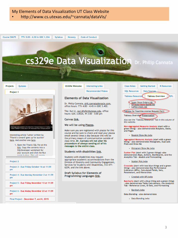
MyElementsofDataVisualiza9onUTClassWebsite• hVp://www.cs.utexas.edu/~cannata/dataVis/
3

TwoUsefulBooks
4
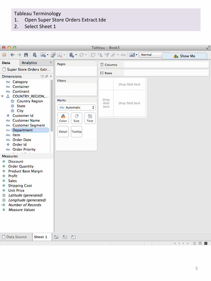
TableauTerminology1. OpenSuperStoreOrdersExtract.tde2. SelectSheet1
5

TableauTerminology–DimensionsandBlueThings1. ClickonDepartmentunderDimensionsandselectDescribe2. ClickLoadifnecessary
6
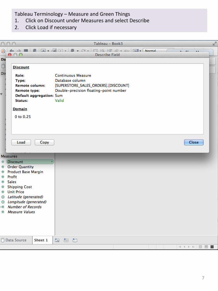
TableauTerminology–MeasureandGreenThings1. ClickonDiscountunderMeasuresandselectDescribe2. ClickLoadifnecessary
7

MethodologyToanalyzeaDataSource1. Startwithagreenthing(usuallyaMeasure)innon-aggregatedmodeand
makeaBoxplot2. StartwithagreenthinginaggregatedmodeandmakeaHistogram3. Startwith2greenthingsandmakeaScaVerplot4. Startwithtwobluethings(usuallyDimensions)plusagreenthingandmakea
Crosstab5. StartwithabluethingandagreenthingandmakeaBarchart
8
Non-AggregatedMeasuresAnalysis(startwithagreenthing)-alsodemonstratesBoxplots,Dates,andPages
BoxplotShowMe.twbxAggregatedMeasuresAnalysis(startwithagreenthing)-alsodemonstratesHistograms,Dual-axisPlotsandShowMe
HistogramShowMe.twbxSca5erPlots(startwith2greenthings)-alsodemonstratesMaps,Ac9ons,Dashboards,andtheAnaly9csTab-ModelsandForecas9ng
ScaVerPlot.twbxCrosstabs(startwithtwobluethingsandagreenthing)-alsodemonstratesKeyPerformanceIndicators(KPIs),CalculatedFields,Sets,Parameters,andHierarchies
CrosstabwithKPI.twbxBarcharts(startwithabluethingandagreenthing)-alsodemonstrateTableCalcula9ons,theAnaly9csTab-ReferenceLines,Formahng,andIDSets
Barchart.twbxJoiningTables-thissec9ondemonstrateshowtojointwotables.DataBlending-thissec9ondemonstrateshowtoblendtwotables,whichisnotthesameasjoiningtables.

BoxplotStory(startwithagreenthing)1. OpenSuperStoreOrdersExtract.tde2. UncheckAggregateMeasuresundertheAnalysistabandRenametheCurrent
SheettoSalesBoxplot.3. ClickonSalesUnderMeasuresandthenclickontheboxploticonon"Show
Me”i.e.,therighticononrow7.4. DragCategoryontoColumns.5. DragRegionontotheColorShelf.6. DragRegionontotheFiltersShelfandfromthisPill'smenu,selectShow
QuickFilter.7. DragSalesontotheFiltersShelfandfromthisPill'smenu,selectShowQuick
Filter.8. DragCustomerNameontoDetail9. Exploretheoutliers10. DragRegionontoPages11. SettheminimumSalesto$20,00012. ClickthroughtheRegionsonPagesandno9ce“officeSupplies”iscommonto
all
9

BoxplotStory(startwithagreenthing)+SalesoverQuarterTimeusingPages1. DuplicatetheSalesBoxplotSheetandrenameittoSalesBoxplotoverTime.2. OntheOrderDateitemunderDimensions,selectChangeDataType->Date3. DragOrderDateontopofRegionsonthePagesShelfandonthisPill'smenu,
changeittoQuarter(makesureyouselectthesecondQuarterop9on)4. OntheAnaly9csTab.ClickandholdontheAverageLinepillanddragtoPane5. SelecttheforwardplaybuVon.
10

BoxplotStory(startwithagreenthing)+ProfitoverQuarterTimeusingPages1. DuplicatetheSalesBoxplotoverTimeSheettoanewsheetnamedProfitBoxplot
overTime.2. DragProfitontopofSalesonRowtoreplaceSaleswithProfit3. Selectaregionofinterestandplaythemovie.
11

Howmightyouusewhatyou’vejustseenonyourproject?
12
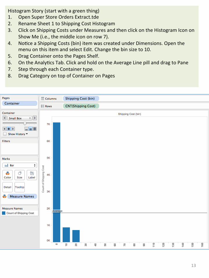
HistogramStory(startwithagreenthing)1. OpenSuperStoreOrdersExtract.tde2. RenameSheet1toShippingCostHistogram3. ClickonShippingCostsunderMeasuresandthenclickontheHistogramIconon
ShowMe(i.e.,themiddleicononrow7).4. No9ceaShippingCosts(bin)itemwascreatedunderDimensions.Openthe
menuonthisitemandselectEdit.Changethebinsizeto10.5. DragContainerontothePagesShelf.6. OntheAnaly9csTab.ClickandholdontheAverageLinepillanddragtoPane7. StepthrougheachContainertype.8. DragCategoryontopofContaineronPages
13

HistogramStory(startwithagreenthing)+ProfitonaDual-axis1. DuplicatethecurrentSheettoanewSheetnamedShippingCost+Profit
Histogram2. DragProfittotherightaxistocreateadualaxisplot.3. ClickontheCNT(ShippingCosts)PillontheMarksCardandchangeitsMarkto
Bar.4. OntheAnaly9csTab.ClickandholdontheAverageLinepillanddragto
Sum(Profit)/Pane5. StepthrougheachContainertype.
14
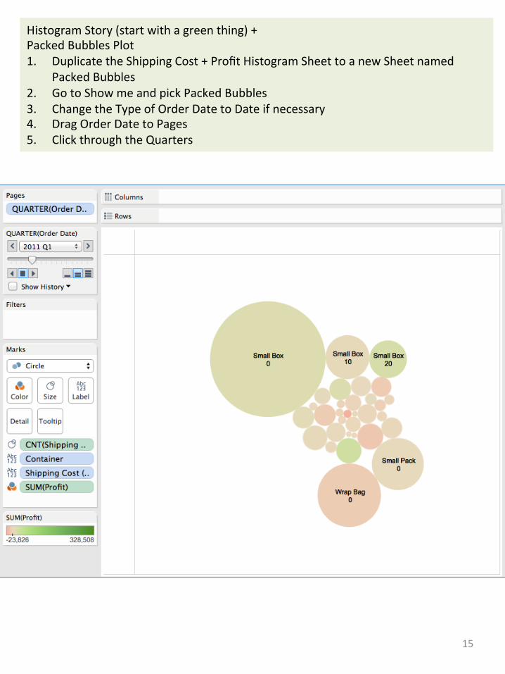
HistogramStory(startwithagreenthing)+PackedBubblesPlot1. DuplicatetheShippingCost+ProfitHistogramSheettoanewSheetnamed
PackedBubbles2. GotoShowmeandpickPackedBubbles3. ChangetheTypeofOrderDatetoDateifnecessary4. DragOrderDatetoPages5. ClickthroughtheQuarters
15

HistogramStory(startwithagreenthing)+TreemapPlot1. DuplicatetheShippingCost+ProfitHistogramSheettoanewSheetnamed
TreemapDrag2. GotoShowmeandpickTreemap3. ChangetheTypeofOrderDatetoDateifnecessary4. DragOrderDatetoPages5. ClickthroughtheQuarters
16

Howmightyouusewhatyou’vejustseenonyourproject?
17

ScaVerPlotStory(startwith2greenthings)1. OpenSuperStoreOrdersExtract.tde2. UncheckAggregateMeasuresundertheAnalysistab3. RenametheCurrentSheettoScaVerPlot4. DragSalesontotheColumnsShelf5. DragProfitontotheRowsShelf6. DragCategoryontothePagesShelf7. ClickontheAnaly9csTabanddoubleclickonTrendLine8. ClickontheDataTab9. DragStateontoColor10. RemoveCountryRegionfromColor
18

ScaVerPlotStory(startwith2greenthings)+MapsandAc9ons1. CreateanewSheetnamedMap2. DoubleclickonState3. ClickontheWorksheetTabandselectAc9ons4. SelectAddAc9on->Filter5. SelectRunAc9ononSelect6. SelectMapfortheSource7. SelectScaVerPlotforTarget8. ClickonOkandOk9. ClickonTexasonthemap
19

ScaVerPlotStory(startwith2greenthings)+Dashboards1. CreateanewDashboard2. DragtheScaVerPlotandMapSheetsontotheDashboard3. ZoomintotheUnitedStates4. DragselectWashington,Oregon,andCalifornia5. Clickonthewhite“UseasFilter”iconjusttotheletoftheXintheScaVerPlot
Sheet6. StepthroughtheCategoriesandcomparetheStates
20
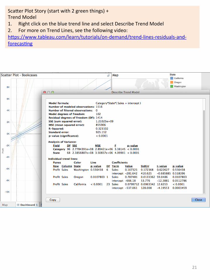
ScaVerPlotStory(startwith2greenthings)+TrendModel1. RightclickonthebluetrendlineandselectDescribeTrendModel2. FormoreonTrendLines,seethefollowingvideo:hVps://www.tableau.com/learn/tutorials/on-demand/trend-lines-residuals-and-forecas9ng
21

ScaVerPlotStory(startwith2greenthings)+AnotherAc9onPlot1. Createanewsheetnamed“HighProfitStates”.2. DragStateontoColumnsandProfitontoRows.3. ClickontheWorksheetTabandselectAc9ons4. SelectAddAc9on->Filter.5. SelectRunAc9ononSelect.6. Select“HighProfitStates”fortheSource.7. SelectScaVerPlotforTarget.8. ClickonOkandOk.9. ClickonIllinoisonthe“HighProfitStates.10. Addthissheettothedashboardalsoandselectthefourhighestprofitstates.
22
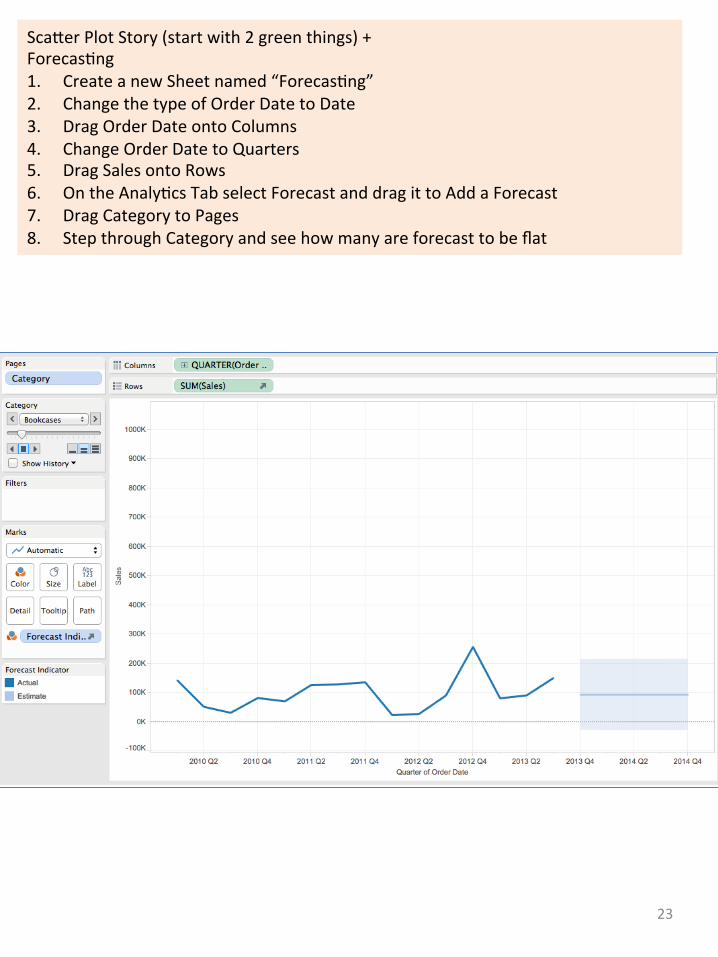
ScaVerPlotStory(startwith2greenthings)+Forecas9ng1. CreateanewSheetnamed“Forecas9ng”2. ChangethetypeofOrderDatetoDate3. DragOrderDateontoColumns4. ChangeOrderDatetoQuarters5. DragSalesontoRows6. OntheAnaly9csTabselectForecastanddragittoAddaForecast7. DragCategorytoPages8. StepthroughCategoryandseehowmanyareforecasttobeflat
23

Howmightyouusewhatyou’vejustseenonyourproject?
24
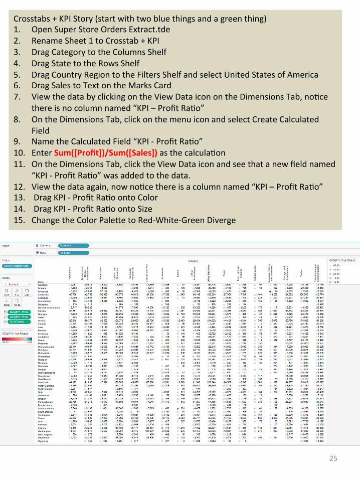
Crosstabs+KPIStory(startwithtwobluethingsandagreenthing)1. OpenSuperStoreOrdersExtract.tde2. RenameSheet1toCrosstab+KPI3. DragCategorytotheColumnsShelf4. DragStatetotheRowsShelf5. DragCountryRegiontotheFiltersShelfandselectUnitedStatesofAmerica6. DragSalestoTextontheMarksCard7. ViewthedatabyclickingontheViewDataiconontheDimensionsTab,no9ce
thereisnocolumnnamed“KPI–ProfitRa9o”8. OntheDimensionsTab,clickonthemenuiconandselectCreateCalculated
Field9. NametheCalculatedField“KPI-ProfitRa9o”10. EnterSum([Profit])/Sum([Sales])asthecalcula9on11. OntheDimensionsTab,clicktheViewDataiconandseethatanewfieldnamed
“KPI-ProfitRa9o”wasaddedtothedata.12. Viewthedataagain,nowno9cethereisacolumnnamed“KPI–ProfitRa9o”13. DragKPI-ProfitRa9oontoColor14. DragKPI-ProfitRa9oontoSize15. ChangetheColorPaleVetoRed-White-GreenDiverge
25

Crosstabs+KPIStory(startwithtwobluethingsandagreenthing)+Sets1. CreateanewSheetnamed“FourHighest”2. DragCategorytotheColumnsShelf3. DragSalestotheRowsShelf4. DragCountryRegionontoFiltersandselectUnitedStatesofAmerica5. SelectthefourhighestSalesCategoriesandhoveroveroneofthem6. ClickontheSeticonandselectCreateSet7. NametheSet“FourHighestSalesCategories”
26

Crosstabs+KPIStory(startwithtwobluethingsandagreenthing)+Sets1. Duplicatethe“Crosstab+KPI”SheetanewSheetnamed“Crosstab+KPI2”2. DragtheFourHighestSalesCategorySettoFiltersandchangeittoShowIn/Out
ofSet3. ShowQuickFilteronthisSet4. SetthisFiltertoIn
27

Crosstabs+KPIStory(startwithtwobluethingsandagreenthing)+Sets1. CreateanewSheetnamed“RegionSalesMap”2. DragCountryRegiontoFiltersandselectUnitedStatesofAmerica3. DoubleclickonState4. DragKPI–ProfitRa9otoColor5. DragtheFourHighestSalesCategoriestotheFiltersShelf6. DragRegiontoLabel
28
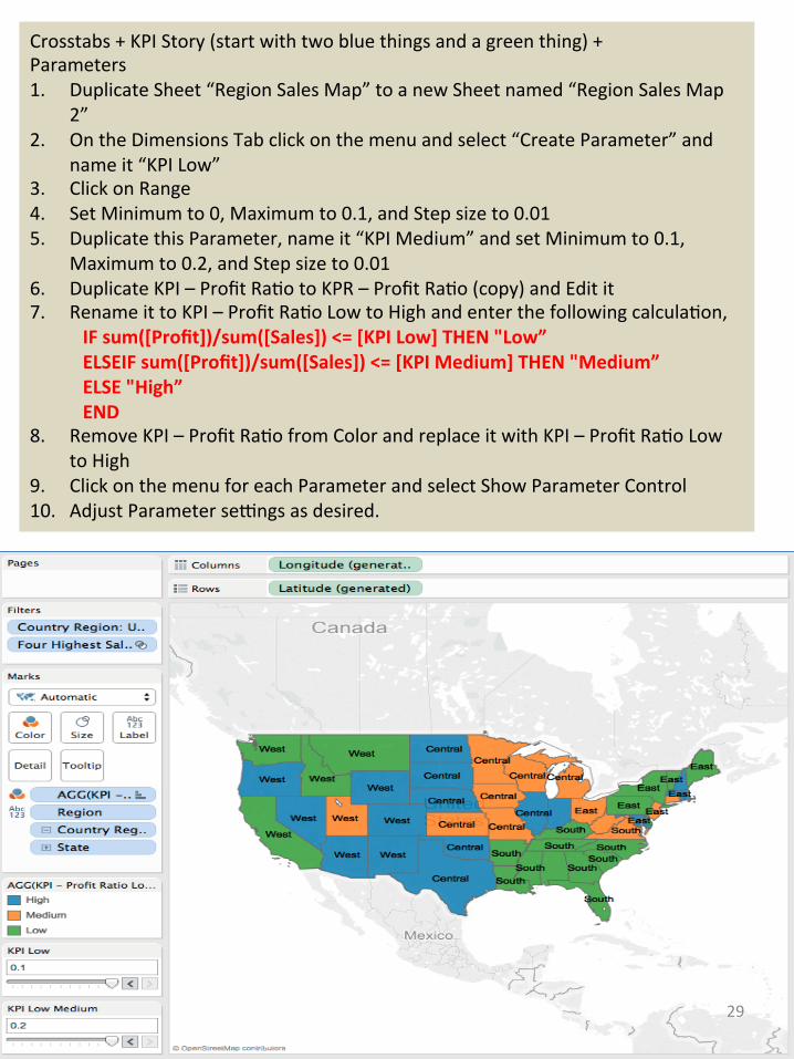
Crosstabs+KPIStory(startwithtwobluethingsandagreenthing)+Parameters1. DuplicateSheet“RegionSalesMap”toanewSheetnamed“RegionSalesMap
2”2. OntheDimensionsTabclickonthemenuandselect“CreateParameter”and
nameit“KPILow”3. ClickonRange4. SetMinimumto0,Maximumto0.1,andStepsizeto0.015. DuplicatethisParameter,nameit“KPIMedium”andsetMinimumto0.1,
Maximumto0.2,andStepsizeto0.016. DuplicateKPI–ProfitRa9otoKPR–ProfitRa9o(copy)andEditit7. RenameittoKPI–ProfitRa9oLowtoHighandenterthefollowingcalcula9on,
IFsum([Profit])/sum([Sales])<=[KPILow]THEN"Low”ELSEIFsum([Profit])/sum([Sales])<=[KPIMedium]THEN"Medium”ELSE"High”END
8. RemoveKPI–ProfitRa9ofromColorandreplaceitwithKPI–ProfitRa9oLowtoHigh
9. ClickonthemenuforeachParameterandselectShowParameterControl10. AdjustParametersehngsasdesired.
29

Crosstabs+KPIStory(startwithtwobluethingsandagreenthing)+Hierarchies1. OntheMarksCard,clickonthe+signontheletsideoftheStatePill
30

Howmightyouusewhatyou’vejustseenonyourproject?
31
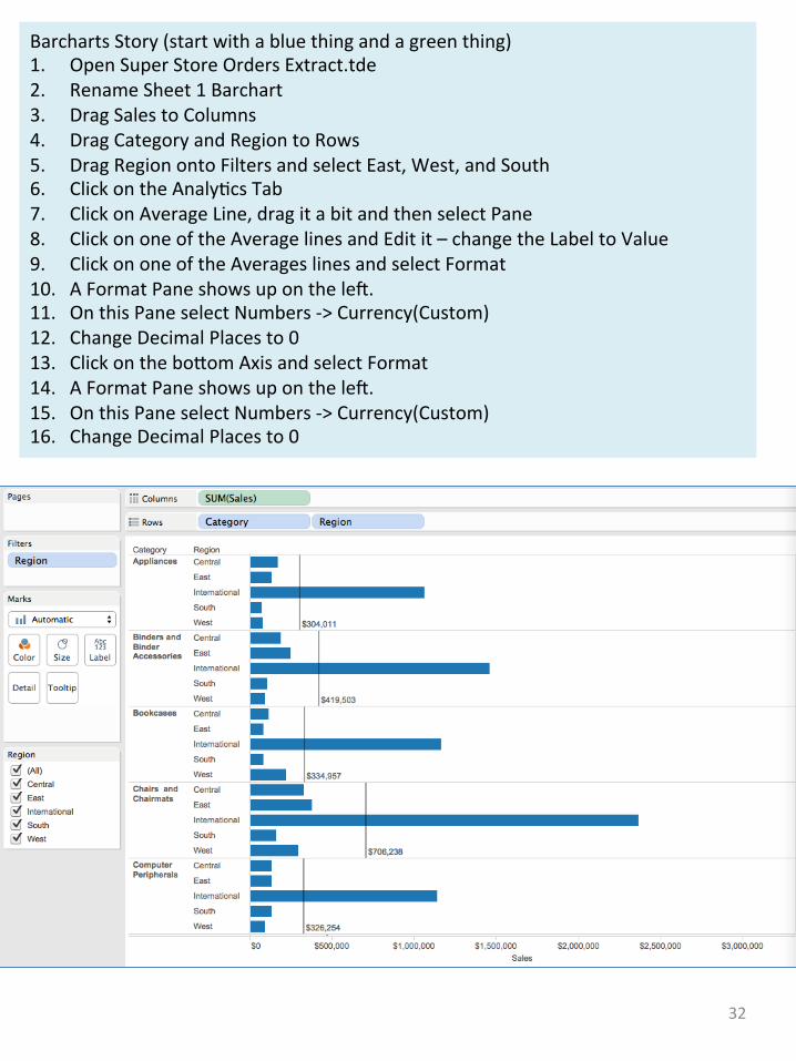
BarchartsStory(startwithabluethingandagreenthing)1. OpenSuperStoreOrdersExtract.tde2. RenameSheet1Barchart3. DragSalestoColumns4. DragCategoryandRegiontoRows5. DragRegionontoFiltersandselectEast,West,andSouth6. ClickontheAnaly9csTab7. ClickonAverageLine,dragitabitandthenselectPane8. ClickononeoftheAveragelinesandEditit–changetheLabeltoValue9. ClickononeoftheAverageslinesandselectFormat10. AFormatPaneshowsuponthelet.11. OnthisPaneselectNumbers->Currency(Custom)12. ChangeDecimalPlacesto013. ClickontheboVomAxisandselectFormat14. AFormatPaneshowsuponthelet.15. OnthisPaneselectNumbers->Currency(Custom)16. ChangeDecimalPlacesto0
32
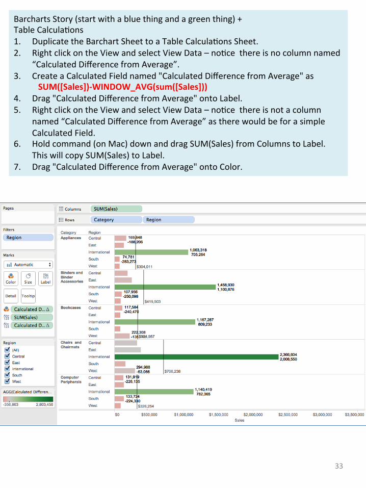
BarchartsStory(startwithabluethingandagreenthing)+TableCalcula9ons1. DuplicatetheBarchartSheettoaTableCalcula9onsSheet.2. RightclickontheViewandselectViewData–no9cethereisnocolumnnamed
“CalculatedDifferencefromAverage”.3. CreateaCalculatedFieldnamed"CalculatedDifferencefromAverage"as
SUM([Sales])-WINDOW_AVG(sum([Sales]))4. Drag"CalculatedDifferencefromAverage"ontoLabel.5. RightclickontheViewandselectViewData–no9cethereisnotacolumn
named“CalculatedDifferencefromAverage”astherewouldbeforasimpleCalculatedField.
6. Holdcommand(onMac)downanddragSUM(Sales)fromColumnstoLabel.ThiswillcopySUM(Sales)toLabel.
7. Drag"CalculatedDifferencefromAverage"ontoColor.
33

BarchartsStory(startwithabluethingandagreenthing)+IDSets1. CreateanewSheetnamedIDSets2. DragOrderIdontoColumns3. DragDiscountontoRows4. SettheViewtobeEn9reView5. Highlightalllinesbetween0.40and0.30bydraggingaboxoverthem6. Hoveroverahighlightedline,selecttheSeticonandclickonCreateSet7. NametheSetHighDiscountOrders8. DragtheSetontoPagesandclicktheplaybuVonsothatthestatusshowsOut9. Highlightalllinesbetween0.30and0.20bydraggingaboxoverthem10. Hoveroverahighlightedline,selecttheSeticonandclickonCreateSet11. NametheSetMediumDiscountOrders
34

BarchartsStory(startwithabluethingandagreenthing)+IDSets1. CreateanewSheetnamedIDSetsonaMap2. DoubleclickState3. HighlighttheUnitedStateswiththeZoomAreatool4. Dragthe2SetstoPages5. DragCustomerNametoColor6. DragCustomerNamestoDetail7. DragCitytoDetail8. ChangetheMarkstoCircle9. ClickthePagessliderandhoveroveraCircletoseetheDetails
35

BarchartsStory(startwithabluethingandagreenthing)+IDSetsPart21. CreateanewSheetnamedHighSalesCustomers2. DragCustomerIdontoColumns3. DragSalesontoRows4. SettheViewtobeEn9reView5. HighlightselectCustomerswithSales>$100k6. DragHighDiscountOrdersontoFilters7. DragProfitontopofSalesonRows
36

Howmightyouusewhatyou’vejustseenonyourproject?
37

JoiningTables:1. OpenSuperStoreOrdersExtract.tde2. OpenUSSuperStoreQuota.tde3. Youshouldseethefollowingontheconnec9onspage::
4. Clickonthe“Join”icon,i.e.,theiconwiththeblueandwhitecircles.5. FillintheJoinasfollows,i.e.,select“Inner”andsetState=US_STATE
6. Inspectthedataandno9ceonlytheUSStatesappear.
7. ThisshowsthatinanInnerJoin,onlyrowsthatmeetthejoincriteriaareretainedintheresul9ngtable.
38

JoiningTablescon9nued:1. ChangetheJointobeLet
2. Inspectthedataandno9cethatUSStatesappearwithaQUOTAandnon-USStatesappearwithnullfortheirQUOTA.
3. ThisshowsthatinaLetJoin,alloftherowsintheLettableappearatleastonceintheresul9ngtableeveniftheirvalueneedstobesettonull.
39

JoiningTablescon9nued:1. OpenSheet1andno9cethereareDimensionsandMeasuresforbothtables.
40

Howmightyouusewhatyou’vejustseenonyourproject?
41

BlendingData:1. OpenSuperStoreOrdersExtract.tde.2. DragSalesontoColumnsandRegionontoRows.3. AddCoffeeChainextractasanewdatasourcebychoosing:
4. TrytoaddcoffeesalestoColumns,youshouldgetthefollowingwarning:
5. UnderDatagotoEditRela9onships.6. DoaCustomeditandaddRegionfromSuperStoreandMarketfromCoffeeChain:
7. NowyoushouldbeabletodragCoffeeSaletoColumns.42

Howmightyouusewhatyou’vejustseenonyourproject?
43