style - tinkafoo.com · style book. advertisement for "disposable ... right: cd booklet from...
TRANSCRIPT

01 Medieval02 Rococo03 Victorian04 Arts & Crafts05 Minimalism06 Cubism07 Futurism08 Surrealism09 Constructivism10 De Stijl11 Art Deco12 ITS13 Sixties14 New Wave15 Deconstructivism16 Information Graphics17 Millennium18 Beck Map19 Macrap20 Propaganda Poster
j a s o n w a l l a c ehistory of graphic designd e c e m b e r 1 1 , 2 0 0 1
STYLEBOOK

Advertisement for "disposable absorbent underpants".
Characteristics*: Border Carpet page Drop cap Inconsistencies: No dimenuendo* One of the characteristics for period pieces is that it has to be illuminated -- stamped with gold leaf. Due to limitations in modern printing methods, and the value of gold, modern examples of the Medieval style will simply feature an intricate border with pictures of shininess (which this piece unfortunately doesn't have).
Page 01
Medieval

A little metal tea can that one of my friends has on his desk...
Characteristics: Organic contour Intricate, fine lines Thick & thin letterforms Type has some flourishes*
Inconsistencies: Symmetrical. True Rococo is asymmetrical. It's not busy enough.* Type is not embellished enough -- too conservative. (...but it's the only thing I could find...)
Page 02
Rococo

Advertisement for Alias|Wavefront 'Maya' (a $5,000 3D rendering program..)
Characteristics: Variety of fonts Decorative letterforms Busy* Undulating baseline Type in a banner Eclectic
Inconsistencies: No gradations in text* The definition of 'busy' has changed over the years, and doesn't look all that busy (to me at least). It seems like the designers knew the characteristics of Victorian style, but didn't make it 'too busy' because it would have been more fine art than an informative design piece.
Page 03
Victorian

Scenes from the movie "Brazil".
Characteristics: Organic plantforms Repeated patterns Borders Simple (no undulating baseline) Soft, muted colors Attention to fine detail
Inconsistencies: The philosophies of "truth to materials" and "reviving craftsmanship" are hard to prove since this is a work of fiction. Even in the context of the movie, no character mentions the environment in that detail.
Page 04
Arts & Crafts

CD cover from Rephlex Records' compilation album "Braindance".
Characteristics: Flat background Large simple image Prominent product name
Inconsistencies: This doesn't detract from the fact that it's Minimalism, but the weirdness of the image also makes it Surrealism.
Page 05
Minimalism

CD cover from Autechre's album "Confield".
Characteristics: Overlapping elements Somewhat flat design Abstracted, stylized planes Muted color
Inconsistencies: Since cubism was illustration only (no typography), the type on the cover has nothing to do with the rest of the design. Also, these images seem to have depth, but you have to look at them 'just right'..
Page 06
Cubism
Top: inside bookletLeft: cover
borders added later

Right: CD booklet from Underworld's album "dubnobasswithmyheadman"Left: back cover from Kraftwerk's album "The Man Machine"
Characteristics (Underworld): Variety of fonts Variety of point sizes Angled lines Asymmetrical layout
Characteristics (Kraftwerk): Dynamism (in lines and text)
Inconsistencies (Underworld): With all of the chaotic, overlapping forms, this could easily be called Deconstructivism. Also, the text only has horizontal baseline.
Page 07
Futurism
rota
ted
90°

CD cover from The Orb's album "U.F.Off The Best of The Orb".
Characteristics: It is applying an unreal situation to a real object. The title, which sounds like "you F-off" complements the offensiveness of the finger. The title is also a parody of one of The Orb's previous albums, "U.F.Orb".
Inconsistencies: Since some cultures do not use the finger as a form of offensive communication, they would not understand the link between the title and the image. To make it more meaningless, some of those cultures don't even have a space program..
Page 08
Surrealism

CD cover from Kraftwerk's album "The Man Machine".
Characteristics: black, white, and red bars and rules sans serif font
Inconsistencies: Constructivism did not use dynamism. The lines would have been horizontal and vertical.
Page 09
Constructivism

Radio Shack advertisement
Characteristics: Black bars Planes of primary colors Asymmetrical Sans serif letters*
Inconsistencies:* The letterforms are not squared (block) letters. This font has a more rounded design. The photographic elements and copy have nothing to do with De Stijl.
Page 10
De Stijl

Scenes from: "Brazil" and "A.I."
Characteristics (Brazil): Repeated patterns Rigid geometry Cubist-style illustrations Female form (pic 2) zig-zag pattern concentric circle pattern (top of MOI logo)
Characteristics (A.I.): Repeated patterns Pastel Colors waterfall patternInconsistencies: ( none )
Page 11
Art DecoMinistry of
Information logo (Brazil)
Brazil pic 1
A.I. pic 1
Brazil pic 2

Aphex Twin's CD and video: "Come To Daddy" and "Home Video Item".
Characteristics: Helvetica Flush-left, ragged-right Strong grid alignment Void of decoration (except for cover) Black and white Photos instead of illustrations
Inconsistencies: Despite the fact that the cover image is surreal (everyone looks like Aphex Twin), it's a perfect example!
Page 12
ITS
Top Left: photo of CD and videoTop Right: back of CDBottom Left: back of videoBottom Right: lyric sheet
borders added later

Cover art for the movie "Fear and Loathing in Las Vegas".
Characteristics: Bright colors (unnaturally) Organic lines (some) Hand lettering* Carpet page?**
Inconsistencies:* The title text is not as organic as it could be, and the top and bottom text is not stylized at all.** It's not completely a carpet page. The smoke fills the space with a wavy contour, but it's not distinct from the sky.
Page 13
Sixties

The back of a Cap'n Crunch box!
Characteristics: violated grid bright colors text in geometric forms variety of type reverse type angled baselines layers demands you kids' attention!
Inconsistencies: ( none ) Well, okay.. Nobody has "80's hair"..
Page 14
New Wave

Top: DVD booklet from "Fight Club"Bottom: DVDs from "Se7en".
Characteristics (Fight Club): Chaotic layout* Textures** Variety of fonts (in background) Layers
Characteristics (Se7en): Chaotic Layout (better example) Textures** Distressed type Variety of fonts (better example)
Inconsistencies:* ..except the images aligned to grid.** No "faux" textures, instead they are the
effects of layered photomanipulation.
Page 15
Deconstructivism

Map & guide for DFW Airport
Characteristics: Bold headings Grid alignment Color coded Spot illustrations Flush-left, ragged-right Few fonts (could be variations on a single font) Other graphic elements: bars, rules, text in boxes, and a simple map of the airport It is conveying a vast amount of information in a small amount of space
Inconsistencies: ( none )
Page 16
Information Graphics
Front Back

Top Left: Warp Records websiteTop Right: Windows XP default themeBottom Left: http://www.lycos.comBottom Right: my DSL modem box
Characteristics? / Inconsistencies? Since this style is still under construction, it's difficult to establish characteristics until after we've evolved into another style. Sure, they all share the bright colors, and some rounded elements, but Lycos and Warp Records have an 'angled' scheme (like De Stijl and Information Graphics with 45° angles added). Since Microsoft has a lot of influence over darn near everything, Millennium style might follow whatever they design. Apple is more design comscious, but they are quite protective over their own designs (see: 'look & feel' lawsuits vs. Microsoft in the early 1990's.) Therefore, people aren't as inclined to copy and build on their style.
Page 17
Millennium

Chicago Transit Authority Train Map.
Characteristics: Color coded Lines: horizontal, vertical, angled No useless decoration (just enough to get the point across) Not to scale
Inconsistencies: Trains are really closely related to subways, and since you said "no subway maps" I hope I don't get in too much trouble!
Page 18
Beck Map
http://www.transitchicago.com/maps/rail/rail.html

'lost dog' poster from Wal-Mart Header graphic for an article from "Tom's Hardware Guide"
Characteristics (lost dog): They want to get your attention, but why did they use an undulating baseline, drop shadow, and a rock texture? The texture is especially useless in that context -- against a rock background!Characteristics (Tom's Hardware): First, the website is not very orderly: there's two menus, and little chunks of info everywhere. As for that god-awful picture: they want to imply the use of a voltmeter, a knife, some tape, a CPU-identification program, an Athlon CPU itself, and some text, but DAMN! They've abused the drop shadow, the inner bevel, the color red, stretched the type three different ways, and the whole thing is backed-up with a collage of dark, contrasty pictures. And they expect me to want to read the article? Only if it's better than that picture...
Page 19
Macrap
http://www.tomshardware.com/howto/01q4/011112/index.html

Scenes from the movie "Brazil".
Characteristics: Rely on emotion over intellect. In conext with 'Brazil', they help build paranoia in the story.
- "Who Can You Trust": Sam (the main character) is suprised to learn two things: his long-time friend Jack is a high-ranking officer in the Ministry of Information, and that Jack is also investigating whether Jill (Sam's love interest) is a bombing terrorist.
- "Mind That Parcel: Eagle Eyes Can Save A Life": Sam has followed Jill into a factory to pick up a package. It could be an explosive, or it could be a simple Christmas present... We don't know.
Page 20
Propaganda Poster
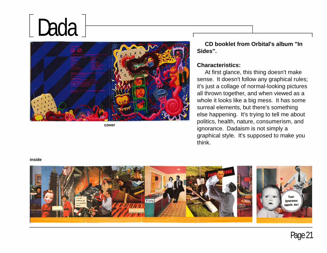
CD booklet from Orbital's album "In Sides".
Characteristics: At first glance, this thing doesn't make sense. It doesn't follow any graphical rules; it's just a collage of normal-looking pictures all thrown together, and when viewed as a whole it looks like a big mess. It has some surreal elements, but there's something else happening. It's trying to tell me about politics, health, nature, consumerism, and ignorance. Dadaism is not simply a graphical style. It's supposed to make you think.
Page 21
Dada
cover
inside

Date: November 25, 2001 - December 09, 2001Fonts: Header: Impact 48 pt. Body Copy: Helvetica 14 pt. (except colophon (12 pt.)) Captions: Helvetica Bold 10 pt.Software: Page Layout: Adobe Illustrator 10 Photo Editing: Adobe Photoshop 6.0.1 OS: Windows XP ProfessionalHardware: Computer System: home-built Athlon 1Ghz, 768MB Scanner: Epson Perfection 1250 Digital Camera: Nikon Coolpix 990 Printer: Epson Stylus Photo 780Size: 23 Adobe Illustrator Pages: 6.47MB 40 TIFF Images: 285MBPurpose: Style Book for History of Graphic Design (ART 3643)Intended Audience: Dr. Jim Watson, and anyone else who wants to read it!Missing Styles: Wood Type Poster, Art Nouveau, Fifties.Why Did I Include Dada: I'm not trying to make some weird statement by
including a style we weren't supposed to. I simply created the page on accident without paying attention to the syllabus. I spent too much time with my temperamental computer not to include those images. Think of this project as "Style Book: The Director's Cut".
Miscellaneous: You can learn much about an artist by studying his
works, and I tried to help the viewer by using items from my personal environment rather than items from random sources.
Most pieces came from CDs, DVDs and other objects I've owned for quite some time. (For example, I've had that box of Cap'n Crunch on my fridge for about three months!) Until I learned the characteristics of these styles however, I simply lived my life without knowing (or caring) what styles made up my surroundings.
Some of the items were easy to recognize. For example, Kraftwerk's "The Man Machine" album is Constructivism not only because of its graphic layout, but also because it share its philosophy with some period pieces -- man and machine working as one toward a common goal. In contrast, they are only using a machine to create music, not an entire political revolution (it is revolutionary music, but that's a different topic.)
Some items were nearly impossible to categorize, such as anything by Underworld. It's Deconstructivist with the overlapping layers, but it doesn't use faux textures. It's also Futursistic with its heavy use of text, but it doesn't use much dynamism.
Special Thanks to Kinko's: ...for screwing up my first copy of this by binding it
along the wrong side. At least this time, they didn't charge me for their mistakes!
Thank you, Jason Wallace
colophon
