speakerhead com a beginer guide to logo design
TRANSCRIPT
1
This project is an opportunity to create a unique logo for a fictional record company. Objective: To create a logo for record, sound, or music company that captures the attention of the demographic while depicting the nature of the small music artist. You will also
develop a branding guidelines sheet for your logo. The brand guide will include restriction of usage, color & type; a stationery set and placement of a product; and communication device.
Graphic DesiGn skills: Formal elements of design such as focal point, hierarchy, eye flow (continuation), unity through grids, balance using negative and positive space.
typOGraphic cOncepts: Typographic rules, leading, kerning, alignment, use of serif, sans serif, and script type faces. Using classic typefaces or typeface that communicate a style, purpose or message.
cOmputer layOut skillsIllustrator: Tools, techniques to creating a logo in vector format.
lOGO iDentity anD branD imaGe: You create a fictious name to design a logo for. Choose names that are descriptive and easy to remember. Stay away from abstract names, they will be hard to create pictorial symbols for.
style: You want to make sure it will fit well in your rock/gig poster. Look at examples of record company logos to see what has been done and what you can do.
Final prODuctlOGO anD statiOnery set:Logo, letterhead, business card, envelop
lOGO branD GuiDe sheet:on an 11 x 17 sheet you will break down the guidelines for type, color, and logo placement.
lOGO
Grading is based on the following: Note: Extra credit will be given to anyone who creates 3
covers (3 issues) for their magazine.
prOcessConducted Research
Provided Sketches/Comps Time (having things done on time)
Followed directions according to specs
DemOnstratiOn OF prOper use OF skills
Computer techniques as specified in the objectives
DemOnstratiOn OF eFFective typOGraphic cOncepts
Type usage and treatment as specified in the assignment objectives.
DemOnstratiOn OF eFFective DesiGn cOncepts
Layout and composition using the elements and principles of design.
Logo terms, concepts and elements
DesiGnDr. Paula DiMarco • [email protected]
FOr recOrD cOmpany
GraDinG criteria
art 354: cOmputer Graphics

2
pictOrial / abstract symbOl: [Click on the arrow to see samples]
This type of mark represents the company in a simple but bold manner. Most often represented through an abstract design. Usually, the ideas and concept behind the logo are complex, yet are represented in the simplest form possible. The abstract symbols can often take on a target market or stylistic form, (technology, health care, or nonprofit, etc). However, in many cases you will find a graphic representation of a pictorial object in a logo mark; a recognizable noun, (an apple, a panda bear, a rabbit, a tree, etc).
WOrDmark: [Click on the arrow to see samples] Other samples click here This logo type is a uniquely styled font type that spells out the company or brand name. Technology companies usually use this type of logo, as stylized text looks best on electronics and expresses the sophistication of a company. Examples of a wordmark include Sony, Samsung and Microsoft. Other great examples are Facebook and Google, the world’s most visited website. However, word marks are used in other industries as well and often become iconic in their typographic treatments, such as Coca Cola, Disney, Ray Ban, or Subway.
lettermark: [Click on the arrow to see samples]
This type of logo is exclusively typographic. The lettermark uses the company name written out, yet has a symbol representing the company through the use of its initials or the brands first letter. (think HP, or IBM)The best usage for this type of logo depends on many different variables such as; your initials can better graphically illustrate the company better than the full name, the name is too long, hard to pronounce, or is just not distinct enough to carry its own weight.
cOmbinatiOn mark: This type of logo is the combination of a symbol and a wordmark. The purpose of the combination mark is to create an identity that embodies a given company through the use of a symbol and type treatment. In certain situations and with proper investment of time & money, a strong combination mark can use its symbol to represent the company without the use of text. Most logos have a version of their logo as a combination mark but are often seen only as a symbol. But brands like the following rely on both words and symbols. Great examples include; Mexicana Airlines, Bank of America, 9/11 Memorial, and Rip Curl.
lOGO typesart 354: cOmputer Graphics

3
5 principles OF GOOD lOGO DesiGnWhat makes a good logo? A good logo is instantly recognizable, simple in form, easy to remember, built for longevity, and able to fit different mediums of branding material.
SimpleIn order for a good logo design to take shape, we must take our concepts down to their simplest form. Simplicity is key and allows a logo to be easily recognized. Without simplicity, a logo cannot follow it’s other principles of memorability and versatility.
memorable To build a lasting impression, a logo must be memorable. How else will your client’s customers remember them? Complexity of design serves as a negative in a logo design, your logo will have only a few seconds to be absorbed by the average person. Keep it simple.
TimeleSSTimeless refers to no particular point in time. Focus on building a strong concept for your logo and keep away from trends. As trends fade away, so will the logo. A timeless logo allows your client to enjoy it’s longevity, allowing your design to stay on board for the long-term.
When designing a logo, remember to:• Build a strong concept• Stay away from trends• Design for the long-term
VerSaTileLogos are marks and symbols that represent a business. As companies market themselves through various forms and mediums, they apply their logo to business cards, advertisements, folders and many more. When designing a logo, it is important to consider logo size equally on a business card as on a billboard.
Can a logo be applied to various forms of size and color? Think about:
• Printing in small and large sizes• Can the concept be understood in 1 color• Cost of printing multiple colors
Design and present your logo concepts in only black and white, as colors can obscure your clients judgment and take away from the concept. Consider printing the logo in a 1 inch square. Is it visible? Thin lines are likely to fade or disappear when printing in small sizes, think about this when drawing your initial sketches.
releVanTDoes your logo fit the purpose and identity of the company? A logo must portray the company it represents through the use of shape and form. A good rule to follow (not always though) is, smooth lines for a youthful company and straight lines for a structured company. It is important to make sure the logo is relevant to the industry your company is in. A technology logo is identifiable based on the symbol and the style of the type treatment. That style will not work for a clothing company or food product.
the nike logo is a good example of a memorable logo.
the coca cola logo is an example of a timeless logo. it has not changed since it’s debut in 1885.
target logo is an example of a versatile logo.
these lOGOs are relevant tO their inDustry.
automobiles
technology
care
chase logo design by chermayeff & Geismar is a good example of a simple logo symbol and wordmark.
art 354: cOmputer Graphics
4
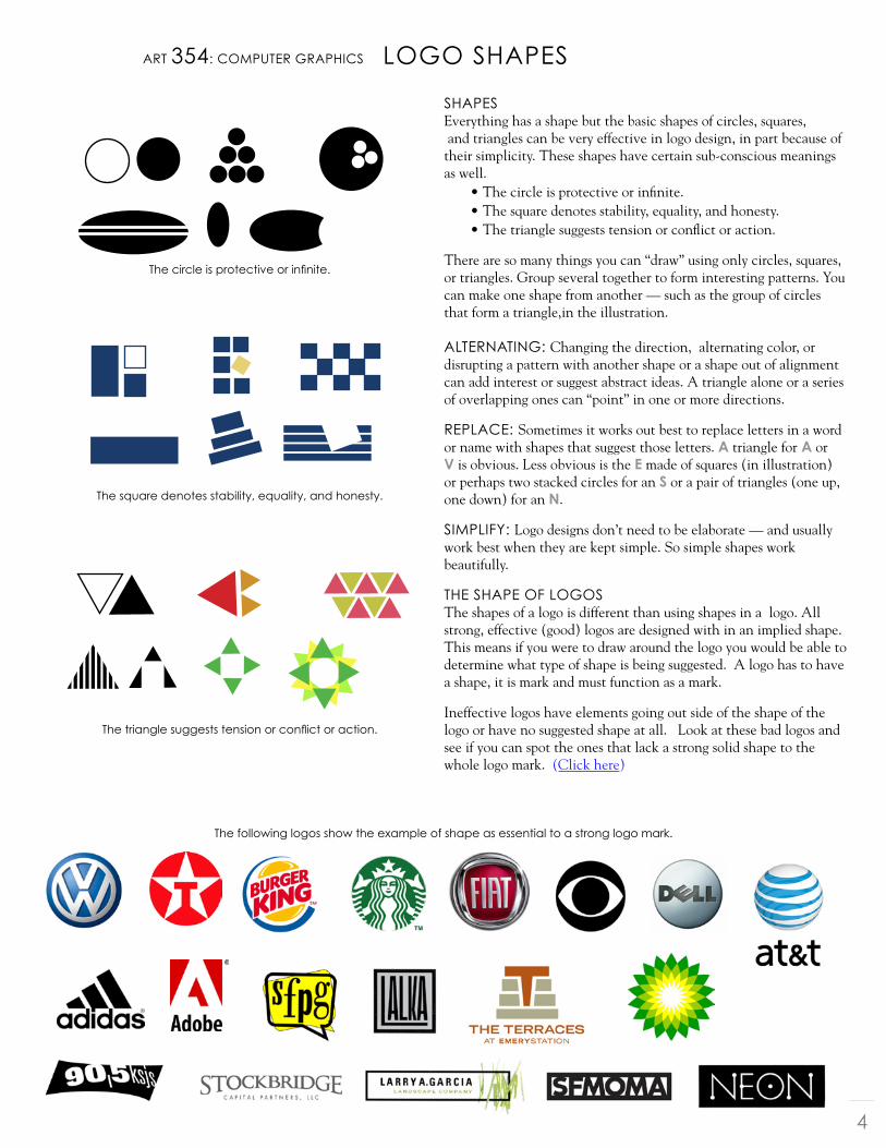
lOGO shapesart 354: cOmputer Graphics
The circle is protective or infinite.
the square denotes stability, equality, and honesty.
The triangle suggests tension or conflict or action.
the following logos show the example of shape as essential to a strong logo mark.
shapesEverything has a shape but the basic shapes of circles, squares, and triangles can be very effective in logo design, in part because of their simplicity. These shapes have certain sub-conscious meanings as well.
• The circle is protective or infinite.• The square denotes stability, equality, and honesty.• The triangle suggests tension or conflict or action.
There are so many things you can “draw” using only circles, squares, or triangles. Group several together to form interesting patterns. You can make one shape from another — such as the group of circles that form a triangle,in the illustration. alternatinG: Changing the direction, alternating color, or disrupting a pattern with another shape or a shape out of alignment can add interest or suggest abstract ideas. A triangle alone or a series of overlapping ones can “point” in one or more directions.
replace: Sometimes it works out best to replace letters in a word or name with shapes that suggest those letters. a triangle for a or V is obvious. Less obvious is the e made of squares (in illustration) or perhaps two stacked circles for an S or a pair of triangles (one up, one down) for an n.
simpliFy: Logo designs don’t need to be elaborate — and usually work best when they are kept simple. So simple shapes work beautifully.
the shape OF lOGOsThe shapes of a logo is different than using shapes in a logo. All strong, effective (good) logos are designed with in an implied shape. This means if you were to draw around the logo you would be able to determine what type of shape is being suggested. A logo has to have a shape, it is mark and must function as a mark.
Ineffective logos have elements going out side of the shape of the logo or have no suggested shape at all. Look at these bad logos and see if you can spot the ones that lack a strong solid shape to the whole logo mark. (Click here)

5
Directions: Once you decide on the name for your record company, you will conduct the following steps to complete the project:
1. begin Type TreaTmenTS• 20 type treatments for each name. Make sure you adjust kerning
as needed. • 15 Choose the best 5 treatments and place one on each page.
Now come up with 2 additional changes to that type treatment (Make 3 different ideas on each page) do this for all 5. Total 15 type treatments. (Layout example to the left)
2. Thumbnail SkeTcheS: (by hand) 30 hand sketch ideas.• While you are doing your type treatments you should be coming
up with ideas for the symbol for your logo. This can be pictorial or abstract.
• Sketches by hand and use tracing paper as a way to trace images if needed. Come up with variations of the word mark. Some sketches can be symbols only, some can be lettermarks only, some can be combinations.
• Refined more detailed hand sketches. These are based on the
first set of sketches, but they have been narrowed down by the art director.
3. refine logo ideaS in The compuTer:• This is where you will scan your refined sketches and work in
illustrator to trace and create logo symbols based on your sketches. Save your scanned sketches in a folder in Dropbox called “Scan Sketches.”
• In the computer, (Illustrator) match your final symbols with your type treatments.
4. final logo deciSion: The art director will decide on the final logo. She is the client as well, so it is her decision. But it is up to the designer to convince her of the one you think is the best.
5. STaTionery SeT: You will create a 15 different ideas for a letterhead, business card and
envelop for your company brand. Save your stationery ideas as .pdfs in a folder in Dropbox called “Stationery ideas.” The Art director will decide on the best solution. (Click on the images to the left to see samples of stationery sets and business cards)
6. logo guide SheeT: You will create a sheet (11 x 17) that explains how the logo can be used and what typefaces are used. You will dictate the color choices in CMYK, RGB and Pantone.
lOGO/branD assiGnmentart 354: cOmputer Graphics
Sample SkeTcheS click here
Note: I will provide examples of branding books so you will see how they are done
and what you should say..