south jordan: fair housing equity assessment - ucdp.utah.edu
TRANSCRIPT

South Jordan: Fair Housing Equity Assessment
Prepared by
Bureau of Economic and Business Research David Eccles School of Business
University of Utah
James Wood John Downen
DJ Benway Darius Li
April 2013
[DRAFT]

S O U T H J O R D A N : F A I R H O U S I N G E Q U I T Y A S S E S S M E N T P A G E 2
TA B L E O F C O N T E N T S
Summary of Fair Housing Equity Assessment .............................................................................................. 5
Fair Housing Equity Assessment Analysis ..................................................................................................... 6
Background ......................................................................................................................................................... 7
Segregation ........................................................................................................................................................ 11
RCAP ................................................................................................................................................................. 24
Disparities in Opportunity .............................................................................................................................. 35
Lending Practices ........................................................................................................................................ 47
Appendix ........................................................................................................................................................... 55
Explanation of Opportunity Indices ........................................................................................................ 55
Index of Dissimilarity for Mortgage Denials and Approvals ........................................................... 55

S O U T H J O R D A N : F A I R H O U S I N G E Q U I T Y A S S E S S M E N T P A G E 3
TA B L E O F F I G U R E S Figure 1 Large Renter Households by City and Share of Salt Lake County Large Renter Households,
2010 ........................................................................................................................................................ 7 Figure 2 Beneficiaries of Social Security Disability by Zip Code in Salt Lake County, 2010 ............... 10 Figure 3 Dot Density of Salt Lake County Minority Population by Census Block, 2000 and 2010 . 13 Figure 4 Percent of Minority Population by Tract in South Jordan, 2000 and 2010 ............................. 13 Figure 5 Minority Owner-Occupied Units in South Jordan, 2010 ........................................................... 14 Figure 6 Share of Owner-Occupied Units in South Jordan Occupied by Minority Household, 2010
............................................................................................................................................................... 15 Figure 7 Minority Owner-Occupied Units and Proximity to Low-Wage Jobs in South Jordan, 2010
............................................................................................................................................................... 16 Figure 8 Minority Renter-Occupied Units by Tract in South Jordan, 2010 ............................................ 17 Figure 9 Minority Share of Renter-Occupied Units by Tract in South Jordan, 2010 ............................ 18 Figure 10 Minority Renter-Occupied Units and Proximity to Low-Wage Jobs in South Jordan, 2010
............................................................................................................................................................... 19 Figure 11 Single-Family Homes Affordable at 80% AMI in South Jordan, 2011 .................................. 21 Figure 12 Dissimilarity Index for Minorities in Salt Lake County, 2010 ................................................. 23 Figure 13 Poor by Census Tract in South Jordan, 2010............................................................................. 25 Figure 14 Racially Concentrated Areas of Poverty in Salt Lake County.................................................. 25 Figure 15 Concentrations of Poverty and Minority Majority by Tract in Salt Lake County, 2007–
2011 ...................................................................................................................................................... 26 Figure 16 Concentrations of Poverty and Hispanics by Tract in Salt Lake County, 2007–2011 ......... 27 Figure 17 Concentrations of Poverty and Minorities by Tract in Salt Lake County, 2007–2011 ........ 27 Figure 18 Subsidized Apartment Projects in Salt Lake County, 2011 ...................................................... 28 Figure 19 Section 8 Vouchers in South Jordan, 2011 ................................................................................. 28 Figure 20 Individuals Receiving Public Assistance by Zip Code, 2012 ................................................... 30 Figure 21 Number of Large Families by Zip Code Receiving Public Assistance, 2012 ........................ 31 Figure 22 Disabled Recipients Receiving Public Assistance by Zip Code, 2012 .................................... 32 Figure 23 Hispanic Recipients of Public Assistance by Zip Code, 2012 ................................................. 33 Figure 24 Percent of Individuals Residing in a Zip Code Receiving Public Assistance, 2010 ............. 34 Figure 25 Opportunity Index by Census Tract in South Jordan .............................................................. 35 Figure 26 Childcare Centers in Salt Lake County, 2010 ............................................................................. 36 Figure 27 Free/Reduced Lunch Eligibility in South Jordan, 2011 ........................................................... 37 Figure 28 Share of Students Proficient in Language Arts in South Jordan Public Schools, 2011 ....... 38 Figure 29 Share of Students Proficient in Science in South Jordan Public Schools, 2011.................... 38 Figure 30 Minority Share of Enrollment in Public Schools in South Jordan, 2011 ............................... 39 Figure 31 Share of Students with Parents of Limited English Proficiency in South Jordan, 2010...... 39 Figure 32 Total Minority Enrollment Changes, 2007–2011 ...................................................................... 41 Figure 33 Minority Enrollment Percentage Change, 2007–2011 .............................................................. 42 Figure 34 Percent of Students with LEP Parents, 2010 ............................................................................. 43 Figure 35 Assessed Value of Detached Single-Family Homes in South Jordan, 2011 .......................... 44 Figure 36 Share of Foreclosed Owned Housing Units, 2008–2012 ......................................................... 46 Figure 37 Approval Rates (Total and Conventional Loans) with Loan Type Composition in South
Jordan, 2006–2011 ............................................................................................................................. 47 Figure 38 Percent of High-Interest Loans by Income Level in South Jordan, 2006–2011 .................. 47 Figure 39 Approval Rates by Income Level and Race/Ethnicity in South Jordan, 2006–2011 .......... 48

S O U T H J O R D A N : F A I R H O U S I N G E Q U I T Y A S S E S S M E N T P A G E 4
Figure 40 Percent of Applications for Properties in Daybreak and Neighboring Areas in South Jordan, 2006–2011 ............................................................................................................................. 48
Figure 41 Percent of Total/Approved Applications for Properties in Daybreak and Surrounding Areas in South Jordan, 2006–2011 .................................................................................................. 49
Figure 42 Median Loan Amount and Income of Approved Applicants in South Jordan, 2006–2011 ............................................................................................................................................................... 49
Figure 43 Mortgage Application Outcomes by Race/Ethnicity and Neighborhood, and Housing Period ................................................................................................................................................... 50
Figure 44 Cumulative Distribution of Applications and Denials across Income Levels by Race/Ethnicity in South Jordan, 2006–2011 ................................................................................. 51
Figure 45 Primary Denial Reason by Race/Ethnicity in South Jordan, 2006–2011 .............................. 52 Figure 46 Cumulative Distribution of Applications and Approvals by Income and Race/Ethnicity in
South Jordan, 2006–2011 .................................................................................................................. 53
L I S T O F TA B L E S Table 1 Demographic Trends for Protected Classes South Jordan, 1990–2010 ...................................... 8 Table 2 Demographic Trends for Protected Classes (Absolute Change), 1990–2010 ............................ 8 Table 3 Demographic Trends for Protected Classes (Percent Change), 1990–2010 ............................... 8 Table 4 Average Household Size by Race/Ethnicity in South Jordan, 1990–2010 ................................. 9 Table 5 Homeownership Rate by Race/Ethnicity South Jordan, 1990–2010 ........................................ 11 Table 6 Rental Tenure Rate by Race/Ethnicity South Jordan, 1990–2010 ............................................. 11 Table 7 Total Households by Race and Ethnicity South Jordan, 1990–2010 ......................................... 12 Table 8 Rental Households by Race and Ethnicity South Jordan, 1990–2010 ....................................... 12 Table 9 Predicted Racial/Ethnic Composition Ratio South Jordan ........................................................ 20 Table 10 Fair Share Affordable Housing Index South Jordan .................................................................. 20 Table 11 Dissimilarity Index .......................................................................................................................... 22 Table 12 Number and Share of Poor Persons by Race and Ethnicity in South Jordan, 2010 ............. 24 Table 13 Poor in South Jordan by Race and Ethnicity, 2010 .................................................................... 24 Table 14 Distinct Individuals on Public Assistance, 2007–2012 .............................................................. 29 Table 15 Large Family Households on Public Assistance, 2007–2012 .................................................... 31 Table 16 Disabled Individuals on Public Assistance, 2007–2012 ............................................................. 32 Table 17 Hispanic Individuals on Public Assistance, 2007–2012 ............................................................. 33 Table 18 Weighted, Standardized Opportunity Index................................................................................ 35 Table 19 South Jordan School Opportunity ................................................................................................ 37 Table 20 Enrollment Percentage by Race in Public Schools, 2011 .......................................................... 40 Table 21 Foreclosed Homes in Salt Lake County, 2008–2012 ................................................................. 45 Table 22 Indices of Dissimilarity for Denials & Approvals by Race/Ethnicity in South Jordan, 2006–
2011 ...................................................................................................................................................... 53

S O U T H J O R D A N : F A I R H O U S I N G E Q U I T Y A S S E S S M E N T P A G E 5
S U M M A RY O F FA I R H O U S I N G E Q U I T Y A S S E S S M E N T Background
The new housing construction in Daybreak has contributed significantly to the increase in South Jordan’s housing stock, which nearly doubled from 2000 to 2010.
Minorities constituted only 8.3 percent of the city’s net population growth from 1990 to 2000, but they accounted for a fifth of the city’s growth in the following decade.
Segregation
Minorities accounted for nearly 14 percent of the growth in total households in South Jor-dan from 2000 to 2010, but represented nearly 18 percent of the growth in rental households during this time period.
More than a third of minority owner-occupied units are in the Daybreak community, which has nearly 40 percent of the city’s single-family homes that are affordable at the 80 percent AMI level. On the other hand, 40 percent of minority rental units are on the easternmost part of South Jordan, which only has 1.8 percent of the city’s affordable single-family homes at the 80 percent AMI level.
RCAP/ECAP
The overall poverty rate in South Jordan in 2010 was one of the lowest in the county at un-der 2 percent. However, a minority resident was twice as likely to be poor as a non-Hispanic white resident.
The city has no racially or ethnically concentrated areas of poverty, or any concentrations of minorities or Hispanics more than 10 percentage points above the county average.
Disparities in Opportunity
HUD provided an opportunity index that aggregated a variety of factors such as school pro-ficiency, job access, poverty, and housing stability. Overall, South Jordan received one of the highest scores of 8 out of 10, which is 3.1 points above the county average.
The schools in South Jordan also score highly in terms of access to opportunity, with 80 percent of the ranked schools scoring a 9 or 10, the highest possible scores.
The assessed single family home values in the city are generally high, above $250,000, with few home values affordable to low- and limited-income families. As a result, even though there is tremendous access to opportunity in the city, not many protected classes live in, or are able to afford to live in, South Jordan.

S O U T H J O R D A N : F A I R H O U S I N G E Q U I T Y A S S E S S M E N T P A G E 6
FA I R H O U S I N G E Q U I T Y A S S E S S M E N T A N A LY S I S South Jordan has seen a significant increase in its minority population in the last decade. A majority of this can be attributed to the newest housing community of Daybreak. This area has contributed to a significant increase in the city’s housing stock, and also prompted an addition of the TRAX line into this west community, helping to connect this western area to the rest of the valley. This area includes homes, shopping, businesses parks, a University of Utah Medical Center, and is basically a smaller city center within the city of South Jordan. This area offers a wide range of employment opportunities, transportation options and amenities and services for the residents themselves, but also has public transit options to connect to other community and urban areas throughout the valley via TRAX. More than a third of minority owner-occupied units are in the Daybreak community. On the other hand, 40 percent of minority rental units are on the easternmost part of South Jordan. The southern part of Daybreak has several bus routes that service connections to a TRAX station. However, South Jordan does not have any bus routes that provide direct service from Daybreak to the com-mercial centers on the east side of the city, where most of the low-wage employment centers are lo-cated. This creates a dichotomous situation where residents of the Daybreak area can live and work in their community, but are disconnected from other more urban, commercial and residential cen-ters within the city itself. The same is true for low-income and minority residents in South Jordan, who are disconnected from the schools, employment opportunities and transportation options avail-able in Daybreak. While the development of commercial centers in the Daybreak community will create another low-wage employment center in South Jordan, a more complete public transportation infrastructure bridging Daybreak with other South Jordan neighborhoods could allow for more mo-bility and opportunities throughout the entire city. The access to opportunity is high in all census tracts within South Jordan, which certainly contrib-utes to the low rate of poverty. However, much of the city is disconnected from itself due to a lack of intra-city transportation options. Also, the lower-opportunity tracts tend to have lower home values, while higher-opportunity tracts have higher opportunity (the one major exception being the tract with Daybreak). As a result, a majority of South Jordan’s protected classes are only able to af-ford to live in the lower-opportunity areas, making it more difficult for them to travel into other tracts from employment, education, healthcare and other amenities. In this sense, there are still dis-parities in the opportunities available to low-income and minority households within the city. With the construction of the Daybreak neighborhood South Jordan effectively created a small micro
urban center on the western half of the city. In many other cities in the county the far western por-
tions of the city are largely residential without much commercial activity. However, the community
of Daybreak offers adequate sized homes for larger households, food, shopping, employment and
even healthcare. However, even with the introduction of the TRAX line running to Daybreak there
is still a lack of public transportation options. More specifically, there are few bus routes running
east-west in the city. This can be an impediment to a low-income or minority individual who would
like to find housing in or near Daybreak but relies on public transit to commute to work on the east
side. As a result, public transportation and bus routes are a key aspect in the effort to promote fair
and equitable housing in South Jordan.

S O U T H J O R D A N : F A I R H O U S I N G E Q U I T Y A S S E S S M E N T P A G E 7
BAC KG RO U N D South Jordan’s housing units nearly doubled from 2000 to 2010, mostly due to the new housing construction in Daybreak, the residential community between Mountain View Corridor and Banger-ter Highway. Table 1 shows the demographic trends in South Jordan from 1990 to 2010 for select-ed protected classes. The minority share of the city’s population nearly quadrupled from 3.2 percent in 1990 to 12 percent in 2010. While minorities accounted for 8.3 percent of the net population growth in the city from 1990 to 2000, they represented a fifth of the city’s growth in the last decade. The share of households with children under 18 decreased from 68 percent in 1990 to 51 percent in 2010. At the same time the share of households with persons 65 and over in-creased from 11.5 percent in 1990 to 17 percent in 2010. Single-parent households with children have experienced a slight uptick from 4.7 percent in 1990 to 5.3 percent in 2010. Figure 1 shows each city’s share of Salt Lake County’s large rental households, which are defined as having five or more persons. Over a fifth of the county’s large rental house-holds reside in Salt Lake City. The six entitlement cities—Salt Lake City, West Valley City, Taylorsville, West Jordan, Sandy, and South Jordan—constitute nearly 64 percent of the county’s large rental house-holds. Only 2.6 percent of large rental households reside in South Jordan. The non-entitlement cities in the south-ern and eastern regions of the county each have very minimal county shares. Although not pictured in Figure 1, the unincorpo-rated areas are home to nearly 14 percent of the county’s large rental households.
Figure 1
Large Renter Households by City and Share of Salt
Lake County Large Renter Households, 2010

S O U T H J O R D A N : F A I R H O U S I N G E Q U I T Y A S S E S S M E N T P A G E 8
Table 1
Demographic Trends for Protected Classes
South Jordan, 1990–2010
1990 2000 2010
Count Share Count Share Count Share
Total Population 12,220
29,437
50,418
White (not Hispanic) 11,833 96.8% 27,606 93.8% 44,387 88.0%
Black (not Hispanic) 7 0.1% 80 0.3% 316 0.6%
Asian1 81 0.7% 297 1.0% 1,295 2.6%
Hispanic/Latino 252 2.1% 962 3.3% 3,008 6.0%
Minority (all except non-Hispanic white) 387 3.2% 1,831 6.2% 6,031 12.0%
Persons with disabilities1 — — 2,628 ± 251
9.8% ± 0.9%
3,466 ± 524
7.7% ± 1.1%
Total Households 2,829
7,507
14,333
Households with Children under 18 years 1,928 68.2% 4,652 62.0% 7,335 51.2%
Households with Persons 65 years or over 326 11.5% 990 13.2% 2,486 17.3%
Single Parent with Children under 18 years 133 4.7% 313 4.2% 760 5.3%
Large Families (5 or more persons) 1,251 44.2% 2,694 35.9% 4,028 28.1%
Owner-occupied Housing Units 2,576 91.1% 6,734 89.7% 12,137 84.7%
Renter-occupied Housing Units 253 8.9% 773 10.3% 2,196 15.3% 1 The Asian population was tabulated by aggregating all the Asian races in the 1990 Census Summary Tape File 1A. This methodology was used
into order to disaggregate the Asian and Pacific Islander populations, which were tabulated as one group in the 1990 Census. However, the
individual Asian races were not disaggregated by Hispanic origin in the 1990 Census Summary Tape File 1A, so an overlap could exist between
the 1990 tabulations for the Asian and Hispanic/Latino populations. This overlap is most likely very small given the relatively few Hispanic
Asians in the total population. Note that the Asian category in the table above for 2000 and 2010 are non-Hispanic given the availability of
disaggregation by Hispanic origin for the Asian population—separate from the Pacific Islander population—since Census 2000.
2 The disability data account for only the population ages 5 and older, since Census 2000 did not gather disability data on the population under
5. The 2010 data was derived from the 2009-2011 American Community Survey 3-year estimates by aggregating only the age groups older
than 5. The margins of error for the disability data are associated with 90% confidence intervals. The margin of error for the 2010 data was
recalculated to account for only the population ages 5 and older. The margin of error for the 2000 data was calculated using the methodology
described in the Census 2000 Summary File 3 Technical Documentation. Despite these adjustments to make the 2000 and 2010 data
encompass the same age groups, these two data points are not comparable given changes in survey design and revisions in the definition of
disability.
Source: U.S. Census Bureau
Table 2
Demographic Trends for Protected Classes (Absolute Change), 1990–2010
Table 3
Demographic Trends for Protected Classes
(Percent Change), 1990–2010
1990–2000
2000–2010
1990–2000
2000–2010
Total Population 17,217 20,981 Total Population 140.9% 71.3%
White (not Hispanic) 15,773 16,781 White (not Hispanic) 133.3% 60.8%
Black (not Hispanic) 73 236 Black (not Hispanic) 1042.9% 295.0%
Asian (not Hispanic) 216 998 Asian (not Hispanic) 266.7% 336.0%
Hispanic/Latino 710 2,046 Hispanic/Latino 281.7% 212.7%
Minority 1,444 4,200 Minority 373.1% 229.4%
Total Households 4,678 6,826 Total Households 165.4% 90.9%
Households with Children <18 2,724 2,683 Households with Children <18 141.3% 57.7%
Households with Persons 65+ 664 1,496 Households with Persons 65+ 203.7% 151.1%
Single Parent with Children < 18 180 447 Single Parent with Children < 18 135.3% 142.8%
Large Families (5+ persons) 1,443 1,334 Large Families (5+ persons) 115.3% 49.5%
Owner-occupied Housing Units 4,158 5,403 Owner-occupied Housing Units 161.4% 80.2%
Renter-occupied Housing Units 520 1,423 Renter-occupied Housing Units 205.5% 184.1%
Source: U.S. Census Bureau Source: U.S. Census Bureau

S O U T H J O R D A N : F A I R H O U S I N G E Q U I T Y A S S E S S M E N T P A G E 9
Table 4 lists the average house-hold sizes in South Jordan by race and ethnicity. The citywide aver-age household size steadily de-creased from 4.3 in 1990 to 3.52 in 2010. Interestingly, the non-Hispanic white average household size was slightly larger than that of Hispanics in 1990. However, in the next 20 years, the average household size declined for non-Hispanic whites more rapidly than for Hispanics. In 2010, Hispanics/Latinos and Pacific Islanders had the highest average household sizes—3.89 and 5.73, respectively. The higher average household sizes among minority groups could pose diffi-culties in finding affordable and suitable rental locations as well as incurring higher rent burdens. Thus, limited selection and af-fordability of rental units with three or more bedrooms could disproportionately affect minority groups, especially Hispan-ic/Latino and Pacific Islander res-idents.
Table 4
Average Household Size by Race/Ethnicity in
South Jordan, 1990–2010
Race/Ethnicity 19901 2000 2010
White (not Hispanic) 4.30 3.91 3.48
Hispanic/Latino 4.22 4.20 3.89
American Indian (not Hispanic) 3.675 —4 —4
Asian/Pacific Islander (not Hispanic) 4.125 4.68 4.05
Asian2 3.335 4.03 3.62
Pacific Islander2 5.505 7.005 5.73
Black (not Hispanic) 2.005 —4 3.42
Other Race (not Hispanic) 4.005 —4 —4 Two or More Races (not Hispanic) —3 3.86 3.84
Total Population 4.30 3.92 3.52 1 The average household size was not a metric available in the 1990 Census
Summary Tape File 2B. Thus, the average household size was calculated by
taking the average of the distribution of household sizes for each
race/ethnicity. However, since the upper limit of the household size was capped at 9 or more persons, households in this group were assumed to have
9 members for the purposes of calculating the average. This methodology
could lead to slight underestimations of the actual average household size.
For 2000 and 2010, the average household size was available as a metric
without further calculation.
2 The 1990 Census Summary Tape File 2B does not further disaggregate
Asian and Pacific Islander populations by Hispanic origin. However, this lack
of detailed disaggregation in the census raw data only overcounts the total
number of households in Salt Lake County by 91, given the relatively few Hispanic Asians and Hispanic Pacific Islanders in the total population. Note
that the Asian and Pacific Islander categories for 2000 and 2010 are non-
Hispanic given the availability of disaggregation by Hispanic origin for these
two races in the last two censuses to avoid overlap with the Hispanic/Latino
population.
3 The 1990 Census did not include “Two or More Races” as an option for race.
4 The 2000 and 2010 Census did not provide average household sizes for these groups due to low numbers of households.
5 These groups have fewer than 30 households. Please refer to the exact
number of households for these groups in Table 7.
Source: U.S. Census Bureau

S O U T H J O R D A N : F A I R H O U S I N G E Q U I T Y A S S E S S M E N T P A G E 1 0
The number of disabled social security disability beneficiaries in Salt Lake County is shown in Figure 2 at the zip code level. The beneficiaries are heavily concentrated in West Valley City, Taylorsville, and Kearns as well as parts of South Salt Lake and Murray. South Jordan has higher numbers of beneficiaries than the more southern zip codes and cities, but still substantially less than the north-west.
Figure 2
Beneficiaries of Social Security Disability by Zip Code in Salt Lake County, 2010
S O U T H J O R D A N : F A I R H O U S I N G E Q U I T Y A S S E S S M E N T P A G E 1 1
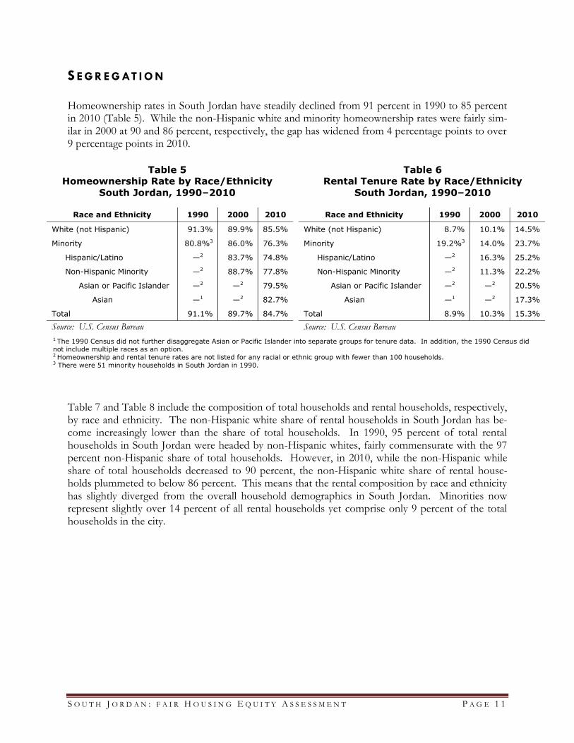
S E G R E G AT I O N Homeownership rates in South Jordan have steadily declined from 91 percent in 1990 to 85 percent in 2010 (Table 5). While the non-Hispanic white and minority homeownership rates were fairly sim-ilar in 2000 at 90 and 86 percent, respectively, the gap has widened from 4 percentage points to over 9 percentage points in 2010.
Table 7 and Table 8 include the composition of total households and rental households, respectively, by race and ethnicity. The non-Hispanic white share of rental households in South Jordan has be-come increasingly lower than the share of total households. In 1990, 95 percent of total rental households in South Jordan were headed by non-Hispanic whites, fairly commensurate with the 97 percent non-Hispanic share of total households. However, in 2010, while the non-Hispanic while share of total households decreased to 90 percent, the non-Hispanic white share of rental house-holds plummeted to below 86 percent. This means that the rental composition by race and ethnicity has slightly diverged from the overall household demographics in South Jordan. Minorities now represent slightly over 14 percent of all rental households yet comprise only 9 percent of the total households in the city.
Race and Ethnicity 1990 2000 2010
White (not Hispanic) 91.3% 89.9% 85.5%
Minority 80.8%3 86.0% 76.3%
Hispanic/Latino —2 83.7% 74.8%
Non-Hispanic Minority —2 88.7% 77.8%
Asian or Pacific Islander —2 —2 79.5%
Asian —1 —2 82.7%
Total 91.1% 89.7% 84.7%
Source: U.S. Census Bureau
Race and Ethnicity 1990 2000 2010
White (not Hispanic) 8.7% 10.1% 14.5%
Minority 19.2%3 14.0% 23.7%
Hispanic/Latino —2 16.3% 25.2%
Non-Hispanic Minority —2 11.3% 22.2%
Asian or Pacific Islander —2 —2 20.5%
Asian —1 —2 17.3%
Total 8.9% 10.3% 15.3%
Source: U.S. Census Bureau
Table 5
Homeownership Rate by Race/Ethnicity
South Jordan, 1990–2010
Table 6
Rental Tenure Rate by Race/Ethnicity
South Jordan, 1990–2010
1 The 1990 Census did not further disaggregate Asian or Pacific Islander into separate groups for tenure data. In addition, the 1990 Census did not include multiple races as an option. 2 Homeownership and rental tenure rates are not listed for any racial or ethnic group with fewer than 100 households. 3 There were 51 minority households in South Jordan in 1990.

S O U T H J O R D A N : F A I R H O U S I N G E Q U I T Y A S S E S S M E N T P A G E 1 2
Table 7
Total Households by Race and Ethnicity
South Jordan, 1990–2010
1990 2000 2010
Race and Ethnicity Number of Households
% Share
Number of Households
% Share
Number of Households
% Share
White (not Hispanic) 2,756 97.4% 7,136 95.1% 13,014 90.8%
Minority 73 2.6% 371 4.9% 1,319 9.2%
Hispanic/Latino 51 1.8% 203 2.7% 658 4.6%
Non-Hispanic Minority 22 0.8% 168 2.2% 661 4.6%
American Indian 3 0.1% — — 19 0.1%
Asian or Pacific Islander 17 0.6% 78 1.0% 429 3.0%
Asian — — 61 0.8% 341 2.4%
Pacific Islander — — 17 0.2% 88 0.6%
Black 1 0.0% — — 79 0.6%
Other Race 1 0.0% — — 12 0.1%
Two or More Races — — 57 0.8% 122 0.9%
Total 2,829 100.0% 7,507 100.0% 14,333 100.0%
Source: U.S. Census Bureau Note: For the 1990 data, the number of households by race and ethnicity of householder is not further disaggregated to
distinguish between Asian and Pacific Islander. The number of households is not disaggregated in the 2000 data for racial and
ethnic groups with low population size.
Table 8
Rental Households by Race and Ethnicity
South Jordan, 1990–2010
1990 2000 2010
Race and Ethnicity Number of Households
% Share
Number of Households
% Share
Number of Households
% Share
White (not Hispanic) 239 94.5% 721 93.3% 1,883 85.7%
Minority 14 5.5% 52 6.7% 313 14.3%
Hispanic/Latino 9 3.6% 33 4.3% 166 7.6%
Non-Hispanic Minority 5 2.0% 19 2.5% 147 6.7%
American Indian 0 0.0% — — 6 0.3%
Asian or Pacific Islander 4 1.6% 4 0.5% 88 4.0%
Asian — — 4 0.5% 59 2.7%
Pacific Islander — — 0 0.0% 29 1.3%
Black 0 0.0% — — 24 1.1%
Other Race 1 0.4% — — 3 0.1%
Two or More Races — — 7 0.9% 26 1.2%
Total 253 100.0% 773 100.0% 2,196 100.0%
Source: U.S. Census Bureau Note: For the 1990 data, the number of households by race and ethnicity of householder is not further disaggregated to
distinguish between Asian and Pacific Islander. The number of households is not disaggregated in the 2000 data for racial and
ethnic groups with low population size.

S O U T H J O R D A N : F A I R H O U S I N G E Q U I T Y A S S E S S M E N T P A G E 1 3
Figure 3
Dot Density of Salt Lake County Minority Population
by Census Block, 2000 and 2010
Figure 4
Percent of Minority Population by Tract
in South Jordan, 2000 and 2010

S O U T H J O R D A N : F A I R H O U S I N G E Q U I T Y A S S E S S M E N T P A G E 1 4
Figure 3 shows the dot density of the Salt Lake County minority population by census block for 2000 to 2010. In 2000, the highest concentrations of minorities are in Salt Lake City’s west-side River District, West Valley City, and Kearns (unincorporated area west of Taylorsville). In addition to these areas, which had even higher minorities concentrations in 2010, Cottonwood Heights, South Salt Lake, Taylorsville, and West Jordan have experienced a larger influx of minorities in the past decade. The cities in the southern end of the county have very few areas of minority popula-tions. As shown in Figure 4, the western census tracts in South Jordan have experienced the highest increases in minority share from 2000 to 2010.
Figure 5
Minority Owner-Occupied Units in South Jordan, 2010

S O U T H J O R D A N : F A I R H O U S I N G E Q U I T Y A S S E S S M E N T P A G E 1 5
Figure 5 shows the number of minority owner-occupied units by census tracts in South Jordan. Figure 6 provides the percent of owner-occupied units that are minority households. Most of the minority owner-occupied units are in the Daybreak community. The dark green census tract in Fig-ure 6 with a 13 percent minority share of the population approximates the eastern part of Daybreak.
Figure 6
Share of Owner-Occupied Units in South Jordan Occupied by Minority Household, 2010

S O U T H J O R D A N : F A I R H O U S I N G E Q U I T Y A S S E S S M E N T P A G E 1 6
Figure 7 overlays the density of low-wage jobs (in shades of purple) with the number of minority owner-occupied units. While there are new retail centers in the Daybreak area, most of the low-wage jobs are found in commercial centers on the eastern side of the city. The large dark purple re-gion with the largest number of low-wage jobs includes parts of South Jordan, Sandy, Draper, and Bluffdale. The red lines in Figure 7 represent the bus routes in the city. There are several bus routes that service the southern part of the Daybreak community with connections to the TRAX line. Two TRAX stations are conveniently located on the western part of Daybreak, providing easy access to downtown Salt Lake City. Thus, residents in Daybreak might find commuting to employment areas outside of South Jordan much more accessible via the TRAX line than traveling to the commercial centers on the other side of the city.
Figure 7
Minority Owner-Occupied Units and Proximity to Low-Wage Jobs in South Jordan, 2010

S O U T H J O R D A N : F A I R H O U S I N G E Q U I T Y A S S E S S M E N T P A G E 1 7
Figure 8 shows the number of minority renter-occupied units in South Jordan. Relatively few mi-nority rental units are in the Daybreak community. The easternmost part of the city has the highest concentration of minority rental-occupied units. This is not surprising considering the more urban nature of the eastern portion of South Jordan near I-15. However, this area is also the highest con-centration of low-wage jobs in the city (Figure 7). Therefore, households needing to live within close proximity are more likely to have rent. This is reinforced in Figure 10.
Figure 8 Minority Renter-Occupied Units by Tract in South Jordan, 2010

S O U T H J O R D A N : F A I R H O U S I N G E Q U I T Y A S S E S S M E N T P A G E 1 8
Figure 9 shows the minority share of renter-occupied units in South Jordan. The areas north of Daybreak have minority shares slightly higher than those in the Daybreak community. The census tract constituting the eastern part of Daybreak has a minority rental share of 13.4 percent, slightly below the citywide minority rental share of 14.3 percent.
Figure 9 Minority Share of Renter-Occupied Units by Tract in South Jordan, 2010

S O U T H J O R D A N : F A I R H O U S I N G E Q U I T Y A S S E S S M E N T P A G E 1 9
Figure 10 overlays the density of low-wage jobs (in shades of purple) with the number minority renter-occupied units. Most of the low-wage jobs are located in the easternmost part of the city, which also coincides with the region with the largest number of minority rental units. This region borders other low-wage employment centers in Sandy and Draper. The TRAX line services the Daybreak community but does not provide easy accessibility for residents on the east side, where the highest numbers of minority rental units are located.
Figure 10
Minority Renter-Occupied Units and Proximity to Low-Wage Jobs in South Jordan, 2010

S O U T H J O R D A N : F A I R H O U S I N G E Q U I T Y A S S E S S M E N T P A G E 2 0
Table 9 shows the ratio between predicted and actual racial/ethnic composition in South Jordan. The predicted percent of mi-nority households is the expected composi-tion based on the income distribution in the metropolitan area by race and ethnicity. The actual composition is based on the 2005-2009 American Community Survey 5-year estimates. The minority household share is severely below predicted based on this methodology. The black household share is only 9 percent of the predicted share. Table 10 compares the affordability of rental housing units in South Jordan with the met-ro area for rental prices based on AMI. Af-fordability is based on the threshold that rent would not amount to more than 30 percent of total income.
None of South Jordan’s total housing units are deemed affordable below the 30 percent AMI level. The percent of fair-share need at the 30-50 percent AMI level is 3 percent, meaning that the city’s share of affordable rental units at this income level is only 3 percent of the metro area’s share. According to HUD’s scale for the fair share affordable housing index, this means that South Jordan’s housing stock is extremely unaffordable for those with incomes ranging from 30-50 percent AMI. Similarly, the city’s housing stock is extremely unaffordable for those in the 50-80 percent AMI income bracket.
Table 10
Fair Share Affordable Housing Index
South Jordan
A B C D E F
Income Level Total
Housing Units
Number of Affordable
Rental Units
% of Affordable
Rental Units in
City (B/A)
% of Affordable
Rental Units in
Metro Area
Fair Share Need
(D × A)
% of Fair Share Need (C/D)
<30% AMI 13,102 0 0% 6% 801 0%
30%-50% AMI 13,102 45 0.3% 12% 1,514 3%
50%-80% AMI 13,102 265 2% 19% 2,474 11% Source: HUD Spreadsheet for Sustainable Communities Grantees Note: The affordability for each income level is based on the threshold that gross rent will not amount to more than 30%
of total income.
Table 9
Predicted Racial/Ethnic
Composition Ratio
South Jordan
Percent of Households
Actual/ Predicted
Ratio Actual Predicted
Minority 6.1% 11.9% 0.52
Asian 1.5% 2.0% 0.71
Black 0.1% 0.8% 0.09
Hispanic/Latino 3.6% 7.4% 0.49
Source: HUD Spreadsheet for Sustainable Communities Grantees
Actual/Predicted Ratio Scale
Value Ranges Interpretation of Actual
Share
0-0.5 Severely Below Predicted
0.5-0.7 Moderately Below Predicted
0.7-0.9 Mildly Below Predicted
0.9-1.1 Approximates Predicted
> 1.1 Above Predicted
Percent of Fair Share Need
Scale
Value Ranges Interpretation of Actual
Share
0-50% Extremely Unaffordable
50-70% Moderately Unaffordable
70%-90% Mildly Unaffordable
90%-110% Balanced Affordability
> 110% Above Fair Share, Affordable

S O U T H J O R D A N : F A I R H O U S I N G E Q U I T Y A S S E S S M E N T P A G E 2 1
Figure 11 shows the number and share of single-family homes in South Jordan census tracts that are affordable at 80% AMI in 2011. The percentages shown in Figure 12 are each census tract’s share of the total affordable homes in the city. Affordability calculations are based on 30 percent of annu-al income, accounting for taxes, home insurance, and mortgage insurance. The maximum affordable single-family home price at 80% AMI is $255,897. Nearly 40 percent of all affordable single-family homes in South Jordan are located in the census tract containing the eastern part of Daybreak (Figure 11), which has over 36 percent of minority owner-occupied units (Figure 5).
Figure 11
Single-Family Homes Affordable at 80% AMI in
South Jordan, 2011

S O U T H J O R D A N : F A I R H O U S I N G E Q U I T Y A S S E S S M E N T P A G E 2 2
Another measure of segregation is the dissimilarity index shown in Table 11. The dissimilarity indi-ces for South Jordan are below the county levels. In order for the minority and non-Hispanic white geographic distributions in South Jordan to match, 29 percent of minorities would have to move to other census blocks in the city. While the dissimilarity index itself does not provide any geospatial information about segregation, Figure 12 shows the levels of dissimilarity at the census block level.
𝐷𝑖𝑠𝑠𝑖𝑚𝑖𝑙𝑎𝑟𝑖𝑡𝑦 𝑊,𝑀 𝑗 =1
2
𝑀𝑖
𝑀𝑗
−𝑊𝑖
𝑊𝑗
𝑁
𝑖=1
where
𝑊 = non-Hispanic population
𝑀 = minority population
i = ith census block group
j = geographic area (city or county)
N = number of census blocks in geographic area 𝑗
Table 11
Dissimilarity Index
Group South Jordan Salt Lake County
Minority 0.29 0.43
Hispanic/Latino 0.36 0.50
Non-Hispanic Minority 0.37 0.41
Source: BEBR computations from 2010 Census
The dissimilarity index calculates the share of the minority group that would have to move to different census blocks in order to
match the non-Hispanic white distribution in the respective geographic area. The Salt Lake County dissimilarity index was
calculated using data from all incorporated cities and unincorporated areas.
The dissimilarity index is calculated as follows:
Dissimilarity Index
Scale Value
Ranges Interpretation
≤ 0.40 Low Segregation
0.41-0.54 Moderate Segregation
≥ 0.55 High Segregation

S O U T H J O R D A N : F A I R H O U S I N G E Q U I T Y A S S E S S M E N T P A G E 2 3
Figure 12 shows the absolute difference between each census block’s county share of the minority and non-Hispanic white population. These absolute differences are used to calculate the minority dissimilarity index in Table 11 for the county. Noticeably large dissimilarities between the minority and non-Hispanic white county shares at the block level are concentrated on the west side of Salt Lake City in River District neighborhoods. Some census blocks in West Valley City and South Salt Lake also have dissimilarities greater than 0.1 percent. The low dissimilarity in South Jordan is com-parable to the surrounding cities in the southern parts of the county.
Figure 12
Dissimilarity Index for Minorities in Salt Lake County, 2010

S O U T H J O R D A N : F A I R H O U S I N G E Q U I T Y A S S E S S M E N T P A G E 2 4
RCAP In 2010, only 640 of the 46,946 people living in South Jordan were considered poor, which equates to a mere 1.6 percent of the city’s population (Table 12). Less than 2 percent of non-Hispanic whites were poor, and a Hispanic was twice as likely to be poor than a non-Hispanic white. Overall, about 3 percent of minorities living in the city were living in poverty. The highest prevalence of poverty of any race/ethnicity was 3.3 percent among Pacific Islanders. However, this means only 9 of the 240 Pacific Islanders in the city were poor. Due to the overwhelmingly large non-Hispanic white population, poor minorities only comprised about 13 percent of the total poor population (Table 13). Most of the poor minority population was poor Hispanics, comprising about 65 percent of the poor minority population in the city.
Table 12
Number and Share of Poor Persons by
Race and Ethnicity in South Jordan, 2010
Table 13
Poor in South Jordan by Race and
Ethnicity, 2010
Poor Total % Poor
Race/
Ethnicity Persons Share
South Jordan
Black 0 86 0.0%
South Jordan
Black 0 0.0%
Native Am. 0 26 0.0%
Native Am. 0 0.0%
Asian 24 1104 2.2%
Asian 24 3.2%
Pacific Island 9 271 3.3%
Pacific Island 9 1.2%
Hispanic 62 2079 3.0%
Hispanic 62 8.4%
Total Minority 95 3566 2.7%
Total Minority 95 12.8%
White 645 43380 1.5%
White 645 87.2%
Total 740 46946 1.6%
Total Poor 740 100.0%
Source: HUD Spreadsheet for Sustainable Communities Grantees
Source: HUD Spreadsheet for Sustainable Communities Grantees
The poor residents of South Jordan primarily live to the west of 1300 West, with the densest con-centration of poor non-Hispanic whites between 1300 West and 2700 West and 10400 South and 9400 South (Figure 13). All of the poor Hispanic residents live west of 2700 west. The concentra-tion of poor people living in the city tends to get denser closer to public transportation options. There is a cluster northwest of the intersection of 2700 West and 11400 South, both of which have bus routes running along them. Similarly, there is a smaller, less concentrated group of poor resi-dents in the southwest near the end of the Daybreak TRAX line. The most sparsely populated area in the city is east of 1300 East due to the fact that there were no poor residents living west of the Daybreak TRAX line. Not surprisingly, there are no racially or ethnically concentrated areas of pov-erty as defined by HUD in the city of South Jordan (Figure 14).

S O U T H J O R D A N : F A I R H O U S I N G E Q U I T Y A S S E S S M E N T P A G E 2 5
Figure 13
Poor by Census Tract in South Jordan, 2010
Figure 14
Racially Concentrated Areas of
Poverty in Salt Lake County
HUD defines a racially/ethnically
concentrated area of poverty as a census tract with a family poverty rate greater
than or equal to 40%, or a family poverty
rate greater than or equal to 300% of the
metro tract average, and a majority non-
white population, measured at greater
than 50%.

S O U T H J O R D A N : F A I R H O U S I N G E Q U I T Y A S S E S S M E N T P A G E 2 6
The following three figures (Figure 15, Figure 16 and Figure 17) show concentrations of poverty in Salt Lake County, estimated from the 2007-2011 American Community Survey. Here, an area of poverty is considered concentrated when it has three times the countywide average share of the population living below the countywide poverty line. The countywide average is approximately 11.6 percent, so an area is considered highly concentrated when it has 34.7 percent or more of the popu-lation living in poverty. Figure 15 overlays these areas of poverty with census tracts that have mi-nority-majority populations, which are defined as having a minority share greater than 50 percent of the census tract population. Figure 16 overlays the concentrations of poverty with tracts that have a Hispanic population of 10 percentage points or more above the county’s Hispanic share of 17.1 per-cent. Figure 17, on the other hand, overlays the concentrated areas of poverty with a county map showing the census tracts where the minority population is 10 percentage points above the county average of 26 percent. In all cases, the concentrated areas of poverty are along Interstate 15 in Salt Lake City. None of the concentrations are in the city of South Jordan. Not surprisingly, there are no concentrations of Hispanic or minority residents higher than 10 percentage points above the county average, let alone any tracts with a minority-majority. None of this is surprising, considering the low poverty and minority resident rate in the city (Table 12).
Figure 15
Concentrations of Poverty and Minority Majority by Tract in Salt Lake County, 2007–2011

S O U T H J O R D A N : F A I R H O U S I N G E Q U I T Y A S S E S S M E N T P A G E 2 7
Figure 16
Concentrations of Poverty and
Hispanics by Tract in Salt Lake
County, 2007–2011
Figure 17
Concentrations of Poverty and
Minorities by Tract in Salt Lake
County, 2007–2011

S O U T H J O R D A N : F A I R H O U S I N G E Q U I T Y A S S E S S M E N T P A G E 2 8
Figure 18 maps all the subsidized apartment projects in Salt Lake County. A majority of the projects, especially project-based units, are located in the central and northern ends of the county. As a result, there are no any subsidized apartment projects in the city. There is, however, a larger-sized tax-credit unit in northern Herriman, right along the border of South Jordan. This unit is relatively close to the end of the Daybreak TRAX line, as well as along bus routes that lead into South Jordan. The next closest units are in southwestern West Jordan, one in southern Sandy, and one in northern Draper, all of which are also tax credit units. Considering South Jordan’s low rate of poverty, the lack of subsidized apartment projects is not surprising. However, when considering the high potential access to opportunity in the city for residents (Figure 17), the low prevalence of economically disadvantage families may not be due to self-selection, but rather a lack of adequate and affrodable housing options.
Just as there were not many poor residents in South Jordan in 2010 (Table 12), there were not many Section 8 vouchers used in the city in 2011 either (Figure 19). Overall, there were only seven vouchers used. Most of the vouchers were also used near public transit options, whether TRAX or major bus routes, like the ones running along the South Jordan Parkway and Redwood Road. The one clear exception is the Salt Lake City HA voucher used near the intersection of 10200 South and 4000 West, right in the middle of the city near Elk Ridge Middle School. The low number of vouchers being used in the city could indicate either a lack of desire for low-income families to want to live in the city, or it could represent a higher cost of living and home value prices that continue to discriminate against the low-income and protected classes.
Figure 18
Subsidized Apartment Projects in Salt
Lake County, 2011
Figure 19 Section 8 Vouchers in South Jordan, 2011

S O U T H J O R D A N : F A I R H O U S I N G E Q U I T Y A S S E S S M E N T P A G E 2 9
Table 14 displays the number of individuals receiving public assistance in South Jordan disaggregat-ed by city and zip code. Each count in 2007 and 2012 is a distinct individual living in that zip code receiving assistance from a state program such as food stamps, Temporary Assistance for Needy Families (TANF) or any other financial, medical or child care services from the Department of Workforce Services (DWS). DWS estimates its services capture at least 70 percent of all poor living in these areas; the other 30 percent may be living in poverty, but are not using any form of public assistance. The number of recipients in South Jordan more than doubled from 2007 to 2011 with almost 4,500 additional recipients in 2012. The number of individuals receiving public assistance in 2012 is mapped in Figure 20 by zip code. Each zip code with fewer than ten recipients was sup-pressed in the data set, and each zip code without any residences or missing data are also removed. It should be noted that the zip codes used in the map are based on total population from the U.S. Census Bureau’s “zip code tabulation areas” (ZCTAs), which do not exactly correspond to the zip code boundaries used by DWS. Regardless, the general trends of public assistance recipients as a can be seen. Overall, the number of recipients ranged from under 10 to over 18,000 in a single zip code in 2012. South Jordan, along with other centrally located cities and zip codes, ranged in the middle in terms of number of individuals receiving public assistance. Much like the other southern cities, South Jordan has relatively few public assistance recipients, with significantly less than the northwestern cities and zip codes.
Table 14
Distinct Individuals on Public Assistance, 2007–2012
City Zip
Code 2007
Individuals 2012
Individuals Absolute
Change Percentage
Change
South Jordan 84095 2,196 4,451 2,255 102.7%
Salt Lake County 146,699 215,426 68,727 46.8%
Source: BEBR Calculations from Utah DWS Data

S O U T H J O R D A N : F A I R H O U S I N G E Q U I T Y A S S E S S M E N T P A G E 3 0
Figure 20 Individuals Receiving Public Assistance by Zip Code, 2012

S O U T H J O R D A N : F A I R H O U S I N G E Q U I T Y A S S E S S M E N T P A G E 3 1
Table 15 uses the same DWS data on public assistance to calculate the number of large family households on public assistance in 2007 and 2012. A large family size is classified as a household of five or more individuals living together. Countywide, the number of large families receiving public assistance increased about 61 percent over the five year period. South Jordan’s large family recipi-ents more than doubled but still only added just fewer than 650 more recipients in 2012. Figure 21 displays the concentrations of these large families by zip code in Salt Lake County. Again, South Jordan characteristics are more like the other southern cities than those to the north with fewer re-cipients than West Jordan and Taylorsville, but still more than Sandy or northeastern Salt Lake City.
Table 15
Large Family Households on Public Assistance, 2007–2012
City Zip
Code
2007 Family Size ≥5
2012 Family Size ≥5
Absolute Change
Percentage Change
South Jordan 84095 568 1,209 641 112.9%
Salt Lake County 30,473 49,019 18,546 60.9%
Source: BEBR Calculations from Utah DWS Data
Figure 21
Number of Large Families by Zip Code Receiving Public Assistance, 2012

S O U T H J O R D A N : F A I R H O U S I N G E Q U I T Y A S S E S S M E N T P A G E 3 2
Table 16 shows the number of disabled individuals receiving public assistance in 2007 and 2012. To be considered disabled and on public assistance by DWS standards, each individual must be receiv-ing financial assistance and have a verified condition by the Medical Review Board. Between 2007 and 2012, South Jordan saw a 51 percent increase in the number of disabled residents on public as-sistance. Figure 22 maps the number of disabled individuals on public assistance in 2012 in Salt Lake County by zip code. In 2012, there were 446 total disabled recipients in the zip code covering most of South Jordan, which is substantially less than the northwestern zip codes in west Salt Lake City and West Valley City, but higher than many of the southern and eastern zip codes. This could, however, be due to a higher number of residents in this zip code than the others further south.
Table 16
Disabled Individuals on Public Assistance, 2007–2012
City Zip
Code 2007
Disabled 2012
Disabled Absolute
Change Percentage
Change
South Jordan 84095 295 446 151 51.2%
Salt Lake County 21,460 25,942 4,482 20.9%
Source: BEBR Calculations from Utah DWS Data
Figure 22
Disabled Recipients Receiving Public Assistance by Zip Code, 2012

S O U T H J O R D A N : F A I R H O U S I N G E Q U I T Y A S S E S S M E N T P A G E 3 3
Table 17 uses the DWS data for the number of Hispanic individuals who received public assistance from the state in 2007 and 2012. In South Jordan, 106 more Hispanics were on public assistance in 2012, for a 46 percent increase, while 8,000 more Hispanics individuals in the county received public assistance in 2007 than 2012, about a 20 percent increase. Figure 23 maps the number of Hispanic recipients in 2012 by zip code in Salt Lake County. Even though the number in Hispanic individuals receiving assistance increased, the 339 total Hispanic recipients in South Jordan’s zip code was still relatively low.
Table 17
Hispanic Individuals on Public Assistance, 2007–2012
City Zip
Code 2007
Hispanic 2012
Hispanic Absolute
Change Percentage
Change
South Jordan 84095 233 339 106 45.5%
Salt Lake County 37,911 46,019 8,108 21.4%
Source: BEBR Calculations from Utah DWS Data
Figure 23
Hispanic Recipients of Public Assistance by Zip Code, 2012

S O U T H J O R D A N : F A I R H O U S I N G E Q U I T Y A S S E S S M E N T P A G E 3 4
Figure 24 maps the percentage of individuals receiving public assistance in each zip code in Salt Lake County. Though the ZCTAs do not exactly correspond to the zip code boundaries used by DWS the general trends of public assistance recipients as a share of the regions population can be seen. Again, there is a clear difference between the east and west sides of Interstate 15, and even more so between the northwestern and southeastern regions. Much higher proportions of the populations in the northwest and west are recipients of some form of public assistance from the state. South Jor-dan’s share of the population receiving public assistance is quite low, in some cases even lower than its southern neighbors. In this sense, South Jordan has a very low overall prevalence of residents on public assistance.
Figure 24
Percent of Individuals Residing in a Zip Code Receiving Public Assistance, 2010

S O U T H J O R D A N : F A I R H O U S I N G E Q U I T Y A S S E S S M E N T P A G E 3 5
D I S PA R I T I E S I N O P P O R T U N I T Y HUD provided six measurements of opportunity for each census tract with which to quantify the number of important “stressors” and “assets” that influence the ability of an individual or family to access and capitalize on opportunity. These six measures were aggregated to the city level using the population of each census tract within the city boundaries of South Jordan received an overall op-portunity score of 8 out of 10, just over 3 points higher than the county average (Table 18). Only one of the composite index scores for South Jordan averaged less than the county, the index for job access, which scored 4.1 to the county’s 5.4. This is most likely due to the suburban, less commer-cial zoning of South Jordan, and low number of public transportation options. Despite this, the la-bor market engagement index scored a 6.0, a full point higher than the county average, indicating many residents probably are not relying on public transit for work. School proficiency and housing stability each also score well, both at almost an 8, while the poverty index scored the highest of 8.5, 3.6 points higher than the county average. Overall, South Jordan as a whole scored very highly in terms of access to opportunity. However, very few residents are of the protected classes, who have the highest need for the opportunity to capitalize on the assets of the city. With so little subsidized housing (Figure 18 and Figure 19) much of the reason could be due to inadequate housing for large families, most of whom are overwhelmingly minorities and low-income.
Table 18
Weighted, Standardized Opportunity Index
School Proficiency
Job Access
Labor Market
Engagement Poverty Housing Stability Opportunity
South Jordan 7.8 4.1 6.0 8.5 7.6 8.0
Salt Lake County 4.3 5.4 5.0 4.9 5.3 4.9
Source: HUD Spreadsheet for Sustainable Communities Grantees
As Figure 25 illustrates, every census tract in the city of South Jordan scored an overall opportunity score of 6 or higher. The lowest performing tract is in the northeast corner, above 10200 South, which in-cludes Welby Elementary and the Glenmore Golf course. The south-central three tracts below 10200 South, between Bangerter Highway and the Jordan River scored in the midrange for the city, between a 7 and 8. The rest of the tracts scored at least a 9, with three of them scoring a full 10 points on HUD’s Opportunity Index. Overall, the entire city of South Jordan provides many well developed as-sets providing families with and access to capitalize on opportunity. This is only concerning due to the low prevalence of low-income and minority resi-dents (Table 12) as they are the ones in most need of access to this opportunity. Yet, so few of these protected classes are living in South Jordan and are unable to take advantage of the opportunities pre-sent there.
Figure 25
Opportunity Index by Census Tract in South Jordan

S O U T H J O R D A N : F A I R H O U S I N G E Q U I T Y A S S E S S M E N T P A G E 3 6
Figure 26 maps the active childcare centers in Salt Lake County by size. The larger the dot is on the map, the higher the maximum capacity of the center. Access to daycare can be considered an ad-vantage in terms of fair and equitable housing as well as access to opportunity for many reasons. For one, if a household relies on low-wage jobs for stability, it is valuable to have affordable child-care so that adults are able to earn income for their families. Similarly, without access to childcare, more parents will be forced to stay at home with their children, thereby forgoing potential earned wages. This is especially important for Hispanics, who on average have larger household sizes than their non-Hispanic white counterparts (Table 4). As a result, a lack of adequate childcare can restrict a family’s mobility and time they can invest in opportunities outside the home, presenting an imped-iment to housing choice for minorities, larger families, and low-income households. As it can be seen in Figure 26, there are a few large-capacity childcare facilities and a few small centers located in the city. Two of the larg-est centers are located in close proximity to the community of Daybreak, an area flush with trans-portation options and a large number of minority residents (Figure 5 and Figure 8). There are also childcare centers along bus routes in the eastern tracts of the city in high-opportunity areas (Figure 25), also along bus routes. However, many of the central tracts of South Jordan do not have bus routes or childcare cen-ters. This can result in an impediment to fair and equitable housing for families, especially for the protected classes, who might require childcare in these neighborhoods. Similarly, for the resi-dents who are able to lo-cate housing in this area, it can result in forgone opportunity from em-ployment as members of the household night have to remain in the home to take care of the children.
Figure 26
Childcare Centers in Salt Lake County, 2010
Each dot represents childcare centers only and does not include any licensed family or
residential certificate providers. Those providers are protected under GRAMA and their
location is not public information. However, each licensed provider in a private residence may have up to 8 children in their care.

S O U T H J O R D A N : F A I R H O U S I N G E Q U I T Y A S S E S S M E N T P A G E 3 7
As a further assessment opportunity in South Jordan, an index is created as a representation of op-portunity within K-12 public schools in Salt Lake County. This is done by summing two normal-ized, positive indicators: percent proficiency in language arts and science for elementary, middle and high schools. Subtracted from this indicator is the summation of four negative proxies for home environment and educational quality: free and reduced lunch percentage, percentage of minority students, percentage of students with limited English proficiency parents/guardians and average classroom size. Each school containing data on all of these indicators is then ranked based on their normalized index score by the county. From there, the ranking is split into decile ranks across the county, with a score of 10 representing the highest opportunity score. Overall, there are 204 schools with complete data on all the indicators, of which there are 10 ranked, and 2 unranked schools in South Jordan (Table 19). The lowest-scoring school Bingham High, scores a 6 is ranked 122nd of the 204 ranked schools. In fact, only two of all ranked schools in South Jordan are not ranked in the top 20 percent of all public schools in the county. The high-est-ranked school, Jordan Ridge School is ranked the 6th best in the county, and three other schools also scored a ten in the school opportunity index. Over-all, the public schools in South Jordan provide lots of access for individuals to capitalize on op-portunity within the public school system.
The following five figures (Figure 27, Figure 28, Fig-ure 29, Figure 30 and Figure 31) each depict most the elements of the school opportunity index, the excep-tion being the exclusion of class size due to the minute changes between schools. Not surprisingly, there are no Title I schools in the city, and the prevalence of both minority students and students with limited English proficient parents/guardians are low. However, the proficiency scores in langauge arts and science are all above 85 percet (with only Bingham High scoring lower on language arts). Overall, all schools in South Jordan, regardless of geographic location are flush with opportunity for all students. Once again however, it is not the innate opportunieis that exist in South Jordan that weakens equitable housing, but the lack of minorities, low-income and other protected classes that actually live in the city. Even though these school offer opportunities to succeed, they are also lacking access in enrollment.
Table 19
South Jordan School Opportunity
District School County
Ranking Opportunity
Index
Jordan Bingham High 83 6
Jordan Elk Ridge Middle 69 7
Jordan Monte Vista School 28 9
Jordan Elk Meadows School 26 9
Jordan South Jordan School 24 9
Jordan South Jordan Middle 23 9
Jordan Welby School 15 10
Jordan Eastlake School 14 10
Jordan Daybreak School 11 10
Jordan Jordan Ridge School 7 10
Jordan Rivers Edge School — —
Jordan Valley High School — —
Source: BEBR computations from Utah State Office of Education data
Figure 27
Free/Reduced Lunch Eligibility in
South Jordan, 2011

S O U T H J O R D A N : F A I R H O U S I N G E Q U I T Y A S S E S S M E N T P A G E 3 8
Figure 28
Share of Students Proficient in
Language Arts in South Jordan
Public Schools, 2011
Figure 29
Share of Students Proficient in Science
in South Jordan Public Schools, 2011

S O U T H J O R D A N : F A I R H O U S I N G E Q U I T Y A S S E S S M E N T P A G E 3 9
Figure 30
Minority Share of Enrollment in Public Schools in South Jordan, 2011
Figure 31
Share of Students with Parents of
Limited English Proficiency in South
Jordan, 2010

S O U T H J O R D A N : F A I R H O U S I N G E Q U I T Y A S S E S S M E N T P A G E 4 0
One way to measure the racial and ethnic diversity of an area is to use readily available public school enrollment data. Every year, the Utah System of Education collects data on the fall enrollments of each school in the state. Included in this data collection is data on race and ethnicity of each student enrolled in a public school in grades K through 12. In one particular survey, it allows each student to choose only a single race/ethnicity category with an option for multi-racial, creating a distinct count per student. Allowing each student to only be classified by one race/ethnic category elimi-nates the issue of double counting individual students who identify as more than one distinct race. This allows for a unique analysis of racial and ethnic makeup of public schools in Utah. Similarly, the number of minority students enrolled in public schools can be used as a proxy for estimating the diversity of families residing in each city. Table 20 shows the racial and ethnic composition of stu-dents enrolled at each school in the city by race/ethnicity as well as the cities overall composition of the school population aggregated at the city level.
Table 20
Enrollment Percentage by Race in Public Schools, 2011
School Minority African Am
or Black
American Indian/
Alaskan Native Asian Hispanic/
Latino Multi-Race
Pacific Islander
Monte Vista School 11.1% 0.6% 0.3% 0.9% 5.9% 2.2% 1.2%
Daybreak School 12.8% 0.1% 0.2% 1.2% 6.7% 3.4% 1.1%
Elk Meadows School 13.3% 0.6% 0.1% 1.5% 7.2% 2.3% 1.5%
South Jordan School 13.5% 1.1% 0.1% 1.8% 6.1% 3.2% 1.2%
Eastlake School 13.9% 0.9% 0.0% 1.8% 7.8% 3.1% 0.3%
South Jordan Middle 14.0% 1.0% 0.1% 1.8% 5.9% 3.8% 1.3%
Bingham High 14.3% 0.7% 0.1% 1.4% 5.7% 4.1% 2.3%
Jordan Ridge School 14.7% 1.0% 0.2% 5.1% 5.0% 2.5% 0.9%
Welby School 15.0% 0.7% 0.1% 2.3% 6.7% 3.4% 1.8%
Elk Ridge Middle 19.3% 1.3% 0.3% 1.8% 10.9% 3.9% 1.2%
Valley High School 29.8% 1.2% 1.0% 0.8% 22.4% 2.1% 2.3%
South Jordan Totals 15.0% 0.8% 0.2% 1.9% 7.4% 3.3% 1.4% South Jordan Averages 15.6% 0.8% 0.2% 1.9% 8.2% 3.1% 1.4%
Source: BEBR Computations from Utah State Office of Education Data
The enrollment data from the Utah State Office of Education from the years 2006-2007 and 2010-2011 provides information on ethnicity enrollments in Salt Lake County public schools. The data comes from the Superintendent’s Annual Report for each respective year, and are matched based on school name, district and location. From there, the data is separated by city, and in some cases by township. If a school is not located inside an incorporated city, or one of the two townships, Kearns or Magna, then they are included in the analysis for the closest city to their physical location. While the data from each year is not organized or collected in the exact same manner they are still comparable. For example, in 2007 there is a category for “unknown” ethnic/racial identity, whereas in 2011 there is no “unknown” category but there is a “multi-race” category. These two classifica-tions cannot be assumed to be the same, as someone who claims to be “unknown” is not necessarily a multi-race individual. However, both of these categories were used in the calculation for total en-rollments and total minority enrollments in each respective year. South Jordan is an incorporated city in the southern end of Salt Lake County, mostly residential and home to 11 public schools, ten of which are included in the Superintendent’s Annual Report 2007 and 11 in 2011. East Lake School opened in 2008 and is included in this time-series analysis, as it can be assumed the aggregate number of students in the city would not be affected even though the

S O U T H J O R D A N : F A I R H O U S I N G E Q U I T Y A S S E S S M E N T P A G E 4 1
individual elementary school enrollments decreased drastically as students left to enroll in East Lake School. Figure 32 graphs the aggregate enrollment changes for elementary, middle and high schools by race and ethnicity in South Jordan. By far the largest gains were in elementary schools, for both the ethnic minorities and overall students. The largest decrease was among non-Hispanic white en-rollments in high schools. Even though ethnic minority enrollments increased, the decrease in non-Hispanic whites was so significant, the overall high school enrollments in the city decreased between 1077 and 2011. Overall, it is clear the total number of minority students in South Jordan public schools is rising even as non-Hispanic whites are decreasing.
Figure 33 displays the percentage change in enrollments for each ethnic group between 2007 and 2011 by school level. Here the increases in minority enrollments in public schools are shown to be even more significant. For all three levels of school in South Jordan, minority enrollments increased by about 50 percent. The largest percent increases were among Hispanic enrollments which com-prised much of the total minority enrollment growth. Though some of the percentage decreases in minority enrollments in all three levels seem rather large, especially due to the absolute enrollment change, it is due to their low overall enrollment numbers—a 32 percent loss in Pacific Islander en-rollments in middle school only equates to 18 fewer enrollments in 2012 than 2011. Likewise, the non-Hispanic white enrollment decreases in middle and high schools only equate to a 0.4 and 9.4 percent decrease, respecitively.
-300 -200 -100 0 100 200 300 400
High School
Middle School
Elementary School
Change in White/ Caucasian
Change in Pacific Islander
Change in American Indian
Change in Hispanic
Change in Black
Change in Asian
Change in Total Ethnic Minority
Change in Total Students
Figure 32
Total Minority Enrollment Changes, 2007–2011

S O U T H J O R D A N : F A I R H O U S I N G E Q U I T Y A S S E S S M E N T P A G E 4 2
In accordance with Title VI of the Civil Rights Act of 1964, HUD recognizes persons who, as a re-sult of national origin, do not speak English as their primary language and have a limited ability to read, write, or understand the language. As the major metropolitan center of the state, Salt Lake County must account for the percentage of Limited English Proficiency, or LEP, persons living in the county. According to data from the county’s public schools, there are concentrated areas of both high and low numbers of LEP households. The city of South Jordan is in the southern portion of the county located just west of I-15 and Sandy. There are a total of 12 public schools in the city, including eight elementary schools, two middle and two high schools. Each of these institutions lies in the bottom quartile of students who primarily speak a language other than English, including Riv-ers Edge School, reporting zero percent. East Lake School has the highest rate of primary languages other than English at 5.3 percent.
-2.9%
4.7%
4.9%
52.0%
43.7%
52.1%
-33.9%
-3.6%
1.4%
-8.0%
0.0%
-12.5%
42.7%
29.3%
44.9%
0.0%
0.0%
-16.7%
11.9%
-32.1%
-13.8%
-9.4%
-0.4%
0.6%
-50.0% -30.0% -10.0% 10.0% 30.0% 50.0% 70.0%
High School
Middle School
Elementary School
% Change in White/ Caucasian
% Change in Pacific Islander
% Change in American Indian
% Change in Hispanic
% Change in Black
% Change in Asian
% Change in Total Ethnic Minority
% Change in Total Students
Figure 33 Minority Enrollment Percentage Change, 2007–2011

S O U T H J O R D A N : F A I R H O U S I N G E Q U I T Y A S S E S S M E N T P A G E 4 3
Figure 35 shows the assessed value of detached single-family homes by neighborhood in South Jor-dan. As with many other cities in the county, the range of assessed home values is rather large from under $200,000 to over $400,000. As a general trend, the further west the homes are located, the lower the value of the home. A higher concentration of homes valued over $400,000 is on the east-ern third of the city, east of 2700 West. One clear exception is a large neighborhood of homes just southwest of the intersection of the South Jordan Parkway and 1300 West, which has a high concen-tration of low valued homes for the area. This neighborhood surprisingly has low-valued homes even though it is relatively dense, with smaller plots of land and home sizes, there are no reported concentrations of poor residents (Figure 15), nor use of section 8 vouchers in the area (Figure 19). A smaller concentration also exists a little farther north in the city along Redwood Road around 9840 South. Both of these areas are along major bus routes into and out of the city, however, not close to the Daybreak TRAX line like many of the other lower-valued neighborhoods in the western third of the city. This could have implications for access to jobs, schools and other opportunities for low-income protected classes. Overall, much of the city is priced in the mid-range of over $250,000 making the opportunity to buy or even rent an adequate home in the city difficult for many minorities and low-income families. In many cases, even if a minority family is able to be approved for a mortgage loan at the higher South Jordan prices, the interest rate with be higher and they will have a higher likelihood of foreclosures.
Figure 34 Percent of Students with LEP Parents, 2010
0.00%
1.20%
2.48% 2.60% 2.97%
3.52% 3.56% 3.76% 3.88% 4.10%
4.98% 5.33%
Parents Primarary Language Other Than English

S O U T H J O R D A N : F A I R H O U S I N G E Q U I T Y A S S E S S M E N T P A G E 4 4
Foreclosed homes have not only a negative effect on residents who lost their homes, but can also negatively affect neighboring housing and real estate values in the area. Table 21 estimates the per-centage of the owned housing stock that was foreclosed on in the last few years for Salt Lake Coun-ty. The calculations use total foreclosures between 2008 and 2012 from the Wasatch Regional Front Multiple Listing Service, and the total owned homes form the 2010 U.S. Census as the best approx-imation of the total housing stock in a zip code. Zip Code 84095 covers a majority of the city of South Jordan and is estimated to have about 2.4 percent of the housing stock in foreclosure; this is about a tenth of a percentage point above the county aggregate. This equates to 299 total homes, which is rather high compared to the rest of the county zip codes, however, due to its large size, ZCTA 84095 ranks in the middle to lower end in terms of share of housing stock in foreclosure.
Figure 35 Assessed Value of Detached Single-Family Homes in South Jordan, 2011

S O U T H J O R D A N : F A I R H O U S I N G E Q U I T Y A S S E S S M E N T P A G E 4 5
Table 21
Foreclosed Homes in Salt Lake County, 2008–2012
City
Zip Code Tabulation Area
Total Owned
Units
Total Foreclosures for
2010 ZCTA (2008-2012)
Share of Foreclosed
Homes
Bluffdale/Riverton 84065 8534 296 3.47%
Cottonwood Heights (and Big Cottonwood)
84121 11692 168 1.44%
Draper 84020 8852 374 4.23%
Herriman 84096 7597 288 3.79%
Holladay 84117 6588 64 0.97%
Magna Township 84044 6194 254 4.10%
Midvale 84047 5739 126 2.20%
Millcreek/Parley's Canyon 84109 6773 57 0.84%
Murray 84107 6925 137 1.98%
Salt Lake City Total 39134 670 1.71%
Salt Lake City 84101 657 20 3.04%
Salt Lake City 84102 2401 39 1.62%
Salt Lake City 84103 4968 62 1.25%
Salt Lake City 84104 3926 137 3.49%
Salt Lake City 84105 5761 71 1.23%
Salt Lake City 84111 1302 28 2.15%
Salt Lake City 84112 1 0 0.00%
Salt Lake City 84113 0 0 —
Salt Lake City 84116 5944 163 2.74%
Salt Lake City (and Emigration) 84108 5648 32 0.57%
Salt Lake City (and Millcreek) 84106 8526 118 1.38%
Sandy Total 28234 436 1.54%
Sandy 84070 5922 122 2.06%
Sandy (and Little Cottonwood) 84092 8318 138 1.66%
Sandy 84093 6738 74 1.10%
Sandy 84094 7256 102 1.41%
South Jordan 84095 12490 299 2.39%
South Salt Lake 84115 4173 114 2.73%
Taylorsville Total 24345 597 2.45%
Taylorsville 84123 8509 97 1.14%
Taylorsville (and Kearns) 84118 15836 500 3.16%
Unincorporated (Brigham Canyon) 84006 228 2 0.88%
Unincorporated (Millcreek/Mt. Olympus) 84124 6034 64 1.06%
West Jordan Total 26114 691 2.65%
West Jordan 84081 9353 81 0.87%
West Jordan 84084 8868 347 3.91%
West Jordan 84088 7893 263 3.33%
West Valley City Total 26302 791 3.01%
West Valley City 84119 9704 265 2.73%
West Valley City 84120 10246 281 2.74%
West Valley City 84128 6352 245 3.86%
Salt Lake County 235948 5428 2.30% Zip Code 84129 had a total of 25 foreclosed homes since its incorporation in 2011. However, this table uses the 2010
Zip Code Tabulation Areas (ZCTAs) from the 2010 Census, and therefore does not include 84129. However, this zip
code was formed from parts of zip codes 84118, 84119 and 84084. There are 10,324 single-family parcels in 84129.
Of these, 2,090 are in ZCTA 84084, 7,147 are in 84118, and 1,087 are in 84119. Assuming the 25 foreclosures in
84129 since July 2011 were evenly distributed across the area, these numbers are used to weight these foreclosures to
the other/older zip codes. Thus the County totals should still equal the accurate total number of foreclosures, and
ZCTA’s 84118, 84119 and 84084 have 17, 3 and 5 additional foreclosures, respectively, added that are currently in the
84129 zip code.
Source: BEBR Calculations From Wasatch Front Regional Multiple listing Service and U.S. Census Bureau, 2010 Census

S O U T H J O R D A N : F A I R H O U S I N G E Q U I T Y A S S E S S M E N T P A G E 4 6
Figure 36 maps the share of the foreclosed homes in each zip code in Salt Lake County, based on the 2010 owned housing stock and Zip Code Tabulation Areas (ZCTAs) from the 2010 U.S. Cen-sus. For many other metrics, South Jordan tends to share similar characteristics with the other southernmost cities like Draper, Herriman and Bluffdale. However, of these southern cities, South Jordan’s zip code ranks relatively low in terms of share of housing stock in foreclosure. Though not quite as low as the easternmost zip codes, 84095 ranks relatively low compared to the county as a whole.
Figure 36 Share of Foreclosed Owned Housing Units, 2008–2012

S O U T H J O R D A N : F A I R H O U S I N G E Q U I T Y A S S E S S M E N T P A G E 4 7
Lending Practices
Approval/ Denial Rates
(Figure 37)
The non-Hispanic white mortgage ap-proval rate decreased from 70 percent in 2006 to 64 percent before increasing to 80 percent since 2009. The Hispanic ap-proval rate increased slightly from 54 to 60 percent during the 6-year period.
While the Hispanic applicants nearly closed the approval rate gap with their white counterparts in 2008, the gap wid-ened to roughly 20 percentage points from 2009 to 2011.
The share of conventional loans sky-rocketed from below 2 percent in 2006 to a peak of 56 percent and 84 percent for non-Hispanic white and Hispanic applicants, respectively, in 2009.
High-Interest Loans
(Figure 38)
The overall percentage of high-interest loans given to Hispanic/Latino approved applicants from 2006 to 2011 was 36 percent—more than 2.6 times the rate for white applicants.
The gap between the percent of high-interest loans given to Hispanics and whites widens with increasing incomes.
Neighbor-hood
Selection (Figure 41)
The share of South Jordan white and Hispanic applicants selecting Daybreak and surrounding areas increased from 47 percent in 2006 to almost 68 percent in 2009 before declining slightly to 62 per-cent in 2011.
Applicant Income &
Loan Amount
(Figure 42)
The reported Hispanic applicant median income plummeted from $114,000 in 2006 to $69,000 in 2011. Similarly, the reported white applicant median income plummeted from $103,000 in 2006 to $78,000 in 2011.
The Hispanic median loan amount in-creased from $192,000 in 2006 to $268,000 in 2007 before decreasing to $212,000 in 2010. The white median loan amount increased from $201,000 in 2006 to $280,000 in 2008 before crashing to $225,000 in 2009.
Figure 37
Approval Rates
(Total and Conventional Loans)
with Loan Type Composition in South Jordan, 2006–2011
0%
10%
20%
30%
40%
50%
60%
70%
80%
90%
2006 2007 2008 2009 2010 2011
Ap
pro
val R
ate
(p
ercen
t)
Approval Rates
(Overall and Conventional Loans) with Loan Type Composition
Non-Hispanic White (% Nonconventional Loans)
Hispanic/Latino (% Nonconventional Loans)
Non-Hispanic White (Overall Approval Rate)
Hispanic/Latino (Overall Approval Rate)
White (Conventional Loan Approval Rate)
Hispanic (Conventional Loan Approval Rate)
Source: HMDA LAR Raw Data by MSA (2006-2011)
South Jordan (2006-2011)
Figure 38
Percent of High-Interest Loans
by Income Level in South Jordan, 2006–2011
The income percentiles were determined from the entire Salt
Lake County HMDA dataset from 2006-2011. Please refer to
Figure 39 on page 48 for the corresponding income levels in
nominal amounts.
0%
10%
20%
30%
40%
50%
Percent of High-Interest Loans by
Income Level
Non-Hispanic White Hispanic/Latino
Overall % (White) Overall % (Hispanic)
Source: HMDA LAR Raw Data by MSA (2006-2011)
South Jordan (2006-2011)
Percen
t o
f A
pp
ro
ved
Lo
an
s
that
are H
igh
In
terest
Income Percentiles for
Countywide Applicants

S O U T H J O R D A N : F A I R H O U S I N G E Q U I T Y A S S E S S M E N T P A G E 4 8
The disparities in approval rates between non-Hispanic white and Hispanic/Latino applicants cannot be ex-plained by differences in in-come distributions alone. Figure 39 shows the approv-al rates by income level. The percentiles shown on the horizontal axis represent nominal dollars that are con-stant across both groups, since these percentiles were determined from the entire Salt Lake County HMDA 2006–2011 dataset. The cor-responding income levels for each income decile can be found on the table in Figure 39. For nearly all income levels, the overall 2006–2011 ap-proval rate for non-Hispanic whites hovered near or above 70 percent. On the other hand, the Hispanic/Latino approval rates increased from 22 percent for those at the lowest income level (less than $35,000/year) to nearly 55
percent for those earning between $119,000 and $173,000 annually. The approval rate gap closed between both groups at the 21st to 30th income percentile ($43,000–$50,000/year). This could be due to the neighborhood selection effect. In fact, near-ly 80 percent of Hispanic applicants in this income decile selected Daybreak and neigh-boring areas (Figure 40), which has signifi-cantly higher mortgage approval rates than those in other areas of South Jordan. In fact, after the housing market collapse, the His-panic mortgage approval rate was 20 per-centage points higher in Daybreak and neighboring areas then in other parts of South Jordan (Figure 43). Thus, while non-Hispanic white applicants have a consistently high approval rates regardless of income, Hispanic approval rates are highly dependent on income and neighborhood selection..
0%
10%
20%
30%
40%
50%
60%
70%
80%
90%
Percen
t
Income Percentiles for Countywide Applicants
Non-Hispanic White
Hispanic/Latino
Source: HMDA LAR Raw Data by MSA (2006-2011)
South Jordan (2006-2011)
Percent of Applications for Properties in Daybreak & Neighborhood Areas in
Figure 40
Percent of Applications for Properties in
Daybreak and Neighboring Areas in
South Jordan, 2006–2011
Figure 39
Approval Rates by Income Level and Race/Ethnicity in South Jordan, 2006–2011
0%
10%
20%
30%
40%
50%
60%
70%
80%
90%
100%
Ap
pro
val
Rate
(p
ercen
t)
Income Percentile for Countywide Applicants
Approval Rates by Income Deciles
Non-Hispanic White Hispanic/Latino
Source: HMDA LAR Raw Data by MSA (2006-2011)
South Jordan (2006-2011)
PercentileIncome
(1000s)
0-10 ≤35
11-20 36-42
21-30 43-50
31-40 51-57
41-50 58-66
51-60 67-77
61-70 78-93
71-80 94-118
81-90 119-173
91-100 >173
Note: The percentiles are determined from the reported incomes of all applicants in the entire Salt Lake County HMDA dataset from 2006 to 2011. The table above shows the correspondence
between the percentiles and the income in nominal dollars.

S O U T H J O R D A N : F A I R H O U S I N G E Q U I T Y A S S E S S M E N T P A G E 4 9
Figure 40 shows that the percent of applicants select-ing properties in Daybreak1 and surrounding areas in South Jordan. The share of non-Hispanic white South Jordan-prospective applicants selecting the Daybreak community decreased from 60 percent at the lowest income bracket (less than $35,000/year) to 46 percent among those in the highest income bracket (more than $173,000/year). There exists much more volatility in the neighborhood selection affect among Hispanic applicants across the income deciles due to the smaller applicant pool. Nonetheless, the general decreasing trend in selecting Daybreak and surround-ing areas appears to hold as income levels increase. This neighborhood selection effect could be in part due to the relatively affordable housing prices in the Daybreak area compared to neighborhoods in the easternmost part of South Jordan that are assessed at over $400,000.
As shown in Figure 42, the Hispanic/Latino median reported applicant income plummet-ed by 50 percent from $114,000 in 2006 to $57,000 in 2011. Similarly, the non-Hispanic white median reported applicant income de-clined by over 30 percent from $103,000 in 2006 and $70,000 in 2009. Part of the reason for this dramatic decline in median incomes could be the economic downturn following 2008. Another possibility could be related to the relaxed lending practices in verifying in-come information during the housing boom. Even as the median report incomes declined from 2006 to 2009, the median loan amounts soared from roughly $200,000 in 2006 to $280,000 and $257,000 for white and Hispan-ic applicants, respectively. Median loan amounts subsequently declined by 12 and 20
1 The Daybreak neighborhood is roughly bounded from north to south by 10200 South and 11800 South, respectively, and from west to east by Mountain View Corridor and 4000 West, respectively. Since the 2006–2011 HMDA data still use 2000 census tracts, Census Tract 1130.09 was the closest approximation to Daybreak. While the northern and southern boundaries of this census tract roughly match those of Daybreak, the eastern boundary of this census tract extends to 2700 West, roughly 13 additional city blocks east of the actual Daybreak eastern boundary at 4000 West. Thus, all references to Daybreak in fact include the surrounding areas in the geographical disaggregation of data.
0%
10%
20%
30%
40%
50%
60%
70%
80%
90%
2006 2007 2008 2009 2010 2011
Percen
t
Percent of Total/Approved
Applications for Properties in Daybreak and Surrounding
Neighborhoods by
Race/Ethnicity
Non-Hispanic White (Approved App.)
Hispanic/Latino (Approved App.)
Non-Hispanic White (Total App.)
Hispanic/Latino (Total App.)
Source: HMDA LAR Raw Data by MSA (2006-2011)
South Jordan (2006-2011)
Figure 41
Percent of Total/Approved Applications
for Properties in Daybreak and
Surrounding Areas in
South Jordan, 2006–2011
Figure 42
Median Loan Amount and Income
of Approved Applicants in South Jordan, 2006–2011
0
20
40
60
80
100
120
140
160
180
200
220
240
260
280
300
2006 2007 2008 2009 2010 2011
Do
llars (
tho
usan
ds)
Median Loan Amount and Income of
Total Applicants
Non-Hispanic White (Median Loan Amount)
Hispanic/Latino (Median Loan Amount)
Non-Hispanic White (Median Income)
Hispanic/Latino (Median Income)
South Jordan (2006-2011)
Source: HMDA LAR Raw Data by MSA (2006-2011)

S O U T H J O R D A N : F A I R H O U S I N G E Q U I T Y A S S E S S M E N T P A G E 5 0
percent for Hispanics and non-Hispanic white applicants, respectively, before steadily increasing in recent years. Figure 41 shows the neighborhood selection effect from 2006 to 2011 for both groups by total ap-plications and approved applications. Notably, the percent of applicants in both groups selecting Daybreak and surrounding areas increased from 47 percent in 2006 to nearly 68 percent in 2009 for both non-Hispanic white and Hispanic applicants. This trend of selecting Daybreak and surround-ing areas has revised in recent years, decreasing slightly to levels of 60 percent. Nonetheless, the mortgage market in South Jordan is still heavily concentrated in Daybreak and surrounding areas. The share of total applications and the approved loans among non-Hispanic whites have been very similar during this 6-year period. However, for Hispanic applicants, the percentage of approved loans for Daybreak properties was significantly higher than the overall share of total applications in this area. While 68 percent of Hispanic applicants applying for South Jordan properties selected Daybreak and surrounding areas in 2009, nearly 82 percent of the total Hispanic approved loans in South Jordan were for Daybreak properties. This disproportionately higher Hispanic share of ap-
Figure 43 Mortgage Application Outcomes by Race/Ethnicity and Neighborhood, and Housing Period
Source: HMDA LAR Raw Data by MSA (2006-07) Source: HMDA LAR Raw Data by MSA (2008-11)
South Jordan, 2006–2007 South Jordan, 2008–2011

S O U T H J O R D A N : F A I R H O U S I N G E Q U I T Y A S S E S S M E N T P A G E 5 1
provals for properties in Daybreak (Figure 41) is also reflected in the application outcomes across neighborhoods by race/ethnicity (Figure 43). The left-hand panel shows the overall application out-comes during the housing boom from 2006 to 2007. The right-hand panel shows the application outcomes during the housing bust from 2008 to 2011. Each panel disaggregates the application out-comes by neighborhood (based on minority share of census tracts) and race/ethnicity. Notice that the non-Hispanic white approval rates increased slightly from 68 percent during the housing boom to over 70 percent in the housing bust in Daybreak and other parts of South Jordan. In fact, the approval rates in Daybreak following the housing boom are in fact higher than in other parts of South Jordan for both white and Hispanic applicants. The Hispanic mortgage approval rate, which was roughly 55 percent in Daybreak and other parts of South Jordan during the 2006-2007 period, increased to 66 percent in Daybreak and declined to only 48 percent in others of South Jordan during the 2008–2011 period. This reason for this widening approval rate gap between Day-break and other parts of South Jordan could be related to the geographical pricing differentials in South Jordan. While most Daybreak properties were assessed at $200,000 to $300,000 in 2011, many properties in the eastern part of South Jordan were assessed over $400,000. Thus, the afford-ability of Daybreak homes could be a reason for the higher mortgage approval rates following the housing market collapse in 2008.
The disparities in application outcomes across racial and ethnic groups also need to be examined on the basis of income distributions. Figure 44 shows the cumulative percentage of total applications and denials across income levels by race/ethnicity and housing periods. The purple dotted line is the baseline, meaning that curves that approach the shape of this baseline have distributions similar to the overall reported income distribution of all applications in Salt Lake County in the HMDA da-taset from 2006 to 2011. Cumulative application distributions for a subpopulation above the base-line suggest that this group has more applicants in the lower income deciles compared to the entire
0%
10%
20%
30%
40%
50%
60%
70%
80%
90%
100%
0 10 20 30 40 50 60 70 80 90 100
Income Percentiles for Countywide Applicants
Cumulative Distribution of Applications and Denials by Income and Race/Ethnicity
Non-Hispanic White Hispanic/Latino
Cu
mu
lati
ve P
ercen
tag
e
Source: HMDA LAR Raw Data by MSA
(2006-2011)
0%
10%
20%
30%
40%
50%
60%
70%
80%
90%
100%
0 10 20 30 40 50 60 70 80 90 100
Income Percentiles for Countywide Applicants
2006-07 Applications
2006-07 Denials
2008-11 Applications
2008-11 Denials
Baseline
White Hispanic
2006-07 n = 3462 n = 316
2008-11 n = 3347 n = 135
2006-07 n = 542 n = 91
2008-11 n = 339 n = 29
To
tal
Den
ials
Figure 44
Cumulative Distribution of Applications and Denials across Income Levels by Race/Ethnicity in South Jordan, 2006–2011
The income percentiles were determined from the all applicants with reported incomes in the Salt Lake County HMDA dataset from 2006-2011. Thus, the income percentiles represent constant income levels for both groups. Please refer to Figure 39 on page 48 for the corresponding income
levels in nominal dollar amounts.

S O U T H J O R D A N : F A I R H O U S I N G E Q U I T Y A S S E S S M E N T P A G E 5 2
2006 to 2011 Salt Lake County HMDA dataset. Likewise, cumulative application distributions be-low the baseline mean that the group has more applicants in higher income deciles. The two panels in Figure 44 each overlay the cumulative application distributions (solid lines) with the corresponding cumulative denial distributions (dashed lines) for the two housing periods. For both non-Hispanic white and Hispanic/Latino applications, the distributions have skewed more to the lower income levels after the housing boom. During the housing boom from 2006 to 2007, the cumulative denial distributions for both groups did not deviate significantly from the cumulative ap-plication distributions. This means that applicants were not disproportionately denied mortgage loans on the sole basis of income. Thus, the higher denial rates among Hispanic/Latino applicants cannot be explained simply in terms of income disparities across racial and ethnic groups. Interestingly, during the housing bust from 2008 to 2011, the cumulative denial distributions (dashed dark blue line) for both groups exhibit some deviations from the overall application distribution. The cumulative denial distribution (dashed dark blue line in the left panel in in Figure 44 is concave for the bottom two income deciles before turning convex. This means that share of denials among non-Hispanic white applicants are disproportionately higher in the lowest and highest income dec-iles. In fact, 7.4 percent of non-Hispanic white applicants denied mortgage loans from 2008 to 2011 were in the lowest income decile, while only 4.3 percent of the total white applicant pool reported incomes in this lowest bracket. Similarly, nearly 19 percent of the denied applications among non-Hispanic whites were at the highest income bracket, which represented only 9 percent of the total white applicant pool. Among Hispanic applicants, the weight of denied applications fell heavily on those in the lowest income bracket. While only 3 percent of Hispanic applicants from 2008 to 2011 were in the lowest income decile, they represented over 10 percent of the Hispanic denied applications. Thus, the share of denied mortgage applica-tions shifted disproportionately to those in the lowest income bracket for both groups following the housing market collapse. Additional infor-mation such as credit history would need to be investigated in order to un-derstand the approval and denial rate gaps. The HMDA dataset includes reasons for denied mortgage applications. Fig-ure 45 shows the percent of denied ap-plications by race/ethnicity attributed to each denial reason. The denial rea-sons are ordered from the most to least common denial reason among Hispan-ic/Latino applicants with the exception of categorizing all denied applications with other and unknown reasons at the end. The line graphs in Figure 45 show the cumulative percentage aggregated
0%
10%
20%
30%
40%
50%
60%
70%
80%
90%
100%
Percen
t o
f To
tal
Den
ied
Ap
plicati
on
s
by R
ace/
Eth
nic
ity
Primary Denial Reason by Race/Ethnicity
Non-Hispanic White
Hispanic/Latino
Non-Hispanic White Cumulative %
Hispanic/Latino Cumulative %
Source: HMDA LAR Raw Data by MSA (2006-2011)
South Jordan (2006-2011)
Figure 45
Primary Denial Reason by Race/Ethnicity in South Jordan, 2006–2011

S O U T H J O R D A N : F A I R H O U S I N G E Q U I T Y A S S E S S M E N T P A G E 5 3
in the order of the denial reasons that are listed on the horizontal axis. Roughly 44 percent of the denials for whites and Hispanics, respectively, are due to poor credit history, high debt-to-income ratios, and incomplete credit applications. Unfortunately, roughly a fifth of the denial applications do not have reported reasons, making it difficult to develop conclusive analysis on the denial reasons across racial and ethnic groups.
Note that the cumulative income distributions among approved and total applications are fairly comparable for non-Hispanic whites and Hispanicsas shown in Figure 46. This means that approv-als are not disproportionately concentrated among applicants in the higher income brackets. Thus, while the share of denials shiftily disproportionately to applicants in the lowest income bracket (Figure 44), the income distributions among the applicants with approved loans have not deviated from the entire applicant pool. The index of dissimilarity (Table 22) measures the extent to which the income distributions of ap-proved and denied applicants differed from the income distribution of total applicants. The indices are interpreted as the proportion of applicants that must move to another income decile in order to make the overall distribution and the approval/denial distributions identical. The Index of Dissimi-larity section has a detailed expla-nation of this metric. For both groups, the indices of dissimilarity for denials and ap-provals have increased drastically
Table 22
Indices of Dissimilarity for Denials & Approvals by
Race/Ethnicity in South Jordan, 2006–2011
Denials Approvals
Boom Bust Boom Bust
Non-Hispanic White 0.09 0.14 0.03 0.03
Hispanic/Latino 0.09 0.26 0.07 0.08
Source: HMDA LAR Raw Data by MSA (2006-2011)
Figure 46
Cumulative Distribution of Applications and Approvals by Income and Race/Ethnicity in
South Jordan, 2006–2011
0%
10%
20%
30%
40%
50%
60%
70%
80%
90%
100%
0 10 20 30 40 50 60 70 80 90 100
Income Percentiles for Countywide Applicants
Cumulative Distribution of Applications and Approvals by Income and Race/Ethnicity
Non-Hispanic White Hispanic/Latino
Cu
mu
lati
ve P
ercen
tag
e
Source: HMDA LAR Raw Data by MSA
(2006-2011)
0%
10%
20%
30%
40%
50%
60%
70%
80%
90%
100%
0 10 20 30 40 50 60 70 80 90 100
Income Percentiles for Countywide Applicants
2006-07 Applications
2006-07 Approvals
2008-11 Applications
2008-11 Approvals
Baseline
White Hispanic
2006-07 n = 3462 n = 316
2008-11 n = 3347 n = 135
2006-07 n = 2387 n = 174
2008-11 n = 2524 n = 80
To
tal
Ap
pro
vals
The income percentiles were determined from the all applicants with reported incomes in the Salt Lake County HMDA dataset from 2006-2011. Thus, the income percentiles represent constant income levels for both groups. Please refer to Figure 39 on page 48 for the corresponding income
levels in nominal dollar amounts.
S O U T H J O R D A N : F A I R H O U S I N G E Q U I T Y A S S E S S M E N T P A G E 5 4
across housing periods for both groups. This means that slightly more applicants would have to move to other income brackets in order for the denial distribution to resemble that of the entire ap-plicant pool. While the denial dissimilarity index increased more dramatically for Hispanics, this could be due to the small Hispanic applicant pool, which only has slightly over than 300 applicants during the 2008–2011 period. On the other hand, the dissimilarity indices between the approved loans and total applications have not changed significantly during the two housing periods. Thus, neither the indices nor the graphical representations of the income distributions suggest that the low approval rates among Hispanic/Latino applicants are due to the income disparities across racial and ethnic groups alone.

S O U T H J O R D A N : F A I R H O U S I N G E Q U I T Y A S S E S S M E N T P A G E 5 5
A P P E N D I X
Explanation of Opportunity Indices
Index of Dissimilarity for Mortgage Denials and Approvals
The degree of difference between two distribution curves can be calculated using the index of dis-
similarity. The formula2 for the index of dissimilarity shown below is tailored specifically to de-scribe the difference between the income distribution of mortgage applications and that of denied mortgage applications:
=1
2 |
−
|
=1
where
= the number of mortgage applications with reported incomes in the ith income decile
= the total number of mortgage applications
= the number of denied applications with reported incomes in the ith income decile
= the total number of denied applications The index of dissimilarity is interpreted as the percentage of one group that must move to other in-come deciles in order to create a distribution equal to that of the other group. For instance, in com-paring the application volume and denial distributions across the countywide deciles, an index of dissimilarity of 0.03 means that 3 percent of the denied applicants would have to move to another income decile in order to match the overall application distribution. This index in itself cannot spec-ify if approvals and denials are occurring disproportionately at certain income levels. Cumulative distribution curves of total applications and approved/denied applications can provide this infor-mation graphically.
2 Shryock, Henry S., Jacob S. Siegel and Associates. The Methods and Materials of Demography, ed. Edward G. Stockwell. Condensed Edition. San Diego: Academic Press, 1976.