sophia sotiropoulou hellenic open university - eap.grip2014.eap.gr/lectures/sotiropoulou_gr.pdf · ...
TRANSCRIPT
Colour perception and rendering
Sophia Sotiropoulou
Hellenic Open University
• With starting point the definition and explanation of several measures / metrics available for evaluating the quality of artficial lighting sources we will refer and discuss on more general aspects of the quality of lighting with reference to the principal mechanisms of our vision and more precisely of colour perception.
Sophia Sotiropoulou, HOU 26/6/2014 2
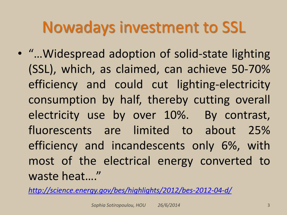
Nowadays investment to SSL
• “…Widespread adoption of solid-state lighting (SSL), which, as claimed, can achieve 50-70% efficiency and could cut lighting-electricity consumption by half, thereby cutting overall electricity use by over 10%. By contrast, fluorescents are limited to about 25% efficiency and incandescents only 6%, with most of the electrical energy converted to waste heat….”
http://science.energy.gov/bes/highlights/2012/bes-2012-04-d/
Sophia Sotiropoulou, HOU 26/6/2014 3

Nowadays investment to SSL
Sophia Sotiropoulou, HOU 26/6/2014 4
http://cordis.europa.eu/fp7/ict/photonics/docs/ssl-cip/lighting-the-cities_en.pdf
….Public lighting represents a significant share of their total electricity costs, accounting for up to the 60% of that budget.
“ …SSL is the most innovative lighting technology emerging on the market. It offers high quality light and visual performance, while providing substantial cost saving opportunities, reducing light pollution in cities and driving innovation in the lighting and construction sectors. When combined with intelligent light management systems, SSL can save up to 70% of electricity used for lighting and significantly reduce energy and maintenance costs compared to current lighting installations…”

LED lighting quality • cost saving: money and energy saving
• energy saving • High LER (Luminous Efficacy of Radiation) of LEDs
is certain, but, what about their quality of lighting (colour rendition, visual performance, etc)?
• reducing light pollution
• high visual performance • Refers to achromatic vision
• high quality light • Usually refers to colour quality, thus to colour
vision Sophia Sotiropoulou, HOU 26/6/2014 5

Colour and achromatic vision
Sophia Sotiropoulou, HOU 26/6/2014 6

Visual information encoded in the retina (light converted to signal)
Sophia Sotiropoulou, HOU 26/6/2014 7
According to the dual process theory (1957), in a first stage receptors (cones)
operate trichromatically and then the output signals of the first stage are the inputs
to the second stage, in which the signals are processed according to the opponent
colours theory.

Colour perception - trichromaticity
8
B G R [Livingstone, 2002]
Sophia Sotiropoulou, HOU 26/6/2014

Luminance perception
9
20
1
[Livingstone, 2002]
Sophia Sotiropoulou, HOU 26/6/2014

Sophia Sotiropoulou, HOU 26/6/2014 10
L* channel - lightness
Daniil, 1974. Hellenic Postbank Collection

Colour contrasts in art
11 Sophia Sotiropoulou, HOU 26/6/2014
Monet, “Impression Sunrise” (1872)
[Livingstone, 2002]

Sophia Sotiropoulou, HOU 26/6/2014 12
Colour contrasts in nature

Opponent colours theory – CIE LAB 1976
Sophia Sotiropoulou, HOU 26/6/2014 13
According to the theory of the opponent process theory, developed by Ewald Hering (1834 -1918) in the late 19th century, vision sensitivity is such that colours are perceived in three dimensions: the green-red axis , the blue-yellow axis and the black – white axis.

Sophia Sotiropoulou, HOU 26/6/2014 14
L* channel - lightness

Sophia Sotiropoulou, HOU 26/6/2014 15
a* channel - (R/G information)

Sophia Sotiropoulou, HOU 26/6/2014 16
L* + a* channels

Sophia Sotiropoulou, HOU 26/6/2014 17
b* channel - (Y/B information)

Sophia Sotiropoulou, HOU 26/6/2014 18
L* + b* channels

Visual pathways to the brain Hierarchical and parallel organisation
Sophia Sotiropoulou, HOU 26/6/2014 19
Source: http://thebrain.mcgill.ca/avance.php

Two major pathways of the visual information processing in the cortex.
Sophia Sotiropoulou, HOU 26/6/2014 20
Source: http://thebrain.mcgill.ca/avance.php
The “where system”: the dorsal visual pathway, for determining the position of the objects in space (perception of movement and position) The “what system”: the ventral visual pathway, for identifying objects (their shape and their colour)

The “action” pathway (dorsal) and the “conscious” pathway (ventral)
Sophia Sotiropoulou, HOU 26/6/2014 21
The “where system” (dorsal cortex (higher visual cortex areas)): by integrating the spatial relationships between our bodies and our environment, it lets us interact with this environment effectively (processing believed to be unconscious) The “what system” (ventral cortex (midbrain)): forming conscious representations of the identity of objects
Source: http://thebrain.mcgill.ca/avance.php

Colour and achromatic vision
Sophia Sotiropoulou, HOU 26/6/2014 22
“where” system - Magnocellular pathway – achromatic “what” system – parvocellular pathway – colour vision
http://pip.ucalgary.ca/psyc-369/mod2-the-visual-system/unit2.3-visual-pathways/geniculostriate2.html
Magno Cells Parvo Cells
Minority of cells in LGN: 10-15%
Majority of cells in LGN: 85-90%
Large receptive field Small receptive field
Fast conduction rate Slow conduction rate
High contrast sensitivity Low contrast sensitivity
Able to differentiate only coarse stimuli (low res)
Able to differentiate detailed stimuli (high resolution)
Colour Blind Colour Sensitive
Processes information about depth & motion
Processes information about colour & detail
The parvocellular pathway must be double- duty: it supports finely detailed luminance vision as well as colour vision

23
Central and peripheral vision R G B cones distribution on the retina
• High acuity and spatial resolution in the centre of the gaze (foveal zone ~2 degree) • Need to align fovea with relevant features (focal points) • Explore our visual environment with gaze movements
Sophia Sotiropoulou, HOU 26/6/2014

Central and peripheral vision
Courtesy National Gallery of Art, Washington 24 Sophia Sotiropoulou, HOU 26/6/2014
Anstis, S. ‘A chart demonstrating variation in acuity with
retinal position’, Vision Research, 14 , (1974): 589-592.

LED lighting quality
• high visual performance (refers to achromatic vision)
– How do we evaluate the visual performance of lighting?
• high quality light (refers to colour vision)
– How do we measure the quality of light? Often we refer to colour (rendering) quality…
– what are the most pertinent metrics for evaluating colour quality, which are also appropriate for SSL?
Sophia Sotiropoulou, HOU 26/6/2014 25

Visual performance • Visual performance is referring to the speed and accuracy of processing
achromatic information (e.g., black print on white paper) by the human visual system, (the speed and accuracy with which a visual task is performed).
• The visual performance depends on the degree of contrast but also on the luminance level, therefore also on the light intensity (lighting enhances acuity) and the adaptation time that is needed for different light sources.
– At relatively high light levels (e.g. found in schools and offices), visual performance is essentially unaffected by the spectral power distribution of the light source, so full-spectrum light sources are no better than any other light source.
– At relatively low light levels (e.g. outdoor lighting for orientation, identification, and safety – in roads in the night, etc), the sensitivity of the human eye is described by the mesopic conditions
Sophia Sotiropoulou, HOU 26/6/2014 26

LER (Luminous Efficacy of Radiation)
• P (λ) is the spectral power density (SPD) of the white light source
• V(λ) is the eye sensitivity function, with maximum at 555 nm (photopic conditions)
• 683 lm/W is a normalization factor
• Notice: Luminous efficacy of the source (LES) is defined as the ratio of luminous flux to input electrical power.
• Practically we can calculate LER, if we know the SPD of the light source
Sophia Sotiropoulou, HOU 26/6/2014 27

LER (Luminous Efficacy of Radiation)
Sophia Sotiropoulou, HOU 26/6/2014 28

CRI-R96a, based on Munsell Atlas test colours (CIE 1995)
Me Appr. Munsell Appearance under daylight
Swatch
TCS01 7,5 R 6/4 Light greyish red
TCS02 5 Y 6/4 Dark greyish yellow
TCS03 5 GY 6/8 Strong yellow green
TCS04 2,5 G 6/6 Moderate yellowish green
TCS05 10 BG 6/4 Light bluish green
TCS06 5 PB 6/8 Light blue
TCS07 2,5 P 6/8 Light violet
TCS08 10 P 6/8 Light reddish purple
TCS09 4,5 R 4/13 Strong red
TCS10 5 Y 8/10 Strong yellow
TCS11 4,5 G 5/8 Strong green
TCS12 3 PB 3/11 Strong blue
TCS13 5 YR 8/4 Light yellowish pink
TCS14 5 GY 4/4 Moderate olive green
29 Sophia Sotiropoulou, HOU 26/6/2014
CRI (Ra) = <Ri>

CRI-R96a, based on Munsell Atlas test colours (CIE 1995)
Me Appr. Munsell Appearance under daylight
Swatch
TCS01 7,5 R 6/4 Light greyish red
TCS02 5 Y 6/4 Dark greyish yellow
TCS03 5 GY 6/8 Strong yellow green
TCS04 2,5 G 6/6 Moderate yellowish green
TCS05 10 BG 6/4 Light bluish green
TCS06 5 PB 6/8 Light blue
TCS07 2,5 P 6/8 Light violet
TCS08 10 P 6/8 Light reddish purple
TCS09 4,5 R 4/13 Strong red
TCS10 5 Y 8/10 Strong yellow
TCS11 4,5 G 5/8 Strong green
TCS12 3 PB 3/11 Strong blue
TCS13 5 YR 8/4 Light yellowish pink
TCS14 5 GY 4/4 Moderate olive green
30 Sophia Sotiropoulou, HOU 26/6/2014
CIE (1995), 8 Munsell Test Colour Samples (TCS).
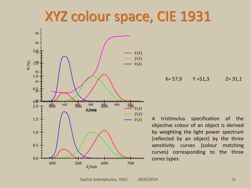
XYZ colour space, CIE 1931
Sophia Sotiropoulou, HOU 26/6/2014 31
400 450 500 550 600 650 700
20
30
40
50
60
70
80
90
R (
%)
λ (nm)
X= 57,9 Y =51,3 Z= 31,1
A tristimulus specification of the objective colour of an object is derived by weighting the light power spectrum (reflected by an object) by the three sensitivity curves (colour matching curves) corresponding to the three cones types.

Full-spectrum light sources and and color perception
• Color in the human perception is constructed from the combination of the spectral power distribution (SPD) of the light source, the spectral reflectance of the materials being illuminated, and the tri-chromatic nature of the human visual system.
• Full-spectrum light sources certainly provide excellent color rendering. Color rendering index (CRI) values for full-spectrum lighting sources are typically greater than 90.
• If there are gaps or large variations in the SPD of a light source, there is a potential for failure in the perception of the apparent colors of objects.
• In the contrary, full-spectrum light sources provide radiant power throughout the visible spectrum, therefore subtle differences in the spectral reflectance characteristics of different objects are discernible. So, when color identification is part of the visual task, such as for graphic arts, museums and color printing applications, full-spectrum light sources will ensure good color discrimination.
Sophia Sotiropoulou, HOU 26/6/2014 32
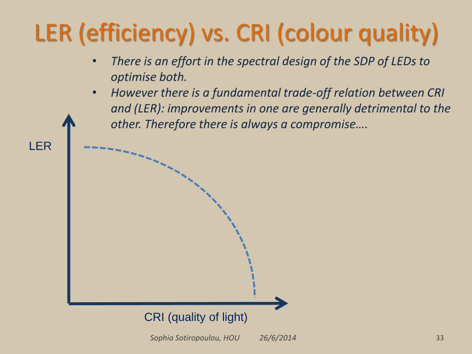
LER (efficiency) vs. CRI (colour quality)
Sophia Sotiropoulou, HOU 26/6/2014 33
• There is an effort in the spectral design of the SDP of LEDs to optimise both.
• However there is a fundamental trade-off relation between CRI and (LER): improvements in one are generally detrimental to the other. Therefore there is always a compromise….
LER
CRI (quality of light)

LER vs. CRI, a compromise…
Sophia Sotiropoulou, HOU 26/6/2014 34
LER becomes high, when there is a good correlation between SPD and V(λ)
CRI becomes high, when there is a good correlation between SPD and x(λ), y(λ), z(λ)
400 500 600 700
0,0
0,2
0,4
0,6
0,8
1,0
Lu
min
ou
s E
ffic
acy
λ (nm)
Photopic Luminous Efficacy V(λ)

Sophia Sotiropoulou, HOU 26/6/2014 35
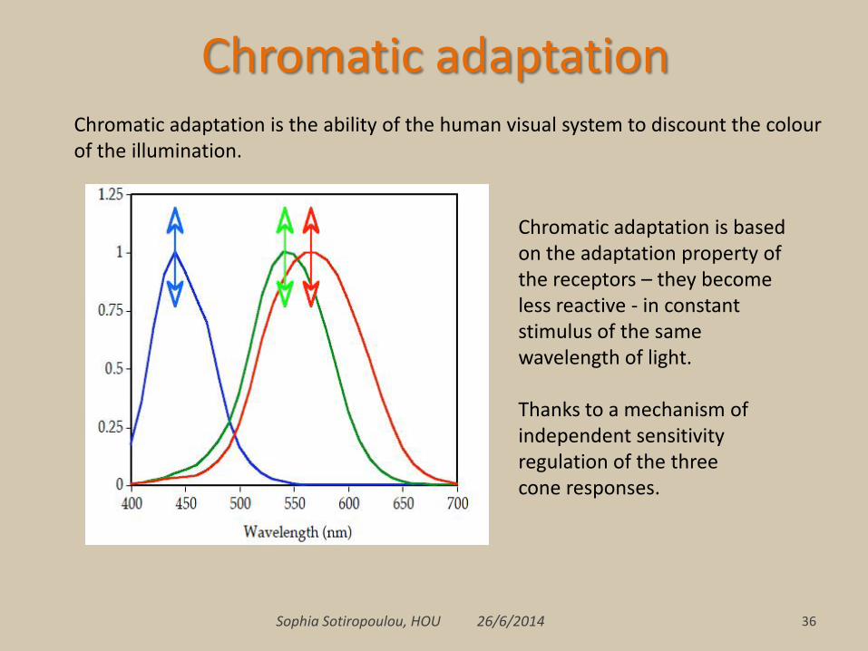
Sophia Sotiropoulou, HOU 26/6/2014 36
Chromatic adaptation is based on the adaptation property of the receptors – they become less reactive - in constant stimulus of the same wavelength of light. Thanks to a mechanism of independent sensitivity regulation of the three cone responses.
Chromatic adaptation is the ability of the human visual system to discount the colour of the illumination.
Chromatic adaptation

Quality vs. energy cost
Sophia Sotiropoulou, HOU 26/6/2014 37
400 500 600 700
0,0
0,5
1,0
1,5
2,0
2,5
SP
D
λ(nm)
Ph-LED YAG
------ 3-LED (455/547/623) gamut expanded
------ 4-LED (461/526/576/624) max Ra
• When we increase the number of LEDs in the spectral design of a LED white source, we may increase the CRI.
• Studies have shown that trichromatic and tetrachromatic white-light LED lamps achieve a great balance between CRI and LER.
• However, a key element associated with the success of LEDs into the solid-state lighting market is LER, and this parameter is reduced when increasing LEDs quantity.

CRI: Colour Rendering Index • CRI advantages:
– Universal, widely used, easy and rational method (it served the lighting community successfully for almost 50 years (introduced in 1965))
• CRI limitations
– The score refers to the average score on specific 8 or 14 or 10 samples,
– It is designed for light sources of broad band (continuous) spectrum
– ‘‘White’’ sources composed of multiple narrowband LED spectra have illustrated more clearly the limits of CRI for characterizing the color rendering properties of electric light sources.
38 Sophia Sotiropoulou, HOU 26/6/2014

Color Rendering vs. Color Quality http://www.iald.org/userfiles/file/PDFs/DOESSLMaterials/09_NIST%20Color%20Quality%20Index.pdf
• Colour rendering is actually defined as the “effect of an illuminant on the colour appearance of objects by conscious or subconscious comparison with their color appearance under a reference illuminant”.
• Colour rendering often refers only to colour fidelity, the accurate representation of object colours compared to those same objects under a reference source, and does not include other aspects of colour quality, such as chromatic discrimination and colour preference.
Sophia Sotiropoulou, HOU 26/6/2014 39

Colour quality of white light sources
• Colour fidelity is only one aspect of the quality of white light.
• Other important aspects and dimensions are:
– Visual clarity (Feeling of Contrast Index (FCI)) • the feeling of “clearness” or “distinctness” between object colours
– Colour discrimination ability • Colour Discrimination index (CDI)
– Colour preference (increased chroma) • Colour Preference index (CPI)
– ‘‘Flattery index’’ (FI) to characterize how ‘‘vivid’’ or ‘‘flattering’’ objects, particularly skin, might be rendered by light sources.
• Colour Saturation - colours appear ‘vivid’ and easily distinguishable
40 Sophia Sotiropoulou, HOU 26/6/2014

CIE Technical Commitees • CIE TC1-62 Colour Rendering of White LED Light Sources, established in 2002, concluded
that Ra is not appropriate to rank-order the color-rendering ability of light sources when LEDs are included, but, the committee did not recommend an alternative measure.
• CIE TC1-69 Colour Rendition by White Light Sources, established in 2006, was formed “to investigate new methods for assessing the color rendition properties by white-light sources used for illumination, including solid-state light sources, with the goal of recommending new assessment procedures.” At the CIE September 2012 meeting in Taipei, TC1-69 agreed to produce a technical report based on work to date, after which it will close. It is anticipated that the draft report will not make a single recommendation.
Two new TCs will continue where TC1-69 left off.
• TC1-90 Colour Fidelity Index was established “to evaluate available indices based on colour fidelity for assessing the colour quality of white-light sources with a goal of recommending a single colour fidelity index for industrial use”.
• TC1-91 New Method for Evaluating the Colour Quality of White-Light Sources was established “to evaluate available new methods for evaluating the colour quality of white-light sources with a goal of recommending new methods for industrial use.
• Both committees have been given four years to perform their work.
Sophia Sotiropoulou, HOU 26/6/2014 41

Colour Quality Scale (CQS) A Colour Quality Scale (CQS) is being developed at NIST, which is adequate for evaluating and communicating several aspects of the quality of a light source illuminating colourful objects. This metric involves several facets of color quality, including color rendering, chromatic discrimination, and observer preferences.
• Davis, W. & Ohno, Y., “Color Quality Scale,” Optical Engineering, Optical Engineering 033602-1 March 2010/Vol. 49_3 (2010)
• http://colorqualityscale.com/ (Wendy Davis, Yoshi Ohno, and the general Lighting Community.)
• Davis, W. and Ohno, Y., Development of a Color Quality Scale, National Institute of Standards and Technology, http://physics.nist.gov/Divisions/Div844/facilities/vision/color.html
• Rupak Raj Baniya, Study of various metrics evaluating color quality of light sources, Master of Science Thesis, Aalto University, Department of Electronics Lighting Unit Science, http://lib.tkk.fi/Dipl/2012/urn100575.pdf
• http://physlab2.nist.gov/Divisions/Div844/facilities/photo/Publications/DavisOhnoSPIE2005.pdf
• Davis, W. and Ohno, Y.. "Toward an improved color rendering metric". Proc. of SPIE 5941, 59411G-1.
42 Sophia Sotiropoulou, HOU 26/6/2014

Sophia Sotiropoulou, HOU 26/6/2014 43
Colour Quality Scale (CQS)

Colour Quality Scale (CQS) vs CRI
44 Sophia Sotiropoulou, HOU 26/6/2014
Saturation factor
• The CRI penalizes lamps for shifts in hue, chroma (chromatic saturation), and lightness, in any direction.
• While a decrease in chroma always has negative effects, an increase in the chroma of objects is considered desirable in many cases. Increases in chroma yield better visual clarity and enhance perceived brightness. These are positive effects and are generally preferred, though they cause deviations in color fidelity (compared to reference).
• In the CQS, lamps are not penalized for increasing object chroma relative to the reference source, though their scores are also not increased. The net result is that a lamp’s score is only penalized for hue shifts, lightness shifts, and reductions in chroma.

Sophia Sotiropoulou, HOU 26/6/2014 45
Gamut Area Scale GAI (Qg) Gamut area of light source is defined as the area of polygon defined by the chromaticities of the eight CIE standard color sample (same used in CIE CRI) in CIE 1976 L*a*b* color space when illuminated by the light source under examination. • GAI is based on the idea that an increase in the chroma of
coloured objects has a positive impact on the perceived color quality.
• When gamut area of light source is larger, objects’ colour will appear more saturated under the light source.
• GAI is more sensitive to saturation and hue discriminability than to colour fidelity.
• Mark S. Rea, Jean P. Freyssinier-Nova, 2008. Color Rendering: A Tale of Two Metrics, COLOR research and application, p. 192-202.
• Mark S. Rea, Jean P. Freyssinier-Nova, 2010. Color Rendering: Beyond Pride and Prejudice, COLOR research and application, p. 401-409.

Sophia Sotiropoulou, HOU 26/6/2014 46
Gamut Area Scale GAI (Qg)
[Sandor, 2006]

Sophia Sotiropoulou, HOU 26/6/2014 47
Gamut Area Scale GAI (Qg) • Rea and Freyssinier (Lighting Research Center, Rensselaer PI) demonstrated
that gamut area index (GAI) was much better than CRI as a predictor of color discrimination.
• Rea and Freyssinier also showed that GAI and CRI were sometimes negatively correlated with each other (CRI- high, GAI – low score); one metric would be positively related to subjective judgments of ‘‘vividness’’ and of ‘‘naturalness’’ while the other would be negatively.
• A Two-metric system (CRI and GAI) of colour rendering is proposed for general illumination applications.
• As colour rendering index (CRI) and of gamut area index (GAI) seem to counteract the weaknesses of one another, together they can be used in choosing a source that will provide good color rendering of most objects in most applications.

Towards a new two-measure system for characterizing color rendition assessment
of the colour quality of white light sources
• Kevin W. Houser, Minchen Wei, Aurélien David, Michael R. Krames, and Xiangyou Sharon Shen, Review of measures for light-source color rendition and considerations for a two-measure system for characterizing color rendition, Optics Express, 21(8), pp. 10393-10411 (2013)
Sophia Sotiropoulou, HOU 26/6/2014 48
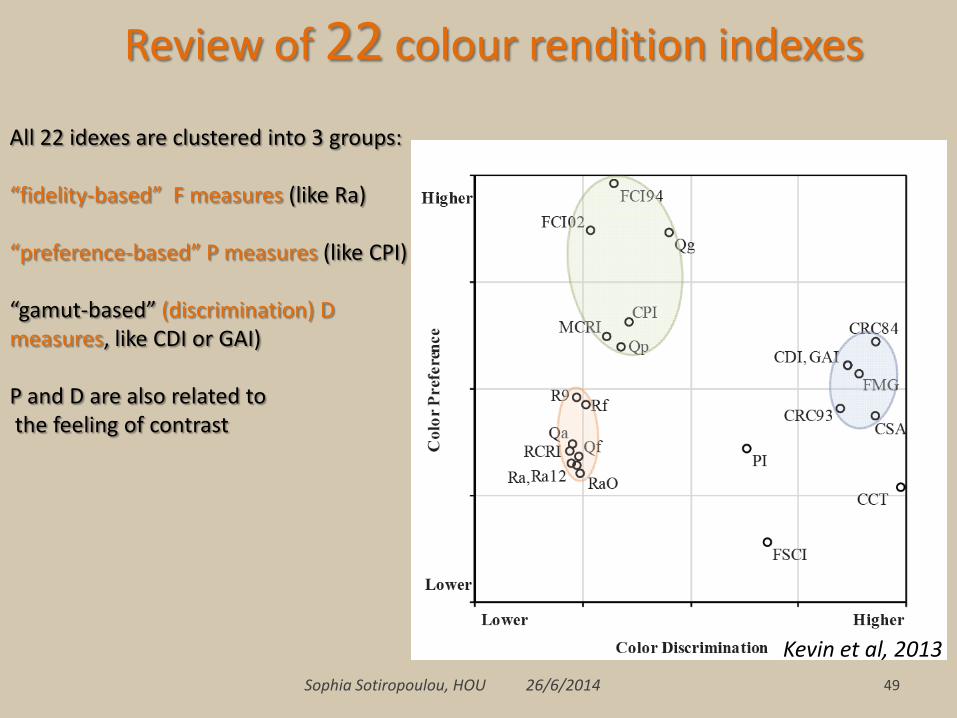
Review of 22 colour rendition indexes, based on the calculation of the indexes for 401 illuminants (SPD) of various types.
One measure that is consistent with the concept of color fidelity or quality and the other is a measure of relative gamut.
Sophia Sotiropoulou, HOU 26/6/2014 49
Review of 22 colour rendition indexes
Kevin et al, 2013
All 22 idexes are clustered into 3 groups: “fidelity-based” F measures (like Ra) “preference-based” P measures (like CPI) “gamut-based” (discrimination) D measures, like CDI or GAI) P and D are also related to the feeling of contrast

Sophia Sotiropoulou, HOU 26/6/2014 50
Review of 22 colour rendition indexes
Kevin et al, 2013

Sophia Sotiropoulou, HOU 26/6/2014 51
Review of 22 colour rendition indexes For different CCTs Colour Fidelity (Ra) vs. Gammut Area (GAI) High CCT is not associated with high preference, but, CCT is moderately correlated with the gamut-based measures: gamut tends to increase with CCT for CIE reference illuminants. GAI is favoured by higher CCTs because gamut area increases with CCT. The plot illustrates also that higher CCT light sources are strongly favoured in simultaneously achieving high values of both Ra and GAI. However, lower CCT light sources can have excellent color qualities, including excellent color-discrimination performance despite having a smaller gamut. But a measure of color rendition should not to be correlated with CCT.
Kevin et al, 2013

Sophia Sotiropoulou, HOU 26/6/2014 52
Review of 22 colour rendition indexes
The role of illuminance. The magnitude of illuminance strongly affects the appearance of colored objects. Perceived hues are dependent upon illuminance (Bezold-Brucke effect), colors appear more saturated (colourful) under higher illuminance (Hunt effect), and color discrimination performance is dependent upon illuminance level. If an electric light source increases object saturation relative to a reference illuminant at a typical indoor illuminance level, then the object may appear more like it would under daylight (high illuminance) at a typical outdoor daytime illuminance level. Nevertheless, a colour rendition system should be independent of the illuminance level.
Bezold-Brucke effect

Sophia Sotiropoulou, HOU 26/6/2014 53
Review of 22 colour rendition indexes
Kevin et al, 2013
Conclusions One number (e.g. CRI) cannot fully encapsulate the multidimensional problem of color rendition. However, the lighting industry needs a simple and readily interpretable tool for communicating color quality. A two-measures system: one reference-based (fidelity) measure and one gamut-based measure A set of saturated reference colours
Conclusions • Although CRI remains the only one CIE established and universally used
index for assessing Colour rendering of artificial white light sources, there is a significant progress in the metrics of colour rendition quality taking into account physiological mechanisms, psychological factors and cognitive functions involved in the perception of colour.
• Waiting the results of the CIE – TCs, towards a two-measures system: one reference-based (fidelity) measure and one gamut-based measure
• Emerging technologies and SSL in particular, provide with technological solutions to shape the Specral Power Distribution (SPD) – thus optimise the quality of light in function to applications in performing specific visual tasks, as well as more generally in commercial, architectural, and entertainment lighting.
54 Sophia Sotiropoulou, HOU 26/6/2014

55 Sophia Sotiropoulou, HOU 26/6/2014
Bibliography - webresources • Colour vision - colour perception
– Livingstone, M., Hubel, D. (2002) Vision and Art : The Biology of Seeing, Harry N Abrams
– Palmer, S. (1999) Vision Science: Photons to Phenomenology Cambridge, MA: The MIT Press.
– Web Exhibits,
• Causes of colour: http://www.webexhibits.org/causesofcolor/1B.html
• Colour vision and art: http://www.webexhibits.org/colorart/
http://www.handprint.com/LS/CVS/color.html
• Colour rendering assessment of white light sources
• http://www.nist.gov/pml/div685/grp03/vision_color.cfm
• Lighting Research Center, Rensselaer Polytechnic Institute, Troy, NY USA http://www.lrc.rpi.edu/programs/solidstate/colorResearch.asp / http://www.lrc.rpi.edu/programs/nlpip/lightinganswers/fullspectrum/lightSources.asp
• Guo, Xin; Houser, Kevin W. (2004), "A review of colour rendering indices and their application to commercial light sources", Lighting Research and Technology 36 (3): 183–199
• Kevin W. Houser, Minchen Wei, Aurélien David, Michael R. Krames, and Xiangyou Sharon Shen, (2013) “Review of measures for light-source color rendition and considerations for a two-measure system for characterizing color rendition”, Optics Express, 21(8): 10393-10411