screen shots of progress ii cover
TRANSCRIPT
Screen shots of progress II
Front Cover
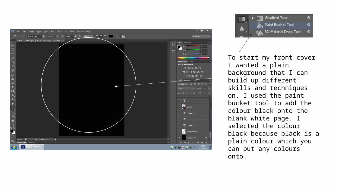
To start my front cover I wanted a plain background that I can build up different skills and techniques on. I used the paint bucket tool to add the colour black onto the blank white page. I selected the colour black because black is a plain colour which you can put any colours onto.
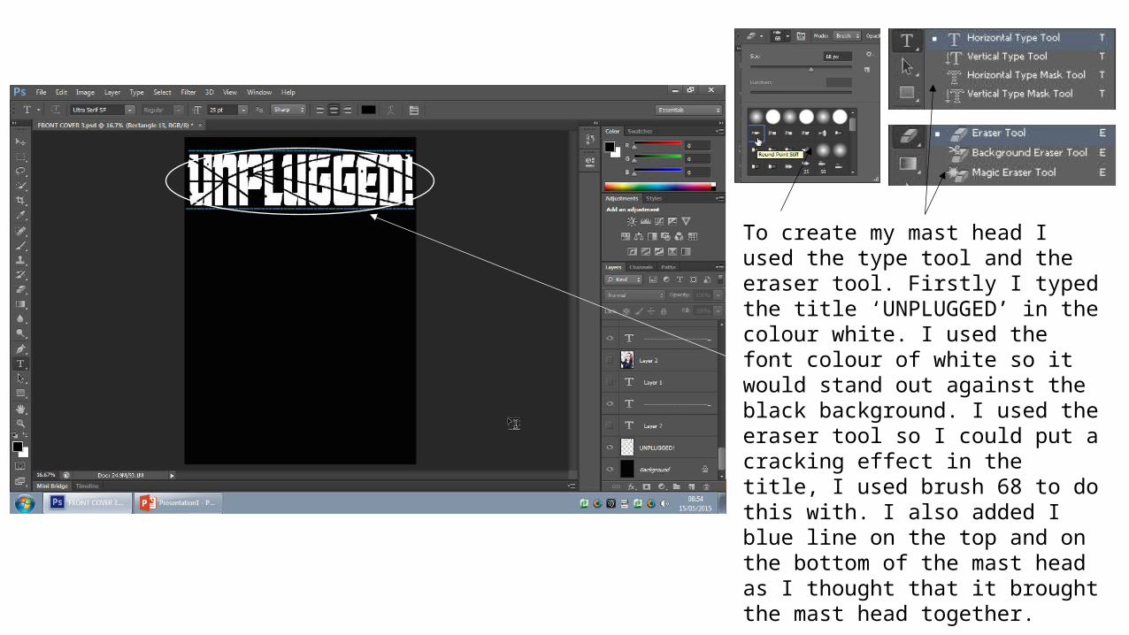
To create my mast head I used the type tool and the eraser tool. Firstly I typed the title ‘UNPLUGGED’ in the colour white. I used the font colour of white so it would stand out against the black background. I used the eraser tool so I could put a cracking effect in the title, I used brush 68 to do this with. I also added I blue line on the top and on the bottom of the mast head as I thought that it brought the mast head together.
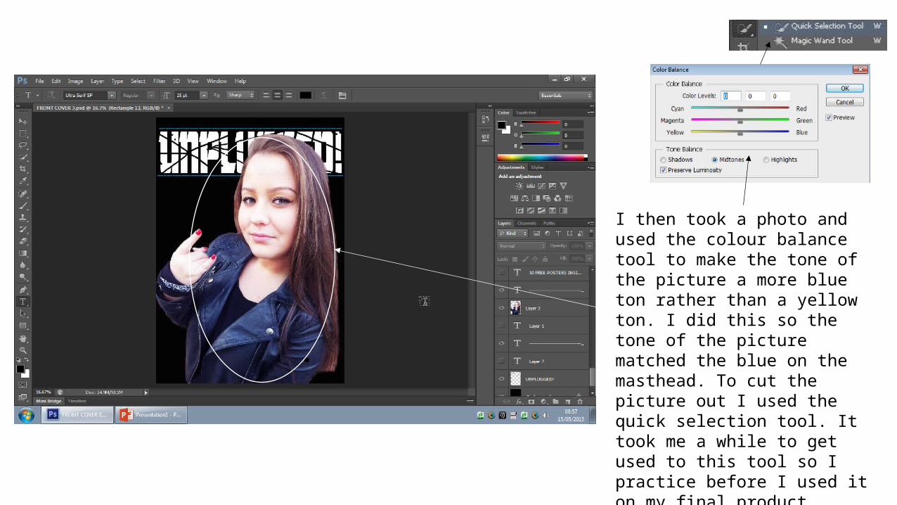
I then took a photo and used the colour balance tool to make the tone of the picture a more blue ton rather than a yellow ton. I did this so the tone of the picture matched the blue on the masthead. To cut the picture out I used the quick selection tool. It took me a while to get used to this tool so I practice before I used it on my final product.
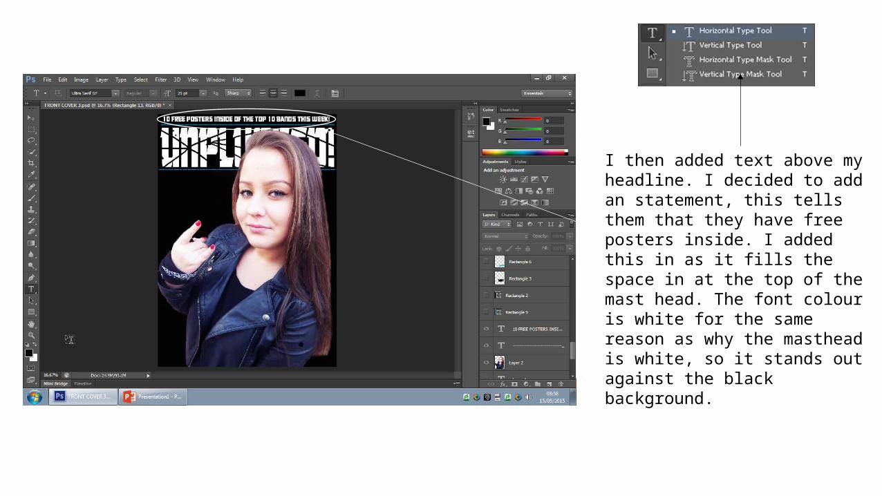
I then added text above my headline. I decided to add an statement, this tells them that they have free posters inside. I added this in as it fills the space in at the top of the mast head. The font colour is white for the same reason as why the masthead is white, so it stands out against the black background.
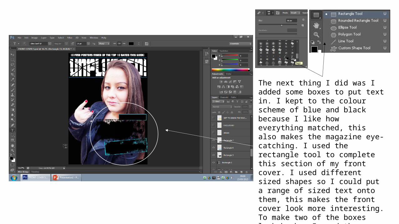
The next thing I did was I added some boxes to put text in. I kept to the colour scheme of blue and black because I like how everything matched, this also makes the magazine eye-catching. I used the rectangle tool to complete this section of my front cover. I used different sized shapes so I could put a range of sized text onto them, this makes the front cover look more interesting. To make two of the boxes look broken I used the eraser tool and brush 134, this gave the front cover a rebel kind of look, which a metal/punk fan would be looking for. I know this from my own experience of a metal/punk fan.

After making the boxes I added text on top of them using the type tool. I added a new colour to brighten up the magazine. This was the colour yellow. The fonts go from small to large because it adds a eye-catching effect to the front cover. I decided to put the text on the right hand side in the bottom corner because it still make the image visible. I also added the effect of using the eraser again so it blends into the boxes making it all look like its together.

I got a barcode off a previous Kerrang magazine. I did this by using the quick selection tool to cut it out and lace it onto my front cover. I placed it on the left hand side at the bottom because that is usually where you would find a barcode, at the bottom. The barcode includes the date, price and issue of the magazine. This makes my front cover look professional as it is from a professional magazine.

I then added some rectangles using the rectangle tool. I placed them of the left hand side as this is where you would usually find sub-headings of what is inside the magazine. I then placed text above and on top of the rectangles that stated somethings you would find inside the magazine. I kept to the colour scheme of blue, black, white and yellow so nothing looked out of place.
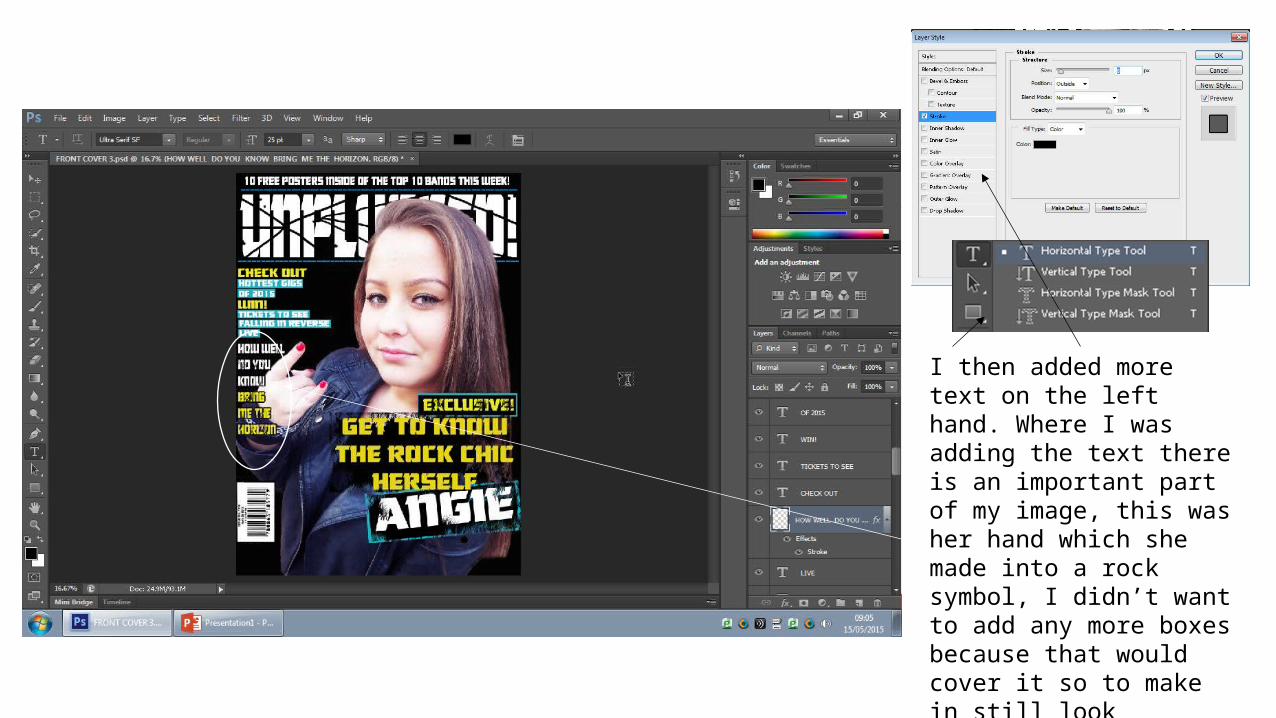
I then added more text on the left hand. Where I was adding the text there is an important part of my image, this was her hand which she made into a rock symbol, I didn’t want to add any more boxes because that would cover it so to make in still look effective I used the stroke tool which made an outline around the text to make it stand out.
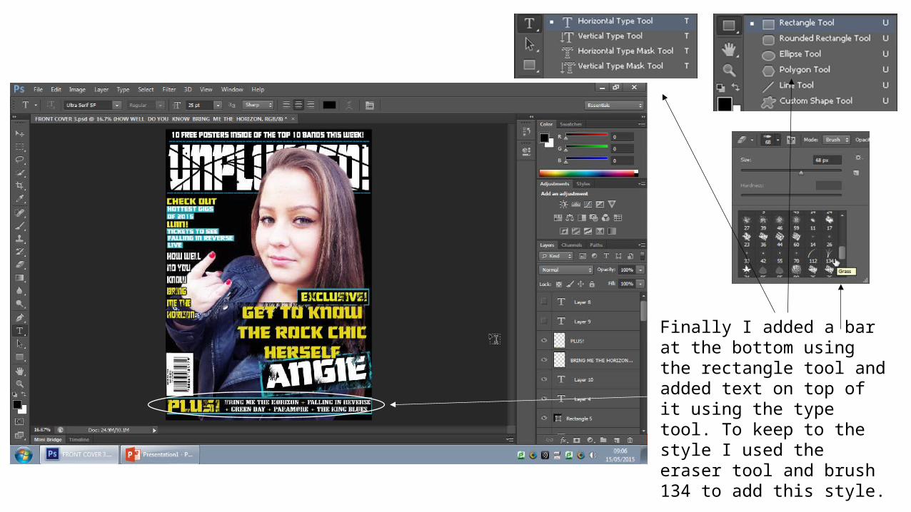
Finally I added a bar at the bottom using the rectangle tool and added text on top of it using the type tool. To keep to the style I used the eraser tool and brush 134 to add this style.