scope: providing awareness of multiple notifications at a
TRANSCRIPT

Scope: Providing Awareness ofMultiple Notifications at a Glance
Maarten van Dantzich, Daniel Robbins, Eric Horvitz, Mary CzerwinskiMicrosoft Research
One Microsoft Way, Redmond WA 98052, USA{maartenv, dcr, horvitz, marycz}@microsoft.com
ABSTRACTWe describe the design and functionality of the Scope, aglanceable notification summarizer. The Scope is an informationvisualization designed to unify notifications and minimizedistractions. It allows users to remain aware of notifications frommultiple sources of information, including e-mail, instantmessaging, information alerts, and appointments. The designemploys a circular radar-like screen divided into sectors thatgroup different kinds of notifications. The more urgent anotification is, the more centrally it is placed. Visual emphasis andannotation is used to reveal important properties of notifications.Several natural gestures allow users to zoom in on particularregions and to selectively drill down on items. We present keyaspects of the Scope design, review the results of an initial userstudy, and describe the motivation and outcome of an iteration onthe visual design.
Categories and Subject DescriptorsH.5.2 [INFORMATION INTERFACES ANDPRESENTATION]: User Interfaces--Graphical User Interfaces.
General TermsDesign, Human Factors.
KeywordsInformation visualization, peripheral displays, awareness,notifications, interruptions, alerting and notification systems
Figure 1 Scope (Figure 2 shows same in color).
Please see color plates for this paper.

Scope: Providing Awareness ofMultiple Notifications at a Glance
Maarten van Dantzich, Daniel Robbins, Eric Horvitz, Mary CzerwinskiMicrosoft Research
One Microsoft Way, Redmond WA 98052, USA{maartenv, dcr, horvitz, marycz}@microsoft.com
ABSTRACTWe describe the design and functionality of the Scope, aglanceable notification summarizer. The Scope is an informationvisualization designed to unify notifications and minimizedistractions. It allows users to remain aware of notifications frommultiple sources of information, including e-mail, instantmessaging, information alerts, and appointments. The designemploys a circular radar-like screen divided into sectors thatgroup different kinds of notifications. The more urgent anotification is, the more centrally it is placed. Visual emphasis andannotation is used to reveal important properties of notifications.Several natural gestures allow users to zoom in on particularregions and to selectively drill down on items. We present keyaspects of the Scope design, review the results of an initial userstudy, and describe the motivation and outcome of an iteration onthe visual design.
Categories and Subject DescriptorsH.5.2 [INFORMATION INTERFACES ANDPRESENTATION]: User Interfaces--Graphical User Interfaces.
General TermsDesign, Human Factors.
KeywordsInformation visualization, peripheral displays, awareness,notifications, interruptions, alerting and notification systems
1 INTRODUCTIONAs personal computers have become connected to increasingnumbers of information sources, users are challenged to managehigher rates of interruption by notifications. Today, many usershandle alerts from a variety of sources, including newly arrivingemail, status changes in instant messenger “buddy lists,” stockand traffic alerts, online auction progress, sports game scores,news headlines, special sales, and so on. Even more notificationsare on the horizon; new development efforts such as the Microsoft.NET platform [21] promise to increase the types of servicesoffered to users and thus provide even larger numbers of
notifications. Users are now facing notification overload—thechallenge of keeping up to date on incoming information alerts.Interruptions can be detrimental to productivity, especially whenthe user is deeply focused on a task [16]. Human attention haslong been known to be a scarce resource [2, 6]. Thus, providingawareness of relevant information or events with minimal strainon cognitive resources promises to be increasingly valuable tousers.
We have sought to develop visualizations that allow users todecide what to attend to, and when. This principle is central in theScope, a graphical display that unifies information about email,pending work items, and other information in one central place.
Figure 2 Scope after design iteration described below
2 WORK ON UNIFYING NOTIFICATIONARCHITECTURES
The Scope display was motivated by work over the last severalyears on systems that consider multiple sources of informationand normalize different types of informational items into a unifiednotification and awareness framework. Existing work in this arenaincludes the Priorities system [12] and its descendant, theNotification Platform.
Priorities considers email messages, tasks, and appointments. Thesystem learns models of prioritization of items from user

behaviors or from explicit user feedback, and uses these models toautomatically assign an urgency score based on multiple facets ofitems, including, for the case of email, the sender, the nature andnumber of recipients, and the content of the header and body ofmessages. A descendant of Priorities, the Notification Platform,maintains a general inbox, called a Unibox, which includes suchitems as email, voicemail, appointments, instant messaging, newsand financial information, and the output of a set of informationgathering agents that have generated information for users. Userscan control the weightings of the urgency scores assigned todifferent items.
The Scope is built to provide a single glanceable visualizationonto the multisource, prioritized information contained in theNotification Platform’s Unibox. That is, we assume in ourinterface design that some notion of an urgency score is availablefor items considered for display.
3 VISUALIZATION DESIGN3.1 Design goalsA primary design goal for the Scope was to provide a tool forsafeguarding a user’s attention. We sought designs that couldempower users to stay focused on their primary task, requiringminimal attention to stay aware of incoming notifications andpending tasks. Thus, we wanted the Scope to provide unobtrusivedisplay modalities, leaving initiative primarily with the user.Second, we designed the Scope to be glanceable, that is, easy toread and understand in a minimal amount of time. The designshould direct a user’s attention to high urgency items. Finally, wedesigned the Scope to present notifications from many sources ina standardized fashion.
We designed for several modes of interacting with the Scope:monitoring incoming items while working on a primary task;deciding what to do next when the user is ready to switch tasks;catching up on newly arrived items after having been away fromthe computer; and use as an implicit to-do list.
We did not explore features for manually creating new items onthe Scope or for accessing or searching the user’s email archives.We believe these tasks are better addressed by existing personalinformation management applications already in use, such asMicrosoft Outlook.
3.2 Visual metaphorFigures 2 and 3 display two incarnations of the basic view of theScope visualization. The Scope is a circular display that borrowsits metaphor from a traditional radar view: we consider the usersituated at the center of the display, and notifications are arrangedso that higher urgency items are closer to the center. Concentricrings delineate areas for high, normal, and low urgency items.This arrangement has the advantage of a single point of visualattention: at any time, all the important items will be near thecenter of the display. As the radius of the focus of visual attentionincreases, more items are included in the glance, but items fartherfrom the center are increasingly less urgent. This is the primarydesign aspect that makes the Scope glanceable, in a manner thataligns the triage of notifications with visual search
The circular space is divided into several wedges, or sectors. Inour current design, each sector represents one canonical type ofnotification: personal communications (including email, voicemail, instant messages), calendar items, “to do” items, and other
alerts (notifications from web services or personal agents). Thispartitioning reflects the organization of personal informationmanagement software already familiar to users. In the currentimplementation, the wedges have a fixed size, each occupying aquarter of the Scope. We would like to make the partitioningreconfigurable, so that more highly populated wedges can occupya greater arc within the Scope.
Figure 3 Original Scope design at large size and high LOD(approximately actual size).
Although we have focused on a set of familiar notification classes,we can imagine alternative arrangements of items into sectors.One alternative is to segment the Scope into subject-orientedsectors, providing such categories as “Work-related”, “Home &Family”, “Hobby & Interests”, and “News”. The work-relatedwedge could then be subdivided to group items related to thesame project. The usefulness of such a formulation depends on thenaturalness of the category and the ability of automated systems toappropriately classify the items. We foresee that laterimplementations could allow software plug-ins to populate newlycreated wedges on the Scope. Note that the Scope will alwaysprovide a single point of visual focus, independent of the numberof wedges or services providing notifications. Thus, theglanceability of the design allows the interface to scale.
3.3 Visual annotations of metadataIn addition to the spatial layout of items, the Scope can assistusers in deciding which items to focus on by providing visualannotations (iconography) to make items more distinct andidentifiable. We identified numerous properties that theNotification Platform can provide that might be of interest to theuser. We chose to highlight a subset of these properties in order tomaintain visual clarity, focusing on email items. We chose a set ofproperties that appeared to be most important in helping usersmake decisions about where next to attend. These propertiesinclude newness, item type, and information about the addressingof recipients of the notification.
We will first describe our original design, to set the context for theuser study discussion. A redesigned Scope with new visuals isdescribed in later sections.

In our original visual design, displayed in Figure 3, every item onthe Scope reveals its type by a letter in the body of the item. (e.g.“E” for email, “A” for agent alerts). This property is typicallyredundant with the wedge the item is placed in, though users candrag items to a different wedge when appropriate. (e.g., an emailcan be put in the Tasks wedge if it is a “to do” item in the user’smind.)
Figure 4 Visual annotations for various metadata.
Second, each item reveals its degree of newness. Items can be“newly arrived” (as revealed by a pulsing of the item), “seen” (nolonger blinking, denoting that the user has attended to but notfully opened the item), or “read” (shown as a blurry halo, after theuser has opened the item). The distinction between “seen” and“read” allows the user to probe an item (yielding a tooltip,described below) and decide whether to open it or not; the itemstate will reflect the user’s viewing behavior. We do notautomatically remove “read” items from the Scope, as the usermay still want to take further action; indeed users commonly leaveread items in their email inbox for just this purpose [24].
Third, each item reveals some special properties if appropriate.We annotate email items if they were addressed explicitly to theuser alone (“ToMeAlone” property), to just a few individuals, orif the sender is listed in the user’s personal address book. Theformer two properties (collectively called the ToType) aredisplayed respectively by shaping the item as a triangle or double-triangle, suggesting single or multiple destinations. A significantsender is indicated with a circle inside the item; it can be thoughtof as an item from the user’s “inner circle.” For calendar items,we indicate whether a meeting may require travel time (e.g., if itslocation is known to be outside the user’s building). This propertywas a popular end user suggestion. We indicate travel time withhash marks inside the item, reminiscent of “speed zips” drawn incartoons to suggest movement. Finally, for calendar and “to do”items that have deadlines, we indicate items that are overdue byinverting their colors. We have explored only a portion of a largerdesign space of visual annotations. A future version of the Scopecan allow a user to switch between different static and animatedcodings.
The same properties displayed in the visual annotations are alsoused by the Notification Platform to determine the urgency of thenotification, and so could be viewed as redundant. However, thevisual affordances help in several ways. They make items moredistinct and assist users in deciding which items to attend to,helping the user feel in control. Earlier work suggests that theurgency scores are quite reliable [12], so seeing the correlationbetween properties and scores can only help to foster user trust inthe system’s intelligence.
Figure 5 Scope on the desktop at low LOD (a) and aftermousing into the window at high LOD (b).
3.4 Levels of detailWe designed the Scope to live in a corner of the user’s display,sized small enough to be unobtrusive—and optionally rendered ina translucent manner on top of other windows. As weexperimented with alternate designs for the visual annotations, wequickly discovered that it is very difficult to make items distinctwhen they are very small: visual differences quickly becomeinscrutable when each item occupies only about 3x3 pixels. Wesolved this problem by implementing two levels of detail (LOD):a peripheral awareness mode (low LOD), and an active interactionmode (high LOD).
By default, the Scope positions itself in the lower right-handcorner of the display, fitting in a 180x180 pixel region as shownin Figure 5. This is the peripheral awareness or low-LOD mode:in this modality, items reveal only the most important properties,which are designed to be maximally distinct. These are newness,ToType, and overdue status. (Compare item visuals in Figure 6with Figure 3.) Recall that urgency of items is still easily deducedfrom the item’s location along the radius of the Scope. This allows
(a)
(b)
“Read” Meeting outside of my building
Email from someone important AND directly
to me Overdue
Task
“Read” Task

users to glance at the Scope and determine immediately whethernew (pulsing) items have arrived, particularly in the high-urgencyzone.
If the user moves the mouse pointer into the Scope window, itresponds by changing into the active interaction mode: the Scopeis popped to the top of the window stack, the window doubles insize, and the items are rendered in high-LOD mode, displaying allof the properties described above, and as displayed in Figure 3.Users can now gain additional information at a glance, or obtainmore details from an on-hover tooltip. We believe that these twolevels of detail provide a fluid way for the Scope to achieve bothunobtrusiveness and useful richness of display.
Figure 6 Scope at low level of detail, enlarged (cf Fig 3).
The visual coding of attributes went through several designiterations. Design criteria for the visual attributes aredistinctiveness (each attribute having a unique visualrepresentation) and discernability (items having a given propertyshould be clearly different looking, even at small sizes). An earlydesign overlayed multiple small icons on top of each item. Eachicon represented the state of a particular property, such as ToType.Because we needed to overlay multiple icons for each item, each“sub-icon” ended up being so small as to be indistinguishable.Because of this, the design presented here instead uses moreabstract visuals that affect the overall appearance of an item. Forexample, a stroked circle that outlines an item is much morediscernable than a series of sub-icons that are blurry (due to theirsize). The design problem is made more difficult because we arerepresenting Boolean states for many properties rather than one ofmultiple states for just a few properties. If we only had to dealwith a few properties, we could easily cycle between severalconfigurations of a basic geometric shape: for example, selectingfrom among a library of square, triangle, circle, and diamondshapes. Instead, we had to design visual modifications that do notconflict when overlaid with others. Although this design is quiteabstract, we found that it does make for relatively efficientdistinguishability, and that was supported by the user study.
3.5 User interaction techniquesBeyond serving as a visualization of pending notifications andtasks, the Scope also allows the user to inspect items further
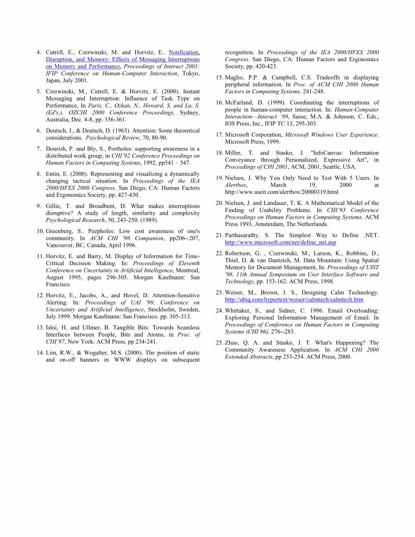
through low-effort interactions, in order to decide whether to openthe item in its native application. The most common user action isto drill down on an item for more detail. When the user hovers themouse pointer over a notification item, a tooltip appears withdetail appropriate to the item type. This includes the title and asnippet of the body text, the sender’s name if it is an email, thetime and location if it is a meeting, and a deadline if one is set.(See Figure 10.)
If the item is newly arrived, inspecting the tooltip for more than afraction of a second marks the item as “seen”, removing thepulsing behavior. The user can click an item once to mark it as“read”, or leave it “seen” as a reminder that the item requiresfurther attention. A double click opens the item in its nativeapplication, e.g., mail messages are opened in an Outlookmessage window. This also marks the item as already read,changing its display state to have a fuzzy halo, causing a mutedappearance with less salience.
Users are able to modify positions and groupings manually. Theintegration of this capability for the Scope was informed by theexperience of Robertson et al. with the Data Mountain [22], whereusers created rich layouts of web favorites when presented with afree-form space to organize in. Users can drag and drop items onthe Scope to produce implicit groupings, to change the urgency ofan item, or to delete an item. A manual change in an item’surgency on the Scope visualization can send feedback to theNotification Platform, allowing refinement of its futureprioritizations. This provides a novel and intuitive way for usersto communicate with the underlying decision making system.
An item can be discarded by simply dragging it off the Scope.
The Scope provides several mechanisms that help combatovercrowding and make the display more scalable. First, users canfocus on one wedge at a time by expanding that wedge with theexpansion button. When the button is clicked, a very shortanimated transition occurs, shrinking the Scope while the chosenwedge expands. This yields space to show more low-urgencyitems below the normal urgency threshold. Thus, additionalinformation is shown while retaining context. A second click onthe button brings the wedge and the Scope back to their naturalsizes.
Second, users can filter the items shown in any given wedge usingthe filter buttons at the rim of the Scope. When the user activates afilter, items that do not match the filter are hidden, and theappearance of the wedge background is changed to reflect itsfiltered state. As an example, emails can be filtered for the itemsthat are “ToMeAlone”; tasks can be filtered for overdue times.Currently, filters are exclusive: clicking on a second filter turnsoff any currently active filter. Two more mechanisms aredescribed in the section on our second design iteration:summarization of items below the urgency threshold, andinspection of detail on multiple items at a time.
3.6 Scope autonomous behaviorAs the Scope was designed to be an unobtrusive application, itdoes not generally initiate interaction. When new items arrive,they are quietly faded onto the Scope. However, when a highurgency item arrives, a more salient behavior is triggered. Asshown in Figure 7, a fly-in detail-view appears briefly to cover thelow-LOD Scope with information similar to the item’s tooltip.This is accompanied by a muted audio cue. The user has an

opportunity to glance at the item’s content in the corner of thescreen; if there is no reaction after a brief interval (3 seconds), the“leaflet” disappears again, and an item is shown arriving onto theScope, indicating where on the Scope it was placed.
Figure 7 A newly arrived item displayed (low LOD Scope).
4 PILOT USABILITY STUDY4.1 Study designWe performed a pilot usability study to evaluate our initial designand explore areas requiring improvement. We gathered sixknowledge workers (1 male, primarily managers andadministrative assistants at a large company) who wereexperienced users of PCs with Microsoft Windows. Participantswere screened to be 25-50 years of age and to have troublemanaging their email inbox, meetings, and to do lists.
Note that this user study was designed to identify major usabilityproblems and to drive design iteration, rather than to formallyvalidate specific claims. We believe that six participants is anappropriate sample of subjects for this purpose, as indicated inprior research by Nielsen [19, 20].
We wanted to present credible content on the Scope withoutaccessing users’ own mailboxes, so we asked our participants toimagine that they were Pat Maloney, a fictitious person, and thatall data on the Scope was intended for Pat.
Participants completed a series of 11 tasks introducingprogressively more of the Scope functionality. Some tasks weredesigned to observe merely what the user noticed and understood(or not) and then teach them the mapping of features and visualattributes; other tasks tested whether the participant hadsuccessfully learned to use the Scope.
Task times and verbal protocols were collected throughout thesession, and a user satisfaction questionnaire was completed at theend. Sessions lasted approximately one hour and participants wererun singly. A sampling of the tasks is provided below:
• See if you can determine which items are of highurgency and which are lower, using the email section.
• Find an unread email of high urgency that was sent onlyto you, from a known contact.
• How many meetings are not close to your office?
• Filter your view of the Scope so that you only see emailmessages that were sent specifically to you.
• Read a high urgency email sent only to you.
4.2 Results of the Pilot StudyWe did find many usability issues with this initial version of theprototype, and have received good design feedback. For instance,many users did not like the Scope’s auto-sizing behavior onmouse-over. In addition, it was clear that some of our mappings ofvisual features to “high urgency”, “new”, “overdue”, and “from aknown contact” were so abstract (i.e., arbitrary) that they werehard for users to remember. The good news is that participantswere able to learn these mappings within an hour and usuallyfound them adequate by the end of the session.
Users’ satisfaction ratings using a 7-point Likert scale (higherscores are better) reflected the fact that most participants foundthe Scope to be promising. Note in the discussion below that ascore of 4.5 is a standard threshold for high satisfaction on a 7point scale. The ratings were quite high for a first iteration oftesting on a novel design, as can be seen from the average ratingsof questions in Table 1.
Questionnaire Item:
Avg. Rating(1=Disagree,
7=Agree)1 The ability to change priorities for an itemby drag and drop was easy:
6.33
2 It was easy to move between low and highlevels of detail:
6.167
3 The use of pulsing to show "new" itemsallowed for good detectability:
6
4 The ability to expand a wedge was useful: 65 I was able to see an overview of my highpriority item from the Scope at a glance:
5.67
6 The different shapes of the items wereeasy to learn and useful: 4.837 The Scope Alerts prototype was easy touse: 4.58 The different textures/motions of items(pulsing, fuzzy or inverted) were easy tolearn and useful: 4.339 The ability to delete items from the Scopeview was easy: 4.3310 It was clear what region of the Scopemeant "high priority" and what region meant"lower priority": 4.167Overall Average Subjective Rating: 5.3Table 1 Subjective usability ratings
Users did not intuit without instruction how to identify highurgency items; the low score on the question 10 reflects this. Webelieve this partly reflects the fact that spatial location (other thanstrict sequence) is rarely used to code attributes in currentgraphical interfaces. We observed that once users had learned theinterface, they could find new items and high priority items easilyand quickly. This is reflected in the higher satisfaction score(5.67) for question 5 (“I was able to see an overview of my highpriority items at a glance”). More subtle attributes, while taking alittle more time, were taking about half as long on average as inearlier tasks. This is in keeping with our design goal: the mostimportant attributes (urgency, newness) should be apparent at a

glance, while other important attributes are available throughfurther inspection.
Task time analysis showed that although participants took sometime to learn the mapping of the Scope features to their meanings,this could easily be accomplished within a single session ofinteraction. For instance, finding a high urgency email withoutguidance or training took 2:34 minutes as users initially exploredthe display arrangement, but by the end of the session it only tookparticipants 34 seconds to find, read, and close a high urgencyemail in a more crowded version of the Scope.
Overall, participants liked the key visual metaphor and thrusts ofthe Scope design and the idea of a “one stop shop” approach topresenting a picture of the high urgency information demandingtheir attention. Participants especially liked annotations such as“ToMeAlone”, and “requires travel time.” Participants were mostinterested in easily finding email from their manager, and easilyidentifying the sender of a message. Several requested that urgentitems be shown in red, to match the red exclamation mark on suchitems in their email client. Many people have commented that thepulsing animation of new items, while designed to be unobtrusive,is still distracting. Finally, participants stated they were veryinterested in the adaptive nature of the Scope, especially whenthey discovered that they could drag and drop Scope items to ahigher or lower urgency rating in order to relay feedback to thesystem. In one participant’s words: “What it’s trying to do iscreate a prioritization scale that is applicable to all these things. Itdoes happen, everyone does it naturally, but I don't think a lot ofthat is explicit in our lives, at least not to me. I do it on the fly.”
5 DESIGN ITERATIONFollowing the user study, we redesigned the Scope item visuals.We describe the new design here to document how use of designconstraints led us to a more effective design.
We addressed several concerns in the design iteration: First, usersfrequently remarked that they did not like the pulsing of newitems. To address this, we decided to use color to code newness,which in turn pre-empted us from displaying high urgency itemsin red. Second, since the original wedge colors made it very hardto find item colors that contrasted well on all of the backgroundcolors, we redesigned the wedge color scheme. Third, we soughtto soften the stark black rendering of items; this could enablecolor and internal details of items to be used to relay attributes ofitems. Finally, we felt we should forego the use of letters for itemtype annotation (“E”, “M”, etc.) as sectors generally only house asingle item type; the type annotation added of visual clutter whileproviding only a small amount of informational value.
5.1 Design ConstraintsThe redesign process prompted us to explicitly consider multipleconstraints on the Scope design. These include:
• items must have good contrast against each of the sectorbackground colors
• the sector background colors must have good pairwisecontrast
• if multiple item shapes are used, they must be easilydistinguished, even at low level of detail
• any iconic or “glyph” annotations must be recognizableeven when the user resizes the Scope window and must
be simple to minimize visual clutter. Traditional iconsdo not resize gracefully and usually have a great deal ofhigh-frequency visual detail. We have limited ourselvesto simpler, more abstract designs.
• any properties coded as “glyph” annotations might notbe shown in low-LOD mode, and thus should be usedfor less important properties
• design of item visuals should take into account impactof graphical complexity on the application’s frame rate.Some rendering techniques like animation andtransparency can slow down display updatessubstantially when applied extensively. Their use shouldbe carefully considered.
• at most one (subtle) animation cue should be used, andemployed in a synchronized manner across items so thatmultiple items can be highlighted with a unified visual“pop-out.” We found that having items animate in sync(all starting the animation cycle at the same time)greatly added to a gestalt appearance that reduced theneed to visually scan the display.
In addition, we ordered the properties by importance, so we couldmap them appropriately to the most salient cues:
• “high urgency” and “newly arrived” are the mostimportant properties, and must be identifiable at aglance
• “overdue” and “pinned” items should be easilyidentifiable
• with slightly more effort, users should be able to readother properties, such as the sender and addressee types.
Figure 8 Redesigned Scope visuals
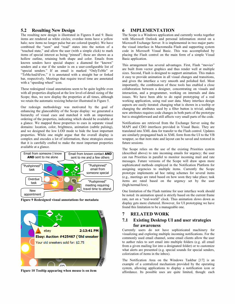
5.2 Resulting New DesignThe resulting new design is illustrated in Figures 8 and 9. Basicitems are rendered as white circles; overdue items have a yellowhalo; new items no longer pulse but are colored (purple). We havecombined the “seen” and “read” states into the notion of a“touched state,” and allow the user (with a simple click) to markitems of special interest as being “pinned”; these are shown as ahollow outline, retaining both shape and color. Emails fromknown senders have special shapes: a diamond for “known”senders and a star if the sender is on a user-configurable list of“special senders.” If an email is marked “OnlyToMe” or“ToMeAndAFew,” it is annotated with a straight bar or forkedbar, respectively. Meetings that require travel time are annotatedwith a “speeding wheel” icon.
These redesigned visual annotations seem to be quite legible evenwith all properties displayed at the low level-of-detail sizing of theScope; thus, we now display the properties at all times, althoughwe retain the automatic resizing behavior illustrated in Figure 5.
Our redesign methodology was motivated by the goal ofenhancing the glanceability of the Scope display: we generated ahierarchy of visual cues and matched it with an importanceordering of the properties, indicating which should be available ata glance. We mapped those properties to cues in separate visualdomains: location, color, brightness, animation (subtle pulsing),and we designed the low LOD mode to hide the least importantproperties. While one might argue that the overall display iscomplex and encodes a lot of information, these strategies ensurethat it is carefully crafted to make the most important propertiesavailable at a glance.
Figure 9 Redesigned visual annotations for metadata
Figure 10 Tooltip appearing when mouse is on item
6 IMPLEMENTATIONThe Scope is a Windows application and currently works togetherwith Microsoft Outlook and personal information stored on aMicrosoft Exchange Server. It is implemented in two major parts:the visual interface in Macromedia Flash and supporting systemcode in Microsoft Visual Basic. This was accomplished byplacing the Flash control on the main form of a simple VisualBasic application.
This arrangement has several advantages. First, Flash “movies”are built from vector graphics and thus render well at multiplesizes. Second, Flash is designed to support animation. This makesit easy to provide animation in all visual changes and transitions,and gives the interface a very smooth and polished feel. Mostimportantly, the combination of these tools has enabled a closecollaboration between a designer, concentrating on visuals andinteraction, and a programmer, working on internals and dataissues. We have been able to do rapid prototyping of a realworking application, using real user data. Many interface designaspects are easily iterated: changing what is shown in a tooltip orchanging the attributes used by a filter button is trivial; addingnew attributes requires code changes in both parts of the prototypebut is straightforward and still affects very small parts of the code.
Notifications are retrieved from the Exchange Server using theMAPI and CDO interfaces provided in Visual Basic. They aretranslated into XML data for transfer to the Flash control. Updatesare similarly propagated back in XML form from the UI to the VBwrapper, so that item state and layout can be saved and restored infuture sessions.
The Scope relies on the use of the existing Priorities system(described above) to rate incoming emails for urgency; the usercan run Priorities in parallel to monitor incoming mail and ratemessages. Future versions of the Scope will draw upon moresophisticated methods employed in the Notification Platform forassigning urgencies to multiple items. Currently the Scopeprototype implements ad hoc rating schemes for several items(e.g., meetings are rated based on how soon they take place; taskitems are rated based on the urgency set by the user(high/normal/low).
One limitation of the Flash runtime for user interface work shouldbe noted: its animation speed is strictly based on the current framerate, not on a “real-world” clock. Thus animation slows down asdisplay gets more cluttered. However, for UI prototyping we havefound this limitation to be a manageable one.
7 RELATED WORK7.1 Existing Desktop UI and user strategies
for awarenessCurrently users do not have sophisticated machinery forvisualizing and exploring multiple incoming notifications. For thecommonly used email channel, some email clients allow the userto author rules to sort email into multiple folders (e.g. all emailfrom a given mailing list into a designated folder) or to customizewhat alerts are presented (e.g. special sounds for special senders,colorization of items in the inbox).
The Notification Area on the Windows Taskbar [17] is anexample of a centralized mechanism provided by the operatingsystem, allowing applications to display a notification icon oraffordance. Its possible uses are quite limited, though: each
“Pushpinned” meeting requiring
travel time to attend
Overdue task
“Pushpinned” task
Email from known contact AND sent to me and a few others
New appointment
“Pushpinned” email from
someone special
Email from someone I know AND sent to me alone

application only gets to display a 16x16 pixel icon in a peripheralarea of the screen, and there is little uniformity in how usersinteract with the notifications. As more notification icons aredisplayed in the area, the value of each diminishes. Similarly, theMac OS has long allowed applications to “blink” their (small)application icon in the system menu header to indicate that thatapplication needs attention. Microsoft MSN Messenger uses smallperipheral textual pop-ups to notify users of changes in buddystatus and new mail arrival.
The Priorities system [12] displays unread email by urgency in alist view, constrained to user-specified periods of time. The clientcan be deployed as a transparent ambient display with user-configurable properties that define policies for audio alerting andthe fading in and out of a translucent display, based on theurgency of incoming items and the sensed context of the user.New messages associated with a notification are highlightedwithin the client as it fades in.
In practice, many users promote their awareness of newly arrivinginformation by either arranging windows so that a small butimportant region is always visible (e.g. the last few lines of theemail inbox application), or by running one or more awarenessapplets.
In summary, it is important to note that in current systemsnotifications are delivered in many different fashions, items arerarely ranked by urgency, notification policy is spread out overmany applications, and there is no single place for users to checkwhere their attention is needed. We feel that adding theseproperties to a single, unified UI is one of the main contributionsof the Scope notification design.
7.2 Research on Awareness andNotifications
There has been a long history of human factors and engineeringefforts exploring the use of dashboards and heads up displays fornotification and awareness. Many research projects have pursuedperipheral awareness of other people on the desktop with video[7] or with abstracted graphics [10]. Much recent work has beendone on peripheral information displays outside of the PC, in theuser’s physical environment (e.g. Weiser and Seely Brown [23]).This is generally called ambient information after theambientROOM by Ishii and Ullmer [13]. InfoCanvas is acustomizable display attached to a personal computer andpositioned in the periphery [18].
Several research projects have attempted to provide awareness ofmulitple sources of information. Sideshow [3] provides a desktoptoolbar that can accommodate many information sources. TheWhat’s Happening? project [25] attempts to present informationabout communty events in a non-distracting fashion and isextensible with new sources. The Scope differs from thesesystems in several ways: it presents notifications on a uniformaxis of urgency, it provides a single point of visual focus, and itabstracts information in an attempt to reduce distraction.
The Vista system [11] explored decision-theoretic approaches tothe display of auxiliary views on information and the highlightingof important information for flight engineers at NASA MissionControl. Measures being tracked by engineers were selectivelyhighlighted in place with color, depending on the inferredimportance of the information in different situations.
There have been multiple studies of the disruptiveness ofnotifications. McFarland found that task performance is betterwhen the user has control over the delivery of interruptions [16].Gillie and Broadbent report [9] that cognitively taxinginterruptions are harmful to task performance, suggesting to usthat a glanceable awareness display can be valuable. Czerwinskiet al. [3] specifically describe the cost of interruptions frominstant messaging on task performance, varying the main task andtime of interruption. Cutrell et al. [4] examine the influence ofnotifications on memory and explore factors in reorienting to atask following a notification.
A number of researchers have investigated the issues involved inperipheral display design. Lim et al. [14] examined the best screenlocations for placing information that users may want to glance at.The results suggested the bottom right display corner as the bestbalance between noticeability and distraction, guiding us in thedefault placement of the Scope. Maglio and Campbell [15] andEntin [8] showed that continuously updating peripheral displaysare more distracting than discrete updates (those that start andstop) and more disruptive to ongoing tasks. It is for this reasonthat the scope uses periodic updates that are visually subtle.Bartram et al. [1] studied the use of motion in peripheral displays.This work suggested that a slow blink motion for new itemsprovides a good balance: it is not too distracting but still verydetectable.
8 FUTURE WORKOur user study suggested several immediate refinements, whichguided the redesign of the visualization. The three major openissues in work on the Scope are discoverability, scalability, andeasy identification of multiple items.
As described above, it is difficult to design visual annotations thatare intuitively recognizable, simple looking, and combinable withother properties. Currently, users need an opportunity tofamiliarize themselves with visual attributes in a training session.To ease the familiarization process we have implemented easilyaccessible legend that we plan to test in future user studies.Further, we are exploring the value of adding a summary of activeattributes in each item’s tooltip, with text describing thesemantics.
Figure 11 Scope design with "more items" summary

Next, we need to ensure that the Scope can scale to numbers ofnotifications that users receive. Currently, the Scope canaccommodate at most 250 items. To increase this number, wehave designed (but not yet implemented or tested) severalfeatures. First, we can drop lower-urgency items off the Scope,and adjust the high/normal/low zones as appropriate. Alternately,Figure 11 illustrates a design we are currently implementing, inwhich low-urgency items that were dropped from the main Scopeare summarized. Each sector has a region that extends outwardand then along the periphery of the sector. This “tail” containsseveral discrete visual indicators (“buckets”) for how many itemshave been dropped and which urgency ranges the items are in. Atail with more “buckets” indicates that more of the urgency scalehas dropped off the main Scope display. (e.g., items with scores 0-30 in the Tasks sector versus 0-50 in the Calendar sector.)Alternatively, the wedge expansion interaction described earliercan be used to enlarge one specific wedge and gain space to seemore items beyond the current urgency threshold.
Second, we are revising the wedge-specific filter buttons to makethem maximally useful based on user feedback. The currentdesign adds filters for email versus voicemail, one-on-onemeetings, tasks that are due today, and for common categories ofalerts. Third, we can provide a distortion mode in which the center(high urgency) region is given more space while outer regions arecompressed—in the manner of fish-eye displays. Finally, if wecluster items based on content, we can collapse related low-urgency items into group objects, revealing individual items uponinspection.
Several people have commented that the high-urgency items arecurrently located in the smallest zone, and that most space isdedicated to low urgency items—and have suggested that thelayout might be inverted. Although we continue to entertain thisidea, two issues speak against it. First, we expect (and observe)that users receive far fewer urgent items than normal or low-urgency items. Second, having all urgent items at the center of theScope makes them glanceable without requiring a larger visualsearch.
Currently, proximity to the center encodes urgency, but we do notmake effective use of the radial placement within a wedge. Thereis an opportunity to group items within a wedge according to asemantic clustering. For example, items on similar topics, fromthe same sender, or about related projects would be placedtogether, allowing the user to learn a spatial map of the layoutover time, and anticipate what an item might relate to withoutfurther inspecting it.
An important challenge that is not handled well by the currentScope design is the efficient display of specific details aboutmultiple items. Users get metadata information about items at aglance, and this helps them decide which items to look at, but toexplore the details of a specific item, they have to interrogate eachitem in turn to raise a tooltip. We are pursuing the creation of amechanism that could provide easy access to detailed informationon the n most urgent items, and a sweep-to-reveal gesture whichwould allow users to access tooltips on several colocated items.Figure 12 shows a user controllable lens that reveals details on thefour most urgent items. A similar technique is useful to quicklyfind items one has seen before but now misplaced.
Finally, as the Scope prototype is implemented entirely usingscalable vector graphics, it can be transferred to displays smaller
than a desktop monitor. We intend to port the Scope application tothe Pocket PC PDA platform, and even envision the possibility ofa Scope display rendered on a wristwatch, for which the circulardesign is ideally suited.
Figure 12 Multi-item detail inspection
9 CONCLUSIONSWe have described a novel visualization and application that helpspeople manage the increasing numbers of notifications frommultiple applications. We believe that the Scope represents a newdirection of research on information visualization for awareness.The Scope unifies many notification sources, providing a singleinterface for users to “stay on top” of their work andcommunications. By coupling visual design and informationvisualization techniques, we have created an application that ishighly glanceable, reducing the mental effort users have to spendto decide what to attend to. Initial usability results suggest that,while the Scope is not immediately intuitive to grasp, informationworkers come to understand it in a brief session, and to appreciateits functionality. We believe that, as users increasingly experiencenotification overload, designs like the Scope will becomeincreasingly valuable.
10 ACKNOWLEDGMENTSWe thank Ken Hinckley, Gina Venolia, Ed Cutrell, GeorgeRobertson and our usability participants for valuable commentsand feedback.
11 REFERENCES1. Bartram, L., Ware, C., and Calvert, T. Moving Icons,
Detection and Distraction, Interact 2001, Tokyo, July.
2. Broadbent, D.E. (1958). Perception and communications.London: Pergamon Press.
3. Cadiz, J.J., Gupta, A., Jancke, G., and Venolia, G.D.Sideshow: Providing Peripheral Awareness of ImportantInformation. Microsoft Research Tech Report MSR-TR-2001-83 (2001).
4. Cutrell, E., Czerwinski, M. and Horvitz, E.. Notification,Disruption, and Memory: Effects of Messaging Interruptionson Memory and Performance, Proceedings of Interact 2001:IFIP Conference on Human-Computer Interaction, Tokyo,Japan, July 2001.
5. Czerwinski, M., Cutrell, E. & Horvitz, E. (2000). InstantMessaging and Interruption: Influence of Task Type onPerformance, In Paris, C., Ozkan, N., Howard, S. and Lu, S.(Ed's.), OZCHI 2000 Conference Proceedings, Sydney,Australia, Dec. 4-8, pp. 356-361.
6. Deutsch, J., & Deutsch, D. (1963). Attention: Some theoreticalconsiderations. Psychological Review, 70, 80-90.
7. Dourish, P. and Bly, S., Portholes: supporting awareness in adistributed work group, in CHI’92 Conference Proceedings onHuman Factors in Computing Systems, 1992, pp541 – 547.
8. Entin, E. (2000). Representing and visualizing a dynamicallychanging tactical situation. In Proceedings of the IEA2000/HFES 2000 Congress. San Diego, CA: Human Factorsand Ergonomics Society, pp. 427-430.
9. Gillie, T. and Broadbent, D. What makes interruptionsdisruptive? A study of length, similarity and complexityPsychological Research, 50, 243-250. (1989).
10. Greenberg, S.. Peepholes: Low cost awareness of one'scommunity. In ACM CHI '96 Companion, pp206--207,Vancouver, BC, Canada, April 1996.
11. Horvitz, E. and Barry, M. Display of Information for Time-Critical Decision Making. In: Proceedings of EleventhConference on Uncertainty in Artificial Intelligence, Montreal,August 1995, pages 296-305. Morgan Kaufmann: SanFrancisco.
12. Horvitz, E., Jacobs, A., and Hovel, D. Attention-SensitiveAlerting. In: Proceedings of UAI '99, Conference onUncertainty and Artificial Intelligence, Stockholm, Sweden,July 1999. Morgan Kaufmann: San Francisco. pp. 305-313.
13. Ishii, H. and Ullmer, B. Tangible Bits: Towards SeamlessInterfaces between People, Bits and Atoms, in Proc. ofCHI’97, New York: ACM Press, pp 234-241.
14. Lim, R.W., & Wogalter, M.S. (2000). The position of staticand on-off banners in WWW displays on subsequent
recognition. In Proceedings of the IEA 2000/HFES 2000Congress. San Diego, CA: Human Factors and ErgonomicsSociety, pp. 420-423.
15. Maglio, P.P. & Campbell, C.S. Tradeoffs in displayingperipheral information. In Proc. of ACM CHI 2000 HumanFactors in Computing Systems, 241-248.
16. McFarland, D. (1999). Coordinating the interruptions ofpeople in human-computer interaction. In: Human-ComputerInteraction—Interact ’99, Sasse, M.A. & Johnson, C. Eds.,IOS Press, Inc., IFIP TC 13, 295-303.
17. Microsoft Corporation, Microsoft Windows User Experience.Microsoft Press, 1999.
18. Miller, T. and Stasko, J. "InfoCanvas: InformationConveyance through Personalized, Expressive Art", inProceedings of CHI 2001, ACM, 2001, Seattle, USA.
19. Nielsen, J. Why You Only Need to Test With 5 Users. InAlertbox, March 19, 2000 athttp://www.useit.com/alertbox/20000319.html
20. Nielsen, J. and Landauer, T. K. A Mathematical Model of theFinding of Usability Problems. In CHI’93 ConferenceProceedings on Human Factors in Computing Systems. ACMPress 1993, Amsterdam, The Netherlands.
21. Parthasarathy, S. The Simplest Way to Define .NET.http://www.microsoft.com/net/define_net.asp
22. Robertson, G. , Czerwinski, M., Larson, K., Robbins, D.,Thiel, D. & van Dantzich, M. Data Mountain: Using SpatialMemory for Document Management, In: Proceedings of UIST'98, 11th Annual Symposium on User Interface Software andTechnology, pp. 153-162. ACM Press, 1998.
23. Weiser, M., Brown, J. S., Designing Calm Technology.http://ubiq.com/hypertext/weiser/calmtech/calmtech.htm
24. Whittaker, S., and Sidner, C. 1996. Email Overloading:Exploring Personal Information Management of Email. InProceedings of Conference on Human Factors in ComputingSystems (CHI 96), 276--283.
25. Zhao, Q. A. and Stasko, J. T. What's Happening? TheCommunity Awareness Application. In ACM CHI 2000Extended Abstracts, pp 253-254. ACM Press, 2000.