scientific plotting in python - pycon sweden · scientific plotting in python jack parmer ceo,...
TRANSCRIPT

Scientific Plotting in Python
Jack ParmerCEO, PlotlyBS Engineering PhysicsStanford University
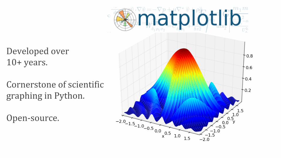
Developed over 10+ years.
Cornerstone of scientific graphing in Python.
Open-source.
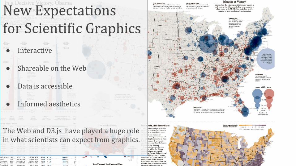
New Expectationsfor Scientific Graphics● Interactive
● Shareable on the Web
● Data is accessible
● Informed aesthetics
The Web and D3.js have played a huge role in what scientists can expect from graphics.
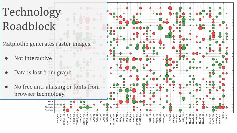
Technology RoadblockMatplotlib generates raster images.
● Not interactive
● Data is lost from graph
● No free anti-aliasing or fonts from browser technology
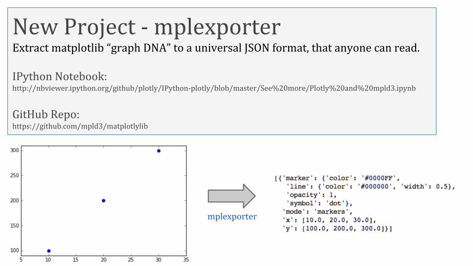
New Project - mplexporterExtract matplotlib “graph DNA” to a universal JSON format, that anyone can read.
IPython Notebook:http://nbviewer.ipython.org/github/plotly/IPython-plotly/blob/master/See%20more/Plotly%20and%20mpld3.ipynb
GitHub Repo:https://github.com/mpld3/matplotlylib
mplexporter

Improving Data Liquidity
fig, ax = plt.subplots()ax.plot([10, 20, 30],[100, 200, 300], 'o')
matplotlib-specific code
Resulting matplotlib-specific
figure
Neutral JSON figure representation
New figure representations based on neutral JSON
representations
Goal is to make data transfer bidirectional - Data can be put in *and* taken out of figures.
Plans to expand Matplotlib so that all figure objects include and expose their data.
[ { ‘x’:[10,20,30], ‘y’:[100,200,300]} ]
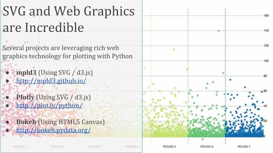
SVG and Web Graphics are IncredibleSeveral projects are leveraging rich webgraphics technology for plotting with Python
● mpld3 (Using SVG / d3.js)● http://mpld3.github.io/
● Plotly (Using SVG / d3.js)● http://plot.ly/python/
● Bokeh (Using HTML5 Canvas)● http://bokeh.pydata.org/

SVG and Web Graphics are InteractiveUsing JavaScript, scientific figures rendered with Python can have interactive elements.
Zoom, pan, hover...
http://nbviewer.ipython.org/gist/jackparmer/7729584
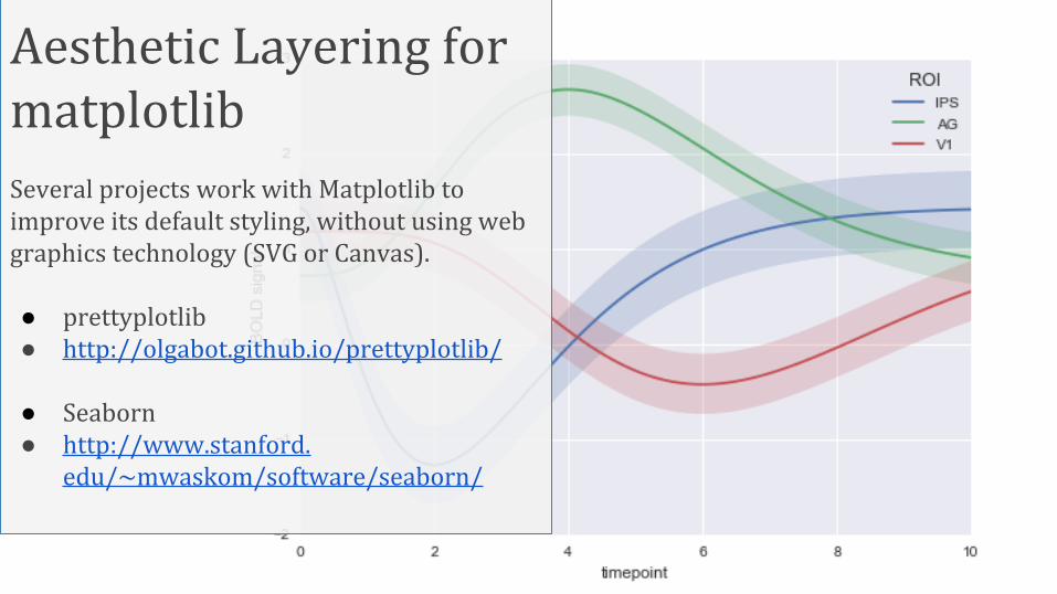
Aesthetic Layering for matplotlibSeveral projects work with Matplotlib to improve its default styling, without using web graphics technology (SVG or Canvas).
● prettyplotlib● http://olgabot.github.io/prettyplotlib/
● Seaborn● http://www.stanford.
edu/~mwaskom/software/seaborn/
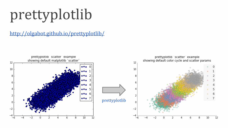
prettyplotlibhttp://olgabot.github.io/prettyplotlib/
prettyplotlib

Sharing Scientific Plots on the WebPlotly syncs graphs and data to its cloud for free with its Python API.
Each graph is given a unique URLhttps://plot.ly/~jackp/1544
Graphs are always kept with their original data.
fig1 = plt.figure()
x = np.arange(0,1.0,0.01)
y1 = np.sin(2*np.pi*x)
y2 = np.cos(4*np.pi*x)
ax = fig1.add_subplot(111)
ax.plot(x, y1, 'b--',
label='sin')
ax.plot(x, y2, 'ro',
label='cos')
ax.set_title("It's a Sign")
ax.set_xlabel('time')
ax.set_ylabel('amplitude')
fig_to_plotly(fig1, \
plotly_username, \
plotly_api_key, \
notebook=True)\
https://plot.ly/~jackp/1544
http://nbviewer.ipython.org/gist/jackparmer/7729584