sass and compass designer's cookbook - sample chapter
TRANSCRIPT
Sass and Compass Designer's Cookbook
Bass Jobsen
Sass and Compass Designer's Cookbook
What this book will do for you...
Spend less time debugging code
Compile Sass code into readable and maintainable CSS
Integrate Sass in your own projects
Reuse your code to prevent code duplications
Write reusable and portable CSS code
Make use of pre-built and established code written by other developers
Reduce development and maintenance time of your projects
Set up a development environment with Grunt
$ 49.99 US£ 31.99 UK
Prices do not include local sales tax or VAT where applicable
Inside the Cookbook... A straightforward and easy-to-follow format
A selection of the most important tasks and problems
Carefully organized instructions to solve problems effi ciently
Clear explanations of what you did
Solutions that can be applied to solve real-world problems
Quick answers to common problems
This book helps you to get most out of CSS3 and harness its benefi ts to create engaging and receptive applications. This book will help you develop faster and reduce the maintenance time for your web development projects by using Sass and Compass. You will learn how to use CSS frameworks such as Bootstrap and Foundation and understand how to use other libraries of pre-built mixins. You will also learn about setting up a development environment with Grunt.
This book guides you through all the concepts and gives you practical examples for fuller understanding.
Bass Jobsen
Sass and Com
pass Designer's C
ookbook
Over 120 practical and easy-to-understand recipes that explain how to use Sass and Compass to write effi cient, maintainable, and reusable CSS code for your web development projects
P U B L I S H I N GP U B L I S H I N G
community experience dist i l led
PU
BL
IS
HIN
GP
UB
LIS
HIN
G
Visit www.PacktPub.com for books, eBooks, code, downloads, and PacktLib.
Free Sample

In this package, you will find: • The author biography • A preview chapter from the book, Chapter 9 'Building Layouts with Sass' • A synopsis of the book’s content • More information on Sass and Compass Designer's Cookbook

About the Author
Bass Jobsen has been programming for the Web since 1995, covering everything from C to PHP and is always on the hunt to fi nd the most accessible interfaces. He is based in Orthen, the Netherlands.
Bass uses Sass in his daily job for web designing tasks and WordPress theme development.
He can be contacted via http://stackoverflow.com/users/1596547/bass-jobsen and he writes a blog that you can fi nd at http://bassjobsen.weblogs.fm/.
Also, check his Bootstrap WordPress Starters Themes (JBST) and other projects at GitHub: https://github.com/bassjobsen.
Information on his current projects and development is available at http://www.streetart.com/, https://menstrualcups.eu/ and https://github.com/bassjobsen/jbst-4-sass.

PrefaceSass (Syntactically Awesome Stylesheets) is a CSS extension language or preprocessor, which means that Sass or SCSS code compiles into static CSS code. Sass changes the way you write and maintain your CSS code; the fi nal CSS code will be the same, although better organized in many situations.
Since the introduction of CSS3 in 2012, the role o f CSS in modern web development has become more and more important. Nowadays, CSS3 is not only used to style your HTML documents, but it also plays an important role in the responsibility of your designs too. Last, but not least, CSS3 extends CSS with features such as animations and transitions.
Writing correct functional CSS code will be the fi rst thing; keeping this code readable, working on all major browsers, and maintainable will be the second. CSS fi les grow and become untidy in the development and maintenance processes. CSS doesn't have the ability to modify existing values or reuse common styles. Also, doing the math or defi ning variables is not possible in CSS. This is where the Sass language comes into the frame.
The Sass language enables you to write your CSS code DRY (Do not Repeat Yourself) because it extends the CSS syntax with variables, mixins, functions, and many other techniques. Sass makes the CSS language is more maintainable, themeable, and extendable.
Also, others know the power of Sass. Projects such as Bootstrap 4 and the Foundation are built with Sass. These projects create clear and extendable Frameworks with Sass. Bootstrap chose Sass because of the increasingly large community of Sass developers. You can't ignore these proofs. Stop writing cumbersome CSS with bugs and browser defects and learn Sass by reading this book.
In this book, you will learn to write, compile, and understand the Sass language. It helps with faster and more cost-effective web development. You will get practical tips to integrate Sass in your current and new projects. After reading this book, you will write clear and readable CSS3 with Sass. Instead of spending your time debugging your complex CSS code for a specifi c device or browser, you could pay more attention to your real design tasks.

Preface
Your clients will be happy with your advanced and stable designs. Development and maintenance time, and therefore costs, shall decrease.
Sass is available for use and modifi cation under the MIT License. You can use Sass free of charge.
What this book coversChapter 1, Getting Started with Sass, gives you an introduction to the Sass language. You will learn how to install and use Sass for your projects on your system, read how to edit your code, and organize your fi les. It will also tell you why you should use newer SCSS syntax instead of the intended Sass Syntax.
Chapter 2, Debugging Your Code, teaches you how to comment and debug your Sass code. Get introduced to an online tool to test your code and impress with style guides.
Chapter 3, Variables, Mixins, and Functions, showcases the power of Sass. Learn to use variables to defi ne commonly used values at a single place and write reusable code by using mixins and functions.
Chapter 4, Nested Selectors and Modular CSS, explains about the nested selectors and other methodologies to structure your code. Reuse your selectors by extending them and use placeholders to prevent duplicated and unused CSS selectors.
Chapter 5, Built-in Functions, dynamically assigns property values based on your input. Use the built-in functions of Sass, among others, for color values and mathematical operations.
Chapter 6, Using Compass, teaches you to code faster using Compass. Compass contains many useful helper mixins and functions to write clean and reusable CSS code.
Chapter 7, Cross-Browser CSS3 Mixins, helps to write maintainable and cross-browser CSS code. Learn about the CSS3 introduced vendor-specifi c rules, and read how Sass helps you prefi x your code to support different browsers.
Chapter 8, Advanced Sass Coding, uses conditionals and loops to create dynamic code and avoid repeats. Learn how to use prebuilt libraries for vertical rhythms, color contrasts, iconic fonts, and CSS Media Queries.
Chapter 9, Building Layouts with Sass, introduces grid-based layouts, help coders and designers, to work together in a consistent manner. Sass can help you create semantic or responsive grids for your projects.
Chapter 10, Building Grid-based Layouts with Susy and Sass, introduces Susy, which is a Sass add-on for grids; learn how to use it. You can also use Susy to create asymmetric or responsive layouts.

Preface
Chapter 11, Foundation and Sass, explores Foundation for Sites 6. Foundation is a responsive frontend framework built with Sass.
Chapter 12, Bootstrap and Sass, explains details about Bootstrap 4. Bootstrap 4 uses Sass now. Learn how to develop mobile fi rst and responsive projects with Bootstrap and Sass.
Chapter 13, Meeting the Bourbon Family, explains about Bourbon, which is a simple and lightweight mixin library for Sass; it helps you write CSS faster and easier without the need of using vendor prefi xes.
Chapter 14, Ruby on Rails and Sass, builds web applications with Ruby on Rails (RoR) and Sass. Get to grips with sass-rails to compile the CSS code for your RoR apps.
Chapter 15, Building Mobile Apps, explains that the look and feel of mobile apps may differ from that of other web applications. Get introduced to Frameworks for mobile app development with Sass. Build mobile apps with Foundation for Apps and Ionic.
Chapter 16, Setting up a Build Chain with Grunt, gives introduction to Grunt, a build tool for JavaScript projects. Learn how to create tasks to automatically compile, compress, and prefi x your CSS code.

203
9Building Layouts
with Sass
In this chapter, you will learn the following:
Using a CSS Reset
Importing and organizing your fi les
Building a grid with grid classes
Creating responsive grids
Building a semantic grid with mixins
Applying the grid on your design
Integrating a vertical navigation menu in your layout
Creating grids with semantic.gs
Using Compass Layout Module
IntroductionIn the recipes in this chapter, you will learn how to create a layout for your website or web application with Sass. The grid forms the basics of the layout. Grids help web designers and developers to work together and make deploying responsive layouts easier.

Building Layouts with Sass
204
In the course of time, different ways to deploy layouts on the web saw the light. For years, tables have been (mis)used to build HTML layouts. Newer techniques leverage the CSS fl oat to arrange elements. The CSS float property is a positioning property that keeps HTML elements in the fl ow of the document instead of applying a text wrap on it. Other layouts are built with the display property set to inline-block. HTML elements with the display property set to inline-block are positioned like lines of text. The Bootstrap CSS framework, as we will see in Chapter 12, Bootstrap and Sass, uses the fl oat technique, but Bootstrap 4, as described in Chapter 12, Bootstrap and Sass, also ships with an opt-in, fl exbox-based grid system and components. An example of the inline-block technique can be found at http://cardinalcss.com.
Even the CSS display: table declaration can be used to build a responsive layout, as can be seen at https://github.com/mdo/table-grid, but in this chapter you will build a grid layout with the CSS3 fl exbox module.
Every technique mentioned previously has its pros and cons. Saying that you should prefer one above the other is not easy. Some people predict the CSS fl exbox module as the most modern, and so preferred technique, to build your layouts.
The Bootstrap team says:
The future is now—switch a Boolean variable and recompile your CSS to take advantage of a fl exbox-based grid system and components.
The recipes in this chapter will show you how to build a grid layout with fl exible boxes, but do not necessarily advise you to do so. The CSS Flexible box module is intended to describe the spatial position of child elements in relation to their parent, but fl exible boxes are also intended to position only single UI elements and not the entire page layout.
When using fl exible boxes for page layouts, the browsers have to do a lot of repainting that can result in bad, slow, or unexpected rending of elements, which have also been described at http://jakearchibald.com/2014/dont-use-flexbox-for-page-layout/. On the other hand, others such as Paul Irish claim the opposite, you can read more about that at http://updates.html5rocks.com/2013/10/Flexbox-layout-isn-t-slow. The cons of the fl exbox layouts are that it dramatically reduces the complexity of fl uid grids. When choosing a technique, you should always carefully consider the pros and cons, and make sure you are optimizing for the real bottlenecks.
Finally, you will notice that the fl exbox module has been intended to lay out major regions of an application. The CSS3 Grid Layout module in contrast to the fl exbox module can be applied on a high-level HTML element such as header, footer, and main. At the time of writing this book, only a few browsers support the Grid Layout module.
Besides the fl exbox layout, this chapter pays attention to CSS Resets, organizing your Sass code and fi les, importing fi les, and how to build a navigation menu for your site.

Chapter 9
205
Using a CSS ResetWhen talking about cascade in CSS, there will no doubt be a mention of the browser default settings getting a higher precedence than the author's preferred styling. When writing Sass code, the compiled CSS code will overwrite the browser's default styling. In other words, anything that you do not defi ne in your Sass code will be assigned a default styling, which is defi ned by the browser. This behavior plays a major role in many cross-browser issues. To prevent these sorts of problems, you can perform a CSS Reset, or a CSS Reset alternative such as Normalize.css.
Getting readyIn this recipe, you will use Normalize.css as an alternative for other CSS Resets. You can download Normalize.css at https://necolas.github.io/normalize.css/. After downloading the fi le you can compile your code with the Ruby Sass compiler. The Installing Compass recipe of Chapter 1, Getting Started with Sass describes how to install Compass for command line usage on your system.
How to do it...Perform the the following step to use Normalize.css as an alternative for other CSS Resets in your Sass code:
1. Download the normalize.css fi le at https://necolas.github.io/normalize.css/.
2. Rename the normalize.css to _normalize.scss and then create the fi le and directory structure like that shown in the following fi gure:
3. Your main.scss can now import the _normalize.scss partial fi le by declaring the following line of code:
@import 'base/normalize';
4. As you will see now, when you compile your project by running the command like that shown in the following code, the compiled CSS code will start with the CSS code from normalize.css:
sass main.scss

Building Layouts with Sass
206
How it works...CSS resets the overwrite of the default styling rules of the browser and creates a starting point for styling. This starting point looks and acts the same on all (or most) browsers. In this book, Normalize.css v3.0.2 is used. Normalize.css is a modern, HTML5-ready alternative to CSS Resets. It lets browsers render all elements more consistently and makes them adhere to modern standards.
In this recipe, you had to rename the original CSS fi le. You should prepend an underscore to the fi le name and change the fi le extension to make it a Sass partial fi le. The preceding prevents Sass from compiling the fi le into CSS. Read more about partials in the Working with partials recipe of Chapter 1, Getting Started with Sass. Also notice that changing the fi le extension from .css to .scss will prevent Sass from creating a regular CSS @import declaration instead of importing and processing the fi le, as explained in the Importing and organizing your fi les recipe of this chapter. You should always import the reset code at the beginning or top of your style rules.
Bootstrap 4, as described in Chapter 12, Bootstrap and Sass, uses an extended version of Normalize.css called Reboot.
There's more...When you start a project, you should also think about the CSS Reset that you will have to use. Writing a CSS Reset yourself seems like reinventing the wheel again. On the other hand, using a random CSS Reset code without any research may cause unwanted effects or unnecessary process time for your project. Your choice should depend on using HTML5 or not, the browsers that you will have to support, and so on. At http://www.cssreset.com/, you can fi nd and download the most popular CSS Resets, including Normalize.css. To make a motivated choice, you can read the Which CSS Reset Should I Use? section on that website, too. Download the CSS fi le (with the .css extension) of the CSS Reset of your choice and save this fi le into your working directory. Rename it as shown in this recipe. You can use the Ruby Sass compiler to see how the CSS Reset compiles into your fi nal CSS code.
The oldest and most famous browser reset is Eric Meyer's CSS Reset. When you use Compass as described in Chapter 6, Using Compass, you can directly apply Meyer's CSS Reset by using the Compass Reset module. The module applies the global reset to your stylesheet by simply importing it.
Use Meyer's CSS Reset with compass by declaring the following @import statement at the beginning of your code:
@import 'compass/reset';

Chapter 9
207
See alsoRead more about Eric Meyer's CSS Reset at http://meyerweb.com/eric/tools/css/reset/.
Importing and organizing your fi lesIn the Working with partials recipe of Chapter 1, Getting Started with Sass, you can read about the @import directive in Sass. The @import directive enables you to have as many fi les as you want in your development environment and this will compile to a single fi le in production. When your project grows, the number of fi les will also grow. In this recipe, you will learn how to use and organize these fi les.
Getting readyIn this recipe, you only will compile a single Sass template into CSS code to demonstrate the use of the @import directive. You can compile this template by using the Ruby Sass compiler. Read the Installing Sass for command line usage recipe of Chapter 1, Getting Started with Sass, to fi nd out how to install Ruby Sass.
How to do it...The following steps will learn you how to import fi les and organize your fi les:
1. Create a Sass template called imports.scss. The imports.scss fi le should contain the following lines of SCSS code:
@import 'file.css';@import 'file' screen;@import 'http://sass-lang.com/file.scss';@import url(file.scss);
2. Then run the following command in your console to compile it into CSS code:
sass imports.scss
3. Finally, you will fi nd that the SCSS code from Step 1 compiles into static CSS code like that shown in the following:
@import url(file.css);
@import "file" screen;
@import "http://sass-lang.com/file.scss";
@import url(file.scss);

Building Layouts with Sass
208
How it works...The syntax of the @import directive in Sass is similar to the @import at-rule in CSS. So Sass should only process Sass templates and leave other @import at-rules intact. When you import a Sass template, you do not explicitly have to set the fi le extension; the compiler automatically searches for fi les with the .scss and .sass extension and processes these fi les.
As you can see when evaluating the compiled CSS code in Step 3, all other declarations compile into a regular CSS @import at-rule.
The @import 'file.css'; declaration will not be processed due to the .css extension. The second declaration contains the screen media query. At compile time, there is no context to evaluate the media query so this declaration also compiles into a CSS @import at-rule. Also, fi le names that are in the url() form, or start with http://, will compile into CSS @import at-rules.
Remember that Sass will ignore fi les that begin with underscores until you specifi cally import them. These fi les are called partials. In this book, the so-called 7-1 pattern has been used to organize the Sass templates. Note that you may not include a partial and a non-partial with the same fi le name in the same directory. You can read more about partials in the 7-1 pattern in the Working with partials recipe of Chapter 1, Getting Started with Sass.
There's more…Although you mostly use the @import directives at the beginning of your style document, Sass also allows you to nest a Sass with the @import directive inside of a style rule.
When your _nested.scss partial fi le contains the SCSS like that shown as follows:
p {color: red}
You can compile the following SCSS code:
#library { @import 'nested';}
The previous code compiles into CSS code as follows:
#library p { color: red; }

Chapter 9
209
See also Read more about the CSS @import at-rule, which allows you to import style rules
from other stylesheets, at https://developer.mozilla.org/en/docs/Web/CSS/@import.
You can read more about the 7-1 pattern developed by Hugo Giraudel at http://sass-guidelin.es/#the-7-1-pattern.
Read why you should not use Sprockets directives in Asset Pipeline to combine your Sass fi les at http://blog.pivotal.io/labs/labs/structure-your-sass-files-with-import.
Matt Stauffer wrote a quick blog post about Nesting Sass @imports, with BEM. You can fi nd Stauffer's post at https://mattstauffer.co/blog/nesting-sass-imports-with-bem.
The Sass globbing plugin allows you to import many Sass or SCSS fi les in a single import statement. You can fi nd this plugin at https://github.com/chriseppstein/sass-globbing.
And fi nally the Sass CSS Importer plugin, which enables you to import a CSS fi le into Sass, can be found at https://github.com/chriseppstein/sass-css-importer.
Building a grid with grid classesGrid-based layouts divide your design into a collection of rows with equal-sized columns. Content and graphical elements can be organized according to this layout. Grids help in creating a logical and formal structure for designs. They prevent inconsistencies between the original design and the fi nal implementation in HTML as designers and developers work with the same grid.
Grids are also helpful in responsive design, because the grid's columns can easily be rearranged to fi t different screen widths.
Grids are formed by rows and columns. A grid with 12 columns can be easily adopted for different screen sizes. In this recipe, CSS classes are used to set the width of the grid items.
There are 12 classes for a grid of 12 columns, where each class has a width that spans a number of columns. The total items that span the columns in a row should be equal to the total number of columns in the grid. So, when your grid has 12 columns, a row can contain, for instance, three items that span four columns, or one item that spans one column and one item that spans 11 columns.

Building Layouts with Sass
210
Getting readyThe code used in this recipe is based on the CSS3 Flexible box module, using the same naming conventions as Bootstrap. Read more about Bootstrap in Chapter 12, Bootstrap and Sass. Notice that Bootstrap 4 also has opt-in fl exbox support.
Though it will be interesting to inspect the compiled code, the best way to test the grid you will construct in this recipe will be to use it in your browser. Notice that the code in this recipe uses the offi cial W3C syntax for fl exboxes, so you should use a browser that supports this syntax. You can fi nd out which browsers support the Flexible box layout at http://caniuse.com/#feat=flexbox.
Also, the box-sizing property, as described in the There's more... section, should be supported by your browser. In the How it works... section of this recipe, you can read how to add support for older browsers, too.
If you are not familiar with the CSS Flexible box module already, it's strongly recommended that you read more about it before you start this recipe. An excellent article titled A Complete Guide to Flexbox can be found at http://css-tricks.com/snippets/css/a-guide-to-flexbox/.
Of course, you will have to compile the Sass code of the recipe. Read Chapter 1, Getting Started with Sass to fi nd out how to install Sass on your system. Also read the Using vendor prefi xes recipe of Chapter 7, Cross-Browser CSS3 Mixins.
How to do it...Now, build a fl exbox grid yourself by performing the following steps:
1. Firstly, create a Sass fi le called sass/main.scss and write down the SCSS code shown here into this fi le:
@import 'utils/variables';@import 'base/normalize';@import 'base/base';@import 'layout/grid';
The fi le shown previously contains the CSS Reset as already described in the Using a CSS Reset recipe of this chapter. In the section of this recipe, you can read about setting the box-sizing property to make a calculation of widths inside your grids more easily. The base/_base.scss fi le only sets the box-sizing property.

Chapter 9
211
2. Create a Sass partial fi le called utils/_variables.scss and write down the SCSS code into this fi le:
// variables;
$half-gutter-width: .5rem !default;$gutter-compensation: -.5rem !default;$outer-margin: 2rem !default;$grid-columns: 12 !default;$border-color: #ff6347 !default; // tomato
3. Also, create the layout/_grid.scss partial fi le and write down the SCSS code for the grid into it:
// mixins
@mixin grid () { padding-right: $outer-margin; padding-left: $outer-margin;}
@mixin row() { box-sizing: border-box; display: flex; flex-direction: row; flex-wrap: wrap; margin-right: $gutter-compensation; margin-left: $gutter-compensation;}
@mixin make-columns($grid-columns: $grid-columns) { @for $i from 1 through $grid-columns { .col-#{$i} { flex-basis: ((100% / $grid-columns) * $i); max-width: ((100% / $grid-columns) * $i); } }} // the grid .grid { @include grid();}

Building Layouts with Sass
212
.row { @include row();}
[class^="col-"],[class*=" col-"] { border: 2px solid $border-color; box-sizing: border-box; display: flex; flex-direction: column; flex-grow: 0; flex-shrink: 0; padding-left: $half-gutter-width; padding-right: $half-gutter-width;}
@include make-columns($grid-columns);
4. Now run the following command in your console to compile the SCSS code from Step 3 into CSS code:
sass sass/main.scss main.css
5. Then, create an HTML fi le named index.html and include the main.css fi le into it by adding the following lines of HTML code to the head section:
<link rel="stylesheet" type="text/css" href="main.css" />
6. Now write the following snippet of HTML code into the body of the index.html fi le to make the grid visible in your browser:
<div class="grid"> <div class="row"> <div class="col-12"> </div> </div> <div class="row"> <div class="col-6"> </div> <div class="col-6"> </div> </div> <div class="row"> <div class="col-4"> </div> <div class="col-4"> </div> <div class="col-4"> </div> </div></div>
Chapter 9
213
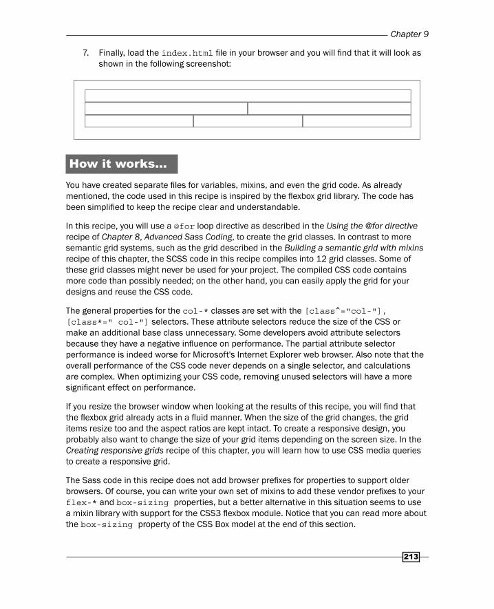
7. Finally, load the index.html fi le in your browser and you will fi nd that it will look as shown in the following screenshot:
How it works...You have created separate fi les for variables, mixins, and even the grid code. As already mentioned, the code used in this recipe is inspired by the fl exbox grid library. The code has been simplifi ed to keep the recipe clear and understandable.
In this recipe, you will use a @for loop directive as described in the Using the @for directive recipe of Chapter 8, Advanced Sass Coding, to create the grid classes. In contrast to more semantic grid systems, such as the grid described in the Building a semantic grid with mixins recipe of this chapter, the SCSS code in this recipe compiles into 12 grid classes. Some of these grid classes might never be used for your project. The compiled CSS code contains more code than possibly needed; on the other hand, you can easily apply the grid for your designs and reuse the CSS code.
The general properties for the col-* classes are set with the [class^="col-"], [class*=" col-"] selectors. These attribute selectors reduce the size of the CSS or make an additional base class unnecessary. Some developers avoid attribute selectors because they have a negative infl uence on performance. The partial attribute selector performance is indeed worse for Microsoft's Internet Explorer web browser. Also note that the overall performance of the CSS code never depends on a single selector, and calculations are complex. When optimizing your CSS code, removing unused selectors will have a more signifi cant effect on performance.
If you resize the browser window when looking at the results of this recipe, you will fi nd that the fl exbox grid already acts in a fl uid manner. When the size of the grid changes, the grid items resize too and the aspect ratios are kept intact. To create a responsive design, you probably also want to change the size of your grid items depending on the screen size. In the Creating responsive grids recipe of this chapter, you will learn how to use CSS media queries to create a responsive grid.
The Sass code in this recipe does not add browser prefi xes for properties to support older browsers. Of course, you can write your own set of mixins to add these vendor prefi xes to your flex-* and box-sizing properties, but a better alternative in this situation seems to use a mixin library with support for the CSS3 fl exbox module. Notice that you can read more about the box-sizing property of the CSS Box model at the end of this section.

Building Layouts with Sass
214
Compass has a fl exbox module that provides prefi xing support for the three versions of fl exbox that have been implemented by browsers since 2009. Compass has also got a box-sizing() mixin for cross-browser changing of the box model. Read more about Compass in Chapter 6, Using Compass. In the Implementing semantic layouts recipe of Chapter 12, Bootstrap and Sass, you can read how to create cross-browser fl exbox layouts leveraging the Bootstrap library.
Alternatively, you can use the autoprefi xer to add cross-browser prefi xes to your CSS code. In contrast to the Sass compiler, autoprefi xer is a postprocessor for your CSS. The autoprefi xer checks the Can I Use database. Read the Automatically prefi xing your code with Grunt recipe of Chapter 16, Setting up a Build Chain with Grunt to fi nd out how to use the autoprefi xer.
The -prefix-free project enables you to use unprefi xed CSS properties. Because the -prefix-free project code runs at the client side, some people claim that you shouldn't use it for production. Client-side code has a negative effect on end-user performance in many cases.
On the other hand, Lea Vera, the author of the -prefix-free project says, -prefi x-free detects which features need a prefi x and only adds it if needed. With the -prefix-free library, you can use smaller CSS fi les without any prefi x and you don't have to update your code when some new browsers become available. Also read The -prefi x-free library recipe of Chapter 7, Cross-Browser CSS3 Mixins.
There are also prefi x plugins available for some text editors.
There's more…In this section, you will learn how to use the box-sizing property of the CSS Box model.
Using the box-sizing property with SassWhen building grids and layouts, it is useful to pay some attention to the box-sizing property. The box-sizing property sets the CSS Box model and is used to calculate the width and height of an element. The default value of the box-sizing property is content-box; this model does not take borders and padding into account when calculating dimensions. On the other hand, the border-box model calculates dimensions that includes borders and padding. The difference between these two models can be easily made clear with a simple example. Consider the following SCSS code:
// scss-lint:disable VendorPrefix
// Box sizing@mixin box-sizing($boxmodel) { -webkit-box-sizing: $boxmodel; -moz-box-sizing: $boxmodel;

Chapter 9
215
box-sizing: $boxmodel;}
$background-color: #000; // black$border-color: #f00; // red$font-color: #fff; // white
.container { &.fit { @include box-sizing(border-box); } > div { @include box-sizing(inherit); background-color: $background-color; border: 5px $border-color solid; color: $font-color; float: left; padding: 10px; width: 50%; }}
The compiled CSS code of the preceding SCSS code can be applied to the following HTML snippet:
<div class="container"> <div>col 1</div> <div>col 2</div></div><div class="container fit"> <div>col 3</div> <div>col 4</div></div>
When you load the preceding code into your browser, it will look like what is shown in the following screenshot:

Building Layouts with Sass
216
As you can see in the preceding screenshot, the last two columns of 50% width fi t in the same row. Neither the padding nor the border sizes of this column infl uences the total width of these columns due to the border-box model. So the border-box model makes the calculation of column sizes for your layouts easier, because of which you may ignore the padding and border sizes in your calculations.
See also More information about the Compass box-sizing() mixin can be found at
http://compass-style.org/reference/compass/css3/box_sizing
Bottlenecks in CSS performance are tested and described at http://benfrain.com/css-performance-revisited-selectors-bloat-expensive-styles/
An online service that prefi xes your CSS code can be found at http://prefixr.com/
The autoprefi xer can be found at https://github.com/postcss/autoprefixer/
The -prefix-free project can be found at http://leaverou.github.io/prefixfree/
You can read an interview with Lea Vera, author of the -prefix-free project, by Chris Coyier of CSS-tricks.com at http://css-tricks.com/five-questions-with-lea-verou/
The Can I Use database can be found at http://caniuse.com/
Creating responsive gridsCSS media queries make it possible to only apply style rules when a certain condition is true. For responsive designs, the screen width can be used as a condition to evaluate the media queries. A typical media query looks like the following:
@media (min-width: 768px) { //style rules}
The style rules inside the preceding media query will only be applied when the screen's width (viewport) is equal to or wider than 768 pixels.
Getting readyIn this recipe, you will have to use the code from the Building a grid with grid classes recipe of this chapter. You also will have to use the command line Ruby Sass compiler. Read Chapter 1, Getting Started with Sass, to fi nd out how to install Sass on your system.

Chapter 9
217
How to do it...Perform the following steps to create a responsive grid yourself:
1. Copy the fi les from the Building a grid with grid classes recipe of this chapter into your working directory. You should end up with a fi le and directory structure like that shown in the following fi gure:
2. Then, change the make-columns()mixin to the sass/layout/_grid.scss fi le by adding a $grid parameter. Finally, the make-columns() mixin should look like that shown in the following SCSS code:
@mixin make-columns($grid, $grid-columns: $grid-columns) { @for $i from 1 through $grid-columns { .col-#{$grid}-#{$i} { flex-basis: ((100% / $grid-columns) * $i); max-width: ((100% / $grid-columns) * $i); } }}
3. Also, remove the make-columns() mixin call at the end of the sass/layout/_grid.scss fi le.
4. Next, create a sass/main.scss fi le that will contain the following SCSS code:
@import 'utils/variables';@import 'base/normalize';@import 'base/base';@import 'layout/grid';
// the responsive grid$basefontsize: 16;$sm-breakpoint: (768 / $basefontsize) *1em;$grid-columns: 4;

Building Layouts with Sass
218
@include make-columns(xs); @media (min-width: $sm-breakpoint) { @include make-columns(sm);}
5. Then, compile the sass/main.scss fi le by running the following command in the console:
sass sass/main.scss main.css
6. In the next code, you will fi nd part of the compiled CSS code that contains the styles for the columns of the grid. The other styles for the grid, including fl exbox properties, are not shown:
.col-xs-1 { flex-basis: 25%; max-width: 25%; }
.col-xs-2 { flex-basis: 50%; max-width: 50%; }
.col-xs-3 { flex-basis: 75%; max-width: 75%; }
.col-xs-4 { flex-basis: 100%; max-width: 100%; }
@media (min-width: 48em) { .col-sm-1 { flex-basis: 25%; max-width: 25%; }
.col-sm-2 { flex-basis: 50%; max-width: 50%; }
.col-sm-3 { flex-basis: 75%; max-width: 75%; }
.col-sm-4 { flex-basis: 100%; max-width: 100%; } }

Chapter 9
219
7. Now write down the following HTML code into the index.html fi le:
<div class="grid"><div class="row"> <div class="col-xs-2 col-sm-3">col-xs-2 col-sm-3</div> <div class="col-xs-2 col-sm-1">col-xs-2 col-sm-1</div></div></div>
8. In your browser, the previous code should look like that shown in the following fi gure:
9. Finally, resize your browser so that the screen width is smaller than 40em (~640 pixel) and you will fi nd that each column gets 50% of the width of the grid now.
How it works...In this recipe, you created two grids: the xs (extra small) grid with the col-xs-* classes, and the sm (small) grid with the col-sm-* classes for screen sizes wider than 40 em. Notice that the breakpoint has been set in em units instead of pixels. The em units let the media queries appropriately respond to a change in font size, such as when the user magnifi es the page. Modern browsers do not require media queries in (r)em values for correct zooming; viewports do not depend on font sizes and earlier bugs about the zooming behavior have already been fi xed. Also, Bootstrap 4 defi nes its breakpoint in pixel values again. Also realize that pixels provide absolute control and consistent rendering across every browser. Designers used to think and operate in pixels.
There's more...To make the code act in a mobile-fi rst manner, the .make.-cols(xs); mixin call is not wrapped in any media query. You can also use this strategy for other style rules. Start with the default style rules without media queries and add more or other style rules for wider screen sizes with media queries, which set the min-width condition. The mobile-fi rst strategy refers to earlier times when mobile browsers did not support JavaScript or the full range of CSS (or CSS3) rules. This strategy is still true, and the browser loads the default-style rules fi rst. Other style rules are loaded and applied if the browser supports them. The mobile-fi rst strategy also prevents the browser from loading features and style rules that are never used in the situation where bandwidth and processing power are limited.

Building Layouts with Sass
220
See also An insight into responsive design fundamentals can be found at
https://developers.google.com/web/fundamentals/layouts/
Read more about the mobile-fi rst strategy at http://www.uxmatters.com/mt/archives/2012/03/mobile-first-what-does-it-mean.php
Building a semantic grid with mixinsIn the Building a grid with grid classes recipe of this chapter, you can read how to build a grid with CSS grid classes. Using these grid classes on the div elements breaks the semantic nature of HTML5. In this recipe, you will learn how to keep the HTML5 semantic tags intact when deploying a grid.
Getting readyIn this recipe, you will have to use the code from the Building a grid with grid classes and Creating responsive grids recipes of this chapter. You will use the Ruby Sass compiler as described in Chapter 1, Getting Started with Sass, to compile your CSS code.
How to do it...Learn how to set up a semantic grid by performing the step beneath:
1. Leverage the SCSS code from the Building a grid with grid classes and Creating responsive grids recipes, and edit the sass/layout/_grid.scss fi le so that it contains the following SCSS code:
@mixin set-span($col-number) { flex-basis: ((100% / $grid-columns) * $col-number); max-width: ((100% / $grid-columns) * $col-number);}
@mixin grid-item($span, $unit) { @if $unit == xs { @include set-span($span); } @else if $unit == sm { @media (min-width: $sm-breakpoint) { @include set-span($span); } }}

Chapter 9
221
2. The SCSS code in the sass/main.scss fi le should look like that shown in the following:
@import 'utils/variables';@import 'base/normalize';@import 'base/base';@import 'layout/grid';
article { @include grid-item(4,xs); @include grid-item(2,sm);}
3. Then, compile the sass/main.scss fi le by running the following command in the console:
sass sass/main.scss main.css
4. Finally, the compiled CSS code should look like that shown in the following:
article { flex-basis: 100%; max-width: 100%; } @media (min-width: 48em) { article { flex-basis: 50%; max-width: 50%; } }
How it works...The Sass compiler does not group equal media queries; this is why the loop in the Building a grid with grid classes recipe was called inside a media query, as can be seen in the following snippet of SCSS code:
@media (min-width: $sm-breakpoint) { @include make-columns(sm);}
When each iteration of the loop creates a class that includes the corresponding media query, the compiled CSS will become ineffi cient and contain many unnecessary media queries. The result of the preceding code is that the mixins of the fl exbox grid library do not defi ne media queries. Moreover, the original make-column() mixin always creates a class.

Building Layouts with Sass
222
To solve the issue in the preceding code, the make-column() mixin has been split up into two new mixins as follows:
@mixin set-span($col-number) { flex-basis: ((100% / $grid-columns) * $col-number); max-width: ((100% / $grid-columns) * $col-number);}
@mixin grid-item($span, $unit) { @if $unit == xs { @include set-span($span); } @else if $unit == sm { @media (min-width: $sm-breakpoint) { @include set-span($span); } }}
Now you can call the set-span() mixin to set the fl exbox properties without defi ning a class. To solve the media query issue, a grid-item() helper mixin has been created. The grid-item() helper mixin sets the required media query based on the $span input parameter and the already defi ned $*-breakpoint variables. Notice that media queries are still not grouped, but the number of media queries will be limited when you have to generate all the grid classes.
There's more...Building your grid with responsive mixins instead of CSS classes helps you to write more semantic HTML code. Also notice that grid items should still be wrapped in a row and a row, in turn, should have a grid as its parent. The need for these wrappers to set the fl exbox properties will mean you can't build a pure semantic layout.
The semantic.gs grid system enables you to build pure semantic grids. You can read more about semantic.gs in the Building semantic grids with semantic.gs recipe of this chapter.
See also A post CSS processor such as CSS MQPacker can pack the same CSS media query
rules into one media query rule. CSS MQPacker can be found at https://github.com/hail2u/node-css-mqpacker. Also read the Automatically prefi xing your code with Grunt recipe of Chapter 16, Setting up a Build Chain with Grunt to fi nd out how to integrate postprocessors in your build process using PostCSS.
More information on the semantic grid system can also be found at http://semantic.gs/.

Chapter 9
223
On the HTML5 Doctor website at http://html5doctor.com/, you will fi nd an easy-to-understand HTML5 sectioning element fl owchart to help you get to grips with some of the semantic elements in HTML5.
Applying the grid on your designIn this recipe, you will learn how to build a layout using the fl exbox code you have already built in the preceding recipes of this chapter.
Getting readyRead Chapter 1, Getting Started with Sass to fi nd out how to compile your CSS code using Ruby Sass. You will reuse the code from the Building a grid with grid classes recipe of this chapter.
How to do it...You need to perform the following steps to apply the grid on your design:
1. Copy the fi les of the Building a grid with grid classes recipe of this chapter into your working directory. Your fi le and directory structure should look like that shown in the following fi gure:
2. Now edit the sass/layout/_grid.scss fi le. Write down the following SCSS code at the end of this fi le:
@mixin make-cols($grid) { @for $col-number from 1 through $grid-columns { @include make-column($grid, $col-number); } }
@include make-cols(xs);

Building Layouts with Sass
224
@media (min-width: $sm-breakpoint) { @include make-cols(sm);}
@media (min-width: $md-breakpoint) { @include make-cols(md);}
@media (min-width: $lg-breakpoint) { @include make-cols(lg);}
3. The Main Body part in the HTML code in Step 5 contains an unordered list (ul). This list gets grid classes to lay it out. Use the following SCSS at the end of the sass/main.scss fi le to set the colors and other styling elements of the items on the list:
.blocks { padding: 0; li { background-color: $blocks-background-color; border: 2px solid; color: $blocks-font-color; font-size: 3em; height: 100px; padding: 10px; }}
4. Compile the sass/main.scss fi le by running the following command in the console:
sass sass/main.scss main.css
5. Finally, create an index.html fi le and write the following HTML code into it:
<div class="grid"> <header class="row"> <h1 class="col-xs-12">Flexbox Grid System</h1> </header> <div class="row"> <!-- Main Body --> <section class="col-xs-12 col-sm-9"> <ul class="row blocks"> <li class="col-xs-12 col-sm-6 col-md-4">1</li> <li class="col-xs-12 col-sm-6 col-md-4">2</li> <li class="col-xs-12 col-sm-6 col-md-4">3</li> <li class="col-xs-12 col-sm-6 col-md-4">4</li> <li class="col-xs-12 col-sm-6 col-md-4">5</li>

Chapter 9
225
<li class="col-xs-12 col-sm-6 col-md-4">6</li> <li class="col-xs-12 col-sm-6 col-md-4">7</li> <li class="col-xs-12 col-sm-6 col-md-4">8</li> <li class="col-xs-12 col-sm-6 col-md-4">9</li> </ul> </section> <aside class="col-xs-12 col-sm-3"> <h2>Sidebar</h2> <nav> <ul class="row"> <li class="col-xs-12">Item 1</li> <li class="col-xs-12">Item 2</li> <li class="col-xs-12">Item 3</li> </ul> </nav> </aside> </div></div>
6. Load the index.html fi le in your browser and you will see what it will look like in the following screenshot:
Also, resize your browser window to see the effect of the media queries. The previous fi gure shows the layout for screens (viewports) between 768 pixels (48em) and 960 pixels (60em) wide.

Building Layouts with Sass
226
How it works...The SCSS code of this recipe with different grids for different screen sizes is defi ned. For each grid, there are a set of classes that set the column span for the grid items. The naming of the grid classes is equal to that in Bootstrap 3. In Chapter 12, Bootstrap and Sass, you can read about Bootstrap 4; the small grid of Bootstrap 4 starts at a screen width of 544 pixels instead of 768 pixels.
This recipe also shows you that a grid row can be easily nested. The <ul class="row blocks"> element defi nes a nested row. In the small ( sm ), medium ( md ), and large ( lg ) grids, this nested row has a 9 divided by 12 equals 75 percent of the screen width due to the col-sm-9 class of its parent.
In the Building a semantic grid with mixins recipe of this chapter, you can read how to use mixins to set the properties of a grid item. Leveraging the mixins from this recipe, which are not included in the Less code you have downloaded, you could also use the following SCSS code to style the block structure:
.row.blocks li { .grid-item(12,xs); .grid-item(6,sm); .grid-item(4,md);}
The compiled CSS of the preceding SCSS code will make the repeated usage of the col-xs-12 col-sm-6 and col-md-4 classes in the list of blocks unnecessary, which will help you to keep your HTML clean and readable.
There's more...As already mentioned, the SCSS code declarations in the recipe only contain the offi cial and unprefi xed W3C syntax for the fl exbox properties. You should use the autoprefi xer, as described in the Automatically prefi xing your code with Grunt recipe of Chapter 16, Setting up a Build Chain with Grunt, to prefi x your code.
Adding the browser prefi xes, as described in the preceding steps, does not add fl exbox support for older browsers, such as Internet Explorer below version 9. For older browsers that don't support fl exbox, you can create a fallback. Tools such as Modernizr can be used to check for fl exbox support. In the Reusing Bootstrap's grid recipe of Chapter 12, Bootstrap and Sass, you can read how to compile Bootstrap's grid into a single CSS fi le. Because the fl exbox grid code uses the same naming conventions for grid classes as that of Bootstrap, you could also consider using Bootstrap's grid as a fallback for Internet Explorer 8. Notice that Bootstrap 4 itself has already got optional fl exbox support.

Chapter 9
227
See also Modernizr can be found at http://modernizr.com/
Read more about conditional stylesheets by Paul Irish at http://www.paulirish.com/2008/conditional-stylesheets-vs-css-hacks-answer-neither/
Integrating a vertical navigation menu in your layout
In this recipe, you will learn how to integrate a menu into a layout. Both the menu and the layout are built with the CSS3 Flexible box module.
Getting readyIn this recipe, you will integrate this navigation menu in the example layout created in the Applying the grid on your design recipe of this chapter. Read the preceding recipes mentioned in this chapter before you start is recommended. Use a fl exbox-ready browser to inspect the results of this recipe. You can check for support for the fl exbox module of your browser at http://caniuse.com/#feat=flexbox. The SCSS is compiled with Ruby Sass on the command line. Read the Installing Sass for command line usage recipe of Chapter 1, Getting Started with Sass to fi nd out how to use Ruby Sass.
How to do it...The following steps will show you how to integrate a vertical navigation menu into the layout you have created before in the the Applying the grid on your design recipe:
1. Start by copying the fi les of the Applying the grid on your design recipe of this chapter.
2. Then, create a sass/components/_navigation.scss fi le and write the following SCSS code into it:
nav#mainmenu > ul { list-style: none; margin: 0; padding: 0; background: purple; display: flex; flex-direction: column;
@media all and (min-width: $sm-breakpoint) { justify-content: space-around;
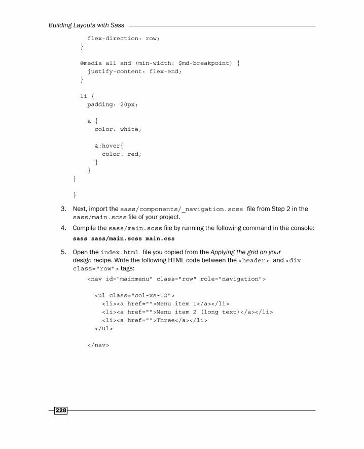
Building Layouts with Sass
228
flex-direction: row; }
@media all and (min-width: $md-breakpoint) { justify-content: flex-end; }
li { padding: 20px; a { color: white; &:hover{ color: red; } }}
}
3. Next, import the sass/components/_navigation.scss fi le from Step 2 in the sass/main.scss fi le of your project.
4. Compile the sass/main.scss fi le by running the following command in the console:
sass sass/main.scss main.css
5. Open the index.html fi le you copied from the Applying the grid on your design recipe. Write the following HTML code between the <header> and <div class="row"> tags:
<nav id="mainmenu" class="row" role="navigation">
<ul class="col-xs-12"> <li><a href="">Menu item 1</a></li> <li><a href="">Menu item 2 (long text)</a></li> <li><a href="">Three</a></li> </ul>
</nav>
Chapter 9
229
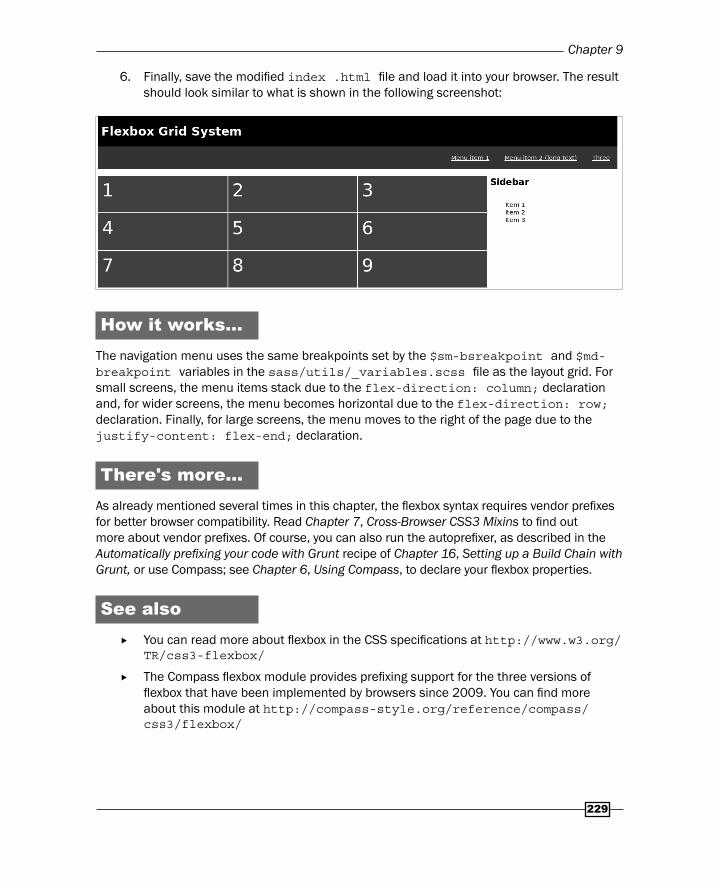
6. Finally, save the modifi ed index .html fi le and load it into your browser. The result should look similar to what is shown in the following screenshot:
How it works...The navigation menu uses the same breakpoints set by the $sm-bsreakpoint and $md-breakpoint variables in the sass/utils/_variables.scss fi le as the layout grid. For small screens, the menu items stack due to the flex-direction: column; declaration and, for wider screens, the menu becomes horizontal due to the flex-direction: row; declaration. Finally, for large screens, the menu moves to the right of the page due to the justify-content: flex-end; declaration.
There's more...As already mentioned several times in this chapter, the fl exbox syntax requires vendor prefi xes for better browser compatibility. Read Chapter 7, Cross-Browser CSS3 Mixins to fi nd out more about vendor prefi xes. Of course, you can also run the autoprefi xer, as described in the Automatically prefi xing your code with Grunt recipe of Chapter 16, Setting up a Build Chain with Grunt, or use Compass; see Chapter 6, Using Compass, to declare your fl exbox properties.
See also You can read more about fl exbox in the CSS specifi cations at http://www.w3.org/
TR/css3-flexbox/
The Compass fl exbox module provides prefi xing support for the three versions of fl exbox that have been implemented by browsers since 2009. You can fi nd more about this module at http://compass-style.org/reference/compass/css3/flexbox/

Building Layouts with Sass
230
Creating grids with semantic.gsHTML5 introduced many new semantic HTML tags, such as footer, header, section, among others; nevertheless, many modern CSS grid systems are built with non-semantic div tags and CSS classes. Critics even say that building your grids with div tags does not differ from the old-school table layouts. The semantic.gs mixins library provides you with a simple manner to build a 12-column semantic grid. Grids can be used as the skeleton of a responsive website.
Using grids in web design will help both the web designer and the web developer to prevent inconsistencies from occurring between the original design and the fi nal implementation in HTML.
Getting readyFor this recipe, you have to download the latest version of the semantic.gs mixins, which can be found at https://github.com/tylertate/semantic.gs/zipball/master. After editing the Sass fi les with a text editor, you can test the result in your browser. Use the Ruby Sass compiler as described in Chapter 1, Getting Started with Sass, to compile your CSS code.
How to do it...In this recipe, you will rebuild the example that is also shown on the home page of the semantic.gs website. The media queries in the example code are changed so that the compiled CSS code will follow the mobile-fi rst approach:
1. Download the fi les of the semantic.gs library from https://github.com/tylertate/semantic.gs/zipball/master and unzip it in the sass folder of your project.
2. After unzipping the fi les, you should end up with a fi le and directory structure like that shown in the following:

Chapter 9
231
3. Use your favorite editor to edit the sass/main.scss fi le, and write down the following SCSS code into this fi le:
$column-width: 60;$gutter-width: 20;$columns: 12;$total-width: 100%;
@import 'semantic.gs/stylesheets/scss/grid';
header { @include column(12);}
article { @include column(12);}
aside { @include column(12);}
@media (min-width: 960px) {
article { @include column(9); }
aside { @include column(3); }
}
4. Compile the sass/main.scss fi le by running the following command in the console:
sass sass/main.scss main.css
5. Create and edit the index.html fi le, which should contain the following HTML code:
<!doctype html><html lang="en"><head> <meta charset="utf-8">

Building Layouts with Sass
232
<title>Creating Grids with Semantic.gs</title> <meta name="description" content="Creating Grids with Semantic.gs"> <meta name="author" content="Bass Jobsen">
<link rel="stylesheet" type="text/css" href="main.css" />
</head>
<body><header>This is a header</header><article>This is an article</article><aside>This is an aside</aside>
</body></html>
6. Finally, load the index.html fi le in your browser. You will fi nd that the aside element fl oat on the right-hand side of the article as expected.
How it works...The semantic.gs mixins provide you with an easy way to build a responsive grid without classes, and that is it. It is good to realize that using a grid does not have to break the semantic structure of your website.
Creating a responsive layout with the semantic.gs mixins is easy and straightforward. You can set the number of columns with the $columns variable; also, the column width and the gutter size are set by variables.
You will also notice that the grid had some limitations. In the recipe, the column size of the compiled CSS is fi xed, although the columns stack for screen widths taller than 960 pixels will be set to 960 (12 x ( $column-width + $gutter-width)). The gutter is set with the margin property. This issue can be partly solved by setting the $total-width variable to 100%. After that the column widths (and margins) are also calculated as a percentage of the total available width and the grid becomes fl uid.
There's more...The semantic.gs mixins use the float CSS property to layout the grid columns, just like Bootstrap, although Bootstrap 4 has got opt-in fl exbox support too. Bootstrap, as discussed in this chapter, builds its grid with div HTML elements and classes. Bootstrap 4 also includes Sass variables and mixins to quickly generate semantic layouts.
Chapter 9
233
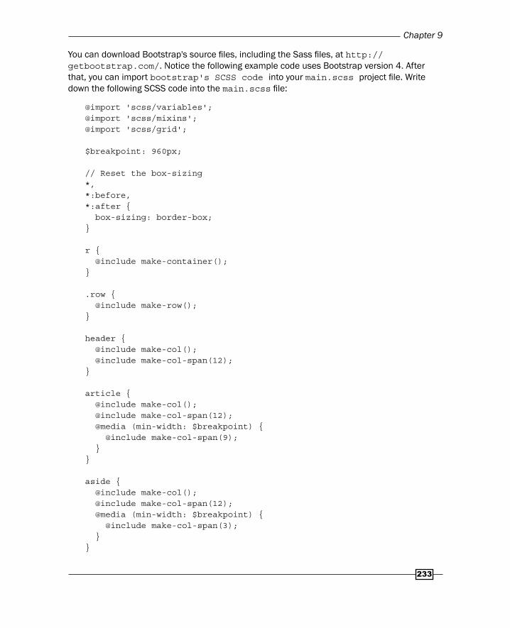
You can download Bootstrap's source fi les, including the Sass fi les, at http://getbootstrap.com/. Notice the following example code uses Bootstrap version 4. After that, you can import bootstrap's SCSS code into your main.scss project fi le. Write down the following SCSS code into the main.scss fi le:
@import 'scss/variables';@import 'scss/mixins';@import 'scss/grid';
$breakpoint: 960px;
// Reset the box-sizing*,*:before,*:after { box-sizing: border-box;}
r { @include make-container();}
.row { @include make-row();}
header { @include make-col(); @include make-col-span(12);}
article { @include make-col(); @include make-col-span(12); @media (min-width: $breakpoint) { @include make-col-span(9); }}
aside { @include make-col(); @include make-col-span(12); @media (min-width: $breakpoint) { @include make-col-span(3); }}

Building Layouts with Sass
234
The compiled CSS code of the preceding SCCS code can be used with the index.html fi le you have created in this recipe. Notice that you still will have to wrap the layout in <div class="container"><div class="row"> to use the CSS code. Also, the box-sizing: border-box; declaration is required. As you will see, the result will be a layout similar to that already created with the semantic.gs mixins.
When reusing Bootstrap's code for your projects, you should keep in mind that you will have to prefi x your properties, too. Also see Chapter 12, Bootstrap and SASS, for more information about Bootstrap and the prefi xing of CSS properties.
See also On the semantic.gs website at http://semantic.gs/, you can fi nd other examples
of how to build the fl uid, nested, and responsive layout with the semantic.gs mixins
More information about Bootstrap can be found at http://www.getbootstrap.com/
Using Compass Layout ModuleIn this last recipe, you can read about the Compass Layout Module. Compass is an open-source CSS framework for Sass. You can read more about Compass in Chapter 6, Using Compass. The code in this recipe demonstrates how to use the Compass Layout Module to generate fi xed, fl uid, and elastic grid-images on-the-fl y using CSS3 gradients.
Getting readyRead Chapter 6, Using Compass, to learn more about Compass. Also read the Installing Sass for command line usage recipe of Chapter 1, Getting Started with Sass. This recipe uses the SCSS you have used for the Creating grids with semantic.gs recipe.
How to do it...Learn how to use the Compass Layout Module by performing the following steps:
1. Copy the fi les from the Creating grids with semantic.gs recipe into your working directory.
2. Then, edit the sass/main.scss fi le and make sure it contains the following SCSS after that:
@import 'semantic.gs/stylesheets/scss/grid';@import 'compass/layout/grid-background';

Chapter 9
235
$column-width: 60;$gutter-width: 20;$columns: 12;$total-width: 960px;
$grid-background-total-columns: $columns;$grid-background-column-width: $column-width * 1px;$grid-background-gutter-width: $gutter-width * 1px;
body { @include column-grid-background();}
header { @include column(12);}
article { @include column(12);}
aside { @include column(12);}
@media (min-width: 960px) {
article { @include column(9); }
aside { @include column(3); }
}
3. Compile the sass/main.scss fi le by running the following command in the console:
sass --compass sass/main.scss main.css

Building Layouts with Sass
236
4. Finally, load the index.html fi le in your browser and you will fi nd that it will look like the following screenshot:
How it works...The grid images are created by CSS3 gradient images. Read the Using vendor prefi xes recipe of Chapter 7, Cross-Browser CSS3 Mixins, to learn more about CSS3 gradients and Sass. The code-compiled CSS code generates background images for the body selector. As you can see, you can use these grid images for testing both horizontal and vertical grids.
There's more...The Compass Layout Module also contains mixins and functions to build sticky footers and to style absolutely positioned elements such that they will stretch to fi ll their positioning parent. You cannot use this module to build a complete (grid-based) page layout. Earlier versions of Compass ship with Blueprint CSS. Blueprint does not support the responsive approaches that are essential to web design nowadays.
Compass removed Blueprint CSS since version 0.13. Compass recommends you to use Susy to build your grid systems now. You can read more about Susy in Chapter 10, Building Grid-based Layouts with Susy and Sass.
See also Read more about the Compass Layout Module at http://compass-style.org/
reference/compass/layout/stretching/
The offi cial website of Blueprint CSS can be found at http://www.blueprintcss.org/. Notice last updated on May 14, 2011

Where to buy this book You can buy Sass and Compass Designer's Cookbook from the Packt Publishing website. Alternatively, you can buy the book from Amazon, BN.com, Computer Manuals and most internet book retailers.
Click here for ordering and shipping details.
www.PacktPub.com
Stay Connected:
Get more information Sass and Compass Designer's Cookbook