sap analytics cloud, analytics designer...analytics designer is the functionality in sap analytics...
TRANSCRIPT

SAP Analytics Cloud, analytics designer
Developer Handbook
Document Version: 1.0 - 2019-05-24

Table of Contents 1
Table of Contents
Table of Contents .................................................................................................................... 1
Figures..................................................................................................................................... 5
Preface .................................................................................................................................... 7
1 About Analytics Designer ........................................................................................... 81.1 What is an analytic application?..................................................................................... 8
1.2 What is Analytics Designer? .......................................................................................... 8
1.3 What can you do with analytic applications that you can't do with stories? ..................... 8
1.4 How are stories and analytic applications related to each other?.................................... 8
1.5 Why do we need both stories and analytic applications? ................................................ 9
1.6 What is the typical workflow in creating an analytic application? .................................... 9
1.7 What are typical analytic applications? ........................................................................ 10
1.8 How does scripting work in analytic applications? ........................................................ 10
1.9 What's the scripting language for analytic applications? ............................................... 11
2 Getting Started .......................................................................................................... 122.1 Prerequisites ............................................................................................................... 122.1.1 Required access ......................................................................................................... 122.1.2 Required roles ............................................................................................................. 122.1.3 Required licenses ........................................................................................................ 122.1.4 Modes ......................................................................................................................... 12
2.2 Designing elements ..................................................................................................... 132.2.1 Canvas ....................................................................................................................... 132.2.2 Widgets and filters ....................................................................................................... 132.2.3 Data sources and models ............................................................................................ 13
2.3 Managing your analytics application ............................................................................ 132.3.1 Transporting an analytic application ............................................................................. 132.3.2 Sharing an analytic application .................................................................................... 14
3 Designing an Analytic Application ........................................................................... 153.1 Creating ...................................................................................................................... 15
3.2 Browsing ..................................................................................................................... 15
3.3 Opening analytic applications in a specific mode ......................................................... 163.3.1 Opening an analytic application from File Repository with CRUD permissions ............. 163.3.2 Opening an analytic application from File Repository with read permissions ................ 163.3.3 Opening a mode with the URL ..................................................................................... 163.3.4 Switching between present and view mode ................................................................. 17
3.4 Toolbar functionalities ................................................................................................. 173.4.1 Toolbar in edit mode.................................................................................................... 173.4.2 Toolbar in view mode .................................................................................................. 18
3.5 Edit mode functionalities.............................................................................................. 183.5.1 Outline and side panels ............................................................................................... 18

Table of Contents 2
3.5.2 Scripting section .......................................................................................................... 193.5.3 Layout section ............................................................................................................. 20
4 Scripting in Analytics Designer ................................................................................ 234.1 Why scripting? ............................................................................................................ 23
4.2 Scripting language overview ........................................................................................ 234.2.1 Type system................................................................................................................ 234.2.2 Tooling – code completion and value help ................................................................... 234.2.3 Events ......................................................................................................................... 234.2.3.1 Application events .................................................................................................... 234.2.3.2 Individual Widget Events .......................................................................................... 244.2.4 Global script objects .................................................................................................... 244.2.5 Accessing objects ....................................................................................................... 24
4.3 Script editor ................................................................................................................. 244.3.1 Creating and editing event-based scripts ..................................................................... 254.3.2 Creating and editing functions in global script objects .................................................. 264.3.3 Script editor layout ...................................................................................................... 274.3.4 Info panel: errors and reference list ............................................................................. 28
4.4 Scripting language features ......................................................................................... 284.4.1 Typing ......................................................................................................................... 284.4.2 No automatic type casting ........................................................................................... 284.4.3 Accessing objects ....................................................................................................... 294.4.4 Finding widgets with fuzzy matching ............................................................................ 294.4.5 External Libraries ........................................................................................................ 294.4.6 Debugging with console.log() ...................................................................................... 304.4.7 Loops .......................................................................................................................... 304.4.8 Double and triple equals (===) operators ..................................................................... 314.4.9 If, else, statements ...................................................................................................... 314.4.10 this 324.4.11 switch statements ........................................................................................................ 324.4.12 break statement .......................................................................................................... 32
4.5 Working with data ........................................................................................................ 32
4.6 Method chaining .......................................................................................................... 33
4.7 Script Runtime ............................................................................................................ 33
4.8 The R widget and JavaScript ....................................................................................... 34
4.9 Differences Between Analytics Cloud and Lumira ........................................................ 34
5 Widget concepts, APIs and usages .......................................................................... 365.1 Basic widget concepts ................................................................................................. 365.1.1 Supported widgets ...................................................................................................... 36
5.2 The Builder Panel ........................................................................................................ 36
5.3 The Styling Panel ........................................................................................................ 37
5.4 Action Menu ................................................................................................................ 37
5.5 Script Editor View ........................................................................................................ 38
5.6 Table........................................................................................................................... 39

Table of Contents 3
5.6.1 Table APIs .................................................................................................................. 395.6.2 Table Events ............................................................................................................... 41
5.7 Chart ........................................................................................................................... 415.7.1 Chart APIs .................................................................................................................. 415.7.2 Chart Events ............................................................................................................... 42
5.8 Popup / Dialog ............................................................................................................ 435.8.1 Main Popup / Dialog APIs ............................................................................................ 435.8.2 Button-related Popup / Dialog APIs ............................................................................. 435.8.3 Popup / Dialog Events ................................................................................................. 445.8.4 Known Limitations with Popup / Dialog ........................................................................ 44
5.9 Text Widget ................................................................................................................. 445.9.1 Changing text .............................................................................................................. 445.9.2 Adding dynamic text .................................................................................................... 45
5.10 RSS Feed ................................................................................................................... 45
5.11 R Visualization ............................................................................................................ 45
6 Typical Patterns and Best Practices ........................................................................ 476.1 Switching between Chart and Table ............................................................................ 47
6.2 Selecting Measures via Dropdown or Radio Button to filter Table and Chart todisplay (Single Selection) ............................................................................................ 52
6.3 Selecting Measures via Dropdown to filter Table and Chart to display (Multi –Selection) .................................................................................................................... 61
6.4 Using Filterline for filtering Table and Chart: ................................................................ 71
6.5 Cascaded Filtering ...................................................................................................... 76
6.6 Add and remove dimension in rows and columns for Table .......................................... 86
6.7 Creating a Settings Panel using a Popup Window ..................................................... 108
6.8 Selection handling in a Table or Chart and open a details popup ............................... 127
6.9 Using RWidget Wordcloud for visualization ................................................................ 151
7 Planning................................................................................................................... 1737.1 What to expect from Analytics Designer in regard to Planning?.................................. 173
7.2 Basic Planning concepts in Analytics Designer .......................................................... 173
7.3 Refreshing your data ................................................................................................. 175
7.4 Set user input ............................................................................................................ 175
7.5 Planning Versions ..................................................................................................... 176
7.6 How to manage versions ........................................................................................... 1777.6.1 Publishing or Reverting data changes........................................................................ 1777.6.2 Copy ......................................................................................................................... 179
8 Predictive ................................................................................................................. 1808.1 Time Series Forecast ................................................................................................ 1808.1.1 Switch on/off Forecast ............................................................................................... 1808.1.2 Configure Forecast .................................................................................................... 180
8.2 Smart Insights ........................................................................................................... 1818.2.1 Discover per selected data point ................................................................................ 181

Table of Contents 4
8.3 Smart Grouping ......................................................................................................... 1828.3.1 Switch on/off Smart Grouping .................................................................................... 1828.3.2 Configure Smart Grouping ......................................................................................... 183
8.4 Smart Discovery ........................................................................................................ 183
8.5 Smart Predictive (Beta) ............................................................................................. 1858.5.1 Add Predictive Service .............................................................................................. 1858.5.2 Consume Embedded Data Model .............................................................................. 1858.5.3 Apply Predictive Model .............................................................................................. 186
9 OData ....................................................................................................................... 1879.1 What you should know about OData .......................................................................... 187
9.2 How you can connect to OData ................................................................................. 1879.2.1 What you need to do ................................................................................................. 1879.2.2 The following restrictions are known .......................................................................... 1879.2.3 What is an Action ...................................................................................................... 1889.2.4 What are Action Imports ............................................................................................ 1889.2.5 What is a Bound Action ............................................................................................. 188
9.3 How you can call OData Actions ................................................................................ 188
9.4 How you can read data from OData Services ............................................................ 195
10 Post Message API ................................................................................................... 19710.1 Scenario 1: How you can embed an analytic application in a host HTML page via
iFrame ...................................................................................................................... 19710.1.1 postMessage............................................................................................................. 19710.1.2 onPostMessageReceived .......................................................................................... 19810.1.3 Example .................................................................................................................... 198
10.2 Scenario 2: How you embed a web application in an analytic application throughthe web page widget ................................................................................................. 199
10.2.1 Web Page Widget Related postMessage and OnPostMessageReceived ................... 19910.2.2 Case 1 - Posting messages from the host analytic application to the embedded
application ................................................................................................................. 19910.2.3 Case 2 - Posting messages from the embedded application to the host analytic
application ................................................................................................................. 200
11 The End and the Future .......................................................................................... 201
12 Important Links ....................................................................................................... 202

Figures 5
FiguresFigure 1: Create Application .................................................................................................... 15Figure 2: Edit Sharing Settings ................................................................................................ 15Figure 3: Open in View Mode .................................................................................................. 16Figure 4: Run Analytic Application ........................................................................................... 17Figure 5: Fullscreen ................................................................................................................ 17Figure 6: Outline ..................................................................................................................... 19Figure 7: Context menu for Scripting Objects in Outline ........................................................... 19Figure 8: Context menu for Canvas Objects in Outline ............................................................. 20Figure 9: Widget Name ........................................................................................................... 20Figure 10: Analytics Designer Properties ................................................................................. 21Figure 11: Styling Properties ................................................................................................... 22Figure 12: Edit Scripts ............................................................................................................. 25Figure 13: Multiple Events ....................................................................................................... 25Figure 14: Script for Dropdown ................................................................................................ 25Figure 15: Script for Chart ....................................................................................................... 25Figure 16: Hover Menu............................................................................................................ 26Figure 17: Add Script Object ................................................................................................... 26Figure 18: Add Script Function ................................................................................................ 26Figure 19: Script Object Function ............................................................................................ 26Figure 20: Script of Script Object Function ............................................................................... 27Figure 21: Script Editor............................................................................................................ 27Figure 22: 3 Areas of Script Editor ........................................................................................... 28Figure 23: Accessing Objects .................................................................................................. 29Figure 24: Example Application Switch Chart Table ................................................................. 47Figure 25: Switch Chart Table ................................................................................................. 47Figure 26: Example Application Dropdown .............................................................................. 53Figure 27: Dropdown Selection ............................................................................................... 53Figure 28: Example Application Multi Selection ....................................................................... 61Figure 29: Example Application Filterline ................................................................................. 72Figure 30: Select Filterline ....................................................................................................... 72Figure 31: Example Application Cascading Filtering ................................................................ 77Figure 32: Add and remove Dimensions .................................................................................. 86Figure 33: Example Application Settings Panel ...................................................................... 109Figure 34: Popup Settings Panel ........................................................................................... 109Figure 35: Example Application Details Popup ...................................................................... 127Figure 36: Details Popup ....................................................................................................... 128Figure 37: Example Application Word Cloud .......................................................................... 152Figure 38: Toolbar Planning Features.................................................................................... 173Figure 39: Planning enabled .................................................................................................. 174Figure 40: Unbooked Data .................................................................................................... 174Figure 41: SetUserInput ........................................................................................................ 175Figure 42: Publish Version .................................................................................................... 177Figure 43: Publish Data ......................................................................................................... 177Figure 44: Success Message ................................................................................................ 177Figure 45: Message .............................................................................................................. 178Figure 46: Dirty Version......................................................................................................... 178

Figures 6
Figure 47: Planning Table in Popup ....................................................................................... 179Figure 48: Automatic Forecast............................................................................................... 180Figure 49: Linear Regression ................................................................................................ 181Figure 50: Time Series Chart: Select the interested data point ............................................... 181Figure 51: Side panel of Smart Insights ................................................................................. 182Figure 52: Smart Grouping .................................................................................................... 182Figure 53: Configure Smart Grouping in Builder Panel of chart .............................................. 183Figure 54: Configure Smart Grouping in Chart Details ........................................................... 183Figure 55: Smart Discovery setting panel .............................................................................. 184Figure 56: New document created by Smart Discovery .......................................................... 184Figure 57: Add Predictive Service in Outline .......................................................................... 185Figure 58: Predictive Service Properties ................................................................................ 185Figure 59: OData Service in Outline ...................................................................................... 189Figure 60: Odata Service ...................................................................................................... 189Figure 61: Actions for OData Service in Outline ..................................................................... 189Figure 62: OData Service Sidepanel ..................................................................................... 190Figure 63: Define OData Service Properties .......................................................................... 191Figure 64: Styling options ...................................................................................................... 191Figure 65: Widget context menu ............................................................................................ 192Figure 66: Create Script ........................................................................................................ 192Figure 67: Create Script ........................................................................................................ 192Figure 68: Value Help ........................................................................................................... 193Figure 69: Value Help for Flight/Book .................................................................................... 193Figure 70: Value Help for Flight ............................................................................................. 193Figure 71: Define Message ................................................................................................... 194Figure 72: Post Message Scenarios ...................................................................................... 197Figure 73: Embed an analytic application into a host page ..................................................... 198

Preface 7
PrefaceWhy shall you read this book? Because we offer you the following:
We give you a kickstart in how to use the SAP Analytics Cloud, analytics designer. We offer youcoding examples and we want to get you enthusiastic about the enormous flexibility you have forbuilding advanced analytic applications. We want you to become a fan of our product seeking forthe unlimited possibilities in the cloud.
Thanks to all people around the globe who helped writing this first version of the developerhandbook for SAP Analytics Cloud, analytics designer!
Thanks to all developers, as well as colleagues from quality team, user experience, userassistance and product management (and any other contributor) who made this awesome productpossible!

About Analytics Designer 8
1 About Analytics DesignerThis handbook presents the basics about SAP Analytics Cloud, Analytics Designer to help youunderstand what it's all about and how it works. Let’s start with some fundamental concepts.
1.1 What is an analytic application?An analytic application presents data in various forms, and lets you navigate it, and enablesplanning. Analytic applications can range from simple static dashboards, showing static numbers,to highly customized applications. These customized applications can contain many options forbrowsing and navigating data, changing visualizations, and navigating across multiple pages orareas. They can have a highly customized look-and-feel, in alignment with customer branding.
1.2 What is Analytics Designer?Analytics Designer is the functionality in SAP Analytics Cloud that allows you to create analyticapplications. There is a dedicated design environment in SAP Analytics Cloud to create suchapplications. The term design doesn't refer specifically to the UX or UI design aspect of theapplication.
It is the entire process of creating an analytic application, which includes:
· defining the data model
· laying out the screen
· configuring widgets
· wiring it all up with the help of custom scripts
Therefore, Analytics Designer is another way to create analytical content in SAP Analytics Cloud.
1.3 What can you do with analytic applications that you can'tdo with stories?
A story is created in a self-service workflow and can be made up of various widgets and a lot ofconfigured functionality. However, the amount of customization is limited to the foreseenpossibilities offered in the story design-time environment.
An analytic application typically contains some custom logic, expressed with the help of scripts.With analytic applications there is much more flexibility to implement custom behavior. It requiresa higher skill level to create those.
1.4 How are stories and analytic applications related to eachother?
In general, stories and applications share widgets and functionality to a large extent, but somewidgets can only be used in applications, because they need to be scripted (dropdown boxes or

About Analytics Designer 9
buttons, for example). Analytic applications can also have custom logic, which cannot beimplemented in stories since there is no scripting.
From a consumption point of view, there shouldn't be any difference between stories and analyticapplications. The consumer shouldn't be aware of whether the analytical content is a story or ananalytic application. The exposed widgets, the available functionality, and the look, feel, andbehavior should be the same.
1.5 Why do we need both stories and analytic applications?Stories and analytic applications share functionality and widgets and may even have very similardesign environments. Why are two different artifact types necessary? The answer is that storydesigners and Analytics Designerers have completely different expectations. This is related to thedifferences between stories and applications:
· In the story design environment, it's practically impossible for you to create a story thatdoesn't work. The expectation of self-service design time for stories is that business usersare guided (to some extent limited) in what they do and can do. The story design time issupposed to consist of multiple configuration steps that prevent business users fromcreating something which breaks. With story design time, we ensure some level ofconsistency.
· It's completely different with applications, especially with the added scripts. As soon asAnalytics Designerers add custom logic with scripting, they have complete freedom tochange the default behavior of the entire analytic application. The design environmentprovides everything to create correct applications, but it doesn't guarantee that theapplication is correct or won't break.
In addition, an analytic application has a dedicated life-cycle. You start it and there are certainsteps which are performed, like the startup event, for example. The story doesn't have that. Youcan switch the story between edit and view mode as often as you like.
These are major differences. That is why we offer two artifacts and two corresponding design-time environments to create stories and analytic applications.
1.6 What is the typical workflow in creating an analyticapplication?
An analytic application is always data-driven. The foundation of an analytic application is one ormore underlying SAP Analytics Cloud models or a direct data access to an OData Service.
As a first step, you need to decide whether you want to visualize your data in a table or a chartand add a table or a chart to your analytic application. This triggers another step for picking amodel. A model is a representation of the business data of an organization, organized intodimensions and measures. In addition to widgets showing data, you add to the layout otherwidgets that control data, such as filters, arrange and configure them, and wire them up.
Almost all widgets expose events. To add custom logic to the analytic application, you canimplement event handlers with the help of the scripting language.

About Analytics Designer 10
1.7 What are typical analytic applications?The variety of analytic applications is huge. analytic applications can range from very staticvisualizations of a few data points to very advanced, highly customized and interactiveapplications which offer rich navigation and generic built-in exploration capabilities. However,there are some patterns of analytic applications:
· Table-centric data visualization
The application is comprised of a table, which consumes a large extent of the availablescreen real estate. Around the table, typically above it, are many user interface controls(buttons, checkboxes, dropdown boxes, and so on) to change the data display, such asto filter the data, change the data view, or show different dimensions. The nature of thisapplication is that there is only one table, but many and potentially complex ways to showdata differently.
· Dashboard
The application is a dashboard visualizing a few data points with the help of tiles. Thereis no interactivity, but it gives users an overview of highly aggregated data. A typical optionof some dashboards is to use the tiles for further drilling into details: clicking on a tiletakes you to a more detailed page or an entirely new application showing more details forthe aggregated number on the tile.
· Generic application
Many applications are created for a specific model. That means that the user interface,the widgets, and the logic are done with knowledge of the model and its availabledimensions, members, and so on. Another category is generic applications. These areapplications which need to be provided with a model whenever the application isexecuted. These applications are more complex to create as their logic needs to workwith whatever model the end user selects at runtime. The advantage is that customersdon't need to create applications for each model they have maintained in their system.
1.8 How does scripting work in analytic applications?Almost all widgets, whether smart, data-related widgets or simple widgets such as buttons anddropdown boxes, expose events. Even the analytic application itself exposes events such as astartup event or similar. To add custom logic to the application, you can implement event handlerswith the help of the scripting language.
Example
Let's say a dropdown box is populated with the available years in the data model - 2015 to 2019.The dropdown box exposes the event OnSelect, which is triggered whenever a value is selectedfrom the dropdown box. The implementation of that event handler could read the selected valueand set a filter for the selected year in the model. The numbers shown reflects the selected year.
Because you can add many event handlers using the scripting APIs of all widgets and otherservice APIs offered, the application can be geared towards the specific needs of a customer.

About Analytics Designer 11
1.9 What's the scripting language for analytic applications?The scripting language is JavaScript. Scripts are executed by the web browser JavaScript engine,which is available out of the box. To offer good tool support for application designers, we add atype system on top. This is used for the tooling and for validating scripts.
Example
Let's say that there is an API method available for filtering members: setFilter("YEAR","2014"). A member is an element of a dimension. The plain JavaScript method expects twostrings, and this is what is executed at runtime by the web browser. However, our definition of theAPI method uses dedicated predefined types for our business domain, that issetFilter(Dimension, Member). With that definition, the system checks and validates thatthe passed strings are a valid dimension and a valid member.
The script editor uses the type information. It doesn't just statically check the types but uses theknowledge about the underlying model and provides value help to offer dimensions and membersexisting in the model.

Getting Started 12
2 Getting StartedAnalytics Designer provides a software development environment that enables applicationdesigners or developers to reuse SAP Analytics Cloud widgets and other functionalities to builddifferent kinds of applications. Interactions between different widgets, pages, and applications areimplemented with script functionalities (including planning, machine learning, etc.) - at designtime. End users will then be consuming these applications - at runtime.
Analytics Designer is built around core story components to keep them synchronized as you goforward. Analytics Designer and Story have different entry points but share much in common:
· Analytics Designer is deeply integrated into SAP Analytics Cloud.
· Analytics Designer and story share data connectivity and User Interface artifacts.
· It ensures a consistent user experience for application and story consumers.
· It inherits infrastructure and life cycle management of SAP Analytics Cloud.
2.1 Prerequisites
2.1.1 Required access
Read access: the user of an analytic application needs a read access to open the application atruntime.
Full access: the application author who creates or edits the application needs a Create, Read,Update and Delete access (CRUD). The CRUD permissions are part the standard roleApplication Creator or can be assigned to any other role.
The folder where the application is stored passes on its access settings. For example, when anapplication is saved in a public folder, all users get Read access by default.
2.1.2 Required roles
All standard Business Intelligence roles have a read access to consume analytic applications.
The ability to create, update, and delete is part of an extra standard role Application Creator.
2.1.3 Required licenses
All SAP Analytics Cloud licenses include the consumption of analytic applications with readaccess.
The Business Intelligence license includes the creation of analytic applications.
The Planning Standard license is necessary only if you want to build a planning application. TheBusiness Intelligence license includes the read access of planning models.
2.1.4 Modes
There are three modes in analytic applications:

Getting Started 13
Edit mode: this is a design time mode. It allows you to edit applications. CRUD access isnecessary. The application opens in edit mode by default if you have CRUD access.
Present mode: this is a runtime mode. It allows you to execute applications. Read access isnecessary. The application opens in present mode by default if you run an it from edit mode.
View mode: this is a runtime mode. It allows you to execute applications. Read access isnecessary. The application opens in view mode by default if you have read access.
2.2 Designing elementsFor analytic applications there is a strict differentiation between design time and runtime. A fewtrained users create applications by using the design time elements, while many end usersaccessing and navigating the final application only at runtime. The following are the availabledesigning elements.
2.2.1 Canvas
The Canvas is a flexible space where you can explore and present your data. Applications haveonly one canvas. Scripting allows you to build numerous navigation options in your app.
2.2.2 Widgets and filters
In Analytics Designer, a Widget is a user interface element that can be inserted and is visible onthe canvas.
Note: Applications don’t have pages. The story concepts of cascading story, page, widget filters,and input controls are thus unavailable in applications. You should add a Filter line widgetinstead. The Filter line widget mimics the story filter and can be placed on the application canvas.Assign a data bound source widget, such as a table or a chart, as source widget. Target widgetscan be assigned via scripting to apply the selected filters to several widgets.
To learn more about widgets, see the related chapter.
2.2.3 Data sources and models
In SAP Analytics Cloud, the widgets table, chart and R widget are data bound. They have theirown data source, even if the same SAP Analytics Cloud model is connected. There is no shareddata source concept. For example, you need to apply filters to each widget when you script inAnalytics Designer for this reason.
2.3 Managing your analytics application
2.3.1 Transporting an analytic application
You can import and export analytic applications from/to other SAP Analytics Cloud tenants. Youcan choose to export with data and other options.

Getting Started 14
Note: The software release Wave versions of SAP Analytics Cloud installed on the source andtarget tenants need to be either the same Wave version or just one Wave version different.
2.3.2 Sharing an analytic application
Analytics Designer has its own access. As the owner of an analytic application, you can shareindividual analytic applications with others and grant access to these applications.

Designing an Analytic Application 15
3 Designing an Analytic Application
3.1 CreatingTo create an analytic application, you need the Application Creator role (or a custom role withthe CRUD permissions) to be able to see the menu entry in the Home menu under Create.
1. Click the menu icon,
2. click Create,
3. and click Analytic Application.
Figure 1: Create Application
3.2 Browsing
Select Browse under the menu to access the file repository where are:
· filters,
· all existing public analytic applications,
· private applications,
· and applications shared with you.
The default access set for an application saved in a public folder is read only for others. You needto explicitly share your application with other users and give CRUD access to allow them to editthe application.
Figure 2: Edit Sharing Settings
Designing an Analytic Application 16
3.3 Opening analytic applications in a specific modeFor analytic applications we talk about the edit mode, where applications can be edited and theview mode, where applications are executed.
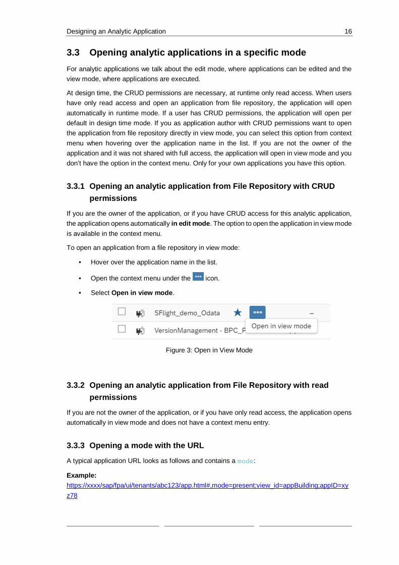
At design time, the CRUD permissions are necessary, at runtime only read access. When usershave only read access and open an application from file repository, the application will openautomatically in runtime mode. If a user has CRUD permissions, the application will open perdefault in design time mode. If you as application author with CRUD permissions want to openthe application from file repository directly in view mode, you can select this option from contextmenu when hovering over the application name in the list. If you are not the owner of theapplication and it was not shared with full access, the application will open in view mode and youdon’t have the option in the context menu. Only for your own applications you have this option.
3.3.1 Opening an analytic application from File Repository with CRUDpermissions
If you are the owner of the application, or if you have CRUD access for this analytic application,the application opens automatically in edit mode. The option to open the application in view modeis available in the context menu.
To open an application from a file repository in view mode:
· Hover over the application name in the list.
· Open the context menu under the icon.
· Select Open in view mode.
Figure 3: Open in View Mode
3.3.2 Opening an analytic application from File Repository with readpermissions
If you are not the owner of the application, or if you have only read access, the application opensautomatically in view mode and does not have a context menu entry.
3.3.3 Opening a mode with the URL
A typical application URL looks as follows and contains a mode:
Example:https://xxxx/sap/fpa/ui/tenants/abc123/app.html#,mode=present;view_id=appBuilding;appID=xyz78

Designing an Analytic Application 17
In edit mode, the URL contains mode=edit. In present mode, the URL contains mode=present.In view mode, the URL contains mode=view. The analytic application opens in present mode bydefault when running the application from the design time.
Figure 4: Run Analytic Application
To change the mode:
· Modify the URL directly or using the navigation options in the user interface.
· Click the Fullscreen button in the toolbar. This action changes the URL frommode=present to mode=view.
3.3.4 Switching between present and view mode
You can switch between present and view mode by clicking the Display Fullscreen button in thetoolbar. You will notice that the URL will change. Instead of mode=present, the URL containsnow mode=view.
Figure 5: Fullscreen
3.4 Toolbar functionalities
3.4.1 Toolbar in edit mode
As in Stories there is a toolbar on top of the application which contains the features. Some optionsare only active once you have saved the application, otherwise they are greyed out.
· File contains the options like Application Details, Save and Save As, Copy, Duplicate,Paste and Share.

Designing an Analytic Application 18
· For Analytics Designer you have 2 Views which are exclusively for applications and ONby default: the Outline and the Info Panel which contains the error list and the referencelist.
· Insert allows you to insert chart, table and all other available widgets.
· With Tools you can do chart scaling and create conditional formatting.
· Data contains refresh data and edit prompts.
· Designer opens the builder and styling panel
· Run Analytic synApplication opens the application in another browser tab in presentmode. Present mode means, that the toolbar is visible only at hover. But it can be toggledto View mode with a static toolbar by clicking on Fullscreen button in the toolbar.
3.4.2 Toolbar in view mode
In view mode as well as in present mode the toolbar contains a limited set of features.
· Data allows you to refresh data and edit prompts.
· Plan contains publish data, version management, version history, value lockmanagement, predictive forecast and allocate values.
· Display Fullscreen will change the mode to present mode by showing the toolbar only athover
3.5 Edit mode functionalities
3.5.1 Outline and side panels
The outline is a crucial element of the edit mode. It contains:
· all visible widgets in the Layout area, either directly on the main Canvas or in a Popup
· the non-visible elements of an application in the Scripting area.
Click on + to create Script Variables, Script Objects, OData Services, and Predictive Models.You can maintain them here and use them in every script of the application.
The outline has a search bar that filters the complete tree to match your search. Click the symbol> to expand or collapse an item.

Designing an Analytic Application 19
Figure 6: Outline
3.5.2 Scripting section
Every Scripting object has a context menu that contains Rename, Find Reference, and Delete.When you select one of these objects, a side panel appears. It allows you to edit properties. Thepanel opens if you click these objects and closes when you click Done in the panel.
For more information, see the chapter on Scripting.
Figure 7: Context menu for Scripting Objects in Outline

Designing an Analytic Application 20
3.5.3 Layout section
If the Designer button on the top right of the application is selected, a Designer panel is availablefor the visible widgets on the canvas. Access the Builder and Styling panelsfrom there.
The widgets in the outline, on the canvas, and the side panel are always synchronized and basedon your selection. Widgets in the outline have a context menu containing Rename, FindReference, Delete, and Hide. Hide conceals the widget on the canvas in edit mode. It has noinfluence on the different view modes when executing the application.
Figure 8: Context menu for Canvas Objects in Outline
Widgets have their own analytic application Properties section in the Styling panel. This is wherethe widget name used for scripting can be changed; it is updated in the outline, and vice versa.The specific properties of the Analytics Designer depend on the widget type.
Figure 9: Widget Name

Designing an Analytic Application 21
Figure 10: Analytics Designer Properties
Under Actions, you can flag the option to hide the widget in application view time. TheContext/Quick Menus can be set to visible or be hidden completely for the view time or singlemenu items can be selected. More styling options are available.

Designing an Analytic Application 22
Figure 11: Styling Properties

Scripting in Analytics Designer 23
4 Scripting in Analytics Designer
4.1 Why scripting?You might be wondering why you would want to script and what advantage it could possibly be.
Most modern analytics tools avoid scripting to simplify the designer’s tasks. Users may find iteasier to use at first, but they quickly find themselves limited to the scenarios built into the tool.
Scripting allows you to go beyond present narratives, to respond to user interaction in a customway, to change data result sets, and to dynamically alter layout. Scripting frees your creativity.
4.2 Scripting language overviewThe scripting language in Analytics Designer is a limited subset of JavaScript. It is extended witha logical type system at design time enforcing type safety. Being a true JavaScript subset allowsexecuting it in browser natively. All scripts are run and validated against strict mode. Some moreadvanced JavaScript features are hidden. Scripts are either tied to events or global script objects.
4.2.1 Type system
The logical type system runs on top of plain JavaScript. It enforces strict types to enable morepowerful tooling. The behavior at runtime doesn’t change as it is still plain JavaScript.
4.2.2 Tooling – code completion and value help
The Analytics Designer scripting framework exposes analytics data and metadata during scriptcreation and editing. This enables
· code completion in the traditional sense like completing local or global Identifiers,· semantic code completion by suggesting member functions or similar· and value help in the form of context-aware value proposals like measures of a data
source for function parameters.
For example, when calling an API method on a Business Warehouse DataSource, the codecompletion can propose measures as code completion options or values to specify a filter.
4.2.3 Events
Scripts always run in response to something happening in the application. Application Events areyour hook. There are several types of events in analytic applications. Some occur in theapplication itself and some occur on individual widgets.
4.2.3.1 Application events
The application has two events: one that fires when the app starts, and another that is triggeredin certain embedded scenarios.

Scripting in Analytics Designer 24
· onInitialization: this event runs once when the application is instantiated by a user.It is where you script anything that you want to be done during startup. Like most events,it has no input parameters.
· onPostMessageRecieved: if your application is embedded in an iFrame, your SAPAnalytics Cloud analytic application can communicate bidirectionally with the host webapp using JavaScript PostMessage (see also: https://developer.mozilla.org/en-US/docs/Web/API/Window/postMessage) calls. It allows the host application to passinformation into the analytic application. This event is called whenever the hostapplication makes a post message call into the analytic application.
Designers have access to this information and to the event’s two input parameters:
· origin: it is the domain of the host application. The contents of an iFrame don’t need tobe in the same origin as the host app, even when same origin policies are in effect. It canbe convenient but be careful about clickjacking attacks and malicious iFrame hosts. Forthe sake of security, we recommend that you check this parameter to ensure that theiFrame host is what you expect.
· message: it is the standard message parameter of the Javascript PostMessage passedinto SAP Analytics Cloud. It does not follow any format and could be almost anything. Itis encoded using the structured clone algorithm and there are a few documentedlimitations in what can and can’t be encoded.
4.2.3.2 Individual Widget Events
Most widgets have an event that is fired when the widget is clicked by a user. However, somewidgets have no events, such as text labels. Data bound widgets generally have an event that isfired when the result set of the data source changes.
Most events have no input parameters, like onSelect and onResultChanged.
4.2.4 Global script objects
Global script objects act as containers. They allow you to maintain and organize script functionsthat are not tied to any event and are invoked directly. You can maintain libraries of re-usablefunctions. These library scripts are called functions.
4.2.5 Accessing objects
You can access every object in the Outline pane such as widgets, script variables, or script objectsby its name when you are working on a script.
4.3 Script editorThe script editor is a tool within Analytics Designer to specify the actions taking place when anevent is triggered by an application user. By adding a script to a widget, you can influence thebehavior of this widget and thus enable user interaction, also referred to as events, at runtime. A

Scripting in Analytics Designer 25
script typically consists of several statements. A statement is a programmatic instruction within ascript. The execution of a statement is typically triggered by user interaction with the widget.
4.3.1 Creating and editing event-based scripts
Scripts are presented in the outline pane, at the left-hand side of the Analytics Designer editorenvironment.
Find them by hovering over the widget name in the outline, or as a menu entry in the quick action
menu of each widget. The icon indicates the event. By clicking on it, the script editor opens theselected function.
Figure 12: Edit Scripts
If a widget has multiple available events, you are presented with a choice in the hover menu.
Figure 13: Multiple Events
If there is an event with an attached script, you can see the icon in the outline pane. If thereare no attached script, there is no visible icon. In the following figure, the onSelect event ofDropdown_1 has a script, but there are no scripts attached to Chart_1.
Figure 14: Script for Dropdown
If a widget has multiple events and at least one has a script attached, then the fx icon will bedisplayed.
Figure 15: Script for Chart

Scripting in Analytics Designer 26
The hover menu will show which of the events have attached scripts.
Figure 16: Hover Menu
4.3.2 Creating and editing functions in global script objects
Functions are found under the global script objects portion of the outline pane. Before you canadd functions, you will need to add your first script object. Do this by clicking the plus sign, nextto the Script Objects header.
Figure 17: Add Script Object
Within a script object, you can add several functions, by invoking Add Script Function in thecontext menu. Keep in mind that the script object container is an organizational aid for you.
Figure 18: Add Script Function
Individual functions are nested within global script objects. For example, in the Figure belowError! Reference source not found. you see the function1 nested within a script object calledScriptObject_1.
Figure 19: Script Object Function

Scripting in Analytics Designer 27
Like canvas widgets, the scripts attached to a function are created by clicking the fx icon in thehover menu of that function. Functions that have and don’t have scripts are visible in the outline,just as with widgets.
Figure 20: Script of Script Object Function
Once you have a script attached to a function, you can call it whenever you please, from anyother script. The script objects are accessible by name and individual functions are accessiblewithin the objects. If you wanted to invoke the function1 script within ScriptObject_1, you wouldcall is like this:ScriptObject_1.function1();
4.3.3 Script editor layout
Once an open script is in the editor, it shows up as a tab along the top of the canvas. You canopen several script editor tabs at the same time: use keyboard shortcuts, for example undo, redo(to be found in the help page “Using Keyboard Shortcuts in the Script Editor”:https://help.sap.com/doc/00f68c2e08b941f081002fd3691d86a7/release/en-US/68dfa2fd057c4d13ad2772825e83b491.html) and referring to the widgets listed in outline withthe corresponding widget names.
Figure 21: Script Editor
The script editor has three areas:
· the widget and event (1)
· the documentation (2)
· and the main body of the script itself (3)

Scripting in Analytics Designer 28
Figure 22: 3 Areas of Script Editor
Write script in the main body using the inbuild help features like code completion and value help.
4.3.4 Info panel: errors and reference list
All errors are listed in the Errors tab of the Info panel. Search for errors and filter out onlywarnings or errors. Double click an error to open the script in a new tab and jump directly to theerror location in the script.
Find all places where a widget or a scripting object is used with the Find References feature.You can find it in the context menu per object in the outline. The result is displayed in theReference list tab of the Info Panel.
4.4 Scripting language features
4.4.1 Typing
Normal JavaScript is weakly typed and dynamically typed. Weak typing means that the scriptwriter can implicitly coerce variables to act like different types. For example, you could have aninteger value and treat it as if it were a string. Dynamic typing means that the runtime will try toguess the type from the context at that moment and the user can even change the type after thevariable is already in use. For example, you could change the value of the beforementionedinteger to another type of object at will; “Dear integer, you are now a duck”.
SAP Analytics Cloud, analytics designer forbids both of these. Once you have a duck, it remainsa duck and you can’t recycle variable names as new types. If you want something else, you’llneed another variable. It is also strongly typed, meaning that if you want to use an integer as astring, you’ll have to explicitly cast it. Both are a consequence of enabling the rich codecompletion capabilities in the editing environment.
The Analytics Designer scripting language is still JavaScript. You can write perfectly validJavaScript while treating the language as if it was strongly and statically typed.
4.4.2 No automatic type casting
A consequence of strong typing is that you can’t expect automatic conversions. The following isvalid JavaScript:
var nth = 1;console.log("Hello World, " + nth);

Scripting in Analytics Designer 29
In Analytics Designer, you will see an error in the script editor, informing you that auto-typeconversion is not possible, and the script will be disabled at runtime, until fixed. Instead, youshould explicitly cast nth to a string.
var nth = 1;console.log("Hello World, " + nth.toString());
4.4.3 Accessing objects
Every object (widget or global script object) is a global object with the same name as in the outline.Suppose you have a chart in your application, named Chart_1 and want to check and see if it isvisible. You can access Chart_1 as a global variable and then access its functions, in this caseto see if it is currently visible.
var isVis = Chart_1.isVisible();
Figure 23: Accessing Objects
4.4.4 Finding widgets with fuzzy matching
The application author can type in the complete name of a widget or just some first letters. Bytyping CTRL + Space, the system either:
· completes the code automatically if there is only one valid option,· or displays a value help list from which you can select an option.
Fuzzy matching helps you finding the result even if you have made a typo or the written lettersare in the middle of the function. Fuzzy matching is applied automatically for the standard codecompletion (e.g.: "cose" → "console").
The script validation runs automatically in the background and shows errors and warningsindicated with red and orange underlying and a red or orange marker before the line number.
4.4.5 External Libraries
There is no provision in SAP Analytics Cloud Analytics Designer for importing external JavaScriptlibraries. You can use the standard JavaScript built-in objects such as:
· Math

Scripting in Analytics Designer 30
· Date
· Number
· Array
· Functions on String
All standard functions listed in the SAP Analytics Cloud Analytics Designer API Reference aresupported even if some browsers don‘t support them natively.
For example, String#startsWith is not available in Microsoft Internet Explorer, but can beused in SAP Analytics Cloud with all browsers.
4.4.6 Debugging with console.log()
Scripts are stored as minified variables and are not directly debuggable in the browser console.Write messages directly to the browser’s JavaScript console to aid in troubleshooting. A globalvariable called console and has a log() function that accepts a string.
var nth = 1;
console.log("Hello World, " + nth.toString());
This would print “Hello World, 1” to the JavaScript console of the browser. Complex objects canbe printed.
4.4.7 Loops
Two types of JavaScript loops are possible in SAP Analytics Cloud Analytics Designer, for andwhile loops. Other types, such as foreach iterators, are not supported.
for
For loops are standard JavaScript for loops, with one caveat. You must explicitly declare the foriterator. This is valid JavaScript, but it isn’t accepted in the script editor:
for (i = 0; i < 3; i++) { console.log("Hello for, " + nth.toString());}
Instead, explicitly declare i. The example below is valid:
for (var i = 0; i < 3; i++) { console.log("Hello for, " + nth.toString());}
while
We fully support while loops in SAP Analytics Cloud Analytics Designer:
var nth = 1;while (nth < 3) { console.log("Hello while, " + nth.toString()); nth++;}
for in
Scripting in Analytics Designer 31
An additional type of look is the for in iterator. Suppose you had a JavaScript object: you caniterate over the properties with the for-in loop. Data selections are JavaScript objects and can beiterated over:
var selection = { "Color" : "red", "Location" : "GER"};
for(var propKey in selection) { var propValue = selection[propKey]; // ...};
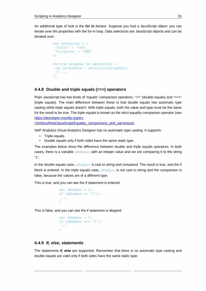
4.4.8 Double and triple equals (===) operators
Plain JavaScript has two kinds of “equals” comparison operators, “==” (double equals) and “===”(triple equals). The main difference between these is that double equals has automatic typecasting while triple equals doesn’t. With triple equals, both the value and type must be the samefor the result to be true. The triple equals is known as the strict equality comparison operator (seehttps://developer.mozilla.org/en-US/docs/Web/JavaScript/Equality_comparisons_and_sameness).
SAP Analytics Cloud Analytics Designer has no automatic type casting. It supports:· Triple equals.· Double equals only if both sides have the same static type.
The examples below show the difference between double and triple equals operators. In bothcases, there is a variable aNumber, with an integer value and we are comparing it to the string“1”.
In the double equals case, aNumber is cast to string and compared. The result is true, and the ifblock is entered. In the triple equals case, aNumber is not cast to string and the comparison isfalse, because the values are of a different type.
This is true, and you can see the if statement is entered:
var aNumber = 1;if (aNumber == "1"){ ...}
This is false, and you can see the if statement is skipped:
var aNumber = 1;if (aNumber === "1"){ ...}
4.4.9 If, else, statements
The statements if, else are supported. Remember that there is no automatic type casting anddouble equals are valid only if both sides have the same static type:

Scripting in Analytics Designer 32
if (nth === 1){ console.log("if...");} else if (nth < 3){ console.log("else if...");} else { console.log("else...");}
4.4.10 this
The this keyword allows you to ignore the name of the object. It is simply the object that this scriptis attached to, regardless of what it is called. It doesn’t matter and is merely a stylistic choice.With this, refer to:
· the instance itself within widget scripts or script object functions
· the parent instance explicitly by its variable name, such as Chart_1
· the parent instance as this
When performing the above console print on one of the events of Chart_1 itself, use the followingvariation of the code:
var theDataSource = this.getDataSource();console.log(theDataSource.getVariables());
4.4.11 switch statements
You can use normal JavaScript switch statements:
switch (1) { case 0: day = "Zero"; break; case 1: day = "One"; break; case 2: day = "Two"; break;}
4.4.12 break statement
You can use break to break out of loops and switch statements, as seen in the example above.
4.5 Working with dataYou can perform many simple operations on data. Keep in mind there are no standalone datasources, and there is a getVariables() function on data sources.
Example
Let’s say you want to print the variables on Chart_1 to the console.

Scripting in Analytics Designer 33
Get the data source on a widget with its getDataSource() function. This returns the datasource attached to that widget and allows you to perform further operations.
The snippet below prints the data source variables of Chart_1 to the console:
var theDataSource = Chart_1.getDataSource();var theVariables = theDataSource.getVariables();console.log(theVariables);
4.6 Method chainingIn the example above, one line of code executes one operation. It is useful when the individualvariables might get re-used in a script, and it increases readability. But some scripts need to bemade compact, and this can be done with method chaining. Certain JavaScript libraries supportmethod chaining where the result of a previous operation can immediately be used in the samestatement. SAP Analytics Cloud Analytics Designer supports method chaining.
Suppose you were only logging the variables in the above example as a debug aid. You werenot re-using them, and the multiple lines were visual clutter. Then you might want to use methodchaining. The code below uses method chaining for compactness and does exactly the samething:
console.log(Chart_1.getDataSource().getVariables());
4.7 Script RuntimeAnalytics Designer validates the script before execution because running arbitrary JavaScript inthe browser is a risk. It ensures that only allowed JavaScript subset can be used. Critical featureslike sending requests can be prevented or forced to use alternative secured APIs if needed. Inaddition, the execution is isolated to prevent:
· access to DOM
· access to global variables
· modifying globals/prototypes
· sending requests
· importing scripts
· including ActiveX etc.
· launching other Web Workers
· access to cookies
· and enforcing different domain
Validation
Validation at runtime follows the same logic as for the script editor. Not all validations have to beperformed e.g. validating analytic data like filter values.

Scripting in Analytics Designer 34
4.8 The R widget and JavaScriptYou might know the R widget from stories already. It becomes much more powerful inapplications. The R widget has two separate runtime environments:
The R environment is on the server, in the R engine.
The JavaScript environment runs in the normal browser space along with the rest of the widgetscripts.
Execution order
On Startup, the R script runs and the JavaScript onResultSetChanged doesn’t run becausethe widget is in its initial view state.
On data change, the R script runs first, the JavaScript onResultChanged event runs.
Accessing the R environment from JavaScript
The R environment can be accessed from the JavaScript environment. It can be read from andmanipulated. However, the JavaScript environment can’t be accessed from the R environment.
Reading
Suppose you had an R widget that had a very simple script. It just gets the correlation coefficientbetween two measures on a model and puts that into a number named gmCorrelation:
grossMargin <- BestRun_Advanced$`Gross Margin`grossMarginPlan <- BestRun_Advanced$`Gross Margin Plan`gmCorrelation <- cor(grossMargin, grossMarginPlan)
Use the getEnvironmentValues on the R widget to access its environment and getNumber
to read a number from the R environment. The following JavaScript code takes the correlationcoefficient from the R environment and logs it to the JavaScript console. Note the this. This codewas taken from the onResultChanged event of a widget with the above R snippet. It means thatR widgets can be used as global data science scripts:
var nCcor = this.getEnvironmentValues().getNumber("gmCorrelation");var sCor = nCcor.toString();console.log("Margin Correlation: " + sCor);
Writing
You can also manipulate the R environment from JavaScript. The magic methods aregetInputParameters and setNumber. The following line of JavaScript sets an R environmentvariable named userSelection to 0.
RVisualization_1.getInputParameters().setNumber("userSelection", 0);
4.9 Differences Between Analytics Cloud and LumiraDesign Studio/Lumira Designer and SAP Analytics Cloud Analytics Designer have broadly similarscripting environments. Both are JavaScript based, perform similar missions and SAP Analytics

Scripting in Analytics Designer 35
Cloud Analytics Designer’s scripting framework was informed by experience with Design Studio.However, there are some differences that you should keep in mind.
Lumira scripts execute on the server. SAP Analytics Cloud Analytics Designer scripts execute inthe browser JavaScript engine. Lumira scripts execute close to the data. SAP Analytics CloudAnalytics Designer scripts execute close to the user.
SAP Analytics Cloud Analytics Designer is not copy + paste compatible with Lumira. This ispartially a consequence of the close-to-data vs close-to-user philosophical difference.
Data sources are currently hidden within data bound widgets and you must access them usinggetDataSource(). When standalone data sources become available, you will be able to accessthem as global variables, as in Lumira.
SAC Analytics Designer not supporting automatic type conversion makes scripts more explicitand avoids common mistakes. This includes requiring a strict equality comparison operator,whereas Lumira allowed the use of the double equals comparison operator for expressions ofdifferent types.

Widget concepts, APIs and usages 36
5 Widget concepts, APIs and usagesIn Analytics Designer, widgets are UI elements and can be inserted onto the canvas. There is awide variety of widgets available. They range from basic widgets like button, text, shape, image,dropdown, checkbox group, radio button group, to data-bound ones like Table, Chart, and furtherto custom widgets built by partners and customers.
Once you have added a widget to the canvas, you can then use its Builder Panel, Styling Panel,Action Menu to configure its styling and runtime behavior, and even write script to configure howit interacts with other widgets.
If you need more information about any script API in Analytics Designer, you can read throughthe API Reference document which you can open from the help portal:
https://help.sap.com/doc/958d4c11261f42e992e8d01a4c0dde25/latest/en-US/index.html
5.1 Basic widget concepts
5.1.1 Supported widgets
All widgets available in stories are available in Analytics Designer:· Table,· Chart,· Filter Line,· Image,· Text,· Clock,· Shape,· and Web Page.
Other widgets are available, such as:· Dropdown,· Radio button group,· Checkbox group,· and Button.
Widgets can also be:· custom-made by partners and customers,
or belong to other varieties like a web page or a clock
5.2 The Builder Panel
If you select a widget on the canvas, the Builder Panel opens on the right-hand side.With the Builder Panel you configure your widget’s data-related settings. The following exampleshows, how to select at least a chart type, measures, and dimension to build a chart. You canadd other characteristics of this chart as well: for instance, a Reference Line. Different widgetshave different configurations.

Widget concepts, APIs and usages 37
5.3 The Styling PanelYou can configure the format of a widget with the help of the Styling Panel. Multipleproperties are provided with the Styling Panel, for example background color, font and dataformats.
5.4 Action Menu
The action menu is a dynamic menu and is only visible if the widget is selected. Differentwidgets have different options available, and some of the options are not available in view mode.

Widget concepts, APIs and usages 38
5.5 Script Editor ViewScripting provides you a powerful way to define a widget’s runtime behavior and how it can interactwith other widgets and other available functionality.
To edit a Script function,
· click the button in the Action Menu
· or click the same button next to the widget name in the Outline.It opens the Script Editor view.

Widget concepts, APIs and usages 39
5.6 Table
5.6.1 Table APIs
The Table widget displays data in rows and columns. In contrast to a chart (which is the graphicalrepresentation of data to help understand the relationship between a large quantity of data andits parts), a table is used to keep track of information such as quantities, price, text description,and other details. However, both are important means to present data and to enable end usersto directly interact with data.
Analytics Designer provides table APIs and Datasource APIs to help Analytics Designerers usescript custom specific logic into their analytic applications.
Besides the common widget APIs like getVisible, setVisible , the main Table APIs are listed below.

Widget concepts, APIs and usages 40
addDimensionToColumns(dimension: string|Dimension, position?: integer): void
Adds the dimension to the column axis at the specified position. If no position is specified, thedimension is added as the last dimension of the columns axis.
Example:Table_1.addDimensionToColumns("Location_4nm2e04531");
addDimensionToRows(dimension: string|Dimension, position?: integer):void
Adds the dimension to the row axis at the specified position. If no position is specified, thedimension is added as the last dimension of the row axis.
Example:Table_1.addDimensionToRows("Location_4nm2e04531");
getDataSource(): DataSource
Returns the data source of the table. If the table has no data source, undefined isreturned. Refer to the section of data-related APIs.
getDimensionsOnColumns(): Dimension[]
Returns the dimensions on the column axis.
getDimensionsOnRows(): Dimension[]
Returns the dimensions on the row axis.
getPlanning(): Planning
Returns the planning object of the table. If the table data source is not of type planning, undefinedis returned.Refer to the section of planning.
getSelections(): Selection[]
Returns the selections of the chart. You can use the elements of the returned array with thefunction DataSource.getData() to get the value of a cell. See also the documentation ofSelection.
(https://help.sap.com/doc/958d4c11261f42e992e8d01a4c0dde25/2019.8/en-US/doc/Selection.html)
removeDimension(dimension: string|Dimension): void
Removes the dimension from whichever axis it is present on. If the dimension is neither on theRows nor Columns axis, the operation is ignored.

Widget concepts, APIs and usages 41
Example :Table_1.removeDimension("Location_4nm2e04531");
5.6.2 Table EventsonResultChanged()
Called when the result set displayed by the table changes
onSelect()
Called when the user selects within the table
5.7 Chart
5.7.1 Chart APIs
A chart is a graphical representation of data in symbols such as bars, lines, or slices. AnalyticsDesigner provides chart APIs and Datasource APIs to help Analytics Designerers use scriptcustom specific logic into their analytic applications.
Besides the common widget APIs like getVisible, setVisible, the main Chart APIs are asbelow.
addDimension(dimension: string|Dimension, feed: Feed, position?: integer): void
Adds a dimension to the feed at the specified position. If no position is specified, the dimensionis added at the end of the feed.
Example:
Chart_1.addDimension("Location_4nm2e04531", Feed.CategoryAxis);
addMeasure(measure: string|Measure, feed: Feed, position?: integer):void
Adds the measure to the feed, at the specified position. If no position is specified, the measureis added at the end of the feed.
Example:
Chart_1.addMeasure("[Account_BestRunJ_sold].[parentId].&[Gross_MarginPlan]",Feed.ValueAxis);
getDataSource(): DataSource
Returns the data source of the chart. If the chart has no data source, undefined is returned.
Refer to the section of Data-related APIs

Widget concepts, APIs and usages 42
getForecast(): Forecast
Returns the forecast of the chart.
Refer to the section of Forecast
getMeasures(feed: Feed): Measure[]
Returns the measures of the feed.
Example:
var measures = Chart_1.getMeasures(Feed.ValueAxis);
getSelections(): Selection[]
Returns the selections of the chart. You can use elements of the returned array with the functionDataSource.getData() to get the value of a cell. See also the documentation of Selection.(https://help.sap.com/doc/958d4c11261f42e992e8d01a4c0dde25/2019.8/en-US/doc/Selection.html)
getSmartGrouping(): SmartGrouping
Returns the Smart Grouping of the chart.
Refer to the section of Smart Grouping
removeDimension(dimension: string|Dimension, feed: Feed): void
Removes the dimension from the feed.
Example:
Chart_1.removeDimension("Location_4nm2e04531", Feed.CategoryAxis);
removeMeasure(measure: string|Measure, feed: Feed): void
Removes the measure from the feed.
Example:Chart_1.removeMeasure("[Account_BestRunJ_sold].[parentId].&[Gross_MarginPlan]",Feed.ValueAxis);
5.7.2 Chart EventsonResultChanged()
Called when the result set displayed by the chart changes
onSelect()
Called when the user selects within the chart

Widget concepts, APIs and usages 43
5.8 Popup / DialogA Popup/Dialog is usually a small window on top of the main page of the application. Itcommunicates information to the user or prompts them for inputs.
For instance, a Popup can show a description of the application, and another Popup can ask theuser to perform configurations. Because the popup acts as a container widget, you can put anyother widget into the popup, such as a table, button, or checkbox.
You can choose to design a popup starting from scratch. Start with an empty canvas and havethe flexibility to add whatever widget you want. You can enable the header and footer setting toturn the popup directly into a popup dialog that has a consistent look and feel compared to otherdialogs in SAP Analytics Cloud stories.
5.8.1 Main Popup / Dialog APIsclose(): void
Hides the popup
getTitle(): string
Returns the title of the popup
open(): void
Shows the popup
setTitle(title: string): void
Sets the title of the popup
5.8.2 Button-related Popup / Dialog APIsisButtonEnabled(buttonId: string): Boolean
Returns whether the specified button in the footer of the popup is enabled
isButtonVisible(buttonId: string): Boolean
Returns whether the specified button in the footer of the popup is visible
setButtonEnabled(buttonId: string, enabled: boolean): void
Enables or disables the specified button in the footer of the popup
setButtonVisible(buttonId: string, visible: boolean): void
Shows or hides the specified button in the footer of the popup
onButtonClick(buttonId: string)

Widget concepts, APIs and usages 44
Called when the user clicks one of the buttons in the footer of the popup
5.8.3 Popup / Dialog EventsonButtonClick(buttonId: string)
Called when the user clicks one of the buttons in the footer of the popup
5.8.4 Known Limitations with Popup / Dialog
Need to add at least two widgets to a popup to run the popup as designed
We recommend you add at least two widgets to a popup as widgets are the visualization of thepopup. If no widgets are added, you won't see the popup displayed when you trigger it whilerunning the analytic application. If only one widget is added, the height and width you set for thepopup won't take effect.
When a table or chart in the canvas act as the source widget of a filter line widget in a popup,source widget cannot find the filter line as its reference after reloading the analytic application
In the case when a table or chart in the canvas act as the source widget of a filter line widget in apopup and you reopen or refresh the analytic application, you will find the filter line is not listed inthe reference list of the table or chart widget after you choose Find Reference. This is becausecurrently we don't initiate the filter line widget in the popup when you first entering an analyticapplication.
To solve this, for now we recommend you activate the popups by clicking on each of them. Thenthe reference list will display all relevant results.
5.9 Text WidgetUse the Text widget to add user-defined text to your application. The style of the text can beconfigured as usual. You could refer to sample Show R Visualization result in Text. The mostfrequently used usages, get/set text and adding dynamic text, are demonstrated and explained
5.9.1 Changing text
In Show R Visualization result in Text, the total value of gross margin is dynamically updatedin Text_GrossMargin when switching among locations. Via API, applyText, you cancustomize the display text of Text at runtime:if (totalSum) {
Text_GrossMargin.applyText(totalSum.toString());
} else {
Text_GrossMargin.applyText("loading...");
}

Widget concepts, APIs and usages 45
The Text shows “loading…” until totalSum is valid.
The text style can be configured by each segment. In-place edit the text by double-clicking theText input field of Text_Title in Canvas and config the style of description.
5.9.2 Adding dynamic text
Add a script variable as the source of dynamic text to a Text widget to automatically update thetext based on the values. For example, in Show R Visualization result in Text,ScriptVariable_Currency is defined and used in Text_Title.
The script variable can be exposed as URL parameter if you switch on the option. For example,if you input p_ScriptVariable_Currency=CNY in the URL link, you’ll get the following:
5.10 RSS FeedUse the RSS feed widget to present relevant articles from an RSS feed alongside data andvisualizations. Leverage the open APIs to dynamically update the list of RSS feeds according toyour actions. For example, show blogs relevant to your area of interest. The sample Presentrelevant RSS articles can be referred for the most frequently used APIs.
Configure Feeds
The RSS feeds in the widget can be updated dynamically at runtime via APIs when you select inChart_RSSCategory in Present relevant RSS articles.
Example:
If you select Business in the chart, BBC Business is added in the list of feeds and selected bydefault after running the scripts below:RssReader_Content.removeAllFeeds();
RssReader_Content.addFeed("BBCBusiness","http://feeds.bbci.co.uk/news/business/rss.xml");
RssReader_Content.setSelectedFeed("http://feeds.bbci.co.uk/news/business/rss.xml")
5.11 R VisualizationUse R Visualization widget to leverage R scripts. It allows you to build your own visualizations,do calculation, and more. Refer to sample Show R Visualization result in Text for the mostfrequently used APIs.
In Script of R Visualization, you can define parameters to get input values or return resultscalculated in Script.
Example:

Widget concepts, APIs and usages 46
Configure the title of visualization R Visualization in Show R Visualization result in Text perlocation by input parameter:RVisualization.getInputParameters().setString("titleParam", "GrossMargin of Oregon");
Example:
Calculate the total of gross margin in RVisualization script, and return the result:RVisualization.getEnvironmentValues().getNumber("totalSum");
Configure the data source of R Visualization via APIs. For example, in Show R Visualizationresult in Text, the dimension filter is set to “Oregon” when you change location viaDropdown_Location by thisRVisualization.getDataFrame("BestRunJuice_SampleModel").getDataSource().setDimensionFilter("Location_4nm2e04531",["CT13","CT14","CT15","CT16","CT17","CT18"]);

Typical Patterns and Best Practices 47
6 Typical Patterns and Best Practices
6.1 Switching between Chart and TableIn this example, we will explore how to switch between a chart and a table using a toggle featurein an analytic application.
To achieve this, we will add an icon that represents a chart and another that represents a table.Then, we will write scripts for each of the images/icon we added to make it so that when we clickon the Chart icon, the chart will appear, and the Table will be invisible, and vice versa.
Our default setting, shown when the application is first run, will be to make the Table visible (andthe Chart invisible).
The result will look like this when we first run the application:
Figure 24: Example Application Switch Chart Table
And if we click on the image, we will get the chart and the image will change its look to a
table icon and if we select it we come back to the view of the previous screenshot:
Figure 25: Switch Chart Table

Typical Patterns and Best Practices 48
Prerequisites for this use case is having already added a table and a chart to your canvas. Pleaseselect e.g. the model “BestRun_Advanced” as data source.
Select the Table in your canvasand click on Designer. Go to theStyling Panel and under Actions,select “Show this item at viewtime”.
Afterwards, change the name ofthe widget to Table.

Typical Patterns and Best Practices 49
Select the Chart afterwards andmake sure that the action “Showthis item at view time” isdeselected.
Afterwards, we will do the same asin the Table and change the nameof this widget to “Chart”
Choose the images you want theuser to click on to change fromTable to Chart and back.
Here, and wereused. You can insert them on topof each other so that when one isclicked on, the other one willappear in the same place.To insert an image, go to theInsert Panel and under the “+”Icon, select Image.

Typical Patterns and Best Practices 50
To enable the switch betweentable and chart, we will edit thename and then the scripts of bothimages.
First, we will edit the ChartImage’s script.Select the image of the Chart you
added and click on thebutton.

Typical Patterns and Best Practices 51
This will open the onClick script ofthe image.Here, we will write a script thatmakes it possible to switch fromthe Table to the Chart.We have set the name of the
icon toSwitch_to_Table_display and the
name of the icon toSwitch_to_Chart_display.This can be done through theCanvas in the Layout or StylingPanel.
This script makes the Chart visibleand the Table invisible as well asset the visibility of the Table iconto true and the visibility of theChart icon to false. This way whenthe Chart is visible, the icon of theTable will also be visible toindicate our ability to now switchback to the Table.
Chart.setVisible(true);
Table.setVisible(false);
Switch_to_Table_display.setVisible(true);
Switch_to_Chart_display.setVisible(false);
We will now do the same for theicon of the Table. Select the imageof the Table you chose and click
on the button.
Here, we will set the Chart as wellas the Switch_to_Table_display tofalse and the Table as well as theSwitch_to_Chart_display to true.

Typical Patterns and Best Practices 52
Chart.setVisible(false);
Table.setVisible(true);
Switch_to_Table_display.setVisible(false);
Switch_to_Chart_display.setVisible(true);
Save the application andclick on Run Analytic Applicationin the upper right side of the pageand the result should looksomething like this:
The Table is displayed as we haveset it to the default.
Now click on the Chart icon aboveit and the Table will change into aChart.If we want to look at the Tableagain, we only have to click on theicon of the Table and we wouldhave the previous icon view again.
6.2 Selecting Measures via Dropdown or Radio Button to filterTable and Chart to display (Single Selection)
In this example, we will explore how to filter a Table or a Chart using a single measure selectedfrom a Dropdown widget or a Radio Button.
In the Dropdown widget, we will load all the measures from our data set and set the default filteringmeasure of the table to “Gross Margin Plan”.
When another measure is selected, the filter is applied to the Table as well as the Chart (You can
go from the Table to the Chart and vice versa using the and the icons, respectively.)
The result will look like this when we run the application:

Typical Patterns and Best Practices 53
Figure 26: Example Application Dropdown
And if we click on the Dropdown box, we will get all the measures with which we can filter theresults of the Table or the Chart:
Figure 27: Dropdown Selection
Prerequisites for this use case is having already added a table and a chart to your canvas. Tohave all the functionalities in this use case, please first go through the “Switching between Tableand Chart“ exercise.

Typical Patterns and Best Practices 54
To add a Dropdown widget, go tothe Insert Panel and click on the+ sign and then chooseDropdown.
We will name the dropdownDropdown_Measures.
To rename the objects, hoverover them one by one in the
Layout and when the iconappears click on it and chooseRename.
This use case assumes that youhave a Table and a Chart alreadyset in the Canvas. If you don’t,please go through the Switchingbetween Table and Chartexercise and keep the names asthey are in that exercise so that itworks here as well.
We will also add a Dropdownlabel so that we can indicate tothe user that they can selectmeasures through the Dropdowntable.To insert Text, please click againon the + icon in the Insert Paneland choose Text.

Typical Patterns and Best Practices 55
Place the Text widget on the leftside of the Dropdown widget andwe can then choose what to writein the Text box we inserted. Wecan, for example, write “SelectedMeasure”.
Now we want to be able toaccess the value that the userchooses from the Dropdownwidget. That is why we will add aScript Variable that acts as aglobal variable that can beaccessed from anywhere in ourapplication.
To add a script variable, click onthe “+” next to SCRIPTVARIABLES that is underScripting.

Typical Patterns and Best Practices 56
A window for the newly addedscript variable should now open.In the Structure part, type inCurrentMeasureFilterSelection asthe Nameand set the Default Value to[Account_BestRunJ_sold].[parentId].&[Gross_MarginActual]. This will make GrossMargin appear as our DefaultValue in the Dropdown widgetwhen we run our application.
Click on Done button to closevariable definition dialog.
[Account_BestRunJ_sold].[parentId].&[Gross_MarginActual]

Typical Patterns and Best Practices 57
To define what should happenwhen a filter is selected, we needto create a Script Object. In thisobject, we will write a functionthat sets the measure filteraccording to what the user haschosen from the Dropdownoptions.
To create a Script Object, selectthe “+” icon next to SCRIPTOBJECTS under the Layout.Afterwards, rename both thefolder that was created as well asthe function.We will name the folder Utils andthe function setMeasureFilter.
To rename the objects, hoverover them one by one and when
the icon appears click on itand choose Rename.
Click on the functionsetMeasureFilter and when theProperties window opens, clickon the “+” icon next toArguments.
We will add an argument with thename selectedId and the Typestring. Click on Done.
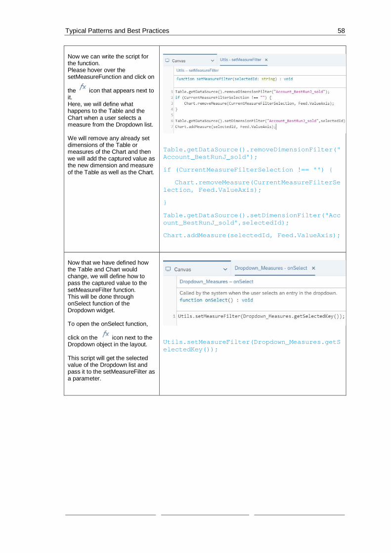
Typical Patterns and Best Practices 58
Now we can write the script forthe function.Please hover over thesetMeasureFunction and click on
the icon that appears next toit.Here, we will define whathappens to the Table and theChart when a user selects ameasure from the Dropdown list.
We will remove any already setdimensions of the Table ormeasures of the Chart and thenwe will add the captured value asthe new dimension and measureof the Table as well as the Chart.
Table.getDataSource().removeDimensionFilter("Account_BestRunJ_sold");
if (CurrentMeasureFilterSelection !== "") {
Chart.removeMeasure(CurrentMeasureFilterSelection, Feed.ValueAxis);
}
Table.getDataSource().setDimensionFilter("Account_BestRunJ_sold",selectedId);
Chart.addMeasure(selectedId, Feed.ValueAxis);
Now that we have defined howthe Table and Chart wouldchange, we will define how topass the captured value to thesetMeasureFilter function.This will be done throughonSelect function of theDropdown widget.
To open the onSelect function,
click on the icon next to theDropdown object in the layout.
This script will get the selectedvalue of the Dropdown list andpass it to the setMeasureFilter asa parameter.
Utils.setMeasureFilter(Dropdown_Measures.getSelectedKey());

Typical Patterns and Best Practices 59
The last step is setting whathappens when the application isfirst run.This is done through theonInitialization function of theCanvas itself.
To get to this script, please hoverover the CANVAS in the Layout
and click on the icon when itappears and selectonInitialization.
In this use case, we want tomake sure that on initialization,we load all the availablemeasures of the Table into ourDropdown List.After doing that, we set theselected key to the first measurein that list and then we set ourmeasure filter to that firstmeasure in our list.
var measures =Table.getDataSource().getMeasures();
var selectedKey = "";
if (measures.length > 0) {
for (var i=0;i<measures.length; i++){
// Measure
Dropdown_Measures.addItem(measures[i].id,measures[i].description);
if (selectedKey === "" && i === 0) {
selectedKey = measures[i].id;
Dropdown_Measures.setSelectedKey(selectedKey);
console.log(["selectedKey ",selectedKey]);
}

Typical Patterns and Best Practices 60
console.log(["CurrentMeasure ",measures]);
}
}
Utils.setMeasureFilter(selectedKey);
Now let’s see how it looks like.
Save the application and click onRun Analytic Application in theupper right side of the page andthe result should look somethinglike this:
If you select a measure from theDropdown list, the values in theTable as well as the Chart(accessed by clicking on the
icon – See “Switchingbetween Table and Chart”exercise) should changeaccordingly.
· Application when it’s first run:
· Chart with “Gross Margin Plan” as the selectedmeasure:
· Chart with “Discount” as the selected measure:

Typical Patterns and Best Practices 61
6.3 Selecting Measures via Dropdown to filter Table and Chartto display (Multi – Selection)
In this example, we will explore how to filter a Table or a Chart using multiple measures selectedfrom a Checkbox Group widget.
Unlike a Dropdown box, the Checkbox Group allows using multiple measures as filters. In thisuse case, we will add a Checkbox Group widget where we will list all the measures in our dataset. On top of that, there will be three buttons;
· “set selected”: to filter the Table and Chart using the checked measures in the Checkbox,
· “remove all”: to remove all the selected filters, and
· “set all”: to display all the available measures in our Table/Chart
The result will look like this when we run the application:
Figure 28: Example Application Multi Selection
Prerequisites for this use case is having already added a table and a chart to your canvas. Tohave all the functionalities in this use case, please first go through the “Switching between Tableand Chart“ exercise.

Typical Patterns and Best Practices 62
To add a Checkbox Group widget to yourCanvas, go to the Insert Panel and click onthe “+” sign and then choose CheckboxGroup. Please place the newly addedwidget on the left side of your Table in thecanvas.
We will name the checkbox groupCheckboxGroup_Measures.
To rename the objects, hover over them
one by one and when the iconappears click on it and choose Rename.
Please remove the initial values “Value 1”and “Value 2” from the Checkbox group
Value list. Select and click andthen click Apply.
This use case assumes that you have aTable and a Chart already set in theCanvas. If you don’t, please go through theSwitching between Table and Chartexercise and keep the names as they arein that exercise so that it works here aswell.
We will also add a label so that we canindicate to the user that the CheckboxGroup is displaying the measures of ourdata set.To insert Text, please click again on the “+”icon in the Insert Panel and choose Text.
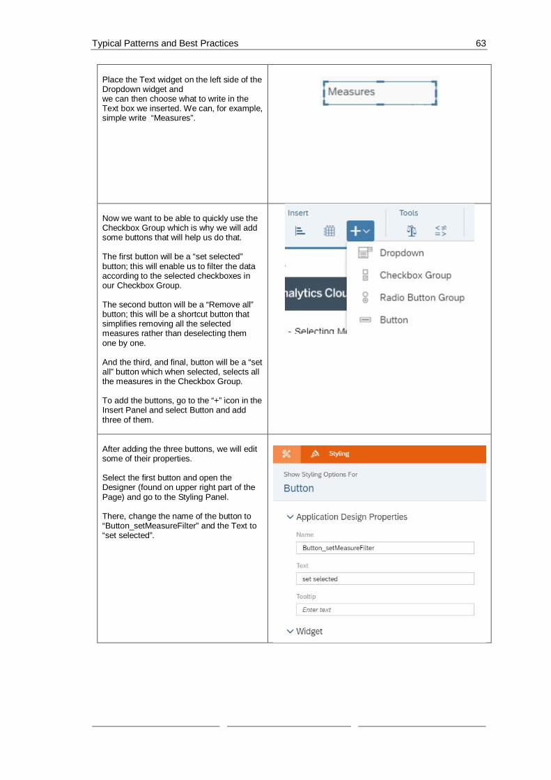
Typical Patterns and Best Practices 63
Place the Text widget on the left side of theDropdown widget andwe can then choose what to write in theText box we inserted. We can, for example,simple write “Measures”.
Now we want to be able to quickly use theCheckbox Group which is why we will addsome buttons that will help us do that.
The first button will be a “set selected”button; this will enable us to filter the dataaccording to the selected checkboxes inour Checkbox Group.
The second button will be a “Remove all”button; this will be a shortcut button thatsimplifies removing all the selectedmeasures rather than deselecting themone by one.
And the third, and final, button will be a “setall” button which when selected, selects allthe measures in the Checkbox Group.
To add the buttons, go to the “+” icon in theInsert Panel and select Button and addthree of them.
After adding the three buttons, we will editsome of their properties.
Select the first button and open theDesigner (found on upper right part of thePage) and go to the Styling Panel.
There, change the name of the button to“Button_setMeasureFilter” and the Text to“set selected”.

Typical Patterns and Best Practices 64
Select the second button and open theDesigner again and go to the Styling Panel.
There, change the name of the button to“Button_removeAllMeasures” and the Textto “Remove all”.
Select the third button and in the StylingPanel,change the name of the button to“Button_setAllMeasures” and the Text to“set all”
To be able to access the values that havebeen selected in the Checkbox Group, weneed to create variables that can beaccessed anywhere in the application.Which is why, we will create 2 ScriptVariables.The first one will be called “AllMeasures”and we will set it as an array. This variablewill hold all the measures that could beselected in the Checkbox Group.
To insert this variable, go to SCRIPTVARIABLES under SCRIPTING in theLayout which you can find on the left partof the Page.Click on the “+” icon next to theSCRIPTING VARIABLES which shouldopen a new window where you can changethe structure of your variable.

Typical Patterns and Best Practices 65
There, type in “AllMeasures” in the Namebox, select “string” as Type, and set theSet As Array button to “YES”.Click on Done to close the properties’window.
Add a second Scripting Variable the sameway as in Step 8.This variable will hold the measures thatthe user has selected from the CheckboxGroup.
When the Structure window opens, type in“CurrentMeasureFilterSelection” in theName box, set “string” as Type, and togglethe Set As Array button to “YES”.

Typical Patterns and Best Practices 66
To define what should happen when a filteris selected, we need to create a ScriptObject.
In this object, we will create a function thatsets the measure filter according to whatthe user has chosen from the CheckboxGroup.
To create a Script Object, select the “+”icon next to SCRIPT OBJECTS under theLayout.Afterwards, rename both the folder thatwas created as well as the function.
We will name the folder Utils and thefunction setMeasureFilter.
To rename the objects, hover over them
one by one and when the iconappears click on it and choose Rename.
Click on the function setMeasureFilter andwhen the Editing window opens, click onthe “+” icon next to Arguments.
Here, we will add an argument with thename “selectedIds” and the Type string[ ](array of strings).

Typical Patterns and Best Practices 67
To define what the setMeasureFilterfunction, that we added in Step 11, does,please go to the function in the Layout,
hover over its name, and click on theicon next to it.
The script of this function does thefollowing:Firstly, it removes any dimensions from theTable or measures from the Chart thatwere added to filter them before.
Secondly, it looks to see which measuresthe user has chosen from the CheckboxGroup and adds them as dimensions to theTable/measures for the Chart.
Lastly, it takes the selected measures ofthe user and saves them in the variable wecreated in Step 9(CurrentMeasureFilterSelection)
// remove Measures
Table.getDataSource().removeDimensionFilter("Account_BestRunJ_sold");
if (CurrentMeasureFilterSelection !==[""]) {
for (vari=0;i<CurrentMeasureFilterSelection.length; i++){
Chart.removeMeasure(CurrentMeasureFilterSelection[i], Feed.ValueAxis);
}
}
// add Measures

Typical Patterns and Best Practices 68
Table.getDataSource().setDimensionFilter("Account_BestRunJ_sold",selectedIds);
for (i=0;i<selectedIds.length; i++){
Chart.addMeasure(selectedIds[i],Feed.ValueAxis);
}
// save the current selection intoglobal variable
CurrentMeasureFilterSelection =selectedIds;
Now, we need to define what happenswhen the buttons we created are clicked.The first button, “set selected” should filterthe data according to the selectedcheckboxes in our Checkbox Group.
To edit the onClick function script of thebutton, you can either hover over it in the
Layout and click on the icon or youcan click on the button in the canvas and
similarly select
In the script of the onClick function, we willcall the Utils.setMeasureFilter function andpass to it the selected measures of theCheckbox Group.
Utils.setMeasureFilter(CheckboxGroup_Measures.getSelectedKeys());
The second button, “Remove all”, removesall the selected measures from theCheckbox Group.
Open the script of the button like in step 13and here, we will remove all the selectedmeasures from the Checkbox Group itselfand also pass an empty array to theUtils.setMeasureFilter so that our Tableand Chart as well as our global variableCurrentMeasureFilterSelection will beupdated.

Typical Patterns and Best Practices 69
CheckboxGroup_Measures.setSelectedKeys([""]);
Utils.setMeasureFilter([""]);
The third button, “set all”, selects all themeasures in the Checkbox Group.
In the script of this button, we will set theselected keys of the Checkbox Group tothe AllMeasures script variable we haddefined before and we will pass the samevariable to the Utils.setMeasureFilterfunction.
CheckboxGroup_Measures.setSelectedKeys(AllMeasures);
Utils.setMeasureFilter(AllMeasures);
The last step is setting what happens whenthe application is first run.This is done through the onInitializationfunction of the Canvas itself.
To get to this script, please hover over theCANVAS in the Layout and click on the
icon when it appears and selectonInitialization.
In this use case, we want to make sure thaton initialization, we get all the availablemeasures of the Table’s data source.Then, we define a selected keys array oftype string and using a loop, we add themeasures to our Checkbox Group and theselected keys array. We also call on thesetSelectedKeys function of the CheckboxGroup and set its selected keys to ourarray.Finally, we set the script variableAllMeasures and the measure filter to theselected keys.

Typical Patterns and Best Practices 70
// get all measures from the tabledata source
var measures =Table.getDataSource().getMeasures();
// define array or the selected Keys
var selectedKeys =ArrayUtils.create(Type.string);
if (measures.length > 0) {
for (var i=0;i<measures.length;i++){
// add the Measure to checkboxgroup
CheckboxGroup_Measures.addItem(measures[i].id,measures[i].description);
//add the measure to theselecedKeys
selectedKeys.push(measures[i].id);
CheckboxGroup_Measures.setSelectedKeys(selectedKeys);
console.log(["CurrentMeasure ",measures]);
}
}
console.log(["selectedKey ",selectedKeys]);
AllMeasures = selectedKeys;
Utils.setMeasureFilter(selectedKeys);
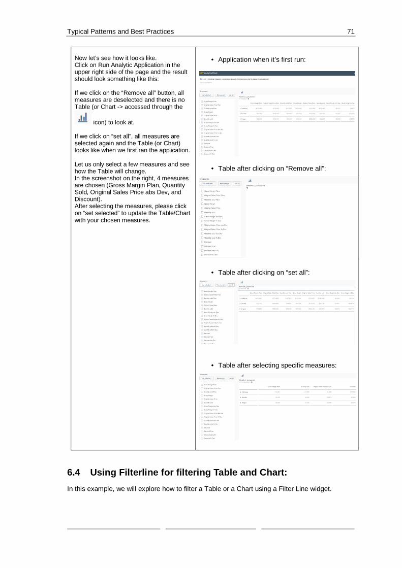
Typical Patterns and Best Practices 71
Now let’s see how it looks like.Click on Run Analytic Application in theupper right side of the page and the resultshould look something like this:
If we click on the “Remove all” button, allmeasures are deselected and there is noTable (or Chart -> accessed through the
icon) to look at.
If we click on “set all”, all measures areselected again and the Table (or Chart)looks like when we first ran the application.
Let us only select a few measures and seehow the Table will change.In the screenshot on the right, 4 measuresare chosen (Gross Margin Plan, QuantitySold, Original Sales Price abs Dev, andDiscount).After selecting the measures, please clickon “set selected” to update the Table/Chartwith your chosen measures.
· Application when it’s first run:
· Table after clicking on “Remove all”:
· Table after clicking on “set all”:
· Table after selecting specific measures:
6.4 Using Filterline for filtering Table and Chart:In this example, we will explore how to filter a Table or a Chart using a Filter Line widget.

Typical Patterns and Best Practices 72
Instead of loading all the dimensions in our data set into a Checkbox group or a Dropdown widget,in this use case, we will select specific dimensions to load into a filter line.
After loading the desired dimensions into our filter line, we will connect it to our Table/Chart sothat the data is filtered using the selected filter.
To use the filter line after running the application, simply click on the filter line icon and select thedimension you want to use to filter your data.
The result will look like this when we run the application:
Figure 29: Example Application Filterline
And this is how it will look like when we click on our Filter line widget:
Figure 30: Select Filterline
Prerequisites for this use case is having already added a table and a chart to your canvas. Tohave all the functionalities in this use case, please first go through the “Switching between Tableand Chart“ exercise.

Typical Patterns and Best Practices 73
To add a Filter Line widget toyour Canvas, go to the InsertPanel and click on the “+” signand then choose Filter Line.Please place the newly addedwidget above the Table.
We will name the filterlineFilterLine.
To rename the objects, hoverover them one by one and when
the icon appears click on itand choose Rename.
This use case assumes that youhave a Table and a Chart alreadyset in the Canvas. If you don’t,please go through the Switchingbetween Table and Chartexercise and keep the names asthey are in that exercise so that itworks here as well.
After adding the Filter Line, weneed to set its properties.We can do that by selecting theFilter Line we added to ourcanvas and afterwards, clickingon the Designer button.You can find this button on theupper right side of the screen.
There, navigate over to theBuilder Panel.
In the Builder Panel, we will setthe structure of the Filter Line.We will set the source widget asthe Table.This is done by going to SourceWidget and choosing “Table”from the Dropdown List.

Typical Patterns and Best Practices 74
Now we will add the filters wewant: In this use case we wantthe user to be able to filter on 4dimensions: Location, Product,Sales Manager, and Store.
We can add these by going to theDimension Selection part andclicking Add Dimension andselecting all 4 when the Checklistcomes up.
In step 3 we needed to select asource widget for our Filter Lineand we chose the Table,however, in our application wegive the user the option to togglebetween Table and Chart using
the andrespectively (please refer to the“Switching between Table andChart” Exercise).
This means that we have to find away to get the filter that’s beenapplied to the Table so that wecan apply that on our Chart too.
To do that, click on the nextto the Table in the Layout andchoose onResultChanged.

Typical Patterns and Best Practices 75
In the script of theonResultChanged function, wewill copy the dimension filtersfrom the Table. We do thecopying 4 times for each of themeasures we had added in theDimension Selection part (in step4).
console.log('OnResultChanged');
Chart.getDataSource().copyDimensionFilterFrom(Table.getDataSource(), "Location_4nm2e04531");
Chart.getDataSource().copyDimensionFilterFrom(Table.getDataSource(), "Product_3e315003an");
Chart.getDataSource().copyDimensionFilterFrom(Table.getDataSource(),"Sales_Manager__5w3m5d06b5");
Chart.getDataSource().copyDimensionFilterFrom(Table.getDataSource(),"Store_3z2g5g06m4.Store_GEOID");
Now let’s see how it looks like.
Click on Run Analytic Applicationin the upper right side of the pageand the result should looksomething like this:
When you click on the Filter Line,the 4 measures we added popup.
When one of the measures in theFilterline is clicked, a pop-upwindow comes up and we get tochoose which cities (locations),products, sales managers, andstores do we want to include inour Table or Chart.
If we were to choose SanFrancisco, Las Vegas, andPortland as our members, thetable would update according tothat filter.
And the Chart will be updated as
well (Click the icon to getthe view of the Chart
· Location is selected

Typical Patterns and Best Practices 76
6.5 Cascaded FilteringIn this example, we will explore how to do cascaded filtering; meaning filtering on dimensions andthen filtering according to hierarchies (such as Flat Presentation, ABC, …) to choose how todisplay the data.
We will add two Dropdown Lists, one for filtering Dimension and the other for filtering Hierarchiesand depending on what Dimension we choose to filter on, the Dropdown List for the Hierarchiesfilters will change.
There is always one consistent filter for Hierarchies which is Flat Presentation and according toour chosen Dimension, we might either only have that one or have more options.

Typical Patterns and Best Practices 77
For example, if we are filtering on Location, we have two choices for Hierarchies; Flat Presentationand according to States, however, if we are filtering on Product, we have Flat Presentation,Category, or ABC (this one categorizes the dimension as “worst-selling”, “medium-selling”, or“best-selling”), and if we are filtering on Store or Sales Manager, our only option is FlatPresentation.
The different filters can be chosen by simply selecting them from the Dropdown lists we added.
The result will look like this when we run the application:
Figure 31: Example Application Cascading Filtering
Prerequisites for this use case is having already added a table and a chart to your canvas. Tohave all the functionalities in this use case, please first go through the “Switching between Tableand Chart“ exercise.
To add a Dropdown widget for theList of Dimensions and one for theHierarchies, we need to go to theInsert Panel, click on the “+” icon,and choose Dropdown.Please insert two widgets into yourCanvas and position them on thesame level above the Table.
We will name the dropdownDropdown_Dimensions.
To rename the objects, hover over
them one by one and when theicon appears click on it and chooseRename.

Typical Patterns and Best Practices 78
Add the second Dropdown widget forthe Hierarchies we will nameDropdown_Hierarchies.
This use case assumes that youhave a Table and a Chart already setin the Canvas. If you don’t, please gothrough the Switching between Tableand Chart exercise and keep thenames as they are in that exercise sothat it works here as well.
Go into the Builder properties of theDimensions Dropdown widget(through the Designer button on theupper right side of the screen).
Here, we will add the values that theuser can choose from the widget.
Add values by clicking on the “+”icon.We will set Location to our defaultvalue.
After entering all the values, click on“Apply” to save the changes.
Location_4nm2e04531 Location
Product_3e315003an Product
Store_3z2g5g06m4 Store
Sales_Manager__5w3m5d06b5 Sales Manager

Typical Patterns and Best Practices 79
To be able to distinguish theDropdown List of the Dimensionsand the one of the Hierarchies, weneed to have labels for both.
To add a Label, please click again onthe “+” icon, insert two Text widgets,and place them on the left side ofeach of the Dropdown Lists weadded in the previous step.
Now, we will set the properties of thelabels we added.Double click on the first label andtype “Dimension”And then go into the Designer StylingPanel of the label. There, we will setthe name of the Label that we willuse if we need to reference thiswidget in a script.Please, insert the name“Dropdown_Dimensions_Label”
We will do the same for our secondlabel.Double click on the first label andtype “Hierarchies”And then go into the Designer StylingPanel of the label andInsert“Dropdown_Hierarchies_Label” as itsName.

Typical Patterns and Best Practices 80
To be able to filter according to theDimension chosen from theDimension Dropdown list, we need tobe able to store the choice in avariable that can be accessed fromanywhere in the application; thatmeans that we need a ScriptVariable.
To add a script variable, click on the“+” next to SCRIPT VARIABLES thatis found under Scripting.
A window for the newly added scriptvariable should now open.In the Structure part, type in“CurrentDimension” as the Name,and then set “string” as the Type and“Location_4nm2e04531” as theDefault Value.This will make Location appear asour Default Value in the Dropdownwidget when we run our application.
To trigger the action of filtering when achoice is selected from the DropdownLists, we need to write an onSelect scriptfor the them.
We’ll start with the HierarchiesDropdown widget:To open the onSelect function, hover onthe Dropdown object in the Layout and
click on the icon that appears nextto it.
This script will get the selected value ofthe Dropdown list and accordingly setthe hierarchy of the Table and the Chartwhile referencing our script variable,CurrentDimension, so that the hierarchydisplays only correctly filtered data.
var sel =Dropdown_Hierarchies.getSelectedKey();
// set hierarchy for Table
Table.getDataSource().setHierarchy(CurrentDimension, sel);
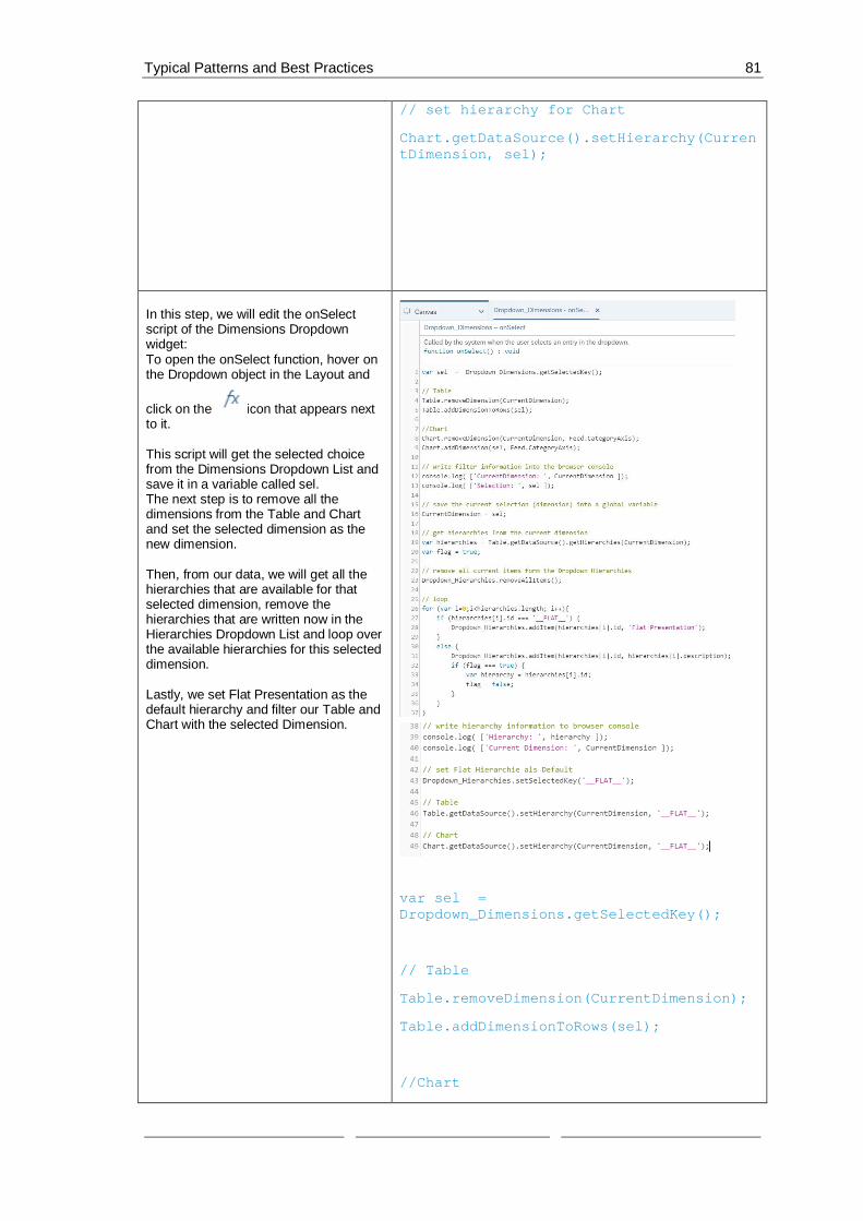
Typical Patterns and Best Practices 81
// set hierarchy for Chart
Chart.getDataSource().setHierarchy(CurrentDimension, sel);
In this step, we will edit the onSelectscript of the Dimensions Dropdownwidget:To open the onSelect function, hover onthe Dropdown object in the Layout and
click on the icon that appears nextto it.
This script will get the selected choicefrom the Dimensions Dropdown List andsave it in a variable called sel.The next step is to remove all thedimensions from the Table and Chartand set the selected dimension as thenew dimension.
Then, from our data, we will get all thehierarchies that are available for thatselected dimension, remove thehierarchies that are written now in theHierarchies Dropdown List and loop overthe available hierarchies for this selecteddimension.
Lastly, we set Flat Presentation as thedefault hierarchy and filter our Table andChart with the selected Dimension.
var sel =Dropdown_Dimensions.getSelectedKey();
// Table
Table.removeDimension(CurrentDimension);
Table.addDimensionToRows(sel);
//Chart
Typical Patterns and Best Practices 82
Chart.removeDimension(CurrentDimension,Feed.CategoryAxis);
Chart.addDimension(sel,Feed.CategoryAxis);
// write filter information into thebrowser console
console.log( ['CurrentDimension: ',CurrentDimension ]);
console.log( ['Selection: ', sel ]);
// save the current selection (dimension)into a global variable
CurrentDimension = sel;
// get hierarchies from the currentdimension
var hierarchies =Table.getDataSource().getHierarchies(CurrentDimension);
var flag = true;
// remove all current items form theDropdown_Hierarchies
Dropdown_Hierarchies.removeAllItems();
// loop
for (var i=0;i<hierarchies.length; i++){
if (hierarchies[i].id === '__FLAT__'){
Dropdown_Hierarchies.addItem(hierarchies[i].id, 'Flat Presentation');
}
else {
Dropdown_Hierarchies.addItem(hierarchies[i].id, hierarchies[i].description);
if (flag === true) {
var hierarchy =hierarchies[i].id;
flag = false;

Typical Patterns and Best Practices 83
}
}
}
// write hierarchy information to browserconsole
console.log( ['Hierarchy: ', hierarchy]);
console.log( ['Current Dimension: ',CurrentDimension ]);
// set Flat Hierarchie als Default
Dropdown_Hierarchies.setSelectedKey('__FLAT__');
// Table
Table.getDataSource().setHierarchy(CurrentDimension, '__FLAT__');
// Chart
Chart.getDataSource().setHierarchy(CurrentDimension, '__FLAT__');
The last step is setting what happenswhen the application is first run.This is done through the onInitializationfunction of the Canvas itself.
To get to this script, please hover overthe CANVAS in the Layout and click on
the icon when it appears and selectonInitialization.

Typical Patterns and Best Practices 84
In this use case, we want to make surethat on initialization, we load all theavailable hierarchies of the dimensionsand set Flat Presentation as the defaultof the Hierarchies Dropdown List.The script for this part is the same assome of what happens when adimension is chosen.
// get hierarchies from the currentdimension
var hierarchies =Table.getDataSource().getHierarchies(CurrentDimension);
var flag = true;
// loop
for (var i=0;i<hierarchies.length; i++){
if (hierarchies[i].id === '__FLAT__'){
Dropdown_Hierarchies.addItem(hierarchies[i].id, 'Flat Presentation');
}
else {
Dropdown_Hierarchies.addItem(hierarchies[i].id, hierarchies[i].description);
if (flag === true) {
var hierarchy =hierarchies[i].id;
flag = false;
}
}

Typical Patterns and Best Practices 85
}
// write hierarchy information to browserconsole
console.log( ['Hierarchy: ', hierarchy]);
console.log( ['Current Dimension: ',CurrentDimension ]);
// set Flat Hierarchie als Default
Dropdown_Hierarchies.setSelectedKey('__FLAT__');
//Table
Table.getDataSource().setHierarchy(CurrentDimension, '__FLAT__');
//Chart
Chart.getDataSource().setHierarchy(CurrentDimension, '__FLAT__');
Now let’s see how it looks like.
Click on Run Analytic Application in theupper right side of the page and theresult should look something like this:
If we keep the dimension on “Location”but change the hierarchy to “States”, theTable would change to display thelocation according to the states we have.
Now, if we change the dimension to“Product” and set the hierarchy to“Category”, we will see the differentcategories of products displayed.

Typical Patterns and Best Practices 86
6.6 Add and remove dimension in rows and columns for TableIn this example, we will, through Checkbox Groups, control which measures as well as whichdimensions are displayed in the Table.
The user can select which measures they would like displayed in the Table through the MeasuresCheckbox and then through another Checkbox, they could decide which dimensions they wantdisplayed on the Columns or the Rows of the Table.
The application also makes it easier for the user to select all or remove all measures by addingbuttons specifically for that purpose.
They can also remove the dimensions that they added to the columns and rows and are able tochoose to add them again afterwards.
The result will look like this when we run the application:
Figure 32: Add and remove Dimensions

Typical Patterns and Best Practices 87
This application assumes that there already is a Table in your Canvas. To match the scripts inthe application it is recommended to rename the widget to “Table”.
We will start by adding 5 CheckboxGroups.The first one will display all theavailable measures and the usercan choose which ones they want tosee in the Table, the second onewill display the dimensions we wantour Columns to be filtered on, whilethe third does the same but for ourRows.The fourth Checkbox Group willdisplay the dimensions that wecould add to the second and thirdCheckbox.
Place the first four CheckboxGroups under each other on the leftside of the Table. (as shown in thescreenshot).
The fifth Checkbox Group will getthe selected dimensions of thefourth Checkbox and order theCheckboxes according to theselections while also taking carethat there aren’t any repetitions inany of the other Checkbox Groups.
To start off, please click on the “+”icon in the Insert Panel and chooseCheckbox Group and place on theleft side of the Table.

Typical Patterns and Best Practices 88
Go to the Designer of the firstCheckbox (by clicking on Designeron the upper right side of thescreen) and switch to the Styling
Panel by clicking on thebutton.
There, please enter“CheckboxGroup_Measures” as theName and choose “Vertical Layout”as the Display Option.
Switch over to the Builder Panel ofthe same widget and delete thevalues in the Table.Simply select the value and click on
the icon to delete it.
Afterwards, click on Apply to savethe changes.
We will do the same for the otherCheckbox Groups. Please add fournew Checkbox Groups; for the firstenter “CheckboxGroup_Columns”,for the second enter“CheckboxGroup_Rows”, for thethird enter “CheckboxGroup_Free”,and for the last enter“CheckboxGroup_AllDimensions” asthe Name.Choose “Vertical Layout” as theDisplay Option for all of them.
Place the three Checkbox Groupsunder each other on the left side ofthe Table, under the MeasureCheckbox, in the order in which weinserted them (as described before).
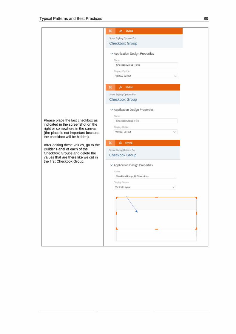
Typical Patterns and Best Practices 89
Please place the last checkbox asindicated in the screenshot on theright or somewhere in the canvas(the place is not important becausethe checkbox will be hidden).
After editing these values, go to theBuilder Panel of each of theCheckbox Groups and delete thevalues that are there like we did inthe first Checkbox Group.

Typical Patterns and Best Practices 90
To be able to distinguish theCheckbox Groups from each other,we need to have labels for four ofthem. (We don’t need a label for theAll Dimensions Checkbox becauseit won’t be visible at view time)
To add a Label, please click againon the “+” icon, insert four Textwidgets, and place each one ofthem above each of the CheckboxGroups we added.
Now, we will set the properties ofthe labels we added.Double click on the first label andtype “Measures”And then go into the DesignerStyling Panel of the label. There, wewill set the name of the Label thatwe will use if we need to referencethis widget in a script.Please, insert the name“CheckboxGroup_Measures_Label”
We will do the same for our secondlabel.Double click on the first label andtype “Columns”And then go into the DesignerStyling Panel of the label andinsert“CheckboxGroup_Columns_Label”in its Name field.

Typical Patterns and Best Practices 91
Navigate towards the third label andthere:Double click on the first label andtype “Rows”And then go into the DesignerStyling Panel of the label andInsert the Name“CheckboxGroup_Rows_Label”.
Finally, we will edit our fourth label.Double click on the first label andtype “Free”And then go into the DesignerStyling Panel of the label andinsert the name“CheckboxGroup_Free_Label” as itsName.
Now, we need to set theAllDimensions Checkbox to invisibleat view time because we only needit to sort our dimensions as you’llsee later in the exercise.Go into the Styling Panel in theDesigner of theCheckboxGroup_AllDimensions anduncheck Show this item at view time

Typical Patterns and Best Practices 92
Now, we will add all the buttons, weneed, to control our choices fromthe Checkbox Groups.To add our first button, please clickon the “+” icon and insert a Buttonand place it between the MeasuresLabel and its Checkbox Group.
To edit the button, click on it and goto the Styling Panel in the Designer.For the Name, enter“Button_setMeasureFilter” and forthe Text enter “set selected”. Thisbutton will set the measures wechoose from the MeasuresCheckbox as measures for ourTable.
Now, we will do the same for all thebuttons we need.Add a new button and place it nextto the first one.For this button, enter“Button_removeAllMeasures” for theName and “Remove all” for theText. This button will be used touncheck all the measures from theMeasures Checkbox Group and setthe measure filters for the Table toempty.
Add a third button and place it nextto the second one.For this button, enter“Button_setAllMeasures” for theName and “set all” for the Text. Thisbutton will be used to set all theavailable measures as measures forour Table.
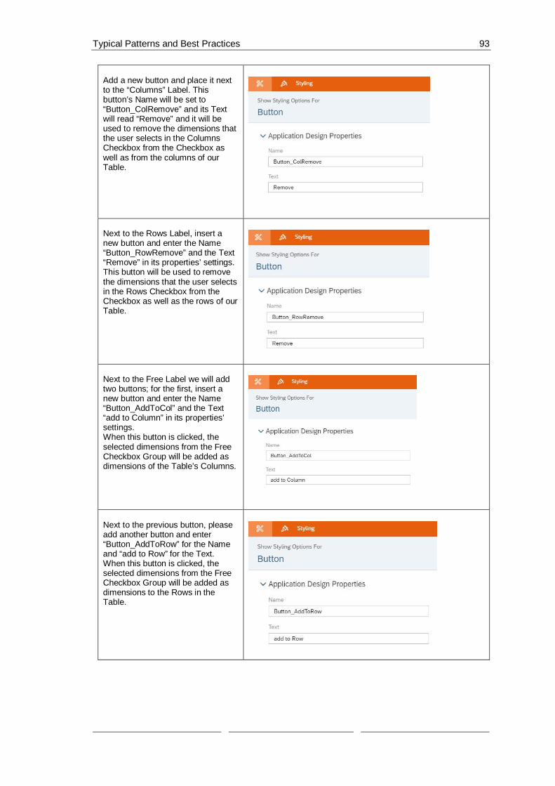
Typical Patterns and Best Practices 93
Add a new button and place it nextto the “Columns” Label. Thisbutton’s Name will be set to“Button_ColRemove” and its Textwill read “Remove” and it will beused to remove the dimensions thatthe user selects in the ColumnsCheckbox from the Checkbox aswell as from the columns of ourTable.
Next to the Rows Label, insert anew button and enter the Name“Button_RowRemove” and the Text“Remove” in its properties’ settings.This button will be used to removethe dimensions that the user selectsin the Rows Checkbox from theCheckbox as well as the rows of ourTable.
Next to the Free Label we will addtwo buttons; for the first, insert anew button and enter the Name“Button_AddToCol” and the Text“add to Column” in its properties’settings.When this button is clicked, theselected dimensions from the FreeCheckbox Group will be added asdimensions of the Table’s Columns.
Next to the previous button, pleaseadd another button and enter“Button_AddToRow” for the Nameand “add to Row” for the Text.When this button is clicked, theselected dimensions from the FreeCheckbox Group will be added asdimensions to the Rows in theTable.

Typical Patterns and Best Practices 94
Please compare your Canvas to thescreenshot on the right and makesure they look alike.
We will not add a label for the lastCheckbox Group (All Dimensions)since it is there to simply help us setthe dimensions in the Columns,Rows, and Free Checkboxes so thatthere are no repetitions.
To be able to filter according to themeasures and dimensions chosenfrom the Checkbox Groups, weneed to be able to store the choicesin variables that can be accessedfrom anywhere in the application;that means that we need ScriptVariables.To add a script variable, click on the“+” next to SCRIPT VARIABLESthat is under Scripting.

Typical Patterns and Best Practices 95
A window for the newly added scriptvariable should now open. In theStructure part, type in“AllDimensions” as the Name, andthen set “string” as the Type andtoggle the Set As Array button toYes.This variable will hold all thedimensions in our data set.
Now, we will add a second scriptvariable that will hold all themeasures of our data set.Add a new variable like we did inthe previous 2 steps.In the name field insert“AllMeasures”, set the Type to“string”, and toggle the Set As Arraybutton to Yes.
To be able to implement theselected dimensions in our Columnsand Rows, we need to save these ina script variable.Firstly, we will insert a scriptvariable to hold the selecteddimensions that we have chosen toadd to our Columns.Add a new script variable and enter“CurrentDimensionColumn” in theName field, set string as Type, andtoggle the Set As Array button toYes.

Typical Patterns and Best Practices 96
To hold the selected dimensions,we have chosen to add to ourRows, we will insert a new scriptvariable.Type “CurrentDimensionRows” inthe Name field, set the Type tostring, and toggle the Set As Arraybutton to Yes.
Our final script variable will hold themeasure(s) we have selected fromthe Measures Checkbox Group.Insert a new script variable and setthe Name to“CurrentMeasureFilterSelection”,the Type to string, and the Set AsArray to Yes.
To define what should happen whena dimension or a measure ischosen, we need to create a ScriptObject. In this object, we will createa function that sets the measurefilter according to what the user haschosen from the MeasuresCheckbox Group and anotherfunction that sets the dimensionsaccording to what the user haschosen from the Free CheckboxGroup.To create a Script Object, select the“+” icon next to SCRIPT OBJECTSunder the Layout.
This will add only one script functionto the script object.To add a second one, hover over
the folder created, click on theicon when it appears and click on “+Add Script Function”.
Rename all the added elements asthe following:

Typical Patterns and Best Practices 97
We will name the folder Utils, thefirst functionsetDimensionCheckboxes and thesecond function setMeasureFilter.
To rename the objects, hover overthem one by one and when the
icon appears click on it andchoose Rename.
Click on the functionsetDimensionCheckboxes and setthe Return Type to void.
Click on the functionsetMeasureFilter and when theProperties window opens, set theReturn Type to void and click on the“+” icon next to Arguments.There, add an argument with thename “selectedIds” and the typestring[] (string array).

Typical Patterns and Best Practices 98
Now, we can write the script for thefunctions.
Please click on the icon next tothe setDimensionCheckboxesfunction.Here, we will define what happenswhen a user selects dimensionsfrom the Free Checkbox Group tobe added to the Columns or theRows.
Firstly, we will remove all items fromthe Column, Rows, and FreeCheckboxes.
Then, we will call on the createfunction of the script variables andcreate two new string arrays andsave one in ourCurrentDimensionColumn scriptvariable and the other in theCurrentDimensionRows scriptvariable.
Afterwards, we get the dimensionsthat are now on the Table’s columnsand push each on into the stringarray of CurrentDimensionColumn.We then do the same for the Rows,this time pushing the rowdimensions into the string array ofCurrentDimensionRows.
We then get all the dimensions andwe will see which dimensions werechosen from theAllDimensionsCheckbox.
Next, we will add these dimensionsto our Free Checkbox but remove

Typical Patterns and Best Practices 99
the ones that are in the Rows orColumns Checkboxes so that wedon’t have any repetitions betweenthe three Checkboxes.
CheckboxGroup_Columns.removeAllItems();
CheckboxGroup_Rows.removeAllItems();
CheckboxGroup_Free.removeAllItems();
CurrentDimensionColumn =ArrayUtils.create(Type.string);
CurrentDimensionRows =ArrayUtils.create(Type.string);
console.log(["CurrentDimensionColumnshould empty",CurrentDimensionColumn.slice()]);
console.log(["CurrentDimensionRows shouldempty", CurrentDimensionRows.slice()]);
// Dimension in Columns
var dimCol =Table.getDimensionsOnColumns();
if (dimCol.length > 0) {
for (var i=0;i<dimCol.length; i++){
CurrentDimensionColumn.push(dimCol[i].id);
console.log(["CurrentDimensionColumn ",dimCol[i].id]);
}
}
// Dimension in Rows

Typical Patterns and Best Practices 100
var dimRows = Table.getDimensionsOnRows();
if (dimRows.length > 0) {
for (i=0;i<dimRows.length; i++){
CurrentDimensionRows.push(dimRows[i].id);
console.log(["CurrentDimensionRows ",dimRows[i].id]);
}
}
// get all Dimensions
if (AllDimensions.length > 0) {
for (i=0;i<AllDimensions.length; i++){
if (AllDimensions[i] !== "") {
CheckboxGroup_AllDimensions.setSelectedKeys([AllDimensions[i]]);
var dimdesc =CheckboxGroup_AllDimensions.getSelectedTexts();
CheckboxGroup_Free.addItem(AllDimensions[i],dimdesc[0]);
console.log(["AllDimensions",AllDimensions[i], dimdesc[0]]);
}
}
}
console.log(["CurrentDimensionColumn",CurrentDimensionColumn]);
console.log(["CurrentDimensionRows",CurrentDimensionRows]);
// remove the dimensions from the freelist, which are in rows / columns
if (CurrentDimensionRows.length > 0) {
for (i=0;i<CurrentDimensionRows.length;i++){
if (CurrentDimensionRows[i] !== "") {
CheckboxGroup_Free.setSelectedKeys([CurrentDimensionRows[i]]);

Typical Patterns and Best Practices 101
dimdesc =CheckboxGroup_Free.getSelectedTexts();
CheckboxGroup_Rows.addItem(CurrentDimensionRows[i],dimdesc[0]);
CheckboxGroup_Free.removeItem(CurrentDimensionRows[i]);
}
}
}
if (CurrentDimensionColumn.length > 0) {
for (i=0;i<CurrentDimensionColumn.length;i++){
if (CurrentDimensionColumn[i] !== "") {
CheckboxGroup_Free.setSelectedKeys([CurrentDimensionColumn[i]]);
dimdesc =CheckboxGroup_Free.getSelectedTexts();
CheckboxGroup_Columns.addItem(CurrentDimensionColumn[i],dimdesc[0]);
CheckboxGroup_Free.removeItem(CurrentDimensionColumn[i]);
}
}
}
Now, we will do the same for thesetMeasureFilter function. Click on
the icon next to thesetMeasureFilter function and there,we will define what happens to theTable when a user selects ameasure from the Dropdown list.
We will remove any already setdimension filter of the Table andthen we will add the selectedIds asthe new dimension(s) of the Table.
Finally, we will save the selectedmeasures in ourCurrentMeasureFilterSelectionscript variable.
// remove Measures
Table.getDataSource().removeDimensionFilter("Account_BestRunJ_sold");
// add Measures
Table.getDataSource().setDimensionFilter("Account_BestRunJ_sold",selectedIds);
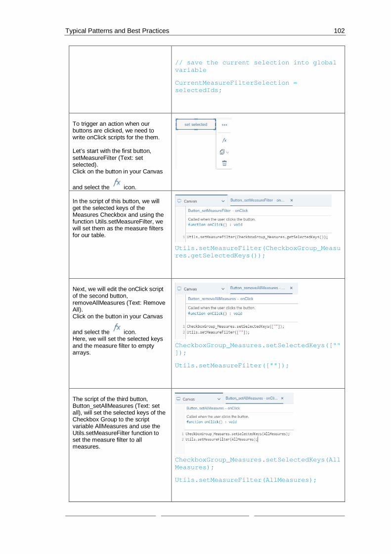
Typical Patterns and Best Practices 102
// save the current selection into globalvariable
CurrentMeasureFilterSelection =selectedIds;
To trigger an action when ourbuttons are clicked, we need towrite onClick scripts for the them.
Let’s start with the first button,setMeasureFilter (Text: setselected).Click on the button in your Canvas
and select the icon.
In the script of this button, we willget the selected keys of theMeasures Checkbox and using thefunction Utils.setMeasureFilter, wewill set them as the measure filtersfor our table.
Utils.setMeasureFilter(CheckboxGroup_Measures.getSelectedKeys());
Next, we will edit the onClick scriptof the second button,removeAllMeasures (Text: RemoveAll).Click on the button in your Canvas
and select the icon.Here, we will set the selected keysand the measure filter to emptyarrays.
CheckboxGroup_Measures.setSelectedKeys([""]);
Utils.setMeasureFilter([""]);
The script of the third button,Button_setAllMeasures (Text: setall), will set the selected keys of theCheckbox Group to the scriptvariable AllMeasures and use theUtils.setMeasureFilter function toset the measure filter to allmeasures.
CheckboxGroup_Measures.setSelectedKeys(AllMeasures);
Utils.setMeasureFilter(AllMeasures);

Typical Patterns and Best Practices 103
The fourth button’s script,Button_ColRemove (Text: Remove),when triggered, gets the selectedkeys of the Columns CheckboxGroup and then removes thesedimensions from the Table and thencalls the setDimensionCheckboxesfunction to set the Checkboxesaccording to the new selections.
var selKeys =CheckboxGroup_Columns.getSelectedKeys();
for (var i=0;i<selKeys.length; i++){
// remove dimension
Table.removeDimension(selKeys[i]);
}
Utils.setDimensionCheckboxes();
Now, we will edit the script of thebutton Button_RowRemove (Text:Remove). Here, we will do the sameas in step 32 with the ColRemovebutton. We will get the selectedkeys of the Rows Checkbox Groupand then remove these dimensionsfrom the Table and call thesetDimensionCheckboxes functionto reset the checkboxes againaccording to the new selections.
var selKeys =CheckboxGroup_Rows.getSelectedKeys();
for (var i=0;i<selKeys.length; i++){
// remove dimension
Table.removeDimension(selKeys[i]);

Typical Patterns and Best Practices 104
}
Utils.setDimensionCheckboxes();
The fifth button, Button_AddToCol(Text: add to Column) will, whenclicked on, get the selected keys ofthe Free Checkbox and add thedimensions to the column of theTable.The script will then call thesetDimensionCheckboxes functionto set the Checkboxes to the newselection.
var selKeys =CheckboxGroup_Free.getSelectedKeys();
for (var i=0;i<selKeys.length; i++){
// add dimension to Column in table
Table.addDimensionToColumns(selKeys[i]);
}
Utils.setDimensionCheckboxes();
The script of the last button,Button_AddtRow (Text: add toRow), will get the selected keys ofthe Free Checkbox and add thedimensions to the Rows of theTable, and then, same as theprevious script, it will call thesetDimensionCheckboxes functionto set the Checkboxes to the newselection.
var selKeys =CheckboxGroup_Free.getSelectedKeys();
for (var i=0;i<selKeys.length; i++){

Typical Patterns and Best Practices 105
// remove dimension
Table.addDimensionToRows(selKeys[i]);
}
Utils.setDimensionCheckboxes();
The last step is deciding whathappens when the application is firstrun.This is done through theonInitialization function of theCanvas itself.
To get to this script, please hoverover the CANVAS in the Layout and
click on the icon when itappears.
In this use case, we want to makesure that on initialization, we get allthe measures from the data sourceof the Table.
We will then define an array of typestring and call it selectedKeys.Afterwards, we will add all themeasures to the MeasuresCheckbox Group as well as theselectedKeys array.
We will then set the selected keys ofthe Checkbox Group to theselectedKeys variable and set ourscript variable AllMeasures toselectedKeys since it still holds allthe measures of our data set.
Afterwards, we define another stringarray and put all the dimensions ofthe data source in it as well as addthese dimensions as items of theCheckbox Group of all dimensions(CheckboxGroup_AllDimensions).
Next, we will set the script variableAllDimensions to the string array(selectedDims) that we havecreated to store the dimensions in.
The last step is to call the functionsof setMeasureFilter to set theselected keys to the array we haddefined at the beginning(selectedKeys) and to call thesetDimensionCheckboxes function
// Measures
// get all measures from the table datasource

Typical Patterns and Best Practices 106
to set the dimension checkboxes toits initial state.
var measures =Table.getDataSource().getMeasures();
// define array or the selected Keys
var selectedKeys =ArrayUtils.create(Type.string);
if (measures.length > 0) {
for (var i=0;i<measures.length; i++){
// add the Measure to checkbox group
CheckboxGroup_Measures.addItem(measures[i].id,measures[i].description);
//add the measure to the selected Keys
selectedKeys.push(measures[i].id);
}
}
CheckboxGroup_Measures.setSelectedKeys(selectedKeys);
console.log(["selectedKey ",selectedKeys]);
AllMeasures = selectedKeys;
// define array or the selected Keys
var selectedDims =ArrayUtils.create(Type.string);
var dims =Table.getDataSource().getDimensions();
if (dims.length > 0) {
for (i=0;i<dims.length; i++){
CheckboxGroup_AllDimensions.addItem(dims[i].id,dims[i].description);
selectedDims.push(dims[i].id);
}
}
console.log(["selectedDims ",selectedDims]);
AllDimensions = selectedDims;

Typical Patterns and Best Practices 107
Utils.setMeasureFilter(selectedKeys);
Utils.setDimensionCheckboxes();
Now let’s see how it looks like.
Click on Run Analytic Application inthe upper right side of the page andthe result should look something likethis:
If we add the Time to the ColumnsCheckbox (select it in the FreeCheckbox and click on add toColumn), we will see that thedimension has been added and wecan now see in more details whathappened in which year regardingevery measure.
Now, if we also add the dimensionLocation to the Rows, we will seethe columns being filtered on theTime and the rows on the Location.
Finally, we can try to removedimensions from the Rows andleave the Columns as we had themin the previous screenshot.
(Note: We cannot remove all thedimensions from the Columnsbecause we must filter on at leastone dimension)

Typical Patterns and Best Practices 108
6.7 Creating a Settings Panel using a Popup WindowIn this example, we will see how to use a popup window widget to create a setting panel where theuser could control the contents of the Table and Chart in the Canvas.
In this use case, we want to be able to filter our table and chart according to certain measuregroups of our data set. Here, Gross Margin, Discount, Quantity Sold, and Original Sales Price arethe options.
These measure groups are going to be selected from a Dropdown list in our Canvas.
Afterwards, we will use the popup widget to switch between Table and Chart using a Radio ButtonGroup and give the user the ability to control the measures (Actual, Plan, Absolute, and % ofDeviation) of the measure groups using a Checkbox Group widget.
The result will look like this when we run the application:
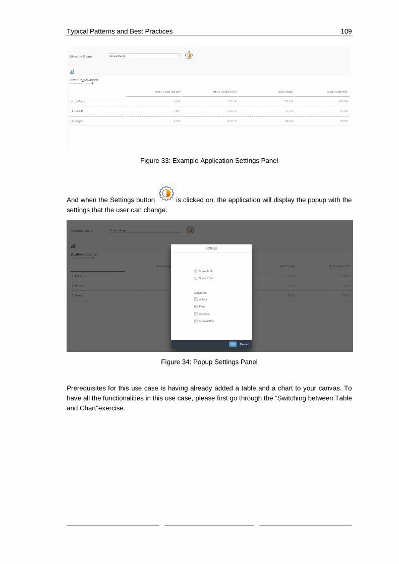
Typical Patterns and Best Practices 109
Figure 33: Example Application Settings Panel
And when the Settings button is clicked on, the application will display the popup with thesettings that the user can change:
Figure 34: Popup Settings Panel
Prerequisites for this use case is having already added a table and a chart to your canvas. Tohave all the functionalities in this use case, please first go through the “Switching between Tableand Chart“exercise.

Typical Patterns and Best Practices 110
The first thing we will do is add aDropdown list that houses the measuregroups with which we can filter ourTable and Chart.To do this, please click on the “+” iconin the Insert panel and select Dropdownand place the widget above the Table inthe Canvas.
Go to the Designer (by clicking onDesigner on the upper right side of thescreen) and switch to the Styling Panel
by clicking on the button.
There, enter“Dropdown_MeasureGroup” as theName.
Now, we will select which measures wewant the user to be able to filter on.In this use case, we will choose 4measures; Gross Margin, Discount,Quantity Sold, and Original Sales Price.
To enter these values in our dropdownlist, switch over to the Builder Panel in
the Designer by clicking on thebutton.
There, press the “+” icon near theDropdown value to enter our desiredvalues.
The first value is Gross_Margin and itsdisplayed text should read GrossMargin.The second value is Discount and thedisplayed text is the same.
The third value is Quantity_sold and itsdisplayed text is Quantity Sold.
Value Text (Optional)
Gross_Margin Gross Margin
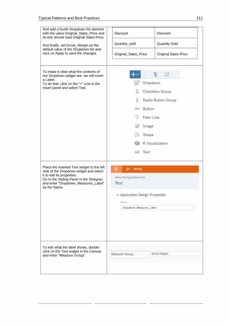
Typical Patterns and Best Practices 111
And add a fourth Dropdown list elementwith the value Original_Sales_Price andits text should read Original Sales Price.
And finally, set Gross_Margin as thedefault value of the Dropdown list andclick on Apply to save the changes.
Discount Discount
Quantity_sold Quantity Sold
Original_Sales_Price Original Sales Price
To make it clear what the contents ofour Dropdown widget are, we will inserta Label.To do that, click on the “+” icon in theInsert panel and select Text.
Place the inserted Text widget to the leftside of the Dropdown widget and selectit to edit its properties.Go to the Styling Panel in the Designerand enter “Dropdown_Measures_Label”as the Name.
To edit what the label shows, doubleclick on the Text widget in the Canvasand enter “Measure Group”.

Typical Patterns and Best Practices 112
The next step is adding the popup thatlets us edit some settings of our Tableand Chart.However, we first need to add an iconthat, when the user clicks on, will makethe popup appear.To do this, click on the “+” icon in theInsert panel and choose image.
Now add any image that you want touse as an icon for the settings.
In our application, we used asour image.
To edit the name of the image, go to theStyling Panel in the Designer and enterSettings_Logo as the name.
Now we will add our popup window.To do this, look for Popups in theLayout and click on the “+” icon to addone.
Double click on the newly added popupin the Layout to rename it and enter thename “Popup_Settings”.

Typical Patterns and Best Practices 113
And then select the popup in theLayout and a new window should open.There, we will add the elements that wewant to appear in our Popup window.
To have a header and a footer, click onthe popup and go to the Builder Panel inthe Designer.There, toggle the “Enable header &footer” button to YES.
Enter “Settings” as the Title of thePopup.
We will have two buttons, an Ok and aCancel button.To add them, click on the “+” icon nextto Buttons.Set the ID of the first button to“Ok_button” and the text to “OK”.Finally, select all the options displayedafterwards (Emphasized, Enabled, andVisible)
Set the ID of the second button to“Cancel_button” and the text to“Cancel”.Please select the options Enabled andVisible but leave the Emphasizedcheckbox disabled.Click on Apply to save the changes.
In this settings popup, we would like togive the user the option of switchingbetween the Table and Chart.To achieve this, please add a RadioButton Group widget from the InsertPanel and place it in the middle of thePopup window.

Typical Patterns and Best Practices 114
To edit the properties of the RadioButton Group, select the widget and goto the Builder Panel in the Designer.There, we will add the two options thatusers can choose from.The first will be “Show Table” and we’llset this to the default while the secondwill read “Show Chart”.
After entering the values, please clickon Apply to save the changes.
To edit the properties of the RadioButton Group, switch over to the StylingPanel.
There, enter “RadioButtonGroup_View”as the Name and select “VerticalLayout” as the Display Option.
We will also give the user the option ofchoosing which measures of the chosenmeasure group they want displayed.
To do this, we will add a CheckboxGroup from the Insert panel and place itunderneath the Radio Button Groupwidget.

Typical Patterns and Best Practices 115
We will firstly edit the Styling propertiesof the widget. To do that, select it in theCanvas or the Layout and go to theStyling panel in the Designer.
There, please enter“CheckboxGroup_Measure_Selection”as the Name and select “VerticalLayout” as the Display Option.
We also want a label text, so we willtoggle the Label text option to enable itand write “Measures” to display it as ourCheckbox Group label.
The next step is to edit the values thatappear in the Checkbox.To do this, go to the Builder panel in theDesigner.We will add the values Actual, Plan,Absolute, and % Deviation as themeasures with which the measuregroups can be filtered.To do that, click on the “+” button andadd the values.
We will set all 4 values as Default.
Click on Apply to save the changes.
Value Text (Optional)
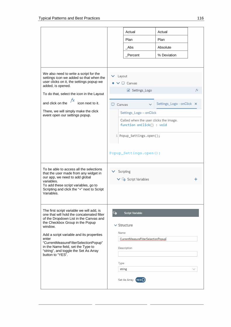
Typical Patterns and Best Practices 116
Actual Actual
Plan Plan
_Abs Absolute
_Percent % Deviation
We also need to write a script for thesettings icon we added so that when theuser clicks on it, the settings popup weadded, is opened.
To do that, select the icon in the Layout
and click on the icon next to it.
There, we will simply make the clickevent open our settings popup.
Popup_Settings.open();
To be able to access all the selectionsthat the user made from any widget inour app, we need to add globalvariables.To add these script variables, go toScripting and click the “+” next to ScriptVariables.
The first script variable we will add, isone that will hold the concatenated filterof the Dropdown List in the Canvas andthe Checkbox Group in the Popupwindow.
Add a script variable and its propertiesenter“CurrentMeasureFilterSelectionPopup”in the Name field, set the Type to“string”, and toggle the Set As Arraybutton to “YES”.

Typical Patterns and Best Practices 117
The second script variable we will add isone that will hold the current measurefilter from the Dropdown list.Add a script variable and in itsproperties enter“CurrentMeasureGroup” in the Namefield, set the Type to “string”, and theDefault Value to “Gross_Margin”.
The third and final script variable weneed is one that will hold the measuresselected from the Checkbox Group inthe Popup window.Add a script variable and its propertiesenter “CurrentMeasureSelection” in theName field, set the Type to “string”, andtoggle the Set As Array button to “YES”.
To define what should happen when afilter is selected, we need to create aScript Object.
In this object, we will create a functionthat sets the measure filter according towhat the user has chosen from theCheckbox Group.
To create a Script Object, select the “+”icon next to SCRIPT OBJECTS underthe Layout.Afterwards, rename both the folder thatwas created as well as the function.
We will name the folder Utils and thefunction setMeasureFilter.

Typical Patterns and Best Practices 118
To rename the objects, hover over them
one by one and when the iconappears click on it and choose Rename.
Click on the function setMeasureFilterand when the Editing window opens,click on the “+” icon next to Arguments.
Here, we will add an argument with thename “selectedId” and the Type string.

Typical Patterns and Best Practices 119
To define what the setMeasureFilterfunction does, please go to the functionin the Layout, hover over its name, and
click on the icon next to it.
In this use case, when thesetMeasureFilter function is called, theset measure filters are removed fromthe Table and the Chart and theselected measure sent to the function isinserted instead.
Table.getDataSource().removeDimensionFilter("Account_BestRunJ_sold");
if (CurrentMeasureGroup !== "") {
Chart.removeMeasure(CurrentMeasureGroup, Feed.ValueAxis);
}
Table.getDataSource().setDimensionFilter("Account_BestRunJ_sold",selectedId);
Chart.addMeasure(selectedId,Feed.ValueAxis);
Now, we will define what happens whena user selects a measure group fromthe Dropdown list in the canvas.To do that, select the Dropdown widgetin the Canvas or Layout and click on the
icon that appears next to it.
In this script, we will first see whichvalue was selected and will remove themeasures of these measure groupsfrom our Chart.
Then, we will save the current selectionin our script variable,CurrentMeasureGroup.
Afterwards, we will see which measureswere selected in the Checkbox in thePopup so that we filter on all the inputsthe user gave us.
After getting these values, we willremove any old filters used and applythe new ones.To get a valid filter, we will concatenatethe selected measures to a filterstatement.
Finally, we will save the concatenatedfilter statement in ourCurrentMeasureFilterSelectionPopupscript variable and the selected keys of

Typical Patterns and Best Practices 120
the Checkbox Group in theCurrentMeasureSelection scriptvariable.
var sel =Dropdown_MeasureGroup.getSelectedKey();
if (CurrentMeasureGroup ==='Gross_Margin') {
Chart.removeMeasure("[Account_BestRunJ_sold].[parentId].&[Gross_MarginActual]", Feed.ValueAxis);
Chart.removeMeasure("[Account_BestRunJ_sold].[parentId].&[Gross_MarginPlan]",Feed.ValueAxis);
Chart.removeMeasure("[Account_BestRunJ_sold].[parentId].&[Gross_Margin_Abs]",Feed.ValueAxis);
Chart.removeMeasure("[Account_BestRunJ_sold].[parentId].&[Gross_Margin_Percent]", Feed.ValueAxis);
}
else if (CurrentMeasureGroup ==='Discount') {
Chart.removeMeasure("[Account_BestRunJ_sold].[parentId].&[DiscountActual]",Feed.ValueAxis);
Chart.removeMeasure("[Account_BestRunJ_sold].[parentId].&[DiscountPlan]",Feed.ValueAxis);
Chart.removeMeasure("[Account_BestRunJ_sold].[parentId].&[Discount_Abs]",Feed.ValueAxis);
Chart.removeMeasure("[Account_BestRunJ_sold].[parentId].&[Discount_Percent]",Feed.ValueAxis);
}
else if (CurrentMeasureGroup ==='Quantity_Sold') {
Chart.removeMeasure("[Account_BestRunJ_sold].[parentId].&[Quantity_soldActual]", Feed.ValueAxis);
Chart.removeMeasure("[Account_BestRunJ_sold].[parentId].&[Quantity_soldPlan]",Feed.ValueAxis);

Typical Patterns and Best Practices 121
Chart.removeMeasure("[Account_BestRunJ_sold].[parentId].&[Quantity_sold_Abs]",Feed.ValueAxis);
Chart.removeMeasure("[Account_BestRunJ_sold].[parentId].&[Quantity_sold_Percent]", Feed.ValueAxis);
}
else if (CurrentMeasureGroup ==='Original_Sales_Price') {
Chart.removeMeasure("[Account_BestRunJ_sold].[parentId].&[Original_Sales_PriceActual]", Feed.ValueAxis);
Chart.removeMeasure("[Account_BestRunJ_sold].[parentId].&[Original_Sales_PricePlan]", Feed.ValueAxis);
Chart.removeMeasure("[Account_BestRunJ_sold].[parentId].&[Original_Sales_Price_Abs]", Feed.ValueAxis);
Chart.removeMeasure("[Account_BestRunJ_sold].[parentId].&[Original_Sales_Price_Percent]", Feed.ValueAxis);
}
// save the current selection (measurefilter) into a global variable
CurrentMeasureGroup = sel;
// get Measures Selection
var Selected_Measures =CheckboxGroup_Measure_Selection.getSelectedKeys();
// remove the current measures fromChart
for (var i=0;i<CurrentMeasureFilterSelectionPopup.length; i++){
Chart.removeMeasure(CurrentMeasureFilterSelectionPopup[i], Feed.ValueAxis);
}
// help variables
var Filter_Pattern_1 ="[Account_BestRunJ_sold].[parentId].&[";

Typical Patterns and Best Practices 122
var Filter_Pattern_2 = "]";
var Filter_Area =ArrayUtils.create(Type.string);
// loop over the selected measures
for (i=0; i<Selected_Measures.length;i++){
//concate all selection informationtogether to a valid filter statemant
var Filter = Filter_Pattern_1 +CurrentMeasureGroup +Selected_Measures[i] +Filter_Pattern_2;
Filter_Area.push(Filter);
// add Measure to Chart
Chart.addMeasure(Filter,Feed.ValueAxis);
}
// remove the "old" filter and set thenew filter selection
Table.getDataSource().removeDimensionFilter("Account_BestRunJ_sold");
Table.getDataSource().setDimensionFilter("Account_BestRunJ_sold",Filter_Area);
// save the current measure filterselection into a global variable
// Note --> this global variable needto be set with the default values onthe onInitialization event from theMain Canvas
CurrentMeasureFilterSelectionPopup =Filter_Area;
CurrentMeasureSelection =Selected_Measures;
// write the current measure filterselection to the browser console
console.log(["Measure Selection: ",CurrentMeasureSelection]);

Typical Patterns and Best Practices 123
console.log(["Measure Filter Selection:",CurrentMeasureFilterSelectionPopup]);
The final script we need to write is thescript of buttons OK and Cancel that wehave in our popup window.Select the popup in the Layout and click
on the icon that appears next to it.
We have two buttons, OK and Cancel,so, we will start off with an if statementthat differentiates the buttons accordingto their Ids.
In this script, we will get the selectionsfrom the Checkbox Group in the popupwindow and then we will remove themeasures currently being used as filtersfor the Chart.
To get a valid filter, we will concatenatethe selected measures to a filterstatement.
We will save the concatenated filterstatement in ourCurrentMeasureFilterSelectionPopupscript variable and the selected keys ofthe Checkbox Group in theCurrentMeasureSelection scriptvariable.
Afterwards, we will get the selected keyof the Radio Button Group in the Popupwindow. If “Show Table” is selected,then we will set the Table to visible andthe Chart to invisible and vice versa if“Show Chart” is selected.
Finally, we will close the Popup whetherthe user clicked on OK or Cancel.
if (buttonId === "Ok_button"){
// get Measures Selection

Typical Patterns and Best Practices 124
var Selected_Measures =CheckboxGroup_Measure_Selection.getSelectedKeys();
if (CurrentMeasureSelection !==Selected_Measures) {
// remove the current measures fromChart
for (var i=0;i<CurrentMeasureGroup.length; i++){
Chart.removeMeasure(CurrentMeasureFilterSelectionPopup[i], Feed.ValueAxis);
}
// help variables
var Filter_Pattern_1 ="[Account_BestRunJ_sold].[parentId].&[";
var Filter_Pattern_2 = "]";
var Filter_Area =ArrayUtils.create(Type.string);
// loop over the seleced measures
for (i=0;i<Selected_Measures.length; i++){
//concate all selection informationtogether to a valid filter statemant
var Filter = Filter_Pattern_1 +CurrentMeasureGroup +Selected_Measures[i] +Filter_Pattern_2;
Filter_Area.push(Filter);
// add Measure to Chart
Chart.addMeasure(Filter,Feed.ValueAxis);
}
// remove the "old" filter and setthe new filter selection

Typical Patterns and Best Practices 125
Table.getDataSource().removeDimensionFilter("Account_BestRunJ_sold");
Table.getDataSource().setDimensionFilter("Account_BestRunJ_sold",Filter_Area);
// save the current measure filterselection into a global variable
// Note --> this global variableneed to be set with the default valueson the onInitialization event from theMain Canvas
CurrentMeasureFilterSelectionPopup =Filter_Area;
CurrentMeasureSelection =Selected_Measures;
// write the current measure filterselection to the browser console
console.log(["Measure Selection: ",CurrentMeasureSelection]);
console.log(["Measure FilterSelection: ",CurrentMeasureFilterSelectionPopup]);
}
// set the visibiltiy of Chart andTable --> Script from theRadioButtonGroup_View onSelect event
var sel =RadioButtonGroup_View.getSelectedKey();
if (sel === 'Show Table') {
Table.setVisible(true);
Chart.setVisible(false);
}
else {
Table.setVisible(false);
Chart.setVisible(true);
}
}
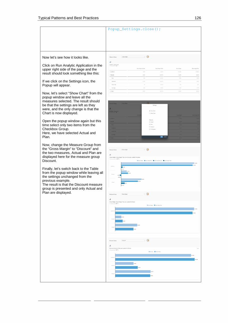
Typical Patterns and Best Practices 126
Popup_Settings.close();
Now let’s see how it looks like.
Click on Run Analytic Application in theupper right side of the page and theresult should look something like this:
If we click on the Settings icon, thePopup will appear.
Now, let’s select “Show Chart” from thepopup window and leave all themeasures selected. The result shouldbe that the settings are left as theywere, and the only change is that theChart is now displayed.
Open the popup window again but thistime select only two items from theCheckbox Group.Here, we have selected Actual andPlan.
Now, change the Measure Group fromthe “Gross Margin” to “Discount” andthe two measures, Actual and Plan aredisplayed here for the measure groupDiscount.
Finally, let’s switch back to the Tablefrom the popup window while leaving allthe settings unchanged from theprevious example.The result is that the Discount measuregroup is presented and only Actual andPlan are displayed.

Typical Patterns and Best Practices 127
6.8 Selection handling in a Table or Chart and open a detailspopup
In this example, we will let the user select certain elements in the Table and the Chart that whenclicked on, open a popup window with extra information in a chart format about the selectedelement.
In a Table, a user will be able to select a measure cell, a dimension cell, or a data cell. Each willopen a popup window that displays information about the selected element in a trend chart.
In the Chart, a user will be able to select a dimension cell and a measure/dimension chart bar(e.g. Gross Margin Plan for Lemonade).
There are also two Dropdown lists, one for Dimensions and the other for Hierarchies. The list ofdimensions let the user choose which dimension filter they want to use on the Table/Chart. In thisuse case, we have chosen 4 dimensions; Location, Product, Store, and Sales Manager.
The second Dropdown list displays the available hierarchies that can be used to change how thedata is displayed.
Note: In this example, only single selection is supported for the Table and Chart.
The result will look like this when we run the application:
Figure 35: Example Application Details Popup

Typical Patterns and Best Practices 128
And when a cell is chosen, a popup window like the one in the screenshot will appear (In thisscreenshot, the dimension cell of Los Angeles was clicked on in the Table):
Figure 36: Details Popup
Prerequisites for this use case is having already added a functioning table and a chart to yourcanvas. To have all the functionalities in this use case, please first go through the “Switchingbetween Table and Chart“ exercise.
It is recommended to use the same names as that exercise for the Table and Chart so that thescripts in this use case don’t have to be altered.
The first thing we will do is add aDropdown list that houses thedimensions in our data set.To do this, please click on the “+” iconin the Insert panel and select Dropdownand place the widget above the Table inthe Canvas.

Typical Patterns and Best Practices 129
Go to the Designer (by clicking onDesigner on the upper right side of thescreen) and switch to the Styling Panel
by clicking on the button.
There, enter “Dropdown_Dimensions”as the Name.
Now, we will select which dimensionswe want the user to be able to filter on.In this use case, we will choose 4;Location, Product, Store, and SalesManager.
To enter these values in our dropdownlist, switch over to the Builder Panel in
the Designer by clicking on thebutton.
There, press the “+” icon near theDropdown value to enter the desiredvalues.
The first value is Location_4nm2e04531and its displayed text should readLocation.The second value isProduct_3e315003an and the displayedtext is Product.
The third value is Store_3z2g5g06m4and its displayed text is Store.And we’ll add a fourth Dropdown listelement with the valueSales_Manager__5w3m5d06b5 and itstext should read Sales Manager.
And finally, set Location as the defaultvalue of the Dropdown list.
Click on Apply to save the changes.
Value Text (Optional)
Location_4nm2e04531 Location
Product_3e315003an Product
Store_3z2g5g06m4 Store
Sales_Manager__5w3m5d06b5
Sales Manager

Typical Patterns and Best Practices 130
We will now add a second list where theuser can choose the hierarchy in whichthey want to display their data.To do this, please click on the “+” iconin the Insert panel and select Dropdownand place the widget next to the firstDropdown list in the Canvas.
Go to the Designer (by clicking onDesigner on the upper right side of thescreen) and switch to the Styling Panel
by clicking on the button.
There, enter “Dropdown_Hierarchies”as the Name.We will load the hierarchies into thisDropdown list later from a script.
To make it clear what the contents ofour Dropdown widgets are, we willinsert a Label for each of the Dropdownwidgets.To do that, click on the “+” icon in theInsert panel and select Text.
Place the inserted Text widget to the leftside of each Dropdown widget andselect the first one to edit its properties.Go to the Styling Panel in the Designerand enter“Dropdown_Dimensions_Label” as theName.

Typical Patterns and Best Practices 131
To edit what the label shows, doubleclick on the Text widget in the Canvasand enter “Dimension”.
Select the second label and go to theStyling Panel in the Designer and enter“Dropdown_Dimensions_Label” as theName.
To edit what the label shows, doubleclick on the Text widget in the Canvasand enter “Hierarchies”.
We will now add the popup window thatwill display extra information about theselected measure, dimension, or datacell.
To add a popup window, go to Popupsin the Layout and click on the “+” iconnext to it.
Click on the newly added popup and goto the Styling Panel in the Designer.There, enter “Popup_Details” in theName input form and set the PopupSize to the width of 800 px and height of400 px.

Typical Patterns and Best Practices 132
Now, switch over to the Builder Panel
by clicking on the button.Insert “Details” as the Title.Here, we will also enable the headerand footer by toggling the button to Yes.
We also want to add a button throughwhich the user can exit the popup.Firstly, delete the buttons that can befound there by selecting each of them
and clicking on the icon.To add this new button, click on the “+”icon next to Buttons.
Insert the ID “BTN_Cancel”, the text“Cancel”, and check the options“Emphasized”, “Enabled”, and “Visible”.Click on Apply to save the changes.

Typical Patterns and Best Practices 133
To be able to display the extrainformation that we want in the popup,we need to add a chart.To do that, please select the Chart iconfrom the Insert Panel.
Click on the Chart and go to theDesigner to set its properties.First, go to the Styling Panel and enter“Details_Chart” as the Name.
Then, switch over to the Builder Panel.There, select the data sourceBestRun_Advanced.
Select Trend (Time Series) as the ChartStructure.
Add Gross Margin, Gross Margin %Dev, Gross Margin abs Dev, and GrossMargin Plan as the Measures.
Under Time, add Time as the dimension
=
To be able to access all the selectionsthat the user made from any widget inour app, we need to add globalvariables.To add these script variables, go toScripting and click the “+” next to ScriptVariables.
The first script variable we will add isone that will hold the current selectionfrom the Dimensions Dropdown list.Add a script variable and in itsproperties enter “CurrentDimension” inthe Name field, set the Type to “string”,and the Default Value to“Location_4nm2e04531”.

Typical Patterns and Best Practices 134
The second script variable we will add,is one that will hold the current measureselection(s) (Actual, Plan, Absolute,Percent).
Add a script variable and its propertiesenter “CurrentMeasures” in the Namefield, set the Type to “string”, and togglethe Set As Array button to “YES”.
The third, and last, script variable wewill add will hold the data about theselections made that will be used todisplay the data in the popup window.Set “CurrentDetailsMeasures” as theName, the Type to string, and toggle theSet As Array button to YES.

Typical Patterns and Best Practices 135
Now, we will decide what will happenwhen a Dropdown list element in theCanvas is selected.Firstly, we will write the script for thefirst widget, the Dimensions Dropdownlist.To do this, select the DimensionsDropdown list in the Canvas and click
on the icon that appears next toit.
This will open the onSelect script of theDropdown widget.Here, we will first get the selectedelement of the list.
We will then remove any already setdimensions in the Table and the Chartand add the newly selected dimensionto them.We will also add that dimension to ourDetails Chart (the one that we added tothe Popup window).
Afterwards, we will write the filterinformation in the browser’s consoleand save the selection in our scriptvariable, CurrentDimension.
Then, to set the available hierarchies forthe selected dimension, we loopthrough the available hierarchies of ourdata source in relation to the currentdimension and then we push all theavailable hierarchies in the Dropdownlist of the Hierarchies.

Typical Patterns and Best Practices 136
At the end, we set the default hierarchyof the Table, Chart, and Details Chart toFlat Presentation.
var sel = Dropdown_Dimensions.getSelectedKey();
// Table
Table.removeDimension(CurrentDimension);
Table.addDimensionToRows(sel);
//Chart
Chart.removeDimension(CurrentDimension,Feed.CategoryAxis);
Chart.addDimension(sel,Feed.CategoryAxis);
//Details_Chart remove dimension filter

Typical Patterns and Best Practices 137
Details_Chart.getDataSource().removeDimensionFilter(CurrentDimension);
// write filter information into thebrowser console
console.log( ['CurrentDimension: ',CurrentDimension ]);
console.log( ['Selection: ', sel ]);
// save the current selection(dimension) into a global variable
CurrentDimension = sel;
// get hierarchies from the currentdimension
var hierarchies =Table.getDataSource().getHierarchies(CurrentDimension);
var flag = true;
// remove all current items form theDropdown_Hierarchies
Dropdown_Hierarchies.removeAllItems();
// loop
for (var i=0;i<hierarchies.length;i++){
if (hierarchies[i].id ==='__FLAT__') {
Dropdown_Hierarchies.addItem(hierarchies[i].id, 'Flat Presentation');
}
else {
Dropdown_Hierarchies.addItem(hierarchies[i].id,hierarchies[i].description);
if (flag === true) {
var hierarchy =hierarchies[i].id;
flag = false;
}
}
}

Typical Patterns and Best Practices 138
// write hierarchy information tobrowser console
console.log( ['Hierarchy: ', hierarchy]);
console.log( ['Current Dimension: ',CurrentDimension ]);
// set Flat Hierarchie als Default
Dropdown_Hierarchies.setSelectedKey('__FLAT__');
// Table
Table.getDataSource().setHierarchy(CurrentDimension, '__FLAT__');
// Chart
Chart.getDataSource().setHierarchy(CurrentDimension, '__FLAT__');
// Details_Chart
Details_Chart.getDataSource().setHierarchy(CurrentDimension, '__FLAT__');
Now to edit the onSelect function of thesecond Dropdown list, Hierarchies,select it in the Canvas and click on the
icon next to it.
In the script of the onSelect function ofthis widget, we will simply set thehierarchy of the Table, Chart, andDisplay Chart (the one in the popupwindow) to the selected element of theDropdown list.
var sel =Dropdown_Hierarchies.getSelectedKey();
// set hierarchy for Table
Table.getDataSource().setHierarchy(CurrentDimension, sel);
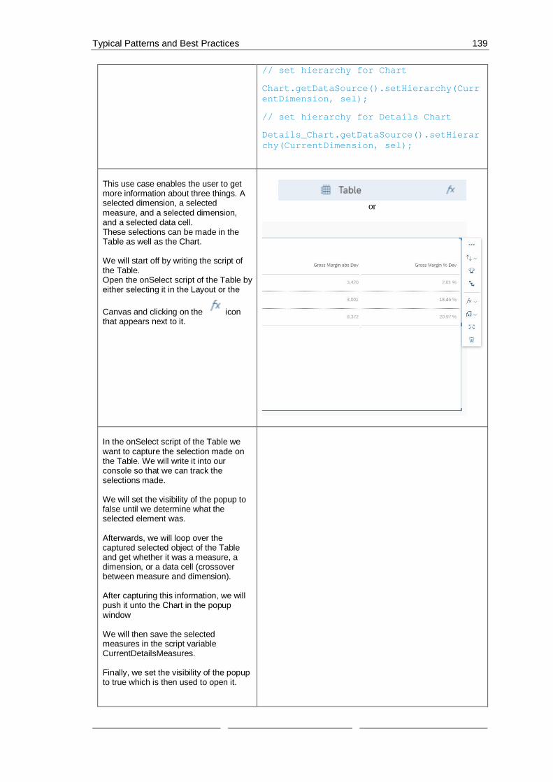
Typical Patterns and Best Practices 139
// set hierarchy for Chart
Chart.getDataSource().setHierarchy(CurrentDimension, sel);
// set hierarchy for Details Chart
Details_Chart.getDataSource().setHierarchy(CurrentDimension, sel);
This use case enables the user to getmore information about three things. Aselected dimension, a selectedmeasure, and a selected dimension,and a selected data cell.These selections can be made in theTable as well as the Chart.
We will start off by writing the script ofthe Table.Open the onSelect script of the Table byeither selecting it in the Layout or the
Canvas and clicking on the iconthat appears next to it.
or
In the onSelect script of the Table wewant to capture the selection made onthe Table. We will write it into ourconsole so that we can track theselections made.
We will set the visibility of the popup tofalse until we determine what theselected element was.
Afterwards, we will loop over thecaptured selected object of the Tableand get whether it was a measure, adimension, or a data cell (crossoverbetween measure and dimension).
After capturing this information, we willpush it unto the Chart in the popupwindow
We will then save the selectedmeasures in the script variableCurrentDetailsMeasures.
Finally, we set the visibility of the popupto true which is then used to open it.

Typical Patterns and Best Practices 140
var sel = Table.getSelections();
console.log( ['Table Selection: ', sel]);
Details_Chart.getDataSource().removeDimensionFilter(CurrentDimension);
var Popup_show = false;
if (sel.length > 0) {
var selection = sel[0];
for (var dimensionId in selection) {
var memberId =selection[dimensionId];
if (dimensionId ==='@MeasureDimension') {
// Measure
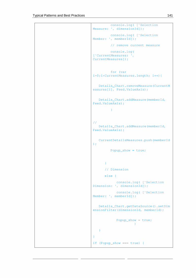
Typical Patterns and Best Practices 141
console.log( ['SelectionMeasure: ', dimensionId]);
console.log( ['SelectionMember: ', memberId]);
// remove current measure
console.log(['CurrentMeasures: ',CurrentMeasures]);
for (vari=0;i<CurrentMeasures.length; i++){
Details_Chart.removeMeasure(CurrentMeasures[i], Feed.ValueAxis);
Details_Chart.addMeasure(memberId,Feed.ValueAxis);
}
// Details_Chart.addMeasure(memberId,Feed.ValueAxis);
CurrentDetailsMeasures.push(memberId);
Popup_show = true;
}
// Dimension
else {
console.log( ['SelectionDimension: ', dimensionId]);
console.log( ['SelectionMember: ', memberId]);
Details_Chart.getDataSource().setDimensionFilter(dimensionId, memberId);
Popup_show = true; }
}
}
if (Popup_show === true) {

Typical Patterns and Best Practices 142
Popup_Details.open();
}
Now, we need to do the same for theChart.Opposed to the Table, in the Chart, theuser can only click on a dimension andcan click on the chart bars which arecrossovers of a measure and adimension.
To write the script of the Chart, selectthe widget in the Layout and click on the
icon next to it.
In the onSelect function of the Chart, wewill get the selected element of theChart and save it in a local variable, sel.We will set the popup window’s visibilityto false and remove the currentmeasures from the Details_Chart in thepopup.
And then, if it’s a measure, we will add itas a measure to the Details_Chart andif it’s a dimension, we will set it as adimension filter of the Details_Chart.
We will then push the selectedmeasures, if any, unto the scriptvariable CurrentDetailsMeasures.
At the end, the popup window’s visibilityis set to true and is opened.
var sel = Chart.getSelections();
console.log( ['Chart Selection: ', sel,CurrentMeasures ]);
var Popup_show = false;

Typical Patterns and Best Practices 143
if (sel.length > 0) {
Details_Chart.getDataSource().removeDimensionFilter(CurrentDimension);
// remove the current measures
for (vari=0;i<CurrentMeasures.length; i++){
Details_Chart.removeMeasure(CurrentMeasures[i], Feed.ValueAxis);
}
for (i=0;i<sel.length; i++){
var selection = sel[i];
for (var dimensionId inselection) {
var memberId =selection[dimensionId];
if (dimensionId ==='@MeasureDimension') {
// Measure
console.log( ['AddSelection Measure: ', dimensionId]);
console.log( ['AddSelection Member: ', memberId]);
Details_Chart.addMeasure(memberId,Feed.ValueAxis);
CurrentDetailsMeasures.push(memberId);
Popup_show = true;
}
// Dimension
else {

Typical Patterns and Best Practices 144
console.log( ['SelectionDimension: ', dimensionId]);
console.log( ['SelectionMember: ', memberId]);
Details_Chart.getDataSource().setDimensionFilter(dimensionId, memberId);
Popup_show = true;
}
}
}
}
if (Popup_show === true) {
Popup_Details.open();
}
In previous steps, we had created thepopup window and added a Cancelbutton. To make the button do anything,we need to write a script for it.
To do that, select Popup_Details in the
Layout and click on the next to it.
This will open the onButtonClick scriptof the Popup widget.Here, we will set what happens whenthe user clicks on the Cancel button.
Firstly, we will remove the content, ifthere is any, of theCurrentDetailsMeasures from theDetails_Chart and set the defaultmeasures, from the CurrentMeasuresscript variable, as the measures of theDetails_Chart.
At the end, we will trigger the closing ofthe popup.
// remove the current measure selectionand set all default measures for thedetails chart

Typical Patterns and Best Practices 145
for (vari=0;i<CurrentDetailsMeasures.length;i++){
Details_Chart.removeMeasure(CurrentDetailsMeasures[i], Feed.ValueAxis);
}
CurrentDetailsMeasures =ArrayUtils.create(Type.string);
for (i=0;i<CurrentMeasures.length;i++){
Details_Chart.addMeasure(CurrentMeasures[i], Feed.ValueAxis);
}
// close the popup
Popup_Details.close();
The last script we will write is the onefor the Canvas. This script getsexecuted on the initialization of theCanvas.
Please, select the Canvas element in
the Layout and click on the iconnext to it.Select the onInitialization function there.
In this script, we will load the hierarchiesinto the Hierarchies Dropdown list andset the default hierarchy to FlatPresentation.At the end, we will also fill the scriptvariable CurrentMeasures with theavailable measures of Gross margin(Actual, Plan, Absolute, and Percent)

Typical Patterns and Best Practices 146
// get hierarchies from the currentdimension
var hierarchies =Table.getDataSource().getHierarchies(CurrentDimension);
var flag = true;
// loop
for (var i=0;i<hierarchies.length;i++){
if (hierarchies[i].id ==='__FLAT__') {
Dropdown_Hierarchies.addItem(hierarchies[i].id, 'Flat Presentation');
}
else {
Dropdown_Hierarchies.addItem(hierarchies[i].id,hierarchies[i].description);

Typical Patterns and Best Practices 147
if (flag === true) {
var hierarchy =hierarchies[i].id;
flag = false;
}
}
}
// write hierarchy information tobrowser console
console.log( ['Hierarchy: ', hierarchy]);
console.log( ['Current Dimension: ',CurrentDimension ]);
// set Flat Hierarchy as Default
Dropdown_Hierarchies.setSelectedKey('__FLAT__');
//Table
Table.getDataSource().setHierarchy(CurrentDimension, '__FLAT__');
//Chart
Chart.getDataSource().setHierarchy(CurrentDimension, '__FLAT__');
//Details_Chart
Details_Chart.getDataSource().setHierarchy(CurrentDimension, '__FLAT__');
//fill global Variable CurrentMeasures
CurrentMeasures.push('[Account_BestRunJ_sold].[parentId].&[Gross_MarginActual]');
CurrentMeasures.push('[Account_BestRunJ_sold].[parentId].&[Gross_MarginPlan]');
CurrentMeasures.push('[Account_BestRunJ_sold].[parentId].&[Gross_Margin_Abs]');

Typical Patterns and Best Practices 148
CurrentMeasures.push('[Account_BestRunJ_sold].[parentId].&[Gross_Margin_Percent]');
Now let’s see how it looks like.
Click on Run Analytic Application in theupper right side of the page and theresult should look something like this:
If we click on one of the dimension datacells, in this example the dimension isset to Location and we clicked on LosAngeles, the popup window will appear.It gives us an overview of all themeasures (Gross Margin Actual, Plan,Absolute, Percent) in relation to theselected Location (Los Angeles) overthe Time factor.
When opening the browser’s console,we can also see that the selection wasprinted there.
If we click on one of the measures, inthis screenshot we chose Gross MarginActual, the measure is shown in thepopup window in relation to the Timefactor.
The selection is also printed out in theconsole:
The third option to select in the Table isan individual data cell.In this example, we changed theDimension to store and selected thedata cell at the crossover of GrossMargin Plan and Country Fair Foods.This triggers the opening of a popupwindow that shows Gross Margin Planin relation with Time and with a StoreFilter of Country Fair Foods.
The selection triggers the followingconsole message:
If we change the dimension back toLocation and change the hierarchy ofthe Table to States, the following Tablewill be displayed:
We can then choose a state and wewould also get a popup window thatdisplays the measures in regard to astate (here, Nevada was selected).

Typical Patterns and Best Practices 149
This state selection prints the followingmessage to the browser console:
Now, we will look at how the Chartbehaves.To switch to the Chart, click on the
icon in the Canvas.
There, we will firstly click on adimension. Here, the dimension filterwas set to Product and Lemonade wasclicked on.All the measures are shown in regard toTime and with a product filter ofLemonade.
This selection prints the followingmessage into the console:The measures are added according tothe chosen product
The second thing we can click on in theChart is a specific measure in regard toa specific dimension.For example, Gross Margin Abs Dev inrelation to Orange with pulp (the chartbar marked in the screenshot).
This causes a popup window to appearthat displays the measure chosen(Gross Margin abs Dev) per Time andwith a dimension filter (here: Product –Orange with pulp)
This triggers the printing of the followingmessages in the browser’s console:
Note: The user can always check whatfilter is being utilized by clicking onFilter.
This opens a list of filters used – hereonly one product (Orange with pulp) hasbeen used as a filter.

Typical Patterns and Best Practices 150

Typical Patterns and Best Practices 151
6.9 Using RWidget Wordcloud for visualizationThis application features an overview for the Customer Complaints a company got from itscustomers over the years 2018 and 2019.
In the Canvas, we will add a Table with our Top 10 Customers as well as a Chart with theComplaints of the Customers. Other than that, we will have two R Visualization widgets throughwhich we will create word clouds that change the size of the words displayed according to thefrequency with which they appear in the data set.
Further functionalities in this application include how to filter widgets according to a selectedelement of a Table and how we can change the color of the word clouds through external input

Typical Patterns and Best Practices 152
(in this use case, it is achieved through a Radio Button Group that has a script that passes thevalue to the R widgets.)
And lastly, the filtering of all the widgets in the Canvas through the use of Radio Button Groupswill be explored (here, we will filter according to Regions and according to the selected Region,several countries from that Region will be displayed in another Radio Button Group (Country) forfurther filtering of the widgets).
The result will look like this when we run the application:
Figure 37: Example Application Word Cloud
There are no prerequisites for this use case. You can start with a new application.
It is recommended to use the same names as that exercise for the used widgets so that the scriptsin this use case don’t have to be altered.
The first thing we will do, is add a RadioButton Group to our Canvas where wewill enable the user to choose betweenregions.

Typical Patterns and Best Practices 153
Select the newly added widget in theCanvas and go to the Designer (byclicking on Designer on the upper rightside of the screen) and switch to the
Styling Panel by clicking on thebutton.
There, enter“RadioButtonGroup_Region” as theName, choose Vertical Layout as theDisplay Option, and toggle the LabelText button to enable it and write“Region” as the Label Text.
Now, we will insert the options we wantavailable in our Radio Button Groupwidget.To do that, switch to the Building Panel
by clicking on the button.Once there, start adding values usingthe “+” button.We will add an option that has all theregions (1), and the others will be forLatin America (2), Europe, the MiddleEast and Africa (3), North America (4),and the Asia-Pacific region (5).We will set All as our default value; thismeans that the widgets in our canvaswill be by default filtered according tothat option and the user can change itafterwards.
Please click on Apply to save thechanges to your application.
Value Text (Optional)
ALL ALL
REGION01 LATAM
REGION02 EMEA
REGION03 NA
REGION04 APJ

Typical Patterns and Best Practices 154
To enable further filtering, we will insertanother Radio Button Group thathouses the countries.The values of this widget will changedepending on the region selected.Please place the widget underneath theRegion Radio Button Group.
Select the widget in the Canvas and goto the Styling panel in the Designer.
There, enter“RadioButtonGroup_Country” as theName, choose Vertical Layout as theDisplay Option, and toggle the LabelText button to enable it and write“Country” as the Label Text.
Now, we will insert the options we wantavailable in our Radio Button Groupwidget.To do that, switch to the Building Panel
by clicking on the button.For this widget, we will only add oneoption which is “All”.To do that, click on the “+” button andadd the values like in the screenshot tothe right.Lastly, click on Apply to save thechanges.(The other countries will be addedthrough a script later in this tutorial.)
Value Text (Optional)
ALL All

Typical Patterns and Best Practices 155
Now, we will move on to add our Table,Chart, and R Widgets.We will start off with the Table.Through the Insert Panel, add a newTable and place it to the right side of thetwo radio button groups.SelectBestRunBike_Customer_Complaint asthe data source.
In the Styling Panel of the Table insertthe Name “Table_Customer”.
Afterwards, switch over to the BuildingPanel and there, enter the values as inthe screenshot to the right.Check Responsive / flexible columnswidthCheck Arrange totals / parent nodesbelowAdd Customer to RowsAdd Account to ColumnsAnd set the Filters toAccount – CountCategory – ActualDate – Jan (Q1/2018) – Nov (Q4/2019)
This Table will hold the customers ofour data set.
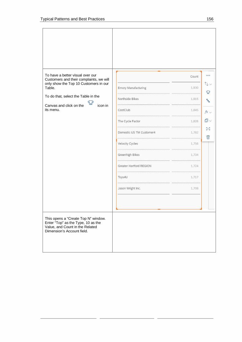
Typical Patterns and Best Practices 156
To have a better visual over ourCustomers and their complaints, we willonly show the Top 10 Customers in ourTable.
To do that, select the Table in the
Canvas and click on the icon inits menu.
This opens a “Create Top N” window.Enter “Top” as the Type, 10 as theValue, and Count in the RelatedDimension’s Account field.

Typical Patterns and Best Practices 157
We also want to be able to view thecomplaints that we got from ourcustomers, which is why we will add achart to display them.First, we need to add the Chart. We willdo that, again, through the Insert Panel.
To edit the properties of our Chart, go tothe Designer.We’ll change the Styling properties first.
In the Styling panel enter“Chart_Complaints” as the Name.
To display the complaints of ourcustomers, we will edit the Buildercomponents of the Chart.Switch over to the Chart’s Builder paneland enter the values as seen in thescreenshot:
Chart Structure: Comparison(Bar/Column)Chart Orientation: HorizontalMeasures: CountDimensions: Complaint CategoryFilters:Category: ActualDate: Jan (Q1/2018) – Nov (Q4/2019)

Typical Patterns and Best Practices 158
To know what the Table and Chartrepresent, we will add text labels on topof each of them.
Add two labels and place one above theTable and the other above the Chart.
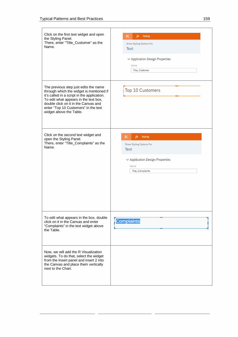
Typical Patterns and Best Practices 159
Click on the first text widget and openthe Styling Panel.There, enter “Title_Customer” as theName.
The previous step just edits the namethrough which the widget is mentioned ifit’s called in a script in the application.To edit what appears in the text box,double click on it in the Canvas andenter “Top 10 Customers” in the textwidget above the Table.
Click on the second text widget andopen the Styling Panel.There, enter “Title_Complaints” as theName.
To edit what appears in the box, doubleclick on it in the Canvas and enter“Complaints” in the text widget abovethe Table.
Now, we will add the R Visualizationwidgets. To do that, select the widgetfrom the Insert panel and insert 2 intothe Canvas and place them verticallynext to the Chart.

Typical Patterns and Best Practices 160
Select the first R Visualization widget inthe Canvas and open the Designer toedit its properties.We will start in the Styling Panel. There,enter“RVisualization_WordCloud_2018” asthe Name.
To edit its content, let’s switch over tothe Builder panel.Here, enter the data set as the inputdata and check the “Refresh On Resize”option.

Typical Patterns and Best Practices 161
After inserting the data source (here:BestRunBike_Customer_Complaint),click on it (still in the Builder panel) sothat we can edit the properties that wewant the data set to have.Here, we will add Complaint Category tothe Rows and Account to the Columns.
Click on Add Filters and select Date –Range and choose Year 2018 to 2018.
The filters should now be Category setto Actual and Date set to 2018-2018.
Click on OK and back in the Builderpanel of the widget, click on Edit Script.
In the R script of this widget, we will getthe words from the complaints and alsohow frequent they come up andaccording to these values, the wordcloud is generated and the words withthe higher frequency are also drawnbigger in the word cloud.
Insert the script written on the right side,into the editor of the R widget and clickon Apply to save the changes.
# load package
library(wordcloud)
# get words

Typical Patterns and Best Practices 162
words <-BestRunBike_Customer_Complaint$`Complaint Category`
# get frequency
frequency <-BestRunBike_Customer_Complaint$Count
if(exists("colorValue")){
myColor <- colorValue
}else {
myColor <- "Oranges"
}
# generate word cloud
wordcloud(words, frequency, scale = c(4,1), rot.per=0.2, colors=brewer.pal(8,myColor))
Now, let’s do the same for the second RVisualization widget.Select it in the Canvas and open theStyling panel.There, enter“RVisualization_WordCloud_2019” asthe Name.
To edit its content, let’s switch over tothe Builder panel.Here, enter the data set as the inputdata and check the “Refresh On Resize”option.

Typical Patterns and Best Practices 163
After inserting the data source, click onit (still in the Builder panel) so that wecan edit the properties that we want thedata set to have.(We will have the same settings that wehad for the last widget but change thedate to 2019.)
Here, we will add Complaint Category tothe Row and in the Columns, we willadd Account.
Click on Add Filters and select Date –Range and choose Year 2019 to 2019.
The filters will be Category set to Actualand Date set to 2019-2019.
Click on OK and back in the Builderpanel of the widget, click on Edit Script.
In the R script of this widget, we will dothe same as in the first widget; we willget the words from the complaints andhow frequent they come up andaccording to these values, the wordcloud is generated and the words withthe higher frequency are also drawnbigger in the word cloud.
Please insert the script written on theright side, into the editor of the Rwidget.
Click on Apply to save the changes.# load package
library(wordcloud)
# get words

Typical Patterns and Best Practices 164
words <-BestRunBike_Customer_Complaint$`Complaint Category`
# get frequency
frequency <-BestRunBike_Customer_Complaint$Count
if(exists("colValue")) {
myColor <- colValue
} else {
myColor <- "Oranges"
}
# generate word cloud
wordcloud(words, frequency, scale = c(4,1), rot.per=0.2, colors=brewer.pal(8,myColor))
To give the users more choice in thelook of the R Visualization widgets, wewant them to be able to choose thecolor of the generated word cloud. Todo this, we need to have a Radio ButtonGroup where we will give them thechoice between 2 colors.Add a Radio Button Group widget andplace it above the R Visualizationwidgets.
Select the widget in the Canvas andopen the Styling panel.Here, we will edit its Name and set it to“RadioButtonGroup_Color” and set theDisplay Option to Horizontal Layout.
To edit the content of the Radio ButtonGroup widget, switch over to the BuilderPanel.There, we will add 2 values “Oranges”and “Greys”, while setting Oranges toour default.
To save the changes, please click onApply.

Typical Patterns and Best Practices 165
The last widget we will need for thisapplication is a Dropdown list. To add aDropdown list, go to the Insert Paneland select a Dropdown widget.
Firstly, we need to change the name ofthe widget to make it morecomprehensible if we want to call it in ascript.To do that, select the widget in theCanvas and go to the Styling Panel inthe Designer.There, enter“Hidden_DropDown_Customer” in theName field.
Through the getSelection function of theTable, we get back a dimension ID anda member ID when a user selects anelement in the Table. This ID is veryuseful and allows us to manipulatewidgets, however, if we want to be ableto display the name of the selectedmember (here: the name of the selectedcustomer), we have to get the text of thename using the member ID we get fromthe Table’s function.That’s why we need this Dropdown listhere, we will simply load all thecustomers in our data set into it and setits selected key to the capturedmemberId. This way we can get the textof the element and use it to make ourCanvas more dynamic.

Typical Patterns and Best Practices 166
Thus, we do not need this widget to bevisible since we just need it for behind-the-scenes work.
To set the widget to invisible, hover over
it in the Layout and click on theicon.
Once there, click on Hide to make thewidget invisible in the Canvas.
To enable the user to filter the Chartand the R Visualization widgetsaccording to a specific customer, we willwrite a script for the Table so that whena user select a specific customer fromour Top 10 Customers list, all our otherwidgets are filtered to that specificcustomer.
To access the script of the Table, hoverover the widget in the Layout and click
on the icon next to it and selectthe onSelect function.
In this onSelect script, we will capturethe selected element and get itsdimension (here: it’s already known thatit’s Customer) and the selected memberid (the specific customer selected).We will then use these values to addfilters to the Chart, and the two RVisualization widgets.
At the end of the script, we will use ourHidden Dropdown list to get the Textrelated to the memberId we get backfrom the getSelection function and editthe text of the Complaint Chart’s label toinclude the name of the selectedcustomer.
var sel =Table_Customer.getSelections();
console.log(["Sel ", sel]);
if (sel.length > 0){
var selection = sel[0];
console.log( ['Selection [0] : ',selection]);
for (var dimensionId in selection){
var memberId =selection[dimensionId];

Typical Patterns and Best Practices 167
console.log( ['SelectionDimension: ', dimensionId]);
console.log( ['Selection Member:', memberId]);
Chart_Complaints.getDataSource().setDimensionFilter(dimensionId, memberId);
RVisualization_WordCloud_2018.getDataFrame("BestRunBike_Customer_Complaint").getDataSource().setDimensionFilter(dimensionId, memberId);
RVisualization_WordCloud_2019.getDataFrame("BestRunBike_Customer_Complaint").getDataSource().setDimensionFilter(dimensionId, memberId);
Hidden_DropDown_Customer.setSelectedKey(memberId);
var text =Hidden_DropDown_Customer.getSelectedText();
Title_Complaints.applyText("Complaints for Customer " + text);
}
}
The next script we will write is for theRegion Radio Button Group.To access the script, hover over thewidget in the Layout and click on the
icon next to it.
In this script, we will add countries tothe Radio Button Group of Countryaccording to what region is selected.For example, if Region 2 (EMEA) isselected, then Dubai, Germany, andGreat Britain are displayed as options inthe Countries widget, however, if theregion changes to another, e.g. Region4 is chosen (APJ), then the countriesthat the user can choose from in theother Radio Button Group are India,China, and Australia.
Furthermore, we will set the dimensionfilter of the widgets in our Canvasaccording to the selected region.

Typical Patterns and Best Practices 168
var sel =RadioButtonGroup_Region.getSelectedKey();
RadioButtonGroup_Country.removeAllItems();
RadioButtonGroup_Country.addItem("ALL", "All");
RadioButtonGroup_Country.setSelectedKey("ALL");
if (sel === "REGION01") {
RadioButtonGroup_Country.addItem("[Country].[Region].&[COUNTRY011]","Mexico");
}else if (sel === "REGION02") {
RadioButtonGroup_Country.addItem("[Country].[Region].&[COUNTRY021]","Dubai");
RadioButtonGroup_Country.addItem("[Country].[Region].&[COUNTRY022]","Germany");
RadioButtonGroup_Country.addItem("[Country].[Region].&[COUNTRY023]", "GreatBritian");
} else if (sel === "REGION03") {
RadioButtonGroup_Country.addItem("[Country].[Region].&[COUNTRY031]", "USAEast");
RadioButtonGroup_Country.addItem("[Country].[Region].&[COUNTRY032]", "USAWest");
RadioButtonGroup_Country.addItem("[Country].[Region].&[COUNTRY033]","Canada");
} else if (sel === "REGION04") {
RadioButtonGroup_Country.addItem("[Country].[Region].&[COUNTRY041]","India");
RadioButtonGroup_Country.addItem("[Country].[Region].&[COUNTRY042]","China");
RadioButtonGroup_Country.addItem("[Country].[Region].&[COUNTRY043]","Australia");
}

Typical Patterns and Best Practices 169
Table_Customer.getDataSource().setDimensionFilter("Region",sel);
Chart_Complaints.getDataSource().setDimensionFilter("Region",sel);
RVisualization_WordCloud_2018.getDataFrame("BestRunBike_Customer_Complaint").getDataSource().setDimensionFilter("Region",sel);
RVisualization_WordCloud_2019.getDataFrame("BestRunBike_Customer_Complaint").getDataSource().setDimensionFilter("Region",sel);
Table_Customer.getDataSource().removeDimensionFilter("Country");
Chart_Complaints.getDataSource().removeDimensionFilter("Country");
RVisualization_WordCloud_2018.getDataFrame("BestRunBike_Customer_Complaint").getDataSource().removeDimensionFilter("Country");
RVisualization_WordCloud_2019.getDataFrame("BestRunBike_Customer_Complaint").getDataSource().removeDimensionFilter("Country");
Now, we will edit what happens whenone of the options in the Radio ButtonGroup Country is selected.To do that, hover over the widget in the
Layout and click on the icon thatappears next to it.
In this script, we will simply set theselected option as the dimension filter ofour Table, Chart, and R Visualizationwidgets.However, because the R Visualizationwidget needs a different kind of inputthan the Table and the Chart, we needto edit the key we get and cut some of itso that we can forward it to the Rwidgets. var sel =
RadioButtonGroup_Country.getSelectedKey();
var cloud_sel =sel.replace("[Country].[Region].&[","");
cloud_sel = cloud_sel.replace("]", "");

Typical Patterns and Best Practices 170
console.log(cloud_sel);
if (sel === "ALL") {
Table_Customer.getDataSource().removeDimensionFilter("Country");
Chart_Complaints.getDataSource().removeDimensionFilter("Country");
RVisualization_WordCloud_2018.getDataFrame("BestRunBike_Customer_Complaint").getDataSource().removeDimensionFilter("Country");
RVisualization_WordCloud_2019.getDataFrame("BestRunBike_Customer_Complaint").getDataSource().removeDimensionFilter("Country");
} else {
Table_Customer.getDataSource().setDimensionFilter("Country",sel);
Chart_Complaints.getDataSource().setDimensionFilter("Country",sel);
RVisualization_WordCloud_2018.getDataFrame("BestRunBike_Customer_Complaint").getDataSource().setDimensionFilter("Country",cloud_sel);
RVisualization_WordCloud_2019.getDataFrame("BestRunBike_Customer_Complaint").getDataSource().setDimensionFilter("Country",cloud_sel);
}
There is now another widget that wehave to write the function for; the ColorRadio Button Group that controlswhether the word cloud will bedisplayed in Orange or in Gray.To edit the script of this widget, hoverover it in the Layout and click on the
icon that appears next to it.
In the script of this widget, we willsimply get the selected option, save it ina variable and pass it as inputparameters to the R Visualizationwidgets’ scripts.
var sel =RadioButtonGroup_Color.getSelectedKey();

Typical Patterns and Best Practices 171
RVisualization_WordCloud_2018.getInputParameters().setString("colorValue",sel);
RVisualization_WordCloud_2019.getInputParameters().setString("c
olValue",sel);
The last script for this application is theone that gets executed when theapplication is initialized. To access thisscript, hover over the “Canvas” in the
Layout, click on the icon thatappears next to it, and selectonInitialization.
In this script, we will load a maximum of1000 customers into the HiddenDropdown of Customers. This numberwas chosen because the number ofcustomers in our data set is under 1000,however, this number can be changed ifneeded.
var list =Table_Customer.getDataSource().getMembers("Customer_",1000);
if (list.length !== 0) {
for (var i=0;i<list.length; i++){
console.log( ['List Dimension: ',i , list[i].displayId ]);
console.log( ['List Description:', i , list[i].description ]);
console.log( ['List Member: ', i ,list[i].id ]);
Hidden_DropDown_Customer.addItem(list[i].id, list[i].description);
}
}

Typical Patterns and Best Practices 172
Now let’s save the application and seehow it looks like.
Click on Run Analytic Application in theupper right side of the page and theresult should look something like this:
If we click on one of the elements in theTable (one of the Customers), the Chartand the R Visualization widgets will befiltered according to the data related tothis particular customer (here: NorthsideBikes was selected).
Now, if we select Greys instead ofOranges in the Color Radio ButtonGroup, the R Visualization widgets aredisplayed in gray.
To filter according to a certain region,we can select one of the Regions fromthe Region Radio Button Group (here:EMEA was selected), and consequentlythe Country Radio Button Group’soptions changed from (All and Mexico)to EMEA countries (All, Dubai,Germany, and Great Britain).The screenshot on the right displays thewidgets filtered on EMEA and Germany;the customer is Greenhigh Bikes.

Planning 173
7 Planning
7.1 What to expect from Analytics Designer in regard toPlanning?
Analytics Designer reuses the Planning features of Analytics Cloud and leverage the capabilitiesby offering flexible scripting that supports customizations of applications according to userrequirements. Planning Data Models, Allocations, Data Action Triggers and all Planning featurescan be integrated to applications.
And what can you not expect? In Analytics Designer you cannot use Input Tasks and Planningscripting is not possible for models based on BPC Write-Back.
7.2 Basic Planning concepts in Analytics DesignerPlanning specific features can be triggered through the toolbar icons in the Plan area.
Figure 38: Toolbar Planning Features
These icons are greyed out if no table cell with a planning model is selected.
Most of these features can also be triggered through scripting.
To get the Planning Table object, use below script. If the table has no planning model assigned,it will return undefined.Table.getPlanning(): Planning | undefined
Scripting will perform the same planning actions that could be done via UI. The benefits ofscripting are augumented in cases which you want to minimize the number of clicks from youruser, personalize your UI or when a special customer requirement can not be fulfilled withstandard planning behaviour.
Data cannot be changed during design time, and you can enable the usage of planning featuresduring runtime in two different ways:
· In the table designer UI: you can find in the Builder panel, section Properties, a box called‘Planning enabled’.

Planning 174
Figure 39: Planning enabled
· Through below script:
setEnabled(boolean): void
This option can be useful when you shall disable planning due specific requirements. Forexample, budget might not be changed in last quarter of the year.
One other valuable script allows checking whether the data model is planning enabled.
isEnabled() : boolean
In the Table Builder panel, there are some configurations that you can do in each dimension, andUnbooked Data might be a good choice when, for example, your Planning Data Model has nobooked data and your end users need to see which dimension members are available forplanning.
Figure 40: Unbooked Data
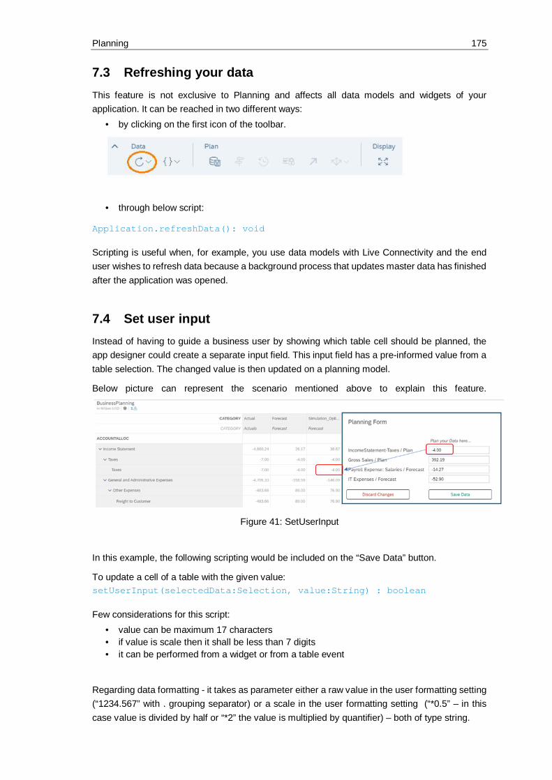
Planning 175
7.3 Refreshing your dataThis feature is not exclusive to Planning and affects all data models and widgets of yourapplication. It can be reached in two different ways:
· by clicking on the first icon of the toolbar.
· through below script:
Application.refreshData(): void
Scripting is useful when, for example, you use data models with Live Connectivity and the enduser wishes to refresh data because a background process that updates master data has finishedafter the application was opened.
7.4 Set user inputInstead of having to guide a business user by showing which table cell should be planned, theapp designer could create a separate input field. This input field has a pre-informed value from atable selection. The changed value is then updated on a planning model.
Below picture can represent the scenario mentioned above to explain this feature.
Figure 41: SetUserInput
In this example, the following scripting would be included on the “Save Data” button.
To update a cell of a table with the given value:setUserInput(selectedData:Selection, value:String) : boolean
Few considerations for this script:· value can be maximum 17 characters· if value is scale then it shall be less than 7 digits· it can be performed from a widget or from a table event
Regarding data formatting - it takes as parameter either a raw value in the user formatting setting(“1234.567” with . grouping separator) or a scale in the user formatting setting (“*0.5” – in thiscase value is divided by half or “*2” the value is multiplied by quantifier) – both of type string.

Planning 176
Example: (scaling in million)· if you plan “12345678” the formattedValue will be “12.35”· if you plan “123456789” the formattedValue will be “123.46”· if you plan “*0.5” of rawValue “123456789” the rawValue will be “61728394.5” and
formattedValue will be “61.73
Regarding data validation:· If an invalid value is planned, error/warning message is returned, and the API also returns
false· if the same value is planned twice, the value is set and API returns true· If the cell is locked, the API returns false and a warning message is shown to the user
To submit the updated cell data with all the beforehand modified data and to trigger refresh ofdata:submitData() : boolean
7.5 Planning VersionsThere are two types of planning versions, private and public.
· Private Version
This data is not visible to other users and solutions of Analytics Cloud.getPrivateVersions() : [ Array of Planning Private Versions] | emptyarray
getPrivateVersion(versionId: String): Planning Private Version |undefined
Below script returns the user id of the user who created this private version.
getOwnerID() : String
· Public Version
This data is visible to all users and solutions of Analytics Cloud.getPublicVersions() : [ Array of Planning Public Versions] | emptyarray
getPublicVersion(versionId: String): Planning Public Version |undefined
Both planning version types have IDs.getId(): String
You can use it, for example, when calling getData().getDisplayId(): String
You can use it, for example, to display the version in dropdowns or texts.
All versions besides ‘Actual’ can be deleted.deleteVersion(): boolean
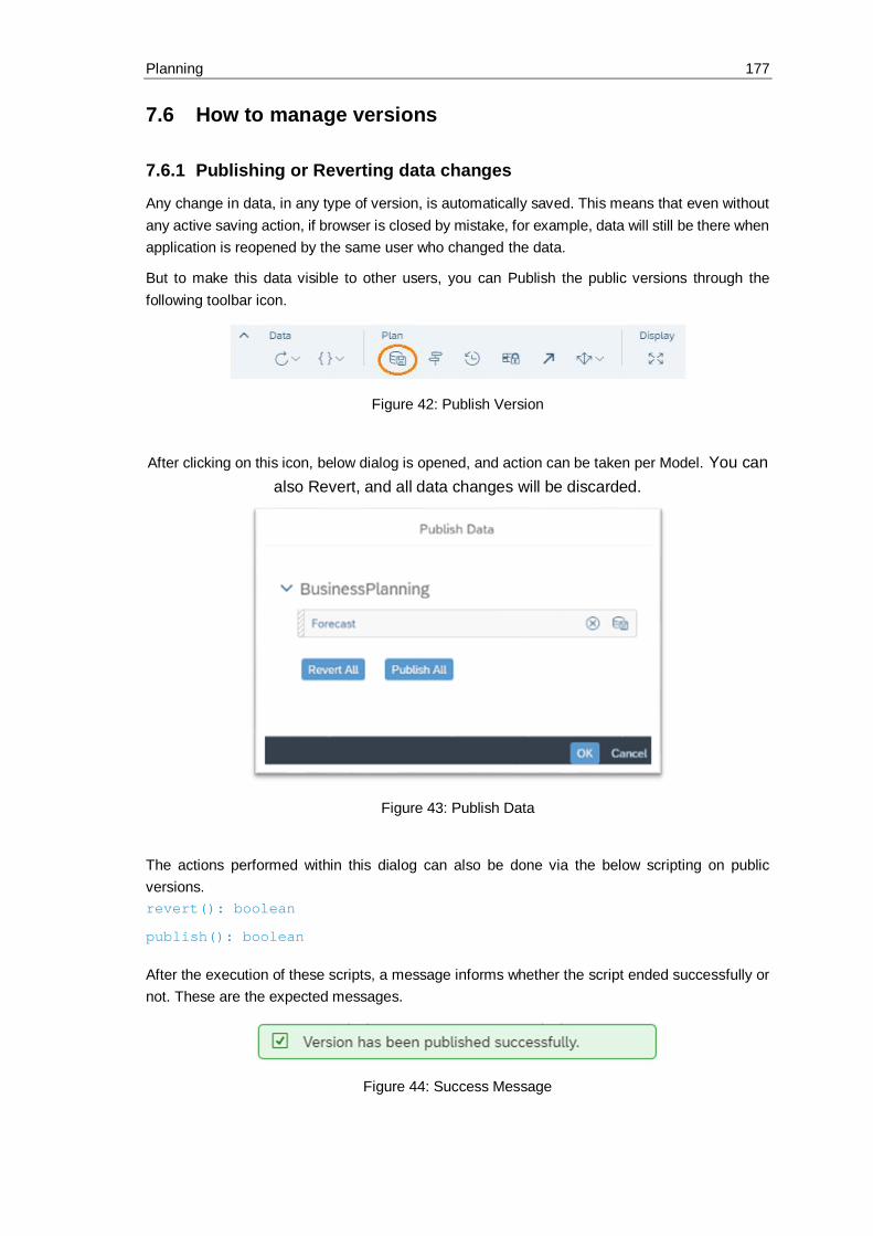
Planning 177
7.6 How to manage versions
7.6.1 Publishing or Reverting data changes
Any change in data, in any type of version, is automatically saved. This means that even withoutany active saving action, if browser is closed by mistake, for example, data will still be there whenapplication is reopened by the same user who changed the data.
But to make this data visible to other users, you can Publish the public versions through thefollowing toolbar icon.
Figure 42: Publish Version
After clicking on this icon, below dialog is opened, and action can be taken per Model. You canalso Revert, and all data changes will be discarded.
Figure 43: Publish Data
The actions performed within this dialog can also be done via the below scripting on publicversions.revert(): boolean
publish(): boolean
After the execution of these scripts, a message informs whether the script ended successfully ornot. These are the expected messages.
Figure 44: Success Message

Planning 178
If version was not modified before these actions are triggered, below message should beexpected.
Figure 45: Message
This message could be avoided if the dirty check is done in advance.isDirty(): boolean
Dirty versions can be identified by a symbol of asterisk (*) just after the version name.
Figure 46: Dirty Version
It is also possible to Publish private versions via the two below scripting options.publish() : boolean
publishAs(newVersionName: String, versionCategory: PlanningCategory):boolean
In the second option, a version name is given, and a new public version is created under theinformed version category.
These scripts can be very useful if your planning model is placed in a popup, for example. As thetoolbar is kept in the background canvas, user does not need to close the popup to then Publishthe data. With scripting, you can do it directly in the popup!

Planning 179
Figure 47: Planning Table in Popup
Find in the next session more information about version category and how to create privateversions.
7.6.2 Copy
Data models with planning enabled capability have one dimension in common - version. And eachversion shall be classified in one of the following planning categories:
· Actual· Planning· Budget· Forecast· Rolling Forecast
Version category 'Actuals' is created automatically and cannot be deleted.
PlanningCopyOptions offers you the possibility to either create a new empty version or to copy alldata from the source version. In case you want to create a private copy of any version, use belowscript.copy(newVersionName: string, planningCopyOption: PlanningCopyOption,versionCategory?: PlanningCategory): boolean

Predictive 180
8 PredictiveIn Analytics Designer, there are several predictive features that can help you to explore the dataand gain more insights.
8.1 Time Series ForecastIn order to predict future values of a specific measure for a period of time, you can run Time SeriesForecast on historical data in a Time Series Chart. Time Series Forecast can be configured toturn on/off and switch among different algorithms. You could refer to sample Gain insights intothe data for the usages in detail.
8.1.1 Switch on/off Forecast
In Gain insights into the data, a Time Series Chart, Chart_Forecast, is added to show GrossMargin over time. You can turn on Forecast to predict the future trend based on existing historicaldata.
Basically, Time Series Forecast can be switched on/off via two ways: the entry in context menuat both design time and runtime,
Figure 48: Automatic Forecast
AND API to set the forecast type.Chart_Forecast.getForecast().setType(ForecastType.Auto);
8.1.2 Configure Forecast
You can also configure the number of periods to predict Chart_Forecast for a longer time ifneeded.
The number of periods to predict can be configured via two ways: the entry in Chart Details atboth design time and runtime,

Predictive 181
Figure 49: Linear Regression
AND API to set the value.Chart_Forecast.getForecast().setNumberofPeriods(7);
8.2 Smart InsightsSmart Insights automatically discovers key insights based on existing data. The insights varyamong links, correlations, clusters, predictions, etc. As an analytic application developer or enduser, you can straightly look into the result without any manual exploration. Sample Gain insightsinto the data can be referred to get familiar with the usage.
8.2.1 Discover per selected data point
In Gain insights into the data, a Time Series Chart, Chart_Forecast, is added to show GrossMargin over time. You will notice that the gross margin of May 2015 is pretty low. To get moreinsights, you can trigger Smart Insights to explore further.
Figure 50: Time Series Chart: Select the interested data point

Predictive 182
Figure 51: Side panel of Smart Insights
8.3 Smart GroupingSmart Grouping can be used to automatically analyze the data points in correlation chart, Bubbleor Scatterplot, and group them based on similar properties. As an analytic application developer,you can configure the visibility of Smart Grouping and the related settings. Sample Gain insightsinto the data demonstrates the typical usages.
8.3.1 Switch on/off Smart Grouping
In Gain insights into the data, a Scatterplot, Chart_Group, is added to show Discount and GrossMargin per Store. You can turn on Smart Grouping in this chart to analyze based on similarproperties.
Basically, Smart Grouping can be switched on/off via two ways: the setting in Builder Panel atdesign time,
Figure 52: Smart Grouping
AND API to set the visibility.

Predictive 183
Chart_Group.getSmartGrouping().setVisible(true);
8.3.2 Configure Smart Grouping
There are several Smart Grouping settings that you can configure in Chart_Group. And you canconfigure them in two ways: the entry in Builder Panel or Chart Details at both design time andruntime,
Figure 53: Configure Smart Grouping in Builder Panel of chart
Figure 54: Configure Smart Grouping in Chart Details
AND APIs to set the values.Chart_Group.getSmartGrouping().setNumberOfGroups(3);
Chart_Group.getSmartGrouping().setGroupLabel("Group");
Chart_Group.getSmartGrouping().includeTooltipMeasure(true);
8.4 Smart DiscoveryAs an analytic application developer, you can enable Smart Discovery in your application todiscover additional information (for example, key influencers) between columns within a data set.
Sample Gain insights into the data demonstrates how to trigger Smart Discovery via APIs.var ds = Chart_Forecast.getDataSource();
var members = ds.getMembers("Product_3e315003an");
var SDsetting =SmartDiscoveryDimensionSettings.create(ds,"Product_3e315003an",[members[1]]);

Predictive 184
SDsetting.setIncludedDimensions(["Location_4nm2e04531","Store_3z2g5g06m4"]);
SDsetting.setIncludedMeasures(["[Account_BestRunJ_sold].[parentId].&[Gross_Margin]","[Account_BestRunJ_sold].[parentId].&[Discount]"]);
SmartDiscovery.buildStory(SDsetting);
In this example, Smart Discovery is invoked via clicking “More Insights…” to discover Productwith Dark Beer as the target group. In addition, two more measures (Gross Margin and Discount)and two more dimensions (Location and Store) are included in the analysis.
Figure 55: Smart Discovery setting panel
Figure 56: New document created by Smart Discovery

Predictive 185
8.5 Smart Predictive (Beta)In Analytics Designer, predictive functionality of SAP Analytic Cloud is integrated to enable DataScientist and IT Developers to build intelligent applications which help business user make betterdecisions.
With the help of APIs, you can apply Predictive Model at runtime, and consume the output viabinding/scripting on the chart or table.
8.5.1 Add Predictive Service
Firstly, add a Predictive Service in Outline on the left. And the corresponding Predictive Model,Output Dataset, etc. can be defined in the side panel.
Figure 57: Add Predictive Service in Outline
Figure 58: Predictive Service Properties
Note: As the Predictive Scenario doesn’t support import/export, you may have to manuallyrecreate the Predictive Scenario on the new server and bind the Predictive Model again whenimport an existing document.
8.5.2 Consume Embedded Data Model
Bind chart or table to the Embedded Data Model, or blend/link the Embedded Data Model withother data models. So that the chart or table will be updated according to predictive results.

Predictive 186
8.5.3 Apply Predictive Model
Write Analytics Designer scripts to let Predictive Model predict desired results based on an inputdataset via API.
Then at runtime, the prediction result from Predictive Model will be on-the-fly updated inEmbedded Data Model and reflected in chart or table as a result.PredictiveService_1.apply(“PUBLIC/Dev_Progress_Forecast”,[PredictiveApplyParameter.dateColumn(“Date”),[PredictiveApplyParameter.targetColumn(“Value”),[PredictiveApplyParameter.numberOfPeriods(21)]);

OData 187
9 OData
9.1 What you should know about OData
Open Data Protocol (OData) is an open protocol which allows the creation and consumption ofqueryable and interoperable RESTful APIs in a simple and standard way, initiated by Microsoftin 2007.
Versions 1.0, 2.0, and 3.0 are released under the Microsoft Open Specification Promise.
Version 4.0 was standardized at OASIS, with a release in March 2014. In April 2015 OASISsubmitted OData v4 and OData JSON Format v4 to ISO/IEC JTC 1 for approval as aninternational standard.
“The protocol enables the creation and consumption of REST APIs, which allow Web clients topublish and edit resources, identified using URLs and defined in a data model, using simpleHTTP messages. OData shares some similarities with JDBC and with ODBC; like ODBC,OData is not limited to relational databases.” (https://en.wikipedia.org/wiki/Open_Data_Protocol)
9.2 How you can connect to ODataIn Analytics Designer in SAP Analytics Cloud, you can define OData Services based on anexisting on-premise S/4 HANA live connection in your system which was created using CORS(Cross-origin resource sharing) connectivity also referred to as direct connection.
For oData, CORS should be configured on backend analogous to InA connection plus: Supportfor "if-match" as allowed header.
9.2.1 What you need to do· Define the CORS configuration to your S/4HANA on premise system according to the
help page· Additionally: Configure support for "if-match" as allowed header in the S/4HANA system· Define a direct connection to this system· Open an application and add an OData service (more details in the following chapters)
9.2.2 The following restrictions are known
In the initial iteration:· Only parameters of simple types will be supported.· Actions with mandatory parameters of unsupported types will not be available.· For actions with optional parameters of unsupported types, the parameters will not be
available but the action itself will.· In case of bound actions, only binding on entity types (passable by key) will be supported.· Only the JSON format will be supported· Only S/4HANA on-prem will be supported· Only Direct (CORS) connections will be supported. No Path (Proxy), as this feature is
being deprecated

OData 188
Script execution will block waiting on the response of a triggered action. For now, the assumptionis that actions triggering long-running processes return quickly (although the process may not yetbe complete). So, while of course the XHR invoking the action is asynchronous, script executionwill block waiting for the response, to allow the script writer to react to the return value of theaction.
The following types are not supported:· Edm.Stream· Edm.Untyped· All Edm.Geography types· All Edm.Geometry types· All types defined in different namespaces.
9.2.3 What is an Action
Actions are operations exposed by an OData service that MAY have side effects when invoked.Actions MAY return data but MUST NOT be further composed with additional path segments.
9.2.4 What are Action Imports
Action Imports or unbound actions are not associated with any OData EntitySet or Entity. Theygenerally expose simple parameters. All parameters are set via POST body.
9.2.5 What is a Bound Action
Bound Actions are actions which may be invoked on a specific Entity. They always contain a firstparameter which is set via URL (to resolve the binding to the Entity within the relevant EntitySet),and all other parameters are set via POST body.
In general, actions can be bound on every type, but we support only binding on single entities.
In Analytics Designer OData actions can be called from and executed in the backend system viascripting inside an analytic application. Also, programmatic read access to Odata services isprovided.
9.3 How you can call OData ActionsWith this feature you as application developer have the ability to execute OData (V4) Actionsexposed by a connected on-premise S/4HANA system within an analytic application.
In your analytic application in the Layout Outline in the Scripting Section you can create a newOData Service by clicking on plus.

OData 189
Figure 59: OData Service in Outline
Once you have clicked a new entry with the default name ODataService_1 will appear below thenode. You will see a context menu indicated with three points when hovering over the name,where you do the following actions: Rename, Find References or Delete.
Figure 60: Odata Service
Figure 61: Actions for OData Service in Outline
At the same time the side panel opens on the right side. It opens every time you click on theOData Service in the Outline. In the side panel you can change the name, select the System fromthe list of available S/4 systems whose connections are already created in SAC underConnections, and specify the End-Point URL of the OData Service manually.
Note: you need to know the URL. So far there is no browse catalog implemented.
To see the metadata of the OData Service you have to click the refresh button next to Metadata.Click on Done to close the panel.

OData 190
Figure 62: OData Service Sidepanel
In the example you see System FUB, the End-Point URL for this OData Service and as Metadatayou got the information that this Service is based on OData Version V.4 and it has 2 Actions calledFlight/Book and CancelMyFlights.

OData 191
Figure 63: Define OData Service Properties
Now you can insert a Button Widget and change the text of the Button in the Analytics DesignerProperties of Styling Panel to Cancel Flight.
Figure 64: Styling options

OData 192
Start the script editor by clicking the fx sign in the quick action menu of the widget to create ascript which triggers the execution of the action in the source system.
Figure 65: Widget context menu
The script editor opens. You can open it as well by hovering over the widget in the outline andclicking the fx sign.
Figure 66: Create Script
Figure 67: Create Script
Type in the name of the OData Service you have specified. The script editor assists you with codecompletion and value help wherever possible when you click CTRL+Space.

OData 193
The complete expression will look like this:ODataService_1.executeAction("CancelMyFlights", {DateFrom: "2019-01-01", DateTo: "2019-12-31"});
You have now created the first script to execute an OData action. This Action had a very simplesyntax with only 2 parameters.
Figure 68: Value Help
Now you can insert another button, rename the text to Book Flight in the Styling Panel and openthe script editor. The BookFlight Action is a bound action which is much more complex than thefirst one.
The result shall look like this:ODataService_1.executeAction("Flight/Book",{Flight:{Airline:"UA",Flightconnection:"0941", Flightdate: "2019-01-05"},NumberOfSeats: 1});
Figure 69: Value Help for Flight/Book
Figure 70: Value Help for Flight
Congratulations. You finished the second more complex OData action and now you can run yourapplication and book and cancel a flight for the selected values.
You can enhance your application and start using other script methods to fill the parameter valuesdynamically with local or global variables.
Also, you can make the response from the backend system visible in the app by writing theresponse as message in a text field.

OData 194
Insert six Text widgets on the canvas and rename the last one to MessageBox.
Figure 71: Define Message
Now rewrite your scripts from Book Flight as follows:var ret = ODataService_1.executeAction("Flight/Book",{Flight:{Airline:"UA",Flightconnection:"0941", Flightdate: "2019-01-05"},NumberOfSeats: 1});
var succ = "";
if (ret.ok === true) {
succ = "SUCCESS";
} else {
succ = "ERROR";
}
MessageBox.applyText(succ);
Text_2.applyText(succ + " message :" + ret.error.message);
Text_3.applyText(succ + " code :" + ret.error.code);
Text_4.applyText("target :" + ret.error.target);
Text_5.applyText("");
And rewrite your script from Cancel Flight as follows:var ret = ODataService_1.executeAction("CancelMyFlights", {DateFrom:"2019-01-01", DateTo: "2019-12-31"});
console.log(ret);
var succ = "";
if (ret.ok === true) {
succ = "SUCCESS";
} else {
succ = "ERROR";
}
MessageBox.applyText(succ);

OData 195
Text_2.applyText(succ + " message :" + ret.error.message);
Text_3.applyText(succ + " code :" + ret.error.code);
Text_4.applyText("target :" + ret.error.target);
var info = "";
if (ret.ok === true) {
var numberofoccupiedseats =ConvertUtils.integerToString(ret.value[0].Numberofoccupiedseats);
var flightprice =ConvertUtils.numberToString(ret.value[0].Flightprice);
var totalnumberofseats =ConvertUtils.integerToString(ret.value[0].Totalnumberofseats);
var currency = ret.value[0].Currency;
info = "Your flight price was " + flightprice + " " + currency + "." + "There are " + numberofoccupiedseats + " occupied from " +totalnumberofseats + " seats in total.";
}
Text_5.applyText("" + info);
Run the application and book a flight and cancel a flight to see the error messages.
To create a meaningful application in the sense of an intelligent application, the best would be todisplay the backend data via a live connection to a Bex Query. Like this you would be able to seethe changes (the booked and canceled seats) in the data directly after clicking the buttons andexecuting the actions.
9.4 How you can read data from OData ServicesBesides OData Actions, there are also many usecases why it makes sense to access EntitySetsexposed via OData services.
Therefore, in Analytics Designer you have programmatic access to these data, which can beused for any purposes other than visualization in table or chart. For example, you can readand display one member in a text widget.
You can focus on the following 2 capabilities regarding access to OData entity sets:
Retrieving a single OData Entity from an EntitySet, by specifying the key to the entity. (analogousto selecting a single row from a SQL table via SELECT * FROM T1 WHERE ID = <id>).
Retrieving all (throttled to a maximum number) Entities from an OData EntitySet. (analogous toSELECT TOP <N> * FROM T1).
As of today the following features are not supported:· Chaining from one EntitySet to another· filter· orderby· select· count· expand (analogous to joining)
OData 196
· Skip· EntitySets with parameters and EntitySets with mandatory filters
//Get all entities (up to a throttled limit of 1000) from a givenEntitySet
getEntitiesFromEntitySet(entitySetName: string):ODataResult<EntityTypeSpecificPayload[]>;
//ODataResult is the same result structure returned when executingactions, and contains generic information about whether the rawrequest on
HTTP level was successful, and additionally the response payload insuccess cases.
//included here for completeness, but the "main" definition is in "PDCalling OData Actions".
ODataResult<T>: {
ok: boolean;
value: T; //depends on payload of action or entity type
error: ODataError;
}
ODataError: {
code: string;
message: string;
target: string;
details: ODataError[];
}
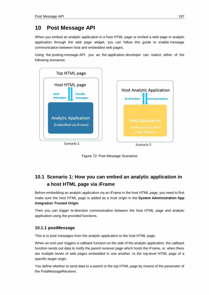
Post Message API 197
10 Post Message APIWhen you embed an analytic application in a host HTML page or embed a web page in analyticapplication through the web page widget, you can follow this guide to enable messagecommunication between host and embedded web pages.
Using the posting message API, you as the application developer can realize either of thefollowing scenarios:
Figure 72: Post Message Scenarios
10.1 Scenario 1: How you can embed an analytic application ina host HTML page via iFrame
Before embedding an analytic application via an iFrame in the host HTML page, you need to firstmake sure the host HTML page is added as a trust origin in the System Administration AppIntegration Trusted Origin.
Then you can trigger bi-direction communication between the host HTML page and analyticapplication using the provided functions.
10.1.1 postMessage
This is to post messages from the analytic application to the host HTML page.
When an end user triggers a callback function on the side of the analytic application, the callbackfunction sends out data to notify the parent receiver page which hosts the iFrame, or, when thereare multiple levels of web pages embedded in one another, to the top-level HTML page of aspecific target origin.
You define whether to send data to a parent or the top HTML page by means of the parameter ofthe PostMessageReceiver.

Post Message API 198
The syntax of the postMessage event is:postMessage (receiver: PostMessageReceiver, message: string, targetOrigin:string): void
10.1.2 onPostMessageReceived
This is to handle messages sent from the host parent or top HTML page in the analytic application.In scenario 2 depicted below, the event can also handle messages sent from an HTML pageembedded via the web page widget in an analytic application.
Note:
We advise you always to check the origin when receiving an event-triggered message, becausea malicious site can change the location of the window and therefore intercept the data you sentusing the postMessage event without your knowledge.
In the current scenario, the parent window which hosts the iFrame can post messages to theanalytic application's iFrame window of specific target origin. The messages posted are thenretrieved by the analytic application and trigger changes accordingly, such as updating some inputdata.
The syntax of the onPostMessageReceived event is:onPostMessageReceived(message: string, origin: string)
10.1.3 Example
You can embed an analytic application in a host HTML page. The URL of the host HTML page ishttp://localhost:8080.
Figure 73: Embed an analytic application into a host page

Post Message API 199
First, you want to allow end users to post the company selection in the analytic application to thehost HTML page. Write the script below for the sending button:
var message = RadioButtonGroup_Company.getSelectedText();
Application.postMessage(PostMessageReceiver.Parent, message,"http://localhost:8080");
Then you want to allow end users to display the message received from the Host HTML page ina text box of the embedded analytic application.If (origin == “http://localhost:8080”) {
Text_ReceivedMessage.applyText(message);}
10.2 Scenario 2: How you embed a web application in ananalytic application through the web page widget
You can trigger bi-direction communication between the embedded web application and the hostanalytic application.
10.2.1 Web Page Widget Related postMessage andOnPostMessageReceived
When the host analytic application's web page widget embeds a web application, youcan post messages from the embedded application to the host analytic application or the otherway around.
The syntax of the postMessage event is:postMessage(message: string, targetOrigin: string): void
Note:
The target origin is optional. If it is left empty, the URL defined in the web page widget will betaken as the target origin by default.
The syntax of the onPostMessageReceived event is:onPostMessageReceived(message: string, origin: string)
10.2.2 Case 1 - Posting messages from the host analytic application to theembedded application
The event for posting messages is:postMessage()
The event for handling messages sent from the host analytic application depends on the type ofthe embedded application:
· If the embedded application is an SAP Analytics Cloud application, once the message isreceived, the embedded application can use the event onPostMessageReceived() tohandle the message.

Post Message API 200
· If the embedded application is another web application, once the message is received,the embedded application can use the event window.on("message") to handlethe message.
10.2.3 Case 2 - Posting messages from the embedded application to thehost analytic application
The event for posting messages depends on the type of the embedded application:· If the embedded application is an SAP Analytics Cloud application, use the
event Application.postMessage() to post messages.· If the embedded application is another web application, use the
event window.parent.postMessage to post messages.
The event for handling messages sent from embedded application is: Once the messages isreceived, the host application can use the event onPostMessageReceived() to handlethe messages.

The End and the Future 201
11 The End and the FutureDear Reader, we hope you have enjoyed the book. We will enhance the content in the future withthe newest features. Now please go ahead and have fun building awesome analytic applications!

Important Links 202
12 Important LinksPlease open the SAP Help page to find many more information about SAP Analytics Cloud,analytics designer:
https://help.sap.com/viewer/product/SAP_ANALYTICS_CLOUD/release/en-US· The official documentation· The API reference guide· The SAP Analytics Cloud community· The SAP Analytics Cloud wiki· And many more links
© 2019 SAP SE or an SAP affiliate company. All rights reserved.
No part of this publication may be reproduced or transmitted in any form or for any purpose without the express permission of SAP SE or an SAP affiliate company.
The information contained herein may be changed without prior notice. Some software products marketed by SAP SE and its distributors contain proprietarysoftware components of other software vendors. National product specifications may vary.
These materials are provided by SAP SE or an SAP affiliate company for informational purposes only, without representation or warranty of any kind, and SAP orits affiliated companies shall not be liable for errors or omissions with respect to the materials. The only warranties for SAP or SAP affiliate company products andservices are those that are set forth in the express warranty statements accompanying such products and services, if any. Nothing herein should be construed asconstituting an additional warranty.
In particular, SAP SE or its affiliated companies have no obligation to pursue any course of business outlined in this document or any related presentation, or todevelop or release any functionality mentioned therein. This document, or any related presentation, and SAP SE’s or its affiliated companies’ strategy and possiblefuture developments, products, and/or platform directions and functionality are all subject to change and may be changed by SAP SE or its affiliated companiesat any time for any reason without notice. The information in this document is not a commitment, promise, or legal obligation to deliver any material, code, orfunctionality. All forward-looking statements are subject to various risks and uncertainties that could cause actual results to differ materially from expectations.Readers are cautioned not to place undue reliance on these forward-looking statements, and they should not be relied upon in making purchasing decisions.
SAP and other SAP products and services mentioned herein as well as their respective logos are trademarks or registered trademarks of SAP SE (or an SAPaffiliate company) in Germany and other countries. All other product and service names mentioned are the trademarks of their respective companies. Seewww.sap.com/copyright for additional trademark information and notices.