s1.1 representation and summary of data - chsmaths -...
TRANSCRIPT

© Boardworks Ltd 20051 of 35 © Boardworks Ltd 20051 of 35
AS-Level Maths: Statistics 1for Edexcel
S1.1 Representation and summary of data
This icon indicates the slide contains activities created in Flash. These activities are not editable.
For more detailed instructions, see the Getting Started presentation.
© Boardworks Ltd 20052 of 35
Con
tent
s
© Boardworks Ltd 20052 of 35
Graphical representations of data
Simple graphical representations of data: histograms, stem-and-leaf diagrams, quartiles and box plots
Outliers
Cumulative frequency diagrams and linear interpolation

© Boardworks Ltd 20053 of 35
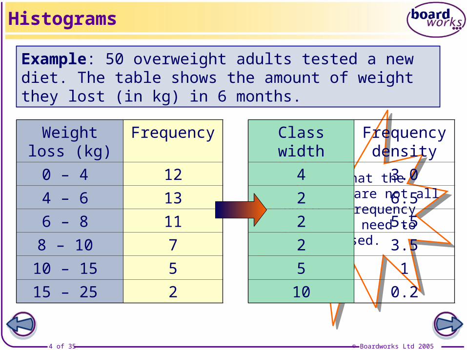
A histogram can be used to display grouped continuous data. There are some important points to remember:
frequencyfrequency density = class width
Histograms
The area of each bar in a histogram should be in proportion to the frequency.
When the class widths are not all equal, proportional areas can be achieved by plotting the frequency density on the vertical axis, where
The class width of an interval is calculated as the difference between the smallest and largest values that could occur in that interval.
© Boardworks Ltd 20054 of 35
Notice that the class widths are not all
equal – frequencydensities need to
be used.
Histograms
Weight loss (kg)
Frequency
0 – 4 124 – 6 136 – 8 118 – 10 7
10 – 15 515 – 25 2
Class width Frequency density
4 3.02 6.52 5.52 3.55 110 0.2
Example: 50 overweight adults tested a new diet. The table shows the amount of weight they lost (in kg) in 6 months.
© Boardworks Ltd 20055 of 35
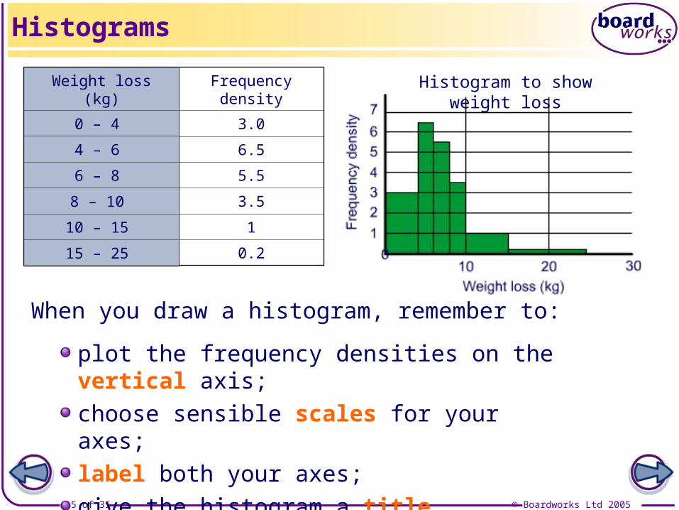
Histograms
Weight loss (kg)
0 – 4
4 – 6
6 – 8
8 – 10
10 – 15
15 – 25
Frequency density
3.0
6.5
5.5
3.5
1
0.2
Histogram to show weight loss
When you draw a histogram, remember to:
plot the frequency densities on the vertical axis;choose sensible scales for your axes;label both your axes;give the histogram a title.
© Boardworks Ltd 20056 of 35
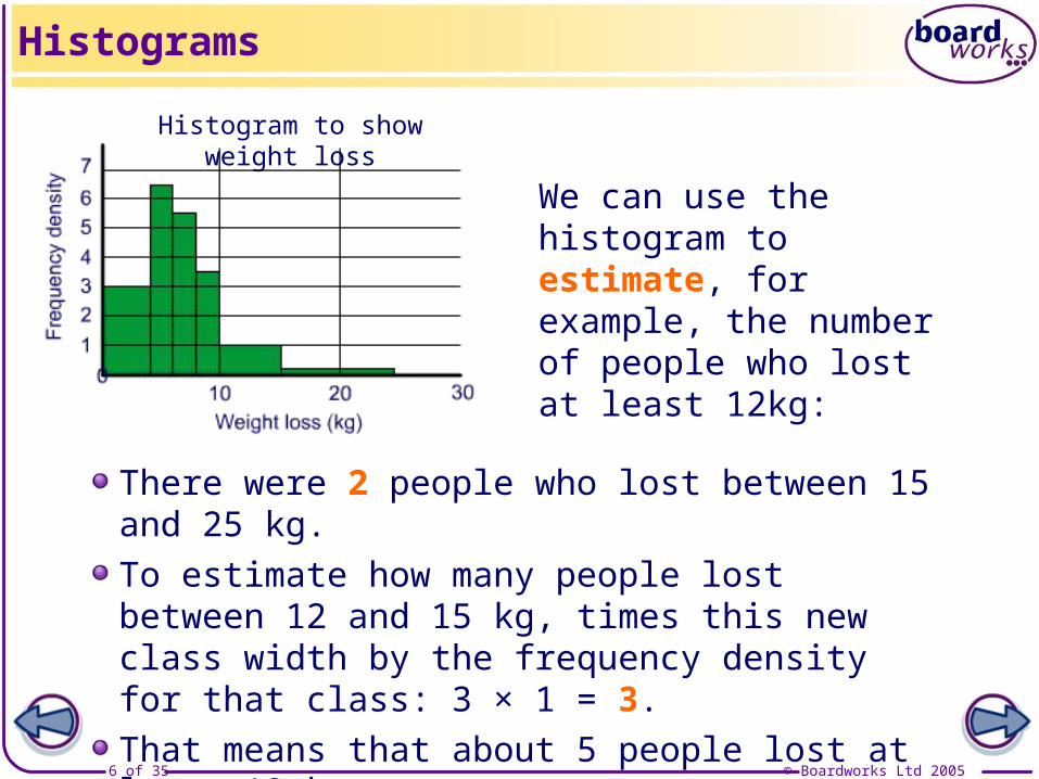
Histograms
We can use the histogram to estimate, for example, the number of people who lost at least 12kg:
There were 2 people who lost between 15 and 25 kg.To estimate how many people lost between 12 and 15 kg, times this new class width by the frequency density for that class: 3 × 1 = 3.That means that about 5 people lost at least 12 kg.
Histogram to show weight loss
© Boardworks Ltd 20057 of 35
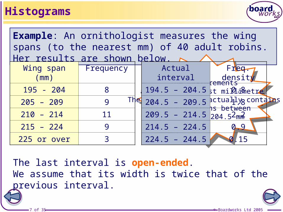
Example: An ornithologist measures the wing spans (to the nearest mm) of 40 adult robins. Her results are shown below.
Histograms
Wing span (mm) Frequency195 - 204 8205 – 209 9210 – 214 11215 – 224 9225 or over 3
The measurements are to the nearest millimetre.
The first interval contains all wing spans between
194.5 and 204.5 mm
The measurements are to the nearest millimetre.
The first interval actually contains all wing spans between
194.5 and 204.5 mm
Actual interval Freq. density194.5 – 204.5 0.8204.5 – 209.5 1.8209.5 – 214.5 2.2214.5 – 224.5 0.9224.5 – 244.5 0.15
The last interval is open-ended. We assume that its width is twice that of the previous interval.
© Boardworks Ltd 20058 of 35
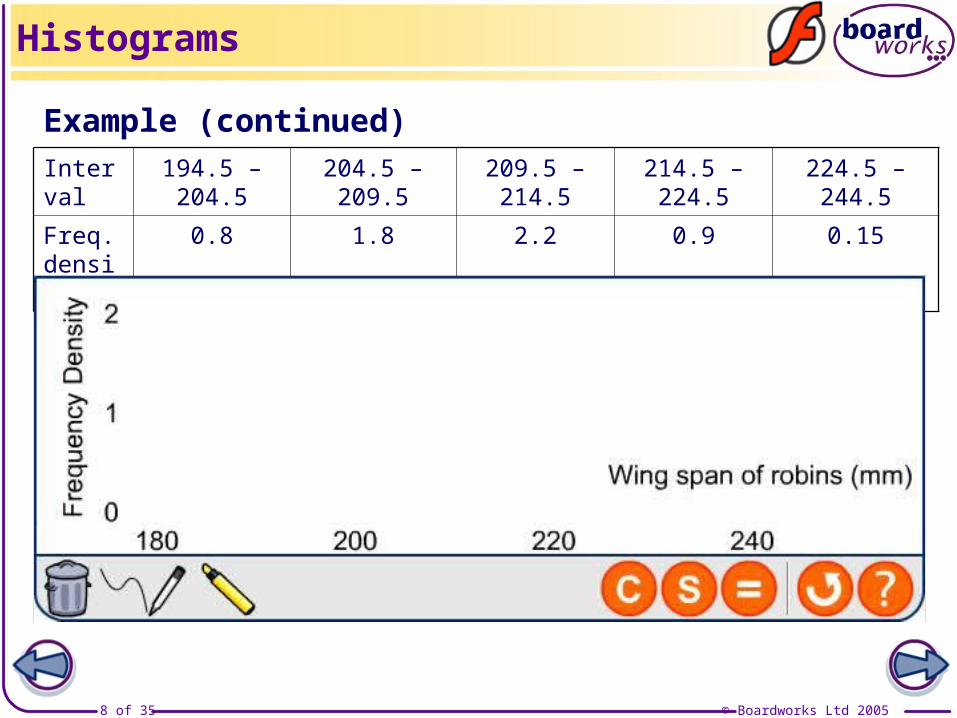
Histograms
Interval 194.5 – 204.5 204.5 – 209.5 209.5 – 214.5 214.5 – 224.5 224.5 – 244.5
Freq. density
0.8 1.8 2.2 0.9 0.15
Example (continued)
Wing span (mm)
A histogram showing the wing spans of robins
Freq
. den
sity
© Boardworks Ltd 20059 of 35
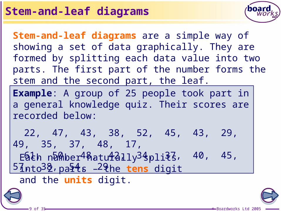
Stem-and-leaf diagrams are a simple way of showing a set of data graphically. They are formed by splitting each data value into two parts. The first part of the number forms the stem and the second part, the leaf.
Example: A group of 25 people took part in a general knowledge quiz. Their scores are recorded below:
22, 47, 43, 38, 52, 45, 43, 29, 49, 35, 37, 48, 17, 61, 50, 48, 42, 34, 37, 40, 45, 57, 38, 54, 29
Each number naturally splits into 2 parts – the tens digit and the units digit.
Stem-and-leaf diagrams

© Boardworks Ltd 200510 of 35
Stem-and-leaf diagrams
Stem-and-leaf diagrams are useful as they contain the same degree of accuracy as the original data.

© Boardworks Ltd 200511 of 35
It is sometimes necessary to split the contents of each leaf over two rows.
Stem-and-leaf diagrams
49 9
50 0 1 2 2
50 5 6
51 0 2 3 4 4
51 5 6 6 8 9
52 0 2
52 6
49 | 9 means 49.9 secsThese values can be plotted in a stem-and-leaf diagram:
Stem-and-leaf diagram of times in the 400m
Example: The times (in seconds) taken to run the 400 m by 20 female competitors in the 2004 Olympic Games were:50.2, 51.5, 50.2, 51.0, 50.5, 51.4, 51.3, 52.2, 50.0, 50.6, 52.0, 51.8, 51.6, 51.2, 51.9, 50.1, 49.9, 52.6, 51.4, 51.6.
When splitting rows, the top row should contain the digits 0, 1, 2, 3 and 4. Higher digits are put on the second row.
© Boardworks Ltd 200512 of 35
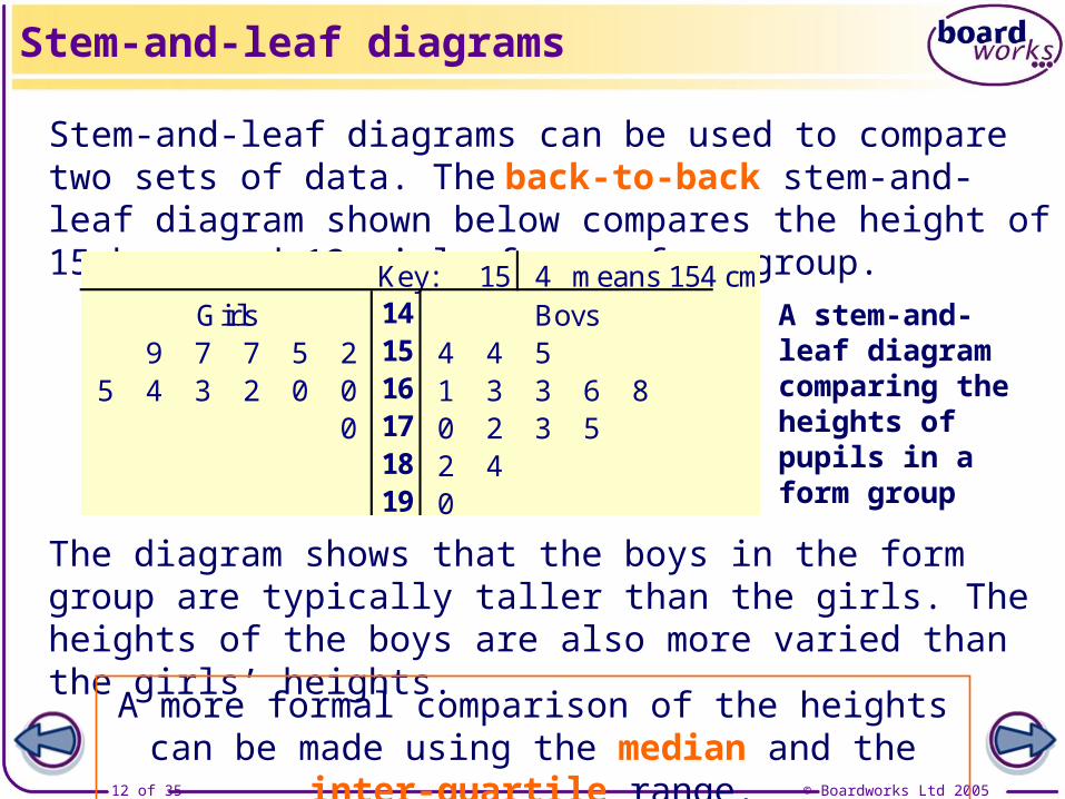
Stem-and-leaf diagrams can be used to compare two sets of data. The back-to-back stem-and-leaf diagram shown below compares the height of 15 boys and 12 girls from a form group.
A stem-and-leaf diagram comparing the heights of pupils in a form group
Stem-and-leaf diagrams
Key: 15 4 means 154 cm14
9 7 7 5 2 15 4 4 55 4 3 2 0 0 16 1 3 3 6 8
0 17 0 2 3 518 2 419 0
Girls Boys
The diagram shows that the boys in the form group are typically taller than the girls. The heights of the boys are also more varied than the girls’ heights.
A more formal comparison of the heights can be made using the median and the inter-quartile range.
© Boardworks Ltd 200513 of 35
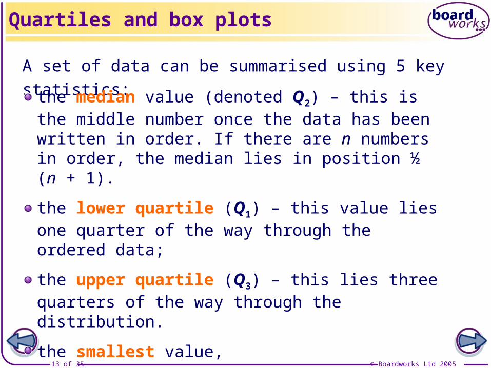
A set of data can be summarised using 5 key statistics:
Quartiles and box plots
the median value (denoted Q2) – this is the middle number once the data has been written in order. If there are n numbers in order, the median lies in position ½ (n + 1).
the lower quartile (Q1) – this value lies one quarter of the way through the ordered data;
the upper quartile (Q3) – this lies three quarters of the way through the distribution.
the smallest value,
and the largest value.
© Boardworks Ltd 200514 of 35
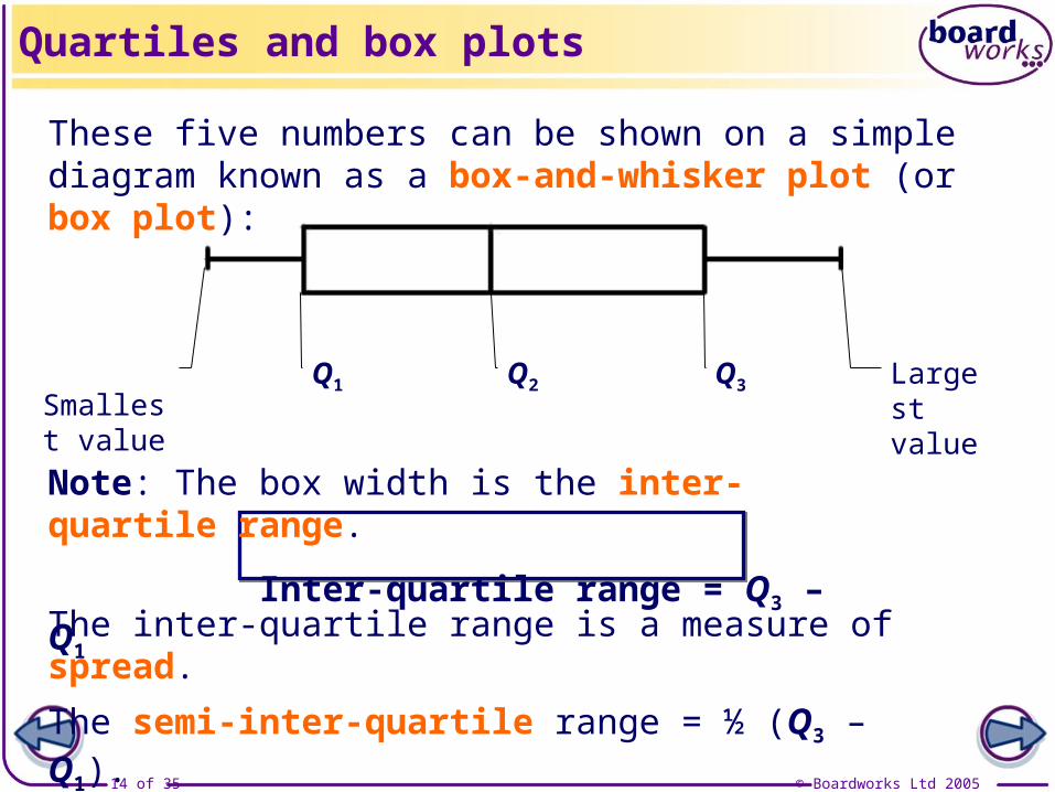
These five numbers can be shown on a simple diagram known as a box-and-whisker plot (or box plot):
Smallest value
Q1 Q2 Q3 Largest value
Note: The box width is the inter-quartile range.
Inter-quartile range = Q3 – Q1
Quartiles and box plots
The inter-quartile range is a measure of spread.The semi-inter-quartile range = ½ (Q3 – Q1).
© Boardworks Ltd 200515 of 35
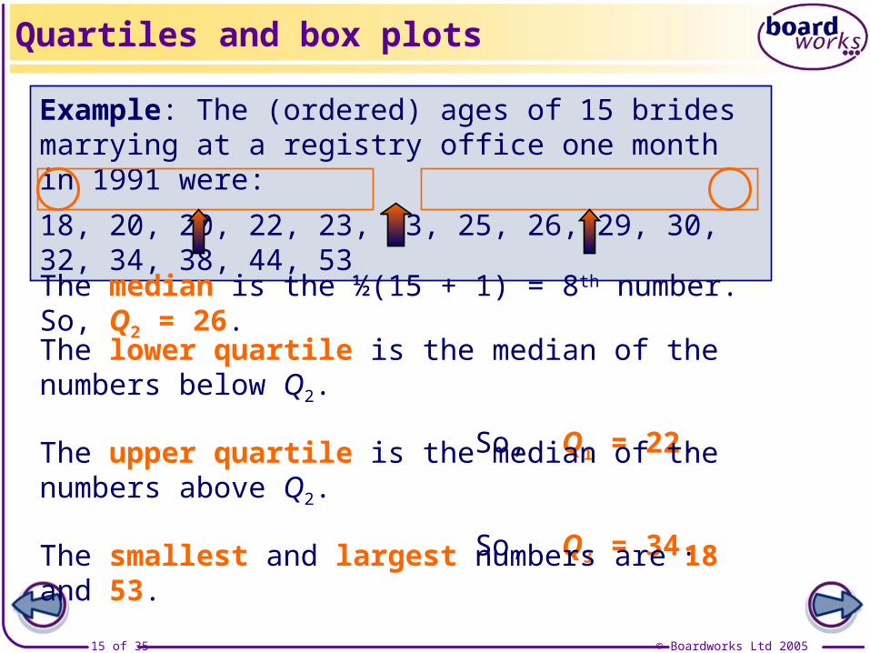
Example: The (ordered) ages of 15 brides marrying at a registry office one month in 1991 were: 18, 20, 20, 22, 23, 23, 25, 26, 29, 30, 32, 34, 38, 44, 53
The median is the ½(15 + 1) = 8th number. So, Q2 = 26.
The lower quartile is the median of the numbers below Q2.
So, Q1 = 22.The upper quartile is the median of the numbers above Q2.
So, Q3 = 34.The smallest and largest numbers are 18 and 53.
Quartiles and box plots

© Boardworks Ltd 200516 of 35
The (ordered) ages of 12 brides marrying at the registry office in the same month in 2005 were: 21, 24, 25, 25, 27, 28, 31, 34, 37, 43, 47, 61
Q2 is half-way between the 6th and 7th numbers: Q2 = 29.5.
Q1 is the median of the smallest 6 numbers: Q1 = 25.
Q3 is the median of the highest 6 numbers: Q3 = 40.
The smallest and highest numbers are 21 and 61.
Quartiles and box plots
© Boardworks Ltd 200517 of 35
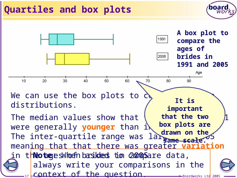
We can use the box plots to compare the two distributions. The median values show that the brides in 1991 were generally younger than in 2005. The inter-quartile range was larger in 2005 meaning that that there was greater variation in the ages of brides in 2005.
Note: When asked to compare data, always write your comparisons in the context of the question.
Quartiles and box plots
A box plot to compare the ages of brides in 1991 and 2005
It is important that the two box plots are drawn
on the same scale.

© Boardworks Ltd 200518 of 35
Box plots are useful because they make comparing the location, spread and the shape of distributions easy.
A distribution is roughly symmetrical if Q2 – Q1 ≈ Q3 – Q2
A distribution is positively skewed if Q2 – Q1 < Q3 – Q2
A distribution is negatively skewed if Q2 – Q1 > Q3 – Q2
Shapes of distributions

© Boardworks Ltd 200519 of 35
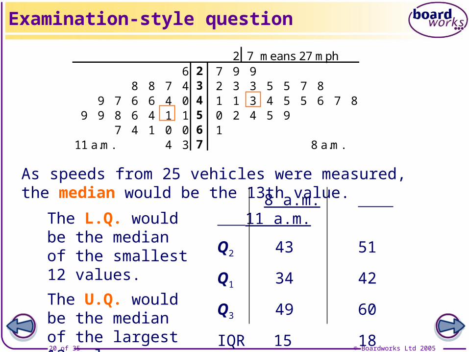
Examination-style question: A survey was carried out into the speed of traffic (in mph) on a main road at two times: 8 a.m. and 11 a.m. The speeds of 25 cars were recorded at each time and displayed in a stem-and-leaf diagram:
a) Find the median and the inter-quartile range for the traffic speeds at both 8 a.m. and 11 a.m.
b) Draw box plots for the two sets of data and compare the speeds of the traffic at the two times.
A stem-and-leaf diagram to show vehicle speed on a main road
Examination-style question
2 7 means 27 mph6 2 7 9 9
8 8 7 4 3 2 3 3 5 5 7 89 7 6 6 4 0 4 1 1 3 4 5 5 6 7 8
9 9 8 6 4 1 1 5 0 2 4 5 97 4 1 0 0 6 1
11 a.m. 4 3 7 8 a.m.
© Boardworks Ltd 200520 of 35
The L.Q. would be the median of the smallest 12 values.The U.Q. would be the median of the largest 12 values.
8 a.m. 11 a.m.
Q2 43 51
Q1 34 42
Q3 49 60
IQR 15 18
As speeds from 25 vehicles were measured, the median would be the 13th value.
Examination-style question
2 7 means 27 mph6 2 7 9 9
8 8 7 4 3 2 3 3 5 5 7 89 7 6 6 4 0 4 1 1 3 4 5 5 6 7 8
9 9 8 6 4 1 1 5 0 2 4 5 97 4 1 0 0 6 1
11 a.m. 4 3 7 8 a.m.

© Boardworks Ltd 200521 of 35
The box plots show that traffic speed is generally slower at 8 a.m. than at 11 a.m. The inter-quartile ranges show that there is greater variation in the traffic speed at 11 a.m. than at 8 a.m.Notice that the speeds at 8 a.m. have a negative skew, whilst the speeds at 11 a.m. are roughly symmetrically distributed.
8 a.m. 11 a.m.
Q2 43 51
Q1 34 42
Q3 49 60
IQR 15 18
Examination-style question
A box plot comparing vehicle speed at 8 a.m. and 11 a.m.

© Boardworks Ltd 200522 of 35
Con
tent
s
© Boardworks Ltd 200522 of 35
Simple graphical representations of data: histograms, stem-and-leaf diagrams, quartiles and box plots
Outliers
Cumulative frequency diagrams and linear interpolation
Outliers
© Boardworks Ltd 200523 of 35
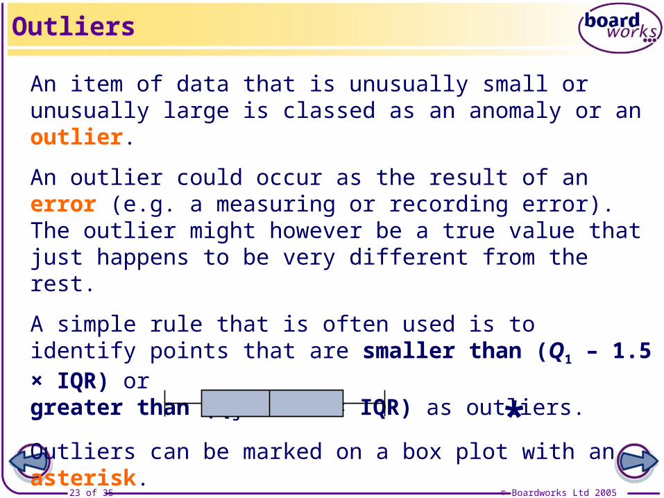
An item of data that is unusually small or unusually large is classed as an anomaly or an outlier.
An outlier could occur as the result of an error (e.g. a measuring or recording error). The outlier might however be a true value that just happens to be very different from the rest.
A simple rule that is often used is to identify points that are smaller than (Q1 – 1.5 × IQR) or greater than (Q3 + 1.5 × IQR) as outliers.
Outliers can be marked on a box plot with an asterisk.
Outliers
*

© Boardworks Ltd 200524 of 35
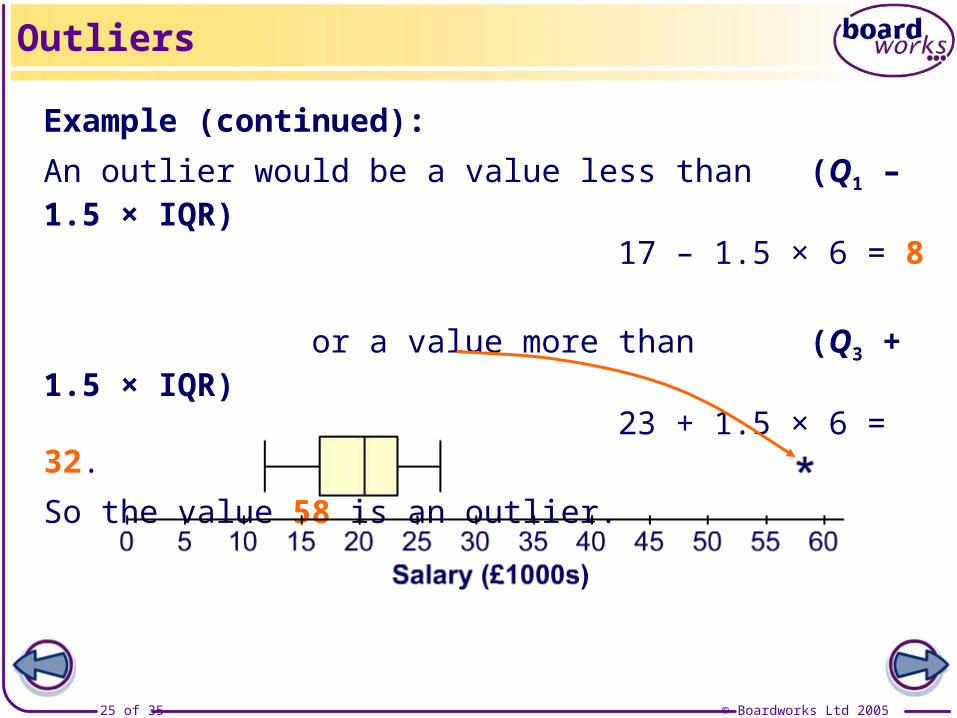
Example: The annual salaries (in thousands of pounds) of 10 employees of a small company are:
12, 14, 17, 17, 20, 21, 22, 23, 27, 58.
Outliers
The median salary is half-way between the 5th and 6th values,i.e. Q2 = 20.5 (or £20,500).
The lower quartile is the median of the lowest 5 values,i.e. Q1 = 17 (or £17,000).
The upper quartile is the median of the largest 5 values, i.e. Q3 = 23 (or £23,000).
The IQR is 23 – 17 = 6.
© Boardworks Ltd 200525 of 35
Example (continued): An outlier would be a value less than (Q1 – 1.5 × IQR)
17 – 1.5 × 6 = 8 or a value more than (Q3 + 1.5 × IQR)
23 + 1.5 × 6 = 32.So the value 58 is an outlier.
Outliers
© Boardworks Ltd 200526 of 35
Con
tent
s
© Boardworks Ltd 200526 of 35
Simple graphical representations of data: histograms, stem-and-leaf diagrams, quartiles and box plots
Outliers
Cumulative frequency diagrams and linear interpolation
Cumulative frequency diagrams
© Boardworks Ltd 200527 of 35
0
50
100
150
0 10 20 30 40 50 60 70
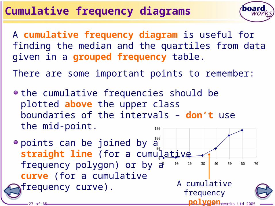
A cumulative frequency diagram is useful for finding the median and the quartiles from data given in a grouped frequency table.
There are some important points to remember:
Cumulative frequency diagrams
the cumulative frequencies should be plotted above the upper class boundaries of the intervals – don’t use the mid-point.
points can be joined by a straight line (for a cumulative frequency polygon) or by a curve (for a cumulative frequency curve).
A cumulative frequency polygon
© Boardworks Ltd 200528 of 35
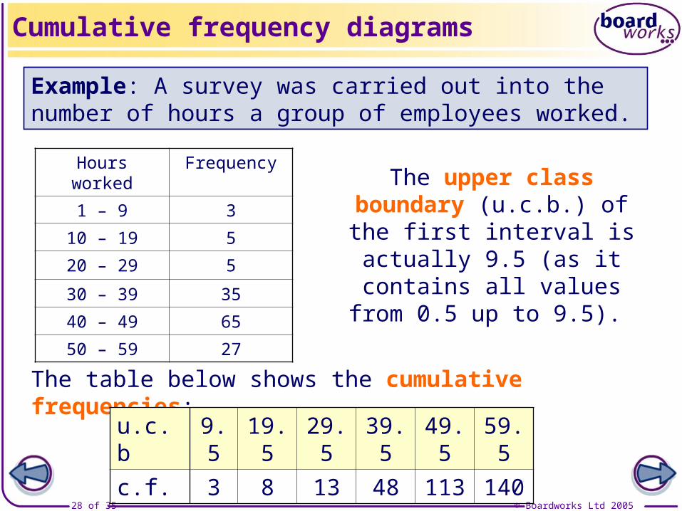
Example: A survey was carried out into the number of hours a group of employees worked.
The table below shows the cumulative frequencies:
Cumulative frequency diagrams
Hours worked Frequency
1 – 9 3
10 – 19 5
20 – 29 5
30 – 39 35
40 – 49 65
50 – 59 27
The upper class boundary (u.c.b.) of the first interval is actually 9.5 (as it contains all values from 0.5 up to 9.5).
u.c.b 9.5 19.5 29.5 39.5 49.5 59.5c.f. 3 8 13 48 113 140
© Boardworks Ltd 200529 of 35
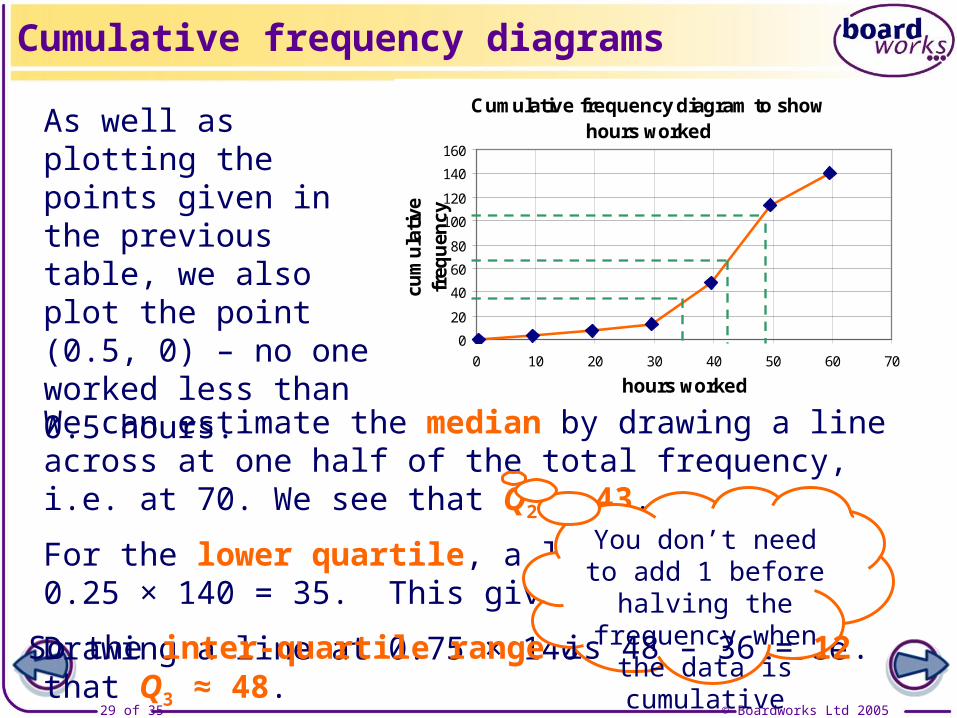
Cumulative frequency diagram to show hours worked
0
20
40
60
80
100
120
140
160
0 10 20 30 40 50 60 70
hours workedcu
mul
ativ
e fr
eque
ncy
Cumulative frequency diagrams
As well as plotting the points given in the previous table, we also plot the point (0.5, 0) – no one worked less than 0.5 hours.
We can estimate the median by drawing a line across at one half of the total frequency, i.e. at 70. We see that Q2 ≈ 43.
For the lower quartile, a line is drawn at 0.25 × 140 = 35. This gives Q1 ≈ 36.
Drawing a line at 0.75 × 140 = 105, we see that Q3 ≈ 48.
You don’t need to add 1 before halving the frequency when the data is cumulativeSo the inter-quartile range is 48 – 36 = 12.

© Boardworks Ltd 200530 of 35
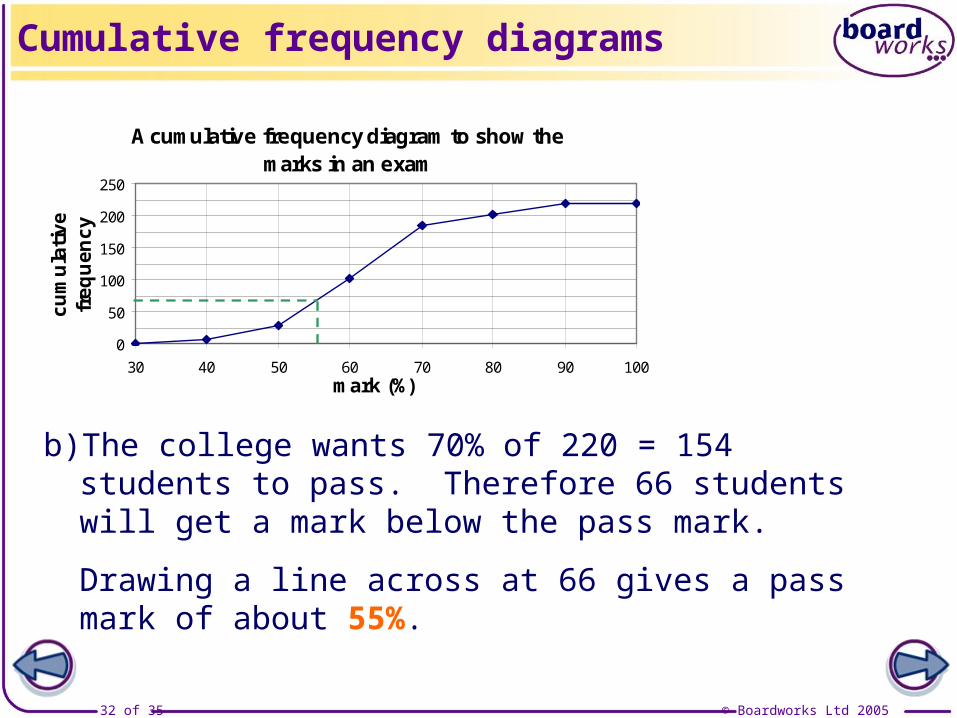
A cumulative frequency diagram to show the marks in an exam
0
50
100
150
200
250
30 40 50 60 70 80 90 100mark (%)
cum
ulat
ive
freq
uenc
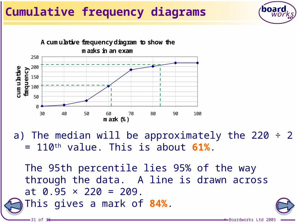
yExamination-style question: The cumulative frequency diagram shows the marks achieved by 220 students in a maths examination.
Cumulative frequency diagrams
a) Estimate the median and the 95th percentile.
b) Where should the pass mark of the examination be set if the college wishes 70% of candidates to pass?
© Boardworks Ltd 200531 of 35
a) The median will be approximately the 220 ÷ 2 = 110th value. This is about 61%.
Cumulative frequency diagrams
The 95th percentile lies 95% of the way through the data. A line is drawn across at 0.95 × 220 = 209.This gives a mark of 84%.
A cumulative frequency diagram to show the marks in an exam
0
50
100
150
200
250
30 40 50 60 70 80 90 100mark (%)
cum
ulat
ive
freq
uenc
y
© Boardworks Ltd 200532 of 35
Cumulative frequency diagrams
A cumulative frequency diagram to show the marks in an exam
0
50
100
150
200
250
30 40 50 60 70 80 90 100mark (%)
cum
ulat
ive
freq
uenc
y
b) The college wants 70% of 220 = 154 students to pass. Therefore 66 students will get a mark below the pass mark.
Drawing a line across at 66 gives a pass mark of about 55%.

© Boardworks Ltd 200533 of 35
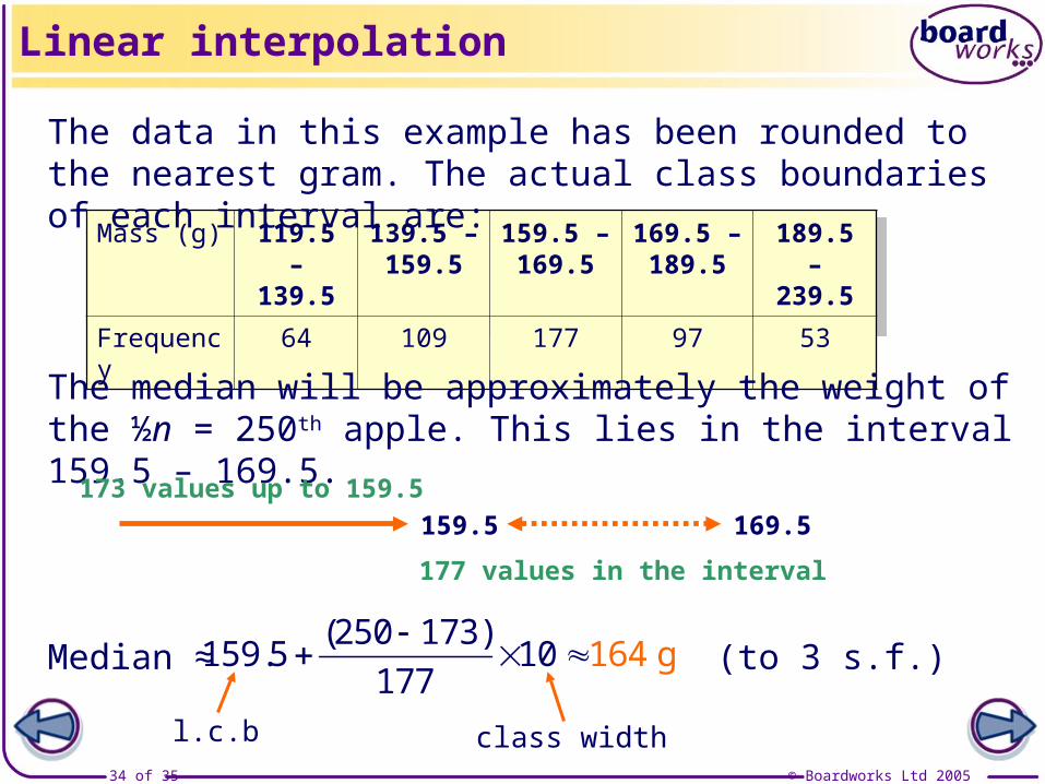
It is possible to estimate the median, the quartiles and any percentile from a grouped frequency table without drawing a cumulative frequency diagram.
Linear interpolation
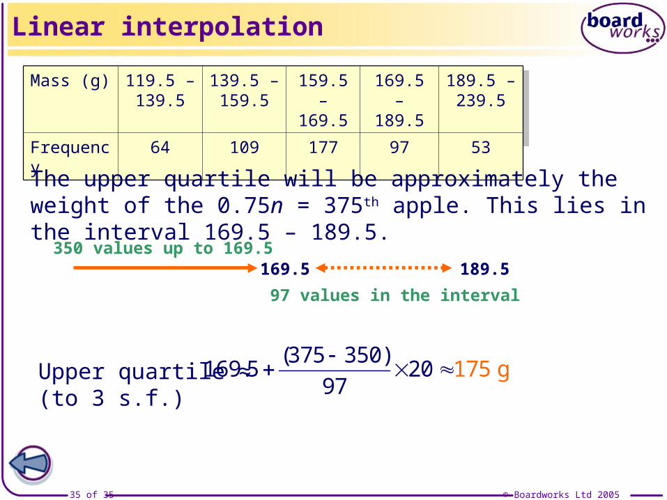
Mass (g) 120 - 139 140 - 159 160 - 169 170 - 189 190 - 239
Frequency 64 109 177 97 53
Estimate the median mass of his apples, and the value of the upper quartile.
Example: A farmer records the mass of a sample of 500 apples:
© Boardworks Ltd 200534 of 35
Linear interpolation
Mass (g) 119.5 – 139.5
139.5 – 159.5
159.5 – 169.5
169.5 – 189.5
189.5 – 239.5
Frequency 64 109 177 97 53
The data in this example has been rounded to the nearest gram. The actual class boundaries of each interval are:
The median will be approximately the weight of the ½n = 250th apple. This lies in the interval 159.5 – 169.5.
Median ≈ (to 3 s.f.)( ). 250 173159 5 10
177164 g
177 values in the interval169.5159.5
173 values up to 159.5
l.c.b class width
© Boardworks Ltd 200535 of 35
Linear interpolation
Mass (g) 119.5 – 139.5
139.5 – 159.5
159.5 – 169.5
169.5 – 189.5
189.5 – 239.5
Frequency 64 109 177 97 53
The upper quartile will be approximately the weight of the 0.75n = 375th apple. This lies in the interval 169.5 – 189.5.
Upper quartile ≈ (to 3 s.f.)( ). 375 350169 5 20
97175 g
97 values in the interval189.5169.5
350 values up to 169.5