rough stuff #9
DESCRIPTION
ROUGH STUFF #9 (100 pages, $6.95) presents another fascinating journey into the creative minds and processes of comics artists, with interviews, articles, never-before-seen penciled pages, sketches, layouts, roughs, and unused inked pages from throughout comics history—plus critiques of newcomers’ work, and more! This issue features an amazing FOUR interviews, with ROB HAYNES (interviewed by fellow professional artist TIM TOWNSEND), JOE JUSKO, MEL RUBI, and SCOTT WILLIAMS, as each artist offers commentary explaining how their work evolves from concept and rough, into finished form. Plus: editor and pro artist BOB McLEOD presents an article examining “Inkers: Who Needs ’Em?”, RUDY VASQUEZ goes under the scrutiny of a ROUGH CRITIQUE of his work, and more! New painted cover by JOE JUSKO!TRANSCRIPT

FeaturingFeaturingJOE JUSKOJOE JUSKO
N o . 9S U M M E R 2 0 0 8$ 6 . 9 5
Celebrat ing the ARTof Creat ing Comics !
MEL RUBIMEL RUBISCOTT WILLIAMSSCOTT WILLIAMSROB HAYNESROB HAYNES
ALSO IN THIS ISSUEALSO IN THIS ISSUEINKERS: WHO NEEDS ’EM?!INKERS: WHO NEEDS ’EM?!
by Bob McLeod
RUDY VASQUEZRUDY VASQUEZROUGH CRITIQUEROUGH CRITIQUE
FOUR Interviews!FOUR Galleries!FOUR Interviews!FOUR Galleries!
18265827766
6
82
Silver Surfer TM & ©2008 Marvel Characters, Inc.
SUMMER 2008 • ROUGH STUFF 1
Volume 1, Number 9Summer 2008
Celebrating the ART of Creating Comics!
EDITORBob McLeod
PUBLISHERJohn Morrow
DESIGNERMichael Kronenberg
PROOFREADERSJohn Morrow and Eric Nolen-Weathington
COVER ARTISTJoe Jusko
CIRCULATION DIRECTORBob Brodsky, Cookiesoup Productions
SPECIAL THANKSRob Haynes
Joe Jusko
Mel Rubi
Scott Williams
Tim Townsend
Rudy Vasquez
Ruben Azcona
ROUGH STUFF™ is published quarterly byTwoMorrows Publishing, 10407 Bedfordtown Drive,Raleigh, NC 27614. Bob McLeod, Editor. JohnMorrow, Publisher. Editorial Office: ROUGH STUFF,c/o Bob McLeod, Editor, P.O. Box 63, Emmaus, PA10849-2203. E-mail: [email protected]. Four-issue subscriptions: $26 Standard US, $36 FirstClass US, $44 Canada, $60 Surface International,$72 Airmail International. Please send subscriptionorders and funds to TwoMorrows, NOT to the edi-torial office. Central cover art by Joe Jusko. Allcharacters are copyright Marvel Comics. All materi-al © their creators unless otherwise noted. All edi-torial matter © 2008 Bob McLeod andTwoMorrowsPublishing. ROUGH STUFF is a TM of TwoMorrowsPublishing. Printed in Canada. FIRST PRINTING.
ROUGH STUFF INTERVIEW3 Rob Haynes
18 Joe Jusko
48 Mel Rubi
66 Scott Williams
ROUGH STUFF FEATURE56 Inkers, Who Needs ’Em?!
Bob McLeod
ROUGH STUFF DEPARTMENTS2 Scribblings From The Editor
Bob McLeod
16 Cover StoriesJoe Jusko reveals the process of creating a cover.
44 PreProArt by Rob Haynes, Joe Jusko, Scott Williams, and Mel Rubi,done before they turned pro.
84 Rough CritiqueEditor Bob McLeod critiques an aspiring penciler’s sample page.
86 Rough TalkComments and opinions from our readers.
ISSN 1931-9231
SUMMER 2008 • ROUGH STUFF 3
In an industry driven by trends and big name-artists there exists a subculture, one that flies under the radar of the average fan but is well known
amongst its peers. This group consists of artists who, for one reason or another, have avoided the limelight or do not have countless volumes of
high profile work on the shelves. This group also happens to contain some of the best talent our art form has to offer. Many brandname profes-
sionals have been intensely influenced by these individuals and regularly refer to them and their work for inspiration and knowledge.
One of these quiet geniuses goes by the name of Rob Haynes. Rob has not only influenced an entire generation of artists but has
also pioneered a particular style and approach to comic book illustration that has caught on like wildfire. There are
those who have been influenced by his work without even realizing it, having been influenced by someone who
was influenced by Rob. We [comic artists] are an incestuous lot.
In 1998 I had the distinct pleasure of having Rob and his partner in crime, colorist David
Self, move into my home as roommates, having been introduced by mutual friend and
artist, Casey Jones. For the next four years I witnessed, first hand, Rob’s coming-of-age. I
watched him find his voice right before my eyes. At the risk of sounding melodramatic, it
changed and influenced me as an artist forever. Rob is not a shy person, but is a man of
relatively few words unless he has something to say. He is motivated by neither fame nor
money. He is, quite simply, driv-
en to draw “cool pictures.”
I realize that a good
interviewer does not interject
themselves into the subject matter.
The focus should be solely on the inter-
viewee. The nature of this conversation with Rob as well as the
rich past we share lent itself to personal anecdotes and familiar
insights on my part. I wanted to let you, the reader, eavesdrop
on one of our classic late-night four-hour blab sessions.
INTERVIEW
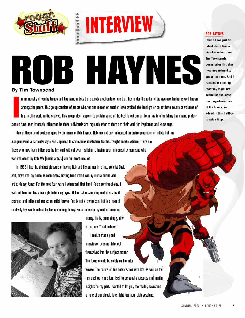
ROB HAYNESBy Tim Townsend
ROB HAYNESI think I had just fin-
ished about five or
six characters from
Tim Townsend’s
commission list, that
I wanted to hand to
you all at once. And I
remember thinking
that they might not
seem like the most
exciting characters
of the bunch, so I
added in this Hellboy
to spice it up.
4 ROUGH STUFF • SUMMER 2008
TIM TOWNSEND: Tell us a little about yourself,Rob. When and where were you born? Whowere you as a child that put you on the road tocreativity and, more in particular, comic books?ROB HAYNES: Hey bud! I’m a ’70s kid fromCharlotte, North Carolina. My mother and fatherwere both writing and voicing in radio, and myfather created and played a character on TVcalled, “Dead Ernest.” He put on face-paintwith fangs and hopped out of a coffin everyweek to host horror movies on local stations inCharlotte and Atlanta, I think. So, I was aroundcolorful, creative folks from the beginning. Soevery day I can remember as a child, I was fas-cinated with larger-than-life characters withsuperhero costumes and superpowers. Still am.
TOWNSEND: Under those circumstances, howcould you be anything other than a comic bookartist? That’s fantastic! Which came first, the draw-ing or the comic books? Usually one seems tolead to the other but not always in the same order.HAYNES: My love for comics definitely camefirst. I drew about as often as any other kid growing up,but a handful of my childhood friends were more artisticand polished than I was. I desperately wanted to have theskill, but didn’t have the patience for it. I was more intoplaying outside any chance I got back then. I playedsome sports, but I also like playing “war” with all theneighborhood kids and their toy guns (my step-dad didn’tallow toy guns for some reason), and I had a girlfriend
who would choreograph ninja fights with me on the roofof my garage which always ended with one of us gettingpinned and suchlike. Also, when you get silly ideas inyour head that everyone around you is better than you atdrawing, then you might not put as much time into it.Know what I mean?
So, I was sure that I would either become a lawyer oran actor. I took some law classes in high school and loved
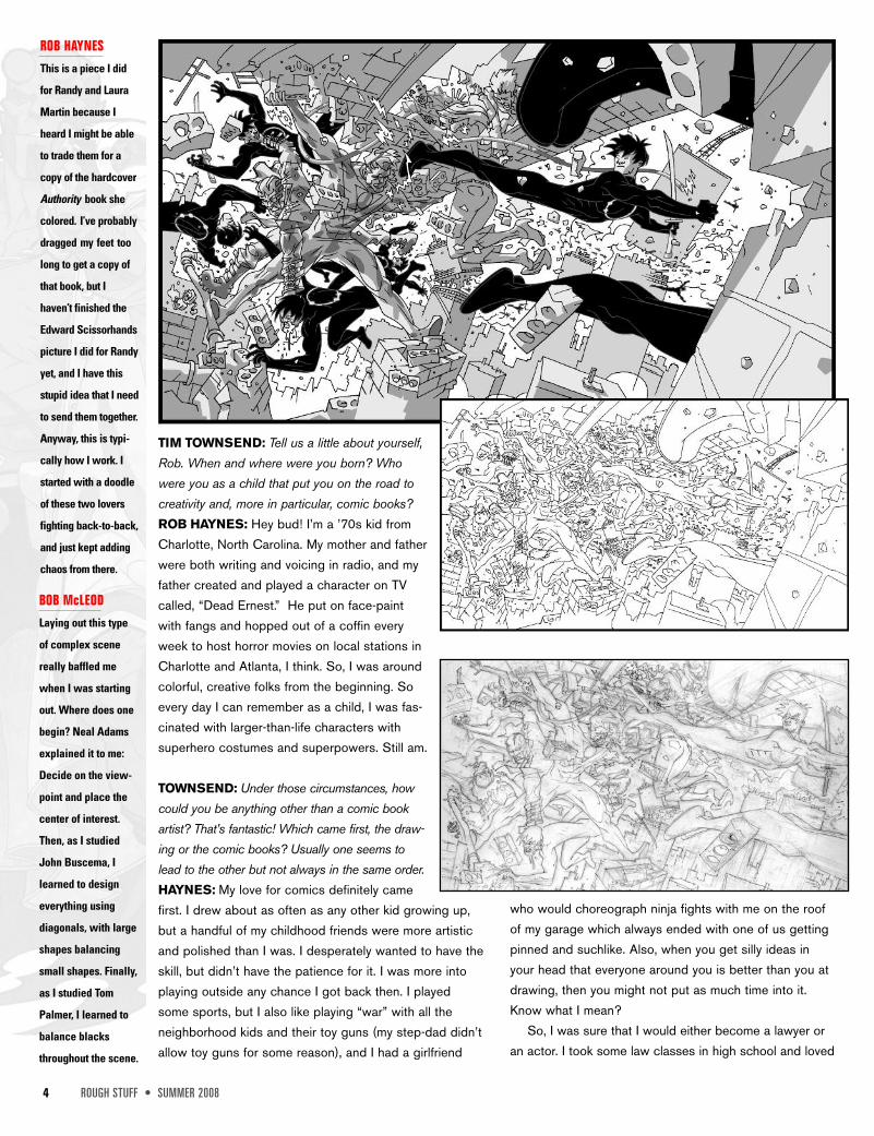
ROB HAYNESThis is a piece I did
for Randy and Laura
Martin because I
heard I might be able
to trade them for a
copy of the hardcover
Authority book she
colored. I’ve probably
dragged my feet too
long to get a copy of
that book, but I
haven’t finished the
Edward Scissorhands
picture I did for Randy
yet, and I have this
stupid idea that I need
to send them together.
Anyway, this is typi-
cally how I work. I
started with a doodle
of these two lovers
fighting back-to-back,
and just kept adding
chaos from there.
BOB McLEODLaying out this type
of complex scene
really baffled me
when I was starting
out. Where does one
begin? Neal Adams
explained it to me:
Decide on the view-
point and place the
center of interest.
Then, as I studied
John Buscema, I
learned to design
everything using
diagonals, with large
shapes balancing
small shapes. Finally,
as I studied Tom
Palmer, I learned to
balance blacks
throughout the scene.

it, and acted in stage plays for about six or sevenyears. But I was also at the comic store everyweek. A friend of the family who collectedcomics, Ruth Castleberry, set up a trip for me toMarvel Comics in New York when I was about15 years old. I did the tour and gotsome free comics out ofthe spinning
rack in the lobby — I havethat comic rack now, thanks to you Tim — and gota quick education about how comics were made atMarvel. I never thought of it as a real job until then; a cooljob. But I didn’t have the skill or the practice, or the drive.
I got the drive very soon after in an unlikely place. Ithink it was the next summer after visiting Marvel when I
went to the OutwardBound School in the
****ing steep NorthCarolina Mountains. I
was put with a group ofkids who really wanted to be
there. Some of them applied forscholarships. Me, I was miserable formost of it. I think I was cured of mylove for the outdoors. No tents; no cab-
ins; just hike every day with close tosixty pounds on your back, and wherever
we stopped at night, hang up a blue plastictarp over ten of us plus the ten million bugs
for about a month. Actually we all did a lot ofgreat things there, but I just had a typical teenager
attitude about the whole thing.Long story short, I got my attitude adjusted. And, I
learned maybe my best personal lesson about drawing.We were all spending a 48-hour period solo — no con-tact with each other at all — in some very dense forest. Iwas almost always able to keep myself entertained withmy own thoughts as a kid, but not for 48 hours in a row.We were allowed pencil and paper, but no music orbooks. And, all I could think was that I wish I could drawwell enough to keep myself entertained. Writing alonejust wasn’t cutting it. It was frustrating.
So after that experience at age 15, I really put all mythought and effort into learning how to draw. I sort ofthought I would have to explain that lawyers and actors liefor money, and that drawing stories might be a little lessdishonest. My parents were mostly hands-off because theyboth had careers, but on this I received encouragementfrom them. They even paid for my first trip to San DiegoCon a few years later after I graduated high school so Icould get advice from editors and artists.
TOWNSEND: I love the fact that, of all the various sourcesof inspiration and stimuli, the one that affected you themost, Outward Bound, had the least to do with art or
comics. I can relate in a roundabout way havinggone through a very
structured andmilitant
training in art school.When you’re pushed
to your limits, thingshave a way of falling
SUMMER 2008 • ROUGH STUFF 5
ROB HAYNESThese were some of
the first few images
from the animated
sequence I did to see
if Flash and Adobe
Streamline could han-
dle the style I was fin-
ishing my drawings,
without degrading the
line quality. Even
though I was inking
most of my work with
a simple dead line,
that Daredevil pose
was one of the first
times I felt that I didn’t
leave too many extra
shapes and lines out
of fear that there was-
n’t enough there.
Daredevil andBullseye TM &©2008 MarvelCharacters, Inc.
16 ROUGH STUFF • SUMMER 2008
COVER STORIES
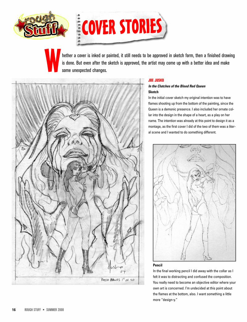
W hether a cover is inked or painted, it still needs to be approved in sketch form, then a finished drawingis done. But even after the sketch is approved, the artist may come up with a better idea and makesome unexpected changes.
JOE JUSKOIn the Clutches of the Blood Red QueenSketchIn the initial cover sketch my original intention was to haveflames shooting up from the bottom of the painting, since theQueen is a demonic presence. I also included her ornate col-lar into the design in the shape of a heart, as a play on hername. The intention was already at this point to design it as amontage, as the first cover I did of the two of them was a liter-al scene and I wanted to do something different.
PencilIn the final working pencil I did away with the collar as Ifelt it was to distracting and confused the composition.You really need to become an objective editor where yourown art is concerned. I’m undecided at this point aboutthe flames at the bottom, also. I want something a littlemore “design-y.”
SUMMER 2008 • ROUGH STUFF 17
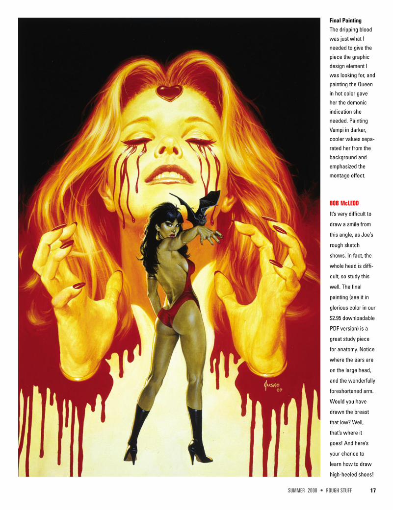
Final PaintingThe dripping bloodwas just what Ineeded to give thepiece the graphicdesign element Iwas looking for, andpainting the Queenin hot color gaveher the demonicindication sheneeded. PaintingVampi in darker,cooler values sepa-rated her from thebackground andemphasized themontage effect.
BOB McLEOD
It’s very difficult to
draw a smile from
this angle, as Joe’s
rough sketch
shows. In fact, the
whole head is diffi-
cult, so study this
well. The final
painting (see it in
glorious color in our
$2.95 downloadable
PDF version) is a
great study piece
for anatomy. Notice
where the ears are
on the large head,
and the wonderfully
foreshortened arm.
Would you have
drawn the breast
that low? Well,
that’s where it
goes! And here’s
your chance to
learn how to draw
high-heeled shoes!

18 ROUGH STUFF • SUMMER 2008
INTERVIEW
JOE JUSKOBy Bob McLeod
W orking as a NYC police officer wasn’t tough enough for Joe Jusko, so he decided to become one of
the best fantasy artists in the world. He set the standard for painted trading cards with his 1992
Marvel Masterpieces cards, and his awesome 1995 Burroughs cards. He’s won two “Favorite
Painter” Wizard Fan Awards, several trading card awards, a Burroughs Bibliophiles Golden Lion Award and a Chesley Award
nomination for best cover in 2001. He also recently painted a graphic novel based on Lara Croft and won a Certificate of
Merit from the Society of Illustrators. And to really rub it in, he’s a very nice guy.BOB McLEOD: Hi, Joe.Welcome to Rough Stuff,and thanks for that beau-tiful cover! We all have tostart somewhere. Whatwas the first pro paintingyou ever did? Do youremember?JOE JUSKO: I got reallylucky in that regard! I hadjust graduated fromNYC’s High School of Art& Design, and despitewinning DC Comics’“Award of Excellence” incartooning I had decidedthat I wanted to paint,instead.
McLEOD: Whoa! Tell meabout this Award ofExcellence. What was it,and what did it mean?
JUSKO: Every graduatingclass had awards grantedfrom different companiesto the top student in eachof the art majors that theschool taught. I was anIllustration major, butsomehow received theCartooning award fromDC. It was a congratula-tory letter from SolHarrison on DC letter-head and a $25 gift cer-tificate to an art supplystore. I still have the letterframed in my studio, and Iused the gift certificate tobuy my first brushes andtubes of paint! $25 wenta long way in 1977!(laughs) The award wasincredibly reassuring andobviously much appreciated,
JOE JUSKOVampirella Tree
Sketch
I was looking for an
image that evoked
memories of the orig-
inal Enric covers
from the Warren
magazines. It’s
become the most
popular Vampi image
I’ve painted.
SUMMER 2008 • ROUGH STUFF 19
evidenced by the fact that I still have it all these yearslater! The irony for me has always been that DC hasgiven me almost no work in the past 30 years. One ofthose things that make you go “Hmmm?.”
McLEOD: Don’t get me started on irony in the comicbook business. So what did you do next?JUSKO: I spent the gift certificate money I received on asampling of paints; everything from watercolors to oils. Iplayed with them all over that summer and ended up witha couple of decent mixed media pieces, since I wasteaching myself and didn’t really have a handle on anyparticular medium.
McLEOD: How did you transition from talented amateurto published pro?JUSKO: That fall I met Howard Chaykin in a GreenwichVillage comic shop, and was hired as his assistant basedon those few painting samples.
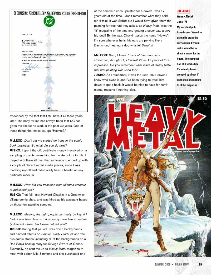
McLEOD: Meeting the right people can really be key. If Ihadn’t met Neal Adams, I’d probably have had an entire-ly different career. So Howie helped you?JUSKO: During that period I was doing backgroundsand painted effects on Empire, Cody Starbuck and vari-ous comic stories, including all of the backgrounds on aRed Sonja backup story for Savage Sword of Conan.Eventually, he sent me up to Heavy Metal magazine tomeet with editor Julie Simmons and she purchased one
of the sample pieces I painted for a cover! I was 17years old at the time. I don’t remember what they paidme (I think it was $250) but I would have given them thepainting for free had they asked, as Heavy Metal was the“It” magazine of the time and getting a cover was a verybig deal! By the way, Chaykin hates the name “Howie”!I’m sure wherever he is, his ears are perking like aDachshund hearing a dog whistle! (laughs)
McLEOD: Yeah, I know. I think of him more as aDoberman, though. Hi, Howard! Wow, 17 years old! I’mimpressed. Do you remember what issue of Heavy Metalthat first painting was used for?JUSKO: As I remember, it was the June 1978 cover. Iknow who owns it, and I’ve been trying to track himdown to get it back. It would be nice to have for senti-mental reasons if nothing else.
JOE JUSKOHeavy Metal
June ’78
My very first pub-
lished cover. Were I to
paint this today the
only change I would
make would be to
shoot a model for the
figure. The composi-
tion still works fine.
It’s actually been
cropped by about 4"
on the top and bottom
to fit the magazine.

20 ROUGH STUFF • SUMMER 2008
JOE JUSKOSheena croc
sketch
Just a really cool
slam bang jungle
action piece! The
monkey was shifted
to just out of reach
of the croc’s jaws in
the final painting.
BOB McLEODNotice the arc cre-
ated by the tree
limb in the upper
right going down to
her left arm and
flowing down to her
thigh and then into
the panther’s front
leg. An opposing
arc is created by
the croc’s mouth
moving down
through his leg, cre-
ating an ‘X’ design.
But there’s also a
circular design cre-
ated by the place-
ment of darks, fram-
ing Sheena in the
center.
SUMMER 2008 • ROUGH STUFF 35
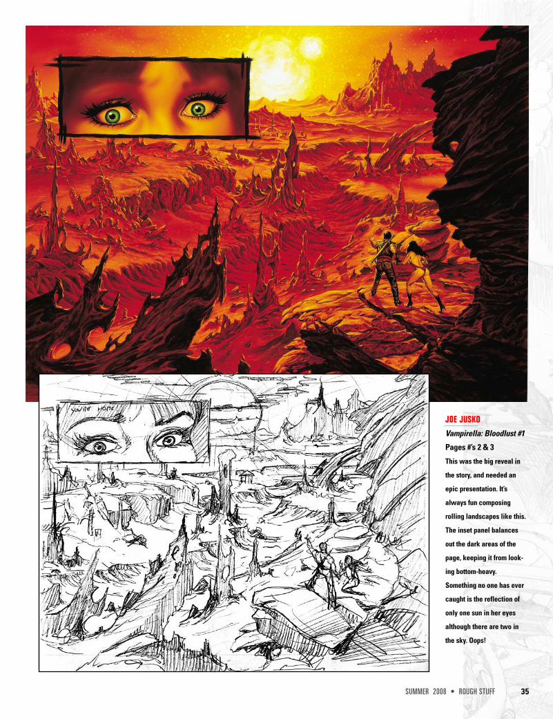
JOE JUSKOVampirella: Bloodlust #1
Pages #’s 2 & 3
This was the big reveal in
the story, and needed an
epic presentation. It’s
always fun composing
rolling landscapes like this.
The inset panel balances
out the dark areas of the
page, keeping it from look-
ing bottom-heavy.
Something no one has ever
caught is the reflection of
only one sun in her eyes
although there are two in
the sky. Oops!
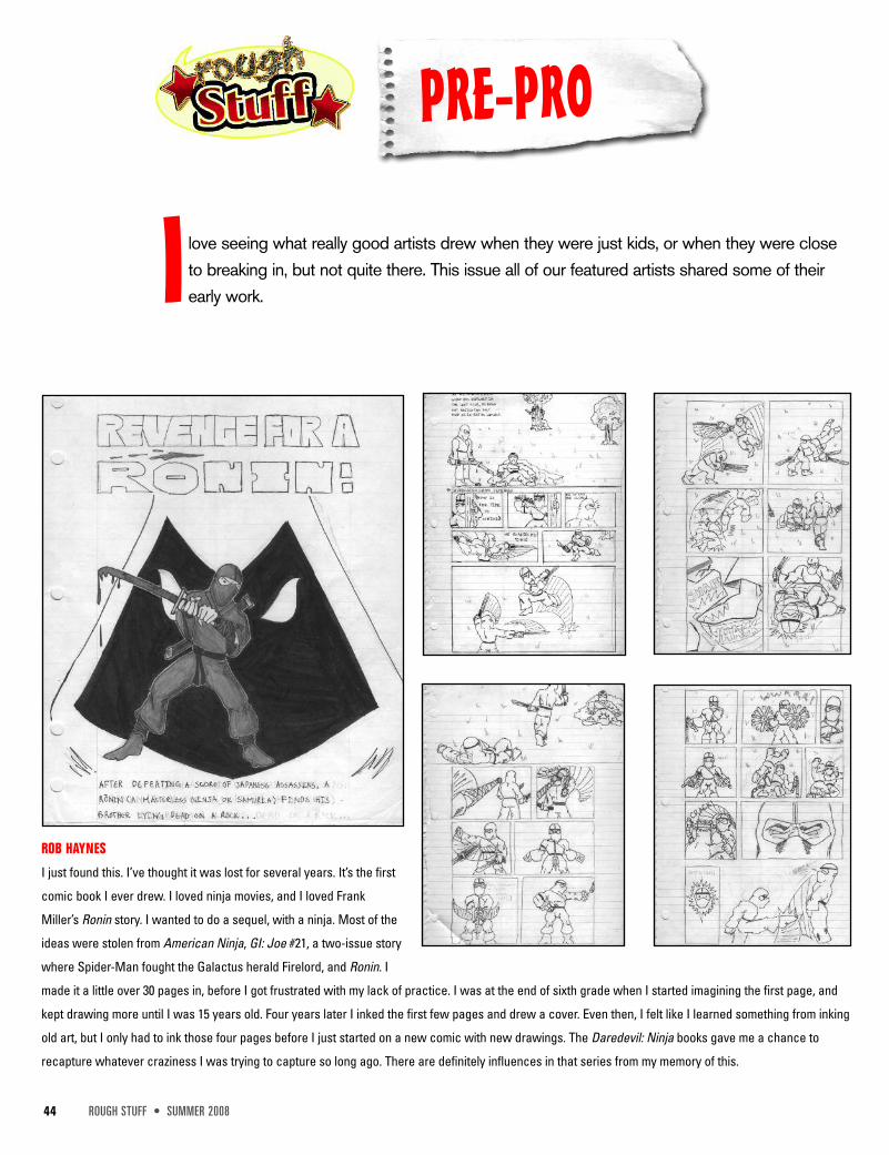
ROB HAYNES
I just found this. I’ve thought it was lost for several years. It’s the first
comic book I ever drew. I loved ninja movies, and I loved Frank
Miller’s Ronin story. I wanted to do a sequel, with a ninja. Most of the
ideas were stolen from American Ninja, GI: Joe #21, a two-issue story
where Spider-Man fought the Galactus herald Firelord, and Ronin. I
made it a little over 30 pages in, before I got frustrated with my lack of practice. I was at the end of sixth grade when I started imagining the first page, and
kept drawing more until I was 15 years old. Four years later I inked the first few pages and drew a cover. Even then, I felt like I learned something from inking
old art, but I only had to ink those four pages before I just started on a new comic with new drawings. The Daredevil: Ninja books gave me a chance to
recapture whatever craziness I was trying to capture so long ago. There are definitely influences in that series from my memory of this.
44 ROUGH STUFF • SUMMER 2008
PRE-PRO
I love seeing what really good artists drew when they were just kids, or when they were closeto breaking in, but not quite there. This issue all of our featured artists shared some of theirearly work.
SUMMER 2008 • ROUGH STUFF 45
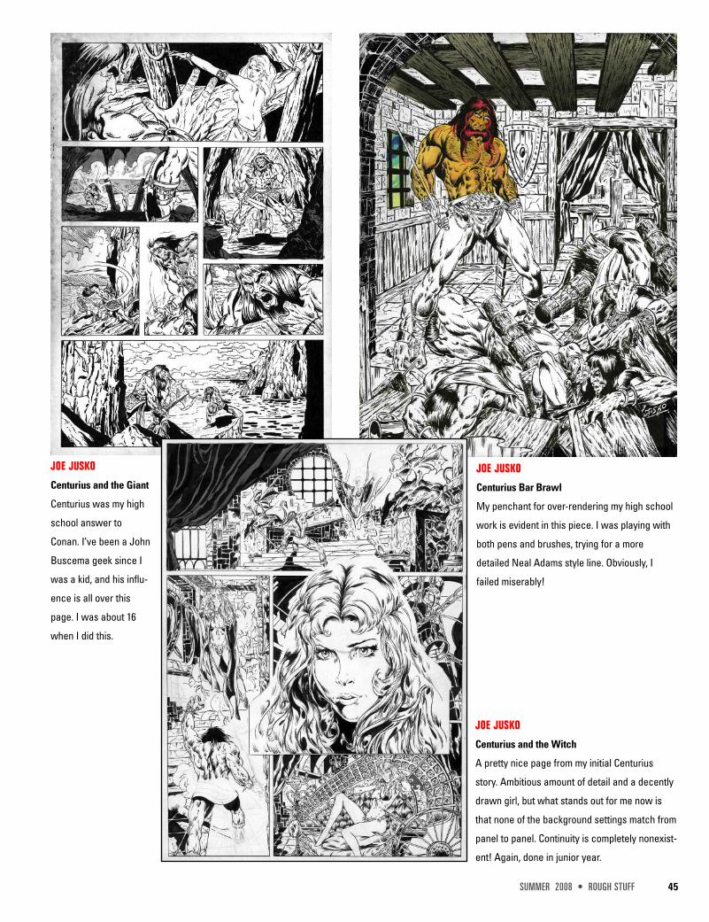
JOE JUSKO
Centurius and the Giant
Centurius was my high
school answer to
Conan. I’ve been a John
Buscema geek since I
was a kid, and his influ-
ence is all over this
page. I was about 16
when I did this.
JOE JUSKO
Centurius Bar Brawl
My penchant for over-rendering my high school
work is evident in this piece. I was playing with
both pens and brushes, trying for a more
detailed Neal Adams style line. Obviously, I
failed miserably!
JOE JUSKO
Centurius and the Witch
A pretty nice page from my initial Centurius
story. Ambitious amount of detail and a decently
drawn girl, but what stands out for me now is
that none of the background settings match from
panel to panel. Continuity is completely nonexist-
ent! Again, done in junior year.
48 ROUGH STUFF • SUMMER 2008
INTERVIEW
MEL RUBIBy Bob McLeod
Mel Rubi is yet another in the long line of great Filipino comic artists. There must be something in the water
over there. He’s worked for Valiant, Marvel, and Dark Horse and just keeps getting better with every job. If
you’re unfamiliar with his work, as I was, you’re going to be glad you picked up this issue of Rough Stuff.BOB McLEOD: Thank you for agreeing to this interview,Mel. I just recently discovered your work whenRuben Azcona mentioned you to me, but Iknow you’ve been working in comics for afew years now. How did you first breakinto comics? Was Marvel the first publisherto give you work?MEL RUBI: It took almost three years to finallybreak in. I remember standing in line formany hours for a portfolioreview and just when it wasmy turn to show my work theeditors would say that they will nolonger review for the day.
McLEOD: Yes, I’ve seen thathappen before at conven-tions! How frustrat-ing for you!RUBI: It was awful!But with patience andendurance, I succeeded withnot only one publisher but twoat Wonder Con back in 1993.Marvel and Valiant loved my art!And the rest is history.
McLEOD: 1993! I didn’t realize you’d been around thatlong. What was your first assignment?
RUBI: Dr. Strange was my very first series to havedrawn as a rookie. At that time, I wasn’tthat thrilled to work on this title. Iwould’ve preferred something along theX-Men line. Who wouldn’t, right? But afterawhile I started to feel the character and
began to have fun with it.
McLEOD: Did you have a favorite prior Dr.Strange artist?RUBI: I would have to say Michael Goldenwas inspiring when he took on Dr. Strange.
McLEOD: Yes, he’s always inspiring on whatev-er he does, but my favorite Dr. Strange artist wasprobably Gene Colan, inked by Tom Palmer. Sowhat happened to cause you to leave Dr.Strange?RUBI: Just when I got comfortable with the bookthey pulled me away to work on a cooler charac-ter called the Punisher. Well, hopefully, there’llcome a time for Dr. Strange and me to reunite.
McLEOD: Well, I think Dr. Strange is waycooler than the Punisher, so I hope

50 ROUGH STUFF • SUMMER 2008
MEL RUBIThis is how I usually
begin on my pages
and I would go
straight to finishes.
Wolverine TM &©2008 MarvelCharacters, Inc.
SUMMER 2008 • ROUGH STUFF 51
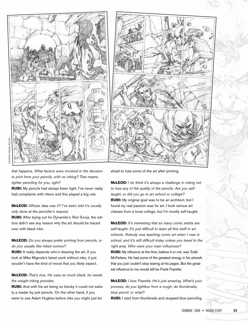
that happens. What factors were involved in the decisionto print from your pencils, with no inking? That meanstighter penciling for you, right?RUBI: My pencils had always been tight. I’ve never reallyhad complaints with inkers and this played a big role.
McLEOD: Whose idea was it? I’ve been told it’s usuallyonly done at the penciller’s request.RUBI: After trying out for Dynamite’s Red Sonja, the edi-tors didn’t see any reason why the art should be tracedover with black inks.
McLEOD: Do you always prefer printing from pencils, ordo you usually like inked comics?RUBI: It really depends who’s drawing the art. If youlook at Mike Mignola’s latest work without inks, it justwouldn’t have the kind of mood that you likely expect.
McLEOD: That’s true. He uses so much black, he needsthe weight inking provides.RUBI: And with his art being so blocky it could not satis-fy a reader by just pencils. On the other hand, if youwere to see Adam Hughes before inks you might just be
afraid to lose some of the art after printing.
McLEOD: I do think it’s always a challenge in inking notto lose any of the quality of the pencils. Are you self-taught, or did you go to art school or college?RUBI: My original goal was to be an architect, but Ifound my real passion was for art. I took various artclasses from a local college, but I’m mostly self-taught.
McLEOD: It’s interesting that so many comic artists areself-taught. It’s just difficult to learn all this stuff in artschools. Nobody was teaching comic art when I was inschool, and it’s still difficult today unless you travel to theright area. Who were your main influences?RUBI: My influence at the time, believe it or not, was ToddMcFarlane. He had some of the greatest energy in his artworkthat you just couldn’t stop staring at his pages. But the great-est influence to me would still be Frank Frazetta.
McLEOD: I love Frazetta. He’s just amazing. What’s yourprocess, do you lightbox from a rough, do thumbnails,blue pencil, or what?RUBI: I start from thumbnails and stopped blue penciling
Cour
tesy
Rube
nAz
cona
56 ROUGH STUFF • SUMMER 2008
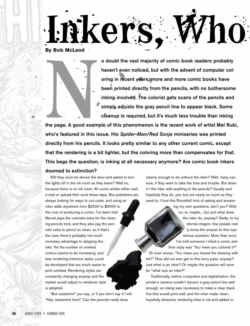
N o doubt the vast majority of comic book readers probably
haven’t even noticed, but with the advent of computer col-
oring in recent years, more and more comic books have
been printed directly from the pencils, with no bothersome
inking involved. The colorist gets scans of the pencils and
simply adjusts the gray pencil line to appear black. Some
cleanup is required, but it’s much less trouble than inking
the page. A good example of this phenomenon is the recent work of artist Mel Rubi,
who’s featured in this issue. His Spider-Man/Red Sonja miniseries was printed
directly from his pencils. It looks pretty similar to any other current comic, except
that the rendering is a bit lighter, but the coloring more than compensates for that.
This begs the question, is inking at all necessary anymore? Are comic book inkers
doomed to extinction?
Inkers, Who Needs ’Em?!
Will they soon be shown the door and asked to turnthe lights off in the ink room as they leave? Well no,because there is no ink room. All comic artists either mail,e-mail or upload their work these days. But publishers arealways looking for ways to cut costs, and using aninker adds anywhere from $2500 to $3000 tothe cost of producing a comic. I’ve been toldMarvel pays the colorists extra for the clean-ing-pencils trick, and they also pay the pen-ciler extra to pencil so clean, so if that’sthe case there’s probably not muchmonetary advantage to skipping theinks. Yet the number of uninkedcomics seems to be increasing, andless rendering-intensive styles couldbe developed that are much easier toprint uninked. Rendering styles areconstantly changing anyway and themarket would adjust to whatever styleis adopted.
“But waitaminit” you say; or if you don’t say it I will.“Hey, waitaminit here!” Can the penciler really draw
cleanly enough to do without the inker? Well, many can,sure, if they want to take the time and trouble. But does-n’t the inker add anything to the pencils? Usually andhopefully they do, yes, but not nearly so much as theyused to. I love this Rumsfeld trick of asking and answer-
ing my own questions, don’t you? Well,no, er, maybe... but just what does
the inker do, anyway? Sadly, to myeternal chagrin, few people real-ly know the answer to this mys-
terious question. More than onceI’ve told someone I inked a comic and
their reply was “You mean you colored it?”Or even worse, “You mean you traced the drawing with
ink?” How did we ever get to this sorry pass, anyway?Just what is an inker? Or maybe the question will soonbe “what was an inker?”
Traditionally, before computers and digitalization, theprinter’s camera couldn’t discern a gray pencil line wellenough, so inking was necessary to make a clear blackline that would print well, and the inker made clean,hopefully attractive rendering lines in ink and added or
By Bob McLeod
SUMMER 2008 • ROUGH STUFF 57
Inkers, Who Needs ’Em?!Sc
an c
ourt
esy
Heri
tage
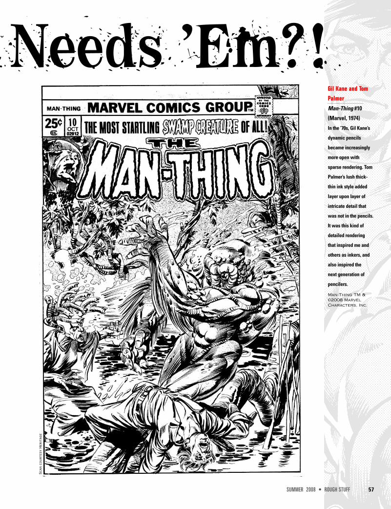
Gil Kane and TomPalmerMan-Thing #10
(Marvel, 1974)
In the ’70s, Gil Kane’s
dynamic pencils
became increasingly
more open with
sparse rendering. Tom
Palmer’s lush thick-
thin ink style added
layer upon layer of
intricate detail that
was not in the pencils.
It was this kind of
detailed rendering
that inspired me and
others as inkers, and
also inspired the
next generation of
pencilers.
Man-Thing TM &©2008 MarvelCharacters, Inc.
58 ROUGH STUFF • SPRING 2008
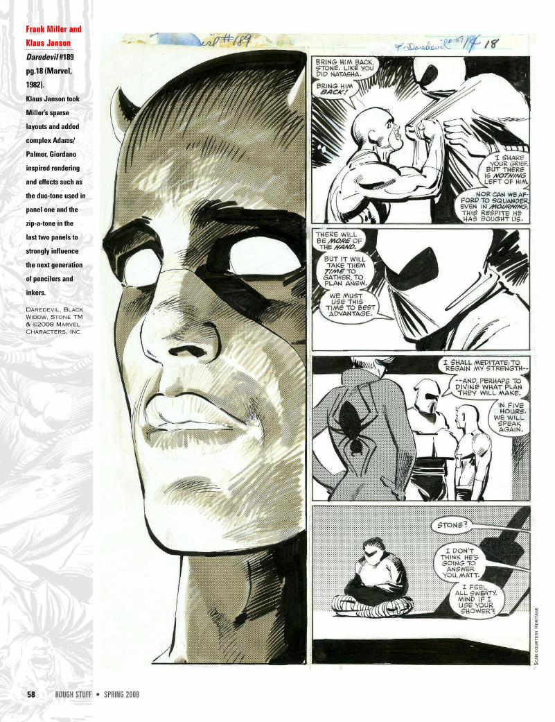
Frank Miller andKlaus Janson Daredevil #189
pg.18 (Marvel,
1982).
Klaus Janson took
Miller’s sparse
layouts and added
complex Adams/
Palmer, Giordano
inspired rendering
and effects such as
the duo-tone used in
panel one and the
zip-a-tone in the
last two panels to
strongly influence
the next generation
of pencilers and
inkers.
Scan
cou
rtes
y He
rita
ge
Daredevil, BlackWidow, Stone TM& ©2008 MarvelCharacters, Inc.
66 ROUGH STUFF • SUMMER 2008
INTERVIEW
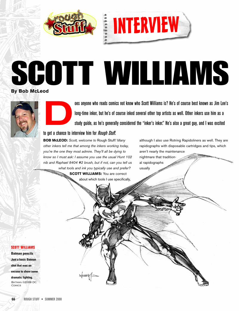
SCOTT WILLIAMSBy Bob McLeod
D oes anyone who reads comics not know who Scott Williams is? He’s of course best known as Jim Lee’s
long-time inker, but he’s of course inked several other top artists as well. Other inkers use him as a
study guide, as he’s generally considered the “inker’s inker.” He’s also a great guy, and I was excited
to get a chance to interview him for Rough Stuff.BOB McLEOD: Scott, welcome to Rough Stuff! Manyother inkers tell me that among the inkers working today,you’re the one they most admire. They’ll all be dying toknow so I must ask: I assume you use the usual Hunt 102nib and Raphael 8404 #2 brush, but if not, can you tell us
what tools and ink you typically use and prefer?SCOTT WILLIAMS: You are correct
about which tools I use specifically,
although I also use Rotring Rapidoliners as well. They arerapidographs with disposable cartridges and tips, whicharen’t nearly the maintenancenightmare that tradition-al rapidographsusually
SCOTT WILLIAMSBatman pencils
Just a basic Batman
shot that was an
excuse to show some
dramatic lighting.Batman ©2008 DCComics
SUMMER 2008 • ROUGH STUFF 67
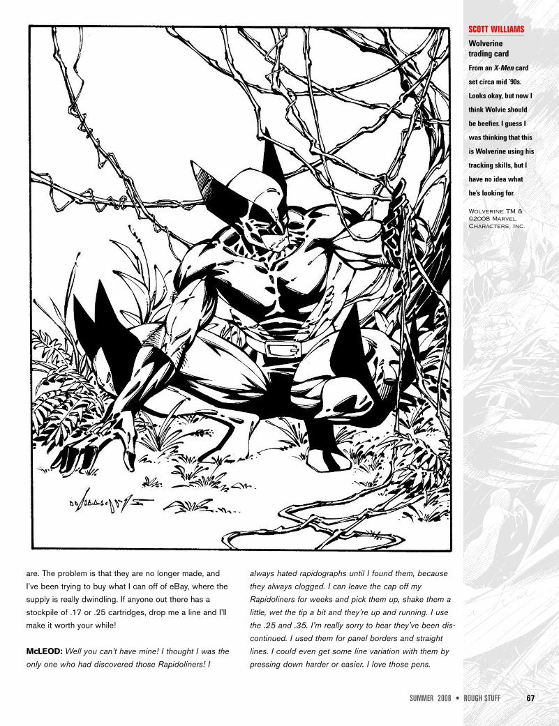
are. The problem is that they are no longer made, andI’ve been trying to buy what I can off of eBay, where thesupply is really dwindling. If anyone out there has astockpile of .17 or .25 cartridges, drop me a line and I’llmake it worth your while!
McLEOD: Well you can’t have mine! I thought I was theonly one who had discovered those Rapidoliners! I
always hated rapidographs until I found them, becausethey always clogged. I can leave the cap off myRapidoliners for weeks and pick them up, shake them alittle, wet the tip a bit and they’re up and running. I usethe .25 and .35. I’m really sorry to hear they’ve been dis-continued. I used them for panel borders and straightlines. I could even get some line variation with them bypressing down harder or easier. I love those pens.
SCOTT WILLIAMSWolverine trading card
From an X-Men card
set circa mid ’90s.
Looks okay, but now I
think Wolvie should
be beefier. I guess I
was thinking that this
is Wolverine using his
tracking skills, but I
have no idea what
he’s looking for.
Wolverine TM &©2008 MarvelCharacters, Inc.
68 ROUGH STUFF • SUMMER 2008
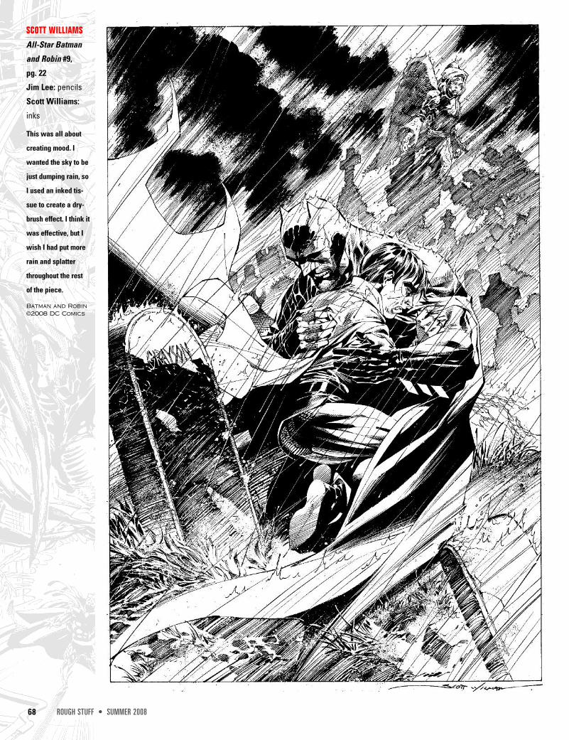
SCOTT WILLIAMSAll-Star Batman
and Robin #9,
pg. 22
Jim Lee: pencils
Scott Williams:
inks
This was all about
creating mood. I
wanted the sky to be
just dumping rain, so
I used an inked tis-
sue to create a dry-
brush effect. I think it
was effective, but I
wish I had put more
rain and splatter
throughout the rest
of the piece.
Batman and Robin©2008 DC Comics
84 ROUGH STUFF • SUMMER 2008
ROUGH CRITIQUE
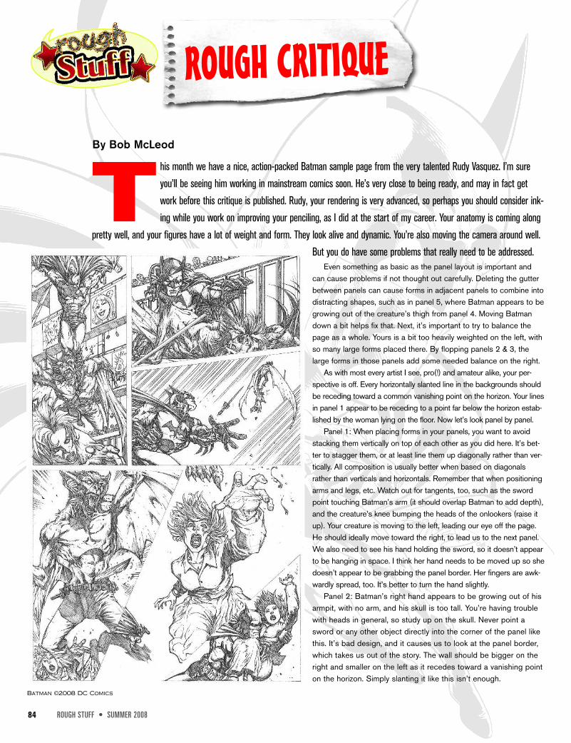
By Bob McLeod
T his month we have a nice, action-packed Batman sample page from the very talented Rudy Vasquez. I’m sureyou’ll be seeing him working in mainstream comics soon. He’s very close to being ready, and may in fact getwork before this critique is published. Rudy, your rendering is very advanced, so perhaps you should consider ink-ing while you work on improving your penciling, as I did at the start of my career. Your anatomy is coming along
pretty well, and your figures have a lot of weight and form. They look alive and dynamic. You’re also moving the camera around well.But you do have some problems that really need to be addressed.
Even something as basic as the panel layout is important andcan cause problems if not thought out carefully. Deleting the gutterbetween panels can cause forms in adjacent panels to combine intodistracting shapes, such as in panel 5, where Batman appears to begrowing out of the creature’s thigh from panel 4. Moving Batmandown a bit helps fix that. Next, it’s important to try to balance thepage as a whole. Yours is a bit too heavily weighted on the left, withso many large forms placed there. By flopping panels 2 & 3, thelarge forms in those panels add some needed balance on the right.
As with most every artist I see, pro(!) and amateur alike, your per-spective is off. Every horizontally slanted line in the backgrounds shouldbe receding toward a common vanishing point on the horizon. Your linesin panel 1 appear to be receding to a point far below the horizon estab-lished by the woman lying on the floor. Now let’s look panel by panel.
Panel 1: When placing forms in your panels, you want to avoidstacking them vertically on top of each other as you did here. It’s bet-ter to stagger them, or at least line them up diagonally rather than ver-tically. All composition is usually better when based on diagonalsrather than verticals and horizontals. Remember that when positioningarms and legs, etc. Watch out for tangents, too, such as the swordpoint touching Batman’s arm (it should overlap Batman to add depth),and the creature’s knee bumping the heads of the onlookers (raise itup). Your creature is moving to the left, leading our eye off the page.He should ideally move toward the right, to lead us to the next panel.We also need to see his hand holding the sword, so it doesn’t appearto be hanging in space. I think her hand needs to be moved up so shedoesn’t appear to be grabbing the panel border. Her fingers are awk-wardly spread, too. It’s better to turn the hand slightly.
Panel 2: Batman’s right hand appears to be growing out of hisarmpit, with no arm, and his skull is too tall. You’re having troublewith heads in general, so study up on the skull. Never point asword or any other object directly into the corner of the panel likethis. It’s bad design, and it causes us to look at the panel border,which takes us out of the story. The wall should be bigger on theright and smaller on the left as it recedes toward a vanishing pointon the horizon. Simply slanting it like this isn’t enough.
Batman ©2008 DC Comics