robinhood mobile user onboarding
TRANSCRIPT


Robinhood get’s right to
the 3 Important CTAs:
• Registration/Login
• Swipe for more info
• Try Demo

Robinhood get’s right to
the 3 Important CTAs:
• Registration/Login
• Swipe for more info
• Try Demo
It’s really clear what they
want you to do…but they
give you options if you’re
not ready to commit yet.

Robinhood get’s right to
the 3 Important CTAs:
• Registration/Login
• Swipe for more info
• Try Demo
It’s really clear what they
want you to do…but they
give you options if you’re
not ready.
I love that they prioritize
by size, color, and
positioning.
…Pretty…

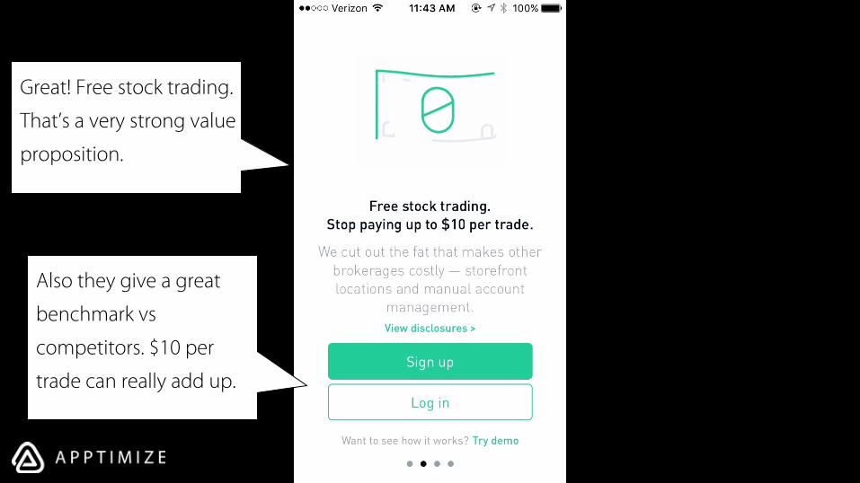
Great! Free stock trading.
That’s a very strong value
proposition.

Great! Free stock trading.
That’s a very strong value
proposition.
Great! Free stock trading.
That’s a very strong value
proposition.
Also they give a great
benchmark vs
competitors. $10 per
trade can really add up.

“How is this possible?!”
Robinhood pre-emptively
answers common user
questions and even throws
in extra disclosures (but
hides them behind a link) Also they give a great
benchmark vs
competitors. $10 per
trade can really add up.
Great! Free stock trading.
That’s a very strong value
proposition.

Great! Free stock trading.
That’s a very strong value
proposition to open with.
“How is this possible?!”
Robinhood pre-emptively
answers common user
questions and even throws
in extra disclosures (but
hides them behind a link)
The 4 dots clearly
indicate that there are
more pages to go
Also they give a great
benchmark vs
competitors. $10 per
trade can really add up.
Great! Free stock trading.
That’s a very strong value
proposition.


What’s the question on
users minds? Security.

What’s the question on
users minds? Security.
I’m loving that the app
addresses all your
concerns as they arise.
They’ve clearly thought
a great deal about their
onboarding.

I’m loving that the app
addresses all your
concerns as they arise.
They’ve clearly thought
a great deal about their
onboarding. Member of an org that
doesn’t mean much to
me, but they do
guarantee protection up
to $500,000!
That works.
What’s the question on
users minds? Security.
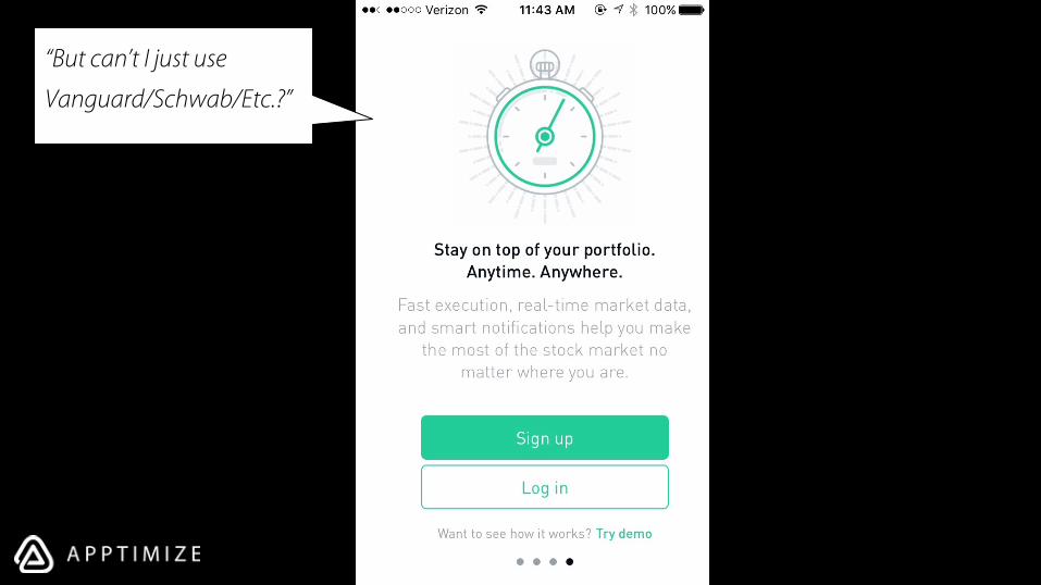
“But can’t I just use
Vanguard/Schwab/Etc.?”

“But can’t I just use
Vanguard/Schwab/Etc.?”
Again, they’re super on
top of user sentiment
and questions

“But can’t I just use
Vanguard/Schwab/Etc.?”
Again, they’re super on
top of user sentiment
and questions
They clearly articulate
their advantage and
stress the importance of
mobile.

Now I’m on the last
page, but what if users
still aren’t ready to sign
up?

Now I’m on the last
page, but what if users
still aren’t ready to sign
up?
They can try the demo!

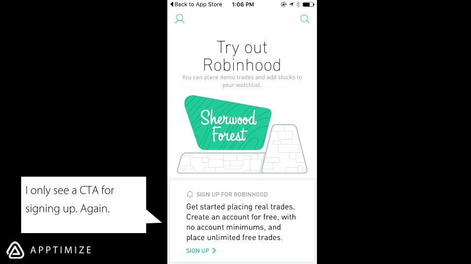
I only see a CTA for
signing up. Again.

This explanation tells me
exactly what I can do…
But how?
I only see a CTA for
signing up. Again.

This explanation tells me
exactly what I can do…
But how?
I only see a CTA for
signing up. Again.
If you look closely, you can
see that this is a card, not
a static page. Not a great
design but…

Pulling the page up
reveals a list.

Pulling the page up
reveals a list.
I would recommend
displaying a card that is
only partially viewable
without scrolling

Like this

Like this

Like this
Or these. Which
imply there’s
more content
below

This card doesn’t give
any visual cues to users’
ability to scroll down

Okay. So now we have a
dashboard. Let’s click on
one of these

This view gives us a lot
of good information at a
glance:
Current price
Trends
Gains/Losses today

This view gives us a lot
of good information at a
glance:
Current price
Trends
Gains/Losses today
Also there’s a very
obvious CTA to
purchase here.

This view gives us a lot
of good information at a
glance:
Current price
Trends
Gains/Losses today
Also there’s a very
obvious CTA to
purchase here.
Let’s click on 3 months
to get a bigger picture
view


The colors change for an
overall downward trend!

The colors change for an
overall downward trend!
Coach marks also
appear to explain a
non-obvious gesture

The colors change for an
overall downward trend!
Coach marks also
appear to explain a
non-obvious gesture
While Robinhood has
generally avoided coach
marks (a good thing),
non-obvious gesture
coaching makes sense

The colors change for an
overall downward trend!
Coach marks also
appear to explain a
non-obvious gesture
The colored dot
indicates where to place
fingers
While Robinhood has
generally avoided coach
marks (a good thing),
non-obvious gesture
coaching makes sense


Dragging your finger
across shows historical
numbers. Imprecise, but
+10 cool points

Scrolling down, we can
see other important
stats and an about
section.

Scrolling down, we can
see other important
stats and an about
section.
Let’s click buy.

A simple UI for
checkout. Very clean
and less confusing than
most companies in the
field.

Once you enter the
number of shares, you’re
prompted to review the
order

Once you enter the
number of shares, you’re
prompted to review the
order
This makes a lot of sense
with mobile, especially
given the clunkiness of
mobile controls.

On this confirmation
page, you can review
the order, but are
critically reminded that
this is a simulated trade.

On this confirmation
page, you can review
the order, but are
critically reminded that
this is a simulated trade.
As silly as it seems, this
reassurance is necessary
to remind them that
they’re not about to
make an accidental
purchase

On this confirmation
page, you can review
the order, but are
critically reminded that
this is a simulated trade.
Rather than utilize
another button to
complete the purchase,
Robinhood helps avoid
accidental presses by
harnessing a swipe
gesture for confirmation.
As silly as it seems, this
reassurance is necessary
to remind them that
they’re not about to
make an accidental
purchase


Lastly, they let you
decide whether to sign
up now, or continue
playing with the service.
