rit-312 python for data science ii
TRANSCRIPT

DATA SCIENCE WITH PYTHON II
Dr Norbert G GyengeResearch IT, IT Services, University of Sheffield
2020


Course Outline:
- Correlation Analysis- Regression Analysis- Error Analysis
Requirements:
- Data Science with Python I

Anaconda Python should be installed on your desktop, please start Spyder.

REGRESSION ANALYSIS
x
y
β
a
• Set of statistical processes for estimating the relationships between two variables.
• The most common form of regression analysis is linear regression.
y = β x+ a
y-interceptslope
• Use the method corr() to find the correlation among the columns in the DataFrame using Pearson method (r).

• Correlations are never lower than -1. A correlation of -1 indicates that the data points in a scatter plot lie exactly on a straight descending line.
• A correlation of 0 means that two variables don't have any linear relation whatsoever. However, some non linear relation may exist between the two variables.
• Correlation coefficients are never higher than 1. A correlation coefficient of 1 means that two variables are perfectly positively linearly related.
y
r < 0
x
yr > 0
y
r = 0

df = pd.read_csv(‘zillow.csv’)
• Tallahassee Housing Prices as reported by Zillow, 20 records: Index, Square footage, beds, baths, zip code, year, list price. There is also an initial header line.
df.corr()
• Use corr() method.
• Investigate the possible combinations.

Space vs Baths (r = 0.81) Space vs Beds (r = 0.79) Space vs Zip (r = 0.33)
Index Space Beds Baths Zip Year PriceIndex 1.000000 0.071324 -0.049520 -0.009392 -0.468281 0.161067 0.043812Space 0.071324 1.000000 0.798973 0.81585 0.333485 -0.030235 0.820899Beds -0.049520 0.798973 1.000000 0.720907 0.430314 -0.115121 0.588464Baths -0.009392 0.81585 0.720907 1.000000 0.385997 0.062906 0.696853Zip -0.468281 0.333485 0.430314 0.385997 1.000000 -0.018947 0.444229Year 0.161067 -0.030235 -0.115121 0.062906 -0.018947 1.000000 0.200663Price 0.043812 0.820899 0.588464 0.696853 0.444229 0.200663 1.000000

Read the file, named ‘zillow.csv’ with pandas DataFrame. Investigate the correlation matrix and find the strongest correlation. Plot the two variables (use the function plot.scatter()).

import pandas as pd
# Read the databasedf = pd.read_csv(‘zillow.csv’)
# strongest cor: space and pricedf.corr()
# plottingdf.plot.scatter(‘Space', ‘Price’)

POLYNOMIAL REGRESSIONRegression analysis can be performed by fitting an m-order polynomial to the data This is method also suitable for fitting linear regression with m = 1.
y = β0 + β1 t+ β2 t2+ … + βm tm+ ɛ
Linear trend y = β0 + β1 t+ ɛ
Quadratic model: y = β0 + β1 t + β2 t2+ ɛ
x
y
x
y
There must be a reason for fitting a trend line (e.g. emphasise known underlying theory).
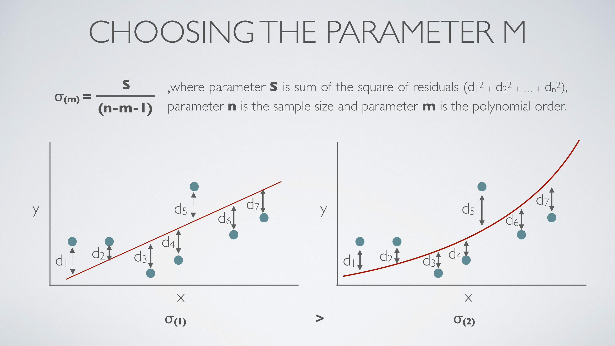
,where parameter S is sum of the square of residuals (d12 + d22 + … + dn2), parameter n is the sample size and parameter m is the polynomial order.
CHOOSING THE PARAMETER MS
(n-m-1)σ(m) =
x
y
d1d2 d3
d4
d5 d6d7
x
y
d1 d2 d3d4
d5 d6
d7
σ(1) > σ(2)

• Change the polynomial order and perform the same calculation.• Plot parameter σ vs m and locate the minimum or when there is no significant decrease in
its value as the degree of polynomial is increased.
Over-fitting
Und
er-fi
tting
Optimal range

df = pd.read_csv(‘zillow.csv’)x = df[‘Space’]y = df[‘Price’]
• We are using Pandas, numpy (for performing regression) and Matplotlib (for plotting).
import pandas as pdimport numpy as npimport matplotlib.pyplot as plt
• Reading the database and defining variables x and y for fitting.
m = 1coefficients = np.polyfit(x, y, m)y_fit = np.poly1d(coefficients)
• Perform a polynomial fit between x and y.
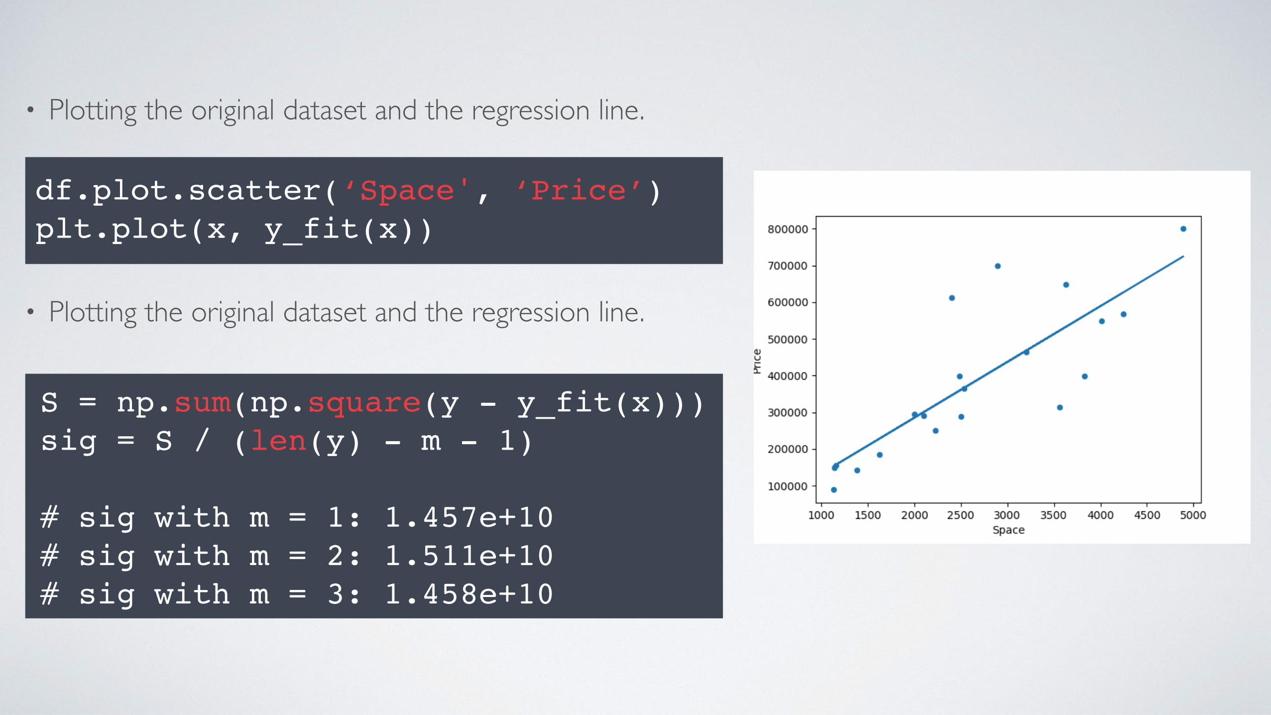
• Plotting the original dataset and the regression line.
df.plot.scatter(‘Space', ‘Price’)plt.plot(x, y_fit(x))
• Plotting the original dataset and the regression line.
S = np.sum(np.square(y - y_fit(x)))sig = S / (len(y) - m - 1)
# sig with m = 1: 1.457e+10# sig with m = 2: 1.511e+10# sig with m = 3: 1.458e+10

Read the file, named ‘SN_d_tot_V2.0.csv’ with pandas DataFrame. The data is separated by semicolons. You are investigating the correlation between variable ‘time’ and ‘SSN’. Perform a polynomial regression (try to change parameter m if the fitting is not perfect) and plot the data!

import pandas as pdimport numpy as npimport matplotlib.pyplot as plt
# Read the database and define x and ydf = pd.read_table(‘SSN.csv’, sep=‘;’)x = df[‘time’]y = df[‘SSN’]
coefficients = np.polyfit(x, y, 5)y_fit = np.poly1d(coefficients)
# Plot the outputdf.plot.scatter(‘time', ‘SSN’)plt.plot(x, y_fit(x), color=‘red’)
# Use this if no outputplt.show()

STANDARD STATISTICAL DISTRIBUTIONS
• Normal distribution • Poisson distribution

ERROR ANALYSIS
x
y
x
N
• Error Analysis provides functions and techniques to ease the calculations required by propagation of errors.
• Common sources of error include instrumental, environmental, procedural, and human.
• In natural science, errors are common and should be published when discussing the results.

• Assume that you are to provide a database, containing a the outside temperature every day
Sunday PressureAttempt #1
11.507E+01
Attempt #21
1.449E+01Attempt #3
11.469E+01
Attempt #41
1.467E+01Attempt #5
11.467E+01
Attempt #61
1.446E+01Attempt #7
11.507E+01
Attempt #81
1.449E+01Attempt #9
11.469E+01
Attempt #102
1.467E+01Attempt #11 1.467E+01Attempt #12
11.446E+01
THE STANDARD DEVIATION
Real Temperature
14.714 15.5
Prob
abilit
y
Significant error Significant error
• You are likely going to read the correct temperature but occasionally your measurement is far from the real value.

Friday Pressure0 am 102 am 114 am 136 am 168 am 1910 am 2312 pm 2614 pm 2716 pm 2618 pm 2120 pm 1622 pm 12
• Assume that you are to provide a database, containing a the outside temperature every day.
• We can calculate the average and the standard deviation of the measure temperatures every day.
Saturday Pressure0 am 102 am 114 am 136 am 168 am 1910 am 2312 pm 2614 pm 2716 pm 2618 pm 2120 pm 1622 pm 12
Sunday PressureAttempt #1
11.507E+01
Attempt #21
1.449E+01Attempt #3
11.469E+01
Attempt #41
1.467E+01Attempt #5
11.467E+01
Attempt #61
1.446E+01Attempt #7
11.507E+01
Attempt #81
1.449E+01Attempt #9
11.469E+01
Attempt #102
1.467E+01Attempt #11 1.467E+01Attempt #12
11.446E+01
import numpy as npdata =np.array([15.07, 14.96, 14.49, 14.07, 14.69, 14.38, 14.67, 14.88, 14.67, 14.47, 14.46, 14.69])
mean_sunday = data.mean()std_sunday = data.std()
μ
σ-σ
68 % of data is between -σ and σ!

Saturday
y μσ
-σμσ
-σ
• Every observation data and its error bar are going to represent a normal distribution.
• Large error bars mean higher standard deviation, i.e flatter normal distribution.
• Small error bars mean lower standard deviation, i.e taller normal distribution.
plt.errorbar(x = x_array, y = mean_array, yerr = std_array)
Sunday
y_array = []y_array.append(std_saturday)y_array.append(std_sunday)
std_array = []std_array.append(mean_saturday)std_array.append(mean_sunday)
Read the file, named ‘’weak_temp.csv”. The database contains the outside temperature every hour in a weak period. Create an error bar plot!
1) You can calculate the daily average and standard deviation by using the in-built methods of Pandas DataFrame (df.mean() and df.std() assuming that your DataFrame is named df).
2) You can create the labels for x-axis by using the df.keys() method.
3) Use the errorbar function by Matplotlib.

import pandas as pdimport numpy as npimport matplotlib.pyplot as plt
# Read the databasedf = pd.read_csv(‘week_temp.csv’)
# Calculate std and meanx = df.keys()y = df.mean()yerr = df.std()
# Generate error bar plotplt.errorbar(x, y, yerr = yerr)

BOTH VARIABLES ARE SUBJECT TO ERROR
multilinear regression

UNCERTAINTY PROPAGATION• The principal of upper-lower bound method is to use the uncertainty ranges of
each variable to calculate the maximum and minimum values of the function.
“Best case” result“Worst case” result
Uncertain Variable Function
• Calculating the area of a circle if the radius (R) is 2 ± 0.1 cm.
Rmin = 1.9 cmRmax = 2.1 cm
Amin = 11.34 cm2
Amax = 13.85 cm2A =
Amin + Amax
2 ± | Amin - Amax |2
Value Error
= 12.59 ± 1.25 cm2} }

RESAMPLING HISTOGRAM
• Investigate the weight distribution for 200 individuals.
import pandas as pddf = pd.read_csv(‘hw_200.csv’)df.hist(‘Weight’)
• How can you add error bars to these histograms?
• The database contains only one measurement for each individuals.
• We are going to artificially generate data to simulate the error of our statistics.

Resampling: Create a new dataset, containing n items randomly sampled from the original height and weight data samples. Repeat the process over and over again.
3, 4, 5, 6, 2, 5, 6, 5, 0, 3, 4, 5, 6, 1, 0, 3
1) Original dataset
6, 0, 5, 2, 3, 5, 6, 1, 3, 3, 4, 3, 6, 1, 2, 1
2) Draw a number from the original dataset.
6
3) Append the resampled dataset with the number and put it back to the original dataset!
4) Repeat steps 1-3.

resampled = df.sample(n=200, replace=True)resampled.hist()
Original Resampled
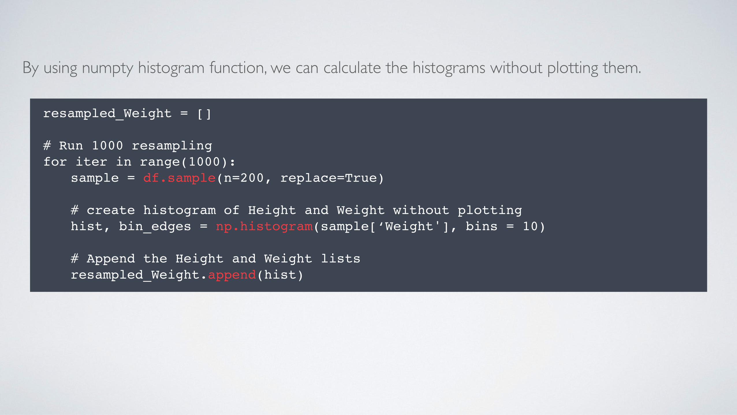
resampled_Weight = []
# Run 1000 resamplingfor iter in range(1000):
sample = df.sample(n=200, replace=True)
# create histogram of Height and Weight without plottinghist, bin_edges = np.histogram(sample[‘Weight'], bins = 10)
# Append the Height and Weight listsresampled_Weight.append(hist)
By using numpty histogram function, we can calculate the histograms without plotting them.

We have a matrix now where the columns are the bins and the rows are the simulations.
array([ 8, 9, 31, 35, 45, 27, 30, 11, 0, 4]),array([11, 13, 21, 27, 62, 29, 24, 9, 1, 3]),array([10, 19, 31, 31, 52, 22, 19, 13, 1, 2])
μ1
σ1
μ2
σ2
μ3
σ3
μ4
σ4
μ5
σ5
μ6
σ6
μ7
σ7
μ8
σ8
μ9
σ9
μ10
σ10
Calculate μn and σn for each bins.
# Convert the list to numpty array resampled_Weight = np.array(resampled_Weight)
# Weight distributionr_mean = resampled_Weight.mean(axis=0)r_std = resampled_Weight.std(axis=0)

Plot the histogram with error bars.
# Create bar plotsplt.errorbar(bin_edges[:-1], r_mean, r_std)
# Use this function if no outputplt.show()

Investigate the distribution of pizza delivery times (filename: pizza.csv)! Resample the histogram 1000 times and create an error bar plot! The database contains 5000 delivery information. Each pizza costs GBP 5, however the pizza is free if the delivery takes more than 40 minutes. What is the expectable net income of the company based on this statistics?

import pandas as pdimport numpy as npimport matplotlib.pyplot as plt
# Read the database and define x and ydf = pd.read_csv(‘pizza.csv’)
delivery = []
# Run 1000 resamplingfor iter in range(1000):
sample = df.sample(n=5000, replace=True)
# create histogram of Height and Weight without plottinghist, bin_edges = np.histogram(sample[‘time'], bins = 10)
# Append resampled listdelivery.append(hist)
delivery = np.array(delivery)
# STD and mean distributiondelivery_mean = delivery.mean(axis=0)delivery_std = delivery.std(axis=0)
plt.errorbar(bin_edges[:-1], delivery_mean, yerr = delivery_std)
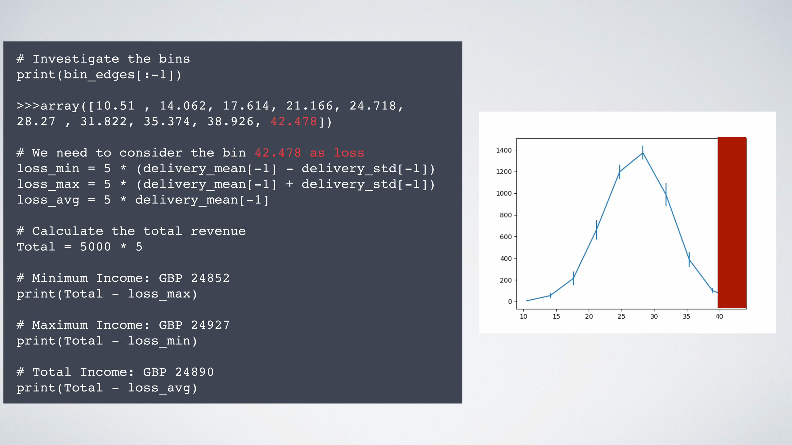
# Investigate the binsprint(bin_edges[:-1])
>>>array([10.51 , 14.062, 17.614, 21.166, 24.718, 28.27 , 31.822, 35.374, 38.926, 42.478])
# We need to consider the bin 42.478 as lossloss_min = 5 * (delivery_mean[-1] - delivery_std[-1])loss_max = 5 * (delivery_mean[-1] + delivery_std[-1])loss_avg = 5 * delivery_mean[-1]
# Calculate the total revenueTotal = 5000 * 5
# Minimum Income: GBP 24852print(Total - loss_max)
# Maximum Income: GBP 24927print(Total - loss_min)
# Total Income: GBP 24890print(Total - loss_avg)