rhetoric of global warming: multimodal arguments … of global warming: multimodal ... public...
TRANSCRIPT

1
Rhetoric of Global Warming: Multimodal Arguments in Public and Scientific Contexts
A Major Qualifying Project Report:
Submitted to the Faculty of
WORCESTER POLYTECHNIC INSTITUTE
In partial fulfillment of the requirements for the
Degree of Bachelor of Science
by
___________________________ Eric Andresen
Submitted on: April 28, 2009
Approved:
___________________________ ___________________________ Professor Lorraine Higgins Professor Chrysanthe Demetry
This report represents the work of one or more WPI undergraduate students submitted to the faculty as evidence
of completion of a degree requirement. WPI routinely published these reports on its web site without editorial or
peer review.
2
Abstract
Public opinion about scientific issues guides behavior and policy decisions with local and global
ramifications. This report analyzes techniques for communicating about scientific issues used in visual
media aimed at two distinct audiences, scientific communities and the public. It compares their
practices in samples from the current issue of global warming, using an article from the journal Nature as an
example of scientific communication and the popular documentary An Inconvenient Truth as an example of public
argumentation.
3
Acknowledgements
I would like to thank Professors Chrysanthe Demetry and Lorraine Higgins for their helpful and
timely advice throughout this project. Their support has been crucial to its success. I would also like to
thank those who attended my presentation of this project. I greatly appreciate their interest in my
findings.
4
Table of Contents
Abstract................................................................................................................................................... 2
Acknowledgements ................................................................................................................................. 3
List of Tables ........................................................................................................................................... 7
List of Figures .......................................................................................................................................... 8
Introduction ............................................................................................................................................ 9
Background ........................................................................................................................................... 12
Communicating Science to Public Audiences ..................................................................................... 12
Global Climate Change....................................................................................................................... 13
Overview of Subjects for Analysis ...................................................................................................... 15
“Fingerprints of global warming on wild animals and plants” ......................................................... 15
An Inconvenient Truth .................................................................................................................... 16
Responses to An Inconvenient Truth .............................................................................................. 17
Visuals as Communication Tools ........................................................................................................ 19
Methodology ......................................................................................................................................... 20
Documenting Claims and Evidence .................................................................................................... 20
Argument Composition .................................................................................................................. 20
Argument Strategies ...................................................................................................................... 21
Types of Claims .............................................................................................................................. 23
Determining Visuals’ Roles and Purposes ........................................................................................... 24
5
Form .............................................................................................................................................. 25
Rhetorical Appeals ......................................................................................................................... 25
Identifying Qualification and Elaboration ........................................................................................... 27
Qualifying and Rebutting ............................................................................................................... 27
Supporting Arguments Visually ...................................................................................................... 28
Verbal Explanations ....................................................................................................................... 30
Logical Fallacies ............................................................................................................................. 31
Summary ........................................................................................................................................... 32
Results and Analysis .............................................................................................................................. 33
What arguments are being made in each of the subjects? ................................................................. 33
Key Claims and Their Purposes ....................................................................................................... 34
How are the arguments supported by visual content? ....................................................................... 35
Rhetorical Appeals ......................................................................................................................... 40
Purposes for Visuals ....................................................................................................................... 41
Argument Strategies ...................................................................................................................... 44
How is visual evidence elaborated and qualified? .............................................................................. 46
Verbal Explanations ....................................................................................................................... 47
Rebuttals and Qualifiers ................................................................................................................. 47
How do the genres of public advocacy and scientific argument compare? ......................................... 50
Conclusion............................................................................................................................................. 51
6
References ............................................................................................................................................ 55
Appendix A: Lists of Visual Content ........................................................................................................ 57
Appendix B: Classifications of Visual Content ......................................................................................... 59

7
List of Tables
Table 1 Fulkerson’s six strategies of argument in Toulmin’s terms of warrant, data and claim ............... 22
Table 2 I will use certain aspects of my findings to answer specific research questions. ......................... 32
8
List of Figures
Figure 1 An example of how correlation may falsely imply causality ...................................................... 28
Figure 2 A stacked bar chart of species displaying behavioral change in the Nature article .................... 36
Figure 3 Gore using graphs to argue a causal relationship ...................................................................... 37
Figure 4 Gore argues that receding glaciers signify a global warming trend............................................ 37
Figure 5 Types of visuals used in An Inconvenient Truth ......................................................................... 38
Figure 6 Vice President Gore greeting a crowd of supporters ................................................................. 39
Figure 7 Quantity of visuals supporting each argument in An Inconvenient Truth ................................... 39
Figure 8 Quantity of visuals employing each visual appeal in the film and journal .................................. 41
Figure 9 A numerical table summarizing the article’s quantitative evidence........................................... 42
Figure 10 A visuals used to teach the basic concepts of global warming in An Inconvenient Truth .......... 43
Figure 11 Charts conveying ethos by showing that the rhetors’ mastery of the information................... 44
Figure 12 Statistical methods like standard error tails used as qualification in the journal ...................... 48
Figure 13 Summary of the domains of scientific and public arguments .................................................. 51
Figure 14 List of visual content in the Nature article .............................................................................. 57
Figure 15 List of visual content in An Inconvenient Truth........................................................................ 58
Figure 16 Classifications of visual content in the Nature article .............................................................. 59
Figure 17 Classifications of visual content in An Inconvenient Truth ....................................................... 61
9
Introduction
Knowledge derived from scientific sources guides public action, facilitating societal changes like
inhibiting the spread of diseases based on new medical knowledge or increasing work productivity
based a technological advance. To motivate the public to adopt such behavioral changes, public
advocates must translate findings from the scientific communities where they originate to the general
public where they can be acted upon. Researchers rarely communicate directly with the public, leaving
public advocates with the task of identifying important findings and communicating their content and
relevance to lay audiences.
Media aimed at influencing public discourse are primarily multimodal: television and the
internet combine visual and auditory signs while even traditional books and newspapers combine
writing with images, graphs and diagrams. Media communicating scientific issues to the public often
rely on visuals. Visual explanations increase the accessibility of technical concepts to unfamiliar
audiences by fulfilling the communicator’s chief objective, highlighting trends and parallels to more
familiar concepts and developing a link to existing values. Communicators clarify this association by
varying their modes of persuasion, employing data-driven visuals alongside purely emotive ones. While
these practices can help audiences grasp the data being presented and can persuade them to care, they
may also obscure or oversimplify the original data, creating potentially misleading impressions about
their content. Despite visuals’ prominent role in public argumentation about science, their potential to
manipulate audiences makes their use controversial and demands closer investigation.
Global climate change is one recent issue that demands public discourse. Public concern about
the issue has been increasing since the middle of the 20th century, when scientists began to observe its
effects. As media aimed at public audiences intensified their focus on the phenomenon in recent
10
decades, coverage of the topic divided into two primary competing parties: one argues that the
scientific consensus on the causes and effects of global climate change warrants preventive action, while
a second argues not only that such a consensus does not exist, but also that proposed actions are
unnecessary and potentially harmful. No single multimedia argument has polarized the public debate
on this topic as much as Al Gore’s 2006 documentary, An Inconvenient Truth, a presentation of verbal
arguments supported by an array of visual evidence. The film employs not only video footage of Gore
and his subject matter, but also the graphs, animations, maps and other material that he has gathered
as evidence of his claims. Ranked fourth in the list of highest-grossing documentaries in American
history, Gore’s film thrust the demand for action into public view, prompting myriad attempts by
opposing stakeholders to address and discredit his arguments. While none of these responses reached
the level of influence of Gore’s film, the criticisms are interesting and warrant further attention. How do
and should visuals work in public arguments about science?
In this report, I will analyze the argumentative and visual content of Gore’s An Inconvenient
Truth and compare it to the use of argument and visuals in an example of scientific communication
about the issue. This analysis seeks to reveal some of the primary differences between the two genres,
public advocacy about scientific issues and communication about research findings within the scientific
community. I intend to compare the types of visuals employed and the rhetorical role played by visuals
in arguments in the two genres. Specifically, I address these questions:
What arguments are being made? What are the primary claims and type of evidence used?
How are the arguments supported by visual content? What roles do visuals play in the
arguments?
To what degree is visual evidence elaborated? Is it qualified? Are alternatives considered? Does
verbal content further describe, explain or source evidence in visuals?

11
What do these differences suggest about the genre of public advocacy about science and how it
differs from scientific argument itself?
After analyzing the role of visuals in both the documentary and the scientific article, I will explore the
implications of these two genres’ differences on their methods of communication. I intend for this
analysis to improve understanding of how public arguments are composed by revealing the strategies
employed in a prominent example. I will highlight the strategies unique to public argument by
contrasting it with those used in a scientific argument with a similar purpose.

12
Background
This section introduces the media I will analyze and the context in which that analysis takes
place. The public bases important decisions on the scientific knowledge that it receives through sources
intended to translate that information to the public, and global warming exemplifies an issue about
which the public must make these decisions. The documentary I have selected stands at the forefront of
public discourse about global climate change, a controversial topic that exemplifies the communication
between advocates about science and public audiences.
Communicating Science to Public Audiences
In their paper, “Why Should We Promote the Public Understanding of Science?”, Geoffrey
Thomas and John Durant (1987) offer a definition of science they deem appropriate for the context of
public understanding: “scientific knowledge is knowledge that is produced by and in some sense bears
the seal of approval of the scientific community” (p. 5). They further define the scientific community as
the accepted group of individuals that produce new knowledge. The public can be therefore
distinguished from the scientific community by its initial ignorance of this new knowledge. The
knowledge must be communicated from the scientific community to the public.
Understanding of science by the public is almost universally accepted as positive and often as
necessary in some way. Thomas and Durant classify the reasons for fostering a public understanding of
science into nine categories, ranging from benefits to national strength to benefits to the individual
intellect. Among these reasons is the benefit to democratic government, which they explain as the
“*promotion of+ more effective decision making” (p. 5). They argue that understanding of the scientific
aspects of an issue contributes to the formation of a more informed viewpoint overall, a sign of good
decision-making.
13
In their book, Science in Public, Jane Gregory and Steve Miller (1998) introduce instances that
extend the need for a scientifically informed public from a factor in an informed view to the key factor in
the decision-making process. Because scientific research is typically funded by federal grants, the
question of how well-funded these pursuits become is at least indirectly decided by the voting public.
Gregory and Miller offer the example of how in 1996, NASA’s funding for planned missions to Mars was
in jeopardy until it cultivated public interest in its work by releasing reports about the possibility that the
planet once sustained some form of life, attracting public support for further research and attaching
itself to presidential candidate Bill Clinton’s election campaign. After the president was elected, the
space agency received funding for its missions. In this case, the question answered by public
understanding was whether demand for information from Mars warranted funding for NASA’s missions.
More frequently, however, the public must employ its understanding of science in problems
with outcomes whose direct effects extend beyond the scientific community. When facing a decision
such as choosing to elect a ban on public smoking, the voting public must rely on scientists’ assessment
of all aspects of the situation, from the dangers of passive smoking to the economic impacts on bars and
restaurants. Nearly all evidence used in such a decision originates in the scientific community, and in
turn, this information is often filtered through some secondary source, such as a newspaper reporter.
Global Climate Change
Perhaps the most significant ongoing issue requiring communication from scientific
communities to public audiences is that of global climate change. Scientists have reported rising global
average temperatures since the mid-twentieth century, but reports have presented controversy within
the scientific community regarding the causes and implications of this warming trend. Because many
reports cite human activity among the causes and dire implications such as extreme weather, rising sea
levels and extinction of species, governments and individuals have begun to act.
14
Global climate change refers to the current warming trends in global surface temperature and
that of the lower atmosphere. Scientists have observed these increases over the last century and have
found them accelerating in recent years: the eight warmest years recorded since 1850 have occurred in
the last ten. Despite the strong overall trend in climate, its effects are quite varied and difficult to
predict. Scientists anticipate more extreme weather events, though these may not always take the form
of record-high temperatures (Schlein, 2009, p. 1). Increases in precipitation and the severity of storms
may also occur.
Most scientists attribute the current trends in global climate change to the buildup of gases like
carbon dioxide in the atmosphere. Known as greenhouse gases, they impede the escape of heat from
the planet. Human industrial activity such as burning fossil fuels and deforestation contribute to the
buildup, explaining the warming trend’s increase alongside that of human industrialization.
In 1988, the United Nations Environmental Program and the World Meteorological Association
created the Intergovernmental Panel on Climate Change (IPCC), an association of scientists whose goal
was to objectively review and report the findings of the international scientific community to
policymakers, students and experts (Intergovernmental Panel on Climate Change, 2007, p. 5). While the
body conducts no research of its own, it advocates policy decisions such as the acceptance of the Kyoto
Protocol, an agreement among industrialized nations to reduce their output of greenhouse gases. Its
ratification by over 180 countries (UNFCCC, 2006, p. 1) indicates the panel’s widespread acceptance in
the international community. Nevertheless, the United States does not intend to ratify on the grounds
that its lack of targets for developing nations would cause disproportionate harm to the US economy.
Despite widespread scientific acceptance of IPCC reports, dissenting opinions exist and are
frequently cited in media about global climate change (Corbett & Durfee, 2004, p. 132). These may
15
challenge popular opinions about the efficacy of proposed action such as the Kyoto Protocol, the
connections between human activity and climate change, the causes of the phenomenon or its effects.
Overview of Subjects for Analysis
This section introduces the two subjects of analysis, a popular documentary about global
warming and a scientific article explaining findings on the influence of global warming on animal and
plant activity. This includes brief overviews of their content, information about the film’s creator and
reception and information about the journal in which the article appeared. While these samples may
not represent the methods of all content in their respective genres, I selected them on the basis of their
influence on their intended audiences.
“Fingerprints of global warming on wild animals and plants”
As researchers present evidence of a growing trend of global warming, other researchers have
turned the focus of their studies on its effects. One such study is documented in the article
“Fingerprints of global warming on wild animals and plants,” published in the January 2, 2003 issue of
the scientific journal Nature. Researchers from the Center for Environmental Science and Policy, the
American Bird Conservancy, the Department of Fisheries and Wildlife, the National Aeronautics and
Space Administration and other institutions composed the authoring team. Described as a meta-
analysis, the research overviews findings of 143 localized studies in order to study the effects of rising
temperatures on global animal and plant activity. By documenting that roughly 80 percent of changing
species have made a shift in the direction predicted for global warming scenarios, the authors assert
that “there has probably been a discernable impact of recent global warming on animals and plants”
(Root, Price, Hall, Schneider, Rosenzweig, & Pounds, 2003, p. 1). They go on to warn of more significant
ecological impact as warming trends continue.
16
Nature is an international scientific journal that publishes peer-reviewed research with
interdisciplinary relevance. First issued in 1869, the publication is now the “world's most highly cited
interdisciplinary science journal,” according to the 2007 Journal Citation Report Science Edition
(Thomson Reuters, 2008). It aims to report significant advances in science and technology and to the
larger scientific community and the public, but its audience is composed chiefly of research scientists.
I selected an article from this publication because of its influence on the scientific community as
evidenced by its level of citation, as well as its intended purpose of informing its audience of relevant
scientific advances. If this is the content that the scientific community deems relevant to public
understanding of science, it will typify the information sources filtered by public advocates as they
inform the public through popular media. Additionally, its method of employing visuals is typical of
content of its type; while the article contains supplementary visual content, the verbal arguments are
sufficiently developed to stand alone.
An Inconvenient Truth
Public concern about global warming saw a moderate rise in 2006 (Nisbet & Myers, 2007, p.
444) coinciding with the release of Al Gore’s hit documentary, An Inconvenient Truth. Drawing on Gore’s
status as a public figure established in his 1993-2001 run as Vice President of the United States and loss
in the historically close 2000 presidential race, the documentary follows as he presents a slideshow that
argues that the global warming in recent decades has been caused by human activity and will have
devastating effects on human populations and the environment unless governments and individuals
take action to reverse the changes. He also reflects on the importance of maintaining the environment
for future generations. The film won an Academy Award for best documentary feature in 2006, and the
New York Times listed the accompanying book, whose content followed the movie closely, as the
number one bestseller for the week of July 2 of that year. The enormous success of the film indicates
17
the level to which the public has been exposed to its arguments. I selected it as a sample of public
argument because it is perhaps the most successful exposure of a scientific issue to public audiences in
recent history, and its content remains relevant to an ongoing series of policy decisions regarding that
issue.
Responses to An Inconvenient Truth
Despite the strong positive reception, the documentary also prompted significant criticism. To
those viewing the issue as a political one, a perception that reports of contrary opinions has helped
foster, Gore’s work suffers from severe partisan bias. This criticism was the subject of a British legal
case brought by school governor Stewart Dimmock, who objected to plans to show the film in schools,
citing both one-sidedness and scientific inaccuracy. A high court judge ruled that both charges held
merit, and that while the film could still be shown in schools, it should be accompanied by a disclaimer
about it shortcomings. Among the nine significant inaccuracies the court cited were Gore’s attribution
of the melting of Kilimanjaro’s snow, hurricane Katrina and the bleaching of coral reefs to global
warming. The court ruled that while Gore’s was “broadly accurate,” evidence for these and other claims
was insufficient (Adam, 2007, p. 1). This general acceptance despite minor scientific inaccuracies or
exaggerations typifies the film’s reception among those who accept the common scientific consensus
about climate change.
The undeniable popularity of Gore's work prompted advocates for dissenting viewpoints about
global climate change to launch myriad counterattacks. These ranged from innumerable weblogs and
weblog posts to more formal, point-by-point attacks on Gore's content. In one such paper, entitled "Al
Gore's Science Fiction: A Skeptic's guide to An Inconvenient Truth," environmental policy advocate
Marlo Lewis (2007) argues that "nearly every significant statement Gore makes regarding climate
science and climate policy is either one sided, misleading, exaggerated, speculative, or wrong" (p. 3),
18
outlining evidence with specific examples from Gore's work and citing opposing research. While the
paper is displayed and discussed on numerous websites and is the basis for a slide presentation that
aired on C-Span and an upcoming book, it and other responders to Gore's film have never reached the
level of popularity that An Inconvenient Truth has enjoyed.
Other media questioning Gore’s conclusions have taken a more similar form to that of Gore's
film, such as director Martin Durkin's The Great Global Warming Swindle, a British television
documentary. Without discussing Gore as specifically as Lewis, Durkin questions the overall conclusion
that human action has caused the current global warming trend. In addition to disputing some of the
evidence for this connection presented by groups like the IPCC, he also alleges that these groups
discourage dissenting views. He also interviews scientists with alternative hypotheses about the causes
and effects of global warming, as well as those arguing that proposed actions to curb emissions are not
only unnecessary but harmful.
While the documentary has never approached the level of critical acclaim of Gore’s work, those
disputing mainstream views about climate change hail Durkin's work as a fitting counterpoint to An
Inconvenient Truth. Advocates have offered copies to the British school system as a response to Gore’s
already circulating film (Leake, 2007, p. 1).
Like Gore's film, the release of this documentary prompted allegations of misinformation by
those with opposing views. The film faced numerous scientific objections, even from the scientists
featured on the program. Carl Wunsch, an oceanographer featured in Durkin’s original release, alleged
that the director “set out to imply, through the way he uses me in the film, the reverse of what I was
trying to say” (Wunsch, 2007). In response to these and other complaints, many networks have aired
edited versions, some omitting Wunsch’s appearance. Others respond to broader complaints by
19
including disclaimers that some of the content may be controversial or inaccurate. Originally shown on
British Channel Four, it has subsequently aired in Germany, Hong Kong, New Zealand and Australia.
Visuals as Communication Tools
Much of the communication between scientists or science reporters and the public is
multimodal; that is, the ideas are communicated through not only verbal means, but also through some
additional mode of communication, such as visuals (Kress & van Leeuwen, 2001, p. 24). This multimodal
communication occurs wherever text is accompanied by graphics, including journals, newspapers,
television and film. While the scientific illustration and other visuals accompanying scientific writing
may communicate similar ideas, each has the capacity for independent communication. Scott
Montgomery (200) states of visuals in The Chicago Guide to Communicating Science, “they don't just
restate the data or reduce the need for prose, but offer a kind of separate "text" for reading and
interpretation” (p. 113). What he calls their “pictorial rhetoric” is the source of their content. I outline
methods for classifying this content in the following section.
20
Methodology
This section outlines my approach to addressing my research questions. In the context of my
two media samples, a popular documentary aimed at public audiences and an article in an influential
journal aimed at a scientific audience, I will analyze the types of claims and evidence used, the roles and
purposes for visuals used, and the ways in which evidence is elaborated and qualified. Here, I introduce
the terminology and frameworks for classification I will apply to these subjects.
Documenting Claims and Evidence
Before analyzing visuals’ role in public discourse about climate change, I first identified the
arguments made by the participants in that discourse. As defined by Richard Fulkerson in his book,
Teaching the Argument in Writing, “an argument is any set of two or more assertions in which one (or
more) is claimed to offer support for another” (1996, p. 2). To further characterize the assertions within
an argument, he uses a set of definitions for components of an argument established by British
philosopher Stephen Toulmin, which I will use to describe arguments about global climate change.
Argument Composition
Toulmin proposes that an effective argument consists of three main components: claim, data
and warrant. At the center of this model is the claim, an assertion that the arguer wishes the audience
to accept and that the other assertions are provided to support. The primary support for that claim
comes from data, which are additional assertions that would encourage the audience to accept the
claim. To guide the audience from data to claim, the arguer either explicitly offers or implies a warrant,
a general rule that allows data to support a claim. The following statements compose a simple
argument: “That dog has no collar. It has no owner.” In this case, the latter sentence is the claim,
supported by the data in the first sentence. As is the case in some more readily accepted arguments,
21
the warrant is not provided, but rather implied: “Dogs with owners wear collars.” The speaker might
have offered a third sentence to explicitly state this if the audience was likely to need stronger
persuasion or be unfamiliar with the rule stated in this warrant. Regardless of whether it is stated or
unstated, however, the warrant is a necessary part of an argument under the Toulmin model.
Toulmin’s terminology allowed me to classify the components of the arguments made in my
subjects. I first summarized the major claims in the film and article. I then characterized the type of
evidence used for each, to give the reader an overall sense of how each argument was composed.
Finally, I grouped each visual by the claim to which they belonged and the component of that argument
that they constituted, as defined by Toulmin: data, warrant and claim. To compare how each media
sample uses visuals to support its claims, I prepared a bar chart of quantity of visual evidence offered for
each claim, noting the most common types of visuals used and the most common roles they played in
the argument.
Argument Strategies
After identifying the composition of each argument made in my two media samples, I will
sample key pieces of evidence for a closer investigation of how they are linked to claims. Fulkerson
offers six strategies for linking claims to data: argument for a generalization, argument from analogy,
argument from sign, argument from principle, argument from authority and causal argument
(1996). Each type draws upon a different type of warrant to reach the claim from the data, but the
types are frequently used in conjunction with one another. Table 1 explains each strategy and offers
an example:
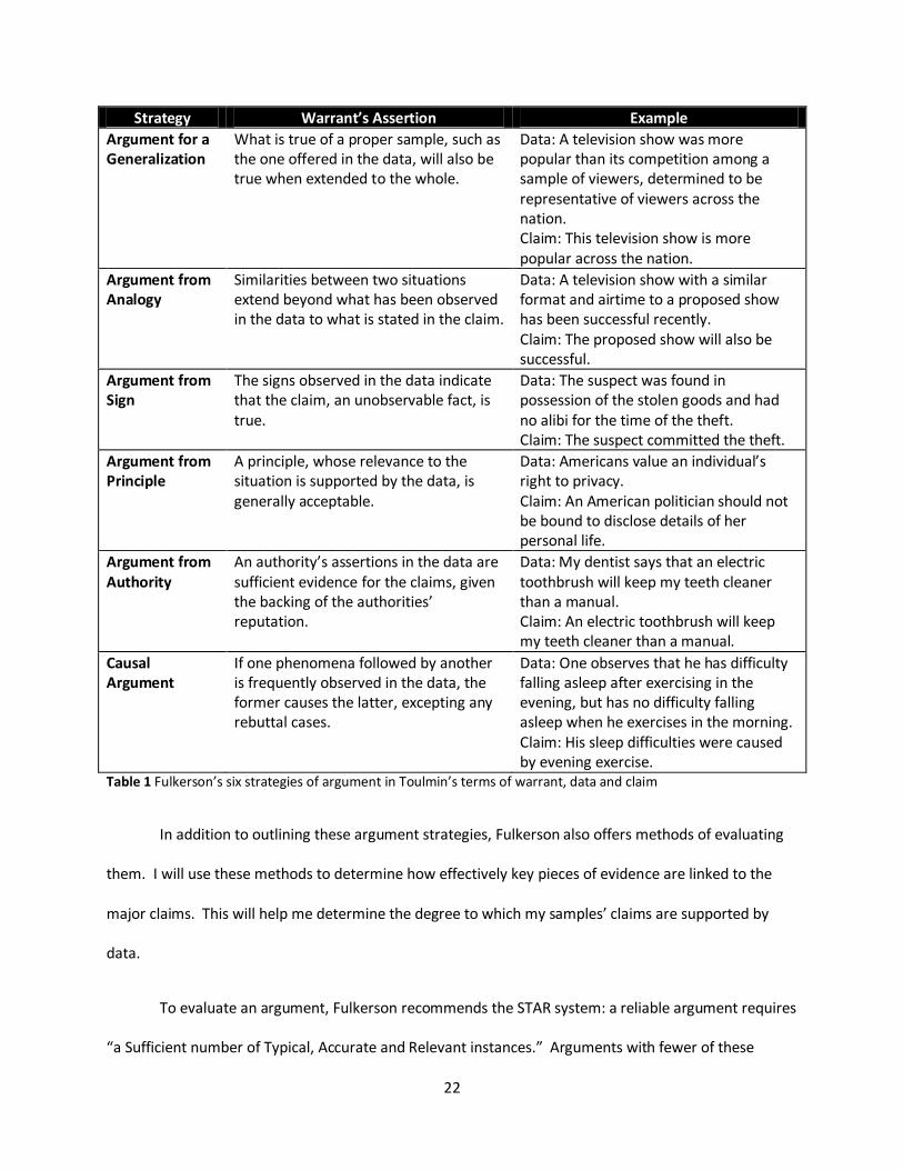
22
Strategy Warrant’s Assertion Example
Argument for a Generalization
What is true of a proper sample, such as the one offered in the data, will also be true when extended to the whole.
Data: A television show was more popular than its competition among a sample of viewers, determined to be representative of viewers across the nation. Claim: This television show is more popular across the nation.
Argument from Analogy
Similarities between two situations extend beyond what has been observed in the data to what is stated in the claim.
Data: A television show with a similar format and airtime to a proposed show has been successful recently. Claim: The proposed show will also be successful.
Argument from Sign
The signs observed in the data indicate that the claim, an unobservable fact, is true.
Data: The suspect was found in possession of the stolen goods and had no alibi for the time of the theft. Claim: The suspect committed the theft.
Argument from Principle
A principle, whose relevance to the situation is supported by the data, is generally acceptable.
Data: Americans value an individual’s right to privacy. Claim: An American politician should not be bound to disclose details of her personal life.
Argument from Authority
An authority’s assertions in the data are sufficient evidence for the claims, given the backing of the authorities’ reputation.
Data: My dentist says that an electric toothbrush will keep my teeth cleaner than a manual. Claim: An electric toothbrush will keep my teeth cleaner than a manual.
Causal Argument
If one phenomena followed by another is frequently observed in the data, the former causes the latter, excepting any rebuttal cases.
Data: One observes that he has difficulty falling asleep after exercising in the evening, but has no difficulty falling asleep when he exercises in the morning. Claim: His sleep difficulties were caused by evening exercise.
Table 1 Fulkerson’s six strategies of argument in Toulmin’s terms of warrant, data and claim
In addition to outlining these argument strategies, Fulkerson also offers methods of evaluating
them. I will use these methods to determine how effectively key pieces of evidence are linked to the
major claims. This will help me determine the degree to which my samples’ claims are supported by
data.
To evaluate an argument, Fulkerson recommends the STAR system: a reliable argument requires
“a Sufficient number of Typical, Accurate and Relevant instances.” Arguments with fewer of these
23
instances require more qualification (Falkerson, 1996, pp. 29-36). Reliable arguments from analogy
require more “relevant similarities” between the things being compared, while relevant dissimilarity
weaken its reliability. Assessing an argument from sign may also require judgment of the strength of the
relationship between the sign and what it is said to indicate. These arguments can be deemed
unreliable by revealing alternate means of producing the sign.
Types of Claims
Fulkerson offers an alternative to classifying arguments based on their strategies: stasis theory,
a method that uses an argument’s claim to identify its purpose. By synthesizing a range of proposed
methods for classifying claims, Fulkerson has developed his own, which I will use to identify the purpose
of each claim presented in my subjects. His categories for claims follow:
Substantiation: These claims make objective assertions. They may offer the definition of a
concept; the answer to a question of fact; or comparison, categorization or causal statements
based on objective criteria. For example, a lawyer might define the legal criteria for an assault,
compare the physical size of the defendant and the claimant, or claim that the claimant’s
injuries resulted from an altercation with the defendant.
Evaluation: These claims make subjective assertions. They may offer judgments about morality,
value, efficacy or desirability. For example, a lawyer may claim that striking someone
significantly smaller is an especially immoral form of assault.
Recommendation: These claims make suggestions for action. They generally offer a proposal for
what should or must be done. For example, a lawyer may argue that the defendant receive the
strictest sentence available.
Fulkerson notes that these types of claims are sequentially progressive. That is, the initial claims
form a foundation on which the later ones rely. Claims of substantiation, once established, allow an
24
arguer to make further claims of evaluation. These claims then support any claims of recommendation.
For example, once a lawyer defines a crime in general terms and then asserts that these criteria were
met in the instance in question. These are claims of substantiation. The lawyer can then make
evaluative assertions based on that substance, such as a claim that the defendant’s actions were
especially immoral. Finally, based on that judgment, the lawyer may make a claim of recommendation,
suggesting that the defendant face the harshest penalty for those immoral, criminal actions. In some
cases, claims of the same type may build upon one another, as the definition of the crime enables the
lawyer in the last example to assert that the criteria were met. Both are claims of substantiation.
I will use these methods of classification to identify and compare the purposes of claims in my
subjects. After identifying the claims, I will label each substantiation, evaluation or recommendation.
From this, I will map how claims build upon one another in sequential progression. After classifying both
the journal article and the film, I will compare the purposes of their claims, and how their claims
interact. I will also compare the quantity of evidence supporting each, identifying the emphasis of their
work’s purpose.
Determining Visuals’ Roles and Purposes
After documenting the claims and evidence presented in the two samples’ arguments, I
compared the communicators’ strategies for utilizing visuals. For this, I developed a list including a
description of each visual in each sample. For reference, I numbered the visuals in order of their first
appearance in the film or article in a table. The complete lists can be found in Appendix A: Lists of Visual
Content. I then established quantitative measures of the characteristics of the visual content as it would
relate to the themes of my research.
25
Form
For each visual, I identified the form it took. Broadly categorized, these forms include
quantitative and qualitative visuals. Qualitative visuals depict physical forms or general ideas, but do
not involve numerical data. They include still images like photographs, drawings and paintings, as well
as moving images like video and animation. In contrast, quantitative visuals depict numerical values and
their trends. They include plots and charts derived from data sets, as well as tables of raw or
summarized data, which Tufte calls quantitative displays.
Due to their reliance on symbolic representations, quantitative visuals rely on established
methods of modeling numerical content. Typical methods include charts and plots, which use patterns
in an image to represent values and trends. Some common types of charts and plots include bar charts,
line charts, area charts and box plots.
In addition to labeling the types, I also indicated the level of detail provided in the visual,
including whether specific values and axes were labeled and explained. In these quantitative visuals,
exact values can be emphasized by including labels, while others may emphasize general trends by
omitting these. Because perception can be influenced by these design choices, they constitute an
opportunity for unethical manipulation. Omission of labels, exact values and titles may lead to
oversimplification or may hide other methods of manipulation, such as alteration of scale or data
grouping. Because of the implications of these choices, I indicated when each of these practices was
applied. To compare the proportions of visual content that took each form, I used a pie chart
emphasizing the distinction between quantitative and qualitative visuals.
Rhetorical Appeals
In looking at the roles that visuals play, it can help to identify the methods of persuasion used.
Aristotle describes three appeals that rhetors use to persuade. I categorized my subjects’ arguments
26
based on their methods of persuasion, including both logic and rhetoric, drawing upon the distinctions
between logic and rhetoric made by Aristotle. In their book, Fundamentals of Argumentation Theory,
Frans van Eemeren, Rob Grootendorst, and Francisca Snoeck Henkemans (1996) outline these
distinctions between these two approaches to argument: logic demands evidently true data and a valid
warrant to arrive at a claim with certainty, while rhetoric aims to make a connection between data,
warrant and claim that the audience finds persuasive (p. 33). Under Aristotle’s model of the three
rhetorical appeals, the task of providing convincing logic is only one method used in the overall task of
producing a persuasive argument.
Aristotle proposed that in rhetoric, persuasive appeals comprised three categories: logos, the
appeal to logic; pathos, the appeal to emotion; and ethos, the appeal to the presenter’s character or
reputation. Effective argument balances the three by presenting claims drawn from data through logical
warrants, supported by appeals to emotion, and offered by an arguer established to be fair and credible.
For example, an advertisement for children’s cough medicine may include images of sick children being
comforted as an appeal to pathos, favorable comparisons of the medicine’s price and effectiveness to its
competitors as an appeal to logos, and references to the company’s long history in the business as an
appeal to ethos.
I used these appeals to classify the arguments I identify in my subject material, allowing me to
compare the roles of visual and verbal arguments in each of these appeals. After classifying how each
visual factored into an argument, I identified which of the three rhetorical appeals it employed: ethos,
pathos or logos. To do this, I indicated whether a given visual exhibited each of the appeals
independently, allowing for cases in which a visual employed more than one theme.
27
Identifying Qualification and Elaboration
While the concepts of rhetoric are typically reserved for analysis of verbal arguments, their
applications have also been extended to visual media. In their book, Defining Visual Rhetorics, Charles
Hill and Marguerite Helmers explain that visuals are capable of presenting comparable assertions to
those made by verbal arguments; in Toulmin’s terms, visuals may offer claims for a viewer to accept or
reject, as well as data in support of an argument. Thus, means of classifying verbal arguments, such as
those offered by Fulkerson, will also be applicable to visual arguments. The quality of these arguments
corresponds to how well their arguments integrate supporting visuals through qualification and
elaboration.
Qualifying and Rebutting
In Toulmin’s model, three additional components accompany the primary data, warrant and
claim: backing, rebuttal and qualifier. In most arguments, the arguer limits the certainty of the claims by
adding qualifiers. In my original example, the simple argument that a dog with no collar has no owner,
the claim could be amended to the more realistic, “It probably has no owner,” recognizing that the
warrant will not allow the user to accept the claim based on the data in all cases. Qualifiers can range
from “possibly” to “certainly,” depending on the likelihood that the warrant will hold. The arguer may
also limit the claim’s certainty by offering rebuttals, cases in which the data and the warrant may not
lead to the conclusion. In the example, the speaker may add “unless it has lost its collar,” offering a
scenario in which the data is true, yet the claim is not. Finally, if the arguer anticipates that the audience
may disagree with the warrant, backing may help support it. In our example, the speaker may cite a
local law requiring that all pets to be licensed and wearing a tag.
28
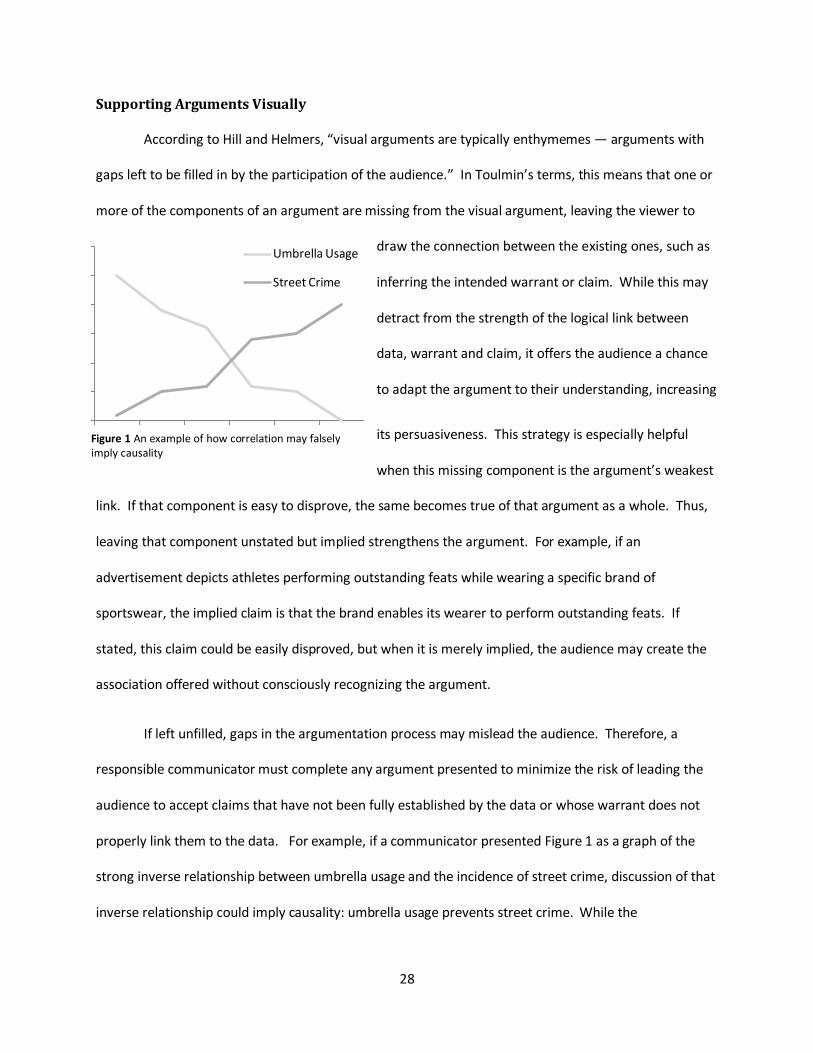
Supporting Arguments Visually
According to Hill and Helmers, “visual arguments are typically enthymemes — arguments with
gaps left to be filled in by the participation of the audience.” In Toulmin’s terms, this means that one or
more of the components of an argument are missing from the visual argument, leaving the viewer to
draw the connection between the existing ones, such as
inferring the intended warrant or claim. While this may
detract from the strength of the logical link between
data, warrant and claim, it offers the audience a chance
to adapt the argument to their understanding, increasing
its persuasiveness. This strategy is especially helpful
when this missing component is the argument’s weakest
link. If that component is easy to disprove, the same becomes true of that argument as a whole. Thus,
leaving that component unstated but implied strengthens the argument. For example, if an
advertisement depicts athletes performing outstanding feats while wearing a specific brand of
sportswear, the implied claim is that the brand enables its wearer to perform outstanding feats. If
stated, this claim could be easily disproved, but when it is merely implied, the audience may create the
association offered without consciously recognizing the argument.
If left unfilled, gaps in the argumentation process may mislead the audience. Therefore, a
responsible communicator must complete any argument presented to minimize the risk of leading the
audience to accept claims that have not been fully established by the data or whose warrant does not
properly link them to the data. For example, if a communicator presented Figure 1 as a graph of the
strong inverse relationship between umbrella usage and the incidence of street crime, discussion of that
inverse relationship could imply causality: umbrella usage prevents street crime. While the
Umbrella Usage
Street Crime
Figure 1 An example of how correlation may falsely imply causality

29
communicator may not state this false claim, it could be implied through enthymeme if no claim were
made in such a discussion.
Because data direct the audience to accept or reject an argument’s claim, the quality of that
data must be established. Working from historical examples of visual evidence’s role in crucial
decisions, visual communication expert Edward Tufte concludes that clear and scientific displays of data
correspond to clear and scientific reasoning: “if displays of data are to be thoughtful and revealing, then
the logic of the display must reflect the logic of the analysis.” To effectively create quality visuals based
on quality logic, he and others (Bouvée & Thill, 2008) recommend:
Documenting data sources: To establish that data are worthy of consideration as evidence of a
claim, the communicator should reveal how and by whom the data were gathered. For
example, a chart of data about income levels collected in the US Census would warrant
consideration that data collected in a voluntary response survey at a single time and location
would not. While the methods used by which the Census was conducted may not be included,
the ethos of this institution is strong enough that most viewers would accept that its methods
would have been appropriate to the study.
Documenting data characteristics: To ensure that the audience shares the communicator’s
interpretation of visual evidence and to avoid enthymemes, an accompanying explanation of the
key features of the visual and their implications may strengthen its effectiveness. If figure one
were presented with no explanation, the inverse relationship between the two data sets and the
possible implications may escape a viewer with low statistical literacy. As visual explanations
become more complex or the relationships depicted become more subtle, the need for
accompanying explanation increases. Further, Bouvée and Thill emphasize the importance of
consistency between verbal and visual explanations. Not only can discrepancies between these
30
two information sources confuse or mislead the audience, but they can also detract from the
communicator’s credibility.
Considering alternative explanations: To authentically establish a causal link between two
phenomena, a communicator must not only establish a strong correlation between the two, but
the cause must also be isolated as the only possible driver of the effect. For example, discussion
of figure one may imply that umbrellas ward off street criminals, but proper consideration of
alternative explanations would introduce the confounding factor of weather.
Verbal Explanations
To analyze the design quality of my subjects’ material, I will seek and identify argumentative
practices in their visual evidence. I will identify documentation of the sources and characteristics of
each visual and look for consideration of alternative explanations. Greater evidence of these
approaches will yield a more positive assessment.
I recorded the content of any verbal explanations that accompanied visuals. When this
explanation included explicit references to visuals, I recorded the following:
Description of characteristics: I indicated if the content of a visual was described verbally to
clarify and reinforce its content or if the visual was left to deliver its message independently.
Alternatives addressed: I noted if any accompanying verbal explanation addressed possible
alternative interpretations of data to the one primarily presented, including any that were
rebutted.
Citation of data source: For visuals illustrating data, I identified if and how a source for that data
was indicated. Because the source of a set of data can have direct bearing on its quality and
reliability, a communicator is ethically bound to cite them. Information about how, when and
by whom the data was gathered may also be relevant as the audience analyzes its content. I
31
noted where the source was indicated within the visual and where it was cited in the verbal
explanation of the data. I also noted if no source was cited for some sets of data.
Using the data gathered in this analysis, I will follow with closer analysis of selected examples of key
visuals in each media sample. I will explain how the rhetorical appeals are employed in each example by
identifying the argument strategies employed in these visuals and their accompanying arguments.
Logical Fallacies
A rhetorically sound argument requires logical constructions that are persuasive but not
necessarily valid, but fallacious logic may detract from this aspect of an argument’s persuasiveness. In
Logical Fallacies, Tim Holt categorizes these errors of logic into three types: fallacies of relevance,
fallacies of ambiguity, and fallacies of presumption. In a fallacy of relevance, data are offered that do
not directly apply to the claim being made. Examples include appeals to consequence, in which the data
argue that accepting the claim will have positive consequences or rejecting it will have negative ones. In
a fallacy of ambiguity, the data only appear to support the claim due to imprecise language. An example
includes the straw man argument, in which a claim denouncing a competing position is made based on
data that misrepresent that position. In fallacy of presumption, claims are made based on faulty
data. Examples include cum hoc or post hoc arguments, fallacies arising in causal argument when
occurrences observed concurrently or in succession (respectively) are considered evidence of a claimed
causal relationship without proper warrants for making these connections.
In each of Fulkerson’s argument strategies, the arguer may also be more likely to make certain
logical fallacies. Causal arguments present the danger of a post hoc, ergo propter hoc fallacy, the
equation of a correlation with a cause. Arguments from authority risk the fallacy of appeals to authority,
in which the arguer labels claims reliable because their source is an established expert.
32
I will use these methods to determine how effectively key logical arguments are composed to
support the major claims. This will help me determine the strength of the arguments supporting these
samples’ claims.
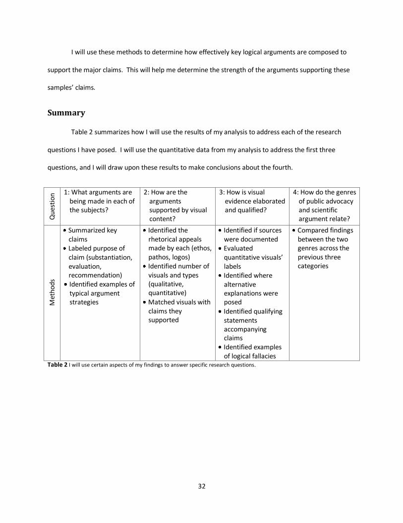
Summary
Table 2 summarizes how I will use the results of my analysis to address each of the research
questions I have posed. I will use the quantitative data from my analysis to address the first three
questions, and I will draw upon these results to make conclusions about the fourth.
Qu
esti
on
1: What arguments are being made in each of the subjects?
2: How are the arguments supported by visual content?
3: How is visual evidence elaborated and qualified?
4: How do the genres of public advocacy and scientific argument relate?
Met
ho
ds
Summarized key claims
Labeled purpose of claim (substantiation, evaluation, recommendation) Identified examples of typical argument strategies
Identified the rhetorical appeals made by each (ethos, pathos, logos)
Identified number of visuals and types (qualitative, quantitative)
Matched visuals with claims they supported
Identified if sources were documented
Evaluated quantitative visuals’ labels
Identified where alternative explanations were posed
Identified qualifying statements accompanying claims
Identified examples of logical fallacies
Compared findings between the two genres across the previous three categories
Table 2 I will use certain aspects of my findings to answer specific research questions.
33
Results and Analysis
After documenting the visual content in “Fingerprints of global warming on wild animals and
plants” and An Inconvenient Truth, I gathered the following quantitative data about the characteristics
of that content. Due to its primarily visual medium, the film contains vastly more visuals than the
journal article: “Fingerprints of global warming on wild animals and plants” includes three visuals while I
documented 77 visuals in An Inconvenient Truth. In the documentary, these visuals include the scenes
that compose the film, as well as the visuals with which Gore supports his arguments within the film. In
the article, these include a table summarizing the numerical data and two figures illustrating the trends
in those data, a stacked bar graph and a forest plot of means and their standard errors.
I used these data to identify patterns in the types of claims, visual support and elaboration of
evidence in my subjects. This analysis helped me respond two my three initial research questions, and
by comparing these findings, I also drew conclusions about relationship between the genres of public
advocacy and scientific argument.
What arguments are being made in each of the subjects?
In the two samples I investigated, I found that the purpose for the claims made in the journal’s
scientific argument differed substantially from those made in the film’s public argument and that these
differences extend into the type of support offered in each genre. The scientific argument focuses on
questions of substantiation. While it also makes minor recommendations based on the substantiation,
these appear in the concluding statements as potential applications of the research. This example
shows that scientific argument’s ultimate purpose is to inform its audience. To support these
substantive claims, the authors use primarily quantitative visual evidence. In contrast, the public
argument focuses on questions of policy or recommendation. To build a case for a recommendation or
34
policy, my example shows that public arguers follow a sequential progression from layers of
substantiation and evaluation to arrive at the primary claim. To support these claims, they use both
quantitative and qualitative visuals.
Key Claims and Their Purposes
To document the arguments made in each sample, I first identified the major claims. In the
journal article, I identified two claims: (1) “there has probably been a discernable impact of recent global
warming on animals and plants”; and (2) there is a “need for actions to modify conservation efforts and
future planning to account for climate change, and to slow the projected rate of warming.”
As Fulkerson demonstrated, different claims may serve different purposes, as these do. The first
makes a claim of substantiation by offering an answer to a question of fact: has global warming
impacted wild animals and plants? The second makes a claim of recommendation by calling for action in
response to a question of policy: should preventative action be taken in response to global warming?
Nine of the scientific article’s ten paragraphs support the first claim, while the second claim is
introduced only in the final paragraph and relies heavily upon the first. The imbalanced emphasis
favoring the claim of fact indicates that the scientific article’s overall purpose is substantive.
Furthermore, the secondary recommendation claim is underdeveloped; under Fulkerson’s model, a fully
developed recommendation claim should utilize sequential progression by stemming not only from
substantiation, but also from evaluation. The article makes no attempt to evaluate the moral content
any of the content it discusses, sacrificing that potential to strengthen its recommendation in favor of a
stronger substantive emphasis. The article’s purpose is to provide its audience with factual information,
leaving evaluative judgment and ultimately the choice of action to the audience.
In the documentary, I identified five claims: (1) the global climate is warming; (2) humans’
emissions of greenhouse gases are causing global warming; (3) global warming has and will continue to
35
have devastating consequences on the environment and human populations; (4) to allow global
warming to continue would be “deeply unethical”; and (5) we must prevent global warming by changing
our way of thinking and our emissions.
Under Fulkerson’s model, the purpose of the first three claims is substantive, the fourth is
evaluative, and the final claim makes a recommendation. Unlike the scientific article’s claims, these five
create a sequential progression toward the final claim. The final claim bases its recommendation on the
evaluation made in the fourth. That evaluation judges the moral value of facilitating the conditions
established in the previous two substantive claims. These two claims rely factually on the first. That is,
Gore’s call to preventative actions relies upon the established immorality of humans’ contribution to the
established devastating consequences of the emissions that he established to be the cause of the global
warming that he established to be occurring. Through this sequence, the film places its ultimate
emphasis on the final claim, the recommendation. The film’s purpose is to provide its audience with the
necessary motivation to guide their choice of action.
How are the arguments supported by visual content?
In the journal article, all three visuals serve as evidence of the authors’ first claim. The article’s
visual content is entirely quantitative, consisting of a table of numerical summaries of the meta-analysis,
a stacked bar chart showing the frequency of each level of change observed, and a forest plot
summarizing the individual mean changes among species and a combined mean, along with their
confidence intervals for each. All three included sufficient labeling to determine values to a relevant
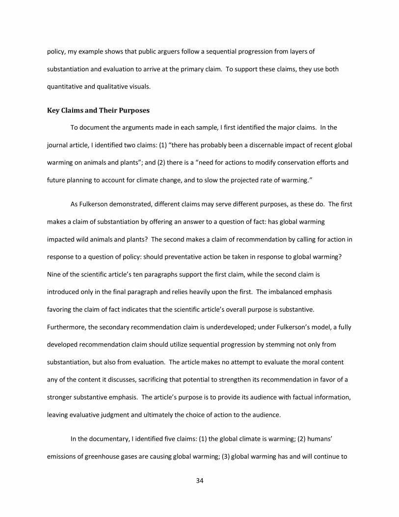
level of precision. For example, one can observe from the stacked bar graph in Figure 2 that a combined
18 species changed by a decrease of three days over the past ten years or that one significant and one
nonsignificant species exhibited a -14 day change.
36
Figure 2 A stacked bar chart of species displaying behavioral change in the Nature article
This supports the substantive emphasis I identified while analyzing the types of claims made in the
journal. As visuals provide emphasis and reinforcement of the key claims in an argument, the focus on
visual support for the first claim indicates that it is the author’s primary focus. By excluding qualitative
visuals, the authors further emphasize the substantive content of their article.
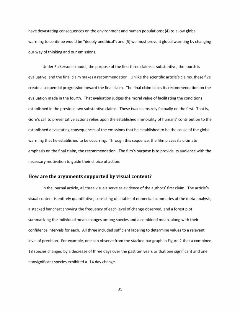
The documentary contains both quantitative and qualitative visual content. Of its 77 visuals, 21
are quantitative, including 9 line charts, 6 bar charts, 5 area charts, and 1 numeric table. Of these 21
quantitative visuals, 8 were sufficiently labeled to allow the audience to determine relevant values.
Only overall trends were visible in the remaining 13. Figure 3 shows two charts that are typical of Gore’s
quantitative evidence. The pair of charts on the left include labeled axes that enable the reader to
ascertain exact values, while the chart on the left does not label values for its temperature trend.
37
Figure 3 Gore using graphs to argue a causal relationship
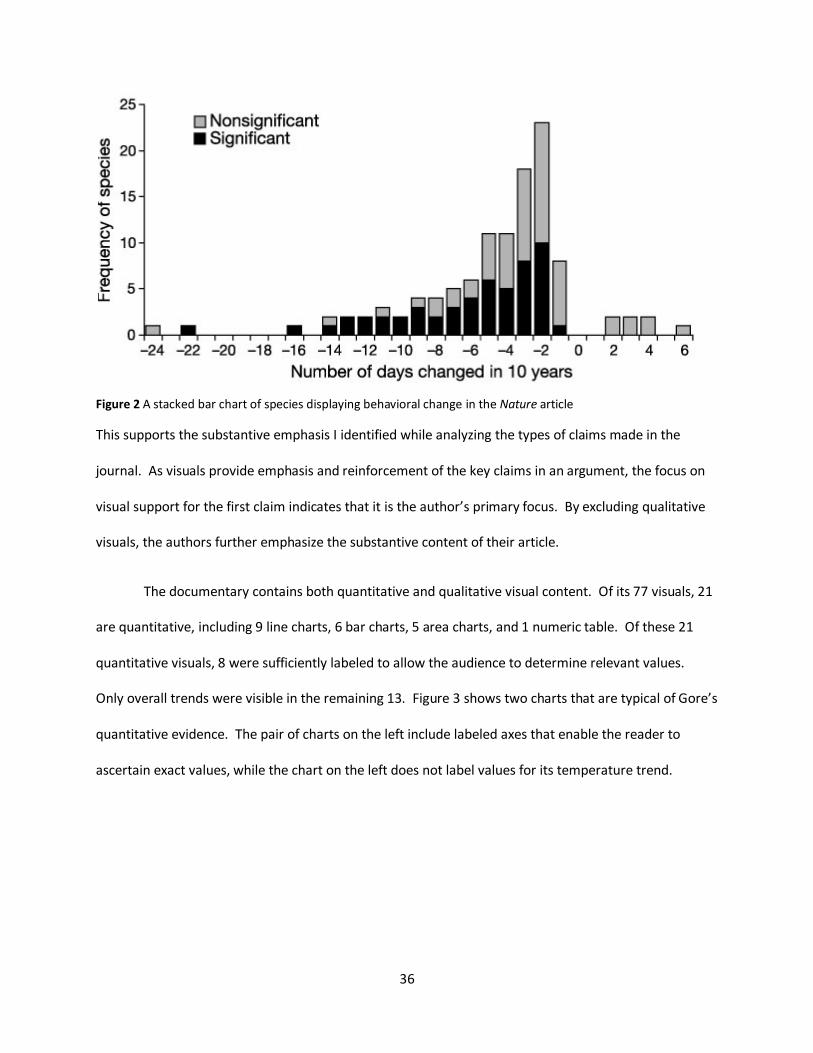
The remaining 56 visuals are qualitative, including 23 photographs, 11 videos, 10 animations, 8 maps, 2
non-numeric tables, and 1 illustration. Figure 4 shows two photographs that are typical Gore’s
qualitative evidence.
Figure 4 Gore argues that receding glaciers signify a global warming trend.
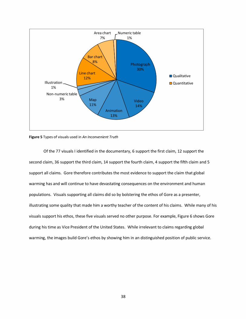
38
Figure 5 Types of visuals used in An Inconvenient Truth
Of the 77 visuals I identified in the documentary, 6 support the first claim, 12 support the
second claim, 36 support the third claim, 14 support the fourth claim, 4 support the fifth claim and 5
support all claims. Gore therefore contributes the most evidence to support the claim that global
warming has and will continue to have devastating consequences on the environment and human
populations. Visuals supporting all claims did so by bolstering the ethos of Gore as a presenter,
illustrating some quality that made him a worthy teacher of the content of his claims. While many of his
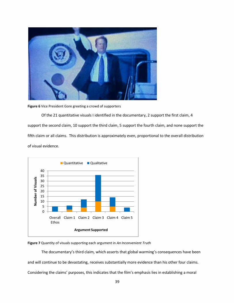
visuals support his ethos, these five visuals served no other purpose. For example, Figure 6 shows Gore
during his time as Vice President of the United States. While irrelevant to claims regarding global
warming, the images build Gore’s ethos by showing him in an distinguished position of public service.
Photograph30%
Video14%
Animation13%
Map11%
Non-numeric table3%
Illustration1%
Line chart12%
Bar chart8%
Area chart7%
Numeric table1%
Qualitative
Quantitative
39
Figure 6 Vice President Gore greeting a crowd of supporters
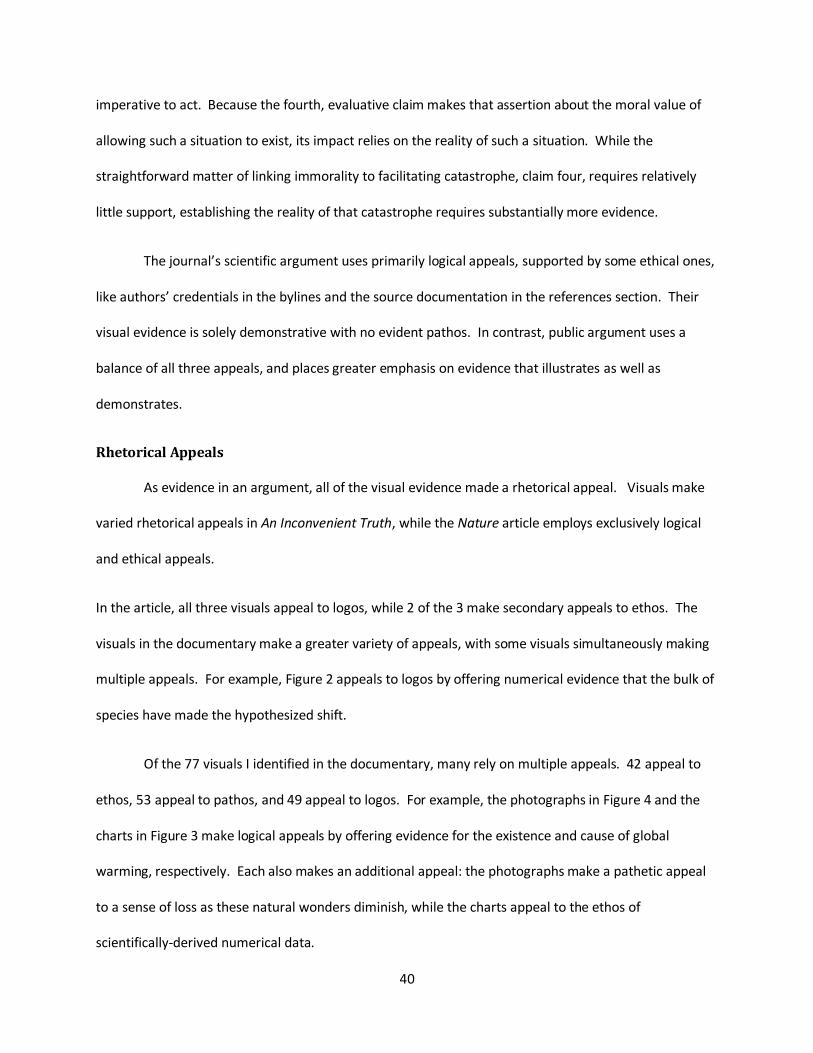
Of the 21 quantitative visuals I identified in the documentary, 2 support the first claim, 4
support the second claim, 10 support the third claim, 5 support the fourth claim, and none support the
fifth claim or all claims. This distribution is approximately even, proportional to the overall distribution
of visual evidence.
Figure 7 Quantity of visuals supporting each argument in An Inconvenient Truth
The documentary’s third claim, which asserts that global warming’s consequences have been
and will continue to be devastating, receives substantially more evidence than his other four claims.
Considering the claims’ purposes, this indicates that the film’s emphasis lies in establishing a moral
0
5
10
15
20
25
30
35
40
Overall Ethos
Claim 1 Claim 2 Claim 3 Claim 4 Claim 5
Nu
mb
er o
f V
isu
als
Argument Supported
Quantitative Qualitative
40
imperative to act. Because the fourth, evaluative claim makes that assertion about the moral value of
allowing such a situation to exist, its impact relies on the reality of such a situation. While the
straightforward matter of linking immorality to facilitating catastrophe, claim four, requires relatively
little support, establishing the reality of that catastrophe requires substantially more evidence.
The journal’s scientific argument uses primarily logical appeals, supported by some ethical ones,
like authors’ credentials in the bylines and the source documentation in the references section. Their
visual evidence is solely demonstrative with no evident pathos. In contrast, public argument uses a
balance of all three appeals, and places greater emphasis on evidence that illustrates as well as
demonstrates.
Rhetorical Appeals
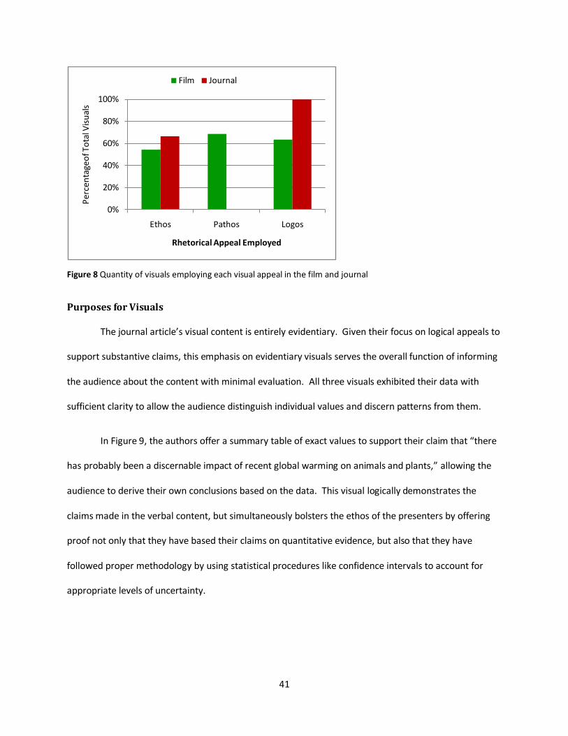
As evidence in an argument, all of the visual evidence made a rhetorical appeal. Visuals make
varied rhetorical appeals in An Inconvenient Truth, while the Nature article employs exclusively logical
and ethical appeals.
In the article, all three visuals appeal to logos, while 2 of the 3 make secondary appeals to ethos. The
visuals in the documentary make a greater variety of appeals, with some visuals simultaneously making
multiple appeals. For example, Figure 2 appeals to logos by offering numerical evidence that the bulk of
species have made the hypothesized shift.
Of the 77 visuals I identified in the documentary, many rely on multiple appeals. 42 appeal to
ethos, 53 appeal to pathos, and 49 appeal to logos. For example, the photographs in Figure 4 and the
charts in Figure 3 make logical appeals by offering evidence for the existence and cause of global
warming, respectively. Each also makes an additional appeal: the photographs make a pathetic appeal
to a sense of loss as these natural wonders diminish, while the charts appeal to the ethos of
scientifically-derived numerical data.
41
Figure 8 Quantity of visuals employing each visual appeal in the film and journal
Purposes for Visuals
The journal article’s visual content is entirely evidentiary. Given their focus on logical appeals to
support substantive claims, this emphasis on evidentiary visuals serves the overall function of informing
the audience about the content with minimal evaluation. All three visuals exhibited their data with
sufficient clarity to allow the audience distinguish individual values and discern patterns from them.
In Figure 9, the authors offer a summary table of exact values to support their claim that “there
has probably been a discernable impact of recent global warming on animals and plants,” allowing the
audience to derive their own conclusions based on the data. This visual logically demonstrates the
claims made in the verbal content, but simultaneously bolsters the ethos of the presenters by offering
proof not only that they have based their claims on quantitative evidence, but also that they have
followed proper methodology by using statistical procedures like confidence intervals to account for
appropriate levels of uncertainty.
0%
20%
40%
60%
80%
100%
Ethos Pathos Logos
Per
cen
tage
of T
ota
l Vis
ual
s
Rhetorical Appeal Employed
Film Journal

42
Figure 9 A numerical table summarizing the article’s quantitative evidence
The documentary’s visual content not only offers evidence, but also warrants. Because Gore
intends to address public audiences, his talk includes a class of visual that the article directed at
scientists does not: visuals teaching warrants. These visuals instruct the audience about the
fundamental background concepts of climate, the environment and climate change that enable viewers
to understand the implications of his arguments; Toulmin explains that warrants link his evidence to his
claims. In an early example, Gore explains how the atmosphere traps heat and warms the planet, an
essential concept that links carbon dioxide levels to global temperature. Where the Nature audience
may have understood a warrant like this, Gore broadened his potential audience by offering such
explanations, a key to a public argument’s success.
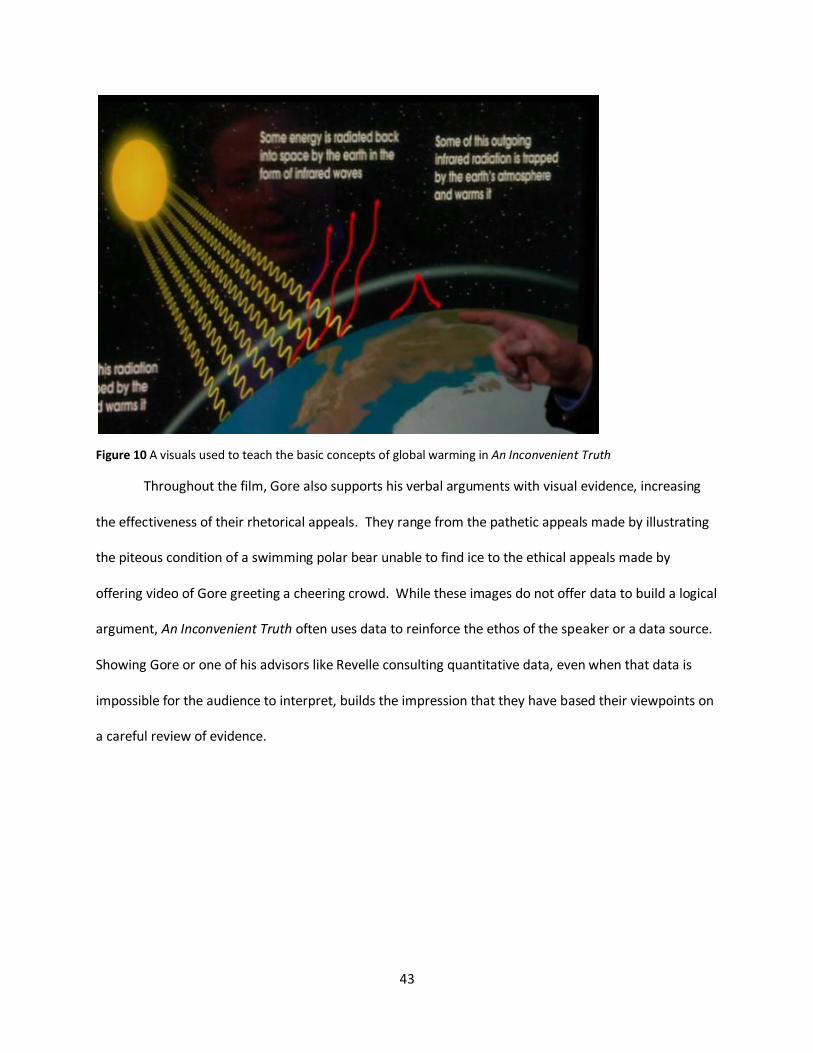
43
Figure 10 A visuals used to teach the basic concepts of global warming in An Inconvenient Truth
Throughout the film, Gore also supports his verbal arguments with visual evidence, increasing
the effectiveness of their rhetorical appeals. They range from the pathetic appeals made by illustrating
the piteous condition of a swimming polar bear unable to find ice to the ethical appeals made by
offering video of Gore greeting a cheering crowd. While these images do not offer data to build a logical
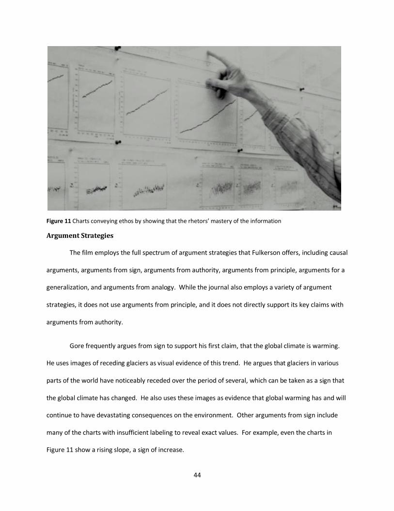
argument, An Inconvenient Truth often uses data to reinforce the ethos of the speaker or a data source.
Showing Gore or one of his advisors like Revelle consulting quantitative data, even when that data is
impossible for the audience to interpret, builds the impression that they have based their viewpoints on
a careful review of evidence.
44
Figure 11 Charts conveying ethos by showing that the rhetors’ mastery of the information
Argument Strategies
The film employs the full spectrum of argument strategies that Fulkerson offers, including causal
arguments, arguments from sign, arguments from authority, arguments from principle, arguments for a
generalization, and arguments from analogy. While the journal also employs a variety of argument
strategies, it does not use arguments from principle, and it does not directly support its key claims with
arguments from authority.
Gore frequently argues from sign to support his first claim, that the global climate is warming.
He uses images of receding glaciers as visual evidence of this trend. He argues that glaciers in various
parts of the world have noticeably receded over the period of several, which can be taken as a sign that
the global climate has changed. He also uses these images as evidence that global warming has and will
continue to have devastating consequences on the environment. Other arguments from sign include
many of the charts with insufficient labeling to reveal exact values. For example, even the charts in
Figure 11 show a rising slope, a sign of increase.
45
When arguing his second claim, that humans’ emissions of greenhouse gases are causing global
warming, Gore presents two pairs of graphs that compare trends in carbon dioxide concentrations with
those in global temperature. He first shows side by side graphs of the thousand-year trends of each,
verbally emphasizing the similarities: “you can see how closely they fit together.” He then shows the
two trends over 650,000 years on the same graph, one above the other. He explains, “when there is
more carbon dioxide the temperature gets warmer, because it traps more heat from the sun inside.”
Here, Gore has employed a causal argument strategy, as he argues that the changing carbon dioxide
levels have caused corresponding changes in temperature.
In this same example, Gore has also made an argument from generalization, as he has used data
from specific locales to make general claims about the global environment. In his first pair of graphs, he
uses data from mountain glaciers in North American. In the second, he uses data from core ice samples
from Antarctica. Arguing by generalization, he claims that these trends could be extended to describe
the general trends in global carbon dioxide and temperature levels over these periods.
Throughout his film, Gore uses arguments of authority to reinforce claims that other arguments
have not fully established. After comparing the pairs of graphs linking carbon dioxide levels to
temperatures, he admits that the relationship is “complicated,” but insists that scientists have made the
link. He establishes the scientific expertise of his sources by emphasizing the credentials of his data
sources, not only noting their institutional affiliations, but going as far as establishing their dedication to
science and strong personal character. Furthermore, he establishes the unanimity of scientists’
opinions on the subject, stating that a representative sample of peer-reviewed journals found no
dissenting opinions on the consensus of human-caused climate change.
In the journal article, the authors use causal argument to attribute the global warming trends to
the observed patterns in behaviors in wild animals and plants. They argue that their analysis indicates
46
that behavioral changes that can be attributed to warmer temperatures. To support this causal
argument, the authors use a meta-analysis of other researchers’ data sets, whose validity they establish
through arguments of authority. When discussing how they selected sources for these data, they note
that they used only sources with reliable methodology and mention their approval by the IPCC, a
prestigious and reputable organization.
The journal’s authors extend their primary, substantive argument to make a secondary
recommendation claim using an argument of analogy: “Clearly, if such climatic and ecological changes
are now being detected when the globe has warmed by an estimated average of only 0.6 °C, many more
far-reaching effects on species and ecosystems will probably occur in response to changes in
temperature to levels predicted by IPCC, which run as high as 6 °C by 2100.” Here, the analogy draws
similarities between the observed situation, the current climate, and a hypothetical one, the IPCC’s
proposed climate for 2100. The authors argue that they could extend these similarities to conclude that
a similar, yet more extreme, rise in average temperature would create a similar, yet proportionally more
extreme, change in behavior.
How is visual evidence elaborated and qualified?
In this section, I will show that the two samples use two distinctly contrasting approaches to
qualification and elaboration. The journal’s scientific argument uses thoroughly documented and
labeled visuals, with exact values visible for the audience’s scrutiny. Sources are always available.
Alternative explanations are posed and addressed explicitly and thoroughly. Claims are conspicuously
qualified. In contrast, the film’s public argument uses less thoroughly documented and labeled visuals,
though they are usually sourced. Exact values are seldom visible. Alternative explanations are rarely
posed, and claims are not qualified.
47
Verbal Explanations
Of the three visuals in the journal article, all are accompanied by verbal explanations of their
content. These explanations address alternative explanations for the trends in the data and cite sources
for the data depicted.
Of the 21 quantitative visuals I identified in the documentary, 15 are accompanied by verbal
explanations of their content. In two cases, these explanations include discussion of alternatives, and
one of them cited a source for the visuals. An additional nine visuals include a source citation within the
text displayed but not spoken.
Rebuttals and Qualifiers
In the journal article, authors pose and logically reject alternative explanations for the observed
trends and qualify their claims to address the possibility of an unconsidered alternative. They argue that
factors like “habitat modification, pollinator loss and exotic species introductions” can be disregarded,
as these forces would create “localized or multidirectional patterns” inconsistent with the unidirectional
patterns documented globally. Despite their rejection of these alternatives, the authors recognize that
their proposed explanation may also be incorrect by affixing “probably” to each statement of their
primary substantive claim. They also exhibit such cautious uncertainty in their use of statistical visual
evidence. While the accompanying visuals strongly reinforce their primary claim, they include not only
the data points for mean values, but also tails indicating the standard error for those means. The
relatively tight tails on each of the data points indicate relative certainty, but their inclusion indicates
the possibility of uncertainty.

48
Figure 12 Statistical methods like standard error tails used as qualification in the journal
In the documentary, Gore seldom presents alternative explanations for the evidence presented,
and does not qualify his claims. Visuals include none of the statistical qualifiers offered in the journal
article. In the few cases in which he presents alternative explanations, Gore dismisses them quickly,
usually employing logical fallacies to do so. For example, when he displays his area chart of the past
thousand years’ temperature trends, he dismisses the claim that current warming trends compare to a
harmless warming period during the Middle Ages without addressing the content of that argument.
Instead, he appeals to ridicule by introducing the idea in a mocking tone, laughing along with his
audience at the relative size of that period when compared with the current warming period. While the
graph he presented may have constituted all the evidence necessary for a logical rebuttal of that
argument, he dismisses the need for such a rebuttal by stating, “There’s just no comparison.” In
another case, Gore employs a straw man fallacy by summing up opponents’ responses to increases in
carbon dioxide levels as “So?” before appealing again to ridicule by laughing at the possibility the gas
levels could be harmless. In reality, opponents have presented detailed theories about the effects of
increased carbon dioxide levels, such as scenarios in which the gas buildup benefits the growth of plants.

49
While Gore may again possess the evidence necessary to refute such arguments, he avoids them with
logical fallacies.

50
How do the genres of public advocacy and scientific argument compare?
The two genres are substantially different in their approach to arguing about global warming.
These differences stem from the purposes of their claims and audience. Scientific argument intends to
inform the public indirectly by informing the scientific community about an issue. To do so, it relies on
claims of substantiation, only expanding to recommendation to propose possible implications of the
substantive content or recommend further research; these recommendations are intended to
emphasize the importance of that content more than to be followed as policy.
Because logical arguments are most effective at supporting claims of substantiation, these
dominate the evidence in scientific arguments. Pathetic arguments support evaluative claims, so these
are neglected in scientific argument and integrated into public arguments. Ethical arguments bolster
the credibility of a rhetor, thus supporting claims of all purposes, so they are used in both. Qualitative
and illustrative visuals are especially effective at making pathetic arguments, so they are used heavily in
public and not scientific argument.
The two genres of argument are also shaped by expectations about their audience. Because
scientific argument primarily addresses the scientific community, it can afford to forgo teaching visuals
and focus solely on demonstrative visuals, which effectively support substantive claims. Conversely,
public argument cannot assume any level of existing expertise on the part of its audience, so it must
establish concepts and evaluation through teaching and illustrative visuals. Public arguments capitalize
this lack of expertise by identifying the experts who posses it and ascribing substantive claims to them.
As the audience lacks the expertise to question them, labels, exact values and qualifications are less
relevant than the assertion that experts support them.
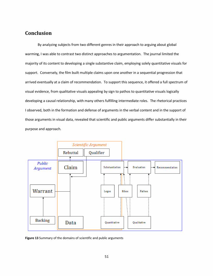
51
Conclusion
By analyzing subjects from two different genres in their approach to arguing about global
warming, I was able to contrast two distinct approaches to argumentation. The journal limited the
majority of its content to developing a single substantive claim, employing solely quantitative visuals for
support. Conversely, the film built multiple claims upon one another in a sequential progression that
arrived eventually at a claim of recommendation. To support this sequence, it offered a full spectrum of
visual evidence, from qualitative visuals appealing by sign to pathos to quantitative visuals logically
developing a causal relationship, with many others fulfilling intermediate roles. The rhetorical practices
I observed, both in the formation and defense of arguments in the verbal content and in the support of
those arguments in visual data, revealed that scientific and public arguments differ substantially in their
purpose and approach.
Figure 13 Summary of the domains of scientific and public arguments
52
I summarize these differences in Figure 13. The scientific argument limits its argumentative
strategies due to its narrow focus, the claim of substantiation. It employs mostly logical appeals about
factual claims, while also establishing the authors’ ethos as scientists with the credibility needed to
make such claims. In science, such credibility is established by addressing uncertainty, alternatives and
methods deemed satisfactory in the scientific community. The public argument addresses a full range of
claims with a full range of data and strategies for connecting them, including logos, pathos and ethos. It
makes logical claims about factual assertions but also makes emotional ones evaluating the moral
content of those facts. To establish the author’s authority to make both of these types of appeals, ethos
establishes that the author possesses the moral character to make evaluations and is suitably well-
informed about the issue to make factual claims about it. Unlike in science, the assertion that one is
well informed is sufficient; elaboration of methods and consideration of uncertainty or alternatives can
be omitted. The key differences in their approach to persuading audiences within these domains can be
seen in the content that is unique to each domain, including the scientific argument’s rebuttals and
qualifiers, which are key to establishing their ethos, and the public argument’s warrants, which are
needed when the audience lacks a common background like the scientific community’s.
Their approach to audience constituted a key difference in the purpose of the two arguments:
while the scientific argument focused solely on building the strength of its appeal to a specific, narrow
audience with predictable expectations about methods, the public argument balanced its focus between
broadening the audience to which it appealed and building a strong argument that could be accessed by
that broad audience. The public argument accomplished this by providing ample warranting linking its
data to its claims where some of its audience may lack the expertise required to make the link
otherwise. The division of its purpose became more apparent as it also sacrificed some of the
components of a strong argument to make its argument more entertaining and accessible. It neglected
qualifiers completely, avoided thorough logical rebuttals in favor of ridiculing opposing views, and
53
reduced the details of its quantitative data to the level of overall trends. While all three of these
strategies reduced the arguments overall resilience to counterargument, they may broaden the
argument’s appeal to public audiences by reducing the appearance of uncertainty and streamlining the
argument to appeal to its audience’s interest in entertainment.
Because the scientific audience demands an argument that exhibits close adherence to scientific
principles, this argument disclosed the level of its uncertainty with qualifiers, the unbiased approach it
took with thorough rebuttals of the alternative explanations it considered, and the scientifically sound
methods it used by displaying the exact quantitative values behind the trends it observed. Following
and appreciating these arguments requires a level of knowledge, expertise and familiarity with scientific
argument that limits their audience significantly, indicating that audience size does not hold the same
value in scientific argument that it does in public argument.
While its attempts to broaden its audience created significant gaps in the public argument, I
found that it used a recurrent appeal to ethos to bridge them. By building the credibility of its rhetor as
both a student of science and a dedicated and selfless servant of public and family, the argument
established his ability to make both substantive and evaluative assertions. When some of the details
supporting these assertions were omitted, the endorsement of such a credible rhetor assured the
audience that they existed.
Among the more critical scientific audience, ethos does not offer the same freedom of omission
that it does in public arguments. Scientific arguments must establish both the credibility of their rhetors
to merit their consideration, but additional assertions of ethos afford the arguers no extra privileges,
due to the unique role of ethos in science: the degree to which public rhetors are informed dictate their
ethos, while a scientific rhetor either follows established protocols or does not. While the rhetors’ ethos
is established in the scientific argument by offering educational credentials and affiliations with
54
institutions, this does not grant them the same freedom to omit the less compelling aspects of their
argument, as it would in a public setting.
The success of these strategies can be seen in the reception of the two arguments: the scientific
argument was published in a respected journal and cited frequently, while the public argument was
popular among audiences and discussed in personal and political contexts. By raising awareness and
discussion of its issue, a public argument can successfully motivate individual and public policy action
centered on its core ideas. Communicating with visuals can facilitate this motivation by connecting
explanations of logical concepts to the evaluation needed to provide relevance. Due to its success in
that regard, An Inconvenient Truth offers a model for effective rhetorical strategies in the genre of public
argument.
55
References
Adam, D. (2007, October 11). Gore's climate film has scientific errors - judge. Retrieved from The Guardian: http://www.guardian.co.uk/environment/2007/oct/11/climatechange?gusrc=rss&feed=8
Beck, U. (1992). Risk Society: Towards a New Modernity. Thousand Oaks, CA: SAGE Publications Inc.
Bertin, J. (1984). Semiology of Graphics. University of Wisconsin Press.
Bouvée, C., & Thill, J. (2008). Business Communication Today. Upper Saddle River, New Jersey: Pearson Prentice Hall.
Chandler, D. (2009, January 13). Signs. Retrieved from Semiotics for Beginners: http://www.aber.ac.uk/media/Documents/S4B/sem02.html
Corbett, J. B., & Durfee, J. L. (2004). Testing Public (Un)Certainty of Science: Media Representations of Global Warming. Science Communication , 129-151.
Durkin, M. (2007, March 17). 'The global-warmers were bound to attack, but why are they so feeble?'. Retrieved from Telegraph.co.uk: http://www.telegraph.co.uk/news/uknews/1545873/%27The-global-warmers-were-bound-to-attack%2C-but-why-are-they-so-feeble%27.html
Durkin, M. (Director). (2007). The Great Global Warming Swindle [Motion Picture].
Falkerson, R. (1996). Teaching the Argument in Writing. Urbana, IL: National Council of Teachers of English.
Gore, A. (Director). (2006). An Inconvenient Truth [Motion Picture].
Gore, A. (2006). An Inconvenient Truth. New York, NY: Rodale Books.
Gregory, J., & Miller, S. (1998). Science in Public. Basic Books.
Hill, C., & Helmers, M. (2004). Defining Visual Rhetorics. Mahwah: Lawrence Erlbaum Associates.
Intergovernmental Panel on Climate Change. (2007). AR4 Synthesis Report.
Kress, G., & van Leeuwen, T. (2001). Multimodal Discourse: The Modes and Media of Contemporary Communication. New York: Oxford University Press.
Leake, J. (2007, October 14). Please, sir - Gore's got warming wrong. Retrieved from Times Online: http://www.timesonline.co.uk/tol/news/uk/education/article2652851.ece
Lewis, M. (2007). Al Gore’s Science Fiction: A Skeptic’s Guide to An Inconvenient Truth. Washington, DC: Competetive Research Institute.
Monboit, G. (2000, March 16). Modified Truth. Retrieved from Monboit.com: http://www.monbiot.com/archives/2000/03/16/modified-truth/
56
Montgomery, S. (2003). The Chicago guide to communicating science. Chicago: University of Chicago Press.
Nelkin, D. (1995). Selling Science: How the Press Covers Science and Technology. W.H. Freeman & Company.
Nisbet, M., & Myers, T. (2007). The Polls—Trends: Twenty Years of Public Opinion about Global Warming. Public Opinion Quarterly , 444-470.
Penrose, A. M., & Katz, S. B. (1998). Writing in the Sciences: Exploring Conventions of Scientific Discourse. New York, NY: St. Martin's Press.
Quiring, S. M. (2008). Science and Hollywood: a discussion of the scientific accuracy of An Inconvenient Truth. GeoJournal , 1-3.
Root, T. L., Price, J. T., Hall, K. R., Schneider, S. H., Rosenzweig, C., & Pounds, J. A. (2003). Fingerprints of global warming on wild animals and plants. Nature , 57-60.
Schlein, L. (2009, January 14). Meteorologists: Global Warming and Cold Weather Go Hand-In-Hand. Retrieved January 14, 2009, from Voice of America News: http://www.voanews.com/english/2009-01-14-voa5.cfm
Stamm, K. R., Clark, F., & Eblacas, P. R. (2000). Mass communication and public understanding of environmental problems: the case of global. Public Understanding of Science , 219-237.
Stoll-Kleemann, S., O'Riordan, T., & Jaeger, C. (2001). The psychology of denial concerning climate mitigation measures: evidence from Swiss focus groups. Global Environmental Change , 107-117.
Thomas, G., & Durant, J. (1987). Why Should We Promote the Public Understanding of Science?
Thomson Reuters. (2008). 2007 Journal Citation Report Science Edition. Thomson Reuters.
Tufte, E. (2001). The Visual Display of Quantitative Information. Cheshire, CT: Graphics Press.
Tufte, E. (1997). Visual Explanations: Images and Quantities, Evidence and Narrative. Cheshire, CT: Graphics Press.
UNFCCC. (2006, September 28). United Nations Framework Convention on Climate Change. Retrieved January 9, 2009, from Kyoto Protocol Status of Ratification: http://unfccc.int/files/essential_background/kyoto_protocol/status_of_ratification/application/pdf/kpstats.pdf
van Eemeren, F., Grootendorst, R., & Henkemans, F. S. (1996). Fundamentals of Argumentation Theory. Mahwah: Lawrence Erlbaum Associates.
Whitmarsh, L. (2008). What’s in a name? Commonalities and differences in public understanding of “climate change” and “global warming”. Public Understanding of Science , 1-20.
Wunsch, C. (2007, December 7). Lateline ABC. Retrieved from My words were twisted in global warming documentary: expert: http://www.abc.net.au/lateline/content/2007/s1977366.htm
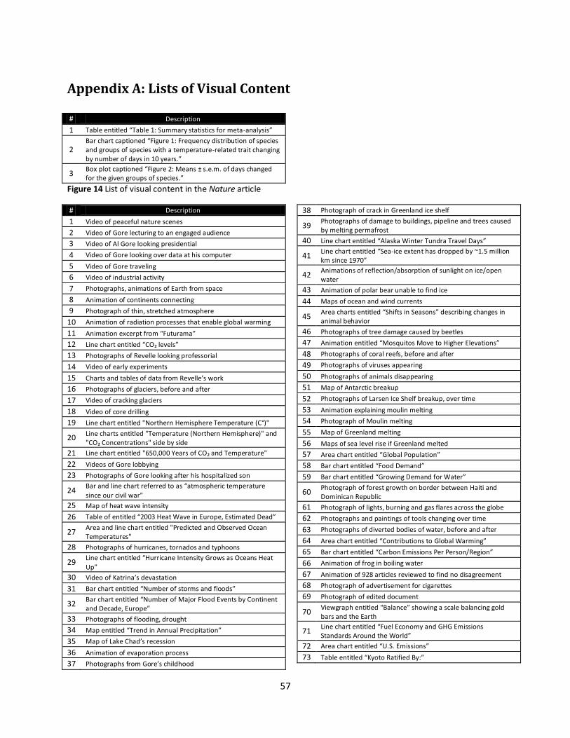
57
Appendix A: Lists of Visual Content
# Description
1 Table entitled “Table 1: Summary statistics for meta-analysis”
2 Bar chart captioned “Figure 1: Frequency distribution of species and groups of species with a temperature-related trait changing by number of days in 10 years.”
3 Box plot captioned “Figure 2: Means ± s.e.m. of days changed for the given groups of species.”
Figure 14 List of visual content in the Nature article
# Description
1 Video of peaceful nature scenes
2 Video of Gore lecturing to an engaged audience
3 Video of Al Gore looking presidential
4 Video of Gore looking over data at his computer
5 Video of Gore traveling
6 Video of industrial activity
7 Photographs, animations of Earth from space
8 Animation of continents connecting
9 Photograph of thin, stretched atmosphere
10 Animation of radiation processes that enable global warming
11 Animation excerpt from “Futurama”
12 Line chart entitled “CO₂ levels”
13 Photographs of Revelle looking professorial
14 Video of early experiments
15 Charts and tables of data from Revelle’s work
16 Photographs of glaciers, before and after
17 Video of cracking glaciers
18 Video of core drilling
19 Line chart entitled "Northern Hemisphere Temperature (C°)"
20 Line charts entitled "Temperature (Northern Hemisphere)" and "CO₂ Concentrations" side by side
21 Line chart entitled "650,000 Years of CO₂ and Temperature"
22 Videos of Gore lobbying
23 Photographs of Gore looking after his hospitalized son
24 Bar and line chart referred to as “atmospheric temperature
since our civil war”
25 Map of heat wave intensity
26 Table of entitled “2003 Heat Wave in Europe, Estimated Dead”
27 Area and line chart entitled "Predicted and Observed Ocean Temperatures"
28 Photographs of hurricanes, tornados and typhoons
29 Line chart entitled “Hurricane Intensity Grows as Oceans Heat
Up”
30 Video of Katrina’s devastation
31 Bar chart entitled “Number of storms and floods”
32 Bar chart entitled “Number of Major Flood Events by Continent and Decade, Europe”
33 Photographs of flooding, drought
34 Map entitled “Trend in Annual Precipitation”
35 Map of Lake Chad’s recession
36 Animation of evaporation process
37 Photographs from Gore’s childhood
38 Photograph of crack in Greenland ice shelf
39 Photographs of damage to buildings, pipeline and trees caused by melting permafrost
40 Line chart entitled “Alaska Winter Tundra Travel Days”
41 Line chart entitled “Sea-ice extent has dropped by ~1.5 million km since 1970”
42 Animations of reflection/absorption of sunlight on ice/open water
43 Animation of polar bear unable to find ice
44 Maps of ocean and wind currents
45 Area charts entitled “Shifts in Seasons” describing changes in animal behavior
46 Photographs of tree damage caused by beetles
47 Animation entitled “Mosquitos Move to Higher Elevations”
48 Photographs of coral reefs, before and after
49 Photographs of viruses appearing
50 Photographs of animals disappearing
51 Map of Antarctic breakup
52 Photographs of Larsen Ice Shelf breakup, over time
53 Animation explaining moulin melting
54 Photograph of Moulin melting
55 Map of Greenland melting
56 Maps of sea level rise if Greenland melted
57 Area chart entitled “Global Population”
58 Bar chart entitled “Food Demand”
59 Bar chart entitled “Growing Demand for Water”
60 Photograph of forest growth on border between Haiti and Dominican Republic
61 Photograph of lights, burning and gas flares across the globe
62 Photographs and paintings of tools changing over time
63 Photographs of diverted bodies of water, before and after
64 Area chart entitled “Contributions to Global Warming”
65 Bar chart entitled “Carbon Emissions Per Person/Region”
66 Animation of frog in boiling water
67 Animation of 928 articles reviewed to find no disagreement
68 Photograph of advertisement for cigarettes
69 Photograph of edited document
70 Viewgraph entitled “Balance” showing a scale balancing gold bars and the Earth
71 Line chart entitled “Fuel Economy and GHG Emissions Standards Around the World”
72 Area chart entitled “U.S. Emissions”
73 Table entitled “Kyoto Ratified By:”

58
74 Map entitled “US States Taking the Lead on Global Warming”
75 Table entitled “U.S. Cities Supporting Kyoto:”
76 Photographs of great moments in U.S. history
77 Line chart entitled “The CPC Success Story”
Figure 15 List of visual content in An Inconvenient Truth
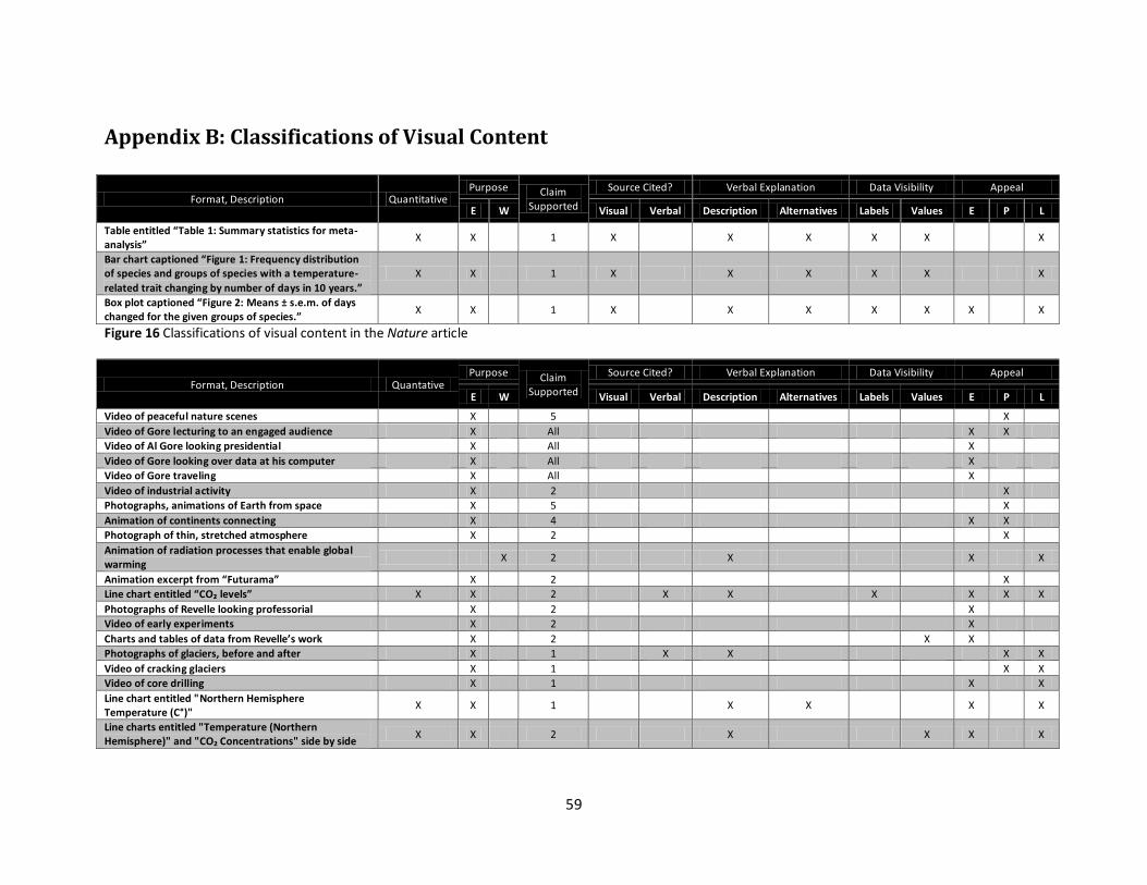
59
Appendix B: Classifications of Visual Content
Format, Description Quantitative Purpose Claim
Supported
Source Cited? Verbal Explanation Data Visibility Appeal
E W Visual Verbal Description Alternatives Labels Values E P L
Table entitled “Table 1: Summary statistics for meta-analysis”
X X 1 X X X X X X
Bar chart captioned “Figure 1: Frequency distribution of species and groups of species with a temperature-
related trait changing by number of days in 10 years.”
X X 1 X X X X X X
Box plot captioned “Figure 2: Means ± s.e.m. of days changed for the given groups of species.”
X X 1 X X X X X X X
Figure 16 Classifications of visual content in the Nature article
Format, Description Quantative Purpose Claim
Supported
Source Cited? Verbal Explanation Data Visibility Appeal
E W Visual Verbal Description Alternatives Labels Values E P L
Video of peaceful nature scenes X 5 X
Video of Gore lecturing to an engaged audience X All X X
Video of Al Gore looking presidential X All X
Video of Gore looking over data at his computer X All X
Video of Gore traveling X All X
Video of industrial activity X 2 X
Photographs, animations of Earth from space X 5 X
Animation of continents connecting X 4 X X
Photograph of thin, stretched atmosphere X 2 X
Animation of radiation processes that enable global warming
X 2 X X X
Animation excerpt from “Futurama” X 2 X
Line chart entitled “CO₂ levels” X X 2 X X X X X X
Photographs of Revelle looking professorial X 2 X
Video of early experiments X 2 X
Charts and tables of data from Revelle’s work X 2 X X
Photographs of glaciers, before and after X 1 X X X X
Video of cracking glaciers X 1 X X
Video of core drilling X 1 X X
Line chart entitled "Northern Hemisphere Temperature (C°)"
X X 1 X X X X
Line charts entitled "Temperature (Northern Hemisphere)" and "CO₂ Concentrations" side by side
X X 2 X X X X
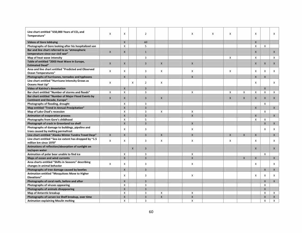
60
Line chart entitled "650,000 Years of CO₂ and
Temperature" X X 2 X X X X X
Videos of Gore lobbying X All X
Photographs of Gore looking after his hospitalized son X 5 X X
Bar and line chart referred to as “atmospheric temperature since our civil war”
X X 1 X X
Map of heat wave intensity 3 X X X
Table of entitled “2003 Heat Wave in Europe, Estimated Dead”
X X 3 X X X X X
Area and line chart entitled "Predicted and Observed Ocean Temperatures"
X X 3 X X X X X X
Photographs of hurricanes, tornados and typhoons X 1 X X X
Line chart entitled “Hurricane Intensity Grows as Oceans Heat Up”
X X 2 X X X
Video of Katrina’s devastation X 3 X
Bar chart entitled “Number of storms and floods” X X 3 X X X X X X
Bar chart entitled “Number of Major Flood Events by Continent and Decade, Europe”
X X 3 X X X X X X
Photographs of flooding, drought X 3 X
Map entitled “Trend in Annual Precipitation” X 3 X X
Map of Lake Chad’s recession X 3 X X X
Animation of evaporation process X 3 X X X
Photographs from Gore’s childhood X 5 X X
Photograph of crack in Greenland ice shelf X 3 X X X
Photographs of damage to buildings, pipeline and trees caused by melting permafrost
X 3 X X X
Line chart entitled “Alaska Winter Tundra Travel Days” X X 3 X X X X X X
Line chart entitled “Sea-ice extent has dropped by ~1.5 million km since 1970”
X X 3 X X X X X
Animations of reflection/absorption of sunlight on ice/open water
X 3 X X
Animation of polar bear unable to find ice X 3 X X
Maps of ocean and wind currents X 3 X X X X
Area charts entitled “Shifts in Seasons” describing changes in animal behavior
X X 3 X X X
Photographs of tree damage caused by beetles X 3 X X
Animation entitled “Mosquitoes Move to Higher Elevations”
X 3 X X X X
Photographs of coral reefs, before and after X 3 X X
Photographs of viruses appearing X 3 X
Photographs of animals disappearing X 3 X
Map of Antarctic breakup X 3 X X X X
Photographs of Larsen Ice Shelf breakup, over time X 3 X X X X
Animation explaining Moulin melting X 3 X X X
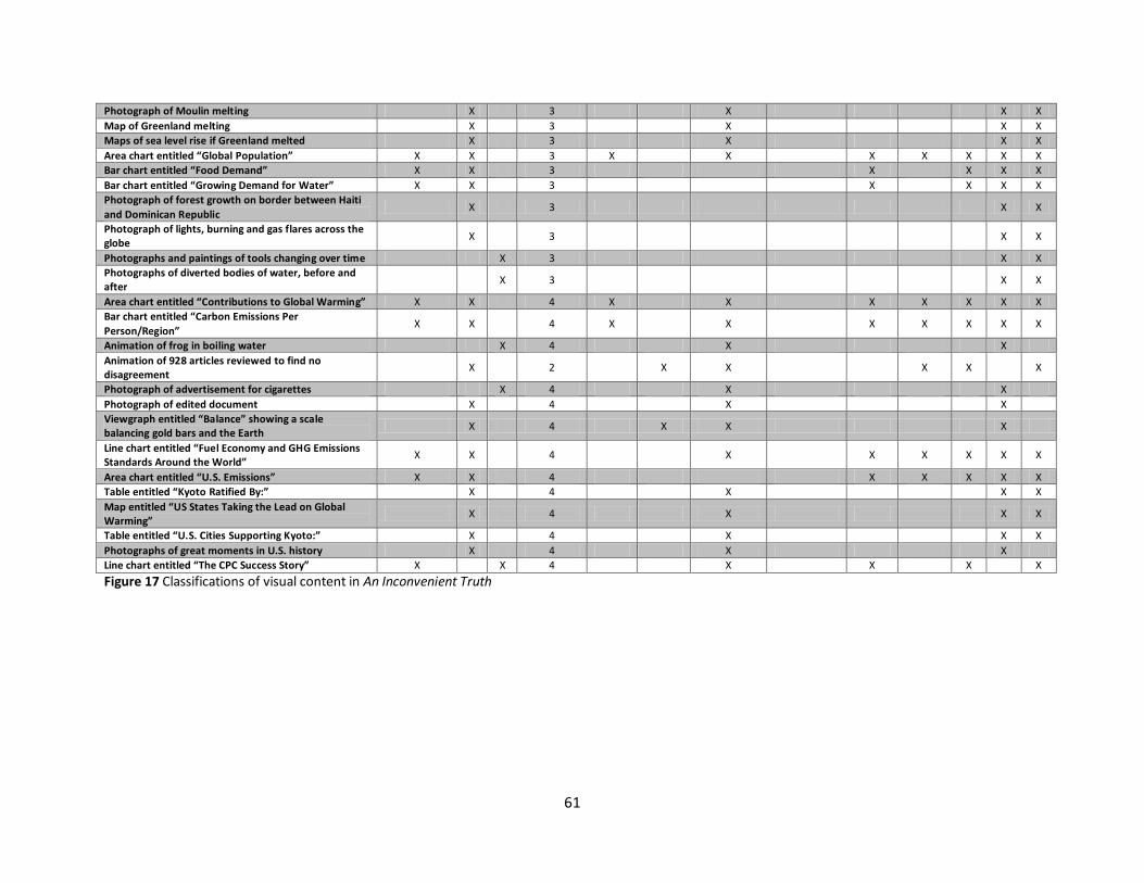
61
Photograph of Moulin melting X 3 X X X
Map of Greenland melting X 3 X X X
Maps of sea level rise if Greenland melted X 3 X X X
Area chart entitled “Global Population” X X 3 X X X X X X X
Bar chart entitled “Food Demand” X X 3 X X X X
Bar chart entitled “Growing Demand for Water” X X 3 X X X X
Photograph of forest growth on border between Haiti
and Dominican Republic X 3 X X
Photograph of lights, burning and gas flares across the globe
X 3 X X
Photographs and paintings of tools changing over time X 3 X X
Photographs of diverted bodies of water, before and after
X 3 X X
Area chart entitled “Contributions to Global Warming” X X 4 X X X X X X X
Bar chart entitled “Carbon Emissions Per
Person/Region” X X 4 X X X X X X X
Animation of frog in boiling water X 4 X X
Animation of 928 articles reviewed to find no disagreement
X 2 X X X X X
Photograph of advertisement for cigarettes X 4 X X
Photograph of edited document X 4 X X
Viewgraph entitled “Balance” showing a scale balancing gold bars and the Earth
X 4 X X X
Line chart entitled “Fuel Economy and GHG Emissions Standards Around the World”
X X 4 X X X X X X
Area chart entitled “U.S. Emissions” X X 4 X X X X X
Table entitled “Kyoto Ratified By:” X 4 X X X
Map entitled “US States Taking the Lead on Global Warming”
X 4 X X X
Table entitled “U.S. Cities Supporting Kyoto:” X 4 X X X
Photographs of great moments in U.S. history X 4 X X
Line chart entitled “The CPC Success Story” X X 4 X X X X
Figure 17 Classifications of visual content in An Inconvenient Truth