representationalism in woven tapestry technique …
TRANSCRIPT

REPRESENTATIONALISM IN WOVEN TAPESTRY TECHNIQUE
PROBLEM IN LIEU OF THESIS
Presented to the Graduate Council of the
North Texas State University in Partial
Fulfillment of the Requirements
For the Degree of
MASTER OF FINE ARTS
By
Lynne Dees, B.F.A.
Denton, Texas
May, 1980

TABLE OF CONTENTS
PageLIST OF ILLUSTRATIONS . . . iv
Chapter
I. INTRODUCTION . . . . . . . . . . . . . . . . . 1
ProblemOrigin of StudyMethodologyHistory of Representational TapestryInfluences Upon My Work
II. THE REPRESENTATIONAL TAPESTRIES . . . . . . . 18
Choosing the DesignPreparing to WeaveExecution of the TapestryTapestry Finishing, Displaying, and Evaluation
III. CONCLUSIONS . . . . . . . . . . . . . . . . . 56
APPENDIX . . . . . . . . . . . . . . . . . . . . . . . 58
BIBLIOGRAPHY . . . . . . . . . . . . . . . . . . . . . 62
SLIDES .............................. ............. 63
iii
LIST OF ILLUSTRATIONS
Plate
I.
II.
III.
IV.
V.
VI.
VII.
VIII.
IX.
X.
XI.
XII.
Slits.. . . . . . . . . . . . . . . . .
Single Interlocking Technique . . . . . .
Method of Connecting Weft Threads . . . .
"Lazy Lines" . . . . . . . . . . . . . .
Use of Slits in Areas of Connected Wefts
Splicing of Wefts . . . . . . . . . . . .
Location of Weft Splices . . . . . . . .
Weft Bubbling . . . . . . . . . . . . . .
Meeting Places of Multiple Weftsin a Solid Color Area . . . . . . . . . .
The Securing of Weft Ends . . . . . . . .
The Maori Edge . . . . . . . . . . . . .
The Mounting Board .. 0 . . . 0.0.0 . .
iv
Page
. 28
. 30
. 31
. 33
. .34
. .35
. 37
. 40
. 42
. . . 43
. . . 50
. . . 52

CHAPTER I
ORIGIN OF STUDY
My interest in pictorial representationalism began when
I started painting and drawing as a child, and my concern
for working realistically continued and developed through my
undergraduate years in college. I then applied this interest
to three-dimensional fiber sculptures which represented real-
istic objects. Through these sculptures, I learned how to
apply my knowledge of color mixing and application as a
painter to the medium of fiber to achieve a representational
end product. In January, 1978, I became interested in using
and mixing yarns in such a way as to create representational
woven tapestries.
Problem
In this investigation I explored the working processes
used in a representational approach to contemporary woven
tapestries. A brief discussion of the origins of represen-
tational woven tapestries with concentration upon Twentieth
Century textiles was followed by an analysis of the influ-
ences upon my work by artists and stylistic trends. I then
discussed the process of my work in four steps and answered
the following questions:
1. In choosing subject matter for a tapestry, what
1

2
initially attracted me to a particular design?
How were my choices of the subject matter for each weaving
influenced by my experience as a realistic painter and by my
growing knowledge and increasing awareness of the possibil-
ities inherent in fiber?
How did I arrive at a goal or initial concept for each tap-
estry?
2. What steps were taken in the planning and prepa-
ration for weaving a representational tapestry?
Were alterations to the original design necessary for more
ease in weaving and for a more successful end product, and if
so, what?
What materials could be used to produce the most satis-
factory results?
3. What traditional weaving techniques were success-
fully applied to the production of a representational
tapestry?
Did difficulties or changes arise in the actual weaving
process which were non-existent in the planning stage?
If mistakes were made, how could they be corrected?
4. What was the most secure and aesthetically pleasing
method of finishing a tapestry?
What was the best method to hang and display a tapestry?
How could the success or failure of each piece be evaluated?

3
Methodology
Notations made in my journal were the main source of
information for the documentation of the entire weaving pro-
cess. My sketchbooks, research notes, personal observations,
and knowledge gathered from reading provided additional in-
formation. Eleven representational woven tapestries served
as the final products of this investigation.

4
History of Representational Tapestry
Tapestry is a weaving technique in which the horizontal
weft threads interlace with and completely hide the vertical
warp threads.1 Most tapestries depict pictoral scenes, so
the weft threads are manipulated in such a way as to repre-
sent various shapes.
Due to the scarcity of remains of ancient tapestries,
most of our knowledge of the origins of tapestry weaving has
come from written documents and from paintings, sculptures,
and prints depicting the art of weaving in progress. One
literary reference to tapestry-making is in the story of Pe-
nelope, who was waiting for Ulysses to return from a voyage.
Upon the completion of a tapestry she was weaving, Penelope
was to select a husband. In order to ward off her many suit-
ors, she unravelled at night this tapestry which she wove
during the day.2 Some of the earliest fragments of the tap-
estry technique have been found in Egyptian royal tombs,
including that of Tutankhamun. Early tapestry weaving often
consisted of woven strips or small pieces which were used on
the edges of clothing, or used for funerary purposes. This
was also true of Babylonian and Greek tapestry work. The
Romans were probably the first civilization to produce
'Technical terms are defined in the glossary.
2Madeleine Jarry, World Tapestry: From Its Origins tothe Present (New York, 1968), p. 12.

5
tapestries for display in public buildings, a custom which is
still in effect today.
Coptic weaving of the Third through the Seventh Centu-
ries A. D. exhibits numerous techniques that are used in
modern-day tapestry work. These tapestries, which contained
the shading technique called hatching, utilized a thinner
linen thread for the warp with a thicker wool thread for the
weft. Though primitive in craftsmanship and in stylistic
maturity, Coptic tapestry influenced later tapestries of the
Western world.
Though the art of tapestry-making was practiced in nu-
merous parts of the world, European tapestries dominated
until well into the Twentieth Century. European tapestry
began its era of importance around 1350-1400, and France be-
came the leader in tapestry-making for the next six hundred
years. Previously, tapestry weavings had been created for
use in daily life as saddles, sacks, clothing, and as small
decorative hangings with repeated motifs. Beginning about
1360, the weaving of tapestries depicting historical scenes
began, and this tendency did not die out until the end of
the Nineteenth Century. Tapestry of the Medieval and later
periods had not only an aesthetic purpose but a functional
purpose as well. Most tapestries were made for secular use
to decorate and insulate the drafty palaces and villas. A
few, small, odd-shaped tapestries were woven to fit into cor-
ners and side aisles of churches which contained too many

6
large windows to permit the installation of mural-sized tap-
estries.
Paris was the intellectual capital of the West during
the Middle Ages, and tapestry-making flourished under the
reigns of Charles V, his son Charles VI, and Philip the Bold.
These rulers supported tapestry-making by raising the social
status of weavers and by commissioning much work for their
palaces. Tapestries became much sought-after items, due to
their resistance to wear and tear during the repeated han-
dling and moving of them by the nobility. Tapestries were
a practical form of art for rulers who liked to take their
possessions with them to their country palaces or off to war.
Most Gothic tapestries depicted historical, literary,
and religious themes. Popular subject matter included events
like the Destruction of Troy, the adventures of King Arthur,
The Annunciation, and heroes such as Hercules and Caesar.
Most tapestries were woven in several panels depicting nu-
merous scenes. The greatest weaving series of the Medieval
era was the Angers Apocalypse, a huge seven-part tapestry
displaying 105 scenes which was commissioned by the brother
of Charles V. 3 Also a popular theme for paintings of the
era, the Apocalypse was typically Gothic in style with its
stilted, unrealistic, and flat figures which were set in lof-
ty architectural surroundings. Medieval tapestry-makers
3Jarry, p. 30.

7
limited themselves to between fifteen and twenty colors. From
this palette, fifteen colors were used in the Apocalypse.
Most Medieval tapestries were woven on the high warp
loom and contained thirteen to fifteen warp ends per inch.
Due to the lack of foot treadles, the high warp loom pro-
duced weavings more slowly; however, the end product was
more accurate. The high warp weaver worked on the front
side of the weaving and was able to view the entire work.
The more expensive tapestries were worked on this type of
loom, whereas the low warp looms wove the less important
works. Low warp tapestries contained about ten ends per
inch. These looms produced less accurate renditions of the
cartoons, due to the fact that the tapestry must be woven
from the back. The accuracy of the design and color could
only be checked with a hand mirror.
Large workshops produced most of the tapestry weavings
of the Medieval and Renaissance eras. The first noteworthy
workshop was at Arras. Wealthy noblemen patronized these
high warp weavers, who supplied tapestries to the House of
Burgundy. The Tournai workshops flourished in the late
1500's, when the first known tapestry-making regulatory ordi-
nance was published. Tapestries from these workshops ex-
hibited the typical Medieval style. Figures were shaded in
a primitive manner, outlining was used, picture planes were
quite crowded, and lettering was often used to clarify that

8
which was shown pictorally. Often the use of embroidery
and painted areas enhanced these tapestries.
During the Renaissance, painting became the major art
form, and tapestry gradually became a subordinate art with
its only purpose being to copy paintings. This copying
later led tapestry-making to its downfall in the Eighteenth
and Nineteenth Centuries. However, during the Renaissance
tapestry-making reached a high point socially and econom-
ically. The industry became more regulated, and weavers be-
gan earning their pay according to their skill and gained
status in society. Weavers of flesh and face earned more
than weavers of foliage and background.4 Most tapestries
depicted historical or literary scenes executed in the repre-
sentational Renaissance style. The demand for tapestries
grew at an incredible rate, and the workshops were so or-
ganized that tapestries were produced efficiently and
quickly. Edicts were passed to prevent plagiarism by weav-
ers of other countries. Tapestry weavings from Paris were
exported to nobility all over the world. Begainning about
1550, the demand for the Parisian tapestries grew so great
that the technique deteriorated and originality was lost in
the mass production. Despite some excellent works based on
cartoons by Raphael and his chief pupil Giulio Romano, the
majority of tapestries woven during the heyday of Renaissance
4 Jarry, p. 142.

9
weaving had already begun to lose some of the originality
and vitality typical of the Medieval period.
Recognizing that tapestries were an important trade
item and because he knew that tapestries were a popular art
form, Francis I set up the first royal tapestry workshop,
which was financed by the state. Though the primary purpose
of the workshop was to produce tapestries for royalty, the
weavers were allowed to produce weavings for private commis-
sions. During the next two centuries, most tapestry workshops
in Europe became state owned and operated.
The excellent organization of the tapestry. workshops in
seventeenth century France was due to the interest of
Henri IV. He gave permission to two Belgian emigres,
Francois de La Planch and Marc de Comans, to settle near the
Seine River to set up a tapestry workshop. In this workshop,
the exacting "Flemish style" of tapestry-making was produced
on low warp looms. In 1662, Louis XIV bought the hotel of
the Gobelin family and gave this name to all the tapestry
workshops in Paris, including the Seine River organization.
Two hundred and fifty workers, not including apprentices,
wove in the royal Gobelins factory, and they made works for
the royal residences, including Louis XIV's palace at
Versailles. These successful workshops produced tapestries
for only about twenty years until unrest and financial dif-
ficulties led to the temporary shut-down of the Gobelins in

10
1694.5 The rivalry of two controlling ministers of the
Gobelins split the weavers into two opposing groups which
fought over stylistic and philosophical trends. Weaving was
an art for the very rich, and the royal treasuries had over-
extended themselves to the point that the expensive art of
tapestry could no longer be accommodated. Not only were tap-
estries expensive to buy, but funds were required after
their installation to pay for security, cleaning, and trans-
portation. These factors contributed to the gradual decline
of tapestry as a major art form during the next two hundred
years.
Tapestry weaving was totally reduced to an art of imi-
tation during the Eighteenth Century. During this era, due
to architectural and interior decoration changes, tapestries
became smaller and were meant to be viewed more closely in
the salons in which they were installed. The works lost
their monumental quality. The rules of tapestry-making were
abandoned, and the weaver lost his freedom to add, subtract,
or to alter details of the original design or cartoon to exe-
cute better the tapestry. To imitate more precisely the
nuances of Baroque painting, new evanescent dyes were de-
veloped, and as many as 14,400 different shades of colors
were in constant use.6 These dyes were neither colorfast
5 Joseph Jobe, editor, Great Tapestries: The Web of His-tory From the Twelfth to the Twentieth Century (Switzerland,1965), p. 97.
6 Jobe, p. 103.

11
nor durable. Often fading began before the tapestry was com-
pleted. The desire to imitate paintings so perfectly became
so great that the weavers began twisting two threads of dif-
ferent shades together to obtain a third shade to copy bet-
ter a color in the painting. State-owned workshops like
Aubusson, Felletin, and Beauvais mass-produced tapestries
depicting national scenes and the heroic deeds of Napolean
during the French Revolution. Tapestries were in such great
demand that preliminary paintings, called cartoons, were
copied as many as ten or twelve times.7
During the late Nineteenth Century, tapestry workers
and the directors of the manufacturies realized that the art
of tapestry had lost its prestige, and measures were taken to
restore its integrity and stature as a major art form. Be-
cause the new dyes were fading and deteriorating, official
committees demanded a return to the original, restricted
palette of durable colors. Workshop weavers returned to the
appropriate techniques and the traditional dye methods best
suited to their medium. Despite these measures taken by
large groups, the major reforms of the art of tapestry took
place in the workshops of individuals who designed and exe-
cuted their own work.
Englishman William Morris is generally credited with
the first attempt at the revival of tapestry in Europe.
7 Jarry, p. 240.

12
Morris, who loved Medieval tapestry, abandoned perspective
and restricted his palette to the original fifteen colors
used in Medieval weavings. His work was decorative, and he
made no attempt to copy paintings. Frenchman Jean Lurcat,
who experimented continuously with tapestry throughout his
life, wanted to reestablish the mural character of tapestry.
Lurcat desired to elevate the art of tapestry above that of
merely imitating painting. Like Morris, he eliminated per-
spective, modeling, the horizon line, and the decorative
border from his works. Lurcat and Francois Tabard, the
Aubusson tapestry master, were the major figures in the re-
vival of tapestry in the early Twentieth Century.
Lurcat believed that tapestry was meant to be viewed as
a monumental art in a public building.8 Most Twentieth Cen-
tury tapestries, whether woven by workshops or by individ-
uals, have been sold to large companies who display them on
large wall surfaces. Like Medieval and Renaissance tap-
estries, modern works continue to serve as an art for the
public. The nobility and the Church patronized tapestries
in past centuries. Banks, oil companies, schools, luxury
liners, office buildings, and churches are the major patrons
of modern-day tapestry. Modern architecture with its bare
walls, lack of ornamentation, and large open spaces has been
one factor in the revitalization of tapestry-making.
8 Job6, p. 152.

13
During the first half of the Twentieth Century, most
tapestry-makers copied designs made by contemporary artists
such as Dufy, Matisse, Calder, and Picasso, who designed car-
toons only as a sideline to their other work. During the
1960's and 1970's, however, the number of tapestries de-
signed by the actual weaver of the work has increased. In
this way, tapestry has become a more personal art.
The most innovative works in tapestry of the Twentieth
Century have been executed during the last two decades.
Weavers have returned to the art of tapestry as an end in it-
self. The International Tapestry Biennales which originated
in 1962 in Lausanne, Switzerland, have displayed works which
exhibit the wide variety of approaches to the art of tapes-
try. Contemporary tapestry-makers have incorporated many un-
conventional fibers into their works besides the traditional
materials. Jute, hemp, nylon, plastics, and metals are a
few of the materials which are in use today.

14
Influences Upon My Work
As an artist, I have fluctuated between working with
painting and drawing and working with fibers. I have a love
for many styles and media, but I have always desired to work
in a representational manner. My painting style matured
first, but during the last eight years, my intrigue with pic-
torial realism has manifested itself in sculpture and most
recently in representational tapestry. I feel that this re-
cent work reflects the artistic and stylistic influences to
which I have been exposed during the last decade.
The first artist I studied in depth was Belgian Sur-
realist Rene Magritte. Magritte was not technically as
excellent a painter as other Surrealists. His modeling and
painting techniques were somewhat amateurish. However, I
felt that I could understand his visions of reality because
I had worked in a similar manner. I was impressed with
Magritte's starkness, simplicity, and purity of colors, and
his humorous and witty approach to the banalities of life.
Magritte led a seemingly mundane life, but he looked beyond
banality and saw the unexpected. In 1972, I felt very much
like Magritte. I feel that much of the straightforwardness
and simplicity of Magritte's work is present in my work today.
During the mid-1970's, I made numerous trips to the East
Coast, and I was exposed to the Renaissance and Medieval
painting collections of the Metropolitan Museum of Art and
the National Gallery in Washington, D. C. I spent hours

15
looking at the minute detail and tedious brushwork of the
Medieval tryptichs and portraits. Though I never had at-
tempted such difficult work, I felt that I was ready to try
representationalism. As a result, my paintings became more
realistic and detailed, and I increased my desire for per-
fectionism in color mixing and in the rendering of reality.
I believe that it was a natural step for me to turn to the
art of tapestry, an art which demands meticulous attention
and flawless technique.
Though I was not usually attracted to sculpture, I
liked Claes Oldenburg's whimsical and joyful soft sculptures.
Oldenburg, like Magritte, took everyday objects and rear-
ranged, shrunk, enlarged, and altered them until they created
a new kind of reality. He made obvious the beauty of house-
hold objects that have been present for many years which are
normally taken for granted or are ignored. Like Oldenburg,
I have taken common objects out of context and have created
them in an unexpected medium--fiber. Like Oldenburg's soft
sculptures, my tapestries are presented as non-functional
fine arts objects instead of functional objects of daily life.
My representational tapestries directly resulted from
some investigations I had been doing of advertisements of the
1920's and 1930's in magazines such as Saturday Evening Post
and Ladies Home Journal. I had also seen some early twen-
tieth-century paper labels from wooden citrus crates. I
began studying styles used in early twentieth-century

16
advertising art and discovered that most of the advertising
of the day was original artists' work rather than photo-
graphy. The artists, generally anonymous, frequently used
close-up views of the products they were selling. These de-
signs were depicted in bright colors and simple shapes.
Often there was a combination of geometric design and real-
istic elements. In some instances, ads used several objects
which related to one another in the making of the product.
This combination and tie-in of elements is obvious in the
"Heinz Tomato Soup Label".9 Occasionally, modern :can labels
or pages in magazines which advertise a product will exhibit
some of the same characteristics of early day labels. This
simplicity of design, clarity of color, and straightfor-
wardness of intent can be seen in the "Concho Tomato Label"
and in the "Gold Tip Tomato Label".
During my transition from painter to weaver, I studied
certain tapestry weavers of recent years. Though my work
differs drastically, I especially enjoy the huge "super-
realistic" mural tapestries by Swedish weaver Helena
Hernmarck. She depicts modern-day scenes and events, using
a textural rosepath or brocade tapestry technique. New York
tapestry weaver Michelle Lester works with such a flawless
technique that she is able to recreate beautifully her hus-
band's luminous, translucent watercolors. I was exposed to
9Each work of art is included in the slides.

17
Lester's working methods in an August, 1978, workshop. As a
result, my work improved technically. I especially admire
the textural qualities, naturalism, and muted colors in
Cynthia Schira's works. She weaves with ikat-dyed strips
which result in soft, flowing, impressionistic textiles. I
see a strong relationship between Schira's, Lester's, and
Hernmarck's work.
I feel that my weaving of the representational tapes-
tries resulted partially from my studying of numerous artists,
especially those currently working during the decade be-
ginning in 1970.

CHAPTER II
CHOOSING THE DESIGN
The primary step in the weaving of the representational
tapestries was the selection of the subject matter. As the
result of a suggestion made by a friend, I began weaving
tapestries of antique citrus labels and magazine advertis-
ments. Seeking out material from junkstores and antique
shops satisfied my sense of nostalgia. I also gained insight
into America's rich heritage in everyday advertising art.
When choosing a design to weave, I was initially attracted
to the colors used and to the simplicity of shapes in the
design. Color was the primary factor in my attraction to
the "Transit Lemon Label". In the weaving of this tapestry,
I wanted to recreate the cheerful effect that the combination
of citrus colors had upon me when I first viewed the label.
I chose to weave the "Concho Tomato Label" and the "Gold Tip
Tomato Label" for similar reasons. In these two tapestries,
I was attracted to the way in which the background color con-
trasted dynamically with the central tomato figure. The
repeated use of the color red in the tapestries was an un-
conscious act. I did not become aware of this until I began
reevaluating my work for this investigation. Nine of the
eleven tapestries contained one or more shades of red. To-
mato and tomato soup logos accounted for over one-third of
18

19
the tapestries, which was probably due to my preference for
red.
Unlike the brightly colored works, the "Heinz Tomato
Soup Label" and the "Campbell Tomato Soup Label" were select-
ed because of their more subtle color combinations. I es-
pecially liked the use of the red in the "Campbell Soup"
label, which served as the focal point amidst the brown, tan,
and grey colors which constituted most of the design.1 The
decision to weave the "Heinz Soup" label was made because I
was attracted to the rich, harmonious color scheme. I chose
to execute the "Santa Fe Weaving No. 1" because I believed
that the hand-dyed yarns I planned to use would beautifully
duplicate the pictorial image. Overall, the color scheme of
a design served as the first consideration in my decision to
weave a tapestry.
The second major factor which affected my choice of sub-
ject matter was the subjective meaning of the design to me.
I have never woven a tapestry which depicted a situation or a
product about which I felt neutrally or had disliked. Most
of the works had a story behind them which led to their
making. The most personally significant tapestry was in-
spired by a mid-winter excursion I made several years ago. I
saw an American Airlines logogram on the side of an airplane
which was hanging in the Smithsonian Air and Space Museum in
Washington, D. C. The resulting tapestry, "American Airlines
1 0 Shortened forms of titles will be utilized when thework has been previously listed on the same page.

20
Logo", represented my fascination with airplanes and with
flying which symbolized freedom to me. Similarly, I was at-
tracted to the neon flying horse which rotated atop the Mobil
Building in Dallas, Texas, and, as a result, I wove the
"Mobilgas" tapestry. My love for cooking with tomatoes mani-
fested itself in the weaving of the four tomato tapestries.
The "Santa Fe Weaving No. 2" was taken from a tile mosaic dis-
played on the front of one of the exhibition barns near Will
Rogers Auditorium in Fort Worth, Texas. Being native-born
in Fort Worth, I had always been exposed to Western motifs,
the stock show, and rodeo events, and this exposure prompted
the weaving of this tapestry. In most cases I chose to
weave from designs that I had collected which represented
some bygone era in American advertising art.
In general, I selected designs which made the most di-
rect and simple use of the elements of line, shape, color,
and composition. I was especially interested in designs
which were straightforward in their statements. For the
"Self-Portrait" I worked from a color slide, but chose to uti-
lize the dynamic technique of a value drop-out in black and
white. I was likewise attracted to the forcefulness and sim-
plicity of the "Transit Lemon Label" and the "Handsum Orange
Label". The choosing of the designs directly related to my
attraction to the composition.
My early choices of subject matter were guided by my
intuition, for I had no guidelines by which to work to assure

21
the technical or artistic success of a tapestry. With no
experience as a tapestry weaver, I rather naively blundered
into this investigation and subsequently learned by trial
and error. Though I knew how to render objects representa-
tionally in paintings, I had no idea of how representation-
alism could be achieved in flat tapestry technique with its
rather rigid method of interlacing threads at right angles.
I knew that color areas were connected by weft joins, but I
did not know how gradual shading could be achieved. I en-
countered problems in my earlier works which I solved by
trial and error, but gradually I built up a body of know-
ledge from which I chose later designs.
As I became more experienced in tapestry weaving, I
began to become more aware of how shapes, colors, and de-
tails in the original design would affect the final tapestry.
My choices of subjects were influenced by the complexity and
detail of a design with consideration for what size the work
had to be woven in order to render successfully the details.
The forty-eight inch limitation set by the weaving width of
my loom also affected my choices of designs.
Incorporating the knowledge I gained by working, I often
excluded, added, or altered aspects of the design in order to
execute better the tapestry. In certain instances, I chose
to exclude the design entirely. Because of my artistic
knowledge, I likewise deliberately changed details in all
eleven tapestries to produce a cleaner, more straightforward,
and less cluttered end product.

22
To attain more realistic renditions, I often chose de-
signs which contained colors that were readily available.
I never made a final decision to weave a design until I con-
sulted my yarn catalogues, but if I had my heart set on
creating a particular tapestry, the lack of a yarn color did
not prevent me from doing the work. Instead, I devised
methods to obtain the color I needed.
Despite my knowledge as a painter and my growing knowl-
edge as a tapestry-maker, my choice of designs usually was
entirely determined by my subjectivity, not by logic or facts.
Often I wove a design just because I wanted to do it, even
though I knew that the execution would be difficult. I feel
that my ignoring the technical obstacles in order to create
the tapestry was typical of my attitude throughout the en-
tire investigation. I had a positive attitude about over-
coming any problems that I would encounter, and in order to
execute the design, I was prepared to meet and conquer any
technical challenge that I faced.
The initial concept or goal that I set for each work
was usually of a technical nature. In early tapestries, my
desire was to recreate the design in tapestry form so that
the letters were legible and the pictorial aspects were rec-
ognizable. I set various technical goals based on difficul-
ties that had occurred in earlier tapestries. I also
deliberately planned to utilize techniques to which I had

23
recently been exposed. I often set out to discover the most
appropriate ways to depict representational objects.
After prolonged contemplation over the factors which
contributed to the selection of a design, it became evident
that the color scheme was the primary factor in my decision.
The choices were also influenced by my subjective and intui-
tive feelings about a specific design. My knowledge of the
technical possibilities and difficulties in tapestry weaving
never deterred me from executing a design that I really
wanted to do.

24
Preparing to Weave
After selection of the design, I then began to prepare
for the actual weaving of the work. The dimensions of the
proposed weaving were my first consideration. My decision
was dependent upon the size and the amount of detail which I
wished to include in the final product. Since larger details
were more easily executed, I often needed to enlarge the
work accordingly. The original design or label was mounted
by the corners with masking tape upon cardboard, then cov-
ered with a slightly larger sheet of clear acetate. An exect
grid of squares was drawn over the design. Next, I drew a
grid on a sheet of eighty pound paper. The same number of
squares was used on a much larger scale. Usually a one inch
grid on my original design was expanded to a four of five
inch grid on the cartoon. The design was then drawn off in
full scale. I used watercolor or colored pencil to clarify
obscure or confusing areas. I fount it necessary to shade
in the details on the plate in the "Heinz Tomato Soup Label"
to prevent confusion.
I made alterations to my cartoon before weaving. Small
letters were eliminated from six of my tapestries which
would have been impossible to weave legibly. Complex shaded
areas were simplified before being drawn on the cartoon. To
distinguish between small areas of similar colors, I numbered
or lettered areas on my cartoon which corresponded to cer-
tain yarn colors. The leaves on the "Transit Lemon Label",

25
"Gold Tip Tomato Label", and the "Concho Tomato Label" had to
be altered and drawn off more simply for ease in weaving.
The simply shaded areas seemed to be the most successful.
In some cases it became necessary to add details to a
design. Because of superficial lettering which obscured
part of the advertisement, I had to recreate part of the
leaves on the china in the "Campbell Tomato Soup Label". On
both soup labels, I found it necessary to construct borders
for the edges of the designs. In tapestry weaving, numerous
color changes near the selvages cause structurally weak
areas. In general, however, I discovered that relatively
few alterations needed to be made.
After the cartoon was completed, the yarn selection was
made. When using two-ply wool on a 7/4 linen warp set at
six ends per inch, I discovered that I usually needed 1/2
pound of weft per square foot. After relying upon my exper-
ience to estimate how many skeins of each color I needed, I
ordered my yarn. As I grew accustomed to yarn ordering, es-
timations became more accurate. Due to my large stock of
yarns which I accumulated from leftovers of earlier weavings,
I found that I often did not need to order certain colors.
After ordering the yarn, I dressed the loom. I prepared
the warp and threaded the loom. In most cases, only two har-
nesses were utilized. After weaving in about four inches of
cloth strips, I twined the warp to prevent unraveling. Then
I wove in three to four inches of weft. This gave enough

26
stable fabric upon which to attach my cartoon. To prevent
the paper from tearing, I adhered masking tape on the back
of the cartoon where the T-pins were to be inserted. I
pinned the cartoon to the weaving, and by pressing it up
toward the warp, I was able to mark the warp threads at the
point where each shape or color ended. I used three or four
different colors of waterproof felt-tip pens to make the
distinctions between close joinings more discernible. I
taped my original design to the loom castle directly in
front of me so I could easily and quickly refer to it while
working.
Careful evaluation of the design, drawing off the car-
toon, and conscientious yarn ordering were my main concerns.
In many ways, I discovered that the preparation was the most
difficult and tedious step in the entire process. I often
procrastinated and literally experienced nightmares as a re-
sult of having to make decisions about choosing colors.
After the supplies were ordered, I felt relaxed and confi-
dent during the remainder of the weaving process. I found
that if I took my time and planned cautiously and logically,
much confusion and many errors could be avoided when the
actual weaving process began.

27
Execution of the Tapestry
My first consideration while weaving concerned the
creation of neat and sturdy weft joins. The legibility of
lettering and the successful modeling of objects were total-
ly dependent upon these carefully executed weft joins. I
discovered the most advantageous techniques for each color
change by practicing and by much experimenting.
Except for certain instances, the best method of han-
dling the meeting places of wefts was to leave open places
or slits. (See Plate I.) The utilization of slits resulted
in the smoothest and least irregular joining line. The use
of slits was most accomplished in the weaving of the "Camp-
bell Tomato Soup Label", especially in the areas where shapes
with gradual upward curves met. I found that slits could
not be successfully utilized under the following circum-
stances: (1) When using a color around only one warp
thread. (2) When more than three or four weft turns met
each other, thereby causing a slit which was too long and re-
sulted in a gap. Usually two or less picks did not have to
be sewed up. Three picks did not have to be sewed if the
join was near other picks of four or more which were connect-
ed. However, if the three-pick meet was adjacent to several
unconnected two-pick joins, sewing the slit closed invisibly
with nylon thread was required.
When slits could not be used, I sometimes connected the
weft threads with a single interlocking technique. (See

28
Plate I--Slits
i

29
Plate II.) All weft threads must be free to move back and
forth because the weft areas must be built up simultaneous-
ly when using this technique. Due to the characteristic of
tapestry weaving which requires areas to be built up sepa-
rately and often unevenly, I could not always apply this
type of meet and separate join to my tapestries. Instead, I
devised a method of sewing one weft to another which had
previously been woven in. I executed the lettering in all
of my tapestries in this manner. To prevent having to sew
in extremely lengthy pieces of yarn, I tried to lay in the
larger areas first and then sew in the smaller area or details
to the already existing areas. The weft thread had to be
sewed into the other thread in an upward manner, with the
needle leading away from myself and towards the reed. (See
Plate III.) I feel that this method of sewing wefts together
produced the best results.
Due to the nature of tapestry weaving, the warp and
weft threads interlace at right angles. This characteristic
usually presented no problems except when I wove near-verti-
cal lines. I could not execute precisely smooth diagonal
lines because a slight stair-stepping effect occurred. When
weaving in these areas, I learned several techniques which
made the line smoother and visually more successful. In the
"Mobilgas" label, I used "lazy lines" to create a smoother
diagonal in the weaving of the body of the horse. In this
technique, I wove in two picks of one weft color over the

Plate II--Single Interlocking Technique
30
5.
4.
3.
2.
I.
-Lild-1Wgdo f
,Mo

2
..
A
Plate III--Method of Connecting Weft Threads
31
&40"?
tj
M"Imm--Nft
32
built-up area of another color. Then I filled in the new
color area. (See Plate IV.) I used "lazy lines" in areas
of the "Handsum Orange Label" and in the "American Airlines
Logo".
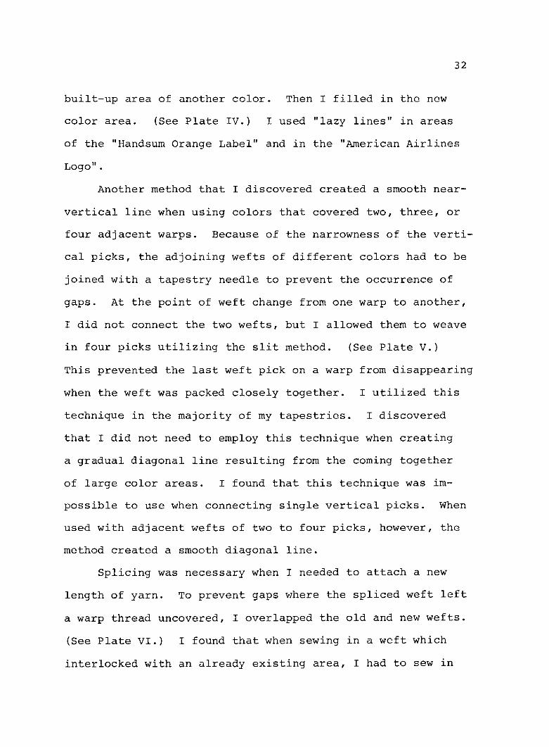
Another method that I discovered created a smooth near-
vertical line when using colors that covered two, three, or
four adjacent warps. Because of the narrowness of the verti-
cal picks, the adjoining wefts of different colors had to be
joined with a tapestry needle to prevent the occurrence of
gaps. At the point of weft change from one warp to another,
I did not connect the two wefts, but I allowed them to weave
in four picks utilizing the slit method. (See Plate V.)
This prevented the last weft pick on a warp from disappearing
when the weft was packed closely together. I utilized this
technique in the majority of my tapestries. I discovered
that I did not need to employ this technique when creating
a gradual diagonal line resulting from the coming together
of large color areas. I found that this technique was im-
possible to use when connecting single vertical picks. When
used with adjacent wefts of two to four picks, however, the
method created a smooth diagonal line.
Splicing was necessary when I needed to attach a new
length of yarn. To prevent gaps where the spliced weft left
a warp thread uncovered, I overlapped the old and new wefts.
(See Plate VI.) I found that when sewing in a weft which
interlocked with an already existing area, I had to sew in

Plate IV--"Lazy Lines"
33
2
I
%.or
r

34
laV--seoSli ts iA r
Plate V--Use of Slits in Areas of Connected Wefts

35
Plate VI--Splicing of Wefts

36
the spliced threads as far away as possible to the point of
the weft connection. (See Plate VII.) Failure to do this
resulted in the new weft end pulling out when I put tension
on the needle.
Another method to prevent the needle-threaded weft from
pulling out was to leave its loose end hanging out of the
front of the tapestry until the first turn was made. Then
the new weft end could be clipped off flush with the surface
of the tapestry. The loose end was also handy for pulling
when the tension needed to be adjusted. I employed these
techniques in order to control correctly my weft joins and
weft tension, which were the major concerns in the process.
My secondary interest in these tapestries concerned
techniques of shading which I needed to utilize in order to
create a three-dimensional illusion. Five techniques were
used for the modeling of objects. These included inlays,
hatching, shading by color, yarn plying, and pick and pick.
In the "Transit Lemon Label", I used inlays of a light yellow
color to ease the transition from yellow to the highlights.
This method caused unevenness in the weft height, which was
corrected by weaving in extra picks of the lower areas.
I employed the more traditional hatching technique to
shade the "Gold Tip Tomato Label", the "Concho Tomato Label",
and the bucket in the "Heinz Tomato Soup Label". A larger
form of hatching, which I call "wedging", was used for the
sun rays in the "Handsum Orange Label". The hatching

37
Plate VII--Location of Weft Splices
-kT -ii- on

38
technique proved to be an excellent method for modeling cer-
tain areas in my work, although it was tedious and confusing.
The simplest shading technique I utilized involved the
weaving of adjacent areas with yarns of slightly different
shades of a color. I used modeling of this type to represent
the foliage in several tapestries. When similar yarn colors
were available, I preferred this technique over the other
methods, but I had to use a more complicated method of yarn
re-plying when I could not obtain the proper yarns.
When a median shade of a color was required to ease the
transition between a light and a dark color, I twisted to-
gether one ply of each color to create a third shade.
Though spotty in appearance, the results were satisfactory,
as seen in the silverware on the "Campbell Tomato Soup Label"
and the hand and orange in the "Handsum Orange Label". The
cup in the "Campbell Soup" label was very subtly shaded in
this manner in order to separate it visually from the plate
upon which it sits.
I used a pick and pick technique to create the shadow
on the soup bowl in the "Heinz Tomato Soup Label". Using
light and dark blue, I alternately wove in two picks of light
blue and one pick of dark blue. The pick and pick tech-
nique was used with re-plied yarn in the hand and the orange
of the "Handsum" label. The five shading techniques I used
created various visual effects which enhanced my representa-
tional tapestries.

39
Though I made little use of textural effects, I did
utilize some three dimensional yarn techniques. In order to
best duplicate the foliage at the bottom of the "Santa Fe
Weaving No. 1", I treadled the loom, which was threaded on
four harnesses, by raising various combinations of the har-
nesses to obtain a loose weave. I created the grass near the
bottom selvage of the "Santa Fe Weaving No. 2" in a similar
manner. In this tapestry I also used rya knots of varying
lengths to best illustrate the cow's tail. To attain a tex-
tural effect in the "Heinz Tomato Soup Label", I stitched in
by hand short lengths of light orange yarn to create the
tomato seeds. As a result, the seeds appear to be slightly
raised from the surface of the cut tomato. Despite oc-
casional use of three dimensional effects, most of my works
were woven in a flat tapestry method.
The use of several techniques benefited the appearance
of the overall tapestry, especially the evenness of selvages.
To prevent the selvages from drawing in, I adjusted the ten-
sion of each weft by bubbling the yarn. (See Plate VIII.)
When weaving a tapestry I discovered that the selvages would
tend to distort where much weft joining occurred. As a re-
sult, the selvages containing areas of a solid color seemed
to shrink in, especially near the top and bottom. I con-
trolled these difficulties by two means. First, I slightly
pulled the weft tension in areas of much detail more tightly
to prevent the extra slack which caused the selvages to

40
Plate VIII--Weft Bubbling

41
shift. I also used a technique which loosened the weft in
areas of large solid colors. Instead of using a single weft
which crossed the entire warp width, I used about four wefts
of the background color and with each, crossed about one-
fourth of the warp. I alternated the meeting places of the
wefts in order to prevent visible slits. (See Plate IX.)
I later determined that this method of preventing the sel-
vages from drawing in was time consuming and tedious, and I
compensated for selvage unevenness by adjusting the tension
by the bubbling process.
The weavings contained ennumerable weft ends which I
had to deal with in a structurally secure manner. The ends
were dealt with in two ways. While weaving my earlier tap-
estries I simply left the loose ends hanging out the back of
the weaving. In the other tapestries I began weaving them
in as I worked. With a tapestry needle, I threaded the weft
end down vertically into the path of a warp thread which was
covered with previously woven wefts. (See Plate X.) The
end was then trimmed off even with the surface. As a result,
the secured weft ends did not begin to unravel or loosen de-
spite repeated handling of the works.
I frequently encountered difficulties which required an
alteration or careful attention in order to correct the prob-
lem. Many difficulties had not existed during the planning
stage of the tapestry and became evident only when I began
the actual weaving process.

/1 ____ - r
Plate TX--Meeting Places of Multiple Weftsin a Solid Color Area
42
l. ' I |

43
Plate X--The Securing of Weft Ends

44
The majority of my difficulties concerned the use of
the cartoon. When rolling the warp forward to create more
weaving area, the cartoon often slipped and when the warp
was tightened, the cartoon did not match the previously
marked dots on the warp. In addition, the warp threads ro-
tated so that the dots could not be seen. To remedy this
difficulty, I found it necessary to put the marks around the
entire warp thread. I compensated for the slippage of the
cartoon by measuring the distance from the grid lines to the
reed in three or four places, then re-adjusting the cartoon
to achieve a uniform distance. I then re-pinned the cartoon
and checked my ink dots on the warp. If necessary, I re-
marked them and wove according to the new marks. Due to my
careful re-checking of the placement of the cartoon, my tap-
estries were not affected by any pictorial distortion.
Often I found that though the cartoon was carefully
drawn, I could not follow it precisely. Some areas I had
drawn in were simply too small to weave. Since one vertical
pick was approximately 1/4 inch wide, a vertical detail less
than that width could not be woven. The removal of such
small details usually did not affect the completed design.
Numerous vertical details in the background leaves of the
"Gold Tip Tomato Label" and in the green flowers on the plate
in the "Campbell Tomato Soup Label" had to be eliminated be-
cause they were too small to weave.

45
When weaving letters, at least one pick of background
color had to be left between the letters to prevent them
from running together. Often I had to disregard totally or
modify my following of the cartoon in order to carry this
out. This difficulty also occurred with pictorial details.
The weaving of a sharp vertical point also created dif-
ficulties. If more than two or three picks were woven in
around one warp thread, the point appeared to be spotty and
disconnected. When weaving points such as leaf tips, the
picks were limited to numbers of two or three.
The cartoon could also not be followed precisely when
narrow areas of hatching were to be used. At least two warp
threads had to be incorporated in the solid areas between
the stripes. Modifications had to be made in the hatching
on the sides of the tomatoes in the "Gold Tip Tomato Label"
and the "Concho Tomato Label" because of this characteristic
typical of the technique.
Another major unexpected situation which I encountered
concerned the need to separate areas of the same color. I
accomplished this in two ways. In the "Campbell Tomato Soup
Label", I differentiated between the soup cup and the plate
by plying a slightly darker yarn with the tan color I used
for the cup. To distinguish the line between the tomatoes
on the right hand side of the "Heinz Tomato Soup Label", I
used another method. I wove in with one vertical pick a
darker orange between the two shapes. This solution created

46
an outline, but I did not feel that it distracted from the
pictorial statement.
Another major difficulty which I encountered while
weaving dealt with yarn tension problems. Due to the ir-
regular height in my weft, the warp tension became uneven.
When this occurred, I wove more slowly and carefully. With-
out failure, the warp tension eventually returned to normal.
Weft tension likewise went beserk for seemingly unknown
reasons. When utilizing "lazy lines" which travel at oblique
angles to the warp, the weft became extremely tight when
packed down. To correct this, it was necessary to remove
the weft and to bubble it more. After some practice, I was
able to prevent this difficulty by deliberately weaving in
"lazy lines" with an extremely loose tension.
Despite the care I took, a small bulge occurred at ev-
ery warp turn when I used the pick and pick technique. I
determined that the best method for preventing the disorder
was to avoid the technique whenever practical.
I encountered another difficulty with weft tension when
I failed to bubble the weft adequately when weaving one di-
rection while adequately bubbling the yarn when weaving the
opposite direction. This carelessness resulted in the pro-
tuberance of every other warp, as seen in parts of the "Mobil-
gas" label. To prevent the repetition of this problem, I
more carefully bubbled the yarn in later tapestries.

47
Difficulties which I encountered during the weaving
stage often resulted as flaws in the final product. The
most obvious flaws manifested themselves as the unevenness
of selvages or bulging and wrinkling of the fabric of the
tapestry. My use of eccentric wefts caused the fabric to
buckle in several tapestries. After completion, the irregu-
larities could not be corrected.
Another irreversible mistake was the unevenness of the
selvages in several of the weavings. As I became a more ex-
perienced weaver, this difficulty was eliminated from other
tapestries.
Before I devised a means of correcting "disappearing"
vertical wefts, several small letters and details in a few
of the tapestries appeared illegible or incoherent. To rem-
edy this, I hand-stitched inlays into the problem areas to
fill in the gaps left by the wefts which had disappeared.
Several flaws occurred only once during this investi-
gation. The first of these concerned the use of color.
Having been somewhat out of practice, not having woven for
five months, I used yarns which were much too bright for the
major highlights in the "Concho Tomato Label". I quickly
realized my mistake and wove the small upper highlights with
an appropriate color. The end result was that of a somewhat
splotched tomato.
My second flaw occurred when I simply was not paying
attention to my work and forgot to follow the cartoon when

48
doing the hatching on the left side of the "Gold Tip Tomato
Label". Because of this neglect, the dark red shading
stopped arbitrarily.
Because I used the pick and pick technique to shade the
hand in the "Handsum Orange Label", stripes appeared which I
feel distracts from the overall appearance. I noticed an-
other difficulty when the "Handsum" label was hung. Because
I wove the tapestry sideways on the loom, the slits became
horizontal and drew apart, leaving gaps which added to the
general distortion of the tapestry. Though the slits con-
sisted of mostly one, two, or three pick weft meets, the
sheer weight of the heavy work pulled the tapestry down so
much that the slits relaxed and opened up. I sewed the
larger slits with nylon thread, but more slits appeared the
longer the work hung.
Although the planning process proved the most difficult
to me, I learned the most about tapestry weaving by the ac-
tual execution of the work. Most of my knowledge about the
art was acquired by trial and error and by experimentations
with yarns and techniques. By the time I had twined the top
selvage and had taken the tapestry from the loom, I felt a
great sense of accomplishment and was ready to complete the
final steps in the creation of a representational tapestry.

49
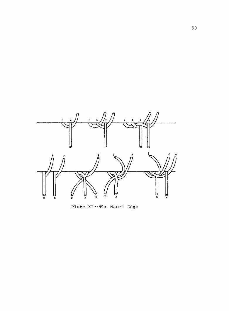
Tapestry Finishing, Displaying, and Evaluation
After I removed the tapestries from the loom, I then
finished and displayed the works. First, the tapestry was
allowed to "rest" horizontally for three to seven days in
order to allow the fibers to shrink and to situate them-
selves to their final size. After this short period of time,
I began to deal with the loose warp ends. All of the tap-
estries utilized the Maori edge for dealing with the ends.
(See Plate XI.) The Maori edge resulted in an extremely
sturdy, tightly rolled edge which did not distract from the
tapestry itself. The warp ends, which had been turned to
the back, were stitched down with sewing thread about three-
eights of an inch from the edge. The warps were then
clipped off close to the hand-stitching. This method of
finishing the warps worked so successfully that I did not
attempt any other method.
To correct the undulating surface and uneven selvages
of the "Handsum Orange Label", I attempted to block it. Af-
ter tacking down the edges, I applied steam heat with
disastrous results. The tapestry stretched even more out of
shape than it had previously. The yarn colors stained cer-
tain areas, and the water-soluble felt tip pens that I had
used in this weaving ran onto the yarn. I determined at
that point that I would rather learn to weave more even tap-
estries than to risk damaging another weaving.
50
Plate XI--The Maori Edge
2 2 3 2 3
a 8 g g S c a
61G D D A p A D E

51
I did not devise a satisfactory method of hanging my
work until I had completed approximately half of the works.
The display of the tapestries had always perplexed me, for
hanging by pins or nails had stretched and distorted the top
edges. Finally, I chose to utilize 3M Brand hook and loop
fastener (commonly called Velcro) to hang the weavings. The
one-inch wide strip was sewn across the top of the backside
of the tapestry. The corresponding piece of fastener, which
had a strong adhesive on it, was attached to a piece of un-
finished pine lattice wood. The wood, which was one inch
wide, was the exact length of the upper edge of the tapestry.
Two picture hooks were screwed in with brass screws at a
point approximately four inches from each end of the wood
strip. Three to four inch strips of lattice which had been
split lengthwise were glued to the lower edge of the mount-
ing board on each end and in the middle. (See Plate XII.)
These strips prevented the mounting board from tilting for-
ward when the tapestry was hung. The tapestry was then
attached to the mounting board by means of the hook and loop
fastener. I discovered four advantages to this method of
presentation. First, the weaving remained undisturbed by
nails, tacks, or pins, thereby avoiding pulling and dis-
tortion. Second, the method required the use of only two
nails. The tapestries could be displayed quickly and with
minimal damage to wall surfaces. Third, the linen warp
threads, which tended to fray, were completely protected and

52
fI':2: 41
Plate XII--The Mounting Board

53
covered by the Velcro. Lastly, because of the method of
mounting, the transporting of the weavings was simple. They
were removed from the wall, rolled up, and moved. There was
never any need to remove the tapestry from the mounting
board except for dry-cleaning.
The evaluation of each finished tapestry was the final
step in the production of the eleven tapestries. I took into
consideration each factor contributing to the designing,
preparation, and execution of the weavings. I determined
whether the finished product had met my initial goals and
whether the tapestry was a success or failure in terms of
the techniques used and in an artistic sense.
Because of the precision required in the work, my first
consideration in evaluating the tapestries concerned the
overall neatness. The primary concern was the presence of
even selvages and the flatness of the work. Several tap-
estries exhibit these qualities, including the "Campbell To-
mato Soup Label", the "Heinz Tomato Soup Label", and the
"Self-Portrait". On the contrary, I considered the "Handsum
Orange Label" a technical failure, due to its irregular sur-
face and distorted selvages. As I strove for perfection in
each tapestry, even fairly minor flaws annoyed me.
My second consideration in the evaluation was the treat-
ment of the weft joins and the resulting appropriateness to
the areas in which they were used. I especially emphasized
the neatness of near-vertical lines in each work, due to the

54
difficulty of creating them in the weaving process. I felt
that the "Campbell Tomato Soup Label" and the "American Air-
lines Logo" exhibit the most precise and clear weft joins of
this type. The fuzzy, rough diagonals in the "Transit Lemon
Label" lowered the overall forcefulness of the tapestry. Due
to care taken with weft joins, the "Campbell Soup", "Heinz
Tomato Soup Label", the "Self-Portrait", and the "American
Airlines Logo" were structurally the most sturdy works.
Besides the technical evaluation, the works were eval-
uated in terms of aesthetics. My primary areas of evaluation
included the forcefulness of the finished product. I an-
alyzed whether the tapestry was as visually attractive as
the original design. I discovered that I was attracted to
every tapestry on the same or on a more intense level than I
had been with the original label. The increased forcefulness
of the finished work was partially due to its increased size
and brightness of yarn colors.
The tapestries were also evaluated in terms of the be-
lievability of the three-dimensional objects depicted. One
of the major intents while weaving the "Concho Tomato Label"
was to recreate successfully the two water droplets on the
tomato. I felt that I accomplished this goal. The ren-
ditions of the silverware in the "Campbell Soup" and "Heinz
Soup" labels were also successful. My goal to weave a believ-
able likeness was also met in the "Self-Portrait". On the
other hand, I felt that the depiction of the highlights on

55
the "Concho Tomato Label" were a failure. Also, the edges
of the plates in the "Campbell Tomato Soup Label" did not
create the sense of three-dimensionality. Considering the
amount of work that went into each piece that could have re-
sulted badly, I was pleased with the outcome of the works as
a whole.
When analyzing the tapestries, I was confronted with
three works which had deviated from the original design.
These weavings, as a result, took on the additional charac-
teristics of liveliness and imagination which I felt were
lacking in the other tapestries. The two "Santa Fe Weavings"
did not follow precisely the photographs from which they
were taken, nor did the "Self-Portrait". I felt less tied to
the original designs and wove more freely when executing
these weavings. I wove all three quickly and with little in-
hibition and, as a result, the tapestries make a more personal
statement.
Generally, the tapestries met the original criteria
that I set for each. The works met my expectations and de-
viated very little from my preconceived visions of their
final state. I felt satisfied with the resulting body of
work and felt that I accomplished that which was originally
intended.

CHAPTER III
CONCLUSIONS
At the onset of this investigation, I set out to dis-
cover whether I could successfully execute representational
depictions in woven tapestry form, and I believe that the
eleven finished tapestries themselves illustrate that the
goal was reached. I had hoped to create a series of tap-
estries which gave me happiness while weaving and a sense of
accomplishment after completion. Each tapestry was to be a
challenge, though I knew that I could meet any goals that
were set. The woven tapestries were to be straightforward
and dynamic in their intensity of color, design, size, and
simplicity. I also entered the investigation in order to
learn about the tapestry-making process.
After I had decided to weave representational tapes-
tries, I began to investigate precisely how the work could
best be done. First, I learned which designs could best be
utilized, though the choices made were governed by my sub-
jective feelings. Then the choices of the materials were
made. The seeking out of the most appropriate weaving tech-
niques suitable for each tapestry was the next important
step. Methods for hanging and displaying the tapestries
were discovered and perfected, and the works were evaluated
56

57
in terms of their meeting the artistic and technical goals
that were set for them.
Because I felt that there was a shortage of published
material concerning the weaving of representational tapes-
tries, I intended to compile and organize a body of in-
formation relating to the works. This information will
serve me in future work, and it will aid other weavers who
wish to work in a similar manner.
I feel that I have reached a high level of competency
in the production of representational tapestries of a con-
temporary origin and that my knowledge and experience will
serve as a foundation for new work. I intend to work toward
a more personal style which will be based entirely upon my
own designs and photographs. I desire to allow my medium to
dictate my choices of subject matter. I want to utilize
soft, impressionistic color schemes with textural interest,
which may lead to somewhat abstracted subject matter. My
main concern in future tapestries will be the creation of a
more personal statement.

GLOSSARY
Bubbling. A method of waving the weft while weaving. This
allowance for extra weft slack prevents the drawing in
of the selvages.
Cartoon. The preliminary drawing used as a guide by the
weaver.
Eccentric weft. A weft thread which crosses the warp threads
at an angle other than ninety degrees. Continued use
of eccentric wefts causes buckling of the tapestry sur-
face.
Evanescent. A type of dye used for tapestry yarns in
European tapestry workshops during the Eighteenth and
Nineteenth Centuries. The colors were designed to be-
gin fading immediately in order to create the subtle
nuances of color which were essential to the copying of
the shades in the realistic paintings of the era.
Hatching. A method of regularly altering the meeting places
of two colors in tapestry weaving. The use of this
technique results in an area of mixed colors.
High warp loom. A popular type of tapestry loom in which the
warp is stretched vertically between two rollers. The
high warp loom usually does not have foot treadles or
harnesses. The weaver is able to work comfortably on
a vertical plane and can see large areas at a time.
58

59
Ikat. The technique of resist-dyeing the warp or weft be-
fore weaving.
Inlay. Discontinuous yarns which do not travel from sel-
vage to selvage. The use of inlays compensates for
unevenness in weft height, and can be used to enhance
areas with additional colors, patterns, or textures.
Loom castle. The structure across the top of the loom which
supports the harnesses.
Low warp loom. A type of tapestry loom in which the warp is
stretched horizontally between two rollers. Most have
foot treadles and harnesses. The weaver usually works
on the weaving from the backside and must view his work
with a hand mirror.
Maori edge. A method of finishing the warp threads in a tap-
estry which was developed by the Maori tribe of New
Zealand.
Pick. A single shot of weft yarn which travels in one di-
rection.
Pick and pick. A method of weaving where two or more weft
colors are woven in alternately according to a set pat-
tern. Most pick and pick designs result as stripes,
dots, or lines.
Rya. A knotting technique which results in a pile weave, a
three-dimensional textural surface which is composed of
lengths of yarn which stand out from the flat surface
of the tapestry.

60
Selvage. The edges of the woven tapestry at the point where
the weft threads make the turn around the far right and
far left warp threads.
Single vertical pick. A shot of weft thread which crosses
only one warp thread before reversing its direction.
Slits. Vertical openings in the tapestry which are created
at the point of juncture between two pattern segments.
Splicing. The addition of a new weft thread to one which
has become too short.
Tapestry. A plain weave fabric in which the weft threads
completely cover the warp threads. The pattern areas
of the tapestry are built up by free-weaving techniques
and usually result in a pictoral design.
Twining. A two element fiber technique where the two weft
yarns twist around each other as they interlace with
the warp. This technique is utilized at the beginning
and the ending of a tapestry to prevent the threads
from unraveling.
Value drop-out. Usually a photographic technique in which
all the shades of gray are eliminated and transformed
to either black or white.
Warp. The system of parallel vertical threads that run
lengthwise in the tapestry into which the weft threads
are woven.
Wedging. A method of hatching, where pointed triangular
shapes of a color area result.

61
Weft. The horizontal or crosswise threads which are woven
in perpendicular to the warp.
Yarn re-plying. A method of combining lengths of yarn to
create a median shade of color. Each strand of two
yarn colors is unplied and then one ply of each of the
two unlike colors is twisted together.

BIBLIOGRAPHY
Books
Ackerman, Phyllis, Tapestry: The Mirror of Civilization,New York, Ams Press, 1970.
Black, Mary E., New Key to Weaving: A Textbook of HandWeaving for the Beginner Weaver,~New York, MacmillanPublishing Co., Inc., 1957.
Collingwood, Peter, The Techniques of Rug Weaving, New York,Watson-Guptill Publications, 1968.
Held, Shirley E., Weaving: A Handbook for Fiber Craftsmen,Dallas, Holt, Rinehart,~and Winston, Inc., 1972.
Jarry, Madeleine, World Tapestry: From Its Origins to thePresent, New York, G. P. Putnam's Sons, 1968.
Jobe, Joseph, editor, Great Tapestries: The Web of HistoryFrom the Twelfth to the Twentieth Century, Switzerland,Edita S. A. Lausanne, 1965.
Salkin, John; and Gordon, Laurie, Orange Crate Art, New York,Warner Books, Inc., 1976.
Verlet, Pierre; Florisoone, Michel; Hoffmeister, Adolf; andTabard, Francois, The Book of Tapestry: History andTechnique, New York, The Vendome Press, 1977.
Articles
"Helena Hernmarck--An Interview," Fiberarts, V (March-April,1978) , 32-39.
"Helena Hernmarck: Tapestry Designer," Interior Design,XXXXVIII (April, 1977), 145-146
Kester, Bernard, "The Super Real Tapestries of HelenaHernmarck," Craft Horizons, XXXV (February, 1975),44-45, 70-71.
Preston, P. K., "Michelle Lester," Fiberarts, V (March-April,1978) , 48-49.
62

.Y .r if 1'j^A'it'
t< LZ 1'
A"1
. , . .

I

obil gasI I

r--------- ____---__-- - -- ---- --.-

ait
s

WI. .4. +

A ,.

~esP~ E m" - 4 .-4-

SRAM
A~t-.. S . - N-

{ ' :"rw r, - ". Na
w(weA , a A i.11

iEsc K I9'DMATIES{ '' 9 ! 1 TRR N 't nmm af''+ q+. +*uf4 nn ,..Fr . ." =uo -'. n.rs -. 'n- - -- --- - , _