recal for ios - princeton university · 2015-10-15 · recal for ios is a swift-based project that...
TRANSCRIPT
RECAL FOR IOS Junior Independent Work, Fall 2014
Author: Naphat Sanguansin
Advisor: Robert M. Dondero, Ph.D.

Abstract
ReCal for iOS is a Swift-based project that aims to provide the users of ReCal with a mobile client, so that they may experience the power or ReCal on their phones. This paper documents the development of ReCal for iOS, from its motivation to the beta
testing. While developing ReCal for iOS, a lot of thoughts were put into the user interfaces and into the various engineering techniques to help structure the ReCal
codebase. These thoughts are also documented in this paper.

Table of Contents
1 - Background 1
2 - ReCal For iOS 4 2.1 - Walkthroughs - Shared 5
2.2 - Walkthroughs - Course Selection 7
2.3 - Walkthroughs - Calendar 10
3 - Selected User Interface Design Decisions 13 3.1 - Two Applications, One Unified Interface 14
3.2 - Course Selection - Choosing Sections 15
3.3 - Calendar - Summarized Day View 16
4 - Selected Implementation Design Decisions 19 4.1 - Code Stack 20
4.2 - Engineering Techniques 25
5 - Beta Testing and Looking Forward 39 5.1 - Beta Testing ReCal Course Selection 40
5.2 - Looking Forward 44

1 - BACKGROUND
ReCal Calendar was a project for COS 333: Advanced Programming Techniques. This section outlines the overall structure of ReCal and sets up the context for this independent work.

What if there were a calendar system tailored for students? What if this system was aware
of what classes one is taking and used that information to keep one’s calendar up to date? If a
classmate adds an assignment or an office hour to his calendar, then people taking the same class
would naturally want that event on their calendars, too. This is the original motivation for ReCal.
Over time, two components of ReCal developed: ReCal Calendar and ReCal Course Selection
(Figure 1.1). ReCal Calendar is the aforementioned calendar system. It crowdsources calendar
information to keep everyone’s calendar up to date. ReCal Course Selection is the gateway to
ReCal. It allows the users to plan out their semesters, and once complete, send the information to
ReCal Calendar.
From the start, implementing ReCal on mobile has been a very desirable goal. We want
users to be able to make decisions about their courses without going back to their laptops.
Existing course selection solutions, such as ICE and TigerHub, do not offer that. Similarly, we
want users to be able to receive the ReCal Calendar experience on mobile, allowing them to
!2
ReCal
Course Selection Calendar
FIGURE 1.1 - THE RECAL STRUCTURE

check their day schedule while walking to class, for example. This is the problem that we tried to
address in this project.
!3

2 - RECAL FOR IOS
A large part of the original motivation for ReCal was that the existing course selection solutions do not work well on mobile devices. For this semester, we set off with the goal to bring ReCal, both course selection and calendar, to iOS.

We wanted the best experience for the users of ReCal. As mentioned earlier, there are two
parts to ReCal: Course Selection and Calendar. Unfortunately, due to time constraint, we were
not able to bring both to mobile in their entirety. We could bring one full-featured and the other
in a less feature-complete state. For this reason, we chose to prioritize the course selection
component. ReCal Course Selection is the gateway to ReCal. Users cannot start using ReCal
Calendar without first making their schedules in ReCal Course Selection. ReCal Course
Selection is also what is likely to be embraced first by users, as users are already familiar with
other course selection offerings, like ICE and TigerHub, and will immediately see the usefulness
for one on mobile. Our crowdsourced calendar, on the other hand, is not something users are
familiar with.
What follows are walkthroughs of the two ReCal iOS applications.
2.1 - Walkthroughs - Shared
The walkthroughs presented in this subsection are for the interface elements common to
both ReCal Course Selection and ReCal Calendar.
2.1.1 - Log In Page
The log in page, shown in Figure 2.1, is the first
point of contact for users of ReCal. The users have two
options: logging in or using the app in demo mode.
Tapping on logging in brings up the standard CAS log in page. The demo mode, on the other
hand, allows a person who does not have a Princeton CAS credentials (or is not willing to
!5
FIGURE 2.1 - LOG IN PAGE

provide one) to try out the application. The downside of this demo mode is that none of the
person’s changes will be saved.
2.1.2 - Top Level Navigation
After logging in, there will always be a button shaped like three
horizontal bars on the top left corner of the screen (Figure 2.2). Tapping
on it brings up the top level navigation menu
(Figure 2.3). Here, the users can find their
username and the log out button. There is a navigation menu for
switching between Course Selection and Calendar, provided both apps
are installed. Lastly, there is a toggle between dark and light modes. In
future updates, individual applications may have their preferences
settings here as well.
2.1.3 - Authentication Error
Periodically, users’ authentication can become outdated. We chose a lazy approach to
keeping a consistent authentication. If, for any reason, the users’ authentication is no longer
valid, the users will not be prompted to log in right away. Instead, the users can continue using
the apps as usual, but there will be a red status bar on top, reminding the users that they are no
longer authenticated (Figure 2.4). As long as this status bar exists, the users are essentially in
demo mode and all of their changes will be local; changes will not be sent to ReCal’s server. At
any point, the users can tap on this status bar, and they
will be presented with a CAS authentication page.
!6
FIGURE 2.2 - NAVIGATION BUTTON
FIGURE 2.3 - NAVIGATION MENU
FIGURE 2.4 - AUTHENTICATION STATUS BAR
2.2 - Walkthroughs - Course Selection
2.2.1 - Schedule Management
Possible Actions:
• Select a schedule.
• Create a schedule.
• Delete a schedule.
When users first log in, they are presented with the schedule selection page, shown in
Figure 2.5. In this page, users are presented with a list of their schedules, grouped by semesters
and sorted alphabetically. To select one, they simply have to tap on it. This table of schedules
also supports the standard iOS gesture of swiping to
delete.
In order to create a schedule, there is a “plus”
button on the top right corner of the screen. Tapping on it
brings up the schedule creation view (Figure 2.6). Users
need to type in a name and select a semester to create a schedule. Tapping on save confirms the
creation and brings the user to the course selection view.
2.2.2 - Course Selection View - The Basics
The course selection view is the view users will
spend most of their time in. This view is a horizontally
scrollable view with three different resting points,
representing three different modes. The first, which is also
!7
FIGURE 2.5 - SCHEDULES LIST
FIGURE 2.6 - SCHEDULE CREATION
FIGURE 2.7 - UNSELECTED MODE

the default, is the Unselected mode (Figure 2.7). The view in the center is a calendar, showing
the users their current schedule. Two sidebars are
partially visible, with the words “SEARCH” and
“ENROLLED” written on them. These two sidebars
correspond to the other two modes. To switch modes,
users can either tap on one of these sidebars, or scroll
horizontally on
the calendar towards one of the sidebars. Scrolling left
brings the users to the Course Search mode (Figure 2.8).
Scrolling right brings the users to the Enrolled Courses /
Sections Selection mode (Figure 2.9). To get back to the
Unselected mode, simply scroll in the opposite direction of the direction used to get into the
current mode.
2.2.3 - Course Search Mode
Possible Actions:
• Search for courses.
• Enroll in a course.
• Unenroll in a course.
• Lookup course information.
Scrolling left puts the course selection view into the Course Search mode (Figure 2.8).
To search for courses, simply type into the search box. Below the search box is a table with two
sections. The first section, “Search Results”, displays all unenrolled courses matching the text in
!8
FIGURE 2.8 - COURSE SEARCH MODE
FIGURE 2.9 - ENROLLED COURSES / SECTIONS SELECTION MODE
the search box. The second section, “Enrolled Courses”, displays all the enrolled courses. The
section labels are hidden if the sections are empty.
To enroll in a course, simply search for the course and tap on it. The course entry would
animate from the “Search Results” section to the “Enrolled Courses” section, and the calendar
view would be updated. To unenroll, tap on the course entry in the “Enrolled Courses” section.
This will bring up a dialogue asking for confirmation.
On every course entry is a little “i” button.
Tapping on that will bring up a view displaying
information about the course, as shown in Figure 2.10.
Listed here are the full course title, all cross listings, and
the course description.
2.2.4 - Enrolled Courses / Sections Selection Mode
Possible Actions:
• Unenroll a course.
• Choose a section.
Scrolling right leads to the Enrolled Courses / Sections Selection mode. In this mode is an
“enrolled courses” table displaying all the enrolled courses as well as the colors associated with
them (Figure 2.9). Tapping on a course entry causes it to expand to show the delete button as
!9
FIGURE 2.10 - COURSE INFORMATION

well as the list of sections for this course (Figure 2.11). Tapping the delete button brings up the
dialogue for unenrolling a course.
To choose a section, users can tap on one in the
expanded view. However, this is not the best nor the
intended way. Instead, users can slide their fingers on the
list of sections, and whichever section their fingers
happen to be on top of, that’s the section that will get
reflected on the calendar view. Lifting their fingers
commit the selection. This allows for a quick preview of what the users’ schedules would look
like with a particular section selected. More information on choosing sections this way can be
found in Section 3.2.
2.3 - Walkthroughs - Calendar
2.3.1 - Three Different Perspectives on the Same Information
ReCal Calendar for iOS, unlike ReCal Course Selection for iOS, does not provide a
feature-complete experience of what its web counterpart offers. Instead, it is meant to be a read-
only view so that users can keep track of their calendars on the go. For this reason, much effort
has been put into how to make this viewing experience as comfortable as possible. We are
providing users with three different alternatives on how to view their calendars.
!10
FIGURE 2.11 - EXPANDED COURSE ENTRY
2.3.2 - Agenda View
The agenda view on iOS (Figure 2.12) is reminiscent of the
agenda view on the web. It is a list of events, color coded by courses.
This view is great for seeing quickly what ones’ events (say, assignments)
are, without necessarily caring how long an event is. Just like the web
version, tapping on an entry brings up more information about the event.
2.3.3 - Summarized Day View
Swiping right on the agenda view or tapping “day” on the top
navigation bar puts the app into the Summarized Day View. This view is
like a regular calendar view, but with all the empty space shortened, or
summarized. The goal of this view is to provide more information than
the agenda view, such as how long an event is and whether or not two
events overlap, without actually taking the space required to present a full
week view of the calendar. Tapping on an event brings up the event
information. More information on the Summarized Day View can be
found in Section 3.3.
2.3.4 - Week View
Turning the phone landscape puts the app in the
week view (Figure 2.14). This view allows the users to
have the full calendar experience, at the cost of having to
use two hands to hold the phone horizontally. Unlike the
!11
FIGURE 2.12 - THE AGENDA VIEW
FIGURE 2.13 - THE SUMMARIZED
DAY VIEW
FIGURE 2.14 - THE WEEK VIEW
previous two views, the week view is meant to be used when the users need to make serious
decisions about their calendars, not when they are casually using their calendars. Again, tapping
on an event brings up more information.
2.3.5 - Event View
In all the previous three views, it is always possible to bring up
more information about an event. That is where the event view comes in
(Figure 2.15). The event view is a way to present details about the event.
It is presented as a view that flies on top of whatever view presented it. It
takes on the color of the course that the event belongs to, and it displays
all the standard information users would expect from a calendar
application, such as the title, the time, the location, and the description.
!12
FIGURE 2.15 - THE EVENT VIEW

3 - SELECTED USER INTERFACE DESIGN DECISIONS
One of the biggest challenges that we faced is design. In this section, we outline the various user interfaces have to be rethought in the context of mobile.

3.1 - Two Applications, One Unified Interface
There are two parts to ReCal, as explained in Section 1, which naturally leads to two
different applications. This makes the code base easier to maintain; there are natural boundaries
to support modularity. However, this also means that the users will have to interact with two
different applications. To ease the user experience, the two ReCal applications have to hide the
fact that they are two different applications as much as possible. In terms of interface, they have
to feature the same theme of interface. We will do that in two different ways.
The first method involves how we
structure our code base. We will have the two
applications call all the UI classes from a common
framework. This enforces the two applications’ UI to
look the same, as they inherit
from a common code base. More about how we structure our project can
be found in Section 4.1.3.
The second method is to introduce “top level” interfaces that are
present in both applications. The first top level interface interface is the
interface for logging the user in, as shown in Figure 3.1. The other
interface is the navigation interface for switching between the two
applications, as shown in Figure 3.2.
!14
FIGURE 3.1 - LOG IN PAGE
FIGURE 3.2 - TOP LEVEL NAVIGATION

3.2 - Course Selection - Choosing Sections
A major user expectation for any course selection applications is the ability to choose and
switch between sections easily. For example, PHY 103 has 22 lab sections to choose from; users
expect to be able to try out different sections quickly and find one that fit their schedules. On the
web, this can be done relatively intuitively by displaying all the possible sections first, and then
allowing the user to select a section by clicking on one on the calendar itself. Unfortunately, this
design does not translate well to mobile. At a much smaller screen size, users cannot comfortably
select a section by tapping on it. In order to bring course selection to mobile, this interface has to
be rethought.
We need a user interface that makes it easy for the users to switch between the different
possible section. The problem with letting the users interact with the actual calendar is that the
tap targets are too small. While the targets are too small to tap, they are not too small to slide
over. This is the key insight to designing our custom section selection interface: everything will
be based on the users sliding their fingers over the desired section. We will keep the calendar, but
we will move the interactions to the right side of the screen, as
shown in Figure 3.3. In this new user interface, the calendar
merely acts as a display of the current state; the users do not
interact with it. On the side, we have a control that displays all
the possible sections. In order to choose a section, the users
simply has to slide their fingers over it, and the calendar display
will update in real time. This makes it easy to switch between sections: just slide one’s finger
without ever taking it off the screen.
!15
FIGURE 3.3 - MOBILE SECTIONS SELECTION

3.3 - Calendar - Summarized Day View
On the web, ReCal Calendar offers the users two different views of their schedules: the
agenda view and the
week view, as shown
in Figure 3.4 and
Figure 3.5. The
agenda view is merely
a list of events and so
translate easily to a
mobile interface. The week view, on the other hand, does
not. We will take a look at two different approaches other calendar applications choose to present
the week view to the users.
The first is an approach taken by most applications, including Apple’s own built-in
Calendar app. That is, only present the week view if the user is in landscape mode, as shown in
Figure 3.6. This has an obvious benefit, as a week view
is naturally wider than it is long, making landscape a
natural presentation. The problem with this approach,
however, is that it forces the user to go landscape. While
users may be willing to hold their phones in a horizontal
position when they are sitting down and planning their day, holding a smartphone horizontally is
hard to do one-handed. Therefore, users who are walking to class and want a quick glimpse of
!16
FIGURE 3.4 - WEB AGENDA VIEW
FIGURE 3.5 - WEB WEEK VIEW
FIGURE 3.6 - IOS 8 CALENDAR APP

their day will not be able to do so with the horizontal week view, as they
may not be able to user both hands (the other hand might be holding
books, for example).
The second approach attempts to solve the one-handed problem
by presenting the week view in portrait, as shown in Figure 3.7. This is
the approach taken by Sunrise Calendar, a popular calendar application.
This approach comes with its own problem: there is a lot of horizontal
scrolling needed, and horizontal scrolling is not as natural or comfortable
as vertical scrolling. In fact, a good majority of the built-in iOS user
interfaces involve vertical scrolling.
We will solve this problem with two solutions. First,
if the users are willing to hold their phones horizontally,
then there is no better approach than to have a week view
presented in landscape, just like the first approach.
Therefore, we will provide that (Figure 3.8). The interesting part is when the users need to hold
their phones vertically, in one hand. For this, we are introducing a new interface we call the
Summarized Day View.
The thought process for the Summarized Day View goes like this: what if we had a
regular week view, but display only one day at a time? Furthermore, instead of requiring
horizontal scrolling, what if we stack the days vertically on top of each other, so that the user
only has to scroll vertically? While this would eliminate horizontal scrolling and still be a good
user interface for one-handed use, the user ends up having to scroll a lot, if we want to display all
!17
FIGURE 3.7 - SUNRISE
CALENDAR
FIGURE 3.8 - RECAL CALENDAR HORIZONTAL WEEK VIEW

hours of the day. The key insight, however, is that we do not need to display all hours of the day.
The main purpose of a week view is for the users to be able to visually understand their
schedules. They should be able to see how long the events are, relative to each other. They
should be able to tell easily if two events overlap in time. They should also be able to see which
parts of the day they have events on, so a quick glance should be able to tell if there is an event at
9:00 AM, for example. If we can somehow convey all these information to the users, then we can
justifiably eliminate the need for a full-featured, traditional week view. That is exactly what the
Summarized Day View is for.
The algorithm for the Summarized Day View is simple. In every day, scan through each
hour. For each hour where an event does not physically appear, remove that hour. Put a
“indicator” view on each contiguous chunk of hours that have been removed to indicate that the
hours have been “summarized” away. For example, if a user had two events, one from 3:00 PM
to 4:20 PM and another from 11:00 PM to 11:50 PM, then this is
what the summarized view would look
like (Figure 3.9).
Summarized Day View maintains the
relative proportion of the sizes of events from the week view. It also
maintains the ability to display overlapping events. Lastly, it allows at
glance information about when the users’ events are in the day.
Summarized Day View does all this in a compact way, so it is possible to
fit many days on screen, as shown in Figure 3.10.
!18
FIGURE 3.9 - A SINGLE SUMMARIZED DAY
FIGURE 3.10 - THE SUMMARIZED
DAY VIEW

4 - SELECTED IMPLEMENTATION DESIGN DECISIONS
In developing ReCal for iOS, we were inspired by various engineering patterns. This section goes through the code stack and documents said patterns so that they may be reused by other projects.

4.1 - Code Stack
4.1.1 - Client-Server Model
ReCal for iOS is not just a standalone mobile application. There is a web equivalent, and
the users will be expecting to have their data synced between the two ends. We will call both the
webpage and the mobile application “clients”, to emphasize the fact that they are clients of the
cloud “server”, which holds the user data.
A simple way to model our mobile client is to have it talk directly to the server, as
illustrated in Figure 4.1. This is, in fact, how a typical web client would be modeled. However,
the communication channel between the client and the server is not necessarily consistent.
Consider what happens when the user loses network connection momentarily. The user would
still expect to be able to interact with the app, say, to enroll in a course in ReCal Course
!20
FIGURE 4.1 - SIMPLE CLIENT-SERVER MODEL
Server
Client
FIGURE 4.2 - CLIENT-SERVER MODEL WITH
LOCAL STORAGE
Server
Client
Local Storage
Cloud
Local
!21
Ask for Authentication
Authentication Result
Server Communicator
Send
/ re
ceiv
e da
ta fr
om s
erve
r
Authenticator
Che
cks
auth
entic
atio
n
Core Data Importer
Process downloaded data
Core Data
Impo
rt da
ta
View Controller
Get
/ sa
ve d
ata
View
Use
r inp
ut
Dis
play
dat
a
FIGURE 4.3 - LOCAL MODULES
Local Storage
Client
1 2
3
4
5
6
Selection. A good mobile client would then push those changes back to the server when network
connection becomes available. To achieve this, we model both of our mobile clients such that
there is a local backing store that is always available, independent of the server, as illustrated in
Figure 4.2.
4.1.2 - Local Modules
In this subsection, we go through the local modules that make up the “Local Storage” and
“Client” boxes in Figure 4.2. Note that this is merely meant to serve as a high-level overview
and not as a detailed implementation documentation. We will only discuss the modules common
to both Course Selection and Calendar applications. Figure 4.3 gives a visual representation of
the local modules.
1. Server Communicator
Server Communicator is the module responsible for keeping the local storage
synchronized with the server. When the application launches (not shown in Figure 4.3),
the root view controller gives it a list of Server Communication objects, which describe
what server request to make and what to do with the data when the download completes.
Before making a request, it checks with the Authenticator to see if the user has been
authenticated. If the user has, then a server request is made. Once the request returns, the
data is passed on to the Core Data Importer. More details on the implementation of Server
Communicator can be found in Section 4.2.4.
2. Authenticator
Authenticator is in charge of authentication. Internally, it uses a deterministic
finite automaton (DFA) to keep track of the state of user authentication. When asked for
!22

authentication by another module, it performs a server request to see if the user is
authenticated. If the user is authenticated, then it returns. If the user is not authenticated,
then it hijacks the application and presents the user with a log in page, ensuring that the
previous view is only returned to once the user has been authenticated.
3. Core Data Importer
Core Data Importer takes a dictionary and maps it to a typed Core Data object. It
is implemented using the composition pattern. More details on Core Data Importer can
be found in Section 4.2.3.
4. Core Data
Core Data is a built-in iOS module that presents an easy-to-understand layer on
top of SQLite, the database system used by iOS apps internally. It exposes each database
entity as a typed object and handles the saving and refreshing of objects.
5. View Controller
View Controller is a built-in iOS class that enforces the Model-View-Controller
pattern, the preferred pattern in iOS. The View Controller is responsible for taking data
from Core Data and passing it on to the View, so that it may be displayed to the user. It is
also responsible for taking user inputs from the view and saving that back to Core Data.
The View Controller and the View together make up the “Client” box in Figure 4.2, and
the View Controller is the only point of contact between the “Client” box and the “Local
Storage” box.
!23

6. View
View is also a built-in iOS class and serves as the interface to the user. It takes
data given by the View Controller and presents that data to the user. It also passes up any
user inputs to the View Controller.
4.1.3 - Project Structure - Pushing Code to a Shared Framework
There are two parts to ReCal: Course Selection and Calendar. From a user’s perspective,
the two are independent apps. From a developer’s perspective, there is an enormous opportunity
to share the code base of the two apps. For example, the two apps use exactly the same
authentication protocol. In order to take advantage of this opportunity, we set up an additional
third project, called ReCalCommon. ReCalCommon is a shared framework between the two
projects. Any code that could potentially be shared by the two projects are put and built under
ReCalCommon, and the two projects would then be linked against this framework.
Maintaining a shared framework is great for modularity. Because ReCalCommon could
potentially be used in more projects, if ReCal were to introduce a third app, for example, any
code belonging in ReCalCommon has to be completely project-independent. In fact, most of the
code in ReCalCommon is ReCal-independent - we can easily use this same framework in a non-
ReCal project. This results in flexible modules.
We stated that any code that could potentially be shared is moved to ReCalCommon. This
means that, whenever we develop any new component for a project, we actually end up starting
the code in ReCalCommon first, even if the component ends up being used for only one of the
two applications. This makes our modules more maintainable, as we get to reason about a
module solely in terms of what it is meant to do, not in the context of ReCal and the
!24

application(s). For example, the authentication module is meant to work with any view
controllers, in any context.
4.2 - Engineering Techniques
In developing ReCal for iOS, we came across various engineering techniques and design
principles that are generally useful for all software development projects. In this section, we
outline the major techniques used in our own project.
4.2.1 - Swift: An Introduction
In the summer of 2014, Apple introduced a new programming language to replacing the
aging Objective-C, and they called it Swift. We decided early on that we would write the entire
code base in Swift. Perhaps the best way to describe Swift is a concise imperative programming
language heavily inspired by functional languages like OCaml. In fact, by using only a subset of
the language’s syntax, it is possible to program in Swift as one would in OCaml, preserving
functional features such as immutable datatypes. That, however, is beyond the scope of this
discussion. In this section, we will introduce the concepts in Swift as needed and show how
certain features of Swift allow us to write better code. Before we discuss any engineering
techniques, we first need to introduce a core concept in Swift: optional types.
In languages like Java, most types are nullable by default. In Swift, this following line of
code would cause a compile-time error:
let x: String = nil // nil is Swift’s version of null
!25

Every object must be assigned a value. Objects that do not have values (i.e. = nil)
belong to a different set of types known as optional types. This is how we would make an
optional String type:
let x: String? = nil
String? is treated as a completely different type from String. Using this variable
where we would need a String causes a compile-time error. To make the conversion from
String? to String, we must force the variable:
println(x!) // ! forces an optional type to a value
Forcing an optional type variable whose value is nil causes a run-time error, so it is a
good idea to avoid that with an if statement.
if (x != nil) {
println(x!)
}
Optional types in Swift force the developers to deal with null values explicitly, and thus
eliminates most of the run-time exceptions relating to null.
4.2.2 - The Perils of Null 1
It is possible to turn every type into an optional type and start programming in Swift the
way one would in Java. However, one of the things we have discovered is that optional types
(and null in general, in any language) should be avoided whenever possible. In fact, null should
This subsection is inspired by a COS 326 guest lecture by Yaron Minsky entitled “Effective 1
ML”. The Harvard version of the talk can be found at the Jane Street blog: https://blogs.janestreet.com/effective-ml-video/
!26
never be used to specify the state of an object. To demonstrate this point, let us consider a simple
promise interface we wrote for this project:
protocol Promise<SuccessType, FailureType> {
/// Save a callback for when the promise succeeds
func onSuccess(callback: SuccessType -> Void)
/// Mark the promise as succeeded
func succeedWith(successObject: SuccessType)
/// Save a callback for when the promise fails
func onFailure(callback: FailureType -> Void)
/// Mark the promise as failed
func failWith(failureObject: FailureType)
}
Note that a protocol is just an interface, func denotes a function, and T->G is the
type of a function that takes a value of type T and returns a new value of type G. This promise
interface allows us to hide expensive tasks in a background thread and be notified of its
completion (or failure) via a callback. Here is an example of how a promise might be used:
let taskPromise = someExpensiveTaskThatReturnsAPromise()
println(“Task started”)
taskPromise.onSuccess({ (data: NSData) -> Void in
println(“Task completed”)
})
Here, someExpensiveTaskThatReturnsAPromise is a function that starts some
expensive function and returns right away, so it does not block. Instead, the function returns a
promise. The progress of the task can be tracked using the returned promise.
Here is a naive implementation of this interface, using optional types:
!27

class Promise<SuccessType, FailureType> {
private var successObject: SuccessType?
private var failureObject: FailureType?
func onSuccess(callback: SuccessType -> Void) {
if failureObject == nil {
// a failure object exists, meaning this
// promise has already failed. Therefore,
// onSuccess does not do anything.
return
}
if successObject != nil {
callback(successObject!)
} else {
// save callback
}
}
func succeedWith(object: SuccessType) {
successObject = object
// call all the saved callbacks for success
}
// similar code for failure
}
This is, in fact, how one would implement a promise in Java. Now consider what happens
if we were to add a new state to this promise, such as “cancel”.
protocol Promise<SuccessType, FailureType, CancelType> {
...
func onCancel(callback: CancelType -> Void)
func cancelWith(successObject: CancelType)
!28

}
We would add similar implementations for the two new functions, but we would also
need to remember and go back to the success/failure functions, and add a check for whether or
not the promise has cancelled.
There are a couple of problems with this approach. First of all, we are abusing optional
types. According to the Swift documentations, optional types should only be used to denote the
lack of values, yet we are using optional types to represent the state of the promise. We are also 2
relying on the programmer to remember to go back and modify the existing code should we add
more states. A better way to do it would be to use enums:
enum PromiseState {
case Unevaluated
case Succeeded
case Failed
}
Enums solve the latter problem, as in Swift, any switch statements involving enums are
checked by the compiler and throws a compile-time error if we forget a case. This is still not the
best solution. We now have two representations of the same information (the state of our
promise) and must remember to keep them in sync. That is, the optional variable
successObject will not be nil if the state == PromiseState.Succeeded, and
nil otherwise. It is possible to make a programmer error where we forget to set the
successObject upon changing the state to Succeeded. A better approach is to use a
Swift Documentations, Apple’s Developers Website. https://developer.apple.com/library/2
prerelease/ios/documentation/Swift/Conceptual/Swift_Programming_Language/TheBasics.html
!29
language feature and make our state correct by construction. In Swift, it is possible to associate
additional objects with the state of an enum, just like in functional languages, so we can do this:
enum PromiseResult<SuccessType, FailureType> {
case Success(SuccessType)
case Failure(FailureType)
}
enum PromiseState<SuccessType, FailureType> {
case Unevaluated
case Evaluated(PromiseResult<SuccessType,
FailureType>)
}
This way, our promise is never in an invalid state, no matter what mistakes the
programmer makes. Here is the corresponding implementation of a promise. Note that it is not
the implementation actually used in our project, as there are other issues not addressed, including
thread safety.
class Promise<SuccessType, FailureType> {
private var state: PromiseState<SuccessType,
FailureType> = .Unevaluated
func onSuccess(callback: SuccessType -> Void) {
switch state {
case .Evaluated(.Success(let successObject)):
callback(successObject)
default:
// save the callback for later use
}
}
func succeedWith(object: SuccessType) {
!30
state = .Evaluated(.Success(object))
// call all the saved callbacks for success
}
// similar code for failure
}
4.2.3 - Data Importing - Using The Composition Pattern
The goal for this subsection is to come up with a generic function that will let us import
data from the server-provided dictionary into a Swift object. All of our models are represented
using typed Swift objects. However, when we process data from the server, all types information
is lost, and we are left with a generic object of type Dictionary<String, AnyObject>.
We need to map this loosely typed object into our strongly typed representation. Supposed that a
course is represented as the following object:
class Course {
var title: String?
}
Suppose also that this is the dictionary we receive from the server:
{
course_title: “Title goes here”
}
A naive way to map the dictionary into our object is to do this:
func import(course: Course, dict: Dictionary<String,
AnyObject>) {
course.title = dict[“course_title”] as String
}
!31

This is in danger of running into a runtime exception if the server returns an invalid
dictionary. One might argue that we can control that, but it is a good idea to have the client app
be as decoupled from the server as possible. We could protect against such corruption:
func import(course: Course, dict: Dictionary<String,
AnyObject>) {
let value: String? = dict[“course_title”] as? String
if value == nil {
return
}
course.title = value!
}
We also want this function to tell us whether or not the import was successful, so we can
notify the user. We can do that with an enum. Note that a tempting mistake here would be to use
a boolean value to indicate success. Doing so leads to unmaintainable code, as it puts the burden
on the programmer to understand what the return value means. By using an enum, we can use the
compiler to help us remember what the return value means and also to help make sure we
consider all possible code path when we do a switch on this return value.
enum ImportResult {
case Success, Failure
}
func import(course: Course, dict: Dictionary<String,
AnyObject>) -> ImportResult {
let value: String? = dict[“course_title”] as? String
if value == nil {
return .Failure
}
!32

course.title = value!
return .Success
}
This function does what we want, but our import operation has become a complicated
task. If a Course object were to contain more fields, we would have to copy and paste more
code. What we want is an abstraction that does all the error handling for us. We also need this
abstraction to be able to compose, as we want to reuse the code necessary to import a string, for
example. We came up with the following interface:
protocol AttributeImporter {
func import(object: AnyObject, dict:
Dictionary<String, AnyObject>() -> ImportResult
}
An AttributeImporter is responsible for importing just one attribute. That is, there
is one importer for course title, another for course description, and so on. We can adapt our
original import code to come up with a generic string AttributeImporter:
class StringAttributeImporter : AttributeImporter {
init(objectAttributeName: String, dictionaryKey:
String) { ... }
func import(object: AnyObject, dict:
Dictionary<String, AnyObject>() -> ImportResult { ... }
}
If we can come up with a composite importer that takes a group of AttributeImporter and
apply all the import operation, then we are done.
class CompositeAttributeImporter : AttributeImporter {
let childImporters: [AttributeImporter]
!33

init(childAttributeImporters: [AttributeImporter])
{ ... }
func import(object: AnyObject, dict:
Dictionary<String, AnyObject>() -> ImportResult {
for importer in childImporters {
switch importer.import(object, dict) {
case .Failure:
return .Failure
case .Success:
break
}
}
return .Success
}
}
To import a Course object, all we have to do is construct the different attribute
importers, and pass them all to this CompositeAttributeImporter.
func import(course: Course, dict: Dictionary<String,
AnyObject>) -> ImportResult {
let titleImporter = StringAttributeImporter(“title”,
“course_title”)
let descriptionImporter =
StringAttributeImporter(“description”,
“course_description”)
let courseImporter =
CompositeAttributeImporter([titleImporter,
descriptionImporter])
return courseImporter.import(course, dict)
}
!34

This composition pattern can easily be extended to import objects with child objects, such
as a Course object with a set of Section objects. However, that is beyond the scope of this
subsection.
4.2.4 - Server Communicator
Recall that our applications are modeled such that the client talks to a local backing store,
whose state is synced with the server. Who is responsible for the actual syncing? In a typical
Model-View-Controller pattern, the view controller, who is already responsible for shuffling data
from the model to the view and vice versa, would be the natural choice. There are two problems
with this method: (1) the view controller logic becomes complicated quickly, and (2) there are a
lot of missed opportunity for sharing code between different server communications.
The next logical thing to do is to perhaps move the entire syncing logic to a separate
protocol ServerCommunication.
protocol ServerCommunication {
func start()
}
This will solve our first problem and simplify our view controllers, as the controllers
simply need to instantiate the required ServerCommunication instances. Our second
problem is also taken care of, as we can have a base ServerCommunication class where all
the common logic goes.
In most applications, this method is sufficient. Unfortunately, our applications do not fall
under that category. In complicated applications, this method introduces yet two more problems.
The first problem is a maintainability problem. Consider what happens when the base
!35

ServerCommunication class becomes more powerful (and complicated). For example, we
might want to have every server communication be associated with a timer, so that a server
communication is made every N seconds. We may also want to have a unified mechanism for
handling errors, such as when the server request timeouts. Because of how much logic is in the
base class, reasoning about the subclasses becomes notoriously difficult. If a subclass overwrites
the wrong method, or forgot to call super in one of the overwritten methods, for example, the
subclass may not work properly. It is not immediately obvious what we need to overwrite to
create a new ServerCommunication subclass. Subclassing is a powerful technique, but in
this case, it is not the best solution.
The second problem is of a more practical origin: we may have two distinct entities who
need to start the same server communication, and they may be running at the same time. In the
current method, this will result in two ServerCommunication objects doing the same thing
and potentially conflicting. This problem can be solved by making every
ServerCommunication subclasses a singleton, but having singletons everywhere is a design
disaster.
To solve these problems, we have to rethink our ServerCommunication API. The
current API is purposely vague, with only one method (start()), and that is not necessarily a
good thing. We want to do as little work as possible to create a new kind of server
communication, say, to sync the changes in the user’s schedule. We also want to not have to deal
with singletons when doing so.
!36
We are putting too much responsibility on ServerCommunication. To simplify, we
will redefine the ServerCommunication protocol so that each ServerCommunication
object is only responsible for describing what server request to make, and what to do when the
server request completes. It will not be responsible for actually making the server request. That
task will be delegated to a new interface, ServerCommunicator.
protocol ServerCommunicator {
func registerServerCommunication(communication:
ServerCommunication)
func
unregisterServerCommunicationWithIdentifier(identifier:
String)
}
protocol ServerCommunication {
var identifier: String { get }
var idleInterval: Int { get }
var url: String { get }
func handleCommunicationResult(communicationResult:
ServerCommunicationResult)
}
enum ServerCommunicationResult {
case Success(NSData)
case Error(NSError)
}
Note that var identifier: String { get } is a way of describing that all
objects conforming to this interface must have a property named identifier of type
String, and it must be at least readable, but not necessarily writeable. In this new scheme, on
!37

every predefined clock interrupt, a ServerCommunicator object checks its list of
ServerCommunication objects. For every said object, it makes a connection based on the
supplied URL. When the connection terminates, the ServerCommunication object is
notified of the result via the handleCommunicationResult(communicationResult:
ServerCommunicationResult) function. The ServerCommunication object can
then tell the ServerCommunicator how many interrupts it wants to sleep before being
awaken for another server request by the idleInterval property. The clients of this module
would interact with the ServerCommunicator object by calling
registerServerCommunication(communication: ServerCommunication)
and unregisterServerCommunicationWithIdentifier(identifier:
String) functions.
This new scheme solves our previous two problems. Recall that the first problem is that
our ServerCommunication, the class which we had to subclass, had gotten too complicated.
In this new scheme, we do not even need a base class! ServerCommunication can remain
just an interface, while all the shared logic had been moved to ServerCommunicator. In the
second problem, we wanted to make sure that if two controllers invoke the same communication,
only one communication is done. This can be achieved by making ServerCommunicator a
singleton. Doing so is fine because (1) ServerCommunicator is only one class and (2) we
do not need to subclass ServerCommunicator.
!38

5 - BETA TESTING AND LOOKING FORWARD
We believe in feedbacks from real users. In this section, we discuss the reactions we received from beta testing ReCal Course Selection and the changes we made in response. Lastly, we discuss the future of ReCal.

5.1 - Beta Testing ReCal Course Selection
When we first started developing ReCal for iOS, we were only concerned with getting
the actual applications completed on time. However, because we were developing two
independent applications, we saw an opportunity. If we were to develop the applications
sequentially, instead of concurrently, we can finish one application and beta test it while
developing the other.
That is exactly what we did with ReCal Course Selection. A little more than halfway into
the project, we completed ReCal Course Selection and utilized Apple’s beta testing service,
TestFlight, to allow some beta testers to try out the application. This all happened while we were
actively developing ReCal Calendar for iOS. The goal of beta testing is not to get the application
out to as many people as possible. Instead, we chose to focus on a small number of testers so that
we can personally see how the testers interact with the application and figure out the
shortcomings. Therefore, we beta tested with only five beta testers.
The feedbacks from our beta testers have been largely positive. The testers found the
interface to be intuitive, figuring out most of the actions in the application almost immediately.
They also commended us on the overall look and feel of the application, a reprieve from what
they were used to when loading ICE on a mobile browser. Overall, ReCal Course Selection felt
like a mobile application, not a web page shrunk to a mobile device. That said, there were valid
concerns raised by our beta testers. In this subsection, we discuss how we deal with those
concerns.
!40

5.1.1 - Conflicting Swipe Recognizers
Recall that the key user action in ReCal Course Selection is the horizontal swiping to
navigate between the two modes: course search and sections selection. Also recall that the
interface for sections selection involves swiping to select
the sections. This leads to conflicting swipes. Namely, if
we are in the sections selection mode, with a course
selected, as shown in Figure 5.1, and the user makes a
horizontal swipe on the sections, then the horizontal swipe
could belong to any of the two actions. The users could be trying to change modes or choose a
different section.
The way we handled this conflict at the time we shipped the application for beta testing is
to not handle it. Actually, we left it up to iOS to figure out which action the swipe belongs to.
Because of the view hierarchy, the action of switching modes is always prioritized over the
action of sections selection. Therefore, if the users swipe horizontally, the app always changes
mode. In order to enter into section selection, the users must press and hold their fingers for a
second before starting the swipe. The feedback we received was that this is unintuitive. Instead,
when the users swipe on the sections selection interface, they expect sections selection be be
given priority.
In order to accomplish what the users want and give sections selection action the priority,
we must first understand why iOS is giving priority to the mode switching action by default. Our
application is composed of three smaller views inside a larger, scrollable view, as shown in
Figure 5.2. Because our sections selection interface lives inside the right sidebar, a child view of
!41
FIGURE 5.1 - SECTIONS SELECTION

the scrollable view, any actions
associated with the scrollable view is
given priority. The mode switching
action is registered with the
scrollable view. One way to get
around this is to register the mode switching action with the Main View in Figure 5.2 instead.
The result is that any swipes on the sections selection interface will always go to the sections
selection action, but it also means that the user would have to swipe horizontally only on the
Main View to do mode switching. As it turns out, this is an acceptable behavior for our beta
testers.
5.1.2 - Ambiguous Labels in Calendar
When we shipped ReCal Course Selection for
iOS Beta, the labels in the calendar view always
displayed the section name, not the course name (“L01”,
not “COS 333”). The expectation was that the users
would use the colors to differentiate between courses, and labels to differentiate between
sections. This turns out to be unclear and, in the word of one of our beta testers, “annoying”.
Sure enough, with enough courses, seeing “L01”
everywhere does not add much information, as shown in
Figure 5.3.
Our initial attempt at solving the problem was to
replace all the labels with course names instead. However,
!42
Sidebar Main View Sidebar
FIGURE 5.2 - COURSE SELECTION VIEW HIERARCHY
Visible
FIGURE 5.3 - LABELS WITH SECTION NAMES
FIGURE 5.4 - LABELS WITH COURSE NAMES

this makes sections selection an impossible task, as there is no way to tell which section the
physical view on the calendar is representing. This is shown in Figure 5.4.
What we want is
essentially the best of
the two solutions.
Showing section names
makes sense in sections
selection mode. Showing course names makes sense in every other mode. Therefore, as the user
transitions from one mode to another, we update the labels in real time, as illustrated in Figure
5.5. This change was welcomed by the beta testers and so is our solution of choice.
5.1.3 - Course Search Section Labels
When displaying course search results, we grouped the courses into two categories:
enrolled and unenrolled. The original idea is if the users have not typed anything into the search
box, then we would show all enrolled courses. Once the users type something, then we query the
database for matching results and also apply the search
filter to the
enrolled courses
list. Therefore, if
the search query is
“COS”, the courses under “enrolled” courses would be
!43
FIGURE 5.5 - ADAPTIVE LABELS
Swipe
FIGURE 5.6 - WITHOUT SEARCH QUERY
FIGURE 5.7 - WITH SEARCH QUERY “COS 33”
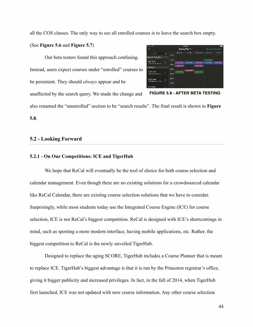
all the COS classes. The only way to see all enrolled courses is to leave the search box empty.
(See Figure 5.6 and Figure 5.7)
Our beta testers found this approach confusing.
Instead, users expect courses under “enrolled” courses to
be persistent. They should always appear and be
unaffected by the search query. We made the change and
also renamed the “unenrolled” section to be “search results”. The final result is shown in Figure
5.8.
5.2 - Looking Forward
5.2.1 - On Our Competitions: ICE and TigerHub
We hope that ReCal will eventually be the tool of choice for both course selection and
calendar management. Even though there are no existing solutions for a crowdsourced calendar
like ReCal Calendar, there are existing course selection solutions that we have to consider.
Surprisingly, while most students today use the Integrated Course Engine (ICE) for course
selection, ICE is not ReCal’s biggest competition. ReCal is designed with ICE’s shortcomings in
mind, such as sporting a more modern interface, having mobile applications, etc. Rather, the
biggest competition to ReCal is the newly unveiled TigerHub.
Designed to replace the aging SCORE, TigerHub includes a Course Planner that is meant
to replace ICE. TigerHub’s biggest advantage is that it is run by the Princeton registrar’s office,
giving it bigger publicity and increased privileges. In fact, in the fall of 2014, when TigerHub
first launched, ICE was not updated with new course information. Any other course selection
!44
FIGURE 5.8 - AFTER BETA TESTING

applications will not be given this privilege. If TigerHub were a better solution than ICE in terms
of functionality and usability, this should have effectively forced a switch to TigerHub for most
students. The fact that it did not proved TigerHub still has a long way to go. In fact, after a few
weeks, ICE was updated with new course data, presumably due to students’ demand.
Our plan is to capitalize on this demand and launch ReCal Course Selection as soon as
possible. ReCal Course Selection will be presented as a better alternative to ICE. We will
highlight the strengths of ReCal over ICE, some of which not even TigerHub can claim. For
example, being able to do course selection from a phone is a big feature for ReCal and will help
distinguish ReCal from ICE and TigerHub.
5.2.2 - Launch Plan
Most students already know what a course selection tool is and what to expect from one.
Therefore, we plan to launch ReCal Course Selection as soon as the spring of 2015. We see
ReCal Course Selection as being the first of the two ReCal applications that will be adopted by
users and the one that will draw more users for us initially. ReCal Calendar requires a more
delicate launch plan, as students do not know what to expect from a crowdsourced calendar.
Simply putting the application on the App Store and putting up the web application would result
in effectively no new users and also take away ReCal Calendar’s novelty as a new product.
Instead, we plan to use the more conventional ReCal Course Selection to carry the weight of
drawing new users while we use a smaller and slower launch plan for ReCal Calendar. We will
launch ReCal Calendar to a select, small number of students. This will make it easier for us to
convey to those students what we hope ReCal Calendar would be. Because the biggest strength
of ReCal Calendar comes from crowdsourcing, and crowdsourcing only makes sense if the
!45

students are taking some of the same classes, we hope to that our initial set of users will be from
a common course. This launch plan will give the best opportunity for ReCal Calendar to
highlight its strength without worrying about having to draw users.
!46