real-life data visualization - guest lecture for mcgill insy-442
TRANSCRIPT

Real-life Data Visualization
Business Intelligence & Analytics
INSY-442, Winter 2014
Michael Deutsch McGill Info Systems Resources (ISR)

Agenda
Personal intro
Data visualization defined
What is good visualization?
Visualization in business
Exercise: Original analysis + visualization

Profile: Mike Deutsch
Education: U. Penn (Philadelphia), 1998.
Computer Science & Cognitive Science
Management @ Wharton
15 years as a Designer/Analyst/Developer in
educational environments
McGill central IT since 2002:
Student systems (Banner/Minerva/uApply)
LMS (myCourses)
Data Warehouse & Business Intelligence

Profile: Mike Deutsch
Some of my analyses over the years:
MyCourses
Traffic patterns
Pedagogical use
McGill Business Intelligence
Strategic Enrollment Management
Course Teaching patterns
Graduate capacity planning
Mercury course evaluations

Necessary disclaimers
I strive for accuracy, but facts may not always
be exactly as reported.
All opinions expressed herein are my own,
and may not correspond to official University
positions on whatever it is I’m talking about.
Visualization is a blend of Art & Science;
Keep both hats on.
Please ask questions!

Data visualization defined

Data visualization defined
The pictorial representation of data.
How?
Via graphing tools or custom design.
Why?
To communicate information clearly and effectively
through graphical means.
In the right conditions, this sets in motion a narrative
in the viewer’s head.
Their brain can do what brains do best:
see patterns and relationships between dry bits of data.
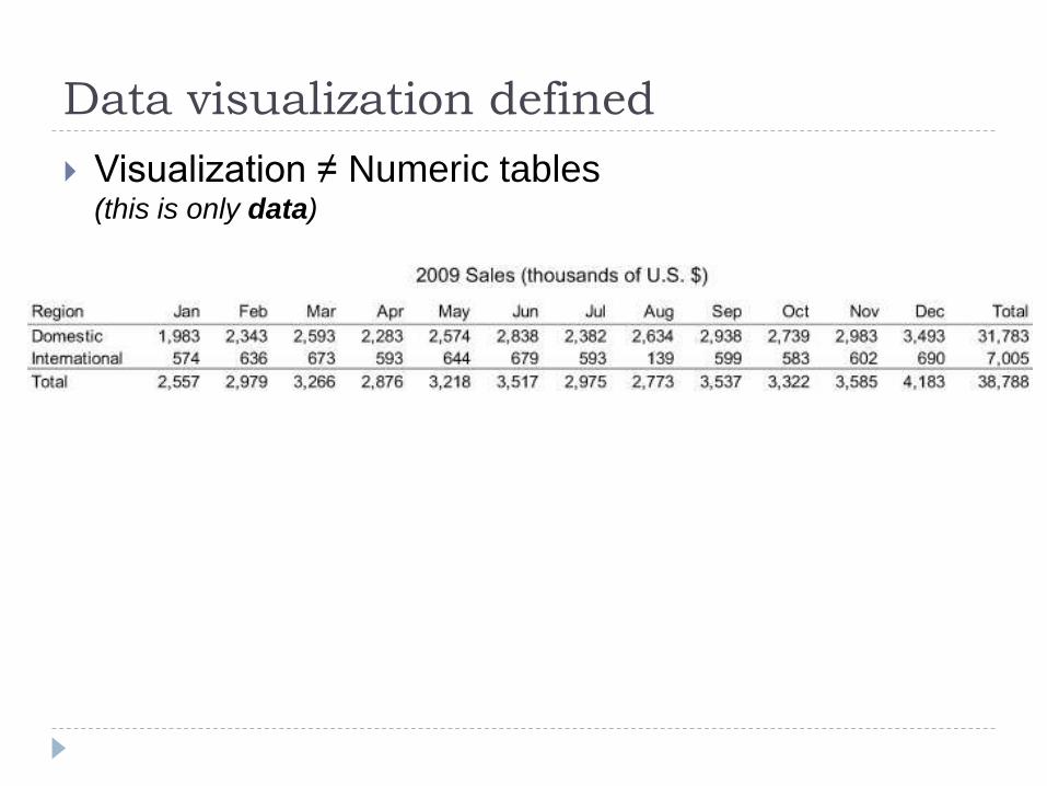
Data visualization defined
Visualization ≠ Numeric tables(this is only data)

Data visualization defined
Visualization ≠ Illustrations or Diagrams(this is only pictorial)
Greek optics paper, 11th century CE
Darwin on speciation, 1837

Data visualization defined
Visualization ≠
Graphic design
or “infographics” (this forces the story)
Megan Jaegerman,
New York Times, 1992

Data visualization defined
To do it well: Data + pictorial
Functionality and aesthetics and go hand in hand.
The data itself tells the story.
Bonus: it’s backed up by emerging neuroscience.
Left brain/Right brain

Data visualization defined
The pictorial representation of data:
Few, Stephen (2013):
Data Visualization for
Human Perception.
interaction-design.org

Data visualization defined
Why is this important right now?
Explosion in visualization online & everywhere
Web analytics
Business Intelligence
Journalism (all forms)
Annual reports, presentations, etc.
As Management students & professionals,
there are things YOU can do to improve the charts &
tables you produce. Your work can become more
informative and influential.

What is good visualization?
What is good visualization?
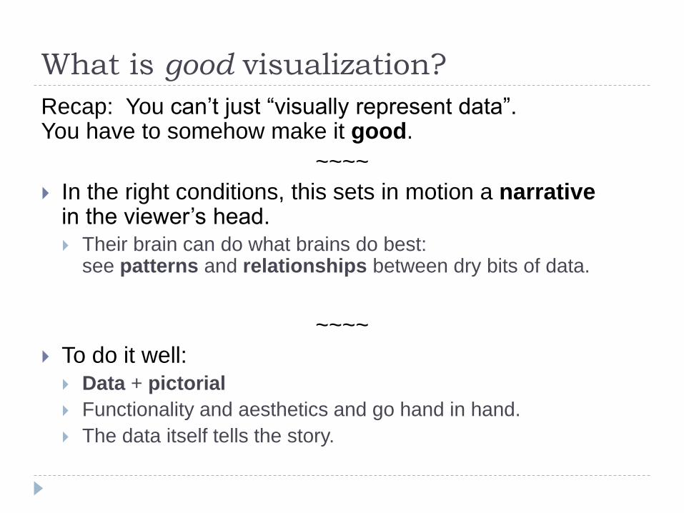
Recap: You can’t just “visually represent data”. You have to somehow make it good.
~~~~
In the right conditions, this sets in motion a narrativein the viewer’s head.
Their brain can do what brains do best: see patterns and relationships between dry bits of data.
~~~~
To do it well:
Data + pictorial
Functionality and aesthetics and go hand in hand.
The data itself tells the story.

What is good visualization?
The most exciting phrase to hear in science,
the one that heralds new discoveries,
is not “Eureka” (I found it) but “That's funny...”
Isaac Asimov (1920–1992)

What is good visualization?
So, some examples…

What is good visualization?
The original:
William
Playfair,
Scotland, 1786 “…the first quantitative
graphical form that did
not locate data either in
space, as had
coordinates and tables,
or time, as had
Priestley's timelines. It
constitutes a pure
solution to the problem of
discrete quantitative
comparison”
Wikipedia: William Playfair

What is good visualization?
A great first example: GraphJam
Taking notes in class
When I become a professor
http://cheezburger.com/FlashBuilder/GraphJam
A little more serious: Information is Beautiful
http://www.informationisbeautiful.net/visualizations/mount
ains-out-of-molehills/

What is good visualization?
Good news: You DON’T have to be a graphic artist.
Tools help.
Google Analytics, Google Charts, Google Maps
Excel
Tableau
And there are rules.

What is good visualization?
THE RULES:
Show the data
Show restraint with everything that’s NOT data
Encourage comparison
Avoid distorting the data

What is good visualization?
Show the data
(Duh)
But clearly
And show enough of it
What is good visualization?
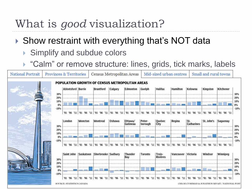
Show restraint with everything that’s NOT data
Simplify and subdue colors
“Calm” or remove structure: lines, grids, tick marks, labels

What is good visualization?
Encourage comparison
Side-by-side or contrasting appearance
Also:
The trustworthiness
of beards

What is good visualization?
Avoid distorting the data
3D effects and free-form visualization are risky

What is good visualization?
Excel, pre-2007

What is good visualization?
So who does it well in the business world? National Post:
http://news.nationalpost.com/category/graphics/
The Economist:
http://www.economist.com/blogs/graphicdetail
New York Times:
http://www.nytimes.com/interactive/2012/12/30/multimedia/2012-the-year-in-graphics.html?_r=0
Wall Street Journal:
http://online.wsj.com/public/page/news-interactive-features-trends.html
Tableau Public
https://www.tableausoftware.com/public/community/in-the-wild

What is good visualization?
More at National Post:
2011 Canadian census
Immigration patterns
So many ways to die
Ontario budget breakdown (A misfire?)
Charts Bin (geog)
http://www.Chartsbin.com
Tableau – Public data sets, make your own.
(download)
http://www.tableausoftware.com/products/public

What is good visualization?
Geog charts
http://cryscresc.net/current-worldwide-annual-coffee-
consumption-p-0 -- original source is http://chartsbin.com/
NYT croissants vs. white bread
Gazette population flow
Add time dimension
http://chartsbin.com/view/1016 - current worldwide alcohol
consumption
http://chartsbin.com/view/1026 - Change over last 5 years
What can you NOW see? Suit your charts to your
audience and what you’re trying to convey.
What is good visualization?
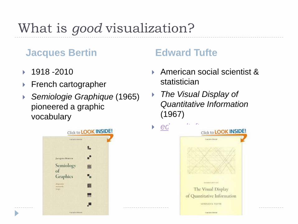
Jacques Bertin Edward Tufte
1918 -2010
French cartographer
Semiologie Graphique (1965)
pioneered a graphic
vocabulary
American social scientist &
statistician
The Visual Display of
Quantitative Information
(1967)
edwardtufte.com

What is good visualization?
Stephen Few
British programmer &
designer
Social data sets &
interactive visualization
InformationIs Beautiful.net
American BI/DWH
innovator
Information Dashboard
Design (2006) led the
modern business
dashboard era
PerceptualEdge.com
David McCandless

Visualization in business

Visualization in Business
We saw the “Rules” of data viz:
Show the data
Restraint in everything that’s NOT data
Encourage comparison
Avoid distorting the data
Let’s see them in use in the business world…
Can occur in different contexts, on different
platforms.
The goal in business is always:
viz narrative action.

Visualization in BusinessData
viz
B.I.
Analytic
s
Data
mining

Visualization in Business
Sun Life Financial Inc.:
Large multinational, financial services, Toronto HQ.
[Annual Report of Sun Life Financial: 2010 & 2012]

Visualization in Business
McGill University:
Large public educational institution.
Mission: Teaching, Scholarship, Service.
Just like corporations, McGill analyzes and solves:
“Production”
Operations
Budgeting
Marketing
Competition
Regulation

Visualization in Business
[Corporate structure]
[Early reports & dashboards]

Visualization in Business
Before: http://www.mcgill.ca/es/registration-statistics

Visualization in Business
1st gen Enrolment Analysis dashboard: ProClarity

Visualization in Business
2nd gen dashboard: Microsoft PerformancePoint
Minimalist look, parallel design rules 1 & 2
+ Immigration, Fee residence, Admit region
Filters for the dimensions ppl use in this context
Interactive tool allows drill down/across/through
In-browser, pop out to Excel

Visualization in Business

Visualization in Business
[Principal’s Report – Fact Book]
[PIA – KPI Report to Senate]
[Provost’s Budget Book]

Conclusion

Conclusion
Good viz allows people’s eyes & brain to mine
data.
Presenting the data is just the first step.
To really have impact, you have to present it well.
Data viz is a mix of Art & Science, but there are
tools and techniques you can use.
Yes, it makes a BIG difference in business.


Exercise:
University Research Analysis

Exercise: University Research Analysis
Introduce the business area
Produce original analysis from SSHRC awards data
Push your visualization
Show us what you came up with

SSHRC: In Few Words
The Social Sciences and Humanities Research Council (SSHRC) is
the federal agency that promotes and supports postsecondary-based
research and training in the humanities and social sciences.
Facts and Figures
Full-time professors: 22,410
Full-time doctoral students: 19,005
Full-time master’s students: 43,150
SSHRC funding (2010-11)
Number of applications received: 12,925
Number of experts involved in peer review: 6,748
New grants, fellowships and scholarships awarded: 4,381
New partnerships with industry, government and NGOs: 118
Value of all grants, fellowships and scholarships supported: $332.4 million

# of
projects
Amount
($ millions)
% of
funding
Environmental science and technologies 475 $21.7 7%
Natural resources and energy 43 $2.6 1%
Health and related life sciences and
technologies370 $19.0 6%
Information and communications technology 658 $23.6 7%
Management, business and finance 695 $20.6 6%
Arts and culture 1,875 $52.2 16%
Economy, employment and markets 717 $26.7 8%
Education and learning 793 $27.3 8%
Human development 661 $21.9 7%
Social development 1,855 $64.4 19%
Governance of society and institutions 1,092 $35.4 11%
Other areas of research 539 $16.9 5%
TOTAL: 9,773 $332.4 100%
Exercise: University Research Analysis
Pick up the XLS 2010 file.
Produce original analysis from SSHRC awards data Approach ONE of the questions on the XLS tab.
Produce a pivot table or chart.
Create a DAX expression: distinct # researchers, avg $, etc.
Use THE RULES: Show the data
Restraint in everything that’s NOT data
Encourage comparison
Avoid distorting the data
Display in different (appropriate) ways
Attend to what’s important
Exercise: University Research Analysis
Push your viz:
Color schemes
Chart types (independent vs. stack vs. 100% stack)
Conditional formatting (heatmap, bars, etc.), sparklines
Exercise: University Research Analysis
What did you come up with?

Appendix:
Visualization Resources

Appendix:
Other fun visualizations

Old school:
The newspaper/magazine “infographic” style:http://www.theonion.com/articles/worst-parts-of-our-jobs,7433/
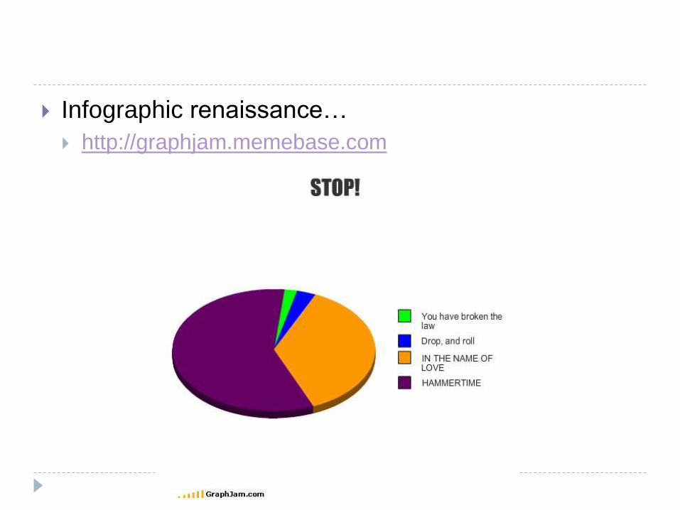

Infographic renaissance…
http://poorlydrawnlines.com/
http://ilovecharts.tumblr.com/
Data visualization
http://popchartlab.com/
http://www.informationisbeautiful.net/

XKCD
Self-description
Money
Height
Numbers