random sampling - center for microbial oceanography...
TRANSCRIPT
©Center for Microbial Oceanography: Research and Education (C-MORE). Materials may be duplicated and distributed for educational, non-commercial purposes only.
RANDOM SAMPLING Grade Level: This kit is appropriate for students in grades 6–12. Standards: This kit is aligned with state science and math content standards for Hawai‘i, California and Oregon, as well as national Ocean Literacy Principles. Overview: This three-lesson kit introduces random sampling, one of the key concepts employed by scientists to study the natural environment, including microbial communities. In Lesson 1, students study the abundance and diversity of marine microbes. Colored beads in a bag represent different species of microbes, and the bag itself represents the ocean. Working in groups, each student randomly selects ten “microbes” from the “ocean”, and records the data. The students then compare the species composition of the samples they obtained to that of the entire population. In Lesson 2, technology is introduced. Students enter and graph data from Lesson 1 using Excel (a Microsoft Office program). In Lesson 3, statistics provide a means for students to assess how well their samples represent the total population. Lessons 1 and 2 are suitable for grades 6–12, and Lesson 3 is geared toward grades 9–12. All of the supplies in this kit are in support of Lesson 1. Computers (not provided) are required for Lesson 2 and may be optionally used for Lesson 3. If computers are not available, Lesson 2 may be omitted, and Lesson 3 can be taught directly following Lesson 1. Each of the three lessons requires approximately 50 minutes of class time. Suggestions for Curriculum Placement: These lessons familiarize students with the diversity of marine microbes, and use microbes as a tool to teach students about the concepts of sampling and probability. These lessons can be used to introduce the scientific method or parts of the process at the beginning of the year. Skills such as forming and revising hypotheses, collecting meaningful data, setting up data tables, and graphing and analyzing results are taught through this exercise. Sampling and probability are important concepts in all fields of science, including ecology, genetics, and oceanography. The use of the Excel program to create data tables and graphs provides a means of incorporating technology into the science classroom, and gives the students exposure to a spreadsheet program that is commonly used in upper level science classes. Materials: (Paper materials contained in binder are shown in BOLD CAPS) Front Binder Materials 1. CD (contains electronic versions of all binder materials) 2. C-MORE Key Concepts in Microbial Oceanography brochure 3. C-MORE Microbial Oceanography: Resources for Teachers brochure
Lesson 1: Introduction to Random Sampling Materials are provided for up to 9 groups of students. We suggest 4 students per group. 1. TEACHER GUIDE – Lesson 1: Introduction to Random Sampling 2. RANDOM SAMPLING SURVEY – Lesson 1 3. TEACHER ANSWER KEY to RANDOM SAMPLING SURVEY – Lesson 1 4. STUDENT READING – Lesson 1: Introduction to Marine Microbes 5. STUDENT WORKSHEET – Lesson 1: Which Microbe is the Most Abundant? 6. TEACHER ANSWER KEY to STUDENT WORKSHEET – Lesson 1: Which Microbe is the Most Abundant? 7. INVENTORY CARD SHEET 8. One transparent bag of beads, which contains the same distribution of beads as the drawstring bags 9. Nine drawstring bags. Each bag contains six sealed storage containers, each filled with “microbes” of a different
color (amounts given above). 10. Nine sorting trays (colors may vary)
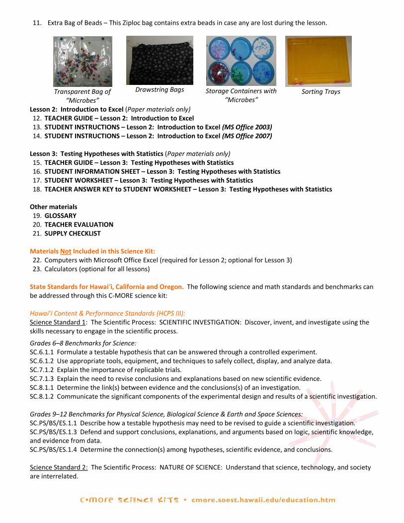
11. Extra Bag of Beads – This Ziploc bag contains extra beads in case any are lost during the lesson.
Transparent Bag of
“Microbes”
Drawstring Bags
Storage Containers with
“Microbes” Sorting Trays
Lesson 2: Introduction to Excel (Paper materials only) 12. TEACHER GUIDE – Lesson 2: Introduction to Excel 13. STUDENT INSTRUCTIONS – Lesson 2: Introduction to Excel (MS Office 2003) 14. STUDENT INSTRUCTIONS – Lesson 2: Introduction to Excel (MS Office 2007)
Lesson 3: Testing Hypotheses with Statistics (Paper materials only) 15. TEACHER GUIDE – Lesson 3: Testing Hypotheses with Statistics 16. STUDENT INFORMATION SHEET – Lesson 3: Testing Hypotheses with Statistics 17. STUDENT WORKSHEET – Lesson 3: Testing Hypotheses with Statistics 18. TEACHER ANSWER KEY to STUDENT WORKSHEET – Lesson 3: Testing Hypotheses with Statistics
Other materials 19. GLOSSARY 20. TEACHER EVALUATION 21. SUPPLY CHECKLIST
Materials Not Included in this Science Kit: 22. Computers with Microsoft Office Excel (required for Lesson 2; optional for Lesson 3) 23. Calculators (optional for all lessons)
State Standards for Hawai‘i, California and Oregon. The following science and math standards and benchmarks can be addressed through this C-MORE science kit: Hawai‘i Content & Performance Standards (HCPS III): Science Standard 1: The Scientific Process: SCIENTIFIC INVESTIGATION: Discover, invent, and investigate using the skills necessary to engage in the scientific process.
Grades 6–8 Benchmarks for Science: SC.6.1.1 Formulate a testable hypothesis that can be answered through a controlled experiment. SC.6.1.2 Use appropriate tools, equipment, and techniques to safely collect, display, and analyze data. SC.7.1.2 Explain the importance of replicable trials. SC.7.1.3 Explain the need to revise conclusions and explanations based on new scientific evidence. SC.8.1.1 Determine the link(s) between evidence and the conclusions(s) of an investigation. SC.8.1.2 Communicate the significant components of the experimental design and results of a scientific investigation. Grades 9–12 Benchmarks for Physical Science, Biological Science & Earth and Space Sciences: SC.PS/BS/ES.1.1 Describe how a testable hypothesis may need to be revised to guide a scientific investigation. SC.PS/BS/ES.1.3 Defend and support conclusions, explanations, and arguments based on logic, scientific knowledge, and evidence from data. SC.PS/BS/ES.1.4 Determine the connection(s) among hypotheses, scientific evidence, and conclusions. Science Standard 2: The Scientific Process: NATURE OF SCIENCE: Understand that science, technology, and society are interrelated.
Grades 6–8 Benchmarks for Science: SC.8.2.2 Describe how scale and mathematical models can be used to support and explain scientific data. Science Standard 3: Life and Environmental Sciences: ORGANISMS AND THE ENVIRONMENT: Understand the unity, diversity, and interrelationships of organisms, including their relationship to cycles of matter and energy in the environment.
Grades 6–8 Benchmarks for Science: SC.7.3.2 Explain the interaction and dependence of organisms on one another. Math Standard 11: Data Analysis, Statistics, and Probability: FLUENCY WITH DATA: Pose questions and collect, organize, and represent data to answer those questions.
Grades 9–12 Benchmarks for Statistics: MA.S.11.1 Develop a hypothesis for an investigation or experiment. MA.S.11.3 Select appropriate display for a data set (e.g., frequency table, histogram, line graph, bar graph, stem-and-leaf plot, box-and-whisker plot, scatter plot). MA.S.11.5 Recognize sampling, randomness, bias, and sampling size in data collection and interpretation. MA.S.11.6 Describe the purpose and function of a variety of data collection methods (e.g., census, sample surveys, experiment, observation). Content Standards for California Public Schools:
Grade 6 – 5a. Students know energy entering ecosystems as sunlight is transferred by producers into chemical energy through photosynthesis and then from organism to organism through food webs.
Focus on Earth Sciences
Grade 6 – 5d. Students know different kinds of organisms may play similar ecological roles in similar biomes.
Grade 6 – 7a. Develop a hypothesis. Investigation and Experimentation
Grade 6 – 7c. Construct appropriate graphs from data and develop qualitative statements about the relationships between variables. Grade 6 – 7e. Recognize whether evidence is consistent with a proposed explanation. Grade 8 – 9b. Evaluate the accuracy and reproducibility of data. Grade 8 – 9e. Construct appropriate graphs from data and develop quantitative statements about the relationships between variables. Grades 9–12 – 1c. Identify possible reasons for inconsistent results, such as sources of error or uncontrolled conditions. Statistics, Data Analysis, and Probability Grade 6 – Standard 2.1. Compare different samples of a population with the data from the entire population and identify a situation in which it makes sense to use a sample. Grade 6 – Standard 2.2. Identify different ways of selecting a sample (e.g., convenience sampling, responses to a survey, random sampling) and which method makes a sample more representative for a population. Grade 6 – Standard 2.5. Identify claims based on statistical data and, in simple cases, evaluate the validity of the claims. Grade 6 – Standard 3.2. Use data to estimate the probability of future events (e.g., batting averages or number of accidents per mile driven). Advanced Placement Probability and Statistics Grades 8–12 – Standard 15.0. Students are familiar with the notions of a statistic of a distribution of values, of the sampling distribution of a statistic, and of the variability of a statistic. Grades 8–12 – Standard 19.0. Students are familiar with the chi- square distribution and chi- square test and understand their uses.

State of Oregon Standards by Design:
6.3S.2 Organize and display relevant data, construct an evidence-based explanation of the results of an investigation, and communicate the conclusions.
Scientific Inquiry
7.3S.2 Organize, display, and analyze relevant data, construct an evidence-based explanation of the results of an investigation, and communicate the conclusions including possible sources of error.
7.3S.3 Evaluate the validity of scientific explanations and conclusions based on the amount and quality of the evidence cited.
8.3S.2 Organize, display, and analyze relevant data, construct an evidence-based explanation of the results of a scientific investigation, and communicate the conclusions including possible sources of error. Suggest new investigations based on analysis of results.
8.3S.3 Explain how scientific explanations and theories evolve as new information becomes available. H.3S.1 Based on observations and science principles, formulate a question or hypothesis that can be investigated
through the collection and analysis of relevant information. H.3S.3 Analyze data and identify uncertainties. Draw a valid conclusion, explain how it is supported by the evidence,
and communicate the findings of a scientific investigation.
H.4D.3 Analyze data, identify uncertainties, and display data so that the implications for the solution being tested are clear.
Engineering Design
8.2.6. Use sample data to make predictions regarding a population. Data Analysis and Algebra
8.2.7. Identify claims based on statistical data and evaluate the reasonableness of those claims. 8.2.8. Use data to estimate the likelihood of future events and evaluate the reasonableness of predictions.
H.2S.1. Identify, analyze, and use experimental and theoretical probability to estimate and calculate the probability of simple events.
Probability
Ocean Literacy Principles. The following ocean literacy principles can be addressed through these lessons:
Ocean Literacy Principle 4: The ocean makes Earth habitable. a. Most of the oxygen in the atmosphere originally came from the activities of photosynthetic organisms in the
ocean. b. The first life is thought to have started in the ocean. The earliest evidence of life is found in the ocean. Ocean Literacy Principle 5: The ocean supports a great diversity of life and ecosystems. a. Ocean life ranges in size from the smallest virus to the largest animal that has lived on Earth, the blue whale. b. Most life in the ocean exists as microbes. Microbes are the most important primary producers in the ocean. Not
only are they the most abundant life form in the ocean, they have extremely fast growth rates and life cycles. g. There are deep ocean ecosystems that are independent of energy from sunlight and photosynthetic organisms.
Hydrothermal vents, submarine hot springs, methane cold seeps, and whale falls rely only on chemical energy and chemosynthetic organisms to support life.
References: Our Project in Hawai‘i’s Intertidal (OPIHI). www.hawaii.edu/gk-12/opihi/index.shtml Triola, M.F. Elementary Statistics 8th Edition. United States: Addison-Wesley, 2001.
TEACHER GUIDE Lesson 1: Introduction to Random Sampling
Time Required: 50 minutes. Structure: This lesson introduces random sampling, one of the key concepts employed by scientists to study the natural environment, including microbial communities. Students first learn about the abundance and diversity of marine microbes. Colored beads in a bag are then used to represent different types of microbes, with the bag itself representing the ocean. Working in groups of four, each student randomly samples ten “microbes” from the “ocean”, and records the data. To learn about the inherent variability of random sampling, the students then compare the composition of their individual samples, their group’s pooled sample data, and that of the entire population. A pre- and post- survey is included for this lesson. Materials (after completion of advance preparation):
1. RANDOM SAMPLING SURVEY – Lesson 1 2. TEACHER ANSWER KEY to RANDOM SAMPLING SURVEY – Lesson 1 3. STUDENT READING – Lesson 1: Introduction to Marine Microbes (one per student) 4. STUDENT WORKSHEET – Lesson 1: Which Microbe is the Most Abundant? (one per student) 5. TEACHER ANSWER KEY to STUDENT WORKSHEET – Lesson 1: Which Microbe is the Most Abundant? 6. INVENTORY CARDS (one per group) 7. One transparent bag of beads, which contains the same distribution of beads as the drawstring bags 8. Drawstring bags, each containing 300 beads (one per group) 9. Six (6) empty storage containers with covers (one set per group) 10. Sorting trays (one per group)
Advance Preparation:
1. Ensure that this kit contains the following: 9 drawstring bags (each with 6 storage containers filled with a different color of beads), 9 sorting trays, 1 transparent bag of beads, and an extra bag of beads.
2. Determine how many groups of students you will have (up to a maximum of 9 groups). For each group, open a drawstring bag and transfer the color-sorted beads from the storage containers into the drawstring bag. Only do this once for each group of students – do NOT do this for all 9 sets of materials unless you plan on having 9 groups. Do not have the students do this. Close the drawstrings and shake each bag well.
3. Photocopy or print STUDENT READING – Lesson 1: Introduction to Marine Microbes (one per student).
4. Photocopy or print RANDOM SAMPLING SURVEY – Lesson 1 (two copies per student). This serves as both a pre-survey and post-survey for this lesson.
5. Photocopy or print STUDENT WORKSHEET – Lesson 1: Which Microbe is the Most Abundant? (one card per student).
6. Photocopy or print INVENTORY CARD SHEET and cut out individual inventory cards (one per group).
7. If you wish, photocopy or print GLOSSARY (either one per student or one per group). This glossary pertains to all lessons.
8. Photocopy or print TEACHER EVALUATION and SUPPLY CHECKLIST. Instructional Procedures: Introduction
1. Pass out RANDOM SAMPLING SURVEY – Lesson 1 (one per student). Have students check the pre-survey box and answer the questions (allow 5 minutes). After the lesson is completed, the students will answer these same questions as a post-survey. A TEACHER ANSWER KEY is provided for your convenience.
2. Pass out STUDENT READING – Lesson 1: Introduction to Marine Microbes. This reading introduces students to the abundance and diversity of marine microbes, and will help them appreciate the sheer number of microbes living in the ocean.
3. Given that microbes are so abundant, ask your students how they would study marine microbe populations if they were microbial oceanographers. Could they count all of the microbes in the ocean? What about in a single bay? Since there are billions of microbes in just one liter of water, there is no way to count all of the microbes in a given population.
4. Explain briefly that scientists use a technique called random sampling to quantify the population sizes of species within an ecosystem when it is not possible or practical to count all the individuals. For an example, read the question and answer to #7 in the TEACHER ANSWER KEY to STUDENT WORKSHEET – Lesson 1: Which Microbe is the Most Abundant?
5. Explain to the students that they are going to become microbial oceanographers. They will use random sampling to determine the relative abundance of different types of “microbes” in the “ocean”.
6. Hold up the transparent bag of beads. Explain that the bag represents the ocean, and the beads it contains represent the population of all microbes in the ocean. Each plastic bead represents an individual microbe, and each color is meant to represent a different type of microbe. Tell students that the population (number and colors of microbes) in this bag is the same as the population that they will be given in the drawstring bags.
7. Remind students that the numbers of microbes in our imaginary ocean are fabricated to illustrate the concept of random sampling, and are not intended to reflect the actual abundances of these microbes in the Earth’s oceans. The data do, however, generally reflect the relative ranking of abundances of these different types of microbes.
8. Pass out STUDENT WORKSHEET – Lesson 1: Which Microbe is the Most Abundant? (one per student). On the worksheet, have students look at Table 1 and note which type of microbe is represented by each color of bead.
9. Divide the class into groups and assign each group to a table, if possible.
10. Have each student complete the hypothesis at the top of their worksheet, based on their brief observation of the transparent bag of microbes. For example, “The most abundant type of microbe (bead) in the ocean (bag) is bacteria (red).”
11. Before handing out the materials to each group, ensure all objects have been pre-mixed into the drawstring bag (as directed under Advance Preparation).
12. Distribute one set of materials (1 drawstring bag, 6 empty storage containers, and 1 sorting tray) to each group.
Data Collection: Table 1 (sample data) 13. You can now either walk your students through each step of their worksheet under DATA COLLECTION: TABLE 1,
or have them work independently in their groups following the directions on their worksheet.
14. When students are finished, bring the class together to ensure that they completed Table 1 correctly before proceeding. Note that answers will vary, but each group should have:
a. Row totals equal to 10 for each student (e.g., H2=10, H3=10, H4=10, etc.). b. In line 11, the sum of the group totals for each microbe (e.g., B11, C11, D11, etc.) should equal the grand
total (H11). c. Grand total (H11) equal to 40 (or 10 times the number of students in each group). d. In line 12, the sum of all group percentages (H12) should add up to 100% (within rounding error).
15. An example is given on the TEACHER ANSWER KEY to STUDENT WORKSHEET – Lesson 1: Which Microbe is the Most Abundant?
16. Explain that scientists are constantly revising their methods and hypotheses based on new data. Ask the students if they feel they should revise their initial hypothesis based on Table 1 results. If so, have them write their revised hypothesis on the worksheet. If not, have students explain why they chose to retain their hypothesis.
Data Collection: Table 2 (population data) 17. Pass out an INVENTORY CARD to each group.

18. Now the students will count the entire population of all microbes in the ocean (that is, take a census) by following the instructions on their worksheet under DATA COLLECTION: TABLE 2. Again, you can either walk your students through each step, or have them work independently in their groups.
19. Note that, unlike Table 1, answers will not vary for Table 2. The entire population for each group should total 300 and have the same color distribution as listed on the TEACHER ANSWER KEY to STUDENT WORKSHEET – Lesson 1: Which Microbe is the Most Abundant? Review each group’s totals. If any of their answers differ, have the group recount their beads and/or search the area for missing beads.
Assessment & Clean-up: 1. Ask the class to secure the lids on their storage containers, complete their inventory cards, and return their set
of materials to you. Please compare each group’s inventory card against the stated color distribution on the INVENTORY CARD for Teacher. If any of the groups are still missing beads after recounting and searching their work area, please use the extra bag of beads provided with this kit to replenish the supply and then update the inventory card accordingly. Place each group’s inventory card and the 6 sealed storage containers with beads into a drawstring bag, and place all materials into the original box.
2. Assessment: After each group discusses the questions on their STUDENT WORKSHEET – Lesson 1: Which Microbe is the Most Abundant?, ask students to individually or collectively submit their answers. A TEACHER ANSWER KEY to STUDENT WORKSHEET – Lesson 1: Which Microbe is the Most Abundant? is provided for your convenience.
3. Pass out RANDOM SAMPLING SURVEY – Lesson 1 (one per student). Have students check the post-survey box and answer the questions (allow 5 minutes).
4. As the students are completing the post- survey, we would be grateful if you would complete the TEACHER EVALUATION of this kit. All comments, corrections, and suggestions are very welcome. If you prefer, you can complete the evaluation online (see TEACHER EVALUATION for website address). If you plan on completing additional lessons from this kit, please wait until you have finished all lessons before you fill out your TEACHER EVALUATION.
5. Re-pack the kit for return to C-MORE. Double check that all the items are included and in their proper place by completing the SUPPLY CHECKLIST. Please make a note of missing, broken, or damaged items so that they can be replaced. Please pack the kit so that the materials are stored as they were when you received them. Please also include a copy of the students' pre- and post-surveys. If you plan on completing additional lessons from this kit, please wait until the end to complete the SUPPLY CHECKLIST.
Mahalo!
RANDOM SAMPLING SURVEY – LESSON 1
Check one: Pre-survey Name: Post-survey Directions: This survey is both a pre- and post- survey. Put a check mark at the top of this paper next to the survey you are doing (pre- or post- survey). Please answer each question to the best of your ability. Circle the most correct answer.
1. In a random sample, each member of the population has an equal chance of being selected. a. True b. False
2. Scientists collect random samples of marine microbes because it is impossible to collect each individual microbe.
a. True b. False
3. Microbes make up _____________ of the ocean’s biomass.
a. less than 1% b. about 10% c. about 50% d. greater than 90%
4. The major groups of life on Earth are:
a. plants and animals b. Prokarya, fungi and viruses c. Archaea, Eukarya, and Bacteria d. insects, fish and birds
5. There are 10 beads in a bag, two of which are blue. If you only get to pick one bead (blindly) from the bag, what
is the chance that you will get a blue bead? a. 1% b. 2% c. 10% d. 20%
TEACHER ANSWER KEY RANDOM SAMPLING SURVEY – LESSON 1
Check one: Pre-survey Name: Post-survey Directions: This survey is both a pre- and post- survey. Put a check mark at the top of this paper next to the survey you are doing (pre- or post- survey). Please answer each question to the best of your ability. Circle the most correct answer.
1. In a random sample, each member of the population has an equal chance of being selected. a. True b. False
2. Scientists collect random samples of marine microbes because it is impossible to collect each individual microbe.
a. True b. False
3. Microbes make up _____________ of the ocean’s biomass.
a. less than 1% b. about 10% c. about 50% d. greater than 90%
4. The major groups of life on Earth are:
a. plants and animals b. Prokarya, fungi and viruses c. Archaea, Eukarya, and Bacteria d. insects, fish and birds
5. There are 10 beads in a bag, two of which are blue. If you only get to pick one bead (blindly) from the bag, what
is the chance that you will get a blue bead? a. 1% b. 2% c. 10% d. 20%
Email [email protected] to request a completed teacher answer key. Please include name, school and grade(s) taught in your request. Mahalo!
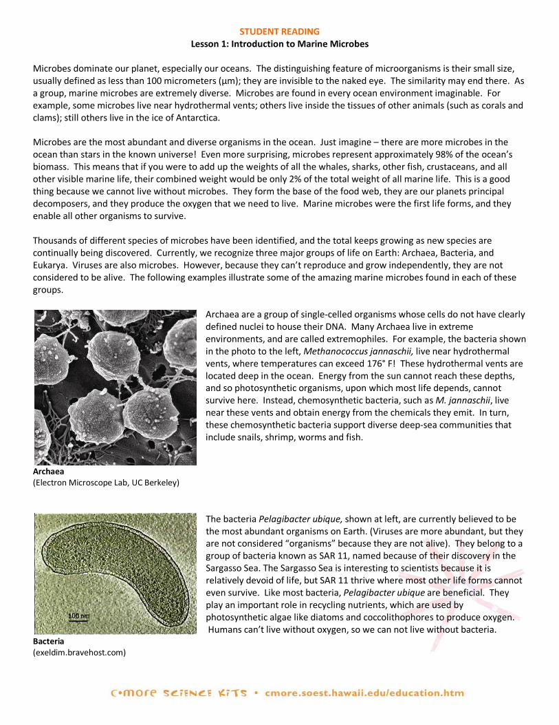
STUDENT READING Lesson 1: Introduction to Marine Microbes
Microbes dominate our planet, especially our oceans. The distinguishing feature of microorganisms is their small size, usually defined as less than 100 micrometers (µm); they are invisible to the naked eye. The similarity may end there. As a group, marine microbes are extremely diverse. Microbes are found in every ocean environment imaginable. For example, some microbes live near hydrothermal vents; others live inside the tissues of other animals (such as corals and clams); still others live in the ice of Antarctica. Microbes are the most abundant and diverse organisms in the ocean. Just imagine – there are more microbes in the ocean than stars in the known universe! Even more surprising, microbes represent approximately 98% of the ocean’s biomass. This means that if you were to add up the weights of all the whales, sharks, other fish, crustaceans, and all other visible marine life, their combined weight would be only 2% of the total weight of all marine life. This is a good thing because we cannot live without microbes. They form the base of the food web, they are our planets principal decomposers, and they produce the oxygen that we need to live. Marine microbes were the first life forms, and they enable all other organisms to survive. Thousands of different species of microbes have been identified, and the total keeps growing as new species are continually being discovered. Currently, we recognize three major groups of life on Earth: Archaea, Bacteria, and Eukarya. Viruses are also microbes. However, because they can’t reproduce and grow independently, they are not considered to be alive. The following examples illustrate some of the amazing marine microbes found in each of these groups.
Archaea are a group of single-celled organisms whose cells do not have clearly defined nuclei to house their DNA. Many Archaea live in extreme environments, and are called extremophiles. For example, the bacteria shown in the photo to the left, Methanococcus jannaschii, live near hydrothermal vents, where temperatures can exceed 176° F! These hydrothermal vents are located deep in the ocean. Energy from the sun cannot reach these depths, and so photosynthetic organisms, upon which most life depends, cannot survive here. Instead, chemosynthetic bacteria, such as M. jannaschii, live near these vents and obtain energy from the chemicals they emit. In turn, these chemosynthetic bacteria support diverse deep-sea communities that include snails, shrimp, worms and fish.
Archaea (Electron Microscope Lab, UC Berkeley)
The bacteria Pelagibacter ubique, shown at left, are currently believed to be the most abundant organisms on Earth. (Viruses are more abundant, but they are not considered “organisms” because they are not alive). They belong to a group of bacteria known as SAR 11, named because of their discovery in the Sargasso Sea. The Sargasso Sea is interesting to scientists because it is relatively devoid of life, but SAR 11 thrive where most other life forms cannot even survive. Like most bacteria, Pelagibacter ubique are beneficial. They play an important role in recycling nutrients, which are used by photosynthetic algae like diatoms and coccolithophores to produce oxygen. Humans can’t live without oxygen, so we can not live without bacteria.
Bacteria (exeldim.bravehost.com)

Cyanobacteria are photosynthetic bacteria. A type of phytoplankton, they use chlorophyll and sunlight to live and grow through a process called photosynthesis. Like other microbes, cyanobacteria are also beneficial. For example, the cyanobacterium Trichodesmium, shown at left, converts atmospheric nitrogen into a form that is usable by other organisms. Trichodesmium can form algal blooms that cover large areas of the ocean surface. Some of these blooms can even be seen from space!
Cyanobacteria (Micro*scope)
All remaining unicellular organisms and all visible forms of life are termed Eukarya (or Eukaryotes). These organisms have cells with well-defined nuclei that house their DNA. Eukarya include many types of microbes, such as most algae (diatoms, coccolithophores, dinoflagellates). Diatoms are a type of single-celled algae whose cell walls contain silica, which is the main component of most types of glass. The long, hair-like projections seen in the diatom at left are called setae. These setae increase drag, and allow this diatom to remain close to the ocean surface so it can obtain sunlight for photosynthesis.
Diatom (Micro*scope)
Coccolithophores, another type of Eukarya, are single-celled algae that are found in the upper layers of the ocean. They form a shell of small, calcium carbonate (limestone) plates called coccoliths. Like other marine organisms that build calcium carbonate shells, coccolithophores are threatened by a process called ocean acidification. The acid dissolves the calcium carbonate shells and the carbon dioxide gets released into the atmosphere.
Coccolithophore (Micro*scope)
Viruses are extremely small; they are even smaller than a cell. Viruses are not even alive, they have to rely on host cells for reproduction and growth. For example, the virus in the photo to the left infects a type of cyanobacteria called Synechococcus. The virus relies on the cyanobacteria to replicate its DNA. Up to 10 billion viruses can be found in a liter of seawater. This makes viruses the most abundant microbes in the ocean!
Virus (Micro*scope) As you can tell from the descriptions above, marine microbes are extremely abundant. Some cyanobacteria blooms can be seen from space and up to 10 billion viruses can be found in a liter of seawater. If they are so common, how can scientists determine the abundances of different types of microbes? They can’t possibly count all of the microbes present in our oceans! Instead, they use a process called random sampling to estimate the size of different microbe populations. Today, you’re going to study an imaginary ocean using this technique to estimate the abundances of the different types of microbes it contains. The numbers of microbes in our imaginary ocean are fabricated to illustrate the concept of random sampling, and are not intended to reflect the actual abundances of these microbes in the Earth’s oceans. The data do, however, generally reflect the relative ranking of abundances of these different types of microbes.
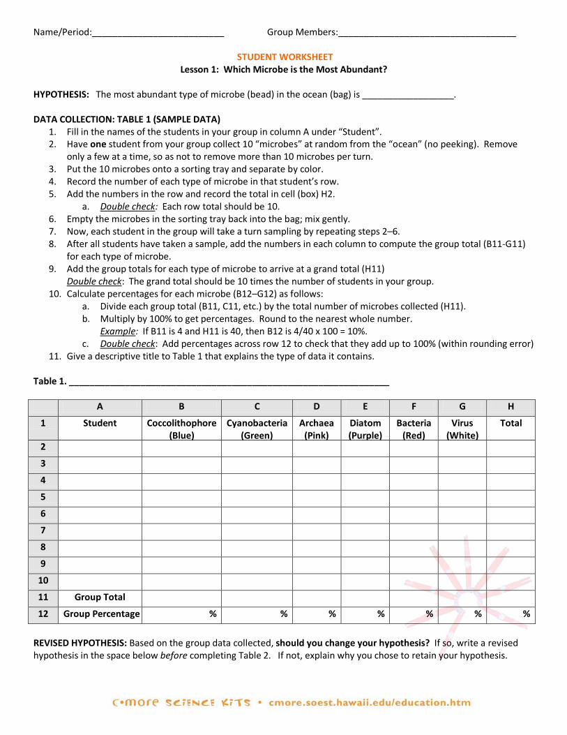
Name/Period:__________________________ Group Members:___________________________________
STUDENT WORKSHEET Lesson 1: Which Microbe is the Most Abundant?
HYPOTHESIS: The most abundant type of microbe (bead) in the ocean (bag) is __________________. DATA COLLECTION: TABLE 1 (SAMPLE DATA)
1. Fill in the names of the students in your group in column A under “Student”. 2. Have one student from your group collect 10 “microbes” at random from the “ocean” (no peeking). Remove
only a few at a time, so as not to remove more than 10 microbes per turn. 3. Put the 10 microbes onto a sorting tray and separate by color. 4. Record the number of each type of microbe in that student’s row. 5. Add the numbers in the row and record the total in cell (box) H2.
a. Double check: Each row total should be 10. 6. Empty the microbes in the sorting tray back into the bag; mix gently. 7. Now, each student in the group will take a turn sampling by repeating steps 2–6. 8. After all students have taken a sample, add the numbers in each column to compute the group total (B11-G11)
for each type of microbe. 9. Add the group totals for each type of microbe to arrive at a grand total (H11)
Double check: The grand total should be 10 times the number of students in your group. 10. Calculate percentages for each microbe (B12–G12) as follows:
a. Divide each group total (B11, C11, etc.) by the total number of microbes collected (H11). b. Multiply by 100% to get percentages. Round to the nearest whole number.
Example: If B11 is 4 and H11 is 40, then B12 is 4/40 x 100 = 10%. c. Double check: Add percentages across row 12 to check that they add up to 100% (within rounding error)
11. Give a descriptive title to Table 1 that explains the type of data it contains.
Table 1. _______________________________________________________________
A B C D E F G H
1 Student Coccolithophore (Blue)
Cyanobacteria (Green)
Archaea (Pink)
Diatom (Purple)
Bacteria (Red)
Virus (White)
Total
2
3
4
5
6
7
8
9
10
11 Group Total
12 Group Percentage % % % % % % %
REVISED HYPOTHESIS: Based on the group data collected, should you change your hypothesis? If so, write a revised hypothesis in the space below before completing Table 2. If not, explain why you chose to retain your hypothesis.
Name/Period:_________________________ Group Members:___________________________________ DATA COLLECTION: TABLE 2 (POPULATION DATA)
1. Carefully put all the “microbes” from the “ocean” (drawstring bag) into the sorting tray, without losing any. 2. Sort the objects by microbe type (color) and place each type of microbe into a different storage container. 3. Count the microbes in each color-sorted storage container. Cover each container securely when done. Record
the population data for each type of microbe in Row 2 (B2–G2). 4. Add the numbers across Row 2 to get the total population size of microbes in the “ocean” (H2).
a. Double check: H2 should total 300. If it doesn’t, recount the number of each color and check your area for any lost objects.
5. Calculate the percentage of each type of microbe in the ocean (B3–G3); round to nearest whole number. 6. Add the percentages across Row 3 to get the total percentage of all types of microbes (H3).
a. Double check: These percentages should add up to 100% in H3. 7. Give a descriptive title to Table 2 that explains the type of data it contains. 8. Complete inventory card and return all materials to your teacher.
Table 2. ________________________________________________________________
A B C D E F G H 1 Coccolithophore
(Blue) Cyanobacteria
(Green) Archaea
(Pink) Diatom (Purple)
Bacteria (Red)
Virus (White)
Total
2 Population Total 3 Population % % % % % % % %
QUESTIONS:
1. According to the data your group collected in Table 1, what are the two most abundant types of microbes? Microbe #1: ______________ Percentage = ____% Microbe #2: ______________ Percentage = ____%
2. According to the sample of 10 objects that you personally collected in Table 1, what are the two most abundant types of microbes? Microbe #1: ______________ Percentage = ____% Microbe #2: ______________ Percentage = ____%
3. What are the two most abundant types of microbes in the ocean (Table 2)? Microbe #1: ______________ Percentage = ____% Microbe #2: ______________ Percentage = ____%
4. Using the STUDENT READING—Lesson 1: Introduction to Marine Microbes, list one interesting fact about each of the two most common microbes found in the ocean (Table 2). Microbe #1: Microbe #2:
5. How did the data from your individual sample (question 2) and your group’s sample (question 1) compare with
the data for the total population (question 3)? Is this what you would expect? Why?
6. How did you ensure that sampling was random and not biased toward collecting any one type of microbe?
7. How could scientists estimate the relative abundance of microbes in the ocean off Ala Moana Beach Park?
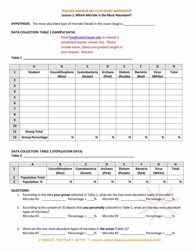
TEACHER ANSWER KEY to STUDENT WORKSHEET Lesson 1: Which Microbe is the Most Abundant?
HYPOTHESIS: The most abundant type of microbe (bead) in the ocean (bag) is __________________. DATA COLLECTION: TABLE 1 (SAMPLE DATA)
Table 1. _______________________________________________________________
A B C D E F G H
1 Student Coccolithophore (Blue)
Cyanobacteria (Green)
Archaea (Pink)
Diatom (Purple)
Bacteria (Red)
Virus (White)
Total
2
3
4
5
6
7
8
9
10
11 Group Total
12 Group Percentage % % % % % % %
DATA COLLECTION: TABLE 2 (POPULATION DATA) Table 2. ________________________________________________________________
A B C D E F G H 1 Coccolithophore
(Blue) Cyanobacteria
(Green) Archaea
(Pink) Diatom (Purple)
Bacteria (Red)
Virus (White)
Total
2 Population Total 3 Population % % % % % % % %
QUESTIONS:
1. According to the data your group collected in Table 1, what are the two most abundant types of microbes? Microbe #1: ______________ Percentage = ____% Microbe #2: ______________ Percentage = ____%
2. According to the sample of 10 objects that you personally collected in Table 1, what are the two most abundant types of microbes? Microbe #1: ______________ Percentage = ____% Microbe #2: ______________ Percentage = ____%
3. What are the two most abundant types of microbes in the ocean (Table 2)? Microbe #1: ______________ Percentage = ____% Microbe #2: ______________ Percentage = ____%
Email [email protected] to request a completed teacher answer key. Please include name, school and grade(s) taught in your request. Mahalo!

4. Using the STUDENT READING—Lesson 1: Introduction to Marine Microbes, list one interesting fact about each of the two most common microbes found in the ocean (Table 2). Microbe #1: Microbe #2:
5. How did the data from your individual sample (question 2) and your group’s sample (question 1) compare with
the data for the total population (question 3)? Is this what you would expect? Why?
6. How did you ensure that sampling was random and not biased toward collecting any one type of microbe?
7. How could scientists estimate the relative abundance of microbes in the ocean off Ala Moana Beach Park?
Email [email protected] to request a completed teacher answer key. Please include name, school and grade(s) taught in your request. Mahalo!
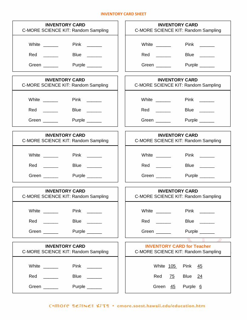
INVENTORY CARD SHEET
INVENTORY CARD C-MORE SCIENCE KIT: Random Sampling
White ______ Pink ______
Red ______ Blue ______
Green ______ Purple ______
INVENTORY CARD C-MORE SCIENCE KIT: Random Sampling
White ______ Pink ______
Red ______ Blue ______
Green ______ Purple ______
INVENTORY CARD C-MORE SCIENCE KIT: Random Sampling
White ______ Pink ______
Red ______ Blue ______
Green ______ Purple ______
INVENTORY CARD C-MORE SCIENCE KIT: Random Sampling
White ______ Pink ______
Red ______ Blue ______
Green ______ Purple ______
INVENTORY CARD for Teacher C-MORE SCIENCE KIT: Random Sampling
White ______ Pink ______
Red ______ Blue ______
Green ______ Purple ______
INVENTORY CARD C-MORE SCIENCE KIT: Random Sampling
White 105 Pink 45
Red 75 Blue 24
Green 45 Purple 6
INVENTORY CARD C-MORE SCIENCE KIT: Random Sampling
White ______ Pink ______
Red ______ Blue ______
Green ______ Purple ______
INVENTORY CARD C-MORE SCIENCE KIT: Random Sampling
White ______ Pink ______
Red ______ Blue ______
Green ______ Purple ______
INVENTORY CARD C-MORE SCIENCE KIT: Random Sampling
White ______ Pink ______
Red ______ Blue ______
Green ______ Purple ______
INVENTORY CARD C-MORE SCIENCE KIT: Random Sampling
White ______ Pink ______
Red ______ Blue ______
Green ______ Purple ______

TEACHER GUIDE Lesson 2: Introduction to Excel
Time Required: 50 minutes. Structure: This lesson should follow Lesson 1. It is a computer-based activity, in which students enter the data they collected during Lesson 1 into an Excel spreadsheet. Materials (per pair of students):
1. Completed STUDENT WORKSHEET – Lesson 1: Which Microbe is the Most Abundant? 2. STUDENT INSTRUCTIONS – Lesson 2: Introduction to Excel (MS Office 2003) 3. STUDENT INSTRUCTIONS – Lesson 2: Introduction to Excel (MS Office 2007)
Materials Not Included in this Science Kit:
4. Computers with Microsoft Office Excel (required) 5. Calculators (optional)
Advance Preparation:
1. Obtain access to computers with Microsoft Office Excel software (two students per computer recommended).
2. Determine whether you have Microsoft Office Excel version 2003 or 2007, and photocopy the appropriate STUDENT INSTRUCTIONS – Lesson 2: Introduction to Excel for that version (one per pair of students). Note: These instructions are designed for PC computers.
3. Photocopy or print the TEACHER EVALUATION and the SUPPLY CHECKLIST.
4. Locate the completed STUDENT WORKSHEET – Lesson 1: Which Microbe is the Most Abundant? (which you collected from students at the end of Lesson 1).
Instructional Procedures: Introduction:
1. Assign two students to each computer. Pair each student with a member of their group from Lesson 1.
2. Return completed STUDENT WORKSHEET – Lesson 1: Which Microbe is the Most Abundant? to students.
3. Hand out one STUDENT INSTRUCTIONS – Lesson 2: Introduction to Excel to each pair of students.
4. Have students create a computer-generated data sheet and graph by following the STUDENT INSTRUCTIONS. Note that there are many ways to use the Excel program; these instructions present some of the basic methods.
5. If students are unfamiliar with graphing, point out that column charts or bar graphs make good illustrations when comparing quantities of different categories of objects, such as species or colors. Mention that the x-axis (the horizontal axis) is used for the independent variable (for example, type of microbe), and the y-axis (the vertical axis) is used for the dependent variable (for example, number). Remind students to label each axis and to give their graph a descriptive title
Assessment and Clean-Up: 1. For assessment, you can (a) compare the students' graphs with the example given in the STUDENT INSTRUCTIONS
– Lesson 2: Introduction to Excel and/or (b) check the values or formulas on the students' spreadsheet.
2. Clean-up: Delete all computer files from the desktop after use.
3. We would be grateful if you would complete a short evaluation of this kit. All comments, corrections, and suggestions are very welcome. If you plan on completing Lesson 3, please wait until you have finished all lessons before filling out the TEACHER EVALUATION. If you prefer, you can complete the evaluation online (see TEACHER EVALUATION for website address).
4. Re-pack the kit for return to C-MORE. Double check that all the items are included and in their proper place by completing the SUPPLY CHECKLIST. Please make a note of missing, broken, or damaged items so that they can be

replaced. Please pack the kit so that the materials are stored as they were when you received them. Please also include a copy of the students' pre- and post-surveys from Lesson 1. If you plan on completing Lesson 3, please wait until the end to complete the SUPPLY CHECKLIST.
Mahalo!
STUDENT INSTRUCTIONS Lesson 2: Introduction to Excel (MS Office 2003)
In this lesson, you will learn to enter and graph data using Excel (a Microsoft Office program). The instructions below are for Excel 2003. Some commands may differ for other versions of Excel. SETTING UP YOUR DATA TABLE WITH EXCEL:
1. In the lower left corner of the computer screen, left-click on “Start”. Left-click on “All Programs”, select the “Microsoft Office” folder, and then open “Microsoft Office Excel 2003”. You’ll see a blank data table. Data tables on computers are called “spreadsheets”.
2. You will now type the information from Table 1 on your STUDENT WORKSHEET – Lesson 1: Which Species is the Most Abundant? Let’s start by labeling the types of data collected. Here’s how: Left-click in the first box in row 1 (this is called cell A1), and type in “Student”. If part of your label disappears, then you need to make your column wider. You can widen column A by putting the cursor exactly on the line between the A & B on the uppermost row (it will become a cross with arrows on the horizontal line only). Left-click, and while holding down the left-click, drag the line to the right.
3. To navigate around the spreadsheet, you can use the arrow keys on your keyboard. For example, hitting the right arrow key brings you to cell B1. Type in the first microbe name from Table 1 into cell B1. Hit the right arrow again and type in the second microbe name in cell C1. Continue doing this until you’ve listed all the microbe names from Table 2. In cell H1, type the word “Total”.
4. Use your arrow keys or your mouse to navigate to cell A2 (under “Student”), and type in the first student’s name. Hit the down arrow or the enter key and type in the second student’s name in A3. Repeat until you have listed every group member’s name.
5. Now, save your file (just in case something happens). To do so, left-click on “File”, then on “Save”. We want to save the file on the desktop, so go to the right of where it says “Save in”, left-click on the arrow and then on “Desktop” (depending on your version, the “Desktop” may be under the folders on the left). You can rename the file by typing a new file name in the box “File name”. Rename the file “Group Data_name” where “name” is your name. Then push “Save”. Note: If you are unable to save data onto your desktop, ask your teacher where you should save it.
ENTERING DATA INTO AN EXCEL SPREADSHEET:
1. Now you are ready to type in your group’s data from Table 1 on your STUDENT WORKSHEET – Lesson 1: Which Species is the Most Abundant? Enter the data for each student (B2-G2, B3-G3, etc.). Be sure to periodically save your data, as explained above.
2. It’s a good idea to double-check your data entries before proceeding. A good way to do this is to add up each student’s numbers and see if they total 10. Excel can automatically add the numbers up for you using a feature called “AutoSum”.
3. The “AutoSum” button is near the top of the Excel window and looks like this: ∑. Left-click in cell H2 and then
on ∑. All the cells in Row 2 will be automatically highlighted. A formula will also appear in H2: “=SUM(B2:G2)”, which means cells B2 through G2 will be added up, and the sum will be placed in H2. Since this is what you want to do, hit “Enter” on your keyboard. What number should appear? If you don’t get 10, double-check to make sure that (a) you typed your data in correctly and (b) the formula is correct.
4. Use “AutoSum” to calculate the totals for the other students (rows 3, 4, 5, etc.). Totals should be entered in column H, and again, each row should total 10.
5. Now label rows 11 and 12. Left-click on cell A11 and type in “Group Total”. Left-click on cell A12 and type in “Group Percentages”.
6. Now figure out how to calculate group totals for each type of microbe, and record your answers in Row 11.
(Hint: Use ∑ again, but first left-click on the cell you want your group total in, such as B11.). Note: If the “AutoSum” automatically selects the wrong cells, then you need to change which cells are selected prior to

pushing enter (the selected cells will be outlined by a box with dotted lines). To do this, left-click on the cell you want your group total in, and push the “AutoSum” button. You should now see the box around your cells. Left-click on the first cell you want to include in your sum (B2) and continue to hold down the left-click while dragging the cursor over all the cells you want to include in your sum (B2-B5 if there are four people in your group), then push enter.
7. In H11, use “AutoSum” to compute a grand total (ALL the microbes sampled by your group).
8. Next, calculate the group percentages. Here’s how: Left-click on the first cell (B12) where you want a percentage. Type in “=b11”. Then type “/” (it’s on the key with the “?”), followed by “h11”. Now push “Enter”. This tells Excel to divide the value in B11 (the total for your first type of microbe) by the grand total in H11. Repeat this for every column, replacing column “b” with “c”, “d”, “e”, etc. Remember to always divide by the grand total in H11.
9. If the numbers in Row 12 don’t have a “%” sign, highlight the cells that you want to convert to percentages. On the top Menu Bar, left-click on “Format”, then “Cells”. Under “Category,” select “Percentage” with a left-click. For “Decimal places”, use the down arrow to select “0” and left-click on “OK”.
10. Add up the percentages on Row 12 using “AutoSum,” and record the total in cell H12. If the H12 total is not 100%, check for errors. Note: The total may be slightly more or less than 100% due to rounding error.
11. Now would be a good time to save your file again. Since your file has already been saved in the correct place
(desktop), simply hit the picture of the computer disk on the upper left corner of the screen. MAKING AN EXCEL GRAPH:
1. Now that you have the percentages of each type of microbe on your spreadsheet, Excel can easily make a beautiful graph for you. But first you must help by copying your Microbe Names to the row just above the "Group Percentage" row. There are several steps involved. First, you will need to insert a blank row above row 12 (so you have a place to paste the Microbe Names): Left-click on any box in row 12, then go to the Menu Bar and select “Insert”, then “Row”. You should see a blank row appear above your “Group Percentages”.
2. Now you can copy the microbe names from row 1 into the blank row (the new row 12 that you just created) by left-clicking on the number “1” at the very beginning (left) of row number 1. The entire row 1 should now be highlighted. Left-click “Edit” then select “Copy” in the menu bar at the top of the screen. Next, left-click on row number 12. The entire row 12 should now be highlighted. Left-click “Edit” then select “Paste”. Your data table should now look like this:
A B C D E F G H
1 Student Coccolithophore Cyanobacteria Archaea Diatom Bacteria Virus Total 2 Name 1 3 Name 2 4 Name 3 5 Name 4 6 7 8 9
10 11 Group Total 12 Student Coccolithophore Cyanobacteria Archaea Diatom Bacteria Virus Total 13 Group
Percentage
STUDENT INSTRUCTIONS - Continued Lesson 2: Introduction to Excel (MS Office 2003)
3. Now you are ready to make a graph. Highlight the Microbe Names (B12-G12) and the Group Percentages (B13-
G13) by left-clicking on one of the corner cells and dragging diagonally to the other corner cell. You should now see a box around these cells.
4. Then left-click on the colorful “Graph Wizard” icon.
It is just below the menu bar and looks like this:
5. You’ll see a window asking you for “Chart type”. “Column” should already be highlighted (if not, left-click on it). Then left-click “Next”. A new screen will pop up. Select “Series in Rows” (not columns) then “Next”.
6. The next window will ask you to title your graph and label your axes. Type in a descriptive title. For the X-axis, type in “Microbe” and for the Y-axis, “Percentage of Each Microbe”.
7. The next window will ask you where to place the chart. Select “As object in” and “Sheet 1,” then “Finish”. The graph will be included with your spreadsheet.
8. To move the graph to a new location in your spreadsheet, left-click near one of the edges of the graph, hold down the left-click, and drag the graph to the desired location.
9. To change the colors of the bars to reflect the color of each type of microbe, left-click on a bar in the graph, then left-click on the bar of interest to highlight it. Now right-click on the bar, and select “Format Data Point”. A new window with color choices will appear. Left-click on the color you want the bar to be, and left-click “OK”. This will change the bar color. Correct the colors on the rest of the bars.
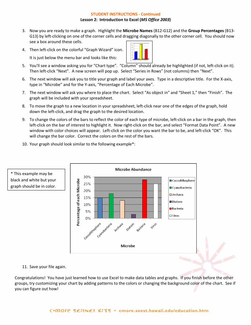
10. Your graph should look similar to the following example*:
11. Save your file again.
Congratulations! You have just learned how to use Excel to make data tables and graphs. If you finish before the other groups, try customizing your chart by adding patterns to the colors or changing the background color of the chart. See if you can figure out how!
0
1
2
3
4
5
6
1 2 3
* This example may be black and white but your graph should be in color.
STUDENT INSTRUCTIONS Lesson 2: Introduction to Excel (MS Office 2007)
In this lesson, you will learn to enter and graph data using Excel (a Microsoft Office program). The instructions below are for Excel 2007. Some commands may differ for other versions of Excel. SETTING UP YOUR DATA TABLE WITH EXCEL:
1. In the lower left corner of the computer screen, left-click on “Start”. Left-click on “All Programs”, select the “Microsoft Office” folder, and then left-click to open “Microsoft Office Excel 2007”. You’ll see a blank data table. Data tables on computers are called “spreadsheets”.
2. You will now type the information from Table 1 on your STUDENT WORKSHEET – Lesson 1: Which Microbe is the Most Abundant? Let’s start by labeling the types of data collected. Here’s how: Left-click in the first box in row 1 (this is called cell A1), and type in “Student”. If part of your label disappears, then you need to make your column wider. You can widen column A by putting the cursor exactly on the line between the A & B on the uppermost row (it will become a cross with arrows on the horizontal line only). Left-click, and while holding down the left-click, drag the line to the right.
3. To navigate around the spreadsheet, you can use the arrow keys on your keyboard or your mouse. For example, hitting the right arrow key brings you to cell B1. Type in the first microbe name from Table 1 into cell B1. Hit the right arrow again and type in the second microbe name in cell C1. Continue doing this until you’ve listed all the microbe names from Table 2. In cell H1, type the word “Total”.
4. Use your arrow keys or your mouse to navigate to cell A2 (under “Student”), and type in the first student’s name. Hit the down arrow (or the enter key) and type in the second student’s name in A3. Repeat until you have listed every group member’s name. Now, save your file (just in case something happens). To do so, left
click on the round “Office” button in the upper left corner, then on “Save”. We want to save the file onto the desktop, so click on “Desktop”, which is located under the folders on the left (Note: You may have to scroll up or down to locate the desktop under the folders section). You can rename the file by typing a new file name in the box “File name”. Rename the file “Group Data_name” where “name” is your name. Then push “Save”. Note: If you are unable to save data onto your desktop, ask your teacher where you should save your file.
ENTERING DATA INTO AN EXCEL SPREADSHEET:
1. Now you are ready to type in your group’s data from Table 1 on your STUDENT WORKSHEET – Lesson 1: Which Species is the Most Abundant? Enter the data for each student (B2-G2, B3-G3, etc.) Be sure to periodically save your data, as explained above.
2. It’s a good idea to double-check your data entries before proceeding. A good way to do this is to add up each student’s numbers and see if they total 10. Excel can automatically add the numbers up for you using a feature called “AutoSum”.
3. The “AutoSum” button is near the top right of the Excel window and looks like this: ∑. Left-click in cell H2 and
then on ∑. All the cells in row 2 will automatically be highlighted. A formula will also appear in H2: “=SUM(B2:G2)”, which means cells B2 through G2 will be added up, and the sum will be placed in H2. Since this is what you want to do, hit “Enter” on your keyboard. What number should appear? If you don’t get 10, double-check to make sure that (a) you typed your data in correctly and (b) the formula is correct.
4. Use “AutoSum” to calculate the totals for the other students (rows 3, 4, 5, etc.). Totals should be entered in column H, and again, each row should total 10. Note: If the “AutoSum” automatically selects the wrong cells, then you need to change which cells are selected prior to pushing enter (the selected cells will be outlined by a box with dotted lines). To do this, left-click on the cell you want your group total in, and push the “AutoSum” button. You should now see the box around your cells. Left-click on the first cell you want to include in your sum for example (B4) and continue to hold down the left-click while dragging the cursor over all the cells you want to include in your sum (B4-G5), then push enter.
5. Now label rows 11 and 12. Left-click on cell A11 and type in “Group Total”. Left-click A12 and type in “Group Percentages”.
6. Now figure out how to calculate group totals for each type of microbe, and record answers in row 11. (Hint:
Use ∑ again, but first left-click on the cell you want your group total in, such as B11.).
7. Have Excel compute a grand total (ALL the microbes sampled by your group) in H11.
8. Next, calculate the group percentages. Here’s how: Left-click on the first cell (B12) where you want a percentage. Type in “=b11”. Then type “/” (it’s on the key with the “?”), followed by “h11”. Now push “Enter”. This tells Excel to divide the value in B11 (the total for your first type of microbe) by the grand total in H11. Repeat this for every column, replacing column “b” with “c”, “d”, “e”, etc. Remember to always divide by the grand total in H11.
9. If the numbers in row 12 don’t have a “%” sign, highlight the cells that you want to convert to percentages. On the top Menu Bar, left-click on the “%” picture within the “Number” section.
10. Add up the percentages in row 12 using “AutoSum,” and record the total in cell H12. If the H12 total is not 100%, check for errors. Note: The total may be slightly more or less than 100% due to rounding error.
11. Now would be a good time to save your file again. Since your file has already been saved in the correct place
(desktop), simply hit the picture of the computer disk on the upper left corner of the screen. MAKING AN EXCEL GRAPH:
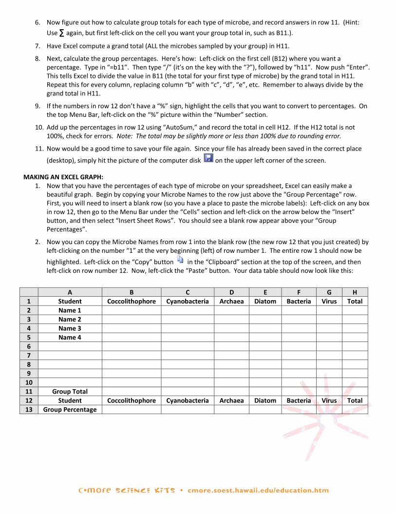
1. Now that you have the percentages of each type of microbe on your spreadsheet, Excel can easily make a beautiful graph. Begin by copying your Microbe Names to the row just above the "Group Percentage" row. First, you will need to insert a blank row (so you have a place to paste the microbe labels): Left-click on any box in row 12, then go to the Menu Bar under the “Cells” section and left-click on the arrow below the “Insert” button, and then select “Insert Sheet Rows”. You should see a blank row appear above your “Group Percentages”.
2. Now you can copy the Microbe Names from row 1 into the blank row (the new row 12 that you just created) by left-clicking on the number “1” at the very beginning (left) of row number 1. The entire row 1 should now be
highlighted. Left-click on the “Copy” button in the “Clipboard” section at the top of the screen, and then left-click on row number 12. Now, left-click the “Paste” button. Your data table should now look like this:
A B C D E F G H
1 Student Coccolithophore Cyanobacteria Archaea Diatom Bacteria Virus Total 2 Name 1 3 Name 2 4 Name 3 5 Name 4 6 7 8 9
10 11 Group Total 12 Student Coccolithophore Cyanobacteria Archaea Diatom Bacteria Virus Total 13 Group Percentage
STUDENT INSTRUCTIONS - Continued Lesson 2: Introduction to Excel (MS Office 2007)
3. Hit the “Esc” key on your keyboard to unhighlight the row.
4. Now you are ready to make a graph. Highlight the Microbe Names (B12-G12) and the Group Percentages (B13-G13) by left-clicking on one of the corner cells and dragging diagonally to the other corner cell. You should now see a box around these cells. To create a column graph, left-click on the “Insert” tab on the top-left, then the
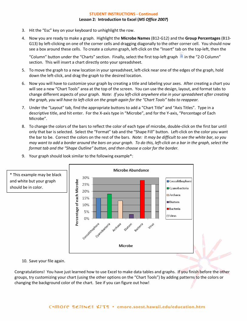
“Column” button under the “Charts” section. Finally, select the first top-left graph in the “2-D Column” section. This will insert a chart directly onto your spreadsheet.
5. To move the graph to a new location in your spreadsheet, left-click near one of the edges of the graph, hold down the left-click, and drag the graph to the desired location.
6. Now you will have to customize your graph by creating a title and labeling your axes. After creating a chart you will see a new “Chart Tools” area at the top of the screen. You can use the design, layout, and format tabs to change different aspects of your graph. Note: If you left-click anywhere else in your spreadsheet after creating the graph, you will have to left-click on the graph again for the “Chart Tools” tabs to reappear.
7. Under the “Layout” tab, find the appropriate buttons to add a “Chart Title” and “Axis Titles”. Type in a descriptive title, and hit enter. For the X-axis type in “Microbe”, and for the Y-axis, “Percentage of Each Microbe”.
8. To change the colors of the bars to reflect the color of each type of microbe, double-click on the first bar until only that bar is selected. Select the “Format” tab and the “Shape Fill” button. Left-click on the color you want the bar to be. Correct the colors on the rest of the bars. Note: It may be difficult to see the white bar, so you may want to add a border around the bars on your graph. To do this, left-click on a bar in the graph, select the format tab and the “Shape Outline” button, and then choose a color for the border.
9. Your graph should look similar to the following example*:
10. Save your file again. Congratulations! You have just learned how to use Excel to make data tables and graphs. If you finish before the other groups, try customizing your chart (using the other options on the “Chart Tools”) by adding patterns to the colors or changing the background color of the chart. See if you can figure out how!
* This example may be black and white but your graph should be in color.
TEACHER GUIDE Lesson 3: Testing Hypotheses with Statistics
Time Required: 50 minutes. Structure: In this lesson, students learn how to use statistics to assess how well random samples represent the total population. This lesson can follow Lessons 1 and 2, or it can stand alone. If this lesson follows Lessons 1 and 2, students can perform statistics on the random samples they collected in Lesson 1. However, if this lesson is taught as a stand- alone lesson, or if you would like all students to have the same results, use the data and answer key provided. Materials (per pair of students):
1. STUDENT INFORMATION SHEET – Lesson 3: Testing Hypotheses with Statistics 2. STUDENT WORKSHEET – Lesson 3: Testing Hypotheses with Statistics 3. TEACHER ANSWER KEY to STUDENT WORKSHEET – Lesson 3: Testing Hypotheses with Statistics
Materials Not Included in this Science Kit:
4. Computers with Microsoft Office Excel (optional) 5. Calculators (optional)
Advance Preparation:
1. Read the STUDENT INFORMATION SHEET – Lesson 3: Testing Hypotheses with Statistics prior to the class session to determine if additional bridging is required.
2. Photocopy or print STUDENT INFORMATION SHEET – Lesson 3: Testing Hypotheses with Statistics (one per student).
3. Photocopy or print STUDENT WORKSHEET – Lesson 3: Testing Hypotheses with Statistics (one per student).
4. Photocopy or print the TEACHER EVALUATION and SUPPLY CHECKLIST.
Instructional Procedures: Introduction
1. Do a pair-share or jigsaw reading activity, where students are paired (or groups are assigned) to read and discuss Parts I & II of the STUDENT INFORMATION SHEET – Lesson 3: Testing Hypotheses with Statistics. Reconvene the class and check for understanding. Correct any misconceptions.
2. As a class or in small groups, have students determine whether their M&M data satisfy all conditions of the Chi-Squared Goodness-of-Fit Test. Answer: Yes, all conditions are met – here’s why:
a. The sample data are in categories. Yes – in this case, the categories are colors.
b. Each observation must be classified into exactly one category. Yes – Each M&M sampled will be exactly one of the six colors. It’s not possible for it to be no color, or two colors.
c. The sample data have been collected randomly. Yes – We picked a sample without peeking (we didn’t pick our favorite colors or avoid the colors we disliked).
d. The sample data are listed as frequency counts for each category. Yes – of the 100 candies selected, 33 are brown, 26 are yellow, etc.
e. For each category, the expected frequency is at least 5. The expected frequency is the frequency of each color from the theoretical color distribution for the population. These are the percentages provided by Mars, Inc. – that is, Brown – 30%; Yellow – 20%; Red – 20%; Orange – 10%; Green – 10%; Blue – 10%.
Using a sample of 100, the lowest expected frequency is 10% * 100 = 10, which is greater than 5, so this condition is met.
3. Direct students to work in their groups and complete the STUDENT WORKSHEET – Lesson 3: Testing Hypotheses with Statistics, based on the information provided in Parts III–V of the STUDENT INFORMATION SHEET – Lesson 3: Testing Hypotheses with Statistics.
Assessment and Clean-Up:
1. For assessment, check STUDENT WORKSHEET – Lesson 3: Testing Hypotheses with Statistics for content. A TEACHER ANSWER KEY is provided for your convenience.
2. We would be grateful if you would complete the TEACHER EVALUATION in this kit. All comments, corrections, and suggestions are very welcome. If you prefer, you can complete the evaluation online (see TEACHER EVALUATION for website address).
3. Re-pack the kit for return to C-MORE. Double check that all the items are included and in their proper place by completing the SUPPLY CHECKLIST. Please make a note of missing, broken, or damaged items so that they can be replaced. Please pack the kit so that the materials are stored as they were when you received them. Please also include a copy of the students' pre- and post- surveys from Lesson 1.
Mahalo!

STUDENT INFORMATION SHEET Lesson 3: Testing Hypotheses with Statistics
I. What is Statistics? “Statistics” refers to a group of numbers describing a certain collection of “things,” such as test scores of freshmen biology students on the island of O‘ahu, grain sizes in a barrel of sand from Waikiki, etc. We collect statistics when we record our observations (data) for some subset (sample) of the entire population. A more precise definition of a statistic is a number representing a particular characteristic of a sample of the population. Descriptive statistics are used to summarize a sample of a population – for example, the mean (average) body temperature of 100 adults on O‘ahu. Statistics can also be used to test hypotheses to draw (or infer) certain conclusions about the population from which the sample is drawn. For example, we can use the mean body temperatures of the 100 sampled adults to make an inference about the mean body temperature of all adults on O‘ahu. This is called inferential statistics or hypothesis-testing. However, we must be very careful to follow certain rules to avoid making incorrect inferences about the population. Each statistical method is applied for a specific purpose and works only if certain conditions are met. In this lesson, we will learn one statistical method for testing hypotheses, and we’ll apply it to a population of M&M candies (because that’s more interesting than body temperatures). II. Testing a Hypothesis about M&M’s Mars, Inc. (the company that makes M&M’s) claims that M& M’s milk chocolate candies are currently produced in the following frequencies (percentages):
Brown – 30; Yellow – 20; Red – 20; Orange – 10; Green – 10; Blue – 10
In other words, the manufacturer claims that, in the whole population, the probability of getting a brown M&M is 30%, the probability of getting a yellow M&M is 20%, etc. In this lesson, we will demonstrate how to test this claim about this population using statistics. To do this, we will first need to take a sample and record some data. Because we are very dedicated to this cause, we selflessly went out and bought a 14 oz. bag of M&M’s milk chocolate candies. Without peeking into the bag, we took out 100 candies without trying to preferentially select our favorite colors. Another way of saying this is we took a random sample of 100 candies. We observed the following color distribution in our sample:
Brown – 33; Yellow – 26; Red – 21; Orange – 8; Green – 7; Blue – 5
Note that the color distribution of our sample does not exactly match the theoretical color distribution of the population. For example, the frequencies for the color brown are 30 (expected) vs. 33 (observed); for the color blue, there are 10 (expected) vs. 5 (observed). Are the color distributions of the sample and population “close enough”, such that the differences can be attributed to the natural variations that you might expect when you take a sample? Or are they sufficiently different to cast doubt on the company’s stated color distribution? To answer these questions, we will use a statistical test called the Chi-Squared (pronounced kai-squared, where kai rhymes with high) Goodness-of-Fit Test. This test will help us measure how well our data fits the claim by Mars, Inc. and allow us to infer, within the rules of statistics, if the data support the manufacturer’s claim. However, before we can use this test, we have to make sure our sample data meets the following conditions:
a. The sample data are in categories. b. Each observation must be classified into exactly one category. c. The sample data have been collected randomly. d. The sample data are listed as frequency counts for each category. e. For each category, the expected frequency is at least 5.
Take a few minutes and check if the M&M’s data fit all five conditions. If one or more of the conditions are not met, you may not use this test. If all of the above conditions are met, you may proceed to set up a hypothesis and test it with the Chi-Squared Goodness-of-Fit Test.
III. Writing Statistical Hypotheses To use the Chi-Squared Goodness-of-Fit Test, we first have to form a hypothesis (so we have something to test). Actually, in statistics, we form two hypotheses. The first is called the null hypothesis – this is the hypothesis we are testing. The null Hypothesis (H0) must always be stated in terms of equality (=, ≥, or ≤). The second hypothesis (H1) is called the alternate hypothesis and it is essentially the opposite of the null hypothesis. If the null hypothesis is false, then the alternate hypothesis is true. This sounds really confusing, so let’s look at an example of a hypothesis written in everyday English: The mean body temperature (T) of high school students is 98.6°F. Translating this into statistical language, we write two hypotheses: Null hypothesis (H0): T = 98.6°F Alternate hypothesis (H1): T ≠ 98.6°F In our M&M’s example, writing a null hypothesis is trickier because we have so many colors, but we’ll help you out. IV. Testing a Hypothesis with the Chi-Squared Goodness-of-Fit The Chi-Squared Goodness-of-Fit Test is used to test a hypothesis to see how well an observed frequency distribution (in our case, a color distribution) fits some expected distribution (in our case, the color distribution claimed by the manufacturer). If all five conditions on the previous page are met, you may proceed to calculate the Chi-Squared test statistic.
...)()()()( 2222
2 +−
+−
+−
=−
= ∑red
redred
yellow
yellowyellow
brown
brownbrown
EEO
EEO
EEO
EEOχ
where χ2= the chi-squared test statistic that you calculate
∑= the symbol for taking a sum (you may recognize the symbol ∑ from Excel) O = observed value (the color distribution for each color, from your sample data)
E = expected value (the color distribution for each color, according to the manufacturer’s claimed distribution)
In other words, this formula tells you to calculate the difference between O and E for each color, square each difference, and divide by E. Do this for every color and then add them all together. The squaring of the difference gives us a positive number. The greater the differences between the observed and expected value, the bigger the test statistic χ2 will be, and the more likely that we will reject the null hypothesis. To decide if the test statistic is big enough to reject, read on….. V. Using the test statistic to evaluate the null hypothesis How big does the test statistic have to be to reject the null hypothesis? It depends on two things:
a. The number of degrees of freedom, which is simply one less than the number of categories. In our case, we have 6 categories (6 colors), so the number of degrees of freedom is 5.
b. The significance level, which is something we choose. Think of the significance level as a measure of the amount of error that you can live with – because we can never be 100% certain when we reject a null hypothesis that it is really false. It’s common to accept a significance level of 0.05 (which means that 5% of the time that we reject a null hypothesis, we will do so in error).
Once you have these two pieces of information, you can look up the “critical value” on a Table of Chi-Square Probabilities (Table 3 on your STUDENT WORKSHEET – Lesson 3: Testing Hypotheses with Statistics). If the test statistic is bigger than the critical value, you REJECT the null hypothesis. If the test statistic is less than the critical value, you ACCEPT the null hypothesis.
Are you confused yet? Reading about statistics can get confusing!! It’s much easier to learn statistics by doing statistics. So, let’s follow the steps in the STUDENT WORKSHEET – Lesson 3: Testing Hypotheses with Statistics to apply this statistical test to M&M’s.
Name/Period:___________________________ Group Members:___________________________________
STUDENT WORKSHEET Lesson 3: Testing Hypotheses with Statistics
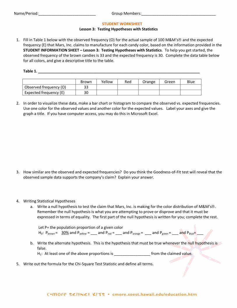
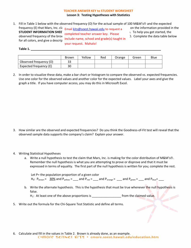
1. Fill in Table 1 below with the observed frequency (O) for the actual sample of 100 M&M’s and the expected
frequency (E) that Mars, Inc. claims to manufacture for each candy color, based on the information provided in the STUDENT INFORMATION SHEET – Lesson 3: Testing Hypotheses with Statistics. To help you get started, the observed frequency of the brown candies is 33 and the expected frequency is 30. Complete the data table below for all colors, and give a descriptive title to the table.
Table 1. ____________________________________________________________________________
Brown Yellow Red Orange Green Blue Observed frequency (O) 33 Expected frequency (E) 30
2. In order to visualize these data, make a bar chart or histogram to compare the observed vs. expected frequencies.
Use one color for the observed values and another color for the expected values. Label your axes and give the graph a title. If you have computer access, you may do this in Microsoft Excel.
3. How similar are the observed and expected frequencies? Do you think the Goodness-of-Fit test will reveal that the
observed sample data supports the company’s claim? Explain your answer.
4. Writing Statistical Hypotheses a. Write a null hypothesis to test the claim that Mars, Inc. is making for the color distribution of M&M’s.
Remember the null hypothesis is what you are attempting to prove or disprove and that it must be expressed in terms of equality. The first part of the null hypothesis is written for you; complete the rest. Let P= the population proportion of a given color H0: Pbrown = 30% and Pyellow = ___ and Pred = ___ and Porange = ___ and Pgreen = ___ and Pblue= ___
b. Write the alternate hypothesis. This is the hypothesis that must be true whenever the null hypothesis is false. H1: At least one of the above proportions is _________________ from the claimed value.
5. Write out the formula for the Chi-Square Test Statistic and define all terms.

6. Calculate and fill in the values in Table 2. Brown is already done, as an example.
Table 2. Goodness-of-Fit Test Calculations for a Sample of 100 M&M’s
Color Category
Observed Frequency (O)
Expected Frequency (E)
O-E
(O-E)2
(O-E)2
E Brown 33 30 3 9 0.30 Yellow
Red Orange Green Blue
7. Use your answers from the above table to calculate the χ2.
χ2 =
8. Now that we have determined the χ2 test statistic, we want to compare this value to the critical χ2 value. To do this, we will need to know the number of degrees of freedom.
a. Degrees of Freedom (df) = ______
b. How did you determine the number of degrees of freedom?
9. Using the degrees of freedom (df) determined above and the 0.05 significance level, look up the critical χ2 value on a Table of Chi-Square Probabilities (an abbreviated version of this table, up to df=10, is given below).
Table 3. Table of Chi-Square Probabilities
df 0.10 0.05 0.025 0.01 1 2.706 3.841 5.024 6.635 2 4.605 5.991 7.378 9.210 3 6.251 7.815 9.348 11.345 4 7.779 9.488 11.143 13.277 5 9.236 11.070 12.833 15.086 6 10.645 12.592 14.449 16.812 7 12.017 14.067 16.013 18.475 8 13.362 15.507 17.535 20.090 9 14.684 16.919 19.023 21.666
10 15.987 18.307 20.483 23.209
10. Compare the χ2 test statistic to the critical value, and circle the correct answers below: The χ2 test statistic is (larger, smaller) than the critical value, so we (reject, do not reject) the null hypothesis.
11. Interpret your results.
significance levels Critical Value of χ2 = __________
TEACHER ANSWER KEY to STUDENT WORKSHEET Lesson 3: Testing Hypotheses with Statistics
1. Fill in Table 1 below with the observed frequency (O) for the actual sample of 100 M&M’s and the expected
frequency (E) that Mars, Inc. claims to manufacture for each candy color, based on the information provided in the STUDENT INFORMATION SHEET – Lesson 3: Testing Hypotheses with Statistics. To help you get started, the observed frequency of the brown candies is 33 and the expected frequency is 30. Complete the data table below for all colors, and give a descriptive title to the table.
Table 1. ____________________________________________________________________________
Brown Yellow Red Orange Green Blue Observed frequency (O) 33 Expected frequency (E) 30
2. In order to visualize these data, make a bar chart or histogram to compare the observed vs. expected frequencies.
Use one color for the observed values and another color for the expected values. Label your axes and give the graph a title. If you have computer access, you may do this in Microsoft Excel.
3. How similar are the observed and expected frequencies? Do you think the Goodness-of-Fit test will reveal that the
observed sample data supports the company’s claim? Explain your answer.
4. Writing Statistical Hypotheses a. Write a null hypothesis to test the claim that Mars, Inc. is making for the color distribution of M&M’s.
Remember the null hypothesis is what you are attempting to prove or disprove and that it must be expressed in terms of equality. The first part of the null hypothesis is written for you; complete the rest. Let P= the population proportion of a given color H0: Pbrown = 30% and Pyellow = ___ and Pred = ___ and Porange = ___ and Pgreen = ___ and Pblue= ___
b. Write the alternate hypothesis. This is the hypothesis that must be true whenever the null hypothesis is false. H1: At least one of the above proportions is _________________ from the claimed value.
5. Write out the formula for the Chi-Square Test Statistic and define all terms.
6. Calculate and fill in the values in Table 2. Brown is already done, as an example.
Email [email protected] to request a completed teacher answer key. Please include name, school and grade(s) taught in your request. Mahalo!
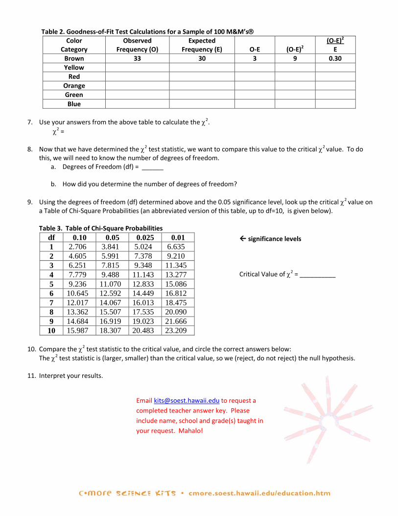
Table 2. Goodness-of-Fit Test Calculations for a Sample of 100 M&M’s
Color Category
Observed Frequency (O)
Expected Frequency (E)
O-E
(O-E)2
(O-E)2
E Brown 33 30 3 9 0.30 Yellow
Red Orange Green Blue
7. Use your answers from the above table to calculate the χ2.
χ2 =
8. Now that we have determined the χ2 test statistic, we want to compare this value to the critical χ2 value. To do this, we will need to know the number of degrees of freedom.
a. Degrees of Freedom (df) = ______
b. How did you determine the number of degrees of freedom?
9. Using the degrees of freedom (df) determined above and the 0.05 significance level, look up the critical χ2 value on a Table of Chi-Square Probabilities (an abbreviated version of this table, up to df=10, is given below).
Table 3. Table of Chi-Square Probabilities
df 0.10 0.05 0.025 0.01 1 2.706 3.841 5.024 6.635 2 4.605 5.991 7.378 9.210 3 6.251 7.815 9.348 11.345 4 7.779 9.488 11.143 13.277 5 9.236 11.070 12.833 15.086 6 10.645 12.592 14.449 16.812 7 12.017 14.067 16.013 18.475 8 13.362 15.507 17.535 20.090 9 14.684 16.919 19.023 21.666
10 15.987 18.307 20.483 23.209
10. Compare the χ2 test statistic to the critical value, and circle the correct answers below: The χ2 test statistic is (larger, smaller) than the critical value, so we (reject, do not reject) the null hypothesis.
11. Interpret your results.
significance levels Critical Value of χ2 = __________
Email [email protected] to request a completed teacher answer key. Please include name, school and grade(s) taught in your request. Mahalo!

GLOSSARY
algae (al–jee); Plant-like organisms in the ocean. Example: seaweed. algal bloom (al–gull bloom); A fast increase in the numbers of one or more kinds of algae. Algal blooms can
occur in freshwater or marine environments. alternate hypothesis The opposite of the null hypothesis. If the null hypothesis is T = 98.6°, then (H1) the alternate hypothesis is T ≠ 98.6°. Archaea (ar-key-uh); A group of single-celled microbes whose cells have no clearly defined nuclei to
house their DNA. Many archaea live in extreme environments, and are called extremophiles. bacteria Like Archaea, bacteria are microbes whose cells lack a nucleus. However, bacteria are
genetically different from Archaea. Although some bacteria cause disease, most do not. In fact, bacteria serve important roles in the environment.
biased Favoring or preferring one result over other results (not random). chemosynthesis (key-mo-sinth-uh-sis); The process of making food by using chemical energy. chi-square goodness- (kai-square); A statistical method used to test a hypothesis. of-fit test (χ2) chlorophyll The molecule that enables plants to use sunlight to make food. Chlorophyll also gives plants
their green color. coccolithophore (ko-ko-lith-uh-four); A type of single-celled algae found in the upper layers of the ocean.
Coccolithophores have shells made of small, calcium carbonate (limestone) plates called coccoliths.
cyanobacteria (sigh-an-oh-bacteria); Photosynthetic bacteria. decomposer An organism that lives by breaking down dead animals or plants. In the process, decomposers
recycle nutrients in the environment. dependent variable The variable you measure in an experiment; it is dependent on another variable (the
independent variable). diatom A type of single-celled algae whose cell walls contain silica, which is the main component of
most types of glass. Eukarya (yew-kah-ree-uh); Organisms with cells that have well-defined nuclei that house their DNA. All (Eukaryotes) visible forms of life, from ants to zebras, and certain microbes are Eukarya. extremophile (ex-treme-oh-file); A living thing that thrives in extreme environments (such as hydrothermal
vents) that are harmful to most other living things on Earth. food web The predator-prey relationships within an ecosystem or habitat. frequency The number of items in a particular category. hydrothermal vent A vent or crack in the sea floor producing extremely hot, sulfur-rich water.
hypothesis A prediction that can be tested. independent variable The variable that is not influenced by other variables in the experiment. infer To draw certain conclusions. microbe An organism that is too small to be seen by the naked human eye. microorganism See microbe. null hypothesis The hypothesis being tested. The null hypothesis must be stated in terms of (Ho) equality (=, ≥, or ≤). Example: T = 98.6°F. nutrient A substance that an organism must obtain from its surroundings to survive and grow. Example:
nitrogen, which is needed by every organism to make proteins and DNA. organism A living thing. photosynthesis (foe-toe-sinth-uh-sis); The way that plants make food. Photosynthesis requires sunlight, carbon
dioxide and water, and produces sugar and oxygen. phytoplankton (fight-o-plank-ton); Microscopic, plant-like organisms that live in the ocean. probability The chance that a particular outcome will happen. random sampling Selecting items purely by chance, without any favor, preference or prejudice. Random sampling
is used to estimate the population sizes of species within an ecosystem when it is not possible or practical to count all the individuals.
statistics A collection of mathematical methods used to describe data and draw conclusions. unicellular Made of a single cell. virus The smallest microbes. They are even smaller than a cell and are not considered alive.
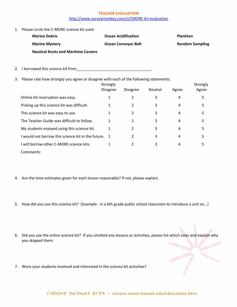
TEACHER EVALUATION http://www.surveymonkey.com/s/CMORE-kit-evaluation
1. Please circle the C-MORE science kit used:
2. I borrowed this science kit from___________________________________.
3. Please rate how strongly you agree or disagree with each of the following statements. Strongly Strongly Disagree Disagree Neutral Agree Agree
Online kit reservation was easy. 1 2 3 4 5
Picking up this science kit was difficult. 1 2 3 4 5
This science kit was easy to use. 1 2 3 4 5
The Teacher Guide was difficult to follow. 1 2 3 4 5
My students enjoyed using this science kit. 1 2 3 4 5
I would not borrow this science kit in the future. 1 2 3 4 5
I will borrow other C-MORE science kits. 1 2 3 4 5
Comments: 4. Are the time estimates given for each lesson reasonable? If not, please explain. 5. How did you use this science kit? (Example: in a 6th grade public school classroom to introduce a unit on…) 6. Did you use the entire science kit? If you omitted any lessons or activities, please list which ones and explain why
you skipped them. 7. Were your students involved and interested in the science kit activities?
Marine Debris
Marine Mystery
Nautical Knots and Maritime Careers
Ocean Acidification
Ocean Conveyor Belt
Plankton
Random Sampling
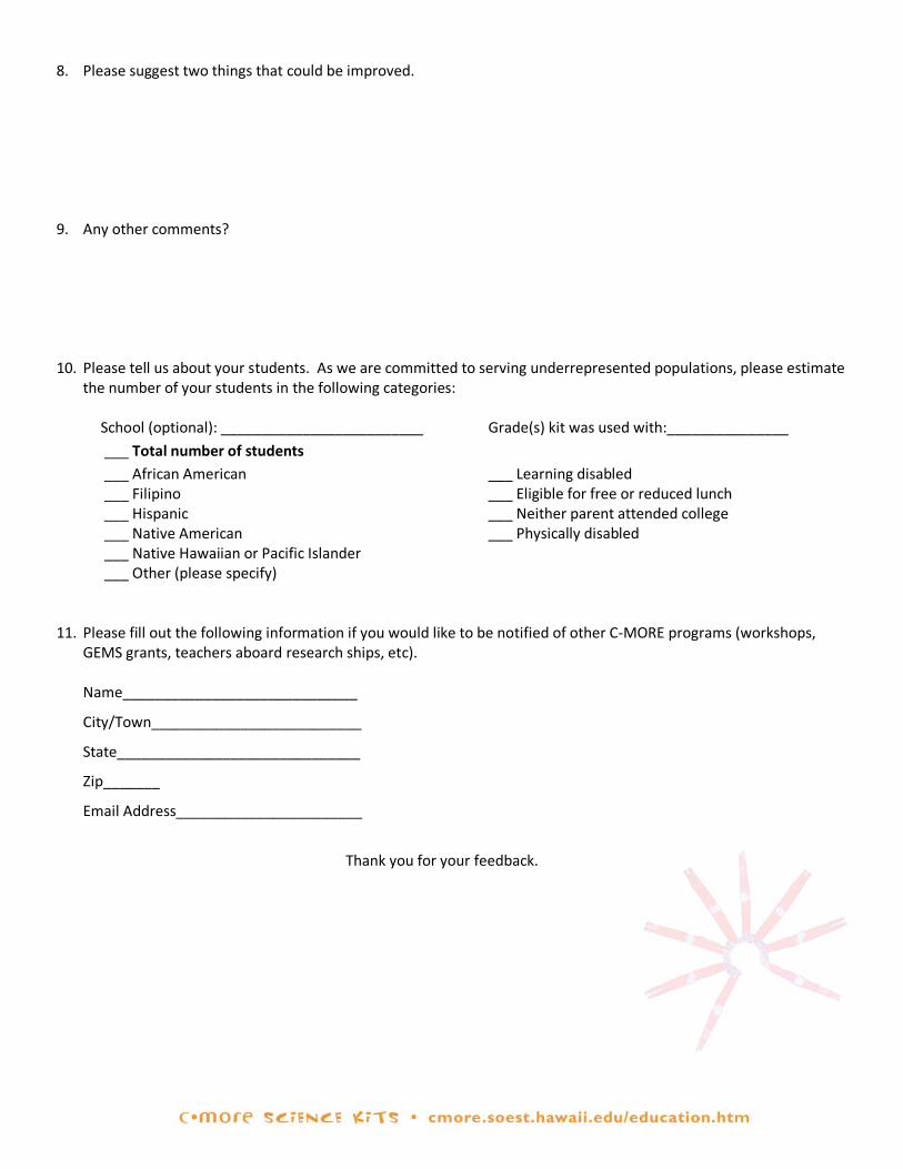
8. Please suggest two things that could be improved. 9. Any other comments? 10. Please tell us about your students. As we are committed to serving underrepresented populations, please estimate
the number of your students in the following categories:
School (optional): _________________________ Grade(s) kit was used with:_______________
___ Total number of students ___ African American ___ Filipino ___ Hispanic ___ Native American ___ Native Hawaiian or Pacific Islander
___ Learning disabled ___ Eligible for free or reduced lunch ___ Neither parent attended college ___ Physically disabled
___ Other (please specify) 11. Please fill out the following information if you would like to be notified of other C-MORE programs (workshops,
GEMS grants, teachers aboard research ships, etc). Name_____________________________
City/Town__________________________
State______________________________
Zip_______
Email Address_______________________
Thank you for your feedback.
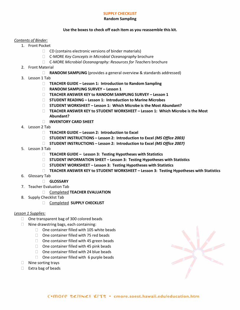
SUPPLY CHECKLIST Random Sampling
Use the boxes to check off each item as you reassemble this kit.
Contents of Binder:
1. Front Pocket � CD (contains electronic versions of binder materials) � C-MORE Key Concepts in Microbial Oceanography brochure � C-MORE Microbial Oceanography: Resources for Teachers brochure
2. Front Material � RANDOM SAMPLING (provides a general overview & standards addressed)
3. Lesson 1 Tab � TEACHER GUIDE – Lesson 1: Introduction to Random Sampling � RANDOM SAMPLING SURVEY – Lesson 1 � TEACHER ANSWER KEY to RANDOM SAMPLING SURVEY – Lesson 1 � STUDENT READING – Lesson 1: Introduction to Marine Microbes � STUDENT WORKSHEET – Lesson 1: Which Microbe is the Most Abundant? � TEACHER ANSWER KEY to STUDENT WORKSHEET – Lesson 1: Which Microbe is the Most
Abundant? � INVENTORY CARD SHEET
4. Lesson 2 Tab � TEACHER GUIDE – Lesson 2: Introduction to Excel � STUDENT INSTRUCTIONS – Lesson 2: Introduction to Excel (MS Office 2003) � STUDENT INSTRUCTIONS – Lesson 2: Introduction to Excel (MS Office 2007)
5. Lesson 3 Tab � TEACHER GUIDE – Lesson 3: Testing Hypotheses with Statistics � STUDENT INFORMATION SHEET – Lesson 3: Testing Hypotheses with Statistics � STUDENT WORKSHEET – Lesson 3: Testing Hypotheses with Statistics � TEACHER ANSWER KEY to STUDENT WORKSHEET – Lesson 3: Testing Hypotheses with Statistics
6. Glossary Tab � GLOSSARY
7. Teacher Evaluation Tab � Completed TEACHER EVALUATION
8. Supply Checklist Tab � Completed SUPPLY CHECKLIST
Lesson 1 Supplies:
� One transparent bag of 300 colored beads � Nine drawstring bags, each containing:
� One container filled with 105 white beads � One container filled with 75 red beads � One container filled with 45 green beads � One container filled with 45 pink beads � One container filled with 24 blue beads � One container filled with 6 purple beads
� Nine sorting trays � Extra bag of beads