radar chart 1 - the learning...
TRANSCRIPT

How to make a Radar chart / spider chart When it comes to using scale measures as part of a personal outcomes approach, the radar chart can help you communicate the data effectively. Most importantly it gives the individual, whose outcomes they are, the ability to view and track their own progress. It also informs the important conversation between the individual and his/her key worker, and it can at times be useful in a wider organisational context. The radar chart visualisation technique is used in Penumbra’s I.ROC outcomes approach as well as in the Wellbeing Web as developed by Angus Council. The easiest way to generate a radar chart is to use Excel, which has been used in this example. Versions of Excel vary, however, all versions will be able to generate this chart, although your screen might look slightly different to the images in this document. 1. To start you need to arrange the variables and related scores in a tabular form. In this example, I have used SHANARRI indicator names as variables and entered a score for each in the second column, and for the purpose of this example I am using scores on a scale of 1-‐10. The number of variables depends on the dataset that you are visualising. However the visualisation itself imposes some limitations on what is practical to visualise. A minimum of three variables is required to shape the graph, and more than 12 is likely to clutter the visualisation making it is less easy to understand.
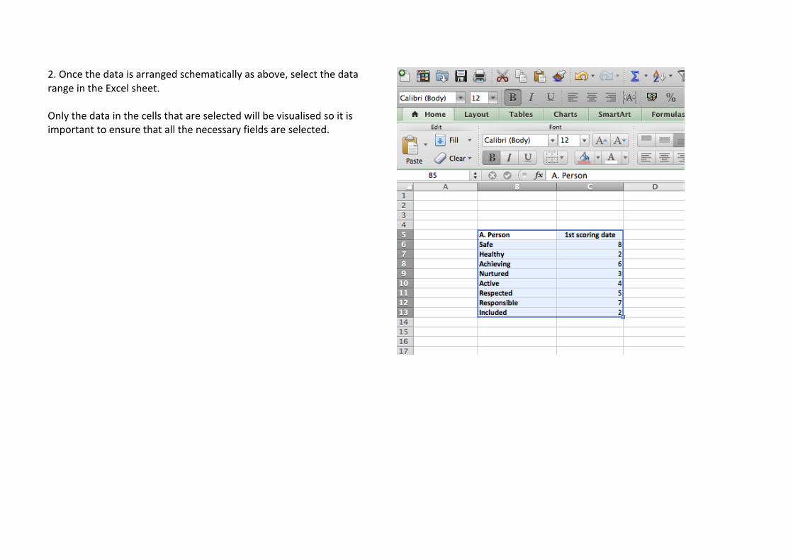
2. Once the data is arranged schematically as above, select the data range in the Excel sheet. Only the data in the cells that are selected will be visualised so it is important to ensure that all the necessary fields are selected.
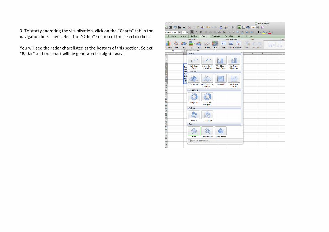
3. To start generating the visualisation, click on the “Charts” tab in the navigation line. Then select the “Other” section of the selection line. You will see the radar chart listed at the bottom of this section. Select “Radar” and the chart will be generated straight away.
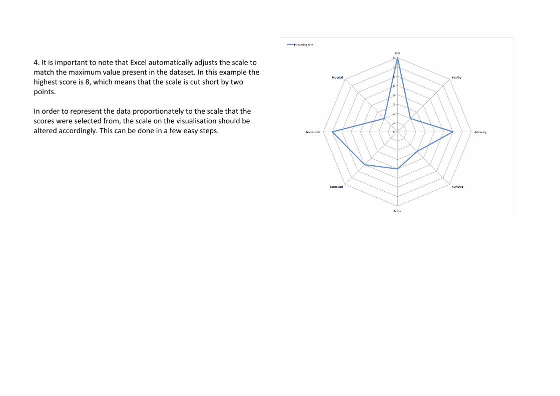
4. It is important to note that Excel automatically adjusts the scale to match the maximum value present in the dataset. In this example the highest score is 8, which means that the scale is cut short by two points. In order to represent the data proportionately to the scale that the scores were selected from, the scale on the visualisation should be altered accordingly. This can be done in a few easy steps.
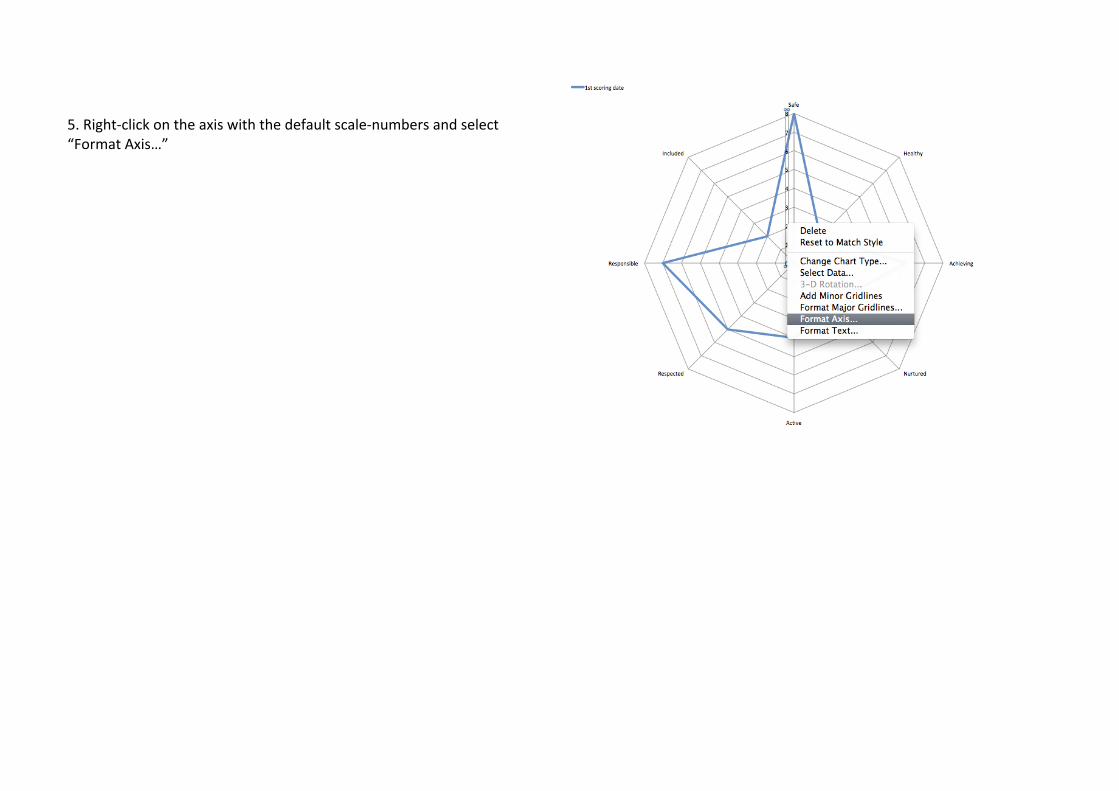
5. Right-‐click on the axis with the default scale-‐numbers and select “Format Axis…”
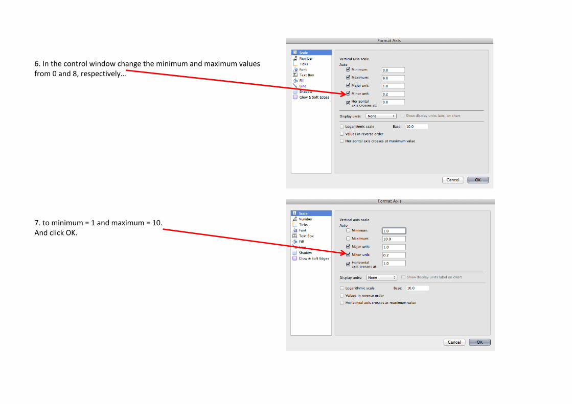
6. In the control window change the minimum and maximum values from 0 and 8, respectively… 7. to minimum = 1 and maximum = 10. And click OK.

8. This is now an accurate presentation of where the scores sit on the scale. In many ways this graph can be considered complete. However, there are other steps that can be taken to enhance the understanding of the chart, for instance incorporating elements such as layout and colours to fit organisational branding requirements.
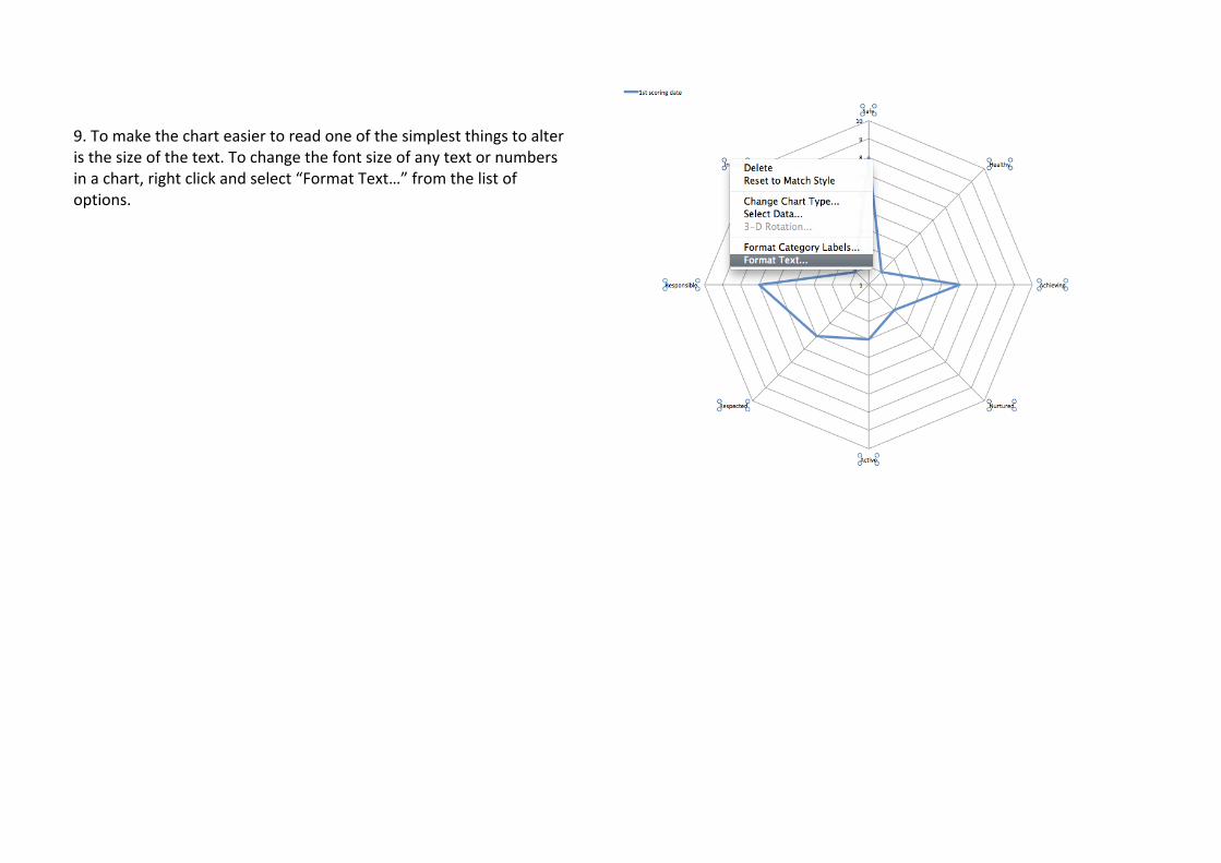
9. To make the chart easier to read one of the simplest things to alter is the size of the text. To change the font size of any text or numbers in a chart, right click and select “Format Text…” from the list of options.

10. In the Format Text window there are many options to choose from to change the text. In general terms it is considered good practice to ensure that the labels are clear and large enough to read. This is the primary concern so choose a font size which makes the labels easy to read. For clarity ensure that the font style and the font itself is unfussy, so avoid italics and any fonts that are swirly or with letters set close together. Text shadow, glow and soft edges should also be avoided as these add a blurring effect to the image, which will make it look less crisp.
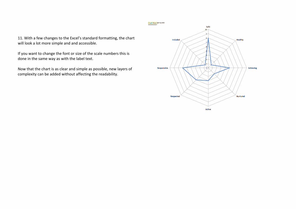
11. With a few changes to the Excel’s standard formatting, the chart will look a lot more simple and and accessible. If you want to change the font or size of the scale numbers this is done in the same way as with the label text. Now that the chart is as clear and simple as possible, new layers of complexity can be added without affecting the readability.
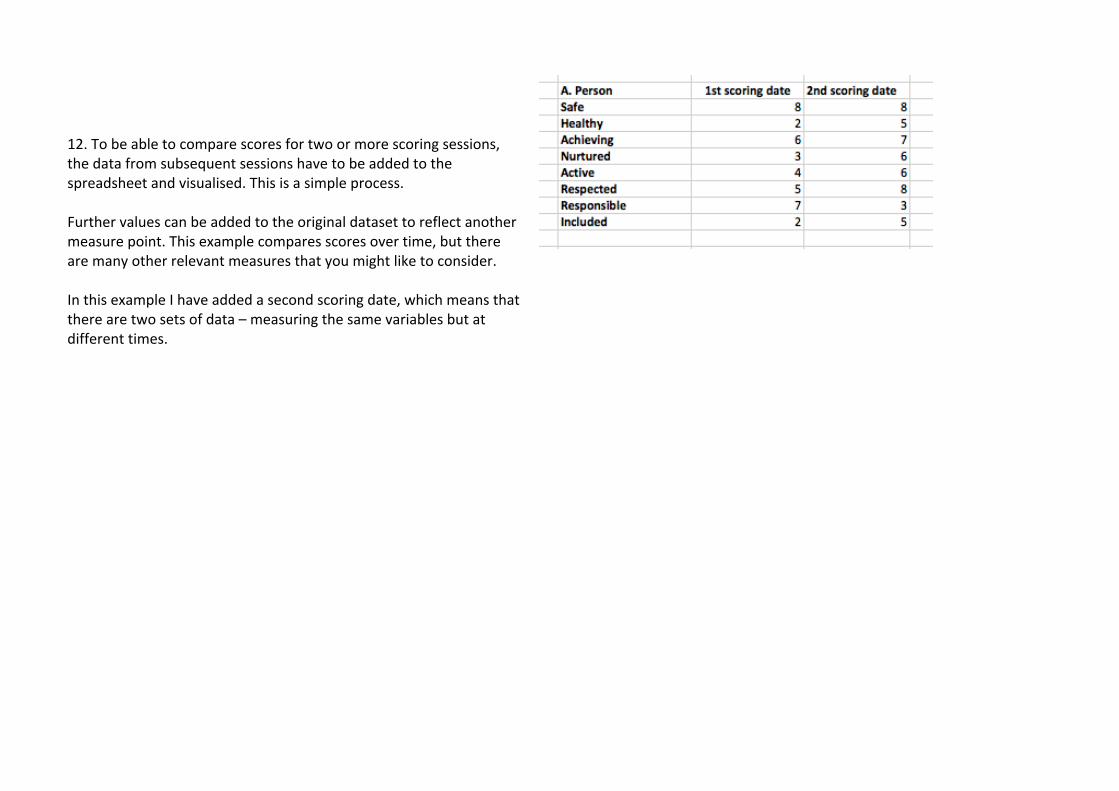
12. To be able to compare scores for two or more scoring sessions, the data from subsequent sessions have to be added to the spreadsheet and visualised. This is a simple process. Further values can be added to the original dataset to reflect another measure point. This example compares scores over time, but there are many other relevant measures that you might like to consider. In this example I have added a second scoring date, which means that there are two sets of data – measuring the same variables but at different times.
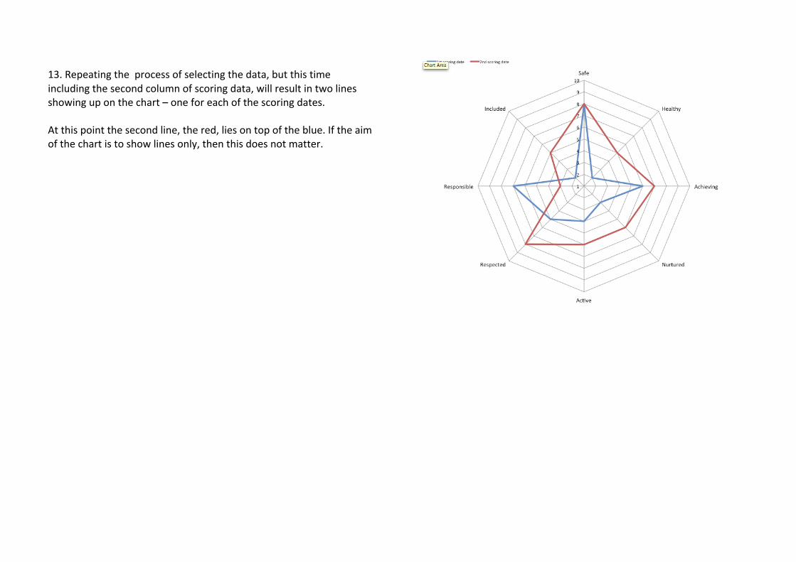
13. Repeating the process of selecting the data, but this time including the second column of scoring data, will result in two lines showing up on the chart – one for each of the scoring dates. At this point the second line, the red, lies on top of the blue. If the aim of the chart is to show lines only, then this does not matter.
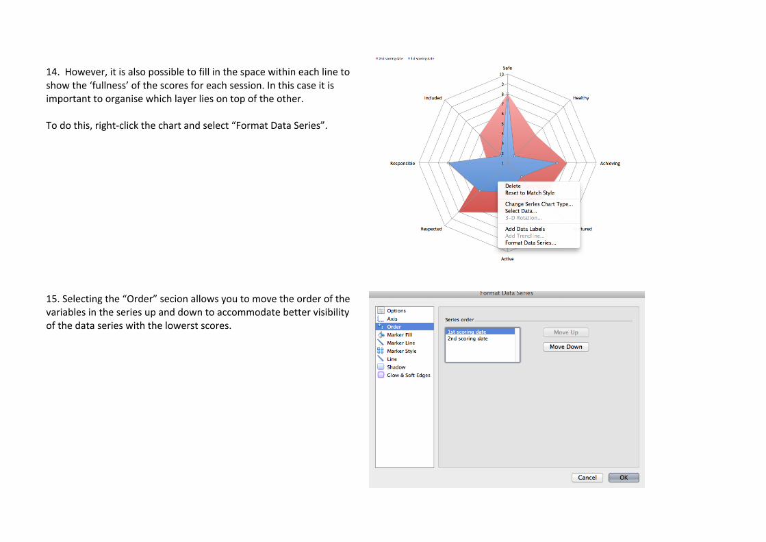
14. However, it is also possible to fill in the space within each line to show the ‘fullness’ of the scores for each session. In this case it is important to organise which layer lies on top of the other. To do this, right-‐click the chart and select “Format Data Series”. 15. Selecting the “Order” secion allows you to move the order of the variables in the series up and down to accommodate better visibility of the data series with the lowerst scores.
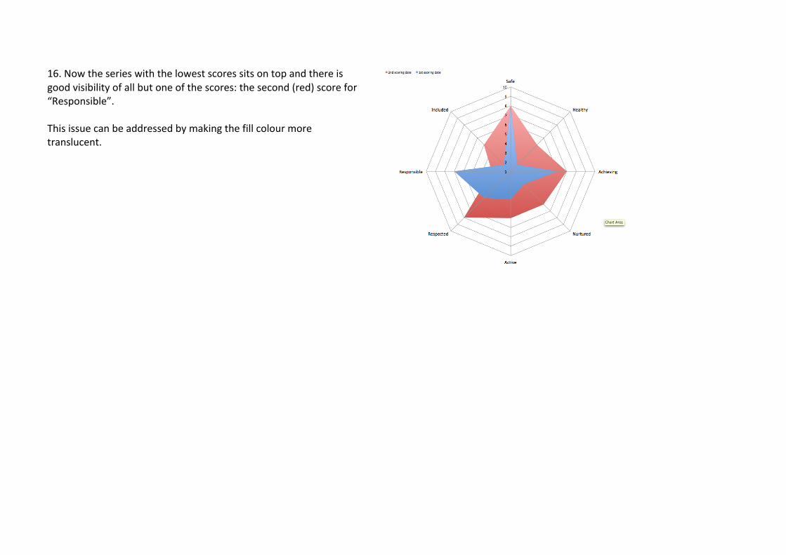
16. Now the series with the lowest scores sits on top and there is good visibility of all but one of the scores: the second (red) score for “Responsible”. This issue can be addressed by making the fill colour more translucent.

17. Again, selecting “Format Data Series” and this time clicking on “Marker Fill” in the list, it is possible to choose the density/transparency of the fill colour by dragging the little marker along the bar in the Transparency section of the window.
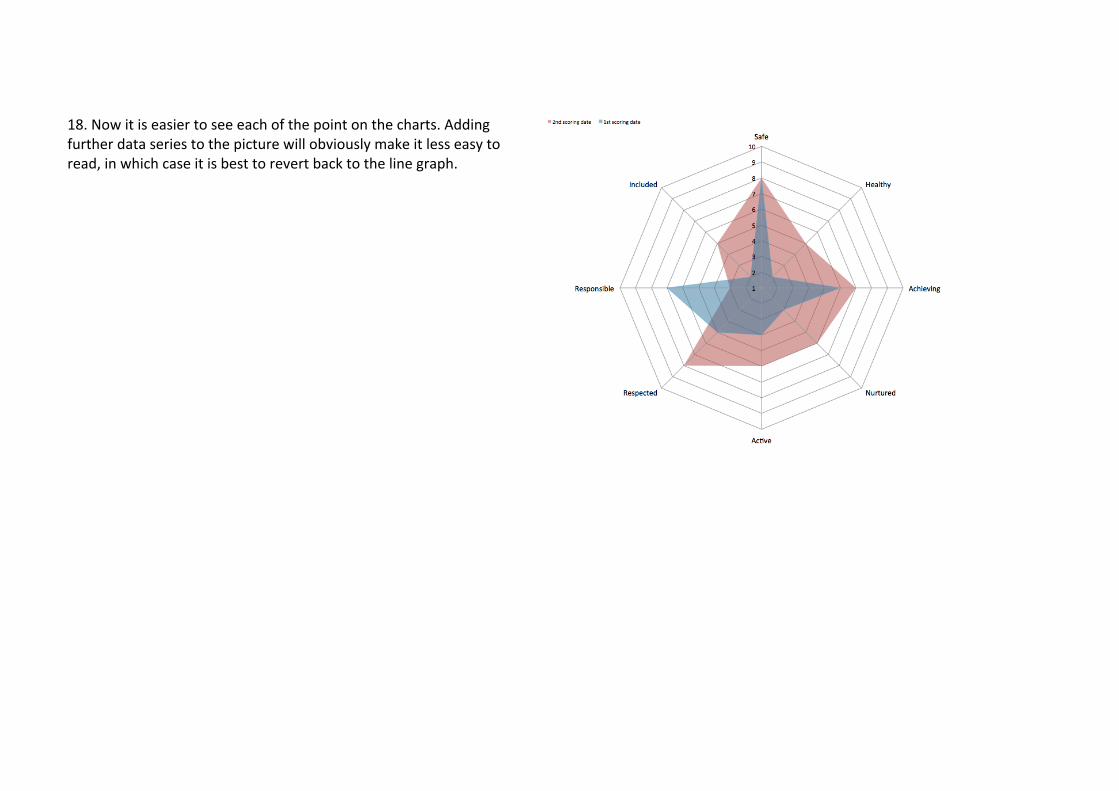
18. Now it is easier to see each of the point on the charts. Adding further data series to the picture will obviously make it less easy to read, in which case it is best to revert back to the line graph.
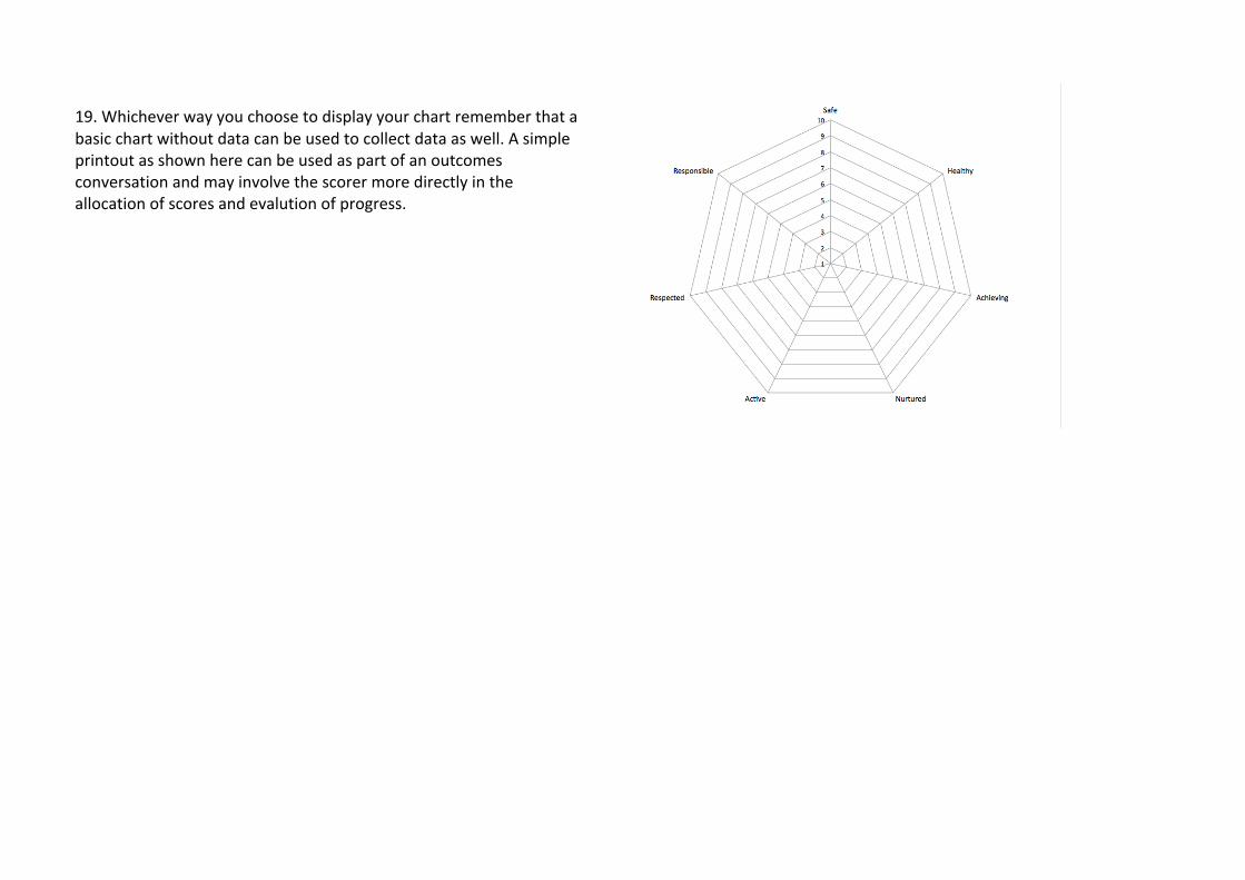
19. Whichever way you choose to display your chart remember that a basic chart without data can be used to collect data as well. A simple printout as shown here can be used as part of an outcomes conversation and may involve the scorer more directly in the allocation of scores and evalution of progress.