r wallpaper usage guidelines - rotman school of management · r wallpaper usage guidelines 11 fonts...
TRANSCRIPT

R Wallpaper Usage Guidelines

R Wallpaper Usage Guidelines 2
R WallpaperRotman School of Management has worked with Hambly and Woolley to develop a signature graphic element we call the R Wallpaper. The R Wallpaper is based on the lovely “R” in Rotman’s core graphic standards and has been designed to be used by all designers the School community works with as an integral aspect of our visual identity. Every printed piece, every ad, every online application should try to find a way to incorporate the R wallpaper and Rotman Marketing will be here to help you do that. The more the R Wallpaper appears, the greater consistency we have across the School and the more all our disperate marketing materials begin to look like a family. The new visual system for the school based on the R Wallpaper is a colour and pattern-based system. It works as follows: Rotman School of Management: unique colour palette just for cross school marketing — 3,2 and 1 colour applications.
3 Colour PatternsRotman Programs (8): Full-Time MBA, Morning MBA, Evening MBA, MFin, EMBA, Omnium, PhD and Executive Programs — each program chooses a 3 colour version and has access to the central black and white and one colour option (Executive Programs would like Rotman Sky Blue PMS 311C and Rotman Yellow C)
Example of a 3 colour pattern.
More options shown on the next page.
Pattern 3-A
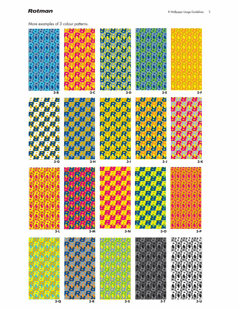
R Wallpaper Usage Guidelines 3
More examples of 3 colour patterns.
3-B
3-G
3-L
3-Q
3-C
3-H
3-M
3-R
3-D
3-I
3-N
3-S
3-E
3-J
3-O
3-T
3-F
3-K
3-P
3-U
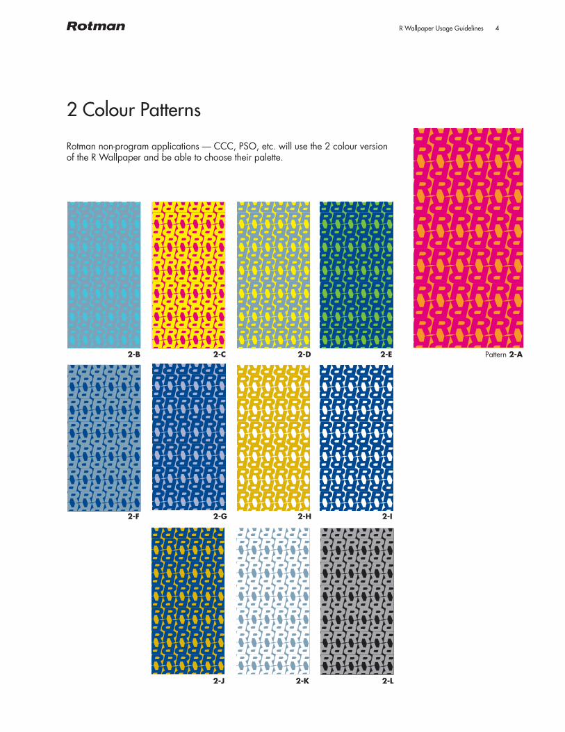
R Wallpaper Usage Guidelines 4
2 Colour Patterns
Rotman non-program applications — CCC, PSO, etc. will use the 2 colour version of the R Wallpaper and be able to choose their palette.
Pattern 2-A2-B
2-F
2-C
2-G
2-J
2-D
2-H
2-K
2-E
2-I
2-L

R Wallpaper Usage Guidelines 5
1 Colour Patterns
Rotman EDU’s/institutes/centres (11): the 11 centres will each get a one colour version of the R Wallpaper with a keyline.
Pattern 1-A1-B
1-F
1-C
1-G
1-J
1-D
1-H
1-K
1-E
1-I

R Wallpaper Usage Guidelines 6
Usage
The R Wallpaper works on many applications, including but not limited to: stationary (business cards, letterhead, folders, etc.); online ( banners, icons, online ads, enewsletters, eblasts, social media- twitter, facebook, linked in, power point templates, email signatures, and digital signage); print collateral (print ads, brochures, one pagers, flyers); interiors (media backdrops, banners, signage, walls) and finally to merchandise (high and low end items).
The R Wallpaper works well standing alone, filling a blank space or creating graphic impact (example would be the inside of a folder and business card or a banner)
It works well as pattern and then single colour with text knocked out of the ground beside the pattern (example would be a website banner)
FIND OUT MORE: http://bit.ly/bbr5Mi’
A L L G R E AT W O M E N H AV E
A D E F I N I N G M O M E N T
I N T H E I R L I V E S .
Come join us at the Rotman Women in Management MBA Open House (proudly sponsored by CIBC).
THURSDAY, DECEMBER 2, 2010 COULD BE YOURS.THURSDAY, DECEMBER 2, 2010 COULD BE YOURS.
a new way to think creative methodology
a new way to think

R Wallpaper Usage Guidelines 7
Usage
It works well as a header or footer (example would be a pattern along the top of a printed piece like an ad).
It works well with text on the pattern if the pattern is scaled up.Scaling the pattern up calms the design down and essentially makes it abstract. As long as an R is recognizable, the pattern can be scaled.
FIND OUT MORE: http://bit.ly/bbr5Mi’
A L L G R E AT W O M E N H AV E
A D E F I N I N G M O M E N T
I N T H E I R L I V E S .
Come join us at the Rotman Women in Management MBA Open House (proudly sponsored by CIBC).
THURSDAY, DECEMBER 2, 2010 COULD BE YOURS.THURSDAY, DECEMBER 2, 2010 COULD BE YOURS.
a new way to think creative methodology
a new way to think

R Wallpaper Usage Guidelines 8
What Not to Do
Do not put text over the pattern so that it is illegible.
Do not place a photo on the wallpaper that visually fights with the pattern.
Please come to the Rotman Women in Management Open House on Thursday, December 2, 2010

R Wallpaper Usage Guidelines 9
Colours
The R Wallpaper MUST use the Rotman colour palette.
The Primary Rotman Colour Palette
Rotman Blue
R-0 / G-38 / B-127
Colour Safe PMS 280 C PMS 280 U
Rotman Blue as CMYK
C-100 / M-72 /
Y-0 / K-18
Rotman Gold
R-206 / G-157 / B-0
Colour Safe PMS 117 C PMS 117 U
Rotman Gold as CMYK
C-0 / M-18 /
Y-100 / K-15
Rotman Grey
R-124 / G-152 / B-174
Colour Safe PMS 5425 C PMS 5425 U
Rotman Grey as CMYK
C-30 / M-4 /
Y-0 / K-31
The Primary Rotman Colour Palette consists of three colours:
Rotman Blue, Rotman Gold, and Rotman Grey. These colours
work well in any combination. Pairing contrasting colours
will always produce a more legible result (a preferred option
for applications such as signage). Light percentages of these
colours may be used for subtle tonal effects.
There is one rule about colours: never make substitutions.
“Rotman Blue” must always be “Rotman Blue” — PMS 280
if using a spot colour — not some similar blue. The logo and
wordmark must never appear together in different colours.
Each colour, including those in the Secondary Rotman Colour
Palette on page 13, can be produced in a number of ways:
On-screen: The on-screen Red/Green/Blue colours are
geared to internet and PowerPoint applications.
Special Match Inks: Pantone Coated and Pantone Uncoated
specifications are for applications that require clean colours
when the budget allows for special inks.
Four-Colour Process: The process-equivalent formulas are
intended for 4-colour process printing.
C O L O U R U S A G EThe Primary Rotman Colour Palette
12
On-Screen Colours Pantone Coated Colours Pantone Uncoated Colours Process Equivalents

R Wallpaper Usage Guidelines 10
Colours
The Secondary Rotman Colour Palette
The Secondary Rotman Colour Palette is comprised of the
six colours shown above. The first colour (Rotman Blue 30%)
is a subdued colour chosen as a background tint for printed
materials. This colour has been used extensively, but is not
the only possibility. Light percentages of any of the Primary
Rotman Colours (Rotman Blue, Rotman Gold, Rotman Grey)
may also be used for subtle tonal effects.
The remaining five colours (Rubine Red, Rotman Orange,
Rotman Yellow, Rotman Green, Rotman Sky Blue) represent an
expanded set of brighter accent colours chosen to give specific
applications their own distinct character. Different program
areas, courses, events, and products need to be positioned with
different degrees of subtlety or boldness. These colours can be
used for backgrounds, image duotones, titles and highlight text.
IMPORTANT: The secondary palette can be used for the logo
and wordmark ONLY if the chosen colour is used extensively
elsewhere in the design (see example 3 on page 30).
Rotman Yellow and Rotman Blue 30% should never be used
for the logo and wordmark. The logo and wordmark must
never appear together in different colours.
The Secondary Rotman Colour Palette
13
Rotman Blue 30%
R-124 / G-151 / B-193
Not Colour Safe PMS 280 C 30% PMS 280 U 30%
Process 30%
C-30 / M-21.6 /
Y-0 / K-5.4
Rotman Yellow
R-252 / G-224 / B-0
Colour Safe Pantone Yellow C Pantone Yellow U
Process
C-0 / M-1 /
Y-100 / K-0
Rotman Sky Blue
R-0 / G-194 / B-226
Colour Safe PMS 311 C PMS 311 U
Process
C-63 / M-0 /
Y-12 / K-0
Rotman Orange
R-255 / G-115 / B-0
Colour Safe PMS 151 C PMS 151 U
Process
C-0 / M-48 /
Y-95 / K-0
Rubine Red
R-211 / G-0 / B-95
Colour Safe PMS Rubine Red C PMS Rubine Red U
Process
C-0 / M-100 /
Y-15 / K-0
Rotman Green
R-98 / G-189 / B-25
Colour Safe PMS 368 C PMS 368 U
Process
C-57 / M-0 /
Y-100 / K-0
On-Screen Colours Pantone Coated Colours Pantone Uncoated Colours Process Equivalents

R Wallpaper Usage Guidelines 11
Fonts
Refer to Rotman’s Graphic Standards for details.
Two fonts — Futura and Perpetua Mau — have been
carefully chosen to clearly express the full range of the Rotman
message in all graphic applications. These fonts must never
be used with exaggerated letterspacing (titles set exclusively
in uppercase being the one exception; an example is the
heading at the top of this page), and the original letterforms
must never be condensed or stretched.
Except for the use of Book Antiqua and Century Gothic for
correspondence only, no other fonts are needed for the
Rotman message and no other fonts must be used for graphic
applications. Use of other fonts with different qualities will
confuse and dilute the Rotman message.
T H E R O T M A N F O N T FA M I L Y
15
Monotype Futura RomanMonotype Futura Bold
Perpetua Mau RomanPerpetua Mau Italic
Century Gothic RegularCentury Gothic Bold
Book Antiqua RegularBook Antiqua Italic