quick start software report guide - scigiene … start software report guide...graphs can be quickly...
TRANSCRIPT


Quick Start Software Report Guide A helpful guide for using SureTrend Software to monitor and improve cleaning in a
healthcare facility.
The data collected from ATP cleaning verification testing can be an invaluable tool for improving hospital cleanliness, validating cleaning processes, and motivating personnel to do the best job possible. By analyzing ATP results with SureTrend software, reports can quickly be generated that clearly illustrate trends, issues, and improvements. E-mail these reports to team members and other departments to share successes and demonstrate that Infection Prevention and Environmental Services personnel are doing the best job possible.
Hygiena’s SureTrend software comes with useful preset reports and charts. This guide will highlight some of the charts that are especially useful to hospitals.
Helpful Tips:
Set up all the locations, users, and test plans before testing so that running reports is easy and accurate.
Graphs can be quickly converted to line, bar, or pie charts depending on your preference.
You don’t need to create reports from scratch! Preprogrammed reports can be modified and saved (see Customization, page 11).
Contents: Overall Cleaning Performance…….. 2 Cleanliness Trends…………………………. 3 Location Cleanliness……………………... 4 Cleaning Performance by
Department…………………..…………… 5 Personnel Performance………………… 6 Training Opportunity……………………… 7 Trouble Areas…………………………………… 8 Corrective Action Missing…………….. 9 Test Volume……………………………………. 10 Customization……………………………….. 11 FAQ...………………………..……………………….. 13 Contact Info…………………………..…… Back
1
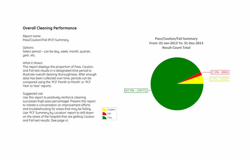
Overall Cleaning Performance Report name: Pass/Caution/Fail (PCF) Summary Options: Select period – can be day, week, month, quarter, year, etc. What it shows: This report displays the proportion of Pass, Caution, and Fail test results in a designated time period to illustrate overall cleaning thoroughness. After enough data has been collected over time, periods can be compared using the ‘PCF Month to Month’ or ‘PCF Year to Year’ reports. Suggested use: Use this report to positively reinforce cleaning successes (high pass percentage). Present this report to initiate a conversation on improvement efforts and troubleshooting for areas that may be failing. Use ‘PCF Summary by Location’ report to drill down on the areas of the hospital that are getting Caution and Fail test results. (See page 4.)
Pass/Caution/Fail Summary
From: 01-Jan-2013 To: 31-Dec-2013 Result Count Total
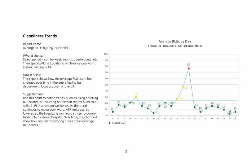
Cleanliness Trends Report name: Average RLUs by Day (or Month) What it shows: Select period – can be week, month, quarter, year, etc. Then specify Plans, Locations, or Users as you want (default setting is All). How it helps: This report shows how the average RLU score has changed over time in the entire facility by department, location, user, or overall. Suggested use: Use this chart to notice trends, such as rising or falling RLU scores, or recurring patterns in scores, such as a spike in RLU scores on weekends. As the trend continues to move downward, ATP limits can be lowered so the hospital is running a stricter program, leading to a cleaner hospital. Over time, this chart will show how regular monitoring drives down average ATP scores.
Average RLUs by Day
From: 01-Jun-2014 To: 30-Jun-2014
3
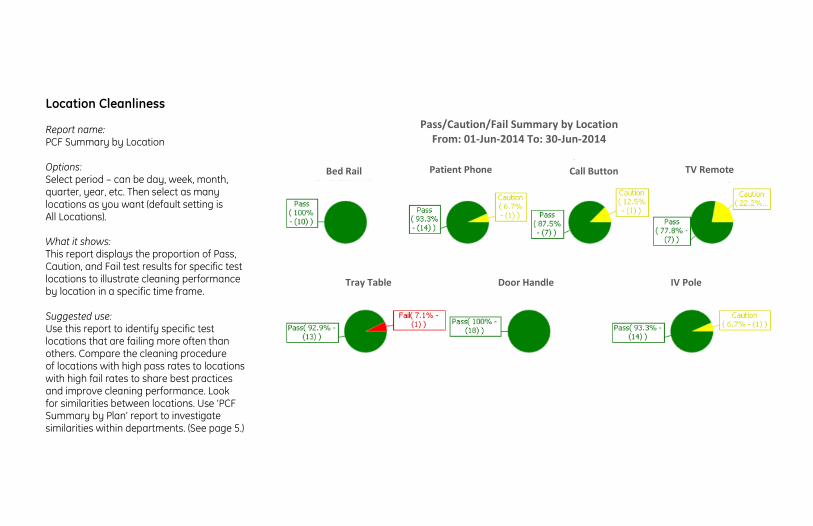
Location Cleanliness Report name: PCF Summary by Location Options: Select period – can be day, week, month, quarter, year, etc. Then select as many locations as you want (default setting is All Locations). What it shows: This report displays the proportion of Pass, Caution, and Fail test results for specific test locations to illustrate cleaning performance by location in a specific time frame. Suggested use: Use this report to identify specific test locations that are failing more often than others. Compare the cleaning procedure of locations with high pass rates to locations with high fail rates to share best practices and improve cleaning performance. Look for similarities between locations. Use ‘PCF Summary by Plan’ report to investigate similarities within departments. (See page 5.)
Pass/Caution/Fail Summary by Location
From: 01-Jun-2014 To: 30-Jun-2014
Bed Rail
Patient Phone
Call Button
TV Remote
Tray Table
Door Handle
IV Pole

Cleaning Performance by Department Report name: PCF Summary by Plan Options: Select period – can be day, week, month, quarter, year, etc. Then select as many Plans as you want (default setting is All Plans). What it shows: This report displays the proportion of Pass, Caution, and Fail test results by department for a quick comparison. Suggested use: Use this report to identify and investigate cleaning failures within a specific department. Departments that are not being properly cleaned can be quickly identified and corrective actions can be initiated. Compare cleaning procedures in departments with high pass rates to departments with high fail rates to share best practices and improve overall hospital cleaning performance.
Pass/Caution/Fail Summary by Plan From: 01-Jun-2014 To: 30-Jun-2014
E. Wing Patient Rooms
W. Wing Patient Rooms
Restrooms
ICU Patient Rooms
Sterile Services
Operating Rooms
Mobile Workstations
NICU
ICU Patient Rooms
NICU
5

Personnel Performance Report name: PCF Summary by User Options: Select period – can be day, week, month, quarter, year, etc. Then select as many users as you want (default setting is All Users). What it shows: This report shows the proportion of Pass, Caution, and Fail test results achieved from a particular user’s cleaning efforts. Suggested use: Use this report during employee performance reviews and for ongoing supervision to identify opportunities for training. Monitor the performance of new employees and share individual reports to demonstrate job performance. To monitor individual employee cleaning performance over time, use ‘PCF Summary Month to Month’ report and specify an individual user.
Pass/Caution/Fail Summary by User From: 01-Jun-2014 To: 30-Jun-2014
John Doe
Jane Doe
Jane Smith

Training Opportunity Report name: Fails Summary by User Options: Select period – can be day, week, month, quarter, year, etc. Then select as many users as you want (default setting is All Users). What it shows: This report shows frequency of Fail results by user so managers can identify staff that may need retraining. Suggested use: When users with high frequencies of Fail scores are identified, those users should be retrained on proper cleaning procedure. To prevent data from being used punitively, some hospitals prefer to group users by shift, such as Day, Swing, and Night. Use ‘PCF Summary Month to Month’ report and specify an individual user or shift to monitor changes in cleaning performance over time.
Fails Summary by User From: 01-Jun-2014 To: 30-Jun-2014
Night
Swing
Night
Day
7

Trouble Areas
Report name: Fails Summary by Location Options: Select period – can be day, week, month, quarter, year, etc. Then select as many locations as you want (default setting is All Locations). What it shows: This report displays frequency of Fail results and corresponding locations to quickly identify trouble areas. Suggested use: Use this chart to reassess cleaning protocols for particular locations, or in some cases, the RLU limits associated with the location. Some older equipment may be difficult to clean and may require an alternative cleaning protocol, or adjusted limits.
Fails Summary by Location From: 01-Jun-2014 To: 30-Jun-2014
Call Button
Tray Table
IV Pole
Door Knob
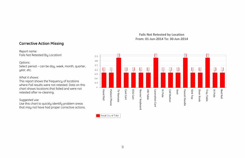
Corrective Action Missing Report name: Fails Not Retested (by Location) Options: Select period – can be day, week, month, quarter, year, etc. What it shows: This report shows the frequency of locations where Fail results were not retested. Data on this chart shows locations that failed and were not retested after re-cleaning. Suggested use: Use this chart to quickly identify problem areas that may not have had proper corrective actions.
Fails Not Retested by Location From: 01-Jun-2014 To: 30-Jun-2014
Bed Rail
IV Pole
Tray Table
Door Knob
Sink Top
Faucet Handle
Seat
Call Button
IV Pole
Laceration Cart
OR Table
Nurses’ Keyboard
ECG Cart
Cast Cart
TV Remote
Patient Phone
Hand Rail
9
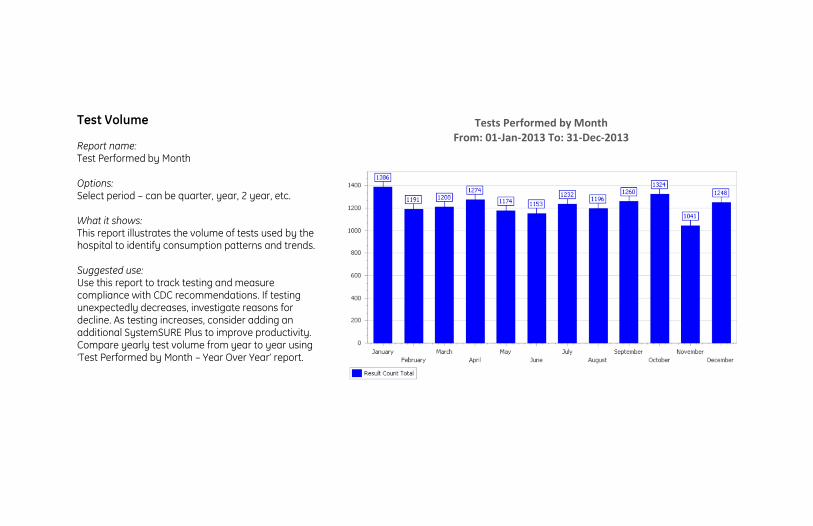
Test Volume Report name: Test Performed by Month Options: Select period – can be quarter, year, 2 year, etc. What it shows: This report illustrates the volume of tests used by the hospital to identify consumption patterns and trends. Suggested use: Use this report to track testing and measure compliance with CDC recommendations. If testing unexpectedly decreases, investigate reasons for decline. As testing increases, consider adding an additional SystemSURE Plus to improve productivity. Compare yearly test volume from year to year using ‘Test Performed by Month – Year Over Year’ report.
Tests Performed by Month From: 01-Jan-2013 To: 31-Dec-2013
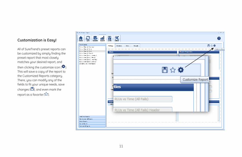
Customization is Easy! All of SureTrend’s preset reports can be customized by simply finding the preset report that most closely matches your desired report, and
then clicking the customize icon ( ). This will save a copy of the report to the Customized Reports category. There, you can modify any of the fields to fit your unique needs, save
changes ( ), and even mark the
report as a favorite ( ).
11

13