quetion 1 evaluation
TRANSCRIPT

Q1. In what ways does your media product use, develop or
challenge forms and conventions of real media
products?Evaluation
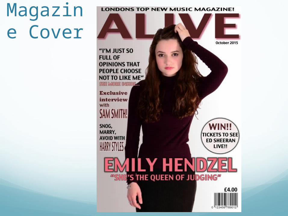
Magazine Cover
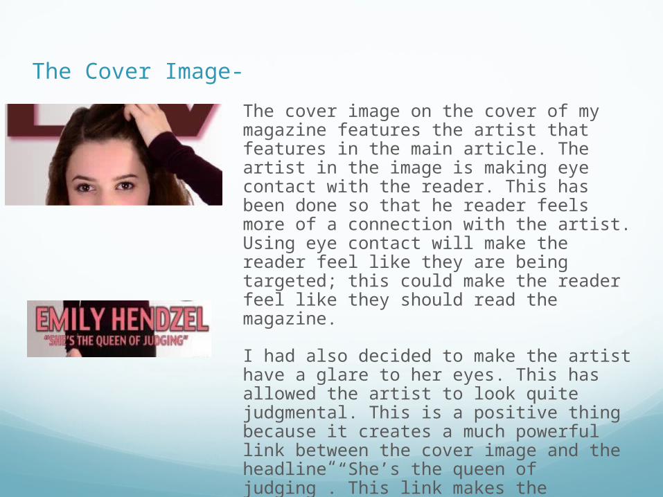
The cover image on the cover of my magazine features the artist that features in the main article. The artist in the image is making eye contact with the reader. This has been done so that he reader feels more of a connection with the artist. Using eye contact will make the reader feel like they are being targeted; this could make the reader feel like they should read the magazine.
I had also decided to make the artist have a glare to her eyes. This has allowed the artist to look quite judgmental. This is a positive thing because it creates a much powerful link between the cover image and the headline “She’s the queen of judging”. This link makes the document a lot better to understand and also will give the reader a much better idea of what the article may be about leaving them to want to read more.
The Cover Image-
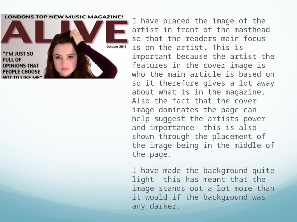
I have placed the image of the artist in front of the masthead so that the readers main focus is on the artist. This is important because the artist the features in the cover image is who the main article is based on so it therefore gives a lot away about what is in the magazine. Also the fact that the cover image dominates the page can help suggest the artists power and importance- this is also shown through the placement of the image being in the middle of the page.
I have made the background quite light- this has meant that the image stands out a lot more than it would if the background was any darker.
The Masthead-
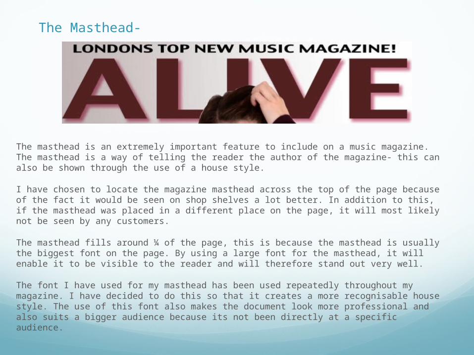
The masthead is an extremely important feature to include on a music magazine. The masthead is a way of telling the reader the author of the magazine- this can also be shown through the use of a house style.
I have chosen to locate the magazine masthead across the top of the page because of the fact it would be seen on shop shelves a lot better. In addition to this, if the masthead was placed in a different place on the page, it will most likely not be seen by any customers.
The masthead fills around ¼ of the page, this is because the masthead is usually the biggest font on the page. By using a large font for the masthead, it will enable it to be visible to the reader and will therefore stand out very well.
The font I have used for my masthead has been used repeatedly throughout my magazine. I have decided to do this so that it creates a more recognisable house style. The use of this font also makes the document look more professional and also suits a bigger audience because its not been directly at a specific audience.

Cover lines-
The cover lines on a magazine cover are usually used to give the reader a brief insight to the stories that feature in the magazine.
I have chosen to position the cover lines on the left hand side of the cover page. This has been done so that they don’t cover up the image of the artist that has been placed in the center of the cover page.
When creating the cover page, I inserted margins around the edge of the page so that the text is lined up neatly and isn’t too close the the edge of the page.
The artists names that feature in the cover page have been made quite large and both include a coloured outline. This has been done so that they stand out a lot and are visible to the reader.

Headings
The headline involves the name of the artist that features in the cover image which is in this case, Emily Hendzel. I have put the headline in bold and made it bigger than the rest of the text so that it stands out more and will become the readers main focus so that the artist will not be ignored as she isn’t a well-known artist just yet. The colour of the text used was chosen based on a colour that features in the cover image, this creates a link between the artist and the headline. I decided to add a dark outline to the text so it stands out a lot more that it would have done originally.
I have included a brief subheading underneath the headline. I have done this in the style of a pull quote. I have decided to do this because in other examples of already existing magazines, I’ve found that it is an effective way of giving the reader a brief idea of what the article is about. The pull quote that has been used isn’t a quote taken from what the artist has said but has come from someone else. This has been done as I found it would have been a more effective way of portraying the artists nature.
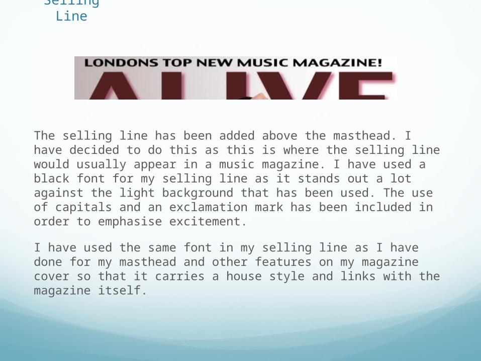
Selling Line
The selling line has been added above the masthead. I have decided to do this as this is where the selling line would usually appear in a music magazine. I have used a black font for my selling line as it stands out a lot against the light background that has been used. The use of capitals and an exclamation mark has been included in order to emphasise excitement.
I have used the same font in my selling line as I have done for my masthead and other features on my magazine cover so that it carries a house style and links with the magazine itself.
Contents Page

Headings
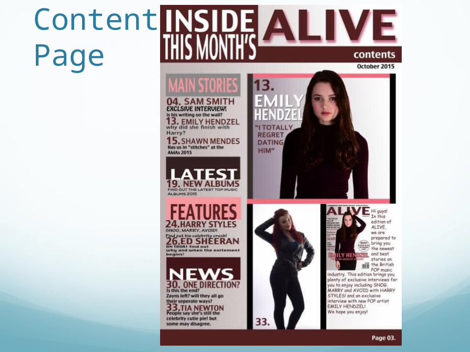
I have included four different headings in my contents page. Each heading suggests a category for the information below each one. The heading ‘main story’ includes all the main stories that feature in the magazine. ‘Latest’ includes information about the latest records and CD’s in the current month. ‘Features’ includes the page numbers for additional stories that feature in the magazine and ‘news’ includes the latest news about the music industry.
Behind each heading, I have included a coloured graphic. This has been done so that each heading stands out against the rest of the text. Each colour chosen is different- this is to highlight a different topic has been introduced. The colours used also help to create a house style. The font I have used for the headings is the same as what has been used in the title of the magazine as this creates a house style and therefore a more professional looking document.
The use of the different colours suggests that the magazine is a POP magazine.
Page numbers and information
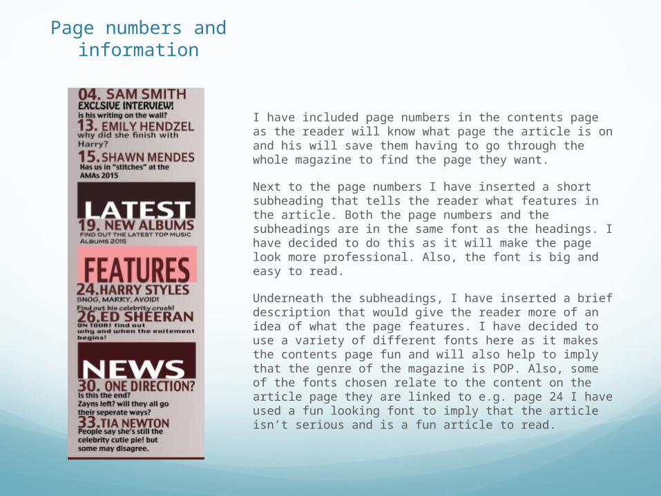
I have included page numbers in the contents page as the reader will know what page the article is on and his will save them having to go through the whole magazine to find the page they want.
Next to the page numbers I have inserted a short subheading that tells the reader what features in the article. Both the page numbers and the subheadings are in the same font as the headings. I have decided to do this as it will make the page look more professional. Also, the font is big and easy to read.
Underneath the subheadings, I have inserted a brief description that would give the reader more of an idea of what the page features. I have decided to use a variety of different fonts here as it makes the contents page fun and will also help to imply that the genre of the magazine is POP. Also, some of the fonts chosen relate to the content on the article page they are linked to e.g. page 24 I have used a fun looking font to imply that the article isn’t serious and is a fun article to read.

Banner
I created a banner to make the contents page look a bit more professional. I got the idea of the banner from the music magazine Q however, I’ve changed the design and style of my banner so that it fits in with my magazine genre.
The colour scheme for my banner was chosen based on the colour scheme on my magazine cover. I decided to leave the space for my masthead blank so that it would stand out more however, I chose not to put the masthead across the whole of the page as I didn’t want it to dominate all of the other main features. I thought this was a suitable place to position it because it’s still noticeable but doesn’t stand out too much so that I would take the readers attention off the more important features. I decided to stick with the same font again because it’s easy to read and fits in with the house style of the document.
I included the word ‘contents’ in the banner as it stands out and also it would let the reader know what page they’re looking at.
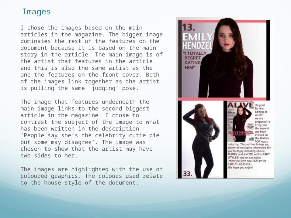
ImagesI chose the images based on the main articles in the magazine. The bigger image dominates the rest of the features on the document because it is based on the main story in the article. The main image is of the artist that features in the article and this is also the same artist as the one the features on the front cover. Both of the images link together as the artist is pulling the same ‘judging’ pose.
The image that features underneath the main image links to the second biggest article in the magazine. I chose to contrast the subject of the image to what has been written in the description- ‘People say she’s the celebrity cutie pie but some may disagree’. The image was chosen to show that the artist may have two sides to her.
The images are highlighted with the use of coloured graphics. The colours used relate to the house style of the document.
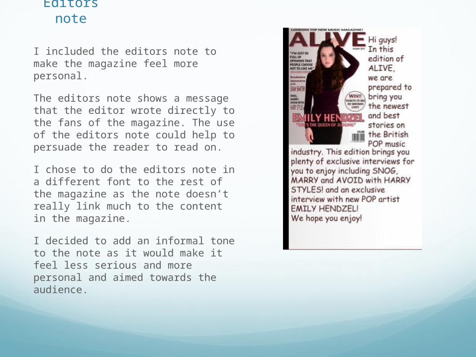
Editors note
I included the editors note to make the magazine feel more personal.
The editors note shows a message that the editor wrote directly to the fans of the magazine. The use of the editors note could help to persuade the reader to read on.
I chose to do the editors note in a different font to the rest of the magazine as the note doesn’t really link much to the content in the magazine.
I decided to add an informal tone to the note as it would make it feel less serious and more personal and aimed towards the audience.

Article
Heading
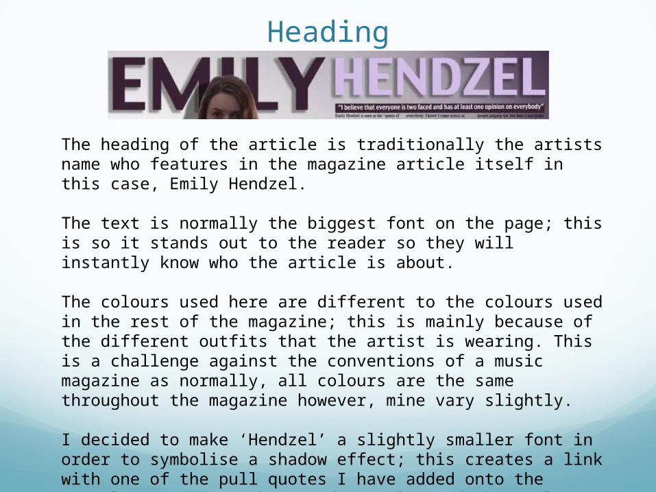
The heading of the article is traditionally the artists name who features in the magazine article itself in this case, Emily Hendzel.
The text is normally the biggest font on the page; this is so it stands out to the reader so they will instantly know who the article is about.
The colours used here are different to the colours used in the rest of the magazine; this is mainly because of the different outfits that the artist is wearing. This is a challenge against the conventions of a music magazine as normally, all colours are the same throughout the magazine however, mine vary slightly.
I decided to make ‘Hendzel’ a slightly smaller font in order to symbolise a shadow effect; this creates a link with one of the pull quotes I have added onto the article. However, I have made ‘Emily’ a darker colour as it is the first name of the artist and will be how the artist is most recognised as.

Pull Quotes
The pull quotes were added in order to give the reader a brief insight to the text and what its about. All of the quotes, apart from the first one shown, have been taken out of the main body of the text in the article. The last two quotes have been placed against a graphic; his has been done so that they stand out.

Main ImageThe main image is of Emily Hendzel who is the
main artist that features in the magazine article. The image covers the first half of the article page because my intentions were to leave the other side for text; this would prevent the reader from getting distracted by the image when they’re reading the text.
I positioned the artist over the top of the heading, this was so I could link the article with the cover of the magazine. This overlapping ide was also taken from an example of an already existing article that I had used for research. I liked this idea as it allowed the image to stand out a lot more and become more profound.

FormsColour Scheme- the colours pink, burgundy, white and black run constantly throughout the cover and contents page. The colours on every page have been picked out depending on what colours feature in the main images used on the page. I have used colours that would suit more of a female audience; this wuld be suitable for my target audience. The colours are all sophisticated and will therefore attract an older audience rather than being based around bright pinks or similar colours that would attract a younger audience.
Fonts- I have use one font quite frequently throughout the whole of the magazine- this appears in all of the headings on each page- this was done so that I could create a house style for the document. I have, however, experimented with a few different fonts on the contents page. Each font chosen for the contents page was decided based on the type of article that they link up to.