questionnaire analysis from showcase - a2 media studies
TRANSCRIPT

Feedback from
Media Studies
Showcase Questionnaire
A2 Media Studies

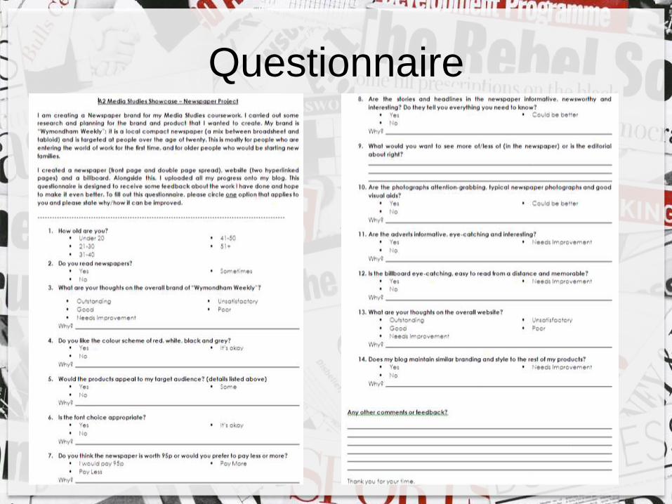
QuestionnaireFor my A2 Media Studies Coursework, I had to get some feedback for my
Newspaper products. I presented my work at a showcase in front of an audience and I asked them to fill in a Questionnaire reviewing my products. Photos from the showcase are below.
I will use the responses to gain some feedback in order to produce the best quality product possible. I won’t follow every person’s feedback, but for each I will justify what I will and won’t take onboard.
There are 20 respondents in total from this Questionnaire which I feel covers a wide range of audiences. I will particularly focus on the feedback from those around the age of 20 onwards as this is my target audience age.
Questionnaire

Comments:
This isn’t specifically my target audience but are all from families which is part of who I
targeted. The most important thing is that I received useful feedback from everybody who
participated in this questionnaire and this has really benefitted me. I can use this feedback
to make reasonable adjustments with my work.
Question 1“How old are you?”
• Under 20
• 21-30
• 31-40
• 41-50
• 51+
Results:
• 1/20 of respondents were aged under 20
• 3/20 of respondents were aged 21-30
• 5/20 of respondents were aged 31-40
• 2/20 of respondents were aged 41-50
• 9/20 of respondents were aged 51+

Comments:
The majority of respondents do read newspapers, others sometimes read them. This is
helpful because I know that people will have had some sort of understanding about
newspapers when they completed my questionnaire, and therefore would give better
advice than those who don’t read newspapers.
Question 2“Do you read newspapers?”
• Yes
• No
• Sometimes
Results:
• 11/20 chose ‘Yes’
• 0/20 chose ‘No’
• 9/20 chose ‘Sometimes’

Comments:
• “It seems fresh and new and fits with the planned target audience”
• “Lovely, simple lines, colourful layout, some funny and interesting stories”
• “The stories are interesting because they are about my local community, the layout is clear and the photos are
appropriate”
• “I like the alliteration”
• “Reminds me of the Wymondham Mercury”
• “Looks professional and eye-catching”
• “Very clear headline in a modern font which appeals to people of my age with the key details clearly stated”
• “Well laid out with clear, simple graphics”
My actions:
I am very pleased with this outcome, as it shows there’s nothing completely negative about my work. 60% of respondents
chose ‘Good’, which means there is something that can be done to improve it to make it even better. The comments
received were positive, my favourite comment was the ‘reminds me of the Wymondham Mercury’ because the main aim
of this project was to create a realistic local newspaper and to make it look as professional and aesthetically pleasing as
possible.
Question 3“What are your thoughts on the overall brand of
“Wymondham Weekly”?”
• Outstanding
• Good
• Needs Improvement
• Unsatisfactory
• Poor
Results:
• 7/20 chose ‘Outstanding’
• 12/20 chose ‘Good’
• 0/20 chose ‘Needs Improvement’
• 0/20 chose ‘Unsatisfactory’
• 0/20 chose ‘Poor’
• 1 was unanswered

Comments:
• “It’s very clear and eye-catching” x2
• “Stands out”
• “Colours compliment each other”
• “Classic”
• “It would be nice to include more colour, but this would be unviable with a newspaper, so I think it is probably the most
suitable for the job and audience”
• “Because there is sufficient contrast to make it easy to read”
• “Stands out and makes me think of a traditional newspaper”
• “The colour scheme is not too busy—one can concentrate on the text without too much distraction form vivid colours”
• “Looks sharp and easy to read”
• “Presentation has impact”
• “Modern and contemporary with a professional audience”.
• “The grey background swallows the print”
My actions:
The decision for the colour scheme was a successful one as I used inspiration from other professional newspapers to choose
the colours that were most popular, and I incorporated that within my work. The only improvement suggested was; “the
grey background swallows the print”, therefore I will relook at this in my newspaper and possibly make the grey shade a
bit lighter so it is easier to read the text as I want to ensure that every aspect of my newspaper is easy to read.
Question 4“Do you like the colour scheme of red, white, black and
grey?”
• Yes
• No
• It’s okay
Results:
• 15/20 picked ‘Yes’
• 0/20 picked ‘No’
• 5/20 picked ‘It’s okay’

Comments:
• “It’s current and local news x2”
• “The local interests, food and drink are all relevant to the TA”
• “Range of news stories”
• “Some are more general than the 18-35 audience suggested”
• “A more general audience”
• “A few might be for an older audience”
• “Local, newsworthy (murder), educational (deaf)”
• “I think the clear layout makes it easy to read and the content is always going to draw their attention”
• “Information about local restaurants and shops will be useful to local readers”
• “Contains local stories and adverts which appeal to the target audience”
• “Good in depth articles”
• “The articles are interesting and informative”
• “The colours used and modern design would appeal to my target audience”
My actions:
The comments about the content relating to target audience was intriguing as the “local interests are of interest”, which is
what I wanted to achieve. However there was a bit of discussion as to whether the target audience should be more
general, perhaps targeted towards an older age range. From this, I will change the target audience to be from people
aged 20 upwards. This gives a much wider range, and I hope that the product will then appeal to a more general
audience that way.
Question 5Would the products appeal to my target audience?
(details listed above)
• Yes
• No
• Some
Results:
• 15/20 picked ‘Yes’
• 0/20 picked ‘No’
• 4/20 picked ‘Some’
• 1 was unanswered

Comments:
• “Bold enough”
• “Clear and easy to follow”
• “Simple, bold and non-fancy”
• “Wider columns would be better”
• “I would like larger font”
• “I am fussy but the layout appealed to me”
• “It is easy to read, but not as boring as some other fonts. It moves away from some of the standard font used and so generates interest”
• “The font is clear and easy to read”
• “clear and easy to read”
• “I couldn’t read this without my glasses!”
• “It is very clear and user friendly”
• “The font is appropriate and stands out from the usual font seen in newspapers, which could make it appealing to younger readers”.
My actions:
For this font choice, one person quoted that they would like “larger font” to make it easier to read, however when I didresearch about other newspapers, I found that their font was a similar size to mine in order to fit a lot of content on thepage, therefore I decided to do this with my newspaper, otherwise it would be a struggle to fit more than one story on apage if the font size was too big. “Wider columns would be better”; I have received this comment more than once, and Ido understand that professional newspapers often don’t have more than 5 columns, but with 7 I feel that mine stands outmore and it is part of the house style of ‘Wymondham Weekly’ so I will leave it the way it is. It is also quite difficult toreduce it to 5 columns as it means I would have to change the page layout completely.
Question 6Is the font choice appropriate?
• Yes
• No
• It’s okay
Results:
• 18/20 chose ‘Yes’
• 0/20 chose ‘No’
• 1/20 chose ‘It’s okay’
• 1 was unanswered

Question 7Do you think the newspaper is worth 95p or would you
prefer to pay less or more?
• I would pay 95p
• Pay Less
• Pay More
Results:
• 10/20 would ‘pay 95p’
• 9/20 would ‘pay less’
• 0/20 would ‘pay more’
• 1 was unanswered
Comments:
• “Limited content for price”
• “Probably worth 75p”
• “Just under”
• “Other papers are cheaper and free”
• “Subbed by advertising”
• “Sell more if 55p”
• “Expensive”
• “No back page”
• “There is a lot of competition from free newspapers and the internet. At 95p you are therefore competing with national
newspapers”
• “A lot of local papers are now free and there is a lot of potential for generating money though advertising and so it would
be feasible to charge a little less and still make a profit”
• “Its less that £1 and I feel I have a bargain”
• “I think it is a fair price to pay”
• “Reasonable price”
• “Good value for money”
My actions:
This question I have tackled easily. Even though more people said they were happy paying 95p, I have chosen to reduce the
price down to 55p as people would probably buy it more at that price, also I agree with the quote about local papers
being free so therefore reducing the price would give the paper a better chance with competition.

Comments:
• “Contrast between big and small”
• “Catchy and fun literacy devices”
• “Good photos link to story which is then informative”
• “I think that the headlines draw the reader’s attention in and the summaries give enough detail for the reader to decide
whether to read on or not”
• “They are about local people and interesting to me”
• “All relevant”
• “Draws in the audience with catchy headlines”
• “Good level of detail”
• “The stories tell me everything I want to know and are very informative”.
My actions:
I’m happy with the responses to this question; they are “interesting”, “informative” and “catchy” which was my aim when
planning out the stories and headlines. No improvements need to be made with this as none were suggested.
Question 8Are the stories and headlines in the newspaper
informative, newsworthy and interesting? Do they
tell you everything you need to know?
• Yes
• No
• Could be better
Results:
• 19/20 decided ‘Yes’
• 0/20 decided ‘No’
• 1/20 decided ‘Could be better’

Question 9What would you want to see more of/less of (in the newspaper) or is the editorial about right? (1 was unanswered)
• “Good mix of storylines”
• “It looks about right” x6
• “The balance seems fine”
• “There is a good mix of human interest stories, with some positive, good news as well as stories about local crime etc.”
• “I enjoyed the length of the articles; they did not go on too long and were full of information.”
• “It is always good to hear about the achievements of local people”
• “There is a good balance of informative news stories, which are of interest to the public”
• “You have a good mix of headlines, pictures and adverts which keep the page eye catching”
• “Slightly less adverts on the front page”
• “Inside front page is quite full”
• “It seems about right, although perhaps more attention could be paid to local businesses and charities”
• “More thought into headlines, some stand out more than others”
• “More sport”
• “Financial/economic section”
My actions:
The overall feedback here was generally positive, quoting about the balance and how it was a “good mix”. I tried to ensure
that the balance between the photos and articles were about right so that people could have a range of things to look at.
Also, someone said “interest to the public”, from the articles so I am pleased about this as I wanted my stories to be
unique and eye-catching to make someone read it.
Even though I was given pointers to improve, I won’t follow any of these changes purely because the majority of respondents
agreed that it was “about right”. If I was to make a full newspaper, then I would include “more sport” and a
“financial/economic section”, however for this project, I was only told to do the front page and inside page, therefore what
I have produced is a suitable amount on each page.

Comments:
• “Good size/colours etc”
• “Bright and colourful
• “They seem to be in line with what I would expect to see in any mainstream newspaper”
• “Good quality visuals”
• “They grab the attention in the first place, making the reader want to read the article”.
My actions:
Feedback from this questionnaire was great. I like the quote about “grabbing attention in the first place, making the reader
want to read the article”. This was also my target from the start, as I found from other newspapers that newspapers use
eye-catching images to draw attention to the reader, but also when they read the article, they act like a visual aid to give
the reader a clearer image in mind when they are interpreting the article. I feel that no improvements need to be made
as the respondents were satisfied with it.
Question 10Are the photographs attention-grabbing, typical
newspaper photographs and good visual aids?
• Yes
• No
• Could be better
Results:
• 19/20 picked ‘Yes’
• 0/20 picked ‘No’
• 1/20 picked ‘Could be better’

Comments:
• “Range of adverts shown”
• “Did not see them as I was quickly browsing. Which is more important, news or adverts making money. You will have to
decide”
• “Very bold and bright”
• “Sort of”
• “Use of colour”
• “Can’t think of much more you could add, except perhaps linking to their website”
• “Adverts catch your eye”
• “Good quality visuals”
• “They are just the right size to fit in appropriate places on the page”
My actions:
Again, I am pleased with the feedback from the respondents. I understand the theory with the adverts, when people are
quickly scrolling through, should they be more important than the news articles or not? I think that newspapers mean
news, therefore it’s good that the articles caught the eye more, however from a marketing point of view, this isn’t good as
adverts need to be eye-catching to sell. From this, I will leave them as they are because I feel that it depends on the type
of person reading the newspaper; some like to take time appreciating things, others don’t. The other feedback given
was; “linking to their website”. The ‘Jackson’s Bar’ advert is the only one which has website details on it, as it is often
likely that restaurants would show their website. The other adverts would be too crowded if I then added more detail onto
them, so I will leave them as they are, but if I had more time for this project, I would consider doing so.
Question 11Are the adverts informative, eye-catching
and interesting?
• Yes
• No
• Needs Improvement
Results:
• 18/20 chose ‘Yes’
• 1/20 chose ‘No’
• 0/20 chose ‘Needs Improvement’
• 1 was unanswered

Comments:
• “More like a tourist picture. Does not suggest news”
• “Simple and effective”
• “It is simple, but uses the most known Wymondham Icon. You don’t want a lot of information on a billboard as you often
only glance at them”
• “The billboard is simple, not too much text and lots of contrast between font colours and background which would make
it easy to read when passing by”
• “I like the colour scheme, but using a colour pop on the image may make it feel more youthful and eye-catching”
• “Using an iconic image to grab the attention of local people and works well”
• “It’s Wymondham”
My actions:
The billboard feedback was quite controversial, as some like it some don’t. I received one key verbal feedback from a person
at the showcase. This was “I think the black and white makes the billboard look outdated and doesn’t really fit with the
other products, let alone fit with the target audience”. From this I will make some changes to it, for example
experimenting with colour, or pops of colour, or something vibrant to make it even better and to link to the target
audience. The feedback that I am happy with is the ‘simple’ quotes, I think this was well achieved as like one person
quoted it will be “easy to read when passing by”, this was the aim of it. Additionally, the use of the “iconic image” worked
well with the survey respondents as they say it “grabs the attention of local people”, which is what it would need to get
people to buy it, so I am happy with this.
Question 12Is the billboard eye-catching, easy to read
from a distance and memorable?
• Yes
• No
• Needs Improvement
Results:
• 18/20 decided ‘Yes’
• 1/20 decided ‘No’
• 0/20 decided ‘Needs Improvement’
• 1 was unanswered
Comments:
• “Adverts and news stand out. Well balanced”
• “It looks like a professional website” x2
• “Clear and well presented”
• “Clear and looks easy to navigate”
• “Smart looking and well thought out with the placement of adverts and news stories”
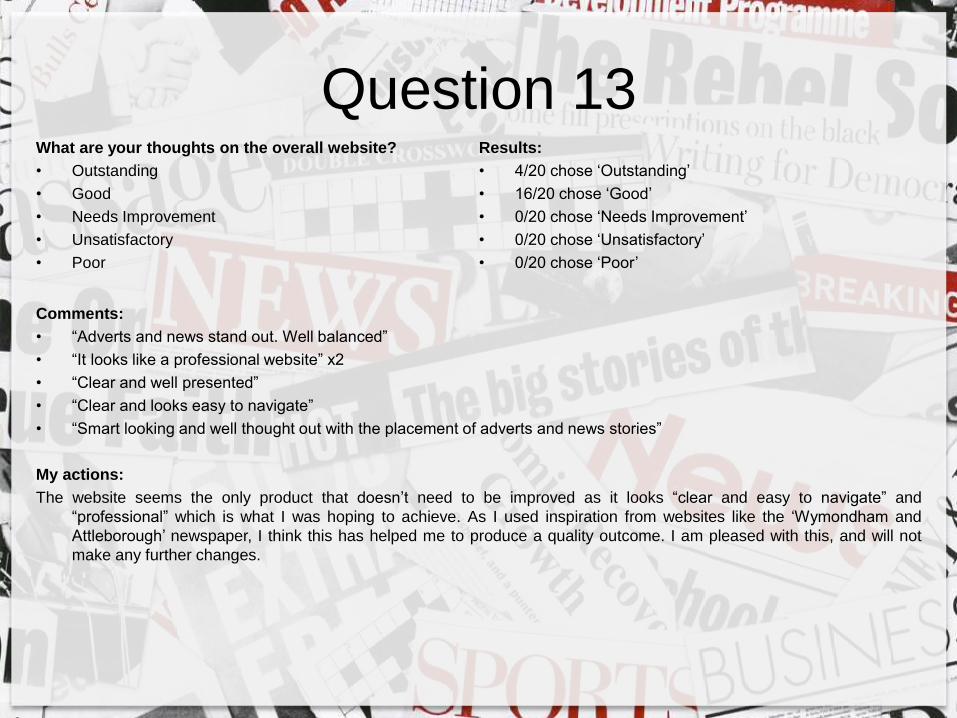
My actions:
The website seems the only product that doesn’t need to be improved as it looks “clear and easy to navigate” and
“professional” which is what I was hoping to achieve. As I used inspiration from websites like the ‘Wymondham and
Attleborough’ newspaper, I think this has helped me to produce a quality outcome. I am pleased with this, and will not
make any further changes.
Question 13What are your thoughts on the overall website?
• Outstanding
• Good
• Needs Improvement
• Unsatisfactory
• Poor
Results:
• 4/20 chose ‘Outstanding’
• 16/20 chose ‘Good’
• 0/20 chose ‘Needs Improvement’
• 0/20 chose ‘Unsatisfactory’
• 0/20 chose ‘Poor’

Comments:
• “Complimentary colours”
• “I would stick to a white stylistic background, very modern”
• “If you want to keep the same styling throughout, you need to use the same font. Also, some of the images seem like
they haven’t kept their aspect ratios when you have resized them”
• “Sorry I don’t like the black background, perhaps grey would be less harsh and in keeping with the rest?”
• “The branding and colour scheme are consistent and look very professional”.
• “The same colour scheme and use of font creates consistency, easily linking the products together”
My actions:
The things that I will change about my blog is the background, as one person commented that they “don’t like the black
background”, as well as another person quoting that they would “stick to a white stylistic background” to make it more
modern, and to link to my target audience. I can’t change the font to be the same as my newspaper as the font is not
available on the software, but I chose a similar font to create a similar effect. The rest of the quotes I am happy with as
the “branding and colour scheme are consistent and look very professional” which was a clear aim from the start.
Question 14Does my blog maintain similar branding and style to the
rest of my products?
• Yes
• No
• Needs Improvement
Results:
• 14/20 picked ‘Yes’
• 1/20 picked ‘No’
• 2/20 picked ‘Needs Improvement’
• 3 were unanswered

Feedback Analysis – ExtrasAny other comments or feedback? (3 were unanswered)
• “Well done” x2
• “Some fantastic work – well done!”
• “A lot of time and dedication has been put into this”
• “Fantastic, a lot of hard work and attention to detail”
• “Your products look very professional and would not be out of place amongst other newspapers etc in the county.”
• “looks professional, is well organised and eye catching”
• “I really enjoyed reading Wymondham Weekly. I particularly enjoyed the article on Deaf Awareness Week and found the
statistics from NDCS very interesting”.
• “Very professional looking product which will appeal to people in my age range”. – This was my aim from the
start so I am glad that it has paid off
• “The newspaper looks professional and has a good layout. The stories and headlines are relevant to your target
audience, especially if they are interested in the news around Wymondham. The adverts are also appropriate to
the local area” – This feedback is what I like to hear, I am glad that the research I have done has worked to create a
high quality product.
• “I loved the OAP robber story” – I’m pleased with this because I thought it was something unique that would catch the
reader’s eye.
• “The end result could be longer” – for this task we were only told to create a front page and double page spread for
the newspaper, however I can understand this point of view if this was an actual newspaper for the public. I would
include more content and a wider range of news stories, but for this occasion I have only done what we were told to do.
• “The last paragraph of ‘Golden Girl’ needs improving, grey background on some columns makes the text
difficult to read” – I will act on this by re-reading through the last paragraph and making reasonable adjustments to
make it more exciting. Additionally, I will change the grey background to a lighter colour to make it clearer to read.