question 1 evaluation
TRANSCRIPT
Question 1 In what way does your media product use, develop forms and conventions of your media product?
Media EvaluationJoe Dolan
Candidate Number: 2043

Front Cover Main Task

‘The Unseen’ magazine ‘repeats’ (Steve Neale – 1980) the codes and conventions off an XXL magazine such as the simple colour scheme of red, white and black. I have also related my images that I have taken have associated to the hip hop scene that hold similarities such as the fashion and stereotypical scene set behind the images e.g. graffiti. I also have ‘repeated’ the colloquial language that is present in XXL within my magazine and have focused this through my articles and use of headings within my front cover. I have also used synergy of social media across all my pages of which keeps the reader ‘informed’ (Katz) so ‘The Unseen’ readers have access to the publication across a variety of platforms and it makes it more convenient for them.
I wanted to keep the theme as similar as I could but change it in some aspects as I wanted to make it look like my own and create my own identity. XXL has a very angry, aggressive colour scheme that is in symbiotic relationship with the emotions usually expressed in the genre, therefore I used this effectively to highlight around my main image and effectively promote a relevant image. I did this with my main image actor ‘Joe Melody’ who I insinuated as a gangster stereotypical looking hip hop artists but also to stand out from the background. I feel my background complemented the main image cover star as the bright colours are able to help the main star stand out for the benefit of a pass along audience. Another example of where I have replicated the codes and conventions of XXL magazine is by creating an independent and successful cover star, making him seem important and majestic by shooting him from the technical code of a low angle shot, which is related to the other issues of XXL, which has introduced where the cover star is either shot from a low angle of which displays their prominence. Creating a ‘star appeal’ (Richard Dyer) allows the reader to effectively help distinguish the target audience by which the stars are manufactured by the music industry to serve a purpose; to make money out of audience, who respond to various elements of a star’s character by buying records and becoming fans. My house style is different to XXL as I wanted to assert a different display of my layout and allow my magazine to fluctuate from the predictable XXL layout. My masthead is far bigger and bolder and helps capture the identity that I wanted to provide to the audience, helping to create a relationship between the magazine and the audience. However, I used similar bold fonts to XXL such as Bebas of which I was able to capture the thick inner glow effect I desired and helped to stand out within my magazine. I have added alternate extra information such as puff promotion or social media of which provided an alternate synergy to my brand identity as I feel that it takes the simplicity away from what I am trying to attain and disheartens the magazine.
Front Cover
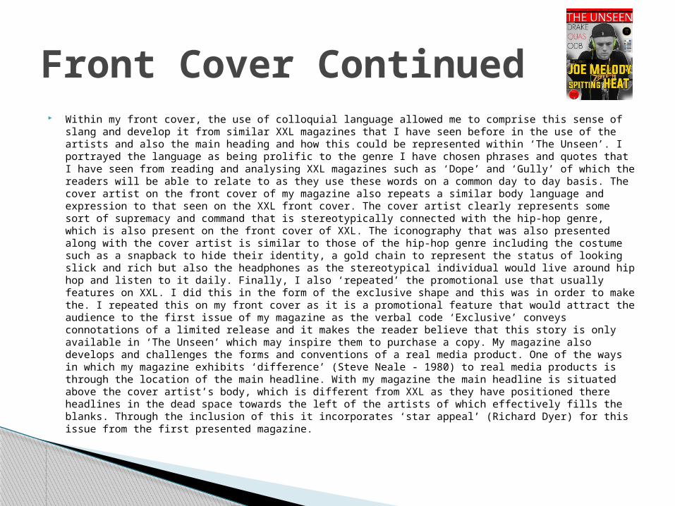
Within my front cover, the use of colloquial language allowed me to comprise this sense of slang and develop it from similar XXL magazines that I have seen before in the use of the artists and also the main heading and how this could be represented within ‘The Unseen’. I portrayed the language as being prolific to the genre I have chosen phrases and quotes that I have seen from reading and analysing XXL magazines such as ‘Dope’ and ‘Gully’ of which the readers will be able to relate to as they use these words on a common day to day basis. The cover artist on the front cover of my magazine also repeats a similar body language and expression to that seen on the XXL front cover. The cover artist clearly represents some sort of supremacy and command that is stereotypically connected with the hip-hop genre, which is also present on the front cover of XXL. The iconography that was also presented along with the cover artist is similar to those of the hip-hop genre including the costume such as a snapback to hide their identity, a gold chain to represent the status of looking slick and rich but also the headphones as the stereotypical individual would live around hip hop and listen to it daily. Finally, I also ‘repeated’ the promotional use that usually features on XXL. I did this in the form of the exclusive shape and this was in order to make the. I repeated this on my front cover as it is a promotional feature that would attract the audience to the first issue of my magazine as the verbal code ‘Exclusive’ conveys connotations of a limited release and it makes the reader believe that this story is only available in ‘The Unseen’ which may inspire them to purchase a copy. My magazine also develops and challenges the forms and conventions of a real media product. One of the ways in which my magazine exhibits ‘difference’ (Steve Neale - 1980) to real media products is through the location of the main headline. With my magazine the main headline is situated above the cover artist’s body, which is different from XXL as they have positioned there headlines in the dead space towards the left of the artists of which effectively fills the blanks. Through the inclusion of this it incorporates ‘star appeal’ (Richard Dyer) for this issue from the first presented magazine.
Front Cover Continued
Contents Page
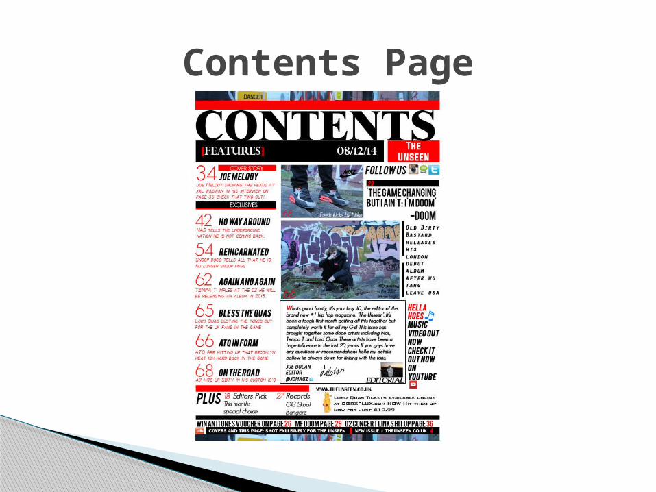
In opposition to XXL magazine, I have similarly chosen to approach the contents page the same way I did with the front cover, allowing me to create my own brand identity rather than copying XXL’s interpretation. The first feature I thought helped adapt the magazine was the house style. The house style along with colour scheme seemed to create an effective layout as they both worked together with each other so well; the black background with a white thick border around the side provided a faultless simplistic style and didn't make the magazine seem as if it was disorderly. However, the main difference I approached the contents page with as opposed with XXL was I only produced one page as opposed to the two pages of XXL. This decision was made because I felt like it allows the reader to be clearer with where to find the content of the issue and distinguish where the pages are allocated within the magazine. This set aside I went for a clear, bold title and decided to place the date from the issue bellow it. I felt that this made it clear that I distribute, in terms of frequency, a once-a-month issue and that this was the December issue. Taking the impression of underlining my heading and each of my sub titles, I made sure that each of the sub lines were applied too from XXL, which involved creating a section summarising the star from the main image and description, stories about inside, which is the overall content in the magazine, artists and stories that change with every issue and finally regulars which is story headings that stay the same with every issue in XXL. I also included a variety of artists who are already recognized and other artists who are less known, therefore ‘The Unseen’ could be seen as a source of advertisement of their talents. These artists are mostly from USA as hip hop has originated from there but I have included British artists as well. During the editorial page I have set myself out as an outgoing character that uses the stereotypical colloquial language to create a ‘personal relationship’ (Katz) with the target audience, for example “What’s good family” of which welcomes the slang users within this editorial and welcomes them. I have also included graffiti at the top and bottom of my page that allows the reader to understand the hip hop scene and therefore enable them to seek the glamour and trappings of this stereotypical scene. Social media was presented within my contents which are similar to XXL as it is shown within the editorial page as well, this is the reason why I have incorporated it below the editorial the editor I see it as significant to have a connection with the readers and I think that it looks somewhat specialized. I included all of the content into a rectangular box such as Facebook, twitter and iTunes downloads and contains the web links for the social media. Lastly I have included a signature of which is presented bellow my editorial that I wrote myself and scanned in and is the similar to XXL therefore denoting a sense of identity and also ‘signifies’ (De Saussure) the editor has signed the issue off, which in turn builds a rapport with the readers. I have also repeated the page number and web address format that is situated at the bottom of the XXL contents page. This significant convention comprises a bolded page number and the web address to simply ‘signify’ to the audience what page they are on and it also means there is cross media convergence as the web address is able to be seen clearly by the target audience, of which is of importance as it clearly helps to connect a personal relationship with the reader and the audience.
Contents Page
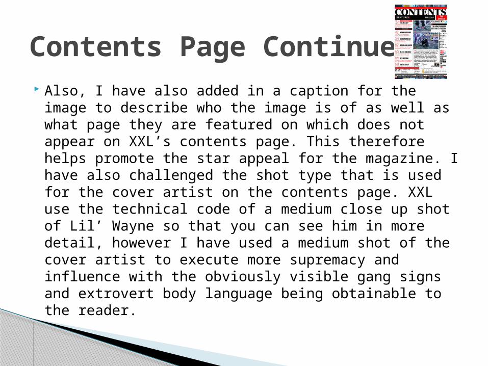
Also, I have also added in a caption for the image to describe who the image is of as well as what page they are featured on which does not appear on XXL’s contents page. This therefore helps promote the star appeal for the magazine. I have also challenged the shot type that is used for the cover artist on the contents page. XXL use the technical code of a medium close up shot of Lil’ Wayne so that you can see him in more detail, however I have used a medium shot of the cover artist to execute more supremacy and influence with the obviously visible gang signs and extrovert body language being obtainable to the reader.
Contents Page Continued

Double Page Spread

The DPS created by XXL that I deconstructed denotes a large main image but seems to be more simplistic than the other pages. I have tried to follow the same layout as XXL and have been happy with the outcome as it looks slick, professional and matches the brand identity that I am trying to develop. I have included text on both pages but primarily on the right hand side of the page with my interview and large pull quote being presented on that side. This therefore denotes a different layout than XXL as it spreads the font out and provides more information than XXL and therefore differs as it revolves around both pages. I based my interview on success (“I’m blessed to be who I am”) information about the artist and his future in the industry as this is what most XXL stars have mutually. Joe’s life consists of him moving up the ladder before the signing industry came into his life, he wishes to share his successes with others who are less fortunate. There was a drop capital of which I thought introduced the interview effectively therefore I decided to increase the size of my text to draw the attention of the reader towards the interview. I really liked this and decided to include this within mine, using a font called Geo Sans Light and along with those who wrote the interview, did the photography and designed the stereotypical hip hop street wear designs. The whole of the right page features Joe Melody with some extras I decided to add in which perfected him. The photo taken was representing ‘The Unseen’ therefore the reader is unable to see his face due to his snapback covering it and this linked effectively with my brand identity. This included a section in the bottom right corner which gave ticket information for concert information and linked well with my front cover information and layout with certain similarities. Finally I also repeated the page number/web address format from the other internal pages as of course this helps to promote in building the brand identity and also cross media convergence for the magazine.
Double Page Spread
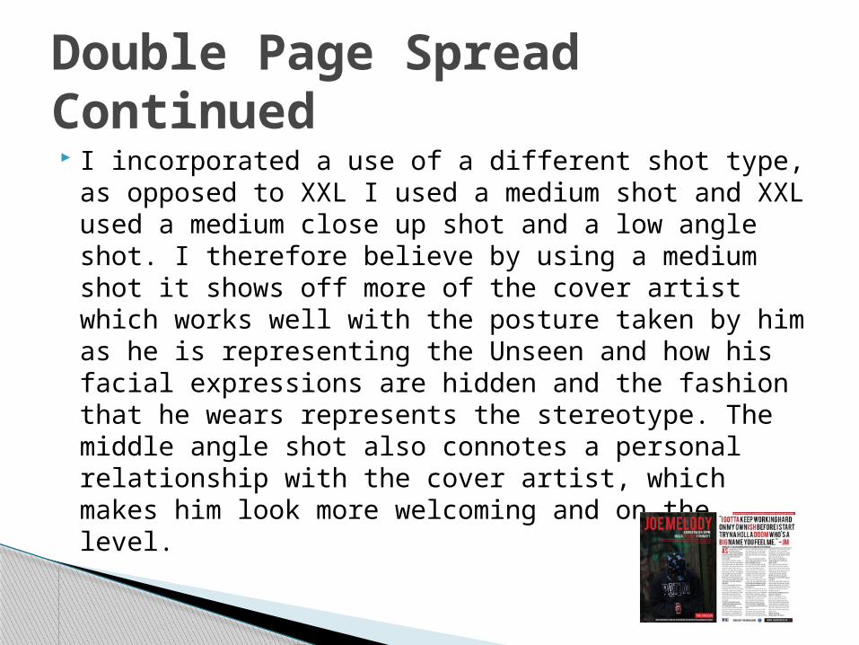
I incorporated a use of a different shot type, as opposed to XXL I used a medium shot and XXL used a medium close up shot and a low angle shot. I therefore believe by using a medium shot it shows off more of the cover artist which works well with the posture taken by him as he is representing the Unseen and how his facial expressions are hidden and the fashion that he wears represents the stereotype. The middle angle shot also connotes a personal relationship with the cover artist, which makes him look more welcoming and on the level.
Double Page Spread Continued

In conclusion, I do follow many significant features from XXL to enable a similar feel to a successful Hip Hop magazine that has established itself to its target audience. On the other hand I have designed most of my features to how I wanted to be as I believe it is important to create what you thinking are correct and therefore allow your own ideas to be incorporated within your magazine like the editor of XXL would. I changed some of XXL ideas to be unique and I personally feel I achieved this target. I finally also added in a headline and a caption at the top and the bottom of the image to clarify exactly what is going on which is not present in XXLs double page spread.
Conclusion