quality metrics - arts council england · 1.5 the quality metrics 16 1.6 the culture counts system...
TRANSCRIPT

Quality Metrics
Final ReportQuality Metrics National Test
by John Knell & Alison Whitaker
CONTENTS
Executive Summary 3
2. Chapter Two: The Evaluation Data 212.1. Metadata and categorisation process 21
2.2. From metadata to artform categorisations 22
2.3. Preparing the dataset for aggregation 23
2.4. Triangulating the Data 23
2.5. Event Choice and Location 25
3. Chapter Three: The Core Aggregated Analysis 283.1. Introduction 28
3.2. The core analysis presented here 28
3.3. What do self, peer and public response tell us about the overall quality of work in this
evaluation? 29
3.3.1 Aggregated self, peer and public scores by dimension 30
3.4. Meeting creative intentions through the prism of triangulation 34
3.5. Risk, Originality and Excellence as measured through self and peer aggregate responses
for all evaluations 37
3.6. Risk, Originality and Excellence as measured through self and peer aggregate responses
by detailed art-form categorisation 41
3.7. How ‘beige’ are the results? 45
3.8. How do the Regions Compare? 47
3.8.1. Regional Analysis 50
3.8.2. Does touring work get different receptions in different places? 56
3.9. For the same evaluations are there any marked differences between online and
interviewer modes of data collection? 58
1
1. Chapter One: Introduction 141.1 The Foundations of the Quality Metrics National Test 141.2 The importance of co-production and an arts sector-led initiative 141.3 The Key objectives of the Quality Metrics National Test 151.4 The Expression of Interest Conditions 161.5 The Quality Metrics 161.6 The Culture Counts System and the Quality Metrics 171.7 The Evaluations 19

CONTENTS
4. Chapter Four: Digging Deeper into Data 604.1. Introduction 604.2. Do multidisciplinary pieces of work produce dimension profiles that are distinctive as compared to single art presentations? 644.3. Detailed Artform Analysis 674.4. Artform Attributes 714.5. Presentation Analysis 734.6. Genre and Subculture Analysis 744.7. Examples of other Attribute Dimension Profiles 754.8. Summary 79
5. Chapter Five: Cohort Engagement, Insights, and Data Culture 805.1. Introduction 805.2. Cohort engagement: ‘supporting’ not ‘pushing’ 805.3. The evaluative and data culture of the participating organisations as judged by the levels of support they required 82 5.3.1. Engagement led to improved evaluation practice and outcomes 85 5.3.2. Engagement led to strong adherence to triangulation / creative intention measurement 855.4. Challenges, Issues and Opportunities identified by the cohort 88 5.4.1. Peer Management, Engagement and Building a Peer Community 88 5.4.2. Enhancing Peer Continuing Professional Development 89 5.4.3. Integration with other data bases; online data bases; and ticketing / CRM systems 92 5.4.4. Integrating with existing evaluation practices – adaptation and innovation 81 5.4.5. Staff Turnover and Resource Challenges 96 5.4.6. Accessibility Issues 87 5.4.7. The language of assessment versus evaluation 87 5.4.8. Resource and context specific challenges 88 5.5. Summary 88
6. Chapter Six: Conclusion 1006.1. Self-driven scalability 100 6.2. The quality metrics and the aggregate analysis 1006.3. The future potential of this approach 101
Acknowledgements 104
Appendix One: Participating Organisations
Appendix Two: Supplementary Data Charts
2
EXECUTIVE SUMMARY
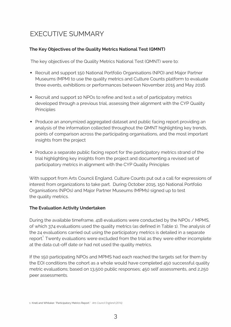
The Key Objectives of the Quality Metrics National Test (QMNT)
The key objectives of the Quality Metrics National Test (QMNT) were to:
Recruit and support 150 National Portfolio Organisations (NPO) and Major PartnerMuseums (MPM) to use the quality metrics and Culture Counts platform to evaluatethree events, exhibitions or performances between November 2015 and May 2016. Recruit and support 10 NPOs to refine and test a set of participatory metricsdeveloped through a previous trial, assessing their alignment with the CYP QualityPrinciples
Produce an anonymized aggregated dataset and public facing report providing ananalysis of the information collected throughout the QMNT highlighting key trends,points of comparison across the participating organisations, and the most importantinsights from the project
Produce a separate public facing report for the participatory metrics strand of thetrial highlighting key insights from the project and documenting a revised set ofparticipatory metrics in alignment with the CYP Quality Principles
With support from Arts Council England, Culture Counts put out a call for expressions ofinterest from organizations to take part. During October 2015, 150 National PortfolioOrganisations (NPOs) and Major Partner Museums (MPMs) signed up to testthe quality metrics.
The Evaluation Activity Undertaken
During the available timeframe, 418 evaluations were conducted by the NPOs / MPMS,of which 374 evaluations used the quality metrics (as defined in Table 1). The analysis ofthe 24 evaluations carried out using the participatory metrics is detailed in a separatereport. Twenty evaluations were excluded from the trial as they were either incompleteat the data cut-off date or had not used the quality metrics.
If the 150 participating NPOs and MPMS had each reached the targets set for them bythe EOI conditions the cohort as a whole would have completed 450 successful qualitymetric evaluations; based on 13,500 public responses; 450 self assessments, and 2,250peer assessments.
1 Knell and Whitaker. "Participatory Metrics Report."
1
Arts Council England (2016)
3
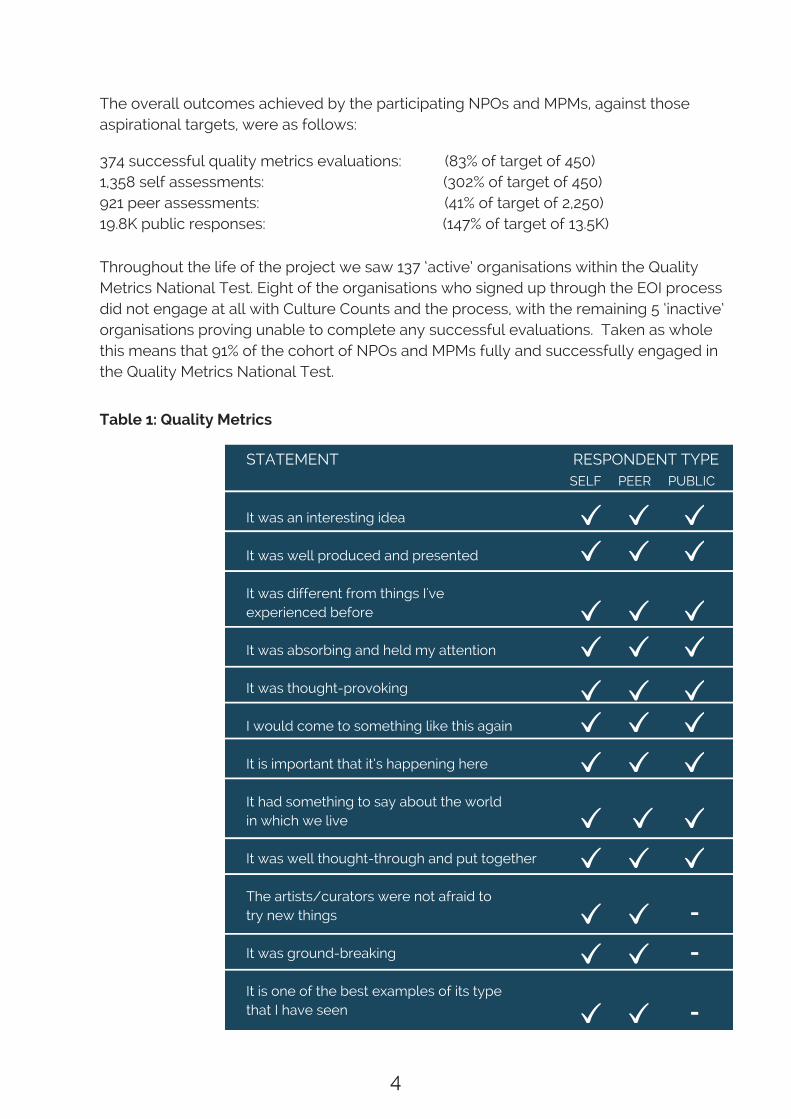
The overall outcomes achieved by the participating NPOs and MPMs, against thoseaspirational targets, were as follows:
Throughout the life of the project we saw 137 ‘active’ organisations within the QualityMetrics National Test. Eight of the organisations who signed up through the EOI processdid not engage at all with Culture Counts and the process, with the remaining 5 ‘inactive’organisations proving unable to complete any successful evaluations. Taken as wholethis means that 91% of the cohort of NPOs and MPMs fully and successfully engaged inthe Quality Metrics National Test.
Table 1: Quality Metrics
Concept
Presentation
Distinctiveness
Captivation
Challenge
Enthusiasm
Local Impact
Relevance
Rigour
Risk
Originality
Excellence
It was an interesting idea
It was well produced and presented
It was different from things I'veexperienced before
It was absorbing and held my attention
It was thought-provoking
I would come to something like this again
It is important that it’s happening here
It had something to say about the worldin which we live
It was well thought-through and put together
The artists/curators were not afraid totry new things
It was ground-breaking
It is one of the best examples of its typethat I have seen
DIMENSION STATEMENT RESPONDENT TYPESELF PEER PUBLIC
-
-
-
4
374 successful quality metrics evaluations: (83% of target of 450)1,358 self assessments: (302% of target of 450)921 peer assessments: (41% of target of 2,250)19.8K public responses: (147% of target of 13.5K)

Our overall approach to constructing metadata was designed with highly sensitiveaggregate analysis in mind in order to tell a clear overall story of the top-lineaggregated results which does not over simplify the findings. In order to manipulateeach data point (i.e. one answer to one question – any individual answer to any individualquestion) individually with any other, and to create any combination of groupcomparisons that are meaningful, metadata needs to be assigned to each questionresponse.
The Culture Counts platform does this by design. For this project, we collectedadditional metadata to that collected via the quality metrics surveys, specificallyorganisation data, event data and geomapping data.
Structured data for location was applied to each event so that events in particularregions could be viewed in the aggregate, with granularity maintained by postcode forgeomapping enabling versatile groups for analysis on a national scale.
Event Choice and Location
Choosing events for the trial was in the hands of the participating cultural organisations.The freedom to choose which events would be suitable to test a new approach toevaluation was important; the nature of many cultural organisations is to approach theirwork in a unique way and one of the objectives of the QMNT was to see how well thisevaluation methodology could support this instinct.
Key Findings
What do self, peer and public responses tell us about the overall quality of work inthis evaluation?
The dimension scores for individual organisations, or in aggregate, are not a clapometer,in which a successful piece of work has to be seen to score highly on every singledimension. Where self prior scores (capturing their intentions / expectations for thework) are in close alignment with self post, peer and public responses then the work isdelivering against the organisation’s creative expectations. Are the cultural organisationsin this study adept at making these judgements in alignment with peer and publicresponse? What are the risk and originality profiles of the work they are producing?
The Evaluation Data
In addition to the core quality metrics data collected in this QMNT, basic demographicdata (age, gender and postcode) was collected for public respondents. In addition,metadata was also assigned to responses or events accordingly.
5

The work presented and analysed in this study received a broadly positive responsefrom peer and public respondents, and largely met the (quite high) prior creativeexpectations of the creative teams involved in its production (self assessors) When it comes to measuring the quality of a cultural experience (for self, peer andpublic respondents) three dimensions in particular - challenge, distinctiveness andrelevance – in the aggregate tended to score lower than the other six dimensionsThe clustering of self, peer and public responses in relation to these metrics suggeststhat audiences are adept at assessing them, with their judgements showing broadalignment with self and peer responses. The participating cultural organisations largely met their creative intentions, asmeasured by the degree of alignment between their self prior scores for eachdimension and the corresponding aggregate scores for peer and public respondents Peer responses (as we have seen in all previous evaluations) are consistently loweracross all dimensions than self and peer responses
Risk, Originality and Excellence as measured through self and peer aggregateresponses for all evaluations
Risk
The aggregated self responses across these three dimensions (risk, originality, andexcellence) show that self assessors tend to score themselves more highly than peerassessors; a well-established trend in previous and ongoing evaluations using thequality metrics. Interestingly, at an aggregate level the self assessors perceivethemselves to be taking quite high levels of risk (broadly supported by peer scores,which are highest for this metric out of the three). This is encouraging to the extent that itwould suggest that taken as a whole the cultural organisations in this study are seekingto stretch themselves with the work they are producing, and that they have a well-developed appetite for creative risk. Another interesting finding is that there is anoticeable variation in self prior risk ratings by artform. This suggests that as more datais gathered across artforms about perceived risk, this could be used to provoke dialogueboth within artforms, and across artforms, about what constitutes creative risk. Oneoutcome might be that ‘risk’ as a dimension measure for self and peers is thickened upwith additional metric components.
Originality
Originality is the lowest ranking dimension aggregate score for both peer and selfrespondents. This would suggest that at an aggregate level self and peer respondentsdid not consider the work being evaluated in this study to display high levels oforiginality. Is this a surprising assessment?
Taken together the aggregate results suggest:
6

To what extent did evaluations in rural and urban areas attract different profiles in termsof dimension scores? Across six of the dimensions (concept, presentation,distinctiveness, rigour, relevance, challenge, and captivation) there is no significantvariations in the profile of public dimension scores as you move from the most ruralareas (rural 1) to the most urban (urban 6). In other words, distinctiveness is not beingrated much higher in urban as opposed to rural areas.
For two of the dimensions, enthusiasm (‘I would come to something like this again’) andlocal impact (‘it is important that it’s happening here’), the differences between publicresponses in rural and urban areas are of particular interest. Given the differential accessto cultural provision in rural as opposed to urban areas, one might expect public ratingsfor ‘enthusiasm’ in more rural areas to be high, and they were (higher than in other urbanareas). Similarly, one would naturally hypothesise that local impact scores would alsoattract high public ratings in rural areas and where this was true in some rural areascompared with urban, the rural status alone does not have a specific influence on localimpact scores in all cases.
Differences in the data by artform
As one might intuitively expect, different artforms do have distinctive dimension profiles,but this only becomes clear when detailed artforms are considered in the their ownright. The variations existing for each artform could be for a variety or reasons, not leastthe particularities of the work evaluated in this QMNT. Exploring these differencesrequires dialogue and debate within and across artforms.
The bar is set high by the originality metric, with respondents asked to express theirrelative support for the notion that the work ‘was ground-breaking.’
How Do The Regions Compare?
The analysis cross referenced the location data for each event analysed against theONS classification for rural and urban areas (which is based on a six-fold categorizationmoving from strongly rural (rural 1) to strongly urban (urban 6).
Immersive work presents a good example. Interestingly for work defined as ‘immersive’in this study, the public and peer ratings were much higher than the aggregate averagefor challenge, distinctiveness and relevance (the ‘lower’ scoring aggregate dimensionsacross all evaluations). With more data it would be interesting to explore whether‘immersive’ work is a consistent inflator in peer and public ratings across particulardimensions.
2 http://webarchive.nationalarchives.gov.uk/20160105160709/http://www.ons.gov.uk/ons/guide-method/geography/products/area-classifications/2011-rural-urban/index.html
2
7

In addition to Learning and Insight days, much of the contact with the cohort was via indashboard, phone and email support. In broad terms, just under half the cohort requiredwhat we would label as ‘high’ levels of direct support (in other words the culturalorganisations in this group initiating multiple calls and emails across the evaluationperiod). Around a third of the cohort required moderate levels of support (initiating somecalls / emails). Just under a fifth required low levels of support (initiating a few calls /emails).
There are of course some subtleties here, in that some organisations made lots ofcontact with Culture Counts because they were trying to do imaginative things with theirevaluations, as opposed to needing ‘hand holding’ support to carry out a basicevaluation. Nonetheless, overall it is true to say that the majority of organisationsseeking the most help were those with lower capacity and / or evaluative expertise.When cross-referenced with well-configured and executed evaluations, these findingsare consistent with our previous depiction of the cultural sector in England as being 80%data shy; 15% data ready; and 5% data driven.
Engagement led to improved evaluation practice and outcomes
What also became very clear during the short span of this study (the majority ofevaluations took place in a concentrated period between January and May 2016) wasthat as the participating organisations grew more familiar with the quality metrics; andthe self, peer, public triangulation approach embedded within and facilitated by theCulture Counts platform; this in turn led to more accomplished evaluative practice andbetter outcomes, as evidenced by:
Culture Counts observing more accurately configured evaluations (i.e. no mistakes inconfiguration or in URL attribution for self, peer and public responses) asorganisations moved through the project A declining number of support calls on how to set up evaluations in the CultureCounts dashboard More interest from the cohort in ‘value adding’ activity, such as creating separateURLs for audience sub groups, and collaborating / sharing data with otherorganisations
3 http://artsdigitalrnd.org.uk/wp-content/uploads/2014/06/HOME-final-project-report.pdf
The evaluative and data culture of the participating organisations as judgedby support requests
Cohort Engagement, Insights and Data Culture
2
Improving data collection outcomes in terms of the total number of public responsesbeing achieved by the participating organisations
8

Peer Management, Engagement and Building a Peer Community
Planning and managing the peer process was a new experience for all of theparticipating organisations and represented the greatest challenge in successfullycompleting their evaluations. Not only do organisations have to select their peers, butthey then have to invite them and secure their participation, and follow through withpeers checking that they have attended their event and completed their evaluation.Some organisations also mentioned that depending on the location of the particularevent the distance required to travel for some productions is a barrier to obtaining peerassessors .
The paradox around the peer review element was that whilst it was the mostdemanding element of the evaluation process, it was also seen as a very positiveaspect of the Quality Metrics National Test. Participating organisations welcomed theopportunity to invite their own peers. Strong support was also expressed for the ideathat as a result of this national test a peer database is formalised across the arts andcultural sector – in other words support is given to create an open searchable data baseof peers for the sector to draw on – in which each peer could list their artform expertiseand interests.
Enhancing Peer Continuing Professional Development
One clear potential deficit in the current process identified by some of the participatingorganisations was that having secured the engagement and participation of their peerevaluators, they had received feedback from peers that they had found the process ‘tooshort’. Peers would have happily answered more questions and would have welcomedmore discussion around the results. Clearly, the length of the quality metrics questionschedules has no bearing on how the peer community is engaged around the results.Even with the current peer dimensions, and additional open questions, organisationscould choose to bring their peer evaluators together on a conference call to discusstheir opinions and evaluations, and their reactions to the triangulated self, peer, andpublic ratings.
3 For example, see http://www.qualitymetricsnationaltest.co.uk/new-blog/2016/5/3/royal-shakespeare-company
Culture Counts received feedback on the challenges being encountered by participatingorganisations both through their direct support request and calls; and through theircontributions at the the Learning and Insight sessions. The key points raised were:
Challenges, Issues and Opportunities identified by the cohort
3
9

Integrating with existing evaluation practices – adaptation and innovation
In both this quality metrics strand, and the participatory metrics strand, thoseorganisations with well developed evaluation frameworks and practices had to thinkcarefully about how best to integrate their quality metrics evaluation work alongsideother evaluation activity they already had planned or were committed to.
Sometimes these integration challenges concerned using the metrics within multi-stranded evaluation approaches; or focused on how to design surveys and manage theirdistribution through a range of URLs targeting different audience segments in ways thatadded value to existing evaluation activity.
In practical terms these issues of integration and complementarity need to be exploredby users in real evaluation examples. For example, in both the quality metrics andparticipatory metrics strand, one response to this integration challenge saw participatingorganisations innovating in their survey designs, adding in bespoke questions or pickingadditional questions from the Culture Counts interface. In total, 485 custom questionswere added to surveys in spite of no recommendation from Culture Counts encouragingorganisations to do so. The appetite to innovate (but also ask audiences lots ofquestions) is clearly present.
Staff Turnover and Resource Challenges
As advised by Culture Counts, the majority of participating cultural organisationsdesignated one member of staff to be a super-user of the Culture Counts system. Inother words, on behalf of a participating organisation that super-user familiarisedthemselves with the Culture Counts system. From the outset of the project (in evaluationterms) on November 1st 2015 to the close of the project on May 31st 2016, 14% of the theoriginally designated super-users of the system either left their job role, or that roledisappeared for resourcing issues inside the participating organisation.
These observations notwithstanding, the feedback from the participating organisationssuggests that the current evaluation process may be under utilising the insights thatcould come from the peer evaluation process, both for the organisations, but also interms of critical reflection and continuing professional development for the peers.
Integration with other databases; online databases; and ticketing / CRM systems
At the Learning and Insight sessions the participating organisations asked a range ofquestions about how a system like Culture Counts could integrate with the otherdatabases, tools, and CRMs they already use. The organisations were both interested inthe future possibilities for integration with existing systems, and informed by the desireto ensure that their evaluation activity in the round is as efficient and as effective aspossible both now, and in the future.
10

Accessibility Issues
The evaluation processes highlighted a range of accessibility challenges that needongoing attention, and the participating organisations also innovated in trying toovercome some of these issues. The specific accessibility issues identified by the cohortwere as follows:
i. Those with visual impairment would struggle to complete the survey alone with the Culture Counts interface as it currently stands
ii. Working with children and adults where English is a second language can in some cases pose difficulties in accurately understanding the questions (e.g. ‘hard to decipher between some specific words e.g. ‘produced’ and ‘presented’)
iii. Specific groups, such as those with dementia, pose very specific challenges (from issues of informed consent to the appropriateness of a survey-based format)
v. The survey response scales are unlikely to be clear enough for participants with ‘ complex individual needs’
v. Elderly respondents (e.g. sometimes with less familiarity of touch screen interfaces and a greater chance of conditions such as Parkinson’s)
vi. For ‘early years’ participants (0-8) the text base interface is not appropriate
The language of assessment versus evaluation
In a strong mirror of the Quality Metrics National Test work on the participatory metrics,the participating organisations discussed their attitudes to evaluating their work andsharing their findings with peers and other organisations.
Organisations acknowledged that the use of standardised metrics could create anxietyaround particular pieces of work being ‘judged’ in particular ways. Clearly, these types ofevaluation approaches will only thrive if cultural organisations are encouraged andsupported to explore the resulting data in ways that put the emphasis on criticalreflection and improvement, as opposed to a narrow emphasis on ‘audit’ and‘performance reporting.’
Understandably, this was very challenging for the participating organisations in terms ofthe continuity of their engagement in the trial which definitely impacted on the ability ofsome organisations to complete the target of three evaluations. This turnover of roughlyone seventh of the initially inducted users presented continuity challenges within theorganisations evaluating, subsequently impacting on delivery of the overall project.
11
This would suggest that the quality metrics and the sector’s evident interest in beingable to measure their creative intentions, allied to tools that help the arts and culturalsector to collect and analyse data easily and at scale, offers up the prospect of a muchricher conversation about cultural value in the future informed by big data. Theaggregated data set from this Quality Metrics National Test is available from ArtsCouncil England.
The future potential of this approach
The overall evaluation approach facilitated by the features of the Culture Countssystem, mirrored in the design and analysis of the aggregate data set from this QualityMetrics National Test, allows the arts and cultural sector:
To present a very clear story on quality which does not over simplify the findings
To use co-produced metadata frameworks, for example relating to artformdescriptions, to demonstrate both the variety and plurality of work being producedby the funded portfolio; and to allow a rich analysis of quality by artform and artformattribute.
The approach effectively unites data across the standardised quality metrics, artform,artform attributes, and other open data into a powerful prism through which to betterunderstand quality. As we have seen this will deepen understanding of how artform andcertain attributes of work influence quality, and offers up the potential to produce a verywide range of analytical and reflective insights.
Crucially, the interpretation of that data will be driven and widely discussed by thecreative professionals that make the work, ushering in an era of co-produced qualitymetrics, co-produced analytical frameworks, and a co-produced conversation aboutcultural value informed by big data.
4 Published and managed by Arts Council England
Conclusion
Self-driven scalability
The project has resoundingly confirmed that funded arts and cultural organisations, ifoffered the right tools and support, can self-drive large scale evaluation activity within avery short time frame, engaging in new ways with peers and audiences about thequality of their work.
4
12

13
2 Faced Dance, DREAMING IN CODE
Courtesy: Lawrence Batley Theatre

The foundations of this Quality Metrics National Test project were initiated in 2010 bythe Department of Culture and the Arts in Western Australia, which commissionedMichael Chappell and John Knell to work with arts and cultural organisations todevelop a metrics system which uses a combination of self, peer and publicassessments to capture the quality of cultural experiences.
The resulting standardised quality metrics have the potential to offer art and culturalorganisations greater insights into what people value about their work; allow them togauge how far they are meeting their creative intentions; benchmark against similarorganisations; and to help everyone talk about quality in a more consistent andconfident way.
Dave Moutrey (CEO of the Cornerhouse in Manchester, now HOME) approached ArtsCouncil England (ACE) in 2012 to ask if they would be prepared to support a group ofarts/cultural organisations in England to develop a similar approach. The resulting workwith a consortium of cultural organisations in Manchester underlined both the scale ofthe opportunity and the possible benefits of this approach.
The Manchester organisations involved in these ACE pilots, working alongside CultureCounts and The University of Manchester, then successfully made a bid to the DigitalR&D Fund (Big Data Strand), administered by NESTA, The Arts and Humanities ResearchCouncil, and Arts Council England. As a direct result of working with an expandedgroup of cultural organisations the Digital R&D work prompted Re:Bourne Ltd to lead apiece of work designed to develop a set of participatory metrics to capture the qualityof participatory work being produced by the cultural sector.
The key insight that came from these foundation pieces of work that preceded thisQuality Metrics National Test was that the active involvement of the arts and culturalsector is fundamental to the creation of a credible and robust measurement frameworkfor the quality of cultural experiences (whether as an audience member or participant).Without their input it was going to be difficult to build greater common language andcurrency about the value of the arts, and that this was going to be an ongoing iterativeprocess.
1. CHAPTER ONE: Introduction
1.1. The Foundations of the Quality Metrics National Test
1.2. The importance of co-production and an arts sector-led initiative
5 Then representing Pracsys and Intelligence Agency Limited, now representing Counting What Counts Ltd.6 http://www.dca.wa.gov.au/research-hub/public-value/http://www.dca.wa.gov.au/Documents/New%20Research%20Hub/Research%20Documents/Public%20Value/DCA%20PVMF%20Valuing%20and%20Investing%20in%20the%20Arts%204.10.12_.pdf 7 http://www.artscouncil.org.uk/what-we-do/research-and-data/quality-work/quality-metrics/quality-metrics-pilot/ 8 http://artsdigitalrnd.org.uk/projects/home-et-al/9 See http://www.artscouncil.org.uk/developing-participatory-metrics
5
6
7
8
9
1314
The attraction to the cultural organisations in being asked to frame new metrics on qualitywas the opportunity to shape a set of quality metrics that more fully reflected theircreative ambitions and intentions. Therefore from the outset this has been a sector-ledproject that has sought to create a standardized and aggregatable metric systemmeasuring what the cultural sector believes are the key dimensions of quality.
Following these successful pilot projects, Arts Council England invited Culture Counts todeliver a national test of the quality metrics to examine the validity and applicability of theframework across a diverse range of organisations in the Arts Council’s National Portfolio.
Recruit and support 150 National Portfolio Organisations (NPO) and Major PartnerMuseums (MPM) to use the quality metrics and Culture Counts platform to evaluatethree events, exhibitions or performances between November 2015 and May 2016. Recruit and support 10 NPOs to refine and test a set of participatory metricsdeveloped through a previous trial, assessing their alignment with the CYP QualityPrinciples
Produce an anonymized aggregated dataset and public facing report providing ananalysis of the information collected throughout the QMNT highlighting key trends,points of comparison across the participating organisations, and the most importantinsights from the project
Produce a separate public facing report for the participatory metrics strand of the trialhighlighting key insights from the project and documenting a revised set ofparticipatory metrics in alignment with the CYP Quality Principles
A key learning point from the project was to test the validity of the quality metricsframework across the diverse range of organisations in the Arts Council’s NationalPortfolio. It was therefore very important to ensure that the cohort was broadlyrepresentative of the wider Portfolio in terms of artform, organisational size and location.
With support from the Arts Council, Culture Counts put out a call for expressions ofinterest from organisations to take part. During October 2015, 150 National PortfolioOrganisations (NPOs) and Major Partner Museums (MPMs) signed up to test the qualitymetrics. As a group they are broadly representative of the wider portfolio in terms ofartform, organisational size and location (see Appendix One).
The key objectives of the Quality Metrics National Test were to:
1.3 The Key Objectives of the Quality Metrics National Test (QMNT)
15

1.5 The Quality Metrics
The core quality metrics chosen for this national test are outlined in Table 2. Ninedimensions were used in surveys designed for all respondent categories, with anadditional three (risk, originality, and excellence) for self and peer respondents only.
1.4 The Expression of Interest Conditions
To trial the core quality metrics across 3 events, performances or exhibitions duringthe lifetime of the grant (which effectively meant a period between November 1st2015 and May 31st 2016). For each evaluation the participating organisation should try to obtain a minimum ofone self assessment; five peer respondents; a minimum of 30 audience responses.Access to self-guided use of the Culture Counts system from November 1st 2015 toJuly 31st 2016, to set up surveys, collect data, and interpret their results To share their data with other participating NPOs To have the opportunity to attend a series of ‘Learning and Insight’ sessions to shareyour experiences of the national test with other participants and to discuss yourinterpretation of the results Agree that their individual event evaluation data will be analysed at an aggregatelevel by Culture Counts to produce a public anonymised aggregated final report atthe end of the project
The 150 organisations that signed up to take part in the Quality Metrics National Testwere committing to the following ‘Expression of Interest’ (EOI) aspirationsand conditions:
16

Concept
Presentation
Distinctiveness
Captivation
Challenge
Enthusiasm
Local Impact
Relevance
Rigour
Risk
Originality
Excellence
It was an interesting idea
It was well produced and presented
It was different from things I'veexperienced before
It was absorbing and held my attention
It was thought-provoking
I would come to something like this again
It is important that it’s happening here
It had something to say about the worldin which we live
It was well thought-through and put together
The artists/curators were not afraid totry new things
It was ground-breaking
It is one of the best examples of its typethat I have seen
DIMENSION STATEMENT RESPONDENT TYPESELF PEER PUBLIC
Table 2: Quality Metrics
1.6 The Culture Counts System and the Quality Metrics
Culture Counts is a cloud-based software system that captures artist, peer and publicfeedback on the quality of arts and cultural events, in this case combined with thequality metrics. Culture Counts captures feedback on the quality of a piece of work or anevent from three different respondent groups:
The artists, curators and/or cultural organisation that created the work or producedthe event (self-assessment) Expert peers such as other artists, people working in cultural organisations in thesame field (peer assessment) Audience members and visitors (public assessment)
-
-
-
17

Quality in this methodology is assessed by asking respondents to rate the work or eventagainst the quality metrics dimensions. Respondents complete a short survey in whicheach quality dimension is presented as a statement or ‘metric’ and respondents recordthe extent to which they agree or disagree with the metric using a sliding scale.Respondents indicate agreement by moving the slider to the right, disagreement bymoving the slider to the left and a neutral response by clicking on the slider once toleave it at the mid-point of the scale. Respondents record a ‘don’t know’ response bynot moving the slider at all. As well as rating the event against the quality dimensions,respondents are asked to provide their gender, age and postcode.
Self assessment is carried out both before (prior) and after (post) an event to explorehow perceptions shift and the extent to which the event meets the creative intentions ofthe cultural organisation as measured by the alignment between self prior ratings andself post, peer and public ratings. Self and peer assessment takes place via an onlineportal, with each assessor given unique login details and emailed instructions on how tocomplete either ‘before’ and ‘after’ surveys, or both.
Public assessment takes place during or just after the event itself and captures real-time feedback on how the audience is responding to the work. Audience membersrecord their ratings using a tablet computer (either through intercept interviewing or byusing a fixed position tablet). Data can also be collected via post event email requests toticket holders to complete the same survey online.
Data from all respondents for every event is stored in a single database and theindividual cultural organisations can view the results in real-time in their Culture Countsdashboard or export their data as csv files for analysis.
18

Figure 1Total activity within theQuality Metrics National Test
Figure 1 summarises the total activity supported by the grant, including the participatorymetrics strand evaluation activity. There were 418 evaluations in total during the availabletime frame, of which 374 evaluations used the quality metrics. The analysis of the 24evaluations carried out using the participatory metrics is detailed in a separate report.
11 Knell and Whitaker. “Participatory Metrics Report.”
11
Arts Council England (2016)
The evaluation period commenced on November 1st 2015 and finished on May 31st 2016.This ‘cut-off’ point at the end of May was to allow the Culture Counts team to completean analysis of the data by grant end (June 30th 2016). However, the participating NPOsand MPMs could continue to use the Culture Counts system through to the end ofAugust 2016.
The original goal was to engage 150 NPOs and MPMs to complete three evaluationsduring the course of the evaluation period, completing at least one self assessment, aimto independently engage five nominated peer assessors, and obtain at least 30 publicresponses per evaluation.
1.7 Evaluations
19

Figure 2 summarises the status of the quality metrics strand of the Quality MetricsNational Test on May 31st 2016 (excluding the evaluations testing the participatorymetrics). For context here, if the 150 participating NPOs and MPMS had each reachedthe targets set for them by the EOI conditions the cohort as a whole would havecompleted 450 successful quality metric evaluations; based on 13,500 public responses;450 self assessments, and 2,250 peer assessments.
* includes 10 shared evaluations where data collected responsibilities were shared between two organisations, each contributing self and peer assessors
**Reasons: Collected self-responses only (12 organisations); didn’t use dimensions (5 organisations); Submitted data after cut-off (2 organisations); data requested to be withdrawn (1 organisation)
Figure 2Overall Summary of QualityMetrics National TestEvaluation Activity
The overall outcomes achieved by the participating NPOs and MPMs, against thoseaspirational targets, were as follows:
374 successful quality metrics evaluations: (83% of target of 450)1,358 self assessments: (302% of target of 450)921 peer assessments: (41% of target of 2,250)19.8K public responses: (147% of target of 13.5K)
The other headline figure to highlight from Figure 2 is that throughout the life of theproject we saw 137 ‘active’ organisations within the Quality Metrics National Test. Eightof the organisations who signed up through the EOI process did not engage at all withCulture Counts and the process, with the remaining 5 ‘inactive’ organisation provingunable to complete any successful evaluations. Taken as whole this means that 91% ofthe cohort of NPOs and MPMs fully and successfully engaged in the Quality MetricsNational Test.
20

In addition to the core quality metrics data collected, as described in Chapter 1, basicdemographic data (age, gender and postcode) was collected for public respondents. Inaddition, metadata was also assigned to responses or events accordingly. Whereorganisations created custom questions, the questions have been recorded in theCulture Counts system for analysis to gain an understanding of what further questionswere deemed complementary to the quality metrics dimensions, but any self, peer, orpublic responses to those additional custom questions have not been analysed and donot form part of the final dataset for the study.
2.1. Metadata and categorisation process
The metadata collected fell in to four categories:
Non-question Survey Data
Organisation Data
Event Data
Geomapping Data
Timestamp, Respondent ID
Registered Area, Region,Organisational Size
Event artform(s) and artformattribute(s), event location
Rural Status
METADATA FIELD EXAMPLES OBTAINED
Automated via CultureCounts software
Arts Council EnglandOpen Data
Supplied byorganisations in the trial
Office of NationalStatistics Open Data
Our overall approach to constructing metadata was designed with highly sensitiveaggregate analysis in mind. In order to manipulate each data point (i.e. one answer toone question – any individual answer to any individual question) individually with anyother, and to create any combination of group comparisons that are meaningful,metadata needs to be assigned to each question response. The Culture Countsplatform does this by design. For this project, we collected additional metadata to thatcollected via the quality metrics surveys, specifically organisation data, event data andgeomapping data.
Structured data for location was applied to each event so that events in particularregions could be viewed in the aggregate, but granularity maintained by postcode forgeomapping enabling versatile groups for analysis on a national scale.
2. CHAPTER TWO: The Evaluation Data
12 For more information on this data standard visit: https://www.w3.org/RDF/13 http://webarchive.nationalarchives.gov.uk/20160105160709/http://www.ons.gov.uk/ons/guide-method/geography/products/area-classifications/2011-rural-urban/index.html
21

2.2. From metadata to artform categorisations
An ontology for artform and artform attributes was created from scratch with datasourced from each of the organisations in the trial. The artform categorisation of eachevent was defined by the organisation and transformed using principles underlined bythe Resource Description Framework (RDF) data model .
This means that instead of a word being stored simply as a string of letters, it is alsounderstood based on its to the work it is attributed to.
For example, the data is computationally understood as:
The work has an attributeThe attribute type is specific artformThe specific artform value is ballet
This also enables analysis of all things which have the same attribute, but may not havethe same artform. For example, grouping contemporary work together, or groupingimmersive work together, regardless of its form or presentation. It also enables granularanalysis of combined arts where the form and presentation can be defined both moreflexibly and comprehensively.
A process of inference has been applied to artforms. This means that when a specificartform has been described such as ballet, it also gets attributed with a broad artform(dance) and a sensory artform (movement). Inference has not been applied to artformattributes at this stage. So for example, a piece of theatre could well be a performance(presentation attribute) but it has not been inferred as such. This is because the rules ofsuch inference, with the data available, cannot be consistently applied across allmetadata, therefore attributes are used exactly as they have been supplied by theorganisations.
14 For more information on this data standard visit: https://www.w3.org/RDF/
12
relationship
The development of these layered artform categorisations has enabled analysis farmore sensitive than broad or ambiguous artform categories whilst also supportinganalysis of work that fits in many different or atypical artform categories. Practicalexamples of the benefit of this approach are as follows:
The word ‘film’ on its own could mean, film as an artform, as presentation method(cinema broadcast), or as a subject (film music), or as a medium (archived materials).Instead of only keeping the pure artform term and disregarding the term as being usefulin other contexts, assigning it as a type of artform attribute retained the term, but in itsintended context for analysis (the assumption was made that when using the term e.g.film music, the film as a subject was important enough to use as a differentiator indescribing the work, therefore it shouldn’t be omitted or disregarded).
22

2.3. Preparing the dataset for aggregation
The dataset was aggregated with standard fields based on the data collected throughthe surveys and metadata agreed at the start of the project. For a full list of fields, andtheir source, please see Table 3.
The raw data aggregate was used for monitoring and initial descriptive analysis. Eachevaluation was then summarised with 5 numbers by respondent/time category (selfprior, self post, peer and public) per dimension. This provided an accurate summary ofthe raw data using medians and interquartile ranges and also forms the basis of theanonymised dataset produced as part of the project. The data presented in this reportuse the median values from the raw data aggregate.
2.4. Triangulating the Data
A key element of this methodology is the triangulation of scores within respondentcategories. Comparing and contrasting the respondent types provides a much morecomplete perspective on the work based upon the perspectives of the creators andproduction teams, other professionals, and the public audiences.
A dimension scoring high by one respondent category and low by another provokes areflective conversation about the work. For example, here are some interpretativeexchanges on the evaluation results from participating organisations at the Learning andInsight sessions:
Commenting on similar scores across all three respondent types: “our audiences aremuch savvier than we give them credit for”
Commenting on a high peer score and low public score: “this would mean we created highquality theatre, but it may not be as assessable to the public as we hoped”
23

Tabe 3: Raw Data Fields
Gender
Age
Postcode
Concept
Presentation
Distinctiveness
Challenge
Captivation
Enthusiasm
Local Impact
Relevance
Rigour
Risk
Originality
Excellence
Three words
Organisation ACERegion
Organisation ACEArtform Discipline
OrganisationACE Area
Respondent
Respondent
Respondent
Respondent
Respondent
Respondent
Respondent
Respondent
Respondent
Respondent
Respondent
Respondent
Respondent
Respondent
Respondent
Respondent
ACE Open Data
ACE Open Data
ACE Open Data
Organisation
Evaluation Name
Event Artform - raw
Location/ Event Notes
Event Attendees - gross
Event Collaborators
Event Postcode Event
Town/City
Event County
User ID
Timestamp
URL
Delivery Method
Respondent Category
Time Category
Evaluation Reference
Evaluation CompletionStatus
Event Rural Status
Rural Description
Organisation
Organisation
Organisation
Organisation
Organisation
Organisation
Organisation
Organisation
Organisation
Culture Counts
Culture Counts
Culture Counts
Culture Counts
Culture Counts
Culture Counts
Culture Counts
Culture Counts
ONS Open Data
ONS Open Data
DATA FIELD SOURCE DATA FIELD SOURCE
24

2.5. Event Choice and Location
Choosing events for the trial was in the hands of the participating cultural organisations.The freedom to choose which events would be suitable to test a new approach toevaluation was important; the nature of many cultural organisations is to approach theirwork in a unique way and one of the objectives of the QMNT was to see how well thisevaluation methodology could support this instinct.
In terms of the types of events organisations chose to evaluate we expected thatorganisations might choose the simplest way to test the metrics but a really large varietyof events have been chosen (as confirmed by the meta data tags), which stretched theCulture Counts delivery team to support lots of different types of evaluative activity.
At the EOI stage, care was taken to ensure that the registered location of theorganisations represented the breadth of the UK funded portfolio. As may be expected,dense areas with high cultural provision in the form of NPOs (in the trial) such as London,Manchester, Newcastle and Bristol had the most number of evaluations (see Figure 3:Event Location Map). The public respondent map (see Figure 4) also reflects theselocations. The more interesting view of the following maps is of where cold spots lie.
It is reiterated here that whilst this sample is broadly representative of the whole fundedportfolio it is inevitably incomplete, moreover some of the cold spots are less denselypopulated areas of England, such as the expansive national parks in the north ofEngland. There are a few counties that seem to have far fewer public respondents thanothers which may not be explained by the baseline population density, further analysisof this however is out of scope for this study.
25

Figure 3: Event Location Map
26
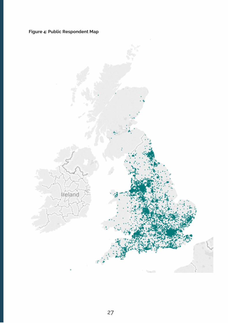
Figure 4: Public Respondent Map
27

3.2. The Core analysis presented here
Our presentation of the aggregate analysis has the following aims:
To tell a clear overall story of the top-line aggregated results which does not oversimplify the findings. To reveal granular insights from the findings through the use of metadata tags thatbring richness to the aggregated results To use the metadata frameworks we have created from the inputs of theparticipating organisations, for example relating to artform descriptions, todemonstrate both the variety and plurality of work being produced by the fundedportfolio; and to allow us to dig a bit deeper into the profile of dimensions scores fordifferent categorisations (artform; artfrom attributes) to see whether the patterns thatemerge are insightful and suggest interesting lines of ongoing research.
To achieve these aims we have grouped together a set of linked questions that reveal avery clear story about the data and which we hope will trigger significant discussion andinterest across the whole cultural sector. The data is, as ever, the starting point for a richconversation about quality and the value of the work being produced.
In Appendix 2 (Supplementary Data Charts) we have provided a range of charts forthose readers that wish to look in more detail at some of the data patterns emerging outof our early analysis of the data set. If we were to include all of these analyses in themain body of this report it would be much harder to frame a clear narrative presentingthe key findings from the study.
We have also produced an open data set of the QMNT data stemming from the purposeof critically exploring the potential of this overall evaluation approach, both for thecultural sector, and for the research and policy making communities. Clearly, animportant element of the potential of this overall approach concerns whether theresulting evaluation data at self, peer and public respondent level is useful and insightfulfor each of the participating cultural organisations. Does it allow them to gain insightsinto their creative practice, and to build a better understanding of their work andaudience reaction?
15 One of the public value outcomes of this study is the resulting data set, which appropriately anonymised, has been lodged with Arts Council England.
15
3.1. Introduction
As the previous chapter explained, the data set created from the Quality MetricsNational Test evaluations has been constructed in a way that allows for a multitude ofdifferent types of cross-cutting analyses. This chapter, which presents the coreaggregated analysis, has sought to confine attention to the most important questionsand intuitive cross-cutting forms of analysis (e.g. dimension scores in aggregate byrespondent; dimension scores by artform categorisation and respondent; dimensionscores by region etc.)
3. CHAPTER THREE: The Core Aggregated Analysis
28

The other important public value element of this approach relates to whether usingsector produced standardised metrics statements, allied to sector produced metadatathat allow for fine layered analytical frameworks around artform or mode of presentation,enables the cultural sector to explore in detail some of the dynamics of how culturalvalue is being created – whether that be the risk profile of the work or the variety andplurality of work being produced.
This chapter presents what we regard as the ‘core’ analysis of the data. Chapter 4presents some additional lines of enquiry that we think are suggestive of the furtherpotential of building cultural value data sets of this kind.
3.3. What do self, peer and public response tell us about the overall quality of work inthis evaluation
Unwrapping what the data tells us about the overall quality of work being produced bythe participating organisations is a multi-layered task. At the outset it is important toremember a number of things about this study and the data.
Firstly, the dimension scores for individual organisations, or in aggregate, are not aclapometer, in which a successful piece of work has to be seen to score highly on everysingle dimension. If you imagine the work of a producing theatre over the course oftwelve months, it will feature new writing and challenging work which the artistic directorwould expect to score highly on originality, risk or challenge. The same theatre mightfeature a traditional show, or indeed a seasonal show, for which the artistic team wouldbe predicting a different profile of dimension scores. Therefore, one very importantelement of the results presented in this study is how far the creative intentions for thework, as captured by the self prior scores (i.e. creative practitioners’ expectations of howthe work will be received), are in close alignment with public and peer responses. Wherethey are in close alignment the work is delivering against creative expectations. Are thecultural organisations in this study adept at making those judgements in alignment withpeer and public response? What are the risk and originality profiles of the work they areproducing? This is something the data can help us explore.
Secondly, care needs to be taken when interpreting the data that inappropriateaggregate comparisons are not being drawn – to stretch that well-worn analogy a little -comparing apples, pears and pineapples (substitute your chosen artform or genre terms)should only be done in ways that are appropriate, such as where similarities betweenevaluation events can be closely aligned and therefore comparison provides meaningfulinsight. Our analysis of the dimensions by artform (and by other attributes (see Chapter 4))will explore this dynamic.
Thirdly, it is important, therefore, when interpreting the aggregate results to consider thedimension profile, in terms of the shape of responses to the dimensions for any given setof respondents (self, peer and public) and variables (e.g. organisation, artform, region etc.),and acknowledging that a variety of work with different individual profiles make up thataggregate.
29

Figure 6 shows the average self prior scores for the nine quality metrics statementsanswered by all self, peer and public respondents, with the dimensions labelled at thebottom of the chart. Why start with this chart? One of the key benefits of the qualitymetrics is that they allow cultural organisations and their creative teams to gainfeedback on the extent to which they are meeting their creative intentions for a piece ofwork (as measured by the proximity between their prior self assessment scores, andtheir post event self assessment scores and peer and public respondent scores). Thecloser the match the more successfully they have met their creative intentions.
Therefore, all the participating cultural organisations in this study were encouraged tocarry out a self assessment both prior to their event taking place, and then to conductanother self assessment after their event. Figure 5 provides a summary of average selfscores by dimension (self, peer and public) carried out prior to the event.
Figure 5: Average self prior ratings by dimensions
3.3.1 Aggregated self, peer and public scores by dimension
Self respondent scores
In order to effectively represent each respondent’s response from the raw data for anumber of aggregate analyses, each respondent type (self prior, self post, peer post,public) was summarised with 5 numbers for each evaluation (20 numbers perevaluation). These numbers represent the median and interquartile ranges for eachrespondent category.
30

Figure 6 shows the average self post scores, evaluated by self respondents after theevent.
Figure 6: Aggregate self post (after the event) ratings by dimensions
Comparing these self prior and post scores, the only significant movement in theirdimension scores post event was for local impact, which self respondents ratednoticeably higher after the event.
Looking at the dimension profile as a whole for self respondents, the scores suggest astrong degree of self confidence in the quality of the work being produced by theparticipating organisations, and that on the whole the work lived up to their creativeintentions and expectations (in other words self respondents were not giving harsherscores, compared to their self prior assessments, after they had seen their workpresented to an audience). The charts that follow in this paper will only use the self priorscores when presenting self assessor information unless otherwise specified.
The other noticeable finding from the aggregated self responses is that threedimensions (challenge: it was thought-provoking, distinctiveness: it was different fromthings I’ve experienced before, and relevance: it has something to say about the world inwhich we live) attracted significantly lower average self scores than the other six higherscoring dimensions (captivation, concept, enthusiasm, local impact, presentation andrigour), as Figure 6 demonstrates.
31
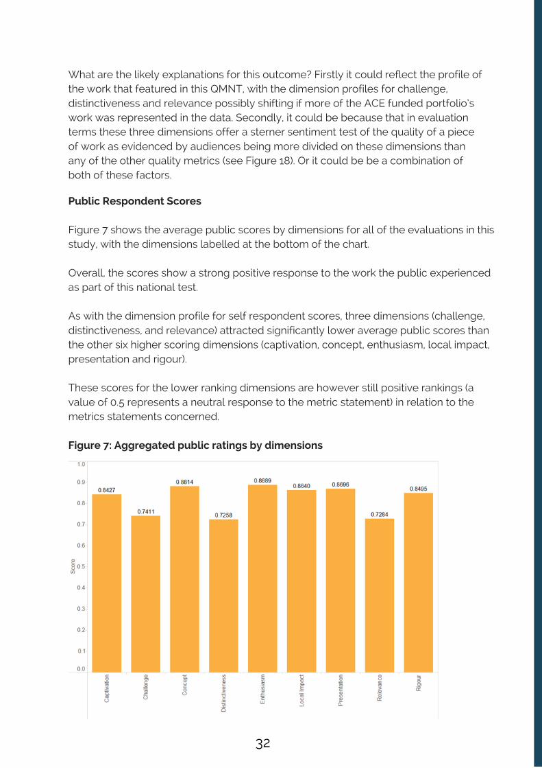
What are the likely explanations for this outcome? Firstly it could reflect the profile ofthe work that featured in this QMNT, with the dimension profiles for challenge,distinctiveness and relevance possibly shifting if more of the ACE funded portfolio’swork was represented in the data. Secondly, it could be because that in evaluationterms these three dimensions offer a sterner sentiment test of the quality of a pieceof work as evidenced by audiences being more divided on these dimensions thanany of the other quality metrics (see Figure 18). Or it could be be a combination ofboth of these factors.
Public Respondent Scores
Figure 7 shows the average public scores by dimensions for all of the evaluations in thisstudy, with the dimensions labelled at the bottom of the chart.
Overall, the scores show a strong positive response to the work the public experiencedas part of this national test.
As with the dimension profile for self respondent scores, three dimensions (challenge,distinctiveness, and relevance) attracted significantly lower average public scores thanthe other six higher scoring dimensions (captivation, concept, enthusiasm, local impact,presentation and rigour).
These scores for the lower ranking dimensions are however still positive rankings (avalue of 0.5 represents a neutral response to the metric statement) in relation to themetrics statements concerned.
Figure 7: Aggregated public ratings by dimensions
32

Peer Respondent Scores
Figure 8 shows the average peer scores across the nine self, peer, public dimensions forall of the evaluations in this study, with the dimensions labelled at the bottom of thechart.
The dimension profile for peer responses follows the same pattern as for self and publicresponses, with peers giving significantly lower scores for lower scores fordistinctiveness, challenge and relevance, than for the six more highly scoringdimensions (captivation, concept, enthusiasm, local impact, presentation and rigour).
Figure 8: Aggregated Peer ratings across the nine (self, peer, public) dimensions
Figure 9 brings together the aggregate scores for self/peer and public responses fortheir shared nine dimensions. The two grey columns for each dimension are the selfprior and post scores, alongside the orange (public) and teal (peer) scores for eachdimension. This chart gives a clear visual demonstration of self, peer and public scoresclustering at a much lower level for challenge, distinctiveness and relevance.
33
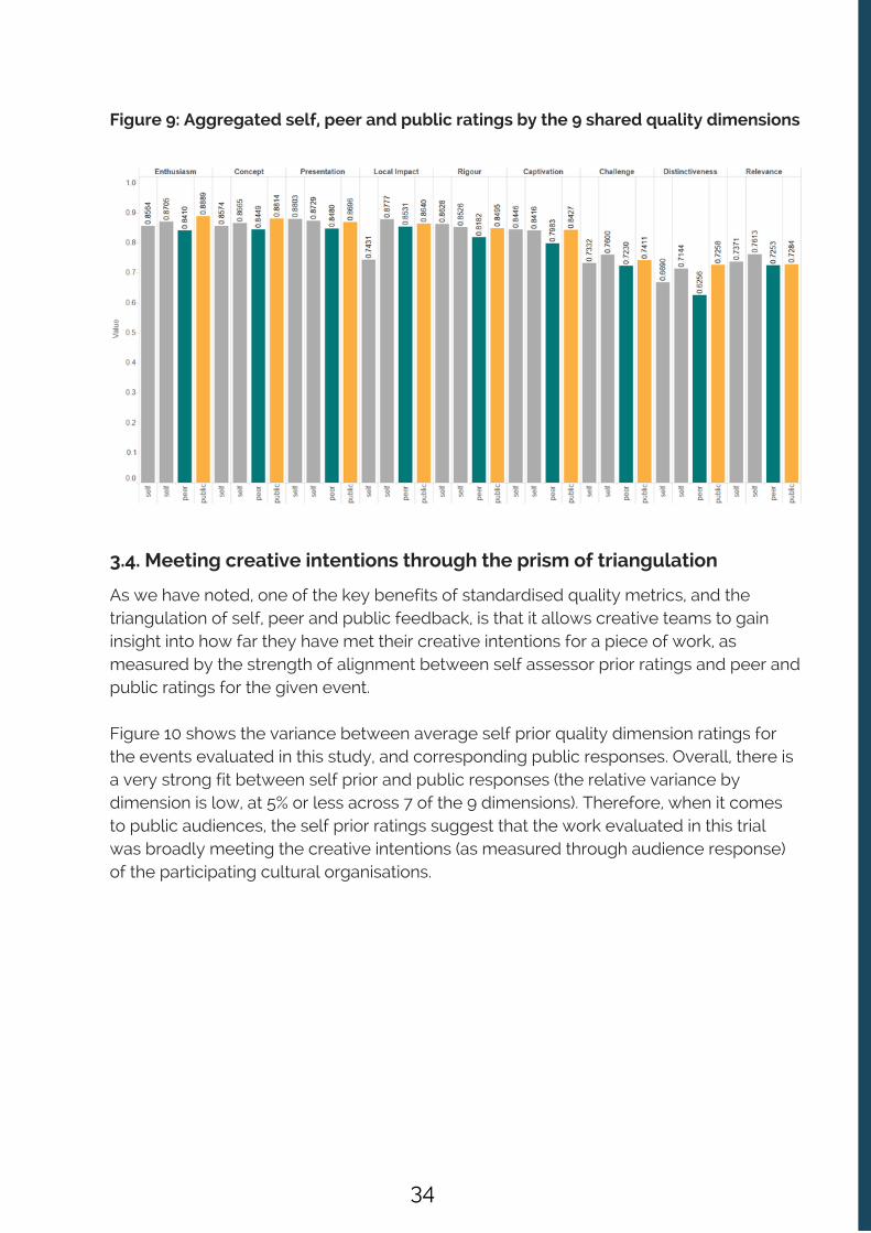
Figure 9: Aggregated self, peer and public ratings by the 9 shared quality dimensions
As we have noted, one of the key benefits of standardised quality metrics, and thetriangulation of self, peer and public feedback, is that it allows creative teams to gaininsight into how far they have met their creative intentions for a piece of work, asmeasured by the strength of alignment between self assessor prior ratings and peer andpublic ratings for the given event.
Figure 10 shows the variance between average self prior quality dimension ratings forthe events evaluated in this study, and corresponding public responses. Overall, there isa very strong fit between self prior and public responses (the relative variance bydimension is low, at 5% or less across 7 of the 9 dimensions). Therefore, when it comesto public audiences, the self prior ratings suggest that the work evaluated in this trialwas broadly meeting the creative intentions (as measured through audience response)of the participating cultural organisations.
3.4. Meeting creative intentions through the prism of triangulation
34

Figure 10: Differences between self prior scores and public scores across thedimensions
As the chart clearly demonstrates, generally, self assessors are most likely tounderestimate the local impact and distinctiveness of work in comparison to the publicresponses. We also know that on local impact these scores realign post-event (in otherwords self assessor ratings post event are much closer to public ratings on localimpact). Interestingly, for challenge and relevance, the differences between self andpublic are negligible, indicating that when work has been rated by the public as notparticularly challenging or relevant that is indeed in line with the balance of the creativeintentions of the self respondents. In other words, work regarded as challenging bycultural organisations, is not being judged unchallenging as audiences.
It is also noteworthy regarding ratings on distinctiveness that self assessors think thework less distinctive than the public. There might be a number of reasons for thispattern in the data. For example, it is likely that at the point a self assessor comes tocomplete a prior survey they will have lived with that piece of work for a number ofmonths, their familiarity acting as a dimension score deflator as compared to the view ofseeing something the work with fresh eyes.
35

Figure 11: Differences between self prior scores and peer scores across thedimensions
Figure 11 examines the same variance dynamic for self prior ratings and peer ratingsacross the dimensions. The pattern is visibly very different from Figure 10, with the localimpact dimension being the only outcome on which self prior ratings are lower than thepeer response. With all of the other dimensions, self prior ratings are higher than thanthe peer response, although as with the self prior / public comparison, the degree ofvariance was quite low (5% or less across eight out of the twelve dimensions). Therewas a significant over-rating of risk, originality and excellence by the self assessors ascompared to peer response, which we examine in more detail below.
Overall interpretation for these aggregate self, peer and public scores
Taken together these aggregate scores suggest:
The work presented and analysed in this study received a broadly positive responsefrom peer and public respondents, and largely met the (quite high) prior creativeexpectations of the creative teams involved in its production (self assessors) When it comes to measuring the quality of a cultural experience three dimensions inparticular - challenge, distinctiveness and relevance – overall, score lower in allrespondent categories but may offer a sterner sentiment test than the other sixdimensions
36

The clustering of self, peer and public responses in relation to these metrics suggeststhat audiences are adept at assessing them, with their judgements showing broadalignment with self and peer responses. The participating cultural organisations largely met their creative intentions, asmeasured by the degree of alignment between their self prior scores for eachdimension and the corresponding aggregate scores for peer and public respondentsPeer responses (as we have seen in all previous evaluations) are consistently loweracross all dimensions than self and peer responsesThe participating cultural organisations largely met their creative intentions, asmeasured by the degree of alignment between their self prior scores for eachdimension and the corresponding aggregate scores for peer and public respondentsPeer responses (as we have seen in all previous evaluations) are consistently loweracross all dimensions than self and peer responses
3.5. Risk, Originality and Excellence as measured through self and peeraggregate responses for all evaluations
Figure 12 below presents the aggregated self (prior and post) and peer scores for allevaluations across the three quality metrics that are for self and peer completion only,namely:
Risk: ‘The artists / curators were not afraid to try new things’Originality: ‘It was ground-breaking’Excellence: ‘It was one of the best examples of its type I have seen’
The aggregated self responses across these three dimensions show that self assessorstend to score themselves more highly than peer assessors; a well-established trend inprevious and ongoing evaluations using the quality metrics. Interestingly, at anaggregate level the self assessors perceive themselves to be taking quite high levels ofrisk (broadly supported by peer scores, which are highest for this metric out of thethree). This is encouraging to the extent that it would suggest that taken as a whole thecultural organisations in this study are seeking to stretch themselves with the work theyare producing, and that they have a well-developed appetite for creative risk.
37

Figure 12: Aggregated Self prior and post and peer ratings for risk, originality &excellence
Originality is the lowest ranking dimension aggregate score for both peer and selfrespondents. This would suggest that at an aggregate level self and peer respondentsdid not consider the work being evaluated in this study to display high levels oforiginality. Is this a surprising assessment? The bar is set high by the originality metric,with respondents asked to express their relative support for the notion that the work‘was ground-breaking.’
As Figure 12 also shows, the aggregate self and peer ratings for excellence suggest thatsome of the work in this evaluation is regarded as amongst the best of its typeexperienced by the self and peer respondents.
Let’s examine these patterns in a little more detail, both in terms of self and peer ratingbehavior, and through a more detailed consideration of risk appetite and originality byartform.
38

Self and Peer rating ranges for risk
Figure 13 shows the distribution of self and peer responses for the risk dimension,broken down by our broad art form categorisations (placing visual sensory artformalongside the broad artforms of dance, literature, music and theatre). In broad terms thecharts show:
There are significant variations in the risk scores within artforms Peers gave a noticeably high, and narrower, range of risk scores for literature Peers show a greater willingness to use all of the respondent scale as compared toself respondents (the self score range stops at 0.2. whereas the peers use the wholerange.)
16 Please see Chapter 4 and Appendix 2 for further exploration of the results cut by artform and artfrom attribute.
14
Figure 13: Distribution of Self and Peer risk dimension scores by broad artform
16
39
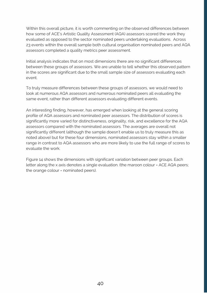
An interesting finding, however, has emerged when looking at the general scoringprofile of AQA assessors and nominated peer assessors. The distribution of scores issignificantly more varied for distinctiveness, originality, risk, and excellence for the AQAassessors compared with the nominated assessors. The averages are overall notsignificantly different (although the sample doesn't enable us to truly measure this asnoted above) but for these four dimensions, nominated assessors stay within a smallerrange in contrast to AQA assessors who are more likely to use the full range of scores toevaluate the work.
Figure 14 shows the dimensions with significant variation between peer groups. Eachletter along the x axis denotes a single evaluation. (the maroon colour = ACE AQA peers;the orange colour = nominated peers).
Within this overall picture, it is worth commenting on the observed differences betweenhow some of ACE’s Artistic Quality Assessment (AQA) assessors scored the work theyevaluated as opposed to the sector nominated peers undertaking evaluations. Across23 events within the overall sample both cultural organisation nominated peers and AQAassessors completed a quality metrics peer assessment.
Initial analysis indicates that on most dimensions there are no significant differencesbetween these groups of assessors. We are unable to tell whether this observed patternin the scores are significant due to the small sample size of assessors evaluating eachevent.
To truly measure differences between these groups of assessors, we would need tolook at numerous AQA assessors and numerous nominated peers all evaluating thesame event, rather than different assessors evaluating different events.
40
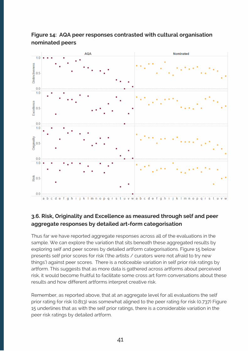
Figure 14: AQA peer responses contrasted with cultural organisationnominated peers
3.6. Risk, Originality and Excellence as measured through self and peeraggregate responses by detailed art-form categorisation
Thus far we have reported aggregate responses across all of the evaluations in thesample. We can explore the variation that sits beneath these aggregated results byexploring self and peer scores by detailed artform categorisations. Figure 15 belowpresents self prior scores for risk (‘the artists / curators were not afraid to try newthings’) against peer scores. There is a noticeable variation in self prior risk ratings byartform. This suggests that as more data is gathered across artforms about perceivedrisk, it would become fruitful to facilitate some cross art form conversations about theseresults and how different artforms interpret creative risk.
Remember, as reported above, that at an aggregate level for all evaluations the selfprior rating for risk (0.813) was somewhat aligned to the peer rating for risk (0.737) Figure15 underlines that as with the self prior ratings, there is a considerable variation in thepeer risk ratings by detailed artform.
41
In comparing the self and peer results, self assessors generally attribute more risk thanpeers to their work. What is also noticeable is a greater degree of misalignmentbetween some sets of self prior and peer risk ratings by artform. So for example, withdrawing, ballet, musical theatre, painting and play there are quite significant differencesbetween self and peer ratings, with the peer ratings being much lower for risk in allthose artform categories.
Terms are only included if there were more than 5 evaluations of that form evaluated inthe study.
Figure 15: Average Self Prior and Peer Risk Score by Detailed Artform
These results highlight how data of this kind could be used to provoke dialogue bothwithin artforms, and across artforms, about what constitutes creative risk. For example, ifthe metrics become widely used across the cultural sector, and as we move from midscale to big data across these types of dimensions, any persistent and marked variationsin say risk ratings by artform; or between self and peer ratings on risk and originality byartform; could then by explored in detailed dialogue. One outcome might be that ‘risk’as a dimension measure for self and peers is thickened up with additional metriccomponents. Helpfully, the data will inevitably drive consideration of what is notableand discussion worthy for the sector, and where insight can be gained by furtherdevelopment and detailed enquiry.
42

Turning to originality, Figure 16 presents self prior and peer ratings on originality byartform. The aggregate self prior score for originality across all evaluations was 0.744.The aggregate peer rating for originality across all evaluations was 0.536.
As Figure 16 demonstrates that aggregate figure hides significant variations in how selfassessors rated the ‘originality’ of the work being evaluated in this national test. This iswhat you would expect. The trial took place in a short six-month window in terms ofevaluations, and cultural organisations were not necessarily ‘picking’ their best, or themost original work, in their current programme of current and planned activities.Moreover, no one could reasonably expect all work being presented to be judged asground-breaking.
Figure 16: Average Self Prior and Peer Originality Scores by Detailed Artform
In addition Figure 16 demonstrates that the aggregate figure hides significant variationsin how peers rated the ‘originality’ of the work by artform. In comparing the self andpeer results, self assessors generally attribute greater originality to their work thanpeers. What is also noticeable is a greater degree of misalignment between some setsof self prior and peer originality ratings by artform. So for example, with drawing, ballet,sculpture, and craft there are quite significant differences between self and peer ratings,with the peer ratings for originality being much lower in all those artform categories.
The only artform in which the peer scores for originality were noticeably higher than theself prior scores for originality was physical theatre.
43

Finally, what of self prior and peer scores on excellence – ‘it is amongst the best ofits type I have seen’. Figure 17 presents the self prior and peer scores forexcellence by artform. The aggregated self prior rating for excellence across allevaluations was 0.744. As with risk, and originality, there is significant variation inthe self prior ratings for excellence by artform.
Figure 17: Average Self Prior and Peer Excellence Scores by Detailed Artform
There is a stronger overall alignment between self and peer ratings on excellence byartform, as compared to the self and peer profiles by artform on risk and originality. Thisis an interesting finding. As we have discovered throughout the course of the QualityMetrics National Test, which has helped support the peer review process central to thisevaluation work, creative practitioners are constantly going to see each other’s work toboth be inspired but also to understand the state of practice in their artform and toequip themselves with a well informed perspective of what good looks like.
When judging the excellence dimension, they are making a relative judgement aboutwhere their own work, or if they were acting as a peer the work of others, sits in thenational ecology in relation to being the ‘best of its type I have seen’.
It is therefore an intuitive finding that given the frequency of exposure to ‘benchmarks’,and the breadth of context they have to make those judgements, self and peer scoreshave shown closer alignment on excellence by artform, than on risk and originality.
44

More broadly, the subtleties of the interplay between self and peer opinionsuggests that over time if the metrics were used at scale, thought would have to begiven to the process of supporting a bank of peers, maintaining a directory of theirskills and expertise, and highlighting their relationship and experience to any givenartform. This type of resource base would help cultural organisations to understandwhich types of perspectives they wish to draw on for their peer assessments,providing further context for them to interpret the peer ratings they receive for anygiven piece of work.
We noted under our reporting of self and peer ratings on originality, if some ofthese patterns were observed at a larger scale, they should be the trigger fordialogue and further research. For example, in this study ballet proved to be theoutlying artform in terms the biggest difference between self and peer ratings onexcellence.
3.7. How ‘beige’ are the results?
The term ‘beige results’ was coined by Nick Merriman of Manchester Museum in theoriginal quality metrics pilot. A set of beige results occurs when the average dimensionscores for public respondents are all grouped around the 0.65 / 0.70 mark, and inaddition the standard deviation for the public scores on each dimension are also low (inother words display very little variation amongst respondents). The original Manchestergroup regarded ‘beige results’ as the audience equivalent of ‘meh.’
The power of the ‘beige results’ description is that it highlighted that a successful pieceof work does not mean that everybody has to ‘like it’ or agree about it. Indeed, a piece ofwork that sharply divides opinion across the dimensions is clearly having a significantimpact on its audiences which may fully reflect the creative intentions behind the work.
How much variation did public respondents display in their reaction to the dimensions inthis study? Clearly where respondents have given high scores in response to thedimensions this reflects genuine appreciation for the work they have seen, whereassome of the dimensions have received consistently lower scores, and all dimensionshave received low scores from some respondents.
In analysing the data we have obviously asked ourselves whether some element of themaximum scores may be due to a growing familiarity with swipe mechanisms facilitatedby touch technology coupled with the known behaviour of survey ‘box ticking’ ratherthan measured responses. For example, where we see a maximum score of 1.0 from arespondent we might suspect that to be a result where the emotional reaction to thequestion is a resolute ‘yes’ rather than a measured proportion of ‘yes.’
In response, maintaining an accurate representation in the dataset for manipulation wasdone through calculating medians and interquartile ranges.
45

This means that the range of results is represented by five numbers for each individualevaluation’s respondent category (self prior, self post, peer, public): the lowest value, the25th percentile, the median, the 75th percentile, and the maximum value.
Figure 18 diagrammatically presents the variation in public response. It presents box andwhisker’ plots for the public responses to each dimension. So for example, reading theplot for the dimension of relevance – second plot from the right, it plots the lowestpublic rating at the bottom of the chart area (a value of 0.1241); the highest at the top ofthe chart area (a value of 0.9801), and then the three values for the lower quartile(0.4881), median (0.7284), and upper quartile (0.8713).
Figure 18: ‘Box and Whisker’ Plot for public ratings by dimension
The box and whisker plots for each dimension are ordered by median – with the highestmedian to the far left (the enthusiasm dimension). An even distribution in each part ofthe plots is depicted with a box (with a centre-point of the median) and two lines(whiskers) which reach to the maximum and minimum values. In the first six plots, thedownward line does not reach to the minimum values. This is because the minimumvalues in these lower quartiles are outliers. This tells us that a score on thesedimensions near that minimum value is unusual and that when it comes to enthusiasm,concept, presentation, rigour, local impact and captivation although there are varyingdegrees of agreement, generally the work is positively scored.
What this chart shows very clearly is that on challenge, relevance and distinctiveness,audiences are divided. In other words, on the basis of the evaluations in this study, it isnot unusual for a piece of work to be judged irrelevant, unchallenging or similar toprevious work.
17 Box and Whisker plots are a way of mapping the five points in the interquartile range, representing the full range of results in a given set.http://www.basic-mathematics.com/box-and-whiskers-plot.html
17
46

3.8. How Do the Regions Compare?
Introduction
In Chapter 2 we discussed event location and choice across the country. In this segmentwe present a more detailed regional analysis. We have generated that analysis by:
Using the metadata for the location of each event evaluated Mapping the organisation level and event level data against ACE RegionsThen cross referencing that location data for each event against the ONSclassification for rural and urban areas (which is based on a six-fold categorizationmoving from strongly rural (rural 1) to strongly urban (urban 6)
The ONS classification defines these rural-urban classifiers as follows:
Rural 1: Mainly rural Rural 2: Largely rural
These two categories together define those areas of the country that are ‘predominantly rural.’
Urban 3: Urban with significant rural Urban 4: Urban with city and town Urban 5: Urban with minor conurbation Urban 6: Urban with major conurbation
The urban 4, 5, and 6 categories together define those areas of the country that are‘predominantly urban.’ Figure 19 shows the colour coding we are using for rural 1 tourban 6 and the number of evaluations carried out in each of these areas across thecountry. Clearly, the great majority of our evaluations were carried out in those areas ofthe country defined as ‘predominantly urban.’ Of the 374 evaluations in our data set, 43evaluations took place in areas defined as ‘predominantly rural’, approximately 12% ofthe total evaluations. The 10 evaluations classed as shared were only counted once (asthey are throughout the analysis). Twenty-two evaluations are not mapped here due toeither data collected in multiple locations or they existed as works broadcast on theworld wide web.
Figure 19: Rural / Urban evaluation frequencies and colour key
Rural 1: 7 evaluationsRural 2: 36 evaluationsUrban 3: 30 evaluationsUrban 4: 100 evaluationsUrban 5: 11 evaluationsUrban 6: 158 evaluations
Taken as a whole, considering the average public scores by dimension, and the variationin public response, the evaluation results across this sample of work are not ‘beige.’
18 http://webarchive.nationalarchives.gov.uk/20160105160709/http://www.ons.gov.uk/ons/guide-method/geography/products/area-classifications/2011-rural-urban/index.html
18
47

Figure 20: Total number of evaluations by rural / urban classification andACE area
Figure 20 shows the detailed location breakdown of evaluations by the region in whichthe organisation is registered in. So for example, organisations based in the South West,produced 53 evaluations in total, of which 12 (light green segment) were in related towork presented to the public in Rural 2 locations; 3 in Urban 3; 34 in Urban 4; reflectingthe distinctive geography of the South West as represented by the NPOs taking part inthis study.
48
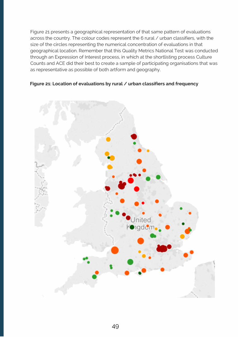
Figure 21: Location of evaluations by rural / urban classifiers and frequency
Figure 21 presents a geographical representation of that same pattern of evaluationsacross the country. The colour codes represent the 6 rural / urban classifiers, with thesize of the circles representing the numerical concentration of evaluations in thatgeographical location. Remember that this Quality Metrics National Test was conductedthrough an Expression of Interest process, in which at the shortlisting process CultureCounts and ACE did their best to create a sample of participating organisations that wasas representative as possible of both artform and geography.
49

3.8.1 Regional Analysis
The following charts present public respondent scores by the region in which the workwas presented to the public. They are presented as three figure which are arrangedpurely by region: North (North East, North West, Yorkshire); Midlands (West Midlands,East Midlands, and East of England); South (South West, London, South East). It isnoticeable that the East Midlands has higher scores on many of the dimensions,although it does have the smallest sample size as show in Figure 20.
Figure 22 - Aggregated public response dimensions across the North of England
50

Figure 24 - Aggregated public response dimensions across the South of England
Figure 23 - Aggregated public response dimensions across the Midlands
51

To what extent did evaluations in rural and urban areas attract different profiles in termsof dimension scores? Figure 25 summaries the aggregate public responses by rural /urban areas across seven of the dimensions (concept, presentation, distinctiveness,rigour, relevance, challenge, and captivation). As the chart demonstrates there are noconsistent variations in the profile of public dimension scores as you move from themost rural areas (rural 1) to the most urban (urban 6). In other words, distinctiveness isnot being rated much higher in urban as opposed to rural areas.
Figure 25: Aggregated public response for 7 dimensions across rural / urban areas
52

Figure 26 below presents aggregated public response across the rural and urban areasfor the other 2 dimensions, enthusiasm (‘I would come to something like this again’) andlocal impact (‘it is important that it’s happening here’). Given the differential access tocultural provision in rural as opposed to urban areas, one might expect public ratingsfor ‘enthusiasm’ in more rural areas to be high, and they were (higher than in other urbanareas). Similarly, one would naturally hypothesise that local impact scores would alsoattract high public ratings in rural areas. In this cut of the data, the rural status alone doesnot seem to have a strong influence on local impact scores.
However, it is also true to say that these findings show no evidence that well servedaudiences in strongly urban areas (urban 5 and 6) are ‘jaded’, or significantly lessenthusiastic about the work they are viewing, than those in rural areas, or relatively lessurban areas (urban 3 and 4). In contrast, enthusiasm and local impact scoreswere impressively high, particulalry in areas urban 5 and 6.
Figure 26: Aggregate public response for enthusiasm and local impact by rural /urban area
53

The regional analysis charts presented thus far include the evaluations conducted bythe Royal Shakespeare Company (RSC), whose work takes place in a location defined asrural (Rural 1). They are therefore an anomaly in the funded portfolio, being a large scalerecognised ‘national’ company, with an international reputation, but located andpresenting work in an area defined as rural. In the Rural 1 area – ‘mainly rural’ – therewere 7 evaluations in the study overall. The small sample of 7, which includes data fromone of the largest organisations in the cohort, is unlikely to be representative of the fullscope of work produced and/ or performed in the most rural communities in England.
Are there any noticeable regional differences by artform? Figure 27 presentsaggregated public dimension scores across 3 dimensions (challenge, distinctivenessand relevance), cut by broad artform (music, theatre, dance, literature, and film), andthen our rural / urban classification areas (numbered 1 to 6 for each art form with amatching set of public responses to the 3 dimension questions). It is interesting to lookvisually at the profile of the dimension scores (for the 3 metrics) by the rural / urbanarea for each artform. The chart shows quite clearly that music and theatre have quitesimilar profiles across the rural and urban regions in this study, whereas visual arts,dance, literature and film have more pronounced differences in regions and dimensionprofiles.
We would be cautious about this data, as of course we have much less data in someareas, but if the quality metrics are used widely across the cultural sector it illustratesthe potential to start to map audience response by geographical location of the workand explore how far this may impact on the sentiments of public respondents to thequality of the work. This is particularly so when the audience profiles of the audiencesare included within the analysis (Culture Counts users can view their results in theCulture Counts dashboard cut by age, gender, and download their results and matchingpostcode data into a CSV file for further analysis).
54

Figure 27: Aggregated public scores across 3 dimensions cut by artform and rural /urban area
55

3.8.2. Does touring work get different receptions in different places?
One obvious way to explore regional differences is to examine whether touring workgets a different reaction from the public in different places. Given the limited number ofexamples available in the test, it isn’t sensible to look at patterns in the wider datahowever a case study from English Touring Theatre does provide some interestinginsight to potential factors influencing dimension scores.
CASE STUDY: ENGLISH TOURING THEATRE
Does having a collaborative relationship with a host venue have an impact ondimension scores for touring companies?
As a touring company, English Touring Theatre (ETT) had a different experience tomany of the other users throughout the Quality Metrics National Test. They wereusing the metrics and the Culture Counts platform to evaluate one specific work,The Herbal Bed, in different locations across the country. Evaluating one piece ofwork in different locations enables the organization to compare the reception of thework across locations. And it wasn’t just the audience’s experience; ETT alsomeasured the experience of peer and self assessors in each location.
As the staff were not able to travel to each venue, it was decided that the mostpractical method to collect public responses would be to use the ‘Online’ method,whereby an email would be sent to attendees after the performance to ask forfeedback. In order for this to be successful, ETT needed to rely on the cooperationof the host venues. Offering to share their results with the host venue, this wasgenerally not a problem. However, it certainly proved a challenge in one case,where one venue chose to not assist in the collection of public responses. Thisresulted in no public responses being gathered for that particular venue, which wasnaturally frustrating for ETT. That said, they were still able to gather peer and selfresponses which have contributed to their overall evaluation.
When comparing the public responses across the three locations, the shape of thegraph remains constant. However, responses in Northampton were consistentlyhigher than in Oxford and Liverpool, and generally the lowest scoring was present inOxford. When comparing the results between Oxford and Northampton, thedimension with the largest difference in scoring was Local Impact, with a 10%difference between the two locations. Whilst this may not seem a large difference,when comparing with the average differences at 4.8%, its significance can beappreciated. Something worth highlighting here is that The Herbal Bed wascoproduced with the host venue in Northampton.
With very special thanks to English Touring Theatre for sharing their results and insight forthis case study.
56

This collaboration might have resonated with the audience in a particular way,causing them to feel a stronger attachment to the work, as opposed to otherlocations and venues. There could of course be other things playing a part – this iswhere perhaps looking at demographics and other cultural activities in the variouslocations could also be of interest.
The chart below compares the different scorings across the locations and thepercentage in difference between the highest scoring location and the lowest forpublic respondents is marked above the bars:
Despite the smaller sample sizes of peer and self assessors, the results theypresent are interesting and highlight the importance of variety within the differentrespondent groups.
The self assessors were from the creative team at ETT, and yet they scored theproduction very differently. Is this due to the fact that each self assessor focuseson a different element of the production, and therefore takes a different approachto assessment? Or is it because their individual backgrounds within the culturalsector have caused them to receive the production differently? The differentperspectives revealed in the self assessment highlight the value of using multipleassessors. Results such as these broaden the discussion surrounding creativeintention.
The peer assessment presents a similar reception to that of the public assessment,where the Northampton production generally scored highest. The responses frompeers can be subject to how well they know the work of the organisation and theirprevious experience as a reviewer.
57

The results largely mirror with what could be expected in comparison with broadertrends emerging from the Quality Metrics National Test: for example, the differencebetween the public and peer scores for the Distinctiveness dimension is large. Inaddition, the peer assessors tend to score lower than the self assessors.
Upon greater reflection, it seems that the significance of the coproduction betweenthe host venue in Northampton and English Touring Theatre must not beunderestimated, as it seems from the scores that the experience of that productionwas more positively felt by all the respondents. The value of the insight being thatETT could explore this notable difference as a point of reflection when reviewing theproduction and planning future work.
3.9 For the same evaluations are there any marked differences betweenonline and interviewer modes of data collection?
We had 14 evaluations which used both interviewer and online methods of datacollection where at least ten responses were collected by each method.
In 4 evaluations, there was a consistent pattern towards higher dimension scores foronline surveys. In a further 4 there was a consistent pattern towards higher dimensionscores collected via interviews. In the remaining 6 there were no patterns between thetwo delivery methods. The difference between scores were picked up if there wasgreater than a 5% difference between delivery methods. In the 8 evaluations with clearpatterns, the differences were present for at least 3 different dimensions. In 2evaluations, a difference of more than 10% was picked up for at least 3 dimensions (1had higher scores by interview, the other via online delivery). None of the dimensionswere more likely to have a discrepancy between delivery method than another.
This sample suggests that there is no direct or consistent effect of the delivery methodon dimension scores.
Given the small sample size – both in total evaluations and the very low threshold of aminimum of ten responses via each method, it is difficult to confirm whether this wouldbe observed at a larger scale.
If more data is collected on regional touring work, allied to a more detailed analysisof audience breakdowns and other relevant metadata, some enduring patterns mayemerge in particular places and / or presenting venues. For example, it is possiblethat the reputation of a hosting company / presenting venue may have an inflatingaffect on some aspects of public dimension ratings. Or may be that a strong localimpact effect is visible that relates directly to rural / urban classifiers. We wouldneed more data to start to confidently explore these types of questions.
58
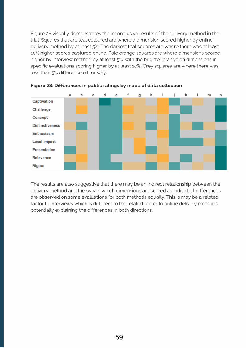
Figure 28 visually demonstrates the inconclusive results of the delivery method in thetrial. Squares that are teal coloured are where a dimension scored higher by onlinedelivery method by at least 5%. The darkest teal squares are where there was at least10% higher scores captured online. Pale orange squares are where dimensions scoredhigher by interview method by at least 5%, with the brighter orange on dimensions inspecific evaluations scoring higher by at least 10%. Grey squares are where there wasless than 5% difference either way.
Figure 28: Differences in public ratings by mode of data collection
The results are also suggestive that there may be an indirect relationship between thedelivery method and the way in which dimensions are scored as individual differencesare observed on some evaluations for both methods equally. This is may be a relatedfactor to interviews which is different to the related factor to online delivery methods,potentially explaining the differences in both directions.
59
4. CHAPTER FOUR : Digging Deeper into Data
4.1 Introduction
In designing the data collection and analysis strategy for this Quality Metrics NationalTest, Culture Counts were clear from the outset that a suitable artform categorisation,representing the breadth and diversity of the work being evaluated, was needed tomeet our aspirations to bring real granularity and subtlety to our aggregated analysis.
In creating that artform categorisation there was a clear opportunity to obtain termsused by the sector and represent them in a semantic data model. Not only does thisenable broad artform categorization and aggregate group analysis but it also meansthat individual attributes of work, such as whether it is contemporary, immersive orperformed by community artists can also be grouped and interpreted in the aggregateresults.
This chapter explores some early analyses using data cuts exploiting those artformattributes. There are many more possibilities for exploration enabled by this dataset andthe flexibility of this categorization enables combinations of attributes and artforms thatfor example accurately describe work that is multi-disciplinary. Moreover, it enables agrowing way of categorizing work produced by Major Partner Museums (MPMs),particularly around subject matter.
The terms referred to throughout this paper are used in a minimum of 5 evaluations.With a larger dataset for robust analysis of the influence of artform attributes, thisnumber would be higher, but for the purpose of testing the potential of these methods,creating a starting set to demonstrate some of the questions that can be asked of thedata, this was deemed the smallest figure that would retain anonymity of thecontributing underlying data. It should also be noted that attributes were not added tothe metadata where it wasn’t specified, so not all performances in the cohort will havebeen labelled with ‘performance’. This was because it could not be accurately inferredcomputationally with the data available.
Based on the terms provided to us by the participating organisations, and using theapproach outlined in Chapter 2, artforms were defined with logic developed by theCulture Counts team. Examples of this logic is as follows:
Sensory artforms: sound, visual, movement Broad artforms: theatre, music, dance, literature, film Artforms are defined in broad and narrow terms. e.g. all music is sound, but not allsound is music. Visual is a broader term for film Sound is a broader term for music.
60

Figure 29 illustrates the artform categories that were used in at least 5 evaluations in thenational test. Any number of artforms can be assigned to a piece of work, and in somecases inferred terms were used. Inferred terms were only assigned where a narrowerterm was used without a corresponding broader term as suggested above. It is notedthat these terms may require grammatical consistency in future iterations of this datamodel but it was decided here that the language provided by organisations should beretained.
Figure 29: Inferred Artform Terms
Movement is a broader term for dance Detailed artforms must be associated to a broad and/ or an appropriate sensoryartform: Visual is a broader term for sculpture. Movement is a broader term for dance, which is a broader term for ballet.
61
This diagram is purely for illustrating the lines of inference. It does not cover the fullspectrum of artform terms that can be accommodated within this model, nor does itindicate the cross-artform possibilities of the work evaluated in this study. For museum-curated work or combined art presentations in our analysis, artform attributes have beenassigned and are not covered in this diagram.
It is also noted that the key is a guide and in some cases an artform crosses into twobroader categories, for example physical theatre is both a type of theatre and has asensory form of movement. It can also be argued that some artforms, e.g. theatre, is asensory amalgamation, hence the use of it as a distinct broad term.
A further use case is that there are many more dance works covered in the evaluationsin addition to ballet. In other cases, the dance had attributes rather than detailedartforms, such as contemporary or hip hop. More detail is provided on artform attributeslater in the chapter.
An initial aggregate analysis looked at these broad and sensory categorisations to viewany overall dimension profiles (see Figure 30). As this chart clearly shows, the (public)profiles look very similar.
Broad artforms and sensory artform categorisations do not, generally, have distinctivedimension profiles, notable exceptions are for literature, and the public scores forchallenge and relevance. Looking generally at sensory artforms – visual sits below theaverage and sound sits above it for ‘high scoring’ dimensions (concept, captivation,enthusiasm, local impact, presentation, rigour) and movement sits above the average fordistinctiveness – a ‘lower scoring’ dimension.
62
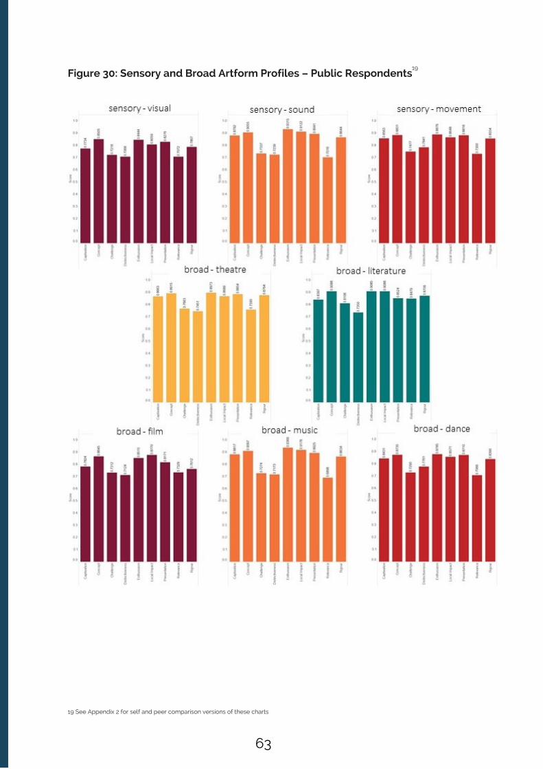
Figure 30: Sensory and Broad Artform Profiles – Public Respondents
19 See Appendix 2 for self and peer comparison versions of these charts
19
63

The categories chosen to be explored cover a large sample of the work in the study.Film as a broad term falls under visual work and was tested for differences .
The differences observed across dimensions do not fall in clear patterns in this cut ofthe data. This may be due to the mixture of artforms in groupings for two or moreartforms which could have any number of combinations, or may indeed havedifferences to do with the nature of multi-disciplinary and combined arts presented indifferent ways.
4.2 Do multidisciplinary pieces of work produce dimension profiles thatare distinctive as compared to single art presentations?
As the following figures show, multidisciplinary work does seem to produce differentdimension profiles than work described with purely one artform.
The charts can be read with the coloured section to the left as a single artform; lightgrey as that artform with one other artform defined; and dark grey with two otherartforms defined.
20 See Appendix 2, Chart A1
20
Figure 31: Multidisciplinary Profiles - Public Respondents: visual
64

Figure 32: Multidisciplinary Profiles - Public Respondents: music
Figure 33: Multidisciplinary Profiles - Public Respondents: dance
65

Figure 34: Multidisciplinary Profiles - Public Respondents: theatre
Figure 35: Multidisciplinary Profiles - Public Respondents: literature
66

4.3 Detailed Artform Analysis
What of detailed artform comparisons? Perhaps as one might intuitively expect,different artforms do have distinctive dimension profiles – but this only becomes clearwhen detailed artforms are considered in their own right. Figure 36 is a respondentcomparison chart looking at the detailed artform term of opera.
Figure 36: Detailed Artform Respondent Comparison: Opera
Interestingly here, peer and public scores sit above the overall aggregate baselineaverage scores. Moreover, the three lower scoring dimensions – distinctiveness,challenge and relevance – do not follow the aggregate pattern for music or soundeither. This starts to show the influence of opera as an inflator on these dimensions inthis particular study. It may be of note here that the opera work included in the trial maynot be representative of opera ‘at large’.
Further data cuts (with more data available) could consider these opera works withrespective attributes, such as presentation (broadcasting and live performance),chronological interpretations (contemporary, new, revival), or key performers ordirectors (potentially cross-referencing with other datasets such as operabase ).
Figures 37a-l shows the dimension profiles for public responses across a variety of otherdetailed artforms. Notable differences start to emerge in basic patterns.
21 http://operabase.com/
21
67

Figures 37a, b, c & d: Detailed artform profiles – public respondents
68
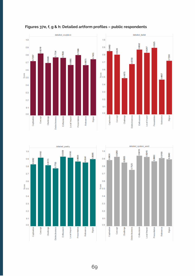
Figures 37e, f, g & h: Detailed artform profiles – public respondents
69
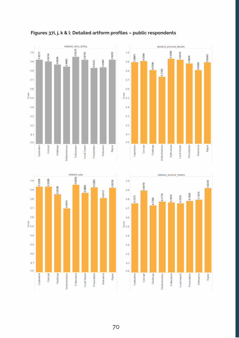
Figures 37i, j, k & l: Detailed artform profiles – public respondents
70

For comparisons with self prior and peer responses for these detailed artforms, pleaserefer to the Supplementary Data Charts, in Appendix 2. The variations existing for eachartform could be for a variety of reasons, not least the particularities of the workevaluated in this QMNT. Exploring these differences requires dialogue and debatewithin and across artforms; a process that is certainly preferable to speculation here.
4.4 Artform Attributes
Artform attributes were assigned to the majority of the evaluations in this study. Itemerged very quickly when gathering artform data from organisations that simply anartform categorisation did not accurately portray the essential context for thoseartforms. Moreover, for some work which does not fit in to artform categorisations, suchas work produced by MPMs, a flexible data model was required to capture suitablemetadata beyond artform. Attributes were kept as they were provided by theparticipating organisations i.e. no inference was applied. This work also provides a basisupon which to better understand the minimum metadata fields to start to delve in toartform analysis. Table 4 lists the emerging artform attribute fields, with commonexamples from this study. In the analysis charts that follow, only terms used at least fivetimes have been included.
Any number and combination of attributes can be accommodated by the data structure.
71

Table 4: Artform Attribute Fields
It is recognised at this stage that these categories are first attempts at categorisingattributes linked to artforms. This will undoubtedly expand as more data is collected,both in terms of extending the fields, and the terms within fields.
Artist Attribute
Audience
Chronology
Genre
Locality
Medium
Person
Place (culture)
Presentation
Process
Purpose
Subculture
Subject
Transaction
young, disability
children, community
contemporary, traditional
documentary, comedy
school, outdoor
digital, percussion
Shakespeare, Mozart
indian, welsh
festival, installation
creative, writing
participation, conceptual
jazz, punk
christmas, social
immersive, interactive
ATTRIBUTE FIELD EXAMPLES PROVIDED BY THE PARTICIPATINGCULTURAL ORGANISATIONS
72

Figure 38 compares self, peer and public ratings for circus work evaluated within thisstudy.
Figure 38: Presentation Respondent Comparison: Circus
4.5 Presentation Analysis
The presentation of art can be a significant component of how that art, or combination ofarts is defined. Therefore, assigning a presentation method can be a useful way ofsegmenting the data. For example, that is very much the case with circus, cabaret, ormulit-arts festivals which are by nature combined in form. If we sought to assigndetailed artform attributes to say cabaret (singing, dance, theatre) it would not aid theanalysis process in this case where the distinctiveness comes from their combinednature and the mode of presentation.
The above chart really highlights the public popularity of circus, particularly on thedimensions which generally score highly across the portfolio – captivation, concept,local impact, presentation, and rigour, with an inflated score on a ‘lower’ scoringdimension - distinctiveness. Lower scores on challenge and relevance are perhaps to bemore typically anticipated with this presentation method, although of course variationbetween specific productions would be expected.
For more respondent comparisons on different presentations of work, please refer toAppendix 2: Supplementary Data Charts.
73
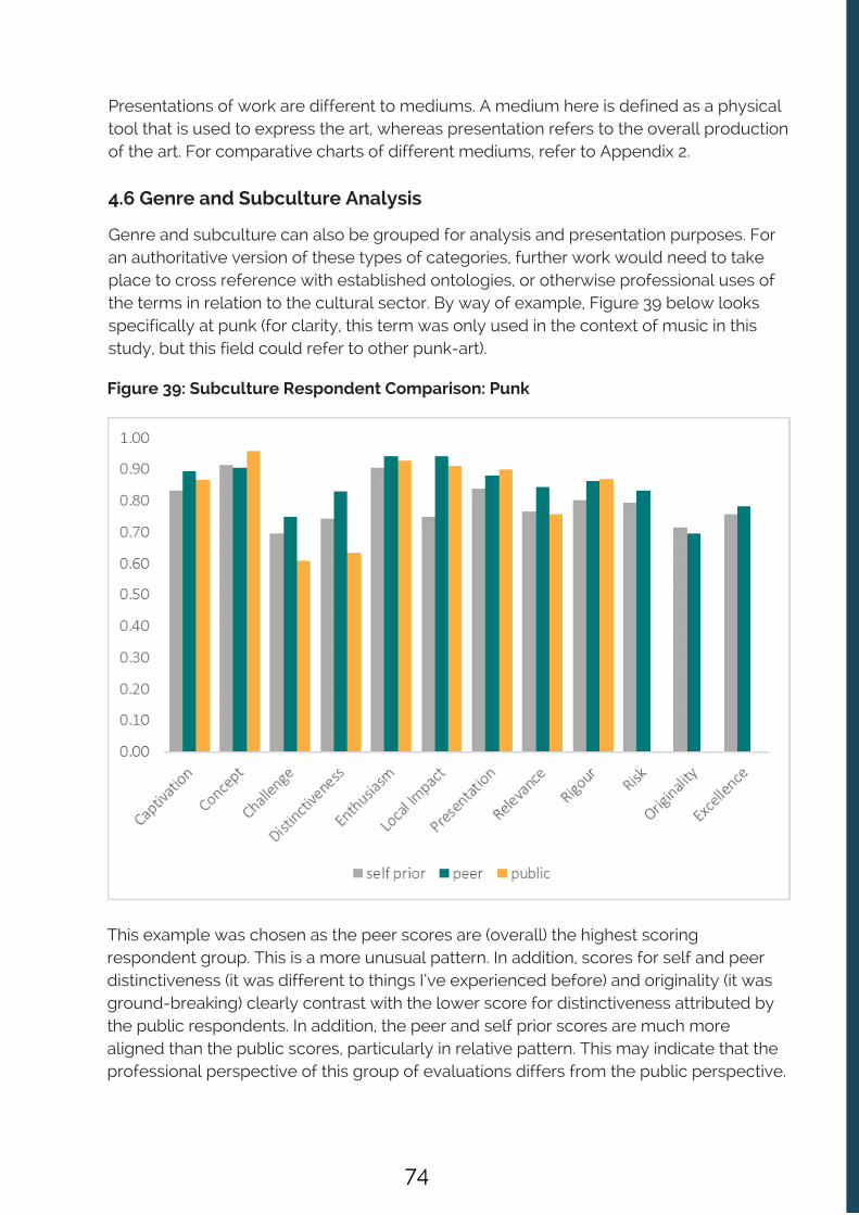
Figure 39: Subculture Respondent Comparison: Punk
Presentations of work are different to mediums. A medium here is defined as a physicaltool that is used to express the art, whereas presentation refers to the overall productionof the art. For comparative charts of different mediums, refer to Appendix 2.
4.6 Genre and Subculture Analysis
Genre and subculture can also be grouped for analysis and presentation purposes. Foran authoritative version of these types of categories, further work would need to takeplace to cross reference with established ontologies, or otherwise professional uses ofthe terms in relation to the cultural sector. By way of example, Figure 39 below looksspecifically at punk (for clarity, this term was only used in the context of music in thisstudy, but this field could refer to other punk-art).
This example was chosen as the peer scores are (overall) the highest scoringrespondent group. This is a more unusual pattern. In addition, scores for self and peerdistinctiveness (it was different to things I’ve experienced before) and originality (it wasground-breaking) clearly contrast with the lower score for distinctiveness attributed bythe public respondents. In addition, the peer and self prior scores are much morealigned than the public scores, particularly in relative pattern. This may indicate that theprofessional perspective of this group of evaluations differs from the public perspective.
74

Figure 40: Transaction Respondent Comparison: Immersive
4.7 Examples of other Attribute Dimension Profiles
Immersive
Figure 40 summaries a transaction respondent comparison – for immersive work. Thetransaction category is somewhat a misnomer as it implies something more concretethan the terms it encompasses here. Transaction is the mode or description of a humanexperience and importantly, the interaction with surroundings in some way e.g.experiential, interactive, immersive. These terms in some cases may be considered assynonyms, but at this stage of the attribute development process, each word is held inits own right as there are conceptual differences as well as overlap.
Interestingly for work defined as ‘immersive’ in this study, the public and peer ratingsare much higher than the aggregate average for challenge, distinctiveness andrelevance (the ‘lower’ scoring aggregate dimensions across all evaluations). With moredata it would be interesting to explore whether ‘immersive’ work is a consistent inflatorin peer and public ratings across particular dimensions.
75

Figure 41: Subject Respondent Comparison: Christmas
As an attribute, Christmas is an important one as it represents a popular season forprogramming, particularly across theatres. Challenging, original work might be assumedto be unusual focuses for ‘Christmas’ shows, however many of the organisations in thecohort put on ‘alternative’ festive productions. This is reflected in a public score fordistinctiveness showing a relatively higher score than anticipated even by the selfassessors. This is also reflected by the relatively high scores for risk.
Participatory
Figure 42 shows self, peer and public responses for work classed as participatory workthat was evaluated within the Quality Metrics National Test. The cultural organisationswho presented and evaluated this work were not participants in the separateparticipatory metrics strand, and therefore used the quality metrics to evaluate theirevents as opposed to any of the participatory metrics, or combination of the two.Therefore, their results are reported here rather than in the participatory metrics report.
Christmas
Figure 41 presents a self, peer and public dimension comparison for ‘Christmas’ work.
76

Figure 42: Purpose Respondent Comparison: Participation
Interestingly, it seems that participatory work generally acts as an inflator on scores,particularly on the generally ‘lower’ scoring dimensions – challenge, relevance anddistinctiveness. Assuming that this work is providing relatively new experiences forrespondents which are more likely to challenge and be relevant to them, this highlightsthe importance of the development and use of the participatory metrics.
77

Figure 43: Chronological Attribute Respondent Comparison: Relevance
For more charts looking at chronological attributes, please refer to the Appendix 2.
Chronological Attributes
The final artform attribute comparison in this section looks at chronology, focussing in onone dimension – relevance (‘it had something to say about the world we live in’).Chronological attribute is assigned when a term implies something about the era inwhich the work is made.
An intuitive hypothesis would be that generally audiences are likely to experience thenewest work as the most relevant, and the oldest work as the least. Whilst of course thiswould not be a hard and fast rule for all work, the public responses do seem to reflectthis, as can be seen in Figure 43. Self prior scores also numerically follow this patternalbeit with less noticeable difference between some groups. Interestingly, peer scoresdo not follow this pattern.
78

4.8 Summary
The aim of this chapter (supported by the supplementary data charts in Appendix 2) wasto demonstrate the wider potential of combining self, peer and public ratings on thestandardised quality metrics with cross-cutting analysis rooted in artformcategorisations generated from the terms provided by the cultural sector (with thesemeta data tags attaching to individual responses within each survey and evaluationacross the Quality Metrics National Test).
As the analysis shows there is enormous potential in this approach, allowing for largerscale aggregation of the data whilst maintaining real granular detail in the results. It alsounderlines that part of the wider value of the standardised quality metrics, and aplatform like Culture Counts, is to capture both survey data and metadata at scale suchthat as the user base of the quality metrics grows, and we move from small scale togenuine big data, all kinds of patterns, subtleties, and added value analysis becomespossible, with the interpretation discussed and driven by the creative professionals thatmake the work.
79
5. CHAPTER FIVE: Cohort Engagement, Insights, and Data Culture
5.1 Introduction
Whilst these headline outputs are clearly very important, and have been fully detailed inthis report and the separate participatory metrics report, both Arts Council England andCulture Counts were also very interested in gaining insights into the data culture of theparticipating cultural organisations, and the challenges and opportunities they identified,or demonstrated, in their evaluative practice.
Nordicity, an independent consultancy, were commissioned by Arts Council England tocarry out an independent evaluation of the Quality Metrics National Test examining insome detail the views and perspectives of the participating organisations. In this chapterwe share some of the key insights gained by the Culture Counts team as to the dataculture and evaluative practices of the participating cultural organisations. Some of theparticipating organisations also took part in the separate participatory metrics strand,supported within the Quality Metrics National Test.
Recruit 150 NPOs and MPMs to take part in the Quality Metrics National Test inaccordance with the published Expression of Interest terms Provide those 150 organisations with logins to the Culture Counts system and supportthem to conduct their own evaluations Analyse and interpret the resulting data Produce an aggregated data set for all of the evaluations that took place.
5.2 Cohort engagement: ‘supporting’ not ‘pushing’
Arts Council England made it very clear to Culture Counts that whilst the aspiration wasfor every one of the 150 participating NPOs to complete 3 evaluations, with a target of 1self assessment, 5 peer assessments, and 30 public responses for each evaluation, andthat this headline target was important, it should not be treated as the priority KPI of theproject. Arts Council England were more interested in examining what proportion ofparticipating NPOs would stay engaged during the lifetime of the project and whatchallenges and barriers they faced in delivering on these aspirations.
This had a very practical implication for Culture Counts in terms of how we sought toengage with the cohort. The Culture Counts delivery team were encouraged by ACE notto ‘push’ the organisations towards the target number of evaluations. This was becausethis national test was designed to examine whether the participating organisations hadthe resources and desire to engage and carry out their own evaluations using the qualitymetrics and the Culture Counts system.
At its simplest this project has had some very clear output targets, namely:
80

Therefore, we did not directly call or email the cohort of organisations to ‘chase’ them tocomplete more evaluations or undertake more activity.
Rather our approach was to support the use of the Culture Counts platform byresponding quickly to any support requests initiated by the participating organisations.We also supported evaluation activity through the development of a wide range ofresource materials on the Quality Metrics National Test site ; and through discussions atthe Learning and Insight sessions (which that took place in December, January, February,April and May at various locations in England (see Figure 43)). These sessions builtunderstanding and interest in the project by encouraging the participating organisationsto share their evaluation experiences and their data stories. As a consequence of thisengagement approach, we gained a wide range of insights into the evaluation practicesand data culture of the participating organisations.
Figure 43: Learning and Insight sessions with the participating organisations
Participatory Learning and Insight sessions took place on:
15th December – London14th January – Manchester28th April – London29th April – Manchester10th May – Manchester11th May – London
Quality Metrics Learning and Insight sessions took place on:
26th January – London4th February – Manchester5th February – Newcastle8th February – Birmingham9th February – Bristol 28th April – London 29th April – Manchester 10th May – Manchester 11th May – London
In terms of attendance Culture Counts estimates that approximately threequarters of the active participating organisations attended one or more thanone of the Learning and Insight sessions.
22 http://www.qualitymetricsnationaltest.co.uk/resources/
22
81

5.3 The evaluative and data culture of the participating organisations asjudged by the levels of support they required
From the outset of the project Culture Counts expected the cohort of participatingorganisations to need very different levels of support. ‘Support’ in this contextencompasses a number of elements:
Support in setting up self, peer and public evaluations in the Culture Counts system Support in using the criteria for peer selection and in how best to invite peers to takepart Support with an organisation’s overall evaluation / data collection strategy and howbest to integrate the quality metrics Support with using the Culture Counts system to segment their audiences andintegrate with their surveying strategy through the Culture Counts dashboard Support with negotiating partnerships with venues not taking part in the national test Support with sharing their data with other organisations / partners Support with data manipulation and analysis
The amount of support a participating organisation sought from us was influenced bytheir overall capacity and resources; their general familiarity with software system andtools; their level of evaluation expertise; and their data analysis expertise.
Culture Counts offered support in a number of ways. A member of the Culture Countsteam could be reached over the phone or skype to talk through any support request; viaemail; or through the support portal of the Culture Counts platform
In addition, Culture Counts launched a dedicated Quality Metrics National Test websitein January 2016 and began directing the cohort to a wide range of instructional videosand other resources to help participating organisations carry out their evaluations andinterpret their data. Therefore, in assessing the support offered to the cohort oforganisations during the lifetime of the project we have reviewed both our directcontact with the participating organisations and all our web analytics for the QualityMetrics National Test site.
In broad terms, just under half the cohort required what we would label ‘high’ or‘significant’ levels of direct support (in other words the cultural organisations in thisgroup initiating multiple calls and emails across the evaluation period). Around a third ofthe cohort required moderate levels of support (initiating some calls / emails). Justunder a fifth required low levels of support (initiating a few calls / emails).
There are of course some subtleties here, in that some organisations made lots ofcontact with Culture Counts because they were trying to do imaginative things with theirevaluations, as opposed to needing ‘hand holding’ support to carry out a basicevaluation. Nonetheless, overall it is true to say that the majority of organisationsseeking the most help were those with lower capacity and / or evaluative expertise.
82
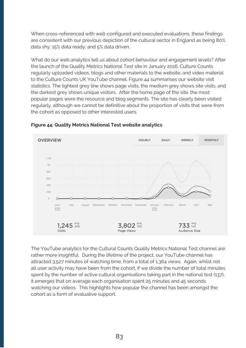
When cross-referenced with well-configured and executed evaluations, these findingsare consistent with our previous depiction of the cultural sector in England as being 80%data shy; 15% data ready; and 5% data driven.
What do our web analytics tell us about cohort behaviour and engagement levels? Afterthe launch of the Quality Metrics National Test site in January 2016, Culture Countsregularly uploaded videos, blogs and other materials to the website, and video materialto the Culture Counts UK YouTube channel. Figure 44 summarises our website visitstatistics. The lightest grey line shows page visits, the medium grey shows site visits, andthe darkest grey shows unique visitors. After the home page of the site, the mostpopular pages were the resource and blog segments. The site has clearly been visitedregularly, although we cannot be definitive about the proportion of visits that were fromthe cohort as opposed to other interested users.
Figure 44: Quality Metrics National Test website analytics
The YouTube analytics for the Cultural Counts Quality Metrics National Test channel arerather more insightful. During the lifetime of the project, our YouTube channel hasattracted 3,527 minutes of watching time, from a total of 1,364 views. Again, whilst notall user activity may have been from the cohort, if we divide the number of total minutesspent by the number of active cultural organisations taking part in the national test (137),it emerges that on average each organisation spent 25 minutes and 45 secondswatching our videos. This highlights how popular the channel has been amongst thecohort as a form of evaluative support.
83

This is confirmed by the fact that views of the YouTube channel strongly spiked duringperiods when we increased direct face to face engagement with the cohort. Figure 45shows when the channel was most popular during the national test. The largest spikesare on 10/11/15 and 16/11/15, just after Culture Counts had provided all organisationswith a login to the Culture Counts system along with their induction and opening supportmaterials which featured the link to the instructional videos on our YouTube channel. However, after this initial viewing immediately after enrolment and induction, we cansee that the predominant spikes in watch time are around the time of the Culture CountsLearning and Insight sessions on 25th January and 9th May. This confirms that face toface contact had a powerful impact on online activity suggesting that these sessionswith the cohort, at which they shared experiences and results, encouraged greater useof the support materials and increased the engagement of participating organisations inthe Quality Metrics National Test as a whole.
Figure 45: Watch Time Graph for the Culture Counts YouTube Channel during theQuality Metrics National Test .
We were also able to track which of our ‘support’ videos were watched the most, interms of total minutes watched and number of views. The most watched videos were:
Configuring the public surveyInterviewing briefing on the Culture Counts Survey Copy surveys Brief run through of the Culture Counts system Inviting self and peer assessors Logging in and setting up your first evaluation Participatory Evaluation run-through
All of which confirms that that these materials acted as an important source of supportand guidance to the participating organisations.
84
5.3.1 Engagement led to improved evaluation practice and outcomes
What also became very clear during the short span of this study (the majority ofevaluations took place in a concentrated period between January and May 2016) wasthat as the participating organisations grew more familiar with the quality metrics; andthe self, peer, public triangulation approach embedded within and facilitated by theCulture Counts platform; this in turn led to more accomplished evaluative practice andbetter outcomes, as evidenced by:
Culture Counts observing more accurately configured evaluations (i.e. no mistakes inconfiguration or in URL attribution for self, peer and public responses) asorganisations moved through the project A declining number of support calls on how to set up evaluations in the CultureCounts dashboard More interest from the cohort in ‘value adding’ activity, such as creating separateURLs for audience sub groups, and collaborating / sharing data with otherorganisations Improving data collection outcomes in terms of the total number of public responsesbeing achieved by the participating organisations
5.3.2 Engagement led to strong adherence to triangulation / creativeintention measurement
The Culture Counts team would also note that the adherence to carrying out self priorand self post evaluations is also a good indicator of cohort engagement in the project.With producing this outcome in mind, at the Learning and Insight sessions, CultureCounts shared with the participating organisations the experience of evaluating theCultural Programme of the Commonwealth Games in 2014 and the importance of theparticipating organisations building a clear sense of their creative intentions in order toinform their self assessments (the cultural organisations in the Commonwealth GamesCultural Programme evaluation prepared their own creative intentions statements foreach piece of work evaluated using the quality metrics and self, peer, and publicresponses).
We also stressed to the participating organisations the importance of building areflective community inside their organisations, so that they would be able to get moreout of their results and interpretation processes. So for example, we suggested thatorganisations could think about creating broad self assessor groups from across theirorganisation (e.g. not made up of just artistic, and curatorial staff – but also includingeducation and marketing teams) in order to enrich both the data and subsequentdialogue about results. At the Learning and Insight days we shared Figure 46 as a wayor prompting and guiding the participating organisations through this process.
23 http://www.creativescotland.com/__data/assets/pdf_file/0017/31652/Evaluating-the-Quality-of-Artist,-Peer-and-Audience-Experience-.pdf
23
85

Figure 46: Building a reflective evaluative community inside your organisation
We have already reported that self prior and post ratings were well aligned to publicratings across the evaluations in this study, showing that the self assessor communitiesdid indeed think through their creative intentions clearly and with considerablepredictive accuracy as judged by alignment with peer and public response. CultureCounts also saw interesting examples of how results were shared and discussed withinorganisations (see the following case study from Derby Museums).
INSIGHTSINTO
QUALITY
Who are our‘self’
evaluators?
What are ourcreative
intentions?
What are ouraudience
engagementaims?
Do we expectpublic and peer
scores to markedlydiffer on anydimensions?
What internalgroup could we
use to review thefindings?
86

CASE STUDY: Derby Museums
Derby Museums completed three evaluations using Culture Counts over the courseof the trial period, all of which were focusing on very different events.
The results were shared at a full staff briefing, where a cross section of the wholeteam was interested to hear the results. Using a more qualitative style of datapresented via the quality metrics enabled the team to view a more roundedperspective, as opposed to only looking at hard figures, which doesn’t necessarilydo justice to the work or its outcomes. Enabling the team to see how satisfied theircustomers were provided a real morale boost.
The results revealed some surprises, showing high levels of satisfaction whereperhaps the team hadn’t felt things had been as successful or relevant. Seeing thenuances between the different events and the scores received can be interesting,as there may be elements of the event that particularly resonated with theattendees, which the organisation may not have previously realised with such clarity. This highlighted the usefulness of the self-assessor completing both the prior andpost surveys. Through completing the self-assessments, they also realised thattheir intentions could be more focused. Having clearer intentions from the offsetwill allow the focus of the work to really come through. By mapping expectationsand experiences, a richer frame for interpretation is formed.
Combining results from the Quality Metrics survey and demographics from othersurvey providers, Derby Museums have been able to further develop theirapplications for funding. Many funding bodies have specific goals to fulfil ordemographics to reach and therefore their funds must be allocated appropriately;for example, this could be the elderly, rural communities, ethnic minorities etc.Incorporating the results from the Quality Metrics survey, Derby Museums havepresented a positive case in funding applications and funding reports. In particular,this has been useful when asked questions about the audience’s thoughts andexperiences, as they were able to refer directly to the positive feedback gatheredfrom the attendees.
There is also the potential to collect more detailed demographics and to gatherfurther data focusing on Generic Learning Outcomes. This could be achieved usingthe system as it currently stands; however, adding further questions was not activelyencouraged during the Quality Metrics National Test.
With very special thanks to Derby Museums for their results and insight for this case study.
87

5.4 Challenges, Issues and Opportunities identified by the cohort
Culture Counts received feedback on the challenges being encountered byparticipating organisations both through their direct support request and calls; andthrough their contributions at the the Learning and Insight sessions. During the course ofthe study the organisations also detailed their responses to some of these challengesand identified opportunities around the quality metrics and this type of evaluationapproach. The key challenges identified by the organisations did not relate to usabilityissues with the Culture Counts platform and dashboard (on which participatingorganisations gave positive feedback to the Culture Counts team), or the core qualitymetrics themselves. Rather the key points raised were:
5.4.1 Peer Management, Engagement and Building a Peer Community
Planning and managing the peer process was a new experience for all of theparticipating organisations and represented the greatest challenge in successfullycompleting their evaluations. Not only do organisations have to select their peers, butthey then have to invite them and secure their participation, and follow through withpeers checking that they have attended their event and completed their evaluation.Some organisations also mentioned that depending on the location of the particularevent the distance required to travel for some productions is a barrier to obtaining peerassessors . This peer engagement and management process was the most demandingpart of the process in terms of the time investment of participating organisations. Theoriginal target aspiration of engaging 5 peers per evaluation proved a very tough targetindeed (with the cohort engaging 777 peers, completing 921 assessments - 41% of the2,250 target).
The paradox around the peer review element was that whilst it was the mostdemanding element of the evaluation process, it was also seen as a very positive aspectof the Quality Metrics National Test. Participating organisations agreed that, irrespectiveof what happens around the future use and development of the quality metrics, one ofthe vital legacies of this project is the bank of peers who have been engaged for the firsttime in this formal way to give feedback on work across the cultural ecology. This wasregarded as a hugely positive thing. We also saw innovation, in terms of organisationsseeking peers from other artforms to review their work as they wanted a broaderinterpretative context to be reflected in their peer ratings. At the Learning and Insightsessions there was considerable discussion around how to secure ongoing benefitsfrom this legacy of a newly engaged community of peers.
Participating organisations welcomed the opportunity to invite their own peers. Strongsupport was also expressed for the idea that as a result of this national test a peerdatabase is formalised across the arts and cultural sector – in other words support isgiven to create an open searchable data base of peers for the sector to draw on – inwhich each peer could list their artform expertise and interests.
24 For example, see http://www.qualitymetricsnationaltest.co.uk/new-blog/2016/5/3/royal-shakespeare-company
24
88

Some of the participating organisations also showed interest in the idea of creatingstable cohorts of peers for their work, who they would use to track peer sentiment overtime, with that cohort becoming well placed to assess changes and inflections in theirapproach and work over time.
5.4.2 Enhancing Peer Continuing Professional Development
One clear potential deficit in the current process identified by some of the participatingorganisations was that having secured the engagement and participation of their peerevaluators, they had received feedback from peers that they had found the process ‘tooshort’. Peers would have happily answered more questions and would have welcomedmore discussion around the results.
Clearly, the length of the quality metrics question schedules has no bearing on how thepeer community is engaged around the results. Even with the current peer dimensions,and additional open questions, organisations could choose to bring their peer evaluatorstogether on a conference call to discuss their opinions and evaluations, and theirreactions to the triangulated self, peer, and public ratings.
By way of international comparison here, the Department of Culture and the Arts inWestern Australia, which is now using the quality metrics and the Culture Countsplatform with all of their funded organisations, believes that the baseline quality metricsdata that is being collected by the organisations in their funded portfolio is giving themthe ability to open up ongoing, consistent long term relationships with peers, with thebaseline data becoming the starting point for dialogue and discussion about the qualityof work being produced.
These observations notwithstanding, the feedback from the participating organisationssuggests that the current evaluation process may be under utilising the insights thatcould come from the peer evaluation process, both for the organisations, but also interms of critical reflection and continuing professional development for the peers.
The participating organisations made a number of suggestions on possible additionalquestions that could be asked of peers:
‘Should we be asking more open reflective questions?’ ‘Many peers are active artists/curators: should we be asking them about whether the piece ofwork they saw made them reflect on their practice or work?’ ‘Should we be including, or encouraging organisations to include open questions about theartform contributions of the piece they saw?’ 'Should we be asking an open question about how might / could the piece of work beenimproved? Are we missing a learning loop here?’ Organisations also discussed how the peer’s interpretative context is vital. The currentACE AQA form asks the assessor – ‘Please give details of the context you bring to thisassessment etc.’ Organisations noted: ‘Should we be including a similar open text questionfor peers?’
89

What is encouraging about these suggestions from the participating organisations is thatthe ease and quickness of giving feedback via the Culture Counts platform actually leftsome peers feeling they would like to have to been engaged more. Meeting thisdemand needs to involve the right mixture of post event discussion and engagementaround their feedback and overall results, and the use of some additional peerquestions.
Engaging with peers so that they get something out of the process in terms of theircontinuing professional development is clearly an important outcome. Given howimportant the participating organisations thought the creation of a peer community wasas a legacy outcome of this Quality Metris National Test, Culture Counts will seek towork with users to explore how to meet these requests.
The self, peer and public triangulation at the heart of the quality metrics processrequires building dialogue and understanding across an interconnected community inthe arts and cultural sector. Figure 47 (‘sine wave’) and Figure 48 (‘Jackson Pollock’)visualise how deeply inter-connected the community in the Quality Metrics NationalTest were.
In both visualisations, the key elements are:
Orange circles = self assessors Teal circles = peer assessors Grey circles outlines = evaluations Grey lines = individual assessor connected to an individual evaluation
So for example, with regard to Figure 47, this depicts a sine wave type shape made upof orange circles (self assessors); teal circles (peer assessors) and grey circles(evaluations), with the grey lines linking the self and peer assessor to an individualevaluation. This chart, and the ‘Jackson Pollock’ chart, very clearly demonstrate theinterconnectedness of the national test evaluations and peer assessors.
90
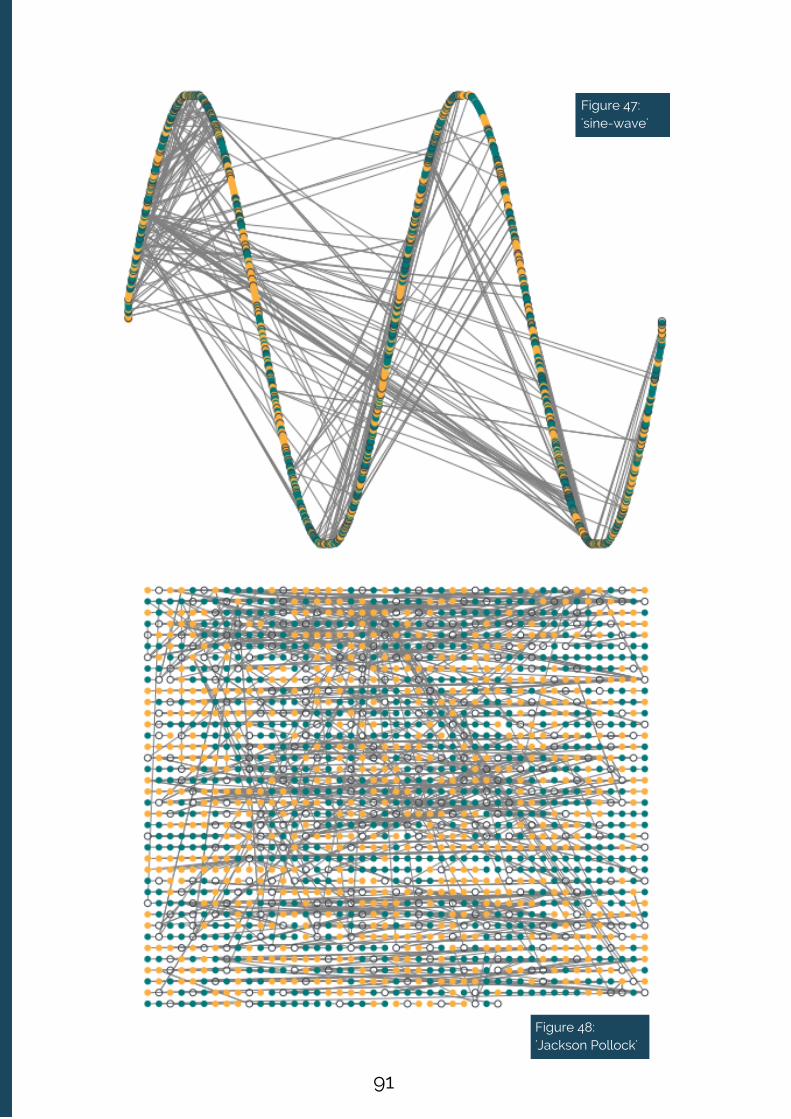
Figure 47:'sine-wave'
Figure 48:'Jackson Pollock'
91
5.4.3 Integration with other databases; online databases; and ticketing /CRM systems
At the Learning and Insight sessions the participating organisations asked a range ofquestions about how a system like Culture Counts could integrate with the otherdatabases, tools and CRMs they already use. The organisations were both interested inthe future possibilities for integration with existing systems, and informed by the desireto ensure that their evaluation activity in the round is as efficient and as effective aspossible both now, and in the future. Broadly speaking their key questions, and CultureCounts responses, were as follows:
Culture Counts and future interoperability: Culture Counts as a software system hasbeen conceived and built from inception to ensure ease of inter-operability with bothopen source and commercially provided data base tools and CRM systems. CultureCounts has a fully documented API, and as a native software company CultureCounts is planning a range of API integrations with other providers. Given the likelyproliferation of data tools it is important that providers can demonstrate an opennessand facility for such integration.
Using the quality metrics with CRM based audience segmentations: We wereasked by a number of participating organisations to support this type of activity, andwe saw organisations innovate around segmenting and reporting their data. Thisnormally involved creating different respondent groups – for example differentgroups of public respondents (e.g. regular attendees; TV audiences vs liveaudiences), and then using the Culture Counts system to create distinctive surveys(often with additional customer questions) and URLs for however many groups theywanted to focus on in their analysis. The most common question (see 5.4.4) beingadded in to the surveys related to organisations segmenting their respondents byprevious attendance.
Interpreting results by demographic profile of respondents: The Culture Countsplatform collects basic demographic data (age, gender, postcode) and can beconfigured to collect more. In response to requests from some of the participatingorganisations we provided materials at the Learning and Insight sessions on how theycould upload their postcode data from their quality metrics evaluations to opensource demographic profiling tools, such as GeoConvert , which is based on ONSdata.
5.4.4 Integrating with existing evaluation practices – adaptation andinnovation
In both this quality metrics strand, and the participatory metrics strand, thoseorganisations with well developed evaluation frameworks and practices had to thinkcarefully about how best to integrate their quality metrics evaluation work alongsideother evaluation activity they already had planned or were committed to.
21 http://geoconvert.ukdataservice.ac.uk/
21
92

Sometimes these integration challenges concerned using the metrics within multi-stranded evaluation approaches; or focused on how to design surveys and manage theirdistribution through a range of URLs targeting different audience segments in ways thatadded value to existing evaluation activity.
In practical terms these issues of integration and complementarity need to be exploredby users in real evaluation examples. However, a few general comments can be madeat this stage. Culture Counts as a data collection platform can be used to ask any‘closed’ or ‘open’ question and generate data from self, peer and public respondents,with multiple URLs for each survey directed at sub-sets of self, peer and publicrespondents. Therefore, it is a straightforward data gathering task to combine the qualityor participatory metrics with other bespoke evaluation efforts (and any questionschedule).
In both the quality metrics and participatory metrics strand, one response to thisintegration challenge saw participating organisations innovating in their survey designs,adding in bespoke questions or picking additional questions from the Culture Countsinterface. It is important to remember here that as part of the EOI terms all participatingorganisations had agreed to use the quality metrics in their standardised format, andCulture Counts did not actively encourage the participating organisations to create newbespoke questions. However, it was of course made clear to users that the CultureCounts system allowed them to use and generate other questions as this is an intuitivefeature of the user interface.
So how much bespoke innovation around metric choice and creation did we see in thisquality metrics strand of the Quality Metrics National Test? In total, 485 customquestions were added to surveys in spite of no recommendation from Culture Countsencouraging organisations to do so. The appetite to innovate (but also ask audienceslots of questions) is clearly present. Most questions were used between one and threetimes, indicating the tailoring of questions to individual pieces of work or organisations.The top 5 custom questions used by a variety of organisations were as follows, andrepresent:
22 Culture Counts has produced a separate participatory metrics report from the Quality Metrics National Test which contains a detailed account of theequivalent set of metric choices and design innovations carried out by the participating organisations.
22
a) A desire to segment: ‘Have you visited [org name] before?’ (the most popular additionalquestion)
b) Insights into marketing impact: ‘How did you hear about the event?’
c) Connections with audience demographics: ‘How would you describe your ethnicity?’
d) Gauging the accessibility of work: ‘Do you consider yourself to have a disability?’
e) Encouraging additional open ended feedback: ‘Do you have additional comments?’
93

The Culture Counts system captures which questions are being asked most frequently,both from the established quality and participatory metrics sets, but also new bespokequestions with an art-form or audience focus. As users endorse the established metrics,and new bespoke questions, through frequent use, this offers up the opportunity toconsolidate them by theme (e.g. artform; cultural consumption; marketing; net promoterscore etc.) in the Culture Counts dashboard and offer them to users. This is vital inbuilding knowledge and expertise around evaluating cultural value across the sectorglobally; encouraging the exchange of views and data; and ensuring a lively, openconversation about what quality is and how we interpret the data arising from thesetypes of metrics and evaluation approaches.
In terms of additional metrics being chosen by the participating organisations,interestingly, alternative dimensions available in the Culture Counts dashboard wereselected 163 times across 22 organisations. The top alternative dimensions were:
Diversity: ‘It could engage people from different backgrounds’Meaning: ‘It moved and inspired me’ Growth: ‘It could appeal to new audiences’ Currency: ‘It made me reflect on the world we live in today’ Platform: ‘It has the potential to inspire other artists and artforms Like: ‘Finally, what were your overall feelings about the work’ Inquisitiveness: ‘It made me want to find out more about the work’ Atmosphere: ‘I enjoy the atmosphere here’ Innovation: ‘It was introduced to the audience in a new way’ Connection: ‘It helped me to feel connected to people in the community’
A particular interesting example of how organisations approached the integration of theparticipatory metrics through combining them with new metrics, or by using variationsof the existing metrics, was Ludus Dance.
CASE STUDY: Ludus Dance
How the identity of the work can shape metric choice
Ludus Dance is an organisation that had signed up to be a part of the Quality MetricsNational Test, whereby the focus was on testing the quality metrics. That said,Ludus made the choice to experiment further with the metrics, choosing theirmetrics according to respondent type. They also added a further respondent groupby including the participants, and testing the participatory metrics, within oneparticular evaluation. This took place over their event The Lancashire Youth DanceFestival. The Festival was a combination of two days of dance workshops andclasses, followed by a showcase which was open to the general public, as well asfriends and family of the participants.
With very special thanks to Ludus Dance for sharing their data and insight for this case study.
94

Through choosing their own metrics in what could be considered a more organicapproach to metric selection, a further layer is understood in the organisation’sintentions or focus of the work. Interestingly, although different metrics were used toacross the respondent groups, peer, self, public and participants, we can seesimilarities in the themes.
The selection of the below metrics indicates the importance of inclusivity andconnection between those from different backgrounds, both amongst the audienceand the participants. Interestingly, Growth is the only metric Ludus chose for thethree respondent groups: public, peer and self.
Audience: Growth: It could appeal to new audiencesSelf: Collaboration: It connected other artistsSelf: Growth: It appeals to a large community of interestParticipants: New people: I got to know people who are different to mePeer: Growth: It could appeal to new audiencesPeer: Diversity: It could engage people from different backgrounds
When looking at the survey for the participants, Ludus’ choice of participatory metricspresents a well-rounded selection. Aligned to the participatory metrics clusters, theemphasis for this piece of work seems to be on the development of the participants.
Generally, the metrics chosen were also frequently used by other organisations;however, it is worth noting that the above themes of inclusivity & connection are quitespecific to this piece of work, which contrasts with other works evaluated. In addition,the selection of the metric New People indicates that the opportunity to meet newpeople was again quite specific to this piece of work whereas in the other test eventsacross all the participatory organisations in the trial, this metric was much less likelyto be chosen. Similarly, with other work evaluated with participatory metrics, themetrics selected demonstrate the unique position the participatory activity has incontribution to the broad range of participatory work produced by organisations.
As well as the core quality metrics, Ludus has also used a metric in their audiencesurvey from the Place category, Accessibility: I find it easy to get to and from here. Whilst this is a place metric, it also relates to the importance of inclusivity, as shownoverall in the chosen metrics.
When looking at the custom questions, the use of the word ‘highlight’ features in boththe questions for the self assessors and the participants, revealing the importance ofthe experience of those that have been involved as part of both the creative andparticipating teams. Ludus also included open text questions regarding theexperience for the peer and public assessors.
95

The importance of inclusivity and opportunity for connection with those fromdifferent backgrounds amongst the participants and audience is clear when lookingat the metric choice. Not only can the metric selection enable one to see howLudus’ Festival sits amongst other participatory works, but it also enables one to seewhat makes it unique. This understanding contributes to the overall picture ofparticipatory work. Ludus’ specific focus on inclusivity and connection is stronglyfeatured, with the emphasis on the participant experience. When looking at theselected metrics collectively, across all respondent groups, we get a sense of thespecific intentions of the Festival.
A number or participating NPOs were involved in strategic touring work. This led tosome interesting innovations around sharing their results in the Culture Countsdashboard. In other words they invited other participating NPOs in the study to sharetheir evaluations directly through the Culture Counts dashboard (the platform allows auser to share surveys or results with any other registered user of the Culture Countsplatform). The project saw ten examples of this data sharing through the dashboard.One interesting variant of this was where organisations toured the same piece todifferent locations, but shared all the results in one dashboard. Those organisations thatstarted to share data in the national test through their Culture Counts dashboard tendedto do so for each of their evaluations.
Finally, by way of adaptation and integration, because some NPOs were taking part inthis quality metrics strand and the participatory metrics strand, some of their work hadoverlapping objectives and therefore those NPOs needed to gain insight into the qualityof a participatory process and the the quality of any event or performance arising fromthat participatory process (as measured through self, peer and public opinion). As aresult, we saw examples of organisations combining the quality and participatorymetrics, as described in the Ludus Dance case study.
96
5.4.5 Staff Turnover and Resource Challenges
As advised by Culture Counts, the majority of participating cultural organisationsdesignated one member of staff to be a super-user of the Culture Counts system. Inother words, on behalf of a participating organisation that super-user familiarisedthemselves with the Culture Counts system; configured the self, peer and publicsurveys; and interfaced with their colleagues around securing the requisite levels of self,peer and public feedback, including where necessary working with volunteers or frontof house teams on coordinating intercept interviewing. From the outset of the project (inevaluation terms) on November 1st 2015 to the close of the project on May 31st2016, 14% of the the originally designated super-users of the system either left their jobrole, or that role disappeared for resourcing issues inside the participating organisation.
Understandably, this was very challenging for the participating organisations in terms ofthe continuity of their engagement in the trial which definitely impacted on the ability ofsome organisations to complete the target of three evaluations. This turnover of roughlyone seventh of the initially inducted users presented continuity challenges within theorganisations evaluating, subsequently impacting on delivery of the overall project.
5.4.6 Accessibility Issues
The evaluation processes highlighted a range of accessibility challenges that needongoing attention, and the participating organisations also innovated in trying toovercome some of these issues. The specific accessibility issues identified by the cohortwere as follows:
i. Those with visual impairment would struggle to complete the survey alone with theCulture Counts interface as it currently stands
ii. Working with children and adults where English is a second language can in somecases pose difficulties in accurately understanding the questions (e.g. ‘hard to decipherbetween some specific words e.g. ‘produced’ and ‘presented’)
iii. Specific groups, such as those with dementia, pose very specific challenges.(from issues of informed consent to the appropriateness of a survey-based format)
iv. The survey response scales are unlikely to be clear enough for participants with‘complex individual needs’
v. Elderly respondents (e.g. are more likely to be unfamiliar with touch-screentechnology and have a higher chance of conditions such as Parkinson's)
iv. For ‘early years’ participants (0-8) the text base interface is not appropriate
97

In response to these challenges the organisations innovated in a number of ways. Forexample, Arnolfini adapted the survey interface into a scale of unhappy (stronglydisagree) to happy (strongly agree) faces to capture the response of the children andyoung people they were working with.
It is clear from both this strand, and the wider Quality Metrics National Test work, thatlike other digital platforms, and text based survey interfaces, Culture Counts will need towork with the cultural sector to facilitate access as much as possible. Culture Counts isalready working with partners on exploring different screen based response modes andother interface innovations alongside efforts to accommodate within the dashboard thefull range of languages in which the metrics can be expressed.
5.4.7 The language of assessment versus evaluation
In a strong mirror of the Quality Metrics National Test work on the participatory metrics,the participating organisations discussed their attitudes to evaluating their work andsharing their findings with peers and other organisations.
Organisations acknowledged that the use of standardised metrics could create anxietyaround particular pieces of work being ‘judged’ in particular ways. Clearly, these typesof evaluation approaches will only thrive if the data proves insightful to culturalorganisations, and they are encouraged and supported to explore the resulting data inways that put the emphasis on critical reflection and improvement, as opposed to anarrow emphasis on ‘audit’ and ‘performance reporting.’
The participating organisations talked about the importance of a number of enablingfactors that will help build openness across the cultural sector to these forms ofevaluations:
i. To use the language of evaluation, and improvement, as opposed to the language of‘audit’ and ‘assessment’
ii. To build understanding that the value in these types of evaluation is when they are acollaborative exercise, between the self, peer and public (and participants), in whichdialogue and reflection are vital to interpreting and gaining insights from the results.Organisations talked about the how the metrics ‘lead to useful evaluative exchanges’
iii. That insightful evaluation is about asking good questions; being open to the answers,and working through with others what they might mean
98

5.4.8 Resource and context specific challenges
Some organisations indicated to the Culture Counts team that they would have carriedout some, or more, intercept interviewing at their events if they had access to moretablets and supporting technology. In some instances, organisations were in a ‘work-around’ situation from the outset of the national test. For example, a few evaluationsinvolving rural touring work in presenting locations without WIFI or 3G/4G coverage,necessitated the use of paper versions of the quality metrics survey, with the datauploaded electronically after the event.
5.5 Summary
This chapter has detailed the contours of cohort engagement in the Quality MetricsNational Test, and explored in more detail some of the challenges, issues andopportunities arising out of this project. As the Culture Counts team expected, wewitnessed a wide range of evaluation practices across the cohort, including interestingexamples of adaptation and innovation. Overall, given the demanding nature of theoriginal EOI terms and conditions, which meant completing evaluations in a short timeframe, and balancing other evaluation commitments, we think the levels of engagementshown by the participating NPOs and MPMs was impressive, resulting in real insight andof course a very substantive data set on the quality of the work being presented.
99

What are the key conclusions that can be drawn from this Quality Metrics National Test?They cluster into three themes:
6. CHAPTER SIX: Conclusion
6.1. Self-driven scalabilityIt can be tempting when a project has met its aims to forget that at the outset of thisproject there was genuine uncertainty on the part of ACE and Culture Counts, given thedemands on funded organisations, as to whether they would sign up in large numbersto take part in this Quality Metrics National Test, and then be able to self-drive largescale evaluation activity using the quality metrics and the Culture Counts platform, allwithin what was effectively a six-month time frame for the evaluation activity. As wenoted in Chapter 1, it is therefore pleasing that 91% of the 150 participating NPOs andMPMs became ‘active’ participants in this national test.
The project has therefore resoundingly confirmed that funded arts and culturalorganisations, if offered the right tools and support, can self-drive large scale evaluationactivity, engaging in new ways with peers and audiences about the quality of their work.This would suggest that the quality metrics and the sector’s evident interest in beingable to measure their creative intentions, allied to tools that help the arts and culturalsector to collect and analyse data easily and at scale, offers up the prospect of a muchricher conversation about cultural value in the future, informed by big data.
6.2. The quality metrics and the aggregate analysis
Taken together the aggregate scores in this Quality Metrics National Test suggest:
The work presented and analysed in this study received a broadly positive responsefrom peer and public respondents, and largely met the (quite high) prior creativeexpectations of the creative teams involved in its production (self assessors) When it comes to measuring the quality of a cultural experience three dimensions inparticular - challenge, distinctiveness and relevance - generally score lower acrossall respondent categories than the other six dimensionsThe clustering of self, peer and public responses in relation to these metrics suggeststhat audiences are adept at assessing them, with their judgements showing broadalignment with self and peer responses. The participating cultural organisations largely met their creative intentions, asmeasured by the degree of alignment between their self prior scores for eachdimension and the corresponding aggregate scores for peer and public respondents Peer responses (as we have seen in all previous evaluations) are consistently loweracross all dimensions than self and peer responses
100

The strong adherence of the participating NPOs and MPMs to the self prior and postrating process within their evaluations indicated their understanding of how the self,peer and public triangulation process provides them with real insight into how far theyare meeting their creative intentions for a particular piece of work. The aggregateresults confirm that self prior and post ratings were well aligned to public ratings acrossthe evaluations in this study, showing that the self assessor communities did indeedthink through their creative intentions clearly and with considerable predictive accuracyas judged by alignment with peer and public response.
The analysis also revealed very interesting differences by artform. As we noted inChapter 3, there is a greater degree of misalignment between some sets of self priorand peer ratings on the ‘risk’ and ‘originality’ dimensions when examined by artform, withthe peer ratings being much lower than self ratings for both dimensions in some artformcategories. Culture Counts thinks these artform differences are a particularly interestingarea of future research, as are the other artform attribute differences presented inChapter 4.
If the metrics become widely used across the cultural sector, and as we move frommid-scale to big data across these types of dimensions and artform categorisations, anypersistent and marked variations in say risk ratings by artform; or between self and peerratings on risk and originality by artform; could then by explored through detaileddialogue across the sector. One outcome might be that ‘risk’ as a dimension measurefor self and peers is thickened up with additional metric components. Helpfully, the datawill inevitably drive consideration of what is notable and discussion worthy for thesector, and where insight can be gained by further development and detailed enquiry.
The aggregated data set from this Quality Metrics National Test is available from ArtsCouncil England.
6.3. The future potential of this approach
The overall evaluation approach facilitated by the features of the Culture Countssystem, mirrored in the design and analysis of the aggregate data set from this QualityMetrics National Test, allows the arts and cultural sector:
To present a very clear story on quality which does not over simplify the findings
To use flexible co-produced metadata frameworks, for example relating to artformdescriptions, to demonstrate both the variety and plurality of work being producedby the funded portfolio; and to allow a rich analysis of quality by artform and artformattribute.
101

The analyses in Chapters 3 and 4 demonstrates that there is enormous potential in thisapproach, allowing for larger scale aggregation of the data whilst maintaining realgranular detail in the results. The approach effectively unites data across thestandardised quality metrics, artform, artform attributes, and open data into a powerfulprism through which to better understand quality. As we have seen this will deepenunderstanding of how artform and certain attributes of work influence quality, and offersup the potential to produce a very wide range of analytical and reflective insights.
More broadly, the approach underlines that the wider value of the standardised qualitymetrics, and a platform like Culture Counts, is the capacity they offer to capture bothsurvey and metadata at such scale so that as the user base of the quality metrics grows,and we move from small scale to genuine big data, all kinds of added value analysesbecomes possible revealing new patterns and subtleties around cultural value.
Crucially, those patterns and the interpretation of that data will be driven and widelydiscussed by the creative professionals that make the work, ushering in an era of co-produced quality metrics, co-produced analytical frameworks, and a co-producedconversation about cultural value, informed by big data.
102

103
Richard Long, TIME AND SPACE, 2015
© Stuart WhippsCourtesy: Arnolfini
All of the cultural organisations who took part in this strand of work volunteered to giveup their time to carry out their evaluation activities, and attend the Learning and Insightsessions across the country. As this report has demonstrated, they all carried out a hugeamount of work in a comparatively small period of time.
Everyone at Culture Counts would like to thank all the individuals and organisations fortaking part, for giving up their precious time, and being so candid and generous withtheir insights.
We would also like to thank Carl Stevens, our project manager at Arts Council England,who offered constructive support throughout the project.
All errors and omissions remain ours alone.
Culture Counts Team, June 30th, 2016.
Acknowledgements
104

Appendix 1: Participating Organisations
This list contains all organisations who signed up including those who focused solely onthe Participatory Metrics Strand.
&Co.20 Stories High20-21 Visual Arts CentreAbandon Normal DevicesAction Transport TheatreAkram Khan CompanyAlbert and Friends Instant CircusAnvil ArtsArcArnolfiniArtsadminAspexBaltic MillBarbicanBattersea Arts CentreBeaford ArtsBike ShedBirminghamRepertory TheatreBirmingham Royal BalletBirmingham Symphony OrchestraBlack Country Living MuseumBook TrustBournemouth Symphony OrchestraBrass Bands EnglandBrewery Arts CentreBrighter SoundBrighton DomeBristol Museums Galleries and ArchivesBristol Old VicBush TheatreCambridge JunctionCandocoCarouselCentre for Chinese Contemporary ArtCheshire DanceChildren's Discovery CentreClod EnsembleCollective EncountersColston HallConeyContactCorn Exchange NewburyCreative Arts EastCrying Out LoudCurveCustoms HouseDada FestDance EastDance UmbrellaDARTS (Doncaster Community Arts Limited)Dash DedaDerby MuseumsDevon Guild of CraftsmenDurham County Council
Eastern AnglesEden ArtsEmergency Exit ArtsEngageEnglish National BalletEnglish Touring TheatreEntelechy Arts LimitedExtantFACTFarnham MaltingsFevered SleepFitzwilliam MuseumForced EntertainmentFree Word CentreFuel TheatreFun PalacesFuture EverythingGemArtsGulbenkian TheatreHalfmoon TheatreHalleHelix ArtsHOMEImprobableIronbridge Gorge Museum TrustJacksons LaneJazz NorthJ-NightJunctionLakeland ArtsLawnmowers Independent Theatre CompanyLawrence Batley TheatreLeeds Art GalleryLift FestivalLive TheatreLiverpool PhilharmonicLudus DanceMAC BirminghamMahogany OperaManchester Art GalleryManchester CamerataManchester MuseumMeadow ArtsMercury TheatreMerseyside Dance InitiativeMind the GapMore MusicMuseum of LondonMusic in the RoundNational Centre for Craft and DesignNational Youth Jazz OrchestraNew Vic TheatreNew Writing SouthNorfolk & Norwich MuseumsNorfolk Museums Service
Northern StageNottingham PlayhouseOldham ColiseumOxford PlayhousePavilion Dance South WestPeckham PlatformPentabusPeople's PalacePilot TheatrePrism ArtsQueens TheatreRambertRifco ArtsRoundhouseRoyal Exchange TheatreRoyal Shakespeare CompanyRural ArtsSadlers WellsSage GatesheadSalisbury Arts CentreSalisbury PlayhouseSerpentine GalleriesSeven StoriesShape ArtsSheffield Theatres TrustSiobhan Davies DanceSituationsSound and MusicSouth Asian Arts UKSouth East DanceSouthbank CentreSpike IslandSpot On LancashireSpread the WordStreetwise OperaTangle InternationalThe AlbanyThe LowryThe MetTheatre Royal Stratford EastTitchfield Festival Theatre Tobacco Factory TheatresTullie HouseTurner ContemporaryTyne and Wear Archives and MuseumsVaneWatermansWatershedWhitworth Art GalleryWolsey TheatreWolverhampton Art GalleryWordsworth TrustWriters Centre NorwichWriting SquadYork Museums Trust

Appendix 2: Supplementary Data Charts
Figure A1: Visual Arts and FilmAs a sensory artform, visual
contains the broad artform film
and many detailed artforms
and medium attributes.
Differences between visual arts
(not film) and film were
measured and the only
difference observed was for
Local Impact with a small
difference for Rigour.
Figures A2-A50: Isolated artforms and attributes by respondent categoryThe following 49 respondent comparison charts present data based on isolated artformsor artform attributes. Self prior scores are in light grey, peer scores in teal and publicscores in orange.
Figure A2: Sensory Artform – Visual

Figure A3: Sensory Artform – Sound
Figure A4: Sensory Artform – Movemennt
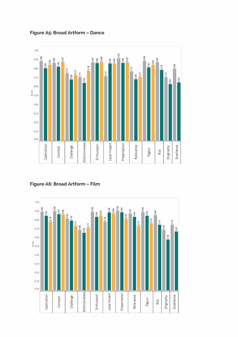
Figure A5: Broad Artform – Dance
Figure A6: Broad Artform – Film

Figure A7: Broad Artform – Literature
Figure A8: Broad Artform – Music

Figure A9: Broad Artform – Theatre
Figure A10: Detailed Artform – Ballet

Figure A11: Detailed Artform – Craft
Figure A12: Detailed Artform – Drawing

Figure A13: Detailed Artform – Musical Theatre
Figure A14: Detailed Artform – Painting

Figure A15: Detailed Artform – Photography
Figure A16: Detailed Artform – Physical Theatre

Figure A17: Detailed Artform – Play
Figure A18: Detailed Artform – Poetry

Figure A19: Detailed Artform – Sculpture
Figure A20: Detailed Artform – Spoken Word

Figure A21: Detailed Artform – Storytelling
Figure A22: Chronological Attribute – Classical

Figure A23: Chronological Attribute – Modern
Figure A24: Chronological Attribute – Contemporary

Figure A25: Chronological Attribute – New
Figure A26: Genre – Comedy

Figure A27: Genre - Documentary
Figure A28: Genre – Drama

Figure A29: Medium – Ceramic
Figure A30: Medium – Digital

Figure A31: Medium – Electronic
Figure A32: Medium – Mixed

Figure A33: Medium – Orchestral
Figure A34: Medium – Screen
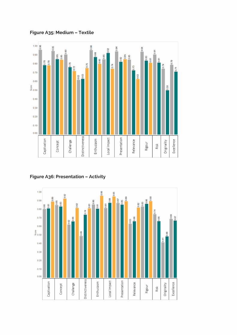
Figure A35: Medium – Textile
Figure A36: Presentation – Activity
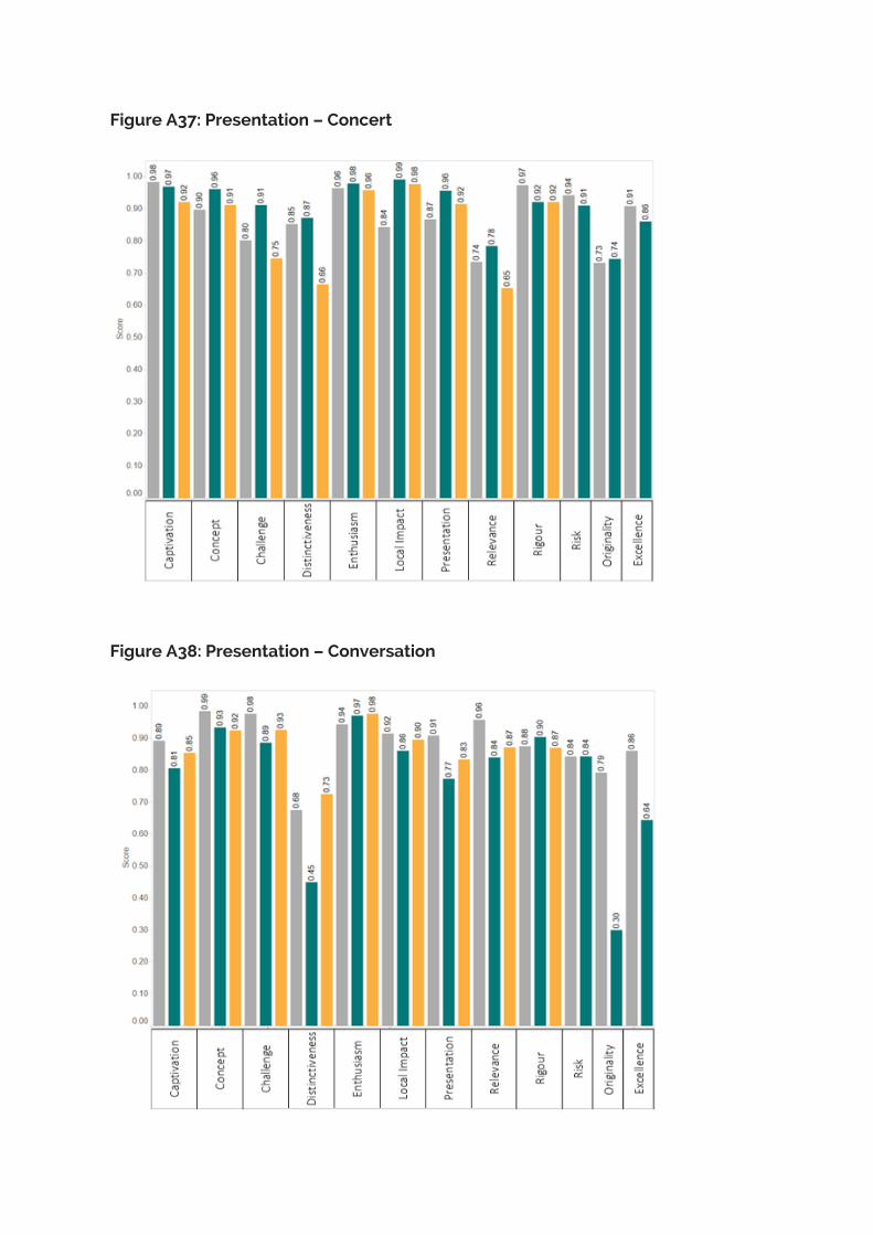
Figure A37: Presentation – Concert
Figure A38: Presentation – Conversation

Figure A39: Presentation – Event
Figure A40: Presentation – Exhibition

Figure A41: Presentation – Festival
Figure A42: Presentation – Installation

Figure A43: Presentation – Live
Figure A44: Presentation – Performance
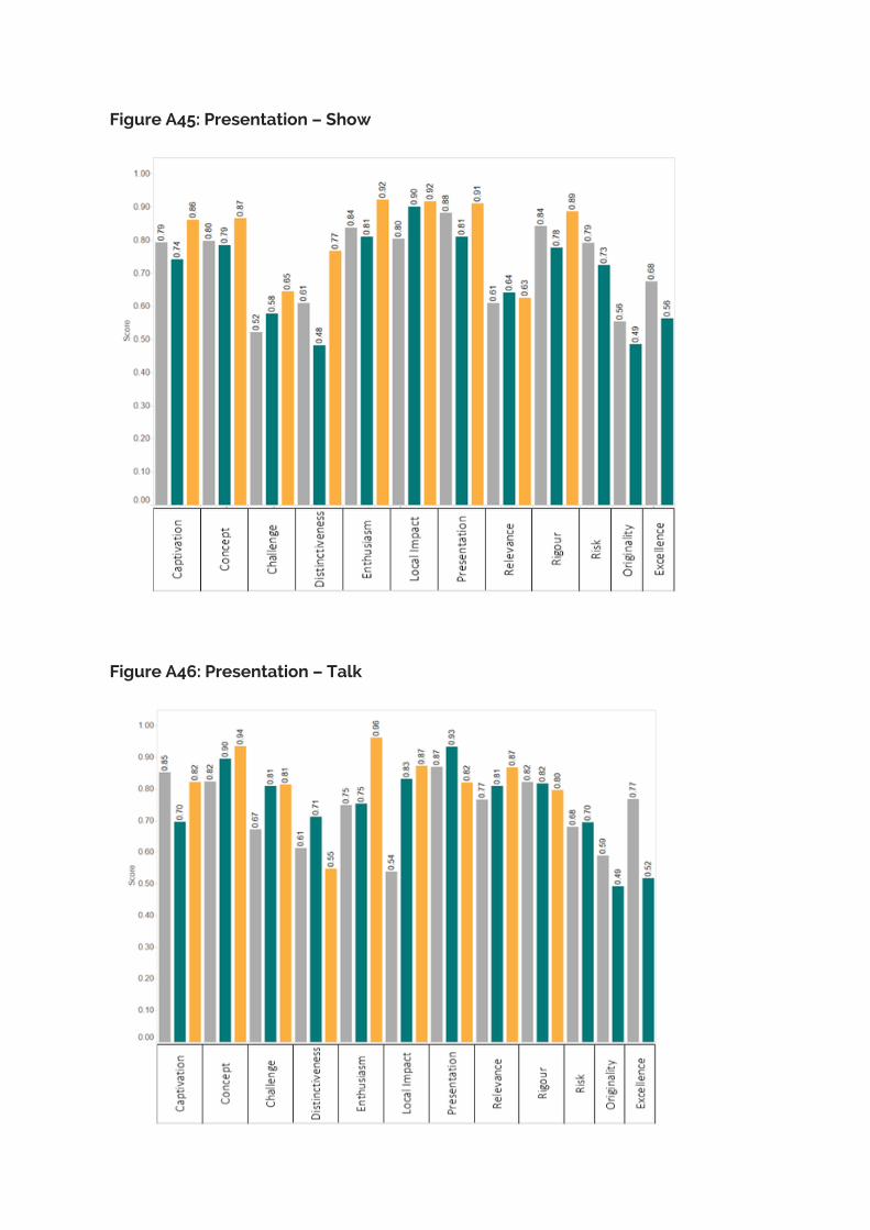
Figure A45: Presentation – Show
Figure A46: Presentation – Talk

Figure A47: Presentation – Workshop
Figure A48: Subculture – Jazz

Figure A49: Subculture – Pop
Figure A50: Subject – History