publishing with elsevier · publishing with elsevier writing and producing books is a complex,...
TRANSCRIPT

PUBLISHING WITH ELSEVIER
Writing and producing books is a complex, collaborative process and we believe that
trying to get each stage in the production of your book right first time will save time,
cost and frustration all round. Our aim is to make the editorial and production stages
of your book’s life as trouble-free as possible and to publish what you have written as
quickly, accurately and attractively as possible.
It is the responsibility of your project manager to make your text ready for typesetting,
and unless instructed otherwise, he or she will automatically make it consistent with
the imprint house style. If you feel strongly, therefore, that some particular aspects of
the house style as described would be unsuitable in your book please discuss these
with your commissioning editor.
Please remember that the time for alterations is prior to submission of your final
copy. Please make sure that you are completely happy with the final copy before you
send it to us. Your material may have been put together over a long period of time.
Before you deliver the final copy read it through carefully for consistency and to make
sure that there are no omissions. Pay particular attention to illustrations to make sure
that all figures are numbered, that figure captions are consistent with what is in the
text and that all figures mentioned in the text exist in the final version of your copy.
Likewise, make sure that references listed in the text actually appear in the reference
list.

If you have any queries about editorial or production matters our editorial and
production staff will be more than happy to advise you. Please contact your
commissioning editor in the first instance so that they can put you in touch with the
appropriate person in our Production Department.
PUBLISHING TEAM; OUR SUCCESS STARTS WITH YOU
We see publishing from a different perspective. Yours. Strong ideas, solid writing,
and professional expertise have built the reputations of Elsevier and its imprints.
Without the talents of our authors, Elsevier would not be where it is today.
Whether you're a first-time or an experienced author, our publishing team wants to
make the publishing process as easy as possible for you.
From helping you understand how the publishing process works, to giving you
guidelines for developing your manuscript, to planning and establishing a schedule
for your project, we want to make sure you have what you need to turn your vision
into a published reality.
THE ACQUISITIONS EDITOR/PUBLISHER
Acquisitions editors/publsihers research current and future needs of the market and
commission suitable material to meet those needs. Commissioning editors are
responsible for the overall structure of the books they commission in terms of
content, length, level and organization. They write jacket/cover blurbs and brief our
Design Department on jacket/cover design. They are also responsible for your
contract and royalty arrangements and processing your sales orders at authors’
discount.

THE EDITORIAL ASSISTANT
Editorial Assistants work alongside the commissioning editors on the various lists.
They will usually be your first point of contact when contacting us after the book has
been accepted at a publishing committee meeting. They will also liaise with you
regarding delivery dates, cover ideas, and will also be in contact with you regarding
marketing for the book.
THE DESK EDITOR
The project manager will work closely with you, and with the many other people
involved, during the stages between typescript and publication. The project manager
organizes the copyediting, proofreading, indexing (if appropriate) and also the
typesetting, redrawing, illustrations and printing. They will work with you to ensure
that your book is produced as quickly as possible to the highest possible standard.
They will resolve any editorial queries with you, send you your page proofs and make
sure that your comments are taken into account.
THE DESIGNER
Our designers are responsible for the design of the jacket or cover of your book.
Working to a brief from your commissioning editor they will create a suitable design
for the ‘outside’ of your book.
THE SALES AND MARKETING TEAM
Our team of UK and European representatives, our sister company in the USA,
together with agents all over the world, backed up by our marketing department
enable your book to be given the best attention at all times. We have two sales
conferences each year covering six-monthly bookshop sales cycles. This combined
with direct marketing, advertising publicity, academic calling and promotion, generic

‘trade promotion’ and proactive ‘special sales’ before and after publication of your
book, ensures sales are maximized at all times.
PUBLISHING WITH ELSEVIER: COPY PREPARATION
Please prepare your copy using Microsoft Word and supply to us on disk with at least
one hard copy (printout) of the material in the most up-to-date version. Copy can be
supplied via email, ftp and ISDN but you must still send us at least one printout at the
same time. Your copy will be edited on-screen by one of our experienced freelance
copyeditors and the edited disk will be passed to a typesetter who will generate page
proofs for you to check.
We prefer copy to be prepared using Microsoft Word. If you intend to prepare your
material using software other than Word please consult us before you start writing.
Please make sure that your copy is complete before you send it to us. As well as the
main text include items (a) to (d) below and any of items (e) to (i) which you and your
commissioning editor feel are appropriate:
A title page bearing your name (and qualifications/position if appropriate) as you
wish it to appear in the book. (Note that if your book has more than one author
names will appear in alphabetical order unless you specify otherwise.)
A contents list (remember to check this against your chapter titles).
A preface.
A separate list of captions to illustrations with any necessary credit lines (please
do not incorporate captions in the text files).
Lists of symbols, contributors etc.
Acknowledgements.
Bibliographical material.
Anything that is to go on the endpapers. We do not usually print on endpapers,
but there may be exceptions.
A foreword. (A foreword is a commendation by an outside authority and is not the
same as a preface.)
Using your original disk means that the literal accuracy of your text will be
maintained, saving effort at the proofreading stage, and that we can produce your
book more quickly than would otherwise be the case. The success of this method will
depend on two things:
The technical compatibility of your hardware and software with those of the
typesetter.
The editorial accuracy, consistency and style of your copy.
TECHNICAL COMPATABILITY
Typesetting/desktop publishing (DTP) is not the same as word processing. DTP
offers a huge selection of typefaces and type sizes and, in addition, there is a large
range of characters and a far greater facility to manipulate word spacing, line lengths,
page depths and so on. The resultant output is therefore far easier on the reading
eye and has a more professional appearance.
Accurate conversion between your word-processing disks and the DTP/typesetting
package is achieved by searching-and-replacing on characters and formatting in your
document. Use of our Word template and styles makes this process more accurate.
Part of the copyeditor’s job is to add style codes into the files for headings, special

design features, etc., which are then interpreted during the process of importing your
files.
Tabular matter and display equations can make conversion difficult. The table facility
in Word can be helpful, however, if you find it confusing to use, or use some other
word processor, then please use tabs rather than spaces to lay out your tables. It is
worth taking the time to set up tabs accurately. In most word processors one can set
tabs by clicking on the ruler. Tabs can be adjusted by dragging within the ruler. They
are deleted by dragging them out. In all cases, please make sure that the print outs
of the tables are as you wish them to appear!
Equations are always tricky – some DTP packages can read some equations set in
Word’s equation editor but it is rarely one hundred per cent. So, please take care to
check that all equations on your print out appear as they should – these may need to
be rekeyed using the print out for reference. Any book that features extensive maths
and/or scientific notation is likely to be typeset using a specialist company, however,
they are likely to rekey the complex areas, so please proof-read carefully.
FILE CONSTRUCTION
Please do not store your entire book as one file. Store each chapter as a
separate file and use separate files for other main parts of the book, e.g. preface,
glossary, bibliography etc.
Please save figures and captions in a separate file indicating clearly the
appropriate position for each figure in the text file (e.g.).
Always use new disks and make sure that the disks you supply to us do not
contain any extraneous material.
It is important to label your disks carefully with your name, the book title, the files

contained, the date the files were created and the word processing software and
version used.
Please supply a listing of the files on each disk, making sure that you have saved
them in a logical order. Chapters should be numbered from 001 (to avoid Chapter
10 preceding Chapter 2).
Please remember to keep back-up copies of any disks you send to us.
PUBLISHING WITH ELSEVIER: TYPING YOUR BOOK
Please keep your presentation as simple as possible. Avoid the temptation to try
to make your book look attractive. Boxes, tints, rules, icons etc. have to be
removed during the editing and DTP process and their presence will only make
this process longer and more prone to error.
Be consistent in your use of type styles e.g. all main headings should look the
same.
Do not use a mixture of word processing packages to prepare your copy. If you
are writing with co-authors this may be difficult – please contact your
commissioning editor for advice.
Do not justify the text, i.e. it should be ranged left with a ragged right margin and
do not use automatic hyphenation. Words at the end of lines should only contain
hyphens if the word actually contains a hyphen. Justification and automatic
hyphenation may interfere with the interfacing process.
Do not indent paragraphs. Use a hard line space between paragraphs, after each
heading and after each item in a list but not at the end of each line. Text should

be keyed as if it were one continuous line using the automatic word wrap facility.
Do not use double word spaces after punctuation. (Note: This includes not keying
two word spaces after a full point.)
Do not confuse lower case l (ell) with 1 (one), or O (oh) with 0 (zero).
It is very important to be consistent in your presentation, punctuation and style.
Do not centre any material.
Use a standard tab indent, not the space bar, for material such as quotations.
If your material uses any special characters which are not on your keyboard you
should symbolize them by using one or more characters not used in their own
right. Make sure that you supply a list of:
1. The symbolic characters you have used and what they symbolize.
2. Any characters that your printer has not printed.
3. Any characters printed differently from the form intended.
THE PRINTOUT
Print out your copy on good quality paper of A4 size (297 ´ 210 mm) and supply
at least two copies (retaining a copy for yourself). Use a good quality printer.
Use one size of paper throughout and print on only one side of each sheet.
Your printout should be double spaced without word breaks, allowing generous
margins. As detailed above, do not justify the right-hand margin, leave a
consistently large space between paragraphs and do not indent the first line of
new paragraphs.

TABLES
Tables should be numbered per chapter (not serially throughout) in the order in
which they are to appear with the table number and heading above the table.
Tables should be keyed double spaced.
Avoid using vertical rules and do not use ditto marks.
HEADINGS
Range all subheadings left and use an initial capital for the first word only (apart
from proper nouns).
If you cannot use Word and our template, you can significantly streamline the
editorial process by indicating the subheading hierarchy. Insert a letter within
square brackets immediately before each heading, i.e. to indicate the first level
heading, to indicate the second level heading, to indicate the third level heading,
etc. Key the square bracket code closed up to the heading without a word space
between the code and the heading, e.g.
First level heading
Note that chapter titles should not be designated ‘A’ headings. This description is
reserved for the principal subheadings within a chapter.
Subheadings should be keyed as separate lines of text with an extra line space
above and below.
Part headings should be titled and numbered. Use an initial capital for each main

word in the title (e.g. Part One Theory and Practice).
Chapter headings should be titled and numbered. Use arabic numerals without
full points. Use an initial capital for the first word (or any proper nouns) only (e.g.
1 First principles).
The typographical style and arrangement of the headings will be decided by your
production controller when the copy is prepared for the typesetter.
BOLD AND ITALIC WITHIN THE TEXT
It is sometimes helpful to the reader for certain text items to be given presentational
emphasis (e.g. an important term or concept at the point of its definition or
explanation). Your commissioning editor will be able to advise on whether this is
appropriate for your book.
FOOTNOTES
Please avoid footnotes. Usually it is possible to incorporate them into the text. Where
they cannot be avoided they should be numbered with superior (raised) figures
starting afresh in each chapter. The notes themselves should be keyed at the end of
each chapter, numbered to match the footnote numbers appearing within the text.
CROSS-REFERENCES
Cross-references within the text cannot normally be inserted until page proofs are
available, and to avoid expensive work at that stage their use should be kept to the
absolute minimum. Where they are unavoidable, space must be left for them and
they should be indicated in the script as ‘(see page 000)’.
EXTRACTS
All quoted extracts should be carefully transcribed. It is essential that the original

punctuation and spelling of the extract to be quoted are preserved. Errors of any kind
within a quoted passage should not be corrected but acknowledged (sic).
LISTS
Adopt arabic numbering (1, 2, 3) going to (a), (b), (c) for subdivisions of points and
REFERENCES
References should always follow a consistent style. They can follow the text matter of
each chapter or appear at the end of the book before the index.
The name and date (Harvard) system is preferred to the numerical system. If it is
customary in your discipline to use the numbered reference system please consult
your commissioning editor before you start writing.
Please check very carefully that all references cited in the text appear in the
reference list and vice versa, and that names and dates are the same in the text and
in the list of references.
In the Harvard system the text reference is given as ‘King (1998)’ or ‘(King, 1998)’
depending on the context and the references are listed alphabetically at the end of
the text.
In the numbered reference system the references are numbered according to their
order of appearance in the text. The references in the reference list should appear in
the same numerical sequence and will thus be non-alphabetical. Our house style is
to use superior numbers rather than square brackets for reference numbers if the
numbered reference system is being used.
The reference list should give the names and initials of all authors unless there are
more than four, in which case only the first three should be given followed by et al.
‘Unpublished observations’ and ‘personal communications’ may not be used as
references, although references to written, not verbal, communications may be
inserted in parentheses in the text. Typescripts accepted but not yet published may
be included in the reference list, followed by ‘in press’ in parentheses.
We do not usually require the place of publication to be given in references but if you
choose to include it please be consistent and adopt the following style: King, A. B.
(1990). Title of Book. Oxford: Butterworth-Heinemann.
EXAMPLES OF REFERENCES
Book with a personal author:
King, A. B. (1998). Title of Book. Butterworth-Heinemann.
Journal article:
King, A. B. (1998). Title of article. Br. J. Surg., 25, 268–70
Chapter in book:
King, A. B. and Cook, A. B. (1998). Title of chapter. In Title of Book (A. B. Frazer,
ed.) pp. 175–8, Butterworth-Heinemann.
Agency publication:
Department of Health (1998). Publication title. HMSO.
Government report:
Name of the report (Jones Report, 1998). HMSO.
Newspaper article:
Anderson, A. B. (1998). Title of article. Newspaper title, 3 August, p. 17.

PUBLISHING WITH ELSEVIER: ILLUSTRATIONS
It is your responsibility to supply the required illustrations along with the copy. They
should be separate from the text and not drawn in or attached to it.
Indicate the desired position of each illustration with a note within square brackets in
the text files, e.g..
Number illustrations per chapter, not in a series throughout the book (e.g. Figure 1.1,
Figure 1.2 etc.).
Do not introduce illustrations by the words ‘above’ or ‘below’ as this requires an
illustration to appear at a point that may not suit the make-up of the pages.
LINE ILLUSTRATIONS
If finished artwork for line illustrations is unavailable you should provide roughs,
on sheets of uniform size, that are sufficiently accurate and detailed for a
typesetter to follow. Keep labels and explanatory matter simple and position them
where they are to appear on the drawing. Write symbols and letters carefully and
don’t be afraid to include explanatory notes for the artist. Remember that the
artist is unlikely to be an expert in your subject so you should provide as much
information as possible.
Large diagrams that can only appear as fold-outs in the finished book are
unacceptable as are, in most cases, diagrams requiring colour printing unless
you have reached agreement with your commissioning editor on their inclusion.
If you are using a graphics software package to produce your line illustrations we
may well be able to use your files to produce the final artwork. It is essential that
you:

1. Supply the graphics files separately from the main text (ideally as one file
of graphics per chapter).
2. Save your graphics files as .eps (line illustrations) or .tif (photographic).
3. Present a complete separate set of printouts of the illustrations for our
reference during copyediting.
4. Ensure the appropriate figure number appears on all illustrations (and
parts thereof) within the graphics file.
5. Label the graphics using a capital for the initial letter of the first word only.
The rest of the labelling should be lower case (apart from essential
capitals). Do not put full points at the end of labels or use underlining.
If we are unable to read your files we will ask you to supply laser quality printouts for
reproduction in the traditional manner.
Illustrations prepared using the drawing facility of a word-processing package are
not usually suitable so please consult your production controller before spending
time trying to prepare your illustrations in this way.
PHOTOGRAPHS
Note: If you intend to supply scanned photographs please see the notes below.
For the best reproduction, photographs (half-tones) should be supplied as original
glossy black and white prints of high quality with good contrast. Do not supply
photographs cut from books or journals as these cannot be reproduced
satisfactorily.
Colour prints or transparencies will lose some contrast and detail when
reproduced in black and white and may not show the level of differentiation you
require or expect. It is therefore advisable to supply black and white originals if
the illustrations are to appear in the finished book in black and white.
Never write on the back of a photograph with a pen or hard pencil and do not
staple or secure with paperclips because the surface will be damaged. Pack
photographs securely in paper between stiff cardboard sheets.
Mark the back of each photograph lightly in soft pencil to show the figure number.
Avoid sticking heavy labels to the back of photographs.
Indicate on a transparent paper overlay (or photocopy) any areas that should not
appear and any lettering required.
Where there might be doubt, indicate the top of the photograph in soft pencil on
the back.
If appropriate, draw your commissioning editor’s attention to magnification factors
that might be wrong if a photograph were to be enlarged or reduced.
If colour photographs are to be used in your book this will have been agreed by
you and your commissioning editor in advance. If the use of colour is agreed you
should discuss how many and which figures should appear in colour with your
commissioning editor. Your commissioning editor will advise you whether the
colour figures will be treated separately (as plates) or integrated throughout the
book.
Radiographs are more expensive to reproduce and often more difficult to handle
than glossy prints which we prefer. Any labels, arrows etc. should be placed on
an overlay and accurately positioned over the relevant area.
SCANNING
If you are planning to supply scanned illustrations please discuss the options with
your commissioning editor as early as possible. Methods of supplying digital
information change rapidly and we are constantly updating our resources. The
important points to remember are:
It is best to scan illustrations to a larger size than required on the printed page.
Enlarging a scan by more than 20 per cent will result in a noticeable loss of
quality.
Please ensure that all illustrations are scanned ‘square’. Any distortions cannot
be corrected.
Colour pictures which will be printed as black and while will appear ‘flat’. An
allowance must be made for this when scanning.
All colour pictures must be supplied as CMYK (not RGB).
Photographs intended for web pages are not of sufficient quality to print
conventionally.
PUBLISHING WITH ELSEVIER: HOUSE STYLE
SPELLING
Elsevier house style is to use -ize endings when optional. Note, however, that the
following words should always be spelt –ise:
advertise Disfranchise Misprise
advise Disguise Mortise
affranchise Emprise practise (verb)
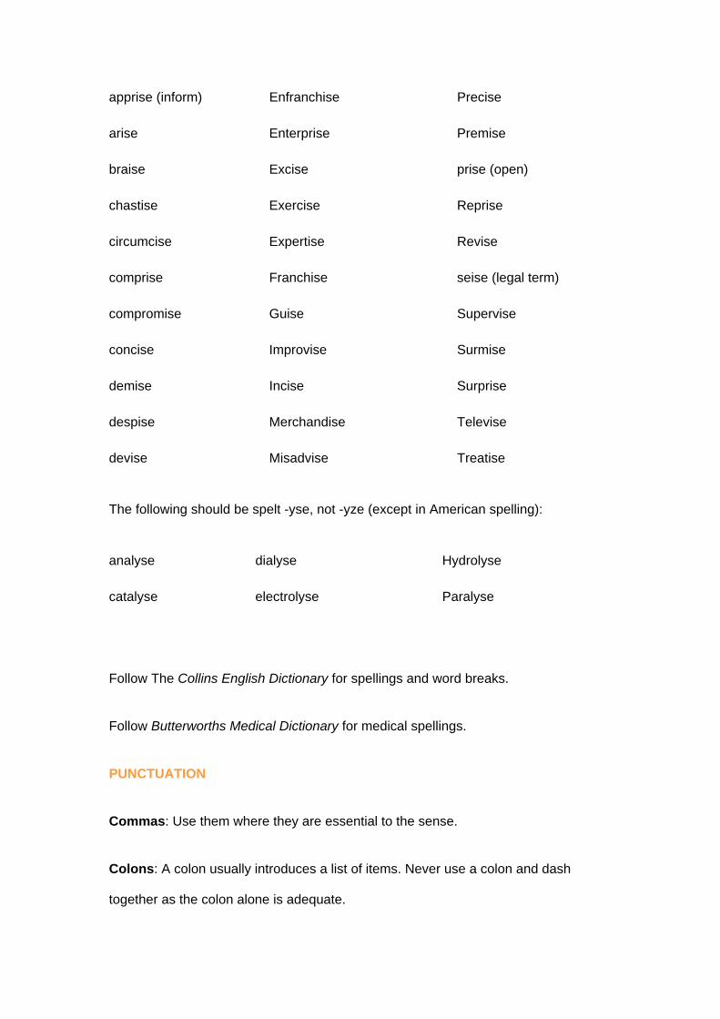
apprise (inform) Enfranchise Precise
arise Enterprise Premise
braise Excise prise (open)
chastise Exercise Reprise
circumcise Expertise Revise
comprise Franchise seise (legal term)
compromise Guise Supervise
concise Improvise Surmise
demise Incise Surprise
despise Merchandise Televise
devise Misadvise Treatise
The following should be spelt -yse, not -yze (except in American spelling):
analyse dialyse Hydrolyse
catalyse electrolyse Paralyse
Follow The Collins English Dictionary for spellings and word breaks.
Follow Butterworths Medical Dictionary for medical spellings.
PUNCTUATION
Commas: Use them where they are essential to the sense.
Colons: A colon usually introduces a list of items. Never use a colon and dash
together as the colon alone is adequate.

Quotes: Use single quotes for ordinary quotations and double quotes within single
quotes for a quotation inside a quotation.
Hyphens: Follow The Collins English Dictionary for hyphenation. The trend is toward
reduced use of the hyphen (e.g. tradeoff, mainframe, textbook). Retain hyphens,
however, between double vowels (e.g. re-establish) and where required to convey a
particular sense (e.g. re-sign rather than resign, three-day-old chicks rather than
three day-old chicks).
Note the use of hyphens in compounds (e.g. long-term plans) and with ‘well’ and ‘ill’
(e.g. a well-produced book). Insert hyphens in compounds where the same
consonants end and begin the constituent parts (e.g. cold-drawn, cross-section).
Dashes: The typesetter will set a spaced en rule for dashes. The en rule is slightly
longer than a hyphen. An unspaced en rule is used to connect specially related
names and properties (e.g. the Adams–Harris equation, stress–strain ratio). The
unspaced en rule is also used to denote a span of numbers.
(e.g. pp. 5–15).
Abbreviations: House style is to include full points after abbreviations but not after
contractions (in which the shortened form ends with the final letter of the word). Thus:
Eq., Fig., Prof. (for Equation, Figure, Professor) but Dr, Mr, Ltd (for Doctor, Mister,
Limited). Plurals (e.g. Eqs, Figs) take no full points.
Stops are required in such abbreviations as etc., e.g., i.e., and c. (circa) which use
lower case letters.
Stops are not required where upper case letters are used as in the initials of an
organization (e.g. BBC, UNESCO) or abbreviated scientific terms (e.g. DNA, GMO).

Do not begin a sentence with an abbreviation.
Numbers
In general works spell out numbers under 100. In technical and scientific writing only
numbers below 10 should be spelt out.
Where numbers larger and smaller than 100 are mixed use figures for both.
Always spell out a number which begins a sentence.
Four-digit numbers should be closed up with no space or comma (e.g. 5000, 3725
etc.) unless they are in tables and have to range with other longer numbers.
Numbers of five digits or more should be divided by a space between three-digit
groups on either side of the decimal point (e.g. 28 673.826 1).
Decimals should generally be used in preference to fractions. Decimals below unity
should carry a zero before the decimal point (e.g. 0.63 not .63). Decimal points are
set on the line. Where fractions are essential use a solidus in running text (e.g. 1/2).
Where fractions are displayed a two-line fraction can be used. The solidus should
always be used for complex fractional indices so that they can be printed on one line
(e.g. 2x (m + n)/3).
The term billion should be either avoided or explained. The term has different
meanings in the UK and the USA.
Use the shortest unambiguous form for ranges of numbers (e.g. 16–17, 23–4).
Do not use Roman numerals (except where essential for a third level with a list after
1, 2, 3 and (a), (b), (c)). They are less easy to comprehend and in listings give a
ragged effect.
Always use a numeral with the term ‘per cent’ (e.g. 15 per cent).

CAPITALIZATION
Keep capitalization to a minimum. Too many capitals tend to be typographically ugly
on the printed page.
Use initial capitals for proper names, official titles, trade names and specific features
in the book itself (e.g. Figure 1.1, Chapter 3).
Proprietary drug names, when used, have an initial capital (e.g. diazepam (Valium)).
ITALICS
Italics slow the reader down because they are less easy to read than ordinary type.
Use them sparingly in the text.
Only unanglicized words and phrases should be italicized, not foreign words which
have become familiar through constant use (e.g. via, et al., in situ are not italicized).
Use italics for book titles and periodicals, films, operas, plays, names of ships and
microbiological nomenclature where strict species terminology is used.
UNITS
SI units should be used exclusively.
Any departure from SI units should be discussed with your commissioning editor. If
‘old’ units have to be used the SI equivalent should usually follow in parentheses.
SYMBOLS
Figures should always be used with symbols (e.g. 10 mm) and there should always
be a space between the figure and the symbol (e.g. 10 mm ´ 10 mm = 100 mm).
The preferred style for partial pressures is as follows: Po2, Pao2, Pco2 etc.

A distinction should be made between a symbol for a physical quantity and a symbol
for a unit. The former is set in italic (e.g. electromotive force, E), whereas the latter is
set in ordinary type (e.g. volt, V).
Italicization of superiors and inferiors follows the same rules as for other symbols.
Unit symbols are always in the singular (e.g. 25 kg not 25 kgs).
EQUATIONS
If mathematical and chemical equations are used, number them per chapter. The
numbers should be ranged right. Display where possible with a line of space above
and below:
2(a - b - c) = (a - b - c) + (a - b - c)
If an equation is long and the line turns, break at =, + or - .
RATIOS
There should be no space either side of a colon indicating a ratio (e.g. 1:7).
BRACKETS
Where several brackets have to be used in a mathematical expression the sequence
should be {}.
VECTORS
Vectors should be set in bold type.
MISCELLANEOUS
Per cent: Spell out per cent as two words in literary contexts, but in statistical
contexts and in tables and diagrams where space is scarce the symbol (%) is
acceptable.

Proprietary names: Proprietary names such as Terylene, Vaseline and Perspex
require an initial upper case letter.
Dating: Avoid vague phrases that may date your book (e.g. ‘in the past decade’, ‘will
soon be introduced’). It is better to replace these with specific dates. Avoid quoting
specific prices of goods and services – if you must include them indicate the year to
which you refer.
Dates: Use the form 15 August 1999 (not 15th August 1999). Do not use numerals –
7.6.99 means 6 July 1999 in the USA.
Do not put apostrophes in decade spans (use 1950s not 1950’s).
Do not use the expressions ‘thirties’ or ‘eighties’ etc. but 1930s, 1980s etc.
Use ‘from 1958 to 1959’ rather than ‘from 1958–9’.
Spell out the names of centuries (e.g. ‘the eighteenth century’ not ‘the 18th century’).
PUBLISHING WITH ELSEVIER: PERMISSION
It is your responsibility to obtain permission to use copyright material. The copyright
owner needs to be told exactly what you wish to use and will normally require an
acknowledgement.
Any substantial extract from a published source (including newspapers, pamphlets,
maps, advertisements, packaging, etc.) will need permission from the author or
original publisher before it can be reproduced. Even adaptations are subject to
copyright and sometimes permission to make alterations will not be granted.

The term of copyright varies from country to country. In the UK it is now seventy
years from the end of the year in which the author died, or in the case of any
posthumously published work, seventy years from the end of the year of publication.
In the case of journals which hold the copyright in their articles the term is seventy
years after publication.
In the USA the term of copyright lasts for a period from the date of publication. This
period varies according to the year of publication.
Material in the public domain, such as Hansard, does not generally require
permission. Speeches made in public also fall into this category but very little else
does. Government publications from HMSO are not in the public domain.
Please indicate to us in a separate statement delivered with your copy which items
require acknowledgement. You should confirm that all permissions have been
applied for and granted and let us have copies of letters relating to permissions
obtained. Ensure that you draw our attention to any specific acknowledgement
wording required by the copyright owner or any restrictions specified.
You should apply to the publisher for permissions in the first instance. You will be put
in contact with the author if necessary.
Any fees you are asked to pay are your responsibility but please consult your
commissioning editor if they seem unreasonable, or you have doubts about what is
involved.
It can take a long time for permissions to be granted. Sometimes you will find it
difficult to track down the copyright holder – the original publishing company may
have gone out of business, for example – so it is important that you start writing for
them early on.

Please use the standard permission letter which you can download from this website
when writing for permissions.
PUBLISHING WITH ELSEVIER: RACISM AND SEXISM
Please be aware of the possible effects of any racist or sexist language in your text
and modify it.
Do not make generalizations on the grounds of race, nationality or sex.
Use ‘he or she’ in full rather than ‘s/he’ or ‘she/he’ (the same applies for ‘him or her’).
Repeated use of ‘he or she’ can be cumbersome so try to rework the text to avoid
this, e.g. the sentence can usually be reworked using a person’s name or job title
(e.g. ‘the doctor’, ‘the user’) or using the plural (‘they’ ‘them’ etc.).
Job titles are frequently discriminatory. The suffixes ‘ette’ and ‘ess’ are often
unnecessary, e.g. use ‘manager’ rather than ‘manageress’. Alternatively a
different term can be used, e.g. ‘flight attendant’ rather than ‘air hostess’.
PUBLISHING WITH ELSEVIER: PROOFREADING
You will be asked to check page proofs for typesetting errors and should always keep
a copy of any corrections in case of queries.
Remember that the terms of your contract may require you to pay for corrections to
your manuscript and additions at page proof stage.

Corrections should be indicated by marking the appropriate place in the text and
inserting the correction or the appropriate proof correction mark in the margin next to
the text.
You should use red pen for typesetting errors and blue pen for your own essential
corrections. Please draw attention to particular points or queries in the text on the
first page or in a note attached to the proofs.
Corrections at page proof stage are costly and time-consuming and publication of
your book may be delayed as a consequence. A few words added to one page may
make it necessary to transfer lines from that page to the next and so on, right through
to the end. Pagination, contents, index and cross-references could all be affected.
Remember to complete any cross-references appearing as ‘page 000’ in the proofs.
To avoid repagination with its consequent delays, it is imperative that if material is
added at proof stage the length of each paragraph should be retained by taking out
of it as many characters as are inserted. If this is impossible, additions should be
made at or near the end of the chapter if there is an unused space. In exceptional
circumstances when we have agreed that substantial new material may be inserted it
should be printed out, double spaced and fixed securely to the appropriate page of
the proofs with a clear instruction indicating where it should go.
We normally allow 2-3 weeks for proofreading. Your project manager will contact you
when proofs are available and a deadline can then be agreed.
It is usually possible to send page proofs to you electronically. If you would
like your proofs to be sent this way you will need a copy of Acrobat Reader.
Please let your commissioning editor know that you would like your proofs to
be sent to you in this way when you deliver your copy. You will not be able to

amend the text files yourself and will need to print off pages and indicate the
corrections which are required on a hard copy as described above.
PUBLISHING WITH ELSEVIER: THE INDEX
It is usually your responsibility to supply the index. If you are unable to do this we can
commission a professional indexer on your behalf, but the cost of this work will be
charged to you unless otherwise agreed with your commissioning editor.
We require the index copy with return of your page proofs. Send us a disk and a
printout in double-line spacing.
Index entries may be single words, groups of words or whole topics but you should
try to foresee the style the reader is likely to expect. For example, ‘Motorways,
development of’ is far more useful than ‘Development of motorways’.
When entering page numbers avoid such expressions as ‘159 et seq.’, ‘159ff’ or
‘Chapter 8’. Tighten up the style to ‘159–70’ and ‘200–30’ respectively if the latter is
the extent of Chapter 8.
The alphabetical order of an index can be on a letter-by-letter basis or on a word-by-
word basis. Indexes ordered on a letter-by-letter basis ignore spaces and hyphens.
Whichever system you adopt remember to use it consistently.
Most word processing packages have features which will make indexes from your
original text files. This can save some time, but they need to be used with caution.
Remember that you want an index which corresponds to the page numbers of the
printed book, not to the page numbers in your original copy. This can be overcome
by going through your original text on disk and changing the page breaks and page
numbers so that they correspond with those in the book but this is something you
would have to do yourself. Please note that we are not able to supply you with a disk

at this stage which you would be able to use to compile an index using your word
processing package.
You should also remember that automatic indexers only deal with words in the text.
Some of the most useful index entries are those which classify material in ways not
included in the text. For example, it might be useful in a modern history book to have
an entry for ‘dictators’ which would refer readers to material on Stalin, Hitler, Franco
and Mussolini.