psy 307 – statistics for the behavioral sciences chapter 2 – describing data with tables and...
TRANSCRIPT
PSY 307 – Statistics for the Behavioral Sciences
Chapter 2 – Describing Data with Tables and Graphs
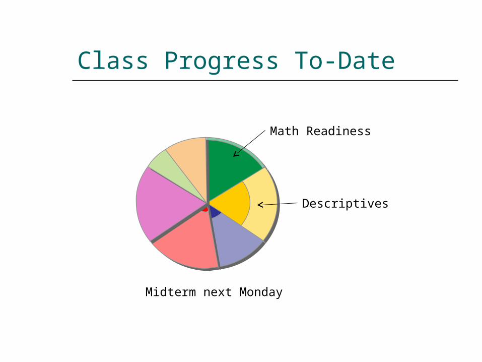
Class Progress To-Date
Math Readiness
Descriptives
Midterm next Monday
Frequency Distributions
One of the simplest forms of measurement is counting How many people show a
characteristic, have a given value or are members of a category.
Frequency distributions count how many observations exist for each value for a particular variable.
Frequency Table
A frequency table is a collection of observations: Sorted into classes Showing the frequency for each class.
A “class” is a group of observations. When each class consists of a single
observation, the data is considered to be ungrouped.
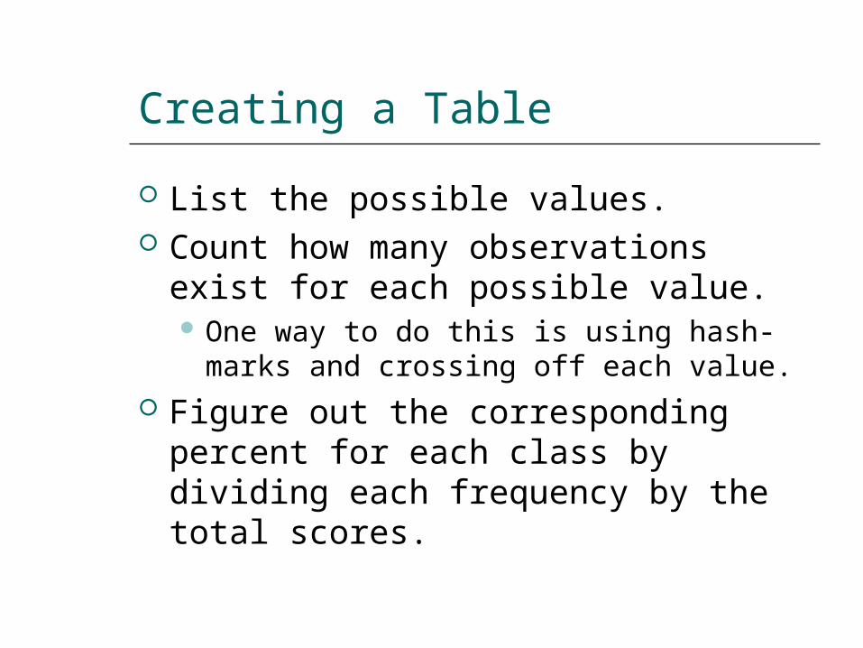
Creating a Table
List the possible values. Count how many observations exist
for each possible value. One way to do this is using hash-marks
and crossing off each value. Figure out the corresponding
percent for each class by dividing each frequency by the total scores.
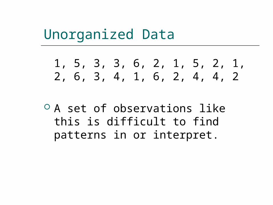
Unorganized Data
1, 5, 3, 3, 6, 2, 1, 5, 2, 1, 2, 6, 3, 4, 1, 6, 2, 4, 4, 2
A set of observations like this is difficult to find patterns in or interpret.
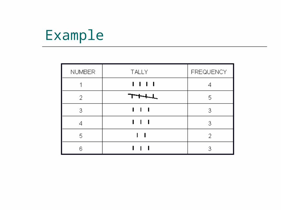
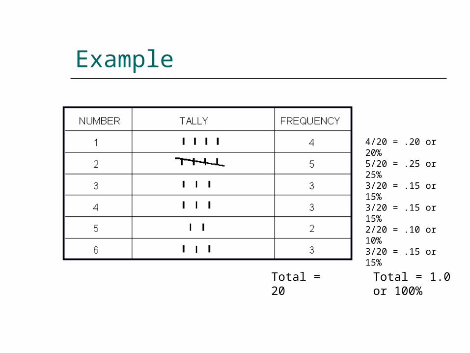
Example
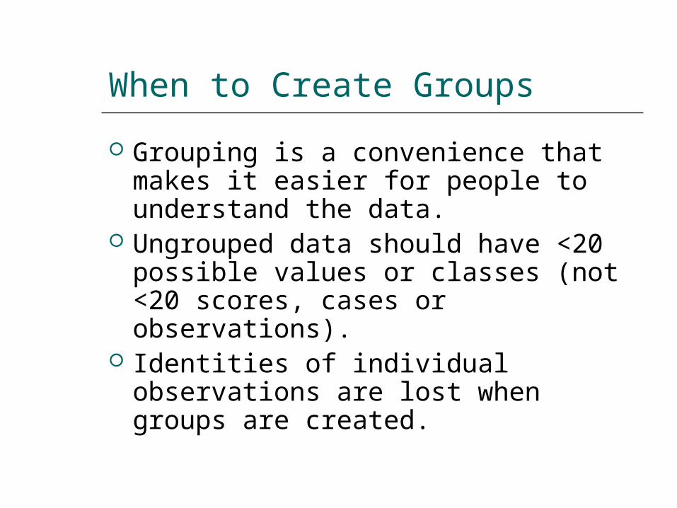
When to Create Groups
Grouping is a convenience that makes it easier for people to understand the data.
Ungrouped data should have <20 possible values or classes (not <20 scores, cases or observations).
Identities of individual observations are lost when groups are created.
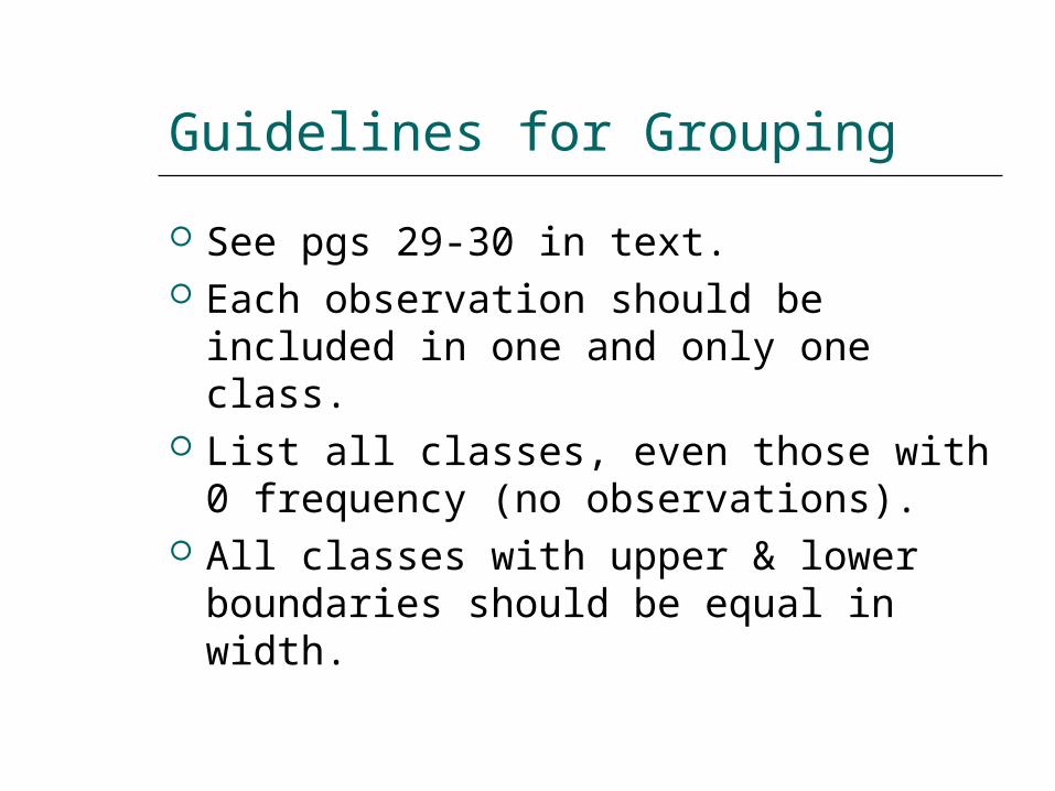
Guidelines for Grouping
See pgs 29-30 in text. Each observation should be
included in one and only one class. List all classes, even those with 0
frequency (no observations). All classes with upper & lower
boundaries should be equal in width.
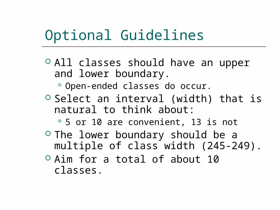
Optional Guidelines
All classes should have an upper and lower boundary. Open-ended classes do occur.
Select an interval (width) that is natural to think about: 5 or 10 are convenient, 13 is not
The lower boundary should be a multiple of class width (245-249).
Aim for a total of about 10 classes.
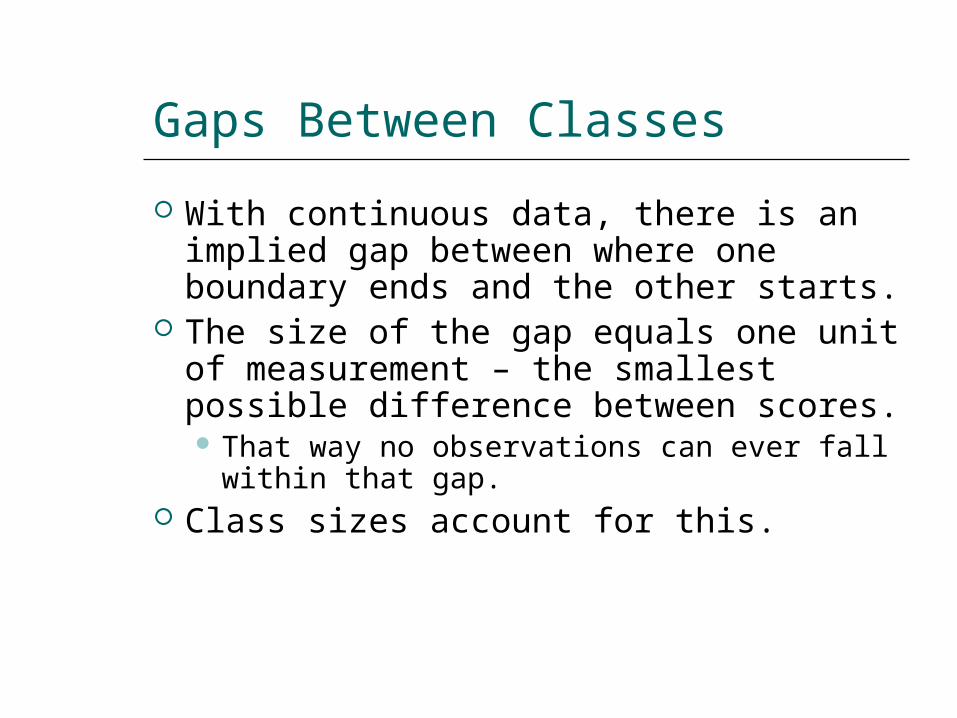
Gaps Between Classes
With continuous data, there is an implied gap between where one boundary ends and the other starts.
The size of the gap equals one unit of measurement – the smallest possible difference between scores. That way no observations can ever fall
within that gap. Class sizes account for this.
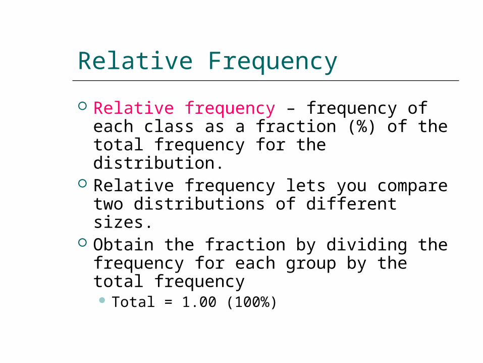
Relative Frequency
Relative frequency – frequency of each class as a fraction (%) of the total frequency for the distribution.
Relative frequency lets you compare two distributions of different sizes.
Obtain the fraction by dividing the frequency for each group by the total frequency Total = 1.00 (100%)
Example
Total = 20
4/20 = .20 or 20%
5/20 = .25 or 25%
3/20 = .15 or 15%
3/20 = .15 or 15%
2/20 = .10 or 10%
3/20 = .15 or 15%
Total = 1.0 or 100%
Cumulative Frequency
Cumulative frequency – the total number of observations in a class plus all lower-ranked classes.
Used to compare relative standing of individual scores within two distributions.
Add the frequency of each class to the frequencies of those below it.
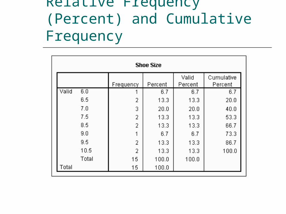
Relative Frequency (Percent) and Cumulative Frequency
Cumulative Proportion (Percent)
The cumulative proportion or percent is the relative cumulative frequency. Percent = proportion x 100
It allows comparison of cumulative frequencies across two distributions.
To obtain cumulative proportions divide the cumulative frequency by the total frequency for each class. Highest class = 1.00 (100%)
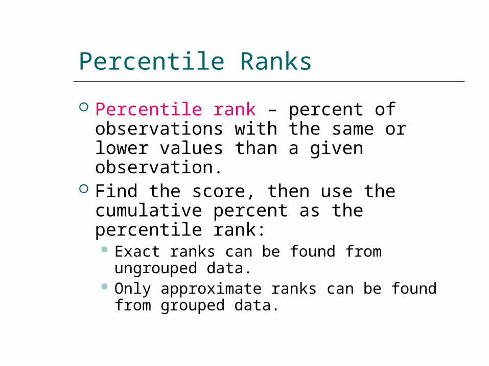
Percentile Ranks
Percentile rank – percent of observations with the same or lower values than a given observation.
Find the score, then use the cumulative percent as the percentile rank: Exact ranks can be found from
ungrouped data. Only approximate ranks can be found
from grouped data.
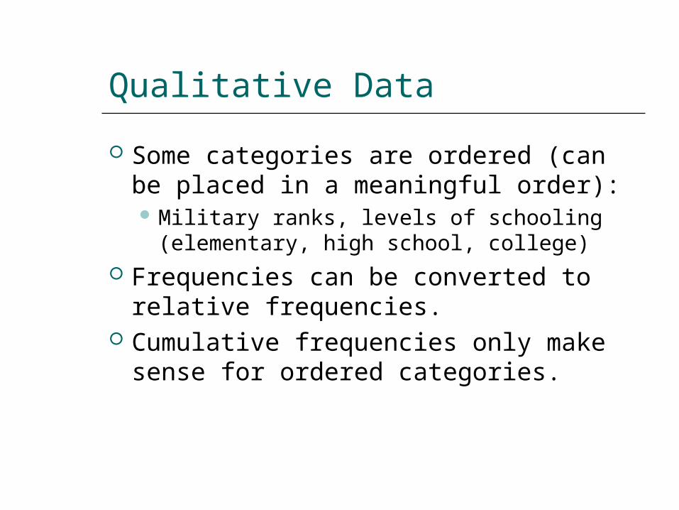
Qualitative Data
Some categories are ordered (can be placed in a meaningful order): Military ranks, levels of schooling
(elementary, high school, college) Frequencies can be converted to
relative frequencies. Cumulative frequencies only make
sense for ordered categories.
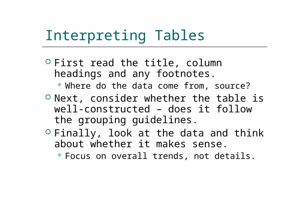
Interpreting Tables
First read the title, column headings and any footnotes. Where do the data come from, source?
Next, consider whether the table is well-constructed – does it follow the grouping guidelines.
Finally, look at the data and think about whether it makes sense. Focus on overall trends, not details.
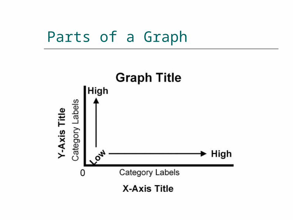
Parts of a Graph
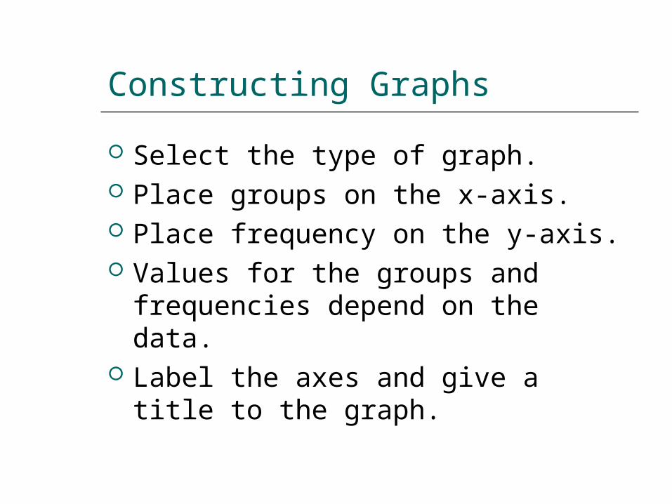
Constructing Graphs
Select the type of graph. Place groups on the x-axis. Place frequency on the y-axis. Values for the groups and
frequencies depend on the data. Label the axes and give a title to
the graph.
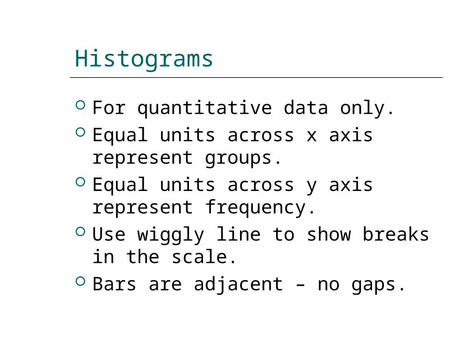
Histograms
For quantitative data only. Equal units across x axis represent
groups. Equal units across y axis represent
frequency. Use wiggly line to show breaks in
the scale. Bars are adjacent – no gaps.
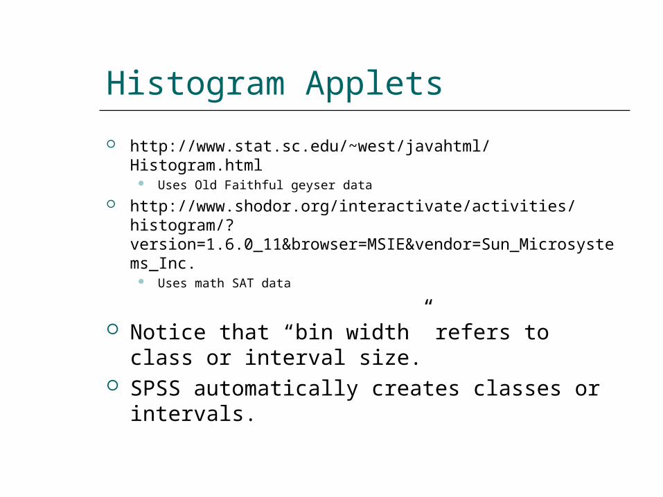
Histogram Applets
http://www.stat.sc.edu/~west/javahtml/Histogram.html Uses Old Faithful geyser data
http://www.shodor.org/interactivate/activities/histogram/?version=1.6.0_11&browser=MSIE&vendor=Sun_Microsystems_Inc.
Uses math SAT data
Notice that “bin width” refers to class or interval size.
SPSS automatically creates classes or intervals.
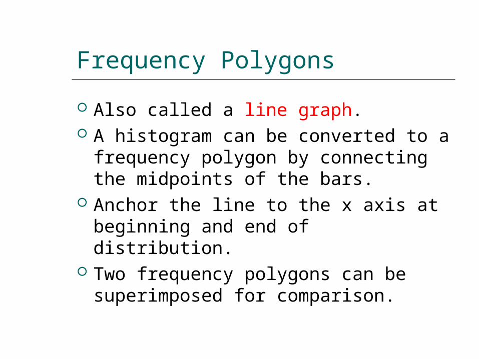
Frequency Polygons
Also called a line graph. A histogram can be converted to a
frequency polygon by connecting the midpoints of the bars.
Anchor the line to the x axis at beginning and end of distribution.
Two frequency polygons can be superimposed for comparison.
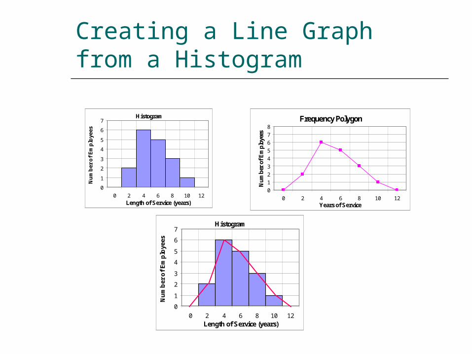
Creating a Line Graph from a Histogram
Frequency Polygon
0
1
2
3
4
5
6
7
8
0 2 4 6 8 10 12Years of Service
Nu
mb
er o
f E
mp
loye
es
Histogram
0
1
2
3
4
5
6
7
0 2 4 6 8 10 12Length of Service (years)
Nu
mb
er o
f E
mp
loye
es
Histogram
0
1
2
3
4
5
6
7
0 2 4 6 8 10 12Length of Service (years)
Nu
mb
er o
f E
mp
loye
es

Stem-and-Leaf Displays
Constructing a display: Notice the highest and lowest 10s Arrange 10s in ascending order. Copy right-hand digits as leaves.
The resulting display resembles a frequency histogram.
Stems are whatever digits make sense to use.
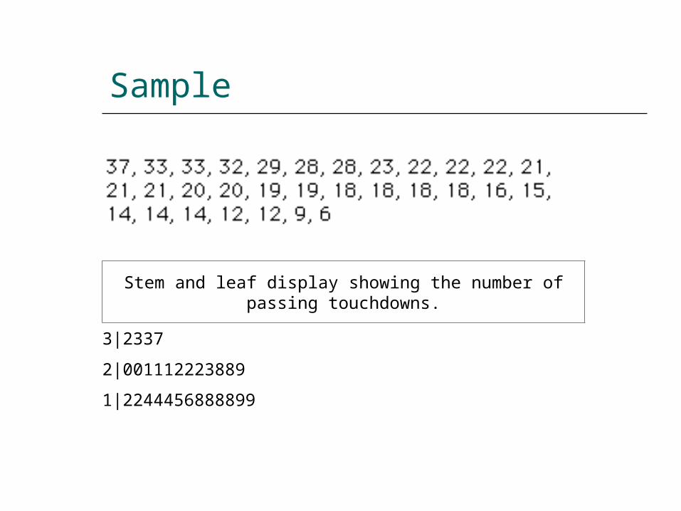
Sample
Stem and leaf display showing the number of passing touchdowns.
3|2337
2|001112223889
1|2244456888899
Purpose of Frequency Graphs
In statistics, we are interested in the shapes of distributions because they tell us what statistics to use.
They let us identify outliers that might distort the statistics we will be using.
They present data so that readers can quickly and easily grasp its meaning.
Shapes of Distributions
Normal – bell-shaped and symmetrical.
Bimodal – two peaks. Suggests presence of two different
types of observations in the same data. Positively skewed – lopsided due to
extreme observations in right tail. Negatively skewed – extreme
observations in left tail.
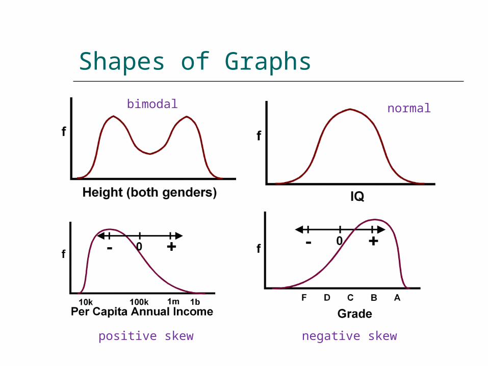
Shapes of Graphs
bimodal normal
positive skew negative skew
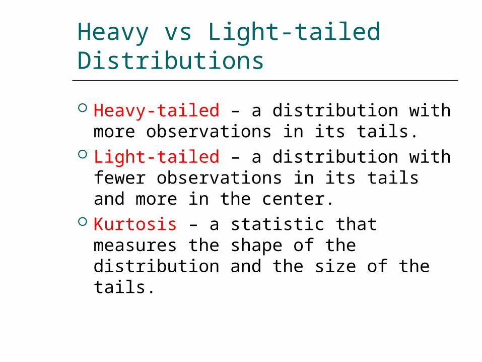
Heavy vs Light-tailed Distributions
Heavy-tailed – a distribution with more observations in its tails.
Light-tailed – a distribution with fewer observations in its tails and more in the center.
Kurtosis – a statistic that measures the shape of the distribution and the size of the tails.
Other Kinds of Graphs
Frequency is not the only measure that can be displayed on the y-axis. We are using a graph to explore the
shape of a distribution in this chapter. Usually the y-axis shows the
dependent variable while the x-axis shows groups (independent variable).
Graphs can be visually interesting!
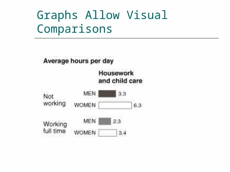
Graphs Allow Visual Comparisons
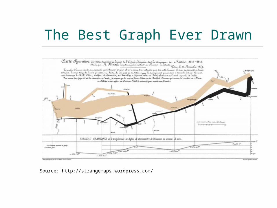
The Best Graph Ever Drawn
Source: http://strangemaps.wordpress.com/
Details About the Graph
The map was the work of Charles Joseph Minard (1781-1870), a French civil engineer who was an inspector-general of bridges and roads, but whose most remembered legacy is in the field of statistical graphics
The chart, or statistical graphic, is also a map. And a strange one at that. It depicts the advance into (1812) and retreat from (1813) Russia by Napoleon’s Grande Armée, which was decimated by a combination of the Russian winter, the Russian army and its scorched-earth tactics. To my knowledge, this is the origin of the term ’scorched earth’ – the retreating Russians burnt anything that might feed or shelter the French, thereby severely weakening Napoleon’s army. It unites temperature, time, geography and number of soldiers, all in one picture.
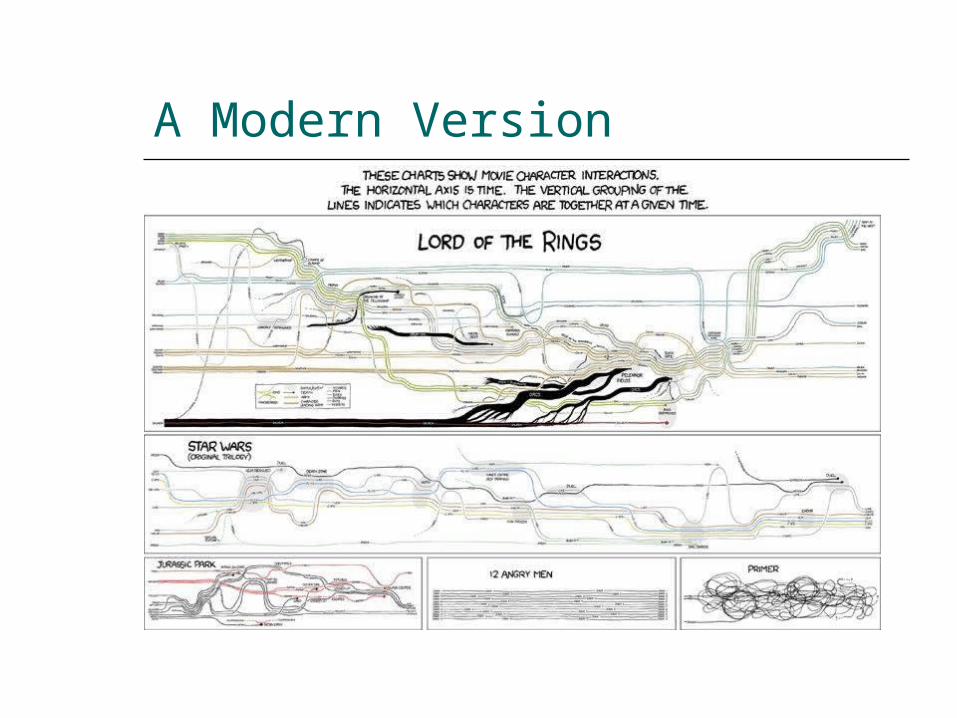
A Modern Version
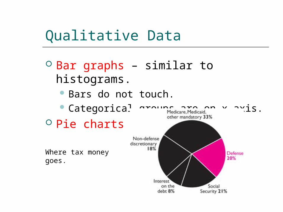
Qualitative Data
Bar graphs – similar to histograms. Bars do not touch. Categorical groups are on x-axis.
Pie charts
Where tax money goes.
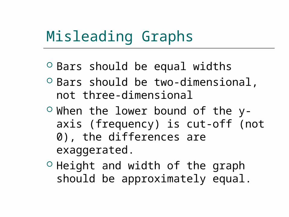
Misleading Graphs
Bars should be equal widths Bars should be two-dimensional, not
three-dimensional When the lower bound of the y-axis
(frequency) is cut-off (not 0), the differences are exaggerated.
Height and width of the graph should be approximately equal.
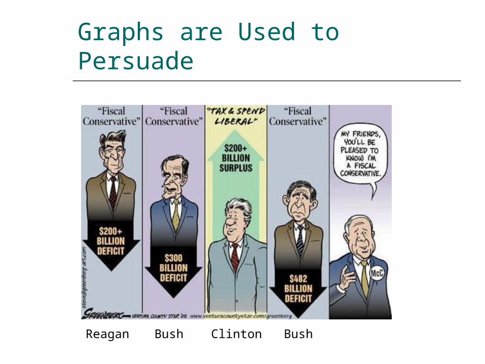
Graphs are Used to Persuade
Reagan Bush Clinton Bush
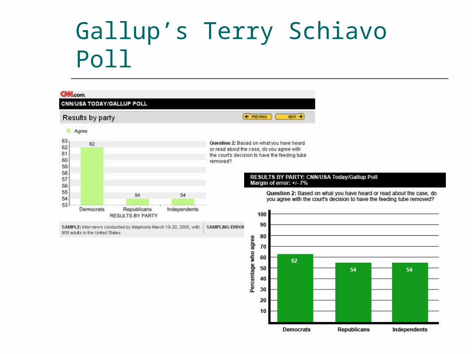
Gallup’s Terry Schiavo Poll
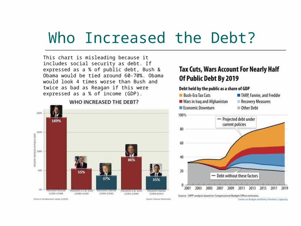
Who Increased the Debt?This chart is misleading because it includes social security as debt. If expressed as a % of public debt, Bush & Obama would be tied around 60-70%. Obama would look 4 times worse than Bush and twice as bad as Reagan if this were expressed as a % of income (GDP).
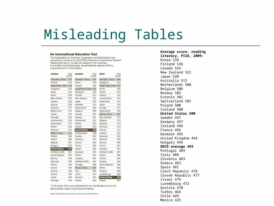
Misleading TablesAverage score, reading literacy, PISA, 2009:Korea 539Finland 536Canada 524New Zealand 521Japan 520Australia 515Netherlands 508Belgium 506Norway 503Estonia 501Switzerland 501Poland 500Iceland 500United States 500Sweden 497Germany 497Ireland 496France 496Denmark 495United Kingdom 494Hungary 494OECD average 493Portugal 489Italy 486Slovenia 483Greece 483Spain 481Czech Republic 478Slovak Republic 477Israel 474Luxembourg 472Austria 470Turkey 464Chile 449Mexico 425
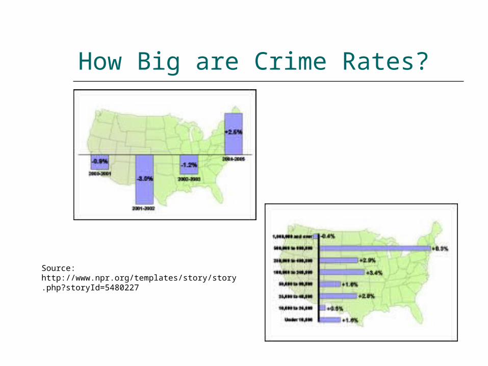
How Big are Crime Rates?
Source: http://www.npr.org/templates/story/story.php?storyId=5480227
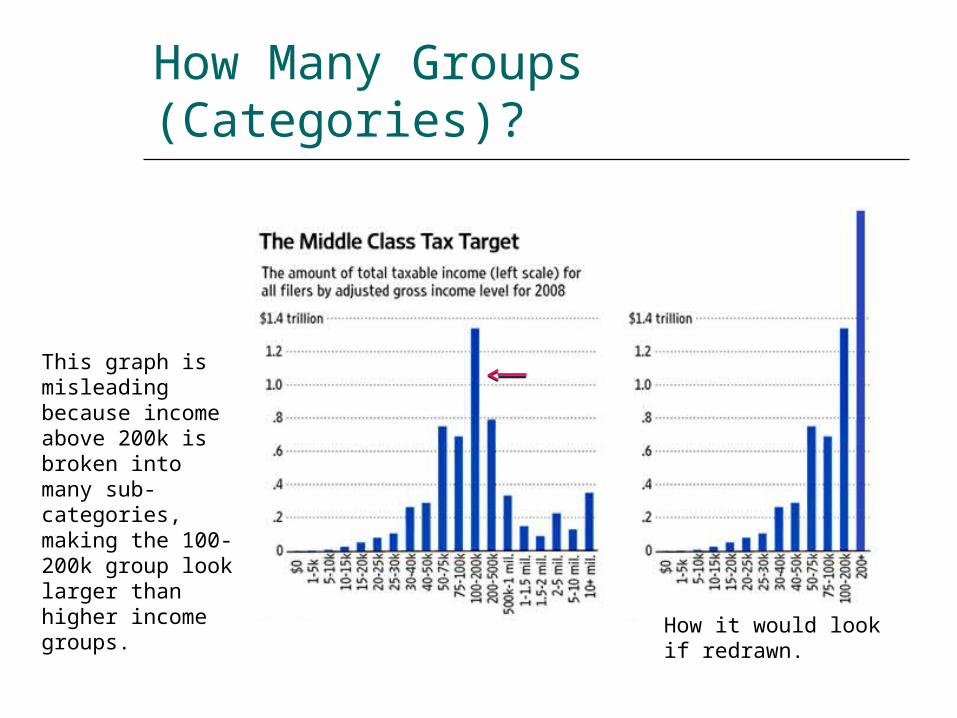
How Many Groups (Categories)?
This graph is misleading because income above 200k is broken into many sub-categories, making the 100-200k group look larger than higher income groups.
How it would look if redrawn.
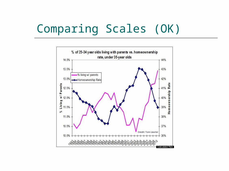
Comparing Scales (OK)
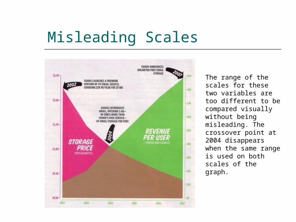
Misleading Scales
The range of the scales for these two variables are too different to be compared visually without being misleading. The crossover point at 2004 disappears when the same range is used on both scales of the graph.
More Misleading Graphs
http://www.coolschool.ca/lor/AMA11/unit1/U01L02.htm