professional comparison
TRANSCRIPT
Comparison of two professional products
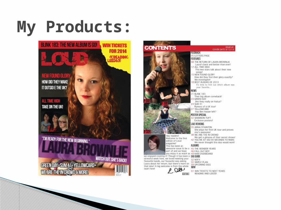
My Products:

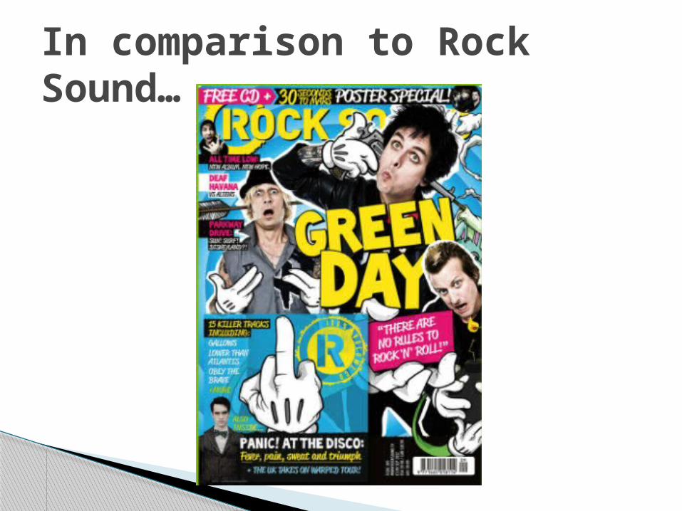
In comparison to Rock Sound…

There are a range of midshots and longshots in Rock Sound, my magazine has less longshots but has a range of midshots.
The eyelines of the images Rock Sound are more varied, not keeping a direct eyeline. Mine are much more straight.
The poses in Rock Sound are kept very open and friendly, with a few more serious images where the bands aren’t using a direct mode of address. The models in my magazine are usually using a direct mode of address with some more closed body language.
Image composition:
Cover- The cover of Rock Sound is very busy, having the main image taking up most of the page and having may sell lines and a poster giveaway. My cover doesn’t do this, so I may want to consider making it look slightly busier.
Contents page- The contents page is split into sections with the use of boxes, has more colour and many scattered images. It also uses the main image from the cover as the focus image on the contents page which mine also does but it could be centred better. My contents is also split into sections but doesn’t use colours as Rock Sound does, I may need to add more colour to my own contents page.
Layout
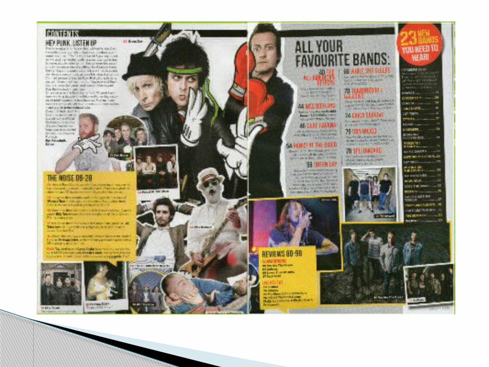
DPS- The article on the double page spread ranges across two pages whereas mine is only spread across one. Their image also ranges across both pages which mine also does. However there are many more images on the page, so I may want to include more.
Layout

Cover- The Rock Sound cover uses one main image surrounded by a few smaller images and text. I could use more text on my own as it doesn’t have as much going on.
Contents- In comparison to my own contents, I don’t have as many images which is something I may wish to consider. The amount is roughly the same as my own although I could add more captions to my images like in Rock Sound.
Text to image ratio
DPS- On the Rock Sound DPS there are more images than my own which I may wish to consider. The amount of text is roughly the same as my own.
Text to image ratio
The use of locations in Rock Sound are mainly studio locations and at live venues. My magazine uses outdoor locations as well as studio locations as I was unable to attend a live concert to take images.
Use of Locations
The use of costume and props in Rock Sound varies, but as the bands and artists are shown, their costumes usually stay the same. There are more props used in Rock Sound such as guitars, so I may wish to consider using more props.
Use of costume and props
The lighting in Rock Sound ranges from naturalistic to darker lighting. Some of my own images are quite bright and should be toned down slightly. The cover of Rock Sound is fairly bright in addition to the cover whereas my own is very dark.
Use of lighting
The colours used prominently in Rock Sound are reds, greys, blacks, yellows, and on the cover blue is used. My own products use less of these colours however I have tried to use a consistent house style using reds and blacks, but I may wish to add in more colour.
Use of colour
The pop punk genre in Rock Sound is shown with a mixture of images and use of language. I have tried to in cooperate the techniques of existing magazines to show this genre.
Genre
The language used in Rock Sound includes more taboo language than my own. In mine I have tried to use more informal language to capture the readers attention, but it’s perhaps too reader friendly.
Language
There is much more range with Rock Sound’s fonts so I may need to change some of my own and do some more research. My main sell line could have a better, more appealing and exciting font to draw in readers.
Font Choice
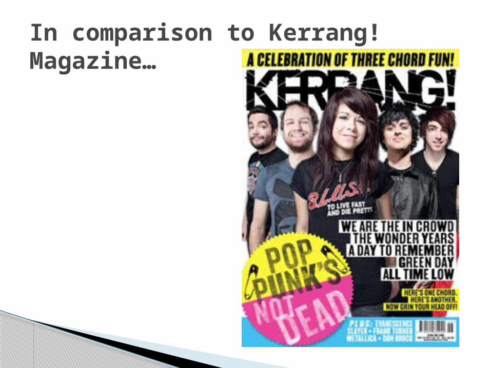
In comparison to Kerrang! Magazine…
There is a range of mainly midshots to medium long-shots in Kerrang magazine, whereas in my own I have ranged from longshots to midshots to give more variety.
The eyelines in Kerrang are very even and symmetrical which I have tried to do in my own magazine to make it look slightly more professional.
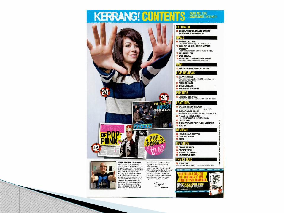
The poses in Kerrang are quite straight forward in that most aren’t ordinarily what people would see. There are a few that are out of the ordinary, for example the woman on the contents page reaching out which is the most obscure. This is similar to my own as in doesn’t range as much as Rock Sound does.
Image composition
Cover- The main image is kept to the centre, showing the main focus of the magazine which my cover also does. The left side third is left empty and the text is kept mainly to the right hand bottom corner, this is very different to my own magazine as there is nothing kept to the right of my own. I may wish to add in some more sell lines to the right to make it look fuller.
Contents- The layout of the contents is very similar to my own with the use of subheadings along the page index. Some images also overlap, much like my own and the editorial letter is also roughly in the same place as my own.
Layout

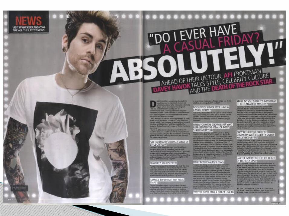
DPS- The double page spread of Kerrang uses a main image on the left page and the bulk of the text is on the right. This is quite similar to my own DPS as the bulk of text is on the right page with a main image on the left. The heading is slanted and much bigger than my own with varying font sizes.
Layout
Cover- Kerrang’s cover has quite a lot of bulk text on the right side of a list of bands whereas my own is spread out, making it look more cluttered and full, but without too much text in one place.
Contents- The amount of text taking up the page is roughly 2/3rds of my own magazine and Kerrang’s magazine with the amount of images roughly the same.
Text to image ratio

DPS- There is roughly the same amount of text on Kerrang’s DPS as mine although my image looks as it if takes up more of the space as it has a different background colour.
Text to image ratio

The locations seen in Kerrang are predominantly studio locations with a few live gigs used. Mine have a split in the use of outdoor and studio locations as I couldn’t get to any live performances.
Use of locations

Kerrang have a range of costume but mainly use t-shirts and skinny jeans to show the pop-punk genre. The make up is kept mainly to eyeliner which I’ve tried to use in my own magazine. The props are quite minimal, like in my own product.
Use of costume and props

The lighting in Kerrang is quite bright and has some much brighter images than my own. Some of theirs are darker, but the majority are light in contrast to my own.
Use of lighting

Kerrang has a clear house style of blacks, whites and yellows. Not much red has been used like in my own to identify with the pop-punk genre. Kerrang have also used blue like in Rock Sound, which I may need to consider for my own magazine.
Use of colour
The genre of Kerrang is shown by a mixture of language and images. These all use methods to help identify with the reader and make the pop-punk genre quite significant. I have tried to use these techniques in my own magazine.
Genre
The language used in Kerrang is quite informal to gain the audience’s attention and to also identify with them. Mine is on a similar level but could use some more informal language to identify more with the readers.
Language
Kerrang uses a range of different fonts, however not as many as Rock Sound have been used. My products don’t have as many varying fonts which I may wish to consider.
Font choice