print work: mock-ups
TRANSCRIPT
After having researched two digipaks and two print adverts, I have been thinking about what features from each I will be using within my own print work. The existing digipaks and print adverts which I looked at showed features which follow and challenge conventions, many of which I feel were effective, but not appropriate given my chosen genre of music and the type of artist.
For example, on the cover of Lana Del Rey’s album Ultraviolence, her name is not featured. This is primarily not needed on an artist of her star-status as she is extremely well-known, and her image is recognisable.
As the artist of my choice, Sarah de Warren, is an unsigned artist, I feel this would be inappropriate. Up and coming artists tend to want to get their name known, and so I feel that featuring this will be a crucial part of the designs I create.
I will be featuring key information such as the name, title and tracklist, as well as the institution which labels the artist and copyrighting information.


Here is a simple mock-up of how I intend for the front cover of my digipak to appear.
I have here positioned the artist’s name and the title of the album in the lower left hand corner of the side, so that no important aspects of the photograph are interrupted.
At the moment, I intend for the front cover’s imagery to be of the artist, and to be a medium close-up shot. This allows me to also introduce mise-en-scene features such as the background, which will be visible (to the left in this case), as well as outfit.
Until I have taken photographs to use for my product packaging, I am somewhat limited to how I will lay the piece out. However, this is an initial idea and from this mock-up alone, I feel it would be a successful layout which follows conventions of the Indie Pop genre.
Visual links with print work research
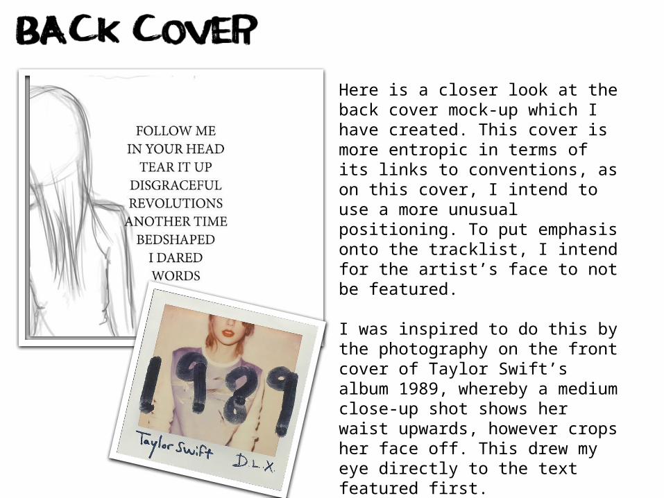
Here is a closer look at the back cover mock-up which I have created. This cover is more entropic in terms of its links to conventions, as on this cover, I intend to use a more unusual positioning. To put emphasis onto the tracklist, I intend for the artist’s face to not be featured.
I was inspired to do this by the photography on the front cover of Taylor Swift’s album 1989, whereby a medium close-up shot shows her waist upwards, however crops her face off. This drew my eye directly to the text featured first.
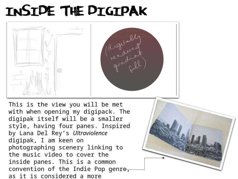
This is the view you will be met with when opening my digipack. The digipak itself will be a smaller style, having four panes. Inspired by Lana Del Rey’s Ultraviolence digipak, I am keen on photographing scenery linking to the music video to cover the inside panes. This is a common convention of the Indie Pop genre, as it is considered a more ‘artistic’ genre than one such as mainstream pop, whereby every pane might feature a photograph of the artist.

I have decided that to break up the heavy content of photographic imagery which will dominate my digipak product, to create a simple, minimalistic digital design to colour the CD itself. I feel that this will juxtapose the busy, detailed photography effectively, showing the buyer that it is a significant element in the product. I will likely use a gradient fill to ensure some interest, rather than a block colour.
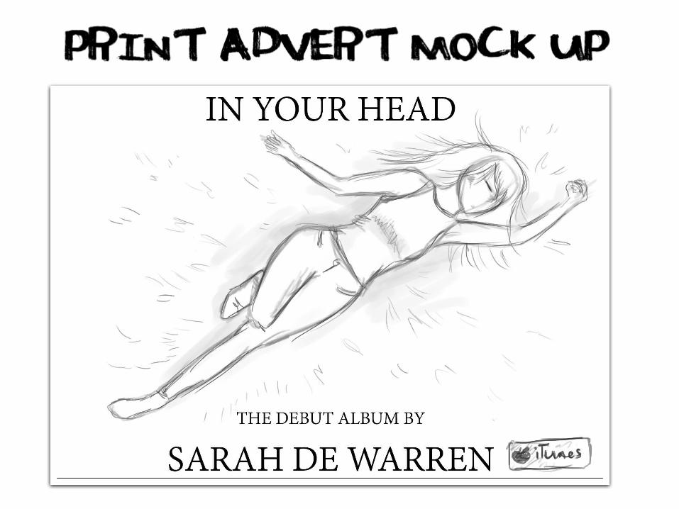
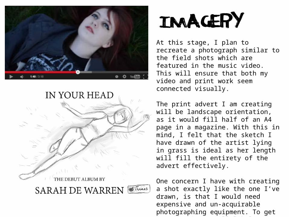
At this stage, I plan to recreate a photograph similar to the field shots which are featured in the music video. This will ensure that both my video and print work seem connected visually.
The print advert I am creating will be landscape orientation, as it would fill half of an A4 page in a magazine. With this in mind, I felt that the sketch I have drawn of the artist lying in grass is ideal as her length will fill the entirety of the advert effectively.
One concern I have with creating a shot exactly like the one I’ve drawn, is that I would need expensive and un-acquirable photographing equipment. To get around this, I will likely photograph from a slightly different angle.
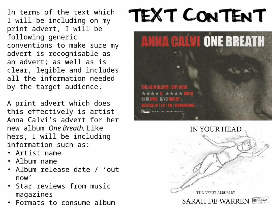
In terms of the text which I will be including on my print advert, I will be following generic conventions to make sure my advert is recognisable as an advert; as well as is clear, legible and includes all the information needed by the target audience.
A print advert which does this effectively is artist Anna Calvi’s advert for her new album One Breath. Like hers, I will be including information such as:• Artist name • Album name• Album release date / ‘out
now’• Star reviews from music
magazines• Formats to consume album in
(iTunes logo)• Record label logo• Copyright information