pressurised recovery evaluation
DESCRIPTION
evaluation of the first comprehensive brief I have completed for the OUGD301 module At Leeds College of art. (BA (Hons) Graphic Design).TRANSCRIPT
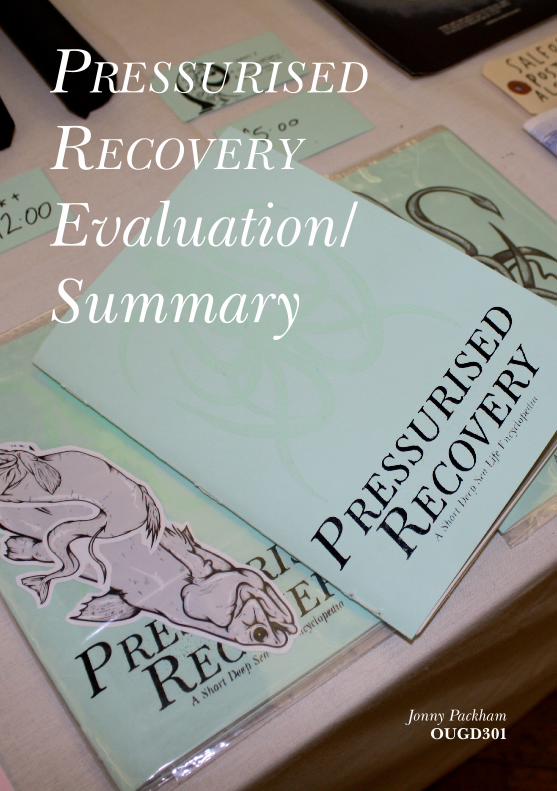
Pressurised
recovery
Evaluation/Summary
Jonny PackhamOUGD301
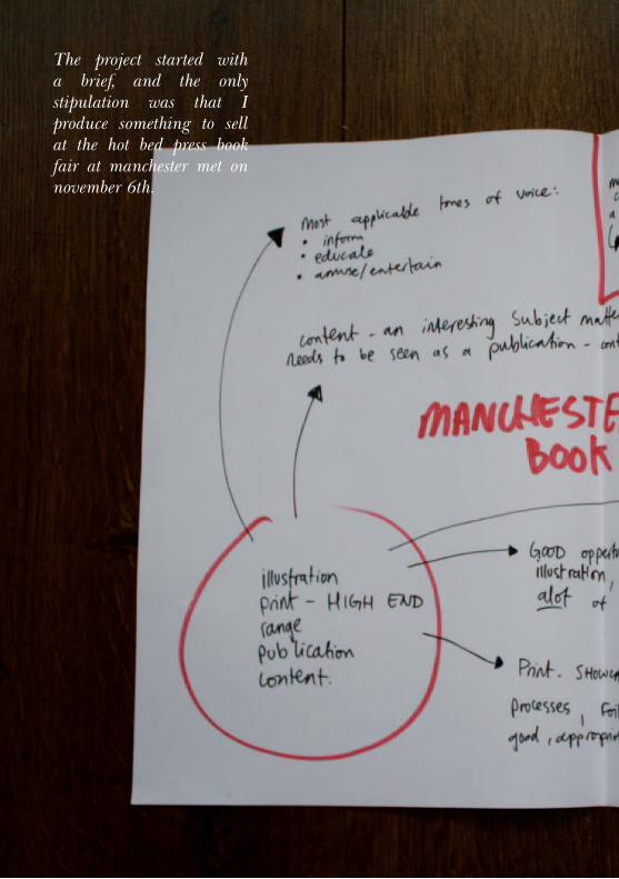
The project started with a brief, and the only stipulation was that I produce something to sell at the hot bed press book fair at manchester met on november 6th.
Jonny Packham
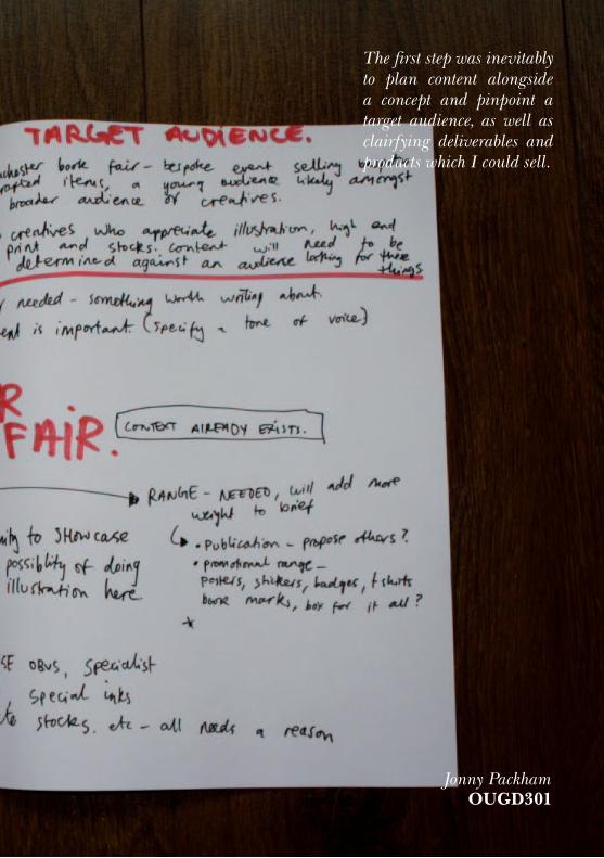
The first step was inevitably to plan content alongside a concept and pinpoint a target audience, as well as clairfying deliverables and products which I could sell.
OUGD301
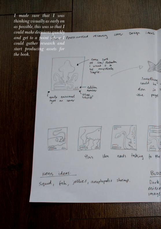
I made sure that I was thinking visually as early on as possible, this was so that I could make decisions quickly and get to a point where I could gather research and start producing assets for the book.
Jonny Packham
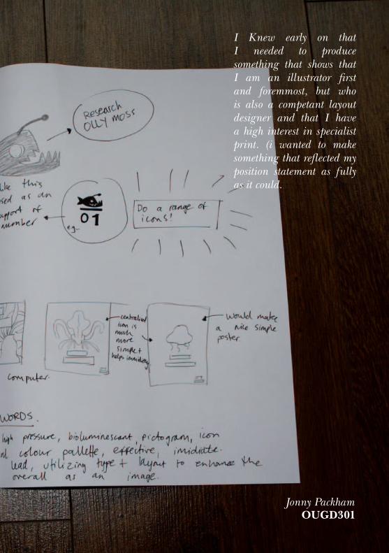
I Knew early on that I needed to produce something that shows that I am an illustrator first and foremmost, but who is also a competant layout designer and that I have a high interest in specialist print. (i wanted to make something that reflected my position statement as fully as it could.
OUGD301

illustrator/ designer for creative & commercial industries, driven by Print & Publication
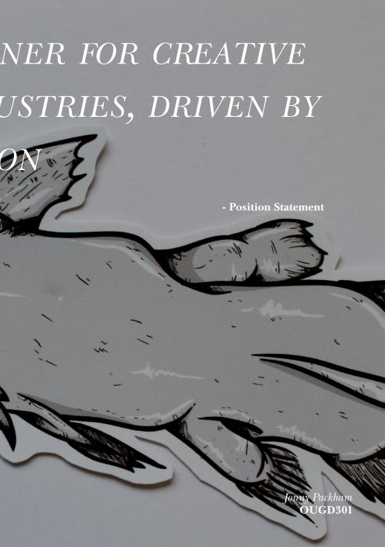
illustrator/ designer for creative & commercial industries, driven by Print & Publication
Jonny PackhamOUGD301
- Position Statement
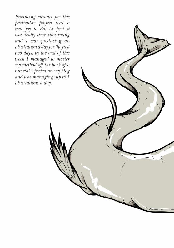
Producing visuals for this particular project was a real joy to do. At first it was really time consuming and i was producing an illustration a day for the first two days, by the end of this week I managed to master my method off the back of a tutorial i posted on my blog and was managing up to 5 illustrations a day.
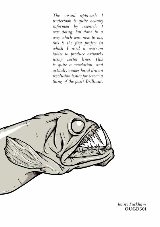
The visual approach I undertook is quite heavily informed by research I was doing, but done in a way which was new to me, this is the first project in which I used a waccom tablet to produce artworks using vector lines. This is quite a revelation, and actually makes hand drawn resolution issues for screen a thing of the past! Brilliant.
Jonny PackhamOUGD301
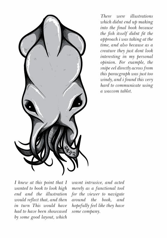
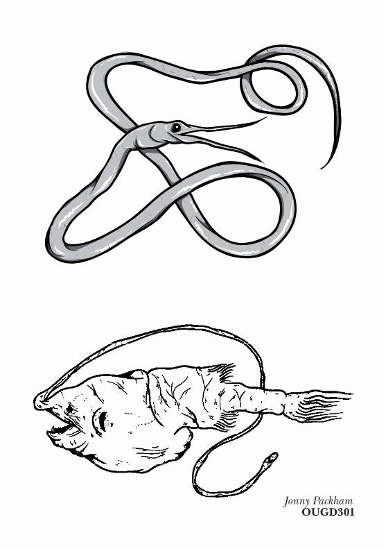
There were illustrations which didnt end up making into the final book because the fish itsself didnt fit the approach i was taking at the time, and also because as a creature they just dont look interesting in my personal opinion. For example, the snipe eel directly across from this paracgraph was just too windy, and i found this very hard to communicate using a waccom tablet.
I knew at this point that I wanted to book to look high end and the illustration would reflect that, and then in turn This would have had to have been showcased by some good layout, which
wasnt intrusive, and acted merely as a functional tool for the viewer to navigate around the book, and hopefully feel like they have some company.
Jonny PackhamOUGD301
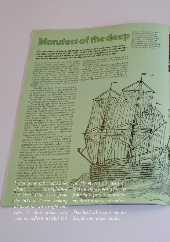
I had some old magazines about unexplained mysteries that were from the 60’s so I was looking at these for an insight into type. (I dont know why now on reflection) But this
quickly moved my ideas on into an encyclopedia for my fish which gave a context for my illustration to sit within.
This book also gave me an insight into paper stocks.

In terms of colour, as before this I had no thoughts on colour at this point what so ever, I had also tried to add colourways to the fish ilustrations, but it detracted from the linework, so I Jonny Packham
OUGD301
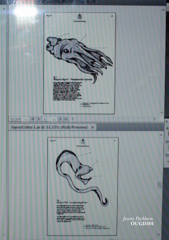
decided pretty early on that greyscale was the best option for the illustration which fit best with an encyclopedia idea anyway.

In the initial stages of layout was a slow process because I hadnt gethered all my information before I started and did what i typically do when im excited about something and jump the gun. The process became alot quicker and easier as soon as I started getting feedback from other people who are more adept with layout of type.
Throughout this part of the design process I had invaluable feedback from Will, Emma, Tim and Ross, as well as Joe and Fred.
Jonny PackhamOUGD301
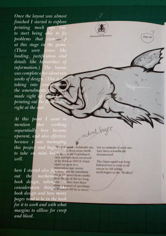
Once the layout was almost finished I started to explore printing mock ups out, to start being able to fiz problems that came up at this stage in the game. (These were issues like leading, justification and details like hierarchies of information.) The layout was complete after about two weeks of design. (This is not taking into consideration the amendments that were made right up until I was printing out the final copies right at the end.
At this point I want to mention that working sequentially here became aparant, and also effective, because i was managing this project and beginning to take on mini briefs as well.
here I started also figuring out the mechanics of book design, taking into consideration things like book design and how many pages need to be in the book for it to work and with what margins to alllow for creep and bleed.
Jonny PackhamOUGD301

Once all the layout was sorted I started thinking about how to get this thing into print at the most high end that was possible. My first thought was to outsource paper stocks, to really nail the feel I wanted for the book. I wanted it to be something precious, something that someone would really want to take care of and also own, and paper seemed a great way to do this. However my budget wasnt very high, being £50, meaning I couldnt afford to
do this. Luckily I did have a contingency plan at this time, which was to source paper rom Gadsbys, and as luck would have it they had a very nice selection of papers anyway, I had some pearlised paper which would be a speciality stock endpage, and I also bought some trace which became an endpage too, the paper became a means of easing the viewer into the book in an interesting, tactile way.
Jonny PackhamOUGD301
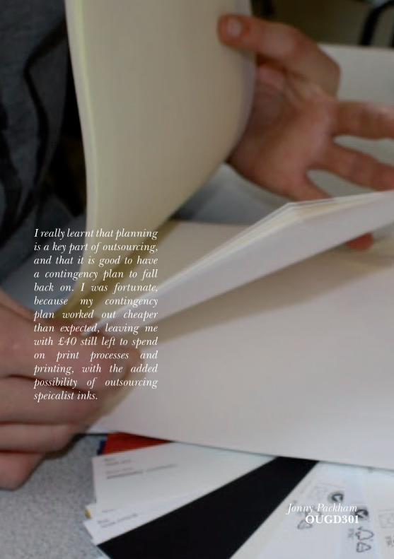
I really learnt that planning is a key part of outsourcing, and that it is good to have a contingency plan to fall back on. I was fortunate, because my contingency plan worked out cheaper than expected, leaving me with £40 still left to spend on print processes and printing, with the added possibility of outsourcing speicalist inks.

I printed 10 copies of the conetnt for my book in the digital print room, this cosetd £22, and took about 2 days to do, which I really wasnt prepared for, as I overlooked having to manually feed every single page into the printed to make sure it duplexed correctly. This was a painstaking and also nervewracking endeavour, but with careful attention it whent off without a hitch, hich was great - if a bit long winded. There definately will have
been a more efficient way of doing this, I just didnt trust it what so ever. I printed 5 copies each onto two different paper stocks, just in case in wanted to have to seperate editions later on in the project. The difference was subtle but just enough to distinguish a difference.
OUGD301
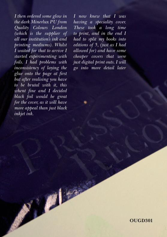
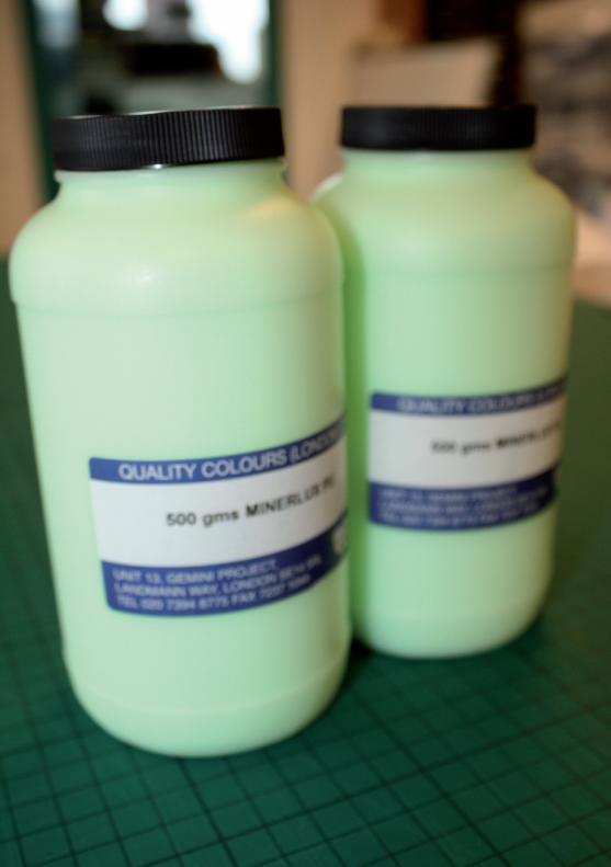
I then ordered some glow in the dark Minerlux PU from Quality Colours London (which is the supplier of all our institution’s ink and printing mediums). Whilst I waited for that to arrive I started experimenting with foils. I had problems with inconsistency of laying the glue onto the page at first but after realising you have to be brutal with it, this whent fine and I decided black foil would be great for the cover, as it will have more appeal than just black inkjet ink.
I now knew that I was having a speciality cover. These took a long time to print, and in the end I had to split my books into editions of 5, (just as I had allowed for) and have some cheaper covers that were just digital print outs. I will go into more detail later
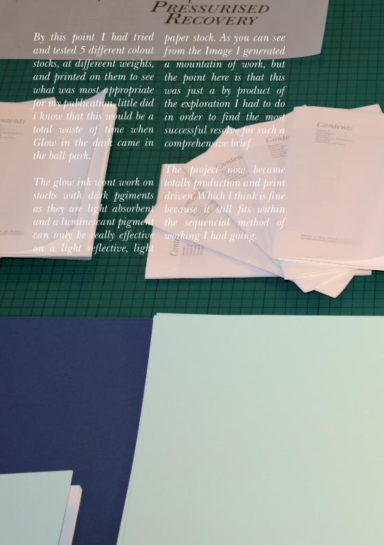
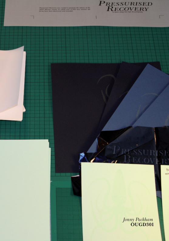
By this point I had tried and tested 5 different colout stocks, at differeent weights, and printed on them to see what was most appropriate for my publication, little did i know that this would be a total waste of time when Glow in the dark came in the ball park.
The glow ink wont work on stocks with dark pgiments as they are light absorbent and a luminescant pigment can only be really effective on a light reflective, light
paper stock. As you can see from the Image I generated a mountatin of work, but the point here is that this was just a by product of the exploration I had to do in order to find the most successful resolve for such a comprehensive brief.
The project now became totally production and print driven. Which I think is fine because it still fits within the sequencial method of working I had going.
Jonny PackhamOUGD301
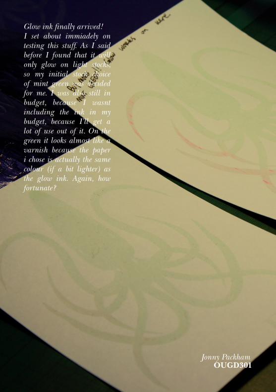
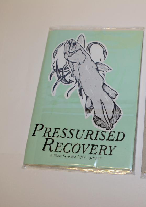
Glow ink finally arrived!I set about immiadely on testing this stuff. As I said before I found that it will only glow on light stocks, so my initial stock choice of mint green was decided for me. I was also still in budget, because I wasnt including the ink in my budget, because I’ll get a lot of use out of it. On the green it looks almost like a varnish because the paper i chose is actually the same colour (if a bit lighter) as the glow ink. Again, how fortunate?
Jonny PackhamOUGD301

It took about three days longer than I had anticipated, due to hold ups in the print room, but I finally got the books finished. This was a hair raising time period because registration was going wrong as I rushed it a litle. For this reason, I decided I had to have to editions of 5.
One of which would glow and be foiled on the cover, it would also come with stickers of what I thought to be the best illustrations in the book. The other of which would be the stand alone book, with a digitally printed cover. I added an illustration to the cover of this one to make it almost equally as appealing.
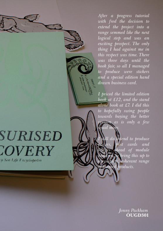
After a progress tutorial with fred the decision to extend the project into a range semmed like the next logical step and was an exciting prospect. The only thing I had against me in this respect was time. There was three days until the book fair, so all I managed to produce were stickers and a special edition hand drawn business card.
I priced the limited edition book at £12, and the stand alone book at £7. I did this to hopefully swing people towards buying the better version as is only a few squid more.
I still do intend to produce posters, post cards and badges ahead of module hand in, to bring this up to a complete, coherant range of themed products.
Jonny PackhamOUGD301
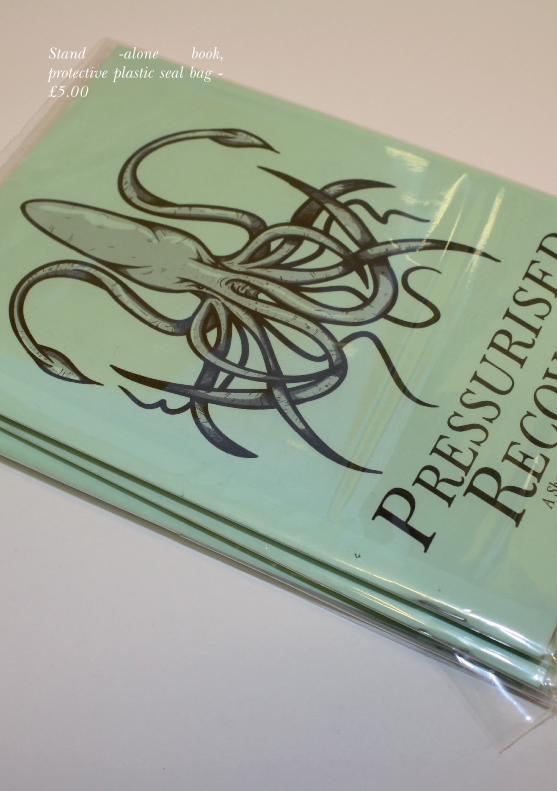
Stand -alone book, protective plastic seal bag - £5.00
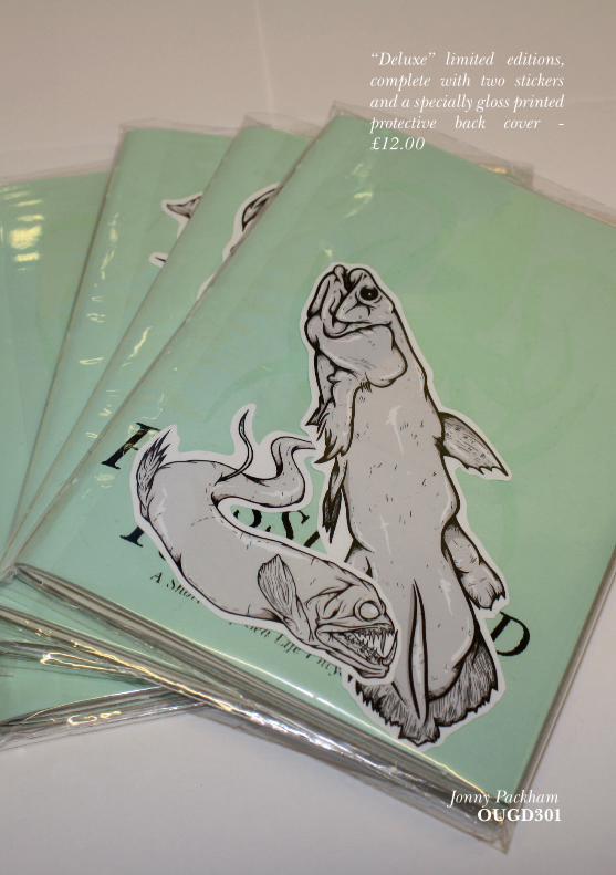
“Deluxe” limited editions, complete with two stickers and a specially gloss printed protective back cover - £12.00
Jonny PackhamOUGD301

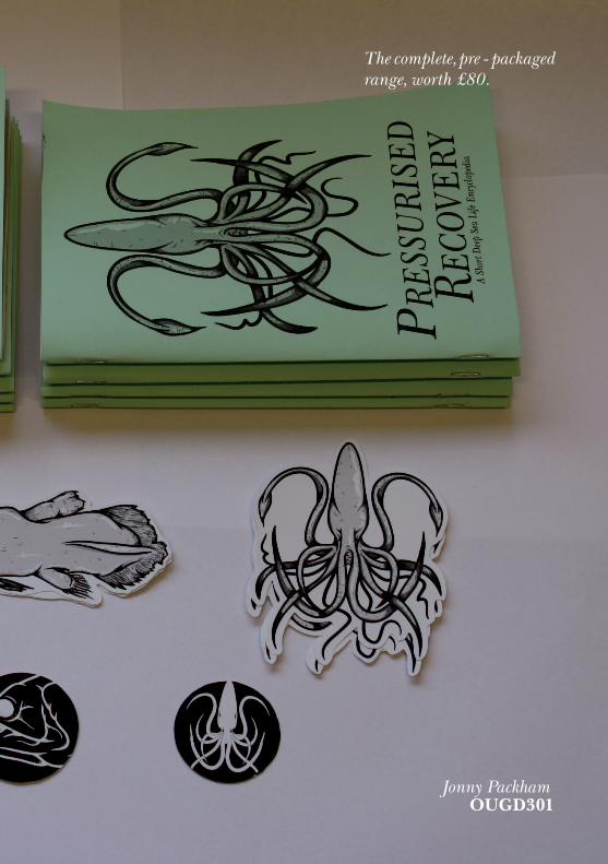
The complete, pre - packaged range, worth £80.
Jonny PackhamOUGD301
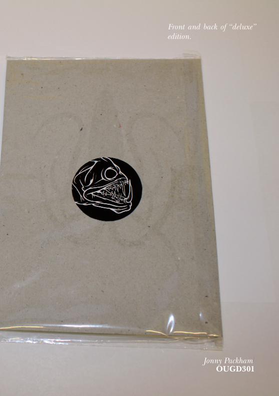
Front and back of “deluxe” edition.
Jonny PackhamOUGD301
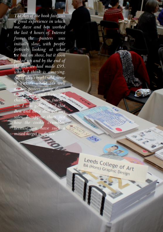
The day of the book fair was a great experience in which me, dave and ben worked the last 4 hours of. Interest from the punters was initially slow, with people fertively looking at what we had on show, but it soon picked up and by the end of the day, we had made £95. which I think is amazing. All of alex’s books sold, some of Vickie’s whent (as well as her posters going down really well) and kate and charlotte got some interest too. I was gobsmacked that Ben and dave didt get any sales. I suppose thats just how the cookie crumbles, because you have such a mixed target audience.
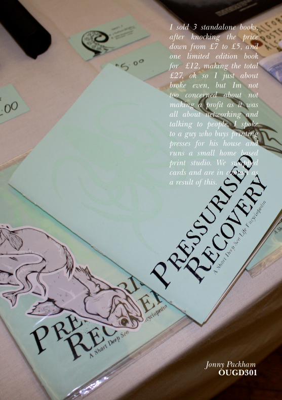
I sold 3 standalone books, after knocking the price down from £7 to £5, and one limited edition book for £12, making the total £27, ok so I just about broke even, but Im not too concerned about not making a profit as it was all about networking and talking to people. I spoke to a guy who buys printing presses for his house and runs a small home based print studio. We swapped cards and are in contact as a result of this.
Jonny PackhamOUGD301
evaluation
This Project lasted about a week longer than I wanted it to not including the day of the book fair, but that’s just because other things had to be done in and around the course of this brief, things like mini briefs and un reliable print rooms!
However taking that into consideration, I would say I worked smart on this brief with a good level of awareness in regards to constantly moving the project forward and being sure that I was working around my position statement at all times.
- Buzzword - Synthesis.
I would have benefitted from making a personal deadline and possibly turning down some of the life briefs I did alongside this project to have ensured a more efficient work rate. This year has definately got off to a flying start, but I think I need to be aware of how much work I set myself at times.
The main structure of this brief stayed the same throughout the project, but i did feel it neccessary to be constantly changing the projects direction to keep improving its appropriateness for the context it would end up sitting in.
In terms of professional practise, I think I did a good job of staying on top of my project and not getting lazy with it at all. Thats testament that I managed to outsource some materials that really enhanced what I came out with at the end of it. (I’m sure that glow in the dark ink will be coming out to play again in the very near future.)
My professional practise was also tested to its limits at the book fair, Ive never actively stood and sold my wares before and it was a totally new experience for me. I felt that we were representing the course, and also that we did it exceptionally well. We were also asked to sell at the next fair, and the organiser was impressed with what was out on the table.
I feel like overall, I have made a major breakthrough in the last few months and I’m also confident that its starting to show in the work I am doing. Ive learnt alot about the mindset I have towards working now and that no amount of work, will ever be enough for me, i wont stop worrying about it until its wrestled out of my hands! (this could probably do with adressing.)
On the whole, I think i need to relax and prepare for the next briefs now ahead of next week. This evaluation will go towards my bigger one at the end of the module.
Thanks for reading.
Jonny PackhamOUGD301


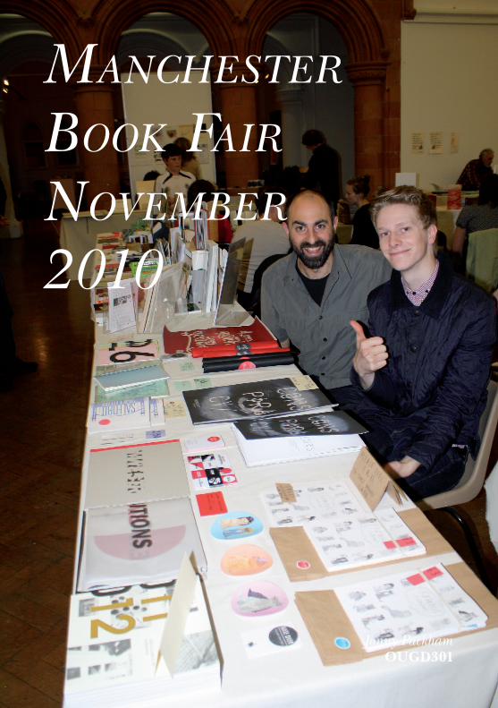
manchester
book fair
november
2010
Jonny PackhamOUGD301