polymer 1.0 par cyril balit au devfest paris 2016
TRANSCRIPT

Polymer 1.0
1


Moi...

Des composants


@polymer #itshackademic


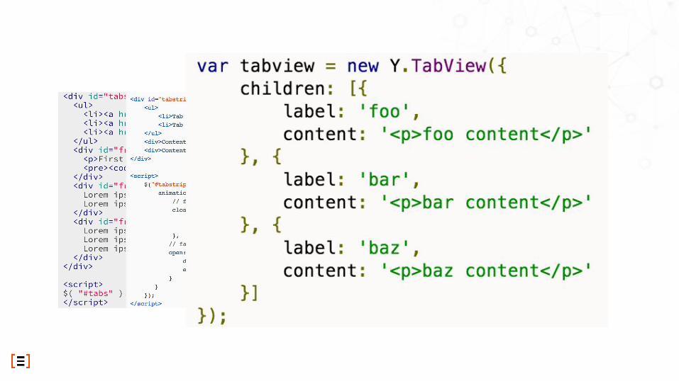
<paper-tabs>
<paper-tab>KNOWLEDGE</paper-tab>
<paper-tab>HISTORY</paper-tab>
<paper-tab>FOOD</paper-tab>
</paper-tabs>

Web Components

Custom Element

Shadow DOM

HTML Imports

Template


Polyfills...
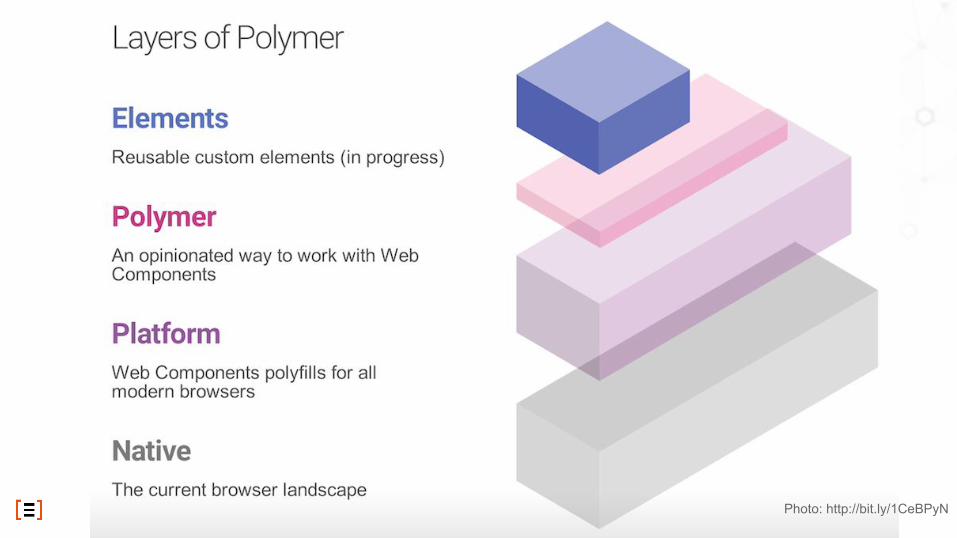
Photo: http://bit.ly/1CeBPyN


Polymer elements
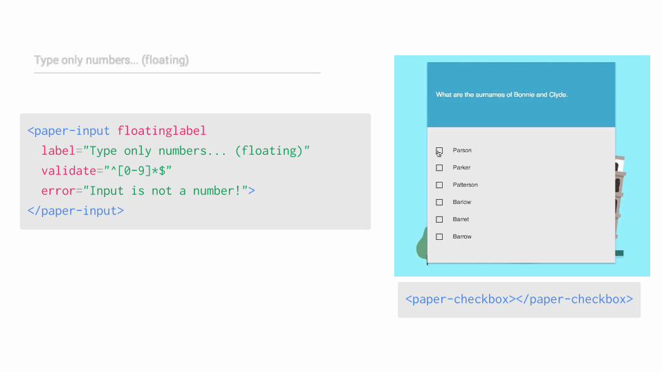
<paper-checkbox></paper-checkbox>
<paper-input floatinglabel
label="Type only numbers... (floating)"
validate="^[0-9]*$"
error="Input is not a number!">
</paper-input>

<paper-header-panel>
<paper-header-panel flex>
<paper-toolbar>
<paper-icon-button icon=“menu">
</paper-icon-button>
<div>MY APP</div>
</paper-toolbar>
<div>…</div>
</paper-header-panel>
MY APP

<paper-drawer-panel>
<paper-drawer-panel>
<div drawer> Drawer panel... </div>
<div main> Main panel... </div>
</paper-drawer-panel>

Créer un composant

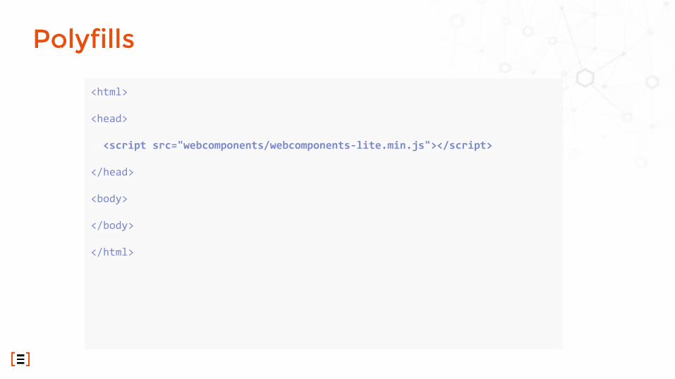
<html>
<head>
<script src="webcomponents/webcomponents-lite.min.js"></script>
</head>
<body>
</body>
</html>
Polyfills

<html>
<head>
<script src="webcomponents/webcomponents-lite.min.js"></script>
<link rel=”import” href="paper-card.html">
</head>
<body>
</body>
</html>
Importer l’élément

<html>
<head>
<script src="webcomponents/webcomponents-lite.min.js"></script>
<link rel=”import” href="paper-card.html">
</head>
<body>
<paper-card heading=”hello my friend”>
<img src=”avatar.svg”>
</paper-card>
</body>
</html>
Utiliser l’élément

<dom-module id="paper-card"> <style> :host { border-radius: 2px; } .card-header ::content img { width: 70px; border-radius: 50%; } paper-material { border-radius: 2px; } </style> <template> <paper-material elevation="{{elevation}}" animated on-tap=”tapAction”> <div class="card-header layout horizontal center”> <content select="img"></content> <h3>{{heading}}</h3> </div> <content></content> </paper-material> </template></dom-module><script> Polymer({ is:'paper-card', properties: { heading: {type: String, reflectToAttribute: true, value: “”}, elevation: {type: Number, reflectToAttribute: true, value: 1} }, attached: function() { /* your initialisations here */ }, tapAction: function (e) { /* your event handling here */ } });</script>
script: called on init
content injection using select= polymer expression
injecting all other content
scrip
t / p
roto
type
the name must have a “-”
event binding
published attributes
data binding
tags
/ sh
adow
DO
M a
nd s
tyle

MyElement = Polymer({
is: 'my-element',
created: function() {},
attached: function() {},
detached: function() {},
attributeChanged: function(name, type) {}
ready: function() {}
});
1. created callback
2. local DOM initialized
3. ready callback
4. attached callback
Lifecycle

Distribution du DOM : la composition

Light Dom and Shadow Dom

<my-component> <span class="title">Hello too</span> <span>Bla Bla Bla</span></my-component>
Dom & Light Dom
<h1>In Shadow</h1><h2>
<content select=".title"></content></h2><section>
<content></content></section>
Shadow Dom
<my-component><h1>In Shadow</h1><h2>
<span class="title">Hello too</span></h2><section>
<span>Bla Bla Bla</span></section>
</my-component>
Composed Dom
Light Dom and Shadow Dom

●●●
And Shady Dom...

Propriétés

●●●●●●
Polymer({
is: 'x-custom',
properties: {
userName: String,
isHappy: Boolean,
count: {
type: Number,
readOnly: true,
notify: true
}
}
...
});
<x-custom user-name="Scott"></x-custom>
Properties : configuration

Data Binding

<dom-module id="host-element">
<template>
<child-element name="{{myName}}"></child-element>
</template>
</dom-module>
Data Binding

●●
2 types

●●●
Pour faire du 2 way databinding

●●●
<dom-module id="x-custom">
<template>
<div hidden="{{!enabled}}"></div>
<span>{{computeFullName(first, last)}}</span>
</template>
</dom-module>
<script>
Polymer({
is: 'x-custom',
properties: {
first: String,
last: String
},
computeFullName: function(first, last) {
return first + ' ' + last;
}
Les expressions

●●
<dom-module id="employee-list">
<template>
<template is="dom-repeat" items="{{employees}}">
<div># <span>{{index}}</span></div>
<div>First name: <span>{{item.first}}</span></div>
</template>
</template>
…
</dom-module>
Helpers : dom-repeat

●<dom-module id="user-page">
<template>
<template>
All users will see this:
<div>{{user.name}}</div>
<template is="dom-if" if="{{user.isAdmin}}">
Only admins will see this.
<div>{{user.secretAdminStuff}}</div>
</template>
</template>
…
</dom-module>
Helpers : dom-if

Styling

●●●
○
source :http://www.html5rocks.com/en/tutorials/webcomponents/shadowdom-201/
CSS et Shadow Dom

<dom-module id="my-button">
<template>
<style>
.title {
color: var(--my-toolbar-title-color,red);
}
:host {
@apply(--my-button-theme);
}
</style>
</template>
</dom-module>
<style>
.submit {
--my-toolbar-title-color: green;
}
.special {
--my-button-theme:{
padding:20px;
backgound-color:red;
}
</style>
<my-button class="submit"></my-button>
<my-button class="special"></my-button>
Custom CSS properties / mixins

Cas réels

Des applications et des composants...

Une mire d’authentification pré-connectée
<frf-login>
<frf-login loginurl=“/login"
logouturl=“/logout">
<span>C’est qui ?</span>
</frf-login>
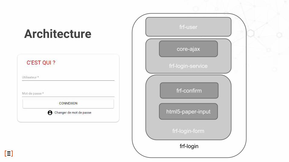
Architecture
frf-login
frf-user
frf-login-form
frf-confirm
html5-paper-input
frf-login-service
core-ajax

API

ui: { $frfLogin: 'frf-login'},events: { 'login-success frf-login': 'onLogin', 'logout-success frf-login': 'onLogout'},onLogin: function (e) { this.ui.$frfLogin.hide(); var userDatas=this.ui.$frfLogin.get(0).getCurrentUser();},logout: function () { his.ui.$frfLogin.get(0).logout();}
render() { reactPolymer.registerAttribute('login-url'); reactPolymer.registerEvent('login-success','login-success'); return ( <div> <link rel="import" href="frf-login/frf-login.html"/> <div className="views"> <frf-login ref="frfLogin" login-url={loginUrl} logout-url={logoutUrl} login-success={this.onLogin}> <span id="title">C'est qui ?</span> </frf-login> </div> </div> );}onLogin(event) { var userDatas = this.refs.frfLogin.getDOMNode().getCurrentUser();}
Un élément HTML comme les autres

Une implémentation du composant google-recaptcha
<re-captcha>
<re-captcha sitekey="yoursitekey"
></re-captcha>
source: https://github.com/cbalit/re-captcha

Les outils

bower install --save Polymer/polymer#^1.0.0
bower install --save PolymerElements/iron-elements
bower install --save PolymerElements/paper-elements
bower install --save PolymerElements/gold-elements
Bower

npm install -g generator-polymer
yo polymer (polymer:app)
yo polymer:el
yo polymer:seed
yo polymer:gh
Yeoman

npm install -g web-component-tester
wtc
OU
bower install Polymer/web-component-tester --save
<script src="../../web-component-tester/browser.js"></script>
Web Components Tester

https://github.com/cbalit/re-captcha
Exemple

●●●●●●●
Et aussi