polaris: a system for query, analysis and visualization of ...c/stolte.pdf · polaris: a system for...
TRANSCRIPT

Polaris: A System for Query, Analysis andVisualization of Multi-dimensional Relational Databases
Chris Stolte and Pat HanrahanComputer Science Department
Stanford University
AbstractIn the last several years, large multi-dimensional databases havebecome common in a variety of applications such as data ware-housing and scientific computing. Analysis and exploration tasksplace significant demands on the interfaces to these databases.Because of the size of the data sets, dense graphical representa-tions are more effective for exploration than spreadsheets andcharts. Furthermore, because of the exploratory nature of theanalysis, it must be possible for the analysts to change visualiza-tions rapidly as they pursue a cycle involving first hypothesis andthen experimentation.
In this paper we present Polaris, an interface for exploringlarge multi-dimensional databases that extends the well-knownPivot Table interface. The novel features of Polaris include aninterface for constructing visual specifications of table-basedgraphical displays and the ability to generate a precise set ofrelational queries from the visual specifications. The visual speci-fications can be rapidly and incrementally developed, giving theanalyst visual feedback as they construct complex queries andvisualizations.
1. IntroductionIn the last several years, large databases have become common
in a variety of applications. Corporations are creating large datawarehouses of historical data on key aspects of their operations.International research projects, such as the Human Genome Proj-ect [15] and Digital Sky Survey [23], are generating massive da-tabases of scientific data.
A major challenge with these databases is to extract meaningfrom the data they contain: to discover structure, find patterns, andderive causal relationships. The analysis and exploration neces-sary to uncover this hidden information places significant de-mands on the human-computer interfaces to these databases. Theexploratory analysis process is one of hypothesis, experiment anddiscovery. The path of exploration is unpredictable, and the ana-lysts or scientists need to be able to rapidly change both what datathey are viewing and how they are viewing that data.
The current trend is to treat multi-dimensional databases as n-dimensional data cubes [13]. Each dimension in these data cubescorresponds to one dimension in the relational schema. Perhapsthe most popular interface to multi-dimensional databases is thePivot Table [11]. Pivot Tables allow the data cube to be rotated, orpivoted, so that different dimensions of the dataset may be en-coded as rows or columns of the table. The remaining dimensionsare aggregated and displayed as numbers in the cells of the table.Cross-tabulations and summaries are then added to the resultingtable of numbers. Finally, graphs may be generated from the re-sulting tables. Visual Insights recently released a new interface for
visually exploring projections of data cubes using linked views ofbar charts, scatterplots, and parallel coordinate displays [10].
In this paper we present Polaris, an interface for the explora-tion of multi-dimensional databases that extends the Pivot Tableinterface to directly generate a rich, expressive set of graphicaldisplays. Polaris builds tables using an algebraic formalism in-volving the fields of the database. Each table consists of layersand panes, and each pane may be a different graphic. The use oftables to organize multiple graphs on a display is a technique of-ten used by statisticians in their analysis of data [3][7][28].
The Polaris interface is simple and expressive because it isbuilt upon a formalism for constructing graphs and building datatransformations. We interpret the state of the interface as a visualspecification of the analysis task and automatically compile it intodata and graphical transformations. This allows us to combinestatistical analysis and visualization. Furthermore, all intermediatespecifications that can be created in the visual language are validand can be interpreted to create visualizations. Therefore, analystscan incrementally construct complex queries, receiving visualfeedback as they assemble and alter the specifications.
2. Related WorkThe related work to Polaris can be divided into three categories:formal graphical specifications, table-based data displays anddatabase exploration tools.
2.1. Formal Graphical SpecificationsBertin’s Semiology of Graphics [4] is one of the earliest at-
tempts at formalizing graphing techniques. Bertin developed avocabulary for describing data and the techniques for encodingdata in a graphic. One of his important contributions is the identi-fication of the retinal variables (position, color, size, etc.) in whichdata can be encoded. Cleveland [7][8] used theoretical and ex-perimental results to determine how well people can use thesedifferent retinal properties to compare quantitative variations.
Mackinlay’s APT system [18] is one of the first applications offormal graphical specifications to computer-generated displays.APT uses a set of graphical languages and composition rules toautomatically generate 2D displays of relational data. The Sagesystem [21] extends the concepts of APT, providing a richer set ofdata characterizations and generating a wider range of displays.
Livny et al. [17] describe a visualization model that provides afoundation for database-style processing of visual queries. Withinthis model, the relational queries and graphical mappings neces-sary to generate visualizations are defined by a set of relationaloperators. The Rivet visualization environment [6] applies similarconcepts to provide a flexible database visualization tool.

Wilkinson [29] recently developed a comprehensive languagefor describing traditional statistical graphs and proposed a simpleinterface for generating a subset of the specifications expressiblewithin his language. We have extended Wilkinson’s ideas to de-velop a specification that can be directly mapped to an interactiveinterface and that is tightly integrated with the relational datamodel. The differences between our work and Wilkinson’s will befurther discussed in Section 7.
2.2. Table-based DisplaysAnother area of related work is visualization systems that use
table-based displays. Static table displays, such as scatterplot ma-trices [14] and Trellis [2] displays, have been used extensively instatistical data analysis. Recently, several interactive table dis-plays have been developed. Pivot Tables [11] allow analysts toexplore different projections of large multi-dimensional datasetsby interactively specifying assignments of fields to the table axes,but are limited to text-based displays. Systems such as the TableLens [19] and FOCUS [24] visualization system provide tabledisplays that present data in a relational table view, using simplegraphics in the cells to communicate quantitative values.
2.3. Database Exploration ToolsThe final area of related work is visual query and database ex-
ploration tools. Projects such as VQE [9], Visage [22], DE-Vise [17], and Tioga-2 [1] have focused on developing visualiza-tion environments that directly support interactive database explo-ration through visual queries . Users can construct queries andvisualizations directly through their interactions with the visuali-zation system interface. These systems have flexible mechanismsfor mapping query results to graphs, and all of the systems supportmapping database records to retinal properties of the marks in thegraphs. However, none of these systems leverages table-basedorganizations of their visualizations.
3. OverviewPolaris has been designed to support the interactive exploration oflarge multi-dimensional relational databases. Relational databasesorganize data into tables where each row in a table corresponds toa basic entity or fact and each column represents a property of thatentity [26]. We refer to a row in a relational table as a tuple orrecord, and a column in the table as a field. A single relationaldatabase will contain many heterogeneous but interrelated tables.
We can characterize fields in a database as nominal, ordinal orquantitative [4][25]. Polaris reduces this categorization to ordinaland quantitative by assigning an ordering to the nominal fieldsand subsequently treating them as ordinal.
The fields within a relational table can also be partitioned intotwo types: dimensions and measures. Dimensions and measuresare similar to independent and dependent variables in traditionalanalysis. For example, a product name or type would be a dimen-sion of product, and the product price or size would be a measure.The current implementation of Polaris treats all nominal fields asdimensions and all quantitative fields as measures.
In many important business and scientific databases there areoften many dimensions identifying a single entity. For example, atransaction within a store may be identified by the time of thesale, the location of the store, the type of product, and the cus-tomer. In most data warehouses, these multidimensional databasesare structured as n-dimensional data cubes [26]. Each dimension
in the data cube corresponds to one dimension in the relationalschema.
To effectively support the analysis process in large multidi-mensional databases, an analysis tool must meet several demands:
• Data-dense displays: The databases typically contain a largenumber of records and dimensions. Analysts need to be ableto create visualizations that will simultaneously display manydimensions of large subsets of the data.
• Multiple display types: Analysis consists of many differenttasks such as discovering correlations between variables,finding patterns in the data, locating outliers and uncoveringstructure. An analysis tool must be able to generate displayssuited to each of these tasks.
• Exploratory interface: The analysis process is often anunpredictable exploration of the data. Analysts must be ableto rapidly change what data they are viewing and how theyare viewing that data.
Polaris addresses these demands by providing an interface forrapidly and incrementally generating table-based displays. In Po-laris, a table consists of a number of rows, columns, and layers.Each table axis may contain multiple nested dimensions. Eachtable entry, or pane, contains a set of records that are visuallyencoded as a set of marks to create a graphic.
Several characteristics of tables make them particularly effec-tive for displaying multi-dimensional data:
• Multivariate: Multiple dimensions of the data can be ex-plicitly encoded in the structure of the table, enabling thedisplay of high-dimensional data.
• Comparative: Tables generate small-multiple displays ofinformation, which, as Tufte [28] explains, are easily com-pared, exposing patterns and trends across dimensions of thedata.
• Familiar: Table-based displays have an extensive history.Statisticians are accustomed to using tabular displays ofgraphs, such as scatterplot matrices and Trellis displays, foranalysis. Pivot Tables are a common interface to large datawarehouses.
Figure 1 shows the user interface presented by Polaris. In thisexample, the analyst has constructed a matrix of scatterplotsshowing sales versus profit for different product types in differentquarters. The primary interaction technique is to drag-and-dropfields from the database schema onto shelves throughout the dis-play. We call a given configuration of fields on shelves a visualspecification. The specification determines the analysis and visu-alization operations to be performed by the sy stem, defining:
• The mapping of data sources to layers. Multiple data sourcesmay be combined in a single Polaris visualization. Each datasource maps to a separate layer or set of layers.
• The number of rows, columns, and layers in the table andtheir relative orders (left to right as well as back to front).The database dimensions assigned to rows are specified bythe fields on the x shelf, columns by fields on the y shelf, andlayers by fields on the layer (z) shelf. Multiple fields may bedragged onto each shelf to show categorical relationships.
• The selection of records from the database and the partition-ing of records into different layers and panes.
• The grouping of data within a pane and the computation ofstatistical properties and aggregates. Records may also besorted into a given drawing order.

• The type of graphic displayed in each pane of the table. Eachgraphic consists of a set of marks, one mark per record inthat pane.
• The mapping of data fields to retinal properties of the marksin the graphics. The mappings used for any given visualiza-tion are shown in a set of automatically generated legends.
Analysts can interact with the resulting visualizations in sev-eral ways. Selecting a single mark in a graphic by clicking on itpops up a window displaying user-specified field values for thetuple corresponding to that mark. Analysts can draw rubberbandsaround a set of marks to brush records. Brushing can be per-formed within a single table or between multiple Polaris displays.
In the next section, we describe how the visual specification isused to generate graphics. In the following section, we describehow it is used to generate the database queries and to performstatistical analysis.
4. Generating GraphicsThe visual specification consists of three components: (a) thespecification of the different table configurations, (b) the type ofgraphic inside each pane, and (c) the details of the visual encod-ings. We discuss each of these in turn.
4.1. Table AlgebraWe need a formal mechanism to specify table configurations, andwe have defined an algebra for this purpose. When the analysts
place fields on the axis shelves, as shown in Figure 1, they areimplicitly creating expressions in this algebra.
A complete table configuration consists of three separate ex-pressions in this table algebra. Two of the expressions define theconfiguration of the x and y axes of the table, partitioning the tableinto rows and columns. The third expression defines the z axis ofthe table, which partitions the display into layers.
The operands in this table algebra are the names of the ordinaland quantitative fields of the database. We will use A, B, and C torepresent ordinal fields and P, Q, and R to represent quantitativefields. We assign ordered sets to each field symbol in the follow-ing manner: to ordinal fields we assign the members of the or-dered domain of the field, and to quantitative fields we assign thesingle element set containing the field name.
A=domain(A)={a 1,…,a n}P ={P}
This assignment of sets to symbols reflects the difference inhow the two types of fields will be encoded in the structure of thetables. Ordinal fields will partition the table into rows and col-umns, whereas quantitative fields will be spatially encoded asaxes within the panes.
A valid expression in our algebra is an ordered sequence ofone or more symbols with operators between each pair of adjacentsymbols, and with parentheses used to alter the precedence of theoperators. The operators in the algebra are cross (×), nest (/) andconcatenation (+), listed in order of precedence. The precise se-
Figure 1: The Polaris user interface. Analysts construct table-based displays of relational data by dragging fields from the databaseschema onto shelves throughout the display. A given configuration of fields on shelves is called a visual specification. The specifica-tion unambiguously defines the analysis and visualization operations to be performed by the system to generate the display.

mantics of each operator is defined in terms of its effects on theoperand sets.
ConcatenationThe concatenation operator performs an ordered union of the setsof the two symbols:
A+B ={a 1,…,a n}+{b1,…,bm}={a 1,…,a n,b 1,…,b m}
A+P ={a 1,…,a n}+{P}={a 1,…,a n,P}
P+Q = {P}+{Q}= {P,Q}
CrossThe cross operator performs a Cartesian product of the sets of thetwo symbols:
A×B ={a 1,…,a n}×{b 1,…,b m}={a 1b 1,…,a 1b m, a 2b 1,…,a 2b m,…, a nb 1,…,a nb m}
A×P ={a 1,…,a n}×P={a 1P,…,a nP}
NestThe nest operator is similar to the cross operator, but it only cre-ates set entries for which there exist records with those domainvalues. If we define R to be the dataset being analyzed, r to be arecord, and A(r) to be the value of the field A for the record r, thenwe can define the nest operator as follows:
A/B={a ib j | ∃r ∈ R st A(r)=a i & B(r)=b j}
The intuitive interpretation of the nest operator is “B withinA”. For example, given the fields quarter and month, the expres-sion quarter / month would be interpreted as those months withineach quarter, resulting in three entries for each quarter. In con-trast, quarter × month would result in 12 entries for each quarter.
Using the above set semantics for each operator, every expres-sion in the algebra can be reduced to a single set, with each entryin the set being an ordered concatenation of zero or more ordinalvalues with zero or more quantitative field names. We call this set
Figure 2: The graphical interpretation of several expressions in the table algebra. Each expression in the table algebra can be re-duced to a single set of terms, and that set can then be directly mapped into a configuration for an axis of the table.
evaluation of an expression the normalized set form. The normal-ized set form of an expression determines one axis of the table:the table axis is partitioned into columns (or rows or layers) sothat there is a one-to-one correspondence between set entries inthe normalized set and columns. Figure 2 illustrates the configu-rations resulting from a number of expressions.
Analysts can also combine multiple data sources in a singlePolaris visualization. When multiple data sources are imported,each data source is mapped to a distinct layer (or set of layers).While all data sources and all layers share the same configurationfor the x and y axes of the table, each data source can have a dif-ferent expression for partitioning its data into layers.
4.2. Types of GraphicsAfter the table configuration is specified, the next step is to spec-ify the type of graphic in each pane. One option, typical of mostcharting and reporting tools, is to have the user select a chart typefrom a predefined set of charts. Polaris allows analysts to flexiblyconstruct graphics by specifying the individual components of thegraphics. However, for this approach to be effective, the specifi-cation must balance flexibility with succinctness. We have devel-oped a taxonomy of graphics that results in an intuitive and con-cise specification of graphic types.
When specifying the table configuration, the user also implic-itly specifies the axes associated with each pane. We have struc-tured the space of graphics into three families by the type of fieldsassigned to their axes:
• Ordinal-Ordinal
• Ordinal-Quantitative
• Quantitative-Quantitative
Each family contains a number of variants depending on howrecords are mapped to marks. For example, selecting a bar in anordinal-quantitative pane will result in a bar chart, whereas se-lecting a line mark results in a line chart. The mark set currentlysupported in Polaris includes the rectangle, circle, glyph, text,Gantt bar, line, polygon and image.
Following Cleveland [8], we further structure the space ofgraphics by the number of independent and dependent variables.For example, a graphic where both axes encode independent vari-ables is different than a graphic where one axis encodes an inde-pendent variable and the other encodes a dependent variable(y=f(x)). By default, dimensions of the database are interpreted asindependent variables and measures as dependent variables.
Finally, the precise form of the data transformations, in par-ticular how records are grouped and whether aggregates areformed, can affect the type of graphic. Some graphic types bestencode a single record, whereas others can encode an arbitrarynumber of records.
We briefly discuss the defining characteristics of the threefamilies within our categorization.
Ordinal-Ordinal GraphicsThe characteristic member of this family is the table, either ofnumbers or of marks encoding attributes of the source records.
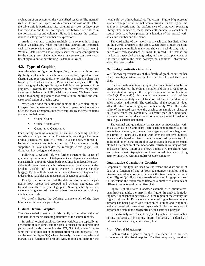
In ordinal-ordinal graphics, the axis variables are typically in-dependent of each other, and the task is focused on understandingpatterns and trends in some function f(Ox,Oy) à R, where R repre-sents the fields encoded in the retinal properties of the marks. Thiscan be seen in Figure 3(a) where the analyst is studying sales andmargin as a function of product type, month and state for the
items sold by a hypothetical coffee chain. Figure 3(b) presentsanother example of an ordinal-ordinal graphic. In this figure, theanalyst is investigating the performance of a graphics renderinglibrary. The number of cache misses attributable to each line ofsource code have been plotted as a function of the ordinal vari-ables line number and file name.
The cardinality of the record set in each pane has little effecton the overall structure of the table. When there is more than onerecord per pane, multiple marks are shown in each display, with aone-to-one correspondence of mark to record. The marks arestacked in a specified drawing order, and the spatial placement ofthe marks within the pane conveys no additional informationabout the record’s data.
Ordinal-Quantitative GraphicsWell-known representatives of this family of graphics are the barchart, possibly clustered or stacked, the dot plot and the Ganttchart.
In an ordinal-quantitative graphic, the quantitative variable isoften dependent on the ordinal variable, and the analyst is tryingto understand or compare the properties of some set of functionsf(O)à Q. Figure 6(c) illustrates a case where a matrix of barcharts is used to study several functions of the independent vari-ables product and month. The cardinality of the record set doesaffect the structure of the graphics in this family. When the cardi-nality of the record set is one, the graphics are simple bar charts ordot plots. When the cardinality is greater than one, additionalstructure may be introduced to accommodate the additional rec-ords (e.g., a stacked bar chart).
The ordinal and quantitative values may be independent vari-ables, such as in a Gantt chart. Here, each pane represents all theevents in a category; each event has a type as well as a begin andend time. In Figure 3(c), major wars over the last five hundredyears are displayed as Gantt charts, categorized by country. Anadditional layer in that figure displays pictures of major scientistsplotted as a function of the independent variables country of birthand date of birth. Figure 3(d) shows a table of Gantt charts, witheach Gantt chart displaying the thread scheduling and lockingactivity on a CPU within a multiprocessor computer.
Quantitative-Quantitative GraphicsGraphics of this type are used to understand the distribution ofdata as a function of one or both quantitative variables and todiscover causal relationships between the two quantitative vari-ables. Figure 6(a) illustrates a matrix of scatterplot graphics usedto understand the relationships between a number of attributes ofdifferent products sold by a coffee chain.
Figure 3(e) illustrates a another example of a quantitative-quantitative graphic: the map. In this figure, the analyst is study-ing how flight scheduling varies with the region of the country theflight originated in. Data about a number of flights between majorairports has been plotted as a function of latitude and longitude,and composed with two other layers which plot the location ofairports and display the geography of each state as a polygon.
It is extremely rare to use this type of graph with a cardinalityof one, not because it is not meaningful, but because the density ofinformation in such a graphic is very low.
4.3. Visual MappingsEach record in a pane is mapped to a mark. There are two
components to the visual mapping. The first component, described
Figure 3: Examples of the different graph types that can be constructed in Polaris. The graphical table (a), showing sales and margin asa function of product type and state for a hypothetical coffee chain, is an example of the ordinal-ordinal family of graphics. The sourcecode display (b), which is displaying the source code for a graphics rendering library with the code colored by the number of cachemisses attributable to each line of code, is another example of the ordinal-ordinal family. Gantt charts, used in (c) to display major warsin several countries over the last five hundred years, and in (d) to display the thread scheduling for a graphics application, are an exam-ple of the ordinal-quantitative family. Maps, as in (e) which shows flights between several major airports categorized by the region ofthe country they departed from, are an example of the quantitative-quantitative family of graphics. Line charts, as in (f) which shows av-erage sales and profit as a function of time for the coffee chain, are another example of the quantitative-quantitative family.

in the previous section, determines the type of mark. The secondcomponent encodes fields of the records into visual or retinalproperties of the selected mark. The visual properties in Polarisare based on Bertin’s retinal variables [4]: shape, size, orientation,color (value and hue), and texture (not supported in the currentversion of Polaris).
Allowing analysts to explicitly encode different fields of thedata to retinal properties of the display greatly enhances the datadensity and the variety of displays that can be generated. How-ever, in order to keep the specification succinct, analysts shouldnot be required to construct the mappings. Instead, they should beable to simply specify that a field be encoded as a visual property.The system should then generate an effective mapping from thedomain of the field to the range of the visual property. Thesemappings are generated in a manner similar to other visualizationsystems. We discuss how this is done for the purpose of com-pleteness. The default mappings are illustrated in Figure 4.
ShapePolaris uses the set of shapes recommended by Cleveland forencoding ordinal data [7]. We have extended this set of shapes toinclude several additional shapes to allow a larger domain of val-ues to be encoded.
SizeSize can be used to encode either an ordinal or quantitative field.When encoding a quantitative domain as size, a linear map fromthe field domain to the area of the mark is created. The minimumsize is chosen so that all visual properties of a mark with theminimum size can be perceived [16]. If an ordinal field is encodedas size, the domain needs to be small, at most four or five values,so that the analyst can discriminate between different catego-ries [4].
OrientationA key principle in generating mappings of ordinal fields to orien-tation is that the orientation needs to vary by at least 30° betweencategories [16], thus constraining the automatically-generatedmapping to a domain of at most six categories. For quantitativefields, the orientation varies linearly with the domain of the field.
ColorWhen encoding an ordinal domain, we use a predefined palette toselect the color for each domain entry. The colors in the paletteare well separated in the color spectrum, predominantly onhue [27]. We have ordered the colors to avoid adjacent colors withdifferent brightness or substantially different wavelengths in anattempt to include harmonious sets of colors in each pal-
ette [4][16][27]. We additionally reserve a saturated red for high-lighting items that have been selected or brushed.
When encoding a quantitative variable, it is important to vary onlyone psychophysical variable, such as hue or value. The defaultpalette we use for encoding quantitative data is the isomorphiccolormap developed by Rogowitz [20].
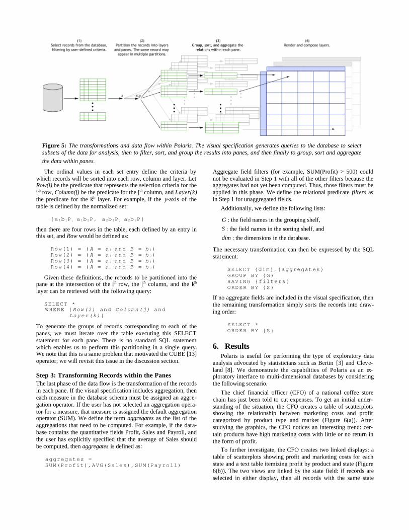
5. Generating Database QueriesObviously, the visual specifications determine the final visualiza-tion. However, just as importantly, the visual specification gener-ates queries to the database that (a) select subsets of the data foranalysis, then (b) filter, sort and group the results into panes, andthen finally (c) group, sort and aggregate the data before passing itto the graphics encoding process.
Figure 5 shows the overall data flow in Polaris. We can pre-cisely describe the transformations in each of the three phasesusing SQL queries.
Step 1: Selecting the RecordsThe first phase of the data flow retrieves records from the data-base, applying user-defined filters to select subsets of the data-base.
For an ordinal field A, the user may specify a subset of thedomain of the field as valid. If filter(A) is the user-selected subset,then a relational predicate expressing the filter for A is:
A in filter(A)
For a quantitative field P, the user may define a subset of thefield’s domain as valid. If min(P) and max(P) are the user-definedextents of this subset, then a relational predicate expressing thefilter for P is:
(P ≥ min(P) and P ≤ max(P))
We can define the relational predicate filters as the conjunction ofall of the individual field filters. Then, the first stage of the datatransformation network is equivalent to the SQL statement:
SELECT *WHERE {filters}
Step 2: Partitioning the records into panesThe second phase of the data flow partitions the retrieved recordsinto groups corresponding to each pane in the table. As we dis-cussed in Section 4.1, the normalized set form of the table axisexpressions determines the table configuration. The table is parti-tioned into rows, columns, and layers corresponding to the entriesin these sets.
Figure 4: The different retinal properties that can be used to encode fields of the data and examples of the default mappings thatare generated when a given type of data field is encoded in each of the retinal properties.
The ordinal values in each set entry define the criteria bywhich records will be sorted into each row, column and layer. LetRow(i) be the predicate that represents the selection criteria for theith row, Column(j) be the predicate for the jth column, and Layer(k)the predicate for the kth layer. For example, if the y-axis of thetable is defined by the normalized set:
{a 1b 1P , a 1b 2P, a 2b 1P , a 2b 2P}
then there are four rows in the table, each defined by an entry inthis set, and Row would be defined as:
Row(1) = ( A = a 1 and B = b 1)Row(2) = ( A = a 1 and B = b 2)Row(3) = ( A = a 2 and B = b 1)Row(4) = ( A = a 2 and B = b 2)
Given these definitions, the records to be partitioned into thepane at the intersection of the ith row, the jth column, and the kth
layer can be retrieved with the following query:
SELECT *WHERE {Row(i) and Column(j) and Layer(k)}
To generate the groups of records corresponding to each of thepanes, we must iterate over the table executing this SELECTstatement for each pane. There is no standard SQL statementwhich enables us to perform this partitioning in a single query.We note that this is a same problem that motivated the CUBE [13]operator; we will revisit this issue in the discussion section.
Step 3: Transforming Records within the PanesThe last phase of the data flow is the transformation of the recordsin each pane. If the visual specification includes aggregation, theneach measure in the database schema must be assigned an aggre-gation operator. If the user has not selected an aggregation opera-tor for a measure, that measure is assigned the default aggregationoperator (SUM). We define the term aggregates as the list of theaggregations that need to be computed. For example, if the data-base contains the quantitative fields Profit, Sales and Payroll, andthe user has explicitly specified that the average of Sales shouldbe computed, then aggregates is defined as:
aggregates =SUM(Profit),AVG(Sales),SUM(Payroll)
Aggregate field filters (for example, SUM(Profit) > 500) couldnot be evaluated in Step 1 with all of the other filters because theaggregates had not yet been computed. Thus, those filters must beapplied in this phase. We define the relational predicate filters asin Step 1 for unaggregated fields.
Additionally, we define the following lists:
G : the field names in the grouping shelf,
S : the field names in the sorting shelf, and
dim : the dimensions in the database.
The necessary transformation can then be expressed by the SQLstatement:
SELECT {dim},{aggregates}GROUP BY {G}HAVING {filters}ORDER BY {S}
If no aggregate fields are included in the visual specification, thenthe remaining transformation simply sorts the records into draw-ing order:
SELECT *ORDER BY {S}
6. ResultsPolaris is useful for performing the type of exploratory data
analysis advocated by statisticians such as Bertin [3] and Cleve-land [8]. We demonstrate the capabilities of Polaris as an ex-ploratory interface to multi-dimensional databases by consideringthe following scenario.
The chief financial officer (CFO) of a national coffee storechain has just been told to cut expenses. To get an initial under-standing of the situation, the CFO creates a table of scatterplotsshowing the relationship between marketing costs and profitcategorized by product type and market (Figure 6(a)). Afterstudying the graphics, the CFO notices an interesting trend: cer-tain products have high marketing costs with little or no return inthe form of profit.
To further investigate, the CFO creates two linked displays: atable of scatterplots showing profit and marketing costs for eachstate and a text table itemizing profit by product and state (Figure6(b)). The two views are linked by the state field: if records areselected in either display, then all records with the same state
Figure 5: The transformations and data flow within Polaris. The visual specification generates queries to the database to selectsubsets of the data for analysis, then to filter, sort, and group the results into panes, and then finally to group, sort and aggregatethe data within panes.

remove this line
value as the selected records are highlighted. The CFO is able touse these linked views to determine that in New York, severalproducts are offering very little return despite high expenditures.
The CFO creates a third display (Figure 6(c)): a set of barcharts showing profit, sales, and marketing for each product soldin New York, broken down by month. In this view, the CFO canclearly see that Caffé Mocha’s profit margin does not justify itsmarketing expenses. With this data, the CFO can change the com-pany’s marketing and sales strategies in this state.
This example illustrates several important points about the ex-ploratory process. Throughout the analysis, both the data userswant to see and how they want to see it change continually. Ana-lysts first form hypotheses about the data and then create newviews to perform tests and experiments to validate or disprovethose hypotheses. Certain displays enable an understanding ofoverall trends, whereas others show causal relationships. As theanalysts better understand the data, they may want to drill-downin the visible dimensions or display entirely different dimensions.
Polaris supports this exploratory process through its visual in-terface. By formally categorizing the types of graphics, Polaris isable to provide a simple interface for rapidly generating a widerange of displays. This allows analysts to focus on the analysistask rather than the steps needed to retrieve and display the data.
7. DiscussionSeveral of the ideas in our specification are extensions of Wil-
kinson's [29] efforts to develop a grammar for statistical graphics.His grammar encapsulates both the statistical transformation ofdatasets and their mapping to graphic representations.
The primary distinctions between Wilkinson's system and oursarise because of differences in the data models. We chose to focuson developing a tool for multi-dimensional relational databasesand we decided to build as much of the system as possible usingrelational algebra. All of the data transformations required by ourvisual specifications can be precisely interpreted as standard SQLqueries to OLAP servers. Wilkinson instead intentionally uses adata model that is not relational, citing shortcomings in the rela-tional model's support for statistical analysis. Consequently, hisspecification defines operations and function in terms of his owndata model consisting of variable sets and indexed variables.
The differences in design are most apparent in the table alge-bra. As in our system, Wilkinson’s table algebra performs twofunctions: it provides database services such as set operations andit specifies the layout of the tables and graphs. Since we use rela-tional algebra for all our database services, our algebra is differ-ent. For example, his blend operator performs both set union andmay partition the axes of a table; our concatenation operation isdifferent since it just performs partitioning. Another difference isin his cross and nest operators: cross generates a 2D graphic andnest only a 1D graphic. We use a different mechanism (shelves) tospecify axes of the graphic. Overall, whether our system is betterthan Wilkinson's is hard to judge completely, and will requiremore experience using the system to solve practical problems.One major advantage of our approach is that it leverages existingdatabase systems and as a result was very easy to implement.
Another interesting issue is the interpretation of our visualspecifications as database queries. When database queries aregenerated from the visual specifications in Polaris, it is necessaryto generate a SQL query per table pane. This problem is similar tothe one that motivated Gray et al. to develop the CUBE opera-tor [13]. The CUBE operator generalizes the queries necessary to
Figure 6: An example scenario demonstrating the capabili-ties of Polaris for exploratory analysis of multi-dimensionaldatabases. The data displayed is for a hypothetical coffeestore chain, and the analyst is searching for ways to reducethe company’s expenses.

develop cross-tab and Pivot Table displays of relational data into asingle, more efficient operator. However, the CUBE operatorcannot be applied in our situation because it assumes that the setsof relations partitioned into each table pane do not overlap. Inseveral possible Polaris table configurations, such as scatterplotmatrices, there can be considerable overlap between the relationspartitioned into each pane. One can imagine generalizing theCUBE operator to handle these overlapping partitions.
Another major limitation of the CUBE operator is its methodfor computing aggregates. Usually only aggregates based on sumsare allowed. More complex aggregation operators requiring rank-ing, such as computation of medians and modes, are not part ofthe current specification, although they are available in somecommercial systems. These operators are very useful for datamining applications.
8. Conclusions and Future WorkWe have presented Polaris, an interface for the exploration andanalysis of large multi-dimensional databases. Polaris extends thewell-known Pivot Table interface to display relational query re-sults using a rich, expressive set of graphical displays. A secondcontribution of this system is a succinct visual specification fordescribing table-based graphical displays of relational data and theinterpretation of these visual specifications as a precise sequenceof relational database operations.
We have many plans for extending this system. The currentversion of Polaris does not leverage the hierarchical structure ofmany multi-dimensional databases. We are currently exploringinteraction techniques for navigating these types of hierarchiesand developing specifications that describe graphics derived fromhierarchical data.
Furthermore, because graphical marks in Polaris directly cor-respond to tuples in the relational databases, it is possible to gen-erate database tables from a selected set of graphical marks. Thistechnique can be used to develop lenses, similar to the MagicLens [5], that can perform much more complex transformationsbecause they operate in data space rather than image space. Thistechnique can also be used to compose Polaris displays, using aselected mark set in one display as the data input to another. Weare exploring these techniques and believe it is possible to developa relational spreadsheet by composing Polaris displays in thismanner.
AcknowledgmentsThe authors especially thank Robert Bosch and Diane Tang fortheir contributions to the design and implementation of Polaris,their reviews of manuscript drafts, and for many useful discus-sions. The authors also thank Maneesh Agrawala for his insightfulreviews and discussions on early drafts of this paper. The air traf-fic data is courtesy William F. Eddy and Shingo Oue. The coffeechain data is courtesy Stephen Eick and Visual Insights. Thiswork was supported in part by ASCI grant #2DJB705.
References[1] A. Aiken, J. Chen, M. Stonebraker, and A. Woodruff. Tioga-2: A Direct
Manipulation Database Visualization Environment. In Proc. of the 12th In-ternational Conference on Data Engineering, February 1996, pp. 208-217.
[2] R. Becker, W. S. Cleveland and R. Douglas Martin. Trellis Graphics Dis-plays: A Multi-Dimensional Data Visualization Tool for Data Mining. 3rd
Annual Conference on Knowledge Discovery in Databases, August 1997.
[3] J. Bertin. Graphics and Graphic Information Processing. Walter de Gruyter,Berlin, 1980.
[4] J. Bertin. Semiology of Graphics. The University of Wisconsin Press, Madi-son, Wisconsin, 1983. Translated by W. J. Berg.
[5] E. A. Bier, M. Stone, K. Pier, W. Buxton and T. DeRose. Toolglass andMagic Lenses: The See-Through Interface. In SIGGRAPH ’93 Proceedings,August 1993, pp. 73-80.
[6] R. Bosch, C. Stolte, D. Tang, J. Gerth, M. Rosenblum, and P. Hanrahan.Rivet: A Flexible Environment for Computer Systems Visualization. InComputer Graphics, February 2000, pp. 68-73.
[7] W. S. Cleveland. The Elements of Graphing Data. Wadsworth AdvancedBooks and Software, Pacific Grove, California, 1985.
[8] W. S. Cleveland. Visualizing Data. Hobart Press, New Jersey, 1993.
[9] M. Derthick, J. Kolojejchick and S. F. Roth. An Interactive VisualizationEnvironment for Data Exploration. In Proc. of Knowledge Discovery in Da-tabases, August, 1997, pp. 2-9.
[10] S. Eick. Visualizing Multi-Dimensional Data. In Computer Graphics, Febru-ary 2000, pp. 61–67.
[11] Microsoft Excel – User’s Guide, Microsoft, Redmond, WA, 1995.
[12] J. Goldstein, S. F. Roth, J. Kolojejchick, and J. Mattis. A Framwork forKnowledge-based Interactive Data Exploration. In Journal of Visual La n-guages and Computing, December 1994, pp. 339-363.
[13] J. Gray, S. Chaudhuri, A. Bosworth, A. Layman, D. Reichart, M. Venkatrao,H. Pirahesh, and F. Pellow. Data Cube: A Relational Aggregation OperatorGeneralizing Group-By, Cross-Tab, and Sub-Totals. In Proc. of the 12th In-ternational Conference on Data Engineering, February 1996, pp. 152-159.
[14] J.A. Hartigan. Printer graphics for clustering. Journal of Statistical Compu-tation and Simulation, 4, pp. 187-213.
[15] Human Genome Project. [online] Available:http://www.ornl.gov/hgmis/about.html, cited March 2000.
[16] S. M. Kosslyn. Elements of Graph Design . W.H. Freeman and Co., NewYork, NY, 1994.
[17] M. Livny, R. Ramakrishnan, K. Beyer, G. Chen, D. Donjerkovic, S. La-wande, J. Myllymaki and K. Wenger. DEVise: Integrated Querying and Vi s-ual Exploration of Large Datasets. In Proc. of ACM SIGMOD, May, 1997.
[18] J.D. Mackinlay. Automating the Design of Graphical Presentations of Rela-tional Information. In ACM Trans. of Graphics, April 1986, pp. 110-141.
[19] R. Rao and S. Card. The Table Lens: Merging Graphical and Symbolic Rep-resentations in an Interactive Focus+Context Visualization for Tabular In-formation. In Proc. of SIGCHI '94, pp. 318-322.
[20] B. Rogowitz, and L. Treinish. How NOT to Lie with Visualization. Comput-ers in Physics, May/June 1996, pp. 268-274.
[21] S.F. Roth, J. Kolojejchick, J. Mattis and J. Goldstein. Interactive GraphicDesign Using Automatic Presentation Knowledge. In Proc. of SIGCHI ’94,April 1994, pp. 112-117.
[22] S.F. Roth, P. Lucas, J.A. Senn, C.C. Gomberg, M.B. Burks, P.J. Stroffolino,J. Kolojejchick and C. Dunmire. Visage: A User Interface Environment forExploring Information. In Proc. of Information Visualization, October 1996,pp. 3-12.
[23] Sloan Digital Sky Survey. [online] Available: http://www.sdss.org/, citedMarch 2000.
[24] M. Spenke, C. Beilken and T. Berlage. FOCUS: The Interactive Table forProduct Comparison and Selection. In Proc. of the ACM Symposium on UserInterface Software and Technology, November 1996.
[25] S.S. Stevens. On the theory of scales of measurement. Science, 103, pp. 677-680.
[26] E. Thomsen. OLAP Solutions: Building Multidimensional Information Sys-tems. Wiley Computer Publishing, New York, 1997.
[27] D. Travis. Effective Color Displays: Theory and Practice. Academic Press,London, 1991.
[28] E. R. Tufte. The Visual Display of Quantitative Information . Graphics Press,Box 430, Chesire, Connecticut, 1983.
[29] L. Wilkinson. The Grammar of Graphics. Springer, New York, New York,1999.