plotting and graphing - school of...
TRANSCRIPT
Plotting and Graphing
Section1 Introduction2 The plot Command3 Using the Plot Editor4 Line and Marker Styles5 Labeling a Plot6 Multiple Plots7 Scaling a Plot
ObjectivesAfter reading this chapter, you should beable to
• Create plots at the command line.• Use MATLAB’s graphical Plot Editor.• Use line and marker styles.• Label a plot.• Create multiple plots in the same figure.• Create log–log and semilog scaled
plots.
1 INTRODUCTION
Creating plots of data sets and functions is very useful forengineers and scientists. You can use plots to present resultsfor papers and presentations or to visually search for approx-imate solutions to problems. MATLAB has a rich set of plot-ting commands. In this chapter, we describe MATLAB’sbasic plotting operations.
2 THE PLOT COMMAND
The basic plotting command in MATLAB is plot. If you givethe plot function a vector argument, MATLAB plots thecontents of the vector against the indices of the vector.
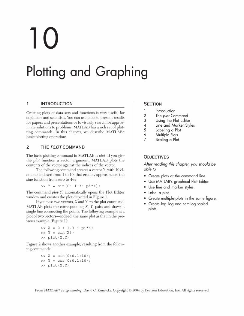
The following command creates a vector Y, with 10 el-ements indexed from 1 to 10, that crudely approximates thesine function from zero to
>> Y = sin(0: 1.3: pi*4);
The command plot(Y) automatically opens the Plot Editorwindow and creates the plot depicted in Figure 1.
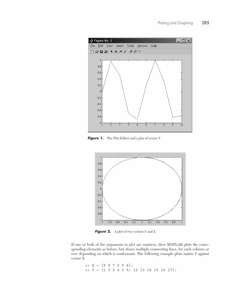
If you pass two vectors, X and Y, to the plot command,MATLAB plots the corresponding pairs and draws asingle line connecting the points. The following example is aplot of two vectors—indeed, the same plot as that in the pre-vious example (Figure 1):
>> X = 0 : 1.3 : pi*4;>> Y = sin(X);>> plot(X,Y)
Figure 2 shows another example, resulting from the follow-ing commands:
>> X = sin(0:0.1:10);>> Y = cos(0:0.1:10);>> plot(X,Y)
Xi, Yi
4�:
From MATLAB® Programming, David C. Kuncicky. Copyright © 2004 by Pearson Education, Inc. All rights reserved.
10
Plotting and Graphing
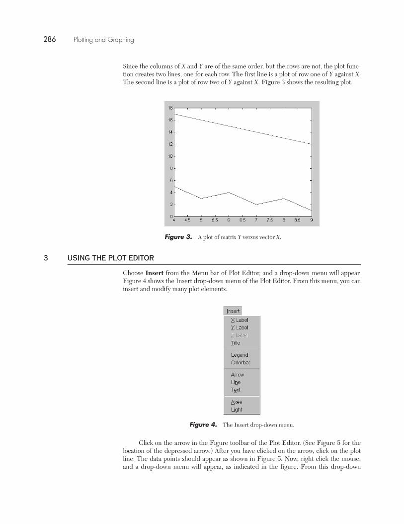
If one or both of the arguments to plot are matrices, then MATLAB plots the corre-sponding elements as before, but draws multiple connecting lines, for each column orrow, depending on which is conformant. The following example plots matrix Y againstvector X:
>> X = [9 8 7 6 5 4];>> Y = [1 3 2 4 3 5; 12 13 14 15 16 17];
Figure 1. The Plot Editor and a plot of vector Y.
Figure 2. A plot of two vectors Y and X.
Plotting and Graphing 285
Using the Plot Editor
Since the columns of X and Y are of the same order, but the rows are not, the plot func-tion creates two lines, one for each row. The first line is a plot of row one of Y against X.The second line is a plot of row two of Y against X. Figure 3 shows the resulting plot.
3 USING THE PLOT EDITOR
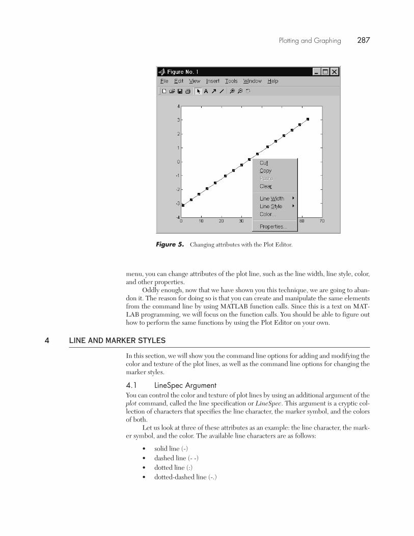
Choose Insert from the Menu bar of Plot Editor, and a drop-down menu will appear.Figure 4 shows the Insert drop-down menu of the Plot Editor. From this menu, you caninsert and modify many plot elements.
Click on the arrow in the Figure toolbar of the Plot Editor. (See Figure 5 for thelocation of the depressed arrow.) After you have clicked on the arrow, click on the plotline. The data points should appear as shown in Figure 5. Now, right click the mouse,and a drop-down menu will appear, as indicated in the figure. From this drop-down
Figure 3. A plot of matrix Y versus vector X.
Figure 4. The Insert drop-down menu.
286 Plotting and Graphing
Plotting and Graphing
menu, you can change attributes of the plot line, such as the line width, line style, color,and other properties.
Oddly enough, now that we have shown you this technique, we are going to aban-don it. The reason for doing so is that you can create and manipulate the same elementsfrom the command line by using MATLAB function calls. Since this is a text on MAT-LAB programming, we will focus on the function calls. You should be able to figure outhow to perform the same functions by using the Plot Editor on your own.
4 LINE AND MARKER STYLES
In this section, we will show you the command line options for adding and modifying thecolor and texture of the plot lines, as well as the command line options for changing themarker styles.
4.1 LineSpec ArgumentYou can control the color and texture of plot lines by using an additional argument of theplot command, called the line specification or LineSpec. This argument is a cryptic col-lection of characters that specifies the line character, the marker symbol, and the colorsof both.
Let us look at three of these attributes as an example: the line character, the mark-er symbol, and the color. The available line characters are as follows:
• solid line (-)• dashed line (- -)• dotted line (:)• dotted-dashed line (-.)
Figure 5. Changing attributes with the Plot Editor.
Plotting and Graphing 287
Line and Marker Styles
The default is a solid line. The marker symbol is one of 13, and the marker codes are asfollows:
• point (.)• circle (o)• x-mark • plus • star • square (s)• diamond (d)• down triangle (v)• up triangle • left triangle • right triangle • pentagram (p)• hexagram (h)
The following are the color codes:
• r–red• g–green• b–blue• c–cyan• m–magenta• y–yellow• k–black• w–white
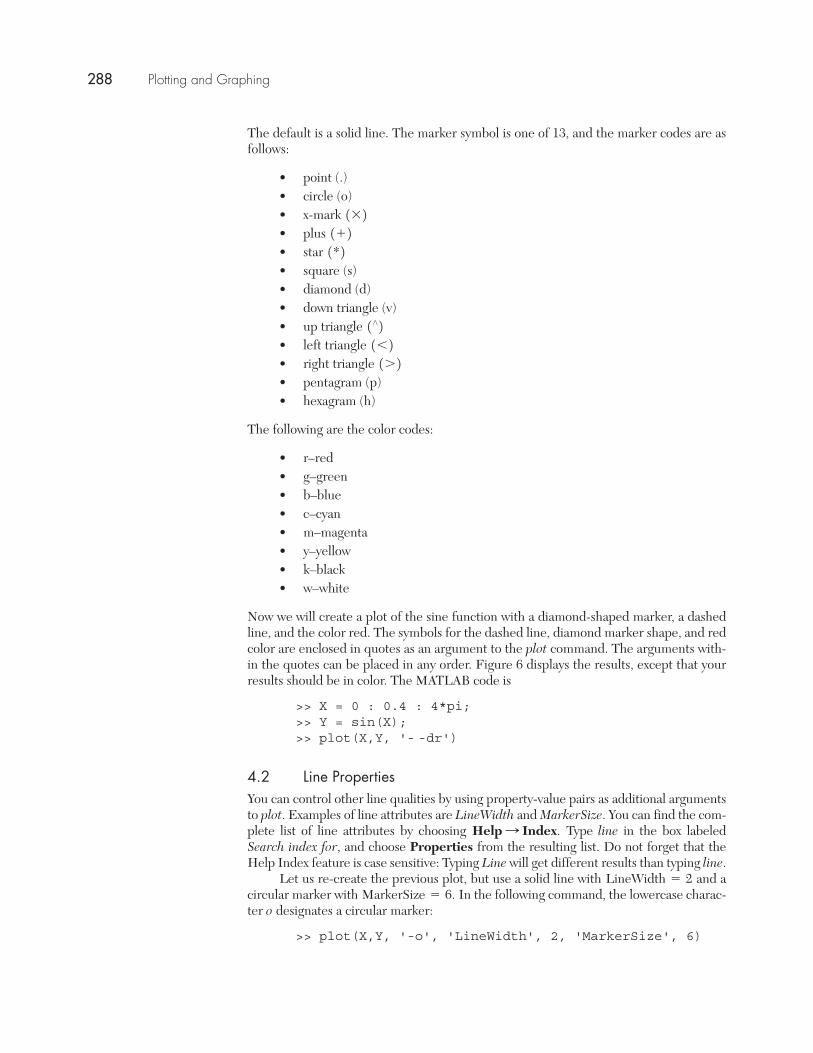
Now we will create a plot of the sine function with a diamond-shaped marker, a dashedline, and the color red. The symbols for the dashed line, diamond marker shape, and redcolor are enclosed in quotes as an argument to the plot command. The arguments with-in the quotes can be placed in any order. Figure 6 displays the results, except that yourresults should be in color. The MATLAB code is
>> X = 0 : 0.4 : 4*pi;>> Y = sin(X);>> plot(X,Y, '- -dr')
4.2 Line PropertiesYou can control other line qualities by using property-value pairs as additional argumentsto plot. Examples of line attributes are LineWidth and MarkerSize. You can find the com-plete list of line attributes by choosing Type line in the box labeledSearch index for, and choose Properties from the resulting list. Do not forget that theHelp Index feature is case sensitive: Typing Line will get different results than typing line.
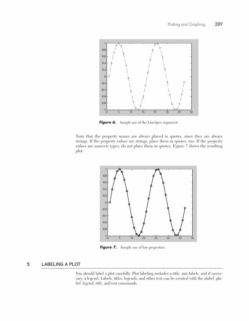
Let us re-create the previous plot, but use a solid line with and acircular marker with In the following command, the lowercase charac-ter o designates a circular marker:
>> plot(X,Y, '-o', 'LineWidth', 2, 'MarkerSize', 6)
MarkerSize = 6.LineWidth = 2
Help : Index.
1721621¿2
1*21+21*2
288 Plotting and Graphing
Plotting and Graphing
Figure 7. Sample use of line properties.
Note that the property names are always placed in quotes, since they are alwaysstrings. If the property values are strings, place them in quotes, too. If the propertyvalues are numeric types, do not place them in quotes. Figure 7 shows the resultingplot.
Figure 6. Sample use of the LineSpec argument.
5 LABELING A PLOT
You should label a plot carefully. Plot labeling includes a title, axis labels, and if neces-sary, a legend. Labels, titles, legends, and other text can be created with the xlabel, yla-bel, legend, title, and text commands.
Plotting and Graphing 289
Labeling a Plot
5.1 Creating axis labels and titlesThe xlabel command has several syntactic variants. The first variant takes a string argu-ment and displays it as the X-axis label:
xlabel('string')
The second form takes a function as an argument:
xlabel(function)
The function must return a string.You can use additional arguments to specify property-value pairs, in a manner sim-
ilar to the way Line properties are specified in the plot statement. For xlabel, the prop-erties are derived from the Text class, whereas the properties used in the plot statementare derived from the Line class. The term class refers to a group of characteristics sharedby a group of objects.)
Some of the Text class properties are as follows:
• HorizontalAlignment• FontName• FontSize• Color
You can see the full list of Text properties by choosing Type text in thebox labeled Search index for, and choose Properties from the resulting list.
The ylabel command has the same syntactic variants and properties as xlabel andperforms the same operations, but on the Y-axis instead of the X-axis.
The title command, too, has the same syntax and properties as xlabel, but createsa title for the graph. The xlabel, ylabel, and title commands share the same Text classproperties.
5.2 Creating general textThe text command is the underlying function for the other labeling commands. By spec-ifying its coordinates, text can be placed anywhere on the graph.
By default, text formatting for string objects uses a formatting language called TeX.MATLAB supports a subset of the TeX formatting commands. This subset is listed asproperties of the String class. To see the available formatting commands, choose
Type string in the box labeled Search index for, and choose Text Prop-erty. Table 1 displays a few of the most common TeX formatting codes.
The text command
>>text(0.5,0.5,'y \leq \pi * x^2')
will place the following in the Plot window, beginning at point (0.5, 0.5):
5.3 Creating a legendThe legend command creates a legend for the plot. You can pass the legend commandeither a list of strings that describe the legend’s contents or a matrix of strings. In the
y … � * x2
Help : Index.
Help : Index.
290 Plotting and Graphing
Plotting and Graphing
second case, each row of the string matrix becomes a line in the legend. The syntax forthe legend command is
legend('str1','str2',...)legend(string_matrix)
You can optionally supply an additional argument to legend that indicates the position ofthe legend in the graph:
legend('str1','str2',...,position)
Table 2 lists the codes for the position argument. The default position is the upper rightcorner of the plot. If position code is zero, MATLAB tries to obscure as few of the plot-ted points as possible.
TABLE 2. Position codes for the legend command.
Code Placement
outside the axes (on the right side of the chart)0 inside the boundaries of the axes1 at the upper right corner2 at the upper left corner3 at the lower left corner4 at the lower right corner
-1
TABLE 1. A few of the TeX formatting codes.
Code Character or Format
\bf bold font\it italics font
\rm normal font\pi\theta\rightarrow\leftarrow\leq\geq^ superscript_ subscript
Ú…;:�
�
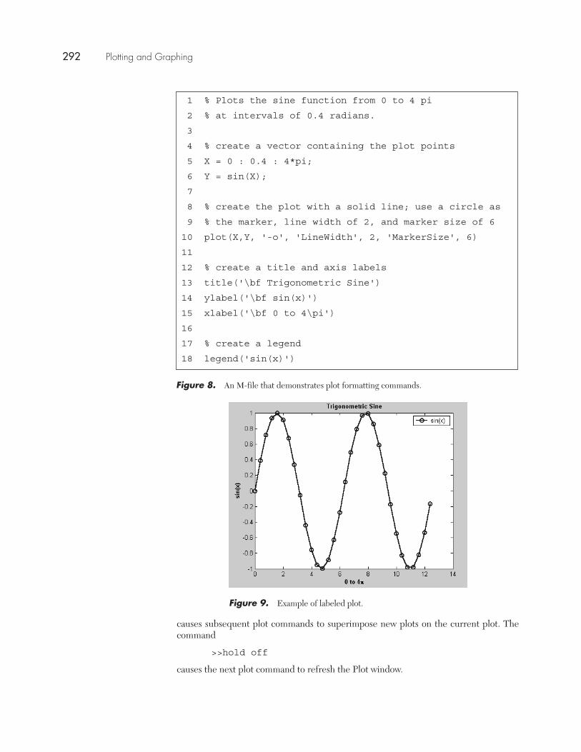
The M-file in Figure 8 creates the labeled plot of the sine function displayed inFigure 9. Copy this file and execute it. Modify the plot formatting arguments until youfeel comfortable using them.
6 MULTIPLE PLOTS
You can display multiple, simultaneous overlapping plots by using the hold command.The hold command is an example of a toggle. A toggle has two values: on or off.
The command
>>hold on
Plotting and Graphing 291
Multiple Plots
1 % Plots the sine function from 0 to 4 pi
2 % at intervals of 0.4 radians.
3
4 % create a vector containing the plot points
5 X = 0 : 0.4 : 4*pi;
6 Y = sin(X);
7
8 % create the plot with a solid line; use a circle as
9 % the marker, line width of 2, and marker size of 6
10 plot(X,Y, '-o', 'LineWidth', 2, 'MarkerSize', 6)
11
12 % create a title and axis labels
13 title('\bf Trigonometric Sine')
14 ylabel('\bf sin(x)')
15 xlabel('\bf 0 to 4\pi')
16
17 % create a legend
18 legend('sin(x)')
Figure 8. An M-file that demonstrates plot formatting commands.
Figure 9. Example of labeled plot.
causes subsequent plot commands to superimpose new plots on the current plot. Thecommand
>>hold off
causes the next plot command to refresh the Plot window.
292 Plotting and Graphing
Plotting and Graphing
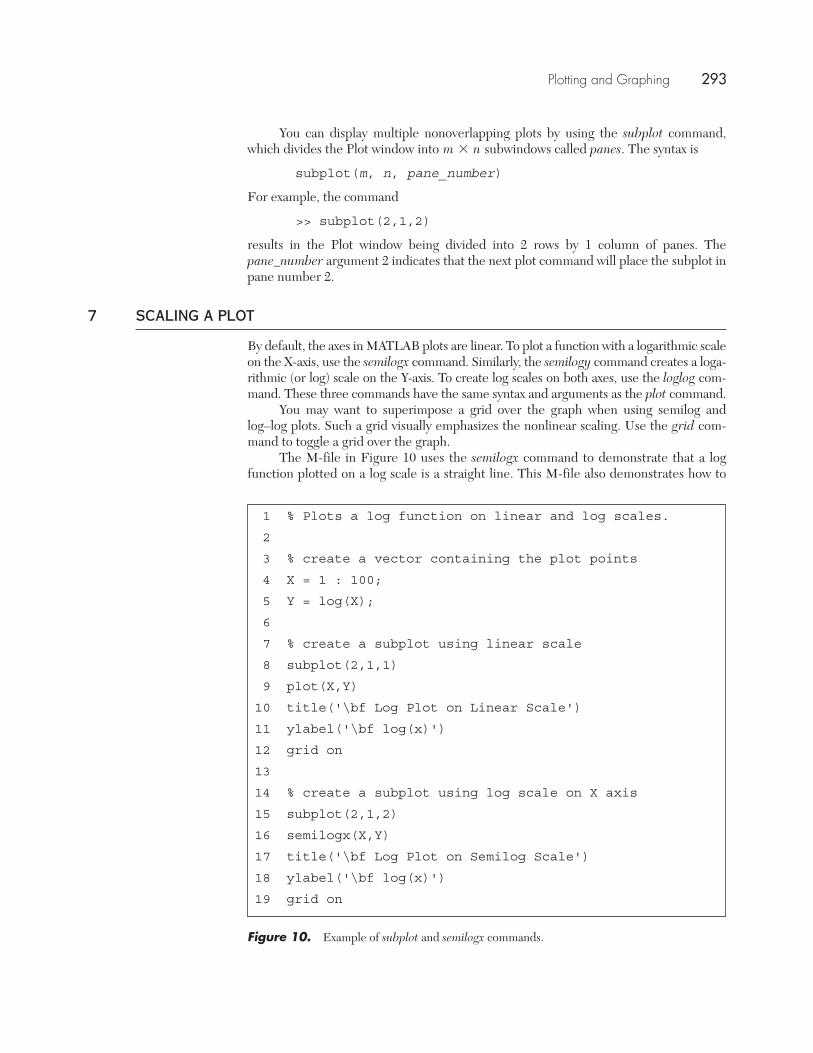
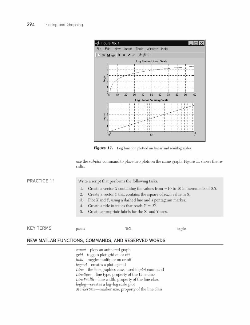
You can display multiple nonoverlapping plots by using the subplot command,which divides the Plot window into subwindows called panes. The syntax is
subplot(m, n, pane_number)
For example, the command
>> subplot(2,1,2)
results in the Plot window being divided into 2 rows by 1 column of panes. Thepane_number argument 2 indicates that the next plot command will place the subplot inpane number 2.
7 SCALING A PLOT
By default, the axes in MATLAB plots are linear. To plot a function with a logarithmic scaleon the X-axis, use the semilogx command. Similarly, the semilogy command creates a loga-rithmic (or log) scale on the Y-axis. To create log scales on both axes, use the loglog com-mand. These three commands have the same syntax and arguments as the plot command.
You may want to superimpose a grid over the graph when using semilog andlog–log plots. Such a grid visually emphasizes the nonlinear scaling. Use the grid com-mand to toggle a grid over the graph.
The M-file in Figure 10 uses the semilogx command to demonstrate that a logfunction plotted on a log scale is a straight line. This M-file also demonstrates how to
m * n
1 % Plots a log function on linear and log scales.
2
3 % create a vector containing the plot points
4 X = 1 : 100;
5 Y = log(X);
6
7 % create a subplot using linear scale
8 subplot(2,1,1)
9 plot(X,Y)
10 title('\bf Log Plot on Linear Scale')
11 ylabel('\bf log(x)')
12 grid on
13
14 % create a subplot using log scale on X axis
15 subplot(2,1,2)
16 semilogx(X,Y)
17 title('\bf Log Plot on Semilog Scale')
18 ylabel('\bf log(x)')
19 grid on
Figure 10. Example of subplot and semilogx commands.
Plotting and Graphing 293
New MATLAB Functions, Commands, and Reserved Words
use the subplot command to place two plots on the same graph. Figure 11 shows the re-sults.
Figure 11. Log function plotted on linear and semilog scales.
Write a script that performs the following tasks:
1. Create a vector X containing the values from to 10 in increments of 0.5.2. Create a vector Y that contains the square of each value in X.3. Plot X and Y, using a dashed line and a pentagram marker.4. Create a title in italics that reads 5. Create appropriate labels for the X- and Y-axes.
Y = X2.
-10
PRACTICE 1!
KEY TERMS panes TeX toggle
NEW MATLAB FUNCTIONS, COMMANDS, AND RESERVED WORDS
comet—plots an animated graphgrid—toggles plot grid on or offhold—toggles multiplot on or offlegend—creates a plot legendLine—the line graphics class, used in plot commandLineSpec—line type, property of the Line classLineWidth—line width, property of the line classloglog—creates a log–log scale plotMarkerSize—marker size, property of the line class
294 Plotting and Graphing
Plotting and Graphing
plot—plots vectors and matricespolar—plots polar coordinatessemilogx—creates a plot with log scale on the X-axissemilogy—creates a plot with log scale on the Y-axisString—the String graphics class, used in text commandsubplot—creates a multiwindow plottext—places text on named coordinatesText—the text graphics class, used in xlabel, ylabel, title commandstitle—creates a plot titlexlabel—creates a label on the X-axis of a plotylabel—creates a label on the Y-axis of a plot
SOLUTIONS TO PRACTICE PROBLEMS
1.% Plot of x^2 in the range [-10, 10]X = -10 : 0.5 : 10;Y = X.^2;plot(X,Y, '- -p');title('\it Y=X^2');xlabel('-10 to 10'); ylabel('X ^2');
Problems
Section 1.1. Create a plot of the function for Turn
the grid on. Look at the graph. What is the approximate minimum of Y?
Section 2.2. Create vector Create a matrix Y that consists of rows
and Plot matrix Y against vectorX.
Section 4.3. Write an M-file that creates a plot of the function for
Use a pentagon-shaped marker of size 10 and a dotted lineof width 2.
Section 5.4. Create an appropriate legend, labels for the axes, and a title for the plot in
Problem 2.5. Create appropriate labels for the axes and a title for the plot in Problem 3. Create
the title in bold font.
Section 6.6. Write an M-file that creates multiple superimposed plots of for
and Label the plot appropriately.7. Write an M-file that creates subplots (not superimposed) of for
and Each subplot’s Y axis should have an appropriateX = [-10 : 0.01 : 10].[1 : 5]n =Y = Xn
X = [-10 : 0.01 : 10].n = [1 : 10]Y = nX2
X = [-10 : 1 : 10].Y = 5X2 - 2X - 50
sin1X + 32.sin1X2, sin1X + 12, sin1X + 22,X = [-5 :0.1 :5].
X = [-5 :0.1 :5].Y = 3X2 + 5X - 3
Plotting and Graphing 295
Problems
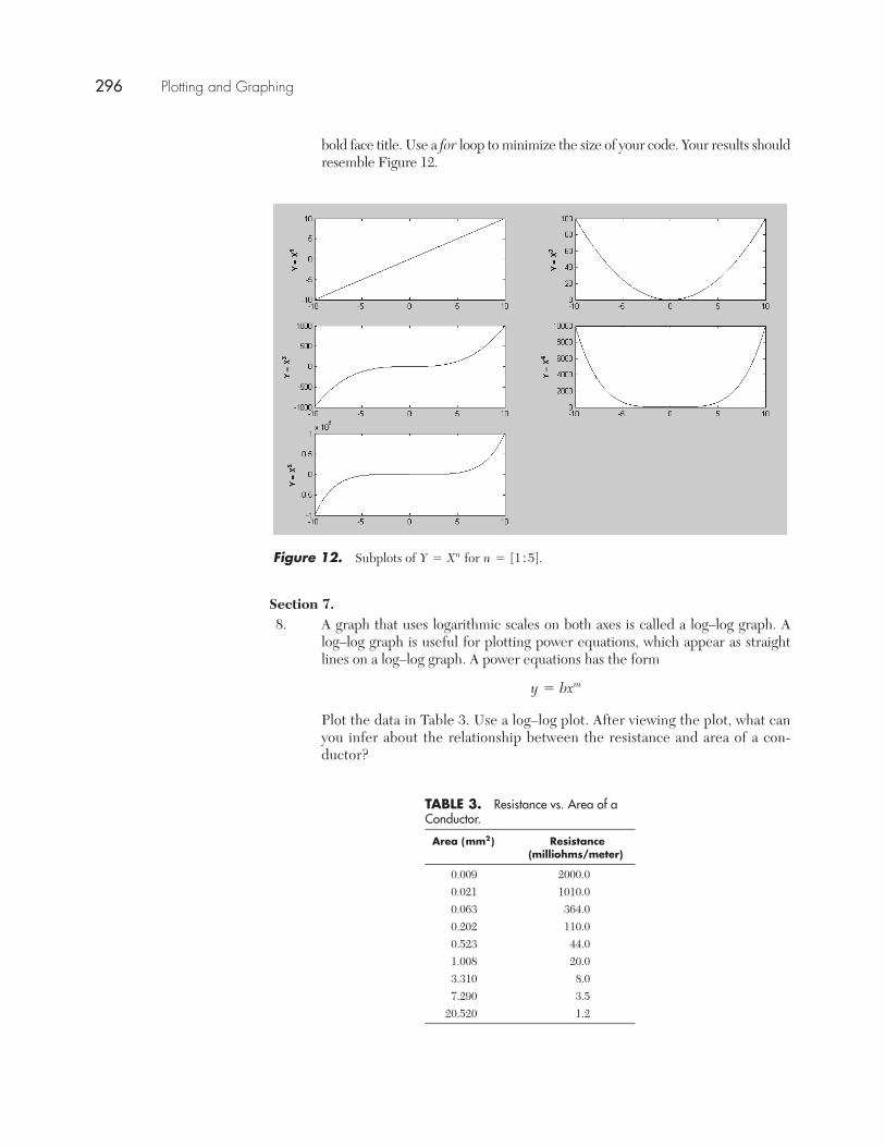
bold face title. Use a for loop to minimize the size of your code. Your results shouldresemble Figure 12.
Section 7.8. A graph that uses logarithmic scales on both axes is called a log–log graph. A
log–log graph is useful for plotting power equations, which appear as straightlines on a log–log graph. A power equations has the form
Plot the data in Table 3. Use a log–log plot. After viewing the plot, what canyou infer about the relationship between the resistance and area of a con-ductor?
y = bxm
Figure 12. Subplots of for n = [1 : 5].Y = Xn
TABLE 3. Resistance vs. Area of aConductor.
Area ( ) Resistance (milliohms/meter)
0.009 2000.00.021 1010.00.063 364.00.202 110.00.523 44.01.008 20.03.310 8.07.290 3.5
20.520 1.2
mm2
296 Plotting and Graphing
Plotting and Graphing
Challenge Problems.9. The plots that have been shown so far use rectangular, or Cartesian, coordi-
nates. Another method of plotting uses polar coordinates. In a polar coordinatesystem, the points are plotted as an angle and radius (theta, rho) instead of ver-tical (Y) and horizontal (X) components. The polar command creates a plot thatuses polar coordinates. The syntax of the polar command is
polar(theta, Rho, LineSpec)
Plot the following function over the range 0 to using the polar command:
This function is known as the three-petal rose. Label the graph appropriately.10. The comet command has the syntax
comet(X,Y)
and the effect is to trace a plot in slow motion with a tail. Use the comet com-mand with sin(X) for Create a loop so that the sine functionis plotted forwards and then backwards continuously.
X = [0 : 0.01 : 4�].
� = cos13�2.
�,
Plotting and Graphing 297