plotroc: a tool for plotting roc curves - michael c...
TRANSCRIPT

JSS Journal of Statistical SoftwareMMMMMM YYYY, Volume VV, Code Snippet II. http://www.jstatsoft.org/
plotROC: A Tool for Plotting ROC Curves
Michael C. SachsBiometric Research Branch, Division of Cancer Treatment and Diagnosis, National Cancer Institute
Abstract
Plots of the receiver operating characteristic (ROC) curve are ubiquitous in medicalresearch. Designed to simultaneously display the operating characteristics at every pos-sible value of a continuous diagnostic test, ROC curves are used in oncology to evaluatescreening, diagnostic, prognostic and predictive biomarkers. I reviewed a sample of ROCcurve plots from the major oncology journals in order to assess current trends in usage anddesign elements. My review suggests that ROC curve plots are often ineffective as statis-tical charts and that poor design obscures the relevant information the chart is intendedto display. I describe my new R package that was created to address the shortcomingsof existing tools. The package has functions to create informative ROC curve plots, withsensible defaults and a simple interface, for use in print or as an interactive web-basedplot. A web application was developed to reach a broader audience of scientists who donot use R.
Keywords: ROC curves; graphics; interactive; plots.
1. Introduction
1.1. About ROC curves
The Receiver Operating Characteristic (ROC) curve is used to assess the accuracy of a con-tinuous measurement for predicting a binary outcome. In medicine, ROC curves have a longhistory of use for evaluating diagnostic tests in radiology and general diagnostics. ROC curvesoriginated in the field of signal detection theory.
For a continuous measurement that I denote as M , convention dictates that a test positive isdefined as M equalling or exceeding some threshold c: M ≥ c. The goal of ROC analysis is toevaluate the classification accuracy of M in reference to the binary outcome D, which takespossible values 0 (negative) or 1 (positive). It is implicitly assumed that the subpopulation

2 plotROC: A Tool for Plotting ROC Curves
D1 0 Total
M ≥ c true positive false positive test positiveM < c false negative true negative test negativeTotal disease positive disease negative
Table 1: Confusion matrix illustrating the possible classification outcomes of a continuoustest M with threshold c versus the true outcome D.
having D = 1 tends to have larger values of M compared to the subpopulation with D = 0.The classification accuracy of M can be evaluated by considering the confusion matrix (Table1). The confusion matrix cross-classifies the predicted outcomeM ≥ c versus the true outcomeD. The four cells of the matrix correspond to the possible classification outcomes: a truepositive, a false positive, a true negative, and a false negative. ROC analysis assesses thetrade-offs between the test’s fraction of true positives versus the false positives as c variesover the range of M .
Formally, for a fixed cutoff c, the true positive fraction is the probability of a test positive inthe diseased population:
TPF (c) = P{M ≥ c|D = 1}
and the false positive fraction is the probability of a test positive in the healthy population:
FPF (c) = P{M ≥ c|D = 0}.
Since the cutoff c is not fixed in advance, one can plot the TPF against the FPF for allpossible values of c. This is exactly what the ROC curve is, a plot of FPF (c) on the x axisand TPF (c) along the y axis as c varies. A useless test that is not informative at all inregards to the disease status has TPF (c) = FPF (c) for all c. The ROC plot of a useless testis thus the diagonal line. A perfect test that is completely informative about disease statushas TPF (c) = 1 and FPF (c) = 0 for at least one value c. If the assumption that support ofM |D = 1 is greater than that of M |D = 0 holds, then the ROC curve will lie in the upper leftquadrant above the diagonal line, however this may not be the case in a particular sample.
Given a sample of test and disease status pairs, (M1, D1), . . . , (Mn, Dn), one can estimatethe ROC curve by computing proportions in the diseased and healthy subgroups separately.Specifically, given a fixed cutoff c, an estimate of the TPF (c) is the proportion of test positivesamong the diseased subgroup:
TPF (c) =
∑ni=1 1{Mi ≥ c} · 1{Di = 1}∑n
i=1 1{Di = 1},
where 1{·} is the indicator function that equals 1 when the condition inside the parenthesesis true and 0 otherwise. An estimate for FPF (c) is the proportion of test positives amongthe healthy subgroup and is given by a similar expression with Di = 1 replaced with Di = 0.Calculating these proportions for c equal to each unique value of the observed Mi yields whatis known as the empirical ROC curve estimate. The empirical estimate is a step function.

Journal of Statistical Software – Code Snippets 3
Other methods exist to estimate the ROC curve, such as the binormal parametric estimatewhich can be used to get a smooth curve. There are also extensions that allow for estimationwith time-to-event outcomes subject to censoring. For a more thorough reference on themethods and theory surrounding ROC curves, interested readers may look to Pepe (2003).
A common way to summarize the value of a test for classifying disease status is to calculatethe area under the ROC curve (AUC). The greater the AUC, the more informative the test.The AUC summarizes the complexities of the ROC curve into a single number and thereforeis widely used to facilitate comparisons between tests and across populations. It has beencriticized for the same reason because it does not fully characterize the trade-offs betweenfalse- and true-positives.
1.2. Design considerations
The main purpose of visually displaying the ROC curve is to show the trade-off between theFPF and TPF as the cutoff c varies. This can be useful for aiding viewers in choosing anoptimal cutoff for decision making, for comparing a small number of candidate tests, and forgenerally illustrating the performance of the test as a classifier. In practice, once the FPFand TPF are computed for each unique observed cutoff value, they can be plotted as a simpleline chart or scatter plot using standard plotting tools. This often leads to the unfortunatedesign choice of obscuring the critical and useful third dimension, the range of cutoff valuesc.
Another key design element is the use of a diagonal guideline for comparison. They allowobservers to roughly estimate the area between the diagonal and the estimated ROC curve,which serves as a proxy for estimating the value of the test for classification above a uselesstest. Likewise, gridlines inside the plotting region and carefully selected axes allow for accurateassessment of the TPF and FPF at particular points along the ROC curve. Many medicalstudies use ROC curves to compare a multitude of candidate tests to each other. In thosecases, curves need to be distinguished by using different colors or line types combined with alegend, or direct labels inside the plotting region.
In the medical literature, FPF and TPF are usually referred to in terms of the jargon sensi-tivity and specificity. Sensitivity is equivalent to the true positive fraction. Specificity is 1 -FPF, the true negative fraction. Sometimes, the FPF and TPF are incorrectly referred to asrates, using the abbreviations FPR and TPR. These are probabilities and their estimates areproportions, therefore the use of the term fraction as opposed to rate is preferred.
1.3. Existing plotting software
The ROC curve plot is, at the most basic level, a line graph. Therefore, once the appropriatestatistics are estimated, existing plotting functions can be used to create an ROC curve plot.Viewers can identify ROC plots through context, by observing the shape of the line, andthrough the addition of axis labels, titles, legends, and so on. In a review of the oncologyliterature, I observed plots with the distinctive characteristics of the plotting functions fromMicrosoft Excel (Microsoft 2015), SAS (SAS Institute Inc. 2014), SPSS (IBM Corp. 2013),and the base R plotting functions (R Core Team 2014).
There are several R packages related to ROC curve estimation that contain dedicated plottingfunctions. The ROCR package (Sing, Sander, Beerenwinkel, and Lengauer 2005) plots the

4 plotROC: A Tool for Plotting ROC Curves
FPF versus TPF, as usual, and then takes the interesting approach of encoding the cutoffvalues as a separate color scale along the ROC curve itself. A legend for the color scale isplaced along the vertical axis on the right of the plotting region. The pROC package (Robin,Turck, Hainard, Tiberti, Lisacek, Sanchez, and Muller 2011) provides an option for plottingcutoff labels (print.thres = TRUE) and is mainly focused on estimating confidence intervalsand regions for restricted ranges of the ROC curve. The plotting methods therein use thebase R plotting functions to create nice displays of the curves along with shaded confidenceregions. The plotROC package uses the ggplot2 (Wickham 2009) plotting package to createclear, informative ROC plots, with interactive features for use on the web, and sensible defaultsfor use in print.
1.4. Literature Review
Anyone giving a cursory look at any of the major medical journals is likely to find at leastone ROC curve plot. I sought to assess the usage of ROC curve plots and to evaluate thedesign choices made in the current oncology literature by conducting a small literature review.I searched Pubmed for clinical trials or observational studies in humans reported in majoroncology journals for the past 10 years for the terms “ROC Curve” OR “ROC Analysis” OR“Receiver operating characteristic curve”. I conducted the search on October 8, 2014 andit returned 54 papers. From those papers, I extracted and reviewed 47 images. The exactspecifications for the Pubmed query are available in the manuscript source files.
Each image consisted of a single ROC curve plot or a panel of multiple plots. I inspected eachplot manually for the following design features: the number of curves displayed, the type ofaxis labels (sensitivity/ 1 - specificity or true/false positive fractions), presence or absence ofgrid lines, presence or absence of a diagonal guide line, whether any cutpoints were indicated,the type of curve label (legend or direct label), and presence of other textual annotations suchas the AUC. The numerical results of the survey are summarized in Table 2.
The small minority of the figures make any attempt to indicate the values of the test cutoffs,which is an integral component of the ROC curve. I conjecture that this is mainly due to theuse of default plotting procedures in statistical software. The software, by default, treats theROC curve as a 2 dimensional object, obscuring the cutoff dimension. Gridlines and directlabels are also somewhat out of the ordinary. The absence of these features make accuratedetermination and comparison of the values more difficult. Many of the plots included largetables containing estimates and inference for AUCs, while the ROC curves themselves, nu-merous and without clear labels or reference lines, merely served as decoration. I aim to solvesome of these problems by providing an easy-to-use plotting interface for the ROC curve thatprovides sensible defaults.
The panels of Figure 1 illustrate the most common styles of ROC curve plots, and the asso-ciated design elements. I favor the use of gridlines and a diagonal reference line to facilitateaccurate readings off of the axes. Direct labels are preferred over legends because they omitthe additional cognitive step of matching line types or colors to labels. The plotROC pack-age additionally provides plotting of cutoff values, which are displayed interactively with theweb-based output option, and direct labels for print use. Exact confidence regions for pointson the ROC curve are optionally calculated and displayed. Additionally, the use of axis scalesadjusted to be denser near the margins 0 and 1 facilitates accurate reading of FPF and TPFvalues. In medical applications, it is often necessary to have a very low FPF (less than 10%,

Journal of Statistical Software – Code Snippets 5
Percent (count)
Number of curves1 19.6 (9)2 43.5 (20)3 10.9 (5)4+ 26.1 (12)Average (SD) 2.6 (1.5)
Axis labelsFPF/TPF 13.0 (6)mixed 2.2 (1)none 2.2 (1)sens/spec 82.6 (38)
Diagonal Guide 43.5 (20)Gridlines 17.4 (8)Cutoffs indicated 15.2 (7)AUC indicated 50.0 (23)Curve Labels
direct 10.9 (5)legend 63.0 (29)none 19.6 (9)title 6.5 (3)
Table 2: Results of a literature review of major oncology journals for ROC curve plots. Therows indicate the frequency and count of key design elements of an ROC curve plot. FPR =False positive rate; TPR = True positive rate; sens = Sensitivity; spec = Specificity; AUC =Area under the Curve
for instance), therefore the smaller scales are useful for accurately determining values nearthe margins. The next section details the usage of the plotROC R package and these features.
The vast majority of the figures that were reviewed looked more like those in panels A and Bthan those in C and D. While plots like this do technically display the trade-offs between false-and true-positives, they minimize the amount of useful information that can be displayed inthe space needed to plot an ROC curve. The plots created by plotROC attempt to increase theamount of information displayed in ROC charts that would otherwise be mostly white space.This is useful not only for print media, where space is limited, but also during data analysis.The analyst can quickly and easily view information that would otherwise be obscured bystandard plotting software. The interactive features take this one step further, enhancing theplots with high density and easily accessible supplementary information.
2. Usage of the package
2.1. Shiny application
A shiny application (RStudio Inc. 2014b) was created in order to make the features more acces-sible to non-R users. A limited subset of the functions of plotROC can be performed on an ex-

6 plotROC: A Tool for Plotting ROC Curves
0.0 0.2 0.4 0.6 0.8 1.0
0.0
0.2
0.4
0.6
0.8
1.0
A
1 - Specificity
Sen
siti
vit
y
0.0 0.2 0.4 0.6 0.8 1.0
0.0
0.2
0.4
0.6
0.8
1.0
B
1 - Specificity
Sen
siti
vit
y
Test A: AUC = 0.81Test B: AUC = 0.64
0.0 0.2 0.4 0.6 0.8 1.0
0.0
0.2
0.4
0.6
0.8
1.0
C
False positive fraction
Tru
ep
osit
ive
frac
tion
Test A
1.6
0.9
0.5
0.1 -0.7
0.0 0.2 0.4 0.6 0.8 1.0
0.0
0.2
0.4
0.6
0.8
1.0
D
False positive fraction
Tru
ep
osi
tive
frac
tion A
B
Figure 1: Illustration of design choices in plotting ROC curves. Panel A shows a sparse ROCcurve, with no design additions inside the plotting region. The plot results in more whitespace than anything else. It is difficult to accurately determine values without reference lines.Panel B shows a plot comparing 2 curves, with different line types and a legend. AUCs arealso given in the legend. Panels C and D add gridlines, diagonal reference lines, and directlabels.

Journal of Statistical Software – Code Snippets 7
ample dataset or on data that users upload to the website. Resulting plots can be saved to theusers’ machine as a pdf or as a stand-alone html file. It can be used in any modern web browserwith no other dependencies at the website here: http://sachsmc.shinyapps.io/plotROC.
2.2. Installation and loading
Users can install the latest version of plotROC from the Comprehensive R Archive Network(CRAN). It can also be downloaded or installed from https://github.com/sachsmc/plotROC,where active development will take place. plotROC also requires at least version 2.0.1 ofggplot2 which is also available from CRAN.
R> install.packages(c("ggplot2", "plotROC"))
R> library(plotROC)
2.3. Quick start
After installing, the interactive Shiny application can be run locally.
R> shiny_plotROC()
2.4. Command line basic usage
I start by creating an example data set. There are 2 markers, one that is moderately predictiveand one that is not as predictive.
R> set.seed(2529)
R> D.ex <- rbinom(200, size = 1, prob = .5)
R> M1 <- rnorm(200, mean = D.ex, sd = .65)
R> M2 <- rnorm(200, mean = D.ex, sd = 1.5)
R>
R> test <- data.frame(D = D.ex, D.str = c("Healthy", "Ill")[D.ex + 1],
+ M1 = M1, M2 = M2, stringsAsFactors = FALSE)
The Roc Geom
As of version 2.0.1, the ggplot2 package (Wickham 2009) exports the previously internal func-tions Geom and Stat. This enables developers to create their own statistical tranformations(stats) and geometric layers (geoms), while enjoying all of the other features of ggplot2. Ihave implemented the empirical ROC curve estimate and the calculation of exact confidenceregions as statistical transformations: stat_roc and stat_rocci, respectively. I have also de-fined geometric layers for the ROC curve and confidence regions for the ROC curve: geom_rocand geom_rocci, respectively. For further discussion and details of the grammar of graphicsas implemented in ggplot2, I refer readers to Wickham (2010) and the ggplot2 vignettes.
To use the ROC geometric layer, I use the ggplot function to define the aesthetic mappings,and the geom_roc function to add an ROC curve layer. The geom_roc function requires that

8 plotROC: A Tool for Plotting ROC Curves
the named aesthetics d for disease status, and m for marker, be present in the aes functioncall inside ggplot. By default, the ROC geom and stat are linked, so that when geom_roc
is called, stat_roc does the computation, and when stat_roc is called, geom_roc is used toplot the layer. The disease status need not be coded as 0/1, but if it is not, stat_roc assumes(with a warning) that the lowest value in sort order signifies disease-free status.
R> basicplot <- ggplot(test, aes(d = D, m = M1)) + geom_roc()
The geom_roc layer includes the ROC curve line combined with points and labels to displaythe values of the biomarker at the different cutpoints. It accepts the argument n.cuts todefine the number of cutpoints to display along the curve. Labels can be supressed by usingn.cuts = 0 or labels = FALSE, however points will be displayed in the latter case. Thesize of the labels and the number of significant digits can be adjusted with labelsize andlabelround, respectively.
R> ggplot(test, aes(d = D, m = M1)) + geom_roc(n.cuts = 0)
R> ggplot(test, aes(d = D, m = M1)) + geom_roc(n.cuts = 5,
+ labelsize = 5, labelround = 2)
R> ggplot(test, aes(d = D, m = M1)) + geom_roc(n.cuts = 50, labels = FALSE)
Confidence regions and the Rocci Geom
It is common to compute confidence regions for points on the ROC curve using the Clopperand Pearson (1934) exact method. Briefly, exact confidence intervals are calculated for theFPF and TPF separately, each at level 1−
√1− α. Based on result 2.4 from Pepe (2003),
the cross-product of these intervals yields a 100∗(1−α) percent rectangular confidence regionfor the pair.
This is implemented in the stat_rocci and displayed as a geom_rocci layer. These bothrequire the same aesthetics as the ROC geom, d for disease status and m for marker. Bydefault, a set of 3 evenly spaced points along the curve are chosen to display confidenceregions. Points corresponding to the confidence regions are distiguished from the others witha different symbol. You can select points by passing a vector of values in the range of m tothe ci.at argument. By default, the significance level α is set to 0.05, this can be changedusing the sig.level option. An example is shown in Figure 2.
R> basicplot + geom_rocci()
R> ## basicplot + geom_rocci(sig.level = .01)
R> ## ggplot(test, aes(d = D, m = M1)) + geom_roc(n.cuts = 0) +
R> ## geom_rocci(ci.at = quantile(M1, c(.1, .4, .5, .6, .9)))
Styles and Labels
The same objects like basicplot with Roc and/or Rocci layers can be treated like any otherggplot objects. They can be printed to display the figure, and other layers can be added to

Journal of Statistical Software – Code Snippets 9
Inf
1.7
1.2
0.9
0.7
0.3
0.2
-0.1
-0.5 -1.8
1.2
0.5
0
0.00
0.25
0.50
0.75
1.00
0.00 0.25 0.50 0.75 1.00
false positive fraction
truepositivefraction
Figure 2: Illustration of plotROC with exact confidence regions.
10 plotROC: A Tool for Plotting ROC Curves
Inf
1.7
1.2
0.9
0.7
0.3
0.2
-0.1
-0.5 -1.8
M1
0.00
0.10
0.25
0.50
0.75
0.90
1.00
0.00 0.10 0.25 0.50 0.75 0.90 1.00
False positive fraction
Truepositive
fraction
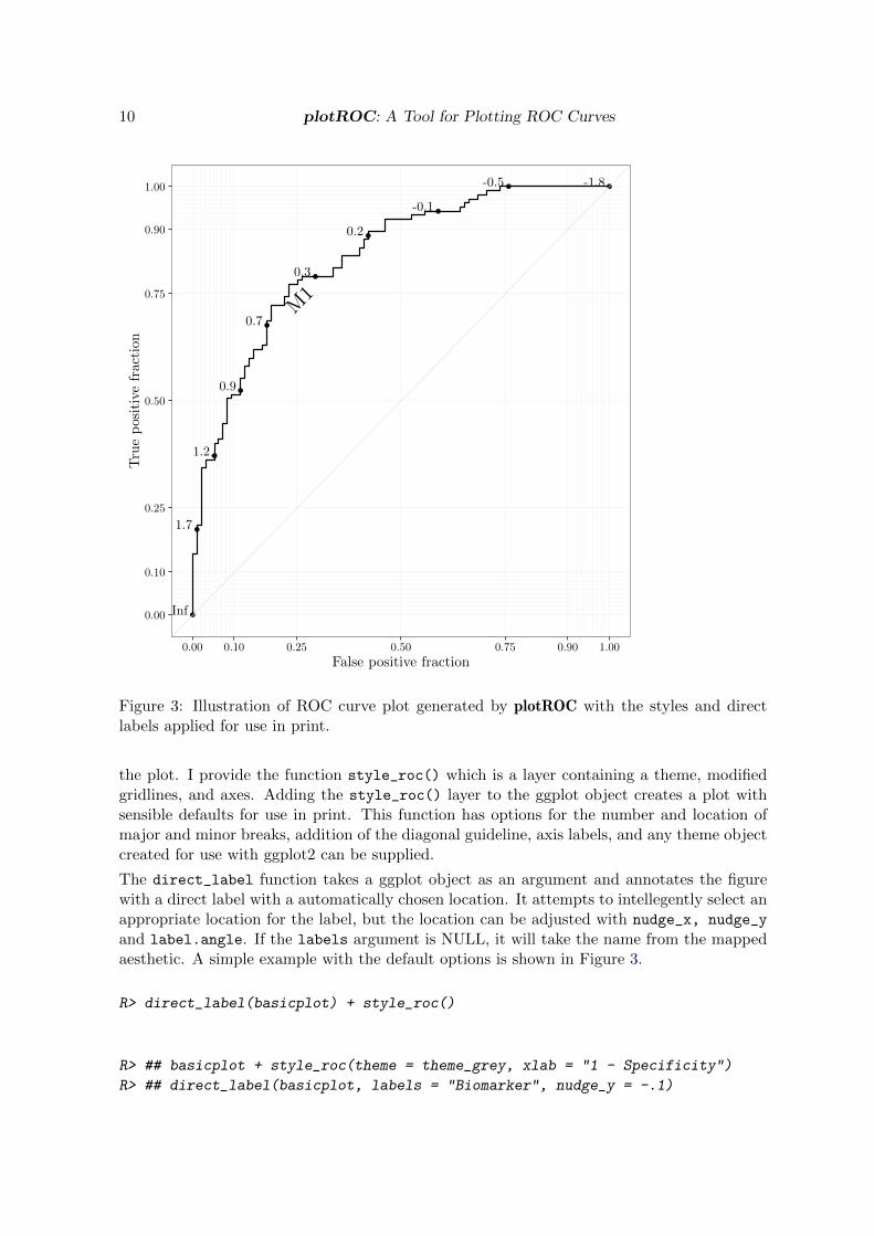
Figure 3: Illustration of ROC curve plot generated by plotROC with the styles and directlabels applied for use in print.
the plot. I provide the function style_roc() which is a layer containing a theme, modifiedgridlines, and axes. Adding the style_roc() layer to the ggplot object creates a plot withsensible defaults for use in print. This function has options for the number and location ofmajor and minor breaks, addition of the diagonal guideline, axis labels, and any theme objectcreated for use with ggplot2 can be supplied.
The direct_label function takes a ggplot object as an argument and annotates the figurewith a direct label with a automatically chosen location. It attempts to intellegently select anappropriate location for the label, but the location can be adjusted with nudge_x, nudge_y
and label.angle. If the labels argument is NULL, it will take the name from the mappedaesthetic. A simple example with the default options is shown in Figure 3.
R> direct_label(basicplot) + style_roc()
R> ## basicplot + style_roc(theme = theme_grey, xlab = "1 - Specificity")
R> ## direct_label(basicplot, labels = "Biomarker", nudge_y = -.1)

Journal of Statistical Software – Code Snippets 11
Interactive ROC plots
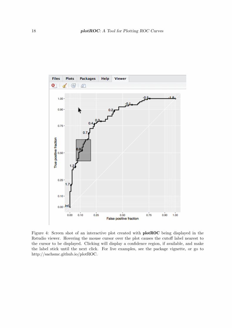
The basicplot object, which is of class ggplot, can be used to create an interactive plot anddisplay it in the Rstudio viewer or default web browser by passing it to the plot_interactive_rocfunction. Give the function an optional path to an html file as an argument called file tosave the interactive plot as a complete web page. A screen shot of an interactive plot is shownin Figure 4. Hovering over the display shows the cutoff value at the point nearest to thecursor. Clicking makes the cutoff label stick until the next click, and if confidence regions areavailable, clicks will also display those as grey rectangles. By default, plot_interactive_rocremoves any existing Rocci geom and adds a high-density layer of confidence regions. Thiscan be suppressed by using the add.cis = FALSE option. The points and labels layer of theRoc geom can be hidden by using the hide.points = TRUE option. Then, points and labelswill be displayed only when the mouse is hovering over the plotting region. Also by default,the style_roc function is applied, the settings can be modified by passing a call to thatfunction or setting it to NULL.
R> plot_interactive_roc(basicplot)
R> plot_interactive_roc(basicplot, hide.points = TRUE)
R> plot_interactive_roc(basicplot, style = style_roc(theme = theme_bw))
Users can export an interactive ROC plot by using the export_interactive_roc func-tion, which returns a character string containing the necessary HTML and JavaScript. TheJavaScript source can be omitted by using the omit.js = TRUE option. Users may wish to dothis when there are multiple interactive figures in a single document; the source only needsto be included once. The character string can be copy-pasted into an html document, orbetter yet, incorporated directly into a dynamic document using knitr (Xie 2014). In a knitrdocument, it is necessary to use the cat function on the results and use the chunk optionsresults = ’asis’ and fig.keep = ’none’ so that the interactive plot is displayed correctly.For documents that contain multiple interactive plots, it is necessary to assign each plot aunique name using the prefix argument of export_interactive_roc. This is necessary toensure that the JavaScript code manipulates the correct svg elements. For examples of in-teractive plots and how to incorporate them into knitr documents, see the package vignette(vignette("examples", package = "plotROC")) or the web page https://sachsmc.github.io/plotROC/.The next code block shows an example knitr chunk that can be used in an .Rmd documentto display an interactive plot.
```{r int-no, results = 'asis', fig.keep = 'none'}cat(
export_interactive_roc(basicplot,
prefix = "a")
)
```
Multiple ROC curves
If you have grouping factors in your dataset, or you have multiple markers measured on thesame subjects, you may wish to plot multiple ROC curves on the same plot. plotROC fully

12 plotROC: A Tool for Plotting ROC Curves
supports faceting and grouping as done by ggplot2. In my example dataset, there are 2markers measured in a paired manner:
R> head(test)
D D.str M1 M2
1 1 Ill 1.48117155 -2.50636605
2 1 Ill 0.61994478 1.46861033
3 0 Healthy 0.57613345 0.07532573
4 1 Ill 0.85433197 2.41997703
5 0 Healthy 0.05258342 0.01863718
6 1 Ill 0.66703989 0.24732453
These data are in wide format, with the 2 markers going across 2 columns. ggplot2 requireslong format, with the marker result in a single column, and a third variable identifying themarker. I provide the convenience function melt_roc to perform this transformation. Thearguments are the data frame, a name or index identifying the disease status column, and avector of names or indices identifying the the markers. Optionally, the names argument givesa vector of names to assign to the marker, replacing their column names. The result is a dataframe in long format.
R> longtest <- melt_roc(test, "D", c("M1", "M2"))
R> head(longtest)
D M name
M11 1 1.48117155 M1
M12 1 0.61994478 M1
M13 0 0.57613345 M1
M14 1 0.85433197 M1
M15 0 0.05258342 M1
M16 1 0.66703989 M1
Then, the dataset can be passed to the ggplot function, with the marker name given as agrouping or faceting variable. Some examples of its usage are given below.
R> ggplot(longtest, aes(d = D, m = M, color = name)) + geom_roc()
R> ggplot(longtest, aes(d = D, m = M)) + geom_roc() + facet_wrap(~ name)
R> ggplot(longtest, aes(d = D, m = M, linetype = name)) + geom_roc() + geom_rocci()
R> ggplot(longtest, aes(d = D, m = M, color = name)) + geom_roc()
R> pairplot <- ggplot(longtest, aes(d = D, m = M, color = name)) +
+ geom_roc(show.legend = FALSE)
R> direct_label(pairplot)
R>
R> pairplot + geom_rocci()
R> pairplot + geom_rocci(linetype = 1)
Journal of Statistical Software – Code Snippets 13
Showing multiple curves is also useful when there is a factor that affects the classificationaccuracy of the test. Let’s create another example dataset.
R> D.cov <- rbinom(400, 1, .5)
R> gender <- c("Male", "Female")[rbinom(400, 1, .49) + 1]
R> M.diff <- rnorm(400, mean = D.cov,
+ sd = ifelse(gender == "Male", .5, 1.5))
R>
R> test.cov <- data.frame(D = D.cov, gender = gender, M = M.diff)
R> bygend <- ggplot(test.cov, aes(d = D, m = M, color = gender)) +
+ geom_roc(show.legend = FALSE)
R> direct_label(bygend) + style_roc()
This example is displayed in Figure 5. Interactive versions of the plots with grouping andfaceting are fully supported.
2.5. Advanced options
Themes and annotations
plotROC uses the ggplot2 package to create the objects to be plotted. Therefore, users canadd themes and annotations in the usual ggplot2 way. A figure with a new theme, title, axislabel, and AUC annotation is shown in Figure 6. plotROC provides the convenience functioncalc_auc that takes a ggplot object that has an Roc layer, extracts the data, and calculatesthe AUC.
R> annotate <- basicplot + style_roc(theme = theme_grey) +
+ theme(axis.text = element_text(colour = "blue")) +
+ ggtitle("Themes and annotations") +
+ annotate("text", x = .75, y = .25,
+ label = paste("AUC =", round(calc_auc(basicplot)["AUC"], 2))) +
+ scale_x_continuous("1 - Specificity", breaks = seq(0, 1, by = .1))
The results are compatible with all other ggplot2 layers and functions, and interactive versionsare supported as long as there is an Roc layer present.
Other estimation methods
By default calculate_roc computes the empirical ROC curve. There are other estimationmethods out there, as summarized in the introduction. Any estimation method can be used, aslong as the cutoff, the TPF and the FPF are returned. Then you can simply pass those valuesin a data frame to the ggplot function and override the default statistical tranformation tostat_identity. For example, let us use the binormal method to create a smooth curve. Thisapproach assumes that the test distribution is normal conditional on disease status.

14 plotROC: A Tool for Plotting ROC Curves
R> D.ex <- test$D
R> M.ex <- test$M1
R> mu1 <- mean(M.ex[D.ex == 1])
R> mu0 <- mean(M.ex[D.ex == 0])
R> s1 <- sd(M.ex[D.ex == 1])
R> s0 <- sd(M.ex[D.ex == 0])
R> c.ex <- seq(min(M.ex), max(M.ex), length.out = 300)
R>
R> binorm.roc <- data.frame(c = c.ex,
+ FPF = pnorm((mu0 - c.ex)/s0),
+ TPF = pnorm((mu1 - c.ex)/s1)
+ )
R>
R> binorm.plot <- ggplot(binorm.roc, aes(x = FPF, y = TPF, label = c)) +
+ geom_roc(stat = "identity") + style_roc()
The example is shown in Figure 7. Interactive plots with stat = ’identity’ are not cur-rently supported.
Another potential use of this approach is for plotting time-dependent ROC curves for time-to-event outcomes estimated as desribed in (Heagerty, Lumley, and Pepe 2000). Here is anexample using the survivalROC package (Heagery and Saha-Chaudhuri 2013) for estimation:
\begin{Schunk} \begin{Sinput} R> library(survivalROC) R> survT <- rexp(350, 1/5) R>cens <- rbinom(350, 1, .1) R> M <- -8 * sqrt(survT) + rnorm(350, sd = survT) R>sroc <- lapply(c(2, 5, 10), function(t){ + stroc <- survivalROC(Stime = survT, status =cens, marker = M, + predict.time = t, method = “NNE”, + span = .25 * 350ˆ(-.2)) +data.frame(TPF = stroc[[“TP”]], FPF = stroc[[“FP”]], + c = stroc[[“cut.values”]], + time =rep(stroc[[“predict.time”]], + length(stroc[[“FP”]]))) + }) R> R> sroclong <- do.call(rbind,sroc) R> R> survplot <- ggplot(sroclong, aes(x = FPF, y = TPF, label = c, color = time))+ + geom roc(labels = FALSE, stat = “identity”) \end{Sinput} \end{Schunk}
3. How it works
plotROC makes use of ggplot2 (Wickham 2009), gridSVG (Murrell and Potter 2014), and d3.js(Bostock, Ogievetsky, and Heer 2011) to create interactive plots. The first step in the processis to create ggplot objects with Roc and/or Rocci layers. They can be plotted and inspectedin the R console. These form the basis for both the print versions and the interactive versionsof the plots. Basic styling and labeling can be added with the style_roc and direct_label
functions.
plotROC makes interactive plots by first converting the ggplot object into a scalable vectorgraphic (svg) object with the gridSVG::grid.export function. This function maps eachelement of the plot to a corresponding element of the svg markup language. Interactivity isthen added using d3.js and JavaScript to manipulate those svg elements in response to users’input. The main interactive feature is to display the cutoff labels at the points on the ROCcurve closest to the mouse cursor.
There are many ways to solve this with d3.js, but Voronoi polygons are a convenient andefficient way to map the cursor location to approximately the nearest point on the ROC

Journal of Statistical Software – Code Snippets 15
curve. For the set of cutoff points along the ROC curve, the d3.geom.voronoi function chaincomputes a set of polygons overlaying the plotting region such that the area of each polygoncontains the region of the plot closest to it’s corresponding cutoff point. Hover events arebound to the polygons so that when the mouse cursor moves around the plotting region,the closest point on the ROC curve is made visible. Similarly, click events are bound tothe polygons so that the appropriate confidence region is made visible upon clicking. Thesvg code and all necessary JavaScript code is returned in the character string provided byexport_interactive_roc.
This approach is similar to what is done in the gridSVG grid.animate function, which usesthe svg <animate /> tags. However, d3.js provides a much richer set of features. Thereare several other R packages that aim to create interactive figures. The authors of animint(Hocking, Sievert, and VanderPlas 2014) created an extensive JavaScript library that createsplots in a similar way as ggplot2. A set of interactive features can be added to plots using d3.js.ggvis (RStudio Inc. 2014a), rCharts (Reinholdsson, Russell, and Vaidyanathan 2014), and themore recently released htmlwidgets (Vaidyanathan, Cheng, Allaire, Xie, and Russell 2014) allleverage existing charting libraries written in JavaScript. qtlcharts (Broman 2015) uses a setof custom JavaScript and d3.js functions to visualize data from genetic experiments. Theirgeneral approach is to manipulate the data and record plotting options in R, and then passthose objects to the charting libraries or functions that handle the rendering and interactivity.plotROC lets R do the rendering, allowing the figures to be consistent across print and web-based media, and retaining the distinctive R style. This also allows users to manipulate thefigures directly in R to suit their needs, using tools that are more accessible and familiar tomost R users. Then, the JavaScript adds a layer of interactivity to the rendered figures.
4. Discussion
Here I have illustrated the usage and described the mechanics of a new R package for creatingROC curve plots. The functions are easy to use, even for non-R users via the web application,yet have sufficient flexibility to meet the needs of power users. My approach to creating inter-active plots differs from other interactive charting packages. I found that existing approachesdid not meet the highly specialized needs of plotting ROC curves. While ROC curve plotscan technically be created with even the most basic plotting tools, I find that specializedfunctions make the results clearer and more informative. The functions are integrated intothe existing and popular ggplot2 package, so that all the benefits and features therein can beused effectively.
4.1. Reproducibility note
This manuscript is completely reproducible using the source files. The output below indicatesthe R packages and versions used. Compiling the pdf output also requires pandoc version1.13.1 and pdflatex.
R> sessionInfo()
R version 3.2.4 (2016-03-10)
Platform: x86_64-apple-darwin13.4.0 (64-bit)

16 plotROC: A Tool for Plotting ROC Curves
Running under: OS X 10.11.4 (El Capitan)
locale:
[1] en_US.UTF-8/en_US.UTF-8/en_US.UTF-8/C/en_US.UTF-8/en_US.UTF-8
attached base packages:
[1] methods stats graphics grDevices utils datasets base
other attached packages:
[1] survivalROC_1.0.3 plotROC_2.0.1 ggplot2_2.1.0 xtable_1.8-2
[5] stringr_1.0.0 knitr_1.13
loaded via a namespace (and not attached):
[1] Rcpp_0.12.5 digest_0.6.9 grid_3.2.4
[4] plyr_1.8.3 gtable_0.2.0 formatR_1.4
[7] magrittr_1.5 evaluate_0.9 scales_0.4.0
[10] highr_0.6 stringi_1.0-1 tikzDevice_0.10-1
[13] labeling_0.3 tools_3.2.4 munsell_0.4.3
[16] colorspace_1.2-6 filehash_2.3
References
Bostock M, Ogievetsky V, Heer J (2011). “D3 data-driven documents.” Visualization andComputer Graphics, IEEE Transactions on, 17(12), 2301–2309.
Broman KW (2015). Web-based interactive charts (using D3.js) for the analysis of experi-mental crosses to identify genetic loci (quantitative trait loci, QTL) contributing to variationin quantitative traits. R package version 0.3-9, URL http://kbroman.org/qtlcharts/.
Clopper C, Pearson ES (1934). “The use of confidence or fiducial limits illustrated in the caseof the binomial.” Biometrika, 26(4), 404–413.
Heagerty PJ, Lumley T, Pepe MS (2000). “Time-dependent ROC curves for censored survivaldata and a diagnostic marker.” Biometrics, 56(2), 337–344.
Heagery P, Saha-Chaudhuri P (2013). survivalROC: Time-dependent ROC curve estimationfrom censored survival data. R package version 1.0.3.
Hocking TD, Sievert C, VanderPlas S (2014). animint: A grammar for interactive anima-tions. R package version 2014.12.4, URL https://github.com/tdhock/animint.
IBM Corp (2013). SPSS Statistics Software. Armonk, NY. URL http://www-01.ibm.com/
software/analytics/spss/.
Microsoft (2015). Excel Software. Redmond, WA. URL http://products.office.com/
en-us/Excel.
Journal of Statistical Software – Code Snippets 17
Murrell P, Potter S (2014). gridSVG: Export grid graphics as SVG. R package version 1.4-2,URL http://CRAN.R-project.org/package=gridSVG.
Pepe MS (2003). The statistical evaluation of medical tests for classification and prediction.Oxford University Press.
R Core Team (2014). R: A Language and environment for statistical computing. R Foundationfor Statistical Computing, Vienna, Austria. URL http://www.R-project.org/.
Reinholdsson T, Russell K, Vaidyanathan R (2014). Interactive Charts using Javascript Visu-alization Libraries. R package version 0.4.5, URL http://ramnathv.github.io/rCharts/.
Robin X, Turck N, Hainard A, Tiberti N, Lisacek F, Sanchez JC, Muller M (2011). “pROC:an open-source package for R and S+ to analyze and compare ROC curves.” BMC Bioin-formatics, 12, 77.
RStudio Inc (2014a). ggvis: Interactive grammar of graphics. R package version 0.4, URLhttp://CRAN.R-project.org/package=ggvis.
RStudio Inc (2014b). shiny: Web Application Framework for R. R package version 0.10.2.2,URL http://CRAN.R-project.org/package=shiny.
SAS Institute Inc (2014). SAS/STAT Software, Version 9.4. Cary, NC. URL http://www.
sas.com/.
Sing T, Sander O, Beerenwinkel N, Lengauer T (2005). “ROCR: visualizing classifier perfor-mance in R.” Bioinformatics, 21(20), 7881. URL http://rocr.bioinf.mpi-sb.mpg.de.
Vaidyanathan R, Cheng J, Allaire J, Xie Y, Russell K (2014). htmlwidgets: HTML widgetsfor R. R package version 0.3.2, URL http://CRAN.R-project.org/package=htmlwidgets.
Wickham H (2009). ggplot2: elegant graphics for data analysis. Springer-Verlag New York.ISBN 978-0-387-98140-6. URL http://had.co.nz/ggplot2/book.
Wickham H (2010). “A layered grammar of graphics.” Journal of Computational and GraphicalStatistics, 19(1), 3–28.
Xie Y (2014). knitr: A General-purpose package for dynamic report generation in R. Rpackage version 1.8.
Affiliation:
Michael C. Sachs9609 Medical Center Drive, MSC 9735Bethesda, MD 20892telephone: [email protected]
Journal of Statistical Software http://www.jstatsoft.org/
published by the American Statistical Association http://www.amstat.org/
Volume VV, Code Snippet II Submitted: yyyy-mm-ddMMMMMM YYYY Accepted: yyyy-mm-dd
18 plotROC: A Tool for Plotting ROC Curves
Figure 4: Screen shot of an interactive plot created with plotROC being displayed in theRstudio viewer. Hovering the mouse cursor over the plot causes the cutoff label nearest tothe cursor to be displayed. Clicking will display a confidence region, if available, and makethe label stick until the next click. For live examples, see the package vignette, or go tohttp://sachsmc.github.io/plotROC.

Journal of Statistical Software – Code Snippets 19
Inf
2.2
1.5
1
0.4
0.1
-0.4
-0.8
-1.6
-3.5
Inf
1.5
1.1
0.8
0.6
0.40.2
-0.1 -0.4 -1.3
Female
Male
0.00
0.10
0.25
0.50
0.75
0.90
1.00
0.00 0.10 0.25 0.50 0.75 0.90 1.00
False positive fraction
Truepositivefraction
Figure 5: Illustration of plotROC with multiple curves.

20 plotROC: A Tool for Plotting ROC Curves
Inf
1.7
1.2
0.9
0.7
0.3
0.2
-0.1
-0.5 -1.8
AUC = 0.83
0.00
0.10
0.25
0.50
0.75
0.90
1.00
0.0 0.1 0.2 0.3 0.4 0.5 0.6 0.7 0.8 0.9 1.0
1 - Specificity
Tru
ep
osi
tive
frac
tion
Themes and annotations
Figure 6: Using ggplot2 themes and annotations with plotROC objects.

Journal of Statistical Software – Code Snippets 21
-1.8-1.3-0.8-0.3
0.2
0.8
1.3
1.8
2.32.8
0.00
0.10
0.25
0.50
0.75
0.90
1.00
0.00 0.10 0.25 0.50 0.75 0.90 1.00
False positive fraction
Truepositivefraction
Figure 7: Illustration of smooth binormal ROC curve.