pierson lisa mobile_presentation
TRANSCRIPT

THINK MOBILE
by: Lisa Pierson
THE GAME HAS CHANGED
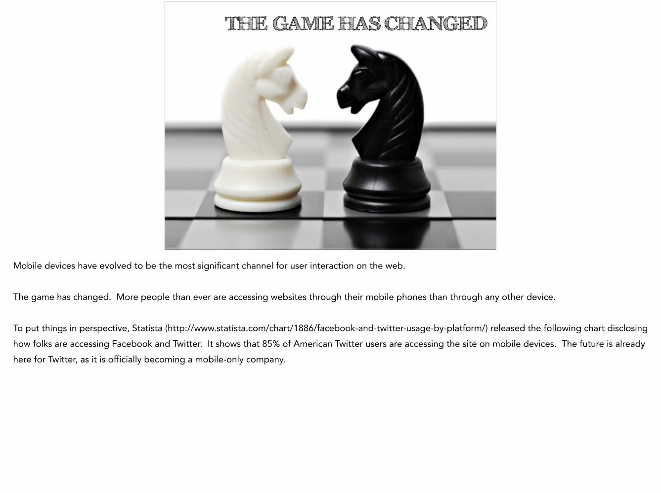
Mobile devices have evolved to be the most significant channel for user interaction on the web. !The game has changed. More people than ever are accessing websites through their mobile phones than through any other device. !To put things in perspective, Statista (http://www.statista.com/chart/1886/facebook-and-twitter-usage-by-platform/) released the following chart disclosing how folks are accessing Facebook and Twitter. It shows that 85% of American Twitter users are accessing the site on mobile devices. The future is already here for Twitter, as it is officially becoming a mobile-only company.
NOWARE
SMALLER
SCREENS
Websites have been a hoarding place for business and brands in the past. “Less is more” is an ideal approach to take when designing a website for all devices. The user experience needs to be focused on, instead of seeing how much information you can cram into your site. After all, those screens are smaller. !Transition should also include more of a touch-and-swipe mentality rather than point and click. Along with this, the content presented needs to be digestible to the customer. !Because mobile websites have high bounce rates, don’t put a lot of energy into destination pages that don’t have high priority. Search and contact links are high priority.
http://validator.w3.org/mobile/
One way to help figure out if your website is optimized for mobile devices is to visit this website and use the validator tool offered. The validator will check to see how a website will respond to a mobile device and offer information to fix any issues.

ADAP TIVE
& RES PONS IVE.
Design
Another way to optimize for mobile devices is to implement adaptive or responsive design. Adaptive design us used by big companies that have the backing to invest to reach extremely large audiences. Adaptive design identifies the device and then generates a page to match the capabilities of the device. Responsive design is a cost-effective solution that uses Cascading Style Sheets (CSS) to make one version of a website that automatically adjusts to fit the screen of any device that accesses the webpage, minus the really old mobile devices. Now, using the WC3 validator website mentioned earlier, I did some research to see how some big companies scored for their mobile friendliness.

WWW.TARGET.COM
0% MOBILE FRIENDLY
Let’s take www.target.com. I was expecting to see high scores from this heavy hitter. !And the validator gave me this number. I did it again to make sure I didn’t make a mistake. How could this be? So I did a few more…

!
WWW.VERIZON.COM = 7%
WWW.AMAZON.COM = 0%
WWW.BESTBUY.COM = 1%
At this point I was a bit confused. I mean, I know that these companies have apps that you can download, but who wants to take up storage on your phone with these applications when you really want to save them for the games you need like Angry Birds and Words with Friends? Anyway, I pulled these sites up on my iPhone 6 Plus. They didn’t look that bad, in their defense. They weren’t that hard to use, and I wasn’t confused, so I am really curious now why they were scoring so low.
WAIT!!!!61%
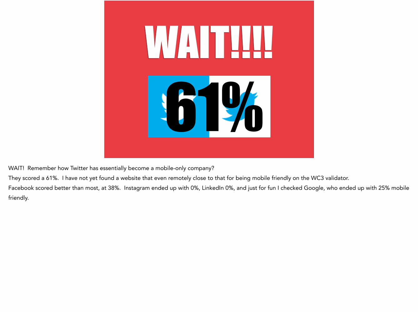
WAIT! Remember how Twitter has essentially become a mobile-only company? They scored a 61%. I have not yet found a website that even remotely close to that for being mobile friendly on the WC3 validator. Facebook scored better than most, at 38%. Instagram ended up with 0%, LinkedIn 0%, and just for fun I checked Google, who ended up with 25% mobile friendly.
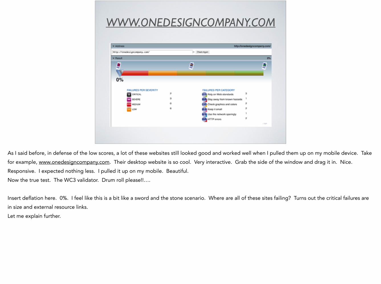
WWW.ONEDESIGNCOMPANY.COM
As I said before, in defense of the low scores, a lot of these websites still looked good and worked well when I pulled them up on my mobile device. Take for example, www.onedesigncompany.com. Their desktop website is so cool. Very interactive. Grab the side of the window and drag it in. Nice. Responsive. I expected nothing less. I pulled it up on my mobile. Beautiful. Now the true test. The WC3 validator. Drum roll please!!…. !Insert deflation here. 0%. I feel like this is a bit like a sword and the stone scenario. Where are all of these sites failing? Turns out the critical failures are in size and external resource links. Let me explain further.
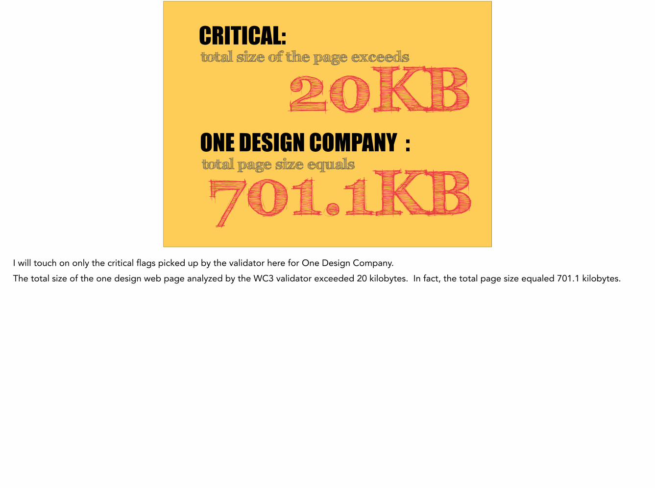
CRITICAL:total size of the page exceeds
ONE DESIGN COMPANY :total page size equals
20KB
701.1KBI will touch on only the critical flags picked up by the validator here for One Design Company. The total size of the one design web page analyzed by the WC3 validator exceeded 20 kilobytes. In fact, the total page size equaled 701.1 kilobytes.
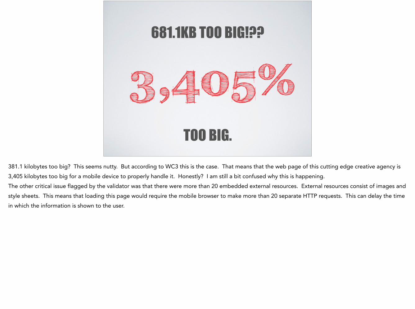
681.1KB TOO BIG!??
3,405% TOO BIG.
381.1 kilobytes too big? This seems nutty. But according to WC3 this is the case. That means that the web page of this cutting edge creative agency is 3,405 kilobytes too big for a mobile device to properly handle it. Honestly? I am still a bit confused why this is happening. The other critical issue flagged by the validator was that there were more than 20 embedded external resources. External resources consist of images and style sheets. This means that loading this page would require the mobile browser to make more than 20 separate HTTP requests. This can delay the time in which the information is shown to the user.

WHAT DO I MAKE OF ALL
THIS?So what can you as a small business owner do to have the most mobile friendly site possible?

FOR THE BEST POSSIBLE PLAN:
3THINGS.
I suggest three things for a small business. If you adhere as much as possible to these three guidelines, you will be ahead of the mobile friendly game.
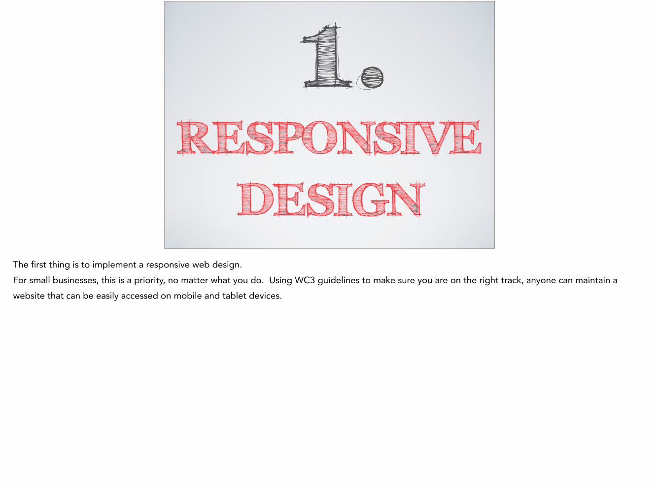
1.RESPONSIVE
DESIGNThe first thing is to implement a responsive web design. For small businesses, this is a priority, no matter what you do. Using WC3 guidelines to make sure you are on the right track, anyone can maintain a website that can be easily accessed on mobile and tablet devices.
2.FRIENDLY
CMSSecond, analyze your CMS. What are the capabilities and how is it working for you? You may want to be looking at your CMS at the same time you are looking at responsive design, because some content management systems do not support it.

3.YOUR BUDDY
IS W3CThird, build a page, and use the validator to make sure you are on the right track. Fix any critical issues before you move on, and visit the W3C standards website often. http://www.w3.org/standards/

AND THAT’S IT!
Obviously there is a lot involved in this, and things are rapidly changing. But there is no reason why everyone can’t have a mobile friendly and accessible website without being one of the big guys. And frankly, from what I researched, following these guidelines presented would actually put anyone ahead of the companies we would all expect to be on top of this revolution in website design.

THANK YOU!

References: !http://mashable.com/2011/08/05/mobile-design-priority/http://www.forbes.com/sites/joshsteimle/2014/02/12/mobile-is-the-future-of-everything/ !http://blogs.sitepoint.com/7-tips-to-make-your-web-site-mobile-friendly/ !http://www.entrepreneur.com/article/226575 !http://validator.w3.org/mobile/check?task=2015013011311437.mobile2&docAddr=http%3A%2F%2Fwww.onedesigncompany.com%2F !http://validator.w3.org/mobile/check?task=2015013009491341.mobile2&docAddr=http%3A%2F%2Fwww.target.com%2F !http://www.w3.org/standards/