perpetual motion: human mobility and
TRANSCRIPT

PERPETUAL MOTION: HUMAN MOBILITY AND
SPATIAL FRICTIONS IN THREE AFRICAN COUNTRIES∗
Paul BLANCHARD
Trinity College Dublin
Douglas GOLLIN
University of Oxford
Martina KIRCHBERGER
Trinity College Dublin
November 2020
Abstract
Frictions affecting human mobility have been identified as important potential sources of
the spatial gaps in wages and living standards that characterize many low-income coun-
tries. However, little direct data has been available to characterize high-frequency mobil-
ity. We use a novel data source that provides highly detailed location data on more than
one million devices across three large African countries for an entire year. This allows
us to examine high-frequency mobility patterns for a subset of high-quality observations
for whom we can determine home locations confidently. We link our users with spatial
data on population density and nationally representative micro-survey data to character-
ize this non-random sample. We then propose a number of metrics to measure characterize
mobility related to frequency, spatial extent and densities visited. We find that users are
remarkably mobile in terms of the fraction of days seen at least 10km away from their
home location, and the average distance for non-home location pings. Individuals residing
in low-density locations are well linked to high-density locations and a significant fraction
of visitors to the largest cities comes from non-urban areas. Finally, the observed mobility
patterns suggest large agglomeration effects: a doubling of population is associated with a
doubling of city fixed effects. Our estimates are in line with previous gravity estimates in
the literature across a wide range of spatial and temporal scales.
∗We thank Neil Barsch, Neenu Vincent, and Sean Walsh for excellent research assistance. We are grateful to Safegraph for sharing
the smartphone app location data and answering many questions. Many thanks to Dave Donaldson, Kevin Donovan, Gabriel Kreindler,
David Lagakos, David Weil, and seminar participants at TCD, the Virtual UEA meeting and the Cities and Development conference for
helpful comments and discussions. We are also grateful to Paddy Doyle for continuous support with Trinity College Dublin’s Computing
Cluster. Kirchberger gratefully acknowledges funding from the Provost Project Award Fund. All potential errors are our own. Contact:
Department of Economics, Room 3014 Arts Building, Trinity College Dublin, Dublin 2, Ireland; email: [email protected];
website: https://sites.google.com/site/mkirchberger.
1
1. Introduction
In most developing countries, there are large gaps in nominal wages and productivity across
sectors (Gollin, Lagakos, and Waugh, 2014). There are similarly large gaps in living stan-
dards across space, with people in sparsely populated rural locations consistently worse
off than those in dense urban settlements (Gollin, Kirchberger, and Lagakos, 2020). The
persistence of these gaps raises the possibility that significant frictions and market imper-
fections limit the movements of people and information, leading to spatial and sectoral
misallocation.
This paper aims to advance our understanding of sectoral and spatial gaps by documenting
and analyzing high-frequency mobility patterns within three low-income African economies.
By examining the frequency with which individuals move across space – from rural areas
to towns and villages, or from cities to rural areas – we can assess the salience of some key
frictions. For instance, a world in which rural people travel frequently to distant towns and
cities is not one in which narrowly defined costs of mobility can plausibly explain sectoral
or spatial gaps.
Understanding high-frequency mobility has previously been limited by the lack of data.
Census data or standard household surveys (e.g., those carried out in collaboration with
the World Bank’s program of Living Standards Measurement Surveys) typically measure
longer-term migration flows but lack data on day-to-day mobility over a given time period.
Surveys providing detailed commuting data available in high-income countries, such as the
American Community Survey, provide information on commutes but miss non-work related
trips. Such surveys are not available for most low-income countries.
In this paper, we measure mobility using newly available, fine-grained, but anonymized,
data on smartphone locations. Unique to our study is the scale at which we can study the
phenomenon of short- and long-term population movements. Our data covers more than
one million smartphone devices over an entire year across three large African countries:
Nigeria, Kenya, and Tanzania.1 We are therefore able to present data on mobility that is
both fine-grained and large-scale.
Each observation in our data reflects an instance when a user’s phone connects to the in-
ternet to use a certain app. For each such use, we observe the GPS location and the precise
time. This type of data has been used, for example, to study the length of time that indi-
viduals spend with their families for Thanksgiving in the US (Chen and Rohla, 2018), to
construct a measure of experienced segregation (Athey, Ferguson, Gentzkow, and Schmidt,
2020), to study the effect of chance meetings on knowledge spillovers in the Silicon Val-
1In the remainder of the paper we will refer to a device as a user. We recognize that this is an inexactequivalence: some users possess more than one device, and some devices are shared by multiple users. Weaddress these issues in detail in Section 3.
2
ley (Atkin, Chen, and Popov, 2020), or to measure the effectiveness of social distancing
(Mongey, Pilossoph, and Weinberg, 2020). We add to this literature by focusing on three
countries in sub-Saharan Africa and by looking at patterns of mobility.
We propose to use the fact that devices are seen at different locations within countries to
characterize movements of users across space, and particularly between rural and urban
areas. We use the data to map and categorize the movements of people and the connected-
ness of locations. For instance, we can ask how frequently a given rural location is visited
by individuals from a nearby town or city; we can also ask how frequently residents of that
rural location pass through a given city or market centre; or, how the composition of visitors
to the capital differs from visitors to secondary cities.
The paper makes three main contributions. First, we construct a novel set of metrics for
characterizing mobility across space related to frequency, spatial extent, densities and places
visited. Second, we analyze these measures to provide insights into the patterns of human
mobility within the three countries where our data originate. Third, we use findings of
recent quantitative spatial models to study returns to mobility across space. Our data allows
us to examine the sensitivity to distance of our measures of mobility and connectedness at
different spatial and temporal scales; it also allows us to compare our findings to those of
previous studies, such as those that have used gravity models to consider within-country
migration.
We find striking evidence of a high degree of mobility within these three African coun-
tries. Although the population we study is undoubtedly atypical for Kenya, Nigeria, and
Tanzania, we find evidence that a substantial fraction of the people in these countries is
highly mobile. Users are seen more than 10km away from home on about one-sixth of
the days on which they are observed. Residents from more sparsely populated areas are
more frequently away from home than city center residents and they venture far when
they do. Spatial transition matrices show that towns and many villages in these countries
appear to receive visits from urban dwellers, and in turn these villages seem to generate
travellers who go to larger towns and cities. The networks of connectivity between different
geographies are strong. This challenges, for instance, the notion that villages and towns
in relatively remote areas are isolated – and therefore ignorant of what goes on in the big
cities. The data also cast doubt on the notion that the monetary and non-monetary costs
of mobility are simply prohibitive. Beyond these qualitative findings, we show that large
cities exert a disproportionate influence: Nairobi, Lagos, and Dar es Salaam are powerful
magnetic forces that pull in visitors from every corner of their countries while secondary
cities appear to be substitutes for each other. This too is important for our understanding of
spatial frictions. One could imagine that rural people seldom venture beyond their nearest
towns or cities. But the data show persuasively that people from these remote villages and
towns do indeed travel to capital cities. These findings can help inform our understanding
3

of spatial frictions in developing countries. In particular, they can discipline models that
incorporate spatial and sectoral frictions. Finally, we find large agglomeration effects: a
doubling of city size is associated with a doubling of the estimated city fixed effect. Our
estimates for the elasticity of mobility with respect to travel are robust to different spatial
and temporal scales, such as estimating mobility between virtual regions and at a quarterly
level, showing that movement costs are significant in these contexts.
Our analysis requires some serious discussion of the representativeness – or lack thereof –
of the population from which our data are drawn. While smartphone users might arguably,
in 2020, be representative of the wider population in rich countries, it would be unrea-
sonable to assume that the same holds in low-income countries. We do not have personal
information on the users of our devices, and for ethical and privacy reasons, we have not
attempted to exploit the data for the purpose of extracting identifying information.2 The
one personal characteristic that we construct for each device is its "home location". We
define this as the modal 0.01-degree cell (≈ 1.1km at the equator) at which we observe the
user between 7pm and 7am.3 We then select a subset of “high-confidence” users that we
observe at least 10 nights and who spend at least half of these in the home location.
We characterize our users in three steps. First, we compare the distribution of popula-
tion density at our users’ home locations with that of the overall population. Second, we
propose a new method to characterize the places our users reside by linking user’s home
locations with widely available micro-survey data. While we do not have characteristics of
users such as age, education or gender, this allows us to gauge how representative our users’
home locations are compared to locations where no users reside. Third, we use additional
nationally representative micro-data to compare basic characteristics such as income, age
and education of individuals across ownership of different types of phone devices, from ba-
sic phones to smartphones. We argue that these steps are crucial in order to understand the
characteristics of our users, given that our data are generated from a population that does
not represent a statistical sample, selected with the benefit of defined sampling frames and
protocols. A rough summary of our efforts to characterize the sample is that we find our
sample to be, unsurprisingly, more urban than the population as a whole, and also younger
and better off. However, our best assessment is that our population is not extraordinarily
atypical in any of these dimensions. Our users’ home locations seem generally unremark-
able. The urban users seem to live in "relatively normal" urban areas (in a sense that we
will characterize below), and our rural users live in similarly normal rural areas. Third,
we use micro-data to compare basic characteristics of individuals owning a smartphone to
2It might be possible, for instance, to use the location information from individual users to identify or infertheir religious observance, gender, and other attributes. In this paper, we do not attempt to use the data forthese purposes, in recognition of the obvious privacy concerns.
3In practice, we define the modal 2-decimal rounded location at night as the home location, so our 0.01-degree grid cells have 2-decimal rounded coordinates as centroids.
4

those owning a different type of phone or no phone. As smartphones have diffused through
sub-Saharan Africa in recent years, smartphone users have come to look more and more
like the rest of the population. In the sections that follow, we address these nature of our
sample in greater detail.
This research builds on a growing literature in economics that seeks to understand the
salience of spatial frictions for development and growth. Spatial frictions limit the mobility
of goods, information, and people within economies. In contexts where spatial frictions
are high, the allocation of factors across firms will tend to result in gaps in marginal prod-
ucts. Similarly, spatial frictions may lead to allocations such that marginal utilities are not
equalized across consumers, and utility may not be equalized across people living in differ-
ent locations. These static effects may also lead to dynamic impacts, as frictions move the
economy away from a theoretically efficient benchmark.4
The importance of within-country spatial frictions in the movement of goods has been doc-
umented in recent work (e.g., Arkolakis, Costinot, and Rodríguez-Clare (2012); Costinot
and Donaldson (2016); Atkin and Donaldson (2015); Donaldson and Hornbeck (2016);
Donaldson (2018); Allen and Arkolakis (2014)). This emerging literature has pointed out
that spatial frictions have implications for patterns of specialization and exchange. An ad-
ditional literature has documented the importance of spatial frictions as they relate to the
flow of information. In particular, a number of papers (e.g., Aker (2010); Jensen (2007))
have shown the impact of mobile phones on the dispersion of prices across space. Allen
(2014) suggests that information frictions can compound spatial frictions.
Both these literatures have used new data sources to understand spatial frictions at a highly
localized level. For movement of goods, many frictions occur in the proverbial “last mile”,
making it important to consider spatially disaggregated data. Similarly, for information fric-
tions, studies have often looked at price dispersion across nearby markets. For movement
of people, however, the literature has largely focused on crudely defined measures of mi-
gration or broad-brush comparisons of rural-urban gaps in living standards (Young (2013);
Hamory Hicks, Kleemans, Li, and Miguel (2017); Bryan, Chowdhury, and Mobarak (2014);
Akram, Chowdhury, and Mobarak (2017)). Our paper builds on the work of Blumenstock
(2012) and Lu, Wrathall, Sundsøy, Nadiruzzaman, Wetter, Iqbal, Qureshi, Tatem, Canright,
Engø-Monsen et al. (2016) in using more spatially detailed data on human mobility.
This paper is structured as follows. Section 2 discusses the smartphone app data we use and
how we define home locations. Section 3 shows our methodology to understand sample
selection and characterize the sample. Section 4 presents our mobility indicators. Section
4It is not entirely clear whether one should view real frictions – such as transport costs – as a source ofinefficiency, in the way that a tariff would be viewed as inefficient. The social planner cannot wish awaydistance or mountain ranges; real resources would be required to reduce or eliminate these frictions. Toavoid this largely semantic issue, we prefer in this paper to use the term “friction” rather than “barrier” or“distortion,” and we have sought to avoid language that would imply “inefficiency.”
5

5 estimates the returns to mobility. Section 6 concludes.
2. Smartphone app data
This paper draws primarily on smartphone app location data for three African countries:
Kenya, Nigeria and Tanzania. We selected these countries based on data availability and a
sufficiently high number of users in the sample. We discuss our main choices of how we
process the raw data here and refer the interested reader to Appendix A.
Each observation in our data set (referred to hereafter as a "ping") represents an instance
where a smartphone accesses the internet via a set of apps. Pings are sourced from thou-
sands of apps that need to access location data.5 These apps include standard social, nav-
igation, information and other apps, but we do not know precisely which apps, and we
cannot associate specific pings with specific apps.
Each ping comes from a device – i.e., a particular smartphone. For each ping we know
the device identifier (i.e., a particular phone, rather than a SIM card), a timestamp and
longitude/latitude coordinates of the current position, measured to an accuracy of approx-
imately 10 meters. Each country dataset covers a period of one year.6
In the remainder of the paper we refer to a device as a user, subject to the caveats already
mentioned in footnote 1 and discussed in further detail below. In this section we start by
discussing how we assign home locations to users and outline how we identify and deal
with irregularities in the data.
We use two criteria to define home locations. First, we identify the modal 0.01-degree
cell (≈ 1.1km at the equator) in which the user is seen at night (between 7pm and 7am,
local time).7 Second, we consider two additional restrictions: (a) that a user is observed
for a minimum of 10 nights; and (b) that the user is at the inferred home location for at
least 50% of the total nights when that user is observed anywhere. These two restrictions
eliminate cases where the user is seen infrequently at night, or is seen frequently but at
multiple locations.
Given the central role home location plays in our analysis, we define our core sample –
which we call the “high-confidence” sample – as users that satisfy both criteria. Unless
specified otherwise, we use our high-confidence users for our analysis. This is a sample of
5We only observe a "ping" when a phone is connected to the internet. We are therefore not able to drawconclusions about areas without internet coverage.
6The time frame is 2016-12-01 to 2017-12-01 in Kenya and 2017-04-01 to 2018-04-01 in Nigeria andTanzania.
7The accuracy of GPS data would theoretically allow us to infer home locations at higher resolutions. Wechoose to settle for a relatively coarser resolution to reduce computational time and because we deem itpreferable for the analyses we conduct throughout the paper. In particular, for our purposes, we would like toconsider pings from a few hundred meters apart as belonging to the same home location, rather than definingthe home location as a particular house or plot of land.
6

just under 120,000 devices across the three countries, with an average of over 2,000 pings
observed per user, as show in Table 1.8
We then examine the spatial distribution of home locations and identify users with appar-
ent mislabelled locations by tabulating home locations and displaying them visually. This
reveals what we call “irregularities” such as data sinks (e.g. a large fraction of users inex-
plicably assigned by the data-generating software to a spurious location, such as a country
centroid) and other apparent errors in the data, e.g. users with equal latitude and longitude
coordinates in locations where no people reside (visible on the 45 degree line on a map).
For example, 372,661 users in Tanzania seem to have been assigned to an arbitrary spot in
the middle of Dodoma. Examining data for outliers is important when working with any
data set. Data input errors may seem more likely in micro-surveys where misinterpretation
of questions or data entry errors are known sources of measurement error. Established pro-
cedures such as piloting of questionnaires, extensive interviewer training, and background
checks help minimize these errors. Big data such as automatically recorded smartphone
app location data - recorded without human interaction - might seem less prone to mea-
surement error. However, we find that working with data of this nature opens new sources
of error and misclassification; unless consistency of the data is examined with a similar
attention to detail than the micro data, it is not reasonable to expect meaningful results.
Appendix A provides further information on this quantitative extent of misclassification and
our procedure to remove observations affected by apparent irregularities.
Table 1 shows the number of users and pings per user for our base sample of users.
Table 1: Sample and pings per user
All High confidenceUsers Pings ratio Users Pings ratio(1) (2) (3) (4)
Kenya 195,630 593 18,535 4,867Nigeria 659,407 304 78,694 1,722Tanzania 234,213 457 22,728 2,123
TOTAL 1,089,250 389 119,957 2,284
Note: Columns (1) and (2) show the total number of users per country and average pings per user.Columns (3) and (4) only use high-confidence users (users who are observed for a minimum of 10nights and who are at the inferred home location for at least 50% of the total observed nights.)
Columns (1) and (2) show the number of users and average pings per user over the entire
year who are observed at least once at night, where the average is computed by summing
over all pings and dividing by the number of users; for this sample we have on average
8We also build other subsets based on alternative values for the minimum number of nights observed: (i)the “medium confidence set" includes users with at least 8 nights observed and (ii) the “low confidence set"with users seen at least 5 nights in total. Our results are generally robust to using these alternative subsets.
7

slightly more than one ping per day per user. Columns (3) and (4) apply the second re-
striction to obtain our high-confidence sample by imposing that we see a user for at least
10 nights and she is at the inferred home location in at least half of these nights. This
drastically reduces our sample size and increases the ratio of pings per user to 2,284. Users
in the high-confidence dataset are therefore seen on average 6 times per day, compared to
users in the complete dataset who are seen on average slightly more than once per day.
As is common with these types of data, there is a large variation in the number of pings
across users, with about 59% of users having at most 20 pings in the initial sample. Our
two conditions defining high-confidence users reduce the fraction of users with at most 20
pings to 0.3%.
Table 2 summarizes user-level temporal statistics for our high-confidence users.
Table 2: User-level temporal statistics by country
Variable Mean Median Min MaxLength of obs. (in days) 102.1 74.4 8.7 365.0
Kenya Days seen 39.2 30.0 8.0 352.0Mean pings per day 98.2 8.9 1.0 20,665.4
Length of obs. (in days) 100.9 81.9 8.6 365.0Nigeria Days seen 40.4 29.0 8.0 346.0
Mean pings per day 40.1 12.8 1.0 9,585.8Length of obs. (in days) 95.1 70.6 8.6 364.9
Tanzania Days seen 38.8 28.0 7.0 349.0Mean pings per day 51.4 10.6 1.0 14,765.6
Length of obs. (in days) 99.0 78.1 8.6 365.0TOTAL Days seen 39.8 29.0 7.0 349.0
Mean pings per day 42.1 11.9 1.0 14,765.6
Note: This table shows the duration over which we observe a user, the number of distinct days weobserve a user, and mean pings per day, defined as the ratio of the total number of pings for a userdivided by the number of distinct days she is seen.
It considers three different measures. The first is the duration over which we observe a
particular user in the dataset, defined as the number of days between the first and the last
observation of that user. The second is the number of distinct days on which we see a
particular user. The third statistic is the mean number of pings per day per user. The mean
number of pings per day is defined as the ratio of the total number of pings for a user,
divided by the number of distinct days she is seen.9 These statistics are roughly similar for
the three countries. We see users on average over a span of about 100 days, on about 40
distinct days, and they have between 40 and 100 pings per day on average.10
9This differs from the pings ratio in Table 1 which simply summed over all pings in the data across all usersand divided by the number of users.
10The minimum number of days is less than 10 as some users are seen on 10 nights but have pings on fewer
8

Figure C.1 shows the distribution of users and pings per user over time. The graphs show
that there is an upward trend in the number of users over the period in which we observe
the sample, likely due to a combination of factors. One is the steady and secular increase in
the rate of smartphone ownership and usage. Another possible reason is the introduction
of new apps in the sourcing of data during this period. The number of pings per user shows
discontinuities, possibly due to further apps being added (or removed) and users switching
between apps. This could bias our estimates of mobility if different types of users are added
on to the sample later in the year. For example, assume that at the start only higher-income
individuals living in dense areas have access to phones, and assume that they make one
trip every three months to the largest nearby city. Later in the year, some lower-income
individuals from lower densities might be able to afford a smartphone, but their mobility is
far below the spatial mobility of higher-income individuals, so that they make one trip every
six months. The fact that they enter the sample later, means that we might not observe them
sufficiently long to observe one of their trips they make every six months and would thereby
underestimate their mobility. We do not have access to income data for our users, but we
can test whether individuals coming into the sample in later months reside in different
densities. We find that the R-squared between the date of entering our data and population
density at home location ranges from 0.0006 to 0.001 in our three countries. Most of our
metrics are aggregated over the entire year, and thus they should not be sensitive to these
particular discontinuities.
3. Characteristics of users
The key selection concern when using smartphone app location data is that we only capture
individuals who own a smartphone. A further restriction affecting selection into our sample
is that individuals require data credit on their phones, similar to requiring phone credit to
make calls or send texts. On the other hand, as app usage is increasing through the use of
messaging services (e.g., Facebook Messenger or Whatsapp), replacing “traditional” calling
and texting, we are more likely to capture locations of individuals engaging in this kind of
activity. Further, we are more likely to capture passive use of a mobile phone if a device
connects to an app without the deliberate action of the holder of the device. This would
make location detection more representative, in some sense, than relying on call and text
events only. In terms of characteristics of the selected sample, we expect this to bias our
sample towards richer, more educated and younger individuals.
Given these general concerns about selection, we seek to understand how our population
of users compares to the broader populations of these three countries. We proceed in three
steps. First, we link users’ locations with geo-coded population density data from World-
Pop to understand how representative users are for different levels of population densities.
than 10 days.
9

Second, to measure how representative our users are, in terms of their home locations, we
develop a methodology to match home locations with nationally representative micro-data
from the Demographic and Health Surveys (DHS). This allows us to say something about
whether the locations where our users live are typical or atypical. Third, we draw on data
from other nationally representative surveys – specifically, the ICT Access and Usage Sur-
veys – to examine differences between individuals who own a smartphone and those who
do not. To the extent that our population of smartphone app users is typical of all smart-
phone owners, these survey data will tell us something about how our users compare to the
broader national populations of their countries.
Figure 1 shows the distribution of home locations in the left panel and compares it with
the population distribution in the right panel.
10

Figure 1: Distribution of home locations and population.
Note: This figure shows the distribution of home locations of users (on the left) and the distributionof the population (on the right).
11

Darker values indicate a higher number of users. Unsurprisingly, we observe a higher num-
ber of users in the main cities. However, the figure shows that coverage of users is broadly
national, with users residing in fairly distant places as well as in the densest cities. In fact,
we have users in all but three of the 115 regional capitals in the three countries we study.11
Maps in Figures C.2 and C.3 in the appendix show these comparisons for the three capitals
as well as Mombasa, Lagos and Dar es Salaam.
To examine how representative home locations of our users are for different levels of pop-
ulation density, we extract the population density values at users’ home locations using
WorldPop population grids and we then infer the distribution of users across population
density bins. The distribution of users is largely skewed to the right with around 70 percent
of users falling in the two densest bins (see Figure 2).12 We also used other population
density products such as Landscan in Figure C.4. Using these products our users are more
represented in the lower quintiles. We therefore view these results as the most conservative
population density distributions.
Figure 2: Users by population density decile.
(a) Kenya (b) Nigeria (c) Tanzania
Note: This figure shows the distribution of users across population density deciles based on nationalpopulation data so that each decile contains one tenth of the population (rather than one thenth ofgrid-cells).
We compute three further metrics to measure the representativeness of our users across
11Regional capitals are broadly understood as capital cities for subdivisions of the first administrative level.More specifically, Kenya has 47 counties, Nigeria has 36 states and a Federal Capital Territory and there are 31regions (or mikoa) in Tanzania. Cities’ boundaries are defined according to GRUMP 3km-buffered polygons.For the 19 regional capitals that have no boundaries defined in the GRUMP product, we overlay the ArcGISlabelled World Imagery basemap with our users’ home location rasters and evaluate qualitatively whethersome users are found within the built-up areas of the cities considered.
12To be specific, we divide each country into gridcells and assign each gridcell an absolute population densitybased on WorldPop or other data. Using the national population data, we can divide the entire populationinto equal-sized bins based on the population density in which they live. This gives rise to a set of gridcellsassociated with each density decile. We can then identify each of our users with the population density and/orthe density bin of their home location; e.g., we can speak of a user whose home location is in the third densitydecile. Note that our users are not evenly allocated across the density decile. As shown in Figure 2, our usersare skewed towards the more densely populated bins.
12

different levels of population density: first, we take all 10-km pixels in a country and regress
the number of users in a pixel on population of the corresponding pixel. We find that the
R-squared ranges between 0.36 in Kenya to 0.81 in Tanzania, depending on the source
of the population density estimates.13 Second, we compare the rank in terms of the total
number of users at the first administrative level in our three countries with the rank of the
population. The bivariate correlation coefficients range between 0.29 in Nigeria and 0.7 in
Tanzania.14
Next, we compare the fraction of users located in cities of at least 200,000 people with the
corresponding fraction of the population living in those.15 In Nigeria, 86.1% of our users
are found in cities of 200,000 whereas these are host to only 20.5% of the population.
Similar results are observed in Kenya and Tanzania where we find 75.9% and 68% of users
in major cities that host 15.9% and 16.7% of the population respectively, which is indicative
of an urban selection pattern.
The urban tilt of our sample is unsurprising; we expect that smartphone users will be con-
centrated in cities. In all of our analysis, we account for this aspect of the data. The more
interesting question is how our urban users compare with other urban dwellers, and how
rural users compare with other rural residents. For this, we can turn to other data sources.
To characterize the home locations of our users, we draw on recently available DHS data.
The key challenges are how to link a relatively small number of DHS survey clusters (the
total number of clusters ranges from 608 in Tanzania to 1,594 in Kenya) to a large number
of home locations for our users, spread across the entire geography of our three countries.
Adding to the challenge is that the published locations for the DHS clusters are randomly
displaced (between 0 and 10 kilometers) in an effort to ensure data confidentiality.16 For
our analysis, we seek a DHS cluster that might be considered comparable to each user’s
home location. We outline our main methodology here and provide further details in Ap-
pendix B.
We start by classifying our users into urban and rural areas. For each user, we select the set
of DHS clusters located within a given distance d from her home location. We set d =10km
for rural users and d = 5km for urban users. This yields a set of DHS clusters that are com-
13We find a significantly higher correlation when using Landscan data than other sources.14See Appendix Figure C.7.15We use city polygons from the Global Rural-Urban Mapping Project (GRUMP) to which we apply a 3km
buffer in order to better capture commuting zones. We overlay 2018 WorldPop population grids with GRUMPcity polygons to obtain city-level population estimates and, for the sake of consistency, total population countsare also based on 2018 population grids. Cities which have boundaries less than 3km apart are merged.As a result, we find that there are 6, 39, and 10 cities of at least 200,000 in Kenya, Nigeria and Tanzaniarespectively.
16To be precise, the published geo-referenced locations for the DHS clusters are displaced by selecting arandom compass direction and then a random distance. Urban DHS clusters are randomly displaced by 0-2km, and rural clusters are randomly displaced by 0-5km, with 1 percent of clusters randomly selected to bedisplaced by 10km (Perez-Heydrich, Warren, Burgert, and Emch, 2013).
13

parable, in some sense, to the home location of our user. The number of these comparison
clusters will be either zero or a strictly positive number of clusters. Not all these nearby
clusters will offer valid comparisons, however. For example, a user at the outskirts of Dar
Es Salaam might be associated with a nearby rural cluster as well as a number of urban
clusters. To ensure that we do not falsely assign an urban cluster as a comparison location
for a rural user (or vice-versa), we add the restriction that the cluster’s average population
density (calculated over a 5km buffer) must be within 25% of the average population den-
sity that we have computed for the user’s home location. If this does not hold, we drop the
DHS comparison cluster.
Following this methodology, we pair 70% of our users in the high-confidence sample with
at least one DHS cluster.17 We call the subset of respondents within paired clusters the
“matched DHS” sample.18 Unsurprisingly, unmatched users are found in low density areas
where the probability of selection in the DHS is lower by design - the average density for
unmatched users is estimated at 2,496 people/km2 against 8,835 people/km2 for users
with at least one paired cluster.
This matching exercise allows us to see whether the home locations of our users are atyp-
ical, relative to the nationally representative sampling frames that have yielded the DHS
clusters. In other words, if we look at the set of DHS clusters where we find our users, we
can ask whether this matched DHS sample looks statistically similar to the overall ("raw")
set of DHS clusters. We carry out this analysis by conducting t-tests for equality of means
between the raw DHS and matched DHS samples on a range of directly quantifiable house-
hold characteristics, such as whether the household has a constructed floor, walls, roof,
overcrowding and access to public services such as electricity and tap piped water. More-
over, we produce results for rural and urban sub-samples separately to account for both
the prevalence of urban users in our sample and the lower matching rate in low density
areas, which together may lead to results being mainly driven by the urban component of
the sample. We produce t-tests comparing our two weighted data sets, with bootstrapped
standard errors robust to heteroskedasticity. The survey weights are used for the reference
DHS sample, while those of the matched DHS sample correspond to the number of users
each cluster is paired with. Definitions for all variables used are given in Table B.1.
Tables 3-5 show differences between clusters that are associated with the home locations
of our device users (matched clusters) compared to the full set of raw DHS clusters repre-
sentative of the whole population.
17The country-specific matching rates are 90% in Kenya, 66% in Nigeria, 72% in Tanzania.18Some clusters are paired to more than one user so the matched DHS sample contains a number of dupli-
cates. In practice, we construct a weighted subset of unique respondents within paired clusters, with weightsbeing equal to the number of users each corresponding cluster is matched to.
14

Table 3: T-tests for equality of means between matched DHS and DHS samples, Kenya.
Difference in characteristics of home locationsVariable All Urban RuralHousehold size -0.91*** -0.26*** -0.19***Age of HH head -5.6*** -1.8*** 0.45***Education of HH head 2.3*** 0.56*** 0.99***Access to electricity 0.43*** 0.15*** 0.081***Radio 0.062*** 0.0023 0.071***Television 0.29*** 0.091*** 0.067***Rooms per adult 0.0023 -0.019*** 0.028***Access to piped water 0.35*** 0.11*** 0.011Constructed floor 0.37*** 0.1*** 0.068***Constructed walls 0.28*** 0.075*** 0.0011Constructed roof 0.097*** 0.014*** 0.11***
Note: This table shows differences in characteristics between households in all DHS clusters com-pared to DHS clusters we could match with home locations of users, by rural and urban classification.
Table 4: T-tests for equality of means between matched DHS and DHS samples, Nigeria.
Difference in characteristics of home locationsVariable All Urban RuralHousehold size -0.86*** -0.61*** -0.93***Age of HH head -0.12 -0.023 -0.57***Education of HH head 4.1*** 1.9*** 4.2***Access to electricity 0.39*** 0.11*** 0.42***Radio 0.24*** 0.13*** 0.14***Television 0.41*** 0.18*** 0.43***Rooms per adult -0.087*** -0.077*** 0.0056Access to piped water 0.026*** -0.0075 0.049***Constructed floor 0.23*** 0.076*** 0.32***Constructed walls 0.16*** 0.044*** 0.21***Constructed roof 0.11*** 0.018*** 0.16***
Note: This table shows differences in characteristics between households in all DHS clusters com-pared to DHS clusters we could match with home locations of users, by rural and urban classification.
Tables C.1-C.3 show the levels for these variables in addition to the differences. Perhaps
unsurprisingly, we find statistically significant differences between the matched clusters and
the raw DHS clusters. Our users live in locations that are not nationally representative. In
particular, the DHS data show that individuals residing in matched clusters have smaller
household size than that found in the nationally representative DHS sample. The matched
clusters also have younger household heads with higher education, and better access to
15

services and housing characteristics.
Most of the differences are statistically significant. What is perhaps more striking, how-
ever, is that the absolute levels are relatively closely comparable; the differences between
matched clusters and the raw DHS data are quantitatively small, especially within the rural
and the urban samples. For example, individuals in urban matched clusters in Kenya live
typically in households with a size of 3.02 people and a household head with 10.46 years
of education. Residents in urban clusters that we were not able to match live in households
with a size of 3.28 people and the household heads have an average of 9.9 years of educa-
tion. The magnitude of these averages for matched and unmatched clusters, within urban
and rural areas, are therefore roughly similar. This is true for housing characteristics, access
to public services and measures of asset ownership. In almost two-thirds of rural and urban
comparisons for these three categories of variables, the differences between the matched
and unmatched clusters are less than 10 percent. In short, users live in locations that are
not fully representative of the national population – but at the same time, these locations
are not wildly atypical or weirdly distorted. We are not seeing only a small population of
people living in gated communities or in rural holiday spots. The locations where our users
live look fairly similar to a nationally representative sample of locations where people live.
Table 5: T-tests for equality of means between matched DHS and DHS samples, Tanzania.
Difference in characteristics of home locationsVariable All Urban RuralHousehold size -0.7*** -0.24*** -0.16***Age of HH head -3.8*** -0.67* -2.2***Education of HH head 2.4*** 0.39*** 1.1***Access to electricity 0.55*** 0.17*** 0.23***Radio 0.14*** 0.012 0.12***Television 0.44*** 0.14*** 0.2***Rooms per adult -0.017*** -0.03*** 0.025***Access to piped water 0.29*** 0.00094 0.27***Constructed floor 0.51*** 0.093*** 0.37***Constructed walls 0.18*** 0.028*** 0.12***Constructed roof 0.24*** 0.023*** 0.22***
Note: This table shows differences in characteristics between households in all DHS clusters com-pared to DHS clusters we could match with home locations of users, by rural and urban classification.
This comparison of locations does not, of course, preclude the possibility that our users are
very different from other people. Smartphone users almost certainly are atypical, compared
to the general population. How different are they? To address this question, we use data
from the ICT Access and Usage Survey 2017-2018 for Nigeria, Kenya and Tanzania. These
surveys are nationally representative and have detailed questions on mobile phone own-
16

ership and usage, as well as individual and household characteristics. Overall, between
19 and 43 percent of the population have either a feature phone or a smartphone in our
three countries.19 Figure 3 shows ownership rates for different types of mobile phones,
comparing rural and urban locations.
Figure 3: Device ownership by location.
0.15
0.58
0.120.14
0.07
0.30
0.12
0.51
0.2
.4.6
Rural Urban
Kenya
No mobile phone Basic mobile phone
Feature phone Smart phone
0.46
0.20
0.25
0.09
0.220.21
0.34
0.23
0.2
.4.6
Rural Urban
Nigeria
No mobile phone Basic mobile phone
Feature phone Smart phone
0.50
0.39
0.06 0.05
0.26
0.38
0.07
0.29
0.2
.4.6
Rural Urban
Tanzania
No mobile phone Basic mobile phone
Feature phone Smart phone
Note: These figures show device ownership rates for rural and urban respondents. All figures usethe sample weights provided.
Compared to rural areas, respondents in urban areas are unsurprisingly more likely to
own a mobile phone, and the phone is more likely to be a more sophisticated phone. The
figure shows that in all countries smartphone ownership is highest in urban areas, with rates
between 25 and 46 percent. If we include feature phones, this increases the rate to between
50 and 60 percent. The proportion of individuals with a basic mobile phone ranges between
24 and 40 percent. Across the rural areas of our three countries, smartphone and feature
phone ownership is highest in Kenya, at 37 percent penetration, and lowest in Tanzania,
with 12 percent. When asking users for the reasons they do not own a smartphone, the
main reasons given are affordability and not needing one, because a feature or basic phone
19A "feature phone" is defined as one that has a small screen and some rudimentary internet access, butbutton-based data entry rather than touch screen. It is more complex than a "basic phone," which can onlycarry out simple calling and texting functions.
17

is enough.20
To examine how owners of these different devices differ from each other – perhaps more
important, from those without a device – we compare users by income, age and education.
Figure 4 shows that while there are differences in these distributions such that those with
no mobile phone tend to have the lowest incomes, the distributions overlap across a large
range of monthly incomes. This is particularly the case for individuals that have any type of
mobile phone. Figure C.5 compares the number of years of schooling and Figure C.6 shows
the age distributions. Both highlight that these distributions are not distinct.
Figure 4: Income and device ownership.
0.2
.4.6
de
nsity
4 6 8 10 12 14Log of Income
No mobile phone Basic mobile phone
Feature phone Smart phone
Kenya
0.1
.2.3
.4d
en
sity
0 5 10 15Log of Income
No mobile phone Basic mobile phone
Feature phone Smart phone
Nigeria
0.1
.2.3
.4.5
de
nsity
6 8 10 12 14 16Log of Income
No mobile phone Basic mobile phone
Feature phone Smart phone
Tanzania
Note: These figures show the distribution of income by device ownership. All figures use the sampleweights provided.
The survey also asks respondents about their usage of a range of apps from social network-
ing apps (facebook, Whatsapp, Instagram) to news, weather, trading, business, health and
dating apps. Figure 5 shows that between 76 and 83 percent of smartphone owners report
using an app weekly on their phones, and more than 55 percent use these apps daily.
20This question is available only for a small number of users from Nigeria.
18

Figure 5: App usage of smartphone users.
0.83
0.55
0.760.73
0.83
0.62
0.2
.4.6
.8
Kenya Nigeria Tanzania
Use app weekly Use app daily
Note: These figures show the fraction of smart phone owners using apps weekly or daily. All figuresuse the sample weights provided.
Our takeaway message from this analysis is that our population of users provides useful
information about patterns of mobility in the broader national population. Our users are
not statistically representative, but they are also not wildly atypical, at least once we con-
trol for the disproportionate concentration in urban areas. Our urban users live in places
that are similar to the places where other urban residents live; our rural users live in loca-
tions that are not especially different from other rural locations. Within urban locations,
smartphone users are a relatively large fraction of the population. Speaking very loosely,
they represent the most privileged one-third to one-half of the distribution – but not just
the top one percent. Even in rural areas, smartphone users account for over one-third of
the Kenyan population, and more than 10 percent in Tanzania. It is true that even within
the populations of smartphone owners, our users may be atypical. Our high-quality subset
consists of people who use their devices relatively frequently, and this may bias us towards
users who are more mobile and more sophisticated than the average. But as people in these
countries have begun to use their phones for messaging and social media, one suspects that
this distinction – to the extent that it ever held true – may not be very pronounced. In
sum, we believe that the evidence supports us in using these data to inform a discussion of
human mobility within these three countries. We are almost certainly looking at a subset of
the population that is more mobile than the average; but equally, we are looking at only a
subset of the total mobility. In other words, the trips that our users have taken are a subset
of the total trips made; and the connections that we identify between locations are a subset
of the total connections.
To conclude this section of the paper, we take up more fully the potential biases that we may
have introduced by equating "devices" with "users." We acknowledge that distinct users may
use the same device, and individual users might have multiple devices. We discuss these
issues in turn. Unfortunately we do not have data on the extent to which smartphones are
shared among contacts. From the ICT Access and Usage Survey we know that between 20
19

and 35 percent who stated that they do not own a mobile phone say that they neverthe-
less used a mobile phone in the past three months. Unfortunately the survey does not ask
which type of mobile phone a respondent used, nor are respondents asked whether this
was the respondent’s own phone at the time.21 However, it is reasonable to assume that
device sharing is frequently likely to occur within households. If so, it would not affect
the home locations we determined for our users, nor would it alter the characteristics of
home locations we discussed. If several people share a device that is used, for example, to
travel to the nearby city, this would lead us to capture travel by several household members
rather than just one device user. Given that we are interested in the flow of people between
locations (and not necessarily the particular person), this would still give us a reasonable
measure of human mobility between locations.
Individuals could also have multiple phones or SIM cards. The latter problem is not a
significant concern for us. Our data observe devices, rather than SIM cards; even when
the SIM card is swapped, the device identifier remains the same, so our smartphone app
data are unaffected. This is an advantage of our data relative to the CDR data widely
used in many development applications; although ownership of multiple active SIM cards
is relatively rare in Kenya (more than 80 percent of individuals have only one active SIM
card), it is fairly common in Nigeria and Tanzania where less than 57 percent of individuals
have only one active SIM card.
However, there is some reason for us to be concerned about users who own multiple de-
vices. This would affect our results in the opposite way of device sharing, such that the
movement data of these two-device-owners would get a higher weight in our mobility met-
ric calculations. A possible additional complication would arise if a user maintains two
devices, with each linked to a different location or set of locations – for example, because
different mobile providers may offer better coverage in certain geographies. This would
make a highly mobile user look artificially as though she does not move very much. For ex-
ample, someone who commutes each week from home in a rural area to work in a big city,
using a different device in each location, will appear as a relatively immobile individual.
Unfortunately, we do not have information on the extent with which users own multiple
devices, but given that smartphones are relatively expensive – and given the attachment
that people feel to particular devices – it is likely to be a rather small number.
Finally, we note that users may not leave their devices turned on at all times, and they may
not connect with apps during all of their travels (e.g., if data charges are high). This would
lead to a systematic underestimation of the frequency of travel and the distance travelled.
With all these caveats, however, we proceed to analyze the mobility data.
21It is possible, for instance, that the respondent lost his/her phone or had it stolen during that time period,or perhaps even that the phone died or was sold.
20
4. Quantifying mobility
In this section, we develop and implement a number of indicators to measure high-frequency
mobility patterns. We consider mobility on two levels: the mobility of individual users
across locations, and the connectedness of different locations through these individual
movements. We characterize mobility at the user level on three key dimensions: frequency,
spatial extent and densities visited. Our preferred indicators in this respect are the fraction
of days with mobility beyond 10km away from home (frequency), the average distance away
from home (spatial extent), and the distribution of (non-home) pings/users across popula-
tion density categories (densities visited). We investigate how these vary across subsets of
users residing in different population density categories - we use population density deciles
as cutoff values to define these density bins. In characterizing the connectivity of locations,
we quantify incoming and outgoing flows separately. We characterize incoming mobility
flows by their size: the number of distinct visitors during the period of observation, the
frequency of visits to the city, the distance travelled, and the population density at visitors’
home locations. Similarly, we calculate the size of outgoing flows: i.e., the number of dis-
tinct residents seen outside the city during the period, the frequency of movements outside
the city, their spatial extent and the population densities visited. In addition, we provide
measures of mobility flows for pairs of cities. We examine the origin locations of visitors in
the five largest cities in each of our three countries, and we also look at the top destinations
visited by their residents. We then disaggregate both the origin and destination locations
into densities and summarize our data in the form a spatial transition matrix to examine
the connections between remote and dense areas.
We begin by considering the mobility of people beyond their immediate surroundings to
evaluate users’ frequency of mobility. Some initial notation is helpful. Let x ∈ X denote
a location defined by rounded coordinates, with X the (finite) set of all possible locations
within the extent of a given country. For any given user i in the set of users I , we can parti-
tion X in two ways. First, we partition X into the home location and non-home locations.
Let di(x) denote the haversine distance to location x from the home location of user i.22
Define the distance threshold d to be the limit of the home location. Then for user i, the set
of locations such that di(x)≤ d defines a set of locations near home, Hi. Similarly, di(x)> d
defines a set of non-home locations, Hi. For any user i, it is true that Hi ∪ Hi = X .
A second useful way to partition X for a given user i is into the subset of locations (typically
a strict subset) where user i is observed with a ping and those where the user is not observed.
We use Zi to represent the set of locations where we observe a ping from i during the period
of observation, and we in turn partition Zi into those locations that belong to i’s home
22Strictly speaking, we use the haversine distance between 2-decimal rounded latitude-longitude locations.This is approximately the same as taking the haversine distance between the centroids of two narrowly definedgridcells.
21

location - as defined by d - denoted ZHi and those that are non-home locations, denoted
Z Hi . In addition, we denote by Zi t the set of locations where we observe a ping from i on
any given day t and that we can partition into ZHit and Z H
i t .
As a final notational preliminary, define an integer-valued function pi(x) that counts the
number of pings for user i in each location x ∈ X . Clearly, pi(x)≥1 for x ∈ Zi, and pi(x)=0
elsewhere. Let Pi =∑
x∈X
pi(x) give the total number of pings for user i.
As our first measure, we use the fraction of days a user is seen more than 10 km away from
her home location (i.e., we set d =10km). Let Mi t be a mobility indicator such that Mi t =1
on any day, t, if there is at least one ping observed for person i at a location away from
home; i.e., Z Hi t 6= ;. Define Mi =
365∑
t=1
Mi t to be the number of days the user is seen more than
10 km away from her home location. Similarly, let Ti t be a dummy indicating whether at
least one ping is observed for person i at any location on day t; i.e., Ti t = 1 if Zi t 6= ;; and
let Ti =365∑
t=1
Ti t be the number of days over the period of study where at least one ping from
user i is observed. Then we define the mobility frequency for user i as:
Fi =Mi
Ti(1)
In this expression, the numerator denotes the number of days with at least one ping 10 km
away from home for user i, and the denominator gives the total number of days on which
user i is observed (i.e., days with at least one ping). A limitation of this metric is that it does
not allow us to distinguish between users making a lot of short trips and those travelling
less but spending more time at their destinations.
To translate this individual measure into a characteristic of a group of people, we average
across the members of that group. For this, it is useful to define some groups of people. As
noted above in Section 3, we assign each user to a population density bin, based on the char-
acteristics of the user’s home location. For instance, we consider the set of decile-bounded
bins, B = {b1, b2, ..., b10}, and we define the corresponding subsets of users I1, ..., I10. Let
n j denote the number of users assigned to bin b j, i.e. the number of users in I j. We then
compute:
F j =1n j
∑
i∈I j
Fi. (2)
Figure 6 shows this frequency for all three countries, broken down by density bin. The pat-
tern is consistent across countries: on roughly 10-20 percent of the days when we observe
them, users appear beyond the 10 km radius from their home locations. There is a distinct
pattern, too, in that those who live in the most densely populated areas are the least likely to
be observed away from home. We also calculate the fraction of days with mobility beyond
22

20km and observe similar and even more marked patterns. One plausible interpretation
is that those who live in relatively remote areas are likely to travel more frequently than
those who live in towns and central cities. We cannot, of course, distinguish between the
frequency of trips and the frequency with which users turn to their phones for informa-
tion. It is possible that users are more likely (or less likely) to use their devices when they
are travelling, compared to when they are home; and these patterns may differ for people
whose home locations are in different bins of population density. Nevertheless, the data are
suggestive both of a relatively high overall frequency of mobility and of differences between
rural and urban residents.
Figure 6: Fraction of days with mobility beyond 10km by density bin.
(a) Kenya (b) Nigeria
(c) Tanzania
Note: These figures show the fraction of days on which a user is seen more than 10km away fromtheir home location by density decile over the period of a year.
Figure 7 focuses not on the frequency with which people travel, but the distance from home
23
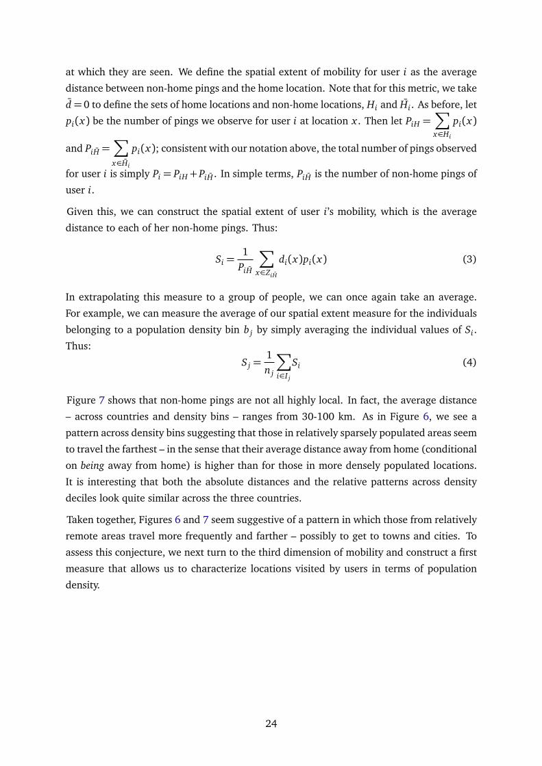
at which they are seen. We define the spatial extent of mobility for user i as the average
distance between non-home pings and the home location. Note that for this metric, we take
d=0 to define the sets of home locations and non-home locations, Hi and Hi. As before, let
pi(x) be the number of pings we observe for user i at location x . Then let PiH =∑
x∈Hi
pi(x)
and PiH =∑
x∈Hi
pi(x); consistent with our notation above, the total number of pings observed
for user i is simply Pi = PiH+PiH . In simple terms, PiH is the number of non-home pings of
user i.
Given this, we can construct the spatial extent of user i’s mobility, which is the average
distance to each of her non-home pings. Thus:
Si =1
PiH
∑
x∈ZiH
di(x)pi(x) (3)
In extrapolating this measure to a group of people, we can once again take an average.
For example, we can measure the average of our spatial extent measure for the individuals
belonging to a population density bin b j by simply averaging the individual values of Si.
Thus:
S j =1n j
∑
i∈I j
Si (4)
Figure 7 shows that non-home pings are not all highly local. In fact, the average distance
– across countries and density bins – ranges from 30-100 km. As in Figure 6, we see a
pattern across density bins suggesting that those in relatively sparsely populated areas seem
to travel the farthest – in the sense that their average distance away from home (conditional
on being away from home) is higher than for those in more densely populated locations.
It is interesting that both the absolute distances and the relative patterns across density
deciles look quite similar across the three countries.
Taken together, Figures 6 and 7 seem suggestive of a pattern in which those from relatively
remote areas travel more frequently and farther – possibly to get to towns and cities. To
assess this conjecture, we next turn to the third dimension of mobility and construct a first
measure that allows us to characterize locations visited by users in terms of population
density.
24

Figure 7: Mean distance away from home by density decile.
(a) Kenya (b) Nigeria
(c) Tanzania
Note: These figures show the average distance from users’ home locations of non-home pings bydensity decile over the period of a year.
Let N(x) denote the population density at location x . Based on this, let N(x) be an indicator
mapping locations into density bins; in other words, N : X → B. We consider the set of non-
home locations pinged by person i, and we assign each ping to a density bin b j. Then the
fraction of visits (i.e., pings in non-home locations) by user i to locations in density bin b j
is given by:
vi j =
∑
x∈{x∈Hi :N(x)=b j}
pi(x)
PiH(5)
Once again, we summarize our measure at the level of each group Io of users with home
location in density bin of origin bo by calculating the average fraction of non-home pings
25

in each one of the 10 density bins of destination (bd)d∈[1;10]. Then our measure becomes:
Vod =1no
∑
i∈Io
vid (6)
Results are shown in Table 6 for our three countries. Each column j of these tables can be
interpreted as the average distribution of non-home pings across density bins for users with
home locations in the density bin j.
Alternatively, we construct an aggregate metric at the density bin level to describe the
population densities visited at least once by users belonging to each density bin b j. For
each user i ∈ I j and each density bin bk, we define pik as a dummy indicating whether user
i ever visited a location in density bin bk:
pik =
1, if ∃x ∈ {x ∈ X |N(x) = bk} : pi(x)> 0
0, otherwise
Then the fraction of users whose home location is in density bin b j and who are seen at
least once in a location belonging to population density bin bk is:
∆ jk =
∑
i∈I j
pik
n j(7)
Tables 6 to 7 show more detail about the locations visited by people when they are trav-
elling. Specifically, these tables show, for individuals whose home locations are assigned
to different population density bins (across the columns of these tables), the proportion of
non-home pings that they record in locations of different population densities.
To give an example, Table 6a shows that for the Kenyan users in our data who live in the
least densely populated areas, just over one-third (36.3%) of their non-home pings are
recorded in other relatively sparsely populated areas. This would include any observations
relatively near to home but outside the immediate home location. But nearly one-fourth of
their non-home pings (23.3%) are recorded in locations that fall in the top two deciles of
the density distribution. Tables 6b and 6c show comparable data for Nigeria and Tanzania,
respectively.
Table 7 offers a slightly different angle on the data. These give the fraction of users residing
in a given density bin who are seen over the course of the year on at least one occasion in a
non-home location within each of the ten density bins. For instance, this tells us that 6.9% of
those Kenyans living in the most densely populated locations in the country, were observed
26

on at least one occasion during the year in a cell that falls within the least densely populated
parts of the country. At the other end of the distribution, 29.3% of the users whose home
locations are in the most sparsely populated areas of the country were observed at least
once during the year in the most densely populated parts of the country.
Table 6: Average distribution of pings across visited density bin, by home density bin.
Home density bin1 2 3 4 5 6 7 8 9 10
Visiteddensity
1 36.3% 7.8% 2.7% 2% 1% 1.7% 1.1% 1.2% 0.7% 0.3%2 9.3% 24.3% 11.8% 2.9% 2.2% 1.7% 1.5% 1.6% 0.7% 0.4%3 4.8% 11.9% 14.5% 7.5% 4.5% 2.4% 3.2% 2.3% 1.2% 0.8%4 4.8% 5% 11.5% 12.6% 9.2% 4.6% 4.6% 3.2% 2.2% 1.6%5 5.3% 4.2% 7.5% 10.3% 12.5% 6.3% 7.1% 3.1% 2.3% 1.4%6 2.8% 4.5% 7.1% 6.2% 12.2% 11.2% 9.3% 5.6% 5.4% 5%7 4.7% 3.3% 4.3% 4.9% 9% 7.4% 13% 9.5% 3.4% 1.6%8 8.6% 8.2% 11.4% 11.8% 11.3% 10.6% 18.4% 20.2% 11.4% 5.6%9 18.8% 21.8% 23.1% 29.4% 27.8% 36.3% 32% 42.1% 50.8% 40.4%10 4.5% 8.9% 6.1% 12.4% 10.3% 17.8% 9.8% 11.3% 21.9% 42.9%
(a) Kenya
Home density bin1 2 3 4 5 6 7 8 9 10
Visiteddensity
1 2.3% 2.7% 2.2% 1.4% 0.5% 0.2% 0.2% 0.1% 0.1% 0.1%2 3.7% 12.7% 6% 1.6% 0.8% 0.6% 0.4% 0.2% 0.2% 0.2%3 1.5% 9% 6.4% 6.1% 1.2% 1% 0.6% 0.3% 0.2% 0.1%4 2.3% 5% 10.8% 5.4% 4.9% 2.6% 1.1% 0.6% 0.5% 0.3%5 2.1% 6.8% 6.2% 9.5% 11.9% 5.9% 2.6% 1.6% 1% 0.5%6 4.5% 6.4% 6.8% 12.4% 16% 20.2% 9% 3.7% 2.2% 1.4%7 7.3% 12.6% 12.7% 14.6% 15.7% 21.6% 26.2% 12.4% 5.1% 2.6%8 20% 13.9% 11.9% 11% 16.2% 15% 24.3% 29.6% 16% 5.3%9 42% 19.6% 27.1% 26.4% 20.7% 19.8% 24.7% 40.3% 54.6% 18%10 14.4% 11.3% 10% 11.6% 12.1% 13.1% 10.9% 11.2% 20.1% 71.5%
(b) Nigeria
Home density bin1 2 3 4 5 6 7 8 9 10
Visiteddensity
1 32.5% 10.5% 4.7% 2.5% 2.5% 2.3% 1.7% 0.6% 0.4% 0.2%2 3% 18.5% 7.2% 3.1% 2.5% 1.7% 0.9% 0.6% 0.3% 0.1%3 5.4% 8.2% 8% 8.4% 7.9% 3.4% 1.9% 0.6% 0.5% 0.2%4 3.2% 3.2% 8.8% 10.6% 9.6% 5.8% 2.7% 0.8% 0.6% 0.3%5 4.4% 10.4% 6.6% 8.3% 10.2% 5.8% 4% 1.5% 0.8% 0.4%6 5% 1.3% 7.1% 9.1% 10.5% 14.4% 11.4% 2.7% 1.4% 0.6%7 6.3% 5.7% 8.7% 12.3% 10.5% 18.2% 20.9% 8.6% 3.4% 1.4%8 14.6% 16.4% 15.9% 15.8% 17% 19.5% 26.3% 37.1% 17% 6.4%9 14.9% 17.3% 19.8% 20.9% 20.5% 20.9% 21.5% 33.2% 49.1% 27.7%10 10.7% 8.5% 13% 9% 8.8% 7.9% 8.7% 14.4% 26.5% 62.8%
(c) Tanzania
Note: These matrices show the average fraction of non-home pings of users residing in density bini for density bin j over the period of a year.
27

Table 7: Share of users by home bin-visited bin pair.
Home density bin1 2 3 4 5 6 7 8 9 10
Visiteddensity
1 70.7% 31.5% 20.1% 13.6% 13.1% 13.8% 14.5% 14% 10.5% 6.9%2 43.1% 57% 39.6% 23.5% 23.5% 18.9% 21.8% 20.4% 16.2% 11.8%3 35.8% 50.3% 55.3% 40.6% 35.4% 28.7% 31.4% 27% 23.4% 16.2%4 37.4% 37.6% 52% 55.1% 48.8% 38.2% 40% 34.2% 31.3% 24.2%5 34.1% 32.1% 45.4% 50.8% 55.3% 40.3% 44.4% 32.8% 29.5% 20.3%6 26.8% 30.9% 43.2% 47.7% 54.2% 48% 52.1% 43.6% 44.3% 37.6%7 33.3% 30.3% 37% 40.8% 44.9% 43.1% 54.7% 50.1% 35.3% 23.1%8 48.8% 41.8% 52.7% 55.7% 53.7% 53.6% 68.3% 69.8% 58% 39.2%9 56.9% 54.5% 59% 67.6% 67.5% 74.5% 72.1% 82.1% 87.9% 79.1%10 29.3% 30.9% 33.7% 46.7% 45.6% 54.4% 46.1% 51% 67.9% 84.8%
(a) Kenya
Home density bin1 2 3 4 5 6 7 8 9 10
Visiteddensity
1 19% 22.7% 16.5% 11.9% 7.9% 4.9% 4.6% 4.8% 4.5% 2.6%2 27.5% 39.1% 33.8% 20% 14.5% 11.2% 10% 8.9% 10.5% 9.8%3 16.2% 34.5% 31.2% 29.4% 19.3% 13.5% 11.3% 9% 7.9% 4.9%4 34.5% 25.5% 40.4% 37.3% 32.9% 23.6% 17.7% 14% 14.5% 11%5 31.7% 32.7% 42.3% 43.8% 49.3% 39.4% 26% 20.4% 17.5% 11.8%6 40.8% 37.3% 46.2% 56.2% 61.5% 67.7% 48.4% 34% 28.1% 19.8%7 61.3% 42.7% 53.8% 59.3% 61.9% 70.1% 75.8% 58.2% 42.7% 28.6%8 76.1% 57.3% 59.6% 58.4% 61.5% 62.8% 74.5% 81.2% 66.6% 39.6%9 86.6% 54.5% 65.4% 64.7% 62.5% 63.5% 66.9% 82% 90.7% 63.7%10 63.4% 34.5% 43.5% 49% 46.2% 47.9% 43.7% 43.7% 57.5% 95.3%
(b) Nigeria
Home density bin1 2 3 4 5 6 7 8 9 10
Visiteddensity
1 67.5% 32.8% 24.4% 18.2% 20.1% 13.6% 13.4% 9.9% 8.2% 4.6%2 25% 55.2% 35.8% 26.4% 19.6% 16.6% 13.2% 12.4% 11.2% 7.1%3 25.8% 36.2% 37.4% 35.2% 34.1% 22.4% 18.2% 13.8% 11.5% 6.9%4 21.7% 20.7% 35.8% 40.3% 37.4% 27.1% 22.9% 16.3% 13.4% 8%5 25.8% 37.9% 37.4% 39% 40.8% 39.9% 27.6% 18.8% 14% 8.1%6 32.5% 27.6% 40.7% 40.3% 43.6% 51.3% 41.9% 26.1% 19.4% 11.8%7 37.5% 36.2% 40.7% 49.7% 42.5% 57% 60.7% 42.6% 28.8% 17%8 49.2% 53.4% 55.3% 55.3% 55.3% 59% 66.3% 80.3% 63.3% 41.3%9 45.8% 51.7% 52% 57.2% 54.7% 59.5% 58.1% 72.6% 87.5% 70.4%10 39.2% 29.3% 44.7% 38.4% 35.8% 37.4% 37.8% 47.7% 66% 91.9%
(c) Tanzania
Note: These matrices show the proportion of users residing in density bin i that are seen at leastonce in density bin j over the period of a year.
Taken together, these tables offer a picture of highly mobile populations across all three
countries, with people travelling both far (measured in terms of distance) and to locations
that differ markedly from their home locations. Nigeria offers a slight exception to the
pattern. Pings are heavily concentrated in the most densely populated parts of the country,
28

to a greater degree than in either Kenya or Tanzania, although there still appear (see Table
7b) to be substantial flows of users across locations at different population density levels.
As an alternative to using density deciles for our analysis, we consider in Tables 8 to 10 the
"visitors" to the major cities of our three countries.
Table 8: Origin of visitors in top 5 cities, Kenya.
Nairobi Mombasa Nakuru Eldoret Kisumu(1,699 visitors) (953 visitors) (891 visitors) (448 visitors) (437 visitors)Origin Visitors Origin Visitors Origin Visitors Origin Visitors Origin Visitors
Mombasa 20.2% Nairobi 68.4% Nairobi 62.5% Nairobi 51.3% Nairobi 57%Nakuru 4.9% Nakuru 1.5% Eldoret 3.1% Mombasa 3.3% Mombasa 4.6%Kisumu 4.1% Kisumu 0.6% Mombasa 2.9% Kisumu 2.9% Eldoret 2.3%Eldoret 4.1% Eldoret 0.5% Kisumu 2% Nakuru 2.2% Nakuru 1.4%Garissa 1.1% Garissa 0.1% Garissa 0.1% - - - -
Non-urban 65.6% Non-urban 28.9% Non-urban 29.3% Non-urban 40.2% Non-urban 34.8%
Note: This table shows the origin of visitors for the five most populated cities. Origin and destinationcity boundaries are defined using 3km-buffered GRUMP polygons. Visitors are defined as being seenat least once in a location over the year. "Non-urban" refers to locations outside boundaries of citieswith 200,000 or more residents. "Other urb." refers to all cities that are not in the top 5 origin cities.
Table 9: Origin of visitors in top 5 cities, Nigeria.
Lagos Kano Ibadan Abuja Kaduna(5,258 visitors) (807 visitors) (2,916 visitors) (3,232 visitors) (1,296 visitors)Origin Visitors Origin Visitors Origin Visitors Origin Visitors Origin Visitors
Abuja 21.9% Abuja 43.5% Lagos 68.7% Lagos 47% Abuja 54.9%Ibadan 13.1% Lagos 18.5% Abuja 6.6% Kaduna 8.8% Lagos 12%
Abeokuta 7.4% Kaduna 11% Abeokuta 3.8% Port Harc. 5.3% Kano 10.3%Shagamu 6.4% Maiduguri 2.9% Ilorin 2.9% Kano 5.2% Zaria 5.9%
Port Harc. 6.4% Zaria 2.9% Shagamu 2.7% Jos 3.2% Katsina 1.7%Other urb. 5.7% Other urb. 2.5% Other urb. 2.4% Other urb. 2.6% Other urb. 1.2%Non-urban 39.1% Non-urban 18.8% Non-urban 12.9% Non-urban 27.9% Non-urban 13.9%
Note: This table shows the origin of visitors for the five most populated cities. Origin and destinationcity boundaries are defined using 3km-buffered GRUMP polygons. Visitors are defined as being seenat least once in a location over the year. "Non-urban" refers to locations outside boundaries of citieswith 200,000 or more residents. "Other urb." refers to all cities that are not in the top 5 origin cities.
29

Table 10: Origin of visitors in top 5 cities, Tanzania.
Dar Es Salaam Zanzibar Mwanza Arusha Mbeya(1,850 visitors) (743 visitors) (704 visitors) (859 visitors) (395 visitors)Origin Visitors Origin Visitors Origin Visitors Origin Visitors Origin Visitors
Arusha 9.7% Dar Es Sa. 53.3% Dar Es Sa. 32.4% Dar Es Sa. 39.5% Dar Es Sa. 38.2%Zanzibar 8.9% Arusha 4% Arusha 3.1% Moshi 10.4% Mwanza 2.8%Mwanza 6.7% Mwanza 0.8% Dodoma 1.3% Mwanza 3% Arusha 2.3%
Morogoro 6% Moshi 0.8% Mbeya 0.9% Dodoma 2.3% Dodoma 1.8%Dodoma 4.3% Dodoma 0.8% Moshi 0.7% Zanzibar 2.2% Morogoro 1.5%
Other urb. 3.5% Other urb. 0.3% Other urb. 0.6% Other urb. 1.6% Other urb. 0.8%Non-urban 61% Non-urban 40% Non-urban 61.1% Non-urban 41% Non-urban 52.7%
Note: This table shows the origin of visitors for the five most populated cities. Origin and destinationcity boundaries are defined using 3km-buffered GRUMP polygons. Visitors are defined as being seenat least once in a location over the year. "Non-urban" refers to locations outside boundaries of citieswith 200,000 or more residents. "Other urb." refers to all cities that are not in the top 5 origin cities.
A visitor is defined here as someone whom we observe in a city whose home location falls
outside the city boundaries. We categorize visitors as those who are residents of other major
cities in the same country, and then we also consider a group of "non-urban" visitors, who
are those who live outside the boundaries of any city of more than 200,000 people.
The data for all three countries show similar and interesting patterns. The largest city con-
sistently has a large number of visitors defined as "non-urban," implying that these cities
are magnets for travellers from the entire country. There are consistently large flows from
secondary cities to these primate cities, but the proportions fall off sharply to more minor
cities. In contrast, the secondary cities typically see large inflows of visitors from the pri-
mate cities, along with large inflows from non-urban areas. The flows across and between
secondary cities are typically fairly modest, according to this metric. Eldoret has little that
Kisumu lacks, and vice versa – so even though these cities are less than 150 km apart, each
accounts for less than 3% of the visitors in the other. The same patterns are seen in Nigeria
and Tanzania. For Nigeria, to give another example, although visitors from Kano make up
10% of the documented visitors to Kaduna, relatively few of those visiting Kano are from
Kaduna. In each city, far more visitors come from towns, villages, and rural areas (together
characterized as "non-urban").
We can similarly look at the destinations of those whose home locations are in the major
cities of our three countries. For these urban dwellers, we can ask what proportion were
seen during the year in other major cities and in non-urban areas (defined as in Table 8.
The results of this analysis are shown in Tables 11 to 13.
30
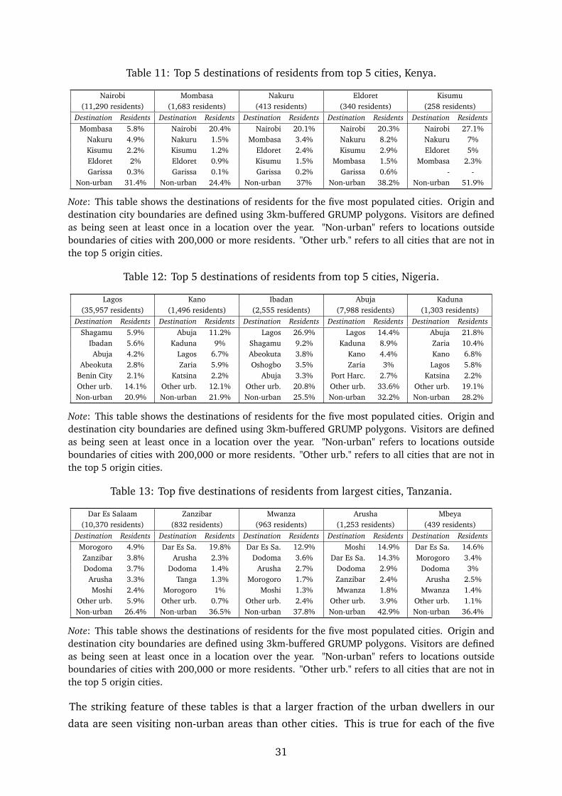
Table 11: Top 5 destinations of residents from top 5 cities, Kenya.
Nairobi Mombasa Nakuru Eldoret Kisumu(11,290 residents) (1,683 residents) (413 residents) (340 residents) (258 residents)
Destination Residents Destination Residents Destination Residents Destination Residents Destination ResidentsMombasa 5.8% Nairobi 20.4% Nairobi 20.1% Nairobi 20.3% Nairobi 27.1%
Nakuru 4.9% Nakuru 1.5% Mombasa 3.4% Nakuru 8.2% Nakuru 7%Kisumu 2.2% Kisumu 1.2% Eldoret 2.4% Kisumu 2.9% Eldoret 5%Eldoret 2% Eldoret 0.9% Kisumu 1.5% Mombasa 1.5% Mombasa 2.3%Garissa 0.3% Garissa 0.1% Garissa 0.2% Garissa 0.6% - -
Non-urban 31.4% Non-urban 24.4% Non-urban 37% Non-urban 38.2% Non-urban 51.9%
Note: This table shows the destinations of residents for the five most populated cities. Origin anddestination city boundaries are defined using 3km-buffered GRUMP polygons. Visitors are definedas being seen at least once in a location over the year. "Non-urban" refers to locations outsideboundaries of cities with 200,000 or more residents. "Other urb." refers to all cities that are not inthe top 5 origin cities.
Table 12: Top 5 destinations of residents from top 5 cities, Nigeria.
Lagos Kano Ibadan Abuja Kaduna(35,957 residents) (1,496 residents) (2,555 residents) (7,988 residents) (1,303 residents)
Destination Residents Destination Residents Destination Residents Destination Residents Destination ResidentsShagamu 5.9% Abuja 11.2% Lagos 26.9% Lagos 14.4% Abuja 21.8%
Ibadan 5.6% Kaduna 9% Shagamu 9.2% Kaduna 8.9% Zaria 10.4%Abuja 4.2% Lagos 6.7% Abeokuta 3.8% Kano 4.4% Kano 6.8%
Abeokuta 2.8% Zaria 5.9% Oshogbo 3.5% Zaria 3% Lagos 5.8%Benin City 2.1% Katsina 2.2% Abuja 3.3% Port Harc. 2.7% Katsina 2.2%Other urb. 14.1% Other urb. 12.1% Other urb. 20.8% Other urb. 33.6% Other urb. 19.1%Non-urban 20.9% Non-urban 21.9% Non-urban 25.5% Non-urban 32.2% Non-urban 28.2%
Note: This table shows the destinations of residents for the five most populated cities. Origin anddestination city boundaries are defined using 3km-buffered GRUMP polygons. Visitors are definedas being seen at least once in a location over the year. "Non-urban" refers to locations outsideboundaries of cities with 200,000 or more residents. "Other urb." refers to all cities that are not inthe top 5 origin cities.
Table 13: Top five destinations of residents from largest cities, Tanzania.
Dar Es Salaam Zanzibar Mwanza Arusha Mbeya(10,370 residents) (832 residents) (963 residents) (1,253 residents) (439 residents)
Destination Residents Destination Residents Destination Residents Destination Residents Destination ResidentsMorogoro 4.9% Dar Es Sa. 19.8% Dar Es Sa. 12.9% Moshi 14.9% Dar Es Sa. 14.6%Zanzibar 3.8% Arusha 2.3% Dodoma 3.6% Dar Es Sa. 14.3% Morogoro 3.4%Dodoma 3.7% Dodoma 1.4% Arusha 2.7% Dodoma 2.9% Dodoma 3%
Arusha 3.3% Tanga 1.3% Morogoro 1.7% Zanzibar 2.4% Arusha 2.5%Moshi 2.4% Morogoro 1% Moshi 1.3% Mwanza 1.8% Mwanza 1.4%
Other urb. 5.9% Other urb. 0.7% Other urb. 2.4% Other urb. 3.9% Other urb. 1.1%Non-urban 26.4% Non-urban 36.5% Non-urban 37.8% Non-urban 42.9% Non-urban 36.4%
Note: This table shows the destinations of residents for the five most populated cities. Origin anddestination city boundaries are defined using 3km-buffered GRUMP polygons. Visitors are definedas being seen at least once in a location over the year. "Non-urban" refers to locations outsideboundaries of cities with 200,000 or more residents. "Other urb." refers to all cities that are not inthe top 5 origin cities.
The striking feature of these tables is that a larger fraction of the urban dwellers in our
data are seen visiting non-urban areas than other cities. This is true for each of the five
31

largest cities in all three countries; our urban dwellers are more likely to have been seen
in a non-urban area than in any other city in the country. Although some of these non-
urban areas may be within commuting distance – or at least within relative proximity to
the cities of residence – it is striking that our cities appear to be substitutes for one another.
In each country, the one or two largest cities serve as magnets, attracting visitors from other
cities; but there is relatively little flow between secondary cities. This may reflect a lack of
specialization and differentiation between cities – an issue that has been raised previously
in sub-Saharan Africa – but even in a country like Nigeria, where there are substantial
differences in geography and demographics across cities, there seem to be relatively limited
movements of people between cities. This contrasts with more substantial flows connecting
cities with smaller towns, villages, and rural areas.
This section has reported on a number of different measures of mobility. These measures
point to some consistent stories. The smartphone users in our data represent a mobile pop-
ulation. On average, they are more than 10 km from home on about one-sixth of the days
on which they are observed. Those in more sparsely populated areas are more frequently
away from home than those who live in city center locations. When they venture from
home, they frequently travel far; when we sight them away from home, they are on aver-
age more than 50 to 100 km away. Flows are not limited to inter-urban movements of city
dwellers visiting other cities; on the contrary, the data show extensive movement across
and between many different locations.
Clearly the data point to a world in which mobility frictions are insufficient to choke off
human mobility. At least some subset of the population in our three countries is highly
mobile and provides a network of information flows across locations. If individuals are
moving, there must also be comparable movement of goods and of information. Even if
our data comes from a selected subset of the population, their movements may be sufficient
to generate flows of knowledge and information about spatial gaps in living conditions or
opportunities. The data provide at least a reason to question frameworks in which spatial
gaps arise from a complete failure of information to flow across locations.
5. Agglomeration effects
Our analysis so far illustrates that individuals move a substantial amount across space.
One interpretation of this finding is that mobility costs are not insurmountable in our three
countries. Another explanation is that movement costs are high but the returns to visiting
certain places outweigh the high costs. We do not know what the return of visiting a certain
location is for individuals. However, we can say something approximate about the costs as
captured by the distance or travel time between two locations. If we see disproportionate
amounts of visits to one location while similar locations are within equal or smaller dis-
32

tances, it must be that visitors to this location experience high returns. The intuition is
simple: take a resident of New York City who can chose to visit Boston or Washington D.C..
The travel time to each of these cities by car is about three hours and 45 minutes and the
approximate distance is 220 miles. If we see twice as many visits to Boston than we see
to D.C., we can infer that – by revealed preference – this individual experiences twice the
return from visiting Boston than they do from visiting Washington D.C..23
Taking this logic to our countries, we examine the probability that residents from Kano
(located in Nigeria’s north) are seen in Abuja (the capital, located in the center) and Lagos
(located in the south) compared to the rest of Nigeria’s cities (see the illustrative map in
Figure 8. The driving distance between Kano and Abuja is about 450km and from Kano to
Lagos it is about twice as long. The data suggests that residents from Kano are almost 4
times as likely to go to Lagos than to any other city, but only 1.3 times as likely to go to
Abuja. We also repeat this exercise for residents Tanzania analyzing movement patterns
Figure 8: Distances between selected cities in Nigeria and Tanzania
Note: This figure shows the main cities considered in the example given in Section 5. It is ap-parent that Abuja is far closer to Kano than Lagos; similarly, Dodoma is much closer to Mwanzaand Mbeya than Dar Es Salaam. Yet, we see much higher mobility toward Lagos and Dar EsSalaam than to Abuja or Dodoma.
from residents of Mwanza (located in the the north-west of Tanzania), and Mbeya (located
in the south) and examine the probability that residents from these cities visit Dodoma
(the capital, located in the center), Dar Es Salaam (located in the east), or any other city.
The driving distance between Mwanza/Mbeya and Dodoma is about 600-700km and from
Mwanza/Mbeya to Dar Es Salaam it is slightly less than twice as far, about 1100km. We
find that residents from Mwanza and Mbeya are more than three times as likely to visit
Dar Es Salaam than the other cities and only 1.2 times as likely to visit Dodoma. These
findings are in line with the descriptive evidence presented in Section 4 which suggested
23For this logic to be correct we assume that returns for residents of New York are homogeneous.
33

that particularly large cities, e.g., Lagos and Dar Es Salaam, attract visitors from throughout
the country. Despite larger costs compared to visiting agglomerations that are closer in
space, people are voting with their feet to visit these large cities.
We explore this revealed preference argument and use our smartphone app location data to
estimate returns to visiting certain destinations relying on the theoretical underpinning of
within-city commuting in recent quantitative spatial models (Ahlfeldt, Redding, Sturm, and
Wolf, 2015; Kreindler and Miyauchi, 2020).24 Specifically, consider an individual i living in
o who can consider one location d to visit. The individual has the following utility function
Uodi =Rd Zodi
Dτod
(8)
where Rd represents the return from visiting d, Dod represents the driving time between o
and d, and Zodi represents an idiosyncratic preference draw that follows a Fréchet distri-
bution with scale parameter T and shape parameter ε. These shocks allow, for example,
for the fact that individuals might have family in one location. Workers observe the shocks
and chose the location that maximizes their utility. Conditional on residing in o, Ahlfeldt
et al. (2015) show that the probability that an individual visits d is
Πod|o =(Rd/D
τod)
ε
∑Ss=1(Rs/Dτos)ε
(9)
This is similar to trade models where the enumerator captures ’bilateral resistance’ and the
denominator ’multilateral resistance’. Taking logs, this becomes
lnΠod|o = ε lnRd−ετ ln Dod− lnS∑
s=1
(Rs/Dτos)ε (10)
We then use Quasi Poisson Maximum Likelihood and two-way clustered standard errors to
estimate
lnΠod =δd−β ln Dod+φo+εod (11)
where φo and δd are origin and destination fixed effects. We consider cities above 200,000
residents in Nigeria. Due to the low number of large cities we lower this threshold to
100,000 in Tanzania and Kenya. A resident is classified as living in a city if her home
location is within a 3km buffered polygon around GRUMP city polygons. In this part of the
analysis, we therefore only consider flows between residents of urban locations, abstracting
from rural residents. A visitor to a city is a resident seen in a city other than her home city
24Couture (2016) uses trip diary data from the National Household Travel Survey to estimate the amenityvalue of restaurants.
34

over the specified time span.
Table 14 shows the estimates for the gravity equation. The coefficient on travel time is
Table 14: Gravity model for inter-city mobility.
Kenya Nigeria Tanzania(1) (2) (3)
Gravity EquationLog(Traveltime) -.953∗∗∗ -1.468∗∗∗ -1.027∗∗∗
(0.061) (0.092) (0.04)
Origin FE YES YES YESDestination FE YES YES YESObs. 210 4422 239R2 0.975 0.935 0.993
Note: This table estimates equation (11). The dependent variable is the mobility flowbetween city o and d. Reported standard errors are two-way clustered at the origin anddestination levels. ∗, ∗∗, ∗∗∗ denote significance at 10%, 5% and 1% levels.
around one in Kenya and Tanzania and somewhat higher in Nigeria. We next retrieve
the estimated destination fixed-effects δd which capture returns to visits to a certain city,
conditional on the distances between origins o and destinations d, and origin fixed effects.
Origin fixed effects capture time-invariant characteristics of residents at the origin, such as
income, overall mobility and geographic factors of a location, e.g., remoteness and access
to transport infrastructure.
Figure 9 plots the city fixed effects against city size, where we use the smallest city in our
sample as the omitted category in each of our countries. A few points are worth highlight-
ing: first, it is remarkable how tightly the city fixed effects correlate with city size. Second,
the figures highlight that that Lagos, Dar Es Salaam and Nairobi are outliers in terms of
city size; all have the highest city fixed effects, conditional on distances between city pairs
and origin city fixed effects. The two recent capitals, Abuja and Dodoma, are well above
the predicted regression lines, indicating that that they receive more visits than their pop-
ulation size would predict. Other locations, like Kano and Zanzibar, receive fewer visits
than predicted by their population size. The model suggests that Zanzibar, located on an
island, clearly would receive more visitors than it does without this barrier. Table 15 shows
the results from the regressions of the city fixed effects on log population to investigate the
relationship more formally.
The table shows a precisely estimated elasticity of around one for all three countries, indi-
cating that as a city’s population doubles, incoming mobility doubles. This underlines the
magnetic forces large cities play. This also highlights that as as cities in Africa are expected
to double in the coming decades, infrastructure will have to not only accommodate their
resident populations, but also the large numbers of people from all over the country who
are attracted by these locations.
35

Figure 9: City fixed effects.
Aba
Abuja
Benin City
Bida
Calabar
Enugu
Hadejia
Ibadan
Ijero
Ilorin
IseyinIwo
Jalingo
Jimeta Jos
KadunaKano
Lagos
Maiduguri
Nguru
Onitsha
Oron
Owerri
Owo
Port Harcourt
Sokoto
Umuahia
Zaria
02
46
City F
ixe
d E
ffe
cts
11 12 13 14 15 16Log City Size
Nigeria
Arusha
Dar Es Salaam
Dodoma
Iringa
Kigoma
MbeyaMorogoroMoshi
Musoma
Mwanza
Songea
Sumbawanga
TaboraTanga
Zanzibar
−1
01
23
City F
ixe
d E
ffe
cts
11 12 13 14 15 16Log City Size
Tanzania
Eldoret
Garissa
KakamegaKericho
Kisii
Kisumu
Kitale
Malindi
Mandera
Meru
Mombasa
Nairobi
Nakuru
Thika
−2
−1
01
23
City F
ixe
d E
ffe
cts
11 12 13 14 15 16Log City Size
Kenya
Note: This figure shows the city fixed effects δd from equation (11) and log city size.
Table 15: Relationship between city fixed effects and population
Kenya Nigeria Tanzania(1) (2) (3)
Agglomeration effectsLog(Population) 0.981∗∗∗ 1.028∗∗∗ 0.874∗∗∗
(0.109) (0.078) (0.084)
Obs. 14 66 15R2 0.735 0.764 0.778
Note: This table regresses the city fixed effects from equation (11) on log city size. Robuststandard errors are reported in parentheses. ∗, ∗∗, ∗∗∗ denote significance at 10%, 5% and1% levels.
Finally, we estimate standard gravity models to link to a previous literature that is struc-
tured around gravity models that use distance as a proxy of movement costs (Bryan and
Morten, 2019). We follow Bryan and Morten (2019) in estimating these with OLS to be
able to compare the estimated coefficients. We test whether the elasticity of mobility with
respect to distance is sensitive to different definitions of origin-destination pairs and tempo-
ral intervals. Most gravity estimates are constrained by limitations in the data available to
define origins and destinations. Much of the literature relies on recall data with relatively
low spatial and temporal granularity. For example, some surveys ask respondents to name
36

the region where they were born – which can then be compared with the region where
a respondent is currently living. Other surveys may ask whether people were living in a
different location five years ago; if so, they are asked to name the place. Matching their
responses to identifiable locations sometimes requires artful interpretation. Many standard
surveys, such as the Demographic Health Surveys, only classify previous locations or loca-
tions at birth into types of places (i.e. city, town, countryside), which makes it impossible
to generate origin-destination matrices. Due to the richness of our data, however, we are
entirely flexible in defining both the spatial unit for origins and destinations and the time
frame we are investigating. We then contrast our estimates with those in the literature.
We start by presenting a basic region-level gravity model over the entire year by linking
home locations to administrative units in our countries where the dependent variable is the
fraction of users from o that travelled to d in the specified sample period. This is similar
to what we would observe in a detailed survey module that contained spatial detail up to
the region. The fraction of pairs with non-zero flows between regions amounts to 50% in
Kenya, 77.25% in Nigeria and 70% in Tanzania.
Table 16 shows the results for the region-level specification. Reassuringly, distance is nega-
tively related to mobility. Overall, the simple gravity model fits the data well, with distance
alone explaining 0.34 percent of mobility between regions. In all specifications, the coef-
ficient on the distance variable is significant and precisely estimated. Including origin and
destination fixed effects gives an estimate of the elasticity of mobility with respect to dis-
tance of -1.2 for Kenya, -2 for Nigeria and -1.3 for Tanzania. This suggests that a 10 percent
increase in movement costs is associated with a 12-20 percent decrease in mobility.
We next define a mobility metric that takes into account the intensive margin as well, by
multiplying the number of residents at origin o that are seen at least once at destination d
with the number of distinct days these residents are seen in d, and dividing this by the total
number of days these residents are seen. Our results are quantitatively robust to including
the intensive margin, so that we focus on the extensive mobility measure in the analysis
that follows.
37

Table 16: Gravity model for inter-region mobility at the extensive margin.
(1) (2)
log(distance) −1.499∗∗∗
(0.068)log(distance)xKEN −1.220∗∗∗
(0.055)log(distance)xNGA −1.953∗∗∗
(0.051)log(distance)xTZA −1.342∗∗∗
(0.109)
Origin FE Yes YesDest. FE Yes YesObservations 2,713 2,713R2 0.818 0.834
Note: The dependent variable is the fraction of people atorigin o that were seen in d in over the entire sample pe-riod. Reported standard errors are two-way clustered atthe origin and destination levels. ∗, ∗∗, ∗∗∗ denote signifi-cance at 10%, 5% and 1% levels.
Since regions reflect arbitrary boundaries involving irregular geometries, we follow the
work of Michalopoulos and Papaioannou (2013) in constructing virtual regions by gener-
ating country-level grids of 50km by 50km and using flows between cell pairs as units of
analysis.25 We also examine the robustness of our results to removing one or two rows of
adjacent cell pairs in columns (3)-(6) to exclude short trips within cities, for example. Table
17 shows that, as one would expect, movement costs are somewhat lower at lower spatial
scales for the three countries but roughly in line with what we found in the region-level
analysis.
25We count 159, 328 and 313 virtual regions with at least one resident user in Kenya, Nigeria and Tanzaniarespectively.
38

Table 17: Gravity model for mobility at the extensive margin between virtual regions.
(1) (2) (3) (4) (5) (6)
log(distance) −0.894∗∗∗ −0.794∗∗∗ −0.790∗∗∗
(0.036) (0.047) (0.058)log(distance)×KEN −0.881∗∗∗ −0.731∗∗∗ −0.696∗∗∗
(0.061) (0.078) (0.104)log(distance)×NGA −1.085∗∗∗ −0.982∗∗∗ −1.001∗∗∗
(0.055) (0.073) (0.093)log(distance)×TZA −0.688∗∗∗ −0.602∗∗∗ −0.586∗∗∗
(0.042) (0.054) (0.063)
Origin FE Yes Yes Yes Yes Yes YesDest. FE Yes Yes Yes Yes Yes YesObservations 16,513 16,513 14,100 14,100 11,909 11,909R2 0.876 0.880 0.882 0.884 0.889 0.891
Note: The dependent variable is the fraction of people at origin o that were seen in d in over the en-tire sample period. Columns (1) and (2) report results for all cell pairs with positive mobility. Columns(3)-(4) show results for the subset of non-adjacent cell pairs and columns (5)-(6) provide coefficient esti-mates for a subset of cell pairs at least two rows/columns apart. Reported standard errors are two-wayclustered at the origin and destination levels. ∗, ∗∗, ∗∗∗ denote significance at 10%, 5% and 1% levels.
One concern might be that some regions have few residents so that a handful of residents
might lead to large shares. To examine to what degree our results are sensitive to this, Table
C.4 limits the sample to origin cells of 50 residents or more.
The general patterns are similar to what we see in Table 17, with slightly higher estimates.
So far we have estimated the model over the entire period over which we have data. We
next turn to estimating the model at a quarterly level. Columns (2), (4) and (6) in Table 18
show the coefficients for the different quarters for each of our countries. The table suggests
that our results are in line with our previous estimates. In brief, the estimates appear to be
robust to different spatial and temporal aggregations.
39

Table 18: Gravity model for mobility at the extensive margin between virtual regions, byquarter.
(1) (2) (3) (4) (5) (6)
log(distance)xKEN −0.881∗∗∗ −0.731∗∗∗ −0.696∗∗∗
(0.061) (0.078) (0.104)log(distance)xNGA −1.085∗∗∗ −0.982∗∗∗ −1.001∗∗∗
(0.055) (0.073) (0.093)log(distance)xTZA −0.688∗∗∗ −0.602∗∗∗ −0.586∗∗∗
(0.042) (0.054) (0.063)log(distance)xKEN-201703 −0.665∗∗∗ −0.508∗∗∗ −0.499∗∗∗
(0.072) (0.089) (0.112)log(distance)xKEN-201707 −0.826∗∗∗ −0.664∗∗∗ −0.646∗∗∗
(0.062) (0.078) (0.101)log(distance)xKEN-201711 −0.852∗∗∗ −0.695∗∗∗ −0.680∗∗∗
(0.059) (0.075) (0.098)log(distance)xNGA-201707 −0.880∗∗∗ −0.758∗∗∗ −0.778∗∗∗
(0.063) (0.083) (0.101)log(distance)xNGA-201711 −0.976∗∗∗ −0.857∗∗∗ −0.877∗∗∗
(0.054) (0.074) (0.091)log(distance)xNGA-201803 −1.003∗∗∗ −0.888∗∗∗ −0.910∗∗∗
(0.050) (0.070) (0.087)log(distance)xTZA-201707 −0.503∗∗∗ −0.409∗∗∗ −0.400∗∗∗
(0.056) (0.066) (0.074)log(distance)xTZA-201711 −0.623∗∗∗ −0.528∗∗∗ −0.516∗∗∗
(0.043) (0.053) (0.060)log(distance)xTZA-201803 −0.649∗∗∗ −0.555∗∗∗ −0.543∗∗∗
(0.039) (0.049) (0.056)
Origin FE Yes Yes Yes Yes Yes YesDest. FE Yes Yes Yes Yes Yes YesObservations 16,513 33,421 14,100 28,032 11,909 23,425R2 0.880 0.879 0.884 0.883 0.891 0.891
Note: The dependent variable is the fraction of people at origin o that were seen in d in a particu-lar quarter. Columns (1) and (2) report results for all cell pairs with positive mobility. Columns (3)-(4) show results for the subset of non-adjacent cell pairs and columns (5)-(6) provide coefficient esti-mates for a subset of cell pairs at least two rows/columns apart. Reported standard errors are two-wayclustered at the origin and destination levels. ∗, ∗∗, ∗∗∗ denote significance at 10%, 5% and 1% levels.
While our estimates are not directly comparable to existing estimates in the literature using
survey and census data, it is still worthwhile to investigate the magnitudes, while highlight-
ing differences in the time periods covered. Bryan and Morten (2019) look at migration
defined as the current location differing from the location at birth and find a value of about
0.7 for Indonesia and 0.5 for the United States, using regencies for Indonesia and states for
the United States as spatial units to define origins and destinations. This represents lower
movement costs than what we find for our extensive measure of mobility at larger spatial
scales such as administrative regions in Table 17. When we define virtual regions of size
50km x 50km our estimates are lower and more in line with the estimates found in Bryan
and Morten (2019).
40
6. Conclusion
Most of our data on human mobility in low-income countries comes from surveys that
show migration flows between survey rounds. Often the surveys are several years apart or
longer (e.g., decennial censuses). This means that mobility is only evident in these data
sources at a very long time horizon. In many studies, we can observe modest flows from
rural to urban areas between successive waves of panel data. We can sometimes see in
these data that households are connected to family members who have moved to other
parts of the country (or even across the world). The data from these surveys are useful and
informative in thinking about human mobility, but they provide little information about
higher-frequency mobility. The daily and weekly movements of people within countries
are crucial to the dissemination of information (e.g., about market opportunities) as well
as to the maintenance of family and social cohesion. We know anecdotally that this kind
of mobility is both important and ubiquitous; anyone who spends time at a bus station in
Accra or Arusha can see first-hand the numbers of people in motion. But we have hitherto
had little ability to quantify these flows or to understand their patterns.
In this paper, we use a new data source – pings from smartphone apps – that provides
objectively measured observations on the frequency with which people move around within
three African countries, and on the locations that they visit. The data reveal a strikingly
high degree of mobility – albeit for a non-representative subset of the population. Our
smartphone users travel frequently and relatively far. Travel is not limited to peri-urban
commuting, nor to city-to-city interchanges. On the contrary, we see substantial flows of
people between rural areas and big cities.
Are these flows sufficient to break down information barriers across locations? We have
no firm basis on which to answer that question. However, it would be difficult, given these
data, to argue that rural areas are completely cut off from cities – or even that rural residents
only have access to information about their nearby market towns. On the contrary, we see
that the largest cities attract flows of people from the entirety of their countries, serving
as magnets of economic activity. Using data on observed trips we estimate high returns to
visiting these locations. Returns are increasing with city size which has important impli-
cations for future city growth in Africa: cities will have to not only provide infrastructure
for their own resident populations but also for a large number of visitors. The analysis of
mobility costs reveals that these remain relevant and roughly proportional across different
spatial and temporal scales. Costs are also large enough to be highly salient, implying that
a reduction in mobility costs (e.g., through improvements in transportation infrastructure)
would likely generate an expansion in mobility at all levels.
Our data and analysis suffer from some limitations. We cannot entirely overcome the selec-
tion issues that make our sample unrepresentative, and we also cannot distinguish places
41

that people visit deliberately – destinations – from those that they merely pass through.26
But we benefit from the large number of observations and the large number of users; our
smartphone owners are not outliers, even if they are in some degree unrepresentative.
In spite of these limitations, our analysis offers insights that can help guide future work on
spatial frictions and their relevance for development. The findings of this paper encourage
us to think critically and carefully before invoking models in which human mobility costs
are prohibitive (i.e., models in which people are unable to move across locations). The data
also suggest that we need to be careful in using models in which information does not flow
across locations; even though we observe only a fraction of the total mobility in our three
countries, the movements of people seem sufficient to spread information across space.
We need to look elsewhere, perhaps, for frictions that seem more capable of explaining
persistent sectoral and spatial gaps. For instance, movements from rural to urban areas
may involve the loss of social connection or informal insurance, or the loss of claims to land
and other resources in rural areas. There may be barriers for rural people – particularly
those who are older – in learning new kinds of work or new ways of life. Certainly there is
no shortage of potential frictions to consider.
We should also bear in mind that, for the poorest people in our three countries, the story
may be very different. Our data shed little light on the mobility of the poor within these
countries, and there is much work still to be done to understand the costs of mobility fric-
tions for the poor. Even small monetary costs of mobility can be highly salient for poor
people, and information may not flow freely across barriers of ethnicity, social class, age,
and other dividing lines. For this reason, we should continue to look for other ways to
assess the relevance of mobility frictions for the poor.
26In part, this reflects the lack of conceptual clarity between destinations and way points; the underlyingdistinction is really based on the intent of the traveller, rather than on the characteristics of the locations orthe trips.
42

References
AHLFELDT, G. M., S. J. REDDING, D. M. STURM, AND N. WOLF (2015): “The economics of
density: Evidence from the Berlin Wall,” Econometrica, 83, 2127–2189.
AKER, J. C. (2010): “Information from Markets Near and Far: Mobile Phones and Agricul-
tural Markets in Niger,” American Economic Journal: Applied Economics, 2, 46–59.
AKRAM, A. A., S. CHOWDHURY, AND A. M. MOBARAK (2017): “Effects of Emigration on Rural
Labor Markets,” Working Paper 23929, National Bureau of Economic Research.
ALLEN, T. (2014): “Information Frictions in Trade,” Econometrica, 82, 2041–2083.
ALLEN, T. AND C. ARKOLAKIS (2014): “Trade and the Topography of the Spatial Economy,”
Quarterly Journal of Economics, 129, 1085–1140.
ARKOLAKIS, C., A. COSTINOT, AND A. RODRÍGUEZ-CLARE (2012): “New Trade Models, Same
Old Gains?” American Economic Review, 102, 94–130.
ATHEY, S., B. A. FERGUSON, M. GENTZKOW, AND T. SCHMIDT (2020): “Experienced Segrega-
tion,” Working Paper 27572, National Bureau of Economic Research.
ATKIN, D., K. CHEN, AND A. POPOV (2020): “The Returns to Serendipity: Knowledge
Spillovers in Silicon Valley,” Unpublished working paper.
ATKIN, D. AND D. DONALDSON (2015): “Who’s Getting Globalized? The Size and Implica-
tions of Intra-national Trade Costs,” Working Paper 21439, National Bureau of Economic
Research.
BLUMENSTOCK, J. E. (2012): “Inferring Patterns of Internal Migration from Mobile Phone
Call Records: Evidence from Rwanda,” Information Technology for Development, 18, 107–
125.
BRYAN, G., S. CHOWDHURY, AND A. M. MOBARAK (2014): “Underinvestment in a Profitable
Technology: The Case of Seasonal Migration in Bangladesh,” Econometrica, 82, 1671–
1748.
BRYAN, G. AND M. MORTEN (2019): “The Aggregate Productivity Effects of Internal Migra-
tion: Evidence from Indonesia,” Journal of Political Economy, 127, 2229–2268.
CHEN, M. K. AND R. ROHLA (2018): “The Effect of Partisanship and Political Advertising on
Close Family Ties,” Science, 360, 1020–1024.
COSTINOT, A. AND D. DONALDSON (2016): “How Large Are the Gains from Economic Inte-
gration? Theory and Evidence from U.S. Agriculture, 1880-1997,” Working Paper 22946,
National Bureau of Economic Research.
43

COUTURE, V. (2016): “Valuing the consumption benefits of urban density,” Unpublished
Manuscript.
DONALDSON, D. (2018): “Railroads of the Raj: Estimating the Impact of Transportation
Infrastructure,” American Economic Review, 108, 899–934.
DONALDSON, D. AND R. HORNBECK (2016): “Railroads and American Economic Growth: A
“Market Access” Approach,” Quarterly Journal of Economics, 131, 799–858.
GOLLIN, D., M. KIRCHBERGER, AND D. LAGAKOS (2020): “Do Urban Wage Premia Reflect
Lower Amenities? Evidence from Africa,” Forthcoming, Journal of Urban Economics.
GOLLIN, D., D. LAGAKOS, AND M. E. WAUGH (2014): “The Agricultural Productivity Gap,”
Quarterly Journal of Economics, 129, 939–993.
HAMORY HICKS, J., M. KLEEMANS, N. Y. LI, AND E. MIGUEL (2017): “Reevaluating Agricul-
tural Productivity Gaps with Longitudinal Microdata,” Unpublished Working Paper, U.C.
Berkeley.
JENSEN, R. (2007): “The Digital Provide: Information (Technology), Market Performance,
and Welfare in the South Indian Fisheries Sector,” The Quarterly Journal of Economics,
122, 879–924.
KREINDLER, G. E. AND Y. MIYAUCHI (2020): “Measuring Commuting and Economic Activity
inside Cities with Cell Phone Records,” Unpublished Manuscript.
LU, X., D. J. WRATHALL, P. R. SUNDSØY, M. NADIRUZZAMAN, E. WETTER, A. IQBAL,
T. QURESHI, A. TATEM, G. CANRIGHT, K. ENGØ-MONSEN, ET AL. (2016): “Unveiling Hidden
Migration and Mobility Patterns in Climate Stressed Regions: A Longitudinal Study of Six
Million Anonymous Mobile Phone Users in Bangladesh,” Global Environmental Change,
38, 1–7.
MICHALOPOULOS, S. AND E. PAPAIOANNOU (2013): “Pre-colonial Ethnic Institutions and
Contemporary African Development,” Econometrica, 81, 113–152.
MONGEY, S., L. PILOSSOPH, AND A. WEINBERG (2020): “Which Workers Bear the Burden
of Social Distancing Policies?” Working Paper 27085, National Bureau of Economic Re-
search.
PEREZ-HEYDRICH, C., J. L. WARREN, C. R. BURGERT, AND M. E. EMCH (2013): “Guidelines
on the Use of DHS GPS Data,” Tech. rep., Demographic and Health Surveys.
YOUNG, A. (2013): “Inequality, the Urban-Rural Gap, and Migration,” Quarterly Journal of
Economics, 128, 1727–1785.
44

Appendix (For Online Publication)
A. Details on data smartphone app data
A.1. Construction of the base sample
Our initial samples have 317,420 users in Kenya, 958,207 users in Nigeria and 780,760
users in Tanzania. According to the methodology presented in Section 2, we cannot infer
home locations for users never observed at night (7pm-7am) and 121,790, 297,895 and
173,886 users are thus removed in Kenya, Nigeria and Tanzania respectively. Moreover,
in Nigeria, inferred home locations with equal latitude and longitude were deemed erro-
neous which resulted in 905 users being removed. In Tanzania, we identified a data sink
of 372,661 users with an inferred home location at (35.75;-6.18), which is located within
the city of Dodoma. This represents 52% of the initial sample while we estimated the city
of Dodoma to host 0.5% of the population.27 We entirely remove users with home location
coordinates at the data sink from the sample.
A.2. Inferred home locations
The calculation of users’ home locations plays a critical role in our analysis of high-frequency
mobility patterns. First, home locations are often used as reference locations to observe
mobility trajectories. Second, home locations are used to evaluate the spatial coverage of
our sample by comparing the spatial distribution of users to the distribution of the pop-
ulation. Third, knowing where our users live help us infer key information allowing to
characterize them, e.g. by pairing users with DHS clusters. In our base sample, we define
home locations as the most frequently observed 2-decimal rounded coordinates at night
(between 7pm and 7am, local time). We consider that the likelihood of correct home loca-
tion prediction increases with both the number of nights a user is seen and the fraction of
these she is observed at the inferred home location. Therefore, we select a subset of users
that are seen at least 10 nights, of which at least half are at their home location. We call
this subset the "high-confidence" sample and use it as our core sample in the analysis of
high-frequency mobility patterns throughout the paper. We also build medium- and low-
confidence subsets that include users seen at least 8 and 5 nights respectively in order to
evaluate the robustness of our results - the required fraction of nights seen at home is kept
at 0.5. The corresponding sample sizes are given in Table A.1. Unsurprisingly, the sample
size decreases with the minimum number of observed nights imposed and nearly doubles
between the high- and low-confidence subsets.
However, differences in the distributions of users across density deciles between the subsets
27We use GRUMP polygons to which we apply a 3km buffer to define the city boundaries and we overlaythe WorldPop 2018 population map to estimate the population in Dodoma.
45

is only minimal, as shown in Figures C.8 to C.10 , which supports the idea that the minimum
number of nights criterion used to build our core sample does not imply a selection of
atypical users.
Table A.1: Number of users by subset and country
Base High Medium LowKenya 195,630 18,535 23,490 37,249Nigeria 659,407 78,694 96,954 146,346Tanzania 234,213 22,728 28,853 46,116
TOTAL 1,089,250 119,957 149,297 229,711
46

B. Pairing users with DHS information
In Section 3, we link users’ home locations with data from the most recently available
Demographic and Health Survey (DHS) data to characterize areas where our users live:
the 2014 standard DHS in Kenya, the 2018 standard DHS in Nigeria and the 2015-2016
standard DHS in Tanzania.28 DHS data are geo-referenced at the cluster level and cluster
coordinates are randomly displaced to maintain respondents’ confidentiality. Urban clusters
are displaced by up to 2 kilometers and rural clusters by up to 5 kilometers with 1% of
rural clusters being displaced up to 10 kilometers. The displacement is restricted such that
clusters stay within the administrative 2 area where the survey was conducted.
We first classify our users within urban and rural categories based on the overlay of users’
home location with GRUMP 3-km buffered city polygons (see section ?? for more details
on GRUMP city polygons). We then apply two criteria to associate each user with a set of
DHS clusters: (i) we select the set of DHS clusters located within a given distance from
her home location (10km for urban users and 5km for rural users) and (ii) we calculate
the average population density within a 5km buffer - that we call the ‘’experienced density‘’
- for both the user and the selected DHS clusters and we keep the subset of clusters with
an experienced density within 25% of the user’s. We assume there is some level of spa-
tial continuity in household characteristics conditional on population density to argue that
our phone users and DHS respondents selected through the matching procedure are likely
to have similar characteristics. Following that methodology, we pair 70% of our users in
the high-confidence sample with at least one DHS cluster (90% in Kenya, 66% in Nigeria,
72% in Tanzania). We call the subset of respondents within paired clusters the ‘’matched
DHS‘’ sample.29 Unsurprisingly, unmatched users are found in low density areas where the
probability of selection in the DHS is lower by design - the average experienced density for
unmatched users is estimated at 2,496 inh./km2 against 8,835 inh./km2 for users with at
least one paired cluster.
In order to appreciate potential differences between our users and the population as a
whole, we conduct t-tests for equality of means between the raw DHS and matched DHS
samples on a range of household characteristics. We rely mainly on characteristics for which
the spatial continuity is more likely to hold (e.g. housing characteristics (floor, walls, roof,
overcrowding), access to public services (electricity, water)). Moreover, we produce results
for rural and urban sub-samples separately to account for both the prevalence of urban users
in our sample and the lower matching rate in low density areas, which together may lead
to results being mainly driven by the urban component of the sample. We produce t-tests
28More information on sampling design at https://dhsprogram.com/29Some clusters are paired to more than one user so the matched DHS sample contains a number of dupli-
cates. It is in fact equivalent to the weighted subset of respondents in clusters paired to at least one user, withweights begin equal to the number of users the corresponding cluster is matched to.
47
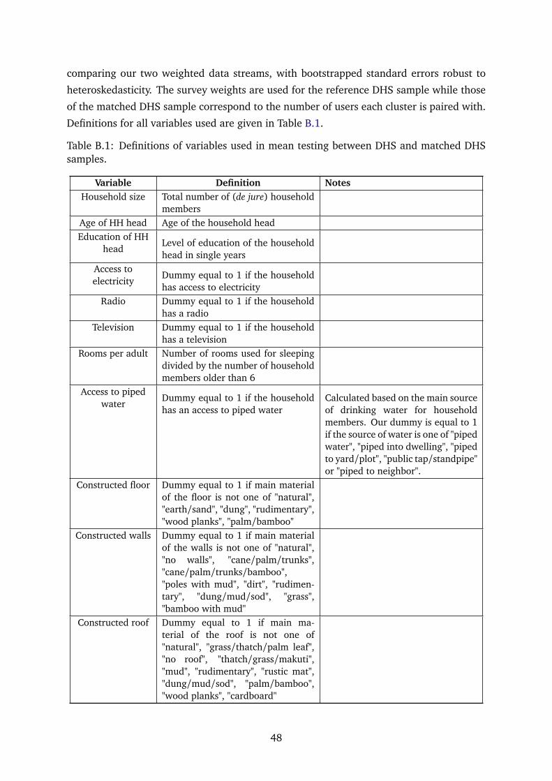
comparing our two weighted data streams, with bootstrapped standard errors robust to
heteroskedasticity. The survey weights are used for the reference DHS sample while those
of the matched DHS sample correspond to the number of users each cluster is paired with.
Definitions for all variables used are given in Table B.1.
Table B.1: Definitions of variables used in mean testing between DHS and matched DHSsamples.
Variable Definition NotesHousehold size Total number of (de jure) household
membersAge of HH head Age of the household headEducation of HH
headLevel of education of the householdhead in single years
Access toelectricity
Dummy equal to 1 if the householdhas access to electricity
Radio Dummy equal to 1 if the householdhas a radio
Television Dummy equal to 1 if the householdhas a television
Rooms per adult Number of rooms used for sleepingdivided by the number of householdmembers older than 6
Access to pipedwater
Dummy equal to 1 if the householdhas an access to piped water
Calculated based on the main sourceof drinking water for householdmembers. Our dummy is equal to 1if the source of water is one of "pipedwater", "piped into dwelling", "pipedto yard/plot", "public tap/standpipe"or "piped to neighbor".
Constructed floor Dummy equal to 1 if main materialof the floor is not one of "natural","earth/sand", "dung", "rudimentary","wood planks", "palm/bamboo"
Constructed walls Dummy equal to 1 if main materialof the walls is not one of "natural","no walls", "cane/palm/trunks","cane/palm/trunks/bamboo","poles with mud", "dirt", "rudimen-tary", "dung/mud/sod", "grass","bamboo with mud"
Constructed roof Dummy equal to 1 if main ma-terial of the roof is not one of"natural", "grass/thatch/palm leaf","no roof", "thatch/grass/makuti","mud", "rudimentary", "rustic mat","dung/mud/sod", "palm/bamboo","wood planks", "cardboard"
48
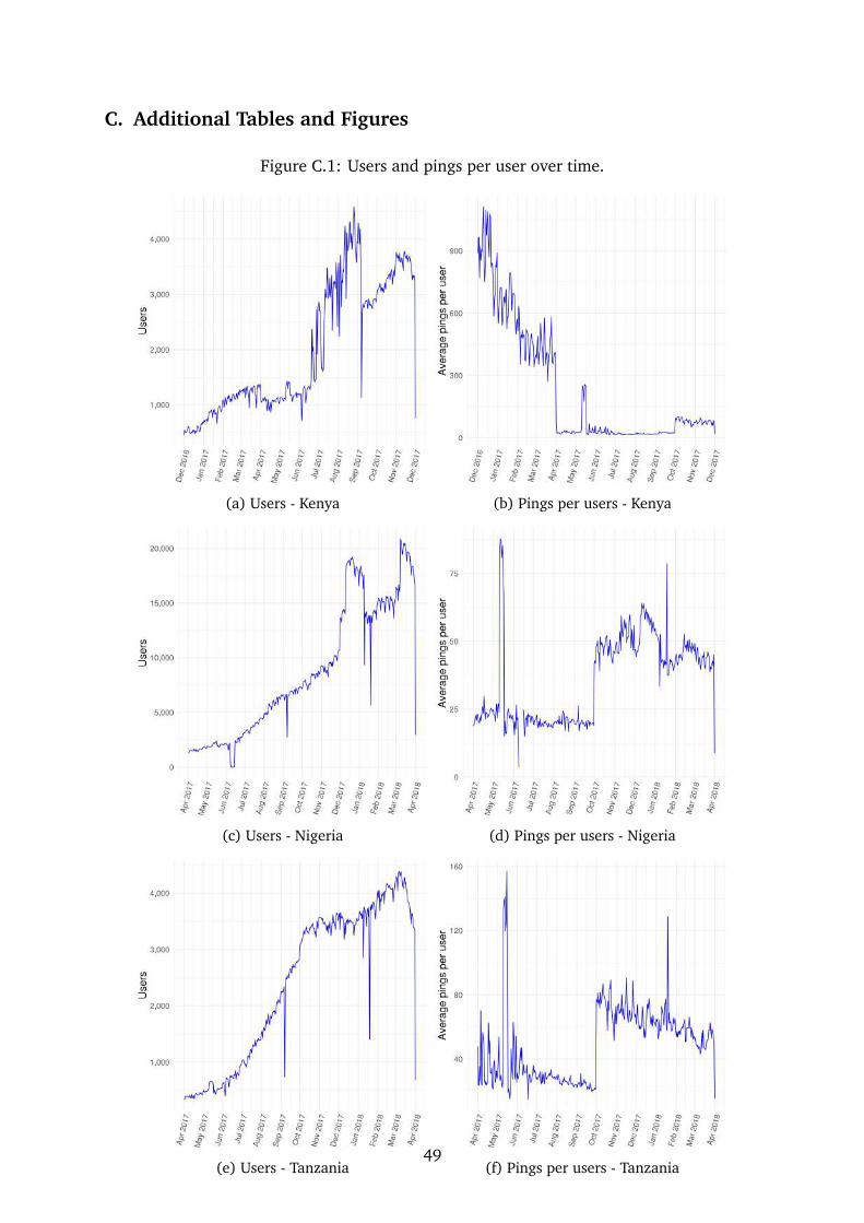
C. Additional Tables and Figures
Figure C.1: Users and pings per user over time.
(a) Users - Kenya (b) Pings per users - Kenya
(c) Users - Nigeria (d) Pings per users - Nigeria
(e) Users - Tanzania (f) Pings per users - Tanzania49

Figure C.2: Distribution of home locations in capital cities, high-confidence sample.
(a) Nairobi (b) Nairobi
(c) Abuja (d) Abuja
(e) Dodoma (f) Dodoma
50

Figure C.3: Distribution of home locations in major cities, high-confidence sample.
(a) Mombasa (b) Mombasa
(c) Lagos (d) Lagos
(e) Dar Es Salaam (f) Dar Es Salaam
51

Figure C.4: Users by population density decile, Landscan.
(a) Kenya (b) Nigeria (c) Tanzania
52

Table C.1: T-tests for equality of means between matched DHS and DHS samples, Kenya.
Variable DHS Matched DHS Difference SE p-value
All
Household size 3.99 3.08 -0.91 0.02 0.000***Age of HH head 42.93 37.29 -5.64 0.11 0.000***
Education of HH head 8.00 10.32 2.33 0.03 0.000***Access to electricity 0.37 0.80 0.43 0.01 0.000***
Radio 0.67 0.74 0.06 0.01 0.000***Television 0.35 0.64 0.29 0.01 0.000***
Rooms per adult 0.66 0.66 0.00 0.00 0.522Access to piped water 0.44 0.79 0.35 0.01 0.000***
Constructed floor 0.53 0.90 0.37 0.01 0.000***Constructed walls 0.64 0.92 0.28 0.01 0.000***Constructed roof 0.89 0.99 0.10 0.01 0.000***
Urban
Household size 3.28 3.02 -0.26 0.03 0.000***Age of HH head 38.60 36.82 -1.78 0.17 0.000***
Education of HH head 9.90 10.46 0.56 0.05 0.000***Access to electricity 0.68 0.83 0.15 0.02 0.000***
Radio 0.74 0.74 0.00 0.01 0.774Television 0.56 0.65 0.09 0.02 0.000***
Rooms per adult 0.68 0.66 -0.02 0.01 0.001***Access to piped water 0.71 0.82 0.11 0.02 0.000***
Constructed floor 0.82 0.92 0.10 0.01 0.000***Constructed walls 0.86 0.94 0.07 0.01 0.000***Constructed roof 0.98 0.99 0.01 0.00 0.002***
Rural
Household size 4.52 4.33 -0.19 0.02 0.000***Age of HH head 46.15 46.60 0.45 0.16 0.005***
Education of HH head 6.58 7.58 0.99 0.04 0.000***Access to electricity 0.13 0.21 0.08 0.01 0.000***
Radio 0.63 0.70 0.07 0.01 0.000***Television 0.19 0.25 0.07 0.01 0.000***
Rooms per adult 0.64 0.67 0.03 0.00 0.000***Access to piped water 0.24 0.25 0.01 0.02 0.464
Constructed floor 0.31 0.38 0.07 0.01 0.000***Constructed walls 0.46 0.46 0.00 0.02 0.949Constructed roof 0.82 0.93 0.11 0.01 0.000***
53

Table C.2: T-tests for equality of means between DHS and matched DHS samples, Nigeria.
Variable DHS Matched DHS Difference SE p-value
All
Household size 4.69 3.83 -0.86 0.02 0.000***Age of HH head 45.29 45.17 -0.12 0.12 0.344
Education of HH head 7.43 11.52 4.10 0.04 0.000***Access to electricity 0.60 0.98 0.39 0.01 0.000***
Radio 0.61 0.84 0.24 0.01 0.000***Television 0.49 0.90 0.41 0.01 0.000***
Rooms per adult 0.74 0.65 -0.09 0.00 0.000***Access to piped water 0.11 0.14 0.03 0.01 0.003***
Constructed floor 0.74 0.96 0.23 0.01 0.000***Constructed walls 0.84 1.00 0.16 0.01 0.000***Constructed roof 0.89 1.00 0.11 0.01 0.000***
Urban
Household size 4.44 3.83 -0.61 0.03 0.000***Age of HH head 45.21 45.18 -0.02 0.18 0.900
Education of HH head 9.66 11.56 1.91 0.06 0.000***Access to electricity 0.88 0.99 0.11 0.01 0.000***
Radio 0.72 0.85 0.13 0.01 0.000***Television 0.73 0.90 0.18 0.01 0.000***
Rooms per adult 0.72 0.65 -0.08 0.01 0.000***Access to piped water 0.14 0.14 -0.01 0.01 0.572
Constructed floor 0.89 0.96 0.08 0.01 0.000***Constructed walls 0.95 1.00 0.04 0.01 0.000***Constructed roof 0.98 1.00 0.02 0.00 0.000***
Rural
Household size 4.85 3.92 -0.93 0.03 0.000***Age of HH head 45.34 44.77 -0.57 0.16 0.000***
Education of HH head 6.03 10.23 4.20 0.06 0.000***Access to electricity 0.42 0.84 0.42 0.02 0.000***
Radio 0.54 0.67 0.14 0.01 0.000***Television 0.35 0.77 0.43 0.01 0.000***
Rooms per adult 0.75 0.75 0.01 0.01 0.503Access to piped water 0.09 0.14 0.05 0.01 0.000***
Constructed floor 0.64 0.96 0.32 0.01 0.000***Constructed walls 0.77 0.98 0.21 0.01 0.000***Constructed roof 0.83 0.99 0.16 0.01 0.000***
54
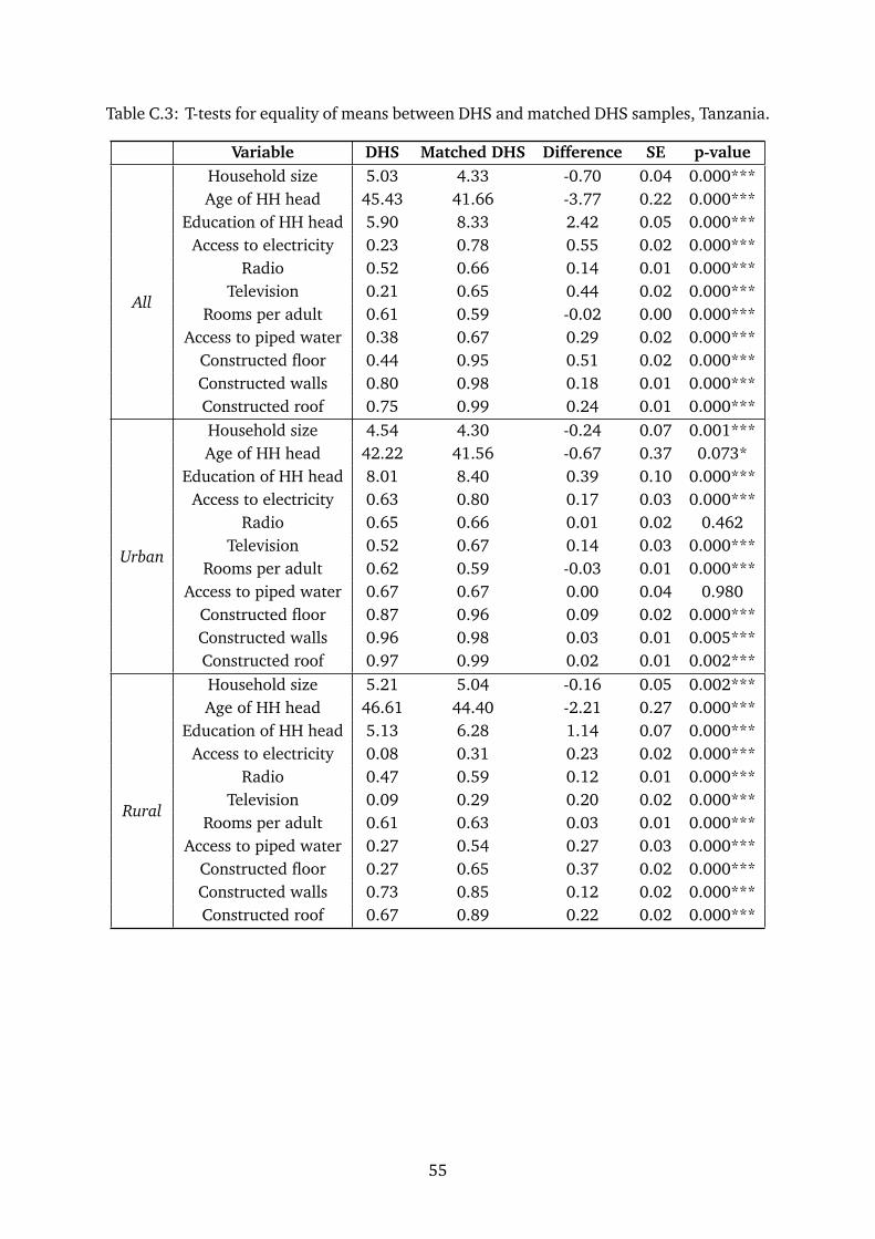
Table C.3: T-tests for equality of means between DHS and matched DHS samples, Tanzania.
Variable DHS Matched DHS Difference SE p-value
All
Household size 5.03 4.33 -0.70 0.04 0.000***Age of HH head 45.43 41.66 -3.77 0.22 0.000***
Education of HH head 5.90 8.33 2.42 0.05 0.000***Access to electricity 0.23 0.78 0.55 0.02 0.000***
Radio 0.52 0.66 0.14 0.01 0.000***Television 0.21 0.65 0.44 0.02 0.000***
Rooms per adult 0.61 0.59 -0.02 0.00 0.000***Access to piped water 0.38 0.67 0.29 0.02 0.000***
Constructed floor 0.44 0.95 0.51 0.02 0.000***Constructed walls 0.80 0.98 0.18 0.01 0.000***Constructed roof 0.75 0.99 0.24 0.01 0.000***
Urban
Household size 4.54 4.30 -0.24 0.07 0.001***Age of HH head 42.22 41.56 -0.67 0.37 0.073*
Education of HH head 8.01 8.40 0.39 0.10 0.000***Access to electricity 0.63 0.80 0.17 0.03 0.000***
Radio 0.65 0.66 0.01 0.02 0.462Television 0.52 0.67 0.14 0.03 0.000***
Rooms per adult 0.62 0.59 -0.03 0.01 0.000***Access to piped water 0.67 0.67 0.00 0.04 0.980
Constructed floor 0.87 0.96 0.09 0.02 0.000***Constructed walls 0.96 0.98 0.03 0.01 0.005***Constructed roof 0.97 0.99 0.02 0.01 0.002***
Rural
Household size 5.21 5.04 -0.16 0.05 0.002***Age of HH head 46.61 44.40 -2.21 0.27 0.000***
Education of HH head 5.13 6.28 1.14 0.07 0.000***Access to electricity 0.08 0.31 0.23 0.02 0.000***
Radio 0.47 0.59 0.12 0.01 0.000***Television 0.09 0.29 0.20 0.02 0.000***
Rooms per adult 0.61 0.63 0.03 0.01 0.000***Access to piped water 0.27 0.54 0.27 0.03 0.000***
Constructed floor 0.27 0.65 0.37 0.02 0.000***Constructed walls 0.73 0.85 0.12 0.02 0.000***Constructed roof 0.67 0.89 0.22 0.02 0.000***
55

Figure C.5: Education and device ownership.
0.0
5.1
.15
.2d
en
sity
0 5 10 15 20Education
No mobile phone Basic mobile phone
Feature phone Smart phone
Kenya
0.0
5.1
.15
.2d
en
sity
0 5 10 15 20 25Education
No mobile phone Basic mobile phone
Feature phone Smart phone
Nigeria
0.1
.2.3
de
nsity
0 10 20 30Education
No mobile phone Basic mobile phone
Feature phone Smart phone
Tanzania
Note: These figures show the distribution of education by device ownership. All figures use thesample weights provided.
56
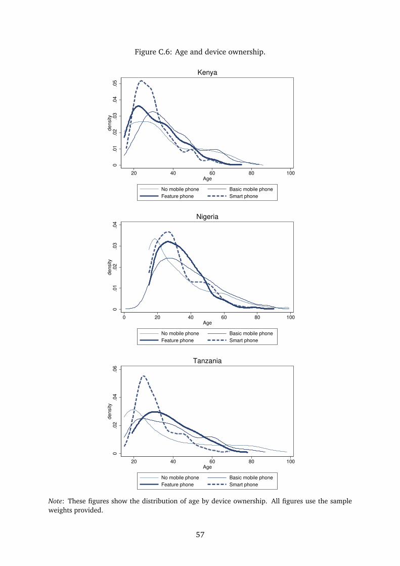
Figure C.6: Age and device ownership.
0.0
1.0
2.0
3.0
4.0
5d
en
sity
20 40 60 80 100Age
No mobile phone Basic mobile phone
Feature phone Smart phone
Kenya
0.0
1.0
2.0
3.0
4d
en
sity
0 20 40 60 80 100Age
No mobile phone Basic mobile phone
Feature phone Smart phone
Nigeria
0.0
2.0
4.0
6d
en
sity
20 40 60 80 100Age
No mobile phone Basic mobile phone
Feature phone Smart phone
Tanzania
Note: These figures show the distribution of age by device ownership. All figures use the sampleweights provided.
57

Figure C.7: Comparing user and population ranks at the first administrative level.
(a) World Pop, Kenya (b) Lanscan, Kenya
(c) World Pop, Nigeria (d) Lanscan, Nigeria
(e) World Pop, Tanzania (f) Lanscan, Tanzania
58

Table C.4: Gravity model for mobility at the extensive margin between virtual regions,origin cells of 50 residents or more.
Dependent variable:
(1) (2) (3) (4) (5) (6)
log(distance) −1.079∗∗∗ −0.964∗∗∗ −0.958∗∗∗
(0.039) (0.052) (0.066)log(distance)×KEN −1.018∗∗∗ −0.829∗∗∗ −0.794∗∗∗
(0.058) (0.080) (0.115)log(distance)×NGA −1.246∗∗∗ −1.129∗∗∗ −1.136∗∗∗
(0.051) (0.073) (0.095)log(distance)×TZA −0.863∗∗∗ −0.770∗∗∗ −0.750∗∗∗
(0.043) (0.063) (0.073)
Origin FE Yes Yes Yes Yes Yes YesDest. FE Yes Yes Yes Yes Yes YesObservations 11,015 11,015 9,954 9,954 8,674 8,674R2 0.825 0.830 0.818 0.821 0.827 0.830
Note: Columns (1) and (2) report results for all cell pairs with positive mobility. Columns (3)-(4)show results for the subset of non-adjacent cell pairs and columns (5)-(6) provide coefficient estimatesfor a subset of cell pairs at least two rows/columns apart. Reported standard errors are two-way clus-tered at the origin and destination levels. ∗, ∗∗, ∗∗∗ denote significance at 10%, 5% and 1% levels.
59

Figure C.8: Fraction of users by population density deciles in Kenya.
(a) Base sample (b) High-confidence subset
(c) Medium-confidence subset (d) Low-confidence subset
60

Figure C.9: Fraction of users by population density deciles in Nigeria.
(a) Base sample (b) High-confidence subset
(c) Medium-confidence subset (d) Low-confidence subset
61

Figure C.10: Fraction of users by population density deciles in Tanzania.
(a) Base sample (b) High-confidence subset
(c) Medium-confidence subset (d) Low-confidence subset
62

Table C.5: Origin of visitors in top 5 cities, Kenya.
Nairobi Mombasa Nakuru Eldoret Kisumu(1,598 visitors) (942 visitors) (858 visitors) (437 visitors) (426 visitors)Origin Visitors Origin Visitors Origin Visitors Origin Visitors Origin Visitors
Mombasa 21.5% Nairobi 69.2% Nairobi 64.9% Nairobi 52.6% Nairobi 58.5%Thika 5.7% Malindi 3.4% Eldoret 3.3% Kitale 4.1% Mombasa 4.7%
Nakuru 5.2% Nakuru 1.5% Mombasa 3% Mombasa 3.4% Kakamega 2.8%Kisumu 4.4% Thika 1% Kisumu 2.1% Kisumu 3% Eldoret 2.3%Eldoret 4.3% Kisumu 0.6% Naivasha 1.4% Nakuru 2.3% Nakuru 1.4%
Other urb. 1.6% Other urb. 0.5% Other urb. 1.3% Other urb. 0.9% Other urb. 0.9%Non-urban 57.3% Non-urban 23.8% Non-urban 24% Non-urban 33.6% Non-urban 29.3%
Note: Details provided in Table 8 note.
Table C.6: Origin of visitors in top 5 cities, Nigeria.
Lagos Kano Ibadan Abuja Onitsha(4,921 visitors) (769 visitors) (2,842 visitors) (3,075 visitors) (1,777 visitors)Origin Visitors Origin Visitors Origin Visitors Origin Visitors Origin Visitors
Abuja 23.5% Abuja 45.6% Lagos 70.5% Lagos 49.4% Lagos 43.3%Ibadan 14% Lagos 19.5% Abuja 6.8% Kaduna 9.2% Abuja 11.8%
Abeokuta 8.1% Kaduna 11.6% Abeokuta 3.9% Port harc. 5.6% Enugu 8.2%Port harc. 6.8% Maiduguri 3% Ilorin 3% Kano 5.5% Port harc. 5.9%Benin city 6.1% Zaria 3% Oshogbo 2.5% Jos 3.3% Owerri 4.8%Other urb. 4.6% Other urb. 2.6% Other urb. 2.3% Other urb. 2.7% Other urb. 3.7%Non-urban 36.9% Non-urban 14.7% Non-urban 11.1% Non-urban 24.2% Non-urban 22.3%
Note: Details provided in Table 8 note.
Table C.7: Origin of visitors in top 5 cities, Tanzania.
Dar es salaam Zanzibar Mwanza Arusha Mbeya(1,753 visitors) (738 visitors) (688 visitors) (832 visitors) (378 visitors)Origin Visitors Origin Visitors Origin Visitors Origin Visitors Origin Visitors
Arusha 10.2% Dar es sa. 53.7% Dar es sa. 33.1% Dar es sa. 40.7% Dar es sa. 39.9%Zanzibar 9.4% Arusha 4.1% Arusha 3.2% Moshi 10.7% Mwanza 2.9%Mwanza 7.1% Mwanza 0.8% Musoma 2.5% Mwanza 3.1% Iringa 2.4%
Morogoro 6.3% Moshi 0.8% Tabora 1.7% Dodoma 2.4% Arusha 2.4%Dodoma 4.5% Dodoma 0.8% Dodoma 1.3% Zanzibar 2.3% Sumbawanga 2.4%
Other urb. 3.7% Other urb. 0.4% Other urb. 0.9% Other urb. 1.7% Other urb. 1.9%Non-urban 58.8% Non-urban 39.4% Non-urban 57.3% Non-urban 39.1% Non-urban 48.1%
Note: Details provided in Table 8 note.
63